I cannot pretend to be impartial about the colors. I rejoice with the brilliant ones, and am genuinely sorry for the poor browns. | ||
| --Winston Churchill | ||
What is the pinnacle, the sunnum bonum, or (don't speak Latin?) the ultimate achievement of compositing? Pulling the perfect matte? Creating a convincing effect seemingly from nothing? Leaving the last doughnut at dailies for the effects supervisor? Those are all significant, but they pale in comparison with the ability to authoritatively and conclusively adjust and match the color of a foreground to a background.
Without this skill, you will not have earned the privilege of the compositor to be the last one to touch the shot before it goes into the edit. No matter how good your source elements are, they'll never appear to have been shot all at once by a real camera.
With this skill, however, you can begin to perform magic, injecting life, clarity, and drama into standard (or even substandard) 3D output, adequately (or even poorly) shot footage, and flat, monochromatic stills, drawing the audience's attention exactly where the director wants it to go, and seamlessly matching the other shots in the sequence.
This sounds like pure art, doesn't it? It's something that requires a good eye, an ineffable skill that can't be taught? Actually, no. It's a skill that you can learn even if you have no feel for adjusting images—indeed, even if you consider yourself color blind.
And what is the latest, greatest toolset for this lofty job? Most of the time, you're going to use Levels. In some cases, Curves is a preferable alternative (although plenty of talented After Effects artists never touch Curves), and Hue/Saturation remains indispensable for certain situations in which Levels and Curves are too cumbersome. You may use the rest of the tools in other situations, but for effects work the no frills approach of using these tools still seems to be the one that endures, and with good reason: These tools are stable and fast, and they will get the job done every time—once you know how to use them.
This may, nevertheless, leave you with some thorny questions:
Why are we still using the same old tools, found in Photoshop since even before After Effects existed, when there seem to be so many cool new ones in 6.5, such as Color Finesse and Auto Color?
Shouldn't I use Brightness & Contrast, or Shadow and Highlight when those are exactly what I want to adjust?
What do you mean I can adjust Levels even if I'm color blind?
This chapter holds the answers. You will begin by looking at how to effectively adjust a standalone source clip, focusing on optimizing brightness and contrast, as well as the more mysterious gamma. You'll then move into matching a foreground layer to the optimized background, and take your adjustment skills into all three color channels to balance color as needed.
More specialized color adjustments are discussed later in the book, in Chapter 12, “Working with Light.”
No doubt you've tried to make a good image look better or, at the very least, tried to make a poorly shot image look acceptable. Even if you're beyond using that time-honored method of flailing around with the controls until arbitrarily arriving at a marginally acceptable result, take some time to review the basic tools of the trade and how to use them.
We're going to start by balancing brightness and contrast of the plate footage. The term “plate” stretches back to the earliest days of optical compositing and refers to the source footage, typically the background onto which foreground elements will be composited. A related term, “clean plate,” refers to the background with any moving foreground elements removed, something we'll look at creating later in the book.
Matching footage is absolute, right or wrong, but optimizing footage is relative. What constitutes an optimized clip? Let's look at what is typically “wrong” with source footage levels and the usual methods for correcting them.
Levels is your tool for optimizing black and white levels; in other words, you use Levels to adjust brightness and contrast. You'll soon see why it's much preferable to the Brightness & Contrast effect for this purpose, and later in the chapter I'll show you some further uses for Levels and its Histogram palette.
Figure 5.1 shows the Levels control and the clip to which it was applied, starting with the default settings. The Levels effect consists of the histogram and five individual controls, each of which can be applied either to the full RGB image or to individual red, green, blue, or alpha channels by selecting them using the Channel menu at the top. For now, we'll focus on the relatively uncomplicated technique of adjusting brightness and contrast in overall RGB, the default Channel setting.
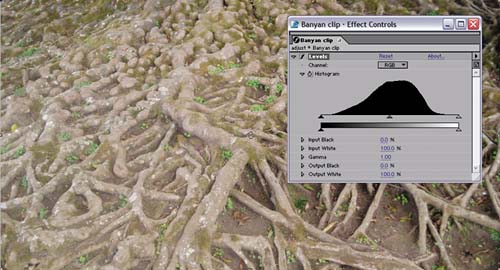
Figure 5.1. Possibly the most used “effect” in After Effects, the Levels adjustment control consists of a histogram and five basic controls per channel; the controls are usually accessed using the triangles on the histogram, with corresponding numerical/slider controls below. The default settings are shown here.
Note
An often overlooked feature of Levels, Alpha Channel mode allows you to directly adjust brightness, contrast, and gamma of the grayscale transparency channel, saving you from having to make a separate track matte to make these adjustments.
The basic function of the histogram is to help your assessment of whether the changes you are making are liable to help or harm the image. There is no one typical or ideal histogram—they can vary as much as the images themselves (Figure 5.2). Below the histogram is a black to white gradient, showing where each part of the histogram falls on the luminance scale.
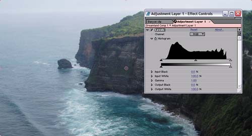
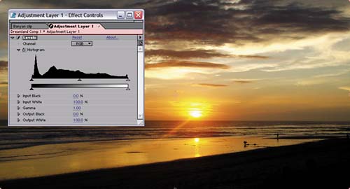
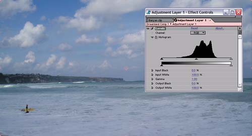
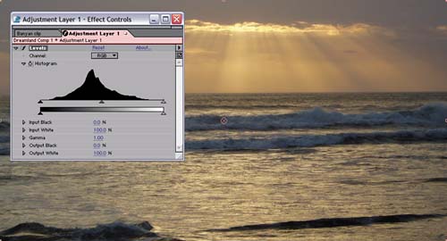
Figure 5.2. The same basic subject will have a variety of histograms depending on lighting conditions. There is no such thing as a “good” histogram, although alongside their images these histograms can tell you quite a bit about how much contrast and range of color is already present, and what might need correction.
Although I've just said no one histogram is ideal, there's a simple trick for optimizing brightness and contrast using Levels. Look at the top and bottom end of the histogram—the highest and lowest points where there is any data whatsoever—and bracket them with the triangle controls for Input Black and Input White. By bracket them, I mean move these controls in so each sits just outside its corresponding end of the histogram (Figure 5.3). The result stretches values closer to the top or bottom of the dynamic range, as you can see by applying a second histogram (Figure 5.4).
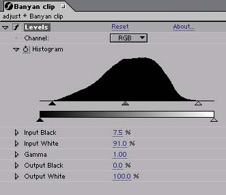
Figure 5.3. When you bring the triangle controls corresponding to Input Black and Input White in to bracket the histogram, the change in percentages can be seen numerically below.
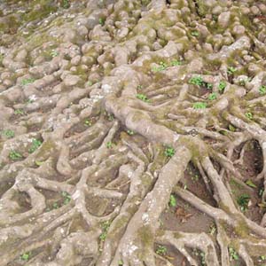
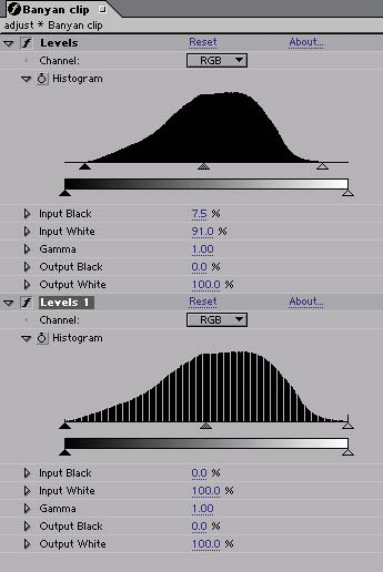
Figure 5.4. Adding a second Levels effect just to view its histogram reveals what has happened as a result of the prior adjustment; the histogram looks similar but now extends to each end of the contrast spectrum. The stripes are quantization, showing that values have been stretched. Although not severe in this case, they are a by-product of working in 8-bit color.
It is generally advisable not to move Input Black above the lowest black or Input White below the highest white value when optimizing an image. This is known as crushing the blacks (or whites), and once that detail has been crushed, it cannot be brought back subsequently. Low blacks all turn to pure black, light colors blow out to white. Unless you're working in linearized color space with overbright values (if you're unsure, that means you're not, but you can check Chapter 11, “Issues Specific to Film and HDR Images,” for the lowdown), you don't get the organic roll-off common to overlit film images. Many a stylized look calls for this effect, but generally speaking and until you really know what you're doing, this is bad form (Figure 5.5).
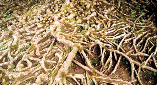
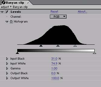
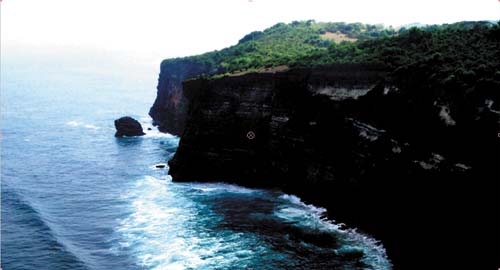
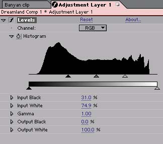
Figure 5.5. The same Levels adjustment, crushing the blacks and blowing out the highlights, can bring a rich dramatic quality to one clip, while totally ruining another. Note in the histogram how much more of the image is affected by this adjustment in the lower example, including most of the lower range and all of the highlight variation.
Therefore, because your source footage is dynamic and the dynamic range can vary from frame to frame, it is a good idea to leave headroom for the whites and foot room for the blacks. Generally speaking, you can use the inside corners of the adjustment triangles to line up with the edge of the image data (as in Figure 5.3). This is a reliable way to adjust the Input Black. The Input White level will need more headroom if something exceptionally bright—such as a sun glint, flare, or fire—comes into frame.
Same Difference: Levels (Individual Controls)
Adjacent to one another under the Adjust section of the Effects menu (or palette) are two versions of the same effect: Levels and Levels (Individual Controls).
Do not fret: Both of these effects accomplish the same basic task using the same basic controls, arranged differently. The main difference is that if you set keyframes for Levels, After Effects lumps together all of your adjustments into one keyframe setting. The values are then inaccessible to expressions and cannot be individually reset.
Therefore you should consider using Levels (Individual Controls) if
You need to animate individual Levels adjustments.
You want to drive a Levels value using an expression or to use a Levels value to drive an expression.
You like being able to right-click on each slider value to reset it.
The number of cases in which the above criteria hold true is likely to be very few. On the other hand, you will get the same result with the same settings in either effect, so it's largely up to you which one you choose. Most people simply use Levels for most situations.
Black and white are not at all equivalent, in terms of how your eye sees them. Blown-out whites are not pretty and are usually a sign of overexposed digital footage, but your eye is much more sensitive to subtle gradations of low black levels. These low, rich blacks account for much of what makes film look filmic, and they can contain a surprising amount of detail, none of which, unfortunately, would be apparent on the printed page.
So what about the Output Black and Output White controls? These have the effect of raising the blackest black and lowering the whitest white, respectively, toward gray, which lowers the dynamic range and the contrast of the image (Figure 5.6).
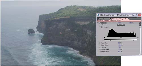
Figure 5.6. Output Black and Output White can help with a particular look (here the scenery appears misty and hazy), but they will come into play more in the Matching section.
You now know the basics of what to look for on a histogram when optimizing an image's brightness and contrast. Now take a look at some potentially unhealthy symptoms that a histogram can help you recognize.
The Levels histogram shows only incoming image data, not the results of any Levels adjustments. Unlike Photoshop CS, After Effects does not have a Histogram palette for constantly monitoring current image levels, but you do have the option to see the results of one Levels adjustment by applying a second Levels effect. This is not a typical thing to do, mostly because people don't like the extra effect sitting in the pipeline, but it can certainly be useful as a temporary check if you think something might be amiss.
Applied to a backlit shot adjusted to bring out foreground highlights, the resulting histogram reveals a couple of new wrinkles (Figure 5.7). At the top end of the histogram the levels increase right up to the top white, ending in a spike. This may indicate that the white data has been crushed slightly, forcing too many whites to pure white and destroying image detail.
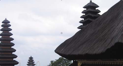
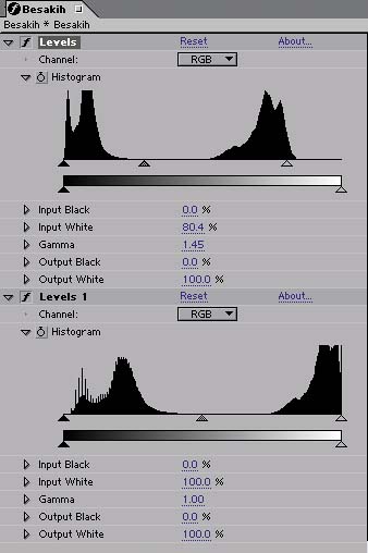
Figure 5.7. In the first instance of Levels, Gamma has been raised and the Input White brought in to enhance detail in the dark areas of the foreground. The second instance has no adjustments and is applied only to see the result of the first adjustment in a second histogram.
At the other end of the scale is the result of the Gamma adjustment: a series of spikes rising out of the lower values like protruding hash marks. The Gamma value has been raised, moving the midpoint closer to black to raise midrange brightness. That means that you effectively stretched the levels below the midpoint, causing them to posterize slightly, to clump up at regular intervals.
X Marks the Histogram
If you are working with Levels and find at some point that the histogram is no longer displaying data, but instead has an x shape across it, this simply means that the data in the image may have changed without the histogram automatically updating. You wouldn't want Levels to be updating its histogram all the time; the background polling of data could slow the application to a crawl.
The simplest way to let After Effects know that you want to update the histogram before making any changes is to toggle the Levels effect off, then back on. The data is polled when the effect is first switched on.
In this case, the spikes are not a worry because they occur among a healthy amount of surrounding data—there are no empty gaps between the spikes, there is a curve of data across the range. In more extreme cases of posterization in which there is no data in between the spikes whatsoever, you will see the result of too much level adjusting in the form of banding. (Figure 5.8)
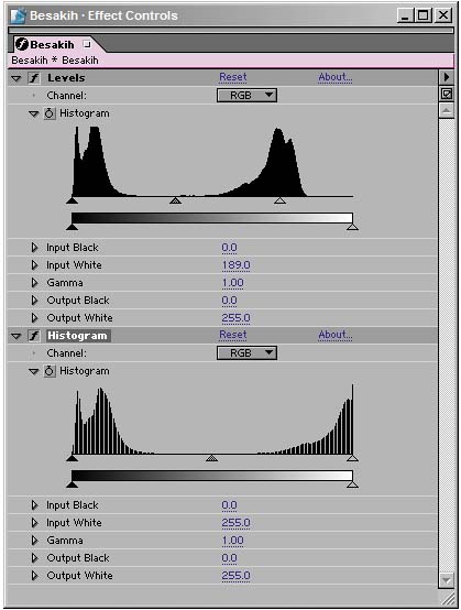

Figure 5.8. Attempting to bring out the foreground highlights with too much Input White adjustment instead of Gamma blows out the sky and heavily quantizes the resulting image. The histogram of a second Levels effect shows quantization and clipped levels, and banding is apparent in the sky. Adjusting Gamma is a better approach.
Banding is the result of limits associated with working in 8-bit color, and After Effects offers a ready-made solution: 16-bit color mode, which you can access by Alt-clicking (Option-clicking) on the bit-depth identifier along the bottom of the Project window (Figure 5.9). For more on what 16-bit color is and how it can be used with other technologies, such as floating-point linearized color, see Chapter 11.
I just had you try an adjustment of brightness and contrast on an image and entirely ignored the effect called Brightness & Contrast. Are we just too good for that effect? In a word, yes. The reason why is easily seen with the image you just optimized.
Brightness & Contrast has two sliders, and I'll give you three guesses what each of them controls. The Contrast control, if set to a value higher than 0.0, causes the values above middle gray to move closer to white and those below the midpoint to move closer to black. Set it to a value below 0.0, and it takes all pixels closer to gray. The Brightness control, unlike Gamma, adjusts all pixel values in the image at once, and identically.
So what's the problem? The example image was typical in that it did not need black and white levels enhanced to the same extent. In fact, it did not need input black levels enhanced at all, as you could see from the histogram. Cranking up the Contrast control to get more detail into the whites would, in this case, crush the blacks—forcing more of them to pure black. And then if you attempted to bring them back by raising the Brightness value, you would quickly have blown out the detail in the sky completely (Figure 5.10). Maddening.
Figure 5.10. Oh, what a tangled web we weave when first we apply Brightness & Contrast. Something's gotta give: Increasing Contrast crushes the blacks, and raising Brightness blows out the sky, as you see here. There is no good reason to use this tool.
The other big problem with Brightness & Contrast is the linearity of it—the fact that all pixels are affected equally by the controls. The ability to create a nice roll-off in complex Brightness & Contrast settings is where Curves stands out.
Geek Alert: What Is Gamma, Anyway?
It would be so nice simply to say, “gamma is the midpoint of your color range” and leave it at that. The more accurate the discussion of gamma becomes, the more obscure and mathematical it gets. There are plenty of artists out there who understand gamma intuitively and are able to work with it without knowing the math behind it or the way the eye sees color midtones. That's fine, but if you'd like to broaden your understanding, read on.
The idea with gamma adjustment is to take the midpoint of color values and shift it without affecting the black or white points. This is done by taking a pixel value and raising it to the power of the gamma value, then inverting the value. The formula looks like this
newPixel = pixel (1/gamma)
You're probably used to thinking of pixel values as being 0 to 255, but this formula works only if they are normalized to 1. In other words, all 255 values occur between 0 and 1, so 0 is 0, 255 is 1, and 128 is .5—which is the “normal” way the math is done behind the scenes.
Why does it work this way? Because of the magic of logarithms: Any number to the power of 0 is 0, any number to the power of 1 is itself, and raising a fractional value (less than 1) to a higher and higher power makes it closer and closer to 0. This value is then inverted, or subtracted from 1, so that the higher the gamma, the closer the value gets to 1 or pure white. The real “magic” of logarithms is that the values are described on a curve, hence a gamma curve.
Hmmm, was that simple? If not, look ahead to the Curves discussion for a visual example.
Gamma, the midrange of the image levels, is a more subjective adjustment: Generally you can think of it as giving more reach to adjustments you may have already made to brightness and contrast, making the image more brilliant or darker without changing the white and black points.
You can adjust gamma in Levels, but, in most cases, the histogram won't really help you decide where a gamma adjustment is needed as much as the image itself. By moving the midpoint in Levels to the left, you are raising gamma, effectively putting more values in the image above the midpoint; moving it to the right has the opposite effect (Figure 5.11).
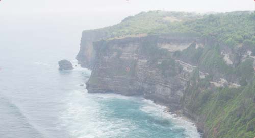
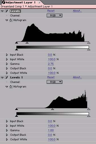
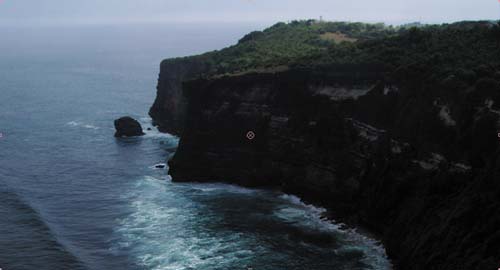
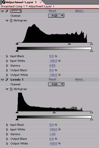
Figure 5.11. It may seem obvious, yet this figure demonstrates it clearly: Raising gamma (top) pushes more image values above the midpoint, while lowering it has the opposite effect. The result in each case bears a proportional relationship (in the histogram) to the original.
How do you know when to stop? In my first professional color correction job, my supervisor told me that he had to see it go too far before he knew how much to dial it back. And that's always remained my basic approach with the sliders.
I consider Curves preferable to Levels for correcting gamma, because
Curves can be used to gently roll-off adjustments, giving a gentler, more organic curve to the corrections they introduce.
You can use Curves to introduce more than one gamma adjustment to a single image or to restrict the gamma adjustment to just one part of the image's dynamic range.
You can often nail an image adjustment with a single well-placed point in Curves, when deriving the equivalent adjustment using Levels would require coordinated adjustment of three separate controls.
It's also worth understanding Curves controls because they are a common shorthand for color adjustments in visual effects work; this control recurs not only in all of the other effects compositing packages but also in more sophisticated tools within After Effects, such as Color Finesse (discussed briefly later in this chapter).
Curves does, however, have a couple of drawbacks, compared with Levels:
It's not initially intuitive how to use Curves, and on any team there will probably be people who aren't as comfortable with Curves as with Levels.
Unlike Photoshop, After Effects doesn't offer an eyedropper for placing sampled values on a curve, nor does it attach a numerical value to the points you create. In other words, it's a purely visual control that is difficult to standardize.
Without a histogram, you can miss obvious clues as to what your image needs.
Nonetheless, the benefits far outweigh the disadvantages, if you're patient enough to gain the necessary skills to use Curves, so I'm going to try to rocket you to comfort with this powerful effect in this section.
By default, Curves displays a grid with a line extending diagonally from lower left to upper right. There is a Channel selector at the top, set by default to RGB as in Levels, and there are some controls on the right to help with drawing, saving, and recalling certain types of curves.
Figure 5.12 shows some basic Curves adjustments and their effect on images, as well as on a linear gradient, and the equivalent Levels settings. This is the best way I could conceive to show what is happening with Curves, and it's the kind of thing you can try easily on your own, using the Ramp effect to create a gradient if you want a neutral palette on which to see the result of the changes. Î would even go so far as to say that performing these kind of scientific explorations into how these tools work is one of the things that will separate you from the mass of artists who work more haphazardly.

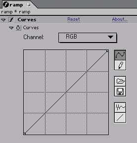

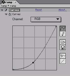

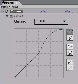

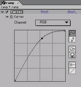
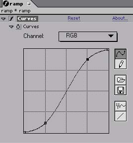

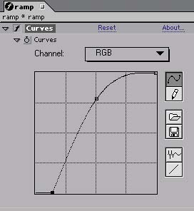
Figure 5.12. This array of Curves adjustments applied to a gradient shows the results of some typical settings. From top-left to bottom-right: The default gradient and Curves setting, an increase in gamma, a decrease in gamma, an increase in brightness and contrast, raised gamma in the highlights only, and raised gamma with clamped black values.
More interesting than these basic adjustments (which are included only to give you a clear idea of what Curves is doing) are the types of adjustments that only Curves allows you to do—or at least do easily. I came to realize that most of the adjustments I make with Curves fall into a few distinct types that I use over and over, and so those are summarized here.
The most basic adjustment is to simply raise or lower the gamma with Curves, by adding a point at the middle of the RGB curve and then moving it upwards or downwards. Figure 5.13 shows the result of each adjustment. Interestingly, this produces a vastly different result from raising or lowering the Gamma control in Levels, and the exact effect of the adjustment is impossible to recreate without Curves' ability to gently roll off the adjustment (Figure 5.14).
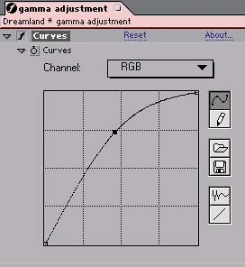
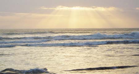
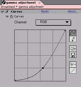
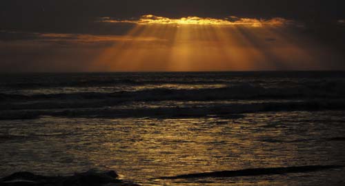
Figure 5.13. Two equally valid gamma adjustments using the Curves control. Dramatically lit footage particularly benefits from the roll-off possible in the highlights and shadows.

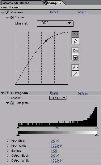

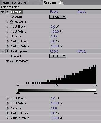

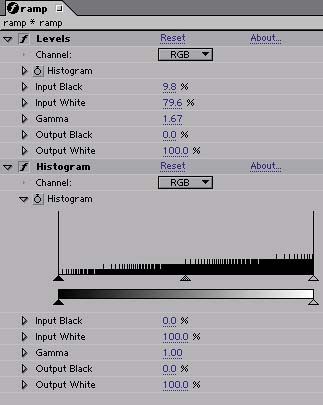
Figure 5.14. Both the gradient and the histogram show that you can push the gamma much harder, still preserving the full range of contrast, with Curves than with Levels, where you face a choice between losing highlights and shadows or crushing them.
Take this idea further, and you can weight the adjustment to the high or low values of the image, pushing a nice roll-off into an image that might have appeared rather low in contrast (Figure 5.15). Combine high and low adjustments and you have the classic S-curve adjustment, which is universally understood to enhance brightness and contrast, but which additionally has the benefit of introducing roll-offs into the highlights and shadows (Figure 5.16). Keep in mind that you want to aim the curve to travel directly through the midpoint of your Curves grid if you don't wish to affect gamma.
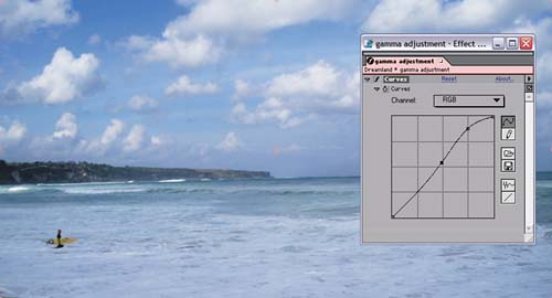
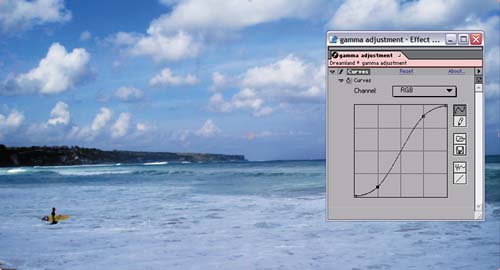
Figure 5.16. The classic S-curve adjustment: The midpoint remains the same, but contrast is boosted.
Some images need a gamma adjustment only to one end of the range—for example, a boost to the darker pixels, below the midpoint, that doesn't alter the black point and doesn't brighten the white values. Here you are required to add three points (Figure 5.17):
One to hold the midpoint
One to boost the low values
One to flatten the curve above the midpoint

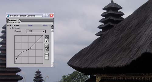
Figure 5.17. A solution for backlighting: Adding a mini-boost to the darker levels while leaving the lighter levels flat preserves the detail in the sky and brings out detail in the foreground that was previously missing.
I find I'm usually able to complete a Curves setting by adding between one and three points to my color curve. More than three points seems to do something not very organic—for want of a better expression—to the image. My method is usually to add a single point and then to add a second or third as needed.
Third in the troika of primary image adjustment tools is Hue/Saturation. This one has many individualized uses:
Colorizing images that were created as grayscale or monochrome
Shifting the overall hue of an image
De-emphasizing, or knocking out, an individual color channel
Desaturating an image or adding saturation (the tool's most common use)
All of these uses will come into play when you learn about creating monochrome elements, such as smoke, from scratch in Chapters 12 to 14.
The Hue/Saturation control allows you to do something you can't do with Levels or Curves, which is to directly control the hue, saturation, and brightness of an image. The HSB color model is merely a different way of looking at the same color data as exists in the RGB model used by Levels and Curves. All good color pickers, including the Apple and Adobe pickers, handle RGB and HSB as two different modes that use three values to describe any given color, which is the correct way to conceptualize it.
In other words, you could arrive at the same color adjustments using Levels and Curves, but Hue/Saturation gives you direct access to a couple of key color attributes that are otherwise difficult to get at.
For example, you can adjust the overall saturation of the image, or even the saturation of individual color channels. Desaturating an image means moving the red, green, and blue values closer together, reducing the relative intensity of the strongest of them. Why attempt this using three separate channels of red, green, and blue when a single slider will do it?
Desaturating an image slightly—lowering the Saturation value somewhere between 5 and 20—can be an effective way to make an image adjustment come together quickly (Figure 5.18). This is a case where understanding your delivery medium is essential, as film is more tolerant and friendly to saturated images than television.
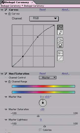
Figure 5.18. For footage that is already saturated with color, even a subtle boost to the gamma can cause saturation to go over the top. There's no easy way to control this with RGB controls, such as Levels and Curves, but moving over to the HSB model allows you to single out Saturation and dial it back.
The other quick fix that Hue/Saturation affords you is a shift to the hue of the overall image or of one or more of its individual channels. The Channel Control menu for Hue/Saturation includes not only the red, green, and blue channels but also their chromatic opposites of cyan, magenta, and yellow. When you're working in RGB color, these secondary colors are in direct opposition, so that, for example, lowering blue gamma effectively raises the yellow gamma, and vice versa.
But in the HSB model all six are singled out individually, which means that if a given channel is too bright or over-saturated, you can dial back its Brightness and Saturation levels, or you can shift its Hue toward the part of the spectrum where you want it (Figures 6.19 and 6.20).

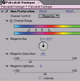
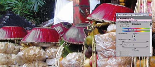
Figure 5.19. Sometimes one color channel comes in much too strong, and you can get away with isolating that –channel —in this case, magenta—and knocking its Saturation back heavily. Go too far, however, and you may not notice artifacts such as areas that have lost too much saturation (see closeup).
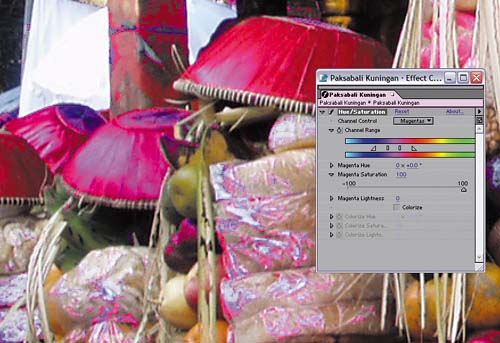
Figure 5.20. When in doubt about the amount of color in a given channel, try boosting its Saturation to 100%, blowing it out—this makes the presence of that tone in pixels very easy to spot.
The Perils of Automation
Skynet may have become self-aware at 2:14 a.m. August 29, 1997, but that doesn't mean that in the early twenty-first century you should be relying on the computer to make your decisions for you.
New with After Effects 6.5 is a trio of automated adjustment tools: Auto Color, Auto Contrast, and Auto Levels. Apply any of these to your footage, and you'll immediately see a result without adjusting anything—the benefit of a tool with “auto” in the title.
There are a couple of obvious problems with using these tools. One is that, although they can instantly give your image a nice kick, the adjustments are “black box” in nature, based on an engineer's educated guess of how your image should look. Also, because these plug-ins rely on sampled data and you can't specify a single frame to sample, the adjustments will, by their very nature, shift over time—not usually a desirable side-effect.
There is also a hidden problem. The sampling takes more processing power than you might think; even on a fast machine these effects can add several seconds per frame on broadcast-quality footage (to say nothing of HD or higher). So these plug-ins don't really even save you time, once you factor in how much longer your renders will take.
Therefore, the only use that I can see for these plug-ins is as idea generators. If you're stuck trying to nail an image adjustment, go ahead and apply one of them. If you like the result, take a snapshot of it and then go about matching it using the controls and matching techniques discussed in this chapter.
I've largely limited the discussion here to The Big Three color tools—Levels, Curves, and Hue/Saturation—for a couple of reasons. For one thing, they are the common currency of color correction, not only in After Effects but also Photoshop. The other main reason is that any other technique you might use would not obviate the need to somehow involve these tools and techniques.
The truth is that there are lots of ways to adjust the color levels of an image. Some alternatives for achieving a specific look—layering in a color solid, matting an image with itself, and more—are discussed in Section III of this book, and the next chapter will get into methods for making very specific color matches.
Even using what was covered in this chapter, there are more alternatives. For example, you can apply these basic color correctors using an adjustment layer rather than directly to your footage. This gives you the added advantage of being able to dial back the correction by varying the opacity of the adjustment layer.
You've examined the tools; now it's time to move on to the bread and butter of compositing: matching foreground and background images.
Color Finesse
The Color Finesse tool set is elegant and full featured, but I'm considering it out of scope for this book for a couple of reasons.
First, its core features are based on the same principles as the tools I've outlined: histograms, such as those in Levels, Curves, and Hue/Saturation adjustments (see Figure 5.21). You have no business working in Color Finesse, therefore, if you don't understand how to get a similar result from the core tools.
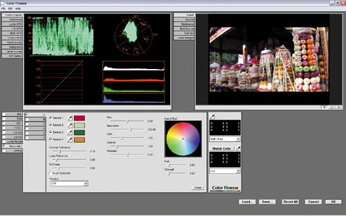
Figure 5.21. Do the controls in Color Finesse seem familiar? They certainly should. Although snazzier looking, they are fundamentally based on the tools covered in depth thus far in the chapter.
Second, I don't like the fact that Color Finesse runs in its own user interface; for example, you have to open a second application to do color correction. I find this cumbersome for use in the effects pipeline and even less stable than sticking with the core tools.
For some situations, however, you will definitely want to check out Color Finesse on your own, and look through its 60-page manual. I love the fact that it lets you isolate secondary color ranges and adjust only them. When I need a quick color fix, this method is much faster than taking the trouble to create a mask for a layer so I can adjust just some subset of the full image. I also think that it could be the tool you want if your only job is conforming the color of an entire edited piece, a job that often goes to dedicated colorists and Inferno operators.
Just make sure you've mastered the core tools first.
Melding images together and eliminating all clues that they came from separate sources is as much science as art. Up to this point we've focused on optimizing source footage, which is a more relative and artistic practice. Once the background has been properly graded, however, matching the foreground using the same tools is much more straightforward. The process obeys such strict rules that you can do it with no artist's eye at all. Assuming the background has already been color-graded, you even can satisfactorily complete a shot on a monitor that is nowhere near correctly calibrated.
How is that possible?
As with so many things in visual effects work, the answer is really a question of correctly breaking down the problem. In this case, the job of matching one image to another obeys rules that can be observed channel by channel, independent of the final, full-color result.
Of course, effective compositing is not simply a question of making colors match; in many cases that is only the first step. You must also obey rules you will understand from having done the kind of careful observing of nature described in the previous chapter. And even if your colors are correctly matched, if you haven't interpreted your edges properly (Chapter 3) or pulled a good matte (Chapter 6), or if such essential elements as lighting (Chapter 12), the camera view (Chapter 9), or motion (Chapter 8) are mismatched, your composite will not succeed.
These same basic techniques will work for other situations in which your job is to match footage precisely—for example, color correcting a sequence to match a hero shot, a process also known as color timing.
Integrating a foreground element into the color space of a background scene breaks down into three steps:
Match brightness and contrast as if the images were grayscale, using Levels. When matching the black and white points, pay attention to atmospheric conditions. Matching the midtones, however, may not always be necessary or even possible.
Using Levels, match the brightness and contrast of individual color channels as needed.
Note any fundamental mismatch problems that remain and ascertain whether they are related to color matching or some other issue, such as the edges, matte, lighting, camera view, and so on.
This approach, although not complicated or even particularly sexy, can take you to places your naked eye doesn't readily want you to go when looking at color. Yet, when you see the results, you realize that nature beats logic every time.
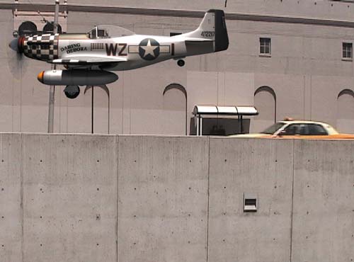
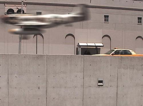
Start with a simple example: inserting a 3D element lit for daylight into a daylight scene. As you can see in Figure 5.22, the two elements are close enough in color range that a lazy or hurried compositor might be tempted to move on without adjusting the foreground.
With only a few minutes of effort, you can do a world better. Make sure the Info palette is somewhere that you can see it, and for now, choose Percent (0-100) in that palette's wing menu to have your values line up with the ones discussed here. You are free to choose any of the color modes in this menu; I advocate this one only for the purpose of standardizing the discussion.
This particular scene is a good beginner-level example of this technique because it is full of elements that would be monochromatic under white light. The background is dominated by concrete, which is generally flat, colorless gray, and the foreground element is an aircraft with a silver body that is lit from the top with white light with dark shadows underneath.
Begin by looking for suitable black and white points to use as references in the background and foreground. In this case, the shadow areas under the archways in the background, and underneath the wing of the foreground plane, are just what's needed for black points—they are not the very darkest elements in the scene, but they contain a similar mixture of reflected light and shadow cast onto similar surfaces, and you can expect them to fairly nearly match. For highlights, you happily have the top of the bus shelter to use for a background white point, and the top silver areas of the plane's tail in the foreground are lit brightly enough to contain pure white pixels at this point.
Figure 5.23 shows the targeted shadow and highlight regions and their corresponding readings in the Info palette. The shadow levels in the foreground are lower (darker) than those in the background, while the background shadows have slightly more red in them, giving the background a warmth that the unadjusted foreground lacks. The top of the plane and the top of the bus shelter both contain levels at 100%, or pure white; the blue readings on the bus shelter, which are a few percentage points lower, give it a more yellow appearance.
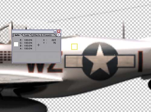
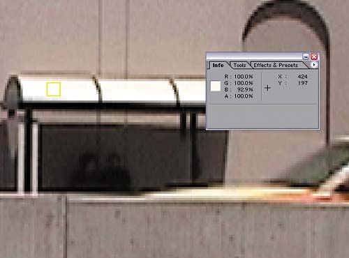
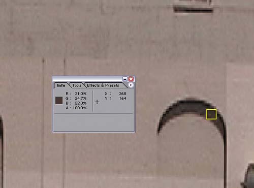
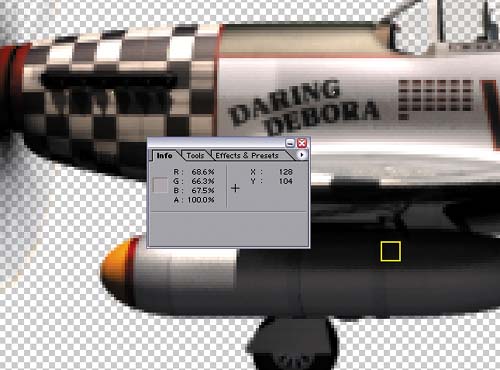
Figure 5.23. The target highlight and shadow areas are outlined in yellow; levels corresponding to each highlight are displayed in the adjacent Info palette.
To correct for these mismatches, apply Levels to the foreground and move the Output Black slider up to about 7.5%. This raises the level of the blackest black in the image, lowering the contrast, something we didn't expect to do when optimizing images earlier in the chapter.
Having aligned the contrast levels, it's time to correct for the differences in color. Remember the red levels in the background shadows are higher than blue or green, which is a clue that you should now switch the Composition window to the red channel (click on the red marker at the bottom of the window or use the Alt+1/Option+1 shortcut). A thin red line around the outside of the display reminds you that you are looking only at red levels, and you can zoom in to an area that shows both of the regions you're comparing (Figure 5.24).
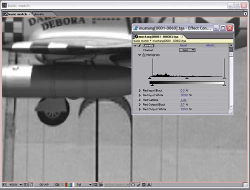
Now you can see clearly that the black levels in the red channel are still too low in the foreground, so raise them to match. Switch the Channel pop-up in Levels to Red, and raise Red Output Black slightly to about 3.5%. You can move your cursor from foreground to background and look at the Info palette to check whether you have it right, but the great thing about this method is that your eye usually gets variations in luminance correct when looking at a grayscale image.
Now for the whites. Because the background highlights have slightly less blue in them, switch to the blue channel (clicking the blue marker at the bottom of the Composition window or use Alt+3/Option+3). Pull back slightly to where you can see the top of the bus shelter and the back of the plane. Switching Levels to the blue channel, lower the Blue Output White setting a few percentage points to match the lower blue reading in the background. Back in RGB mode (Alt+3/Option+3 toggles back from blue to RGB), the highlights on the plane take on a more sunlit, yellow quality. It's subtle, but it seems right.
Note
The human eye is more sensitive to green than red and blue. Often, when you look at a shot channel by channel, you will see the strongest brightness and contrast in the green channel. For that reason, a sensible approach to matching color may be to get the overall match in the ballpark so that the green channels match perfectly, and then adjust the other two channels to make green work. That way, you run less risk of misadjusting the overall brightness and contrast of your footage.
What about the midtones? In this case, they're taking care of themselves because both the foreground and background are reasonably well balanced and your corrections are mild.
Figure 5.25 shows the result, with the same regions targeted previously, but with the levels corrected. To add an extra bit of realism, I also turned on motion blur, without yet bothering to precisely match it (something you will learn more about in Chapter 8, “Effective Motion Tracking”). You see that the plane is now more acceptably part of the scene. Work on this composite isn't done either; besides matching the blur, you could add some sun glints on the plane as it passes, similar to those on the taxi. On the other hand, you can tell that you don't need to bother adding a pilot to the cockpit; the blur on the plane is too much to even notice that the pilot is missing.
Note
All kinds of studies show how taking a break once in a while helps your concentration and lets you stay healthy by stretching your body, but in this case there is a more specific use for turning away from your monitor for a minute or two. When you come back, even to a labored shot, you regain an immediate impression that can save you a lot of noodling. The process outlined in this section is designed to remove many variables to color correction, but it's still a question of whether the final shot looks right or not.
The first example was fairly elementary with lots of good reference in the background, corresponding levels in the foreground, and no variables in the environment—no particulate matter in the air, for example. Now let's complicate matters.
One of the most common phenomena noticeable in the world at large is what happens to objects at a great distance (provided they are here on our planet, anyhow). Particulate matter in the air—not just pollution and fog, but even normal water condensation in otherwise pristine climates—causes objects in the distance to lose contrast and to take on some of the atmosphere color.
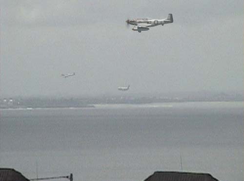
Figure 5.26 shows this phenomenon in full effect. Examine the airplane landing in the background, and the land around it. The darkest black levels are a medium gray, while the rooftops visible in the foreground at the bottom of the frame are as dark as any of the shadow areas in the previous shot.

Now say you want to insert that same airplane into this shot—not as far away as the plane landing in the distance, but not as close as those rooftops. Drop the plane in and scale it down to about 20%, and you'll see that in spite of its size, the depth cueing—the indications to your eye of its scale—are all wrong because of its contrast levels (Figure 5.27).
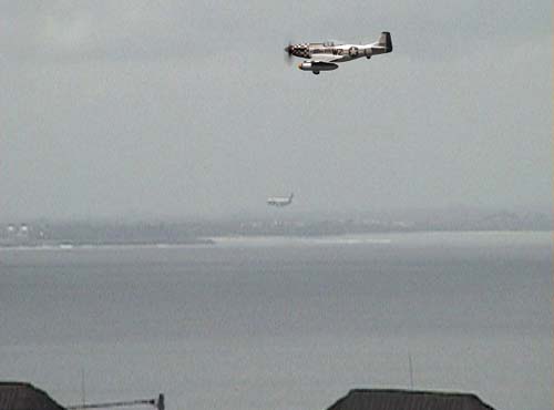
You want the black levels somewhere between those of the plane in the distance and the rooftops in the foreground. You have foreground black level reference (the rooftops) but no white levels. From the black levels in the foreground, you can see that there is not much of a color shift occurring in the shot overall; the blacks are fairly monochromatic, with RGB values within a percentage or two of one another, all around 20%.
In the background, however, everything starts turning cyan. Black and white levels in the background have nearly 10% less red than green or blue.
When Reference Is Missing Something
There will be times when your background is missing the clues that simplify this work. In particular, your background may not have anything in it that would be pure white under normal lighting conditions. In extreme cases, you may have to guess what the color of an object in your background would be if you took a close-up shot of it under normal lighting conditions. Things may also be happening in your background, such as a cloud passing overhead, that should not be occurring in the foreground.
In such cases, you have to do your best knowing the basic rules about how light behaves (outlined here and in Section III).
There is one situation where you will have to use scientific fact instead of reference, unless your background was shot from a spaceship. In outer space, outside of the Earth's atmosphere, there is very little particulate matter (other than the occasional cloud of flying debris) and no atmosphere, so items in the distance tend to retain their full contrast.
On other planets, however, the same rules as Earth's will apply, assuming the planet in question has some kind of atmosphere.
To place the plane in the mid-ground, you're going to take the levels toward, but not quite as far as, those of the background. First, working in RGB, raise Output Black about 30% and lower Output White around 85% to bring the blacks above 40% and the whites into the 80% range. The Info palette reveals that the corresponding levels in the far background are in the mid-50% range for blacks and the mid-70% area for highlights, so you've approached those levels without going quite that far.
Now if you toggle among the red, green, and blue channels in the Composition window, you'll notice that the red channel is slightly darker overall than the other two, accounting for the overall cyan quality of the image. Here is a clear case for the use of gamma—specifically, lowering the Red Gamma value to about 0.85, darkening the red midtones and taking the overall layer more toward cyan.
Just for fun, a second plane is added in the distance, as if it was chasing the plane that is landing, its levels matched to the source plane exactly. Figure 5.28 shows both planes added to the background footage.
Maybe you've seen an old movie on television—my favorite example is Return of the Jedi (before the re-release)—in which you see black levels that you really shouldn't be seeing. Jedi was made prior to the digital age, and some of the optical composites worked fine on film, but when they went to video, subtleties in the black levels that weren't previously evident suddenly became glaringly obvious. For example, some ugly garbage mattes around the inside of the Emperor's hood looked black on film, but look astonishingly bad on video.
Don't let this happen to you! Now that you know how to match levels, put them to the test by slamming the gamma of the image. To do this, you need to make a couple of adjustment layers. I usually call one slam up and the other slam down, as in the examples. Be sure that both of these are guide layers so that they have no possibility of showing up in your final render.
To slam up, apply Curves with the gamma raised significantly (Figure 5.29). This exposes any areas of the image that might have been too dark to distinguish on your monitor; if the blacks still match with the gamma slammed up, you're in good shape.
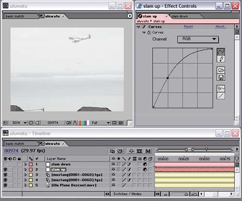
Figure 5.29. Slamming gamma is like shining a bright light on your scene. Your black and midtone levels should still match when seen this way.
Similarly, and somewhat less crucial, you can slam down by lowering the gamma and bringing the highlights more into the midrange (Figure 5.30). All you're doing with these slams is stretching values that may be difficult for you to distinguish into a range that is easy for you to see.
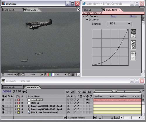
Figure 5.30. If in doubt about the highlights in your footage, you can also slam the gamma downward.
This method is useful anywhere that there is a danger of subtle discrepancies of contrast; you can use it to examine a color key, as you'll learn in the next chapter, or a more extreme change of scene lighting.
This chapter has covered some of the basics for adjusting and matching footage. Obviously there are exceptional situations, some of which occur all of the time: changes in lighting during the shot, backlighting, interactive light and shadow. There are even cases in which you can, to some degree, relight a shot in After Effects, introducing light direction, exchanging day for night, and so on. These topics and more are covered in depth in Chapter 12.