
9. Working with Widgets
No changes need to be made to complete Lesson 9 in the Adobe Muse third-quarter update. However, a new widget category has been added to the Widgets Library panel: Forms. Adobe Muse now has built-in support for contact forms that work with sites hosted using Adobe Business Catalyst. There are also some improvements to the Slideshow and Composition Widgets, such as default formatting and the options available.
The L9_start.muse and L9_extras.muse files may show missing images when opened on Windows. You can fix them in the Assets panel.
Forms
The newest widget in the Widgets Library is the Forms category of widgets. Muse now includes a long and short contact form that you can drag and drop onto the page and edit as you see fit. You can add and remove fields, and style the form as you would other Adobe Muse elements. You can independently style the various states of the form and form fields to provide a compelling user experience, with visual cues for error states, empty states, and more.
Because Form processing requires server-side support, Adobe Muse forms are configured to work when published to Adobe Business Catalyst. If you make changes to your form and publish again, Adobe Muse will make the appropriate changes to your Adobe Business Catalyst forms. The form data will be emailed to the address(es) specified in the form options, which you will see shortly.
Insert a form
The first step in the process is to create a page to contain the form, and then add the form widget to that page. After page 230, you can insert a contact form.
1. In Plan mode, position the pointer over the Kart Map thumbnail and click the plus (+) to the right to add a page to the right. Name the page “CONTACT.”
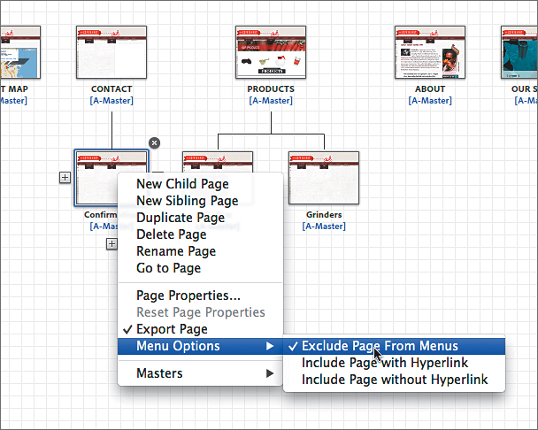
2. Position the pointer over the new CONTACT page and click the plus (+) beneath the page to add a new child page. Name the page “Confirmation.”
The new Confirmation page is what users will be redirected to after they submit the form data, so it doesn’t need to show in the menu.
3. Right-click (Windows) or Ctrl-click (Mac OS) and choose Menu Options > Exclude Page From Menus.
4. Double-click the new CONTACT page thumbnail to open the page in Design mode. Choose View > Fit Page In Window.
Adding a page to the site plan will add the text and link to the menu widget in the header and footer. You may wish to reposition both menus on the A-Master and Master Flash master pages in Plan mode.
5. Open the Widgets Library panel and click the arrow to the left of the Forms category. There are two forms to choose from: Detailed Contact and Simple Contact. Drag the Simple Contact form widget into the center of the page.
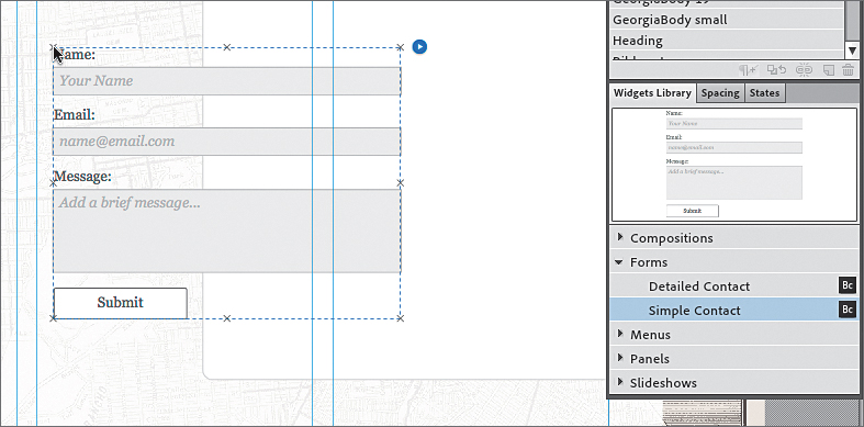
The two contact forms are identical, except that the Detailed Contact form shows two more sections that can easily be added to the Simple Contact form as well.
Edit the form options
After inserting the form widget into your page, you need to edit the main form options and then edit the individual form field options as well.
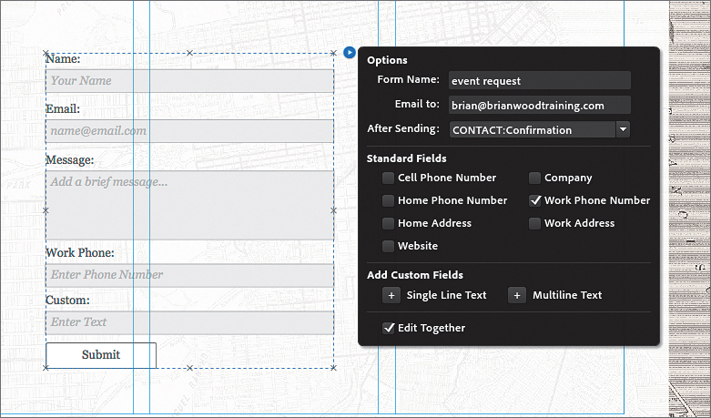
1. With the form widget on the page selected (you can tell it’s selected because the Selection Indicator in the Control panel shows “Form”), click the editing options icon (white arrow in the blue circle). In the widget Options menu that appears, change the Form Name to “event request.”
2. Continuing in the widget Options menu, ensure that the following options are set accordingly:
• Email To: your email address (the default setting, which comes from the Adobe ID used to install Adobe Muse).
You can insert multiple email addresses by separating them with a semicolon like this: [email protected];[email protected].
• After Sending: choose CONTACT: Confirmation.
• Standard Fields: This area contains an array of fields that you can add to your form. Select Work Phone Number and leave the rest deselected.
• Add Custom Fields: Click the Add button (+) to the left of Single Line Text. This adds a generic single-line text field to the form. You can add or remove form fields at any time.
• Edit Together: Selected (the default setting).
With the form in place and the options set, you can begin to edit the individual options for each field, if you like.
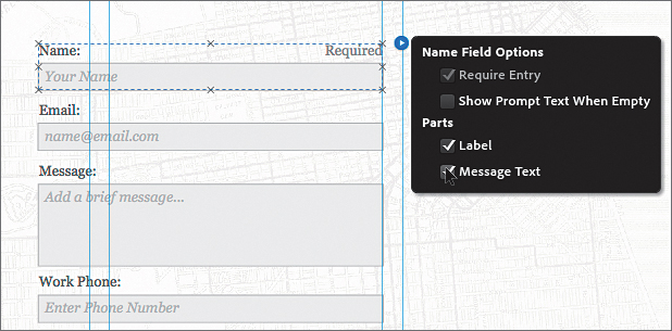
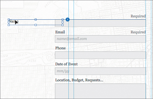
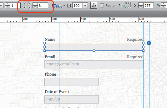
3. With the Selection tool selected and the form selected, position the pointer over the Name field. A tooltip with the words “Form Field” appears. Click once to select both the form field and the “Name” text.
Notice that “Form Field” appears in the Selection Indicator in the Control panel. A form field is typically composed of a label (the text “Name”) and the field (called Text Input in this case).
4. Click the editing options icon (white arrow in the blue circle) to show the form field options. Ensure that the following options are set accordingly:
• Require Entry: This option cannot be changed for the Name field. There are certain fields that are “optional” in a Muse form, but the Name and Email form fields are required by default. This means that the user is required to fill out the field in order to submit the data.
• Show Prompt Text When Empty: Deselect.
The prompt text is the text “Your Name,” which shows in the field initially. This text can be very helpful to show things like a date format, for instance. The prompt text may not disappear from the field, initially, and that’s okay. When you preview the page, it will be gone.
• Label: Selected (the default setting).
• Message Text: Selected.
The Message text is a text frame that shows the editable text “Required,” by default. You can change the position, content, and other formatting properties.
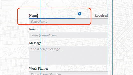
5. Select the Text tool and insert the cursor into the “Name:” text. Change the text to “Name” without the colon (:).
6. Select the Selection tool, then click the Email field to select it. Click the editing options icon (white arrow in the blue circle) to show the form field options. Ensure that Message Text is selected, and leave the other options at default.
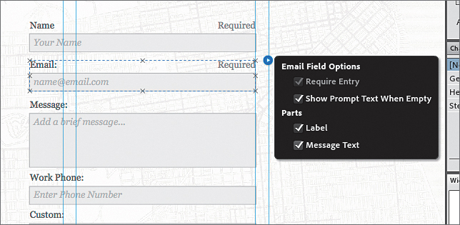
7. Select the Text tool and insert the cursor into the “Email:” text. Change the text to “Email” without the colon (:).
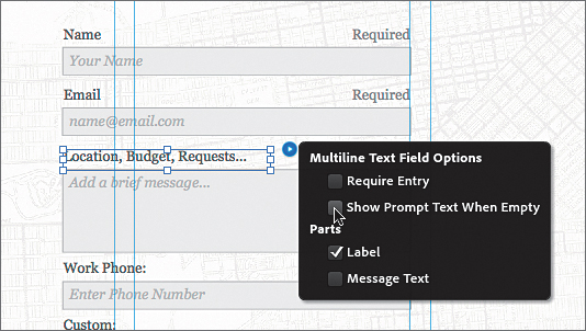
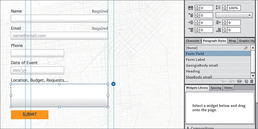
8. Select the Text tool and select the label text “Message:” Change the text to “Location, Budget, Requests...” without the colon (:). If the text field is too narrow, select the Selection tool and drag the lower, right bounding point of the frame to the right to ensure that the text fits on one line.
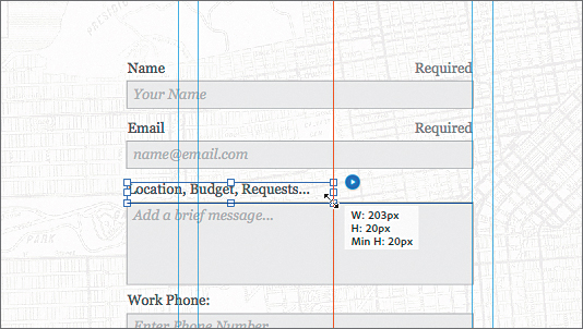
9. Click the editing options icon (white arrow in the blue circle) to the right of the Location, Budget, Requests... label to show the form field options. Deselect Show Prompt Text When Empty.
10. With the Text tool selected, select the text “Add a brief message...” and press Delete or Backspace to remove it. By deleting that text, you don’t have to look at it when designing in Muse. Insert the cursor in the Name field and delete the text “Your Name.”
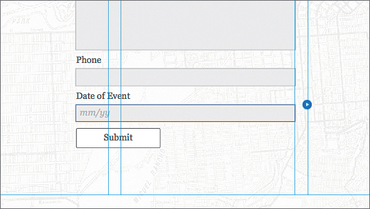
11. Select the Text tool and insert the cursor into the “Work Phone:” text. Change the text to “Phone” without the colon (:).
12. Select the text “Enter Phone Number” in the Phone field and delete it.
13. With the Text tool selected, insert the cursor into the “Custom:” text. Change the text to “Date of Event” without the colon (:).
14. Insert the cursor in the Date of Event field and change the text in the field from “Enter Text” to “mm/yy” to indicate the preferred date format.
15. Click the Preview mode link to preview the form. Click the Design mode link to return to the CONTACT page in Design mode.
Move and resize form fields
Now that the form has the form fields we need, as well as the options set, you can edit the position of fields and their labels.
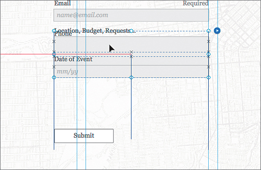
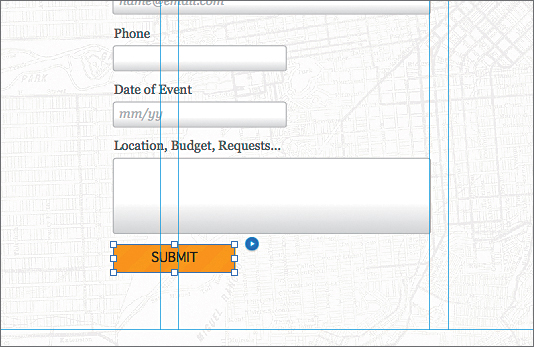
1. With the Selection tool selected, click away from the form to deselect it. Click twice, slowly, on the Phone field to select the form field and label. Shift-click the Date of Event field to select it as well.
2. Drag both form fields up to just beneath the Email form field. Don’t worry about the spacing between the fields, since you will align them shortly. Leave the fields selected.
With more than one field selected, if you click the editing options icon (white arrow in the blue circle), the options for the form appear, not the individual field options.
The Phone and Date of Event fields will be on top of the Location, Budget, Requests... field, and that’s okay—you’ll remedy that next.
3. With the two fields still selected, choose Object > Send To Back to arrange them behind the larger Location, Budget, Requests... field.
4. Click the Location, Budget, Requests... field to select it. Drag the field down beneath the Date of Event field. Make sure that your fields look similar to the figure.
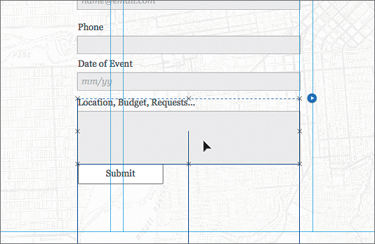
It may be a bit tricky to select the field since there are several fields on top of each other. You can deselect all (Edit > Deselect All), and then click twice on the Location, Budget, Requests... field to select it.
5. Press and hold the Shift key, then click all of the fields, except for the Submit button. Open the Align panel (Window > Align) and click the Distribute Top Edges button ( ) to distribute the spacing between the fields.
6. Click and drag the Submit button beneath the bottom field so that it looks like the figure.
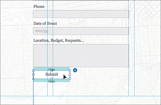
7. With the Selection tool, click to select the Name field. Click once more on the field label (the text “Name” above the field). Drag the label to the left side of the field.
You can change the size of the label, the position of the label, text formatting like alignment, and much more. A good, simple, rule of thumb to keep in mind is that when the data being collected is familiar (like a simple contact form), labels should be stacked vertically on top of fields, or not shown at all (with the prompt text indicating what the user should enter into the field). When the data being collected is unfamiliar or complex, labels should be placed to the left of the field.
8. Choose Edit > Undo Move Item to return the label to its original position.
Next, you will resize the form fields.
9. With the Selection tool, click the Phone field (not the label) twice to select just the field. Click and drag the right, middle bounding point to the left until the measurement label shows a width of approximately 185px.
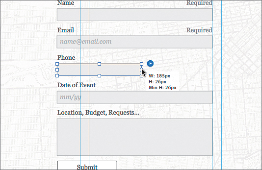
Notice that changing the size of one of the form fields changes them all, except for the multiline field. That is because the Edit Together option is selected in the form options.
10. Choose Edit > Undo Resize Item.
11. Press the Escape key twice to select the entire form. Click the editing options icon (white arrow in the blue circle) to show the form options menu. Deselect Edit Together.
12. With the Selection tool, click the Phone field (not the label) twice to select just the field. Once again, click and drag the right, middle bounding point to the left until the measurement label shows a width of approximately 185px. Notice that the Phone field is now the only field that resizes.
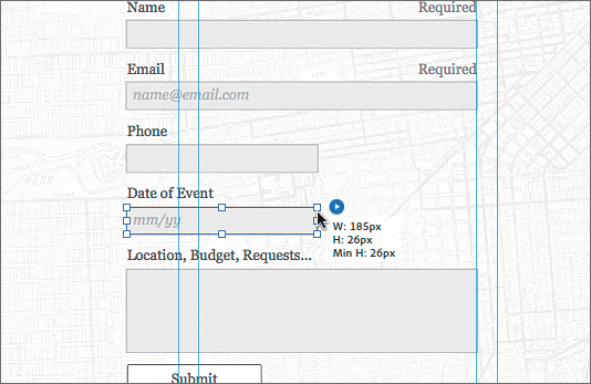
13. Click the Date of Event field (not the label) twice to select just the field. Click and drag the right, middle bounding point to the left until the measurement label shows a width of approximately 185px.
You can also set the width and height of fields using the Transform options in the Control panel or the Transform panel.
When it comes to sizing fields, keep the visual design of the entire form in mind. Some very simple forms, such as a login form (username and password), keep the fields the same size. It may not help the visitor if you have a bunch of different fields that are all different widths.
Edit the appearance of the form fields
Most of us will want to change the formatting options of the form fields and labels to change colors, borders, and more. That’s what you’ll do next.
1. Choose Edit > Deselect All. With the Selection tool selected, click to select the form.
2. Click twice on the Name field (not the label) to select it. Change the Corner Radius in the Control panel to 3.
3. Click the Fill link in the Control panel to show the Fill options. Select Gradient. Change the first Fill color to White (if not White already), the second Fill color to a light gray (we entered the values R=223, G=223, and B=223), and change the Focal Point to approximately 80% and select Vertical for Direction. Leave the field selected.
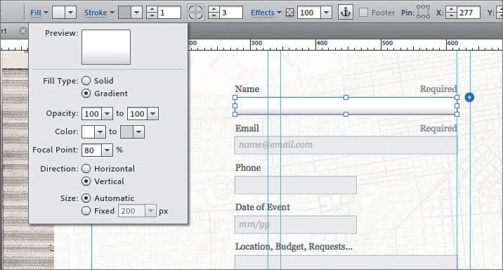
As far as visual appearance options, treat each form field like a rectangle you drew. You can change the stroke and fill, and add effects, as well as change the opacity and more. For instance, you could set the fill color to None and the stroke weight to 0 for a form field, and then place an image behind the entire form or each field to make the field take on a different appearance.
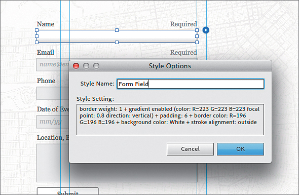
Now that the form field has an appearance, you can save that formatting as a graphic style to easily apply the formatting to the other fields.
4. Open the Graphic Styles panel (Window > Graphic Styles) and click the Create A New Style button ( ) at the bottom of the panel to create a new graphic style from the selected form field.
5. Double-click the new graphic style named “Style” in the list to open the Style Options dialog box. Change the name to “Form Field” and click OK.
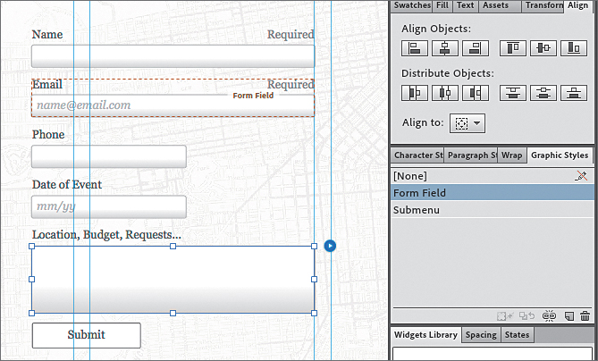
6. With the Selection tool selected, click twice on the Email field (not the label) to select it. Click the Form Field graphic style in the Graphic Styles panel to apply the formatting.
7. Select the Phone field, the Date of Event field, and the Location, Budget, Requests... fields, one at a time, and apply the Form Field graphic style to each.
Edit the appearance of the Submit button
Next, you will change the appearance of the Submit button.
1. With the Selection tool, click to select the Submit button.
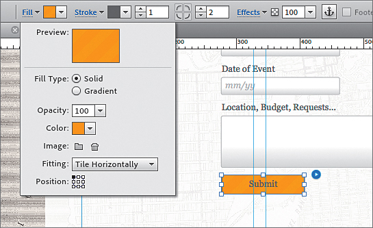
2. Click the Fill link in the Control panel and change the fill color to a color with the values R=231, G=168, B=0 (a yellow/orange).
3. Click the Choose Background Image button ( ) and navigate to the Lessons > update > Lesson09 folder and select the form_bg.png image. Click Open. Choose Tile Horizontally from the Fitting menu.
4. Change the stroke color to the same yellow/orange that you just created in the previous steps.
5. Open the Text panel (Window > Text) and choose Geneva from the web safe category of the Font menu. Click the Bold button in the Text panel, change the color of the text to Black, and choose Edit > Change Case > Uppercase.
You can change the text on the submit button from “Submit” to anything you like by selecting the Submit text with the Text tool and changing it. If the text is too wide, you may need to resize the button.
Now that the main appearance of the Submit button is set, you can edit the appearance of the rollover states of the button if you wish.
6. With the Submit button still selected, click the Normal link to the right of the Submit text on the left end of the Control panel to show the states menu, and select the Rollover state.
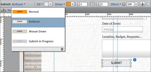
7. Click the Reset To Default button ( ) at the bottom of the menu. This makes the Rollover state look like the Normal state.
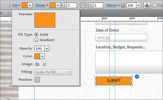
8. Click the Fill link in the Control panel, and then click the Clear Background Image button to remove the background image. Press the Escape key to hide the Fill menu.
9. Click the Rollover link on the left end of the Control panel, and then click the Mouse Down state to select it. Click the Reset To Default button () at the bottom of the menu to make the Mouse Down state look like the Rollover state.
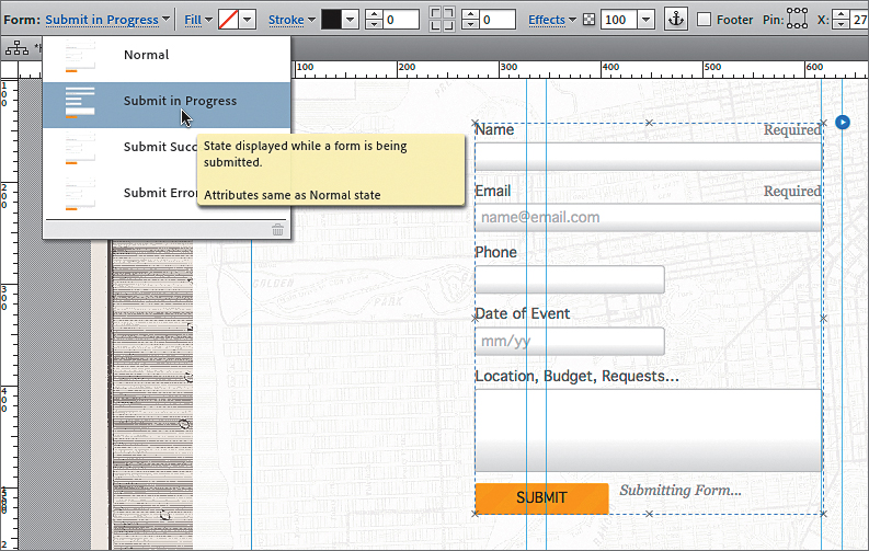
10. Click the Submit In Progress state to select it. Click the Reset To Default button () at the bottom of the menu to make the selected state look like the Normal state.
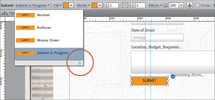
The Submit In Progress state is a button state that appears when the data is being submitted after the user clicks the Submit button.
11. With the Selection tool, click and drag the text frame with the text “Submitting Form” to the right of the Submit button and align the top edge of the text frame with the top edge of the Submit button. This text frame is called a form message.
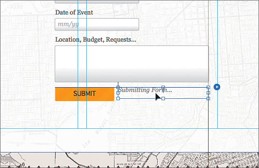
If you don’t see the form message, you can choose Edit > Deselect All, then click twice on the Location, Budget, Requests... field to select the label and the field. Choose Object > Send To Back. Click to select the Submit button, and then click the Normal state link in the Control panel. Select the Submit In Progress state and you should now see the text field with the text “Submitting Form...”
12. Click Preview to test the button, and then click the Design mode link to return to the CONTACT page in Design mode.
13. Choose File > Save Site.
Edit the appearance of the form text
With the submit button ready, you will edit the text formatting of the labels and the fields and create paragraph styles to make applying and updating easier.
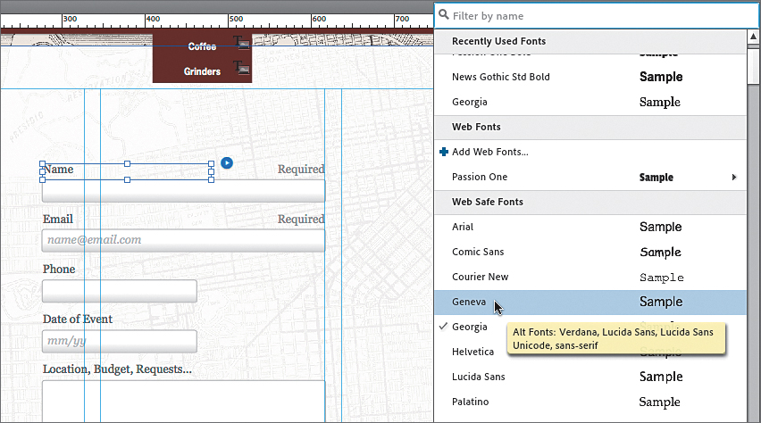
1. With the Selection tool, click the Name label twice to select it. In the Text panel, change the font to Geneva.
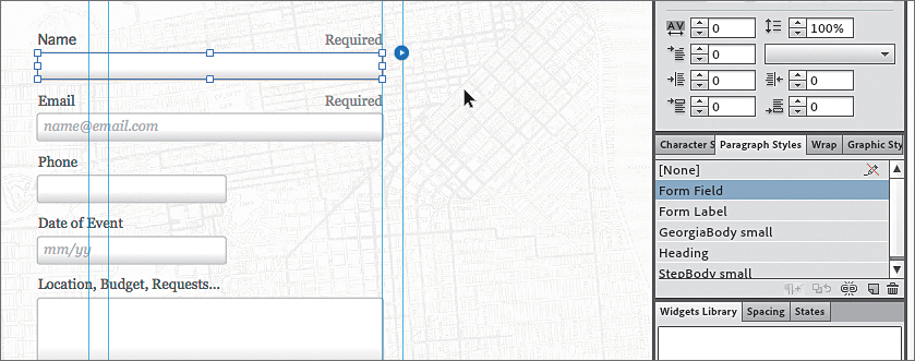
2. Open the Paragraph Styles panel (Window > Paragraph Styles), and with the label still selected, click the Create A New Style button () at the bottom of the panel to create a new style. Double-click the new style in the list and name it “Form Label” in the Style Options dialog box. Click OK.
3. Click the Name field once to select it.
4. In the Text panel, change the font to Geneva. Make sure that the Italic button is not selected. Click the Create A New Style button () at the bottom of the panel to create a new style. Double-click the new style in the list and name it “Form Field” in the Style Options dialog box. Click OK.
5. With the Selection tool, click the Email label twice to select it. Apply the Form Label paragraph style.
6. Click the Email field once to select it. Apply the Form Field paragraph style.
7. Repeat steps 4 and 5 on the remaining fields and labels.
If you select a form and its label and then apply a paragraph style, the style is applied to both at once. You can also select the entire form and apply a paragraph style that applies to all of the text within the form.
8. Choose File > Save Site and then Edit > Deselect All.
Edit the Error state of your form fields
When users fill out the form, all required fields are checked to ensure that they are filled out. If one or more fields are not filled out properly, errors will appear in the form after the user clicks the Submit button, indicating which form fields are required. This is generically referred to as form validation.
Next, you will change the appearance of the error state of the fields.
1. With the Selection tool, click the form widget on the page. Click once more on the Name field to select the label and field.
2. Click the Empty link to the right of the text Form Field in the Selection Indicator in the Control panel. Select the Error state.
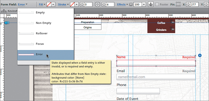
All text in the Name field, label, and message text will turn a red color. This is what that content will look like when a user clicks the Submit button, but the field is not filled out or filled out improperly (in the case of the email field, for instance). With the Error state selected, you could select the field, label, or message text and change the appearance.
You can also change the appearance of the other states for the form fields if you like, including the Rollover and Non Empty states.
3. Press the Escape key to hide the states menu in the Control panel. With the Selection tool, click the field label to select it. Click the Italic button in the Text panel.
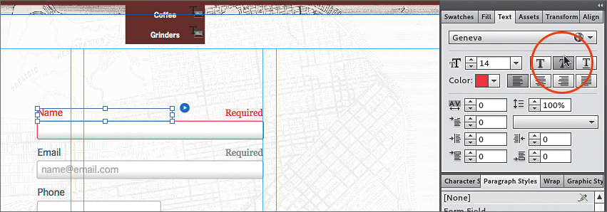
4. Click the Email label twice to select it. You should see the red color on the Email label, field, and required text. Click the Italic button in the Text panel.
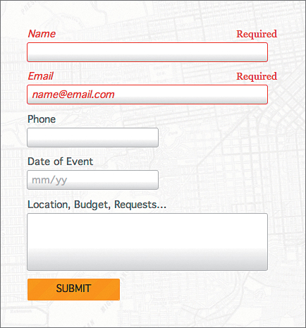
5. Click the Preview mode link. Test the form by filling in all of the fields, except for the Email field. Click Submit. The error should appear on the Email field. Fill out an email in the Email field and click Submit again. No errors should appear this time.
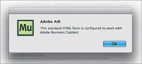
You most likely will see a dialog box when submitting a non-published previewed form with Muse (or the browser). The dialog box will indicate that the form is configured to work with Business Catalyst. Click OK.
6. Click the Design mode link, and then choose File > Save Site.
Edit the Form states
If you select the entire form and then open the States panel (Window > States) or click the Normal link in the Selection Indicator of the Control panel, you will see states. When you select a state other than Normal, a text field appears toward the bottom of the form that contains different text, depending on which state is selected. You most likely will need to click each state and position this text field where you would like the text to appear. You can also change the message that appears and the formatting of that text.
Each of these states is explained below:
• Normal: The appearance of the form when the user has yet to interact with it.
• Submit In Progress: After the Submit button has been clicked, a text frame appears that contains the text “Submitting Form...”
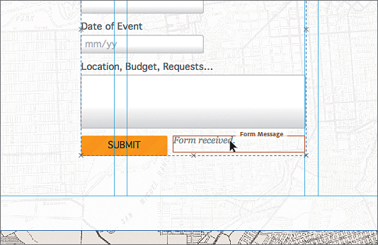
• Submit Success: After the Submit button has been clicked, and the data is submitted to the server successfully, a text frame appears that contains the text “Form Received.
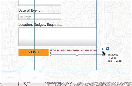
• Submit Error: After the Submit button has been clicked, and the form submission encountered an error such as a network issue, a text frame appears that contains the text “The server encountered an error.”
Next you will edit the form states.
1. Click away from the form to deselect it, and then click the form to select it again.
2. Click the Normal link to the right of the Selection Indicator in the Control panel. Select the Submit In Progress state, and a text frame with the text “Submitting Form...” should appear.
This is the same “Submitting Form...” text frame that you saw earlier when you were editing the states for the Submit button. It should already be to the right of the Submit button. If it isn’t, you can drag it into position to the right of the Submit button and style it any way you like. You can also change the message by selecting the text with the Text tool.
When you select a state like Submit In Progress, the form message text frame may be beneath one of your form fields and be difficult to select. With the form selected, you can click any of the form fields to select it. Then choose Edit > Select All. This will show you where the text frame is. You can move fields out of the way, select and reposition the text frame, and then put the fields back where they were. You can also select a field, and then choose Object > Send To Back to arrange it behind the form message text field. Of course, you will need to reselect the form and then choose the Submit In Progress state again.
3. Click the Submit In Progress link to the right of the Selection Indicator in the Control panel. Select the Submit Success state, and a text frame with the text “Form Received.” should appear. With the Selection tool, click the text frame (a tooltip will appear that shows “Form Message”). Drag it into position to the right of the Submit button, and style it any way you like. You can also change the message by selecting the text with the Text tool.
4. Click the Submit Success link to the right of the Selection Indicator in the Control panel. Select the Submit Error state, and a text frame with the text “The server encountered an error.” should appear. With the Selection tool, click the text frame (a tooltip will appear that shows “Form Message”). Drag it into position to the right of the Submit button and style it any way you like. You can also change the message by selecting the text with the Text tool.
5. Choose File > Save Site.
Slideshow and Composition Widget Improvements
Each of the widgets in the Compositions, Panels, and Slideshows categories of the Widgets Library panel has changed in appearance either slightly or drastically. Throughout Lesson 9 (or AppB_MuseCIB.pdf—Widgets Extras), when dragging out a new widget, the figures in the Classroom in a Book will look different from what you see in the Muse update. There is also a change to the Lightbox Display widget that will affect the lesson in a few places.
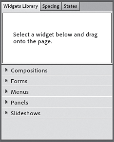
On page 214, the Widgets Library panel is shown. In the Muse update, there are now five categories of widgets: Compositions, Forms, Menus, Panels, and Slideshows.
Edit Composition Widget Options
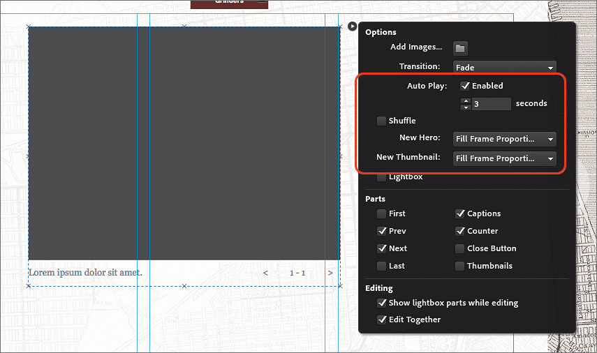
The first widget that is dragged into a page is the Lightbox Display composition widget. A few new options have been added to the widget. On page 218, in the Options menu, the following options have been changed:
• Auto Play: The Auto Play option is now a selection, rather than a menu. After enabling Auto Play by selecting Enabled, you can then adjust the speed in seconds in the field beneath.
• There is a new Shuffle option that, if selected, loads the images randomly, rather than in order. It appears to work in conjunction with the Auto Play selection.
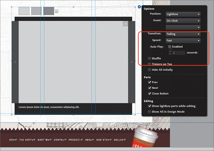
The Previous and Next buttons in the widget are also much larger than in the initial release of Muse. That doesn’t affect the lesson, though.
Select Same
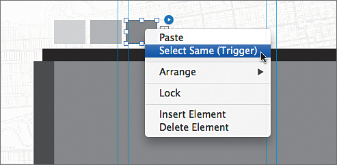
On page 219, step 4, you will see the context menu appear when you right-click (Windows) or Ctrl-click (Mac OS) the third trigger. A new menu item appears, “Select Same (Trigger).” This menu item (also found in Edit > Select Same (Trigger)) is contextual and allows you to select all of the same type of object on the open page. For instance, you could select an image on a page and choose Edit > Select Same (Image) to select the other images on the page. This can be very useful for applying a graphic style, for instance, to all of the images.
The Align panel
As previewed in Lesson 3 of this document, Adobe Muse now has an Align panel for easy alignment. On page 224, after pasting the content that was pasted from the other Muse site, in step 14, you drag to align the content to the center of the page area. Try aligning using this method instead (replace step 14):
1. Choose View > Fit Page In Window.
2. With the container still selected, open the Align panel (Window > Align or click the blue link “Align” in the Control panel, if available). In the Align panel, choose Align To Content Area from the Align To menu. Click the Align Horizontal Centers button ( ) and then the Align Vertical Centers button (
 ).
).
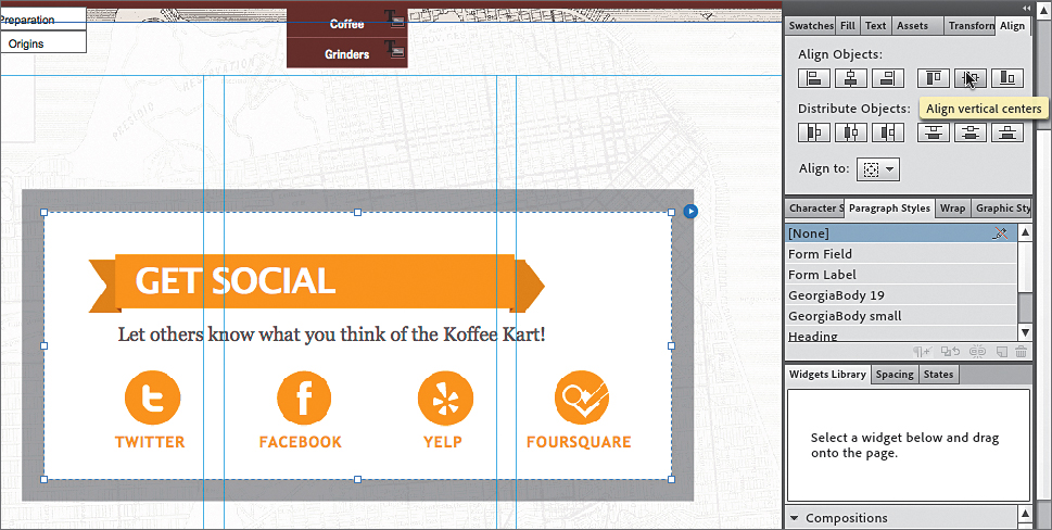
The Target area doesn’t need to be centered in the page area since it is centered in the browser window by default.
On page 227, in the “Edit slideshow widget options” section, step 1, you are asked to set the New Hero option to Fill Frame Proportionally. That is no longer necessary, as Fill Frame Proportionally is now the default.
When editing the options for the Blank slideshow widget on page 227, once again a few new options have been added to the widget. On page 227, after step 1, in the Options menu, the following options have been changed:
• Auto Play: The Auto Play option is now a selection, rather than a menu. After enabling Auto Play by selecting Enabled, you can adjust the speed in seconds in the field beneath.
• There is a new Shuffle option that, if selected, loads the images randomly, rather than in order. It appears to work in conjunction with the Auto Play selection.
After making the option changes for the slideshow, the thumbnails that appear will be in a different location than what is currently in the Adobe Muse Classroom in a Book.
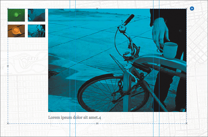
On page 229, step 2, when you select the image, the text “Hero Image” will appear in the Selection Indicator of the Control panel.