CHAPTER 3
Direction of a Trend
One of the basics of understanding any technical charting program is to understand cycles and trends. It is critical to understand how repeating cycles define, direct, and bend a trend line. A series of repeating upward-moving cycles, where the high of the cycle is higher than the previous cycle, ultimately defines a trend line. The trend line will begin to angle upward.
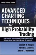
When the cycles begin to change where the higher highs are now lower than the previous high and the lower lows are now lower than the previous low, the trend line will begin to change its direction. The URBN chart shown in Figure 3.1 illustrates how repeating cycles define a trend line.
FIGURE 3.1 URBN—Cycles and Trends
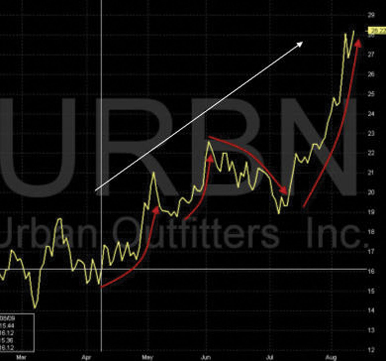
The two-year view of the DIA chart in Figure 3.2 shows how repeating cycles will change the trend of the stock. It is important to note that within each of the cycles of this two-year chart, there are numerous cycles and trends occurring. Advanced Charting is all about identifying these cycles relative to their trends.
FIGURE 3.2 DIA—Cycles and Trends
■ Four Phases of a Cycle
Advanced Charting allows traders to look into the future with a higher degree of probability to determine the four phases of a cycle, which are:
Every cycle will move through these four phases. However, the time duration of the phases distinguishes one cycle from another. Some cycles are short and others are long. A long up cycle may be followed by a short down cycle and then another long up cycle. The time duration of a cycle is the strength or weakness of the four phases The length of a cycle indicates how strong the phases are.
Upward Cycles
There are four upward cycles:
Downward Cycles
The four downward cycles are:
Understanding the four phases of a cycle and how Advanced Charting indicators allow traders to see the phase coming is paramount to the mastery of the technique.
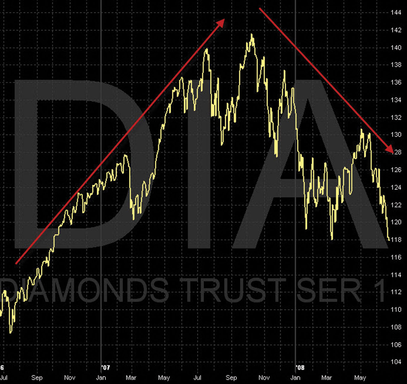
The chart of DIA in Figure 3.3 shows the four phases of a cycle.
FIGURE 3.3 DIA Chart—Four Phases of a Cycle
It is important to note that phases can change rapidly from one phase to another. Phases can be very short or very long, but all cycles go through all four phases.
We have now explained how repeating cycles will define trends for both upward and downward moving stocks. However, the challenge with any charting program is to determine which indicators will confirm and validate these four important phases with consistency and accuracy. Advanced charting has formulated technical indicators specifically to address this challenge.
There are no absolutes or guarantees with any technical charting tools. Trading is all about probabilities. Advanced charting uses 18 technical indicators to determine the probability that the cycle will move in a specific direction.
Why 18 indicators? The Advanced Charting tool in the CSE toolbox has two charts: Window 1—Chart 1 (on the upper left) and Window 2—Chart 2 (on the upper right). Under each chart there are four lower indicators.
The two charts and their technical indicators were reformulated from traditional charting techniques to find the answer to one question: Is the V of the tic true or false? The definitions of these indicators have been reworked within a new methodology to interpret what the indicators are confirming and validating (Chapters 1 to 7 show Window 1—Chart 1 types; see Chapter 8 for more on Chart 2 types.).
■ Moving Averages Defined
A large part of our technical analysis is centered on moving averages (MAs). In this section we define what a moving average is and then discuss the moving averages used with the CSE techniques.
A moving average is an indicator frequently used in technical analysis showing the average value of a stock price over a set period of time. Moving averages are generally used to measure momentum and define areas of possible support and resistance.
Moving averages are used to emphasize the direction of a cycle and to smooth out price and volume fluctuations, or noise, that can confuse chart interpretation. Typically, upward momentum is confirmed when a short-term average crosses above a longer-term average. Downward momentum is confirmed when a short-term average crosses below a long-term average. We study momentum in more detail in Chapter 4.
Each new day’s (or week’s or month’s) numbers are added to the average at the front and the oldest numbers are dropped at the end; thus, the average “moves” forward over time. In general, the shorter the time frame used, the more volatile the prices will appear. For example, 25-day MA lines tend to move up and down more than the M3 (blue) MA line. M3 (blue) MA lines will move more than the 100-day MA.
Key Points to Moving Averages
We study the combination of five different moving averages developed exclusively for, and applied directly to, the CSE techniques.
■ Moving Average 1: Lead MA1 (White) M1
The lead MA (white) is the most important Moving Average that we will study. It is the most important indicator, and we must gain trust in reading the direction of the lead MA (white): up, down, or flat. It is called the lead dog, similar to the lead dog of a sled race (see Figure 3.4). Where the lead dog goes, so goes the sled. Where the lead MA (white) goes, so goes the other MAs. We explain the real significance of this analogy as we look at all moving averages together. The lead MA is called “M1.”
FIGURE 3.4 Lead Dog

Remember this visual: The lead MA (white), M1, is the lead dog. Where M1 (white) goes, the other MAs follow. Why? M1 (white) is an exponential moving average. Remember that what forms the M1 (white) line is higher highs and higher lows or lower highs and lower lows. In order for M1 (white) to be dramatically up or down, there must be dramatically higher or lower highs and lows. This is graphically illustrated by M1 (white). It is important to grasp this concept and learn to trust it.
Just as the sled racer must have complete trust in the lead dog, traders must gain the same confidence in reading the lead MA (white) M1 on our charts. In Chapter 4 we explain how to read M1 (white) and validate it with other indicators.
The chart in Figure 3.5 is an example of M1 (white) and its relationship to the stock price. Look for M1 (white) in a dramatically up or down position.
FIGURE 3.5 —DY—M1
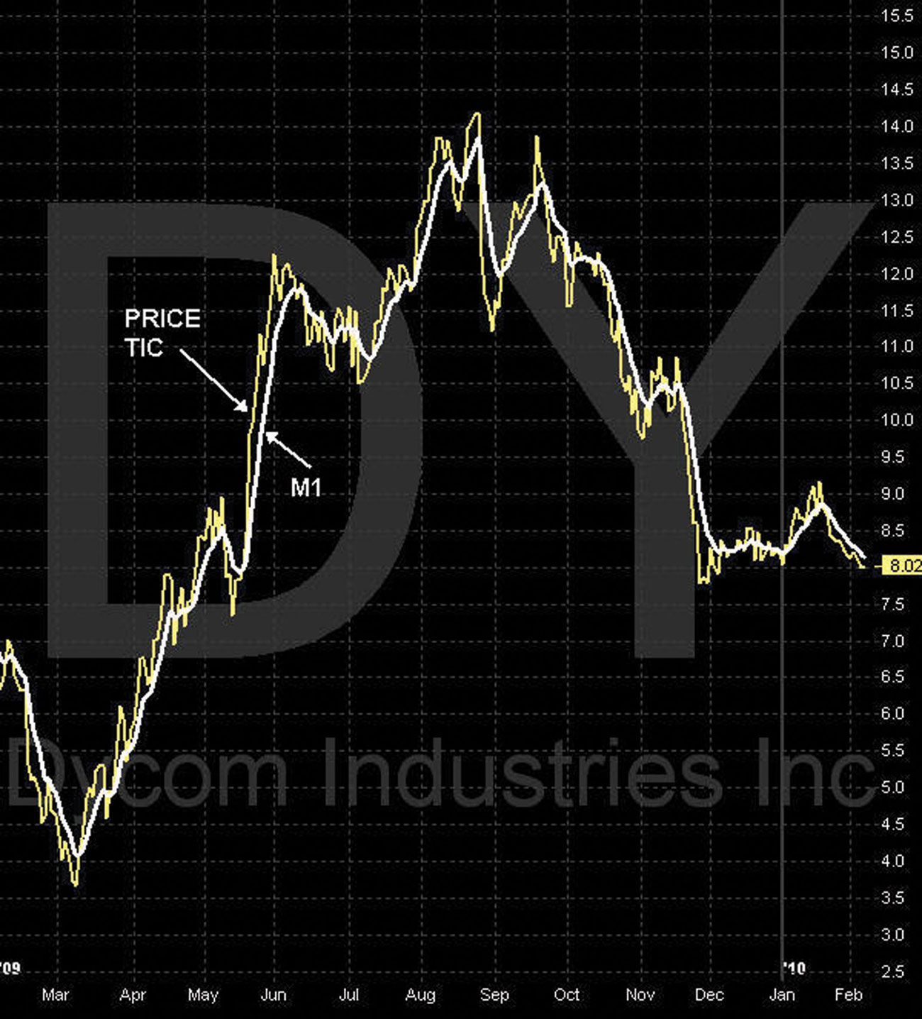
M1 (white) is represented by the wide white line on the chart. This indicator plots the average price of a security over a short period, with more value being assigned to the most recent data. We use a bold white line because this line is the most important indicator to watch. It is bold so it is easy to see.
M1 (white) is the most important indicator, as it combines optimally with our other technical indicators to provide an accurate picture of bias. We must learn to trust M1.
Notice that M1 (white) moves up in an upward angle because the stock is closing with higher highs and higher lows. Another important characteristic of this MA is that M1 (white) is weighted more heavily to the most recent day’s data. M1 (white) also moves down in a downward angle because the stock is closing with lower highs and lower lows. M1 (white) moves to a horizontal or flat line because the highs and lows are averaging out or are converging.
As M1 (white) is a weighted average toward the most recent data, it is a highly valuable moving average in understanding the direction of the daily movement of the price tic. When the M1 (white) flattens out and changes direction, the stock’s cycle may be changing direction.
The steepness of the angle, upward or downward, tells us the strength and momentum of the cycle. M1 (white) used in conjunction with other MAs and other technical indicators gives us a simple but yet very accurate method of trading the cycle.
Chart of DY—M1 (White)
On the chart of DY in Figure 3.6, note the higher highs and higher lows of M1 (white) as the stock cycles upward. Also note the lower highs and lower lows of M1 (white) as the stock cycles lower. This is very important to identify the “cycle rhythm” that all stocks create as the stock cycles up and down. Cycle rhythm is reviewed in more detail in Chapter 3.
FIGURE 3.6 Chart of DY—M1
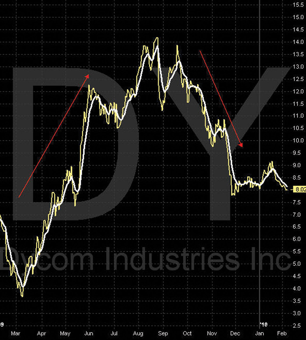
On the chart of DY, note the relationship of the price movement (tic) to M1 for both the uptrending and downtrending cycle. M1 is formulated to interpret the movement the price tic as it moves up and down. A series of higher highs and higher lows causes M1 to turn and bend upward. The day-to-day movement of the price tic, or noise, is removed, and M1 proceeds to move gently upward.
The downward move of the price is a series of lower highs and lower lows of the price tic. This causes M1 to turn and bend downward. The day-to-day movement of the price tic, or noise, is removed, and M1 proceeds to move gently downward.
Chart of FSS—M1 (White)
On the chart of FSS in Figure 3.7, note the relationship of the price movement to M1 and the numerous downtrending cycles. Remember that the tic price of the stock always leads M1 and is out in front of the M1. Why? As in the case of FSS in August, the dramatic downward angle of M1 is the result of daily lower highs and lower lows of the tic. The price tic is leading out in front of M1, and M1 is headed down dramatically.
FIGURE 3.7 Chart of FSS—M1
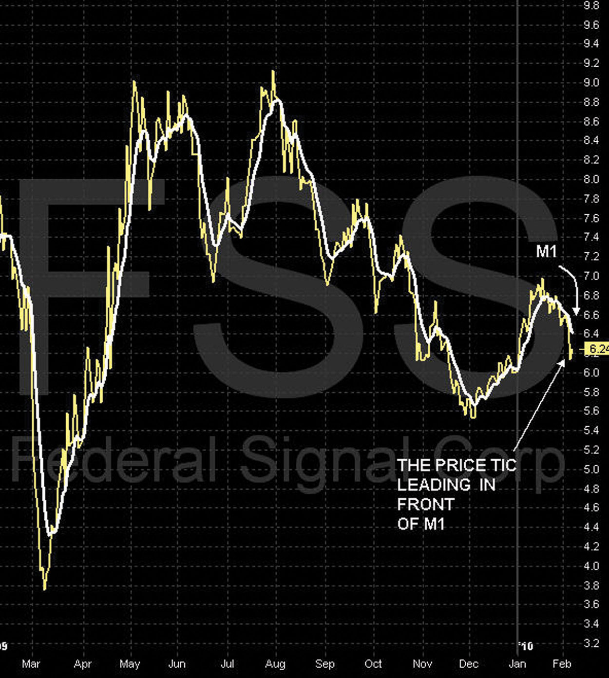
A very important characteristic of M1 to note is that it becomes support for dramatically upward-trending stocks and resistance for dramatically downward-trending stocks. The chart in Figure 3.7 shows that when the stock price is moving up, M1 becomes support. When the stock is moving down, M1 becomes resistance. We study this in greater detail when we review the relationship of the upper Bollinger band to M1 and how the price tic moves between these two indicators in chapter 5. This is an extremely important element of a successful 10-cent rule or TSS. In sharply upward- or downward-moving cycles, M1 becomes support or resistance for the stock.
Chart of AA—M1 (White)
Note the stock price of AA shown in Figure 3.8 as it moves up and bounces off of M1. We must train our eyes to see this important relationship of the upward angle of M1 and the stock price. The stock price cannot and will not do anything but bounce off of M1 as it moves upward. We note this at several places on this chart.
FIGURE 3.8 Chart of AA—M1
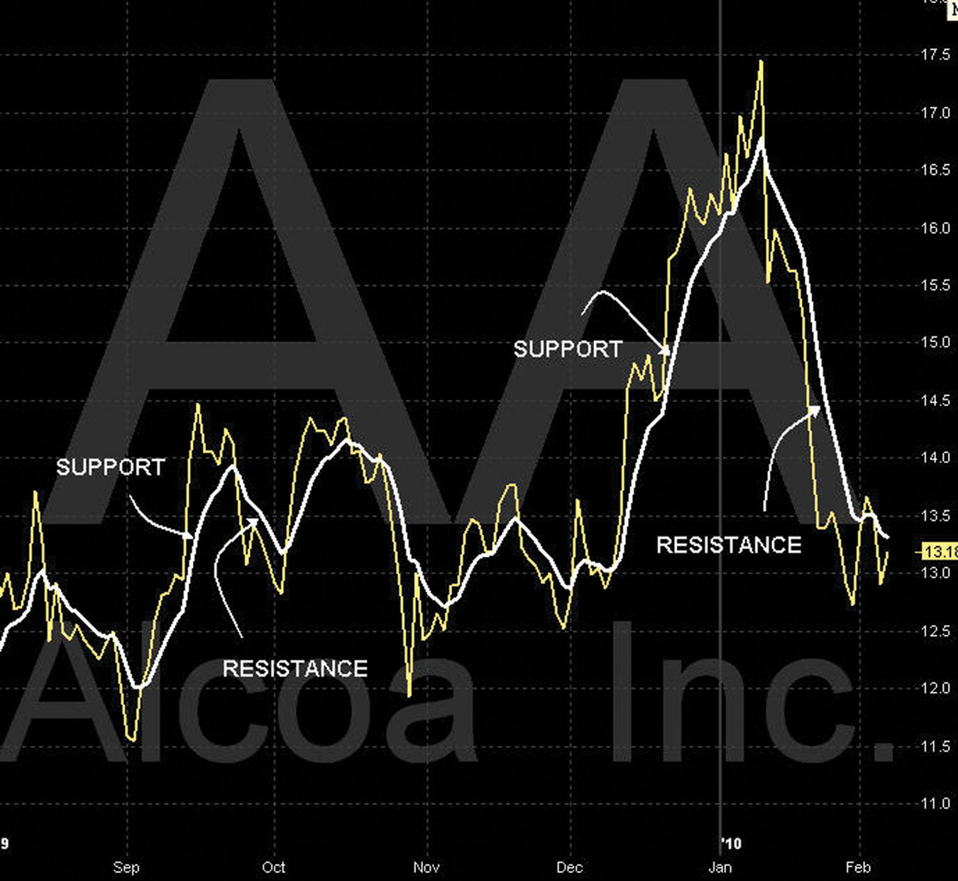
In sharply upward- or downward-moving cycles, M1 becomes support or resistance for the stock.
Chart of AMAT—M1 (White)
On chart of AMAT shown in Figure 3.9, try to identify the dramatic upward-moving M1 and the stock price (yellow line) as it bounces off of M1. It should be obvious that for downward-moving stocks, the same principles apply. Note the downward-moving M1 and the stock price as it also bounces off of M1. Go back to the previous chart examples and look for similar patterns with the stock price as it bounces off the lead MA (white) M1.
FIGURE 3.9 Chart of AMAT—M1 (White)
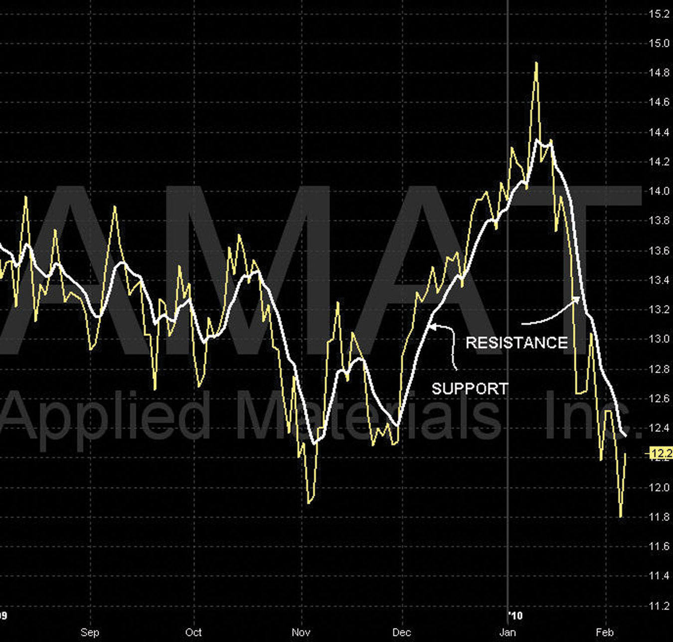
In sharply upward- or downward-moving cycles, M1 becomes support or resistance for the stock.
■ Moving Average 2: M2 (Green)
M2 (green) is the second moving average indicator that we use and is represented by the green line on the chart in Figure 3.10. This indicator plots the average price of a security over a longer period of time with all data given equal weight. We want this moving average to be smooth and gentle. We study the relationship of M1 (white) and M2 (green) as M2 (green) validates the momentum of M1 and as M1 (white) and M2 (green) cross each other at various angles. We focus on the importance of the severity of the angle and what it indicates.
FIGURE 3.10 Chart of AMAT—M2 (Green)
Moving averages flatten out large price fluctuations. Therefore, trends are easier to identify. When moving averages are used in combination, the relationship identifies possible changes in cycle direction, momentum, and duration of a given price move. M2 (green) used with M1 (white) is an important indicator to watch as M1 (white) arches up to cross M2 (green) or arches down to cross back over M2 (green). Another important indicator is M1 (white) and M2 (green) as they move parallel to each other in either a dramatically up cycle or a dramatically down cycle. This is another validation of a strong upward or downward movement of the stock price.
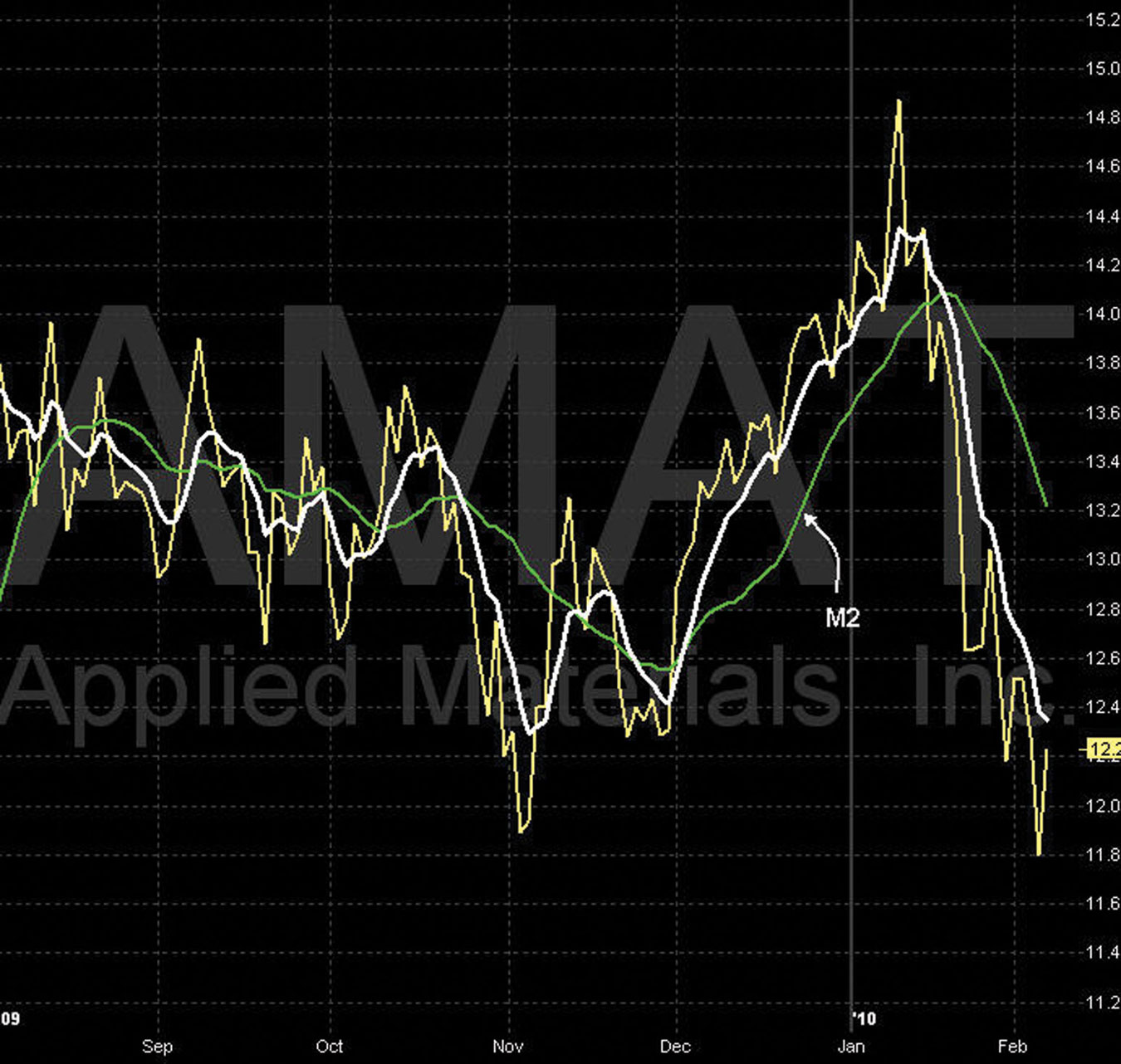
Chart of AMAT—M1 (White) and M2 (Green)
In the chart example of AMAT in Figure 3.11, note the relationship of M1 (white) above M2 (green) and M1 (white) below M2 (green). When M1 (white) is moving above M2 (green), the stock is generally in an upward cycle. When M1 (white) is moving below M2 (green), the stock is generally in a downward cycle. It is also important to note the angle of M2 (green) relative to M1 (white).
FIGURE 3.11 Chart of AMAT—M1 and M2
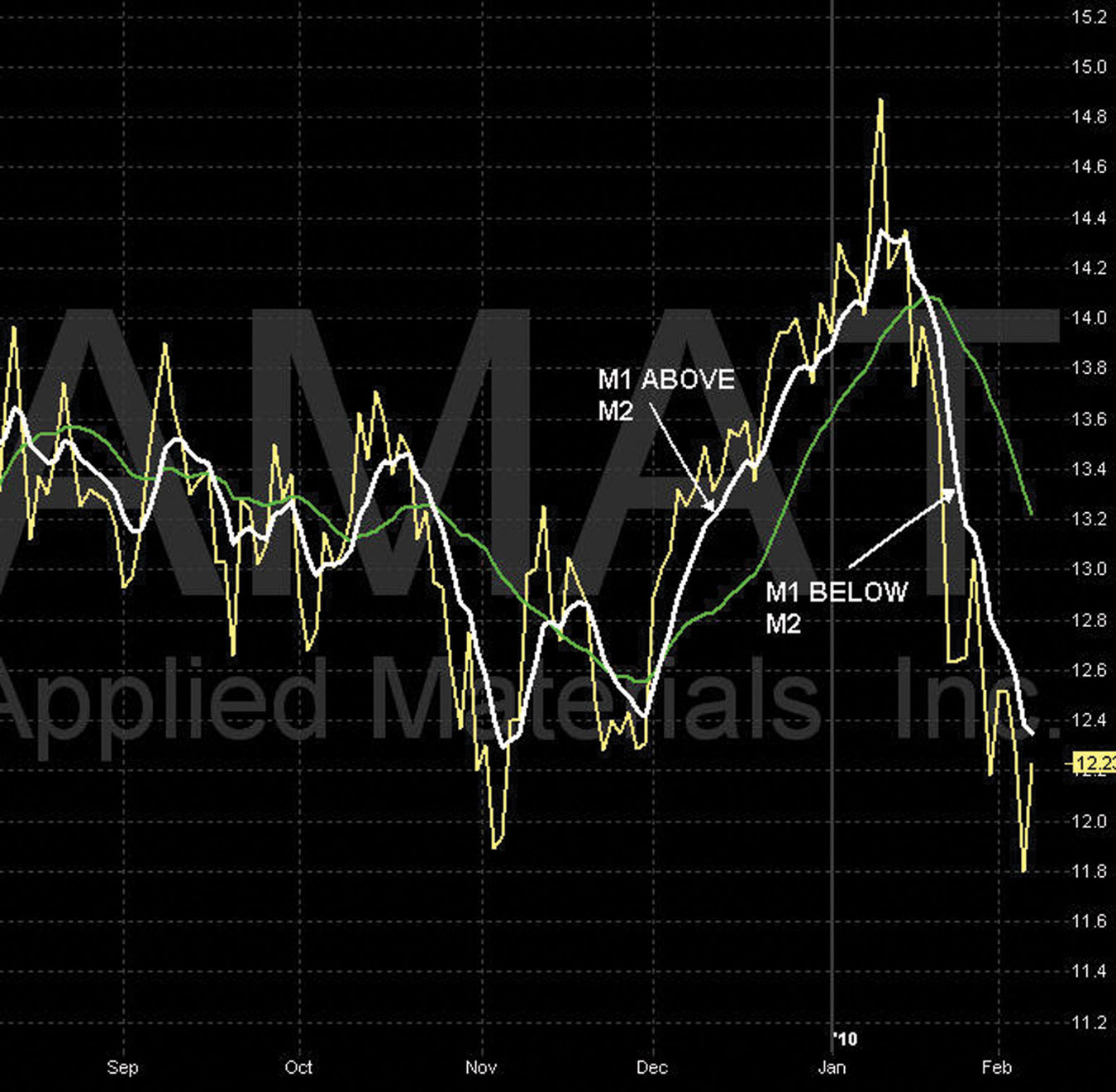
If M2 (green) is tracking the angle of M1 (white), this indicates the beginning of a strong cycle. This is agreement, confirmation, and validation of the direction of the cycle as M2 follows M1.
Chart of AA—M1 (White) and M2 (Green)
On the chart of AA in Figure 3.12, note the relationship of the price movement to M1 (white) and M2 (green). Watching the position of M1 (white) relative to M2 (green) gives us the cycle direction. When M1 (white) is above M2 (green), the cycle is up; when M2 (white) is below M2 (green), the cycle is down.
FIGURE 3.12 Chart of AA—M1 and M2 Crossover
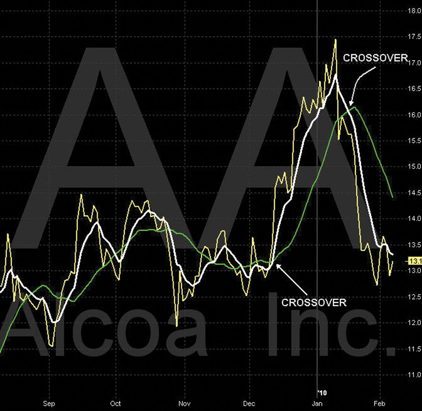
When M1 (white) turns up and crosses M2 (green) from the bottom, we see the establishment of an upward cycle in the stock price. When M1 (white) turns down and crosses M2 (green) from the top, we see the establishment of a downward cycle in the stock price.
■ Moving Average 3: M3 (Blue)
The M3 (blue) is represented by the blue line on the chart in Figure 3.13. This indicator plots the average price of a security over a longer period, longer than both M1 (white) and M2 (green), with all data given equal weight.
FIGURE 3.13 Chart of DELL—M1, M2, and M3 Stacked Up
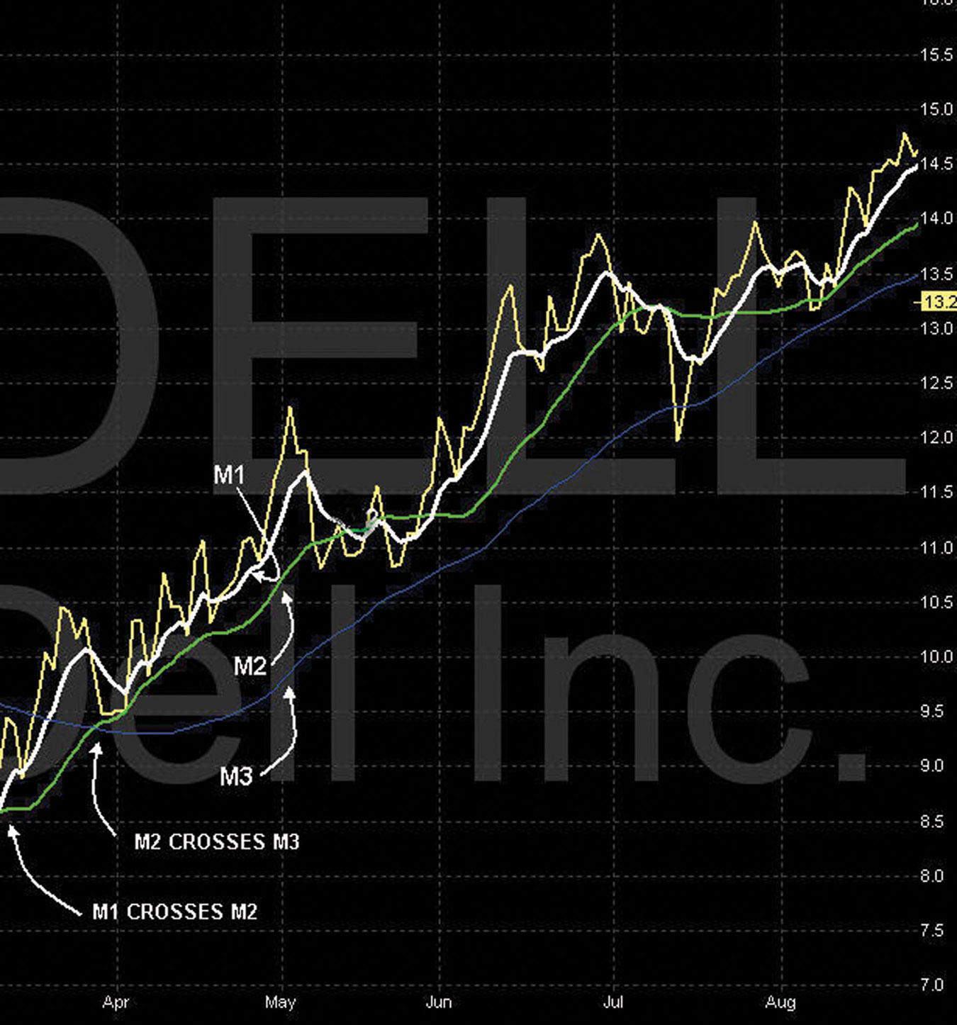
M3 (blue) is similar to M2 (green) and is used only to validate and confirm the strength and momentum of the cycle. All moving averages are lagging indicators. M3 (blue) is lagging way behind but is used to confirm and validate that a strong price move is occurring. A strong price move is confirmed when all three moving averages are stacked and moving in the same direction.
If the duration of this move is strong, M3 (blue) will follow the direction of M2 (green). For a stacked upward-trending stock, the MAs will be in this order:
When M1 (white), M2 (green), and M3 (blue) are positioned in this order, they are stacked, and this indicates a strong price movement. This is the momentum phase.
Chart of DELL—M1 (White), M2 (Green), M3 (Blue) Stacked Up
Look at the DELL chart in March (Figure 3.13). This chart is typical for a strong upward cycle with M1 (white) crossing over M2 (green) and then crossing M3 (blue). M2 (green) then crosses over M3 (blue), and all moving averages are now stacked up. M1 (white) is above M2 (green), then M2 (green) and M3 (blue) are both under M1 in that order. This indicates an uptrending cycle with very strong momentum.
Identifying these cycles allows for very large returns on KADD and the 10-cent rule transactions. It allows for great certainty of exiting the position versus going into management. We discuss this in depth later in Chapter 7. We can time the perfect entrance of a new position by first identifying the birth of a new cycle followed by the beginning of the momentum phase. Understanding the lower indicators, which we review later in Chapter 7, is the key to knowing when to pull the trigger.
Chart of M1 (White), M2 (Green), M3 (Blue) Stacked Down
On the DELL chart in mid-August (Figure 3.14), note the crossover of M1 (white) over M2 (green) and then crossing over M3 (blue). When M1 (white) crosses M2 (green) and M2 (green) crosses M3 (blue), this indicates a change in momentum—in this case, a strong downward cycle began. When M3 (blue) begins to follow M2 (green) (late August), this validates strong momentum and the duration of this cycle direction. At this point, all three MAs are stacked down. This indicates a downward-trending cycle with very strong momentum.
FIGURE 3.14 Chart of DELL—M1, M2, M3 Stacked Down
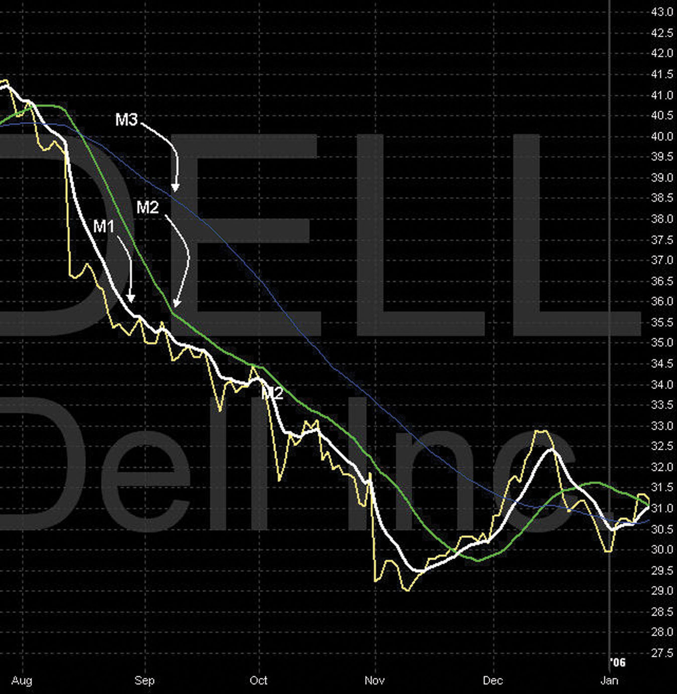
Identifying the stacked-down formation and the false Vs, as the stock price bounces off of M1 (white), allows us to achieve incredible returns using the TSS. Timing the perfect entry for a TSS is possible by identifying the end of momentum, the beginning of exhaustion, and the birth of a new downward cycle. Understanding the lower indicators, which we review later in Chapter 7, is the key to knowing when to pull the trigger.