WrapLayout is similar to StackLayout, except it doesn't stack all the child elements in one column/row; instead, it wraps them to new columns/rows if no space is left. WrapLayout is often used with items of the same size, but this is not a requirement:
<WrapLayout orientation="horizontal" width="200" height="200">
    <Label text="Label 1" width="100" height="70"
     backgroundColor="red"></Label>
    <Label text="Label 2" width="100" height="70"
     backgroundColor="green"></Label>
    <Label text="Label 3" width="100" height="70"
     backgroundColor="blue"></Label>
</WrapLayout>
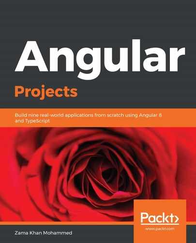
The preceding code will wrap the three labels into one column. Since the width exceeds the width of WrapLayout, it wraps the third label onto a new column and produces the following layout:

In the preceding example, WrapLayout has a width of 200 pixels, but the children need 300 pixels to be stacked horizontally. WrapLayout creates a new row to accommodate the third child.
Now, let's look at how the flex layout works.