
7.7 The Rendering, Image Adjustments, and Image Options groups let you adjust your image’s color.
Chapter 7: What Options Do I Have to Create a Physical Copy of My Photos?
Ultimately, the reason we shoot is to share our best images with other people, whether digitally or as a printed image. However, getting a great print is a little more involved than just clicking the Print button. In this chapter, you learn everything from how to make sure your print on paper looks like the image on your screen to how to create different types of prints and even a custom book.
Color Management
One of the industry-defining features of the early Mac and LaserWriter was how the page on the screen in Aldus PageMaker looked just like the page that came out of the LaserWriter. This consistency spawned the desktop-publishing revolution. Over the years, we’ve all become used to What-You-See-Is-What-You-Get (WYSIWIG) printing, but setting your computer up so that you get prints at exactly the right size, layout, and color is still a little complex. The first step is making sure you have a color-calibrated workflow, and once set up, the next step is setting Aperture’s Print panel to give you the size and layout of images you want. However, if you don’t have a printer, Aperture has a built-in way for you to order high-quality prints. If you really want to go above and beyond to impress a client (or your grandparents), Aperture also has tools to enable you to build and order a beautiful, custom book.
Depending on a number of factors, including how old your monitor is, the quality of its internals, whether sunlight or tungsten bulbs illuminate it, and more, the exact same image file can look completely different on two different monitors. Furthermore, if you just click the Print button without doing anything, the resulting print will most likely look completely different than what you see on your monitor, and if you switch paper types, it will look different still. You might get lucky and get a print that matches your monitor fairly well, but this will be the exception and not the rule. Unless you’re willing to do a little bit of work to create a color-calibrated workflow, you will always be playing Russian roulette when you click Print.
There are a few reasons for this complexity. One is that your monitor is capable of displaying far more colors than your printer can print, and you need to help your computer determine the best way to go from the wider color space your monitor has to the more limited color space that your printer has. When we talk about a color space, we are talking about a subset of all possible colors created for some particular reason. For example, sRGB was designed to be a small color space (meaning it has fewer shades of each color than other color spaces) that looks roughly the same on all uncalibrated monitors. Adobe RGB (1998) is a color space that Adobe created to contain most colors that printers can output but that can also be displayed identically on a monitor. Figure 7.1 shows a CIE 1931 diagram (which represents all possible colors) with a triangle indicating the colors in the Adobe RGB (1998) and sRGB color spaces.

The set of colors that a device can reproduce is referred to as the device’s gamut.
Setting up a calibrated workflow so that your computer knows how your printer and monitor render each color is key to getting consistent prints of your photos. This process involves two key steps: calibrating your monitor and calibrating your printer. Although setting up a calibrated workflow might sound very complex, it’s actually rather easy.
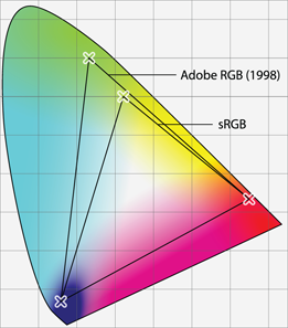
7.1 The larger Adobe RGB (1998) and the smaller sRGB color spaces on top of a CIE 1931 diagram with all colors.
Calibrating your monitor
The first part of setting up a calibrated workflow is to figure out how your monitor renders colors. For example, a shade of red could look darker or bluer or more orange, and so forth, on your monitor than on another monitor. Calibrating your monitor lets your computer (and Aperture) know that it needs to correct this shade of red so that it matches the red standard.
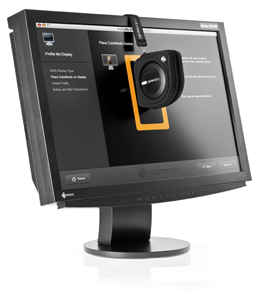
To calibrate your monitor, you need a special device called a colorimeter. This device reads the light coming out of your monitor and uses it to build a color profile for your monitor. A color profile is a file that describes a device’s color space. At the time of writing, there are three devices that we suggest checking out. The X-Rite Pantone Huey is a low-cost tool that can give reasonable results, although its results are not as accurate as other tools. The Datacolor Spyder 4 is a great midrange tool that generates very good profiles and can automatically adjust them as the ambient light in your office changes. The X-Rite ColorMunki (see Figure 7.2) is a very high-quality spectrophotometer that is capable of calibrating your monitor, projector, and printer. Although more expensive than the other two devices, the ColorMunki is our currently recommended calibration device.
Courtesy X-Rite
7.2 The X-Rite ColorMunki spectrophotometer.
Although these devices have very impressive names, they’re fairly easy to use. Follow the directions for the device you purchase. In general, you’ll install a piece of software, launch it, hang the device from your monitor when prompted, and then save the resulting profile (and switch your system to use it).

Pay attention to the lighting conditions in your room when calibrating your monitor. Even a calibrated monitor will look different in sunlight and under artificial lighting. We recommend making your room as dark as reasonable when calibrating your monitor and judging color, as it’s easier to make a room dark than to match a specific lighting level.
Calibrating your printer
A monitor color profile tells your computer how to properly display the colors in an image file, and a printer color profile tells your computer how to convert the colors in the file into your printer’s color space. Most printer manufacturers have profiles available on their websites for their printers and paper types. Make sure you pay close attention to the paper type specified in the profile name, because if you use a printer profile based on one type of paper such as glossy to print onto another paper type such as matte, your colors will be off. Many times, third-party print labs have their printer profiles available for download on their websites with instructions on how to use them.
While these generic profiles are usually pretty good for printers, you can create a custom printer profile to get the best results. Do so either by using a device like the X-Rite ColorMunki or by using a service such as Cathy’s Profiles (www.cathysprofiles.com). Note that you need a custom profile for each ink and paper combination you use with your printer.
Soft proofing
Even if you are very careful in creating your monitor and printer profiles, it’s still possible that you will see a small difference between the image on the screen and the printed image. This difference can happen for a number of reasons, but the main reason is that we sometimes perceive a printed image differently than a displayed image. This difference can be more extreme with certain types of paper; for example, watercolor paper causes prints to appear less saturated.
Soft proofing is a way to preview how you perceive the print before actually printing it, as shown in Figure 7.3. As we explain next, you can then use Aperture’s adjustment tools to modify the image so that the final output looks as good as possible.
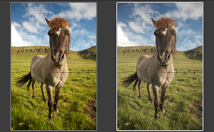
7.3 The original image and how it appears soft proofed. Sometimes the difference is insignificant, but sometimes it is substantial.
Follow these steps to soft proof and adjust an image:
1. Select the photo to print.
2. Choose Photos →Duplicate Version.
3. Choose View →Proofing Profile, and select the appropriate profile for your printer and paper type. Note how the image changes. You are now soft proofing this image.
4. Toggle soft proofing temporarily off by choosing View →Onscreen Proofing. Pay close attention to how the image changes from the original as you turn soft proofing back on by again choosing View →Onscreen Proofing.
5. Select the original version so that both versions are displayed, but change the primary selection back to the new version.
6. Open the Adjustments Inspector and adjust this new version so that it looks the same with soft proofing on as the original does with soft proofing off. Unfortunately, when soft proofing is on, Aperture turns soft proofing on for every image in Viewer — you can’t select both the original image and this new version and have Aperture only show a soft proof for this new version. Instead, you need to keep toggling Onscreen Proofing on and off as you adjust this new version. Your setup will look similar to Figure 7.4.

7.4 A soft proofing setup with the original image on the left and the soft-proof version you’re adjusting on the right.
7. Use this new version to print from rather than the original version as you follow the rest of the printing instructions in this chapter.
Using Aperture’s Print Dialog
After you finish soft proofing and adjusting your images, select them and choose File →Print Image. A print dialog like the one in Figure 7.5 appears. There are three key parts to the Print dialog. On the top left, you find all the different print style presets, including contact sheets and custom preset layouts (which we cover shortly). On the bottom left are all the print options (which we also cover shortly), but by default Aperture only shows a limited set. Click More Options to see the complete set of options as already done in Figure 7.5 (note that the button changes to read Fewer Options). The right side of the dialog contains a preview of your print.
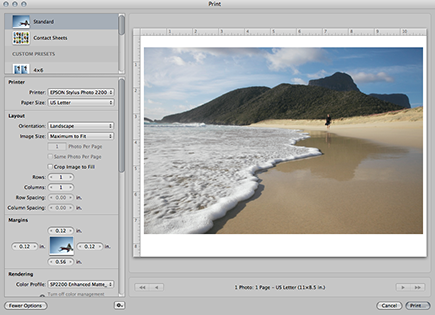
7.5 The Print dialog with the print style presets and options on the left and the print preview on the right.
Configuring a standard print
Typically, when photographers talk about wanting to make a print, they want to print one image per sheet of paper at a specific size. Aperture calls this type of print a standard print. Select Standard from the presets area to begin. Notice how the preview on the right displays your image as filling the page as much as possible. Next, you set a variety of options to control how Aperture places the image on the page and prints it.
This is where you set which printer you’re using and what size paper you’re using. To add a new printer, choose Add Printer from the Printer pop-up menu, and Aperture opens the system-wide Add Printer dialog (which you can also access through the Print & Fax system preference). Choose your paper size from the pop-up list, but if you don’t see the right size in the list, choose Custom and type the paper’s dimensions.
Layout and Margins
The next controls are the Layout options and the Margins options, as shown in Figure 7.6. These options control how your image is placed onto the page. Switch the orientation from Portrait to Landscape to change how the page is displayed in the preview area. Image Size lets you set your image to be a specific size, or choose Maximum to Fit to make the image take as much of the paper as possible (taking your margin settings into account).
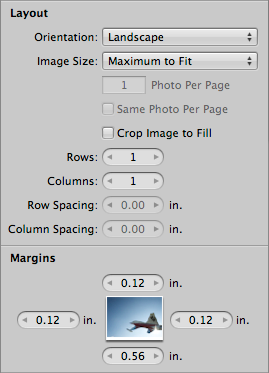
7.6 The Layout and Margins print options let you adjust where the image is on the page.
If you select an image size that’s smaller than the paper size, Aperture automatically increases the number of photos per page when possible. For now, set this number to 1 (we cover the settings related to rows, columns, and number of photos per page when we discuss contact sheets). If you mouse over the preview, guidelines appear around your image. Move your mouse over one of these guides, and when the cursor turns into a double-arrow, click and drag to adjust the margin sizes interactively, controlling where on the page Aperture prints your image. Alternatively, if you know the exact margin that you want to use, type its size into the Margins options area.
Although you won’t typically use this next feature, it’s good to have it in your bag of printing tricks just in case. When you click on your image in the preview area or make a pinch gesture on a Multi-Touch trackpad, Aperture displays a heads-up display (HUD) that lets you scale up your image. Then you can click and drag your image to control which specific part Aperture prints. We recommend cropping your image beforehand when you have more control, and printing your full image rather than using the Print dialog to crop into an image.
Pay close attention to the Crop Image to Fill check box. Deselect this option. If this is selected, Aperture will crop your image to match the printable area’s aspect ratio. For example, if you try to print a panorama onto a square sheet of paper, it will crop the panorama into a square image. While this is great for maximizing paper use, it’s typically not what you want when printing an image.
Rendering
Aperture has three groups of options to control your image and color. They are the Rendering, Image Adjustments, and Image Options groups, as shown in Figure 7.7.
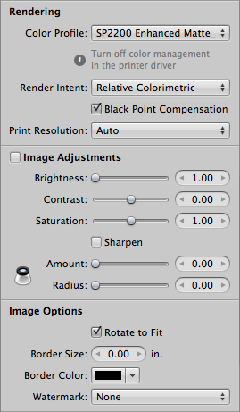
The Rendering options control the color profiles and conversions that Aperture uses for your print, and these settings are crucial for having color-accurate prints. The first pop-up menu is to select whether you want Aperture or your printer to handle the color management. If you want your printer to manage color, choose Printer Managed. Aperture also displays a tip, reminding you to enable printer color management in the System Print dialog that appears when you click Print. If you choose to let Aperture manage color, which we recommend, select your printer and paper combination’s profile from the list. In this case, Aperture displays a tip reminding you to disable color management in the next System Print dialog so that you don’t accidentally double-convert your print’s color.
When you choose to have Aperture handle color, you’ll also see a Render Intent pop-up menu and a Black Point Compensation check box. As discussed earlier in the chapter, your printer, monitor, and image file all have different gamuts. To help your computer move between color spaces and to deal with these gamuts, it’s helpful to give it a hint as to what part of the color space conversion is most important to you. Picking a rendering intent (see Figure 7.8) is how you provide this hint.
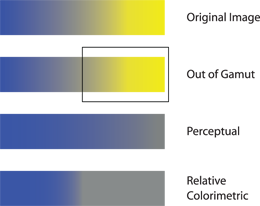
7.8 An exaggerated sample illustrating the original image and how it might be printed with perceptual or relative colorimetric rendering intents, assuming part of the original is outside the printer’s gamut.
![]() Perceptual. This method takes all the colors in one device’s space and scales them to fit within another device’s space. This is useful for printing because it preserves the relationships between colors so that a color that appears more saturated on your monitor than a neighboring tone also appears more saturated on your print. However, perceptual rendering will cause all your colors to shift slightly — a specific shade of red on the printed page will not be the exact same color as what’s displayed on your monitor.
Perceptual. This method takes all the colors in one device’s space and scales them to fit within another device’s space. This is useful for printing because it preserves the relationships between colors so that a color that appears more saturated on your monitor than a neighboring tone also appears more saturated on your print. However, perceptual rendering will cause all your colors to shift slightly — a specific shade of red on the printed page will not be the exact same color as what’s displayed on your monitor.
![]() Relative Colorimetric. This intent maps each color from the source (your displayed image) into the closest color that the destination (your printer) can reproduce. This means that a specific shade of red will match almost, if not perfectly, between a print and the display. However, if you have a lot of colors in the source that are outside of the destination’s gamut, they might appear different on the screen yet the same in the print. For example, two different shades of very saturated orange could appear identical in a print because relative colorimetric rendering decided that the closest very saturated orange that the printer could create happened to be the same value.
Relative Colorimetric. This intent maps each color from the source (your displayed image) into the closest color that the destination (your printer) can reproduce. This means that a specific shade of red will match almost, if not perfectly, between a print and the display. However, if you have a lot of colors in the source that are outside of the destination’s gamut, they might appear different on the screen yet the same in the print. For example, two different shades of very saturated orange could appear identical in a print because relative colorimetric rendering decided that the closest very saturated orange that the printer could create happened to be the same value.
In general, both methods will do a very good job, and you might not be able to tell the difference. However, if you have an image with a lot of very saturated colors or with very subtle color gradients, we recommend using perceptual rendering.
Regardless of which rendering intent you use, make sure to select Black Point Compensation. This option ensures that your shadows aren’t clipped in your print by scaling the black values in your image to fit within your printer’s gamut.
For Print Resolution, Auto automatically determines the best resolution for your print based on the print and image sizes, but you can also pick a standard size (Aperture uses 72, which is typically too low for high-quality prints) or type a custom resolution such as 360 for high-quality printing.
Image Adjustments
The Image Adjustments group provides two useful functions. The first is that sometimes, despite your best efforts at color management and soft proofing your prints, you’ll find that your prints look a little better if you boost the brightness, contrast, or saturation before printing them. While you could make a new version, make those changes, and then print this new version, using these three sliders in the Print dialog is far easier.
The second part of the Image Adjustments group is the sharpening settings. As you’ve probably heard, you want to sharpen the image you’re going to output after it’s resized to the final print size. If you sharpen it before resizing, then your image won’t appear to be sharpened properly because it’s going to be scaled from the size you used to pick your settings. By selecting the Sharpen check box and setting the desired Amount and Radius settings (click the Loupe button to the left to open the Loupe tool so that you can zoom into your image and pick appropriate sharpening settings), Aperture sharpens your image appropriately now that it’s scaled to its final print size. Similar to settings in Photoshop, Radius controls the size of the area around each object’s edge that will be affected, and Amount controls how much the contrast in each edge will be exaggerated. Be careful not to set your Radius too high, as you might see halo artifacts around each object, especially with higher Amount settings.
While Aperture’s sharpening is quite good, it doesn’t provide as much control as you might want for the highest-quality prints. We recommend using an Aperture plug-in like Nik Software’s Sharpener Pro before printing (and then not using Aperture’s Sharpen tool) to achieve the most precise, targeted sharpening.
Image Options
The last set of image and color options that directly affects how your image is printed is called, appropriately, Image Options. We recommend always leaving Rotate to Fit selected so that if you have a landscape image but your layout settings are set to portrait, Aperture will rotate your image to fit on the page. The border size and color controls let you add a solid line border around your image. Lastly, to add a watermark to your image, select it from the pop-up menu, or if it doesn’t appear, select Choose and browse for your watermark.
Metadata & Page Options
The final set of print options controls whether you see metadata with your print, and if so, what type of metadata, as shown in Figure 7.9. This can be useful if you’re printing a selection of images to discuss with clients, and you’d like to have image information such as the filename available with the image.
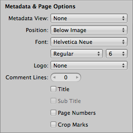
7.9 The Metadata & Page Options let you control the text that’s printed with your image.
From the Metadata View pop-up menu, select the metadata view that contains the metadata fields you want to see printed with your image (we cover creating custom views in Chapter 4). Use the Position and Font pop-up menus to determine where and with what font style Aperture will print your metadata. If you have a company logo that you want to add to each printed page, select it from the Logo pop-up menu (if it’s not there, select Choose to browse for the logo image).
Comment lines provide the specified number of blank lines below the metadata text for you to write comments onto. The Title and Sub Title check boxes control whether you see the project or album name as the title and a subtitle, which defaults to your name, in a larger font on the page. If you want a different title but don’t want to rename your album or project, Aperture also lets you click on the title and subtitle text and to then type new text. Selecting the Page Numbers check box adds page numbers to each page, and selecting Crop Marks displays small crop marks where your page margins are.
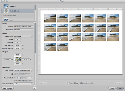
Creating a contact sheet
To print a contact sheet, do the following:
1. Select all the images that you want on the contact sheet.
2. Choose File →Print.
3. Choose Contact Sheets from the print presets area. The Print dialog changes its preview and looks similar to Figure 7.10.
The print options covered earlier about configuring a standard print still apply, with a few small differences.
The biggest difference in print options is that under the Layout options group, the Photos Per Page and Same Photo Per Page options (as well as a couple Layout group sizing options) have disappeared, and the row and column controls are now relevant. As you probably guessed, the Rows and Columns fields control how many rows and columns your contact sheet will have, and the Row Spacing and Column Spacing fields control the space between each row and column.
7.10 The Print dialog after selecting the Contact Sheets print preset.
The next difference is that under Image Options, selecting the Rotate to Fit check box causes each thumbnail to rotate to match the page’s orientation. For example, if you have portrait thumbnails on a page set to print in landscape mode, selecting Rotate to Fit causes the portrait thumbnails to rotate to have a landscape orientation. We recommend deselecting this check box.
Furthermore, the border and metadata options now apply to each individual image, although options like Title and Page Numbers still apply to the print page as a whole.
Use the arrow buttons under the print preview to switch pages, assuming your contact sheet has more than one page, to make sure that everything looks as you expect before clicking Print.
When printing a contact sheet, you’ll want to use a light touch with any Image Adjustments, especially sharpening, as the settings are applied to each image. The settings that work for one image will most likely not work for all images.
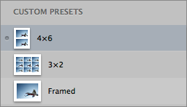
Using built-in custom presets and creating your own
While the Standard and Contact Sheets print presets will meet most of your needs, sometimes you’ll have custom print layout needs, such as printing two 4-×-6-inch images on one sheet of paper. Custom presets provide this flexibility.
Aperture provides a number of built-in custom presets. We recommend that you click these presets and look at what options Aperture changes to achieve each print style. For example, the 4 × 6 preset is based on the Standard print preset but has the image size fixed at 4 × 6 inches and automatically adjusts the number of photos per page to fill the selected paper size as completely as possible with 4-×-6-inch images. Same Photo Per Page is selected so that each page has two 4 × 6 prints of each image, and Crop Image to Fill is selected so that the print is guaranteed to be 4 × 6 inches and to have that exact aspect ratio, regardless of the original image’s aspect ratio.
Sequence is similar, but rather than using a standard Image Size setting, it has a custom setting and Crop Image to Fill is selected, which creates a sequence of images that you might use to promote a show, for example. Again, remember that you can click on each image in the print preview and adjust how Aperture crops the image (and scale the image up or down as needed, too).
Review Sheet is based on the Contact Sheets preset. You can tell because under Layout, it doesn’t have any individual image size options. Unlike the Contact Sheets preset, Review Sheet has no space between the rows, fewer rows and columns overall, and a few settings changed under Metadata & Page Options.
While these different custom presets provide some diverse printing options, chances are they’re not exactly the settings you want, and you’ll still want to create your own presets for your specific needs.
The Action pop-up menu at the bottom of the Print dialog provides three commands to help you manage your custom presets: Save Preset, Duplicate Preset, and Delete Preset.
To create a custom preset, follow these steps:
1. Select an existing preset that’s closest to the preset you want to create, even if it’s just the straightforward Standard or Contact Sheets preset.
2. Choose Duplicate Preset from the Action pop-up menu and give the new preset a name. Note how Aperture displays a dot, as shown in Figure 7.11, to the left of the preset’s thumbnail. This dot means that the preset has unsaved changes.
7.11 The small, embossed dot means that the preset has unsaved changes.
3. Change whatever print options you need to change for your preset. While you might save certain Image Adjustments, such as brightness, to account for how your printer prints, we recommend not saving sharpening settings as part of a preset to avoid accidentally oversharpening an image.
4. Choose Save Preset from the Action pop-up menu.
5. Click Print to print your image using this preset. In the future, you’ll be able to select this new preset from the Custom Presets list to quickly print another image (or group of images) with the same settings.
As you might expect, at some point if you want to remove a preset, select it and choose Delete Preset from the Action pop-up menu.

Often, you’ll change a setting in a custom preset just for a particular image or group of images, such as adjusting a sharpening setting. You don’t need to save the preset each time you change it, unless you explicitly want to save the adjusted settings as part of the preset.
Clicking the Print button and its settings
After you set up your print (or prints) the way you want them, click Print on the bottom right. Aperture opens the standard system Print dialog, as shown in Figure 7.12. Make sure to click the disclosure triangle, select Color Management from the pop-up menu, and choose the appropriate setting. Remember, if you told Aperture to manage your color (which we recommend), you select No Color Adjustment. If you told Aperture that your printer would manage your colors, choose the appropriate color management settings here.
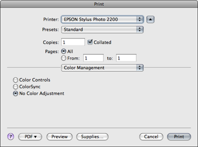
7.12 The system Print dialog and Color Management settings.
Once you finish adjusting your Color Management settings, click Print, and Aperture spools your print job.
Ordering Prints
If you don’t own a printer, Aperture provides a tool to order prints via a third-party print service. Unfortunately, you have no control over the paper type or other print settings. To order a print, follow these steps:
1. Select the images you want to have printed.
2. Choose File →Order Prints.
3. Use your Apple ID to sign in. This is the same ID you use to log in to the iTunes Store. If you don’t have an Apple ID, click the Create Account button and follow the steps. The screen changes to display the order form.
4. As shown in Figure 7.13, use the text fields to select the number of each size of prints that you want to order, and click Continue when done. The screen changes to display just your order.
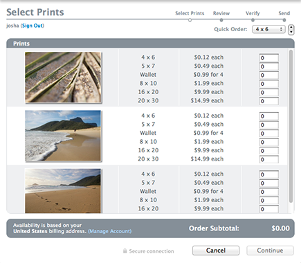
7.13 Use the Select Prints screen to control how many of each type of print for each print you want to order.
5. Review your order and click either the Back button to make changes or Continue to go forward. The screen changes again to display shipping and billing information.
6. Type your shipping and billing addresses as well as your e-mail address for a receipt. This last Verify screen also includes the estimated tax and shipping charges.
7. Click Place Order to confirm your order.
While Aperture’s Order Prints tool is quite convenient and priced nicely, for full control over your prints, we recommend using the techniques described in Chapter 8 to create a ready-to-print digital version of your image and send it to a print service that provides more control, such as www.mpix.com.
For other types of prints, such as a card or calendar, open your Aperture library from iPhoto to access your images. Then order the desired print product from within iPhoto.
Creating a Book
One of Aperture’s mature features is the ability to lay out and order a completely custom book of your photos. Creating a book comes down to three main steps: picking the type of book you want to make, laying out the pages in your book, and ordering your book. This section covers how to do each of these tasks and describes in depth how to lay out a page to customize your book.
Creating a new book album and picking themes
To create a new book, follow these steps:
1. Select the images you want to put into your book.
2. Choose File →New →Book. Aperture displays the New Book dialog shown in Figure 7.14. Or click on the New button in the Toolbar at the top of Aperture’s screen and select Book from its pop-up menu.
3. Type your book’s title into the Book Name field.
4. Select the type of book from the Book Type pop-up menu. In addition to the standard Apple books, you can also download photo book plug-ins from the Apple website for third-party book printers, such as Graphistudio and Couture Book. Choose Learn More from the Book Type pop-up, and Aperture opens the Photo Book Plug-Ins page in your Browser. Lastly, choose Custom if you want to create a completely custom book that you will print yourself.
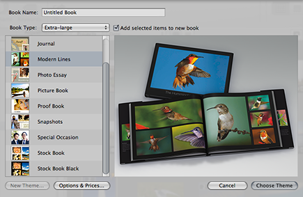
7.14 The New Book dialog lets you pick a book type and style.
5. Select your book’s theme from the list on the left. As you click on each theme, a theme preview appears on the right side of the dialog. If you’re creating a Custom book type, click New Theme to type your book’s page size and margin information.
6. Click Options & Prices to see a list of prices and finishing options for your book.
7. Click Choose Theme to confirm these options, create your book album in the Library Inspector, and to open the Book Layout Editor.
8. Choose whether you want a Hardcover or Softcover book, if your book type provides the option, by clicking the appropriate button at the top of the Book Layout Editor. Because this choice affects page layout, changing it later might adversely affect your book’s pages.
It’s possible to add images from multiple projects and albums to the book by dragging the images onto the book’s icon in the Library Inspector.
Any custom themes you create are saved in /Users/yourUserName/Library/Application Support/Aperture3/Book Themes. To share your theme with another person, copy your custom theme from that folder to the same location on the other person’s computer.
Navigating the Book Layout Editor
Whenever you have a book album selected in the Library Inspector, Aperture displays the Book Layout Editor that you see in Figure 7.15 instead of the standard Viewer. This editor lets you control the pages in your book and the layout of those pages including the images, text, and maps placed on the page. There are two main parts to the Book Layout Editor: the Pages pane and the Book Editor Viewer.
![]() Pages pane controls. The Pages pane is on the left side of the Book Layout Editor. It lets you quickly see and navigate between pages in your book, add and remove pages, change page templates, and more. At the top of the Pages pane, there are buttons to switch your book’s theme and to switch cover type (if available).
Pages pane controls. The Pages pane is on the left side of the Book Layout Editor. It lets you quickly see and navigate between pages in your book, add and remove pages, change page templates, and more. At the top of the Pages pane, there are buttons to switch your book’s theme and to switch cover type (if available).
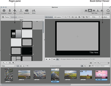
7.15 The Book Layout Editor replaces the standard Viewer when working on a book and allows you to see, navigate between, and edit the pages in your book.
![]() Book Editor Viewer. The Book Editor Viewer is similar to a regular Viewer, but it displays a book page instead of just a photo. Because normal Viewer functions such as View →Zoom to Actual Size are disabled with the Book Editor Viewer, Aperture provides three controls in the bottom right of the Book Editor to fit the Book Editor Viewer to the available space, zoom it to actual size, and to manually select the zoom scale for the Viewer. There are also buttons at the bottom of this viewer to switch between viewing a single page or a full spread and to go to the previous or next page. At the top of this viewer are buttons to control the contents of the page, and we cover these buttons in more detail in the rest of this chapter. If you are using a Multi-Touch trackpad, swipe here to change pages or pinch to zoom in and out of a page.
Book Editor Viewer. The Book Editor Viewer is similar to a regular Viewer, but it displays a book page instead of just a photo. Because normal Viewer functions such as View →Zoom to Actual Size are disabled with the Book Editor Viewer, Aperture provides three controls in the bottom right of the Book Editor to fit the Book Editor Viewer to the available space, zoom it to actual size, and to manually select the zoom scale for the Viewer. There are also buttons at the bottom of this viewer to switch between viewing a single page or a full spread and to go to the previous or next page. At the top of this viewer are buttons to control the contents of the page, and we cover these buttons in more detail in the rest of this chapter. If you are using a Multi-Touch trackpad, swipe here to change pages or pinch to zoom in and out of a page.
Aperture prepopulates the Pages pane with a variety of page types. These prepopulated pages help show what options are available with this theme and provide a nice starting point to create your book.
At the bottom-right corner of the Pages pane is the Book Actions pop-up menu. This menu contains many commands we refer to throughout the rest of the chapter.
Placing images and text
As you click on different pages in the Pages pane, Aperture changes the page currently displayed in its Viewer. Notice how many pages have gray areas with a crosshatch in the middle and blocks of lorem ipsum text. These are placeholders for images and text, respectively.
Changing the text is fairly straightforward. Double-click on the lorem ipsum text or Section Title text and type the text you want to appear. We cover how to customize your text’s appearance shortly.
Placing images is almost as easy. Start by dragging and dropping an image from Browser onto the gray placeholder area (if Browser isn’t visible, choose View →Split View or press V). Double-click on a placed image to open the Image Scale HUD, which lets you zoom your placed image in or out, and click and drag your placed image to move it around within the image box. For example, if you’ve placed a landscape image onto a portrait placeholder box, you can drag the image around to control how it’s being cropped into a portrait image.
If you’re unable to place an image or edit text, make sure the Edit Content button at the top of the Book Editor Viewer is selected and not the Edit Layout button.
When you place an image into a book, Browser displays a small maroon badge with a number indicating how many times this image has been placed into this book.
The Rebuild Book commands in the Book Actions menu will remove any changes you’ve made to the book’s design, revert to the default series of pages, and automatically fill the image placeholders with either all your images or the selected images, depending on which command, Rebuild Book With All Images or Rebuild Book With Selected Images, you choose.
Rather than placing images manually into each image placeholder, Aperture can automatically place either your selected images or all images that haven’t been used yet in the book. To automatically place a specific group of images, select the images in Browser and choose Autoflow Selected Images from the Book Actions pop-up menu. Aperture places the selected images into your book, shown in Figure 7.16, starting with the first empty image placeholder. To have Aperture automatically place any unused images into your book, simply choose Book Actions →Autoflow Unplaced images.
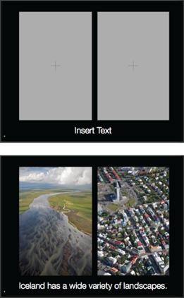
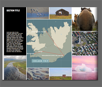
7.16 A before and after view of an empty page and a page with text and images filled out.
Some layouts will also let you place a photo as the page background. To do so, drag an image from Browser onto the background area of the page, and let go when Aperture highlights the background.
To unplace an image, select the photo box and press Delete. To remove a background image, click the Set Page Background pop-up menu, pointed out in Figure 7.17, and choose either No Background or a background color. Figure 7.17 also points out the other customization menus that we refer to throughout the rest of the chapter.
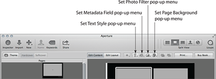
7.17 The text, metadata, photo filter, and page background customization menus provide formatting options for each type of item on the page.
Adjusting metadata boxes
Some themes have special text fields that are linked to a particular image placeholder and display that image’s metadata. You cannot directly type new metadata values for the image here (use the Info Inspector if you want to adjust an image’s metadata), but you can change what metadata is displayed in the box and link the metadata box to a different image.
To change the metadata box’s metadata view, select the metadata box, click the Set Metadata Field pop-up menu, and select the new metadata you want displayed. Note that this menu doesn’t provide access to the standard metadata views and isn’t customizable. There is only a limited subset of metadata that you can have automatically displayed in a metadata box.
To link a metadata box to a different image, follow these steps:
1. Select the metadata box.
2. Choose Book Actions →Unlink Metadata Box.
3. Select both the image you want to connect to the metadata box and the metadata box by ![]() +clicking on each.
+clicking on each.
4. Choose Book Actions →Link Metadata Box. The metadata box should now be displaying metadata values for the new image.
By default, Aperture doesn’t number your images. To turn on automatic numbering, choose Book Actions →Enable Plate Metadata. Aperture automatically adds the word “Plate” and the image’s number to each metadata box.
Configuring item options
Each photo and text box (including metadata boxes) has a number of configuration options related to both style and how the box contents are placed into the box.
To start, the Set Photo Filter pop-up menu provides a number of filters that you can quickly apply to an image, including the page background image. To use them, select a photo and then select a filter from this menu.
There are two ways to apply a different style to a text or metadata box. The first is to select the text box and then click the Set Text Style pop-up menu. This menu, with an example shown in Figure 7.18, lists all the preset styles from this book template. You can choose a different text style by picking one from the menu.
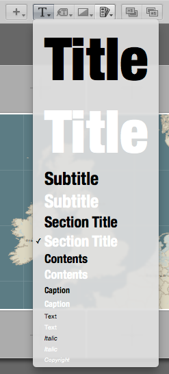
7.18 An example Text Style menu, showing the preset options from the built-in Photo Essay theme.
Alternatively, if you highlight the text you want to style and choose Edit →Show Fonts, Aperture opens the standard System Font dialog. Use this dialog to pick custom fonts, sizes, and colors for your text.
The next set of configuration settings deals with how each box’s contents are placed into its box. If you select a photo box and choose Book Actions →Photo Box Alignment, you see four options:
![]() Scale to Fill. This option is the default and scales the image up to fill the photo box completely, regardless of aspect ratio.
Scale to Fill. This option is the default and scales the image up to fill the photo box completely, regardless of aspect ratio.
![]() Scale to Fill Centered. This option scales the photo so that it fits completely into the photo box at the proper aspect ratio. The photo will be centered in the photo box.
Scale to Fill Centered. This option scales the photo so that it fits completely into the photo box at the proper aspect ratio. The photo will be centered in the photo box.
![]() Scale to Fill Left. This option scales the photo so that it fits completely into the photo box at the proper aspect ratio. The photo will be placed along the left side of the photo box.
Scale to Fill Left. This option scales the photo so that it fits completely into the photo box at the proper aspect ratio. The photo will be placed along the left side of the photo box.
![]() Scale to Fill Right. This option scales the photo so that it fits completely into the photo box at the proper aspect ratio. The photo will be placed along the right side of the photo box.
Scale to Fill Right. This option scales the photo so that it fits completely into the photo box at the proper aspect ratio. The photo will be placed along the right side of the photo box.
The Photo Box Alignment options are available both when in Edit Content and Edit Layout mode. However, to make the text box options active, click the Edit Layout tab.
Now, if you select a text box, you’ll notice that the Book Actions →Text Box Alignment menu is active. Use this menu to select whether a text box is left aligned, centered, and so on. We cover the other options available when in Edit Layout mode later in the section on customizing page layout.
Working with Browser’s extra book features
In addition to showing you how many times an image is used in a book, as mentioned previously in this chapter, Browser has three extra buttons when attached to the Book Editor, as indicated in Figure 7.19.
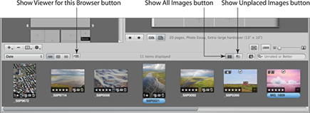
7.19 Browser gains buttons for Show Viewer for this Browser, Show Unplaced Images, and Show All Images when attached to the Book Editor.
On the right, Browser now has buttons to toggle between showing all images in the book album and only showing images that haven’t been placed into the book. It’s useful to have Browser set to Show All Images while you collect images to put into your book and to switch to Show Unplaced Images mode while placing images.
The other button Browser gains is the Show Viewer for this Browser button. When the Book Editor is open, there’s no obvious way to make an adjustment to an image beyond the Book Editor’s photo filters, aside from leaving the Book Editor and finding the image in its project. Instead, if you select an image (or images) in Browser and click this button, Aperture temporarily switches the Book Editor out for a normal Viewer so that you can inspect your images and make any adjustments. Click this button again to close Viewer and return to the Book Editor.
The Loupe still works even when the Book Editor is open, allowing you to zoom in on your images to check for sharpness. However, it doesn’t magnify the entire page contents. It only lets you loupe the images on the page or in Browser.
Using maps
Some themes, such as Photo Essay and Journal, also have map elements on certain pages. These maps integrate with Places, allowing you to flag a specific place or to draw a journey between places. If you haven’t yet set a specific place, it’s possible to add a new place on the map while creating the book.
To set a map’s initial location, either drag a photo with a location set onto the map or follow the following instructions on how to manually add a new place to the map. Double-click on the map to open the Map Options HUD, as shown in Figure 7.20.
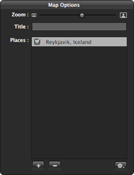
7.20 The Map Options HUD lets you control the locations marked on the map, the lines between locations, and other options.
There are four main controls in the Map Options HUD:
![]() Zoom slider. This lets you change the map’s scale.
Zoom slider. This lets you change the map’s scale.
![]() Title. This lets you add stylized title text to the map.
Title. This lets you add stylized title text to the map.
![]() Places. This lists the locations flagged on the map. If you’re going to set the map to display lines and arrows between locations, drag and drop each location name in the list to rearrange them into the order that you want Aperture to draw the lines.
Places. This lists the locations flagged on the map. If you’re going to set the map to display lines and arrows between locations, drag and drop each location name in the list to rearrange them into the order that you want Aperture to draw the lines.
![]() Action pop-up menu. This contains controls to display how the map’s displayed.
Action pop-up menu. This contains controls to display how the map’s displayed.
To add locations to the map, you can either drag additional photos tagged with a location to the map or follow these steps:
1. Double-click the map to open the Map Options HUD.
2. Click the Add (+) button in the bottom left. If Aperture doesn’t automatically start editing this new item, double-click on it in the Places list.
3. Start typing the location in Places and Aperture displays a pop-up menu with matching locations. If you are typing a new address, you might need to wait a second or two for Aperture to give you the option to search the web for this address in its Auto-Complete list.
4. Pick the correct location from the list.
5. The new location now appears in the list in the Map Options HUD and on the map.
To delete a location, select it in the Map Options HUD and click the Remove (–) button in the bottom left.
The Action pop-up menu in the Map Options HUD has a number of commands to help you configure your map to create a finished map, as shown in Figure 7.21, and they are as follows:
![]() Return to Starting Place. If you have your map set to draw lines between locations, this option closes the loop and draws a line from the last place to the first place.
Return to Starting Place. If you have your map set to draw lines between locations, this option closes the loop and draws a line from the last place to the first place.
![]() Move Label. This option causes the label, if visible, for the selected place to move to a different side of the place pin, making it easier to read the label.
Move Label. This option causes the label, if visible, for the selected place to move to a different side of the place pin, making it easier to read the label.
![]() Show Lines with Arrowheads/Show Straight Lines/Hide Lines. These options toggle between showing a line between places with arrowheads, without arrowheads, and not drawing any lines.
Show Lines with Arrowheads/Show Straight Lines/Hide Lines. These options toggle between showing a line between places with arrowheads, without arrowheads, and not drawing any lines.
![]() Show Place Marker Text. Show or hide the place labels.
Show Place Marker Text. Show or hide the place labels.
![]() Show Region Text. Show or hide the larger labels, such as the country name, on the map.
Show Region Text. Show or hide the larger labels, such as the country name, on the map.
![]() Center Map on Places. Zoom the map automatically to show all places marked on the map.
Center Map on Places. Zoom the map automatically to show all places marked on the map.
![]() Reset Map. Reset the map display back to the book’s default.
Reset Map. Reset the map display back to the book’s default.
Instead of manually typing a location into the Map Options HUD, double-click on the map and then click and drag the map around to move it. Control+click on a location and choose Add Place to interactively add places to the map.
7.21 A finished map, showing different locations, lines with arrows between locations, location names, and a map title.
Switching page styles
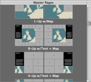
To switch page styles between different preset master pages, select the page in the Pages pane and either click the Set Master Page button at the bottom of the Pages pane or click the disclosure triangle that appears next to the selected page. Aperture opens a menu, such as the one in Figure 7.22, with the available page styles. Note that the right and left pages might have different options; for example, the left page has options for styles that span both pages.
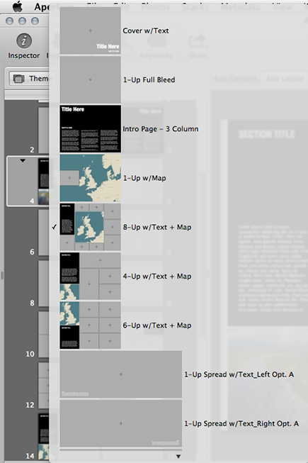
7.22 The Master Page pop-up menu, showing a number of different available page styles.
Adding and removing pages
To add a new page, select the previous page in the Pages pane, click the Add Pages button, and choose Add New Page. Aperture creates a blank page with what it determines to be the appropriate master layout, and you can change that layout after the fact. To choose a specific layout and then add a new page using that layout, choose Book Actions →Show Master Pages, select a master page, and then choose Add Pages →Add New Page From Master. Choosing Duplicate Page makes a duplicate of the previous page’s layout and images, with the layout adjusted to reflect whether the new page is on the left or right side of the book. Note that the default Apple books are limited to 99 pages.
To remove a page, select the page and click the Delete Pages button. Books require an even number of pages and at least 20 pages. If needed, Aperture inserts a blank page later in your book to accommodate these restrictions.
Customizing page layout
While there are plenty of preset page masters to choose from, sometimes you still want to adjust the page layout. To begin, click the Edit Layout button at the top of the Book Editor.
The easiest way to begin customizing a page layout is to drag the different boxes around on the page to rearrange them. As you do so, Aperture displays Smart Guides along the page and snaps the box to them to help you line up your different boxes. Use the Bring Forward and Send Backward buttons at the top of the Book Editor, shown in Figure 7.23, to move items behind and in front of one another. These commands are also in the Book Actions menu under the Arrange submenu.
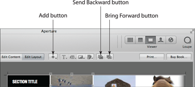
7.23 The Bring Forward, Send Backward, and Add buttons provide additional commands to modify the page’s layout.
Resize a box by selecting it, clicking on one of the handles that appears, and dragging that handle. Hold the Option key while dragging to cause Aperture to scale the box around the middle rather than only the side you’re dragging. With a Multi-Touch trackpad, the pinch gesture resizes the object beneath your mouse pointer, and the rotation gesture rotates objects. Hold down the Shift key while rotating to rotate in 15-degree increments.
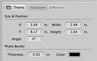
You can type specific sizes and locations for your boxes by using the Layout Options pane, as shown in Figure 7.24. To open it, choose Book Actions →Show Layout Options. When you select a box on the page, Aperture fills the Layout Options pane with the box’s information. Type new numbers in these fields for precise control over each item’s layout.
7.24 The Layout Options pane lets you type exact values for each box’s size, position, and rotation.
The Book Actions menu contains a number of other useful layout commands:
![]() Photo Box Aspect Ratio submenu. To quickly apply a specific aspect ratio to a photo box, instead of manually resizing it, select the photo box and choose an aspect ratio from this submenu.
Photo Box Aspect Ratio submenu. To quickly apply a specific aspect ratio to a photo box, instead of manually resizing it, select the photo box and choose an aspect ratio from this submenu.
![]() Text Box Columns. To change the number of columns in a text box, select the text box and choose the number of columns from this submenu.
Text Box Columns. To change the number of columns in a text box, select the text box and choose the number of columns from this submenu.
![]() Page Numbers. To force page numbers to be always on or off or to let Aperture automatically determine when to show them, choose the appropriate option from this submenu.
Page Numbers. To force page numbers to be always on or off or to let Aperture automatically determine when to show them, choose the appropriate option from this submenu.
![]() Enable/Disable Plate Numbers. By default, Aperture does not display image numbers in its metadata boxes. Enable Plate Numbers if you want to automatically have plate numbers.
Enable/Disable Plate Numbers. By default, Aperture does not display image numbers in its metadata boxes. Enable Plate Numbers if you want to automatically have plate numbers.
To add a completely new element to the page, whether you want an image, text box, metadata box, or map, either click the Add button at the top of the Book Editor or choose Book Actions →Add and select the appropriate item. Position, size, and format it using the commands covered in this chapter.
Remove an element by selecting it and pressing Delete.
At any point, if you want to return to the original page master, choose Book Actions →Reapply Master, and Aperture resets the page to its default.
Editing master pages
Master pages are the default starting layouts for the different pages in your book. Aperture lets you customize these masters, either by editing an existing one or creating a new one.
To see the masters, choose Book Actions →Show Master Pages. Aperture opens the pane you see in Figure 7.25. As you scroll through this list, you can click on any master page to open it into the Book Editor Viewer. Edit the master’s layout as you would any other page to make changes directly to the master. Note that you cannot make changes to the cover page.
7.25 The Master Pages pane lets you quickly modify and add new master pages to your book.
To add a new master page, follow these simple steps:
1. Select an existing master page.
2. Click the Add (+) button and select Add New Page. This adds a new master to the Master Pages pane.
3. Double-click its name to give it a new, descriptive name. You can edit its layout as previously described.
If, after customizing a normal book page, you decide that you want to add these changes to the master rather than redoing all the changes on the master, simply select the page and choose Book Actions →Save Page →To Document Master. If you want to turn your changes into a new master page, rather than modifying the existing master, choose Save Page →As New Document Master instead. Then show the Master Pages pane, find this new master, and double-click its name to give it a more descriptive name.
By default, when you create a new master, whether by explicitly adding a new master or by saving a page in your book as a new master, Aperture creates versions of this page for both the right- and left-hand sides of your book. You will most likely want to tweak each version of this master. For example, you might have a text field on the left for a page on the left but want the text field to be on the right for a page on the right. To do so, click the left and right sides of your master to make changes to each version.
If you instead want this master to have one layout for both the left and right sides of your book, choose Book Actions →Unify Master Page. Rather than displaying two thumbnails for each side of the page, your master will now only have one thumbnail representing both sides, as shown in Figure 7.26. To split a master so that the left and right sides have different versions, select the master and choose Book Actions →Split Master Page.
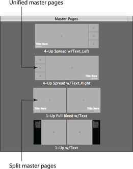
7.26 Unified and split master pages in the Master Pages pane.
Printing or ordering your book
When you finish creating your book, you can either print it yourself, save it as a PDF to send to a third-party print service, or buy it directly through Aperture. To print it or save it as a PDF, click Print in the Book Editor. Aperture opens the standard system Print dialog. Either set your print settings and click Print or choose PDF →Save as PDF to create a PDF version of your book.
To order a copy of your book directly from within Aperture, do the following:
1. Click Buy Book in the Book Editor. Aperture displays a sheet like the one in Figure 7.27.
2. Log in using your Apple ID or create one if you don’t yet have one.
3. Adjust the quantity of books you want to order.
4. Click Preview Book to see a PDF preview of what your book will look like.
5. Click Continue, type your billing and shipping information, and click Place Order to confirm your order. Aperture uploads your book in the background to the appropriate print service, and your new book arrives in the mail in a few days.
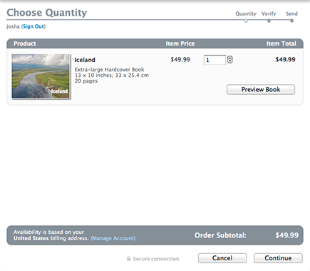
7.27 The very handy book order sheet.
..................Content has been hidden....................
You can't read the all page of ebook, please click here login for view all page.