
6.31 Using the Shadows option enables you to make more precise adjustments to the shadows.
Chapter 6: What Tools Can I Use to Make My Images Better?

Although it’s always wise to take the time to make the best photos possible while shooting, Aperture has a lot of tools that you can use to make your images even better. By clicking a button, setting a few sliders, or applying a few brushstrokes, you can optimize your shots and add impact without spending excessive amounts of time on your computer. That way you can make the most of your images and still have time to go about your life!
Getting Started with Adjustments
Using Third-Party Editing Plug-Ins
Getting Started with Adjustments
Before you jump in and start adjusting your images, there are a few basics that are helpful to understand. That way you’ll be able to get the most out of the adjustment tools as efficiently as possible.
Reprocessing originals for Aperture 3.3 or later
If you are upgrading to Aperture 3.3 or later from a version of Aperture prior to Aperture 3.0, or opening a library created prior to Aperture 3.0, you’ll discover that Apple modified the algorithms it uses for better noise processing, sharpening, and highlight recovery with RAW files as well as adding brush tools for localized adjustments (that we cover later in this chapter). In the Aperture 3.3 upgrade, the library changed to enable unified libraries, as we cover in Chapter 2, as well as to add even more new and improved adjustments. When you first launch Aperture 3.0 or later, you see the message in Figure 6.1. You can opt to update the library as well as reprocess your images or just update the library.
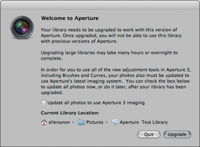
6.1 You need to update your library when accessing a library created prior to Aperture 3.0, but by default Aperture lets you wait to reprocess the images or you can opt to do it all in one step.
Any time algorithms change, the appearance of images you’ve already processed may change when you update them to the new algorithms. Apple realizes that even though the new algorithms enable you to perform some great new functions including selectively brushing adjustments in or out, you may not want the appearance of all your images to change when you upgrade. Therefore, when you upgrade your Aperture or Aperture 2 libraries, the images use their original algorithms by default, so that their appearance remains the same. You then have the option to upgrade images one at a time, or to update groups of images, projects, or the entire library. Of course, all new images that you import into your library automatically use the new algorithms.

Although your entire library must be updated when you upgrade from Aperture 3 to Aperture 3.3, images that you have adjusted using tools that have changed, such as the Highlights & Shadows tool, will maintain your original adjustments.
To upgrade one or more images in a project from a library prior to Aperture 3.0, do the following: Choose the image and choose the Adjustments Inspector, and then click Reprocess, as shown in Figure 6.2.
To upgrade groups of images from a library prior to Aperture 3.0, do the following:
1. Select the images or project, album, book, slide show, and so on, that you want to reprocess.
2. Choose Photos →Reprocess Masters. A new dialog appears, as shown in Figure 6.3.
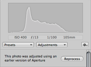
6.2 Click the Reprocess button in the Adjustments Inspector to reprocess images as you need.
3. In the new dialog, specify whether to reprocess all the images or only those with or without adjustments, and whether you want to create a new version for each image or just reprocess the original version. If you are worried whether you’ll like the results, choose the option to keep the existing versions and reprocess new versions. That way you can keep whichever version looks better and delete the others. You cannot “unreprocess” an image.
4. Click Reprocess Photos.
You can opt to reprocess the entire library by following the same steps just described but choosing Photos in the Library Inspector initially.
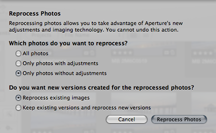
6.3 Specify the criteria to use while reprocessing images, including whether to create a new reprocessed version while retaining the original version.
Reprocessing images takes time, so the more images you select to reprocess at once, the longer it will take. We find it more efficient to reprocess images as needed than to try to do all our older images. If we need to reprocess a lot of images, we let Aperture work on it at night or when we’re away from the computer.
Setting preferences for making adjustments
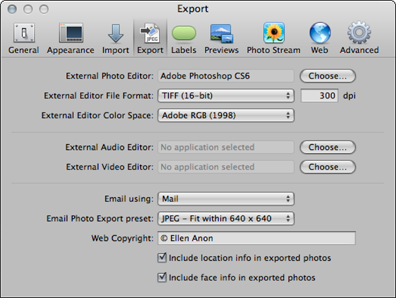
By taking a few minutes initially to set your preferences, you’ll be sure that Aperture behaves the way you expect. First, specify your external editor. For most people, this is Adobe Elements or Photoshop, but it could also be a program such as Nik Software’s Snapseed. You use your external editor to perform tasks that you can’t do within Aperture, such as creating a composite. To set your external editor, take the following steps:
1. Choose Aperture →Preferences →Export.
2. Click the Choose button to the right of External Photo Editor.
3. Navigate to the desired application in the window that appears and click Select. When Aperture returns to the Preferences dialog, the name of your external editor is displayed, as shown in Figure 6.4.
4. Specify the file format. Aperture creates a new TIFF or PSD file for each file that you send to the external editor, and you can choose 8- or 16-bit as well. We normally use 16-bit files because that gives more tonal options to use when making further adjustments.
5. Specify the color space to attach to the file. This should be whatever color space you use as your RGB setting in your external editor, usually Adobe RGB (1998) or ProPhoto RGB. However, if your output is for the web or e-mail only, you can choose sRGB.
6.4 Set your external editor in Preferences.
Next, click the Advanced tab in the Preferences dialog, as shown in Figure 6.5, to set additional preferences. Follow these steps:
1. Specify the Hot and Cold Area threshold settings. These settings determine what areas Aperture will show as clipped (so dark or light that there are no visible details) when you choose View →Highlight Hot and Cold Areas. (Hot areas are highlights lacking detail and appear with a red overlay; Cold areas are shadows lacking detail and appear with a blue overlay, as shown in Figure 6.6). Highlighting the clipped areas makes it easy to see if an adjustment is too extreme and is causing the image to lose important details. The numbers that you set in Preferences establish whether the highlights and shadows must be completely clipped before they appear as hot or cold areas, or whether the overlay warning appears when an area is almost clipped. We prefer to set our Hot Area threshold at 100 percent and our Cold Area threshold at 0 percent, but for some outputs such as slide shows, you might prefer to set those numbers to be less extreme so that you don’t run the risk of the image appearing too contrasty.

6.5 Use the Advanced tab in Preferences to set clipping preferences and whether to automatically create new versions for adjustments.
2. Set the Auto adjust Black Clip and Auto adjust White Clip settings. We prefer to set the Black Clip to 0.05 percent and the White clip to 0.00 percent rather than the default settings of 0.10. That way, if we use an auto adjustment it introduces only minimal clipping in the shadows, which is just enough to add some shadow definition and no clipping in the highlights.
3. Leave the Clipping overlay pop-up menu set to Color because for most images it’s easy to see that way. If the image has a lot of pure red or pure blue, you may prefer to select the Monochrome option so clipped areas appear as a medium gray.
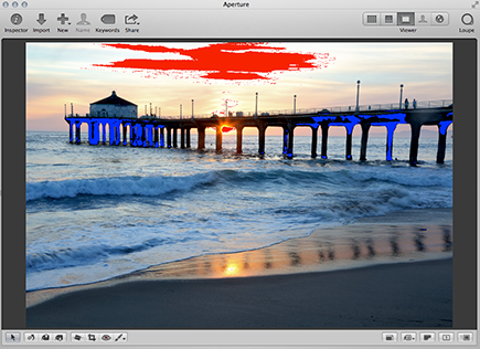
6.6 Highlighting hot and cold areas makes it obvious where an image is losing detail.
4. Leave the check box to create new versions when making adjustments deselected. If you select it, Aperture automatically makes a copy of the original image and shows your adjustments on that version. Then if you opt to use the external editor, Aperture automatically creates another new version. That way you can easily compare the before and after results and won’t have to start all over. Similarly, if you then add adjustments in Aperture, you see another new version. However, we find this can be quite cumbersome and prefer to manually create new versions when we want them. Nonetheless, we suggest that when you choose Preferences →General you select the option to automatically stack new versions so that it’s easy to keep different versions of an image together.

If you select the option to have Aperture create new versions, Aperture creates a separate version to use with a plug-in, but if you then opt to open the results in your external editor or a different plug-in, Aperture does not make a separate version unless you also apply some Aperture adjustments in between. You can manually create a new version whenever you want by choosing Photos →Duplicate version.
Creating versions of an original file for adjustments within Aperture requires only minimal memory space because the original pixels are not duplicated. Each version just contains a series of instructions of what adjustments to apply to that version. However, versions that are created for use with plug-ins or external editors require considerably more space because they are new original files and contain pixels. We cover plug-ins and external editors later in this chapter.
Making Adjustments
Aperture offers a comprehensive set of adjustment tools that we cover in depth. All of Aperture’s adjustment tools are located in the Adjustments Inspector, but a few frequently used ones are also located under the Viewer. In this section, we explain in detail how to use all the various tools, but we begin with some general information.
Commonalities of all the adjustment bricks
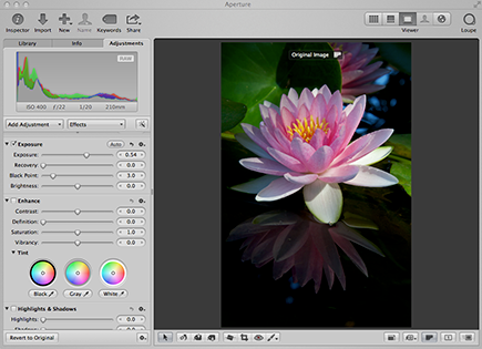
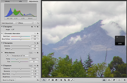
No matter which type of adjustment you use, each one shares some common features, as shown in Figure 6.7:
![]() Disclosure triangle. Use this to expose or hide the settings for each adjustment. We normally leave the adjustments exposed, but that means we have to scroll through them; hiding the controls means less scrolling. That’s strictly a personal preference.
Disclosure triangle. Use this to expose or hide the settings for each adjustment. We normally leave the adjustments exposed, but that means we have to scroll through them; hiding the controls means less scrolling. That’s strictly a personal preference.
![]() Check box. When its check box is selected, the adjustment is applied to the image. To see the image without the effect, deselect this box — it’s an easy way to be sure you’re heading in the right direction with your improvements — then toggle it back on. All sliders can be continuously readjusted.
Check box. When its check box is selected, the adjustment is applied to the image. To see the image without the effect, deselect this box — it’s an easy way to be sure you’re heading in the right direction with your improvements — then toggle it back on. All sliders can be continuously readjusted.
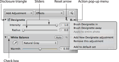
6.7 All the adjustment bricks share some common features.
![]() Sliders. Most adjustments contain sliders that can be directly adjusted, but double-clicking the knob resets that slider back to the default setting. In addition, many have a scrubby number field in which you can type a specific number or click and drag the cursor to quickly set the slider.
Sliders. Most adjustments contain sliders that can be directly adjusted, but double-clicking the knob resets that slider back to the default setting. In addition, many have a scrubby number field in which you can type a specific number or click and drag the cursor to quickly set the slider.
![]() Reset arrow. Use this to reset an adjustment to the default settings.
Reset arrow. Use this to reset an adjustment to the default settings.
![]() Action pop-up menu. This menu contains the following settings:
Action pop-up menu. This menu contains the following settings:
• Add to default set/Remove from default set. To add an adjustment to the default series of adjustments that appears for each image, choose Add to default set from the Action pop-up menu. Normally this would apply to adjustments that are not in the default set of adjustments but are available from the Add Adjustment pop-up menu, as shown in Figure 6.8. Similarly, to remove an adjustment that you don’t use often, choose Remove from default set.

6.8 Any of the additional adjustments can be added to or removed from the default set of adjustments that appears in the Adjustments Inspector.
• Add New X adjustment (where X is the adjustment name) is included in most of the bricks. To add an additional brick of the same type, click the Action pop-up menu in the brick and choose Add New X adjustment. This is helpful when you want to brush the adjustment in one way to parts of the image and use the same controls to make a different adjustment to affect other parts of the image.

With some adjustments, you can use the arrows at either end of the scrubby field to type values that are more extreme than those that are possible by using the slider.
Working with the histogram
One of the advantages of working with digital files is being able to use histograms. Histograms show the distribution of the tonal values in an image and can be set up to show individual channels; a combination of the Red, Green, and Blue channels (RGB); or the luminosity information. This enables you to see factually whether an image is taking advantage of the complete tonal range or whether it’s lost a lot of information in the highlights or shadows, and more. A complete discussion of histograms is beyond the scope of this book.
When making a Curves adjustment you can choose a different type histogram to appear superimposed on the curve by going to the Action pop-up menu in the Curves brick. In Levels, you can choose RGB or Luminance from the Channel pop-up menu to control the type of histogram that appears in the dialog.
To specify the type of histogram you want Aperture to display on the top of the Adjustments Inspector, do the following:
1. Select an image, and then choose the Adjustments Inspector.
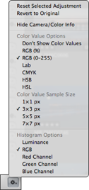
2. Click the Action pop-up menu at the bottom of the Adjustments Inspector, as shown in Figure 6.9.
6.9 Choose the type of histogram to appear in the Adjustments Inspector.
3. Scroll to the bottom of the pop-up menu and choose the type of histogram you prefer. We prefer to use an RGB histogram for the overall image histogram because it provides the most information.
Straightening an image
With digital images, there’s just no excuse to show pictures with a crooked horizon. Whether you’re handholding or carefully composing a shot on a tripod, it’s all too easy to accidentally hold the camera at an angle. Then when anyone looks at your photos, the first thing they notice is the tilt rather than the subject. Fortunately, it’s easy to fix crooked images in Aperture.
To straighten an image, follow these steps:
1. Click the Straighten button from the group of tools beneath the Viewer, as shown in Figure 6.10, press G to use the keyboard shortcut, or choose Add Adjustment →Straighten from the Adjustments Inspector. The cursor changes to a double triangle.
2. Click on the image. A yellow grid appears superimposed over your image.
3. Drag the cursor to rotate the image using the yellow grid as a guide to align any vertical or horizontal items. Aperture simultaneously straightens the image and crops it.
Alternatively, you can drag the Angle slider in the Straighten brick, but we find this more difficult because the grid overlay doesn’t appear this way. You can also set a specific amount in the Value area if you need to rotate an image by a specific amount.
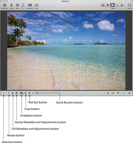
6.10 Use the Straighten tool to quickly correct tilted horizons.
You’ll have more control over the straightening if you click and drag near the sides of the image rather than near the center.
Cropping images
Sometimes you need to crop an image, whether to remove distracting items around the edges, to help emphasize the subject, or to output the image at a specific aspect ratio that’s different from the one your camera uses. Aperture enables you to crop images while maintaining the same aspect ratio your camera uses, to apply other preset crop sizes, or to create a custom crop. To crop an image, follow these steps:
1. Click the Crop button (shown earlier in Figure 6.10), press C to use the keyboard shortcut, or choose Add Adjustment →Crop. A new dialog appears, as shown in Figure 6.11, in which you choose the aspect ratio for the crop.
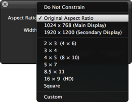
6.11 Use the Crop dialog to set an aspect ratio for the crop or to create a custom crop.
2. Initially, the Aspect Ratio pop-up menu is set to Original Aspect Ratio. To use a preset ratio or to create a custom crop, click the pop-up menu and choose a preset or click Do Not Constrain. The Crop dialog displays the aspect ratio. The crop tool is “sticky” and will open with the last setting you used whenever you open it.
3. To toggle the height and width aspect ratios, click the double arrow that’s between the height and width displays.
4. Select the Show Guides option to superimpose a Rule of Thirds grid while you drag out the crop. This grid can help you place the crop for the best composition following the basic Rule of Thirds principles.
5. Click and drag on the image to establish the crop. Click and drag in the center of the crop area to reposition the crop. Click and drag any of the rectangular handles on the edges of the crop to change the size of the crop. When you’re satisfied with the results, press Return to crop the image or click Apply in the Crop dialog. A Crop brick appears in the Adjustments Inspector.
If you want to modify the crop after you’ve applied it, click the crop icon that’s in the top right of the Crop brick. That restores the crop overlay on the image and makes it active.
You can modify the crop at any time by clicking the Crop tool again and repositioning the crop. To remove the crop entirely, deselect the Crop brick check box in the Adjustments Inspector.
The size of the cropped image appears at the bottom left of the Crop dialog. Be careful to leave enough pixels that you can still create high-quality output. If you crop too aggressively you may find that there are only enough pixels to create a very small print or to put on the web.
Using Auto Enhance
Auto Enhance was completely reworked in Aperture 3.3 and now is a quick way to optimize an image or, at the very least, provide a one-touch preview of the potential of your image as shown in Figure 6.12. Over the years we’ve shied away from Auto tools because usually it’s better to take the time to choose and set adjustments individually for each image. But Auto Enhance employs sophisticated smart algorithms that you can individually tweak after using Auto Enhance. By smart we mean that although Auto Enhance is programmed to use certain adjustments (White Balance, Enhance, Curves, and Highlights & Shadows), if Aperture analyzes the image and decides a particular adjustment is unnecessary, rather than add the adjustment set at zero, it doesn’t add the adjustment at all.
To use Auto Enhance, select an image and then press the Auto Enhance button located just beneath and to the right of the histogram in the Adjustments Inspector, as shown in Figure 6.12. You can also access it by choosing Effects →Quick Effects →Auto Enhance, which means you can apply it during import by choosing the Effect in the Import dialog, as covered in Chapter 3.
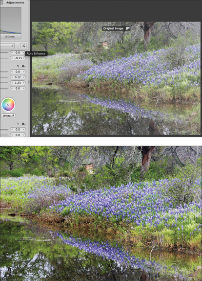
6.12 Using the Auto Enhance tool can be a timesaver as shown in this before and after image
If you use Auto Enhance, glance at all the bricks in the Adjustments Inspector to see which ones are selected. Then consider fine-tuning them if necessary.
Using the adjustment bricks
The remainder of the adjustment tools are found only in the Adjustments Inspector. Some are included in the set of tools that is visible by default, whereas the others are available from the Add Adjustment button below and to the left of the histogram.
Of course, no image needs every adjustment. Before you begin adjusting your image, we highly recommend that you take a minute to assess the strengths and weaknesses of the image and develop a game plan for what you need to do to make the image pop. That way you won’t waste time floundering, randomly trying different adjustments, and instead will select only the adjustments you need for each image. (For more about this, we refer you to our book See It: Photographic Composition Using Visual Intensity, Anon & Anon, Focal Press, September 2012.)
One of the really convenient things about using Aperture to optimize your images is that every edit you make within Aperture (not a plug-in) can be modified at any time in the future. It’s all nondestructive. As mentioned earlier, you can create multiple versions of an image using different adjustments or crops. These versions require only minimal additional hard drive space, and that means you can feel free to create and experiment while creating multiple renditions of an image.
The order that the adjustments appear in the Adjustments Inspector is the order in which Aperture applies them to your image. You cannot rearrange the order they appear in the brick, but you can select them and work on them in any order you choose. However, with some processor-intensive adjustments such as the Retouch Brush, you may find that your computer works better if you apply those adjustments before making other adjustments.
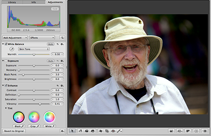
Setting white balance
Many photographers leave their cameras set to Auto White Balance, which usually does a good, but not always perfect, job of balancing the light so that the colors in your image appear the way you expect. Some photographers use white balance effects such as Daylight, Cloudy, Shade, Fluorescent, and so on, offered in their camera presets. These settings often do a good job as long as the lighting conditions don’t change without your changing the preset. Still other photographers set a custom white balance in-camera that works perfectly, as long as the lighting remains identical to the conditions in which they created the preset. The bottom line is that no matter which approach to white balance you take in-camera, you may want to tweak the white balance settings on the computer.
Aperture 3.3 expanded the white balance options to make it even easier to achieve the optimal color balance in each image. There are two places to adjust the white balance settings — in the White Balance Effects and in the White Balance brick where there are automatic as well as manual options.
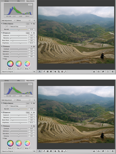
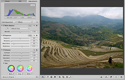
If the overall color of your image appears too cool or too warm, or is just off in some way that you can’t quite identify, a good way to start to fix it is to click the Auto button in the White Balance brick. Aperture analyzes the image and if it detects a face, it uses a white balance algorithm to preserve the skin tones no matter what race. If no faces are detected, then Aperture tries to identify something that should be neutral gray and adjusts the image accordingly. Of course, you may want to tweak the results manually.
Whenever you want to tweak the white balance of your image, regardless of whether you use the Auto button, you can adjust the sliders in the White Balance adjustment brick. First, use the pop-up menu shown in Figure 6.13 to choose which white balance method to use: Natural Gray, Skin Tone, or Temperature & Tint.
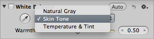
6.13 Specify which approach you want to use to correct the white balance.
The Temperature & Tint method is the classic method based on color temperature, and you visually adjust the sliders until you’re pleased with the results. Use the Temp slider to warm or cool the image by dragging it toward the blue or yellow side. This is a common adjustment to add a bit of warmth. Some images also benefit from adjusting the tint, making it more magenta or more green, but in most cases we find we make fewer adjustments to the tint and when we do, the adjustments are usually smaller than those we make to the Temp slider.
If there are people in your image, choose Skin Tone and then click the eyedropper and drag it over a skin tone in the image, as shown in Figure 6.14. If you don’t like the results, press ![]() +Z to undo the change and then try again. You can also manually tweak the warmth by adjusting the Warmth slider.
+Z to undo the change and then try again. You can also manually tweak the warmth by adjusting the Warmth slider.
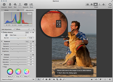
6.14 When there are people in an image, set the white balance by using their skin tone.
If there’s something in your image that should be neutral gray, choose Natural Gray and then use the eyedropper to click on something in the image that should be gray, whether light gray or dark gray or somewhere in between, but pure gray without a colorcast. This might be a gray rock, a gray card, an item of clothing, a road, a bird, or whatever is in your image that should be neutral gray. If you don’t like the results, press ![]() +Z or manually tweak the slider.
+Z or manually tweak the slider.
You can opt to brush in a white balance correction in selective areas of your image. That way you can have more warmth in some areas such as your subject and less in the background (or vice versa).
The other approach to correcting a colorcast is to use the White Balance Effects. The advantage is that you can preview the results of each choice, which makes it easier to see which one does the best job of balancing the colors. To apply a White Balance Effect, follow these steps:
1. Click the Effects pop-up menu and then choose White Balance. A list of six preset white balance settings appears.
2. Hover the cursor over an effect and a thumbnail of the image appears with that white balance setting, as shown in Figure 6.15. Being able to preview the results of each effect makes it easy to select the best one.

6.15 Use the White Balance Effects to choose the best white balance settings.
3. If the result is not perfect, continue on to the White Balance adjustment brick to fine-tune the results.
Using the Exposure controls
The Exposure brick has four sliders that enable you to adjust the overall exposure of the image as well as to recover detail in some of the lightest areas of the picture, to set the black point, and to adjust the overall brightness of the image. There’s an Auto button to use if you want Aperture to set the sliders for you automatically. (Of course, you can fine-tune the results manually as well.)
To use the Exposure controls manually, begin by setting the Exposure slider so that most of your image is exposed correctly. Before you set the other sliders, it’s possible that the overall image may still be a little too bright or too dark, and in some cases there may be a small amount of highlight clipping. The idea is to get the bulk of the image correctly exposed using this slider in such a way that you can use the other sliders to refine the results and improve the exposure of the image. This image was initially underexposed by about 1/2 stop, as shown in Figure 6.16.
While adjusting the Exposure, Recovery, and Black Point sliders, hold down the ![]() key to have the image temporarily replaced by a grayscale version. This makes any clipping more obvious as well as helps you see precisely which pixels are being set to black or white. That can help you set the sliders more accurately. After you release the
key to have the image temporarily replaced by a grayscale version. This makes any clipping more obvious as well as helps you see precisely which pixels are being set to black or white. That can help you set the sliders more accurately. After you release the ![]() key, check the results visually on the image and make any refinements that are needed.
key, check the results visually on the image and make any refinements that are needed.
6.16 Begin by setting the Exposure slider so that most of the image is properly exposed. This image is underexposed by about 1/2 stop.
If there is some highlight clipping, use the Recovery slider. In some cases, highlight detail has been recorded by the sensor, but that isn’t currently visible. This is the information that you use the Recovery slider to access. Adjusting the Recovery slider also makes some of the brightest pixels slightly darker to enable more highlight details to become visible.
Use the Black Point slider to determine which pixels will be pure black, as shown in Figure 6.17. (This is called setting the black point.)
Adjust the Brightness slider to change the overall brightness of the image. This makes the majority of the pixels lighter or darker but has less effect on the lightest and darkest pixels.

6.17 Holding down the ![]() key can make it easier to see where there is clipping, particularly when setting the black point.
key can make it easier to see where there is clipping, particularly when setting the black point.
By using the four sliders in the Exposure brick, as shown in Figure 6.18, you should be able to set an acceptable exposure level in the overall image even though you may still need to use other tools to add (or reduce) contrast or to improve highlight and/or shadow detail.
You can also set the black point using Curves or Levels, but doing so darkens more of the pixels. Setting the black point using the Black Point slider affects less of the tonal range. Which way is better depends on the particular image. If an image just needs some true blacks for definition and pop, then use the Black Point slider. If the image feels too light and needs to be darker or denser, then set the black point in Curves or Levels.
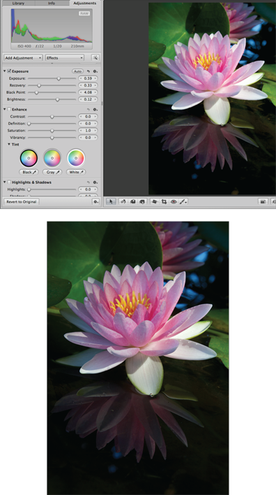
6.18 This image looks considerably better after using the Exposure controls but will also benefit from using the Shadow slider to slightly lighten the reflection.
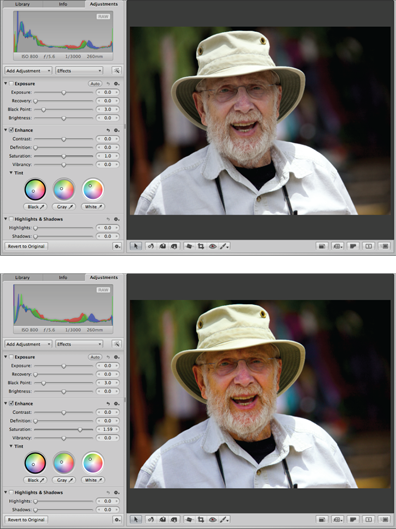
Taking advantage of the Enhance tools
The Enhance brick contains four sliders as well as tint controls that enable you to modify aspects of the color and contrast of the image, thereby increasing the impact of many images. As we describe each control, we suggest you experiment by pulling the sliders to their extreme positions in both directions. That way you’ll visually see the effect each control has and can then set the slider to the best position for the particular shot.
The first slider is the Contrast slider, which enables you to increase or decrease the overall contrast within the image. Increasing the contrast this way spreads the pixels across a wider tonal range, but primarily increases the range of darker tonalities that are included. You can see the change not only in the image, as shown in Figure 6.19, but also in the histogram. Notice that the white point is only minimally modified. With images that are overly contrasty, try slightly reducing the overall image contrast.
For most images, we find we rarely use the Contrast slider, preferring instead to use Levels and Curves adjustments where we can increase the contrast in particular parts of the tonal range such as the midtones, or the revised Mid Contrast slider in Highlights & Shadows.
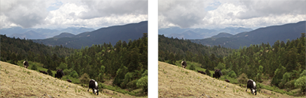
The next slider is the Definition slider. We use this adjustment on many of our images to increase the pop of the image and to reduce haze. Increasing the definition increases local contrast as well as creates the impression of increased saturation and sharpness, as shown in Figure 6.20. Although it can be tempting to use this slider aggressively, as we have done here, we suggest you use it carefully and check the results at 100 percent magnification to ensure you don’t accidentally add artifacts.
The Definition slider is very similar to the Clarity slider in Adobe products such as Camera Raw.
6.19 Increasing contrast by using the Contrast slider moves the black point more than the white point but can be used to boost the contrast of overly flat images.
6.20 Use the Definition slider to add pop to your images.
The Saturation slider increases or decreases the saturation of all the colors in the image, as shown in Figure 6.21. If you want to modify the saturation of a particular color, use the Color controls instead. Although you can convert an image to black and white by completely decreasing the saturation, we find it’s better to use the Black & White adjustment or presets that we cover later in this chapter.
The Vibrancy slider increases (or decreases) the saturation of some of the colors in the image, but it is geared toward helping skin tones remain more natural looking while increasing (or decreasing) the saturation of other colors. This means that some yellow and orange tones are less affected by adjusting the Vibrancy slider, while the blues and greens will be noticeably modified, as shown in Figure 6.22. You can take advantage of the Vibrancy slider not only with photos of people, but with any photo where you want to increase or decrease the saturation of the greens and blues while having less impact on the yellows.
6.21 Using the Saturation slider increases (or decreases) the saturation of all the colors in the image. This can result in unnatural skin tones.
With some images you may want to use the Saturation and Vibrancy sliders in opposite directions to create different effects on the colors in your image. Don’t hesitate to experiment to create just the right balance for each particular picture.
6.22 Using the Vibrancy slider increases (or decreases) the saturation of colors in the image while trying to protect skin tones.
The Tint controls enable you to modify the colorcast of the highlights, midtones, and shadows separately. To access them, click the disclosure arrow to reveal three Tint wheels, as shown in Figure 6.23.
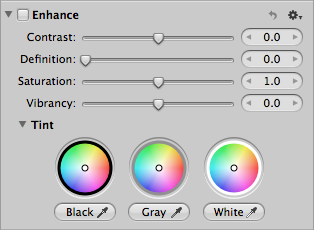
6.23 The Tint wheels enable you to alter the colorcast of the highlights, midtones, and shadows separately.
Think of these controls as joysticks. To use them, click the center white circle and drag it to the desired position. To reset the wheel, double-click the white circle; it snaps back to its default setting.
Alternatively, to have Aperture help set the wheels for you, use the eyedropper beneath the wheel and click the corresponding pixels in the image. Use the Black eyedropper to click on the darkest area in the image that you want to be a neutral black. Similarly, use the White eyedropper to correct the colorcast of anything that should be white by selecting it and then clicking on anything white in the image. Use the Gray eyedropper to balance the colorcast in areas that should be a shade of gray without a colorcast. As you use each eyedropper you’ll see the position of the center point on the Tint wheels move as well as see the color change in the image. Of course, you can still manually drag the position of the Tint wheels to suit your taste.
Although we don’t use the Tint wheels often, we do find them helpful for modifying the colorcast of shadows or highlights, especially when we want to warm the highlights slightly. The Tint wheels can also be helpful if your image was shot with a mix of lighting types such as fluorescent, tungsten, and daylight.
Using the Highlights & Shadows adjustments
The Highlights & Shadows controls were extensively reworked in Aperture 3.3 and enable you to reveal more detail in the highlights and/or shadows of your image while maintaining realistic appearance and appropriate levels of midtone contrast. We find the Highlights & Shadows adjustments very helpful with contrasty images where detail has been recorded in the highlights and shadows, but was initially too light or too dark to easily see, as shown in Figure 6.24.
6.24 Use the Highlights & Shadows controls to reveal more detail in the lightest and darkest areas of your image.
To use the Highlights & Shadows controls, you can adjust one or more of the sliders:
![]() To recover highlight detail, adjust the Highlights slider.
To recover highlight detail, adjust the Highlights slider.
![]() To recover shadow detail, adjust the Shadows slider.
To recover shadow detail, adjust the Shadows slider.
![]() Use the Mid Contrast slider to restore the midtone contrast within the image. Be careful not to reintroduce clipping into the highlights or shadows.
Use the Mid Contrast slider to restore the midtone contrast within the image. Be careful not to reintroduce clipping into the highlights or shadows.
You can use the Mid Contrast slider even if you don’t use the other two.
Other ways to restore midtone contrast in the image are to use the Levels quarter tone controls or make a Curves adjustment, both of which are covered in this chapter.
If you adjusted an image using the Highlights & Shadows controls available in earlier versions of Aperture, the legacy Highlights & Shadows tool appears in the Adjustments Inspector. You’ll also see an Upgrade button to click to update to the newer version. We suggest that if you like the results you’ve achieved on a particular image, don’t update the Highlights & Shadows tool on it, but if you think the image could be better, then go ahead and update it.
Using Levels
Levels enables you to have finer control of the exposure of your image and has some sophisticated features not found in the Levels controls in most other software programs.
To begin, set the Channel pop-up menu to RGB. That way you see a histogram of the Red, Green, and Blue channels superimposed on the Levels controls to help you adjust the settings, and when you set Levels you’ll be adjusting the Levels for all three channels simultaneously.
If you set the pop-up menu in Levels to Luminosity to adjust the overall luminosity of the image, you may accidentally introduce clipping in one or two channels without being aware of it and lose detail in the highlights or shadows. This is more of a risk with images containing highly saturated colors. Alternatively, you can set the pop-up menu to a single channel and use Levels to modify colorcasts.
To use Levels in its most basic form, do the following:
1. Hold down the ![]() key, and click and drag the triangle on the right end of the histogram. The image preview turns black. Continue dragging to the left until colored pixels begin to appear and then back off until the preview is pure black. The colored pixels show you where you’re starting to introduce clipping in one or more channels. If the pixels appear white, then you’re introducing clipping in all three channels.
key, and click and drag the triangle on the right end of the histogram. The image preview turns black. Continue dragging to the left until colored pixels begin to appear and then back off until the preview is pure black. The colored pixels show you where you’re starting to introduce clipping in one or more channels. If the pixels appear white, then you’re introducing clipping in all three channels.
2. Release the ![]() key and then visually tweak the position of the triangle. This sets the white point of the image or, in other words, determines which pixels appear as pure white in the image, and then the rest of the pixels are adjusted accordingly.
key and then visually tweak the position of the triangle. This sets the white point of the image or, in other words, determines which pixels appear as pure white in the image, and then the rest of the pixels are adjusted accordingly.
3. Repeat Steps 1 and 2 using the triangle on the left. This time the image preview turns white as you set the black point or which pixels will appear as pure black.
4. Adjust the middle triangle to adjust the overall brightness of the image. Setting these three controls can greatly improve your image, as shown in Figure 6.25.
Setting the black point in Levels affects a wider tonal range than by setting it using the Black Point slider in the Exposure brick.
The boxes beneath each triangle show the numeric setting of each Levels control, with the default position of the left triangle being 0 and the right being 1. Don’t get too caught up in the precise numeric readouts. Primarily, Levels is a visual adjustment.
6.25 Setting the white and black points and midtone brightness can make a huge difference in an image.
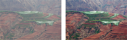
Aperture offers additional controls for Levels called quarter tone controls. The quarter tone controls allow you finer control over the exposure, enabling you to lighten or darken parts of the tonal distribution. To access them, click the button shown in Figure 6.26 and two additional bars appear on the Levels display. Once you get used to using them, they’re an easy way to quickly add some midtone contrast.
6.26 Use the levels quarter tone controls to modify midtone contrast in the image.
To use the quarter tone controls, do the following:
![]() Click the triangle beneath the three-quarter tone controls near the highlights and move it toward the center to lighten the corresponding pixels and toward the highlight end to darken them.
Click the triangle beneath the three-quarter tone controls near the highlights and move it toward the center to lighten the corresponding pixels and toward the highlight end to darken them.
![]() Click the triangle beneath the quarter tone control near the shadows and move it toward the center to darken the corresponding pixels and toward the shadow end to lighten them.
Click the triangle beneath the quarter tone control near the shadows and move it toward the center to darken the corresponding pixels and toward the shadow end to lighten them.
![]() To increase midtone contrast, move both quarter tone controls slightly toward the middle.
To increase midtone contrast, move both quarter tone controls slightly toward the middle.
![]() To have the quarter tone controls affect a wider or narrower range of tonalities, hold down the Option key, and click and drag the associated bar to the right or left. Then adjust the triangle associated with the bar as usual.
To have the quarter tone controls affect a wider or narrower range of tonalities, hold down the Option key, and click and drag the associated bar to the right or left. Then adjust the triangle associated with the bar as usual.
The Levels brick has two buttons to use to apply Levels automatically. The Auto button with the half-black, half-white circle uses the RGB mode to automatically set Levels in a way that allows clipping in individual channels but doesn’t introduce any luminosity clipping. The Auto button with the colored circle sets Levels for each channel individually. This can help correct some colorcasts. We rarely use the Auto buttons because we usually prefer not to introduce any clipping into our images.
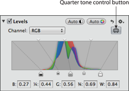
Taking advantage of the Color controls
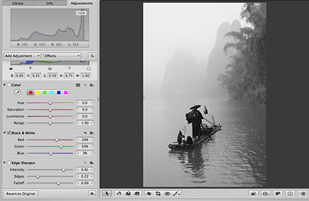
The Color brick allows you to fine-tune the colors in your image. Use it to modify the hue and/or saturation and luminance of specific colors within your image. That way if you want a different shade of red or blue and so on, you can make it happen.
When you first open the brick you see six color blocks and an eyedropper. You can adjust up to six colors in the Color brick. (To adjust more colors, add an additional Color adjustment by going to the Action pop-up menu in the brick and choosing Add New Color adjustment.) Although you can click on any of the color blocks and adjust those colors, in most images you’ll want to adjust specific colors that are in your image.
To use the Color controls to modify specific colors in your image, do the following:
1. Click a color swatch. If you’re going to adjust multiple colors, you can choose the first one and go in order, or you can try to choose the swatch closest to the problematic color. It won’t matter whether you completely change the color of the swatches — the colors are just placeholders. In Figure 6.27, we chose to adjust the color of the pinkish red mop first, so we used the red swatch and then used the cyan swatch to adjust the teal and make it greener. In most images, you’ll want to adjust the specific colors that are in your image rather than the more generic colors that appear by default in the color swatches.
2. Click the eyedropper and drag it over your image to the problematic color. As you do so, a loupe appears to help you see the area in detail.
3. Click the problematic color to choose it. The color swatch in the Color brick updates to reflect the color you chose.
4. Adjust the hue, saturation, and luminance of the color as desired, as shown in Figure 6.27. If necessary, also adjust the Range slider to limit how far the effect extends from the color you selected.
5. Repeat as needed to adjust other colors, choosing a different color block in Step 1 each time until the image looks the way you want.
To see all the color adjustments at once, click the Expanded View button. This is helpful when you’re adjusting several colors and may need to tweak the adjustments of one as you set another. However, most of the time it’s easier to use the more compact view.
6.27 Use the eyedropper to select the color you want to modify.
Sharpening the image
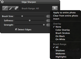
Aperture 3.3 has two sharpening adjustments that are available from the Add Adjustment pop-up menu: Sharpen and Edge Sharpen. Sharpen is available primarily for legacy reasons because it was the first sharpening adjustment that was available in Aperture 1. It exists in case you need to modify the settings you used on images that you adjusted using Aperture 1. However, you should use Edge Sharpen for all your newer images because it offers more control over the sharpening process. We use Edge Sharpen so often that we’ve opted to add it to the default set of adjustments that appears whenever you open the Adjustments Inspector. To add Edge Sharpen to the default set of adjustments, choose Add to Default Set from the Action pop-up menu in the Edge Sharpen brick.
To apply sharpening to an image, do the following:
1. Click the Edge Sharpen box in the Edge Sharpen adjustment brick to apply sharpening.
2. Zoom in to critical areas to be able to accurately judge the effects of the sharpening settings. It’s very difficult to accurately determine the amount of sharpening to apply if you don’t zoom in.
3. Adjust the Intensity slider to control the amount of sharpening to apply.
4. Adjust the Edges slider if necessary. This slider determines which parts of the image are considered edges. The higher the setting, the more areas that are considered edges, and thus the more sharpening that’s applied.
5. Tweak the Falloff slider as desired. Aperture applies the sharpening in three passes and by default it applies less sharpening on the second and third pass. Use this slider to increase or decrease the amount of sharpening applied on the second and third pass.
When you sharpen a digital image you are adding contrast to the edges to give the impression of increased sharpness. You are not actually refocusing the image. Digital sharpening can’t fix poor shooting techniques such as camera or subject movement while shooting or inadequate focus. It’s important to always use the best camera techniques possible to create the sharpest images possible in-camera.
Adjusting the Raw Fine Tuning
The Raw Fine Tuning brick is only available for RAW files. Although it used to appear in the default set of adjustments, because most people rarely use it, you now access it by clicking the Add Adjustment button and then choosing Raw Fine Tuning. (As with any of the adjustment bricks, if you want it to appear in your default set of adjustments, click the Actions icon in the top right of the brick, and choose Add to default set.
Raw Fine Tuning contains controls that let you further customize the algorithms used to decode the RAW file. Aperture uses algorithms that Apple has developed for each supported camera as well as DNG files, but your individual camera may differ from the one the engineers used and you may want to modify the settings used for specific types of shots, such as those with higher ISOs, or individual images. The available sliders are as follows:
![]() Boost. This slider controls the amount of overall contrast by making the lighter tonalities lighter at its default setting of 1.00 and reducing the brightness of the middle and lighter tones when the slider is moved left toward zero. In most images, the darkest tones are minimally affected at most.
Boost. This slider controls the amount of overall contrast by making the lighter tonalities lighter at its default setting of 1.00 and reducing the brightness of the middle and lighter tones when the slider is moved left toward zero. In most images, the darkest tones are minimally affected at most.
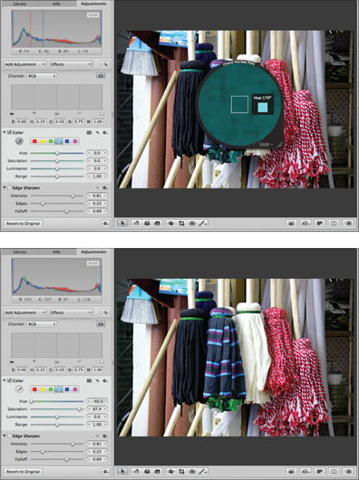
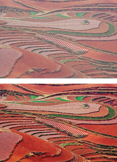
![]() Hue Boost. This slider controls some color shifts that may appear when the Boost slider is used. At settings of 0.00, the original hues are preserved, whereas at 1.00 some color shifting is applied. The Hue Boost may make it possible to see more color differentiation and seems to work best with nature photographs. We find that settings of 1.00 often reveal additional hues in bright sunsets or highly saturated subjects such as sunsets, as shown in Figure 6.28. You may need to experiment with various Boost settings as you modify the Hue Boost slider.
Hue Boost. This slider controls some color shifts that may appear when the Boost slider is used. At settings of 0.00, the original hues are preserved, whereas at 1.00 some color shifting is applied. The Hue Boost may make it possible to see more color differentiation and seems to work best with nature photographs. We find that settings of 1.00 often reveal additional hues in bright sunsets or highly saturated subjects such as sunsets, as shown in Figure 6.28. You may need to experiment with various Boost settings as you modify the Hue Boost slider.
![]() Sharpening. This slider controls the amount of sharpening applied to the image during the RAW decode. This is to counter the small amount of softening that occurs as digital images are captured and is a very subtle effect.
Sharpening. This slider controls the amount of sharpening applied to the image during the RAW decode. This is to counter the small amount of softening that occurs as digital images are captured and is a very subtle effect.
![]() Edges. This slider controls how much sharpening is applied during the RAW decoding at “hard” edges where there are clear-cut color changes. Move it to the right to increase the sharpening and to the left to decrease it.
Edges. This slider controls how much sharpening is applied during the RAW decoding at “hard” edges where there are clear-cut color changes. Move it to the right to increase the sharpening and to the left to decrease it.
View your image at 100 percent magnification before adjusting the Sharpening and Edges sliders. Experiment with a variety of combinations of settings, but remember that this sharpening is not intended as output sharpening; there are other specific adjustments for output sharpening.
![]() Moire. This slider controls the anti-aliasing correction applied to control some high- frequency issues. In plain language, that means that it can be used to correct some digital artifacts that occasionally appear in images with certain types of linear repeating details such as window screens. If it looks like a silk moiré pattern (and thus the name) appears somewhere it shouldn’t in your image, try adjusting the Moire slider. However, most of the time you won’t need to touch this slider at all.
Moire. This slider controls the anti-aliasing correction applied to control some high- frequency issues. In plain language, that means that it can be used to correct some digital artifacts that occasionally appear in images with certain types of linear repeating details such as window screens. If it looks like a silk moiré pattern (and thus the name) appears somewhere it shouldn’t in your image, try adjusting the Moire slider. However, most of the time you won’t need to touch this slider at all.
![]() Radius. This slider is used in conjunction with the Moire slider to determine what areas of the image are considered to be high frequency and thus control where the Moire correction is applied.
Radius. This slider is used in conjunction with the Moire slider to determine what areas of the image are considered to be high frequency and thus control where the Moire correction is applied.
6.28 Setting the Hue Boost slider to the far right often reveals additional colors, particularly in areas with highly saturated reds and yellows. The image on the top has a Hue Boost of 0, whereas the image on the bottom has a value of 1.0.
![]() De-noise. This slider controls the amount of smoothing applied to the image to reduce noise. At 0.00, no noise reduction is applied. Because the smoothing is likely to reduce any fine details in the image, we recommend against using this slider whenever possible. We prefer to apply noise reduction only where needed and use the De-noise adjustments or plug-ins for this. However, in certain images shot at high ISOs or with very long exposures, especially with older digital cameras, the De-noise slider may be helpful. As with sharpening, be sure to view the image at 100 percent magnification to accurately see the effect.
De-noise. This slider controls the amount of smoothing applied to the image to reduce noise. At 0.00, no noise reduction is applied. Because the smoothing is likely to reduce any fine details in the image, we recommend against using this slider whenever possible. We prefer to apply noise reduction only where needed and use the De-noise adjustments or plug-ins for this. However, in certain images shot at high ISOs or with very long exposures, especially with older digital cameras, the De-noise slider may be helpful. As with sharpening, be sure to view the image at 100 percent magnification to accurately see the effect.
With files from some cameras, an Auto Noise Compensation option may appear rather than the De-noise slider.
If you adjust the sliders and create a group of settings that you want to save to apply to other images shot with the same camera under similar conditions, do the following:
1. Click the Action pop-up menu in the top right of the brick and choose Save as Camera Default. A new dialog appears.
2. Assign a descriptive name for the new preset so that you easily recognize it in the future.
3. Click OK to save the effect and have it appear in the Camera pop-up menu at the top of the brick. When you want to use that series of settings for one or more images, select the images and choose the preset. The RAW decode for the images changes accordingly.
Taking advantage of Curves
The Curves adjustment was introduced in Aperture 3.0 and, in our opinion, is a great addition. Using Curves, you can modify the lightness or darkness of various areas of the image and increase or decrease the contrast in different segments of the tonal range, as well as recover highlight data. To begin, select Normal in the Range pop-up menu and RGB in the mode pop-up menu.
Initially, you see a histogram superimposed over the curve. To use curves, do the following, bearing in mind that with any particular image you may need to omit a step:
![]() Hold down the
Hold down the ![]() key and begin to drag the White Point control (the triangle on the right edge.) The preview goes black, and as you move the white point to the left, colored pixels appear indicating where data is being clipped in one or more channels. If the pixels appear white, then data is being lost in all three channels. Move the control back so that there is minimal, if any, clipping. With images that have specular highlights or that are quite contrasty, you may not be able to fully remove the clipping this way, but be certain you don’t accidentally introduce any clipping.
key and begin to drag the White Point control (the triangle on the right edge.) The preview goes black, and as you move the white point to the left, colored pixels appear indicating where data is being clipped in one or more channels. If the pixels appear white, then data is being lost in all three channels. Move the control back so that there is minimal, if any, clipping. With images that have specular highlights or that are quite contrasty, you may not be able to fully remove the clipping this way, but be certain you don’t accidentally introduce any clipping.
![]() Hold down the
Hold down the ![]() key and begin to drag the Black Point control (the triangle on the left edge.) The preview goes white, and as you move the black point to the right, colored pixels appear indicating where data is being clipped in one or more channels. If the pixels appear black, then data is being lost in all three channels. Move the control back so that there is minimal, if any, clipping. With images that have blocked-up shadows or that are quite contrasty, you may not be able to fully remove the clipping this way, but be certain you don’t accidentally introduce any clipping.
key and begin to drag the Black Point control (the triangle on the left edge.) The preview goes white, and as you move the black point to the right, colored pixels appear indicating where data is being clipped in one or more channels. If the pixels appear black, then data is being lost in all three channels. Move the control back so that there is minimal, if any, clipping. With images that have blocked-up shadows or that are quite contrasty, you may not be able to fully remove the clipping this way, but be certain you don’t accidentally introduce any clipping.
![]() Click on the curve and drag it slightly up or down to lighten or darken pixels in that area. With curves, points closer to the tonality that you adjusted are affected more than those farther away.
Click on the curve and drag it slightly up or down to lighten or darken pixels in that area. With curves, points closer to the tonality that you adjusted are affected more than those farther away.
![]() To add some midtone contrast, consider adding a point about one-fourth of the way up the curve and pulling this point slightly down. Add another point about three-fourths of the way along the curve and pull it up slightly. This increases the contrast in the middle half of the tonal range and decreases it slightly at the extreme ends. Of course, you can set these points anywhere along the curve to add contrast to as small or large a portion of the tonal range as you desire.
To add some midtone contrast, consider adding a point about one-fourth of the way up the curve and pulling this point slightly down. Add another point about three-fourths of the way along the curve and pull it up slightly. This increases the contrast in the middle half of the tonal range and decreases it slightly at the extreme ends. Of course, you can set these points anywhere along the curve to add contrast to as small or large a portion of the tonal range as you desire.
![]() To remove a point that you’ve added, select it and then press Delete. The point disappears.
To remove a point that you’ve added, select it and then press Delete. The point disappears.
![]() To protect a range of tones so that they are not affected by changes you make at other places along the curve, lock the curve in that area by placing three points fairly close together. That way when you adjust other points along the curve, that portion of the curve remains unaffected.
To protect a range of tones so that they are not affected by changes you make at other places along the curve, lock the curve in that area by placing three points fairly close together. That way when you adjust other points along the curve, that portion of the curve remains unaffected.
Figure 6.29 shows a Curves adjustment and Figure 6.30 compares an image before and after applying this Curves adjustment.
6.29 The Curves adjustment used in the “after” version in Figure 6.30.
6.30 Using Curves is an excellent way to bring out detail in your image and correct exposure issues.
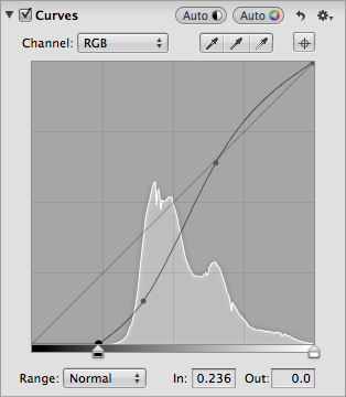
Aperture’s Curves adjustment is unique in that it enables you to work more specifically with the shadows and highlights in the image. To magnify the shadow portion of the curve so that you can make finer adjustments within it, choose Shadows from the Range pop-up menu. The curve display changes, as shown in Figure 6.31, to show just the lower quarter of the tonalities, meaning the shadow portion of the image. Make any adjustments that are needed and then change back to Normal range to make adjustments elsewhere on the curve.

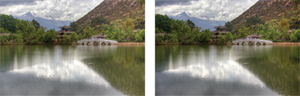
The Extended range option enables you to recover highlight information that was recorded in the file but that is not currently visible. Although most of the time you want to use the Recovery slider and/or the Highlights slider for this purpose because they’re easier, if you’re not getting the results that you hoped for, you can use Curves in the Extended range. One of the advantages of this is that you can apply highlight recovery per channel, which may yield better results with some images. In addition, you can opt to brush the effect in or out, thereby controlling where highlights are recovered and leaving specular highlights in other areas for more natural results. To use the Extended range to recover data, do the following:
1. Choose Extended from the Range pop-up menu in Curves. The curve changes so that it occupies only one-fourth of the dialog and shows how much information is not currently visible. Most of the time we set the Channel pop-up menu to RGB and primarily affect the luminosity of the image; however, you can also opt to work in one channel at a time by choosing the individual channel and alter the color of the image.
2. Move the White Point control over the right edge of the histogram data. Initially, this decreases the contrast in the image.
3. Move the point that’s already on the curve up to the original line of the curve. This restores contrast to the image.
4. Lock down the curve to the left of that point by carefully adding three points close together to make sure that the changes you make in the extended range don’t affect the rest of the image.
5. Grab the curve near the top corner and pull it down as far as necessary to recover the data, as shown in Figure 6.32. This will vary by image and the amount of detail that needs to be recovered.

6.32 Using Extended Curves can help recover highlight detail such as the clouds in this image.
Converting an image to black and white
Many images take on new life when converted into monochromatic images. Although you may like a particular image in color, you may be surprised to see how effective it is in black and white. Rather than simply desaturating an image, use Aperture’s Black & White adjustment or Black & White effects for more control over the final result. To convert an image into black and white using the Black & White adjustment, do the following:
1. Choose Black & White from the Add Adjustment pop-up menu. A new brick appears and the image immediately becomes monochromatic.
2. Adjust the Red, Green, and Blue sliders as desired. Moving a slider to the right lightens the pixels with those tones in the original, and moving it to the left darkens them, as shown in Figure 6.33. So if you want the areas that were blue in the original image to be lighter, move the Blue slider to the right. If you want them to be darker, move it toward the left.
6.33 Adjust the Red, Green, and Blue sliders to tweak the appearance of the black-and-white conversion.
Converting an image to a color monochrome or sepia
The Color Monochrome brick can be used with or without the Black & White adjustment. To use it, do the following:
1. Choose Color Monochrome from the Add Adjustment pop-up menu. A Color Monochrome brick appears. By default, the monochrome choice is set to a sepia tone.
2. Adjust the Intensity slider to control the strength of the sepia effect.
3. Click the arrow to the right of the sepia color swatch if you want to choose a different color for the color monochromatic effect. A new color palate appears. As you hover the cursor over the colors in the color palate, the image preview updates to reflect the color monochrome using that particular color.
To specifically add a sepia effect, choose the Sepia adjustment from the Add Adjustment pop-up menu. A small brick appears containing an Intensity slider that you use to control the intensity of the sepia effect. We prefer the Color Monochrome option because it offers more control over the final effect, but the Sepia adjustment is faster if you like the tone of it.
Adding or removing a vignette
The Vignette and Devignette tools are separate controls available from the Add Adjustment pop-up menu. Although they seem to be opposite ends of the same spectrum, they’re separate adjustments because Aperture applies them at different stages of the adjustment process and they work slightly differently. You can use them whenever you want, but you can see from their location in the series of adjustment bricks that Aperture applies devignetting early on, whereas vignetting is added near the end when the final image is output.
Vignettes can be helpful to help guide your viewers’ eyes toward your subject and away from any distractions near the edges of your image, as shown in Figure 6.34. Ansel Adams was a master of vignetting in the traditional darkroom.
6.34 Adding a vignette can improve an image by helping guide your viewers’ eyes to the main subject.
To apply a vignette in Aperture, follow these steps:
1. Choose the Vignette option from the Add Adjustment pop-up menu. A new brick appears.
2. Choose either Gamma or Exposure from the Type pop-up menu. Gamma yields a stronger overall result whereas Exposure is more subtle.
3. Set the desired intensity of the vignette. We often begin by setting the Intensity to the maximum so we can easily see the effect and then back it off to a pleasing level. That helps us set the Radius slider as well. Note that pulling the slider to the right adds a dark vignette, whereas pulling it to the left creates a light vignette similar to the Devignette tool.
4. Set the Radius slider to determine how far the effect should extend into the image.
Devignetting is helpful to reduce any darkening around the corners or edges of an image that can occur with some lenses that were originally designed for film cameras rather than digital, or with some wide-angle lenses with lens shades or filters. Usually this type of accidental vignetting is not flattering to the image. To reduce vignetting, follow these steps:
1. Choose Devignette from the Add Adjustment pop-up menu. A new brick appears.
2. Set the Intensity slider to determine how much lighter to make the corners.
3. Set the Radius slider to determine how far into the image the effect should extend. Sometimes you’ll need to readjust the Intensity slider as you adjust the Radius slider to achieve a good balance.
The results from a negative Vignette Intensity setting may differ from those obtained by using the Devignette tool if you have cropped or straightened the image. This occurs because the Devignette tool is applied before cropping while the Vignette tool is applied after cropping. The Vignette tool is creating an artistic effect on your final image whereas the Devignette tool was designed to remove lens artifacts.
Removing chromatic aberration
Chromatic aberration appears when the Red, Green, and Blue channels do not focus on precisely the same spot. The result is a colored halo edge along high-contrast edges in the image, as shown in Figure 6.35, particularly near the edges of the image, although it can appear anywhere in the image.
6.35 Zoom in to 100 percent magnification or greater to check for chromatic aberration on high-contrast edges.
To remove chromatic aberration, do the following:
1. Choose Chromatic Aberration from the Add Adjustment pop-up menu. A new brick appears.
2. Increase the image magnification to see the chromatic aberration clearly.
3. Adjust the Red/Cyan and/or Blue/Yellow sliders to remove the colored edge, as shown in Figure 6.36.
Removing noise
Aperture offers a Noise Reduction adjustment that primarily reduces chromatic noise (magenta, green, and blue blobs that appear in areas that should be smooth colors). The adjustment contains two controls: a Radius slider to control how much noise reduction is applied and an Edge Detail slider that controls how much edge detail to retain. The higher the Edge Detail setting the less noise reduction that’s applied.

6.36 Adjust the sliders to remove the colored halos.
We find this adjustment can be helpful with some images, particularly when brushed in, but with images that have major noise issues, we tend to prefer third-party noise-reduction plug-ins that offer more controls.
Using iPhoto Effects
One of the features introduced in Aperture 3.3 is that you can take advantage of some Adjustment Effects such as an Antique effect or an Edge Blur that previously were only available within iPhoto and apply these effects directly within Aperture. If you previously worked in iPhoto and had applied these adjustments to any of your images, and now you’re an Aperture user, you can fine-tune the settings in Aperture.
To apply the iPhoto Effects, do the following:
1. Choose Add Adjustment →iPhoto Effects.
2. From the Effect pop-up menu, choose an effect: None, Black & White, Sepia, or Antique.
3. If you choose Antique, an Amount slider appears to control the intensity of the effect.
4. Set the Matte, Vignette, and Edge Blur sliders as desired to create edge treatments.
5. Set Fade or Boost to change the intensity of the colors in the image.
Although there are fewer options available to control these effects, sometimes they enable you to quickly finish an image and add impact, as shown in Figure 6.37.

6.37 Using the Edge Blur and Boost sliders increased the impact of this image.
Brushing adjustments in or out
Most (but not all) adjustments have the option to be brushed in or out from the Action pop-up menu, while some also contain a brush icon to directly access the brush in or out of the dialog. The ability to brush the effect in or out without needing to make a separate selection is a huge advantage. To brush an adjustment in (or out), do the following:
1. Apply an adjustment. Initially it affects the entire image.
2. Choose Brush adjustment In or Away from the Action pop-up menu at the top right of most adjustment bricks. A new, small dialog appears, as shown in Figure 6.38. If you opt to brush the adjustment in, the brush is selected and the effect disappears from the entire image preview, whereas if you opt to brush it out, the eraser is selected and the effect remains.
6.38 This dialog contains a lot of powerful controls to help you make localized adjustments.
3. Set the brush parameters in the dialog.
• Choose the size of the brush. Normally, we work using a magnified view so that we can work accurately
• Choose the softness of the brush. The softer the brush, the more the changes blend into the background; the harder the brush, the more discrete and obvious the edges are. Usually, we work with a soft to mostly soft brush.
• Specify the strength of the adjustment. The setting you use here controls the initial strength of the change, but you can modify it after the fact in most cases by adjusting the settings in the adjustment brick. In addition, you can vary the strength setting for each brushstroke to apply the effect in differing intensities.
• Select the Detect Edges check box to have Aperture automatically limit your brushstrokes to certain areas. That way you can quickly modify one or more discrete areas of the image without having to use an external editor and make a selection. When you select Detect Edges, the size of the brush is smaller than it would be otherwise.
4. Choose from several other controls located in the Action pop-up menu in the upper right of the small dialog to control how the effect is applied.
• Choose whether to apply the effect to the entire image, clear the effect completely, or invert which areas show the effect.
• The next group of options controls whether to apply an overlay to make it easier to see where you’ve applied the effect.
• The last group of options limits the brush to applying the effect to just the highlights, middle tones, or shadows.
When you take advantage of the option to brush an effect in or out, be sure to zoom in and work carefully so you don’t accidentally leave sloppy edges around the effect. Remember that you can apply an effect in one area and then open another adjustment of the same type, with slightly different settings, and apply that adjustment to a different part of the image by choosing Add New adjustment from the Action pop-up menu in the adjustment brick. The ability to brush adjustments in and out to create localized adjustments gives you a huge amount of control over your images without ever having to leave Aperture and without having to make difficult and time- consuming selections.
Press ![]() +Z to undo previous adjustments. Repeating the keystroke combination continues to step the adjustments back in time if you discover you’re heading in the wrong direction. You can also use the curved arrow near the top right of each of the bricks to reset the brick to its default settings.
+Z to undo previous adjustments. Repeating the keystroke combination continues to step the adjustments back in time if you discover you’re heading in the wrong direction. You can also use the curved arrow near the top right of each of the bricks to reset the brick to its default settings.
Using Quick Brushes
Quick Brushes are very similar to the brushes you use when you brush an adjustment in or out. The main difference is that Aperture has additional adjustments that are only available as Quick Brush adjustments. These adjustments are designed to be brushed in or out but not necessarily applied to the entire image. In this section, we describe using the Quick Brushes, including the Retouch tool and the other Quick Brushes.
Using the Retouch Brushes
Without a doubt, the Quick Brush that we use the most frequently is Retouch in order to remove dust spots due to dirt on the sensor. We also use the Retouch Quick Brush to remove other distractions. To use Retouch, follow these steps:
1. Zoom in to 100 percent magnification when removing dust spots. Otherwise it’s quite possible that you’ll miss some of the smaller spots and then be embarrassed when they suddenly are more visible when you output the image at a larger size. Begin in one corner and then move in a uniform way across the image and then down, making sure not to miss any areas.
2. When you encounter a dust spot or streak, press X to access the Retouch tool or click the Brushes icon beneath the Viewer to the left, as shown in Figure 6.39 and choose Retouch. A small dialog appears.

6.39 Access the Retouch tool from the Brushes icon and the Retouch dialog appears.
3. Select Repair or Clone. In Clone mode, Aperture makes an exact copy of the good pixels and places it over the area you want to hide. At times this is exactly what you need, but you have to be careful not to create obvious repetitions of areas because that will broadcast that you cloned something out. In the Repair mode, Aperture copies the texture from good pixels but blends the color with the color in the problematic area. Often this leads to more subtle results, but which mode is better depends on the area of the image that you’re fixing, how detailed the area is, and whether the detail in the surrounding areas is similar or totally different. There are no hard and fast rules to follow as to which mode to use, and the best advice we can offer is that if the surrounding area is fairly similar in detail, begin by trying Repair mode. If you’re removing a dust spot from a highly detailed area of an image where the nearby detail is of something else, then you may be better off with Clone mode and work at a very high magnification and with a tiny brush.
4. Choose the Radius of the brush. Normally, you want a brush that’s fairly small because you can click and drag the brush to cover an area. You don’t need to use a huge brush and cover large spots in a single click.
5. Set the Softness of the brush. The softer the brush, the more gradually the effect is feathered in, whereas the less soft, or harder the brush, the more discrete the edges of the clone or repair. In highly detailed areas, you may need a harder brush while retouching areas of low detail, such as sky or water or other backgrounds, may require a very soft brush.
6. Set the Opacity of the brush. To cover an area completely, set the opacity to 100 percent, but if you need to blend a retouched area to help it look more natural and to hide any obvious cloning and repetition of patterns, you can retouch using a series of repairs and/or clones at partial opacities.
7. When you use Repair mode, choose whether you want to have Aperture automatically choose the source. We often begin by selecting this check box, but if the results are unexpected and we discover that Aperture is using a source that doesn’t work the way we have in mind, we leave that check box unselected. In that case, as well as when using the Clone mode, hold down the Option key and click on the source pixels to load the brush with pixels.
8. In Repair mode, select the Detect edges option to have Aperture automatically detect edges. We find this option extremely helpful.
When you’ve set all the parameters for the Retouch tool, click and drag to cover the area. The direction that you drag the brush when using the Repair mode can make a difference in how well it works. If you aren’t pleased with the initial results, try increasing or decreasing the radius slightly and/or dragging in a different direction. Often that fixes the problem.
After you use the Retouch tool, a new brick appears in the Adjustments Inspector. You can delete your retouches sequentially by clicking the Delete button in the brick, but you can’t skip over several retouches and delete just one that was several steps back.
Using the remaining Quick Brushes
All the other Quick Brushes share a common control dialog and can be accessed either by choosing Quick Brushes from the Add Adjustment pop-up menu in the Adjustments Inspector and then choosing the specific Quick Brush, as shown in Figure 6.40, or by clicking the Brushes icon under the Viewer.
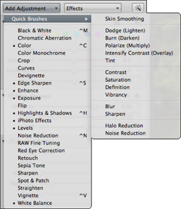
6.40 Access most of the Quick Brushes from the Add Adjustment pop-up menu in the Adjustments Inspector.
Once you choose a specific Quick Brush other than Retouch, the dialog for that brush appears, such as the one for the Dodge Quick Brush shown in Figure 6.41. Although compact, this dialog includes a lot of important options and controls.
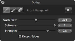
6.41 A lot of controls that make it even easier to brush on localized adjustments are packed into this small dialog.
At the top are three choices: a brush to brush in the effect, a feather to use to help smooth the edges of the areas you brush, and an eraser to remove the effect. The feather and eraser are actually special types of brushes. All three brushes are controlled by the options in the rest of the dialog as follows:
![]() Brush Size slider. To increase or decrease the brush size, adjust the slider accordingly or drag two fingers up or down on a Multi-Touch trackpad.
Brush Size slider. To increase or decrease the brush size, adjust the slider accordingly or drag two fingers up or down on a Multi-Touch trackpad.
![]() Softness slider. This determines how discrete or feathered the edges of the brush are. The softer the brush, the more the effect blends in gradually with areas that you haven’t modified, whereas the less soft or harder the edges, the more abrupt the transition is. While often a soft brush is most helpful, there are times when you need the change to begin and end more abruptly, and in those cases you need to set this slider for a harder brush.
Softness slider. This determines how discrete or feathered the edges of the brush are. The softer the brush, the more the effect blends in gradually with areas that you haven’t modified, whereas the less soft or harder the edges, the more abrupt the transition is. While often a soft brush is most helpful, there are times when you need the change to begin and end more abruptly, and in those cases you need to set this slider for a harder brush.
![]() Strength slider. This determines how strongly the affect is applied. Because you can reduce the strength of most of the Quick Brushes in the associated brick in the Adjustments Inspector after the fact, you could opt to apply the effect at full strength. However, if you start to brush in the effect and it’s clearly too strong, it makes sense to reduce the strength of the brush initially. Keep in mind that you can set the strength at one setting for one stroke and at a different setting for the next stroke. That way you can work precisely and get exactly the results that best suit your image.
Strength slider. This determines how strongly the affect is applied. Because you can reduce the strength of most of the Quick Brushes in the associated brick in the Adjustments Inspector after the fact, you could opt to apply the effect at full strength. However, if you start to brush in the effect and it’s clearly too strong, it makes sense to reduce the strength of the brush initially. Keep in mind that you can set the strength at one setting for one stroke and at a different setting for the next stroke. That way you can work precisely and get exactly the results that best suit your image.
![]() Detect Edges. Selecting this check box causes Aperture to automatically constrain your brushstrokes to areas similar to where you initially begin the brushstroke. That way the effect doesn’t accidentally seep into adjacent areas of the image. We use this option a lot and find it helps us to work more efficiently.
Detect Edges. Selecting this check box causes Aperture to automatically constrain your brushstrokes to areas similar to where you initially begin the brushstroke. That way the effect doesn’t accidentally seep into adjacent areas of the image. We use this option a lot and find it helps us to work more efficiently.
Use the Action pop-up menu in the upper right of the dialog to access additional controls, including the options to see the brushstrokes. This is helpful when you make subtle adjustments that are difficult to see on the image. Taking the time to use the overlays, as shown in Figure 6.42, means you won’t accidentally forget to include an area. Which overlay you use depends in part on personal preference and on the effect you’re using.
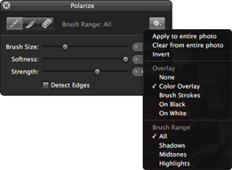
6.42 Take advantage of the overlays to see precisely where you’ve applied a Quick Brush.
Having the ability to limit the effect to the highlights, midtones, or shadows gives you a great deal of control. Although often you may opt to use the Quick Brushes set to All, keeping in mind the option to limit the effect to a specific tonal range enables you to use greater control over the various effects when needed.
There is also the option to apply the effect to the entire image, whether you want it to apply to the whole image or use that as your starting place and then use the Eraser to remove it from a few areas. In cases where you want the effect to apply to the bulk of the image, it’s a lot easier to begin that way rather than having to brush it in nearly everywhere.
There are a variety of Quick Brush effects. Use them as follows:
![]() Skin Smoothing. This Quick Brush reduces skin imperfections such as wrinkles and large pores. The blur effect is somewhat subtle even when applied at full strength. Using Skin Smoothing on portraits can make you popular with your subjects as you make their skin look even better.
Skin Smoothing. This Quick Brush reduces skin imperfections such as wrinkles and large pores. The blur effect is somewhat subtle even when applied at full strength. Using Skin Smoothing on portraits can make you popular with your subjects as you make their skin look even better.
When using Skin Smoothing, remember to leave areas such as eyes, nostrils, mouth, teeth, hair, and earrings untouched. That way the image appears sharp, yet the skin appears smooth(er).
![]() Dodge and Burn Quick Brushes. Use Dodge to lighten areas and Burn to darken areas, as shown in Figure 6.43. We find it best to work at a reduced strength and increased magnification and then repeat the strokes using a higher strength setting as needed.
Dodge and Burn Quick Brushes. Use Dodge to lighten areas and Burn to darken areas, as shown in Figure 6.43. We find it best to work at a reduced strength and increased magnification and then repeat the strokes using a higher strength setting as needed.
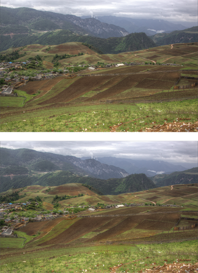
6.43 Using the Dodge and Burn Quick Brushes, you can brush in highlights and shadows to increase the sense of depth in your images.
![]() Polarize. Use this Quick Brush to deepen colors and shadows, as shown in Figure 6.44. This uses a Multiply blend effect that is supposed to simulate using a polarizing filter; however, it does not remove glare from reflective areas. We find the results can be helpful but are not identical to what you’d expect if you were using a polarizing filter on the camera.
Polarize. Use this Quick Brush to deepen colors and shadows, as shown in Figure 6.44. This uses a Multiply blend effect that is supposed to simulate using a polarizing filter; however, it does not remove glare from reflective areas. We find the results can be helpful but are not identical to what you’d expect if you were using a polarizing filter on the camera.
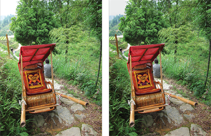
6.44 The Polarize Quick Bruch applied at full strength to part of the image (right) and without (left).
To simulate a polarizing filter, we like to use the polarizing filter in Nik Software’s Color Efex Pro 4. We find that it gives a more realistic effect.
![]() Intensify Contrast. You can use this Quick Brush to increase the contrast by deepening the shadows while leaving the highlights mostly untouched. This adjustment uses the Overlay blending mode to create the effect and differs from the Contrast Quick Brush in that the Contrast brush causes the highlight tones to become noticeably lighter in addition to creating deeper shadows. The difference between the two brushes is shown in Figures 6.45 and 6.46, where both types of contrast have been applied to the entire image. If you don’t want to risk blowing out any highlight values, choose the Intensify Contrast Quick Brush, whereas if you want darker areas to become darker and lighter areas to become lighter, choose the Contrast Quick Brush.
Intensify Contrast. You can use this Quick Brush to increase the contrast by deepening the shadows while leaving the highlights mostly untouched. This adjustment uses the Overlay blending mode to create the effect and differs from the Contrast Quick Brush in that the Contrast brush causes the highlight tones to become noticeably lighter in addition to creating deeper shadows. The difference between the two brushes is shown in Figures 6.45 and 6.46, where both types of contrast have been applied to the entire image. If you don’t want to risk blowing out any highlight values, choose the Intensify Contrast Quick Brush, whereas if you want darker areas to become darker and lighter areas to become lighter, choose the Contrast Quick Brush.

6.45 The Intensify Contrast adjustment has been applied to the entire image.
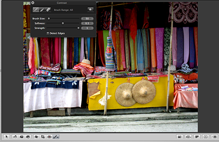
6.46 The Contrast adjustment has been applied to the entire image.
![]() Saturation or Vibrancy. Use these Quick Brushes to intensity saturation or vibrancy in certain parts of your image. Using the Saturation or Vibrancy brushes on your subject can help subtly guide the viewer’s eye to your subject matter, as shown in Figure 6.47. By using the Quick Brush, you can brush in these effects separately from the other Enhance brick adjustments.
Saturation or Vibrancy. Use these Quick Brushes to intensity saturation or vibrancy in certain parts of your image. Using the Saturation or Vibrancy brushes on your subject can help subtly guide the viewer’s eye to your subject matter, as shown in Figure 6.47. By using the Quick Brush, you can brush in these effects separately from the other Enhance brick adjustments.
![]() Definition. Use this Quick Brush to brush in the Definition Adjustment Effects. The Definition adjustment is the same as what’s available in the Adjustments Inspector, but by using the Quick Brush you can brush the Definition in separately from the other Enhance brick adjustments. That way you can add midtone contrast, some saturation, and sharpness just where you want it in the image to help encourage the viewer’s eyes to go there.
Definition. Use this Quick Brush to brush in the Definition Adjustment Effects. The Definition adjustment is the same as what’s available in the Adjustments Inspector, but by using the Quick Brush you can brush the Definition in separately from the other Enhance brick adjustments. That way you can add midtone contrast, some saturation, and sharpness just where you want it in the image to help encourage the viewer’s eyes to go there.
6.47 Use the Saturation, Definition, and Vibrancy brushes to help draw attention to your subject, as in the “after” version of this image on the right.
![]() Blur. Use this Quick Brush to blur any areas as desired. You might try blurring the background to help draw attention to the foreground in your image.
Blur. Use this Quick Brush to blur any areas as desired. You might try blurring the background to help draw attention to the foreground in your image.
![]() Sharpen. Use this Quick Brush to apply a basic sharpening effect to localized areas of the image. We suggest you use this option sparingly because you have less control over the sharpening parameters this way than if you use the Edge Sharpen adjustment.
Sharpen. Use this Quick Brush to apply a basic sharpening effect to localized areas of the image. We suggest you use this option sparingly because you have less control over the sharpening parameters this way than if you use the Edge Sharpen adjustment.
![]() Halo Reduction. This Quick Brush removes any halos such as purple fringing that may occur with certain lenses. Halo Reduction is slightly different from the Chromatic Aberration adjustment and is not necessary with most lenses. However, if you check your image at an increased magnification of 100 percent or more and discover purple fringing, this Quick Brush can be invaluable.
Halo Reduction. This Quick Brush removes any halos such as purple fringing that may occur with certain lenses. Halo Reduction is slightly different from the Chromatic Aberration adjustment and is not necessary with most lenses. However, if you check your image at an increased magnification of 100 percent or more and discover purple fringing, this Quick Brush can be invaluable.
![]() Noise Reduction. Use this Quick Brush to remove noise from specific areas of the image.
Noise Reduction. Use this Quick Brush to remove noise from specific areas of the image.
Creating and Using Effects
The Adjustment Effects in Aperture 3.3 and later are major time-savers, as we’ve already mentioned with the White Balance Effects. There are a series of effects that Apple includes by default, and additionally you can create your own effects that contain a combination of various adjustments. In addition, you can add effects that you download from other sites. All effects can be applied to your images as they’re being imported, or you can apply them to one or more images as you edit the images in Aperture. Using effects is a quick and efficient way to optimize images or at least get the adjustments close to where they need to be. After you apply an effect, you can always tweak the individual adjustment settings for any particular image.
To use the effects, open the Adjustments Inspector and choose the Effects pop-up menu. As shown in Figure 6.48, you see a menu of the types of effects that are available. As you hover over the individual effects within each category, you see a preview of the image with the effect applied. Those previews are huge time-savers because you instantly see whether an effect is helpful.
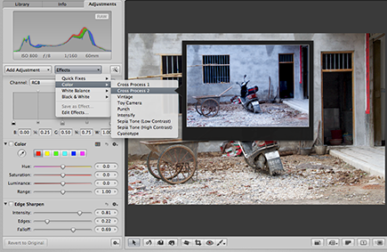
6.48 Hover the cursor over any of the presets and a preview appears showing how the image will look if you apply that preset.
The effects are divided into groups. The first group is called Quick Fixes and primarily adjusts the exposure of the image. We’ve been pleasantly surprised that in many cases Auto Enhance does a good job of getting an image quite close to the way we want to see it. Unfortunately, it sometimes introduces clipping into one or more channels, so we often modify the white and black point Curves settings it creates after applying it. Nonetheless, as discussed earlier, Auto Enhance can provide a great starting place, particularly with low-contrast images, and helps when you initially view your images.
You can apply additional effects by selecting them. The image preview will update, indicating when they’ve been applied. For example, we might use Quick Fix →Auto Enhance and then opt to brighten the Shadows to see more shadow detail, and then perhaps use one of the White Balance Effects to correct the colorcast of the image. With any of the presets, you can tweak the settings in the appropriate adjustment brick.
To remove an earlier effect and apply a new one to an image, hold down the Option key while choosing the new effect. That way the new effect will be applied to the image instead of the earlier one, rather than in addition to it.
The Color Effects offer a variety of trendy effects you can apply. Seeing the previews is a huge help because it makes it very obvious when something is not a good choice.
As we discussed earlier, the White Balance Effects offer access to the traditional white balance settings such as Sunny, Cloudy, Shade, and so on, that are commonly used in cameras but that have been missing in earlier versions of Aperture.
The Black & White Effects offer not only an additional method of converting the image to black and white, but a variety of presets that simulate the presence of various types of filters and infrared. If you want to convert your image to a monochrome, we highly recommend you check out the Black & White Effects at least as starting places.
If you have downloaded effects they also appear in the list of effects. The image preview updates to show the effect of each downloaded effect as well.
As helpful as all the default effects are, many people find the ability to create and apply custom effects even more useful. To create a custom effect, do the following:
1. Open an image and make one or more adjustments to the image.
2. From the Effects pop-up menu, choose Save as Effect. A new dialog appears, as shown in Figure 6.49.
3. In the new dialog, assign the effect a name that is easily recognizable. In our example we created an effect to be able to use the legacy Highlights & Shadows adjustment.
4. In the right section of the dialog, remove any adjustments that you don’t want to include in the effect. For example, if you’ve modified the white balance in your image and applied a small S curve but only want to save the S curve as an effect, you’d select the White Balance adjustment in the right column and click the minus icon (–) to remove it. Only the Curve adjustment remains.
5. Click OK to save the new effect. The new effect appears in the Effect pop-up menu and can be applied to images upon import or within Aperture.
6.49 Create custom effects using this dialog.
If you want to access the legacy Highlights & Shadows tool, open an image that contains that adjustment. Duplicate the image, reset the Highlights & Shadows sliders to their default positions. Then click the Effects button and choose Save as Effect. Name it accordingly. That way you can access the legacy tool via Effects.
To apply a series of adjustments to multiple images, you can use the Lift and Stamp tool that we cover in Chapter 4.
Using an External Editor
As full featured as Aperture is, there are still times when you want to open your images in an external editor such as Photoshop. We primarily do this when we want to create composite images. To use an external editor you first need to specify the editor in Preferences as we cover earlier.
After you establish the external editor, it’s very easy to use it. To edit an image in an external editor such as Photoshop, after you’ve completed setting the Preferences, do the following:
1. Select the image or images you want to open in the external editor.
2. Choose Photos →Edit With Photoshop CS6 (or whatever application you specified in Preferences) or press Shift+![]() +O. Aperture creates a new version of the file as either a TIFF or PSD, depending on what you specified in Preferences, that contains all the pixel and adjustment information. The new file then opens in the external editor software. Make the desired changes.
+O. Aperture creates a new version of the file as either a TIFF or PSD, depending on what you specified in Preferences, that contains all the pixel and adjustment information. The new file then opens in the external editor software. Make the desired changes.
3. When you complete the adjustments in the external editor, choose File →Save or press ![]() +S. Saving the image updates the file in Aperture. When you close the external editor, you can work on the image in Aperture again.
+S. Saving the image updates the file in Aperture. When you close the external editor, you can work on the image in Aperture again.
You must do a Save in the external editor, not a Save As. If you do a Save As, the file is stored outside the Aperture library and the image does not update in Aperture.
Using Third-Party Editing Plug-Ins
Numerous third-party editing programs can enhance the optimizing options that are available within Aperture itself. There are plug-ins for sophisticated noise reduction, advanced sharpening, converting to black and white, creating HDR (High Dynamic Range) images from several exposures or HDR Toning from a single image, adding creative effects, adding creative borders, and so on. Apple has a list of the various plug-ins at the App Store. We often use the plug-ins from Nik Software, particularly Silver Efex Pro for converting to black and white, Color Efex Pro for creative effects; Dfine for Noise Reduction, HDR Efex Pro or HDR Soft’s Photomatix for HDR imagery; and some of the Topaz plug-ins. Many of these programs offer free trials so you can see the effects for yourself and decide which ones are the most helpful for you.
We’re able to offer our readers discounts on all Nik Software programs. Use the promo code EANON, and on Photomatix, use the promo code EllenAnon.
Starting with Aperture 3.3, Aperture no longer provides support for 32-bit plug-ins.
Once you download the plug-ins and install them, they automatically go into the right place.
To use a third party plug-in that you’ve installed, do the following:
1. Select the image and then choose Photos →Edit With Plug-in. A list of the plug-ins you’ve installed appears.
2. Choose the plug-in you want to use. Aperture creates a new version of the file complete with all the pixel information as well as any adjustments you’ve added in Aperture. That version of the file opens in a new dialog for the plug-in, as shown in Figure 6.50 where we used Color Efex Pro 4.
3. Use the plug-in to make the desired changes and then click OK. The file is saved into the Aperture library and visible with your other images. You can continue to modify it in Aperture if necessary.
6.50 Plug-ins open their own interface. When you’re happy with the settings, click OK or Save (depending on the plug-in).
Even if you make no additional changes to the file in Aperture, you can’t reopen the file in an external plug-in and edit the settings you used. Once you click OK or Save, those changes are saved into the file.
..................Content has been hidden....................
You can't read the all page of ebook, please click here login for view all page.