
Pinholes
The best size pinhole for forming images has to be a compromise. It must be small enough to form quite tiny circles of confusion, so that as much subject detail as possible can be resolved. But the smaller the hole the more diffraction (page 326) increases, so that eventually detail no longer improves and rapidly becomes worse.

So for a pinhole placed 50 mm from the film, best diameter is the square root of 50 divided by 25 = 0.3 mm. To make the pinhole, flatten a piece of thin metallic kitchen foil on a pad of paper. Pierce the foil gently with the tip of a dressmaker’s pin. Check with a magnifying glass that the hole is a true circle and free of ragged edges. By placing the millimetre scale of a ruler next to the hole and examining both through the magnifier it is just possible to measure diameters down to about 0.2 mm.
In the example above the relative aperture is f/150. However, a modern SLR camera set to aperture priority (Av) mode should be sufficiently sensitive to measure exposure from the image itself. You may need to adjust your film’s ISO setting to compensate for long exposure reciprocity failure; see page 314.
Image size, object and image distances from lens
Codings:
F = focal length
M = magnification
I = image height
O = object height (neg height when enlarging)
V = lens to image distance*
U = lens to object distance* (to neg or slide when enlarging or projecting)
*See warning note on page 306.
Magnification formulae:
M = I divided by O
M = V divided by U
M = V divided by F, minus one
I = O multiplied by M
O = I divided by M
Object/image distance formulae:
V = M plus one, multiplied by F
U = one divided by M, plus one, multiplied by F
V = F multiplied by U, divided by U minus F
Close-up exposure increase when not using TTL metering
This is important when you are using a camera which does not measure light through the camera lens. Extra exposure (by means of aperture or time) has to be given when you are working close up. The increase becomes significant when the subject is closer than about 4.5 times the focal length of your lens, or to put it another way, when the image size is greater than one-sixth of the size of the subject. Under these conditions and assuming that you would be measuring exposure with a separate hand meter, the exposure that the meter reads out has to be multiplied by either:
M plus one, squared |
|
(ii) |
V squared, divided by F squared; or |
(iii) |
U divided by U minus F, squared |
For example, you might be using a rollfilm camera with an 80 mm lens to photograph a small 10 cm high product 5 cm high on film. The hand-held meter reads ½ sec at f/16. Following formula (i) above, magnification is 0.5, so exposure needs multiplying by 2¼ times. In practice, this means changing to 1 sec at f/16.
*Warning note on telephoto and invertedtelephoto lens designs. The above formulae are sufficiently accurate for most large-format camera lenses, enlarging lenses, and normal focal length lenses for rollfilm and 35 mm cameras. However, expect some discrepancy if using any formula containing V or U for lenses of either telephoto or inverted-telephoto construction. This is because it is difficult to know from where to make simple measurements with a ruler alongside such a lens. In these circumstances you can still calculate close-up exposure increase accurately using the formula based on M rather than V or U.

Figure B.1 The range of ways in which large-, mediumand some small-format cameras allow you to shift or tilt the lens or back to provide ‘camera movements’. A: baseboard view camera. B: 35 mm shift lens, racked upwards to give rising front. (Lens mount rotates, allowing you to also turn this into a crossfront movement.) C: bellows unit replacing Hasselblad body. Accepts regular lens and rollfilm magazine but uses a direct focusing screen. D: A ‘shift camera’ with rollfilm back set to give rising front. The linked direct viewfinder pivots to adjust framing
The term ‘camera movements’ refers to the group of features offered on some cameras by which the lens and/or film plane shifts sideways or pivots. The advantage of a camera with movements is that it can get you out of all kinds of difficulties, particularly in architectural or still-life studio photography. Using movements you can create depth of field, adjust the apparent shape of subjects, even photograph square-on views of reflective surfaces without your reflection showing.
The most comprehensive range of movements is to be found on large-format cameras, but some are offered by medium-format professional cameras too. Special lenses allowing movements are made for 35 mm SLRs. See Figure B.1 and Figure 4.14 on page 63.
Normally in any camera the surface of the lens is parallel to the film, the lens centre is aligned with the dead centre of the picture format, and a line between the two (the lens axis) is parallel to the camera base. In a camera offering movements this arrangement is said to be ‘neutral’. From here there are shift movements (known as rising, drop and cross front or back) and pivoting movements (swing front or back), see Figure B.2.
Shift movements
Rising front means upward shift of the lens, remaining parallel to the film surface.
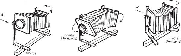
Figure B.2 A monorail camera offers the greatest variety and range of shift and pivot movements, which can be used simultaneously
Drop front means shifting the lens downwards, again parallel to the film, placing the lens axis below the centre of the picture format.
Cross front involves shifting left or right, parallel to the film, placing the lens axis to one side of the picture centre.
These three shift movements are achieved on a view camera by undoing locks on the front (lens) standard and sliding it a few centimetres up, down or sideways. On a monorail view camera front and back standards are identically engineered, so you can double the effect by moving them in opposite directions – for example shifting the back of the camera downwards when you use rising front. Standardlength bellows may not be flexible enough to allow much shift movement. With a view camera you can work more easily by changing to bag bellows instead (Figure 5.9). One or two rollfilm cameras (wide-angle shift cameras) offer shift movements by not having bellows at all. Instead (Figure B.1) two sliding plates are used and the lens has its own focusing mount.
On small- or medium-format SLR cameras the body as such may not offer movements. Instead you fit a ‘shift’ or ‘perspective control’ (PC) lens. This has a special mount allowing the whole lens to slide a centimetre or so offcentre in one direction. The mount itself rotates, to allow you to make this off-setting give either upward, downward or sideways shifts.
Note on lens coverage
Shift movements (or lens pivoting) tend to move the lens axis away from the centre of the picture format. You should only do this if your lens has sufficient covering power (Figure B.4) to continue to illuminate the entire picture area. Otherwise the corners and edges of the format farthest from the lens axis will show blur and darkening. Most good lenses for view cameras are designed with these movements in mind and have generous covering power.
The usual range of lenses for medium- and small-format cameras cover little more than the picture area for which they are designed. Shift lenses are exceptional. Optically they must cover a much larger image patch. Mechanically too the back of the lens must be far enough forward to allow off-setting and pivoting without fouling the sides of the mount. Most shift lenses are wide-angle, typically 75 mm for 6 × 4.5 cm or 35 mm or 28 mm for 35 mm format.
Using rising front
Effect. As you raise the lens the image shifts vertically too. The lowest parts of the subject no longer appear but you gain an equivalent extra strip at the top of the picture. Raising the lens, say, 1 cm raises the image 1 cm. But in most situations the image is much smaller than the subject, so this small shift alters the subject matter contained in your picture by several metres – far greater than if you raised the whole camera by 1 cm.
Practical purpose. Rising front allows you to include more of the tops of subjects (losing an equivalent strip at the bottom) without tilting the camera upwards. The objection to tilting the whole camera is that vertical lines seem to converge. Tall buildings shot from street level or cylindrical containers photographed from low level in the studio begin to look triangular. You can argue that this is exactly how they appear when you look up at a tall subject. However, the stereoscopic effect of seeing with two eyes plus the physical act of looking up helps you to accept converging uprights as a perspective effect – the top of the subject is experienced as more distant than the base. On a two-dimensional photograph though results can be interpreted as something with non-parallel sides, particularly when they are just slightly out of true. (The same problem occurs when you must record a painting fixed too high to allow a centred camera viewpoint, or have to shoot an interior showing more ceiling detail than floor, without walls appearing to converge, Figure B.5.)

Figure B.3 Shooting a subject well above camera height, when you cannot move back or change to a wider angle lens. Below left: tilting the camera results in converging vertical lines. But (below right) camera movements allow you to keep the camera back vertical and raise the lens to include the top of the subject without convergence. See also Figure 14.34
To use rising front for, say, the tall building assignment, choose the best viewpoint for perspective and subject inclusion, and position the camera with its back absolutely vertical. See Figure B.3. This is vital if vertical lines in the structure are to reproduce parallel. The top of the building will now be out of the picture and too much is included at the bottom. Focus the image, then raise the camera front or shift lens until the image of the top of the building moves on to the focusing screen. If in doing this you lose too much at the bottom of the scene, either move back (and accept slightly flatter perspective) or change to a wider-angle lens.
Overdone, any shift movement can produce two ill effects. These are ‘cut-off’ (image darkening) and shape elongation. Both are likely to show in that part of the picture you have just moved onto the screen. Watch out for darkening towards the two corners here, and remember that cut-off has a much more obvious edge when the lens is stopped down. This kind of trouble occurs most often with the extensive shift movement offered by a view camera.
Secondly beware of subject shapes within the area shifted into your picture looking stretched and elongated. This is because they are well off the lens axis, so that light strikes the film more obliquely here. Disguise distortion by keeping such areas plain or free of recognizable elements, especially in the corners.

Figure B.4 Covering power. The patch of image light given by this lens is insufficient to cover film format A. Format B is sufficiently covered provided it remains centrally aligned with the lens. Only film format C is suitable if you intend to use this lens off-centre (essential for most camera movements)
Effect. Shifting the lens downwards, making the lens axis lower than the centre of your picture, includes more at the bottom of your subject and less at the top.
Practical purpose. You can use a camera viewpoint looking slightly down, yet avoid vertical parallel lines in the subject appearing to converge downwards. In architectural photography, for example, your only camera position may be high up, perhaps to avoid traffic obstructions. In the studio you may want to show something of the top surfaces of upright objects such as boxes and packs. In all cases keep your camera back parallel to the vertical surface you do not want to taper, then shift the lens downwards to get the lower subject parts into your picture. There are the same risks of cut-off and image elongation as described with rising front, but this time they will appear in the lowest parts of the scene.
Using cross front
Effect. Shifting the lens left or right of centre means that more is included on one side of the picture, and less on the other.
Practical purpose. Cross front allows you to shoot an apparently ‘square on’ image of a subject from a slightly oblique viewpoint. For example, you may need a flat-on record photograph of a shop window, or an interior shot directly facing a mirror. Instead of setting up the camera opposite the centre of the glass where its reflection will be seen, you can position it farther to the left, keeping its back parallel to the subject. Then you cross the front to your right so that the whole image of the window or mirror shifts sideways until it is centre frame.
Similarly, when a pillar or other obstruction prevents a square-on view of some wall feature you can set up the camera right next to the obstruction, Figure B.6, its back parallel to the subject. Then cross the front to move the feature into frame. (This often gives less distortion than the alternative – fitting the camera in between obstruction and subject and changing to a widerangle lens.) If cross front is overdone, your image may show signs of cut-off and elongation along the side and corners of the frame farthest from the shifted lens axis.

Figure B.5 Extreme rising front used with a good wide-angle lens may not give ‘cut-off’, but stretches recognizable shapes and details near the top part of mthe picture (furthest from the lens centre). Results in this area are like an extreme wide-angle; see Figure 5.14. However, in cramped locations this may be unavoidable
Pivoting movements
Swing front means pivoting the lens so that it tilts upwards or downwards about a horizontal axis, or sideways about a vertical axis, both at rightangles to the lens axis itself (Figure B.2). Front swings on view cameras are achieved by releasing a lock on the side of, or below, the lens standard, pivoting it several degrees and then relocking. Some medium-format SLR cameras, such as Hasselblad, allow you to replace the reflex body with a very flexible bellows system. This provides a full range of swings, but you must then compose and focus on a rear screen, like a view camera. One or two shift lenses for 35mm SLRs also contain a pivoting mechanism. Using this in conjunction with its rotating mount, you can make the lens swing about a vertical or horizontal axis, or anywhere in between.
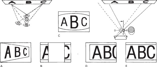
Figure B.6 Using cross front for a square-on image, despite obstruction. Without movements viewpoint A gives convergence, B is blocked and C, because you are forced to use an extreme wide-angle lens, gives distortion. In D the camera is next to the obstruction, back parallel to poster and movements neutral. E is the same camera position as D but with the cross front shifted to the right. (For easier comparison all lens images are shown right way up)

Figure B.7 Top: Even with the lens fully stopped down this oblique subject is not sharp overall. A shows the result of using swing back alone. Since near parts of the subject come to focus farther from the lens, pivoting the film into the (more upright) plane of sharp focus increases depth of field but exaggerates shape. B is the result of using swing front alone. This slight horizontal pivoting of the lens gives a better compromise between subject and film planes. Depth of field improves without shape distortion. However a lens with poor covering power will give ‘cut-off’ (result C)
Practical purposes. Pivoting the lens (a) alters effective coverage because it moves the point where the lens axis meets the film format, and (b) tilts the plane over which the subject is sharply imaged. The latter effect is explained as follows. A subject at right-angles to the lens axis is normally sharply focused as an image on film also at right-angles to the axis. This is typical, say, of copying a flat surface – subject plane, lens surfaces and film are all parallel. But when you swing the lens it views the subject obliquely (Figure B.7). One part of the subject, now effectively closer, is brought to focus slightly farther from the lens. In fact the whole plane on which the subject is sharply focused is pivoted to become much less parallel to the subject.
You can swing front to achieve effect (a) above, in which case (b) usually forms the drawback. Or you can use it for (b) but find yourself limited by (a). Here are examples of each kind of situation.
Photographing a tall structure, you use rising front to avoid tilting the camera and making vertical lines appear to converge. However, there is darkening and other tell-tale signs of image ‘cut-off’ in corners around the top of the subject. By unlocking the horizontal axis swing movement, you can pivot the lens to point upwards very slightly. This makes the lens axis less off-centre on the film; effective coverage is improved and cut-off miraculously disappears.
However, your lens, in viewing the subject obliquely, sharply images it on a plane at an angle to the back of the camera. It is probably impossible now to render the top and bottom of your subject sharp at the same time; the best thing to do is focus for the centre and stop down.
As another example, you have to photograph an expanse of mosaic floor extending into the distance. The camera views the floor obliquely, and even at smallest aperture there is insufficient depth of field. By pivoting the lens slightly downwards about a horizontal axis it views the floor less obliquely, giving a better compromise between planes of floor and film. This adjustment of swing front is critical, but you will find depth of field greatly improves across the floor surface.
This time the drawback is that your lens axis is now much higher than the centre of the film. A lens with only adequate covering power may produce signs of cut-off around corners of the picture where the farthest parts of the floor are imaged.
Although these examples feature swings about a horizontal axis, the same principles apply to vertical-axis swings. Their use in equivalent circumstances would be to improve coverage with extreme cross front, or increase depth of field over an obliquely photographed vertical surface, such as a long wall.
Using swing back
Swing back means pivoting the back of the camera about a horizontal or vertical axis across the film surface, usually at right-angles to the lens axis (Figure B.2). On a monorail view camera you achieve this movement by mechanically adjusting the back standard in the same way as you would alter the front standard for swing front. Baseboard view cameras offer much less swing back because of their box-like structure. Notice how swing back does not itself move the lens axis off the centre of the picture format. Therefore the lens you use needs not have exceptional covering power, unlike lenses used with shift or swing front movements.
Practical purpose. Pivoting the camera back (a) swings the film into (or out of) the plane of sharp focus for a subject, and (b) alters image shape. Once again you can use this movement primarily for (a) and suffer (b), or the reverse.
For example, you have to photograph, from one end, a long table laid out with cutlery and mats. The table must taper away into the distance, its oblique top surface sharp from front to back. Unfortunately there is insufficient depth of field for you to do this, even at smallest aperture. When you think about the problem (see Figure B.7), light from the closest part of the table actually comes to focus some way behind the lens, while the farthest part comes to focus nearer the lens. So by swinging the back of the camera until that part of the film recording near subjects becomes farther from the lens and the part recording far subjects becomes closer, you have angled the film into the plane of sharp focus. Depth of field is greatly extended – and may even be sufficient to shoot at a wider aperture.
The drawback is that the part of your image now recorded farther back from the lens is considerably larger than the image recorded near the lens. Front parts of the table will reproduce larger than they appear to the eye, and distant parts appear narrower. Perspective appears steeper, although only along the plane of the table, which may give it a noticeably elongated shape. (Sometimes of course you can choose just this kind of distortion for dynamic effect.)

Figure B.8 The Scheimpflug correction, to maximize depth of field over a subject plane imaged obliquely. This uses some swing of both front and back, minimizing the side effects of each movement. See Figure B.9
As another example, the new wing of a building must be shown obliquely, to taper away at one side to a feature at the far end. But it is surrounded by other buildings, and the only available viewpoint is opposite the centre of the wing. From this square-on position it appears rectangular. However, you can set up the camera to include the whole wing, then swing the back about a vertical axis to bring the right-hand side of the film closer to the lens, and the left-hand side farther away. In this way, the image at the left end is made bigger and at the right end becomes smaller – the building appears tapered.
The drawback is that the camera back no longer corresponds with the plane of sharp focus for the building (which, because it is square on, is at right-angles to the lens axis). Both ends will look unsharp; you must stop down fully and if necessary reduce the amount of swing to get the whole image in focus.
Combined use of movements
Combinations of movements are useful either to gain extra collective effect or to create a movement the camera itself does not directly offer. Most importantly, you can often produce the result you want and minimize problems by combining a little of each of two movements which have a common effect but different drawbacks.
Figure B.9 Camera movements used to improve depth of field. Below, left: no movements, fully stopped-down lens. Centre: swinging the back more vertical gives the depth of field needed, but distorts shape unacceptably. Right: combined use of some front and back swings (Scheimpflug) achieves the overall sharpness needed, with minimum side-effects
For instance, in tackling the mosaic floor you could create your extra depth of field by using a little of each of front and back swings. The back is swung (horizontal axis) just enough to start to improve depth of field, without noticeable shape distortion. Then the front is swung (horizontal axis) just enough to extend depth of field to the whole floor at your chosen aperture, without noticeable cut-off due to poor coverage. You will notice that in doing this the subject plane (the floor), the film plane (camera back) and the lens plane (glass surfaces) all point towards one imaginary position below the camera. The less front swing you set, the more back swing is needed, and vice versa. This meeting of planes, giving best compromise position of front and back to maximize depth of field over an oblique subject plane, is known as the Scheimpflug principle, as shown in Figure B.8. Remember it as a guide.
The great thing about camera movements is to understand and control them, but use them with restraint. Decide whether it is necessary to show the verticals in a building or studio still-life as truly vertical, or whether tapering will give a stronger impression of height, more striking composition, etc. Bear in mind too that several of the perspective changes previously achieved by camera movements can now be carried out later using the computer, page 287.
Film response to light is often presented in manufacturer’s technical data in graph and in table form. Both allow you to make comparisons between different products, show a film’s performance under differing conditions, etc. It is therefore worth making yourself familiar with how certain technical information is expressed, and what this means in practical terms.
Response to colour
A graph such as Figure C.1 (top) shows how a particular monochrome film responds to the colours of the visual spectrum, on the final print. This film records deep blue and purple, and to a lesser extent red, as lighter in tone than they appear to the eye. On the other hand it responds to greens as if darker than the eye’s impression. Where such differences are important a green or yellow filter over the lens will bring them more into line. The same pan film colour response curve can be compared against film (or paper) which is only blue sensitive or orthochromatic (Figure C.1, centre). The graph shows how shooting on a blue sensitive emulsion would result in a print in which green, yellow and red objects reproduce black or very dark and unnatural in tone. Ortho film responds better by encompassing green, but makes reds black; see Figure 9.14. This film can be handled safely under red lighting. Figure C.1 Top and centre: Tonal reproduction of colours (final print) by panchromatic, ortho, and blue-sensitive black and white materials, relative to eye response. All emulsions respond to ultraviolet down to about 250 nm – still shorter wavelengths are absorbed by gelatin. Bottom: Relative response curves for the blue, green and red colour-sensitive emulsions used in typical daylight-balanced slide film. Only response above the broken line is significant. Y, M and C stand for yellow, magenta or cyan dye finally formed in each emulsion to give a full coloured image
The same pan film colour response curve can be compared against film (or paper) which is only blue sensitive or orthochromatic (Figure C.1, centre). The graph shows how shooting on a blue sensitive emulsion would result in a print in which green, yellow and red objects reproduce black or very dark and unnatural in tone. Ortho film responds better by encompassing green, but makes reds black; see Figure 9.14. This film can be handled safely under red lighting.

Figure C.1 Top and centre: Tonal reproduction of colours (final print) by panchromatic, ortho, and blue-sensitive black and white materials, relative to eye response. All emulsions respond to ultraviolet down to about 250 nm – still shorter wavelengths are absorbed by gelatin. Bottom: Relative response curves for the blue, green and red colour-sensitive emulsions used in typical daylight-balanced slide film. Only response above the broken line is significant. Y, M and C stand for yellow, magenta or cyan dye finally formed in each emulsion to give a full coloured image

Figure C.2 Reciprocity failure; typical exposure/filter compensation required
The three emulsions present together in the colour film (Figure C.1, bottom) collectively respond to the whole spectrum. Where individual response ‘dips’ in the greeny-blue and orange bands, this receives some correction by the fact that two emulsions overlap their sensitivity here. This slide film is a daylight balanced type – had it been exposed/tested to an image lit by red-rich tungsten illumination instead the blue-sensitive and green-sensitive curve would be lower than the red curve. After processing the final picture would have a shortage of cyan dye. The dominant yellow and magenta combine to give the slide a reddish cast.
Response to length of exposure (‘reciprocity failure’)
Giving a film or printing paper a long exposure time to a dim image should always have the same effect as short exposure to a bright image. After all, this reciprocal relationship forms the whole basis of controlling exposure using aperture and shutter settings. In practice though films behave as if they are less light sensitive when exposures of 1 second or longer (or 1/10,000 second or less) are given. This reciprocity failure is mainly an issue in long exposures such as when shooting at night or in other dim lighting conditions. Since RF can also affect the various emulsion layers in colour films by different amounts a correction filter is sometimes needed for slide films. As Figure C.2 shows, it is best to allow for reciprocity failure by widening the lens aperture (intensity) rather than further extending time. Films launched in recent years suffer no reciprocity failure for the most used shutter speeds. However, if you are bracketing exposures around what the TTL or hand meter reads as 1 second or over then always give a series of more rather than less exposures, preferably via aperture adjustment.
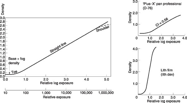
Figure C.3 Characteristic curves of various monochrome films
A so-called characteristic curve is a performance graph showing how a particular film or paper responds to both exposure and processing. To produce the characteristic curve of a black and white film (Figure C.3) the material is first given a series of tightly controlled ‘light dosages’. This is done in an instrument called a sensitometer, which exposes the emulsion to a series of light intensities a small patch at a time, giving the same short exposure for each. This is rather like exposing an image in the camera, except that (a) it gives a much wider range of intensities than you are likely to find in any one actual scene. Also (b) the amount each separate patch or step differs in exposure from the preceding one is an exact regular factor, normally 2.
The exposed sample film is next developed under strictly controlled conditions. The processed result is a series of tone patches, from clear film to something quite dark. The exact darkness of these results is measured with a densitometer instrument, which reads out the values as density figures. (Density is the log10 of opacity, which is incident light divided by light transmitted by the film. When half the incident light passes through the sample opacity is 2.0 and the density reading is 0.3.)
‘Input’ (exposure to light) can now be plotted against ‘output’ (the resulting series of density readings). To prepare a characteristic curve graph, the vertical axis is scaled in density values and the horizontal axis is scaled in log exposure (or relative log exposure) values. The use of a log10 scale here is to avoid an otherwise unmanageably long range of figures; the axis also becomes compatible with the log10 sequence used for density. An increase of 0.3 on the log E axis means doubling of exposure.
When a densitometer linked to a computer plots density figures against each exposure given to the test film, it reads out a graph which is not a straight line, but escalator-shaped.
Significance of curve shape. Most characteristic curves can be divided into three distinct regions: the toe; the straight-line portion; and the shoulder. Remember that both density and exposure axes cover a very wide range of conditions for maximum information. In practice most actual images you expose on film are unlikely to have a brightness range much beyond 100:1, which spans just 2.0 on the log E axis. This means that, like selecting a group of notes from a long piano keyboard, you have options. You might underexpose your image so that it wholly falls on the lowest part of the curve, where there are least resulting densities. Or by giving it greater exposure, the image can correspond to values wholly within the straight-line portion. Again, by overexposing, you might make use of the curve shoulder, which produces the heavier densities.
In this way the characteristic curve shows the total performance of a film under given processing. And the part that relates to a particular shot depends on your image brightness range (a lowcontrast scene spans a much shorter length of the log E axis than one that is very contrasty), as well as whether you under-, over- or correctly expose it.
The toe. The very bottom of the characteristic curve becomes a horizontal straight line. Here the film has received too little light to respond at all. The very slight density value present is due to the film base itself, plus normal fog density. As log E values increase, the graph begins to rise gently, meaning that density values are increasing too. However, the image tones are very compressed – shadow parts of the subject are still difficult to pick out (any density less than about 0.1 above fog usually prints indistinguishably from black). Look at Figure 10.2 on page 180.
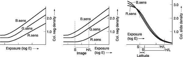
Figure C.4 Colour film characteristic curves. Left: A colour negative film exposed to an image in light for which it is colour balanced. (Emulsion responses to R, G and B are plotted individually.) Centre: If this film is used with light of reduced red content (colour temperature too high) the red sensitive layer reacts as if relatively slow. Its curve has shifted right which shows that the red density and contrast now differ between the image highlights and shadows. This may not be correctable in printing. Right: A colour slide film, exposed to light of the correct colour balance. Compared against lower contrast materials, such films allow much less exposure latitude
Gradually, with more exposure, the upper region of the toe merges into the straight line. The actual length of the toe varies with different films – for example it is longer with Tri-X than Plus-X.
The straight line. In the straight-line part of the graph image tones are still compressed as the material translates them into negative densities, but now the log exposure/density relationship is more constant: tones are compressed evenly. You might assume from this that getting your image to fall entirely on the straight-line portion would be the most ‘correct’ exposure. But, to maximize film speed, and to avoid image highlights becoming so dense that sharpness suffers and graininess is increased, ‘correct exposure’ is regarded as using the upper part of the toe plus only as much as is necessary of the lower part of the straight line; see Figure 10.3. Printing paper characteristics are designed to suit negatives exposed in this way, and reproduce mid-tones to shadows with contrast slightly greater than mid-tones to highlights.
The steepness of the film’s straight-line portion also shows you what contrast to expect. The extremely steep line shown for lith film (Figure C.3) indicates that the particular combination of emulsion and development gives a much more contrasty negative (for the same brightness-range image) than material with a lower pitched slope, such as Plus-X.
The shoulder. At the top of the characteristic curve the graph begins to flatten out again. Increasing exposure now gives less and less increase in density. The material is approaching its maximum black under these development conditions.
With most films the shoulder is never reached in practical picture making because of the poor image quality produced, as mentioned above. In fact the shoulder of the curve is often not included in data published for general-purpose films because of its unimportance.
Theory into practice. Exposure meters are so calibrated that a single overall (or centreweighted) reading, which is assumed equivalent to a mid-grey in the scene, is ‘placed’ on the average film’s characteristic curve at about the lowest part of the straight-line portion. Given an ‘average’ 100:1 range camera image this means that shadows will fall on the toe, but not beyond the lowest useful part. Highlights fall further up the straight-line portion, but nowhere near the definition-destroying upper part or shoulder. You can see from this that a lot of assumptions have to be made.
For tighter control it is better to use a spot or local reading, provided you know what you are doing. This way you can choose your own mid-tone in the scene to place on the curve.
By taking two spot readings – darkest important shadow, brightest important highlight – you measure your image contrast range. If this greatly exceeds the ‘average’ it will also remind you that for better results you might well slightly overexpose and underdevelop. The development change will reduce the slope of the whole characteristic curve and so avoid an excessively contrasty negative. The reverse is true if your two camera readings show the image is much flatter than average; see Figure 11.20. Of course, this kind of adjustment is more difficult if you have a whole mixture of subjects exposed on one film. A magazine-type camera back is then especially useful for critical work; you can expose all your most contrasty subjects on the same film, earmarking this for reduced development.
Most proprietary forms of developer (Acuspeed, Rodinal, etc.) do not have published formulae. They are only sold as ready-mixed concentrated solutions or occasionally as powders. However, the table at the foot of this page gives some well-established developers you can prepare yourself at relatively low cost from their constituent chemicals.
Other formulae in this appendix have a long history but are still listed because they remain of practical value, although some are difficult to track down in a ready-prepared form. The component chemicals you need are stocked by a few suppliers (in London for example by Silverprint or Creative Monochrome). Chemicals marked ![]() should be handled with special care. Be sure to read over the appropriate advice in Appendix E before you begin.
should be handled with special care. Be sure to read over the appropriate advice in Appendix E before you begin.
Preparing solutions from bulk chemicals. First weigh out all the dry chemicals listed in your formula, using clean paper on the scales for each one. The quantities shown in formulae below are in metric units (for conversion, see page 319) and relate to dry chemical in anhydrous or crystalline form.


Stop baths
|
SB-5 (for films) |
SB-1 (for paper) |
Water |
500 ml |
750 ml |
|
11 ml |
17 ml |
|
9 ml |
13.5 ml |
Sod sulphite anhyd |
45 g |
|
Water up to |
1 litre |
1 litre |
Treat for |
30 seconds |
5–10 seconds |
Some bromocresol purple can be added to SB-1 to form an indicator stop bath. The solution then appears yellow when fresh, turns orange in use, and becomes purple when the stop bath is exhausted and must be replaced.

Residual fixer test HT-2
Water |
350 ml |
|
22 ml |
|
3.75 g |
Water to |
500 ml |
Store solution away from light, in a labelled brown screw-top bottle. To test a washed print or film, cut off a small strip of rebate and wipe off surface water. Place a drop of HT-2 on the emulsion surface and allow it to stand for 2–3 minutes. Rinse off. There should be little or no staining. Prints can be compared with a Kodak hypo estimator colour chart.
Negative intensifier: chromium IN-4
Bleacher stock solution: |
|
Water |
500 ml |
|
90 g |
|
64 ml |
Water to |
1 litre |
Use 1 + 10 parts water |
|
Film, which should be hardened, is bleached until yellow-buff right through, washed 5 minutes, then darkened in a regular print developer. Rinse, fix and finally wash 5 minutes. Can be repeated for greater effect.
Sulphide toner T-7a (sepia)
Bleacher working solution (reusable): |
|
Water |
700 ml |
Potassium ferricyanide |
30 g |
Potassium bromide |
10 g |
Sodium carbonate |
16 g |
Water to |
1 litre |
Toner stock solution: |
|
Water |
300 ml |
Sodium sulphide anhyd |
50 g |
Water to |
500 ml |
Dilute stock 1 + 9 parts water for use |
|
Fully bleach the black image to pale straw colour (about 5 minutes). Then rinse 1 minute, and tone for 4–5 minutes. Finally wash thoroughly, separately from other prints.
Blue toner IT-6
Sol A |
Water |
700 ml |
|
|
4 ml |
|
Potassium ferricyanide cryst |
2 g |
|
Water up to |
1 litre |
Sol B |
Water |
700 ml |
|
|
4 ml |
|
Ferric ammonium citrate |
2 g |
|
Water up to |
1 litre |
Use one part A plus one part B. This toner has an intensifying action, so start with a pale black and white print. Immerse prints until the required tone is reached, then wash gently until the whites no longer have a yellow stain. Over-washing begins to bleach the blue – this is reduced by adding salt to the wash water.
Gold toner GP-I (blue-black or red) For red tones, sepia tone the print first.
Water |
700 ml |
Gold chloride, 1% stock solution* |
10 ml |
Sodium thiocyanate |
10 g |
Water up to |
1 litre |
Make up just before use. Treat for 10 minutes, then wash 10 minutes. *1 g of sodium chloro-aurate in 100 ml water.
Bleachers
Farmer’s reducer R-4a
Sol A |
Water |
250 ml |
|
Potassium ferricyanide |
37.5 g |
|
Water up to |
500 ml |
Sol B |
Warm water |
1 litre |
|
Sodium thiosulphate cryst |
480 g |
|
Water up to |
2 litres |
Mix one part A, plus 8 parts B, and 50 parts water, just before use. For faster reduction of density, double the quantity of solution A.
Iodine IR-4
Recommended for locally bleaching out the print image completely, leaving white paper.
Warm water |
750 ml |
Potassium iodide |
16 g |
|
4 g |
Water up to |
1 litre |
Keeps well. For bleach-out, apply neat with brush or cottonwool to the damp (blotted) print. Finally rinse and treat in a small quantity of regular print fixing bath (5–10 minutes) to completely remove deep brown stain. Discard this fixer. Wash fully.
Conversions: metric, UK and US units
Use the information below in conjunction with a pocket calculator.
To convert length and area
Millimetres to inches |
Multiply mm by 0.039 |
Metres to feet |
Multiply metres by 3.28 |
Inches to millimetres |
Multiply inches by 25.4 |
Feet to metres |
Multiply feet by 0.305 |
Sq centimetres to sq inches |
Multiply by 0.155 |
Sq inches to sq centimetres |
Multiply by 6.45 |
To convert volume and weight
Millilitres to UK fl oz |
Multiply by 0.035 |
Millilitres to US fl oz |
Multiply by 0.034 |
UK fl oz to millilitres |
Multiply by 28.4 |
US fl oz to millilitres |
Multiply by 29.6 |
US fl oz to UK fl oz |
Multiply by 1.04 |
Litres to UK fl oz |
Multiply by 35 |
Litres to UK gallons |
Multiply by 0.22 |
Litres to US gallons |
Multiply by 0.264 |
UK gallons to litres |
Multiply by 4.55 |
US gallons to litres |
Multiply by 3.79 |
US gallons to UK gallons |
Multiply by 0.833 |
Grams to ounces |
Multiply by 0.035 |
Ounces to grams |
Multiply by 28.35 |
Kilograms to pounds |
Multiply by 2.20 |
Pounds to kilograms |
Multiply by 0.454 |
To convert temperature:
°Celsius into °Fahrenheit: |
Multiply by 1.8 then add 32 |
°Fahrenheit into °Celsius: |
Subtract 32 then multiply by 0.56 |

Start with about three-quarters of the final volume of water, and fairly hot (typically 50°C). Tap water is satisfactory unless distilled water is specified. Always dissolve chemicals one at a time, in the order given. Tip powder gradually into the water, stirring continuously. Wait until as much as possible has been dissolved into solution before starting to add the next chemical. Measure and pour in liquid chemicals in the same way, taking special care over strong acids; see notes on safety. Finally add cold water to make up the full amount and if possible leave the solution some hours to further dissolve and cool to room temperature. If your formula contains metol and sodium sulphite it is best to dissolve a pinch of weighed-out sulphite first – to help prevent the metol oxidizing (turning yellowish brown) during mixing. Then dissolve the remaining sodium sulphite after the metol, as listed in the formula.
Alternative forms of chemical. Many photographic chemicals come in anhydrous form (also known as ‘desiccated’). Weight for weight this is much more concentrated than the same chemical in crystalline form. A few chemicals are marketed in ‘monohydrate’ (H2O) form, which in terms of concentration falls between the other two. When a formula quotes the weight for one form of the chemical and you can only obtain it in another, make adjustments by the amounts shown in the substitutions table on page 317.
Preparation and use of chemicals. Most common chemicals used in photography are no more dangerous to handle than chemicals – cleaners, insect repellents, adhesives – used every day around the home. However, several of the more special-purpose photographic solutions such as bleachers, toners and intensifiers do contain acids or irritant chemicals which must be handled with care. (These are listed in Figure 11.4 and also picked out in the formulae given in Appendix D.)
Your response to direct contact with chemicals may vary from finger staining to direct irritation such as inflammation and itching of hand or eyes, or a skin burning or general allergic reaction which may not appear until several days later. A small minority of photographers are particularly sensitive to chemicals present in developers. Metol, also known as Rhodol or Elon, can be troublesome to such people. Changing to a developer of different make-up such as those containing Phenidone instead of Metol (i.e. PQ developers) may solve the problem.
The following guidelines apply to all photographic chemical processes:
Spray adhesives. Take special care to ensure ample ventilation when working with aerosol sprays of this kind. Their contents could cause nerve damage if you subject yourself to prolonged exposure in a confined space when mounting or montaging prints this way.
Electrical hazards
Many of the safety precautions you need to take are also common to domestic and simple workshop situations. For example:
• |
Circuit protection. Make sure that all your equipment – enlarger, lamps, heaters – are effectively earthed (‘grounded’) via three-core cable. Plugs should contain fuses which are appropriate to the equipment they serve. This is more than a question of not drawing more power than the fuse will handle, page 120. A 13 amp fuse for instance is quite suitable for equipment drawing 10 amps, but used with something taking only 4 amps means that you are underprotected – before this fuse burns out the cabling could heat up considerably. A circuit-breaker at the mains fuse box is a good protective measure for the whole system. When lighting subjects at locations you have not used before check that the circuit is sufficiently powerful and in good condition to supply your gear. (To light a large area it may be best to hire a generator.) |
• |
Cables. Check all your equipment cables regularly for signs of cracked or worn installation, or loose connections. Don’t roll lighting stands over cables on the floor. Never pull out a plug by means of tugging on its cable. Don’t power a lighting unit through a long cable still coiled on a drum – electricity can heat the coiled-up cable until it starts smouldering. Make sure your main cable is of a suitable gauge to carry all the power you need and will not heat up due to overloading, especially when it feeds several pieces of equipment through adaptors or splitter boxes. Avoid cable runs which come into contact with moisture (condensation as well as water) unless fully protected in a waterproof sheath. Damp grass, wet bench areas of darkrooms, bathrooms and saunas are all hazardous. |
• |
Flash. Studio equipment and even small handflash units should not be opened to make your own repairs – residual charge held in internal power-storage components may give you an electric shock. |
When you are first learning to use a digital manipulation software program it is helpful to compile your own notes. These can be simple reminders of the sequence of steps you have found you have to take to achieve a particular image change. After all, if you are forgetful and make one wrong selection this often breaks the whole chain and brings you to a frustrating halt. On the other hand an image manipulation may often be achieved by more than one command route, and as you progress you can discover which seems the fastest or easiest to remember.
The listings below are practical notes on command sequences for ten different image changes, in a choice of two photo-manipulation programs. Bear in mind too that programs are reissued in revised editions at frequent intervals, so some of these sequences may now differ in current software. They appear here to simply show how you might set out your own quickcheck notebook. Figure 14.11 on page 271 shows the typical positions of command bar, fly-outs, etc., displayed by Photoshop on the computer monitor screen.
PhotoSuite II |
Photoshop 5.0 |
|
Zoom image magnification on screen |
Select Edit Photo. Click on magnifying glass icon. Position cursor centre screen, then keeping the mouse button pressed move cursor gently up the screen (to zoom in) or down screen (to zoom out). Alternatively, keep keyboard Ctrl key pressed and use + or – keys |
Select Window on the command bar, and click ‘Show Navigator’ on fly-out. Use cursor to drag the slider within the navigator dialogue box or keep keyboard Ctrl key pressed and use + or – keys |
Overall brightness, and contrast |
Click on Touch-Up and Transform>Touch-Up>Brightness and Contrast. Use cursor to drag one or both the sliders located below the picture window. Click on Apply tab |
On the command bar click Image>Adjust>Brightness/Contrast. Then drag sliders within fly-out. Click OK. Or Image>Adjust>Curves. Use cursor to drag and reshape graph (page 281). Click OK |
Shading or burning-in small areas |
Click on Touch-Up and Transform>Remove Red Eye. Select either lighten or darken. Drag Opacity slider to a low setting. Select Paint (brush) size. Apply by wiping the cursor across the area to be changed, keeping the button pressed |
Select either Burn or Shade tool from tool bar or fly-out. On command bar select Window>Show Options. On fly-out set Exposure (say 30%) and tones (e.g. midtones). Then Window>Show brushes. Set large softedged brush size. Apply by repeatedly dragging the cursor with button pressed |
Cloning |
Select Edit Photo. Click on clone icon. Under your picture set a suitable brush size, also Opacity (say 100%). Position cursor on the image where you want to ‘pick up’. Click mouse. Move cursor to where the pick up detail is to be put down. Press mouse and keep it pressed as you brush over the put-down area. To change to a different part of the image locate the pickup (larger) cursor in the new position, hold down the Ctrl key and click mouse. Then release key again and as before move cursor to where the new pick-up is to be put down |
Click on Marquee (rectangular) selection tool and mark out entire picture area. Select Rubber Stamp (unshaded) tool. In Rubber Stamp options dialogue box, set ‘Normal’ and Opacity of say 100%. On command bar select Window>Show brushes. Choose size and softness of edge. Position cursor on the image where you want to ‘pick up’. Depress Alt key and click mouse. Move cursor to where ‘pick up’ detail is to be put down. Press mouse button alone and keep it pressed as you brush over the put-down area. To change to a different pick-up hold down Alt key, move cursor to the new position, click mouse and release Alt key again |
Erase parts of one picture over-laying another |
File>Open the first picture. Then via File>Add photo, open your second picture on top. Use accompanying pull bars to size and position the second picture. Click outside picture area to remove pull bars. Click on Eraser tool icon. Set Intensity on the slider under the Picture area (100% or less if a degree of transparency is needed). Set brush size. Drag cursor over the area to be erased, with button depressed. Top picture will melt away, revealing the details of the picture underneath |
File>Open. Picture 1 on screen. Click on marquee (rectangular) selection tool. Mark out entire picture area. Edit>Cut. Then File>Open. Picture 2 on screen. Then Edit>Paste. Click on Eraser tool icon. Command Window>Show brushes and set brush size. Also Window> Show Options. In dialogue box set Pressure (normally 100%) and ‘Airbrush’. Drag cursor over area to be erased, with button depressed |
Overall colour balance correction |
Click on Touch Up & Transform>Touch Up>Fix Colors. Then drag Hue, Saturation, & Value sliders (i.e. increase blue hue to compensate a picture shot on daylight film in tungsten lighting). Apply |
Command Image>Adjust>Variations. Then visually judge and pick the correction needed from ‘ringaround’. Click OK. Alternatively command Image>Adjust> Color balance and drag individual sliders on flyout. Click OK |
Unsharpen chosen areas |
Click on Touch Up & Transform>Remove Red-Eye> Soften. Set level (‘intensity’) high. Set a suitably large diameter brush size and apply repeatedly by swabbing over the chosen area with the cursor button pressed. Don’t overdo |
File>Open to put chosen picture on screen. Then command Layer>Dupe layer. Click OK. Next, Filter>Blur>Gaussian blur. In dialogue box set required level of unsharpness. Click on OK to affect whole picture. Then localize unsharpness by clicking on History Brush icon in tool box. Use cursor with mouse button pressed to swab over parts of the picture to be returned to sharpness |
Sharpen overall |
Not recommended |
Click on command bar Filter>Sharpen>Unsharp Mask. On fly-out set radius (say 1.5), Amount (150%) and Threshold (20). Adjust each to Maximize effect. Click on OK |
Soften or motion blur over chosen areas |
Select Edit Photo. Then with freehand selection tool mark out the area to become blurred. Soften the marked out image by selecting Touch Up & Transform>Touch Up>Soften. Set the intensity on the slider below the picture. Apply |
Click on Lasso tool and draw around the area to be blurred. Either command Filter>Blur>Radial, and on fly-out set the centre of rotation and click OK. Or Filter>Blur>Motion. Then on fly-out set the direction and amount of straight streaky blur. Click OK |
Changing from colour to monochrome |
Click on Touch Up & Transform>Touch Up>Fix Colors. Drag Hue and Saturation sliders to full minuses. Apply. Select Brightness/Contrast and adjust sliders to give best tonal quality. Apply |
Click on command bar Image>Mode>Greyscale. On dialogue fly-out click OK for Discard color information. Then Image>Adjust>Brightness/ Contrast. Adjust sliders. Click OK |
In some programs ‘Help’ information refers to the key marked Ctrl on many keyboards as ‘Command’; also Alt is referred to as the ‘Option’ key.