Chapter 10
Working with Containers
A container pours a collection of widgets (and possibly child containers) into a specific structure of your choosing. If you want a form with labels on the left and fields on the right, you need a container. If you want OK and Cancel buttons to be beneath the rest of the form, next to one another, and flush to the right side of the screen, you need a container. Just from a pure XML perspective, if you have multiple widgets (beyond RadioButton widgets in a RadioGroup), you need a container just to have a root element in which to place the widgets.
Most GUI toolkits have some notion of layout management, frequently organized into containers. In Java/Swing, for example, you have layout managers like BoxLayout and containers that use them (e.g., Box). Some toolkits, such as XUL and Flex, stick strictly to the box model, figuring that any desired layout can be achieved through the right combination of nested boxes. Android, through LinearLayout, also offers a box model, but in addition supports a range of containers that provide different layout rules.
In this chapter, we will look at four commonly used containers, LinearLayout (the box model), RelativeLayout (a rule-based model), and TableLayout (the grid model), along with the all-new GridLayout (the infinite fine-line model) released with Ice Cream Sandwich (ICS). We'll also look at ScrollView, a container designed to assist with implementing scrolling containers.
Thinking Linearly
As just noted, LinearLayout is a box model—widgets or child containers are lined up in a column or row, one after the next. This works similarly to FlowLayout in Java/Swing, vbox and hbox in Flex and XUL, and so forth.
Flex and XUL use the box as their primary unit of layout. If you want, you can use LinearLayout in much the same way, eschewing some of the other containers. Getting the visual representation you want is mostly a matter of identifying where boxes should nest and which properties those boxes should have, such as their alignment relative to other boxes.
LinearLayout Concepts and Properties
To configure a LinearLayout, you have five main areas of control besides the container's contents: the orientation, the fill model, the weight, the gravity, and the padding.
Orientation
Orientation indicates whether the LinearLayout represents a row or a column. Just add the android:orientation property to your LinearLayout element in your XML layout, and set the value to be horizontal for a row or vertical for a column.
The orientation can be modified at runtime by invoking setOrientation() on the LinearLayout, supplying it either HORIZONTAL or VERTICAL.
Fill Model
Imagine a row of widgets, such as a pair of radio buttons. These widgets have a “natural” size based on their text. Their combined size probably does not exactly match the width of the Android device's screen—particularly since screens come in various sizes. We then have the issue of what to do with the remaining space.
All widgets inside a LinearLayout must supply android:layout_width and android:layout_height properties to help address this issue. These properties' values have three flavors:
- You can provide a specific dimension, such as
125dip, to indicate the widget should take up exactly a certain size. - You can provide
wrap_content, which means the widget should fill up its natural space, unless that is too big, in which case Android can use word-wrap as needed to make it fit. - You can provide
fill_parent, which means the widget should fill up all available space in its enclosing container, after all other widgets are taken care of.
The latter two flavors are the most common, as they are independent of screen size, allowing Android to adjust your view to fit the available space.
NOTE: In API level 8 (Android 2.2), fill_parent was renamed to match_parent, for unknown reasons. You can still use fill_parent, as it will be supported for the foreseeable future. However, at such point in time as you are supporting only API level 8 or higher (e.g., android:minSdkVersion="8" in your manifest), you should probably switch over to match_parent.
Weight
But what happens if we have two widgets that should split the available free space? For example, suppose we have two multiline fields in a column, and we want them to take up the remaining space in the column after all other widgets have been allocated their space.
To make this work, in addition to setting android:layout_width (for rows) or android:layout_height (for columns) to fill_parent, you must also set android:layout_weight. This property indicates the proportion of the free space that should go to that widget. For example, if you set android:layout_weight to be the same nonzero value for a pair of widgets (e.g., 1), the free space will be split evenly between them. If you set it to be 1 for one widget and 2 for the other widget, the second widget will use up twice the free space that the first widget does. And so on. The weight for a widget is 0 by default.
Another pattern for using weights is to allocate sizes on a percentage basis. To use this technique for, say, a horizontal layout, do the following:
- Set all the
android:layout_widthvalues to be0for the widgets in the layout. - Set the
android:layout_weightvalues to be the desired percentage size for each widget in the layout. - Make sure all those weights add up to
100.
Gravity
By default, everything in a LinearLayout is left- and top-aligned. So, if you create a row of widgets via a horizontal LinearLayout, the row will start flush on the left side of the screen. If that is not what you want, you need to specify a gravity value. Using android:layout_gravity on a widget (or calling setGravity() at runtime on the widget's Java object), you can tell the widget and its container how to align vis-à-vis the screen.
For a column of widgets, common gravity values are left, center_horizontal, and right for left-aligned, centered, and right-aligned widgets, respectively.
For a row of widgets, the default is for them to be aligned so their text is aligned on the baseline (the invisible line that letters seem to “sit on"). You can specify a gravity of center_vertical to center the widgets along the row's vertical midpoint.
Margins
By default, widgets are tightly packed next to each other. You can change this via the use of margins, a concept that is similar to that of padding, described in Chapter 9.
The difference between padding and margins is apparent only for widgets with a nontransparent background. For widgets with a transparent background—like the default look of a TextView—padding and margins have similar visual effect, increasing the space between the widget and adjacent widgets. For widgets with a nontransparent background—like a Button—padding is considered to be inside the background, while margins are considered to be outside the background. In other words, adding padding will increase the space between the contents (e.g., the caption of a Button) and the edges, while adding margins increases the empty space between the edges and adjacent widgets.
Margins can be set in XML, either on a per-side basis (e.g., android:layout_marginTop) or on all sides via android:layout_margin. As with padding, the value of any of these is a dimension—a combination of a unit of measure and a count, such as 5px for 5 pixels.
LinearLayout Example
Let's look at an example (Containers/Linear) that shows LinearLayout properties set both in the XML layout file and at runtime. Here is the layout:
<?xml version="1.0" encoding="utf-8"?>

<LinearLayout

  xmlns:android="http://schemas.android.com/apk/res/android"

  android:orientation="vertical"

  android:layout_width="fill_parent"

  android:layout_height="fill_parent"

  >

  <RadioGroup android:id="@+id/orientation"

    android:orientation="horizontal"

    android:layout_width="wrap_content"

    android:layout_height="wrap_content"

    android:padding="5dip">

    <RadioButton

      android:id="@+id/horizontal"

      android:text="horizontal" />

    <RadioButton

      android:id="@+id/vertical"

      android:text="vertical" />

  </RadioGroup>

  <RadioGroup android:id="@+id/gravity"

    android:orientation="vertical"

    android:layout_width="fill_parent"

    android:layout_height="wrap_content"

    android:padding="5dip">

    <RadioButton

      android:id="@+id/left"

      android:text="left" />

    <RadioButton

      android:id="@+id/center"

      android:text="center" />

    <RadioButton

      android:id="@+id/right"

      android:text="right" />

  </RadioGroup>

</LinearLayout>
Note that we have a LinearLayout wrapping two RadioGroup sets. RadioGroup is a subclass of LinearLayout, so our example demonstrates nested boxes as if they were all LinearLayout containers.
The top RadioGroup sets up a row (android:orientation = "horizontal") of RadioButton widgets. The RadioGroup has 5dip of padding on all sides, separating it from the other RadioGroup, where dip stands for density-independent pixels (think of them as ordinary pixels for now—we will get into the distinction later in the book). The width and height are both set to wrap_content, so the radio buttons will take up only the space that they need.
The bottom RadioGroup is a column (android:orientation = "vertical") of three RadioButton widgets. Again, we have 5dip of padding on all sides and a natural height (android:layout_height = "wrap_content"). However, we have set android:layout_width to be fill_parent, meaning the column of radio buttons claims the entire width of the screen.
To adjust these settings at runtime based on user input, we need some Java code:
package com.commonsware.android.linear;


import android.app.Activity;

import android.os.Bundle;

import android.view.Gravity;

import android.text.TextWatcher;

import android.widget.LinearLayout;

import android.widget.RadioGroup;

import android.widget.EditText;


public class LinearLayoutDemo extends Activity

  implements RadioGroup.OnCheckedChangeListener {

  RadioGroup orientation;

  RadioGroup gravity;


  @Override

  public void onCreate(Bundle icicle) {

    super.onCreate(icicle);

    setContentView(R.layout.main);


    orientation=(RadioGroup)findViewById(R.id.orientation);

    orientation.setOnCheckedChangeListener(this);

    gravity=(RadioGroup)findViewById(R.id.gravity);

    gravity.setOnCheckedChangeListener(this);

  }


  public void onCheckedChanged(RadioGroup group, int checkedId) {

    switch (checkedId) {

      case R.id.horizontal:

        orientation.setOrientation(LinearLayout.HORIZONTAL);

        break;


      case R.id.vertical:

        orientation.setOrientation(LinearLayout.VERTICAL);

        break;
      case R.id.left:

        gravity.setGravity(Gravity.LEFT);

        break;


      case R.id.center:

        gravity.setGravity(Gravity.CENTER_HORIZONTAL);

        break;


      case R.id.right:

        gravity.setGravity(Gravity.RIGHT);

        break;

    }

  }

}
In onCreate(), we look up our two RadioGroup containers and register a listener on each, so we are notified when the radio buttons change state (setOnCheckedChangeListener(this)). Since the activity implements OnCheckedChangeListener, the activity itself is the listener.
In onCheckedChanged() (the callback for the listener), we see which RadioButton had a state change. Based on the clicked-upon item, we adjust either the orientation of the first LinearLayout or the gravity of the second LinearLayout.
Figure 10–1 shows the result when the demo is first launched inside the emulator.
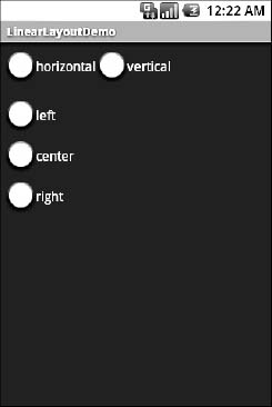
Figure 10–1. The LinearLayoutDemo sample application, as initially launched
If we toggle on the “vertical” radio button, the top RadioGroup adjusts to match, as shown in Figure 10–2.
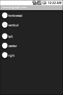
Figure 10–2. The same application, with the vertical radio button selected
If we toggle the “center” or “right” radio button, the bottom RadioGroup adjusts to match, as shown in Figures 10–3 and 10–4.

Figure 10–3. The same application, with the vertical and center radio buttons selected
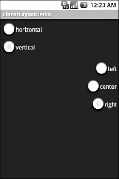
Figure 10–4. The same application, with the vertical and right radio buttons selected
The Box Model
As noted earlier in this chapter, some GUI frameworks treat everything as boxes—what Android calls LinearLayout containers. In Flex and XUL, for example, you create boxes and indicate how big they should be, as a percentage of the available space, and then you put widgets in the boxes. A similar pattern exists in Android for LinearLayout, as is demonstrated in the ContainersLinearPercent project.
Here we have a layout XML file that contains a vertical LinearLayout wrapping three Button widgets:
<?xml version="1.0" encoding="utf-8"?>

<LinearLayout

  xmlns:android="http://schemas.android.com/apk/res/android"

  android:orientation="vertical"

  android:layout_width="fill_parent"

  android:layout_height="fill_parent"

  >

  <Button

    android:text="Fifty Percent"

    android:layout_width="fill_parent"

    android:layout_height="0dip"

    android:layout_weight="50"

  />

  <Button

    android:text="Thirty Percent"

    android:layout_width="fill_parent"

    android:layout_height="0dip"
    android:layout_weight="30"

  />

  <Button

    android:text="Twenty Percent"

    android:layout_width="fill_parent"

    android:layout_height="0dip"

    android:layout_weight="20"

  />

</LinearLayout>
Each of the three widgets will take up a certain percentage of the vertical space for the LinearLayout. Since the LinearLayout is set to fill the screen, this means that the three widgets will divide up the screen based on their requested percentages.
To request a percentage, each Button does the following:
- Sets its
android:layout_heightto be0dip(note that we use height here because it is a verticalLinearLayoutwe are subdividing) - Sets its
android:layout_weightto be the desired percentage (e.g.,android:layout_weight="50")
So long as the weights sum to 100, as they do in this case, you will get your desired breakdown by percentage, as shown in Figure 10–5.
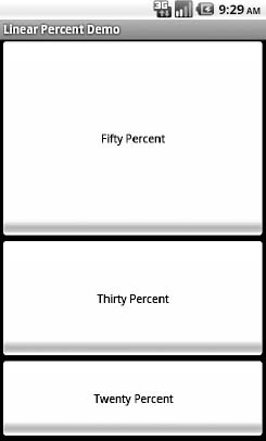
Figure 10–5. A LinearLayout split among three Buttons by percentage
All Things Are Relative
RelativeLayout, as the name suggests, lays out widgets based on their relationship to other widgets in the container and the parent container. You can place widget X below and to the left of widget Y, have widget Z's bottom edge align with the bottom edge of the container, and so on. This is reminiscent of James Elliot's RelativeLayout for use with Java/Swing.
RelativeLayout Concepts and Properties
To make all this work, we need ways to reference other widgets within an XML layout file, plus ways to indicate the relative positions of those widgets.
Positions Relative to Container
The easiest relationships to set up are those that tie a widget's position to that of its container, using the following properties:
android:layout_alignParentTop: Aligns the widget's top with the top of the containerandroid:layout_alignParentBottom: Aligns the widget's bottom with the bottom of the containerandroid:layout_alignParentLeft: Aligns the widget's left side with the left side of the containerandroid:layout_alignParentRight: Aligns the widget's right side with the right side of the containerandroid:layout_centerHorizontal: Positions the widget horizontally at the center of the containerandroid:layout_centerVertical: Positions the widget vertically at the center of the containerandroid:layout_centerInParent: Positions the widget both horizontally and vertically at the center of the container
All of these properties take a simple Boolean value (true or false).
Note that the padding of the widget is taken into account when performing these various alignments. The alignments are based on the widget's overall cell (combination of its natural space plus the padding).
Relative Notation in Properties
The remaining properties of relevance to RelativeLayout take as a value the identity of a widget in the container. To do this:
- Assign identifiers (
android:idattributes) to all elements that you will need to address. - Reference other widgets using the same identifier value.
The first occurrence of an id value should include the plus sign (@+id/widget_a); the second and subsequent times that id value is used in the layout file, the plus sign should be omitted (@id/widget_a). This allows the build tools to better help you catch typos in your widget id values—if you do not have a plus sign for a widget id value that has not been seen before, that will be caught at compile time.
For example, if widget A is identified as @+id/widget_a, widget B can refer to widget A in one of its own properties via the identifier @id/widget_a.
Positions Relative to Other Widgets
The following four properties control the position of a widget relative to other widgets:
android:layout_above: Indicates that the widget should be placed above the widget referenced in the propertyandroid:layout_below: Indicates that the widget should be placed below the widget referenced in the propertyandroid:layout_toLeftOf: Indicates that the widget should be placed to the left of the widget referenced in the propertyandroid:layout_toRightOf: Indicates that the widget should be placed to the right of the widget referenced in the property
Beyond those four properties, five additional properties can be used to control one widget's alignment relative to another:
android:layout_alignTop: Indicates that the widget's top edge should be aligned with the top edge of the widget referenced in the propertyandroid:layout_alignBottom: Indicates that the widget's bottom edge should be aligned with the bottom edge of the widget referenced in the propertyandroid:layout_alignLeft: Indicates that the widget's left edge should be aligned with the left edge of the widget referenced in the propertyandroid:layout_alignRight: Indicates that the widget's right edge should be aligned with the right edge of the widget referenced in the propertyandroid:layout_alignBaseline: Indicates that the baseline of the two widgets should be aligned (where the baseline is the invisible line that text appears to sit on)
The android:layout_alignBaseline property is useful for aligning labels and fields so that the text appears natural. Since fields have a box around them and labels do not, android:layout_alignTop would align the top edge of the field's box with the top edge of the label, causing the text of the label to be higher on the screen than the text entered into the field.
So, if we want widget B to be positioned to the right of widget A, in the XML element for widget B, we need to include android:layout_toRightOf = "@id/widget_a" (assuming @id/widget_a is the identity of widget A).
Order of Evaluation
Android formerly used a single pass to process RelativeLayout-defined rules. That meant you could not reference a widget (e.g., via android:layout_above) until it had been declared in the XML. This made defining some layouts a bit complicated. Starting in Android 1.6, Android uses two passes to process the rules, so you can now safely have forward references to as-yet-undefined widgets.
RelativeLayout Example
With all that in mind, let's examine a typical form with a field, a label, and a pair of buttons labeled OK and Cancel. Here is the XML layout, pulled from the Containers/Relative sample project:
<?xml version="1.0" encoding="utf-8"?>

<RelativeLayout

  xmlns:android="http://schemas.android.com/apk/res/android"

  android:layout_width="fill_parent"

  android:layout_height="wrap_content">

  <TextView android:id="@+id/label"

    android:layout_width="wrap_content"

    android:layout_height="wrap_content"

    android:text="URL:"

    android:layout_alignBaseline="@+id/entry"

    android:layout_alignParentLeft="true"/>

  <EditText

    android:id="@id/entry"

    android:layout_width="fill_parent"

    android:layout_height="wrap_content"

    android:layout_toRightOf="@id/label"

    android:layout_alignParentTop="true"/>

  <Button

    android:id="@+id/ok"
    android:layout_width="wrap_content"

    android:layout_height="wrap_content"

    android:layout_below="@id/entry"

    android:layout_alignRight="@id/entry"

    android:text="OK" />

  <Button

    android:id="@+id/cancel"

    android:layout_width="wrap_content"

    android:layout_height="wrap_content"

    android:layout_toLeftOf="@id/ok"

    android:layout_alignTop="@id/ok"

    android:text="Cancel" />

</RelativeLayout>
First, we open the RelativeLayout. In this case, we want to use the full width of the screen (android:layout_width = "fill_parent") and only as much height as we need (android:layout_height = "wrap_content").
Next, we define the label as a TextView. We indicate that we want its left edge aligned with the left edge of the RelativeLayout (android:layout_alignParentLeft="true") and its baseline aligned with the baseline of the yet-to-be-defined EditText. Since the EditText has not been declared yet, we use the + sign in the ID (android:layout_alignBaseline="@+id/entry").
After that, we add in the field as an EditText. We want the field to be to the right of the label, have the field be aligned with the top of the RelativeLayout, and have the field take up the rest of this “row” in the layout. These requirements are handled by the following three properties, respectively:
android:layout_toRightOf = "@id/label"android:layout_alignParentTop = "true"android:layout_width = "fill_parent"
Then, the OK button is set to be below the field (android:layout_below = "@id/entry") and have its right side align with the right side of the field (android:layout_alignRight = "@id/entry"). The Cancel button is set to be to the left of the OK button (android:layout_toLeft = "@id/ok") and have its top aligned with the OK button (android:layout_alignTop = "@id/ok").
With no changes to the autogenerated Java code, the emulator gives us the result shown in Figure 10–6.
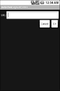
Figure 10–6. The RelativeLayoutDemo sample application
Overlap
RelativeLayout also has a feature that LinearLayout lacks—the ability to have widgets overlap one another. Later children of a RelativeLayout are “higher in the Z axis” than are earlier children, meaning that later children will overlap earlier children if they are set up to occupy the same space in the layout.
This will be clearer with an example. Here is a layout, from Containers/RelativeOverlap, with a RelativeLayout holding two Button widgets:
<?xml version="1.0" encoding="utf-8"?>

<RelativeLayout

  xmlns:android="http://schemas.android.com/apk/res/android"

  android:layout_width="fill_parent"

  android:layout_height="fill_parent"

  >

  <Button

    android:text="I AM BIG"

    android:textSize="120dip"

    android:textStyle="bold"

    android:layout_width="fill_parent"

    android:layout_height="fill_parent"

  />

  <Button

    android:text="I am small"

    android:layout_width="wrap_content"

    android:layout_height="wrap_content"

    android:layout_centerInParent="true"

  />
</RelativeLayout>
The first Button is set to fill the screen. The second Button is set to be centered inside the parent and to take up only as much space as is needed for its caption. Hence, the second Button will appear to float over the first Button, as shown in Figure 10–7.
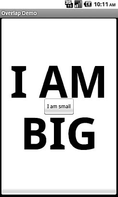
Figure 10–7. The RelativeOverlap sample application
Both Button widgets can still be clicked, though clicking the smaller Button does not also click the bigger Button. Your clicks will be handled by the widget on top in the case of an overlap like this.
Tabula Rasa
If you like HTML tables, spreadsheet grids, and similar layout options, you will like Android's TableLayout, which allows you to position your widgets in a grid to your specifications. You control the number of rows and columns, which columns might shrink or stretch to accommodate their contents, and so on.
TableLayout works in conjunction with TableRow. TableLayout controls the overall behavior of the container, with the widgets themselves poured into one or more TableRow containers, one per row in the grid.
TableLayout Concepts and Properties
For your table layout to work as you intend, you need to understand how widgets work with rows and columns, and how to handle widgets that live outside of rows.
Putting Cells in Rows
Rows are declared by you, the developer, by putting widgets as children of a TableRow inside the overall TableLayout. You, therefore, control directly how many rows appear in the table.
The number of columns is determined by Android; you control the number of columns in an indirect fashion. First, there will be at least one column per widget in your longest row. So if you have three rows—one with two widgets, one with three widgets, and one with four widgets—there will be at least four columns. However, you can have a widget take up more than one column by including the android:layout_span property, indicating the number of columns the widget spans. This is akin to the colspan attribute one finds in table cells in HTML. In this XML layout fragment, the field spans three columns:
<TableRow>

  <TextView android:text="URL:" />

  <EditText

    android:id="@+id/entry"

    android:layout_span="3"/>

</TableRow>
Ordinarily, widgets are put into the first available column. In the preceding fragment, the label would go in the first column (column 0, as columns are counted starting from 0), and the field would go into a spanned set of three columns (columns 1 through 3). However, you can put a widget into a different column via the android:layout_column property, specifying the 0-based column the widget belongs to:
<TableRow>

  <Button

    android:id="@+id/cancel"

    android:layout_column="2"

    android:text="Cancel" />

  <Button android:id="@+id/ok" android:text="OK" />

</TableRow>
In the preceding XML layout fragment, the Cancel button goes in the third column (column 2). The OK button then goes into the next available column, which is the fourth column.
Non-Row Children of TableLayout
Normally, TableLayout contains only TableRow elements as immediate children. However, it is possible to put other widgets in between rows. For those widgets, TableLayout behaves a bit like LinearLayout with vertical orientation. The widgets automatically have their width set to fill_parent, so they will fill the same space that the longest row does.
One pattern for this is to use a plain View as a divider. For example, you could use <View android:layout_height = "2dip" android:background = "#0000FF" /> as a two-pixel-high blue bar across the width of the table.
Stretch, Shrink, and Collapse
By default, each column will be sized according to the natural size of the widest widget in that column (taking spanned columns into account). Sometimes, though, that does not work out very well, and you need more control over column behavior.
You can place an android:stretchColumns property on the TableLayout. The value should be a single column number (again, 0-based) or a comma-delimited list of column numbers. Those columns will be stretched to take up any available space on the row. This helps if your content is narrower than the available space.
Conversely, you can place an android:shrinkColumns property on the TableLayout. Again, this should be a single column number or a comma-delimited list of column numbers. The columns listed in this property will try to word-wrap their contents to reduce the effective width of the column—by default, widgets are not word-wrapped. This helps if you have columns with potentially wordy content that might cause some columns to be pushed off the right side of the screen.
You can also leverage an android:collapseColumns property on the TableLayout, again with a column number or comma-delimited list of column numbers. These columns will start out collapsed, meaning they will be part of the table information but will be invisible. Programmatically, you can collapse and uncollapse columns by calling setColumnCollapsed() on the TableLayout. You might use this to allow users to control which columns are of importance to them and should be shown versus which ones are less important and can be hidden.
You can also control stretching and shrinking at runtime via setColumnStretchable() and setColumnShrinkable().
TableLayout Example
The XML layout fragments previously shown, when combined, give us a TableLayout rendition of the form we created for RelativeLayout, with the addition of a divider line between the label/field and the two buttons (found in the Containers/Table demo):
<?xml version="1.0" encoding="utf-8"?>

<TableLayout

  xmlns:android="http://schemas.android.com/apk/res/android"

  android:layout_width="fill_parent"

  android:layout_height="fill_parent"

  android:stretchColumns="1">

  <TableRow>

    <TextView
        android:text="URL:" />

    <EditText android:id="@+id/entry"

      android:layout_span="3"/>

  </TableRow>

  <View

    android:layout_height="2dip"

    android:background="#0000FF" />

  <TableRow>

    <Button android:id="@+id/cancel"

      android:layout_column="2"

      android:text="Cancel" />

    <Button android:id="@+id/ok"

      android:text="OK" />

  </TableRow>

</TableLayout>
When compiled against the generated Java code and run on the emulator, we get the result shown in Figure 10–8.
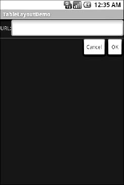
Figure 10–8. The TableLayoutDemo sample application
Scrollwork
Phone screens tend to be small, which requires developers to use some tricks to present a lot of information in the limited available space. One trick for doing this is to use scrolling, so that only part of the information is visible at one time, and the rest is available via scrolling up or down.
ScrollView is a container that provides scrolling for its contents. You can take a layout that might be too big for some screens, wrap it in a ScrollView, and still use your existing layout logic. The user can see only part of your layout at one time, and see the rest via scrolling.
For example, here is a ScrollView used in an XML layout file (from the Containers/Scroll demo):
<?xml version="1.0" encoding="utf-8"?>

<ScrollView

  xmlns:android="http://schemas.android.com/apk/res/android"

  android:layout_width="fill_parent"

  android:layout_height="wrap_content">

  <TableLayout

    android:layout_width="fill_parent"

    android:layout_height="fill_parent"

    android:stretchColumns="0">

    <TableRow>

      <View

        android:layout_height="80dip"

        android:background="#000000"/>

      <TextView android:text="#000000"

        android:paddingLeft="4dip"

        android:layout_gravity="center_vertical" />

    </TableRow>

    <TableRow>

      <View

        android:layout_height="80dip"

        android:background="#440000" />

      <TextView android:text="#440000"

        android:paddingLeft="4dip"

        android:layout_gravity="center_vertical" />

    </TableRow>

    <TableRow>

      <View

        android:layout_height="80dip"

        android:background="#884400" />

    <TextView android:text="#884400"

        android:paddingLeft="4dip"

        android:layout_gravity="center_vertical" />

    </TableRow>

    <TableRow>

      <View

        android:layout_height="80dip"

        android:background="#aa8844" />

      <TextView android:text="#aa8844"

        android:paddingLeft="4dip"

        android:layout_gravity="center_vertical" />

    </TableRow>

    <TableRow>

      <View

        android:layout_height="80dip"

        android:background="#ffaa88" />

      <TextView android:text="#ffaa88"

        android:paddingLeft="4dip"

        android:layout_gravity="center_vertical" />

    </TableRow>

    <TableRow>

      <View
        android:layout_height="80dip"

        android:background="#ffffaa" />

      <TextView android:text="#ffffaa"

        android:paddingLeft="4dip"

        android:layout_gravity="center_vertical" />

    </TableRow>

    <TableRow>

      <View

        android:layout_height="80dip"

        android:background="#ffffff" />

    <TextView android:text="#ffffff"

        android:paddingLeft="4dip"

        android:layout_gravity="center_vertical" />

    </TableRow>

  </TableLayout>

</ScrollView>
Without the ScrollView, the table would take up at least 560 pixels (seven rows at 80 pixels each, based on the View declarations). Some devices have screens capable of showing that much information, such as tablets, but the screens of many devices will be smaller. The ScrollView lets us keep the table as is, but present only part of it at a time.
On the stock Android emulator, when the activity is first viewed, it appears as shown in Figure 10–9.
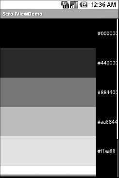
Figure 10–9. The ScrollViewDemo sample application
Notice how only five rows and part of the sixth are visible. By pressing the up/down buttons on the D-pad, you can scroll up and down to see the remaining rows. Also note how the right side of the content is clipped by the scrollbar—be sure to put some padding on that side or otherwise ensure your own content does not get clipped in that fashion.
Android 1.5 introduced HorizontalScrollView, which works like ScrollView, but horizontally. This is useful for forms that might be too wide rather than too tall. Note that neither ScrollView nor HorizontalScrollView will give you bidirectional scrolling, so you have to choose vertical or horizontal.
Also, note that you cannot put scrollable items into a ScrollView. For example, a ListView widget—which we will see in upcoming chapters—already knows how to scroll. If you put a ListView in a ScrollView, it will not work very well.
Take Them to the Grid
A TableLayout appeals to those who yearn for HTML- or CSS-style pixel precision (or lack thereof). Often you'll find that you know how you'd like the elements of your layout to appear relative to one another, or need more finesse when it comes to specifying the placement of widgets in your layout. Enter the all-new GridLayout, released with Android 4 Ice Cream Sandwich (ICS).
GridLayout is a layout that places its children onto a grid of infinitely detailed lines that separate the area into cells. The key to GridLayout's fine control is that the number of cells or, more accurately, grid lines used to describe the cells has no limit or threshold—you specify how many or how few grid lines your GridLayout should have, using rowSpec and columnSpec properties. This means you could create a layout that mimics a simple table with a few cells (that is, rows and columns) or, for those demanding situations where you need fantastically fine precision, you could go crazy specifying thousands or even millions of cells.
NOTE: To complement GridLayout's different view of the UI world, it uses android:layout_gravity in place of android:layout_weight.
As an example, here is a GridLayout used in an XML layout file (from the Containers/Grid demo):
<?xml version="1.0" encoding="utf-8"?>

<GridLayout

 xmlns:android="http://schemas.android.com/apk/res/android"

 android:orientation="vertical"

 android:layout_width="fill_parent"

 android:layout_height="fill_parent"

>

  <Button

    android:text="Defying gravity!"

    android:layout_gravity="top"

  />

  <Button

    android:text="Falling like an apple"

    android:layout_gravity="bottom"

  />

</GridLayout>
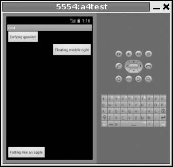
In an ICS Android emulator, we see the activity using our GridLayout, as shown in Figure 10–10.
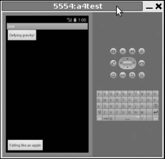
Figure 10–10. The GridDemo sample application
Our buttons have followed their various gravity directions to place themselves on the GridLayout, using the defaults for rowSpec and columnSpec counts. We can observe the utility of the GridLayout not needing the somewhat tedious static layout directives of the TableLayout by adding another button to our declarations in main.xml
...

  <Button

    android:text="Defying gravity!"

    android:layout_gravity="top"

  />

  <Button

    android:text="Floating middle right"

    android:layout_gravity="right|center_vertical"

  />

  <Button

    android:text="Falling like an apple"

    android:layout_gravity="bottom"

  />

...
Figure 10–11 shows how our GridLayout adapts to display its children.