
Chapter 14
Still More Widgets and Containers
This book has covered a number of widgets and containers so far. This chapter is the last that focuses exclusively on widgets and containers, covering a number of popular options, from date and time widgets to tabs. Subsequent chapters introduce new widgets occasionally, but in the context of some other topic, such as introducing the ProgressBar in Chapter 20 (covering threads).
Pick and Choose
With limited-input devices like phones, having widgets and dialog boxes that are aware of the type of stuff a user is supposed to be entering is very helpful. They minimize keystrokes and screen taps and reduce the chance that a user will make some sort of error (e.g., entering a letter somewhere only numbers are expected).
As shown in Chapter 9, EditText has content-aware flavors for entering numbers and text. Android also supports widgets (DatePicker and TimePicker) and dialog boxes (DatePickerDialog and TimePickerDialog) for helping users enter dates and times.
DatePicker and DatePickerDialog allow you to set the starting date for the selection, in the form of a year, month, and day of month value. Note that the month runs from 0 for January through 11 for December. Most importantly, both DatePicker and DatePickerDialog let you provide a callback object (OnDateChangedListener or OnDateSetListener) to notify you when a user has selected a new date. It is up to you to store that date someplace, particularly if you are using the dialog box, since there is no other way for you to access the chosen date later.
Similarly, TimePicker and TimePickerDialog let you do the following:
- Set the initial time the user can adjust, in the form of an hour (
0through23) and a minute (0through59) - Indicate if the selection should be in 12-hour mode with an AM/PM toggle or in 24-hour mode (what is thought of in the United States as “military time” and in much of the rest of the world as “the way times are supposed to be”)
- Provide a callback object (
OnTimeChangedListenerorOnTimeSetListener) to be notified of when the user has chosen a new time, which is supplied to you in the form of an hour and minute
As an example of using date and time pickers, from the Fancy/Chrono sample project, here’s a trivial layout containing a label and two buttons, which will pop up the dialog box flavors of the date and time pickers:
<?xml version="1.0" encoding="utf-8"?>

<LinearLayout

  xmlns:android="http://schemas.android.com/apk/res/android"

  android:orientation="vertical"

  android:layout_width="fill_parent"

  android:layout_height="fill_parent"

  >

  <TextView android:id="@+id/dateAndTime"

    android:layout_width="fill_parent"

    android:layout_height="wrap_content"

    />

  <Button android:id="@+id/dateBtn"

    android:layout_width="fill_parent"

    android:layout_height="wrap_content"

    android:text="Set the Date"

    android:onClick="chooseDate"

    />

  <Button android:id="@+id/timeBtn"

    android:layout_width="fill_parent"

    android:layout_height="wrap_content"

    android:text="Set the Time"

    android:onClick="chooseTime"

    />

</LinearLayout>
The more interesting stuff comes in the Java source:
package com.commonsware.android.chrono;


import android.app.Activity;

import android.os.Bundle;

import android.app.DatePickerDialog;

import android.app.TimePickerDialog;

import android.view.View;

import android.widget.DatePicker;

import android.widget.TimePicker;

import android.widget.TextView;

import java.text.DateFormat;

import java.util.Calendar;


public class ChronoDemo extends Activity {

  DateFormat fmtDateAndTime=DateFormat.getDateTimeInstance();

  TextView dateAndTimeLabel;

  Calendar dateAndTime=Calendar.getInstance();
  @Override

  public void onCreate(Bundle icicle) {

    super.onCreate(icicle);

    setContentView(R.layout.main);


    dateAndTimeLabel=(TextView)findViewById(R.id.dateAndTime);


    updateLabel();

  }


  public void chooseDate(View v) {

    new DatePickerDialog(ChronoDemo.this, d,

                         dateAndTime.get(Calendar.YEAR),

                         dateAndTime.get(Calendar.MONTH),

                         dateAndTime.get(Calendar.DAY_OF_MONTH))

      .show();

  }


  public void chooseTime(View v) {

    new TimePickerDialog(ChronoDemo.this, t,

                         dateAndTime.get(Calendar.HOUR_OF_DAY),

                         dateAndTime.get(Calendar.MINUTE),

                         true)

      .show();

  }


  private void updateLabel() {

    dateAndTimeLabel.setText(fmtDateAndTime

                             .format(dateAndTime.getTime()));

  }


  DatePickerDialog.OnDateSetListener d=new DatePickerDialog.OnDateSetListener() {

    public void onDateSet(DatePicker view, int year, int monthOfYear,

                         int dayOfMonth) {

      dateAndTime.set(Calendar.YEAR, year);

      dateAndTime.set(Calendar.MONTH, monthOfYear);

      dateAndTime.set(Calendar.DAY_OF_MONTH, dayOfMonth);

      updateLabel();

    }

  };


  TimePickerDialog.OnTimeSetListener t=new TimePickerDialog.OnTimeSetListener() {

    public void onTimeSet(TimePicker view, int hourOfDay,

                         int minute) {

      dateAndTime.set(Calendar.HOUR_OF_DAY, hourOfDay);

      dateAndTime.set(Calendar.MINUTE, minute);

      updateLabel();

    }

  };

}
The model for this activity is just a Calendar instance, initially set to be the current date and time. We pour it into the view via a DateFormat formatter. In the updateLabel() method, we take the current Calendar, format it, and put it in the TextView.
Each button has a corresponding method that will get control when the user clicks it (chooseDate() and chooseTime()). When the button is clicked, either a DatePickerDialog or a TimePickerDialog is shown. In the case of the DatePickerDialog, we give it an OnDateSetListener callback that updates the Calendar with the new date (year, month, and day of month). We also give the dialog box the last-selected date, getting the values from the Calendar. In the case of the TimePickerDialog, it gets an OnTimeSetListener callback to update the time portion of the Calendar, the last-selected time, and a value of true indicating we want 24-hour mode on the time selector.
With all this wired together, the resulting activity looks like Figures 14–1, 14–2, and 14–3.

Figure 14–1. The ChronoDemo sample application, as initially launched
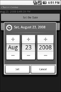
Figure 14–2. The same application, showing the date picker dialog box

Figure 14–3. The same application, showing the time picker dialog box
Time Keeps Flowing Like a River
If you want to display the time, rather than have users enter the time, you may wish to use the DigitalClock widget or the AnalogClock widget. These widgets are extremely easy to use, as they automatically update with the passage of time. All you need to do is put them in your layout and let them do their thing.
For example, from the Fancy/Clocks sample application, here is an XML layout containing both DigitalClock and AnalogClock:
<?xml version="1.0" encoding="utf-8"?>

<RelativeLayout xmlns:android="http://schemas.android.com/apk/res/android"

  android:layout_width="fill_parent"

  android:layout_height="fill_parent"

  >

  <AnalogClock android:id="@+id/analog"

    android:layout_width="fill_parent"

    android:layout_height="wrap_content"

    android:layout_centerHorizontal="true"

    android:layout_alignParentTop="true"

    />

  <DigitalClock android:id="@+id/digital"

    android:layout_width="wrap_content"

    android:layout_height="wrap_content"

    android:layout_centerHorizontal="true"

    android:layout_below="@id/analog"

    />

</RelativeLayout>
Without any Java code other than the generated stub, we can build this project and get the activity shown in Figure 14–4.
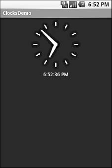
Figure 14–4. The ClocksDemo sample application
If you are looking for more of a timer, Chronometer may be of interest. With a Chronometer, you can track elapsed time from a starting point, as shown in the example in Figure 14–5. You simply tell it when to start() and stop(), and possibly override the format string that displays the text.
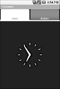
Figure 14–5. The Views/Chronometer API Demo from the Android SDK
Seeking Resolution
The SeekBar is an input widget that allows the user to select a value along a range of possible values. Figure 14–6 shows an example.
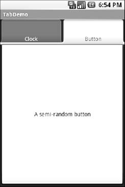
Figure 14–6. The Views/SeekBar API Demo from the Android SDK
The user can either drag the thumb or click on either side of the thumb to reposition it. The thumb then points to a particular value along a range. That range will be 0 to some maximum value, 100 by default, which you control via a call to setMax(). You can find out what the current position is via getProgress(), or find out when the user makes a change to the thumb’s position by registering a listener via setOnSeekBarChangeListener().
We saw a variation on this theme with the RatingBar example in Chapter 13.
Putting It on My Tab
The general Android philosophy is to keep activities short and sweet. If there is more information than can reasonably fit on one screen, albeit perhaps with scrolling, then it perhaps belongs in another activity kicked off via an Intent, as will be described in Chapter 22. However, that can be complicated to set up. Moreover, sometimes there legitimately is a lot of information that needs to be collected to be processed as an atomic operation.
In a traditional UI, you might use tabs to collect and display information, such as a JTabbedPane in Java/Swing. In Android, you now have the option of using a TabHost container in much the same way. A portion of your activity’s screen is taken up with tabs, which, when clicked, swap out part of the view and replace it with something else. For example, you might have an activity with a tab for entering a location and a second tab for showing a map of that location.
Some GUI toolkits refer to “tabs” as only the things that a user clicks to toggle from one view to another. Other GUI toolkits refer to “tabs” as the combination of the clickable button-like element and the content that appears when that element is chosen. Android treats the tab buttons and contents as discrete entities, so they are referred to as “tab buttons” and “tab contents” in this section.
The Pieces
You use the following widgets and containers to set up a tabbed portion of a view:
TabHost: The overarching container for the tab buttons and tab contents.TabWidget: Implements the row of tab buttons, which contain text labels and, optionally, icons.FrameLayout: The container for the tab contents. Each tab content is a child of theFrameLayout.
This is similar to the approach that Mozilla’s XUL takes. In XUL’s case, the tabbox element corresponds to Android’s TabHost, the tabs element corresponds to TabWidget, and tabpanels corresponds to FrameLayout.
For example, here is a layout definition for a tabbed activity, from Fancy/Tab:
<?xml version="1.0" encoding="utf-8"?>

<TabHost xmlns:android="http://schemas.android.com/apk/res/android"

  android:id="@+id/tabhost"

  android:layout_width="fill_parent"

  android:layout_height="fill_parent">

  <LinearLayout

    android:orientation="vertical"

    android:layout_width="fill_parent"

    android:layout_height="fill_parent">

    <TabWidget android:id="@android:id/tabs"

      android:layout_width="fill_parent"

      android:layout_height="wrap_content"

    />

    <FrameLayout android:id="@android:id/tabcontent"

      android:layout_width="fill_parent"

      android:layout_height="fill_parent">

      <AnalogClock android:id="@+id/tab1"

        android:layout_width="fill_parent"

        android:layout_height="fill_parent"

      />

      <Button android:id="@+id/tab2"

        android:layout_width="fill_parent"

        android:layout_height="fill_parent"

        android:text="A semi-random button"
      />

    </FrameLayout>

  </LinearLayout>

</TabHost>
Note that the TabWidget and FrameLayout are indirect children of the TabHost, and the FrameLayout itself has children representing the various tabs. In this case, there are two tabs: a clock and a button. In a more complicated scenario, the tabs could be some form of container (e.g., LinearLayout) with their own contents.
Wiring It Together
You can put these widgets in a regular Activity or a TabActivity. TabActivity, like ListActivity, wraps a common UI pattern (an activity made up entirely of tabs) into a pattern-aware activity subclass. If you wish to use the TabActivity, you must give the TabHost an android:id of @android:id/tabhost. Conversely, if you do not wish to use TabActivity, you need to get your TabHost via findViewById(), and then call setup() on the TabHost, before you do anything else.
The rest of the Java code needs to tell the TabHost which views represent the tab contents and what the tab buttons should look like. This is all wrapped up in TabSpec objects. You get a TabSpec instance from the host via newTabSpec(), fill it out, and then add it to the host in the proper sequence.
TabSpec has two key methods:
setContent(): Indicates what goes in the tab content for this tab, typically theandroid:idof the view you want shown when this tab is selectedsetIndicator(): Sets the caption for the tab button and, in some flavors of this method, supplies aDrawableto represent the icon for the tab
Note that tab “indicators” can actually be views in their own right, if you need more control than a simple label and optional icon.
Also note that you must call setup() on the TabHost before configuring any of these TabSpec objects. The call to setup() is not needed if you are using the TabActivity base class for your activity.
For example, here is the Java code to wire together the tabs from the preceding layout example:
package com.commonsware.android.fancy;


import android.app.Activity;

import android.os.Bundle;

import android.widget.TabHost;


public class TabDemo extends Activity {

  @Override

  public void onCreate(Bundle icicle) {

    super.onCreate(icicle);

    setContentView(R.layout.main);
    TabHost tabs=(TabHost)findViewById(R.id.tabhost);


    tabs.setup();


    TabHost.TabSpec spec=tabs.newTabSpec("tag1");


    spec.setContent(R.id.tab1);

    spec.setIndicator("Clock");

    tabs.addTab(spec);


    spec=tabs.newTabSpec("tag2");

    spec.setContent(R.id.tab2);

    spec.setIndicator("Button");

    tabs.addTab(spec);

  }

}
We find our TabHost via the familiar findViewById() method, and then have it set up via setup(). After that, we get a TabSpec via newTabSpec(), supplying a tag whose purpose is unknown at this time. Given the spec, we call setContent() and setIndicator(), and then call addTab() back on the TabHost to register the tab as available for use. Finally, we can choose which tab is the one to show via setCurrentTab(), providing the 0-based index of the tab.
The results are shown in Figures 14–7 and 14–8.
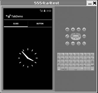
Figure 14–7. The TabDemo sample application, showing the first tab
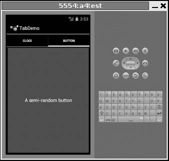
Figure 14–8. The same application, showing the second tab
Note that if your application is running under an older SDK level, prior to the Honeycomb and Ice Cream Sandwich releases, then your menus will appear in the old-fashioned “button” style, as shown in Figure 14–9. You have some control over whether to use the old behavior or the new behavior by specifying android:targetSdkVersion and android:minSdkVersion in your AndroidManifest.xml. Chapter 29 has a useful list of SDK versions.
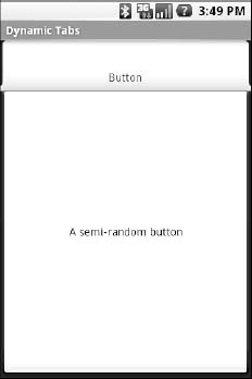
Figure 14–9. The TabDemo sample application, showing the first tab with older-style UI
Adding Them Up
TabWidget is set up to allow you to easily define tabs at compile time. However, sometimes you may want to add tabs to your activity during runtime. For example, imagine an e-mail client that opens each individual e-mail message in its own tab, for easy toggling between messages. In this case, you do not know how many tabs you will need or what their contents will be until runtime, when the user chooses to open a message. Fortunately, Android also supports adding tabs dynamically at runtime.
Adding tabs dynamically at runtime works much like the compile-time tabs previously described, except you use a different flavor of setContent(), one that takes a TabHost.TabContentFactory instance. This is just a callback that will be invoked. You provide an implementation of createTabContent() and use it to build and return the View that becomes the content of the tab.
Let’s take a look at an example (Fancy/DynamicTab). First, here is some layout XML for an activity that sets up the tabs and defines one tab, containing a single button:
<?xml version="1.0" encoding="utf-8"?>

<TabHost xmlns:android="http://schemas.android.com/apk/res/android"

  android:id="@+id/tabhost"

  android:layout_width="fill_parent"

  android:layout_height="fill_parent">

  <LinearLayout

    android:orientation="vertical"

    android:layout_width="fill_parent"

    android:layout_height="fill_parent">

    <TabWidget android:id="@android:id/tabs"

      android:layout_width="fill_parent"

      android:layout_height="wrap_content"

    />

    <FrameLayout android:id="@android:id/tabcontent"

      android:layout_width="fill_parent"

      android:layout_height="fill_parent">

      <Button android:id="@+id/buttontab"

        android:layout_width="fill_parent"

        android:layout_height="fill_parent"

        android:text="A semi-random button"

        android:onClick="addTab"

      />

    </FrameLayout>

  </LinearLayout>

</TabHost>
We want to add new tabs whenever the button is clicked, which we can accomplish with the following code:
package com.commonsware.android.dynamictab;


import android.app.Activity;

import android.os.Bundle;

import android.view.View;

import android.widget.AnalogClock;

import android.widget.TabHost;
public class DynamicTabDemo extends Activity {

  private TabHost tabs=null;


  @Override

  public void onCreate(Bundle icicle) {

    super.onCreate(icicle);

    setContentView(R.layout.main);


    tabs=(TabHost)findViewById(R.id.tabhost);

    tabs.setup();


    TabHost.TabSpec spec=tabs.newTabSpec("buttontab");


    spec.setContent(R.id.buttontab);

    spec.setIndicator("Button");

    tabs.addTab(spec);

  }


  public void addTab(View v) {

    TabHost.TabSpec spec=tabs.newTabSpec("tag1");


    spec.setContent(new TabHost.TabContentFactory() {

      public View createTabContent(String tag) {

        return(new AnalogClock(DynamicTabDemo.this));

      }

    });


    spec.setIndicator("Clock");

    tabs.addTab(spec);

  }

}
In our button’s addTab() callback, we create a TabHost.TabSpec object and give it an anonymous TabHost.TabContentFactory. The factory, in turn, returns the View to be used for the tab—in this case, just an AnalogClock. The logic for constructing the tab’s View could be much more elaborate, such as using LayoutInflater to construct a view from layout XML.
Initially, when the activity is launched, we just have the one tab, as shown in Figure 14–10. Figure 14–11 shows the three dynamically created tabs.
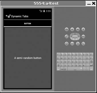
Figure 14–10. The DynamicTab application, with the single initial tab
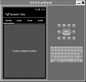
Figure 14–11. The DynamicTab application, with three dynamically created tabs
The table handling is truly dynamic, adapting to the size of your screen. Android formats the table to fit larger-format screens such as tablets and even TVs. Figure 14–12 shows four dynamically created tabs on a larger, tablet-sized screen.
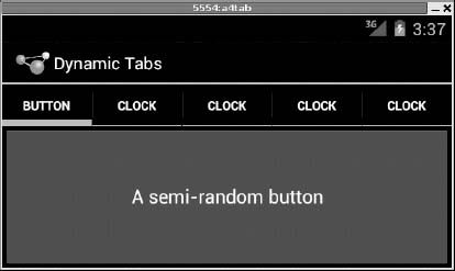
Figure 14–12. The DynamicTab application, demonstrating adaptability on a tablet-sized screen
Flipping Them Off
Sometimes, you want the overall effect of tabs (only some Views visible at a time) but not the actual UI implementation of tabs. Maybe the tabs take up too much screen space. Maybe you want to switch between perspectives based on a gesture or a device shake. Or maybe you just like being different. Android 4.0 Ice Cream Sandwich offers the ability to “push” your tabs up into vacant space in the action bar when space allows, such as when you rotate to landscape orientation, but that doesn’t cater for those crazy “shake, rattle, and roll” ideas you might have.
The good news is that the guts of the view-flipping logic from tabs can be found in the ViewFlipper container, which can be used in other ways than the traditional tab.
ViewFlipper inherits from FrameLayout, in the same way we use it to describe the innards of a TabWidget. However, initially, ViewFlipper just shows the first child view. It is up to you to arrange for the views to flip, either manually by user interaction or automatically via a timer.
For example, here is a layout for a simple activity (Fancy/Flipper1) using a Button and a ViewFlipper:
<?xml version="1.0" encoding="utf-8"?>

<LinearLayout xmlns:android="http://schemas.android.com/apk/res/android"

    android:orientation="vertical"

    android:layout_width="fill_parent"

    android:layout_height="fill_parent"

    >

  <Button android:id="@+id/flip_me"

      android:layout_width="fill_parent"

      android:layout_height="wrap_content"

      android:text="Flip Me!"

      android:onClick="flip"

      />

  <ViewFlipper android:id="@+id/details"

    android:layout_width="fill_parent"
    android:layout_height="fill_parent"

    >

    <TextView

      android:layout_width="fill_parent"

      android:layout_height="wrap_content"

      android:textStyle="bold"

      android:textColor="#FF00FF00"

      android:text="This is the first panel"

    />

    <TextView

      android:layout_width="fill_parent"

      android:layout_height="wrap_content"

      android:textStyle="bold"

      android:textColor="#FFFF0000"

      android:text="This is the second panel"

    />

    <TextView

      android:layout_width="fill_parent"

      android:layout_height="wrap_content"

      android:textStyle="bold"

      android:textColor="#FFFFFF00"

      android:text="This is the third panel"

    />

  </ViewFlipper>

</LinearLayout>
Notice that the layout defines three child views for the ViewFlipper, each a TextView with a simple message. Of course, you could have very complicated child views, if you so choose.
To manually flip the views, we need to hook into the Button and flip them ourselves when the button is clicked:
package com.commonsware.android.flipper1;


import android.app.Activity;

import android.os.Bundle;

import android.view.View;

import android.widget.ViewFlipper;


public class FlipperDemo extends Activity {

  ViewFlipper flipper;


  @Override

  public void onCreate(Bundle icicle) {

    super.onCreate(icicle);

    setContentView(R.layout.main);


    flipper=(ViewFlipper)findViewById(R.id.details);

  }


  public void flip(View v) {

    flipper.showNext();

  }

}
This is just a matter of calling showNext() on the ViewFlipper, as you can on any ViewAnimator class. The result is a trivial activity: click the button, and the next TextView in sequence is displayed, wrapping around to the first after viewing the last, as shown in Figures 14–13 and 14–14.
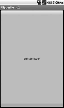
Figure 14–13. The FlipperDemo application, showing the first panel
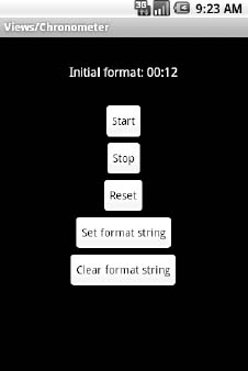
Figure 14–14. The same application, after switching to the second panel
Of course, this could be handled more simply by having a single TextView and changing the text and color on each click. However, you can imagine that the ViewFlipper contents could be much more complicated, like the contents you might put into a TabView.
As with the TabWidget, sometimes your ViewFlipper contents may not be known at compile time. And as with TabWidget, you can add new contents on-the-fly with ease.
For example, let’s look at another sample activity (Fancy/Flipper2), using this layout:
<?xml version="1.0" encoding="utf-8"?>

<LinearLayout xmlns:android="http://schemas.android.com/apk/res/android"

    android:orientation="vertical"

    android:layout_width="fill_parent"

    android:layout_height="fill_parent"

    >

  <ViewFlipper android:id="@+id/details"

    android:layout_width="fill_parent"

    android:layout_height="fill_parent"

    >

  </ViewFlipper>

</LinearLayout>
Notice that the ViewFlipper has no contents at compile time. Also notice that there is no Button for flipping between the contents—more on this in a moment.
For the ViewFlipper contents, we will create large Button widgets, each containing one of the random words used in many chapters in this book. And, we will set up the ViewFlipper to automatically rotate between the Button widgets.
package com.commonsware.android.flipper2;


import android.app.Activity;

import android.os.Bundle;

import android.view.View;

import android.view.ViewGroup;

import android.widget.Button;

import android.widget.ViewFlipper;


public class FlipperDemo2 extends Activity {

  static String[] items={"lorem", "ipsum", "dolor", "sit", "amet",

                         "consectetuer", "adipiscing", "elit",

                         "morbi", "vel", "ligula", "vitae",

                         "arcu", "aliquet", "mollis", "etiam",

                         "vel", "erat", "placerat", "ante",

                         "porttitor", "sodales", "pellentesque",

                         "augue", "purus"};

  ViewFlipper flipper;


  @Override

  public void onCreate(Bundle icicle) {

    super.onCreate(icicle);

    setContentView(R.layout.main);


    flipper=(ViewFlipper)findViewById(R.id.details);


    for (String item : items) {
      Button btn=new Button(this);


      btn.setText(item);


      flipper.addView(btn,

                     new ViewGroup.LayoutParams(

                             ViewGroup.LayoutParams.FILL_PARENT,

                             ViewGroup.LayoutParams.FILL_PARENT));

    }


    flipper.setFlipInterval(2000);

    flipper.startFlipping();

  }

}
After iterating over the funky words, turning each into a Button, and adding the Button as a child of the ViewFlipper, we set up the flipper to automatically flip between children (flipper.setFlipInterval(2000);) and to start flipping (flipper.startFlipping( .
The result is an endless series of buttons, each of which appears, as shown in Figure 14–15, and then is replaced by the next button in sequence after 2 seconds, wrapping around to the first after the last has been shown.
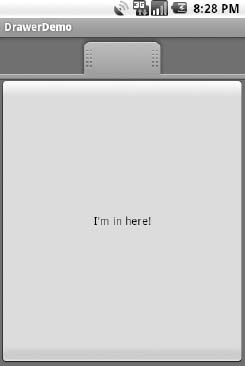
Figure 14–15. The FlipperDemo2 application
The autoflipping ViewFlipper is useful for status panels or other situations where you have a lot of information to display but not much room to display it. However, since it automatically flips between views, expecting users to interact with individual views is dicey, because the view might switch away partway through their interaction.
Getting in Somebody’s Drawer
For a long time, Android developers yearned for a sliding-drawer container that worked like the one on the home screen, containing the icons for launching applications. The official implementation was in the open source code but was not part of the SDK, until Android 1.5, when the developers released SlidingDrawer for others to use.
Unlike most other Android containers, SlidingDrawer moves, switching from a closed to an open position. This puts some restrictions on which container can hold the SlidingDrawer. It needs to be in a container that allows multiple widgets to sit atop each other. RelativeLayout and FrameLayout satisfy this requirement. FrameLayout is a container purely for stacking widgets atop one another. On the flip side, LinearLayout does not allow widgets to stack (they fall one after another in a row or column), and so you should not have a SlidingDrawer as an immediate child of a LinearLayout.
Here is a layout showing a SlidingDrawer in a FrameLayout, from the Fancy/DrawerDemo project:
<?xml version="1.0" encoding="utf-8"?>

<FrameLayout xmlns:android="http://schemas.android.com/apk/res/android"

    android:layout_width="fill_parent"

    android:layout_height="fill_parent"

    android:background="#FF4444CC"

    >

  <SlidingDrawer

    android:id="@+id/drawer"

    android:layout_width="fill_parent"

    android:layout_height="fill_parent"

    android:handle="@+id/handle"

    android:content="@+id/content">

    <ImageView

      android:id="@id/handle"

      android:layout_width="wrap_content"

      android:layout_height="wrap_content"

      android:src="@drawable/tray_handle_normal"

    />

    <Button

      android:id="@id/content"

      android:layout_width="fill_parent"

      android:layout_height="fill_parent"

      android:text="I'm in here!"

    />

  </SlidingDrawer>

</FrameLayout>
The SlidingDrawer should contain two things:
- A handle, frequently an
ImageViewor something along those lines, such as the one used here, pulled from the Android open source project - The contents of the drawer itself, usually some sort of container, but a
Buttonin this example
Moreover, SlidingDrawer needs to know the android:id values of the handle and contents, via the android:handle and android:content attributes, respectively. These tell the drawer how to animate itself as it slides open and closed.
Figure 14–16 shows what the SlidingDrawer looks like closed, using the supplied handle, and Figure 14–17 shows what it looks like open.
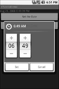
Figure 14–16. A SlidingDrawer, closed
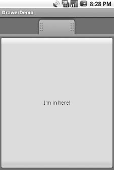
Figure 14–17. A SlidingDrawer, open
As you might expect, you can open and close the drawer from Java code, as well as via user touch events. However, you have two sets of these methods: ones that take place instantaneously (open(), close(), and toggle()) and ones that use the animation (animateOpen(), animateClose(), and animateToggle()). You can also lock() and unlock() the drawer; while locked, the drawer will not respond to touch events.
You can also register three types of callbacks if you wish:
- A listener to be invoked when the drawer is opened
- A listener to be invoked when the drawer is closed
- A listener to be invoked when the drawer is “scrolled” (i.e., the user drags or flings the handle)
For example, the Android launcher’s SlidingDrawer toggles the icon on the handle from open to closed to “delete” (if you long-tap something on the desktop). It accomplishes this, in part, through callbacks like these.
SlidingDrawer can be vertical or horizontal. Note, though, that it keeps its orientation despite the screen orientation. In other words, if you rotate the Android device or emulator running DrawerDemo, the drawer always opens from the bottom—it does not always “stick” to the original side it opened from. This means that if you want the drawer to always open from the same side, like the launcher does, you will need separate layouts for portrait versus landscape, a topic discussed in Chapter 23.
Other Good Stuff
Android offers AbsoluteLayout, where the contents are laid out based on specific coordinate positions. You tell AbsoluteLayout where to place a child in precise x and y coordinates, and Android puts it there, no questions asked. On the plus side, this gives you precise positioning. On the minus side, it means your views will look right only on screens of a certain dimension, or you will need to write a bunch of code to adjust the coordinates based on screen size. Since Android screens might run the gamut of sizes, with new sizes cropping up periodically, using AbsoluteLayout could get quite annoying. Also, note that AbsoluteLayout is officially deprecated, meaning that although it is available to you, its use is discouraged.
Android also has the ExpandableListView. This provides a simplified tree representation, supporting two levels of depth: groups and children. Groups contain children; children are “leaves” of the tree. This requires a new set of adapters, since the ListAdapter family does not provide any sort of group information for the items in the list.
Here are some other widgets available in Android beyond those covered so far in this book:
CheckedTextView: ATextViewthat can have either a check box or a radio button next to it, used with single- and multiple-choice listsChronometer: A stopwatch-style countdown timerGallery: A horizontal scrolling selection widget, designed for thumbnail previews of images (e.g., camera photos and album covers)MultiAutoCompleteTextView: Like anAutoCompleteTextView, except that the user can make multiple choices from the drop-down list, rather than just oneQuickContactBadge: Given the identity of a contact from the user’s contacts database, displays a roster of icons representing actions to be performed on that contact (place a call, send a text message, send an e-mail, etc.)ToggleButton: A two-state button where the states are indicated by a “light” and prose ("ON", "OFF") instead of a check markViewSwitcher(and theImageSwitcherandTextSwitchersubclasses): Like a simplifiedViewFlipperfor toggling between two views