In this chapter, you will continue to learn how to use CSS to control presentation of XHTML web pages, starting with CSS properties that enable you to control presentation of links, backgrounds, list styles, table styles, and outlines around boxes. You will then learn a technique to add content to a page (even if it was not in the XHTML document) using the :before and :after pseudo-classes. Finally, you will see how CSS can be used to position boxes on the page, which will allow you to create attractive layouts for your pages.
By the end of the chapter, you will know how to use CSS to control the following:
Presentation of links
Backgrounds of document
Styles of bullet points and numbered lists
Appearance of tables
Outlines around boxes
Elements that can gain focus or are active
Addition of content to the XHTML document before or after an element
The three positioning schemes that allow you to determine where on a page a box will appear — something that prepares you to use CSS to create layouts
Occasionally in this chapter, you will come across a feature that is not yet implemented by the main browsers, but it is worth learning these now as they are likely to be used as standard in the near future.
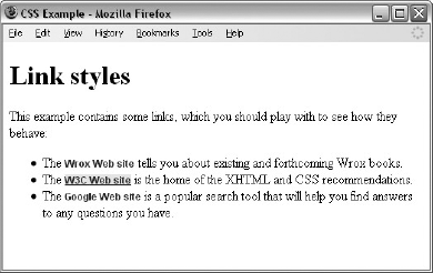
Most browsers show links in blue with an underline and change the color of links you have already visited, unless you tell them to do otherwise. The following are properties often used with links:
color: Changes the colors of the linksbackground-color: Highlights the link, as if it had been highlighted with a highlighter pentext-decoration: Commonly used to control whether the link is underlined or not, although it can also specify that text should have a strikethrough, blink, or be overlined
While you can just create rules that apply to the <a> element to set properties such as color and text-decoration, there are also four pseudo-classes that can give greater control over presentation of links.
Pseudo-class | Purpose |
|---|---|
| Styles for links in general |
| Styles for links that have already been visited |
| Styles for when someone is hovering over a link |
| Styles for links that are currently active (being clicked) |
Using these pseudo-classes allows you to change properties of links when the user hovers over them (making them a slightly different color, maybe adding a highlight and underlining them), and also the properties of links that have been visited (for example, making them a slightly different color — which helps users know where they have been).
When used, these properties should be specified in the order listed in the table above. Here is an example that will change the styles of links as users interact with them (ch08_eg01.css):
body {background-color:#ffffff;}
a {
  font-family: arial, verdana, sans-serif;
  font-size:12px;
  font-weight:bold;}
a:link {
  color:#0000ff;
  text-decoration:none;}
a:visited {
  color:#333399;
  text-decoration:none;}
a:link:hover {
  background-color:#e9e9e9;
  text-decoration:underline;}
a:active {
  color:#0033ff;
  text-decoration:underline;}
Figure 8-1 gives you an idea of how links will look with this style sheet (ch08_eg01.html), although it is rather hard to see the full effect of this in print, with the links changing as the user rolls the mouse over links and visits the sites, so try the example out with the downloaded code for this chapter.
As you saw in the last chapter, CSS treats each element as if it were its own box. You can control the background of these boxes using the following properties (when used on the <body> element they affect the entire browser window).
Property | Purpose |
|---|---|
| Specifies a background color |
| Specifies an image to use as the background |
| Indicates whether the background image should be repeated |
| Indicates a background image should be fixed in one position on the page, and whether it should stay in that position when the user scrolls down the page |
| Indicates where an image should be positioned |
| A shorthand form that allows you to specify all of these properties |
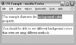
The background-color property allows you to specify a single solid color for the background of any element.
When the background-color property is set for the <body> element, it affects the whole document, and when it is used on any other element it will use the specified color inside the border of the box created for that element.
The value of this property can be a color name, a hex code, or an RGB value (colors are covered in greater depth in Appendix D). For example (ch08_eg02.css):
body {background-color:#cccccc; color:#000000;}
b {background-color:#FF0000; color:#FFFFFF;}
p {background-color: rgb(255,255,255);}
Figure 8-2 ch08_eg02.html used with the styles above from ch08_eg02.css:
I add a rule for the
<body>element to set thebackground-colorproperty for every style sheet I write because some people set their computers to have a background other than plain white (often because it causes less strain on their eyes). When the background color of an operating system is changed, browsers usually use that color, too (along with applications such as word processors). If you do not specify this property, you cannot guarantee that the visitors to the site have the same background color as you want them to have.
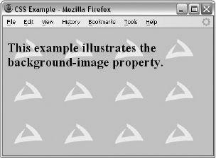
As its name suggests, the background-image property enables you to add an image to the background of any box in CSS. This can be very useful in many situations, from adding a subtle texture or shading to adding a distinctive design to the back of elements or entire pages.
The value for this property should start with the letters url, followed by the URL for the image in brackets and quotes like so:
body {background-image: url("images/background.gif");}If both a background-image property and the background-color property are used, then the background-image property takes precedence. It is good practice to supply a background-color property with a background image and give it a value similar to the main color in the background image because the page will use this color while the background image is loading or if it cannot display the image for any reason.
Here is an example of using a single background image, which is 200 pixels wide and 150 pixels high. By default, this image is repeated all across the page (ch08_eg03.css). The background-color property is set to be the same color as the background of the image (just in case the image cannot be loaded):
body {
  background-image: url("images/background.gif");
  background-color: #cccccc;}
Figure 8-3 shows what this looks like in a browser (ch08_eg03.html).
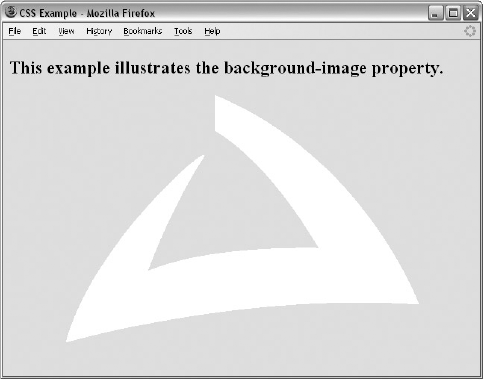
This is not a great example of how to use a background image because there is not enough contrast between the colors used in the background image and the text that appears on top of it, which makes the text harder to read. But it does illustrate the point that you must make sure that there is sufficient contrast between any background image and the writing that appears on top of it; otherwise, users will have trouble reading the text.
If you do use an image behind text, it is worth remembering that low-contrast images (images that are made up of similar colors) often make better backgrounds because it is harder to find a color that will be readable on top of a high-contrast image.
Figure 8-4 shows an improved example of the background image, where the text is on a solid color, which makes it easier to read. This time I have also used a larger image (ch08_eg04.html).
There are a few points to note about how background images work:
There is no way to express the intended width and height of a background image, so you need to save it at the size you want it to appear.
There is no equivalent to the
altattribute (alternate text for those not able to see the image for any reason); therefore, a background image should not be used to convey any important information that is not described on the page in text as well.Background images are often shown on the page after other items have been rendered, so it can look as if they take a long time to load.
The
background-imageproperty works well with most block-level elements, although some older browsers can have problems showing background images in tables.
When you specify a background-image, and the box is bigger than the image, then the image is repeated to fill up the whole box, creating what is affectionately known as wallpaper.
If you do not want your image to repeat all over the background of the box, you should use the background-repeat property, which has four helpful values, as you can see in the table that follows:
Value | Purpose |
|---|---|
This causes the image to repeat to cover the whole page (it is the default therefore rarely used). | |
The image will be repeated horizontally across the page (not down the whole page vertically). | |
The image will be repeated vertically down the page (not across horizontally). | |
The image is displayed only once. |
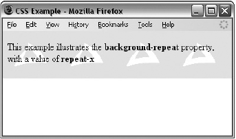
These different properties can have interesting effects. It is worth looking at each in turn. You have already seen the effect of the repeat value (as this is the default behavior when the property is not used. The value repeat-x creates a horizontal bar following the browser's x-axis (ch08_eg05.css):
body {
  background-image: url("images/background_small.gif");
  background-repeat: repeat-x; }
You can see the result of using this property in Figure 8-5.
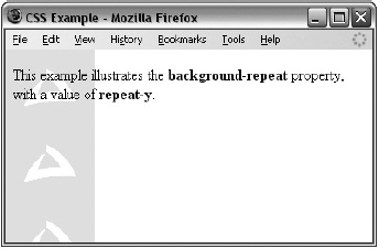
The repeat-y value works just like repeat-x but in the other direction, vertically following the browser's y-axis (ch08_eg06.css):
body {
  background-image: url("images/background_small.gif");
  background-repeat: repeat-y; }
In Figure 8-6, you can see the result with the sidebar coming down the left.
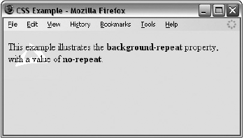
The final value was no-repeat, leaving one instance of the image that by default will be in the top-left corner of the browser window (ch08_eg07.css):
body {
  background-image: url("images/background_small.gif");
  background-repeat: no-repeat;
  background-color: #eaeaea;}
You can see the result in Figure 8-7; note how the background color of the page has been set to the same color as the image we have been using — this makes the image blend in with the page better.
You may want to alter the position of this image, and you can do this using the background-position property, which takes the values shown in the table that follows:
Meaning | |
|---|---|
Percentages along the x (horizontal) and y (vertical) axis | |
Absolute lengths along the x (horizontal) and y (vertical) axis in pixels | |
| Shown to the left of the page or containing element |
| Shown to the center of the page or containing element |
| Shown to the right of the page or containing element |
| Shown at the top of the page or containing element |
| Shown at the center of the page or containing element |
| Shown at the bottom of the page or containing element |
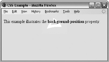
Here is an example of fixing the position of the image as shown in Figure 8-8 (ch08_eg08.css):
body {
  background-image: url("images/background_small.gif");
  background-position: 50% 20%;
  background-repeat: no-repeat;
  background-color: #eaeaea; }
This image will be horizontally centered (because it should be 50 percent of the screen's width from the left-hand side of the page) and a fifth of the way down from the top of the screen (because it is positioned 20 percent of the window height from the top of the screen). It is worth trying this example in the code download and changing the size of the browser window to see how the background image will remain in the center of the browser window horizontally and a fifth of the way down the window vertically when you change the size of the window.
When you specify a background image you can use the background-attachment property to specify whether the image is fixed in its position, or whether it moves as the user scrolls up and down the page.
Value | Purpose |
|---|---|
| The image will not move if the user scrolls up and down the page. |
| The image stays in the same place on the background of the page. If the user scrolls up or down the page, the image moves, too. |
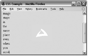
Here is an example where the image will stay in the middle of the page even when the user scrolls further down (ch08_eg09.css):
body {
  background-image: url("images/background_small.gif");
  background-attachment: fixed;
  background-position: center;
  background-repeat: no-repeat;
  background-color: #eaeaea; }
Figure 8-9 shows that the user has scrolled halfway down the page and the image is in the center of the browser window (the background looks exactly the same as it would have when the user was at the top of the page).
The background property allows you to specify several of the background properties at once. The values can be given in any order, and if you do not supply one of the values, the default value will be used.
For example, you can just write:
body {background: #cc66ff; url("images/background_small.gif") fixed
no-repeat center;}
This creates exactly the same effect as the example shown in Figure 8-9.
Back in Chapter 1, you learned how to use the <ul> and <li> elements to create lists with bullet points (also known as unordered lists) and the <ol> and <li> elements to create numbered (or ordered) lists. In this section you will learn about the CSS properties you can use to control lists.
Property | Purpose |
|---|---|
Allows you to control the shape or appearance of the marker (the marker is another name for the bullet point or number). | |
| When a list item takes up more than one line, this property specifies where the marker should appear in relation to the text. |
| Specifies an image for the marker rather than a bullet point or number. |
| Serves as shorthand for the preceding properties. |
| Specifies the distance between a marker and the text in the list. |
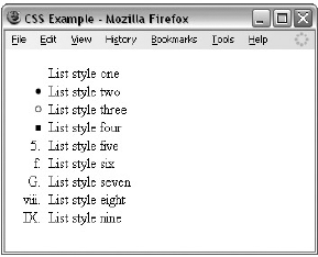
The list-style-type property allows you to control the shape or style of bullet point (also known as a marker) in the case of unordered lists and the style of numbering characters in ordered lists.
The table that follows shows the standard styles for an unordered list.
Value | Marker |
|---|---|
| None |
| A filled-in circle |
| An empty circle |
| A filled-in square |
The table that follows shows values for ordered lists that are supported in most browsers.
Value | Meaning | Example |
|---|---|---|
| Number | 1, 2, 3, 4, 5 |
| 0 before the number | 01, 02, 03, 04, 05 |
| Lowercase alphanumeric characters | a, b, c, d, e |
| Uppercase alphanumeric characters | A, B, C, D, E |
| Lowercase Roman numerals | i, ii, iii, iv, v |
| Uppercase Roman numerals | I, II, III, IV, V |
The list-style-type property can either be used on the <ul> and <ol> elements (in which case it applies to the entire list) or on the individual <li> elements. The following example demonstrates all these styles (ch08_eg10.html):
li.a {list-style-type:none;}
li.b {list-style-type:disc;}
li.c {list-style-type:circle;}
li.d {list-style-type:square;}
li.e {list-style-type:decimal;}
li.f {list-style-type:lower-alpha;}
li.g {list-style-type:upper-alpha;}
li.h {list-style-type:lower-roman;}
li.i {list-style-type:upper-roman;}
You can see the result with examples of each kind of bullet in Figure 8-10.
Lists are indented into the page, and the list-style-position property indicates whether the marker should appear inside or outside of the box containing the main points. There are two values for this property, as you can see in the table that follows:
Value | Purpose |
|---|---|
| The marker is inside the block of text (which is indented). |
| The marker sits to the left of the block of text (this is the default value if this is not specified). |
Here you can see how this property is written; in this case it is given on the <ul> or <ol> elements (ch08_eg11.css):
ul {list-style-position:outside;}
ol {list-style-position:inside;}
Figure 8-11 shows you what this would look like in a browser.
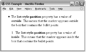
As you can see, the text is indented in both cases, and the value of this property indicates whether the marker is inside this box or outside of the box.
The list-style-image property allows you to specify an image so that you can use your own bullet style. The syntax is similar to the background-image property; the value starts with the letters url and is followed by the URL for the image in brackets and quotation marks (ch08_eg12.css):
li {list-style-image: url("images/bulletpoint.gif");}You can see an example of some triangular bullet points in Figure 8-12.
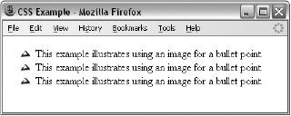
If the image cannot be displayed, the browser should just display a dot rather than a broken image symbol.
The list-style property is a way of expressing more than one of these properties at once. They can appear in any order. For example:
ul {list-style: inside circle;}Remember that you can also set the border, padding, and margin properties for <ul>, <ol>, <li>, <dl>, <dt>, and <dd> elements, as each element has its own box in CSS.
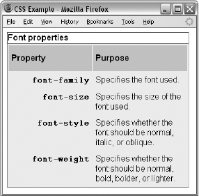
In the last chapter, you saw a couple of examples that use CSS with tables. Properties that are commonly used with the <table>, <td>, and <th> elements include the following:
borderto set the properties of the border of a table.paddingto set the amount of space between the border of a table cell and its content — this property is very important to make tables easier to read.Properties to change text and fonts.
text-alignto align writing to the left, right, or center of a cell.vertical-alignto align writing to the top, middle, or bottom of a cell.widthto set the width of a table or cell.heightto set the height of a cell (often used on a row as well).background-colorto change the background color of a table or cell.background-imageto add an image to the background of a table or cell.
You should be aware that, apart from the background-color and height properties, it is best to avoid using these properties with <tr> elements, as browser support for these properties on rows is not as good as it is for individual cells.
To demonstrate how some of these properties are used with a table, take a look at the one shown in Figure 8-13; it might look familiar because you saw it at the beginning of the last chapter, but this time it has an added <caption> element (ch08_13.html).
Now take a look at the style sheet for this table (ch08_eg13.css):
body {color:#000000; background-color:#ffffff;}
h1 {font-size:18pt;}
p {font-size:12pt;}
table {
   background-color:#efefef;
   width:350px;
   border-style:solid;
   border-width:1px;
   border-color:#999999;
   font-family:arial, verdana, sans-serif;}
caption {
  font-weight:bold;
  text-align:left;
  border-style:solid; border-width:1px; border-color:#666666;
  color:#666666;}
th {
  height:50px;
  font-weight:bold;
  text-align:left;
  background-color:#cccccc;}
td, th {padding:5px;}
td.code {
   width:150px;
   font-family:courier, courier-new, serif;
   font-weight:bold;
   text-align:right;
   vertical-align:top;}
Here are some key points to note about this example. You will be altering settings of some of these properties using new properties that you will meet throughout this section.
The rule for the
<table>element uses awidthproperty to fix the width of the table to 350 pixels; otherwise, it would take up as much of the screen as needed to show as much text as possible on one line.The rule for the
<table>element also has aborderproperty set, which creates a single-pixel border all around the table. Note, however, that none of the other cells in the table inherits this property.The rule that applies to the
<caption>element has itsfont-weight,border, andtext-alignproperties set. By default the text is normal (not bold), aligned in the center, and without a border.The rule that applies to the
<th>element sets theheightof the headings to 50 pixels, and the text is aligned left (rather than centered, which is the default).There is a rule that applies to both the
<th>and<td>elements, and this indicates that both should have a padding property set to5pxso that the content of the cells does not touch the border of those cells. Creating space around the cells is very important and makes the table more readable.The final rule states that the
<td>elements whoseclassattribute has a value ofcodeare given awidthproperty whose value is150px(150 pixels). This ensures that the content of this whole column remains on one line. Unfortunately, there is no way to assign a style to a column, but in the case of thewidthproperty, once it has been set on one element it does not need to be set on all the others in the column.
You may also have noticed in Figure 8-13 that there is a white line around the two columns (which is particularly noticeable around table header cells). Browsers automatically add this to separate each cell from its neighbor. You can, however, remove this gap using a property called border-spacing, which you'll learn about in the next section.
In the following section you will meet five properties that can only be used with tables, and also some values for the border-style property that only apply to tables. Most of these properties were first supported in IE7 and FF2.
Property | Purpose |
|---|---|
| Where the borders of two table cells touch, this property indicates whether both borders should be visible, or whether the browser should pick just one of the borders to show. |
| Specifies the width of the space that should appear between table cells. |
| Specifies which side of a table the caption should appear on. |
| Specifies whether the border should be shown if a cell is empty. |
| If the space you have allocated for a table is not enough to fit the contents, browsers will often increase the size of the table to fit the content in — this property can force a table to use the dimensions you specify. |
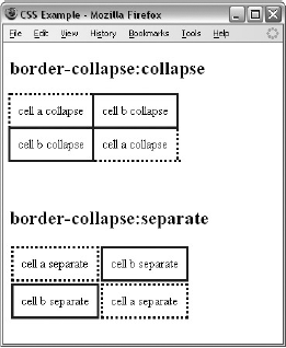
Where two table cells meet, you can tell the browser to show just one of the borders (rather than both — which is the default behavior). You can do this using the border-collapse property, which can take two values:
Value | Purpose |
|---|---|
| Horizontal borders will be collapsed and vertical borders will abut one another. |
Separate rules are observed. This value opens up additional properties to give you further control. |
If two adjacent table cells have different border styles, and you have specified that borders should be collapsed, there is a complex set of rules to specify which border should be shown — rather than try to learn these rules it is quicker to simply try your table out in a browser.
To illustrate how the border-collapse property works, the following style rules apply to two tables: the first has a border-collapse property with a value of collapse, the second has a value of separate, and both tables contain adjacent cells with dotted and solid lines (ch08_eg14.css):
table.one {border-collapse:collapse;}
table.two {border-collapse:separate;}
td.a {border-style:dotted; border-width:3px; border-color:#000000;
  padding:10px;}
td.b {border-style:solid; border-width:3px; border-color:#333333;
  padding:10px;}
Figure 8-14 shows you how, with a value of collapse, the browser collapses borders into each other so that the solid border takes precedence over the dotted border. This wouldn't look as odd if the borders were both solid, but it does illustrate the point well.
If you do not specify that the borders should be collapsed, then two further properties control border presentation:
The following sections discuss these properties.
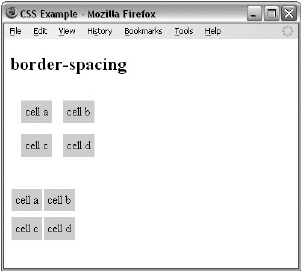
The border-spacing property specifies the distance that separates adjacent cells' borders. If you provide one value, it will apply to both vertical and horizontal borders:
table.one {border-spacing:15px;}Or you can specify two values, in which case the first refers to the horizontal spacing and the second to the vertical spacing:
table.two {border-spacing:2px 4px;}You can see what this looks like in Figure 8-15 (ch08_eg15.html styled with ch08_eg15.css):
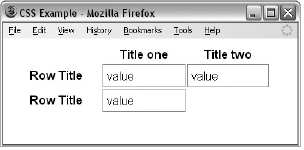
The empty-cells property indicates whether a cell without any content should have a border displayed. It can take one of three values, as you can see in the table that follows.
Value | Purpose |
|---|---|
| Borders will be shown even if the cell is empty (this is the default value). |
| Borders will be hidden if cell is empty. |
| Borders will obey the rules of the containing table (only of use in nested tables). |
If you want to explicitly hide or show borders of empty cells, you should use this property because some versions of IE and Firefox treat empty cells differently.
Here you can see a table with two empty cells: an empty <th> element and an empty <td> element (ch08_eg16.html):
<table>
  <tr>
    <th></th>
    <th>Title one</th>
    <th>Title two</th>
  </tr>
  <tr>
    <th>Row Title</th>
    <td>value</td>
    <td>value</td>
  </tr>
  <tr>
    <th>Row Title</th>
    <td>value</td>
    <td></td>
  </tr>
</table>
The following code shows the empty-cells property used to hide borders of empty cells in the <table> element (ch08_eg16.css):
table {
   width:350px;
   border-collapse:separate;
   empty-cells:hide;}
td {padding:5px;
   border-style:solid;
   border-width:1px;
   border-color:#999999;}
Figure 8-16 shows what the table looks like without borders for empty cells.
The caption-side property is for use with the <caption> element to indicate on which side of the table the caption should go. The following table lists the possible values.
Value | Purpose |
|---|---|
| The caption will appear above the table (the default). |
| The caption will appear to the right of the table. |
| The caption will appear below the table. |
| The caption will appear on the left side of the table. |
For example, here you can see the caption being set to the bottom of the table (ch08_eg17.css):
caption {caption-side:bottom}Figure 8-17 shows you the caption-side property at work; you can see that the caption for this table has moved to the bottom of the table (rather than the top).
When you specify a width for a table or table cell, but the content does not fit into the space you have allowed, a browser can give the table more space to fit the content. The table-layout property allows you to force the browser to stick to the widths you specify, even if this makes the content unreadable.
See the table that follows for the three possible values this property can take.
Value | Purpose |
|---|---|
| The browser looks through the entire table for the widest unbreakable content in the cells. This is slower at rendering, but more useful if you do not know the exact size of each column. This is the default value. |
| The width of a table cell only depends on the widths you specified for the table and its cells. This speeds up rendering. |
| Will obey the rules of the containing table (only of use in nested tables). |
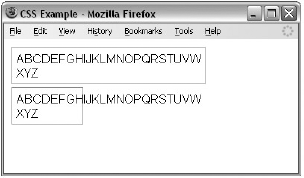
In the following example there are two tables, each with just one cell. The cells contain the letters of the alphabet, and there is a space before the last three letters. Normally, each table cell will be as wide as the longest unbroken set of characters in a cell — in this case, the letters A through W (ch08_eg18.html).
<table class="one">
  <tr>
    <td>ABCDEFGHIJKLMNOPQRSTUVW XYZ</td>
  </tr>
</table>

<table class="two">
  <tr>
    <td>ABCDEFGHIJKLMNOPQRSTUVW XYZ</td>
  </tr>
</table>
Now, if you look at the CSS for this example, you can see that the width of the table is set to 75 pixels — not enough for the letters A through W. One table has the table-layout property set to auto, the other to fixed (ch08_eg18.css).
table {width:75px;}
table.one {table-layout:auto;}
table.two {table-layout:fixed;}

td {
   padding:5px;
   border-style:solid;
   border-width:1px;
   border-color:#999999;}
You can see the results of this example in Figure 8-18; by default the table will make enough space for the letters A through W. However, when the second table is forced to stick to the width specified in the CSS, the letters spill out over the edge of the table.
To prevent the letters spilling out over the edge you could use the overflow property, which you will meet later in the chapter.
There are several other CSS properties that allow you to control groups of cells in one rule. They are not covered in this book because support for them is still patchy. Should you want to look them up on the Web, they are as follows:
IE 5 and later supports
table-header-groupandtable-footer-group.Firefox supports
inline-table,table-row,table-column-group,table-column,table-row, andtable-cell.
Outlines are similar to the borders that you met in the last chapter, but there are two crucial differences:
An outline does not take up space.
Outlines do not have to be rectangular.
The idea behind the outline properties is that you might want to highlight some aspect of a page for the user; this property will allow you to do that without affecting the flow of the page (where elements are positioned) in the way that a physical border would take up space. It's almost as if the outline style sits on top of the page.
Unfortunately, the outline properties are not supported by Internet Explorer 8 (or earlier versions). They do work in other major browsers (although there can be some slight variations in appearance in different browsers).
The table that follows lists the four outline properties.
Property | Purpose |
|---|---|
Specifies the width of the outline | |
Specifies the line style for the outline | |
Specifies the color of the outline | |
| Shorthand for above properties |
Note that the outline is always the same on all sides; you cannot specify different values for different sides of the element.
The outline-width property specifies the width of the outline to be added to the box. Its value should be a length or one of the values thin, medium, or thick — just like the border-width attribute.
input {border-width:2px;}The outline-style property specifies the style for the line (solid, dotted, or dashed) that goes around the box. Its value should be one of the values used with the border-style property you learned about in Chapter 7. For example:
input {outline-style:solid;}The outline-color property allows you to specify the color of the outline. Its value should either be a color name, a hex color, or an RGB value, as with the color and border-color properties you learned about in Chapter 7. For example:
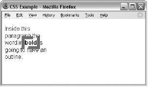
input {outline-color:#ffoooo;}The outline property is the shorthand that allows you to specify values for any of the three properties discussed previously in any order you like. The following example features a paragraph of text:
<p>Inside this paragraph the word in <b>bold</b> is going to have an outline.</p>
There is a rule that says the contents of the <b> element should have an 8-pixel dashed red border around the edge (ch08_eg19.css):
b {outline: #ff0000 8px dashed;}Figure 8-19 shows you what this example looks like, although the border is in black here, not red. Note how the outline does not affect the position of other items on the page (in the same way that the border properties would); it just sits on top of the rest of the page.
You may remember that in Chapter 5 the topic of focus came up. An element needs to be able to gain focus if a user is going to interact with it; for example, focus can be given to links and form controls.
When an element gains focus, browsers tend to give it a slightly different appearance. The :focus pseudo-class allows you to associate extra rules with an element when it gains focus to make it more pronounced. Meanwhile the :active pseudo-class allows you to associate further styles with elements when they are activated — such as when a user clicks a link.
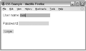
Here is an example of a rule that will change the background-color property of an <input> element when it gains focus (ch08_eg20.css):
input {
       border:none;
       background-color:#dddddd;}
input:focus {background-color:#c4c4c4;}
As you can probably imagine, this could offer users help in knowing which item they should currently be filling in as they work their way through a form; in Figure 8-20 you can see that the form input that has focus has a darker background than other input elements.
IE8 was the first version of IE to support the :focus pseudo-class.
CSS2 introduced a powerful way to add content before or after a specified element, even if it was not in the XHTML document. To do this, the :before and :after pseudo-elements are added to the selector and then the content property is used to specify what should be inserted into the document.
The :before and :after pseudo-elements work to a limited degree in IE7 or higher and have good support in Firefox.
The :before and :after pseudo-elements enable you to add text before or after each instance of an element defined in a selector. For example, the following CSS rule adds the words "You need to register to read the full article" after each instance of a <p> element that carries the class attribute whose value is abstract (ch08_eg21.css):
p.abstract:after {content: "You need to register to read the full
  article.";
  color:#ff0000;}
Here you can see that the pseudo-element :after is used at the end of the selector. Then, inside the declaration, you can see the content property; the text in quotes will be added to the end of the element. The content property can add a number of types of content to the document, not just text, and you will see these in the next section.
The default styles for the parent element will be adopted if no other declarations are added to the rule, although in this example a property was added to indicate that the content should be written in red. You can see this pseudo-element in use in Figure 8-21.

The content property is used with the :before and :after pseudo-elements to indicate what content should be added to the document. The table that follows lists the values it can take; each value inserts different types of content into the XHTML document it is supposed to be styling.
Value | Purpose |
|---|---|
A string | Inserts plain text. (The term "string" is a programming term for a set of alphanumeric characters, not a CSS property.) The text may not include quotes (which in turn means that it cannot include XHTML markup that carries attributes). |
A URL | The URL can point to an image, text file, or HTML file to be included at this point. |
A counter | A counter for numbering elements on the page (discussed in the next section). |
| The value of an attribute named x that is carried on that element (this is of more use to languages other than XHTML). |
| Inserts the appropriate opening quote symbol (see the "Quotation Marks" section later in this chapter). |
| Inserts the appropriate closing quote symbol (see the "Quotation Marks" section later in this chapter). |
| Do not use any opening quotes. |
| Do not use a closing quote (of particular use in prose where one person is speaking for a long while and style dictates the quote is closed only on the last paragraph). |
You have already seen how you can create a number list using the <ol> element, so the concept of automatic numbering is not new. The counter() function is different from numbered lists because you can create a counter that increments each time a browser comes across any specified element — not just an <li> element.
The idea is particularly helpful if you want to automatically number sections of a document without them being a list. It also means that items will automatically be renumbered if extra elements are added or removed (without having to go into the document and manually renumber each item).
In order to see how it works, we will create an example where the sections of a document are going to be numbered using the counter() function. Here is the XHTML (ch08_eg22.html):
<body>
<h1> Introducing Web Technologies</h1>
  <h2>Introducing HTML</h2>
  <h2>Introducing CSS</h2>
  <h2>Introducing XHTML</h2>
<h1> Structure of Documents</h1>
  <h2>Text</h2>
  <h2>Lists</h2>
  <h2>Tables</h2>
  <h2>Forms</h2>
</body>
The example is going to contain two counters, one called chapter and the other called section. Each time an <h1> element comes up, the chapter counter will be incremented by 1, and each time the <h2> element comes up, the section counter will be incremented by 1.
Furthermore, each time the browser comes across an <h1> element, it will insert the word "Chapter" and the number in the counter before the content of the <h1> element. Meanwhile, each time the browser comes across an <h2> element, it will display the number of the chapter counter, then a period or full stop, and then the value of the section counter.
The result should look like Figure 8-22.
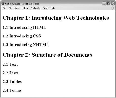
Let's take a look at how this works. First, it is worth noting that you use the counter-reset property on the <body> element to create the chapter and section counters and set them to zero.
body {counter-reset: chapter; counter-reset: section;}Then there are the CSS rules using the :before pseudo-class to insert the automatic numbering of sections. First look at the rule that adds the word Chapter and the chapter number before every <h1> element; if you look at the content property, the value has a set of quotes containing the word Chapter, followed by the counter() function (inside the brackets you can see the name of the counter). After this, you can see another set of quotes containing the colon symbol followed by a space:
h1:before {content: "Chapter " counter(chapter) ": ";}The content property that adds the section numbering before the <h2> elements starts with the counter() function calling the chapter counter and follows that with a period (or full stop) in quotes, then calls the counter() function again, this time with the section number:
h2:before { content: counter(chapter) "." counter
(section) " "; }
Each time the browser comes across an <h2> element, it should increment the section counter using the counter-increment property:
h2 {counter-increment: section; }Each time the browser comes across an <h1> element, it should increment the chapter counter using the counter-increment property and reset the section counter:
h1 {counter-increment: chapter; counter-reset: section;}When you put these rules together, they should look like this (ch08_eg22.css):
body {counter-reset: chapter; counter-reset: section;}
h1:before {content: "Chapter " counter(chapter) ": ";}
h2:before { content: counter(chapter) "." counter
(section) " "; }
h1 {counter-increment: chapter; counter-reset: section;}
h2 {counter-increment: section; }
The first version of IE to support the counter functions was IE8, although Firefox and Safari have enjoyed support for this feature for longer.
The content property can use the values open-quote and close-quote to add quote marks before and after occurrences of specified elements.
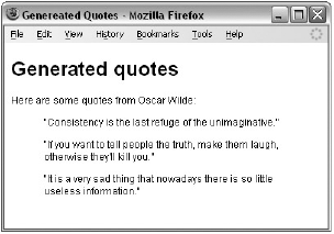
IE8 was the first version of Internet Explorer to support these properties (and it only works if the XHTML page contains a DOCTYPE declaration), although it has enjoyed support in Firefox for longer. Here is the XHTML for this example: (ch08_eg23.html):
<h1>Generated quotes</h1>
<p>Here are some quotes from Oscar Wilde:</p>
<blockquote>Consistency is the last refuge of the unimaginative.</blockquote>
<blockquote>If you want to tell people the truth, make them laugh,
otherwise they'll kill you.</blockquote>
<blockquote>It is a very sad thing that nowadays there is so little useless
information.</blockquote>
And now to add the quotes before and after the <blockquotes> element, use the following CSS (ch08_eg23.css):
blockquote:before {content: open-quote;}
blockquote:after {content: close-quote;}
You can see the result in Figure 8-23.
There are a few very helpful properties that have not yet been covered, which you will look at next:
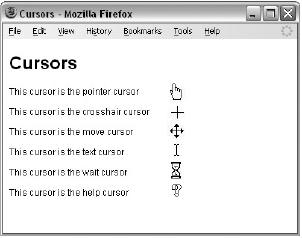
The cursor property allows you to specify the type of mouse cursor that should be displayed to the user. For example, when an image is used for a submit button on a form, this property is often used to change the cursor from an arrow to a hand, providing a visual clue to users that they can click on it.
Figure 8-24 shows you some of the cursor types that are available for you to use (although you will only see one at a time if you try the example out).
As a general rule, you should use these values only to add helpful information for users in places they would expect to see that cursor — for example, using a crosshair on a link may confuse users.
The table that follows shows possible values for the cursor property.
Value | Description |
|---|---|
| Shape of the cursor depends on the context area it is over (a text cursor over text, a hand over a link, and so on). |
| A crosshair or plus sign. |
| Usually an arrow. |
| A pointing hand. |
| A grasping hand (ideal if you are doing drag-and-drop script). |
| Indicate that an edge can be moved. For example, if you were stretching a box with the mouse, the |
| Similar to the vertical bar I. |
| An hourglass. |
| A question mark or balloon, ideal for use over help buttons. |
| The source of a cursor image file. |
The display property can be used to force an element to be either a block-level or inline box. For example, to make an inline element such as a link into a block-level box you would use the following:
a {display:block;}Or you could make a block-level box such as a paragraph into an inline box like so:
p {display:inline;}You may also want to use the value none to indicate that the box should not be displayed. When this value is used it does not take up any space on the page — it is treated as if it were not in the markup at all.
p {display:none;}This property can take other values, but they are mainly for use with languages other than XHTML.
The visibility property allows you to hide a box from view. When you give the visibility property a value of hidden you do not see the content of the element, but it still affects the layout of the page (it takes up the same amount of space that it would if you could see the element on the page — if you want to make something disappear without taking up space you should use the display property that you just met in the previous section). A common use of the visibility property would be to hide error messages that are displayed only if the user needs to see them. The visibility property can also take a value of visible to show the element (which is the default state for all elements).
Value | Purpose |
|---|---|
| The box and its contents are shown to the user (the default state for all elements). |
| The box and its contents are made invisible, although they still affect the layout of the page. |
For example, here are four paragraphs of text (ch08_eg25.html):
<body>
  <p>Here is a paragraph of text.</p>
  <p>Here is a paragraph of text.</p>
  <p class="invisible">This paragraph of text should be invisible.</p>
  <p>Here is a paragraph of text.</p>
</body>
Note that the third paragraph has a class attribute whose value indicates that it's part of the invisible class. Now look at the rule for this class (ch08_eg25.css):
p.invisible {visibility:hidden;}You can see from Figure 8-25 that the invisible paragraph still takes up space, but it is not visible to the user.
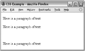
Remember that the source code will still contain whatever is in the invisible paragraph, so you should not use this to hide sensitive information such as credit card details or passwords.
Before you move on to look at how you can use CSS to position elements on a page, let's take a look at three rules:
The @import rule allows you to import styles from another style sheet. It should appear right at the start of the style sheet before any of the rules, and its value is a URL. It can be written in one of two ways:
@import "mystyle.css";
@import url("mystyle.css");
Either works fine. The significance of the @import rule is that it allows you to develop your style sheets with a modular approach. You can create separate style sheets for different aspects of your site. This is the concept I started to introduce in the last chapter when you created a style sheet for code styles. Now if you want to include those styles in any other style sheet you write, rather than repeating them you just use the @import rule to bring those rules into the style sheet you are writing.
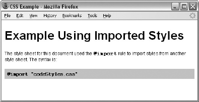
Here is an example of a style sheet that imports the codeStyles.css style sheet from the last chapter (for convenience, this file has been copied into the folder for the code download for this chapter). This example is ch08_eg26.css:
@import "codeStyles.css"
body {
  background-color:#ffffff;
  font-family:arial, verdana, helvetica, sans-serif;}
h1 {font-size:24pt;}
As you can see, it does not contain many rules itself; the code styles have all been taken from the imported style sheet. Figure 8-26 shows a page that uses this style sheet that has imported the styles for the code (ch08_eg26.html).
You might also consider developing modular style sheets that control appearance of forms, different layouts, and so on. If a style sheet contains a rule for one element (say the <body> element was given a black background color), this rule would take precedence over any conflicting rules that applied to imported style sheets (for example, if there was a rule in the imported style sheet indicating that the <body> element should be given a red background color).
When there is a chance that two style-sheet rules might conflict with each other, you can use the !important rule to indicate that this particular rule should take precedence over others.
This can be helpful if you are developing modular style sheets and you want to ensure that a rule in the included style sheets takes precedence over any conflicting rules in the style sheet containing the @import rule (which would otherwise have taken precedence).
It can also be helpful when users have set their own style sheets. Part of the aim of separating style from content, using CSS to style web pages, was to make them more accessible to those with visual impairments. So after you have spent your valuable time learning about CSS and how to write your style sheets to make your sites attractive, I have to tell you that users can create their own style sheets, that can override your settings!
In reality, very few people do create their own CSS style sheets to view pages the way they want, but the ability is there, and was designed for those with disabilities. By default, your style sheet rather than theirs should be viewed; however, the user's style sheet can contain the !important rule, which says "override the site's style sheet for this property." For example, a user might use the rule like so:
p {font-size:18pt !important;
  font-weight:bold !important;}
There is nothing you can do to force the user to use your style sheet, but in practice, a very small percentage (if any) of your visitors will create their own style sheets, so you should not worry about it — it's covered here only so that you understand what the rule is and why you may come across it.
Note that in CSS1, the
!importantrule allowed authors to overrule users' style sheets, but this was switched over in the second version.
If you are writing your style sheet using a character set that features characters other than the basic Latin characters (the ASCII or ISO-8859-1 character sets), you might want to set the @charset rule at the top of your style sheet to indicate what character set the style sheet is written in.
The @charset rule must be written right at the beginning of the style sheet without even a space before it. The value is held in quotes and should be one of the language codes specified in Appendix G.
@charset "iso-8859-1"
Up to this point, you have learned how the content of each element is represented in CSS using a box, and you've seen many of the properties you can use to affect the appearance of the box and its content. Now it's time to look at how to control where the boxes should be positioned within a page.
In CSS, there are three positioning schemes that allow you to control layout of a page: normal, float, and absolute positioning. In the following sections, you'll be seeing how you can use each of these to indicate where the content of an element should appear on the page.
While the CSS positioning schemes were not really intended to be a mechanism for controlling the layout of pages, they have become the standard way to lay out pages on the Web. For the rest of the chapter, we will be looking at how you can control where boxes appear on the page using CSS; then in the next chapter we will look at how to apply this knowledge to create attractive layouts.
Before CSS, web designers commonly used tables to control the layout of web pages. While you will still occasionally see tables used for this purpose, they were designed to contain tabular data, and you should aim to control layout of new pages using CSS instead. If you use CSS to control layout rather than tables your pages will be smaller (in terms of lines of code), easier to adapt to different devices, easier to redesign, faster to load, and more visible to search engines.
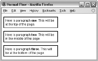
By default, elements are laid out on the page using what is known as normal flow. In normal flow, the block-level elements within a page will flow from top to bottom (remember that each block-level element will appear as if it is on a new line), and inline elements will flow from left to right (because they do not start on a new line).
For example, each heading and paragraph should appear on a different line, whereas the contents of elements such as <b>, <em>, and <span> sit within a paragraph or other block-level element; they do not start on new lines.
Figure 8-27 illustrates this with three paragraphs, each of which is a block-level element sitting on top of the other. Inside each paragraph is an example of an inline element, in this case the <b> element (ch08_eg27.html).
If you want the content of elements to appear in other places than where they would in normal flow, you have two properties to help you: position and float.
The position property allows you to specify how you want to control the position for a box (and is generally used to take items out of normal flow). It can take the four values listed in the table that follows:
Value | Meaning |
|---|---|
This is the same as normal flow, and is the default, so you will rarely (if ever) see it specified. | |
The position of the box can be offset from where it would be if it were left in normal flow. | |
| The box is positioned exactly using x and y coordinates from the top-left corner of the containing element. |
| The position is calculated from the top-left corner of a browser window and does not change position if the user scrolls the window. |
You will see how these are used in the coming sections.
As you'll see in the coming sections, when boxes have a position property whose value is relative, absolute, or fixed, they will also use box offset properties to indicate where these boxes should be positioned. The table that follows lists the box offset properties.
Property | Meaning |
|---|---|
| Offset position from the top of the containing element |
| Offset position from the left of the containing element |
| Offset position from the bottom of the containing element |
| Offset position from the right of the containing element |
Each can take a value of a length, a percentage, or auto. Relative units, including percentages, are calculated with respect to the containing boxes' dimensions or properties.
Relative positioning allows you to move a box in relation to where it would appear in normal flow. For example, you might move a box 30 pixels down from where it would appear in normal flow, or 100 pixels to the right. It is displaced from where it would be in normal flow using the box offset properties.
Let's go back to the last example you met in the previous section when we were looking at normal flow and move the second paragraph using relative positioning, as shown in Figure 8-28.
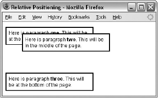
The second paragraph in this example is offset from where it would be in normal flow (where it was in the last example) by 40 pixels from the left and 40 pixels from the top — note the minus sign, which raises it above its position in normal flow (ch08_eg28.css).
p {border-style:solid;
  border-color:#000000;
  border-width:2px;
  padding:5px;
  background-color:#FFFFFF;}
p.two {
  position:relative;
  left: 40px;
  top: −40px;}
The value of the box offsets is most commonly given in pixels or a percentage.
You should specify only a left or right offset and a top or bottom offset. If you specify both left and right or both top and bottom, the right or bottom offset will be ignored.
When you are using relative positioning, you can end up with some boxes overlapping others, as in the previous example. Because you are offsetting a box relative to normal flow, if the offset is large enough, one box will end up on top of another. This may create an effect you are looking for; however, there are a couple of pitfalls you should be aware of:
Unless you set a background for a box (either a background color or image) the box will be transparent by default, making any overlapping text an unreadable mess. In the preceding example, I used the
background-colorproperty to make the background of the paragraphs white and thereby prevent this from happening.The CSS specification does not say which element should appear on top when relatively positioned elements overlap each other, so there can be differences between browsers (although you can control this using the
z-indexproperty, which you will meet shortly).
Absolute positioning takes an element out of normal flow, allowing you to fix its position. You can specify that an element's content should be absolutely positioned by giving it the position property with a value of absolute; then you use the box offset properties to position it where you want.
The box offsets fix the position of a box relative to the containing block — which is slightly different from a containing element because it is a containing element whose position property is set to relative or fixed.
Take a look at the following style sheet. This style sheet is for use with three paragraphs again, but this time the paragraphs are held within a <div> element that also uses absolute positioning (ch20_eg29.css):
div.page {
  position:absolute;
  left:50px;
  top: 100px;
  border-style:solid; border-width:2px; border-color:#000000;}
p {
  background-color:#FFFFFF;
  width:200px;
  padding:5px;
  border-style:solid; border-color:#000000; border-width:2px;}
p.two {
  position:absolute;
  left:50px;
  top: −25px;}
Figure 8-29 shows you what this would look like in a browser; as you can clearly see, the second paragraph is no longer in the middle of the page. The second paragraph element has been taken out of normal flow because the third paragraph is now in the place where the second paragraph would have been if it participated in normal flow. Furthermore, it even appears before the first paragraph and over to the right!
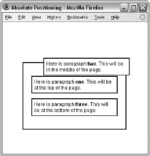
The presence of the <div class="page"> element here is to show that the paragraph is being positioned according to the containing block — the absolutely positioned <div> element.
Absolutely positioned elements always come out above relatively positioned elements, as you see here, unless you use the z-index property (which you'll learn about later in this chapter).
It is also worth noting that, because absolutely positioned boxes are taken out of normal flow, even if two vertical margins meet, their margins do not collapse.
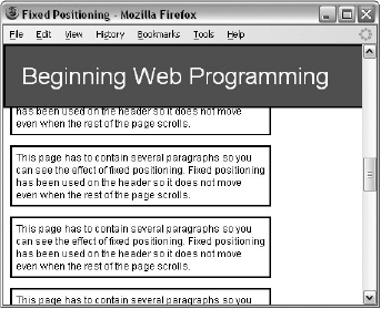
The final value you need to be aware of for the position property is the value fixed. This value specifies that the content of the element should not only be completely removed from normal flow, but also that the box should not move when users scroll up or down a page.
While Firefox and Safari have offered support for fixed positioning for a while, IE7 was the first version of Internet Explorer to support it.
We'll use the following sample of XHTML from ch08_eg30.html to demonstrate fixed positioning. This example continues with several more paragraphs so that you can see the page scrolling while the content of the <div> element remains fixed at the top of the page:
<div class="header">Beginning Web Development</div>
<p class="one">This page has to contain several paragraphs so you can see
the effect of fixed positioning. Fixed positioning has been used on the
header so it does not move even when the rest of the page scrolls.</p>
Here you can see the style sheet for this example (ch08_eg30.css). The header has the position property with the value fixed and is positioned to the top left of the browser window:
div.header {
  position:fixed;
  top: 0px;
  left:0px;
  width:100%;
  padding:20px;
  font-size:28px;
  color:#ffffff; background-color:#666666;
  border-style:solid; border-width:2px; border-color:#000000;}
p {
  width:300px;
  padding:5px;
  color:#000000; background-color:#FFFFFF;
  border-style:solid; border-color:#000000; border-width:2px;}
p.one {margin-top:100px; }
Figure 8-30 shows you what this fixed header element looks like even though the user has scrolled halfway down the page.
Elements positioned using absolute and relative positioning often overlap other elements. When this happens the default behavior is to have the first elements underneath later ones. This is known as stacking context. You can specify which of the boxes appears on top using the z-index property. If you are familiar with graphic design packages, the stacking context is similar to using the "bring to top" and "send to back" features.
The value of the z-index property is a number, and the higher the number the nearer the top that element should be displayed (for example, an item with a z-index of 10 will appear on top of an item with a z-index of 5).
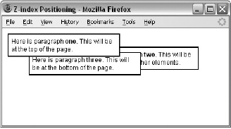
To better understand z-index, take a look at another example of absolute positioning — this time there are just three paragraphs (ch08_eg31.css):
<p class="one">Here is paragraph <b>one</b>. This will be at the top of the
page.</p>
<p class="two">Here is paragraph <b>two</b>. This will be underneath the
other elements.</p>
<p class="three">Here is paragraph <b>three</b>. This will be at the bottom
of the page.</p>
Each of these paragraphs shares common width, background-color, padding, and border properties, which are specified in the first rule (this saves us from having to repeat the same properties for each individual <p> element). Then each paragraph is positioned separately using absolute positioning. Because these paragraphs now all overlap, the z-index property is added to control which one appears on top; the higher the value, the nearer the top it ends up (ch08_eg31.css):
p {
  width:200px;
  background-color:#ffffff;
  padding:5px; margin:10px;
  border-style:solid; border-color:#000000; border-width:2px;}
p.one {
   z-index:3;
   position:absolute;
   left:0px; top:0px;}
p.two {
  z-index:1;
  position:absolute;
  left:150px; top: 25px;}
p.three {
   z-index:2;
   position:absolute;
   left:40px; top:35px;}
Figure 8-31 shows how the second paragraph now appears to be underneath the first and third paragraphs, and the first one remains on top.
The float property allows you to take an element out of normal flow and place it as far to the left or right of a containing box as possible.
Anything else that lives in the containing element will flow around the element that is associated with the float property (just like text and other elements can flow around an image).
Whenever you specify a float property on an element, you must also set a width property indicating the width that the box should take up; otherwise, it will automatically take up 100 percent of the width of the containing box, leaving no space for things to flow around it and therefore making it appear just like a plain block-level element.
To indicate that you want a box floated either to the left or the right of the containing box, you set the float property, which can take one of the values listed in the table that follows.
Value | Purpose |
|---|---|
| The box is floated to the left of the containing element and the content of the containing element will flow to the right of it. |
| The box is floated to the right of the containing element and the content of the containing element will flow to the left of it. |
| The box is not floated and remains where it would have been positioned in normal flow. |
| The box takes the same property as its containing element. |
When a box uses the float property, vertical margins will not be collapsed above or below it like block boxes in normal flow can be (because it has been taken out of normal flow). The floated box will be aligned with the top of the containing box.
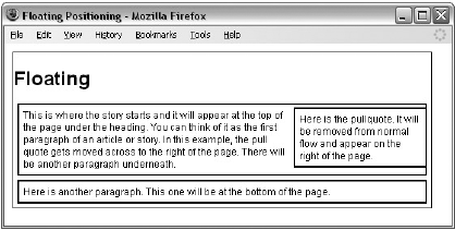
Look at the following XHTML (ch08_eg32.html) and note how the first <p> element has a class attribute whose value is pullQuote:
<body>
  <h1>Heading</h1>
    <p class="pullQuote">Here is the pullquote. It will be removed from
    normal flow and appear on the right of the page.</p>
    <p>This is where the story starts and it will appear at the top of the
    page under the heading. You can think of it as the first paragraph of an
    article or story. In this example, the pull quote gets moved across to the
    right of the page. There will be another paragraph underneath.</p>

    <p>Here is another paragraph. This one will be at the bottom of the page.</p>

</body>
As this example shows, the first <p> element is taken out of the normal flow and placed to the right of the containing <body> element using the float property with a value of right (ch08_eg32.css):
body {
  color:#000000;
  background-color:#ffffff;
  font-size:12px;
  margin:10px;
  width:514px;
  border: 1px solid #000000;}
p {
  background-color:#FFFFFF;
  border:2px solid #000000;
  padding:5px;
  margin:5px;
  width:500px;}
.pullQuote {
  float:right;
  width:150px;}
You can see how the content of the first <p> element with the class attribute whose value is pullQuote ends up to the right of the page, with the content of the second paragraph flowing to the left and then underneath it, as shown in Figure 8-32.
You will see lots more examples of how the float property works in the next chapter when you look at page layout.
The clear property is especially helpful when working with boxes that are floated. As you just saw in Figure 8-33, content can flow around a floated element; however, you might not want this to happen — you might prefer that nothing sit next to the floated element, and that surrounding content be pushed underneath the floated element. This is what the clear property is for, and the following table shows you the values that this property can take.
Purpose | |
|---|---|
| The element with the |
| The element with the |
| The element with the |
| Allows floating on either side. |
Let's have a look at an example. Our XHTML page will use exactly the same structure as the last example, but this time the style sheet will ensure that nothing sits next to the pull quote.
To ensure that the second paragraph does not wrap around the pull quote, we use the clear property on the rule for the <p> elements indicating that nothing should appear to the left of it; you can see this new property is highlighted in the following code (ch08_eg33.css):
p {
  background-color:#FFFFFF;
  border:2px solid #000000;
  padding:5px;
  margin:5px;
  width:500px;
  clear:right}
Figure 8-33 shows you how the clear property works in this example, ensuring that the second and third paragraphs sit below the pull quote.

Try It Out: A Sample Layout
In this Try It Out, you are going to create a sample page layout that uses a combination of the techniques you learned in this chapter to control the layout of the page using CSS.
The page you are going to work with is shown in Figure 8-34 without the style sheet attached.
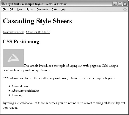
Here is the body of the XHTML code for this example (samplePage.html):
<body>
<h1>Cascading Style Sheets</h1>
<div class="nav"><a href="../index.htm">Examples index</a>
<a href="download.html">Chapter 8 Code</a></div>
<h2>CSS Positioning</h2>
<p class="abstract"><img class="floatLeft" src="images/background.gif"
alt="wrox logo" />This article introduces the topic of laying out
web pages in CSS using a combination of positioning schemes.</p>
<p>CSS allows you to use three different positioning schemes to create
complex layouts:</p>
<ul>
<li>Normal flow</li>
<li>Absolute positioning</li>
<li>Floating</li>
</ul>
<p>By using a combination of these schemes you do not need to resort to
using tables to lay out your pages.</p>
</body>This example illustrates some of the issues that you need to be aware of with CSS — in particular, it is important to demonstrate that while you have seen some very helpful properties, some of them are only supported in the latest browsers. While you can design your site in such a way that it will work with most browsers, you might not be able to get some techniques to work in all the browsers you want it to — so you need to test your site thoroughly.
In Firefox, this Try It Out example will look like Figure 8-35; and you would get a similar result in IE7+.

However, Figure 8-36 shows you what this page would look like in IE6. In particular note how there is no longer the word "navigation" before the links in the left, and how the heading "CSS Positioning" sits further down the page — so if you still have visitors coming to your site who use IE6, you need to consider which features will and won't work and check your page in IE6 before publishing the site.

To start working on the CSS file for this page, start up your web-page editor and follow these steps:
Create a file called
samplePage.css, add the elements from the XHTML page, and use class selectors where appropriate to identify each type of element. You should end up with a list like the one that follows; then you will be able to look at the rule for each element in turn.body {} h1 {} div.nav {} h2 {} p {} p.abstract {} img {} ul {}First comes the rule for the
<body>element, which just sets up some defaults for the page.body { color:#000000; background-color:#ffffff; font-family:arial, verdana, sans-serif; font-size:12px;}Next is the header for the site, which uses fixed positioning to take it out of normal flow and anchor it to the top of the page even if the user scrolls. It also has a
z-indexproperty to ensure that this heading remains on top of the navigation.h1 { position:fixed; top:0px; left:0px; width:100%; color:#ffffff; background-color:#666666; padding:10px; height:60px; z-index:2;}The navigation is also removed from normal flow because it is absolutely positioned. It is positioned 80 pixels from the top so that the links will not disappear underneath the page's heading when the page first loads. The navigation is placed in a box that is 100 pixels wide and 300 pixels high with a light gray background. As a visitor scrolls down the page, the navigation will go underneath the heading for the page because we have not specified a
z-indexproperty, and the heading has az-indexproperty with a value of2.div.nav { position:absolute; top:80px; left:0px; width:100px; height:300px; padding:10px; background-color:#efefef;}You may have noticed that the navigation bar contains the word "Navigation," which was not in the original HTML file. This style sheet uses the CSS
:beforepseudo-class to add this word in. You can see here that it also has other styles associated with it.div.nav:before { content: "Navigation "; font-size:18px; font-weight:bold;}Next is the rule for the
<h2>element, which needs to be indented from the left because the navigation takes up the first 120 pixels to the left of it. It also has padding at the top to bring the text underneath the heading.h2 { padding:80px 0px 0px 130px;}Next are the two rules for paragraphs. The first rule is for all paragraphs, and the second one ensures that the abstract of the article is in bold. As with the
<h2>element, all paragraphs need to be indented from the left.p {padding-left:115px;} p.abstract{font-weight:bold;}The image that sits in the first paragraph is floated to the left of the text. As you can see, the text in the paragraph flows around the image. It also has a 5-pixel margin to the right.
img {
  float:left;
  width:60px;
  margin-right:5px;}
Finally, you have the rule for the unordered list element, which needs to be indented further than the paragraphs or level 2 heading. It also specifies the style of bullet to be used with the
list-styleproperty.ul { clear:left; list-style:circle; padding-left:145px;}Save your style sheet as
samplePage.cssand try loading thesamplePage.htmlfile that is going to use it.
In this chapter you learned the CSS properties that allow you to control lists, links, tables, outlines, and backgrounds with CSS. You then saw how CSS allows you to add content from the style sheet into the document. The :before and :after pseudo-classes allow you to add content before or after an element specified in the selector. This includes text, an image, or content from a file. You can even add automatic numbering or counting of any element using the counter() function and can manage complex sets of quotation marks (although not all browsers support all these functions yet).
You also learned how to use the @import rule to include rules from other style sheets into the current one and create modularized style sheets that allow you to re-use the same rules on different sites, while the @charset rule indicates which character set is being used in the style sheet.
Finally, this chapter looked at the three main positioning schemes in CSS: normal flow (and its offshoot relative positioning), absolute positioning (and its offshoot fixed positioning), and floating. These are powerful tools for controlling where the content of a document should appear; they complete the picture of separating style from content.
The answers to all of the exercises are in Appendix A.
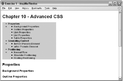
In this exercise, you create a linked table of contents that will sit at the top of a long document in an ordered list and link to the headings in the main part of the document.
The XHTML file
exercise1.htmlis provided with the download code for this book, ready for you to create the style sheet. Your style sheet should do the following:Set the styles of all links including active and visited links
Make the contents of the list bold
Make the background of the list light gray and use padding to ensure the bullet points show
Make the width of the links box 250 pixels wide
Change the styles of heading bullet points to empty circles
Change the style of link bullet points to squares
Your page should look something like Figure 8-37.
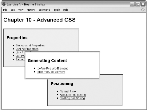
In this exercise, you test your CSS positioning skills. You should create a page that represents the links to the different sections of the chapter in a very different way. Each of the sections will be shown in a different block, and each block will be absolutely positioned in a diagonal top-left to bottom-right direction. The middle box should appear on top, as shown in the Figure 8-38.
You can find the source XHTML file (
exercise2.html) with the download code for this chapter.