This chapter is the first of two chapters about guiding you through the entire process of designing a site from start to finish.
There are a lot of people who have a web site simply because they think they should have one — they don't necessarily know what should be on it and for them the first reaction is often to copy other sites. So, before sketching out your first ideas of how the site might look, I am going to guide you through a process I use whenever I create a new web site. It helps the site owner understand what information should be on the site.
Having determined the content of your site, you can group the information into related chunks and create a site map. That site map shows each of the pages of your site, how they relate to each other, and what needs to appear on them.
Once you know what needs to appear on each page, then you can start to look at page layout, which involves the arrangement of the information on your pages.
Having determined what your page will look like, you need to translate your designs into code. This will involve learning how CSS can be used to control the position of content on your pages.
To wrap up the chapter we will take a look at the issues regarding developing web sites for use on mobile phones. Even if you do not think that you need to worry about users with mobile phones, you might reconsider when you find out that in some countries a fifth of Internet users access the Web via a mobile device.
This chapter is broadly grouped into six sections to reflect these topics:
Understanding the aims of the site correctly, and getting the information to fulfill these aims
Grouping the information into "elements" (such as logos, navigation, product information, contact information, and so on)
Creating a site map, which shows how many pages you need and how they relate
Deciding how to positioning the various elements within the page
How to use CSS to position the elements on the page
Developing for mobile phones
Once you have looked at the overall layout of the page in this chapter, Chapter 10 will go on to look at some more specific issues of designing the sections of each page, such as typography, design of menus, and creating usable forms.
Whether you are going to create a web site for yourself or are hoping to create sites for clients, in order for the design to be effective you need to be able to answer four questions about the audience for your site: who, why, what, and how often?
Who? Who will visit the site?
Why? Why have they come to your site? They probably want to achieve something . . .
What? What sort of information do you think they would expect to find in order to satisfy their reason for coming to the site?
How often? How often can you realistically expect them to visit?
The following sections will help you find out how to answer these questions, but first it is worth noting here that these questions are about your visitors and what they want from your site rather than what you (or your client) want from visitors.
Throughout the design process, you must keep one thing in mind: You need to design the page for the target audience of the site — not just yourself or the site owner.
If you ask a new client whom they are hoping to attract to their site, it is not uncommon for the answer to be along the lines of "the entire world." While it may be easier for people of all ages in all countries to visit a web site than it is for individuals to pop into a store or visit an exhibition, there are very few sites that will appeal to everyone.
Some of the following questions will help you define your target audience (some may be more relevant to your site than others):
What is the age range of your target audience?
Will your site appeal more to men or women?
Which country do your visitors live in?
Do they live in an urban area or rural area?
What is the income level of the visitors?
What level of education do they have?
What is their marital or family status?
What is their occupation?
How many hours do they work per week?
How often do they use the Web?
If your site is aimed at a business:
What is the size of the company?
What is the size of the department?
What is the position on individuals in the company using the site?
Will these individuals be using the item or information themselves?
How large is the budget they control?
Once you have a better idea of who is coming to your site, you can invent five fictional visitors, sometimes referred to as actors or personae, representing the range of your target audience. For example, if you think your audience is composed of well-educated men and women between the ages of 20 and 40, with high earning potential, who regularly use the Web, you might end up with a list like this:
Katie, female, 32, from San Diego, accountant, salary > $150k, uses Web two to three times a week.
Ayo, male, 28, from Denver, attorney, salary > $100k, uses Web every day.
Tim, male, 24, from New York, politics student, uses Web every day.
Noriko, female, 38, from San Francisco, homemaker, trained accountant, household income > $150k, uses Web two to three times per week.
Andrew, male, 35, from Chicago, attorney, salary > $120k, uses Web every day.
These fictional people, actors or personae, should become your friends. They can influence design decisions from simple things such as color palettes to more complicated issues such as the level of detail you offer when describing how to use the site. If in doubt, you can always come back and think, "What would Katie or Ayo want in this situation?"
While some people may happen across your site because they're browsing and see a link that they think is interesting, the majority of visitors arrive at your site for a reason. Your design should be influenced by the goals of users, and therefore you should try and list all the goals that people might have in mind when visiting the site.
It isn't possible to list every reason why people visit your site, but you are trying to get to the salient points, such as the following:
A traveler wants to look at a hotel web site because he is creating a shortlist of hotels he may want to stay at in a city.
A shopper wants to know the opening hours of her local store.
A hobby-guitarist wants to look at a guitar web site to keep up to date with the latest guitars.
An investor wants to see if a scientific research company has sold previous research, and therefore shows promise as an investment.
A picture editor wants to look at a photographer's site to see work examples before deciding whether or not to hire the photographer.
To help determine why people are coming to your site, you should examine two basic categories of questions. The first category attempts to discover the underlying motivations of why visitors visit your site. The second category examines the specific goals of your visitors. In order to identify the underlying motivation for a visitor to come to your site you can ask questions such as:
Is it to be entertained or to achieve a specific goal?
Is the goal for personal or professional reasons?
Would they see this as being essential or a luxury?
To find out the specific goals of visitors you can ask questions such as:
Do they want general information/research (such as background on a topic/a company), or are they after something specific (such as a particular fact or information on a product)?
Are they looking looking for the latest news or updates on a particular topic?
Do they want to discover information about a specific product/service to help them decide whether to buy it?
Do they want to buy a product or service they are already familiar with?
Do they want information on ways to contact you? If so, can they visit you in person (which might require you to publish opening hours and a map of locations).
These questions will, of course, change from site to site, but whatever the question, it is also helpful to consider the triggers for visitors' coming — what made them come now.
Once you have a list of tasks that people might want to achieve when they visit your site, you need to prioritize the most important tasks that this web site should deal with. Allocate the most popular tasks to the fictional target audience members — for example:
Katie bought a product Y several years ago; now she wants to purchase one from your site for a friend's birthday.
Tim has read about your new product X in the press and wants to find out when it will be released in Canada.
Ayo bought product Z five years ago, but it stopped working last week. Because it is out of warranty, he wants to get a phone number so that he can find out who might be able to repair it.
The combination of the typical personae of your target audience and the task each wants to achieve are sometimes referred to as use cases.
Now that you have a list of reasons why people might be coming to your site, you need to work out what you need to offer in order to help them achieve their goal quickly and effectively. You should then prioritize the information from most important need-to-know through to things you would also like them to know, even if these are not essential to their goals.
The following questions may help you work out what information they need:
Will they be familiar with your brand/subject area or do you need to introduce yourself?
Will people be familiar with the product or service you are promoting, or do they need background information on it?
What are the most important features of what you are offering?
What is special about your product or service that differentiates it from the rival?
Consider for a moment when visitors are comparing your product or service with a rival; you will want to give them the key facts that they will be comparing against quickly and easily (otherwise you may not make the shortlist). Then you can highlight what distinguishes you from the competition, along with other background facts.
For example, if a traveler is considering whether to shortlist a hotel as a possible place to stay, this person may want to know what the hotel looks like, price, location, availability for the dates sought, and a phone number (since some people want to deal directly and not put a credit card number on the Web). If all this information isn't found, the prospective traveler is less likely to shortlist you. Once you have provided this information, you might like to add things that distinguish you from others, such as facilities at the hotel and what to do in the area.
You should aim to drill down as far as possible with your answers; for example, what information are you going to include about a product or service? A product will not only have a title, it could have a photo (or multiple photographs), description, dimensions, information about how and where it is made, typical uses for it, and so on. A service might require descriptions of the work involved, how long it takes to complete, what is required so the service can be performed, who will be performing the service, how they are qualified to perform the service, testimonials from people who have paid for this service, pictures of work done.
There are some kinds of goals that will require a lot less information. For example, someone who wants to find out the opening hours of your store will just want to know what time you open and close each day, and they do not want to search through products and offers to know if they can get there before you close.
The results of this task will vary hugely from site to site, but the process should always involve brainstorming everything your visitors will need to know, followed by a rationalized ordering and prioritization of this information.
The last important question about your audience is how often they are likely to come back.
There is a very simple reason for asking this: Some sites should change more often than others. If your site is about something that people do not need to keep coming back for, why spend a lot of time and money regularly adding new content to the site? For example, if you provide a service that people rarely use (from wedding services to double glazing), I would hope that the same person would not need to keep coming back to your site.
Conversely, if visitors have the potential to regularly return to the site, you will need to consider updating the content regularly so that they want to keep coming back.
By now you should have an idea of who is coming to your site, why they are coming, what they need in order to satisfy their reason for visiting, and when they might come back. This will probably be quite a long list already, but there is one more thing you need to add to it: information that the site owner wants on the site, but which might not be part of the list already.
This may include things that users could find useful when they arrive on the site (even though they may not have come for this reason), such as the ability to sign up for e-mail updates, subscribe to an RSS feed, search the site, enter a competition, or find out about your new upcoming product. It may also include information that is not really for the user (such as advertising).
Finally, if your list does not yet include such things, don't forget that you will want to include your logo or branding to most pages. You should also remember some boring yet necessary features such as a copyright notice, terms and conditions, and a privacy policy (the latter is important if you collect information about users or use a technology known as cookies for storing information on the user's computer).
Now that you have a list of what your visitors want to achieve and what the site owner wants to achieve, you should start to prioritize that information. You have your fictional friends to help you work out which tasks are most important. If one of them has not already asked about a piece of information, or it will not help this person achieve a goal, it may be lower priority.
I have come across plenty of site owners who want to push messages that are not aligned with what the majority of visitors want to find out. With so many sites on the Web, if your site does not fulfill your visitors' requirements quickly and easily they will go elsewhere. I'm not saying you should ignore messages that the site owner wants featured, just that the needs of the visitors should usually be considered of paramount importance.
At this point you might also look at other sites that address a similar topic — the competition — and look at what they do and don'tdo well and whether these sites meet the needs of the people you expect to visit your site. One of the key points to think about here is what you can do differently or better — something that makes you look better than the competition (rather than just copying them).
Once you have every possible kind of information on your list, and you have prioritized it, you can trim your ideas back to what you are actually going to use for this web site. Remember that unused ideas can always be used in a future update of the site. (You do not need to use every idea when your site first launches.)
Note
If you are working on a site for a client, it is good to get the client to agree to the aims of the site when you have defined them. Many clients can decide they want extra functionality added during the development of the site, so pinning down the aims from the start is important. If the client wants to then expand on these aims you can re-negotiate terms for these extra features (such as extra development time and extra expenses).
Now that you know what is going to appear on your site and the priority of such information, you should start to group together related information. If the site is advertising several products or services, these may be placed together in related groups of products or services, which can be split into subgroups. For example:
You might group the information about how the company was formed and its history along with information about the company today in a general "about us" section. In this section, you might also include profiles of the people running the business.
The different ways in which people can get in touch with you (phone, e-mail, fax, opening hours, maybe a map, and so on) and ideally a contact form could all be put in one "contact us" group.
If a company has outside investors and is listed on the stock market, you might want to create a section for the investors, with company reports, information on the board of directors, and so on.
For most sites, you should try to create no more than six or seven sections. These sections will form the primary or global navigation items of your site. In addition to these items you will have the homepage. This method of grouping the site will make it much easier to navigate and understand.
Some of the sections will likely contain subsections with several pages of their own, and there may be more than seven subsections in each category. For example, a publisher might have more than seven genres of books in a books section (such as fiction, biography, reference, travel, and so on), or a cookery site may organize a recipes section by classes of ingredients or types of meals. These subsections form secondary or category navigation. In some cases, this can be split further into tertiary navigation.
Remember that your grouping should reflect what you expect the visitors to your site will want to do and the customers' understanding of your products, services, or subject. For example, if your customers are looking for a type of product on your site, will they be looking within a list of manufacturers or in a list of product types?
These categories and subcategories are like a table of contents and will form the basis of the navigation for your site — the sections will each need to take part in the main menu while the subsections will often form their own submenus. This organization is very important on web sites because they do not have the linear order a book does; users are far more likely to take different routes through a web site. The better organized your site, the more chance users will find what they are looking for.
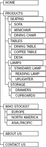
By now you should be getting a good idea of the sections and pages that are going to make up your site, so you should start drawing up a site map. You can do this with a pencil and paper, and it should end up looking something like either a family tree or folder list in Windows Explorer. You should start with the homepage for the site and all of the main categories at the top of the tree.
If any of the categories contain subcategories or more than one page, these pages should appear as children of the first page. For example, if one of your main categories is "products," then you might have this split into several subsections with a page about each item in those subsections.
You can see an example of a site map in Figure 9-1; you could draw this either vertically, as was done here, or horizontally (more like a family tree).
Once you have created a site map, you will know the following:
How many pages are on your site
What information will appear on each of those pages
What links will appear on each page (and where those links point to)
Once you have created your site map, it is a good idea to try to look at the things that you initially expected to draw users to the site. You will also want to look at how users would navigate through the site map, step by step, to get to the information that you think they will need.
Now that you know what pages will make up the site, go back to the groups of information and add these onto the relevant pages.
There will be some key items or elements that should appear on each page, such as a logo/branding, primary navigation, page headings, and a search box. Other information is more likely to appear on only one page, such as individual product details or terms and conditions.
When you are identifying the key elements of each page, several pages, may contain similar types of information. The structure of these pages should be very similar — for example, if you have lots of products listed on your site, each product page should use the same template so that visitors become aware of where to look for particular kinds of information.
Note
You should create the list of the key elements of each page before you even start thinking about where to position them, although it is very helpful if you have an idea of how much space each element will take.
These elements will reflect the aims of the site. But be warned: many clients will want to put everything on every page. You must show them how the organization and planning you have done will lead to a good design and simple navigation that avoids the need to put everything on each page. (You learn more about navigation in Chapter 10.) A site that is less cluttered yet easy to navigate is better than a site that has everything on each page because it is harder to find what you want on a page where there is too much information.
Now that you have a site map to show the pages that make up the site, and a list of what should appear on each page, you are ready to start thinking about designing the pages.
When graphic designers create a page that is going to be printed they know the exact size of the paper their design will be printed on. On the Web, however, different visitors to your site will have different-sized monitors that work at different resolutions, which means that your web pages need to work on different-sized screens.
When thinking about screen sizes, you need to look at the resolution of screens: how many pixels are being displayed along the width and the height of the screen. For example, a screen running at a resolution of 1024 × 768 is 1,024 pixels wide and 768 pixels tall.
Most operating systems allow you to change the resolution that your screen is running at, and as technology has improved over the last decade the number of pixels available on a display has increased.
In January 2000, over 65 percent of web users had displays running at 800 × 600 pixels or less, and as a result most sites were designed to work on screens that were no wider than 800 pixels. Almost a decade later, around 95 percent of web users have a screen resolution of 1024 × 768 or higher and, as a result, sites have been getting wider, and sites are commonly designed for screens that are 1024 pixels wide.
Several sites provide statistics regarding screen resolution, such as www.thecounter.com/stats/ and www.w3schools.com/browsers/. These sites also feature other helpful information such as the number of people using different browsers or operating systems.
(As you have probably guessed, mobile devices have much smaller screens, and we will deal with mobile devices separately later in the chapter.)
As a general rule you will not want users to scroll horizontally, from left to right to view information on a web page, so you should probably make the width of your page fit within a screen that is 1024 pixels wide.
Even when a screen is 1024 pixels wide, you should not assume that you have this much space available for your designs because many browsers have a "window" which takes up space at the edges of the page, and on a long page there will be scroll bars which take up even more of the page. On a long page there will also be scrollbars that take extra pixels on the right-hand side of the window. Therefore, even if the screen is 1024 pixels wide, your design should allow space for the window and scroll bars; somewhere between 960 and 980 pixels is a more common width.
While you should avoid expecting visitors to scroll horizontally, you can safely expect visitors to scroll up and down the page vertically to find the information they are looking for. However, it is very important that, when the page loads, the visitor has a good idea of what kind of information will be on that page without having to scroll.
The term above the fold is often used to refer to the part of the page that a visitor will see when the page loads before scrolling down. The term originates from newspaper design — newspapers are often folded in half so it's considered important to put key news items or photographs on the upper half of the front page.
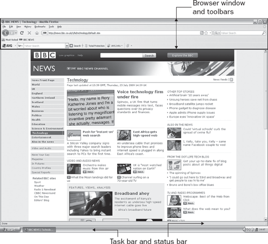
Vertically, you need to account for the fact that a lot of users will have a menu or taskbar (such as the taskbar on Windows or the dock on Mac OS X) that will take up part of the screen's vertical height. You also have to consider the various toolbars that can appear in a browser window. Therefore, you should aim to ensure that the key points of a page appear in the top 570-600 pixels. Figure 9-2 shows you the vertical space taken up in my installation of Firefox on a PC.
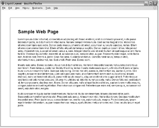
You now know that you are looking to make your designs work within a page that is 960-980 pixels wide, and that a visitor should be able to understand what a page is about from the top 570-600 pixels. But you may have noticed that some designs stretch to fit the whole page as you increase the size of the browser window, and then contract again when you make the browser window smaller. This is known as a liquid design. By contrast, designs that force a page to a certain width or height are known as fixed-width designs.
Fixed-width designs like Figures 9-3 and 9-4 remain the same as you increase and shrink the size of the browser window, whereas the liquid layouts like Figures 9-5 and 9-6 stretch to fill the entire width of the browser window.
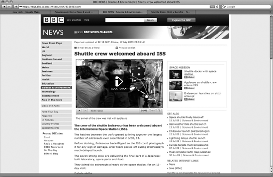
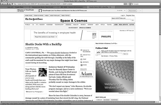
Fixed-width designs are commonly used where the designers want to retain control over exactly how the page looks. This is seen as particularly important when sites are heavily design-led (where the presentation of information on the site is particularly important) or when they feature a lot of text (because there is an optimal width for paragraphs of text). Good examples would be news sites such as http://news.bbc.co.uk shown in Figure 9-3 and www.nytimes.com shown in Figure 9-4.
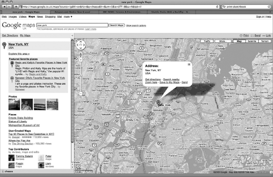
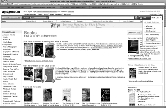
Liquid design is more likely to be featured on sites that are online tools or applications such as maps.google.com shown in Figure 9-5, and sites that feature a lot of lists such as www.amazon.com shown in Figure 9-6. With these pages, it is not as important for the designer to retain control over the width of the page; rather the user can change the size of the page.
Let's take a moment to look at how to control whether a page is a fixed-width or liquid layout.
In order to create a liquid layout that will stretch to fit the page, you specify proportions of a page using percentage values. For example, you might decide your page takes up 80 percent of the width of the browser, as in the example shown in Figure 9-7. If the user increases the size of the browser window, the page increases in size but retains the border around the outside.
Here (ch0090eg01.html) you can see how this effect can be created using a <div> element, which acts as a container for the page:
<body>
  <div id="page">
    <!-- CONTENT OF PAGE GOES HERE -->
  </div>
</body>
The style sheet contains a rule for the <div> element, whose id attribute has a value of page, setting the width property to have a value of 80% of the screen. A border is drawn around the edge so that you can see the box created by the <div> element. To make it more attractive, padding of 5% has been added inside the box to keep the content from the border (ch09_eg01.css):
div#page {
  width:80%;
  padding:5%;
  border:1px solid #666666;
  font-family:arial, verdana, sans-serif;
  font-size:12px;}
There are advantages and disadvantages to the liquid layout approach. The advantages are as follows:
The page expands to fill the browser window and therefore does not leave large spaces around the page when there is a large window.
If the user has a small window open in his or her browser, the page can contract to fit that window without the user having to scroll from left to right to view the content of the page.
The design is tolerant of users setting font sizes larger than the designer intended, as the page layout can stretch.
The disadvantages are:
If you do not control the width of sections of your page, the page can look different than you intended, and you can end up with unsightly gaps around certain elements or items that are squashed together.
If the user has a very wide window, lines of text can become very long, and these become hard to read.
If the user has a very narrow window, words may be squashed too small and you could end up with just a word or two on each line.
If a fixed-width item (such as an image) is in a box that is too small to hold it (maybe the user has made the window small), it can overflow over the top of the text.
Fixed-width designs most commonly use pixels to indicate the width of the page. Fixed-width layouts allow designers much greater control over how their pages appear because the designer knows the size of the canvas; it cannot stretch and shrink as the users resize their windows. Even though a design might look a slightly different size on different resolution monitors, the proportions of elements on the page can remain the same. You can see an example of a fixed-width page in Figure 9-8. The code for this page (ch09_eg02.html) follows shortly.
While Figure 9-8 may look similar to Figure 9-7, if you try out the corresponding code, you will find that this example does not stretch to take up more of the browser window, unlike the previous example of a liquid layout.
Here you can see that we are using a <div> element again to hold the page, which carries an id attribute whose value is page (ch09_eg02.html); it is just the same as the XHTML in the last example:
<body>
  <div id="page">
     <!-- CONTENT OF PAGE GOES HERE -->
  </div>
</body>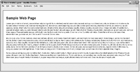
Now take a look at the CSS rules that correspond with this element (ch09_eg02.css):
div#page{
  width:880px;
  padding:20px;
  margin-left:auto;
  margin-right:auto;
  background-color:#ffffff;
  border:1px solid #666666;
  font-size:12px;}
  text-align:left;}
As you can see, the width property is used to fix the size of the page, and its value is specified in pixels. No matter how big or small the visitor's browser window is, this element remains the same size. If the user's browser is narrower than the layout specifies, horizontal scrollbars will appear, whereas if the window is wider than the layout specifies, there will be space to the side of the page.
You might also have noticed that the margin-left and margin-right properties have a value of auto, which ensures that the page is centered in the browser window in most browsers. Unfortunately, this does not work in Internet Explorer versions 5-7, therefore you also need to add a text-align property in a rule that applies to the <body> element; this should have a value of center. This ensures that the page sits in the middle of the window in IE. However, since the value of the text-align property is inherited by the page, if we did not add the text-align property to the page again (see the last line of this rule) the rest of the text in the page would be centered, so we align the text inside the page left.
As with the liquid design, there are both advantages and disadvantages to the fixed-width page approach.
The advantages are:
Pixel values are accurate at controlling width and positioning of elements.
The designer has far greater control over the appearance and position of items on the page.
The size of an image will always remain the same relative to the rest of the page.
You can control the lengths of lines of text regardless of the size of the user's window.
The disadvantages are:
You can have a page sitting in the middle of a window with big gaps around it.
If users browse at higher resolution than the page was designed for, the page can look smaller on their screens and can therefore be hard to read.
If a user has font sizes set to a larger value, the text might not fit as intended in the allotted space.
The design works best on devices that have size and resolution of screens similar to desktop computers.
Now that you've seen how to control the size of a page, you should look at designing the content.
By now, you should know how many pages you have and the main elements that you need to fit on each page, and you might have decided whether you are going to use a fixed-width layout or a liquid layout. Now it's time to work out how the content is going to fit onto the page. All of this should happen before you start building your page.
It is important to distinguish between the use of the word elements in terms of designing pages (where it means items on the page such as navigation, branding, articles/products, and so on) and the more technical use of the word (because an element can also mean a pair of tags and their content, such as a
<b>bold</b>element). Most of this section will refer to elements in terms of designing pages.
Composition in any visual art (such as design, painting, or photography) is the placement or arrangement of visual elements — it is how they are organized on a page. In order to arrange the various items that need to appear on a web page, many designers use a grid (a set of lines, which are sometimes shaded in) and arrange the items that need to appear on a page according to the grid.
Figure 9-9 shows you the homepage of the web site for a leading UK newspaper.
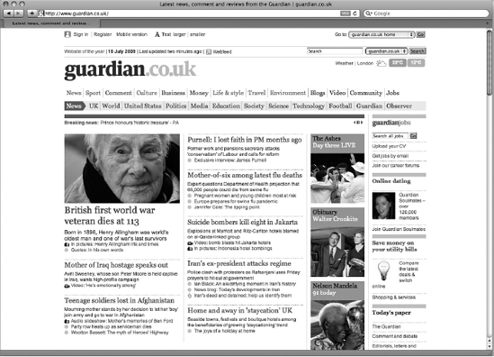
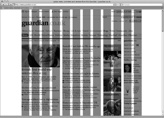
Figure 9-10 superimposes a set of vertical lines across the design to show you how this site was designed according to a grid system (in this grid the columns have been shaded in).
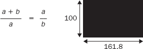
While good design is always subjective, a link between art and mathematics has existed for many centuries. For example, the Golden Ratio (also referred to as the Golden Section or Divine Section) has been used by many artists since the Renaissance, as its proportions are believed to be aesthetically pleasing. It is also widely found in nature and architecture, and has been studied by mathematicians as far back as Pythagoras and Euclid. The Golden Ratio is approximately 1.618, and it states that the sum of a+b is to a as a is to b. For years, designers have created complex grids based upon this ratio (Figure 9-11).
It can become rather complicated to draw a grid based on the golden ratio, but a common alternative whose results are very similar is the rule of thirds, which is much easier to use. According to this rule, you should divide a workspace into thirds and align key points where the lines intersect (for example, portrait photographers often position the subject's eyes one third down on a portrait or the horizon on a landscape a third of the way down the picture).
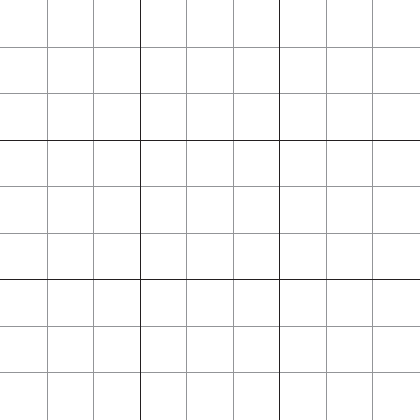
If you apply this to a web page that is 960 pixels wide, you would have three columns of 320 pixels (or if the design were a liquid layout, 33 percent for each column). Vertical lines would also be drawn every 320 pixels to create a grid of boxes. Each of these boxes would then be divided into thirds. Figure 9-12 shows a grid based upon thirds; this grid is just based upon lines (they are not shaded).
When you have columns in a design, you usually need a space between columns so that the text or images in one column do not run into the adjacent column (making the contents unreadable). The gap between columns is known as a gutter.
Personally, I prefer to design using grids that feature a gutter, like the one shown in Figure 9-13.
It can also help to start a design just using vertical lines at the beginning (before worrying about horizontal lines). Assuming we have decided to make our page 960 pixels wide, let's look at a couple of examples of vertical grids. Figure 9-13 shows a 12-column grid, where each column is 80 pixels wide and there is a 20-pixel gap between each column (plus 10 pixels to the left and right of the main page).

This grid can easily be used to create single column layouts or layouts with two equal-sized columns, as shown in Figure 9-14.
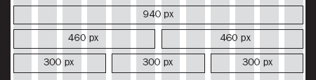
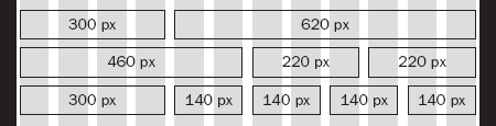
It can also be used to map out various other permutations of column widths, as shown in Figure 9-15.
You may decide to create a grid with more columns. The following grid shown in Figure 9-16 has 16 columns rather than 12. As with the previous grid the page is 960 pixels wide, but each column is only 40 pixels wide and the gap (or gutter) between each is 20 pixels.
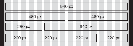
With both the 12- and 18-column grids, the number of columns was chosen because these divide equally into the width of the page, and because that number of columns offers flexible layouts. (The 12-column grid can be divided by 2, 3, 4, and 6, while the 18-column grid can be divided by 2, 3, 4, 6, and 9.)
If you can ensure that all of the boxes on your site align to a grid like this, your design will naturally look a lot better than a design that has blocks of different sizes that bear no direct relation to each other and where gaps between elements are of different sizes.
Let's turn our attention to the vertical lines — many designers will try to use the same units of measurement for vertical spaces. While this is not always possible (particularly further down the page), using vertical measurements that divide by the width of a single column will help make your designs more attractive. Figure 9-17 shows what the 12-column grid looks like with vertical lines set using the same distances.
You may also choose the height of a box on the page by dividing the width by 1.618 (the golden ratio), because we already know that this is supposed to be an aesthetically pleasing size.
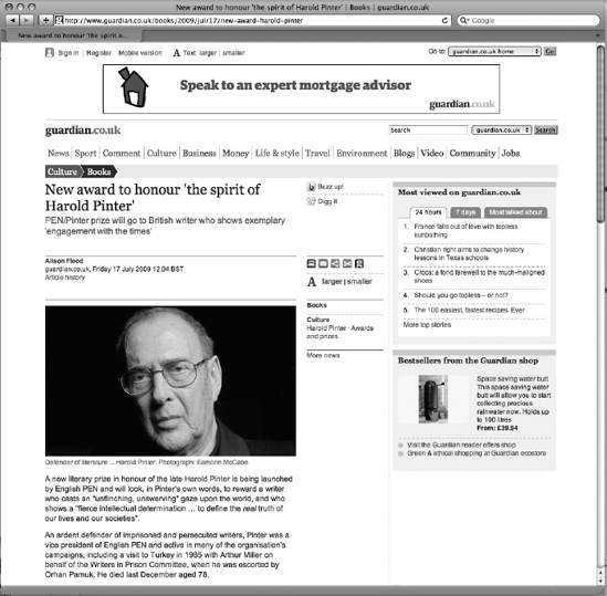
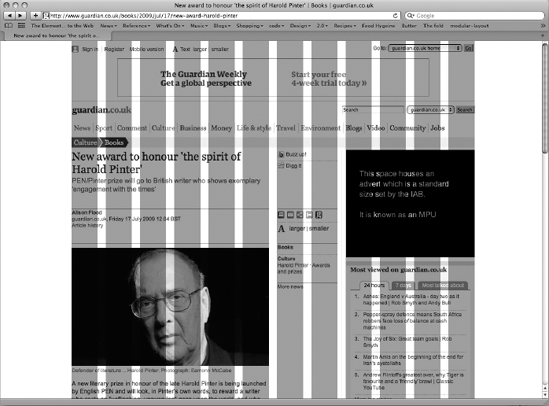
When setting up your grid, you should ensure that the grid can be applied to the entire site: the homepage, section pages, and individual item/article pages. Let's take a look at another couple of pages from the web site for the Guardian newspaper — Figure 9-18 shows you the homepage from the culture section, which is again based around three columns. Lower down the page, you can see that the columns are then divided in two to provide six columns:
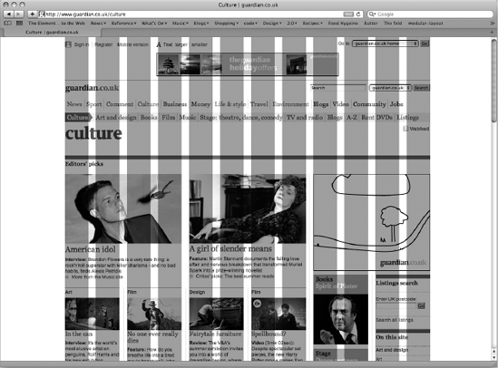
Figure 9-19 shows an individual article page; this time the main column of text is given more space (the main column is the one with the headline and the portrait photograph).
You have looked at the grids designers use when creating layouts, so now it is time to start getting a feel for how the elements will be arranged on the grids.
At this point, you should just be using text, lines, and shading to sketch out where each element (such as the logo, primary navigation, headings and main bodies of text) sits on the page and how much space it gets. You should not be thinking yet about colors, fonts, backgrounds, images, or other design issues; rather, you should be focusing on the placement of information and creating a visual hierarchy to indicate the most important parts on each page.
While it may seem strange (and difficult at first) not to add visual presentation at this stage, it is important that you focus just on making sure you include all of the information a visitor needs and every item the user can interact with in order to give it the necessary space. This process is referred to as creating a wire frame. Figure 9-20 shows you an example of a basic wire frame for a web site (this figure is again based on the Guardian newspaper's site):
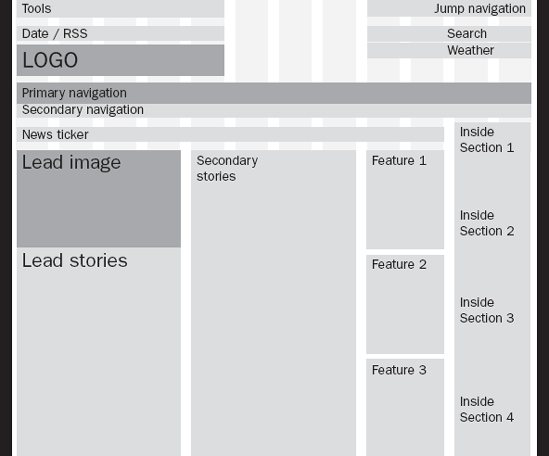
The wire frame of Figure 9-20 is very high-level; it does not yet show the parts of the page the user can interact with (such as navigation, buttons, and form controls). Nor does it give a guide of how much text might be shown for each item or the size of images.
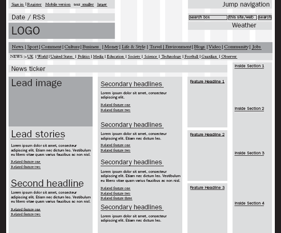
Once you are happy with the general layout of information you should start to add some of this detail into the wire frame, as shown in Figure 9-21.
When you have the second version of the wire frame with extra detail, you should perform two very important checks:
Go back to the target audience you identified earlier and ensure that they can achieve the tasks you allocated to each character you identified. Don't be surprised if you have to move some elements around on the page or if you have to add in an element or two that you missed from the initial list.
Look at each page and decide whether a user coming to this page for the first time would be able to tell the purpose of this page from the part of the page that will appear above the fold. If not, you should arrange the items on the page so that a user would be able to determine what the page is about without scrolling.
You can see from the simple model in Figure 9-21 where the links go and how you can move about the site; however, you are not distracted by the design or look of the page. This is particularly important for two reasons:
When you show users and clients a full design of the site, they tend to focus on the visual elements (such as fonts, choice of images, and colors) rather than the proposed function. A skeletal model ensures that the client focuses on the function and structure of the content and not how it is presented.
If you do need to make changes, you can do so before the design or programming starts, which can save you from rewriting and/or redesigning much of the site later on.
The size and positioning of elements on a page is a valid part of the design process (not only the visual appearance but also the interface or interaction design — how the site handles). However, the process of wire-framing a design will help the user or client focus on what the site actually does and will help you finalize the functionality before starting to design the page. You may choose to tell the client that the exact positions of the elements in the wire frame may change, but that it is an indication of the content that will appear on those pages.
Branding theory states that consistency in how the brand is represented helps reinforce the brand. When it comes to web sites, any information that appears on more than one page should be presented in a consistent manner because it helps visitors:
Identify the site from its appearance
Learn how to use the site and find what they are looking for more quickly
You should formulate the consistent parts of the site early on in a design (because they are used on multiple pages). For example, the logo and primary navigation should be in the same place on every page. If you decide to put your primary navigation under the logo stretching from left to right, it should be under the logo stretching from left to right on every page. Likewise, if the sections of your site require subnavigation, this should be in the same place for each section of the site (even though the items in the subnavigation will change from section to section).
Here are some terms often used to describe parts of pages:
Headers: The top part of the page on any site. In many cases the header will feature the logo and the primary navigation, which should be consistent across the entire site.
Footers: Appear on the bottom of every page. They often contain things like copyright notices, privacy policy, and terms and conditions. Again, they should usually be consistent across the entire site.
Body and content: Describe the main part of the page between the header and footer where the content sits.
Templates: Describe a layout for several pages that look the same but contain different information. For example, an e-commerce site tends to use the same template to display each of its products, which helps the user know where to find things like the price, dimensions, and description of each product.
For most people, the more disconnected bits of information that are visible on a page at the same time, the harder the page is to understand. There are, however, several techniques you can use to group elements together and make it easier for people to understand pages. Grouping or chunking items together helps reduce the number of elements that the user sees on the page.
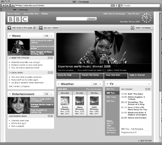
For example, look at Figure 9-22, which shows the BBC homepage (which I have personalized). There are over 65 links on this page, yet by grouping the items into related content areas (such as news, entertainment, and weather), it becomes much easier to digest the information on the page.
The following methods help make it clear to a user that several elements of a page are related:
Location: Making sure that similar elements of the design are near to each other
Color: Using blocks of background color to make it clear which items relate to each other
Borders and padding: Creating a gap between one group of elements and other items on the page to indicate which are grouped together
Headings: Giving related items a header, so that people know what will be in the block of information without necessarily reading each item in the block
Styles: Using similar buttons for navigation items
It is important to create a visual hierarchy in any design so that the most important item on the page is most prominent. There are several ways to do this; for example, you may allow the more important items:
To take up more space
Have more space between them and other items
Use larger headings
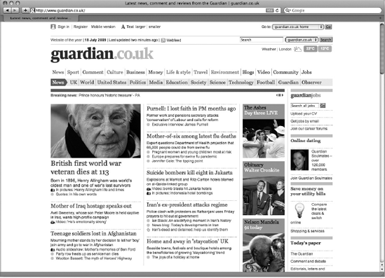
The most important item on the page should be made immediately clear to the user. Looking again at the Guardian news homepage, you can see here that the main story is given more space than the secondary stories, which in turn are given more prominence than the features and inside sections on the right (Figure 9-23).
While it is tempting to put a lot of information on each page, if the screen is too cluttered it will be harder for the user to achieve the goal he or she had in mind when coming to your site. Therefore it is important to prioritize the information that appears on each page.
Generally speaking, the following items should be visible on every page, and they should be above the fold:
Branding/logo: The company name or logo should appear on the same place in each page; it is commonly placed in the top left or top centered.
Primary navigation: A link to the homepage and the main sections of the site — note that the homepage should almost always be the first item of navigation.
Any secondary navigation: If the sections of the site are further divided into subsections, when you are in those sections you should be able to see enough of the navigation to tell that the subsections exist (although you do not need to be able to see all options).
Page headings: With the exception of the homepage, every page should have a title or heading that quickly lets the user know what that page is about.
Content: Ideally you want enough of the content of the page to be above the fold so that the users know whether this page is going to be relevant to them and, you hope, gets them involved with the content of the page before they have to start scrolling.
Search: A way for users to search for the information they want if they do not see it immediately.
The items that should not need to appear on the portion of the page that's visible when the page loads are as follows:
The detail of the rest of the page (for example, if you have a news article, it is only necessary to be able to view the headline and ideally a summary; the entire article does not need to fit in the top part of the page)
Links to related information or other sites (things that are not essential to the point being discussed on this page)
Items that are often required but rarely used, such as Copyright, Terms and Conditions, or Privacy Policy (these can generally go right at the bottom of the page)
The primary factor in prioritizing the items on the page should be letting visitors achieve what they came to do. Back in the early part of the chapter we talked about identifying the target audience of the site and generating some characters that represented typical visitors. We then went on to look at the tasks that these people would like to achieve. You should use this work to help prioritize the content on the site because the tasks people want to do most often should generally be prioritized above the less common ones. This is important because a lot of visitors will not scan the entire page and then choose the part that is most relevant to them; rather, they will select the first option that looks relevant to them and go with that before looking at the rest of the page — something known as satisficing (a mix of satisfying and sufficing). Remember that you can use a visual hierarchy (making some items more prominent than others) in order to help people notice the items you think they want to achieve first.
It is important to acknowledge that, no matter how much you would like your visitors to read every page on your site, and no matter how well written it is, they will not. Visitors scan web pages to find out whether that page is relevant to them.
During the initial scan of the page, when users determine if it is relevant to them, they will also select parts of the page that they will focus on. They are likely to give most attention to these areas rather than looking around for other information that might be relevant to them.
Research by a renowned web usability researcher and author, Jacob Nielsen, has indicated that people commonly scan a page using an "F" shape — starting with two horizontal stripes and then a vertical stripe (the shape and size of the F depend on your design, the type of page, and the amount of information on the page). Therefore, putting your primary navigation down the right-hand side of a page might not be a good idea; under the logo, left to right, might be better.
Now that you know people will scan the page, there are a few tactics you can use to make your site easier to scan:
Text should be concise in particular headings. Where possible, the first couple of words in a heading or paragraph should describe the content the user would discover if he or she read on. Another renowned usability expert, Steve Krug, recommends that, when devising a web page, users look at the copy they started with and divide it in half. Then they should halve it again because most sites are far too wordy. By his own admission, the second one is an exaggeration, but his point is that most sites can get their message across in far fewer words if they really try.
Use subheadings to split up text. If you have a lot of text, you should split it up with descriptive subheadings. Again make sure the first couple of words of the heading give the reader information about the content of the following text.
Use bolding and other styles. Highlight keywords to help users scan pages for key terms, indicating whether the page is relevant to them.
Make links descriptive. Where you have text links, ensure that the text describes what people will see if they click on the link. Links should also stand out from surrounding text (because many people will scan for links).
Stimulate users with visuals. A lot of web users are attracted to (and navigate by) images. So if you have a list of articles or products on your site, thumbnails will help turn lists into something more visual and stimulating, in turn encouraging users to follow those links.
If you are designing a site for a company that's likely to want to change the main feature on a site regularly, you should consider allocating a part of the page for the company to control. You may give a proportion of the homepage (or homepages of the subcategories) to them for regularly changing features. For example, a shop might change the main section of a page every time there is an upcoming occasion it wants to market, such as religious holidays, New Year's, Valentine's Day, Mother's Day, Father's Day, start of school terms, and so on. It is usually better to give the company a section (or sections) of the page that it can edit rather than giving it free rein over the entire page (otherwise it may well be tempted to change the entire structure of the page even though visitors are used to it, and in doing so may break your grid). It is not uncommon for the person responsible for a company's web site to want to change the site more frequently than is necessary — this is often because this person spends more time looking at it than other visitors (and changing a site too often can frustrate visitors who get used to navigating a site in a particular way).
First impressions do count, so your front page is very important. Unless you are working on a site for a company or subject that is a household name, it's important that a visitor be able to ascertain the main purpose of your site easily from the front page. Therefore, it is a good idea to feature a one-line description of the site prominently on the homepage (using no more than ten words — three to five is even better).
You then need to emphasize the tasks that users are most likely to want to come to the site to do — in order to help the most people find the information they came to see as quickly as possible.
You'll remember back to the beginning of the chapter where we talked about identifying personas for the target audience — specifying goals that each of these people would want to achieve, and prioritizing the importance of each of these goals — helping the personas achieve their goals should be the main focus of the homepage. You can also consider other things that might drive these personas into the site.
Because visitors tend to scan pages rather than reading all of their content, all headings and link names should begin with important keywords that help users understand what is in that section or link.
Also, because some people are very visual browsers and respond more to pictures than to text, you should consider the use of relevant photographs to help describe content in parts of a site and to encourage visitors to click on the links (you should also use descriptive text in the alt attribute on any <img> tags for those who cannot see the pictures).
Note
It is crucial to remember that your front page should not solely cover what a company's marketing department wants it to cover that week or month. It's not just some advertising billboard they can use as they fancy — it must address the needs of the majority of visitors to the site. For example, the marketing department may want to push a new product, whereas most customers visiting the site want to find out about an older, more established one. If those users cannot find the information they came to the site looking for, the marketing department will not have as large an audience for the things they want to push. Balancing what the users want with what the company wants is extremely important — and users should not suffer.
Content pages are the meat of most sites; for example, on news sites they can contain articles, and on e-commerce sites they can contain details of each product. A content page should display the content in a way that makes it easy for the user to read the information.
As mentioned earlier, if you have several products or services, the information that you offer should fit in a template that is used for each content page and the presentation of information on these pages should be consistent for each item. For example, if you are dealing with clothes, a visitor should quickly and easily be able to look in the same place on each page in order to tell the colors and sizes in which a garment is available.
You should not make a page too busy because a clean presentation allows users to focus on the content. Even if you have a lot of information to fit on a page, group or chunk related information and make sure there is plenty of space between different elements.
Images should be relevant to the product, service, or topic in question and will usually look better if they are left- or right-aligned, with the text flowing around them. There should also be a gap between any images and the text that flows around them (set using margin properties in CSS).
If your site promotes products or services, these pages need to be action-oriented featuring a prominent "call to action." For example, if customers can buy the item they should be encouraged to do so with buttons that they can clearly click on with obvious titles such as "add to basket." If they have to inquire about a product or service before they can purchase it, then there should be a clear call to action for them to " inquire about this item." The inquiry could be a button or could feature a form for the visitor to fill in on the page.
Between the homepage and the content pages there are often section homepages, particularly on larger sites. These are often necessary because:
The section features too much information to fit on one page.
There is not enough space on the homepage of that section to explain all the content that the user will find in this section.
There are usually two primary tasks that a section homepage needs to achieve:
Let people know what content is in this section of the site. As with the homepage, a one-line description will often help users understand the section.
Offer links to view the individual pages that they will find in this section of the site.
There is a rule that you may hear mentioned called the three-click rule, which states that people should be able to find the information they came to your site for in no more than three clicks (and that if users cannot find what they want within three clicks they will leave your site). As a result of this rule some larger sites have section homepages with a huge number of options for the user to pick from (otherwise they will not adhere to the three-click rule). More recent research has shown that users become frustrated if they have difficulty picking which link they need to follow, and that rather than setting an arbitrary limit of three clicks it is better to make their journey (and choice of what to click on) easy. If they have to click on five links to find what they want, it may well be less frustrating than getting there in three clicks if getting there in three clicks involved tougher decision making.
The use of images has a huge impact on visitors' perceptions of a site. Attractive photographs and illustrations can make the difference between a below-average site and an attractive site (and a bad image on the homepage can create a poor impression which may discourage a user from delving deeper into the site).
It is not uncommon for those creating web sites to commission high-quality photographs and videos just for the sites (just as they might for adverts and brochures). Often these are not just photos of products; they are images that represent a lifestyle or portray an image the company is trying to associate with the brand. But shooting especially for the Web is not always necessary — sometimes a company will have photography it has already had taken for other marketing materials and you should consider using this.
You should also familiarize yourself with stock photography web sites (sites that sell images for use in marketing and PR). At the cheaper end of the market are sites such as www.istockphoto.com and www.sxc.hu, and at the more expensive end of the spectrum are sites such as www.gettyimages.com and www.corbis.com.
I would strongly advise against using clip art on your site as it generally looks quite amateurish. It's fine for a hobby site, but not ideal for a company web site.
Whatever image you use, you should ensure that you have the necessary copyright permission. If you do not, you could end up with either a court case, a heavy fine, or at the very least a letter telling you to remove the image (which would mean that you would have to redesign the site and explain your mistake to the client).
I have worked in the past with clients who have terrible logos that really bring down the look of the site, yet they are not interested in changing them. If you are unfortunate enough to come across such a logo, you are best off keeping the actual size of the logo relatively small; then you can rely on the company's colors to maintain the identity, and if the logo is graphical you can sometimes even add the company name in a larger plain font near the logo.
When working on a site for a client, you should ask for the following before starting to design the site:
An electronic copy of the company logo
Branding guidelines (if the client has them), which will include things such as the company's color scheme, choice of typefaces, and other rules to help ensure that information representing the brand has a cohesive appearance
Copies of brochures or leaflets that they have done (particularly if they do not have branding guidelines)
Materials the client supposed to provide such as photographs
Any text the client wants to write (preferably in electronic format which will allow you to copy and paste it rather than re-type it)
I generally avoid starting work on a site until the client has provided most of these things (otherwise you can spend lots of time on a project only to end up waiting a long time for the client to finish the copy or get some photographs taken).
Now that you have a good idea of how your page will be structured, it is time to start translating it into code.
In Chapter 8, you saw how the contents of an XHTML page appears in the order that you wrote it in the XHTML file; block-level elements such as headings and paragraphs would sit on top of each other, while inline elements such as images and emphasized text would sit alongside text and other inline elements. This is called normal flow.
In order to position elements on the page, we will be taking them out of normal flow. In particular, we will be using:
The XHTML
<div>element to group elements of our XHTML page into blocks or chunksThe CSS
floatproperty to position these<div>elements to the left or the right of the pageThe CSS
widthproperty to set how wide the boxes should be (if you do not set awidthproperty on a floated element, it takes up the full width of the page — just as it would in normal flow)The CSS
marginproperty to separate blocks from each other
In this section, we are going to expand on that and learn how to create far more complex layouts. Before we delve into some sample layouts, there are a couple of points to note.
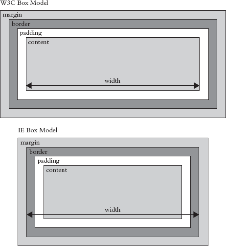
You should always include a DOCTYPE declaration in your XHTML pages. If you do not, Internet Explorer will use a different version of the box model to all other browsers, and your pages will break or look bigger in Internet Explorer than they would in other browsers (Figure 9-24).
Including one of the following DOCTYPE declarations ensures that Internet Explorer version 6 and later will render the page correctly.
Here is the transitional XHTML DOCTYPE:
<!DOCTYPE html PUBLIC "-//W3C//DTD XHTML 1.0 Transitionalt//EN"
 "http://www.w3.org/TR/xhtml1/DTD/xhtml1-transitional.dtd">
And here is the strict XHTML DOCTYPE:
<!DOCTYPE html PUBLIC "-//W3C//DTD XHTML 1.0 Transitionalt//EN"
 "http://www.w3.org/TR/xhtml1/DTD/xhtml1-transitional.dtd">
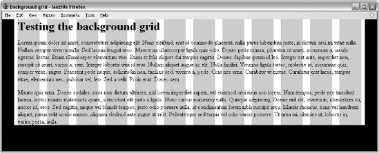
If you have designed a page using a fixed-width grid, you can add the grid to the background of your pages while building them using the CSS background-image property. This will help you ensure that you align elements to the grid. To do this you will need a 1-pixel-tall version image of the grid which can then be repeated vertically.
Unfortunately, you cannot do this for liquid designs because you cannot vary the size and background image as the layout expands and contracts.
As an example, we will add the 12-column grid we were looking at earlier in the chapter to the background of the page, as shown in Figure 9-25.
This example uses two <div> elements:
The first has an
idattribute whose value isframe; it will be the width of the grid.The second has an
idattribute with a value ofpage; it is the width of the page less the gutter to the left and right.
Here is the code for ch09_eg03.html:
<body>
  <div id="frame">
    <div id="page">
      <h1>Testing the background grid</h1>
      <p>Lorem ipsum dolor sit amet...</p>
    </div>
  </div>
</body>
Now here is the CSS for this page (ch09_eg03.css). The first thing to note is that we set the margin property on the <body> element to 0px. Otherwise, some browsers will add space inside the browser window and our site will not reach the top of the page. We also need to set the text-align property to have a value of center, so that the page frame will be centered in the middle of the page in IE versions 5 and 6.
body {
  background-color:#000000;
  margin:0px;}
  text-align:center;}
For the first of the <div> elements, we want to:
Make it the width of the grid using the
widthpropertyAdd the grid to the back of the element using the
background-imageproperty, then use thebackground-repeatproperty to ensure that the grid repeats down the pageCenter the element using the
margin-leftandmargin-rightproperties with a value ofauto; and settext-alignback toleft(since we had set it tocenteron the<body>element).
#frame {
  width:960px;
  background-image:url("images/960px_12_col_grid.gif");
  background-repeat:repeat:y;
  margin-left:auto;
  margin-right:auto;}
  text-align:left;}
The second <div> element is not quite as wide as the frame because there is a 10-pixel gutter to the left and right on the grid. We will add 10 pixels to the bottom, too, using the CSS margin property.
#page {
  margin:0px 10px 10px 10px;
  background-color:#ffffff; }
In order to make the page look like the screenshot, you will need to set the margin of the <h1> element to 0px too — otherwise the browser will set space above the element and push the grid down the page.
Sometimes you may prefer to save an image of the entire page design and use this as a background image (effectively it would be like using code to trace over the boxes in your design).
Now let's take a look at how to code some more complex layouts. We are going to start with a three-column layout, then look at a two-column layout, and finally add combinations of four and six columns as well.
The first example we will look at features three columns, as well as a header, a navigation bar under the header, and a footer at the bottom of the page.
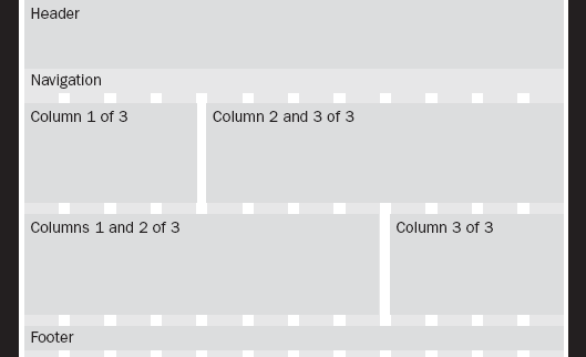
If you look at Figure 9-26 you can see the general layout of the page that we will be creating; there will be a header that takes up the full width of the page, followed by a navigation bar that will take up the full width of the page; under this will be three columns sitting next to each other, and finally a footer taking up the width of the page at the bottom.
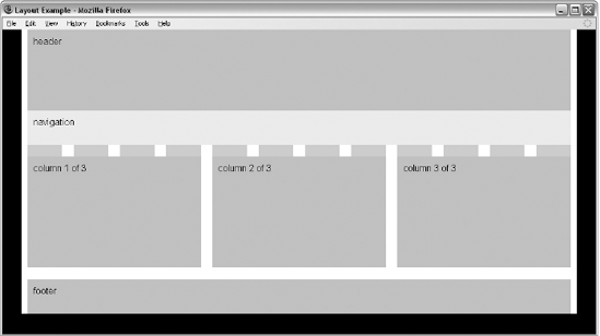
Figure 9-26 is just intended to show you the structure of the page and how the XHTML elements you are about to meet map onto the layout (for example you can compare the code <div id="header"> header</div> in this figure to the code used to create that block. To see a screenshot of the finished example we are building, flick forward a couple of pages to see Figure 9-27.
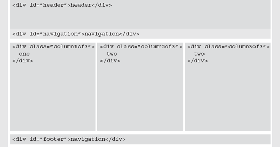
Here you can see the code that generates a page with three columns that is similar to this structure (ch09_eg04.html). Note how the values for the class attributes on the columns indicate how many columns the page is divided into and which column is which. For example, the first column has a value of column1of3:
<body>
  <div id="frame">
    <div id="page">
      <div id="header">header</div>
      <div id="navigation">navigation</div>
      <div class="column1of3">column 1 of 3</div>
      <div class="column2of3">column 2 of 3</div>
      <div class="column3of3">column 3 of 3</div>
      <div id="footer">footer</div>
    </div>
  </div>
</body>
You could add other elements inside any of these <div> elements — for example, your header would likely contain an <h1> element with the name of the site, or an image containing the logo for the site. The navigation would contain <a> elements that would link to the pages of the site, and so on.
Now let's take a look at the CSS for this page (ch09_eg04.css). We can start with the rules for the <body> element and two <div> elements. These rules are virtually identical to the rules that contained the grid in the last example.
body {
  margin:0px;
  background-color:#000000;
  font-family:arial, verdana, sans-serif;}
  text-align:center;}
#frame {
margin-left:auto;
margin-right:auto;
text-align:left;
width:960px;
background-image:url("images/960px_12_col_grid.gif");
background-repeat:repeat-y;}
#page {
padding:0px 10px 10px 10px;
background-color:#ffffff;}The header, navigation, and footer all take up the full width of the page, so we do not need to specify a width for them. I have provided the same properties for each:
background-colorproperty so you can see the space the box takes up; this also acts as a grouping or chunking mechanism for anything that appears in the header.paddingproperty to keep the contents of these elements away from the edge of the box, which makes them more readable.heightproperty to help the boxes sit nicely in the grid.
The footer also features a clear property, to ensure that it sits beneath the columns, and a border property on the top of the element to create a gap between the columns and the footer (you should not use the margin property and clear property on the same element because different browsers treat them in different ways).
#header {
  background-color:#cccccc;
  height:120px;
  padding:10px;}
#navigation {
  background-color:#efefef;
  height:40px;
  padding:10px;}
#footer {
  background-color:#cccccc;
  height:40px;
  padding:10px;
  clear:both;
  border-top:20px solid #ffffff;}
Finally, we come to the three columns. To make them sit nicely next to each other, use the following two properties:
floatto take the items out of normal flow.widthto specify the width of the element that is being floated (if you do not specify a width the element will take up the full width of the container — just like the header, navigation, and footer do).
As with the header, navigation, and footer, the background-color property creates a chunk or group, the padding separates the content from the edge of the box making it more readable, and the margin on top of the boxes ensures that the boxes do not touch the navigation or other columns above them. The height property is only there for visual effect.
.column1of3, .column2of3, .column3of3 {
  float:left;
  width:280px;
  background-color:#cccccc;
  padding:10px;
  margin-top:20px;
  height:173px;}
Remember that the padding is added to the width of the box. Because we want the columns to be 300 pixels wide and to have 10 pixels of padding, the width property of the box should be set to 280px.
There is one last property we need to set — the margin property — which adds the gutter that separates the boxes from each other. We only want to apply a gutter between the first and second columns, and between the second and third columns (because there is already a gutter to the left and right of the page). To achieve this, we will just set the margin-right property of the first and second columns.
.column1of3, .column2of3 {margin-right:20px;}You can see the result in Figure 9-27, and you can try it out for yourself using the download code for the book. Note how you can still just about see the grid poking through the design between the navigation and the columns.
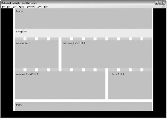
You've now seen a three-column layout, so let's look at how we could merge two columns and create a two-column grid. As Figure 9-28 shows, you could merge either columns 1 and 2 or columns 2 and 3.
This example is very similar to the last one. We do not have to change much in the code to create these additions. Looking at the XHTML, when we only want two columns, we only have two <div> elements to represent the two columns. Where these <div> elements take up twice the width, we have two new values for the class attributes: columns1and2of3 and columns2and3of3 (ch09_eg05.html).
<body>
  <div id="frame">
    <div id="page">
      <div id="header">header</div>
      <div id="navigation">navigation</div>

      <div class="columns1and2of3">column 1 and 2 of 3</div>
      <div class="column3of3">column 3 of 3</div>

      <div class="column1of3">column 1 of 3</div>
      <div class="columns2and3of3">columns 2 and 3 of 3</div>

      <div id="footer">footer</div>
    </div>
  </div>
</body>
Now let's turn to the CSS. First we have to add a rule for these wider boxes; the only difference between this and the one for single columns is that the width property has a value of 600px (ch09_eg05.css):
.columns1and2of3, .columns2and3of3 {
  float:left;
  width:600px;
  background-color:#cccccc;
  padding:10px;
  margin-top:20px;}
We also need to make sure that the new class representing the block that goes across columns 1 and 2 has a margin to the right, so we add the class selector to this line:
.column1of3, .column2of3, .columns1and2of3 {margin-right:20px;}The result is shown in Figure 9-29.
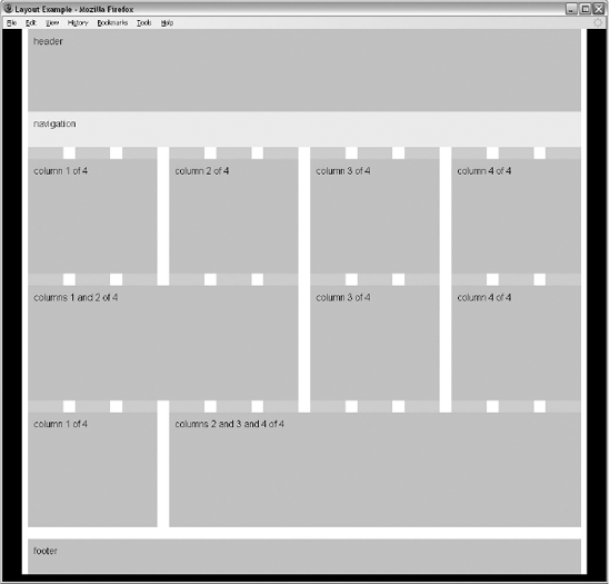
When I introduced the 960-pixel, 12-column grid, I pointed out that 12 could be divided by 2, 3, 4, and 6. Therefore, we can easily take this model and adapt it for four-column layouts. In this case the XHTML to create four columns might look like this (ch09_eg06.html):
<div class="column1of4">column 1 of 4</div>
<div class="column2of4">column 2 of 4</div>
<div class="column3of4">column 3 of 4</div>
<div class="column4of4">column 4 of 4</div>
You could have a class that represented the first two columns, and separate boxes for columns 3 and 4, like so:
<div class="columns1and2of4">columns 1 and 2 of 4</div>
<div class="column3of4">column 3 of 4</div>
<div class="column4of4">column 4 of 4</div>
Or you could have a class that created one box that spans columns 2, 3, and 4, like so:
<div class="column1of4">column 1 of 4</div>
<div class="columns2and3and4of4">columns 2 and 3 and 4 of 4</div>
Here is the CSS for the individual columns — we just need to make them narrower than the three-column layout (ch09_eg06.css):
.column1of4, .column2of4, .column3of4, .column4of4 {
  float:left;
  width:200px;
  background-color:#cccccc;
  padding:10px;
  margin-top:20px;}
The principle for boxes that spread over multiple columns is the same:
.columns1and2of4 {
        float:left;
        width:440px;
        background-color:#cccccc;
        padding:10px;
        margin-top:20px;}

.columns2and3and4of4 {
        float:left;
        width:680px;
        background-color:#cccccc;
        padding:10px;
        margin-top:20px;}
Again, we add a margin to the right of all elements except for those that fill up the right-most column:
.column1of4, .column2of4, .column3of4, .columns1and2of4 {margin-right:20px;}You can see the result in Figure 9-30.
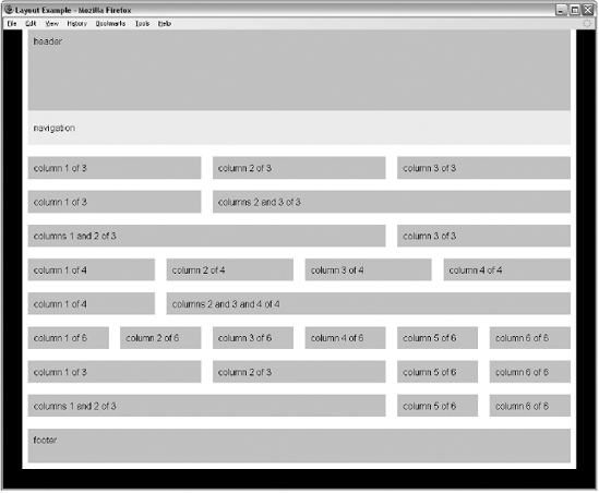
You can use the same principle yet again to create six-column layouts. Figure 9-31 shows you how two-, three-, and six-column layouts can all be made to work with this one grid. If you would like to look at the code for this example, it is provided with the rest of the code for this chapter; the files are ch09_eg07.html and ch09_eg07.css.
So far we have looked at multiple-column fixed-width layouts. It is possible to follow the same principles with liquid layouts. In such cases, you simply have to make sure that the widths are specified using percentages rather than pixels.
Start with your layout grid and work out the percentage of each column. In the following table you can see the width of each column in pixels from the fixed-width design, and the percentage width we are using in the liquid design. Because the gutters on this page stretch to the edge of the browser window, we will make them the same size as the ones between columns.
Column | Pixel size in fixed-width design | Percentage size in liquid layout |
|---|---|---|
Gutter 1 | 10px | 2% |
Column 1 | 300px | 30% |
Gutter 2 | 20px | 2% |
Column 2 | 300px | 30% |
Gutter 3 | 20px | 2% |
Column 3 | 300px | 30% |
Gutter 4 | 10px | 2% |
Total | 960px | 98% |
If you have not already seen it, check the final row showing the totals at the bottom of this table. It shows that the entire width of the design is only going to take up 98 percent of the screen. You must leave 2 percent extra space to the right of the page because when browsers calculate percentages they round the size to the nearest pixel, and therefore if the design tried to take up 100 percent of the browser window, the total width might be more than is available (which could throw out the entire layout).
So, let's look at an example; this time the code does not need the two containing <div> elements, so it will just look like this (ch09_eg08.html):
<body>
  <div id="header">header</div>
  <div id="navigation">navigation</div>
  <div class="column1of3">column 1 of 3</div>
  <div class="column2of3">column 2 of 3</div>
  <div class="column3of3">column 3 of 3</div>
  <div id="footer">footer</div>
</div>
</div>
</body>
Now let's look at the CSS to go with this example. If you do not specify a width for a block-level element, it will take up the full width of the page. Therefore we do not need to set the width of the header, navigation, or footer (ch09_eg08.css).
#header {
  background-color:#cccccc;
  padding:10px;
  height:120px;}

#navigation {
  background-color:#efefef;
  padding:10px;
  height:40px;}
#footer {
background-color:#cccccc;
padding:10px;
height:40px;
clear:both;
border-top:20px solid #ffffff;}Looking back at the table, we still need to add Gutters 1, 2, and 3 to columns 1, 2, and 3 using the margin-left property with a value that is 2%. We do not actually need to add Gutter 4 into the design because we have already allowed a little extra space to the right of the design.
We will also create padding in the boxes by giving the padding property a value of 1%. Because the padding is added onto the width of the box, to create a box that takes up 30 percent of the screen, the width property for each column should have a value of 28%.
/* 3 columns */
.column1of3, .column2of3, .column3of3 {
  float:left;
  width:28%;
  margin-left:2%;
  background-color:#cccccc;
  padding:1%;
  margin-top:20px;
  height:175px;}
You can see the result in Figure 9-32.
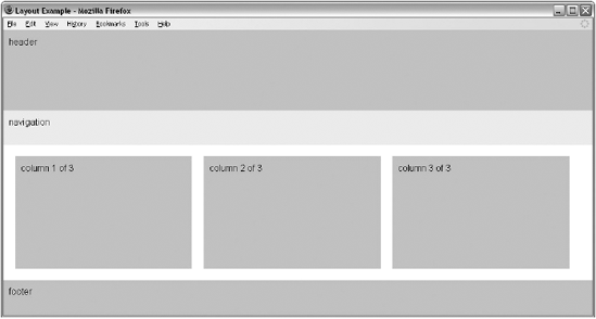
One of the issues with liquid layouts is that, because the user can shrink and increase the width of the boxes in the layout, the text may become too short or too long to read, and any fixed-width items (such as images) may end up poking out of boxes if they are too small.
In such cases, you can make use of the min-width and max-width attributes, which you read about in Chapter 7. Unfortunately, IE7 was the first version of Internet Explorer to support these properties. Luckily, the number of IE6 users is constantly shrinking, and since other browsers have supported these properties for longer, you should use them to help users whose browsers understand them (ch09_eg09.css).
.column1of3, .column2of3, .column3of3 {
  float:left;
  width:28%;
  margin-left:2%;
  background-color:#cccccc;
  padding:1%;
  margin-top:20px;
  height:175px;
  min-width:210px;
  max-width:400px;}
Once you specify a min-width property, if a user shrinks the window down quite small, you may find that content flows out of the boxes. You can use the overflow property to control what happens to content in such circumstances. Alternatively, you could put the three columns in a containing element and set a minimum width for that container element — wide enough to hold the minimum width of all three columns (ch09_eg09.html).
<div class="columns123">
  <div class="column1of3">
    <img src="images/golden_section.gif" width="200" height="75"
    alt="Golden Section" /> column 1 of 3
  </div>
  <div class="column2of3">column 2 of 3</div>
  <div class="column3of3">column 3 of 3</div>
</div>
Here is the rule that attaches the style to the new container element:
.columns123 {min-width:750px;}You should also add the same minimum width to the other elements that take up the full width of the page since their width is calculated as the width of the browser window when the page loads, which means that these elements might not otherwise be as wide as the new container element.
One of the issues when you use the CSS float property to create columns is that when you specify a visible background color or border for the columns, each can look a different height. Let's add some content into the three-column layout you met earlier so you can see what happens:
<div class="column1of3">
 Lorem ipsum dolor sit amet, consectetur adipiscing elit.
</div>
<div class="column2of3">
  Lorem ipsum dolor sit amet, consectetur adipiscing elit.
  Quisque vel sem odio, et tincidunt magna. Nam malesuada justo non risus
  ullamcorper eget dignissim erat viverra.
</div>
<div class="column3of3">
  Lorem ipsum dolor sit amet, consectetur adipiscing elit.
  Quisque vel sem odio, et tincidunt magna. Nam malesuada justo non risus
  ullamcorper eget dignissim erat viverra. Mauris viverra massa ac libero
  feugiat tempor. Cras scelerisque fermentum dui et feugiat. Class aptent taciti
  sociosqu ad litora torquent per conubia nostra, per inceptos himenaeos.
</div>
Figure 9-33 shows how the background for the box comes down only as far as the text (plus padding), which would not make for a very attractive design.
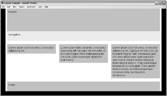
You have actually already seen a way around this problem, when we used the grid as a background image on the <div> element that had a class attribute whose value is page. By using a background image on the containing element, you can ensure that it applies to all columns, no matter how tall they are (ch09_eg10.css).
#frame {
  margin-left:auto;
  margin-right:auto;
  width:960px;
  background-color:#ffffff;
  background-image:url("images/960px_3column_background.gif");
  background-repeat:repeat-y;}
You can see the result in Figure 9-34.
You are now well equipped to be creating well-thought-out sites and page layouts. If you are interested in finding out more about page layout, here are some good resources:
Before we finish looking at page layouts, we need to consider mobile phones that are used to access web pages.
Many people think that the use of the Web on mobile phones is not really relevant to them or their company, especially if they (or those in their peer group) do not use web services on their mobile phones. But two things are changing minds:
The success of high-profile devices such as the Blackberry and iPhone
Statistics that show how many people access web-based services on mobile phones
In 2009, the British government released statistics showing that 11 percent of UK mobile phone users were using their mobile to browse the Internet, which (bearing in mind that more people have mobile phones than web access) equates to over a fifth of web users accessing the Web via mobile devices. Considering that the number of mobile phones sold in 2008 outstripped the entire user base of PCs, this is a trend that is only likely to increase.
Despite the growing interest in the mobile Web, it is not uncommon for people to view the Web on mobile devices as being inferior or "behind" the experience they have on a desktop computer. Yet the comparison between the experience of the Web on mobile devices and desktop computers is not quite as straightforward as it might first seem.
When it comes to thinking about how people access the Web on mobile phones, there are some very important aspects to consider:
Context: What the user is doing when using a mobile phone
Relationship: How people treat their mobile phone
Capabilities: The features and capabilities of mobile phones compared with desktop computers
Mobile devices are being used on the move, often in a hurry, and sometimes one-handed. The result is that when mobile phones are used to access the Web, they are often used to achieve very different things than the same user might want to achieve in front of a desktop computer.
While people sit for hours in front of a desktop computer surfing the Web, when users are out and about, they are far less likely to be just surfing — rather they are more likely to want to do something specific (whether this is checking the local weather forecast, latest news headlines and sports results, or finding out the opening hours of a nearby shop).
It is important here to note that a laptop, even though it is portable, is often used in the same manner as a desktop, even if the user is in a coffee shop, a car park, or at an airport.
When you start to think about your site appearing on a mobile device, it is wise to go back to the beginning of this chapter and create a new set of actors or personae that reflects the typical visitors to your site via a mobile phone.
At the same time, you should be creating a new set of tasks that they might want to achieve, because the mobile user will often want to achieve different things than the desktop user would. For example, mobile users accessing a supermarket web site are more likely to look for the nearest store and its hours than they are to do their weekly grocery shopping on their phones.
Even if users want the same information that they might request when at a desktop computer (for example to check the latest sports results or weather forecast in their area), you should always consider whether they may benefit from the information being displayed in a very different way.
It is also worth comparing the relationship that people have with their mobile phones compared with desktop computers. It is far more common for people to have their own mobile phones whereas desktop computers are often shared between members of a family, or used at work and schools. This means that people have a more personal relationship with their mobile phones. It also means that it is possible to more accurately uniquely identify users and personalize services to them.
These devices are also usually carried around 24 hours a day, no matter where the owner is (they may be turned on silent, but rarely turned off).
Finally, we should compare capabilities of mobile phones and desktop computers. Here are some of the positive aspects of mobile phones that are not as apparent on desktop devices:
Allow for location specific services: Because they can use triangulation or (where installed) GPS to identify location of users.
Have a built-in payment system: Whether on contract or a pay-as-you-go scheme, the payment is integrated more than a desktop computer where a user must enter credit card information or set up an account with a service such as PayPal. The payment system is also available to those who are not old enough to have debit and credit cards. It has also been suggested that mobile phone owners are more used to (and willing to) pay for services accessed via their mobile than they are to pay for services accessed via a desktop computer.
Have a built-in camera: Only a handful of desktop machines will have a camera built in, and those that do are still used in a desk-based setting (rather than being carried around all the time).
Are integrated with voice data: Because they are phones as well, and although services such as Skype allow phone calls to be made through a computer, it is not inherent in the platform.
Have other features: Such as SMS and MMS, which some users (particularly in Europe) use often.
Having said that, there are some inherent limitations with mobile devices:
Slower connection speeds: The connection speeds of mobile phones consistently trail behind those offered by broadband connections.
Connection can be intermittent: As users move about, for example when traveling in more isolated rural areas, or when going through tunnels in cities, their connection can be cut.
Screen are usually smaller: Because screens are small, it is not possible for users to scan as much information to find out what they are looking for.
Input devices are harder to use: Although many mobile users are adept at using their mobile phones, they are unlikely to achieve the same speed and accuracy of data input that they would achieve with a keyboard and mouse.
Less control over appearance: Several phones will remove your choice of font, size of text, and background images to show them in a manner they see fit for the device.
Armed with this information, you can start to think about mobile development.
Often the key factors in deciding a mobile strategy will depend upon the resources a company has available for its web users and whether it has enough users to justify the expense of development. Broadly speaking, you can categorize the approaches in mobile development into one of three categories:
Just have one main web site (no separate mobile site)
Provide a different view of the content on your site to those with mobile phones
Create an entirely new site for mobile users
Let's take a look at each of these options in turn.
The cheapest and least time-intensive strategy for mobile development is simply to do nothing. Many mobile phones are adept at giving users access to the content on the site. Some larger touch-screen phones (such as the iPhone) are capable of cleverly resizing a web page to fit on the screen, then allow users to zoom into parts of the page. Other phones may change the way in which the page is presented in order to make it available on the size of screen they have (often overriding font sizes and image sizes).
The obvious drawback with this approach is that your content is not addressing the aims that visitors to a mobile site might have.
A middle ground is to re-use the content that you have, but to present it in a manner that is easier for mobile users. In this middle ground there are two common options.
The first approach is to add a second style sheet to the same pages, so that mobile devices can use a separate set of CSS rules to control how the pages appear to them:
<link href="mobile.css" rel="stylesheet" type="text/css" media="handheld" />
This can help you use a different layout, change the dimensions of the page, and attempt to control colors and sizes of fonts.
Unfortunately, not all phones know to take this version of the style sheet, and those that do still have to download a page that is the same file size as the pages created for desktop computers (which means that they may take a long time to download).
I have seen style sheets for handheld devices that try to hide parts of the page (setting the CSS display property on those elements to none), which has the advantage that it makes the interface simpler, although it does not make the file size smaller.
The second approach is to use a different set of templates when someone arrives at your site via a mobile device. Rather than just using a new style sheet, some companies will use the same content, but design new pages to hold the information.
This approach allows a lot more flexibility because you can change the order in which items appear. You can also entirely remove some parts of the page (such as advertisements and secondary navigation), and therefore reduce bandwidth needed to load the pages.
Still, both of these methods still fail to address the context in which the phone is being used.
If you have the resources available, users will often benefit from a site being specifically designed for use on a mobile phone. It allows you to address the requirements of users who are on the go (which are often different from those of a desktop PC user) and to understand the context in which visitors to your site use these devices.
A couple of good examples are http://m.flickr.com/ (shown below in Figure 9-35) and http://m.ebay.com/(shown below in Figure 9-36). Both of these sites have been developed especially for mobile users (you should be able to access them from a desktop browser as well to get an idea of how they work). You may also note how the mobile version of Flickr also has a location-based option in the main navigation.
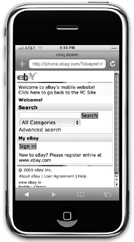
Should you have the opportunity to develop a site specifically for mobile users, it is very important to consider the function of these sites before addressing how they look. (Realistically the mobile offering is likely to look a lot more basic than the desktop site.) Also consider whether your users would benefit from features that are specific to mobile devices, such as location awareness (for example, a store might automatically show the closest locations), or the ability to send in pictures.
The first step is to look at the tasks you have identified as the most common ones that users will want to achieve on a mobile device and make them the first and most prominent offerings. In doing this, it is very important to retain focus on the main tasks and not try to give the mobile user every feature that is available on sites accessed by desktop computers. Content or features that are unlikely to be used on the go should be removed (or adapted into a form that will help mobile users).
Once you have worked out what it is that people want to achieve, and how you can meet their requirements, you can start to consider the practical aspects of your mobile site.
While there is not enough space in this book to go into this topic in great detail, and entire books have been written about building mobile web sites, I can give you some pointers regarding the key issues should you decide to create a site especially for mobile phones.
One of the most common questions regarding mobile development is whether to have a separate top-level domain name for the site because the .mobi top-level domain was created specifically for mobile devices.
In practice, a lot of companies have opted for a variation on their current address instead — for example, m.domainname.com, mobile.domainname.com, and domainname.com/mobile. In my opinion, the fewer taps a user has to make in order to reach a domain name on a mobile device, the better, which is why I tend to opt for the first of these options.
Device detection is a means by which the site attempts to tell whether a user is on a desktop computer or mobile phone, and then guide this user to the appropriate site.
Telling you how to do this is beyond the scope of this book, but the following two URLs should help you make a good start: http://wurfl.sourceforge.net or www.andymoore.info.
If you are able to offer device protection and send visitors to the mobile version of your site, it is a good idea to offer them a link to your full web site on the homepage. If they opt to use the full web site, you should aim to direct them to the same site in the future (when accessed from that phone).
Likewise, on your main web site, it is helpful to tell people that you have a mobile site, to make them more aware of its existence. You can also offer a link to the mobile version of the site.
Most fairly recent phones that feature a web browser are capable of displaying XHTML and basic CSS. That doesn't mean that they will display them as you would expect. Some phones will show all text at the same size, and some will strip out styles that are not necessary (such as background images or colors). Others will show the more complex design.
Technically speaking, they tend to support one of two subsets of XHTML known as XHTML-Mobile Profile and XHTML Basic. A good rule of thumb, however, is just to stick to the most common XHTML features and then most phones will be able to handle it. Here is the DOCTYPE declaration for XHTML-Mobile Profile:
<!DOCTYPE html PUBLIC "-//WAPFORUM//DTD XHTML Mobile 1.0//EN"
 "http://www.wapforum.org/DTD/xhtml-mobile10.dtd">
While there is not enough space in this book to cover all the differences between XHTML-MP and XHTML, there are several resources on the Web that can help you with this, such as the Openwave developer's reference:
http://developer.openwave.com/documentation/xhtml_mp_css_reference/
Most new sites being created for mobile devices are targeting browsers that are between 240 and 320 pixels wide. The layout of these pages should generally be vertical pages that scroll down.
You still need white space in your designs so that they are easy to read. However, if you have too much white space, users will have to scroll more than necessary.
With the exception of touch phones such as the iPhone (and other larger screened phones), many of the browsers on mobile phones do not support the CSS float property, so your boxes are likely to be positioned one above the other, even if you tried to position them to the sides. Because block-level elements (by default) take up the full width of the page, they act like a liquid layout.
So, let's look at some specific issues regarding design for mobile devices.
As we have already discussed, users are less likely to be just surfing the Web on a mobile phone; it is more likely that they are going to want to achieve tasks, and to do that quickly. Therefore:
Use clear concise language. Content should be available in small bite-size chunks that are easy to digest.
Use semantic markup, such as headings in
<hn>elements, paragraphs in<p>elements, and so on.User fewer images and graphics to save on download speeds.
Consider using the title of pages to indicate the action that a user should take.
Figure 9-37 shows the BBC news site on an iPhone; it uses less text and fewer images than the site for desktop computer users. The headlines are short and descriptive, while the page is designed to be long and thin (so users can scroll down to see more stories).
Remember that many mobile phones are used outside where screens can be harder to read, and there is not often an easy way to adjust contrast. Therefore:
Ensure that there is sufficient contrast in your designs.
Avoid using backgrounds.
Figure 9-38 shows the simplified Amazon mobile homepage, which mainly features a search box for users to find the book or other product they are looking for. It is also worth noting on this example the link in the top left-hand corner to the "PC Site."
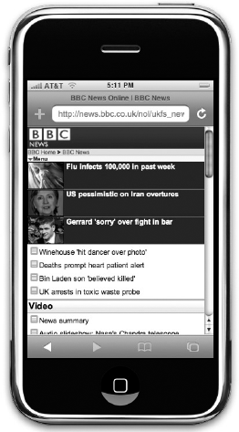
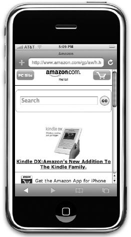
Because those accessing the Web on a mobile device often want to achieve a task quickly, navigation is of primary importance — not only in helping them achieve their task as quickly as possible, but also because there is less space on the screen to show navigation options.
Consider having the main navigation on the homepage only (with a link back to the homepage on every other page), or if you do have a navigation bar at the top of every page, have the minimum number of options you can.
At the end of each page have home and back links, but don't repeat the links that appear on the bottom of the site used by desktop visitors (such as
about,help, andfaq).Consider using access keys for links (we discussed access keys in Chapter 5 when we were looking at Forms).
Figure 9-39 shows the result of a search on the Amazon mobile site. As you can see, there is a link back to the homepage at the top of the page (rather than a navigation bar), and this is followed by another small search box before showing the results.
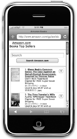
Although CSS allows you a lot of control over how links are presented, it is considered good practice on mobiles to keep links simple and obvious:
Stick to black text and blue links, and avoid using other colors for links. Remember that many mobile phones are used outside where screens can be harder to read.
Make it clear which link is active because it is harder to get the right link.
For phones, while iPhone and the Mobile Opera browser automatically determine phone numbers, you can put phone numbers in
<a>tags, with thehrefattribute starting withtel:<a href="tel:+44 (0) 208 208 2080">+44 (0) 208 208 2080</a>
Filling in a form on a mobile phone is harder for most people than it would be on a desktop computer; not only might people be on the move, using one hand; they also have to contend with smaller buttons or input devices. Therefore you should avoid using form controls as much as possible:
Consider using links instead of form controls.
Do not mask passwords. The use of dots or asterisks on password inputs was to prevent people looking over the shoulder of the user from seeing the password entered; this is not so much of an issue on mobile devices (and it is easier to make mistakes when typing on a mobile device).
If you have fields that only allow numbers (such as quantity fields), only allow people to enter numbers into these form fields (this technique is sometimes known as an input mask).
Avoid logins unless absolutely necessary.
With the number of mobile devices available today, no one would expect you to test a mobile site on every available phone. Some developers choose to run a few phones with varying capabilities (switching one SIM card between them), but you can always ask friends to see if they can access a site for you and show you what it looks like on their phones.
You can also use the following emulators, which mimic the abilities of phones:
Another handy tool is the Firefox Web Developer Toolbar, which allows you to test pages on small screens (https://addons.mozilla.org/en-US/firefox/addon/60). This feature is available from the Miscellaneous menu, under the option Small Screen Rendering, as shown in Figure 9-40.
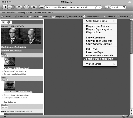
Once you know that your site is working, don't forget to test with real users (which is something we discuss in Chapter 13). It is also a good idea to validate your markup (also discussed in Chapter 13) because mobile phones are less forgiving of markup with errors than browsers such as IE, Firefox, and Safari on desktop computers. The W3C provides a tool for validating markup for mobiles here: http://validator.w3.org/mobile/.
This chapter introduced you to techniques for designing pages that are attractive and that meet the needs of those who visit them. You learned a process that helps you determine the information a visitor might expect to find on the site. You saw that this process involved creating fictional actors or personae who represented the typical audience, working out the tasks that these people would want to achieve, and determining the information needed to achieve those goals.
The information that visitors might expect to find was then added to the information that the site owners might want to convey (bearing in mind that the two may be different). The resulting list was then prioritized to determine the most important information on the site. From this, a site map is developed and the information is apportioned to the relevant pages.
The next step was to understand the issues regarding designing for screens — in particular, the difference between fixed-width and liquid layouts, whether your page should always stay the same size or expand and contract to fit the browser window.
Eventually the design or layout begins, and you saw how the use of a layout grid helps create a far more professional-looking layout compared with randomly selecting the size of parts of pages.
Some popular layout grids were then transformed into XHTML and CSS code, using floats to position the content on the page. This chapter demonstrated two-, three-, four-, and six-column layouts.
I hope the practical advice in this chapter makes it easier for you to design your web sites, and also helps you deal with those people or organizations you might be creating sites for. In the next chapter, we look at some more specific aspects within each page, such as typography, navigation, links, and forms.
The answers to all the exercises are in Appendix A.
Take another look at the article page from the Guardian newspaper's web site; it is shown again in Figure 9-41. List all the different elements on the page that would have been listed in the design stage, and put them together in their relevant grouping or categories. For example, the main article section of the page might need a list like this:
Title
Summary
Author
Date
Try to recreate the structure of the page you can see in Figure 9-41. It sits in the 12-column 960-pixel grid we were using in this chapter, so you have seen much of the code you need already — you just need to assemble it correctly.