Having learned how to structure the content of your documents using XHTML's wide variety of elements and attributes, you're now going to start making your pages look a lot more exciting.
You're going to learn how to use cascading style sheets (or CSS for short) to take control of the style of your pages, including the colors and size of fonts, the width and colors of lines, and the amount of space between items on the page. The cascading style sheets specification works by allowing you to specify rules that say how the content of elements within your document should appear. For example, you can specify that the background of the page is a cream color, the contents of all <p> elements should be displayed in gray using the Arial typeface, and that all <h1> elements should be in red using the Times New Roman typeface.
In this chapter you learn the following:
What makes up a CSS rule
How to place CSS rules within your document and how to link to an external CSS document
How properties and values control presentation of different elements within your document
How to control the presentation of text using CSS
How CSS is based on a box model, and how you set different properties for these boxes (such as width and styles of borders)
By the end of the chapter, you should be confidently writing CSS style sheets and should have learned many of the properties you can use to affect the presentation of any document using CSS.
In the next chapter, you will continue to learn more CSS properties, as well as how CSS can be used to position the content of elements within a page.
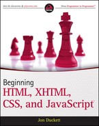
CSS works by allowing you to associate rules with the elements that appear in a web page. These rules govern how the content of those elements should be rendered. Figure 7-1 shows you an example of a CSS rule, which is made up of two parts:
The selector, which indicates which element or elements the declaration applies to (if it applies to more than one element, you can have a comma-separated list of several elements)
The declaration, which sets out how the elements referred to in the selector should be styled
The rule in Figure 7-1 applies to all <td> elements and indicates that they should be 36 pixels wide.
The declaration is also split into two parts, separated by a colon:
A property, which is the property of the selected element(s) that you want to affect, in this case the
widthproperty.A value, which is a specification for this property; in this case it is that the table cells should be 36 pixels wide.
This is very similar to the way that HTML/XHTML elements can carry attributes and how the attribute controls a property of the element; the attributes' value would be the setting for that property. For example, a <td> element could have a width attribute whose value is the width you want the table to be:
<td width="36"></td>
With CSS, however, rather than your having to specify the attribute on each instance of the <td> element, the selector indicates that this one rule applies to all <td> elements in the document.
Here is an example of a CSS rule that applies to several different elements (in this example, the <h1>, <h2>, and <h3> elements). A comma separates the name of each element that this rule will apply to. The rule also specifies several properties for these elements with each property-value pair separated by a semicolon. Note how all the properties are kept inside the curly braces:
h1, h2, h3 {
  font-weight:bold;
  font-family:arial;
  color:#000000;
  background-color:#FFFFFF;}
Even if you have never seen a CSS rule before, you should now have a good idea of what this rule is doing. There are three heading elements named in the selector (<h1>, <h2>, and <h3>), and this rule says that where these headings are used they will be written in a bold Arial font in black with a white background.
If there is only one property-value pair in the declaration, you do not need to end it with a semicolon. However, because a declaration can consist of several property-value pairs, and each property-value pair within a rule must be separated by a semicolon, it is good practice to start adding semicolons every time you write a rule in case you want to add another rule later. If you forget to add the semicolon, any further property-value pairs will be ignored.
Let's have a look at an example that shows how a set of CSS rules can transform the look of an XHTML page. CSS rules can live inside the XHTML document, although for this example we will be making a separate file to hold the CSS rules, and the XHTML page will contain a link to this file, which is known as a style sheet.
Before we meet the CSS style sheet, take a look at Figure 7-2, which shows the XHTML page we will be styling on its own before the CSS rules have been attached.
Here is the code for the page you saw in Figure 7-2 (ch07_eg01.html). It contains a heading, a paragraph, and a table. Inside the <head> element is a <link> element that tells the browser where to find the style sheet that will style this page; the location of the style sheet is given as the value of the href attribute. Also look at how some of the <td> elements carry a class attribute whose value is code; this is used to distinguish the table cells that contain code from other <td> elements in the document.
<?xml version="1.0" encoding="iso-8859-1"?>
<!DOCTYPE html PUBLIC "-//W3C//DTD XHTML 1.0 Strict//EN"
"http://www.w3.org/TR/xhtml1/DTD/xhtml1-strict.dtd">
<html xmlns="http://www.w3.org/1999/xhtml" lang="en">
<head>
<title>CSS Example</title>
<link rel="stylesheet" type="text/css" href="ch07_eg01.css" />
</head>
<body>
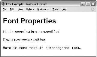
<h1>Basic CSS Font Properties</h1>
<p>The following table shows you the basic CSS font properties that allow
you to change the appearance of text in your documents.</p>
<table>
<tr>
<th>Property</th>
<th>Purpose</th>
</tr>
<tr>
<td class="code">font-family</td>
<td>Specifies the font used.</td>
</tr>
<tr>
<td class="code">font-size</td>
<td>Specifies the size of the font used.</td>
</tr>
<tr>
<td class="code">font-style</td>
<td>Specifies whether the font should be normal, italic or oblique.</td>
</tr>
<tr>
<td class="code">font-weight</td>
<td>Specifies whether the font should be normal, bold, bolder,
or lighter</td>
</tr>
</table>
</body>
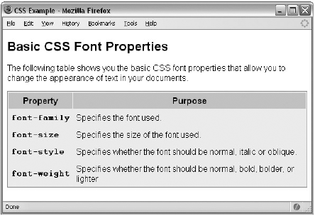
</html>Now let's take a look at how to style this page. Figure 7-3 shows how the page will look with the style sheet attached.
You can create a CSS style sheet in the same editor you are using to create your XHTML pages; once you have created a CSS file it is saved with the file extension .css.
The style sheet for this example, ch07_eg01.css, uses several CSS rules; we will go through them one at a time so that you can see what each one does.
Before the first rule, however, there is a comment to tell us which file this style sheet was written for. Anything between the opening /* and closing */ will be ignored by the browser and therefore will not have an effect on the appearance of the page:
/* Style sheet for ch07_eg01.html */
After the comment, the first rule applies to the <body> element. It specifies that the default color of any text and lines used on the page will be black and that the background of the page should be in white. The colors here are represented using a hex code (the different ways to specify colors are covered in detail in Appendix D). It also states that typeface used throughout the document should be Arial. If Arial is not available, Verdana will be used instead; failing that, it will use its default font group that corresponds to that generic font group.
body {
   color: #000000;
   background-color:#ffffff;
   font-family:arial, verdana, sans-serif; }
I always specify a
background-colorproperty for the body of a document because some people change the default background color of the windows on their computers (so that it is not a glaring white); if you do not set this property, the background color of those users' browsers will be whatever color they have selected.
The next two rules simply specify the size of the contents of the <h1> and <p> elements, respectively (as you will see later in the chapter pt stands for points — a method for specifying the sizes of fonts):
h1 {font-size:18pt;}
p {font-size:12pt;}
Next, it is time to add a few settings to control the appearance of the table. First we give it a light gray background. Then, we draw a border around the edge. Three properties are used to describe the border — the first says it is a solid line (rather than a dashed or dotted line), the second says it should be 1 pixel thick, and the third specifies that it should be light gray:
table {
   background-color:#efefef;
   border-style:solid;
   border-width:1px;
   border-color:#999999;}
Within the table, the table headings should have a medium gray background color (slightly darker than the main body of the table), the text should appear in a bold font, and between the edge of the cell and the text there should be 5 pixels of padding. (As you will see in more detail later in the chapter, padding is the term used for space between the edge of a box and the content inside it.)
th {
   background-color:#cccccc;
   font-weight:bold;
   padding:5px;}
The individual table data cells also have 5 pixels of padding (like the headings). Adding this space makes the text much easier to read, and without it the text in one column might run up right next to the text in the neighboring column:
td {padding:5px;}Finally, you may have noticed in Figure 7-3 that the cells of the table that contained the names of CSS properties were in a Courier font. If you look at the corresponding table cells in the XHTML document, they carried a class attribute whose value was code. On its own, the class attribute does not change the display of the document (as you can see from Figure 7-2), but the class attribute does allow you to associate CSS rules with elements whose class attribute has a specific value. Therefore, the following rule applies only to <td> elements that carry a class attribute whose value is code, not to all <td> elements:
td.code {
   font-family:courier, courier-new, serif;
   font-weight:bold;}
When you want to specify an element whose class attribute has a specific value, you put the value of that class attribute preceded by a period (or full stop) symbol.
There you have the first example; you can find the code for this example with the download code for the rest of the book. This example provides you with an overview of how CSS works. Therefore, for the rest of this chapter, and the following chapter we need to look at:
The properties you can use to control the appearance of various elements, and the values they can take. The different properties are grouped throughout this chapter and the next. For example, the properties that affect the appearance of fonts are together, and those that affect borders are together and so on.
Different selectors that allow you to specify which elements these properties apply to; the basic example featured just a few of the many methods you can use to indicate which elements are controlled by which style rules.
How CSS treats each element in a web page as if it were in its own box and how this affects the way in which you lay out web pages.
Along the way you will also see where you can use CSS rules in your documents, the units of measurements used in CSS (such as pixels, and percentages), and a very powerful concept called inheritance.
If you have used the View Source option in your browser to see how other people have built their web pages, you will probably be glad to hear that you can also look at other people's style sheets. To do this, you need to look at the source code for a web page and find the URL for the style sheet (note that it may be a relative URL); you can then enter the full URL for the stylesheet into the address bar of your browser and the rules will either appear in the window or your browser will ask if you want to download the style sheet.
One of the powerful features of CSS is that, when a property has been applied to one element, it will often be inherited by child elements (elements contained within the element that the rules were declared upon). For example, once the font-family property had been declared for the <body> element in the previous example, it applied to all of the elements inside the <body> element. This saves you from having to repeat the same rules for every single element that makes up a web page.
If another rule is more specific about which elements it applies to, then it will override any properties associated with the <body> element or any other containing element. In the preceding example, most of the text was in an Arial typeface, as specified in the rule associated with the <body> element, although there were a few table cells that used a Courier typeface. The table cells that were different had a class attribute whose value was code:
<td class="code">font-size</td>
Here you can see the rule associated with these elements:
td.code {
   font-family:courier, courier-new, serif;
   font-weight:bold;}
This rule takes precedence over the one associated with the <body> element because the selector is more specific about which element it applies to.
The way in which some properties inherit saves you from having to write out rules and all the property-value pairs for each element and makes for a more compact style sheet. Appendix C contains a handy reference to CSS properties and tells you which ones do and do not inherit.
The example that you saw at the beginning of the chapter placed the CSS rules in a separate file known as an external style sheet. CSS rules can also appear in two places inside the XHTML document:
Inside a
<style>element, which sits inside the<head>element of a documentAs a value of a
styleattribute on any element that can carry thestyleattribute
When the style sheet rules are held inside a <style> element in the head of the document, they are referred to as an internal style sheet.
<head>
  <title>Internal Style sheet</title>
  <style type="text/css">
  body {
    color:#000000;
    background-color:#ffffff;
    font-family:arial, verdana, sans-serif; }
  h1 {font-size:18pt;}
  p {font-size:12pt;}
</style>
</head>
When style attributes are used on XHTML elements, they are known as inline style rules. For example:
<td style="font-family:courier; padding:5px; border-style:solid;
border-width:1px; border-color:#000000;">
Here you can see that the properties are added as the value of the style attribute. You still need to separate each property from its value with a colon and each of the property-value pairs from each other with a semicolon. However, there is no need for a selector here (because the style is automatically applied to the element that carries the style attribute), and there are no curly braces.
The style attribute was deprecated in Transitional XHTML and is not allowed in Strict XHTML 1.0 because it introduces stylistic markup to the web page, when it should only contain markup that explains semantics and structure of the document.
The <link> element is used in web pages to describe the relationship between two documents; for example, it can be used in an XHTML page to specify a style sheet that should be used to style a page. You may also see the <link> element used in XHTML pages for other purposes, for example to specify an RSS feed that corresponds with a page.
It is a very different kind of link than the <a> element because the two documents are automatically associated — the user does not have to click anything to activate the link.
The <link> element is always an empty element, and when used with style sheets it must carry three attributes: type, rel, and href. Here is an example of the <link> element used in an XHTML page indicating that it should be styled by a CSS file called interface.css, which lives in a subdirectory called CSS:
<link rel="stylesheet" type="text/css" href="../CSS/interface.css" />
In addition to the core attributes, the <link> element can also take the following attributes:
charset dir href hreflang media rel rev style target type
You have met many of these already, so the more important ones are discussed in the following sections along with some of the less common ones.
The rel attribute is required and specifies the relationship between the document containing the link and the document being linked to. The key value for working with style sheets is stylesheet.
rel="stylesheet"
The other possible values for this element are discussed in Chapter 1.
The type attribute specifies the MIME type of the document being linked to; in this case, we are dealing with a CSS style sheet, so the MIME type is text/css:
type="text/css"
The other MIME types are listed in Appendix H.
The href attribute specifies the URL for the document being linked to.
href="../stylesheets/interface.css"
The value of this attribute can be an absolute or relative URL (which were covered in Chapter 2), but it is usually a relative URL because the style sheet is part of the site.
The hreflang attribute specifies the language that the resource specified is written in. When used, its value should be one of the language codes specified in Appendix G.
hreflang="en-US"
The media attribute specifies the output device that is intended for use with the document:
media="screen"
While this attribute is not always used, it is becoming increasingly important as people access the Internet in different ways using different devices. See the following table for the possible values.
The <style> element is used inside the <head> element to contain style sheet rules within a web page, rather than linking to an external document. It is also sometimes used when a single page needs to contain just a few extra rules that do not apply to the other pages of the site which all share the same style sheet.
For example, here is a style sheet attached to the XHTML document using the <link> element you just learned about, as well as a <style> element containing an additional rule for <h1> elements:
<head>
  <title>
  <link rel="stylesheet" type="text/css" href="../styles/mySite.css" />
  <style type="text/css">
    h1 {color:#FF0000;}
  </style>
</head>
When you use the <style> element it should always carry the type attribute. Here is a full list of the attributes it can carry:
dir lang media title type
Some browsers also support the id and src attributes although they are not part of any W3C recommendation.
If two or more documents are going to use a style sheet, you should use an external style sheet. There are several reasons for this, including:
It saves you repeating the same style rules in each page.
You can change the appearance of several pages by altering just the style sheet rather than each individual page. This means it is easier to update your site if you want to, for example, change the style of font used in all headings or alter the color of all links.
Once a visitor to your site has downloaded the CSS style with the first page of your site that uses it, subsequent pages will be quicker to load (because the browser retains a copy of the CSS style sheet and the rules do not have to be downloaded for every page). This also puts less strain on the server (the computer that sends the web pages to the people viewing the site) because the pages it sends out are smaller.
The style sheet can act as a style template to help different authors achieve the same style of document without learning all of the individual style settings.
Because the web pages do not contain the style rules, different style sheets can be attached to the same document. So you can use the same XHTML document with one style sheet when the viewer is on a desktop computer, another style sheet when the user has a handheld device, another style sheet when the page is being printed, another style sheet when the page is being viewed on a TV, and so on. You can reuse the same document with different style sheets for different visitors' needs.
A style sheet can import and use styles from other style sheets, allowing for modular development and good reuse. (For example, I have a style sheet that I import into other style sheets whenever I want to include examples of programming code in a web page—I do not need to write the style rules again and again.)
If you remove the style sheet, you can make the site more accessible for those with visual impairments, because you are no longer controlling the fonts and color schemes.
It is fair to say, therefore, that whenever you are writing a whole site, you should be using an external style sheet to control the presentation of it (rather than putting CSS rules in the individual web pages), although as you will see in the next chapter you might use several external style sheets for different aspects of the site.
You now know that styling a web page using CSS involves creating rules, and that these rules contain two parts: firstly, a selector to indicate which elements the rule applies to, and secondly, one or more properties which control the presentation of these elements.
So, if there is a part of the page that you want to make a certain color or size, then you need to find the corresponding property to control those elements.
The properties are grouped together into related functionality; for example, there are properties that allow you to control the presentation of tables, lists, and backgrounds. The following table shows the main properties available to you, all of which you meet in this chapter or Chapter 8.
FONT
font
font-family
font-size
font-size-adjust
font-stretch
font-style
font-variant
font-weight
TEXT
color
direction
letter-spacing
text-align
text-decoration
text-indent
text-shadow
text-transform
unicode-bidi
white-space
word-spacing
BACKGROUND
background
background-attachment
background-color
background-image
background-position
background-repeat
BORDER
border
border-color
border-style
border-width
border-bottom
border-bottom-color
border-bottom-style
border-bottom-width
border-left
border-left-color
border-left-style
border-left-width
border-right
border-right-color
border-right-style
border-right-width
border-top
border-top-color
border-top-style
border-top-width
MARGIN
margin
margin-bottom
margin-left
margin-right
margin-top
PADDING
padding
padding-bottom
padding-left
padding-right
padding-top
height
line-height
max-height
max-width
min-height
min-width
width
POSITIONING
bottom
clip
left
overflow
right
top
vertical-align
z-index
OUTLINES
outline
outline-color
outline-style
outline-width
TABLE
border-collapse
border-spacing
caption-side
empty-cells
table-layout
LIST and MARKER
list-style
list-style-image
list-style-position
list-style-type
marker-offset
GENERATED CONTENT
content
counter-increment
counter-reset
quotes
CLASSIFICATION
clear
cursor
display
float
position
visibility
There are some properties that I will not be covering in this book either because they are very rarely used or because there is little support for them. (For example, I avoid covering aural style sheets because there are not many aural browsers that support them.) You can find out more about these properties on the following web sites or you can pick up a book dedicated to CSS:
www.w3.org/style/css/www.devguru.com/Technologies/css/quickref/css_index.htmlwww.w3schools.com/css/css_reference.asp
Several properties allow you to control the appearance of text in your documents. These can be split into two groups:
Those that directly affect the font and its appearance (including the typeface used, whether it is regular, bold or italic, and the size of the text)
Those that would have the same effect on the text irrespective of the font used (these include color of the text and the spacing between words or letters)
The following table lists the properties that directly affect the font (the first of these two groups):
Property | Purpose |
|---|---|
| Allows you to combine several of the following properties into one |
Specifies the typeface or family of font that should be used | |
Specifies the size of a font | |
Specifies whether the font should be normal or bold | |
Specifies whether the font should be normal, italic, or oblique | |
Allows you to control the width of the actual characters in a font | |
Specifies whether the font should be normal or small caps | |
Allows you to alter the aspect ratio of the size of the font's characters |
Before looking at these properties in detail, it helps to understand some key terms used in typography. Perhaps most importantly, a font is not the same thing as a typeface:
A typeface is a family of fonts, such as the Arial family.
A font is a specific member of that family, such as Arial 12-point bold.
You will often see the terms used interchangeably, but it is helpful to be aware of the distinction.
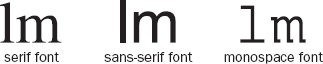
Typefaces tend to belong to one of two groups: serif and sans-serif fonts. Serif fonts have extra curls on letters. For example, if you look at Figure 7-4, the first l contains a serif on the top of the letter and at the bottom of the letter, whereas sans-serif fonts have straight ends to the letters, such as in the second example. The third common style of a typeface is a monospaced serif font. Every letter in a monospaced font is the same width, whereas non-monospaced fonts have different widths for different letters. (For example, in serif and sans-serif fonts, the l tends to be narrower than the m.)
Serif fonts are generally assumed to be easier to read for long periods of printed text. But on the Internet many people find serif fonts harder to read for long stretches, largely because the resolution of a computer screen is not as good as printed documents, which makes the less detailed sans-serif fonts easier to read.
So that we can study the properties that affect fonts, most of the examples in the following section will use a similar structure; paragraphs of text will be repeated, and each <p> element will carry a class attribute with a different value—for example:
<p class="one">Here is some text in a sans-serif font.</p>
<p class="two">Here is some text in a serif font.</p>
<p class="three">Here is some text in a monospaced font.</p>
You can then see how different properties affect each <p> element by writing a separate rule for each paragraph. You can use the value of the class attributes in the CSS selectors to create rules that apply just to one <p> element at a time.
The font-family property allows you to specify the typeface that should be used for any text inside the element(s) that a CSS rule applies to.
When choosing typefaces it is important to know that browsers can only display XHTML text in the font you have specified if that typeface is installed on that computer. So, if you specified a font such as Futura or Garamond, and I do not have them on my computer, I would see the text in a different font—not the one you specified.
This is why, if you look at a selection of web sites, you will notice that most rely heavily on a very small selection of typefaces installed on most computers that access the Web, in particular Arial, Courier/Courier New, Georgia, Times/Times New Roman, and Verdana. (From this list, Arial and Verdana are particularly popular because they are considered easy to read online.)
To help matters, you can specify a list of typefaces so that, if the user does not have your first choice of typeface installed on their computer, the browser can try to show the text in your second or third choice. Each typeface in the list is separated by a comma, and if the name contains spaces (such as times new roman or courier new) you should place the name of the typeface in double quotation marks (ch07_eg02.css), like so:
p.one {font-family:arial, verdana, sans-serif;}
p.two {font-family:times, "times new roman", serif;}
p.three {font-family:courier, "courier new", monospace;}
Figure 7-5 shows what this example would look like in a browser; you can see the different types of fonts used for each paragraph (ch07_eg02.html).
You may notice that each list of typefaces in the previous example ends with so-called generic font names (sans-serif, serif, and monospace). The idea behind these is that each computer will have a font that corresponds to one of five generic font groups (sans-serif, serif, monospace, cursive, and fantasy), and if it cannot find the typefaces you have specified, it can use its choice of font that corresponds to that generic font group:
Generic font name | Type of font | Example |
|---|---|---|
| Fonts with serifs | Times |
| Fonts without serifs | Arial |
| Fixed-width fonts |
|
| Fonts that emulate handwriting | Comic Sans |
| Decorative fonts for titles and so on | Impact |
One thing to keep in mind when choosing a list of fonts is that each font can be of different heights or widths, so you will probably want to choose a list of fonts that are of a similar size (otherwise the layout could look very different to what you would expect). For example, Courier New is quite short and wide, so if this was your first choice it would not be good to have Impact as a second choice because Impact is quite tall and narrow.
When designers want to use a specific typeface that is not likely to be on the majority of users' computers, they often use a GIF image for that text. It is generally frowned upon to use images for large sections of text, but for logos or headings and other small amounts of text, this is a good solution. If you do this, remember that you must provide the text that would be seen in the image as the value of the alt attribute.
There are several efforts to allow web designers to use fonts that the public are not likely to have on their computers. Apart from using images, two you might like to consider are: SIFR, which uses a combination of Flash and JavaScript (
http://novemberborn.net/sifr), and Typekit (http://typekit.com/).
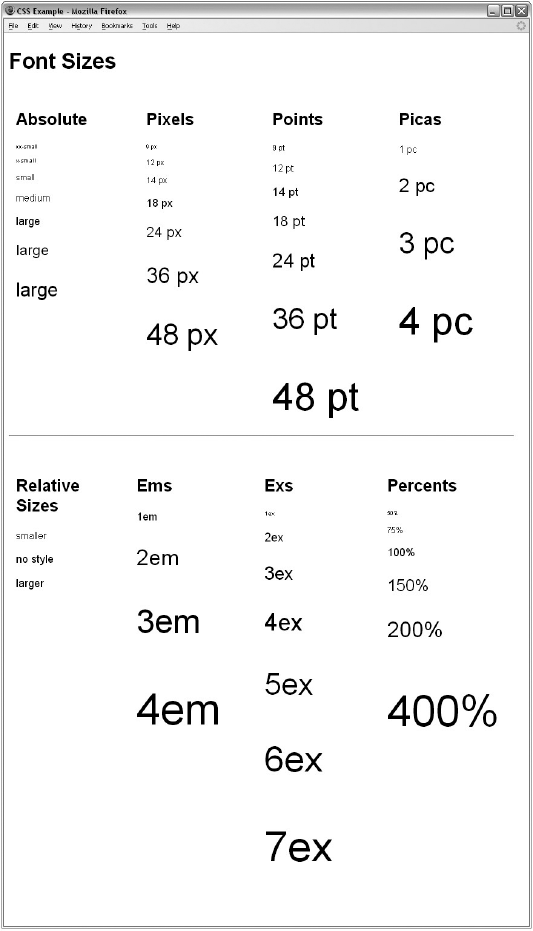
The font-size property enables you to specify a size for the font. You will often see the value for this property specified in pixels, like so:
p.twelve {font-size:12px;}However, there are many other ways you can provide a value:
Length (along with pixels, there are several other units of length which you will learn about in the section "Lengths" later in this chapter)
px em ex pt in cm pc mm
Absolute size (each of these values corresponds to a fixed size)
xx-small x-small small medium large x-large xx-large
Relative size (this value is relative to the surrounding text)
smaller larger
Percentage (a percentage is calculated as a proportion of the element that contains the text)
2% 10% 25% 50% 100%
The use of percentages rather than pixels is becoming increasingly widespread because it allows users to increase and decrease the sizes of fonts if they are having trouble reading them.
Here is an example of each of these ways to specify a value for the font-size property:
p.one {font-size:xx-small;}
p.twelve {font-size:12px;}
p.thirteen {font-size:3pc;}
p.fourteen {font-size:10%;}
Figure 7-6 shows you how a selection of these font sizes work in the browser. (ch07_eg03.html and ch07_eg03.css contain several examples of different ways of specifying size and compare how they look.)
Most fonts have different variations, such as bold and italic. When typographers create a new font, it is not unusual for them to individually craft a separate, thicker version of each character for the bold variation.
Despite all this careful work, rather than finding the bold version of a typeface, browsers tend to use an algorithm that takes the normal version of the font and makes it thicker. Because it uses an algorithm, it means you can also create a lighter version of fonts, too. This is what the font-weight property is for.
The possible values for font-weight are:
normal bold bolder lighter 100 200 300 400 500 600 700 800 900
The following example uses several of these values (ch07_eg04.css):
p.one {font-weight:normal;}
p.two {font-weight:bold;}
p.three {font-weight:normal;}
p.three span {font-weight:bolder;}
p.four {font-weight:bold;}
p.four span {font-weight:lighter;}
p.five {font-weight:100;}
p.six {font-weight:200;}
Figure 7-7 shows you how these values appear in the browser (ch07_eg04.html).
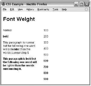
Of these values, bold is most commonly used, although you might also come across the use of normal (especially if a large section of text is already bold and an exception has to be created where just a few words are not in bold).
The font-style property allows you to specify that a font should be normal, italic, or oblique, and these are the values of the font-style property; for example:
p.one {font-style:normal;}
p.two {font-style:italic;}
p.three {font-style:oblique;}
Figure 7-8 shows you how these values appear in the browser (from ch07_eg05.css).
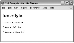
In typography, an italic version of a font would normally be a specifically stylized version of the font based on calligraphy, whereas an oblique version of font would take the normal version of the font and place it at an angle. In CSS, when you specify a font-style property should be italic, browsers will usually take the normal version of the font and simply render it at an angle (as you would expect with an oblique version of a font).
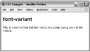
There are two possible values for the font-variant property: normal and small-caps. A small caps font looks like a smaller version of the uppercase letterset.
For example, look at the following paragraph, which contains a <span> with a class attribute (ch07_eg06.html):
<p>This is a normal font, but then <span class="smallcaps">there
are some small caps</span> in the middle.</p>
Now look at the style sheet (ch07_eg06.css):
p {font-variant:normal;}
span.smallcaps {font-variant:small-caps;}
As you can see from Figure 7-9, the rule associated with the <span> element indicates that its content should be shown in small caps.
At the time of this writing, there was no support for this property in the main browsers (IE8 and Firefox 3), but I shall mention it for those interested in type. In the same way that some typefaces have condensed and extended versions with thinner or thicker characters, the font-stretch property sets the width of the characters in a font. It can take the following fixed values:
ultra-condensed extra-condensed condensed semi-condensed semi-expanded
expanded extra-expanded ultra-expanded
Or it can take relative values, where the value is in relation to that of the containing element:
normal wider narrower
For example, if it were supported, you would be able to make a condensed Arial font using the following syntax:
p {font-family:arial; font-stretch:condensed;}At the time of this writing, the font-size-adjust property does not have any support in the main browsers (IE8 and Firefox 3), but its purpose is to allow you to change a font's aspect value, which is the ratio between the height of a lowercase letter x in the font and the height of the font.
For example, Verdana has an aspect value of 0.58 (which means that when the font's size is 100 px, its x-height is 58 pixels). Times New Roman has an aspect value of 0.46 (which means that when the font's size is 100 px, its x-height is 46 pixels). This makes Verdana easier to read at smaller sizes than Times New Roman. By altering a font's aspect value you can, therefore, change its height.
In addition to the properties that affect the font, there are several properties to affect the appearance or formatting of your text (independently from the font it is shown in). They are listed in the table that follows.
Property | Purpose |
|---|---|
| Specifies the color of the text |
Specifies the horizontal alignment of the text within its containing element | |
Specifies the vertical alignment of text within containing element | |
Specifies whether the text should be underlined, overlined, strikethrough, or blinking text | |
Specifies an indent from the left border for the text | |
Specifies that the content of the element should all be uppercase, lowercase, or capitalized | |
Specifies that the text should have a drop shadow | |
Controls the width between letters (known to print designers as tracking) | |
Controls the amount of space between each word | |
Specifies whether the white space should be collapsed, preserved, or prevented from wrapping | |
Specifies the direction of text (similar to the |
The color property allows you to specify the color of the text. The value of this property can either be a hex code for a color or a color name. (The way in which colors are specified for the Web is discussed further in Appendix D.)
For example, the following rule would make the content of paragraph elements red (ch07_eg07.html):
p {color:#ff0000;}The text-align property works like the deprecated align attribute would with text. It aligns the text within its containing element or the browser window. The table that follows displays possible values.
Value | Purpose |
|---|---|
| Aligns the text with the left border of the containing element |
| Aligns the text with the right border of the containing element |
| Centers the content in the middle of the containing element |
| Spreads the width across the whole width of the containing element |
Figure 7-10 shows you how these would work in a table that is 500 pixels wide.
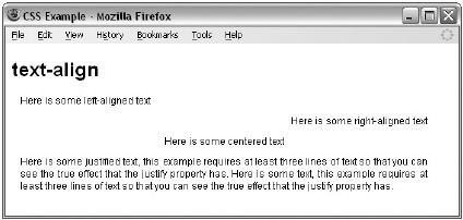
Here are the rules for each row of this example (ch07_eg08.css):
.leftAlign {text-align:left;}
.rightAlign {text-align:right;}
.center {text-align:center;}
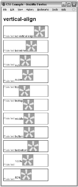
.justify {text-align:justify;}The vertical-align property is useful when working with inline elements, in particular images and portions of text. It allows you to control their vertical positioning within the containing element, for example:
span.footnote {vertical-align:sub;}It can take several values, as you can see in the table that follows.
Value | Purpose |
|---|---|
| Everything should be aligned on the baseline of the parent element (this is the default setting). |
| Makes the element subscript. With images, the top of the image should be on the baseline. With text, the top of the font body should be on the baseline. |
| Makes the element superscript. With images, the bottom of the image should be level with the top of the font. With text, the bottom of the descender (the parts of letters such as g and p that go beneath the line of text) should align with the top of the font body. |
| The top of the text and the top of the image should align with the top of the tallest element on the line. |
| The top of the text and the top of the image should align with the top of the tallest text on the line. |
| The vertical midpoint of the element should be aligned with the vertical midpoint of the parent. |
| The bottom of the text and the bottom of the image should align with the bottom of the lowest element on the line. |
| The bottom of the text and the bottom of the image should align with the bottom of the lowest text on the line. |
This property may also accept a length and a percentage value.
You can try out all of these in your browser using ch07_eg09.html.
Figure 7-11 shows you some of these values.
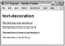
The text-decoration property allows you to specify the values shown in the following table.
Value | Purpose |
|---|---|
| Adds a line under the content. |
| Adds a line over the top of the content. |
| Adds a line through the middle of the content, such as strikethrough text. In general, this should be used only to indicate text that is marked for deletion. |
| Creates blinking text (which is generally frowned upon and considered annoying). |
Here are these properties used on separate paragraphs (ch07_eg10.css):
p.underline {text-decoration:underline;}
p.overline {text-decoration:overline;}
p.line-through {text-decoration:line-through;}
p.blink {text-decoration:blink;}
Figure 7-12 shows you what they look like in Firefox. Note that the blink property works in Firefox but not in Internet Explorer.
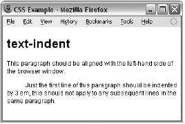
The text-indent property allows you to indent the first line of text within an element. In the following example it has been applied to the second paragraph:
<p>This paragraph should be aligned with the left-hand side of the browser. </p>
<p class="indent">Just the first line of this paragraph should be indented by
3 em, this should not apply to any subsequent lines in the same paragraph. </p>
Now, here is the rule that indents the second paragraph (ch07_eg11.css):
.indent {text-indent:3em;}You can see what this looks like in Figure 7-13.
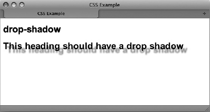
The text-shadow property is supposed to create a drop shadow, which is a dark version of the word just behind it and slightly offset. This has often been used in print media, and its popularity has meant that is has gained its own CSS property. The value for this property is quite complicated because it can take a color followed by three lengths:
.dropShadow {text-shadow: #999999 10px 10px 3px;}After the color has been specified, the first two lengths specify how far from the original text the drop shadow should fall (using X and Y coordinates), while the third specifies how blurred the drop shadow should be.
At the time of this writing, this property does not work in IE8 or Firefox 3 (although support is likely to be added in future versions). The property does work in recent versions of Safari (on Mac), Opera, and Konqueror. Figure 7-14 shows what this example (ch07_eg12.css) looks like in Safari on a Mac.
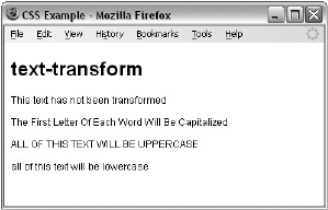
The text-transform property allows you to specify the case for the content of an element. The possible values are shown in the table that follows.
Value | Purpose |
|---|---|
| No change should take place. |
| The first letter of every word should be capitalized. |
| The entire content of the element should be uppercase. |
| The entire content of the element should be lowercase. |
To demonstrate this property, in the following example there are four paragraphs:
<p class="none">This text has not been transformed</p>
<p class="capitalize">The first letter of each word will be capiltalized</p>
<p class="uppercase">All of this text will be uppercase</p>
<p class="lowercase">ALL OF THIS TEXT WILL BE LOWERCASE</p>
Here you can see the four different values for the text-transform property in use (ch07_eg13.css):
p.none {text-transform:none;}
p.capitalize {text-transform:capitalize;}
p.uppercase {text-transform:uppercase;}
p.lowercase {text-transform:lowercase;}
Figure 7-15 shows you how the paragraphs would appear in a browser with these styles applied.
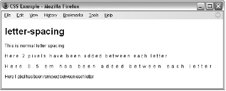
The letter-spacing property controls something that print designers refer to as tracking: the gap between letters. Loose tracking indicates that there is a lot of space between letters, whereas tight tracking refers to letters being squeezed together. No tracking refers to the normal gap between letters for that font.
If you want to increase or decrease the spacing between letters, you are most likely to specify this in pixels or something known as an em (although it can be any unit of length that CSS supports—and we will be looking at the CSS units of length later in the chapter).
If you have a section of text where letter spacing has been altered, then you can specify that an element should have no tracking using the keyword normal.
The first paragraph of the following example shows normal tracking. The second paragraph shows a gap of 3 pixels being used between each letter. The third paragraphs shows a gap between each letter of 0.5 em. The final paragraph shows spacing cut by 1 pixel from what it would have been in normal tracking (ch07_eg14.css):
.two {letter-spacing:3px;}
.three {letter-spacing:0.5em;}
.four {letter-spacing:-1px;}
Figure 7-16 gives you an indication of what this looks like in a browser.
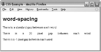
The word-spacing property sets the gap between words, and its value should be a unit of length. In the example that follows (ch07_eg15.css), in the first paragraph there is a standard gap between each of the words. In the second paragraph the gap is 10 pixels between each of the words. In the final paragraph the gap has been cut to 1 pixel less than normal spacing:
.two {word-spacing:20px;}
.three {word-spacing:-1px;}
Figure 7-17 gives you an indication of what this looks like.
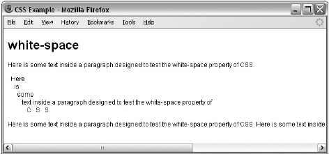
As you saw in Chapter 1, browsers change any two or more spaces next to each other into a single space and make any carriage returns a single space, too. The white-space property controls whether or not white space is preserved, offering the same results as the XHTML <pre> element where white space is preserved and the nowrap attribute where text is only broken onto a new line if explicitly told to. See the table that follows for the possible values for this property.
Meaning | |
|---|---|
| Normal white space collapsing rules are followed. |
| White space is preserved just as in the |
| Text is broken onto a new line only if explicitly told to with a |
For example, you can use the white-space property like so (ch07_eg16.css):
.pre {white-space:pre;}
.nowrap {white-space:nowrap;}
You can see both of these properties working in Figure 7-18.
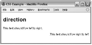
The direction property is rather like the dir attribute and specifies the direction in which the text should flow. The following table shows the possible values.
Value | Meaning |
|---|---|
| The text flows from left to right. |
| The text flows from right to left. |
| The text flows in the same direction as its parent element. |
For example, here are rules for two paragraphs indicating different directions for the text (ch07_eg17.css used with ch07_eg17.html):
p.ltr {direction:ltr;}
p.rtl {direction:rtl;}
In practice, both IE and Firefox use this property much as the align attribute is used. The value rtl will simply right-align text, as you can see in Figure 7-19. Note, however, that the period (or full stop) is to the left of the sentence in the paragraph that is supposed to be running right to left.
While you are learning about text, there are two pseudo-classes that can help you work with text. These pseudo-classes allow you to render either the first letter or the first line of an element in a different way than the rest of that element.
The first-letter pseudo-class allows you to specify a rule just for the first letter of an element. This is most commonly used on the first character of a new page, either in some magazine articles or in books.
Here is an example of the first-letter pseudo-class applied to a <p> element that has a class attribute whose value is introduction. Note how the selector for the element and the first-letter pseudo-class are separated by a colon (ch07_eg18.css used with ch07_eg18.html):
p.introduction:first-letter {font-size:42px;}You can see the effect of this first-letter pseudo-class in Figure 7-20 (which also shows the next pseudo-class we will be looking at).
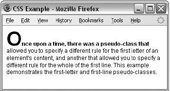
The first-line pseudo-class should allow you to render the first line of any paragraph differently from the rest of the paragraph. Commonly this might be in a bold font so that the reader can clearly see an introduction (for articles) or the first line (for poems).
The name of the pseudo-class is separated from the selector for the element by a colon:
p.introduction:first-line {font-weight:bold;}It is worth trying this example out in a browser, because if you resize the window so that there is less text on the first line, you will see how only the first line of text in the browser will be given this new style. You can see the first-line pseudo-class in action in Figure 7-20, which also demonstrates the first-letter pseudo-class.
Try It Out: Styling the Example Café Text
Now that you've learned about using CSS to format text, it is time to try putting what you have learned into practice by starting to add styles to the Example Café web site.
We will be creating an external style sheet, so start your text editor and create a file called
interface.css, and save it in a folder calledcssalong with the rest of the Example Café files. At the beginning of the style sheet add a comment to explain what the style sheet is for:/* style sheet for Example Cafe */
We want the default font family to be Arial. If the user does not have Arial installed, then we can suggest Verdana, failing which the computer's default sans-serif font.
body {font-family:arial, verdana, sans-serif;}It would be nice to have the headings stand out in a different font, so we will have Georgia as the first choice for headings, and then Times, and finally the default Serif font. I would also like them to appear in gray rather than black, so we can specify a color for the headings using the
colorproperty (which is discussed in more detail in the following chapter). Because we are making all headings the same, we should specify the styles in a single rule like so:h2 {georgia, times, serif; color:#666666;}The paragraphs of text might look a little better slightly smaller than the default size of text, let's make them 90% of the default size. We will also make the text dark gray rather than black.
p {font-size:90%;
   color:#333333;}
Now let's look at the navigation. In particular, we want to control the appearance of the links in the navigation. In order to do this, we are going to have to open the XHTML pages and add an
idattribute to the<div>element that contains the navigation.<div id="navigation"> HOME <a href="menu.html">MENU</a> <a href="recipes.html">RECIPES</a> <a href="opening.html">OPENING</a> <a href="contact.html">CONTACT</a> </div>
Now we need to add a selector, which will specify that we only want to select
<a>elements that live inside an element that has anidattribute whose value isnavigation; we do this using the hash or pound symbol followed by the value of theidattribute. We will specify that these links should be a light blue to match the logo:#navigation a {color:#3399cc;}By default, links appear with underlines; we can remove these by using the
text-decorationproperty with a value ofnone:#navigation a {color:#3399cc; text-decoration:none;}Finally, in the XHTML pages we need to add the
<link>element, which will associate the style sheet with the pages; this should be added to every page:<link rel="stylesheet" type="text/css" href="css/interface.css" />
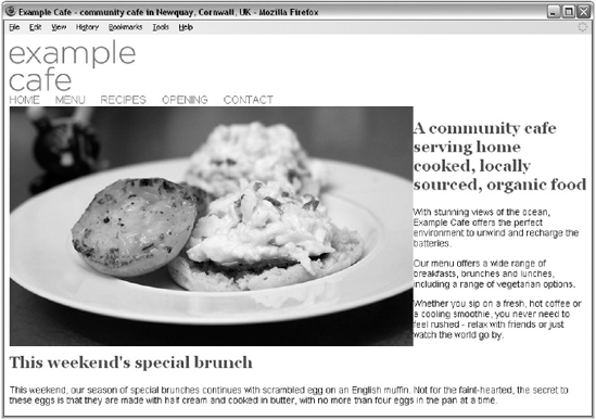
Now all of the pages in the example should be using this same style sheet and your homepage should look a little more like the example in Figure 7-21.
So far, you have seen lots of examples of properties that affect the presentation of text, and you have seen how these properties are applied to elements using style rules. Before we continue to look at more properties, we need to look at some more fundamental issues. We will start by looking at how you can use different types of selector to specify which elements a style sheet rule will apply to before going on to look at the different units of measurements used in CSS.
You can specify which elements a style sheet rule applies to in several ways, not just by using the names of the elements as you have seen so far in this chapter (which is, incidentally, known as a simple selector), or using the value of the class attribute or id attribute. Let's take a look at the different types of selector that are available to specify which element(s) a CSS rule applies to.
The universal selector is an asterisk; it is like a wildcard and matches all element types in the document.
*{}If you want a rule to apply to all elements, you can use this selector. Sometimes it is used for default values that will apply to the whole of the document (such as a font-family and font-size) unless another more specific selector indicates that an element should use different values for these same properties.
It is slightly different from applying default styles to the <body> element, as the universal selector applies to every element and does not rely on the property being inherited from the rules that apply to the <body> element.
The type selector matches all of the elements specified in the comma-delimited list. It allows you to apply the same rules to several elements. For example, if you wanted to apply the same rules to different sized heading elements, the following would match all h1, h2, and h3 elements:
h1, h2, h3 {}The class selector allows you to match a rule with an element (or elements) carrying a class attribute whose value matches the one you specify in the class selector. For example, imagine you had a <p> element with a class attribute whose value was BackgroundNote, like so:
<p class="BackgroundNote">This paragraph contains an aside.</p>
You can use a class selector in one of two ways here. One way is to simply assign a rule that applies to any element that has a class attribute whose value is BackgroundNote, like so, preceding the value of the class attribute with a period or full stop:
.BackgroundNote {}Or you can create a selector that selects only the <p> elements that carry a class attribute with a value of BackgroundNote (not other elements) like so:
p.BackgroundNote {}If you have several elements that can all carry a class attribute with the same value (for example a <p> element and a <div> element could both use the class attribute with the same value) and you want the content of these elements to be displayed in the same manner, you will want to use the former notation. If the styles you are defining are specific to just the <p> element whose class attribute has a value of BackgroundNote, then you should use the latter notation.
A class attribute can also contain several values separated by a space — for example:
<p class="important code">
You can use the following syntax to indicate an element that has a class attribute whose value contains both important and code (although IE7 was the first version of Internet Explorer to support this syntax).
p.important.code {}The id selector works just like a class selector, but works on the value of id attributes. Rather than using a period or full stop before the value of the id attribute, you use a hash or pound sign (#). So an element with an id attribute whose value is abstract can be identified with this selector.
#abstract
Because the value of an id attribute should be unique within a document, this selector should apply only to the content of one element (and you should not have to specify the element name).
The child selector matches an element that is a direct child of another. In this case it matches any <b> elements that are direct children of <td> elements. The names of the two elements are separated by a greater-than symbol to indicate that b is a child of td (>) which is referred to as a combinator:
td>b {}This would enable you to specify a different style for <b> elements that are direct children of the <td> element compared with <b>elements that appear elsewhere in the document.
As a direct child of the <td> element, no other tags would sit between the opening <td> tag and the <b>element. For example, the following selector does not make sense because the <b>element should not be a direct child of a <table> element (instead, a <tr> element is more likely to be the direct child of a <table> element):
table>b {}IE7 was the first version of Internet Explorer to support the child selector.
The descendant selector matches an element type that is a descendant of another specified element (or nested inside another specified element), not just a direct child. While the greater-than symbol is the combinator for the child selector, for the descendent selector the combinator is the space. Take a look at this example:
table b {}In this case, the selector matches any <b>element that is a child of the <table> element, which means it would apply to <b>elements both in <td> and <th> elements.
This is a contrast to the child selector because it applies to all of the children of the <table> element, rather than just the direct children.
An adjacent sibling selector matches an element type that is the next sibling of another. For example, if you want to make the first paragraph after any level 1 heading a different style from other <p> elements you can use the adjacent sibling selector like so to specify rules for just the first <p> element to come after any <h1> element:
h1+p {}IE7 was the first version of Internet Explorer to support the adjacent sibling selector.
The general sibling selector matches an element type that is a sibling of another, although it does not have to be the directly preceding element. So, if you had two <p> elements that are siblings of an <h1> element, they would both use the rules of this selector.
h1~p {}The general sibling selector is part of CSS3; IE7 was the first version of Internet Explorer to support the general sibling selector and Firefox 2 was the first version of Firefox to support it.
The child and adjacent sibling selectors are both very important because they can reduce the number of class attributes you need to add into an XHTML document.
It is very easy to add classes for all kinds of eventualities. For example, if you wanted the first paragraph after an <h1> element to be shown in bold, you might have been tempted to add a class attribute to the first <p> element after every <h1> element. While this would work, your markup can be littered with all kinds of classes that are only there to make it easier to control the presentation of the pages.
If you then decided you wanted the first two <p> elements after every <h1> element to be bold, you might have to go back and add in new class attributes for the second <p> elements after every <h1> element. So the child and adjacent sibling selectors add a lot of flexibility to how you style documents and can make for much cleaner markup.
Take a look at the following XHTML content (ch07_eg19.html):
<p>Paragraph One: not inside a div element.</p>
<div>
  <p>Paragraph One: inside a div element</p>
  <p>Paragraph Two: inside a div element </p>
  <p>Paragraph Three: inside a div element </p>
  <p>Paragraph Four: inside a div element </p>
  <p>Paragraph Five: inside a div element </p>
</div>
Using the adjacent and adjacent sibling and child selectors only, you are going to create a page that looks like the one shown in Figure 7-22.
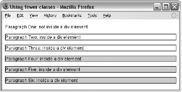
The three different paragraph styles are as follows:
The first paragraph has no border or background color.
The paragraphs inside the
<div>element all have borders.The last three paragraphs have a gray background as well as their border.
I have not used three different classes to specify different paragraph styles; rather, I have one rule that controls the font used for all paragraphs:
p {font-family:arial, verdana, sans-serif;}The following is the second rule for any paragraph that is a child of a <div> element. (Because the first paragraph is not inside a <div> element, the rule does not apply to the first paragraph.)
div>p {border:1px solid #000000;}The third rule matches any paragraph that is also a third consecutive <p> element. (Because the fourth and fifth <p> elements have two previous <p> elements, this rule applies to them, as well as the third <p> element inside the <div>.)
p+p+p {background-color:#999999;}Remember that this example will not work in IE6 or earlier versions of Internet Explorer, as these selectors were first introduced in IE7.
Attribute selectors enable you to use the attributes that an element carries, and their values, in the selector. There are several types of attribute selector and they allow far more complex ways of selecting elements in a document.
The use of attribute selectors is fairly limited because they have only been supported in the latest versions of browsers. Some of the attribute selectors in the following table are from CSS3, which has not yet been completed.
Name | Example | Matches |
|---|---|---|
| Any | |
| Any | |
| Any | |
| Any | |
| Any | |
| Any | |
| Any |
Internet Explorer implemented these attribute selectors in IE7, and in order for them to work, the XHTML document must have the strict !DOCTYPE declaration. Firefox started to support them in Firefox 2.
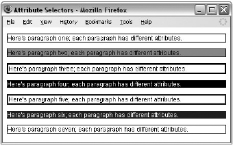
Let's have a look at an example of using these attribute selectors; here are seven different paragraph elements, each carrying different attributes/attribute values (ch07_eg20.html):
<p id="introduction">Here's paragraph one; each paragraph has different
attributes.</p>
<p id="summary">Here's paragraph two; each paragraph has different
attributes.</p>
<p class="important XHTML">Here's paragraph three; each paragraph has
different attributes.</p>
<p language="en-us">Here's paragraph four; each paragraph has different
attributes.</p>
<p class="begins">Here's paragraph five; each paragraph has different
attributes.</p>
<p class="contains">Here's paragraph six; each paragraph has different
attributes.</p>
<p class="suffix">Here's paragraph seven; each paragraph has different
attributes.</p>
Now let's look at a CSS style sheet that uses attribute selectors to associate different style rules with each of these elements (ch07_eg20.css):
p[id] {border:1px solid #000000;}
p[id="summary"] {background-color:#999999;}
p[class~="XHTML"] {border:3px solid #000000;}
p[language|="en"] {color:#ffffff; background-color:#000000;}
p[class^="b"]{border:3px solid #333333;}
p[class*="on"] {color:#ffffff; background-color:#333333;}
p[class$="x"] {border:1px solid #333333;}
You can see the result in Firefox 3.0 in Figure 7-23.
Because XHTML is case-sensitive, all selectors should match the case of the element name that they are supposed to match.
You have already seen that the values of some CSS properties are given as lengths (such as the size of fonts, height of lines of text, and gaps between words and letters), and you will come across more properties whose values are expressed as lengths later in the chapter. So, let's take a moment to look at the three ways lengths can be specified in CSS:
Relative units
Absolute units
Percentages
There are three types of relative units: pixels, which relate to the resolution of the screen, and em's and ex's both of which relate to the size of fonts.
The pixel, referred to in code as px, is by far the most commonly used unit of length in CSS. A pixel is the smallest unit of resolution on a screen and if you look very closely at your screen you might just be able to see the square dots that are the pixels.
Technically, the size of a layout that uses pixels as a unit of measurement can depend upon the viewing medium (keep reading to see why I say "can"), which is why it is counted as a relative unit.
Most computer screens have a resolution of 72 dots per inch (dpi), but you will find that laser and bubble jet printers are usually set with a higher resolution—my current printer runs at 300 dpi. In contrast, mobile devices can have a lower resolution than computer screens or (in the case of some smart phones such as the iPhone) a higher resolution.
So, a table that is 500 pixels wide could be 9.9444 inches wide on a 72 dpi screen, 1.666 inches wide at 300 dpi, or 13.888 inches wide on a 32 dpi screen (and a screen that is only 32 dpi is unlikely to be that much over 13 inches wide).
In reality, when you print a web page from your browser, it will adjust the pixels to present a readable version of the document. In fact, CSS recommends that in such cases user agents rescale pixel units so that reading at arm's length 1 pixel would correspond to about 0.28 mm or
An em is equivalent to the height of the current font, and because the size of fonts can vary throughout a document, the height of the em unit can be different in different parts of the document. Furthermore, because users can change the size of text in their browser, the em unit is capable of varying in relation to the size of the text that the user has selected.
This means that the em unit is most commonly used for measurements of elements that contain text and for controlling spacing between text (for example it can be used in the line-height property to set the gaps between lines of text in relation to their height).
While the em unit is equivalent to the height of a font, it is often thought to have derived from the width of a lowercase m; you may also hear the term en, which equates to half an em.
The ex should be the height of a lowercase x. Because different fonts have different proportions, the ex is related to the font size and the type of font. In Figure 7-24, you can see the x in the Courier typeface is smaller than the x in the Impact typeface.

Generally speaking, absolute units are used far less than relative units (and you will rarely come across designs that use these units of measurement). The following table shows the absolute units that are used in some CSS properties.
Unit | Full Name |
|---|---|
| A point |
| A pica |
| An inch |
| A centimeter |
| A millimeter |
I shouldn't really need to clarify inches, millimeters, or centimeters, but the other two are more interesting. A point is
Percentages give a value in relation to another value. For example, if your page only contained two paragraphs, and you wanted each to take up half of the width of the browser, then the paragraphs might be given a width property with a value of 50%. However, if the <p> element were inside another element that you knew was 500 pixels wide, they would take up 50 percent of the width of that containing element (or 250 pixels) each.
The box model is a very important concept in CSS because it determines how elements are positioned within the browser window. It gets its name because CSS treats every element as if it were in a box.
As you can see in the table that follows, every box has three properties you must be aware of.
Property | Description |
|---|---|
| Even if you cannot see it, every box has a border. This separates the edge of one box from other surrounding boxes. |
| The margin is the distance between the border of a box and the box next to it. |
| This padding is the space between the content of the box and its border. |
You can get a better idea of these properties in Figure 7-25, which shows the various parts of the box (the black line is the border).
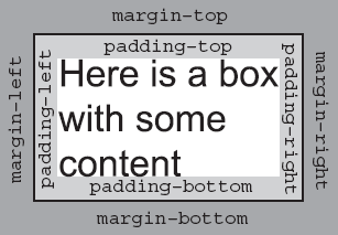
You can use CSS to individually control the border, margin, and padding on each side of a box; you can specify a different width, line-style and color for each side of the boxes' border.
The padding and margin properties are especially important in creating what designers refer to as white space; this is the space between the various parts of the page. For example, if you have a box with a black border and the box contains black text, you would not want the text to touch the border because it would make the text harder to read. Giving the box padding helps separate the text from the line around the edge.
Meanwhile, suppose you have two boxes next to each other, both with borders. If there is not a margin between them the boxes will run into each other, and the line where the boxes meet could look thicker than the other lines.
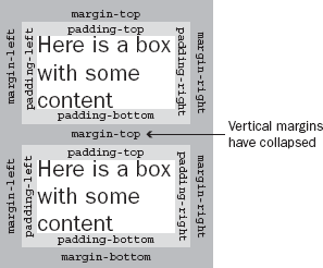
There is, however, an interesting issue with margins: when a bottom margin of one element meets the top margin of another, only the larger of the two will show. (If they are the same size, then the margin will be equivalent to the size of just one of the margins.) Figure 7-26 shows the vertical margins of two adjacent boxes collapsing (note that this only applies to vertical margins; the same is not true for left and right margins).
To really understand how the box model works with elements, take a look at the example in the next section.
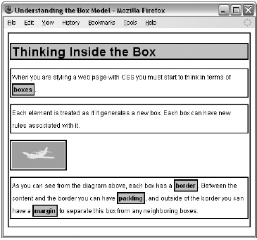
To illustrate the box model we will add a border to each of the elements in a web page. The <body> element creates one box that contains the whole page, and inside that box each heading, paragraph, image, or link creates another box. First, here is the XHTML for the page (ch09_eg21.html):
<?xml version="1.0"?>
<!DOCTYPE html PUBLIC "-//W3C//DTD XHTML 1.0 Transitional//EN"
    "http://www.w3.org/TR/xhtml1/DTD/xhtml1-transitional.dtd">
<html xmlns="http://www.w3.org/1999/xhtml" lang="en" xml:lang="en">
<head>
  <title>Understanding the Box Model</title>
  <link rel="stylesheet" type="text/css" href="ch07_eg19.css" />
</head>
<body>
  <h1>Thinking Inside the Box</h1>
  <p class="description">When you are styling a web page with CSS you
  must start to think in terms of <b>boxes</b>.</p>
  <p>Each element is treated as if it generates a new box. Each box can have
  new rules associated with it.</p>
  <img src="images/boxmodel.gif" alt="How CSS treats a box" />
  <p>As you can see from the diagram above, each box has a <b>border</b>.
  Between the content and the border you can have <b>padding</b>, and
  outside of the border you can have a <b>margin</b> to separate this box
  from any neighboring boxes.</p>
</body>
</html>
Using just one CSS rule you can see how each element involved with the body of the document — <body>, <h2>, <p>, <img>, and <b> — gets treated as if it were in a separate box. You can do this by adding a CSS rule that will add a border around each of these elements, you will learn more about these properties shortly (ch07_eg21.css).
body, h1, p, img, b {
   border-style:solid;
   border-width:2px;
   border-color:#000000;
   padding:2px;}
Each box can be presented differently, for example we can give the <h1> and <bold> elements a gray background to help distinguish them from other elements.
h1, b {background-color:#cccccc;}Figure 7-27 shows you what this page looks like in a browser. While it is not too attractive, the lines show you the borders of the boxes (and demonstrate how boxes are created for each element).
You may remember from Chapter 1 that there is a difference between block level elements and inline elements; the difference becomes quite important when working with CSS because it determines how each box is displayed.
The
<h1>and<p>elements are examples of block-level elements. Each block level element starts on a new line, and the box around a block level element takes up the full width of the browser (or the full width of the element it sits inside).The
<b>element is an example of an inline element. Its box sits in the middle of the paragraph and it does not take up the width of a whole line (it flows within its containing element).
The <img /> element may look like it is a block-level element because it starts on its own line, but it is actually an inline element. You can tell this because the border around it takes up only the width of the image; if it were a block-level element, the border would reach across the full width of the browser. The image is on its own line only because the elements on either side of it are block-level elements (and therefore the surrounding elements appear on their own lines).
In Strict XHTML, this image element should be placed inside a block-level element, as you are only supposed to have block-level elements as children of the <body> element. While it does not matter in Transitional XHTML, you could simply fix this issue by putting the element inside a <div> element (which you might remember is a block-level grouping element).
Now that you know how each element is treated as if it were in its own box, let's take a look at the properties that control the borders, margins, and padding for each box.
The border properties allow you to specify how the border of the box representing an element should look. There are three properties of a border you can change:
The border-color property allows you to change the color of the border surrounding a box. For example:
p {border-color:#ff0000;}The value can be a color name or a hex code for the color (colors are discussed in greater detail in Appendix D). It can also be expressed as values for red, green, and blue; between 0 and 255; or percentages of red, green, and blue. See the table that follows for examples.
Color Name | hex | RGB Values | RGB Percentages |
|---|---|---|---|
|
|
|
|
|
|
|
|
|
|
|
|
You can individually change the color of the bottom, left, top, and right sides of a box's border using the following properties:
border-bottom-colorborder-right-colorborder-top-colorborder-left-color
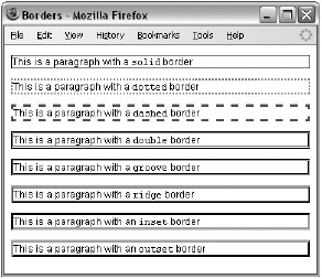
The border-style property allows you to specify the line style of the border:
p {border-style:solid;}The default value for this property is none, so no border would be shown automatically. The table that follows shows the possible values.
Value | Description |
|---|---|
| No border. (Equivalent of |
| Border is a single solid line. |
| Border is a series of dots. |
| Border is a series of short lines. |
| Border is two solid lines; the value of the |
| Border looks as though it is carved into the page. |
| Border looks the opposite of |
| Border makes the box look like it is embedded in the page. |
| Border makes the box look like it is coming out of the canvas. |
| Same as |
Figure 7-28 shows an example of what each of these would look like (taken from ch07_eg22.html). Note that even though the last four examples in Figure 7-27 look very similar, they are different, and you can try them for yourself with the download code for this example.
You can individually change the style of the bottom, left, top, and right borders of a box using the following properties:
The border-width property allows you to set the width of your borders; usually the width is specified in pixels.
p {border-style:solid;}
   border-width:4px;}
The value of the border-width property cannot be given as a percentage, although you could use any absolute unit or relative unit, or one of the following values:
thinmediumthick
The actual width of the thin, medium, and thick values are not specified in the CSS recommendation in terms of pixels; so the actual width that corresponds to these keywords is dependent on the browser.
You can individually change the width of the bottom, top, left, and right borders of a box using the following properties:
border-bottom-widthborder-right-widthborder-top-widthborder-left-width
The border property allows you to specify color, style, and width of lines in one property:
p {border: 4px solid red;}If you use this shorthand, the values should not have anything (other than a space) between them. You can also specify the color, style, and width of lines individually for each side of the box in the same way using these properties:
border-bottomborder-topborder-leftborder-right
The padding property allows you to specify how much space should appear between the content of an element and its border:
td {padding:5px;}The value of this property is most often specified in pixels, although it can use any of the units of length we met earlier, a percentage, or the word inherit.
The padding of an element will not inherit by default, so if the <body> element has a padding property with a value of 50 pixels, this will not automatically apply to all other elements inside it. If the value inherit is applied to any elements, only then will they have the same padding as their parent elements.
If a percentage is used, the percentage is of the containing box, and if the value of 10 percent is specified, there would be 5 percent of each side of the box as padding.
You can specify different amounts of padding inside each side of a box using the following properties:
padding-bottompadding-toppadding-leftpadding-right
The padding attribute is especially helpful in creating white space between the content of an element and any border it has. Take a look at the following two paragraphs in Figure 7-29.
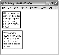
If you look at the CSS rules for these two paragraph elements, you can see that by default the first paragraph has no padding; it must be specified if you want a gap like the one shown in the second paragraph (ch07_eg23.css).
.a, .b {border-style:solid;
  border-color:#000000;
  border-width:2px;
  width:100px;}
.b {padding:5px;}
Sometimes an element may not have a visible border, but it will have a background color or pattern; in such cases giving the box some padding will help make your design more attractive.
The margin property controls the gap between boxes, and its value is either a length, a percentage, or inherit, each of which has exactly the same meaning as it did for the padding property you just saw.
p {margin:20px;}As with the padding property, the values of the margin property are not inherited by child elements unless you use the value inherit.
Also, remember that when one box sits on top of another box, only the larger of the two margins will show (or if both are equal the size of one margin).
You can also set different values for the margin on each side of the box using the following properties:
margin-bottommargin-topmargin-leftmargin-right
If you look at the following example (see Figure 7-30, which shows ch07_eg24.html), you can see three paragraphs, which look as if they are spaced equally. However, they have taller margins on the top than the bottom, and therefore where two boxes meet, the bottom margin is ignored: the margins are collapsed (note that this only happens to the vertical margins, not the left and right margins).
The example also shows how to set the left and right margins on the side of inline elements—where you see the highlighted words. Again, this is not the most attractive example, but it illustrates how both block and inline boxes use margins.
The words in the paragraphs that are emphasized using the <em> element have margin-left and margin-right properties set. Because these <em> elements also have a background color set, you can really see (in Figure 7-30) how the margins to the left and the right separate the words from the surrounding words.
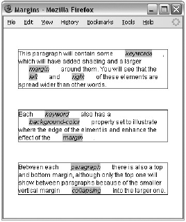
Here are the rules from ch07_eg24.css:
body {
   color:#000000;
   background-color:#ffffff;
   font-family:arial, verdana, sans-serif;
   font-size:12px;}
p {
   margin-top:40px;
   margin-bottom:30px;
   margin-left:20px;
   margin-right:20px;
   border-style:solid;
border-width:1px;
border-color:#000000;}
em {
background-color:#cccccc;
margin-left:20px;
margin-right:20px;}Now that you've seen the border that surrounds every box, the padding that can appear inside the border of each box, and the margin that can go outside the border, it is time to look at the properties that allow you to control the dimensions of boxes.
Property | Purpose |
|---|---|
| Sets the height of a box |
| Sets the width of a box |
| Sets the height of a line of text (like leading in a layout program) |
| Sets the maximum height for a box |
| Sets the minimum height for a box |
| Sets the maximum width for a box |
| Sets the minimum width for a box |
The height and width properties allow you to set the height and width for boxes. They can take values of a length, a percentage, or the keyword auto (the default value being auto, which means the box is just large enough to house its contents).
Here you can see the CSS rules for two paragraph elements, the first with a class attribute whose value is one and the second whose class attribute has a value of two (ch07_eg25.css):
p.one {
  width:200px; height:100px;
  padding:5px; margin:10px;
  border-style:solid; border-color:#000000; border-width:2px;}
p.two {
  width:300px; height:100px;
  padding:5px; margin:10px;
  border-style:solid; border-color:#000000; border-width:2px;}
As you can see in Figure 7-31, the first paragraph will be 200 pixels wide and 100 pixels high, while the second paragraph will be 300 pixels wide and 100 pixels high.
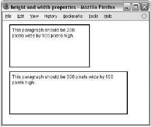
The most common unit of measurement for boxes is pixels, although percentages and ems are often used in layouts that stretch and contract to fit the size of the browser window.
The line-height property is one of the most important properties when laying out text. It allows you to increase the space between lines of text (known to print designers as leading).
The value of the line-height property can be a length or a percentage. It is a good idea to specify this property in the same measurement in which you specify the size of your text.
Here you can see two rules setting different line-height properties (ch07_eg26.css):
p.two {
  line-height:16px;}
p.three {
  line-height:28px;}
As you can see in Figure 7-32, the first paragraph does not have a line-height attribute, whereas the second and third paragraphs correspond to the preceding rules. Adding some extra height between each line of text can often make it more readable, especially in longer articles.
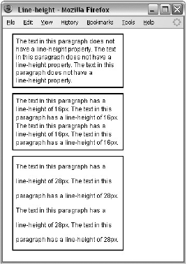
In long paragraphs I try to use leading of around 1.5 times the height of the font. This property can also be helpful when you need to add spacing around single lines of text.
The max-width and min-width properties allow you to specify a maximum and a minimum width for a box. This should be particularly useful if you want to create parts of pages that stretch and shrink to fit the size of users' screens. The max-width property will stop a box from being so wide that it is hard to read (lines that are too long are harder to read on screens), and min-width will help prevent boxes from being so narrow that they are unreadable. It is important to note, however, that IE7 and FF2 were the first of the major browsers to support these properties.
The value of these properties can be a number, a length, or a percentage, and negative values are not allowed. For example, take a look at the following rule, which specifies that a <div> element may not be less than 200 pixels wide and no wider than 500 pixels wide (ch07_eg27.css):
div {min-width:200px;
   max-width:500px;
   padding:5px;
   border:1px solid #000000;}
You can see what this looks like in Figure 7-33, which shows two browser windows, and you can try it for yourself using ch07_eg27.html in the code download. The first window is opened to over 500 pixels wide, and the box does not stretch wider than 500 pixels; the second window is closed to less than 200 pixels, at which point the browser starts to show a horizontal scrollbar because you cannot see the full width of the box.
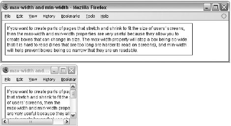
The min-height and max-height properties correspond with the min-width and max-width properties, but specify a minimum height and maximum height for the box. Again, it is important to note that IE7 and Firefox 2 were the first major browsers to support these properties.
The value of these properties can be a number, a length, or a percentage, and negative values are not allowed. Take a look at the following example (ch07_eg28.css):
div {min-height:50px;
   max-height:200px;
   padding:5px;
   border:1px solid #000000;}
Again, these properties are very useful in creating layouts that can be resized depending upon the size of the user's browser window. However, you can see an interesting phenomenon in Figure 7-34: If the content of the box takes up more space than the box is allowed because of these rules, the content can overflow out of the box (you will learn how to deal with this in the next section).
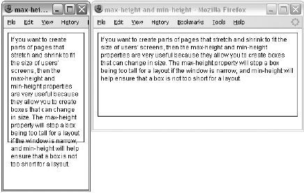
As you just saw in Figure 7-34, when you control the size of a box, the content you want to fit in the box might require more space than you have allowed for it. This not only happens with the min-height and max-height or min-width and max-width properties, but also for a number of other reasons.
The overflow property was designed to deal with these situations and can take one of the values shown in the table that follows.
Value | Purpose |
|---|---|
| The overflowing content is hidden. |
| The box is given scrollbars to allow users to scroll to see the content. |
Take a look at the following example, where the width of two <div> elements has been controlled by the max-height and max-width properties so that the content of the <div> elements does not fit in the box. For the first element, I have set the overflow property to have a value of hidden and the second to have a value of scroll (ch07_eg29.css).
div {max-height:75px;
   max-width:250px;
   padding:5px;
   margin:10px;
   border:1px solid #000000;}
div.one {overflow:hidden;}
div.two {overflow:scroll;}
Now take a look at Figure 7-35, which shows ch07_eg29.html. You can see the effect of these two properties — in the first box the text is simply cut off when it runs out of space, and in the second box a scrollbar is created allowing users to scroll to the appropriate content.
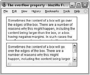
When you come to build sites using CSS you will probably come across a well-documented bug in the Internet Explorer Box Model that affects the width of boxes.
IE treated the width of a box as though it included the width of any border it had been given and the width of the padding in the size of the box. However, the CSS specification says that the width of a box should only be the width of the content (not including the border or padding). You can see this in Figure 7-36:
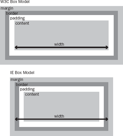
IE6 resolved this problem because it was able to run in two "modes":
Standards-compliant mode follows the CSS specification. You can make sure IE6 or above is running in standards-compliant mode by including one of the
!DOCTYPEdeclarations that you met in Chapter 1.Quirks mode retains the bug, and IE6 or above will run in Quirks mode when there is no
!DOCTYPEdeclaration.
Try It Out: A Style Sheet for Code
I often find the need to display code online. So I wrote the following style sheet to enable me to define styles very similar to those you see in this book, for showing code on the Web. As you will see in the next chapter, this code can then be included in other style sheets when needed, which means it is a reusable style sheet.
The style sheet features several styles for block and inline elements. The table that follows shows the styles you will be creating.
Style Name | Inline or Block | Use |
|---|---|---|
Inline | For a bit of code written in the middle of a sentence, shown in a monospace font | |
Block | Highlighted code in a monospace font for showing examples | |
Block | Like | |
Inline | Keys a user should enter on the keyboard, distinguishable because it is italic | |
Inline | The first use of a key term; helps users scan the document because it appears in a bold font | |
Block | Creates a block of important or key notes that is in a box and has background shading | |
| Block | Creates a block of italic text that has an aside or interesting note |
The first thing to do is create class selectors for each of these styles. Element names are not used for several of the styles here because the styles could apply to different elements (for example, box text could be in a
<p>element or a<div>grouping other elements). The selectors that do use elements are the ones representing code.code.codeInText{} code.codeForeground {} code.codeBackground {} .keystroke {} .importantWords {} .boxText {} .background {}Now it's time to start adding declarations to each selector inside the curly brackets. First is the
codeInTextstyle for words that appear in the middle of a sentence or paragraph that represent code. In the same tradition as most written matter on programming, the code will be displayed in a monospaced font. The first choice of typeface — specified using thefont-familyproperty — is Courier, failing which the browser should try to find Courier New, and if it cannot find that typeface, it will use its default monospaced font (although most computers do have Courier or Courier New installed).To make the code easier to read, this font will appear in bold text, as indicated using the
font-weightproperty..codeInText {font-family:courier, "courier new", monospace; font-weight:bold;}The second style is the
codeForegroundstyle. This style uses the same type of font as thecodeInTextstyle.Here are a few things to take note of:
The
codeForegroundstyle should always be displayed as a block-level element, but just in case the class is incorrectly used with an inline element, thedisplayproperty is used with a value ofblockto ensure that it is displayed as a block (you will see more of this property in Chapter 8).You will also see that the
letter-spacingproperty has been used with a negative value because monospace fonts tend to take up quite a bit of width on the page. So, to help get as many characters as possible on the same line, it is given a value of −0.1 of an em (or 10 percent of a font's height).All lengths in the style sheet are specified in ems so that they relate to the default size of the text in the document. If some of these elements were given in absolute sizes, they might have suddenly appeared a lot smaller or larger than the surrounding text.
The background color of the
codeForegroundstyle is gray. This helps the code stand out and makes it more readable. A one and a half em-sized padding has been added inside the box so that the text does not go right to the edge of the background color — this also makes the code easier to read.The margin ensures that the box does not touch any other boxes or paragraphs. It has a smaller margin on the bottom than the top, as do all of the styles in this style sheet that use the margin property.
.codeForeground {
  font-family:courier, "courier new", monosapce; font-weight:bold;
  letter-spacing:-0.1em;
  display:block;
  background-color:#cccccc;
  padding:0.5em;
  margin-bottom:1em; margin-top:1.5em;}
The
codeBackgroundstyle is identical to thecodeForegroundstyle except that thebackground-coloris white..codeBackground { font-family:courier, "courier new", monosapce; font-weight:bold; letter-spacing:-0.1em; display:block; background-color:#ffffff; padding:0.5em; margin-bottom:1em; margin-top:1em;}The
keystrokestyle is in a Times typeface, or Times New Roman if Times is not available; otherwise, the default serif typeface for the browser is used. Thekeystrokestyle should also be italicized as follows:.keyStroke { font-family:times, "Times New Roman", serif; font-style:italic;}The
importantWordsstyle is simply bold:.importantWords {font-weight:bold; }The
boxTextstyle has a bold font with a very light gray background; what really differentiates it is that it has a border. As with thecodeForegroundstyle,boxTexthas some padding so that the text does not reach the border — making it easier to read — and it has a margin to inset it from the left and right as well as vertically to separate it from other elements. Note that the bottom margin is slightly smaller than the top margin..boxText { font-weight:bold; background-color:#efefef; width:90%; padding:1em; margin-left:3em; margin-right:3em; margin-bottom:1em; margin-top:1.5em; border-style:solid; border-width:1px; border-color:#000000;}The final style is the
backgroundstyle. This style is italic and has the same amount of padding and margins as theboxTextstyle..background { font-style:italic; width:90%; padding:1em; margin-left:3em; margin-right:3em; margin-bottom:1em; margin-top:1em;}For this example, I also included a rule for the
<p>element and a rule for the<body>element (although they are not part of the standard CSS I use for code styles):body { color:#000000; background-color:#ffffff; font-family:arial, verdana, sans-serif; font-size:12px;} p {margin-bottom:1em; margin-top:1.5em;}Save this file as
codeStyles.css. Then take a look at the following XHTML file, which makes use of this style sheet. As you can see, the<link />element indicates that this is the style sheet to be used for this example. You can then see the elements with theclassattributes that relate to these styles:<?xml version="1.0"?> <!DOCTYPE html PUBLIC "-//W3C//DTD XHTML 1.0 Transitional//EN" "http://www.w3.org/TR/xhtml1/DTD/xhtml1-transitional.dtd"> <html xmlns="http://www.w3.org/1999/xhtml" lang="en"> <head> <title>CSS Example</title> <link rel="stylesheet" type="text/css" href="codeStyles.css" /> </head> <body> <p>You are about to see some <code class="codeInText">codeInText</code> followed by some <span class="importantWords">importantWords</span>, and the font for a <span class="keystroke">keystroke</span>.</p> <p>Next you will see some foreground code:</p> <code class="codeForeground">p {font-family:arial, sans-serif; font-weight:bold;}</code> <p>Next you will see some background code:</p> <code class="codeBackground">p {font-family:arial, sans-serif; font-weight:bold;}</code> <p class="boxText">This is some boxed text for important statements.</p> <p class="background">Here is a background comment or aside.</p> </body> </html>
If you look at this example in the browser, it should look like the screenshot in Figure 7-37.
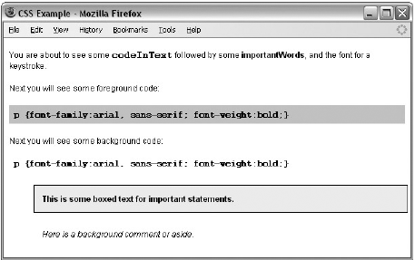
In this chapter, you learned how to write a CSS style sheet. You have seen that a CSS style sheet is made up of rules that first select the element or elements to which the rules will apply and then contain property-value pairs that specify how the element's content should appear.
You have learned how you can change the appearance of fonts and text.
You now know that CSS manages to render a document by treating each element as if it were a separate box and then using the properties to control how each box should appear, and you have learned how to set the dimensions and borders, padding, and margins for each box.
In the next chapter, you not only learn some more properties, you also see how you can use CSS to position elements on a page, which will enable you to create attractive layouts for pages. You even see how you can insert content from a style sheet into a document, deal with bulleted lists, create counters, and more.
In the exercises for this chapter, you are going to continue to work on the Example Café web site:
First, open the index.html page and add a
<div>element just inside the opening<body>tag and the closing</body>tag, and give the element anidattribute whose value ispage. Repeat this for each page of the site.Now, in the style sheet add a rule that gives this element a margin, border, and padding so that it looks like the border in Figure 7-38.
Create a CSS rule that will make the following changes to the navigation:
Add a single pixel gray border on the top and bottom.
Give it 20 pixels of margin above and below the gray lines.
Give it 10 pixels of padding on the top and bottom in the box.
Add a margin to the right of each link in the navigation.
Give the main image on the homepage a
classattribute whose value ismain_image, then create a rule that gives the image a single-pixel black border, and also give the image a 10-pixel margin on the right and bottom sides of the image.Increase the gaps between each line of text to 1.3 em.
Take a look at the following XHTML page:
<?xml version="1.0" encoding="iso-8859-1"?>
<!DOCTYPE html PUBLIC "-//W3C//DTD XHTML 1.0 Transitional//EN"
    "http://www.w3.org/TR/xhtml1/DTD/xhtml1-transitional.dtd">
<html xmlns="http://www.w3.org/1999/xhtml" lang="en">
<head>
  <title>Font test</title>
  <link rel="stylesheet" type="text/css" href="tableStyles.css" />
</head>
<body>
<table>
  <tr>
    <th>Quantity</th>
    <th>Ingredient</th>
  </tr>
  <tr class="odd">
    <td>3</td>
    <td>Eggs</td>
  </tr>
  <tr>
    <td>100ml</td>
    <td>Milk</td>
  </tr>
  <tr class="odd">
    <td>200g</td>
    <td>Spinach</td>
   </tr>
   <tr>
     <td>1 pinch</td>
     <td>Cinnamon</td>
   </tr>
 </table>
</body>
</html>
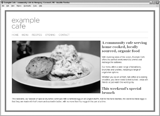
Now create the tableStyles.css style sheet, which makes this example look like it does in Figure 7-39.
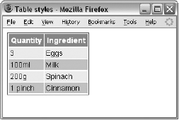
Don't worry about getting the sizes exactly the same as the screenshot, but do make sure you have padding in the cells and a border around the outside. The white border is created by default in IE; you will find out how to remove this in Chapter 8.