
CHAPTER 1
Introducing Pivot Tables
Using a pivot table in Microsoft Office Excel 2007 is a quick and exciting way to slice and dice a large amount of data. With it, you can turn your data inside out, upside down, sideways, and backwards to see how your business is doing. You can examine the data for similarities, differences, highs, and lows. What's going up, what's going down, and what's staying the same? Compare one region to another, view key results for several years of data, or zero in on one product's sales results. Make a few quick changes to the pivot table, and you can see your data from a completely different angle.
Pivot tables are even easier to use in Excel 2007 than they were in previous versions. With just a few clicks of the mouse and no complex formulas, you can summarize thousands of rows of data to show sums, averages, or other calculations. In this chapter, you'll get an overview of what pivot tables are, how you can benefit from using them, and how to prepare your data in Excel so you can use it as the source for a pivot table.
What Is a Pivot Table?
A pivot table is a tool in Excel that helps you summarize many rows and columns of data into a concise report. In Figure 1-1, you can see the first few of several thousand rows of data about food sales. Each row details what was sold, where it was sold, and the date and amount of the sale.

Figure 1-1. The food sales data
If you were asked to create a report from this data, with a count of orders for each region per product category where there was a promotional discount, you could manually list all the regions and product categories and then enter complex formulas to calculate the number of orders. If you create a pivot table instead, the report could be ready with a few clicks of the mouse.
With a pivot table, you simply drop the data into one of four areas, as shown in Figure 1-2. When you do this with the food sales data, row and column labels for the regions and product categories will be automatically created, and the orders will be counted. And you can add a filter to view only the orders with a promotional discount, instead of all the orders.
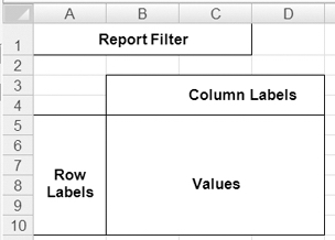
Figure 1-2. The four areas of a pivot table
In Figure 1-3, you can see a pivot table that summarizes the thousands of rows of food sales data, showing the counts of discounted orders.
From the report filter at the top of the pivot table, Yes has been selected so only the orders with a promotional discount are counted. The Grand Total row/column shows that there are 718 discounted orders. Bars and cookies have the highest number of discounted orders, and the West region has the lowest number of discounted orders.
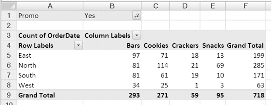
Figure 1-3. A pivot table summarizes the food sales data.
With a few more mouse clicks, you could quickly pivot the data to see a different summary. For example, your marketing director may ask how the sales of low-fat cookies are going in each of the cities you service. You could remove the regions from the pivot table and put in the cities. Instead of product categories as headings across the columns, you could show the Yes and No columns for low-fat items. To focus on cookie sales, you would move the product category to the report filter area and select Cookies.
In a minute or two, you could e-mail a report to the marketing director to show that the low-fat cookies are selling about half as well as the non-low-fat cookies (see Figure 1-4).
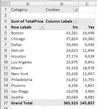
Figure 1-4. The food sales data summarized by city
Anxious to see whether the low-fat cookies sales are getting better or worse, the marketing director asks for the numbers broken down by year to see whether sales are increasing or decreasing. You simply add the order date to the pivot table and summarize the sales by year (see Figure 1-5). The pivot table shows that in most cities, the sales for low-fat cookies are increasing. Overall, the sales are increasing for low-fat and non-low-fat products.
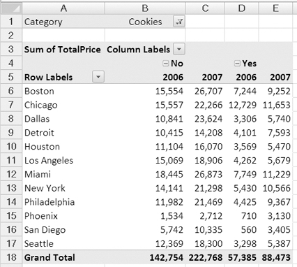
Figure 1-5. The food sales data summarized by city and year
You get one more phone call, just as you're heading out the door. The vice president of sales is flying to Chicago and wants a summary of the product sales in that market. What direction is each product's sales headed, and what are the market's strengths and weaknesses?
Again, you pivot the data, moving a few fields to different positions in the layout. This time you show the sales for one year as a percent change from the previous year to give a quick snapshot of the sales directions (see Figure 1-6). The sales of bars increased by 11.16 percent, and the sales of cookies increased by 19.92 percent; however, potato chips sales have declined. The Grand Total row shows that there is an overall increase in sales.
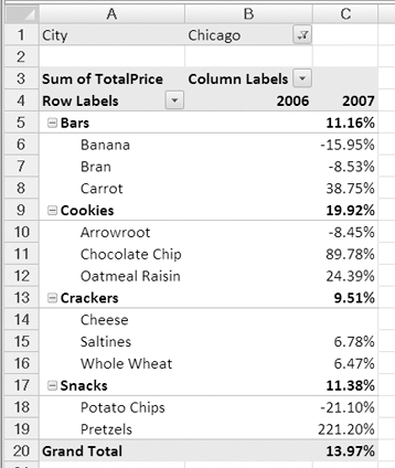
Figure 1-6. Percent change per year in the food sales data
The vice president of sales is happy with the report you created and asks you to create a visual summary to use in the Chicago meeting. The chart should show the totals per year for each product category in the Chicago area. You make a couple of quick changes to the pivot table, press a key on the keyboard, add a title, and your pivot chart is ready (see Figure 1-7).
The vice president of sales leaves for the airport, ready for the Chicago meeting, and you are relieved that you completed all those last-minute jobs without having to stay late!
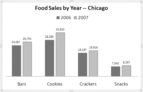
Figure 1-7. Quickly create a chart from the pivot table data.
Understanding the Benefits of Using Pivot Tables
Some people avoid using pivot tables because they're convinced they are complicated and difficult. Those people are missing out on one of Excel's most powerful and easy-to-use features. While they're spending hours writing complex formulas to summarize their data, you can summarize the data in a pivot table in a minute or two with a few clicks of the mouse. With pivot tables, you can prepare a sophisticated report from last night's sales data before today's 9 a.m. meeting.
This book will guide you as you dive into using pivot tables, and it will use different examples to point out many ways you can use pivot tables to report on your business or personal data. Although pivot tables are easy to use, they also have many sophisticated reporting features that may not be easy to discover or to understand exactly how they work. The later examples in this book are designed to explain those enhanced features and show how you can benefit from using them.
Whether you're working with financial data, logistics records, sales orders, customer service reports, web site statistics, resource tracking, event planning, or any other set of records, a pivot table might help you review, analyze, monitor, and report on the data. When the reporting requirements change, you can make minor adjustments to the pivot table instead of starting a worksheet summary from scratch. The examples in this book may inspire you to experiment with your own data and help make your job easier.
If you have used earlier versions of Excel, you'll immediately notice that many features have changed in Excel 2007. Pivot tables are among the features that have undergone a radical transformation, including the way they're created; Excel 2007 also offers new and improved formatting tools and easier ways for connecting to data that's outside Excel. In this book, you'll thoroughly explore the pivot table features that are available through the user interface. A basic knowledge of Excel 2007 is assumed, and only those features that interact with pivot tables, such as formatted Excel tables and conditional formatting, will be explained in the main text. The appendix contains additional instructions for key Excel 2007 skills.
Preparing to Create a Pivot Table
Before you can create a pivot table, you need to collect your data and organize it in a way Excel can use. Your data may already be in the correct format, or you may have to do a little or a lot of preparation before you can create a pivot table from your data. The data can be organized in an Excel workbook, in an external database, or in other sources...even in a text file. I'll start by outlining the requirements for setting up the data. There aren't too many rules, but it's important to set up the source data correctly. Investing in a little preparation time will ensure that you get the best results from the pivot tables you build.
Planning for Source Data in Excel
Many pivot tables are created from worksheet data in Excel, such as the food sales data shown in Figure 1-1, and most of the examples in this book will use similarly arranged data in Excel as the source for a pivot table. First you'll review the requirements for setting up the source data in Excel, and in later chapters you will see how to create a pivot table from data outside Excel. The source data can consist of a few rows and columns or thousands of rows and many columns, but the basic layout requirements are similar (see "Organizing Data in Rows and Columns").
The first example you'll see involves policy information for an insurance company. When you sell a new policy, you record information such as the start and end dates of the policy, the type of business that was insured, where the policy was purchased, and the value of the property that was insured. You want to analyze the policy data to see what type of businesses are insured in each region and what the total insured value is for each type of building. You'll open a sample file with data that illustrates the source data layout requirements that follow.
Opening the Sample File
To work with this example, you can download and open the sample file named InsurancePolicies.xlsx available at the www.apress.com web site.
If you are unable to download the sample file, you can create your own data, as described in the following steps. However, the examples will be easier to follow if you use the sample file. If you downloaded the sample file, you can skip the following steps.
- In Excel, to create a new workbook, click the Microsoft Office Button at the top left of the Excel window (see Figure 1-8).

Figure 1-8. The Microsoft Office Button
- Click New to open the New Workbook dialog box.
- In the list of templates, select Blank and Recent.
- In the center pane, click Blank Workbook, and then click the Create button.
- Starting in cell A1 on Sheet1, enter the headings and data shown in Figure 1-9. This is only a small view of a large table, so this data will not produce the same results as the downloaded sample file.
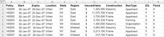
Figure 1-9. The insurance policy data
Organizing Data in Rows and Columns
The Excel data to be used as the source for a pivot table must be organized in rows and columns, with each row containing information about one record, such as a sales order or inventory transaction. In this example, each row, or record contains information about one insurance policy.
The information in each record is stored in the same order, with the policy number in the first column, the start date in the second column, and other data continuing across the columns. The first row contains headings to indicate what information is stored in each column. Each column can also be called a field, and the headings in the first row are the field names.
In Figure 1-9 you can see eight records in the insurance policy data and eleven columns, or fields. The last visible record is for policy 100207, and it has an entry of N in the Flood field. In the sample file there are 11 columns and 927 rows of data.
Adding column headings
Each column in the source data must contain a heading. The heading can be one word or multiple words, and all characters are allowed. You should use a short, descriptive, unique heading for each column in the source data. The headings should indicate the specific data that is contained in the column. For example, in the sample file, EQ is a concise heading for the column that indicates whether earthquake coverage is included.
Note If you try to create a pivot table from data that has blank heading cells, you will see an error message.
Although you can use the same heading for multiple columns, that might cause confusion for you and anyone else who is using the pivot table. If headings are duplicated, Excel will add numbers to make them unique when you create a pivot table.
Entering Similar Data in Each Column
Each column in the source data should contain one type of data. In the insurance policy example, column B contains dates, column G contains currency, and column H contains text.
Separating Data into Multiple Columns
To create an effective pivot table, some of the source data should be separated into multiple columns, instead of using a single column. For example, instead of having a column labeled Address, with the full address for each record, use three columns—one for Street, another for City, and another for State. Then you will be able to analyze the data by city or state instead of having that information buried in with the street address.
Removing Repeated Columns
Don't create multiple columns to store the same type of information. For example, because there is a separate column for each region's dollar amounts in Figure 1-10, it will be difficult to analyze the data by region in a pivot table.
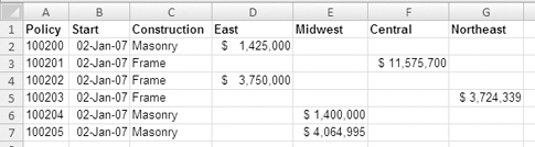
Figure 1-10. Data in repeating columns will make it difficult to analyze by region.
Although the data arrangement in Figure 1-10 may be ideal for creating totals on the worksheet, it's not efficient if the data will be analyzed in a pivot table. Instead, all the related dollar amounts should be in the same column, with the region name in another column. The data arrangement in Figure 1-11 will make it easier to analyze the data by region in a pivot table.
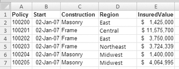
Figure 1-11. Related data in a single column will make it easier to analyze by region.
To help you decide whether something should be a column heading or an entry in the record, think about how you want that item to appear in the pivot table and how you want to summarize the data. Is the item a broad category name, such as Region, or does it describe a quality of the information that's stored in the column, such as Midwest? Do you want to create a total from the numbers in all the columns? If you find yourself creating several columns with different names to store the same type of information that you want to total in the pivot table, as in Figure 1-10, then it's likely that the headings should be changed to entries in a single column, as in Figure 1-11.
Entering Related Data in Each Row
Each row in the source data should contain the details for one record, such as a sales order (or in this example, an insurance policy). If possible, include a unique identifier for each row, such as an order number or policy number. This will make it easier to track the information that's summarized in the pivot table and do any troubleshooting later, if required.
Creating an Isolated Block of Data
The source data should not have any blank rows within it and cannot include any completely blank columns. If you want a column within the source data to appear blank for aesthetic reasons, it must at least contain a heading, which can be formatted with the same font color as the cell fill color to appear as though it is blank.
The source data should be separated from any other data on the worksheet, with at least one blank row and one blank column between it and the other data. The ideal situation is to have only the source data on the worksheet and move other data to a separate worksheet. In the insurance policies file, there are no blank columns or rows in the data, and there is no other data on the worksheet.
Creating an Excel Table
As a final step in preparing the source data, you will create an Excel table from the data on the worksheet. This will activate special features in the source data, such as the ability to automatically extend formulas as new rows are added to the end of the existing data. In the next chapter, you'll create a pivot table from this formatted Excel table.
- Select a cell in the table of insurance policies data.
- On the Ribbon, click Insert to activate the Insert tab.
- In the Tables group, click the Table command (see Figure 1-12).
Note Do not click the Pivot Table command now. You'll create a pivot table later.
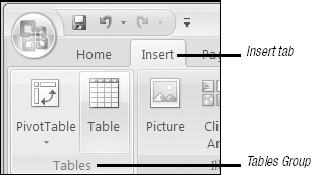
Figure 1-12. The Table command on the Insert tab in the Ribbon
- In the Create Table dialog box, the range for your data should automatically appear, and the My Table Has Headers option will be checked. Click OK to accept these settings (see Figure 1-13).
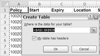
Figure 1-13. The Create Table dialog box
- The Excel table is automatically formatted with a table style, which may include row shading, borders, and heading cells formatted differently than the other rows. The heading cells have drop-down arrows that you can use to sort or filter the data (see Figure 1-14).
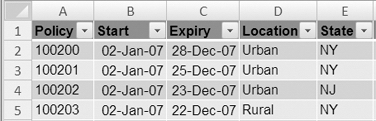
Figure 1-14. The table is automatically formatted.
Note The Excel table formatting does not overwrite any existing formatting that you had manually applied to the data.
- You can drag the resize handle at the bottom right of the last row in the table to make the table larger or smaller (see Figure 1-15).
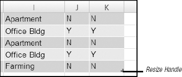
Figure 1-15. The resize handle at the bottom right of the table
Exploring the Excel Table Features
Using Excel's table feature makes it easier to maintain the source data for a pivot table. In an Excel table, if you add rows or columns, the new data is automatically included when you update the pivot table. If you base a pivot table on unformatted source data, new rows or columns may not be detected, and you would have to manually adjust the source data range to ensure that the new data is included in the pivot table. Or, you might forget to adjust the source data range to include the new data, and the pivot table could show inaccurate results.
Because using Excel's table feature makes it easier to maintain the source data for a pivot table, you should base your pivot tables on formatted tables where possible. We'll spend some time exploring the formatted table so you can see how its features can help you.
New Rows Are Automatically Included
If you add data at the end of an Excel table, the table range automatically expands to include the new data. You can test this feature with your table.
- Scroll down to the first blank row at the end of the table, and type the next policy number in column A to start entering a new record.
- Press the Tab key to move to the next cell; the row is formatted, and the Excel table expands to include the new row (see Figure 1-16). The resize handle is now located in the new row.
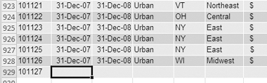
Figure 1-16. The new row is automatically formatted.
Headings Are Automatically Created for New Columns
If you expand the Excel table to the right to add columns to the table, column headings are automatically added for you. If you plan to create a pivot table from an Excel table, every column must have a heading. This feature will create temporary headings for you, which you can change to something more descriptive.
- Scroll down the worksheet until you can see the last row of data, and point to the resize handle at the bottom right of the table.
- When the pointer changes to a two-headed arrow, hold the left mouse button and drag to the right until you reach the right border of column L (see Figure 1-17).
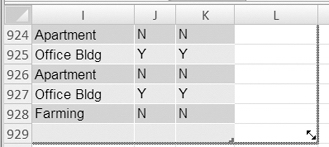
Figure 1-17. Drag the resize handle to the right to add a column.
- Release the mouse button, and Excel automatically formats column L to match the other columns in the table. Excel automatically adds a numbered column heading, Column1, in cell L1.
Deleting Rows and Columns
In an Excel table, you can easily delete rows and columns you no longer need. You'll delete the new row and column that you created, because they don't contain any data.
- Select a cell in the last row of the Excel table. This row contains the policy number you entered but no other data.
- On the Ribbon, click Home to activate the Home tab.
- In the Cells group, click the arrow on the Delete command.
- Click Delete Table Rows (see Figure 1-18) to delete the active row in the Excel table.
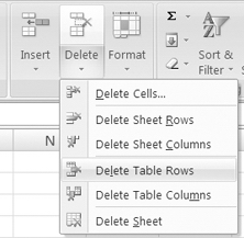
Figure 1-18. Delete a row in the Excel table.
Next, you'll delete the column you added at the right side of the Excel table:
- Select a cell in the last column of the Excel table. This column contains a heading but no other data.
- On the Ribbon, click Home to activate the Home tab.
- In the Cells group, click the arrow on the Delete command.
- Click Delete Table Columns to delete the active column in the Excel table.
Headings Remain Visible
Another advantage of using an Excel table is that the column headings in the first row of the table remain visible when you scroll down the worksheet. This makes it easier to identify the columns as you work in a large table.
- Scroll down the worksheet until the first row is no longer visible, and then click one of the formatted cells in the Excel table.
- Look at the column buttons at the top of the columns, and you'll see that the column letters have been replaced with the column headings that were entered in the first row (see Figure 1-19).
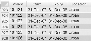
Figure 1-19. Column buttons show the column heading text.
Tip The column headings are visible only in the column buttons when the first row is not visible and a cell in the Excel table is active. Click outside the Excel table, and the column buttons show their letters.
Table Is Automatically Named
An Excel table is automatically named, as in Table1, when it is created. You can refer to this name when programming or when creating a pivot table. You can leave the table name that was created, but in this example you'll change it to something more meaningful:
- To see the table name, select a cell in the Excel table.
Note When a cell in an Excel table is the active cell, the Ribbon displays a context tab named Table Tools. Under the Table Tools tab is a Design tab, which contains commands you can use while working with the Excel table.
- On the Ribbon, under the Table Tools tab, click Design to activate the Design tab. At the far left, in the Properties group, is the table name (see Figure 1-20).
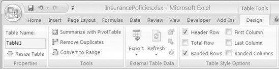
Figure 1-20. Table name in the Design tab (under the Table Tools tab) of the Ribbon
Tip To make more room for the worksheet, you can hide the Ribbon commands temporarily. Double-click the active Ribbon tab to hide the commands (or to show the commands if they've previously been hidden).
Now that you've seen the Excel table name that was automatically assigned, you'll rename the Excel table so it will be easier to identify each table if other tables are added to the workbook. Later, you can look for this name when creating a pivot table, or you can use the name to navigate to the source Excel table.
- In the Ribbon, select the existing name in the Table Name box.
- With the existing name highlighted, type Insurance as a new name for the table.
- Press the Enter key to complete the table name change.
Tip If possible, create a short descriptive name for each Excel table. This will make it easier to identify later if there are multiple Excel tables in the workbook.
Data Is Easily Sorted
An Excel table's heading cells contain drop-down lists that let you quickly and easily sort the data in the table. This feature can help you review the data before creating a pivot table or when troubleshooting a pivot table. For example, you can sort the insured values to quickly spot the highest and lowest amounts in the table.
- Press Ctrl+Home to return to cell A1, or scroll up to the first row so the drop-down arrows in the first row are visible.
- Click the drop-down arrow in the Insured Value heading cell.
Note The drop-down arrows are not visible in the column heading buttons, only in the column heading cells.
- Click Sort Largest to Smallest (see Figure 1-21).
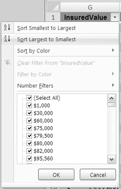
Figure 1-21. Sorting largest to smallest
The entire table is sorted, with records with the highest insured values at the top of the table and lowest insured values at the bottom. The heading cell's drop-down arrow now includes a small downward arrow to show that the data is sorted in descending order (see Figure 1-22).
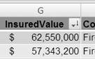
Figure 1-22. Arrow indicating that data is sorted in descending order
Even if multiple cells are selected, the selection is ignored, and the entire Excel table is sorted. This prevents the problems that could occur when cells in one column of an unformatted table are sorted and the data in that column becomes detached from the rest of the record. For example, in a regular table, a user might select and sort a column of telephone numbers but not include the columns that contain the related name and address.
Data Is Easily Filtered
An Excel table's heading cells contain drop-down lists that let you quickly and easily filter the data in the table. This feature can help you review the data before creating a pivot table or when troubleshooting a pivot table. For example, you can filter the Region column to view only the policies that were written in the Central region.
- Press Ctrl+Home to return to cell A1, or scroll up to the first row so the drop-down arrows in the first row are visible.
- Click the drop-down arrow in the Region heading cell.
- In the list of regions, remove the check mark from (Select All). This removes all the check marks from the list.
- Add a check mark to Central, and then click OK (see Figure 1-23).
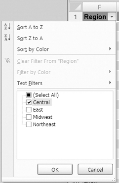
Figure 1-23. Filtering for the Central region
The Excel table is now filtered, with only the Central region records showing. The Region heading cell's drop-down arrow now shows a filter icon to indicate that the data in that column has been filtered (see Figure 1-24). To view the filter information, point to the drop-down arrow in the Region heading cell.
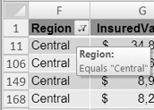
Figure 1-24. Filter icon showing column has a filter applied
Removing a Filter to View All the Data
After filtering an Excel table, to focus on part of the data, you can remove the filter to view all the data again:
- In the Excel table, click the drop-down arrow in the Region heading cell.
- Click the Clear Filter from "Region" option.
This removes the filter from the column, and all the regions are visible again. The Filter icon is no longer visible on the arrow in the column heading cell.
Saving the File
Excel 2007 offers some new file formats. You can save a file in the default file format by choosing Excel Workbook from the list of formats. The file will have an .xlsx file extension and can be opened in Excel 2007. Users with older versions of Excel may not be able to open the file. If you want those users to be able to open the file, you can save it as Excel 97-2003 Workbook Format. Some features from the Excel 2007 file may be lost if the file is saved in this format.
Note If a pivot table is created in Excel 2007 format, it will have view-only properties in earlier versions.
You should save your file now using a different file name. That will leave the original file unchanged, and you can use the new file for your work in the next chapter.
- Click the Microsoft Office Button at the top left of the Excel window.
- Point to Save As, and then click Excel Workbook to open the Save As dialog box.
- In the Save As dialog box, select a folder from the Save In drop-down list.
- Name the file InsurancePolicies02.xlsx, and then click the Save button.
- Close the file or continue to Chapter 2, where you'll create a pivot table from the Excel table.
Summary
A pivot table is a powerful Excel tool that you can use to quickly analyze a large quantity of data. It's easy to get started using pivot tables and to create one with a few clicks of the mouse. Once you understand the basics, you can explore the more sophisticated reporting features that pivot tables offer.
Before creating a pivot table, set up a data source in Excel or another program. To create an effective pivot table, ensure that the source data is structured correctly and meets the following requirements.
- The data is organized in rows and columns.
- Each column has a unique, descriptive heading.
- There is similar data in each column.
- Data, such as address detail, is separated into multiple columns.
- There are no repeating columns, such as region names, storing similar data.
- Each row contains the related data for one record.
- The data is an isolated block on the worksheet.
The best way to prepare the source data is to format it as an Excel table, which will automatically expand as data is added. The Excel table tools provide an easy way to sort and filter the data, so you can review the data for the pivot table or troubleshoot if problems occur.