
CHAPTER 9
Creating Calculations
in a Pivot Table
In this chapter, you'll see how easily you can get a different perspective on the data in your pivot tables. Instead of viewing total quantity sold or the average order price, you can change a setting in the pivot table to create any of the following custom calculations:
- Compare sales in one store to another.
- Calculate the difference in sales from one month to the next.
- Create a running total to see how sales accumulate over the year.
- See what percentage of a region's total sales comes from each product.
- Compare overall sales to each product's sales per region.
If none of these built-in calculations provides the perspective you need, you can create your own calculated fields and calculated items in a pivot table. For example:
- Calculate a bonus payment, based on total product sales.
- Total the sales for specific products, creating a temporary category.
- Compare results for one group of stores to another group.
In the first part of this chapter, you'll explore custom calculations using the food sales company data. In the second part, you'll create calculated fields and calculated items. To start, you'll open the sample workbook, as described in the following steps:
- Download and open the sample file
RegionSales_02.xlsx, available from the Apress web site. - Activate the Pivot_Regions worksheet, which contains a pivot table based on the food sales data (see Figure 9-1). The sales records are on the SalesData worksheet, and they contain the data from the two regions, East and North, that you worked with in Chapter 8.
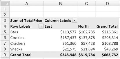
Figure 9-1. Pivot table based on the food sales data
Currently, the pivot table shows the total sales per region for each food category. In the next section, you'll make a simple change to the pivot table to apply a custom calculation, and you'll see the same data in a different way.
Creating Custom Calculations
In a pivot table, it's easy to get a different perspective on the data by using a custom calculation. After you create a normal sum or average, you can change a setting, and the pivot table will compare the values, show the differences between amounts, or calculate the percentage of a total that a sum contributes.
In this section of the chapter, you'll use each of the custom calculations that are available in a pivot table. The eight types of custom calculation are described here, with an example of how the calculation could be used:
Difference From: Calculates the difference between values. Compare each product's sales to a specific product's sales or each month's quantity to the previous month's.
% Of: Calculates the percentage of one value to another. View one region's sales as a percentage of another region's sales.
% Difference From: Calculates the percentage difference between values. See the percentage change in sales each month compared to the previous month.
Running Total in: Compiles a total over a time period or in a list of items. View the year to date total for each product or region.
% of row: Calculates the percentage that an item contributes to a row's total. See each product's sales as a percentage of the overall sales in a region.
% of column: Calculates the percentage that an item contributes to a column's total. See each region's sales as a percentage of the overall sales of a product.
% of total: Calculates the percentage that an item contributes to the overall total. See each region's sales of a product as a percentage of the overall sales.
Index: Calculates the weight that an item contributes to the overall total. See each region's sales of a product as compared to product sales, region sales, and the overall sales.
In the following examples, you'll use each of these custom calculations with the food company sales data to compare results between regions, across a time period, or among products.
Using Difference From
The sales manager of the food company wants a report that highlights the differences in sales between two regions. In which categories is the North region doing better, and how big is the difference in sales for each category? You'll use the Difference From custom calculation in the pivot table so it shows the difference, instead of the total sales, for each category.
In the pivot table, Category is in the Row Labels area, Region is in the Column Labels area, and Sum of TotalPrice is in the Values area.
- In the pivot table, right-click one of the value cells. For example, right-click cell B6, which is the total for cookies in the East.
- In the context menu, click Summarize Data By, and then click More Options (see Figure 9-2).
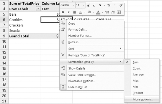
Figure 9-2. More Options command
- In the Value Field Settings dialog box Show Values As tab.
- From the drop-down list for Show Values As, select Difference From (see Figure 9-3).
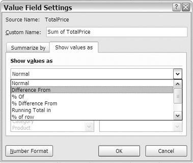
Figure 9-3. Show Values As Difference From
- After you select Difference From, the Base Field and Base Item lists are activated. In this report, you want to compare values between the regions, so select Region as the base field.
- After you select Region as the Base field, the region names appear in the Base Item list. You'll select North as the base item, and East will be compared to it. For the base item, select North, and then click OK (see Figure 9-4).
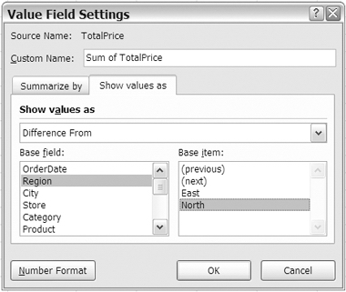
Figure 9-4. Base field and base item selected
The values in the pivot table change to show the difference in sales between the East and North regions. In Figure 9-5, the pivot table at the left shows the Difference From custom calculations, and the original calculations (Normal) are in the pivot table at the right.
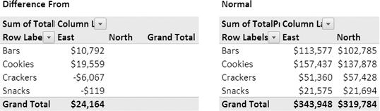
Figure 9-5. The pivot table at left shows Difference From custom calculation.
The values in the East column now show the difference from the North region for each category. The North column is empty, because it is the base item, and there is no difference when compared to itself. From the revised pivot table, the sales manager will quickly see how sales differ. For example:
- Bar sales in the East are $10,792 higher than bar sales in the North.
- Snack sales in the East are $119 lower than snack sales in the North.
- Overall sales in the East are $24,164 higher than sales in the North.
Tip You can hide the grand total for rows, because it will be empty when using this custom calculation.
You can add a heading above the pivot table to explain that the pivot table shows the differences between regions and send the report to the sales manager.
Using % Of
The sales manager is impressed that you were able to calculate the differences between regions so quickly and easily and asks for a slightly different report. Instead of showing the dollars difference between the two regions, could you create a report that compares sales among the different categories? What percentage are the sales of snacks, compared to the sales of bars?
To create this report, you'll use the % Of custom calculation. This will show each category's sales as a percentage of another category's sales. For example, if snack sales are $50, and bar sales are $100, the snack sales are 50 percent of the bar sales.
In the pivot table, Category is in the Row Labels area, Region is in the Column Labels area, and Sum of TotalPrice is in the Values area.
- In the pivot table, right-click one of the value cells. For example, right-click cell B5, which is Bars for the East region.
- In the context menu, click Summarize Data By, and then click More Options.
- In the Value Field Settings dialog box, click the Show Values As tab.
- From the drop-down list for Show Values As, select % Of.
- You want to compare categories, so select Category as the Base field.
- You'll compare the other categories to Bars, so select Bars as the base item.
- It will be easier to compare the percentages with no decimal places, so click Number Format, and set Decimal places to zero, and then click OK to close the Format Cells dialog box.
- Click OK to close the Value Field Settings dialog box.
The values in the pivot table change to show each category's percentage of the Bars category sales. In Figure 9-6, the pivot table at the left shows the % Of custom calculations, and the original calculations (Normal) are in the pivot table at the right.
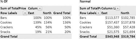
Figure 9-6. The pivot table at left shows the % Of custom calculation.
The revised pivot table shows the percentage for each category compared to the Bars category. Instead of doing those calculations yourself, the pivot table did them for you, with a few clicks of the mouse. From the revised pivot table, the sales manager can quickly see how category sales differ. For example:
- Cracker sales in the North are 56 percent of bar sales in the North.
- Snack sales in the East are 19 percent of snack sales in the East.
- Total cookie sales are 136 percent of total bar sales.
Tip Make a copy of the pivot table to display the normal values, and leave it on the worksheet, near the pivot table with the custom calculations.
Using % Difference From
Next, the sales manager wants to see whether sales in each region have changed from the beginning of 2007 to the end of 2007. Were there large fluctuations in the total sales per month, or were sales steady throughout the year in each region?
To create this report, you can use the % Difference From custom calculation. It's similar to the Difference From calculation that you used earlier, but it shows the difference as a percentage, instead of an amount.
To analyze the data by month, you'll use the OrderDate, Region, and TotalPrice fields in the pivot table layout. First you'll change the TotalPrice field back to Normal calculation, so it will show the dollar amounts when you change the layout:
- Right-click a value cell in the pivot table, choose Summarize Data By, and then click More Options.
- In the Value Field Settings dialog box, click the Show Values As tab, and from the drop-down list for Show Values As, select Normal, and then click OK.
- In the PivotTable Field List pane, remove Category from the Row Labels area.
- Add OrderDate to the Row Labels area, leave Region in the Column Labels area, and leave TotalPrice in the Values area as Sum of TotalPrice.
- Filter the OrderDate field so it shows dates in 2007 only.
The pivot table now shows the order dates, with the total sales for each region (see Figure 9-7).
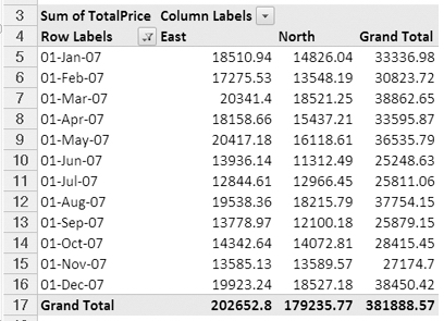
Figure 9-7. Total sales per date for each region
You want to compare the totals to see how they change from one month to the next, so you'll use the % Difference From custom calculation to display the change.
For this report, you want to compare each month's total to the total for the previous month and see the change as a percent difference.
- In the pivot table, right-click one of the value cells.
- In the context menu, click Summarize Data By, and then click More Options.
- In the Value Field Settings dialog box, click the Show Values As tab.
- From the drop-down list for Show Values As, select % Difference From.
- In this report, you want to compare the totals between dates, so choose OrderDate as the Base field.
- In this report, you want to compare each month's total to the previous month's total, so select (previous) as the base item (see Figure 9-8).
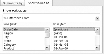
Figure 9-8. OrderDate with (previous) as base item
- It will be easier to compare the values with no decimal places, so click Number Format, and set Decimal places to zero, and then click OK to close the Format Cells dialog box.
- Click OK to close the Value Field Settings dialog box.
The values in the pivot table change to show the difference for each month, from the previous month (see Figure 9-9).
The revised pivot table shows the percentage change in sales each month, compared to the previous month. The row for the first date is empty, because there's no previous date to which this can be compared. From the revised pivot table, the sales manager can quickly see how the sales totals changed during 2007. For example:
- June sales in the East were 32 percent lower than May sales.
- August sales in the North were 40 percent higher than July sales.
- Total December sales were 41 percent higher than November sales.
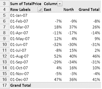
Figure 9-9. Months compared to previous month totals
Using Running Total In
You've sent your report on how the sales totals change from one month to the next, and now the sales manager wants a report that shows how each region's sales totals accumulate over the year. Each month should show the year to date total for each region.
In the pivot table, OrderDate is in the Row Labels area, filtered for 2007 dates; Region is in the Column Labels area; and Sum of TotalPrice is in the Values area. You'll keep the current pivot table layout and change the custom calculation so it creates a running total.
- In the pivot table, right-click one of the value cells.
- In the context menu, click Summarize Data By, and then click More Options.
- In the Value Field Settings dialog box, click the Show Values As tab.
- From the drop-down list for Show Values As, select Running Total In.
- In this report, you want to create a running total based on the Order dates, so choose OrderDate as the base field. For a Running Total In custom calculation, no base item is required.
- Click Number Format, and format the values as Number, with a thousands separator, and no decimal places.
- Click OK to close the Format Cells dialog box, and then click OK to close the Value Field Settings dialog box.
The values in the pivot table change to show the running total for each month (see Figure 9-10).
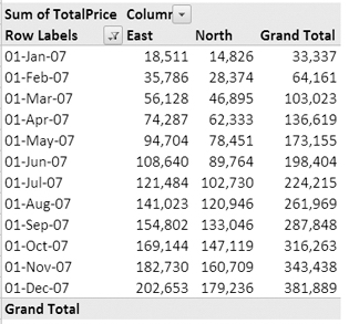
Figure 9-10. Running totals for each region
The revised pivot table shows the year-to-date total for each region for each month. In this report, the sales manager can quickly see how each region was going at any point in the year.
Tip The running total in custom calculations is best suited for using a date field as the base field, although you could use another type of field. For example, if recording expenses for different projects, you could show a running total of expenses over different phases of the project.
Using % of Row
You've created two reports from the monthly sales per region pivot table. In the first report, you showed the percentage change from one month to the next. In the second report, you showed the running total, per month, over the year.
Now the sales manager wants a third report, based on the same data. In the new report, you should show what percentage of each month's sales came from each region. For example, if there were $100 sales in the East region in January and $300 in the North region, then East would be 25 percent of the January sales, and North would be 75 percent. Each month's totals are in a row in the pivot table, so you'll use the % of row custom calculation to create the report.
In the pivot table, OrderDate is in the Row Labels area, filtered for 2007 dates; Region is in the Column Labels area; and Sum of TotalPrice is in the Values area. You'll keep the current pivot table layout and change the custom calculation so it shows the percent of monthly sales that each category contributes.
- In the pivot table, right-click one of the value cells.
- In the context menu, click Summarize Data By, and then click More Options.
- In the Value Field Settings dialog box, click the Show Values As tab.
- From the drop-down list for Show Values As, select % of row.
- For a % of row custom calculation, no base field or base item is required.
- Click Number Format, and format the values as Percentage, with no decimal places.
- Click OK to close the Format Cells dialog box, and then click OK to close the Value Field Settings dialog box.
The values in the pivot table change to show the percent of the monthly sales that each category contributes (see Figure 9-11).
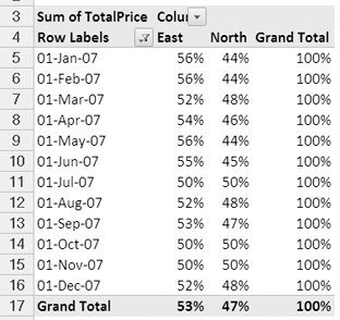
Figure 9-11. Region sales per month displayed as % of row
The revised pivot table shows the percentage of the month's total for each region. In this report, the sales manager can quickly see that the East region has the stronger sales most months and that the North region has the weaker sales overall for the entire year.
Using % of Column
Currently the pivot table shows the percent of the row that each region contributes to each month's total sales. To complement this report, the sales manager wants you to create another report that shows what percentage of each region's sales occurred in each month.
To create this new report from the same data, you'll change the custom calculation. The monthly totals are listed down each region's column, so you'll use the % of column custom calculation:
- In the pivot table, right-click one of the value cells.
- In the context menu, click Summarize Data By, and then click More Options.
- In the Value Field Settings dialog box, click the Show Values As tab.
- From the drop-down list for Show Values As, select % of column.
- For a % of column custom calculation, no base field or base item is required.
- Click OK to close the Value Field Settings dialog box.
The values in the pivot table change to show the percent of each region's total sales for each order date (see Figure 9-12).
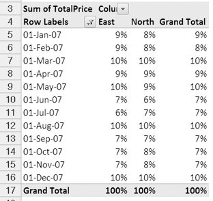
Figure 9-12. Region sales per month displayed as % of column
The Grand Total column shows the overall percent per order date. The Grand Total row shows 100 percent for each category, because that is the total for each column.
By using the custom calculation, % of column, you can see which months have the highest and lowest sales, for each category, and overall.
The revised pivot table shows the percentage of the region's total for each month. In this report, the sales manager can quickly see that July was the lowest month in the East region and that the North region had its weakest sales in June.
Using % of Total
You've reported on the values as percent of column and percent of row to see how each amount compares to a total amount. The sales manager has asked for one more perspective on these percentages and wants to see what percent of the overall total each value contributes. Using the existing layout, you can create the new report by using the % of total custom calculation:
- In the pivot table, right-click one of the value cells.
- In the context menu, click Summarize Data By, and then click More Options.
- In the Value Field Settings dialog box, click the Show Values As tab.
- From the drop-down list for Show Values As, select % of total.
- For a % of total custom calculation, no Base Field or base item is required.
- Because the percentages will be small, it will be best to show one decimal place. Click Number Format, and format the values as Percentage, with one decimal place.
- Click OK to close the Format Cells dialog box, and then click OK to close the Value Field Settings dialog box.
The values in the pivot table change to show the percent of each value of the overall grand total (see Figure 9-13).
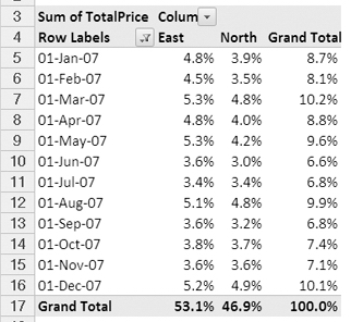
Figure 9-13. Monthly sales per region shown as % of total
From the revised pivot table, the sales manager will quickly see how what percentage of the overall sales occurred in each region in each month. For example:
- Sales in the East for March were strong, at 5.3 percent of the overall total.
- Sales in the North for June were weak, at only 3.0 percent of the overall total.
- March has the highest sales, with combined sales at 10.2 percent of the overall total.
Using Index
While creating the reports for the sales manager, you noticed that there was also a custom calculation named Index. To enhance the overall picture for the sales manager's reports, you'll create one final report on the regions' sales per month using the Index custom calculation. The Index compares each value to its row total, its column total, and the overall total, using a weighted average.
To provide a reference point for the sales manager, you'll also make a copy of the pivot table, adjacent to the existing pivot table. In the copy, you'll show a normal view of the sales amounts.
- To copy the existing pivot table, copy columns A to D, then select cell G1, and finally paste.
- In the new pivot table, right-click one of the value cells, and in the context menu, click Summarize Data By. Then click More Options.
- In the Value Field Settings dialog box, click the Show Values As tab.
- From the drop-down list for Show Values As, select Normal.
- Click Number Format, and format the values as Number, with no decimal places, and a thousand separator.
- Click OK to close the Format Cells dialog box, and then click OK to close the Value Field Settings dialog box.
The new pivot table now shows the total sales per month for each region (see Figure 9-14).
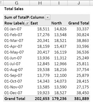
Figure 9-14. Copy of pivot table shows sales amounts.
In the original pivot table, you'll apply the Index custom calculation to see the indexes that are calculated for each month and region:
- In the pivot table that starts in column A, right-click one of the value cells.
- In the context menu, click Summarize Data By, and then click More Options.
- In the Value Field Settings dialog box, click the Show Values As tab.
- From the drop-down list for Show Values As, select Index. For an Index custom calculation, no base field or base item is required.
- Click Number Format, and format the values as Number, with two decimal places.
- Click OK to close the Format Cells dialog box, and then click OK to close the Value Field Settings dialog box.
The values in the pivot table change to show each region's index for each month (see Figure 9-15).
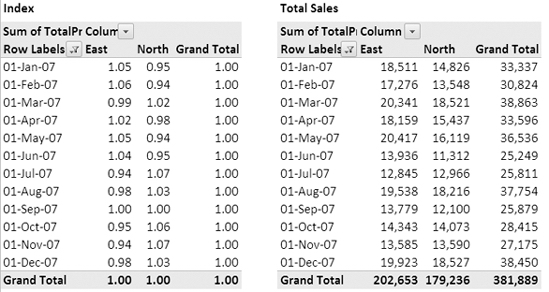
Figure 9-15. Regions' index per month compared to normal view of total sales
Values that are similar in the total sales pivot table can have much different indexes. For example, in November, the values for the East and North are almost equal. However, the index for the North region in November is 1.07, and the East region's index is 0.94.
The index formula is as follows:
 ((value in cell) x (Grand Total of Grand Totals)) /

((Grand Row Total) x (Grand Column Total))
Because the grand total is higher for the East column, the Grand Column Total in the formula is larger. The East November amount is divided by this larger number, and its resulting index is smaller.
Using the Index custom calculation gives you a picture of each value's importance in its row and column context. If all values in the pivot table were equal, each value would have an index of 1. If an index is less than 1, it's of less importance in its row and column, and if an index is greater than 1, it's of greater importance in its row and column.
Creating Formulas
In addition to summary functions and custom calculations, you can create calculated fields and calculated items in a pivot table. These formulas are similar to worksheet calculations but use the pivot table's field names or item names, instead of cell references. For example, in a pivot table, you could do the following:
- You could calculate a discount for stores that order more than 1,000 items this month.
- You could subtract total expenses from total income to calculate a profit for each region.
- You could forecast sales for a new product, based on a percentage of a current product's sales.
A calculated field is used when you want to create a new field in the Values area. With a calculated field, you can perform calculations on the totals for other fields, such as multiplying another field's values by a percentage or dividing one field by another.
With a calculated item, you can perform calculations on the totals for other items in the same field, such as multiplying another item's values by a percentage or totaling two of the other items.
Creating a Calculated Field
As part of a special promotion, the sales manager has decided to pay a 3 percent bonus to the sales staff, based on Bars sales in December 2007. You have been asked to create a report that shows the total for each store and calculate the 3 percent bonuses. You could summarize the sales data in a pivot table and calculate the bonuses using worksheet formulas (see Figure 9-16).
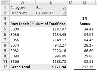
Figure 9-16. Calculating bonus amounts with worksheet formulas
However, you would prefer to include the bonus calculation within the pivot table, so the column of bonus formulas will automatically adjust if stores are added or hidden or if other fields are added to the pivot table layout.
In the following steps, you will clear the pivot table and add the fields you need in the report. Then, you will create a calculated field with a simple formula that multiplies the Sum of TotalPrice field by 3 percent. This will create a new field in the Values area that shows the bonus amount for each store.
- Clear the original pivot table, and delete the comparison pivot table you created in column G.
- In the PivotTable Field List pane, add Store to the Row Labels area, and add TotalPrice to the Values area as Sum of TotalPrice.
- Add the Category field to the Report Filter area, and select Bars from the Category drop-down list to limit the pivot table to showing only the sales for that category.
- Add the OrderDate field to the Report Filter area, below the Category field.
- From the OrderDate drop-down list, select 01-Dec-07 to limit the pivot table to showing the sales only for that order date.
The pivot table now shows the total bar sales for each store in December 2007 (see Figure 9-17).
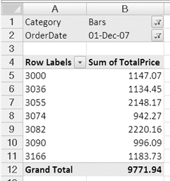
Figure 9-17. Total bar sales per store for selected order date
Now that the pivot table layout is set up for this report, you'll create a calculated field to determine the bonus amount for each store:
- Select a cell in the pivot table.
- On the Ribbon, under the PivotTable Tools tab, click the Options tab.
- In the Tools group, click Formulas, and then click Calculated Field (see Figure 9-18).
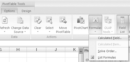
Figure 9-18. Calculated Field command on the Ribbon
The Insert Calculated Field dialog box opens, where you'll enter a name for your calculated field and create a formula to determine the bonus on each store's sales. The Name box contains a default name, Field1, and a default formula, = 0. You'll replace these with your field name and formula.
Tip When naming a calculated field, you can use up to 255 characters, including letters, numbers, and punctuation. However, it's best to use a short, meaningful name so your pivot table is easy to read and understand. Since this calculated field is for a sales bonus, you'll name the field Bonus.
- In the Name box, type Bonus as the name for the calculated field.
- On the keyboard, press the Tab key to move to the Formula box and to select its current contents, and then press the Delete key to remove the existing formula.
- In the Formula box, type an equal sign to start the formula.
- In your formula, you want to calculate a bonus amount that is 3 percent of the order total. The order total is in the TotalPrice field, so you'll use that in the formula. In the list of Fields, select TotalPrice, and click Insert Field to add it to the formula.
- To complete the formula, type * 3% (see Figure 9-19). Space characters are included here to make the formula easier to read—you can enter the formula with or without the spaces.
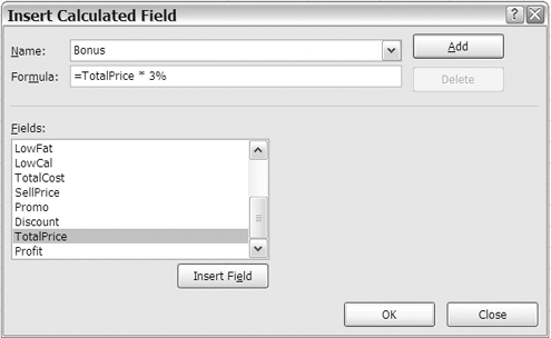
Figure 9-19. Insert Calculated Field dialog box
- Click OK to close the Insert Calculated Field dialog box.
The new calculated field, Bonus, appears in the PivotTable Field List pane and in the Values area of the pivot table (see Figure 9-20). For each store, the bonus amount is 3 percent of its total sales, and the Grand Total row shows the total bonus amount.
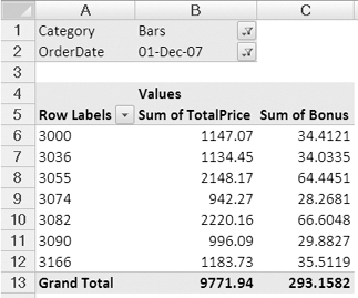
Figure 9-20. Calculated field added to the pivot table
Editing a Calculated Field
After seeing your report, the sales manager decides that the bonus can be a bit higher and asks you to change the bonus to 5 percent, instead of 3 percent. You'll modify the formula, so the bonus shows the increased amount:
- Select a cell in the pivot table.
- On the Ribbon, under the PivotTable Tools tab, click the Options tab.
- In the Tools group, click Formulas, and then click Calculated Field.
- In the Insert Calculated Field dialog box, in the Name box, click the drop-down arrow, and select Bonus, which is the formula you want to change.
- In the Formula box, change the 3% to 5%, and then click Modify (see Figure 9-21).
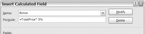
Figure 9-21. Modifying a calculated field
- Click OK to close the Insert Calculated Field dialog box.
The revised bonus amounts now appear in the Values area of the pivot table (see Figure 9-22). For each store, the bonus amount is 5 percent of its total sales, and the Grand Total row shows the total bonus amount.
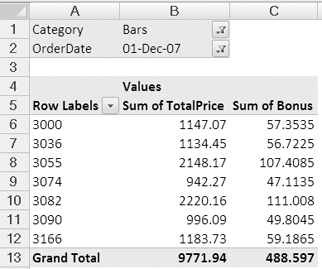
Figure 9-22. The modified calculated field
Creating a Complex Calculated Field
The sales manager wants you to calculate an additional bonus for the bar sales. For stores that ordered more than 1,000 units in December 2007, there will be a special bonus of 4 percent, in addition to the bonus you previously calculated. If you calculated the additional bonus outside of the pivot table, it would use the formula shown in Figure 9-23.
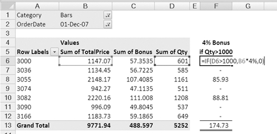
Figure 9-23. Calculating the additional bonus amounts with worksheet formulas
To calculate the additional bonus within the pivot table, you'll use a similar formula, but you'll use the Qty field and the TotalPrice field, instead of cell references. You'll add the Qty field to the pivot table layout and then create the new calculated field:
- Select a cell in the pivot table.
- In the PivotTable Field List pane, add a check mark to the Qty field to add it to the Values area as Sum of Qty.
The pivot table now shows the total quantity for bar sales for each store in December 2007, and stores 3055 and 3082 have quantities greater than 1,000 (see Figure 9-24). Their sales will be eligible for the special bonus.
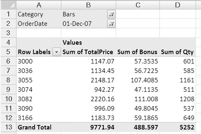
Figure 9-24. Store sales with Bonus and Qty fields
Now that the pivot table layout is set up for this report, you'll create a new calculated field to determine the additional bonus amount for each qualified store:
- Select a cell in the pivot table.
- On the Ribbon, under the PivotTable Tools tab, click the Options tab.
- In the Tools group, click Formulas, and then click Calculated Field.
- In the Insert Calculated Field dialog box, type Bonus2 as the name for the calculated field.
- On the keyboard, press the Tab key to move to the Formula box and to select its current contents, and then press the Delete key to remove the existing formula.
In your formula, you want to calculate a bonus amount that is 4 percent of the order total, but only if the total quantity is greater than 1,000. To do this calculation on a worksheet, you would use an
IFfunction to test the quantity and calculate the bonus if the quantity passed the test. For example, with a quantity in cell D6 and sales amount in cell B6, you would use the formula:=IF(D6>1000,B6*4%,0)(see Figure 9-25).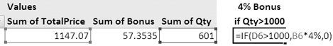
Figure 9-25. Worksheet calculation for special bonus
This formula tests the quantity,
IF(D6>1000, and if that is true, the sales amount is multiplied by the bonus percentage,B6*4%. If the quantity is not greater than 1,000, the test result is false, and the formula result is0.To replicate this formula in the Calculated Field, you'll use field names instead of cell references:
- In the Formula box, type =IF(.
- In the list of Fields, select Qty, and click Insert Field to add it to the formula.
- Next, type >1000 followed by a comma.
- In the list of Fields, select TotalPrice, and click Insert Field to add it to the formula.
- To complete the formula, type * 4%,0). The completed formula (see Figure 9-26) is as follows:
=IF( Qty>1000, TotalPrice*4%,0)
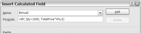
Figure 9-26. Insert Calculated Field dialog box
- Click OK to close the Insert Calculated Field dialog box.
The new calculated field, Bonus2, appears in the PivotTable Field List pane and in the Values area of the pivot table. For each store with quantity greater than 1,000, the additional bonus amount is 4 percent of its total sales, and the other stores show a zero (see Figure 9-27).
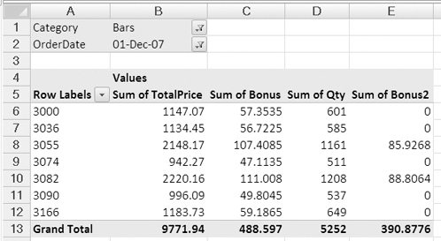
Figure 9-27. Pivot table with two calculated fields
Note The grand total row shows a bonus amount that is 4 percent of the total sales, because the total quantity is greater than 1,000. When you create a calculated field, the grand total performs the same calculation as the row calculations, instead of summing the rows above. In some cases, such as this, the grand total may not provide the information that you need, so you can ignore or hide the Grand Total row.
Using Calculated Fields in Formulas
As a final step in the report, you'll create one more calculated field to add the two bonus amounts. This will make it easier for the sales manager to see the total bonus for each store. In this calculated field, you'll refer to the other calculated fields that you created:
- Select a cell in the pivot table.
- On the Ribbon, under the PivotTable Tools tab, click the Options tab.
- In the Tools group, click Formulas, and then click Calculated Field.
- In the Insert Calculated Field dialog box, type Total Bonus as the name for the calculated field.
- In the Formula box, type =.
- In the list of fields, select Bonus, and click Insert Field to add it to the formula.
- Next, type a plus sign: +.
- In the list of Fields, select Bonus2, and click Insert Field to add it to the formula (see Figure 9-28). The completed formula is as follows:
=Bonus+Bonus2
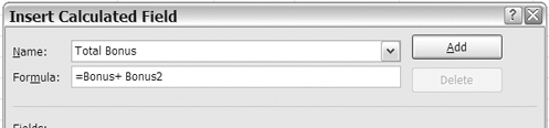
Figure 9-28. Using calculated fields in a formula
- Click OK to close the Insert Calculated Field dialog box.
The new calculated field, Total Bonus, appears in the PivotTable Field List pane and in the Values area of the pivot table. It totals the values in the Bonus and Bonus2 columns.
To simplify the report, you can remove the other bonus fields from the pivot table layout and leave just the Total Bonus field:
- Select a cell in the pivot table.
- In the PivotTable Field List pane, remove the check marks from the Bonus and Bonus2 fields.
- Format the Total Bonus values as Number, with two decimal places.
The pivot table now shows just the Total Bonus calculated field, instead of all three. Even though the Bonus and Bonus2 fields have been removed from the pivot table layout, the Total Bonus field still calculates the total bonus correctly (see Figure 9-29).
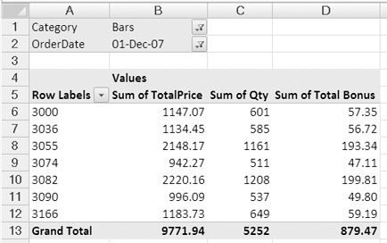
Figure 9-29. Total Bonus Calculated field
Understanding a Calculated Field
It is important to understand that the formulas in a calculated field will always operate on the sum of the fields, no matter what summary function is currently used for that field in the pivot table. To verify this, you'll change the summary function for the Qty field, which is used in the Bonus2 calculated field.
- Right-click a value cell in the Qty column.
- In the context menu, click Summarize Data By, and then click Count.
The values in the Total Bonus column do not change, even though all the values in the Qty column display a 3, which is less than the 1,000 limit. The result in the Total Bonus calculation is based on the Sum of Qty for each store, not the displayed Count of Qty.
When creating formulas in a calculated field, you can use some of the worksheet functions, such as IF, AND, OR, but you cannot use functions such as TODAY, NOW, or RAND, where the results will change.
Also, you cannot use functions that require a range reference, such as OFFSET or COUNTIF.
Some calculations should be done in the source data, instead of the pivot table, to provide accurate results. For example, multiply item cost by item quantity in the source data to calculate the total for each record. Then, in the pivot table, sum the total cost field. If you do the calculation in the pivot table, it would multiply the sum of the item cost by the sum of the item quantity, and the result may not be what you expect or need.
Deleting a Calculated Field
If you no longer need a calculated field in a pivot table, you can delete it. Now that your bonus report is finished, you'll delete the Total Bonus calculated field:
- Select a cell in the pivot table.
- On the Ribbon, under the PivotTable Tools tab, click the Options tab.
- In the Tools group, click Formulas, and then click Calculated Field.
- In the Insert Calculated Field dialog box, in the Name box, click the drop-down arrow, and select Total Bonus, which is the calculated field you want to delete.
- Click the Delete button, and then click OK.
- The Total Bonus field is removed from the Values area of the pivot table and from the PivotTable Field List pane.
Caution You cannot undo the deletion of a calculated field.
Creating a Calculated Item
The sales manager is doing the sales forecasts for the upcoming year and wants a report that compares the total sales for sweet categories, Bars and Cookies, to salty categories, Snacks and Crackers, for each store. Because you want to perform a calculation on specific items within a field, you'll create a calculated item instead of a calculated field.
In the following steps, you will clear the pivot table and add the fields you need in the report. Then, you will create two calculated items—one to total the sweet categories and one to total the salty categories.
Note Clearing the pivot table with the Clear All command will delete any calculated fields and calculated items.
- Remove all the fields from the pivot table.
- In the PivotTable Field List pane, add the Store field to the Row Labels area, add the Category field to the Column Labels area, and add TotalPrice to the Values area as Sum of TotalPrice.
- Format the values as Number, with zero decimal places, and a thousand separator.
The pivot table now shows all four categories separately and a grand total for all four (see Figure 9-30).
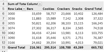
Figure 9-30. Total sales per category per store
You'll create a calculated item to combine the totals for the sweet items, the Bars and Cookies items. This will create a new item in the Category field:
- Select a cell that contains one of the Category headings in the pivot table. For example, select cell B5, which contains the Bars heading.
Note You must select a label for the field in which you want to create a calculated item, or the Calculated Item command will not be available.
- On the Ribbon, under the PivotTable Tools tab, click the Options tab.
- In the Tools group, click Formulas, and then click Calculated Item.
- In the Insert Calculated Item dialog box, type Sweet as the name for the calculated item.
- On the keyboard, press the Tab key to move to the Formula box and to select its current contents, then press the Delete key to remove the existing formula.
- In the Formula box, type an equal sign to start the formula.
- In the list of fields, select Category, the field in which you want to create a new item. Do not click the Insert Field button, because the name of the field is not required in this formula.
Note You can refer to the active field only when creating a calculated item.
- In the list of Items, select Bars, and click Insert Item to add it to the formula.
- Type a plus sign, then select Cookies in the Items list, and click Insert Item. The completed formula is
=Bars + Cookies(see Figure 9-31).
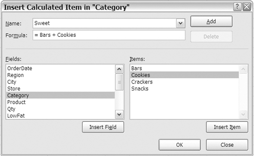
Figure 9-31. Insert Calculated Item dialog box
- Click OK to close the Insert Calculated Item dialog box.
The new calculated item, Sweet, appears in the Column Labels area of the pivot table but does not appear in the PivotTable Field List pane, because it is an item, not a field.
Note When you click a value cell in the pivot table that contains a calculated item, you see the formula in the formula bar, instead of the number.
Now the grand total is inflated, because Bars and Cookies appear individually and are totaled in the Sweet category. You'll hide the individual items so the grand total is correct:
- In cell B4, click the drop-down arrow for Column Labels.
- Remove the check marks from Bars and Cookies, and then click OK.
With the individual items, Bars and Cookies, removed, the grand total is correct (see Figure 9-32).
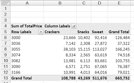
Figure 9-32. Calculated Item in the pivot table
Next, you'll create a calculated item to combine the totals for the salty items, Snacks and Crackers. This will create another new item in the Category field:
- Select a cell that contains one of the Category headings in the pivot table. For example, select cell B5, which contains the Crackers heading.
- On the Ribbon, under the PivotTable Tools tab, click the Options tab.
- In the Tools group, click Formulas, and then click Calculated Item.
- In the Insert Calculated Item dialog box, type Salty as the name for the calculated item.
- In the Formula box, create the formula: =Snacks + Crackers.
Tip To insert an Item name in the formula, you can type the name or double-click a name in the Items list.
- Click OK to close the Insert Calculated Item dialog box.
The new calculated item, Salty, appears in the Column Labels area of the pivot table, but does not appear in the PivotTable Field List pane, because it is an item, not a field.
Now the grand total is inflated, because Snacks and Crackers appear individually, and are totaled in the Salty category. You'll hide the individual items, so the grand total is correct.
- In cell B4, click the drop-down arrow for Column Labels.
- Remove the check marks from Snacks and Crackers, and then click OK.
With the individual items, Snacks and Crackers, removed, the grand total is correct (see Figure 9-33).
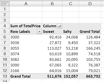
Figure 9-33. Two calculated items
Editing a Calculated Item
Instead of the previous sales in the Sweet and Salty calculated items, the sales manager wants to see a projection for 2008 sales, based on 2007 sales. The estimated increase is 5 percent for Sweet items and 12 percent for Salty items.
To create this report, you'll add the OrderDate field to the Report Filter area, where you can filter for 2007 order dates. Then you'll modify the Calculated Items to show the projected increases.
- Select a cell in the pivot table.
- In the PivotTable Field List pane, add OrderDate to the Report Filter area.
- In cell B2, click the drop-down arrow for the OrderDate list, and add a check mark to Select Multiple Items.
- Remove the check marks from all the order dates in 2006, and then click OK, so only the 2007 order dates are included in the pivot table summary.
The OrderDate cell in the Report Filters area now shows (Multiple Items) as the selection (see Figure 9-34), and only the 2007 sales are included in the totals. Next, you'll modify the calculated items.
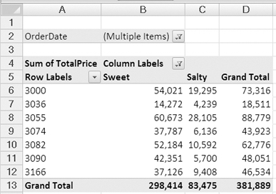
Figure 9-34. Calculated items filtered by order date
- Select a cell that contains one of the Category headings in the pivot table. For example, select cell B5, which contains the Sweet heading.
- On the Ribbon, under the PivotTable Tools tab, click the Options tab.
- In the Tools group, click Formulas, and then click Calculated Item.
- In the Insert Calculated Item dialog box, in the Name box, click the drop-down arrow, and select Sweet, which is the first formula you want to change.
The Sweets are projected to increase by 5 percent, so you'll modify the formula to calculate the increased amount.
- In the Formula box, change the formula to =(Bars +Cookies) * 1.05, and then click Modify (see Figure 9-35).
Figure 9-35. Modifying a calculated item
Tip Click Modify to change the formula and to leave the dialog box open. Click OK to change the formula and to close the dialog box.
Next, you'll modify the formula for the Salty calculated item.
- In the Insert Calculated Item dialog box, in the Name box, click the drop-down arrow, and select Salty, which is the next formula you want to change.
The Salty items are projected to increase by 12 percent, so you'll modify the formula to calculate the increased amount.
- In the Formula box, change the formula to =(Snacks +Crackers) * 1.12, and then click OK to close the Insert Calculated Field dialog box.
The projected sales amounts now appear in the Values area of the pivot table (see Figure 9-36).

Figure 9-36. Pivot table with modified calculated items
Creating a List of Formulas
When you have created calculated fields and calculated items in a pivot table, you may lose track of what you have created and want a reminder. Or you may want to document the calculations you have added to help yourself, or other users, understand what the pivot table contains.
You can use one of Excel's built-in features to create a list of the calculated fields and calculated items to view or to print. Before you send the report to the sales manager, you'll create a list of formulas for future reference.
- Select a cell in the pivot table.
- On the Ribbon, under the PivotTable Tools tab, click the Options tab.
- In the Tools group, click Formulas, and then click List Formulas.
A new sheet is inserted in the workbook, with a list of calculated fields and their formulas and solve order (see Figure 9-37). All the formulas are listed, even if they are not currently in the pivot table layout.
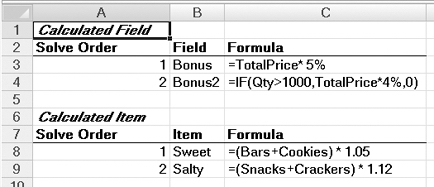
Figure 9-37. List of formulas in the pivot table
Changing the Solve Order
The solve order is the order in which the items are calculated, if two or more formulas update a cell. For example, you might have calculated items in Row Labels and other calculated items in the Column Labels area. In cells where these calculated items intersect, you can control which calculation occurs last. For most pivot tables, you won't need to change the solve order, but it can sometimes be required, as you will see in the report that you are about to create.
The sales manager has asked for a report to compare the forecasted sales at the older stores and the newer stores, so you'll create a calculated item to do that. The older stores are 3000, 3036, 3055, and 3074, and the newer stores area 3082, 3090, and 3166.
- Select a cell that contains one of the store headings in the pivot table. For example, select cell A7, which contains the store 3036 heading.
- On the Ribbon, under the PivotTable Tools tab, click the Options tab.
- In the Tools group, click Formulas, and then click Calculated Item.
- In the Insert Calculated Item dialog box, type OldVsNew as the name for the calculated item.
- In your formula, you want to divide the sum of old stores by the sum of the new stores. In the Formula box, enter the following formula:
= SUM('3000','3036','3055','3074' )/SUM('3082','3090','3166' )
- Click OK to close the Insert Calculated Item dialog box.
The new calculated item, OldVsNew, appears in the Row Labels area of the pivot table as whole numbers (see Figure 9-38). You'll format the values as percentage to see the results with more accuracy.
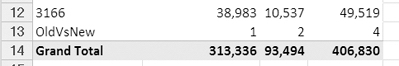
Figure 9-38. Calculated item for OldVsNew stores
- In the pivot table, select cells B13 to D13, which contain the OldVsNew values.
- On the Ribbon, click the Home tab, and in the Number group, click Percent Style (see Figure 9-39). This will format the three cells and leave the other values unchanged.
Figure 9-39. Percent Style command on the Ribbon
The Grand Total row is now incorrect, because it includes the OldVsNew values. The OldVsNew value in the Grand Total column (351%) is a sum of the Sweet and Salty values, instead of a calculation of OldVsNew (see Figure 9-40). You'll hide the Grand Total row and column and then create another calculated item to total the Sweet and Salty categories.
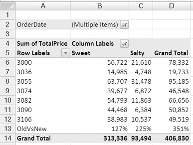
Figure 9-40. Incorrect grand totals after adding OldVsNew calculated item
- To hide both grand totals, select a cell in the pivot table, and on the Ribbon, click the Design tab. In the Layout group, click Grand Totals, and click Off for Rows and Columns.
- Select a cell that contains one of the Category headings in the pivot table. For example, select cell B5, which contains the Sweet heading.
- On the Ribbon, under the PivotTable Tools tab, click the Options tab.
- In the Tools group, click Formulas, and then click Calculated Item.
- In the Insert Calculated Item dialog box, type Category Total as the name for the calculated item.
- In the Formula box, enter the formula = Sweet + Salty.
- Click OK to close the Insert Calculated Item dialog box.
The new calculated item, Category Total, appears in the Column Labels area of the pivot table. It totals Sweet and Salty in each of the rows, which is correct. However, for the last row, you'd like it to show the OldVsNew calculation, instead of the Category Total calculation. You'll change the Solve Order, so it does the OldVsNew calculation last.
- Select a cell in the pivot table.
- On the Ribbon, under the PivotTable Tools tab, click the Options tab.
- In the Tools group, click Formulas, and then click Solve Order.
The Solve Order dialog box opens, with the four calculated items listed (see Figure 9-41).
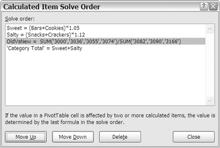
Figure 9-41. Calculated Item Solve Order dialog box
You want the OldVsNew calculation to occur last, so you'll move it down in the order.
- Select the OldVsNew item, and click Move Down to change its Solve Order to 4, instead of 3. Then click Close.
The Category Total cell in the last row now shows the OldVsNew calculation, instead of the sum of the Sweet and Salty percentages (see Figure 9-42).
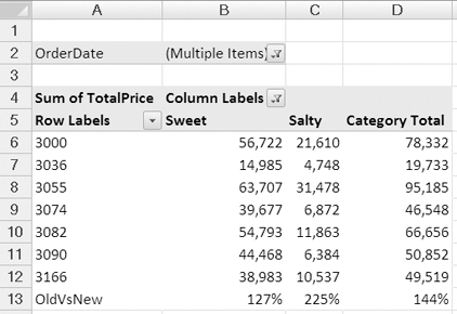
Figure 9-42. Corrected calculation after solve order changed
Summary
In this chapter, you created formulas and calculations to perform analysis beyond the scope of the summary functions. You used custom calculations to gain a different perspective on the totals in the pivot table. With a few clicks of the mouse and no complex formulas, you were able to see the differences between one item's totals and all other totals or to compare one month's sales to the previous month. You created a running total over a year of orders and calculated the percent that each total was compared to its row, its column, or the grand total.
You also created your own calculated fields and calculated items in a pivot table, specific to your data and your reporting requirements. With these calculations you can create a unique and powerful analysis tool from your pivot table.
Finally, you used the list formulas and solve order features to document and manage the formulas you created.