
CHAPTER 2
Creating a Pivot Table
In this chapter, you'll get up and running with pivot tables so you can see how quickly and easily you can build and modify them. You'll create a simple pivot table from the insurance policy Excel table you created in Chapter 1. After creating the pivot table, you'll examine its key features and see how you can quickly change the pivot table layout to get a different view of the data. You'll create a pivot chart from the pivot table data to create a visual summary that will make the data easy to understand at a glance.
Exploring an Insurance Policy Example
In this example, you'll use the insurance policy Excel table from Chapter 1, which you saved in the file named InsurancePolicies02.xlsx. If you did not create the file, you can download it at the www.apress.com web site.
Your company sells insurance policies in four different regions. The claims manager wants to know which region has the highest total of insured value for the policies sold. In the insurance data, the region names are in column F, with a column heading of Region. The insured values are in column G, with the heading InsuredValue (see Figure 2-1).
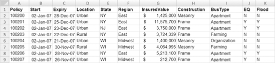
Figure 2-1. Insurance policies data
To find the region totals without a pivot table, you would list the regions in a column on a worksheet and then use formulas to sum the insured values. Another formula would sum the regional totals to create a grand total. The result would look similar to the example in Figure 2-2, where one of the formulas is displayed.
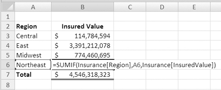
Figure 2-2. Worksheet formulas summarize the insurance data.
Instead of building the summary manually, you'll create a pivot table to achieve the same result quickly and easily. First, you'll create an empty pivot table. Then, you'll drop the data into the pivot table to create the region labels and total the insured value.
Note If you used your own data or created your own file in Chapter 1, your workbook may not match the figures in this book.
- Open the
InsurancePolicies02.xlsxfile you created or downloaded. - On Sheet1, select a cell in the formatted Excel table.
- On the Ribbon, under the Table Tools tab, click the Design tab.
- In the Tools group, click Summarize with PivotTable (see Figure 2-3).
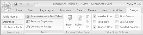
Figure 2-3. The Summarize with PivotTable command
- In the Create PivotTable dialog box that opens, under Choose the Data That You Want to Analyze, the option Select a Table or Range is selected, and in the Table/Range box the name of the active table, Insurance, appears (see Figure 2-4). Leave this value unchanged.
Note If a cell in an Excel table or the entire Excel table is selected when you start to create a pivot table, that Excel table is shown as the default source range for the pivot table. If you want to use a different table or range, you can type an Excel table name or range address in the Table/Range box.
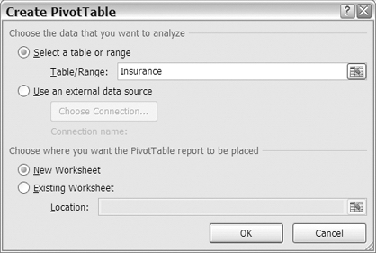
Figure 2-4. Create PivotTable dialog box
- Under Choose Where You Want the PivotTable Report to Be Placed, New Worksheet is the default selection. Leave that option selected, and click the OK button.
Creating the PivotTable Layout
When the Create PivotTable dialog box closes, Excel inserts a new worksheet in the workbook using the next available sheet number. In this example, the new worksheet is named Sheet4. The outline of an empty pivot table starts in cell A3. At the right of the Excel window, the PivotTable Field List pane appears (see Figure 2-5).
Tip If the PivotTable Field List pane is not visible, select a cell in the empty pivot table.
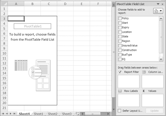
Figure 2-5. The empty pivot table and the PivotTable Field List pane
At the top of the PivotTable Field List pane is a list of the column headings from your Excel table; they appear in the same order as in the Excel table. In the pivot table, these are called fields.
At the bottom of the PivotTable Field List pane are the four areas of the pivot table: Report Filter, Column Labels, Row Labels, and Values. You will drop the fields into these areas, and they'll appear in the matching area of the pivot table layout on the worksheet (see Figure 2-6).
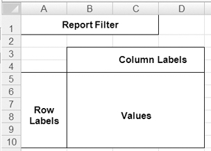
Figure 2-6. The Report Filter, Column Labels, Row Labels, and Values areas in the pivot table layout
Adding Fields to the Pivot Table Layout
In the pivot table example, you want to see a list of regions with the total insured value for each region. When planning a pivot table, you'll decide which fields you should use, and then you'll determine where each field should be dropped in the pivot table layout.
The region names are in the Region field, so that's one of the fields you'll need for this pivot table. The other field required is the InsuredValue field, which will provide the dollar amounts for the summary.
Because you want a list of region names down the left side of the pivot table, the Region field should go in the Row Labels area. To see a sum of InsuredValue amounts, that field should go in the Values area.
Once you've made the design decisions, you can add the fields to the pivot table layout by using the PivotTable Field List pane.
- At the top of the PivotTable Field List pane, in the list of fields, add a check mark to the Region field.
- Because it contains text data, the Region field is automatically added to the Row Labels area at the bottom of the PivotTable Field List pane. On the worksheet, the region names appear in the Row Labels area of the pivot table layout (see Figure 2-7).
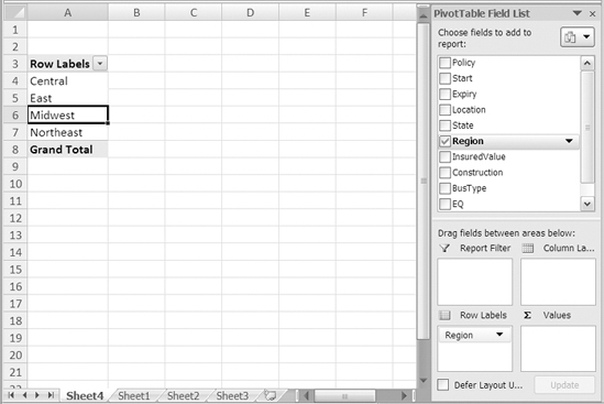
Figure 2-7. Row Labels added to the pivot table layout
- Next, in the PivotTable Field List pane, add a check mark to the InsuredValue field. Because it contains numbers, the InsuredValue field is automatically added to the Values area of the PivotTable Field List pane.
Note Based on the type of data they contain, fields are added to a specific area of the pivot table by default. You can manually place a field in a different area of the pivot table, as you'll see later in the "Moving Fields in the Pivot Table Layout" section.
- On the worksheet, Sum of InsuredValue appears in the Values area of the pivot table, showing the total insured value for each region (see Figure 2-8).
Note With just a few clicks of the mouse and no complex formulas, you summarized almost 1,000 records to show the total insured value per region. This ability to quickly and easily summarize data is one of the key benefits of using pivot tables.
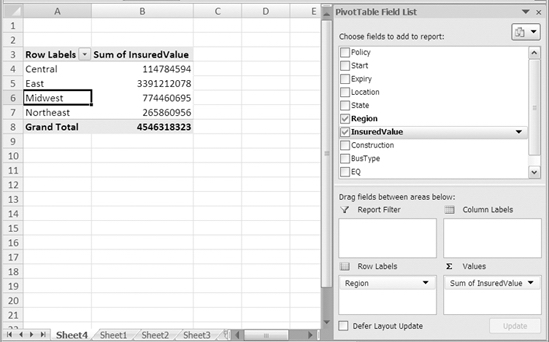
Figure 2-8. Adding values to the pivot table
Changing the Pivot Table Layout
One of the advantages of using pivot tables to summarize data is that it's easy to change the pivot table layout after you've created it. You created a pivot table that summarizes the insured value by region. Next, you'll change the pivot table layout to view other summaries of the data, and you'll see how quickly and easily you can create a different summary.
The underwriting manager is concerned about the fire risk in the insured properties and has asked you for a report on the total insured value for each construction type. In the Excel table, the Construction column shows the construction type for each insured property. You can quickly change the pivot table layout to show a summary for the Construction field.
Currently, the Region field is in the Row Labels area. You'll remove it and drop the Construction field in the Row Labels area instead.
- In the PivotTable Field List pane, remove the check mark from Region.
- The Row Labels area disappears from the pivot table on the worksheet, and the Sum of InsuredValue area shows the grand total for all records.
- In the PivotTable Field List pane, add a check mark to the Construction field.
- The Row Labels area now shows the construction types, and the Sum of InsuredValue area shows the total insured value for each construction type (see Figure 2-9).

Figure 2-9. Change the field in the Row Labels area to see a different summary.
You send this report to the underwriting manager to show that frame-construction buildings comprise almost two-thirds of the total insured value of all the policies sold.
Adding More Fields to the Pivot Table
After receiving your report, the underwriting manager asks you for more detail. Policies are sold for buildings in urban and rural locations, and your report would be more helpful if it showed the insured values by construction type broken down by location type. Are the frame buildings in urban locations, where fire departments can respond quickly?
Currently, Construction is the only field in the Row Labels area, so the pivot table shows total insured value for all the insurance policies of each construction type. To view the summary in greater detail, you can also add the Location field to the Row Labels area to show the insured value by construction and location (urban or rural).
- In the PivotTable Field List pane, add a check mark to the Location field.
- The Location field is added to the Row Labels area in the PivotTable Field List pane, below the Construction field.
- In the pivot table layout on the worksheet, the Row Labels area shows each construction type as a heading, and below each construction heading is a list of location types. The location labels are slightly indented, or nested, below the Construction labels. The Sum of InsuredValue area shows a total for each construction type and a total for each location type within that construction type (see Figure 2-10).
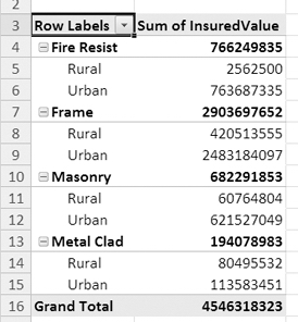
Figure 2-10. Multiple row labels provide a more detailed summary.
You send this more detailed report to the underwriting manager to show that most of the frame-construction buildings are in urban locations. Only a small percentage of the policies for frame-construction buildings are in rural locations.
Moving Fields in the Pivot Table Layout
The underwriting manager appreciates the work you're doing and is pleased you can adjust your reports so quickly. However, the manager has one more request—the total insured value for each location type in addition to the total insured value for the construction types.
Currently, with two fields in the Row Labels area, the pivot table is arranged like a report with headings and subheadings. If you had one set of headings down the left side of the pivot table and another set of headings across the top, you could create totals down the columns and across the rows. If you created the table manually, with formulas, it would be similar to the sample shown in Figure 2-11, where you can see the formula for cell B6 in the Formula Bar above the worksheet.
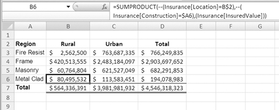
Figure 2-11. Worksheet formulas create totals across rows and down columns.
To create this arrangement in your pivot table, you will move the Location field from the Row Labels area to the Column Labels area. The locations will become labels across the top of the pivot table layout. The revised layout will show the same detail but will include the location totals that the underwriting manager needs.
- In the PivotTable Field List pane, in the Row Labels area, point to the Location field.
- When the pointer changes to a four-headed arrow, drag the Location field to the Column Labels area (see Figure 2-12).
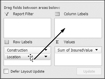
Figure 2-12. Drag a field to the Column Labels area.
- The pivot table layout changes. The Row Labels area now shows only the construction types, and across the top are column labels showing the location types (see Figure 2-13).
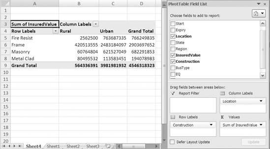
Figure 2-13. The pivot layout with row labels and column labels
- At the bottom of the pivot table is a Grand Total row, which shows the total insured value for each location type. At the right side of the pivot table is a Grand Total column that shows the total insured value for each construction type. The cell at the bottom right of the PivotTable is the grand total for insured values.
Although the layout is different, you can compare Figure 2-10 to Figure 2-13 to see that the totals in the Values area are the same. For example, the total insured value for Rural Masonry is $60764804 in both layouts.
With this layout, you can show the underwriting manager that frame-construction buildings have the highest total insured value, and urban locations have a higher total insured value than rural locations.
Charting the Data in a Pivot Table
The underwriting manager is satisfied with the report and finds the location totals helpful for analyzing the insurance policy data. To help explain the results to the executive committee, the manager asks whether you can create a chart to illustrate the results.
In Chapter 11 you'll learn about pivot charts in detail, but to accommodate the manager's request, you'll create a simple chart from the current pivot table:
- Select a cell in the pivot table.
- On the keyboard, press the F11 key.
- Excel inserts a chart sheet, Chart1, in the workbook, with a pivot chart based on the current pivot table. The Construction field row labels have become the category axis fields, and the Location field column labels have become series in the chart (see Figure 2-14). A series is a group of related values, like Urban, which is represented by the light-colored columns.
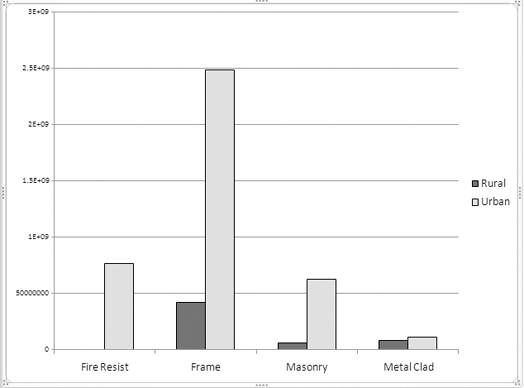
Figure 2-14. A pivot chart provides a visual summary of the data.
The pivot chart, at a glance, shows that policies for frame-construction buildings in urban locations are by far the largest portion of the policies that have been sold. The insured value for fire-resistant buildings in rural locations is so low that the column isn't visible in the chart.
You can save your file now as InsurancePolicies03.xlsx. That will leave the original file unchanged since its last save, and you can use the new file for your work in the next chapter. Close the file or continue to Chapter 3, where you'll modify the pivot table you created in this chapter.
Summary
In this chapter, you learned to create a pivot table, and then you added fields as row labels, column labels, and values. You also changed the pivot table layout by moving fields from one area to another.
With just a few clicks of the mouse and no complex formulas, you summarized almost 1,000 records to show the total insured value of policies per region and discovered just how powerful pivot tables are in analyzing data.
Finally, you created a pivot chart from the pivot table to obtain an effective visual summary of the pivot table data.