
CHAPTER 6
Sorting and Filtering in a
Pivot Table
Instead of viewing a summary of all the pivot table data, you may want to focus on a specific district's data or one technician's results. In this chapter, you'll filter the pivot table to show only the data from one district or for selected service types and to show the work orders for a specific date range. You'll also sort the data in your pivot table to arrange the summarized data from the highest to lowest values and from the lowest tohighest values.
By sorting and filtering the data in a pivot table, you can focus on areas where performance could be improved or pinpoint the activities that are consuming the most resources. With these pivot table tools you can go from the big picture, comparing all aspects of your business, to the small details, homing in on problems for closer analysis.
You'll start by creating a new pivot table and adding report filters by using the WorkOrders_03.xlsx file that you can download from the Apress web site.
Adding Report Filters
The service manager has asked you to report on the work that the leadtechnician named Michner has been doing. The report should show the total hours Michner has worked in each district, and it should indicate which jobs were rush and which were nonrush. For these jobs, what payment type was received?
In the previous chapter, you arranged and formatted a pivot table to count the work orders by teams of technicians. You'll leave that pivot table unchanged so you can refer to it later, if required, and you'll create a new pivot table to analyze the rush jobs and payments.
Note In a workbook, you can create multiple pivot tables from the same source data.
In the WorkOrders_03.xlsx file, you'll review the WorkOrders Excel table, on Sheet1, to see which fields you'll need in the report. The LeadTech field contains the technician name, the District field shows the district name, the LbrHrs field contains the number of hours worked on each job, the Rush field indicates whether the job was a rush, and the Payment field shows the type of payment that was received.
Now that you've determined which fields you need, you'll create a new pivot table with all the data summarized:
- On Sheet1, select a cell in the Excel table named WorkOrders, and create a pivot table on a new worksheet.
- On Sheet 5, in the new pivot table, add the LbrHrs field to the Values area, add the Rush field and the District field to the Row Labels area, and then add the Payment field to the Column Labels area.
The Rush field creates two subheadings in the Row Labels area: Yes and (blank). The (blank) label represents the blank cells in the source data. In the source data, a blank cell means No, so you'll change the label in the pivot table to make it easier to understand.
- In the pivot table, select cell A15, which contains the (blank) label for the Rush field.
- Type No, and press the Enter key to change the label.
Note Changing the label in the pivot table does not affect the source data.
- Format the pivot table with a pivot table style. In the example shown in this chapter, PivotTable Style Light 1 was applied.
To make the pivot table easier to read, format the Sum of LbrHrs value field as a number with zero decimal places and a thousands separator. With the values all showing whole numbers, it will be easier to compare the sorted data (see Figure 6-1).
The pivot table summarizes all the data in the WorkOrders Excel table on which it is based. In row 5 (Rush=Yes) on the pivot table worksheet, you can see that only 184 labor hours were spent on rush jobs. In row 15, you can see that nonrush jobs (Rush=No) had 2,069 labor hours.
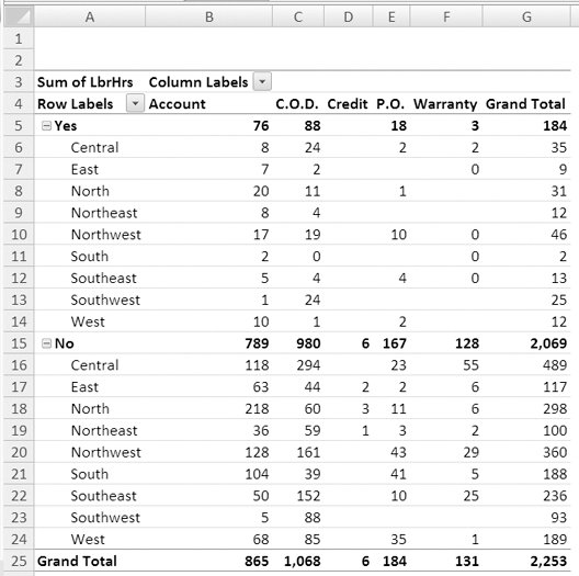
Figure 6-1. Summary of labor hours per payment type
Adding a Report Filter
Viewing all the data gives you the big picture and lets you compare district totals or payment types. However, the service manager wants the report to show information about the lead technician named Michner. Labor hours for all the technicians are included in the summarized data, but the details for each technician aren't shown. Currently, there's no way to tell who did one hour of labor on credit in the Northeast (cell D19) or who did one hour of labor on a rush job in the Southwest (cell B13).
You could add the LeadTech field to the Row Labels area, and that would show Michner's totals, along with those of all the other technicians. Instead, you'll add the LeadTech field to the Report Filter area to limit the information that's shown.
Tip To show details, add a field to the Row Labels or Column Labels area. To limit the data, add a field to the Report Filter area, and filter the data.
- Select a cell in the pivot table.
- In the PivotTable Field List pane, right-click the LeadTechfield, and in the context menu, click Add to Report Filter (see Figure 6-2).

Figure 6-2. Adding a field to the Report Filter area
- The LeadTech field appears in cell A1 on the worksheet, above the body of the pivot table, and its drop-down list shows (All), indicating no filter has been applied.
- To view the work order summary for only one technician, click the arrow on the LeadTech Report Filter field button, select Michner, and then click OK.
The Grand Total field is reduced to 506 labor hours, which is the total for Michner. You can send your report to the service manager to show the number of hours that Michner spent in each district, to show the number of hours he spent on rush and nonrush jobs, and to show which payment types were used.
Adding Multiple Report Filters
Now that you have filtered the pivot table so only Michner's data is showing, the service manager wants to focus on Michner's installation work. How much time is Michner working on installations in each district? What payment type was most common for the installations?
The type of work is stored in the Service field, so you'll add that field to the pivot table. Since you're interested in only one of the service types, you'll add the field to the Report Filter area, where you can use it to limit the data that's shown:
- In the PivotTable Field List pane, add the Service field to the Report Filter section, below the LeadTech field.
- The Service field appears in cell A2 on the worksheet, above the body of the pivot table, and its drop-down list shows (All), indicating that no filter has been applied. The body of the pivot table is automatically moved down one row to make room for the additional report filter (see Figure 6-3).
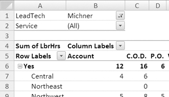
Figure 6-3. Two report filters in the pivot table layout
The pivot table shows only Michner's labor hours but includes all types of work done by Michner. You'll apply a filter to the Service field, so only one type of work is shown.
- To view the work order summary for only Michner's installations, click the arrow on the Service Report Filter field button, select Install, and then click OK.
Note If there are multiple report filters, the filters are independent of one another. Selecting an item in one report filter does not limit the items that are available in other report filters. Even if Michner had no Install work orders, that item would still be available in the Service report filter.
The pivot table now summarizes only the work orders in which the lead technician was Michner and the service type was an Install. The Grand Total cell (F18) shows that Michner spent 150 hours on this type of service.
Changing the Order of Report Filters
When there are multiple report filters, you can change the order in which they appear on the worksheet. Changing the order of the report filtersdoes not affect the pivot table results, but in some situations it may makethe report appear more logical. For example, if you have State, City, and Country in the Report Filter area, you can arrange the filters in order of geographical scope—Country, State, City.
In this report, the service manager is concerned with installation work, so you'll move the Service field so it's above the LeadTech field. Thiswill make it appear at the top of the page if the report is printed.
- Select a cell in the pivot table.
- In the PivotTable Field List pane, in the Report Filter area, drag the Service field above the LeadTech field.
On the worksheet, the report filters change position to reflect the change made in the PivotTable Field List pane.
Arranging Report Filters
You currently have two fields in the Report Filters area, and you'll add two more fields so the service manager can see how many jobs were one-technician jobs and which jobs were done in 2007:
- Select a cell in the pivot table.
- In the PivotTable Field List pane, add the Techs and Years fields to the Report Filter area, below the LeadTech field.
The four report filters appear above the body of the pivot table, in cells A1 to B4 (see Figure 6-4).
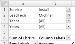
Figure 6-4. Four fields in the Report Filters area
- To view the jobs that were done by one technician, click the arrow on the Techs Report Filter field button, select 1, and then click OK.
- To view the jobs that were done in 2007, click the arrow onthe Years Report Filter field button, select 2007, and then click OK.
The grand total shows that Michner spent 59 hours on installation jobs in 2007, where there was one technician.
Arranging the Report Filters Horizontally
When a pivot table has multiple report filters, you can arrange them vertically above the pivot table body or horizontally. Each arrangement has some benefits, and you can decide what best suits the pivot table on which you're working.
First, you'll arrange the report filters horizontally to see how that affects the pivot table layout. You'll specify how many report filters should be in each row above the pivot table.
- Select a cell in the pivot table.
- On the Ribbon, under the PivotTable Tools tab, click the Options tab.
- At the far left, in the PivotTable group, click the Options command to open the PivotTable Options dialog box.
- On the Layout & Format tab, in the Layout section, select Over, Then Down from the Display Fields in Report Filter Area drop-down (see Figure 6-5). The Report Filter Fields per Column option changes to Report Filter Fields per Row.
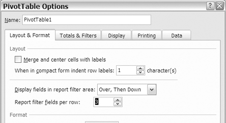
Figure 6-5. Report filter setting in PivotTable Options
- In the Report Filter Fields per Row setting, enter 3, and then click OK.
The report filters are now arranged horizontally above the pivot table. The first three report filters are in row 3, and the last report filter is in row 4 (see Figure 6-6). You specified that there should be three filters per row and the filters should go down to start another row of filters, if required.
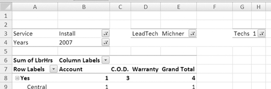
Figure 6-6. Report filters arranged over and then down
Arranging the Report Filters Vertically
Next, you'll arrange the report filters vertically to see how that affects the pivot table layout. This time, instead of using a Ribbon command, you'll use a context menu to open the PivotTable Options dialog box:
- Right-click cell E7, which is the Grand Total column heading, to open a context menu and mini-toolbar (see Figure 6-7).
Note As the name implies, context menu commands will vary, based on the type of cell on which you right-click. For example, the commands for a value cell will be different from the commands for a row label cell.
- In the context menu, click PivotTable Options.
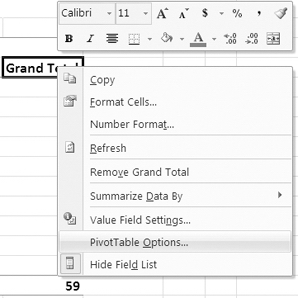
Figure 6-7. PivotTable Options command on the context menu
- In the PivotTable Options dialog box, on the Layout & Format tab, in the Layout section, select Down, Then Over from the Display Fields in Report Filter Area drop-down. The Report Filter Fields per Row option changes to Report Filter Fields per Column.
- In the Report Filter Fields per Column setting, enter 3, and then click the OK button.
The report filters are now arranged vertically above the pivot table.The first three report filters are in column A, and the last report filter is in column D (see Figure 6-8). You specified that there should be three filters down per column and that the filters should go over to start another column of filters, if required.
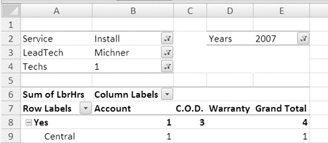
Figure 6-8. Report filters arranged down and then over
If your pivot table has many report filters, you can adjust the arrangement of the filters to make the most efficient use of the worksheet space. You'll want the report filters easily accessible, not spread out too far across the worksheet. You'll also want to avoid a long column of filters above the pivot table, pushing the pivot table body far down the worksheet. By using the Display Fields in Report Filter Area option, you can find the best balance of height and width for the report filter layout.
Clearing All Filters
You have finished your reports for the service manager and want to show all the data in the pivot table again. Instead of resetting each filter individually, you can change them all at once. This will clear all the report filters and any label filters or value filters.
- Select a cell in the pivot table.
- On the Ribbon, under the PivotTable Tools tab, click the Options tab.
- In the Actions group, click Clear, and then click Clear Filters (see Figure 6-9).
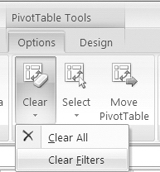
Figure 6-9. Clear Filters command
All report filters are reset to show (All), and the pivot table summarizes data from all the work orders.
Moving Labels
With report filters, you changed the way that data was summarized in the pivot table, limiting the data that was included. Another way you can change how data is presented in a pivot table is to move the labels. When you add a field to the Row Label or Column Label area of the pivot table, itslabels are usually sorted alphabetically. In some reports, you may want to see the labels in a nonalphabetical order, and you can accomplish this by manually moving the labels.
In your pivot table, the district labels are arranged alphabetically, with Central at the top of the list and West at the bottom. The manager of the South district has asked for a copy of the pivot table, so you'll manually rearrange the labels to create a nonalphabetical order, with South at the top of the list. This will make that district's information stand out inthe report.
Dragging Labels to a New Position
In the list of districts, you'll move the South district higher in the list by dragging its label:
- In the pivot table, select cell A14, which contains the South item label.
- Point to the border of the cell, and when the pointer changes to a four-headed arrow, drag the cell up to above the Central label. An insertion bar indicates where the label will be dropped (see Figure 6-10).
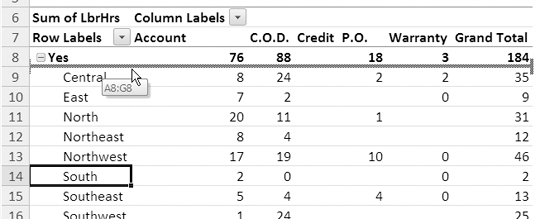
Figure 6-10. Dragging label to a new position
- Release the mouse button, and the South item label moves, along with its row of data. Although you moved only the South label in the Rush Yes group, the South label in the Rush No group has also moved, from A24 to A19.
You can now send the report to the South district, with its data at the top of the list of districts. Manually moving a label allows you to override the default alphabetical sorting in the field and gives you great flexibility in the item order.
Using Commands to Move Labels
Your next report will be sent to the West district, so you'd like that district's information at the top of the list of districts. Another way to manually move the labels is to use a context menu. You'll use a context menu to move the West label to the top of the list:
- In the pivot table, right-click cell A17, which contains a label for the West district.
- In the context menu, click Move, and then click Move "West" to Beginning (see Figure 6-11).
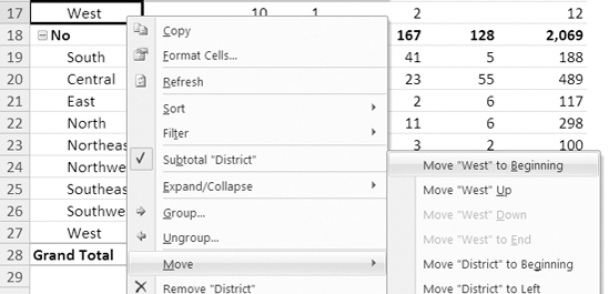
Figure 6-11. Moving a label with a context menu command
- The West label moves, along with its row of data. The West label in the Rush No group has also moved, from A27 to A19.
You may prefer to use this method for moving a label if you find it easier than positioning the pointer over the cell border and using the four-headed arrow to drag the label.
Moving Labels by Typing
The next report is for the East district. A third way to manually move the labels is by typing. You'll use this method to move the East item to the top of the list:
- In the pivot table, click cell A9, which contains the West label. This is the position in which you'd like the East label, which is currently in cell A12.
- Type East in cell A9, replacing the West label (see Figure 6-12), and then press the Enter key.
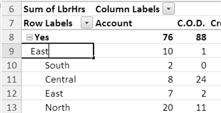
Figure 6-12. Typing over an existing label
- The East label moves up to row 9, along with its row of data. The labels that were above East have moved down, with the West label now in cell A10.
You may prefer to use this method for quickly moving an item label if it has a short, easy-to-spell label.
Caution If you misspell the label, Excel will rename the label you overtyped, and the labels will not move.
Sorting Labels
When you add a field to the Column Labels or Row Labels area of the pivot table, the labels are usually sorted alphabetically in ascending order. For some fields, you may prefer the labels in descending order. After making changes to the pivot table, such as manually moving the labels, the sort order may have changed, and you may want to restore the alphabetical order to the labels. You'll sort the labels in your pivot table to see labels in descending or ascending order.
Sorting the Labels with a Ribbon Command
When you added the Rush field to the Row Labels area, Yes was added at the top of the list, and the No item (blank) was added at the bottom. Youchanged the (blank) label to No, and now you want the rush labels in alphabetical order.
To sort the labels in a pivot table field, you can use the Ribbon commands. You'll sort the labels in the Rush field, so the No label is at the top of the list, instead of the Yes label:
- In the pivot table, select cell A8, which contains the Yes label for the Rush field.
- On the Ribbon, under the PivotTable Tools tab, click the Options tab.
- In the Sort group, click Sort A to Z to sort the rush items in ascending order (see Figure 6-13).
Figure 6-13. Sorting A to Z
The Yes rush label moves down in the pivot table, and the No label moves to the top of the pivot table.
After reviewing the revised order, you decide to sort the field again, so the Yes label is at the top. To return the labels to their original positions, you'll sort the labels in descending order:
- In the pivot table, select cell A8, which contains the No label for the Rush field.
- In the Sort group, click Sort Z to A to sort the rush items in descending order.
Note The Sort commands are also available on the Data tab of the Ribbon.
Sorting Labels with a Context Menu
In the pivot table, the Payment field is in the Column Labels area, with labels arranged alphabetically, from Account on the left to Warranty on the right. You want to sort these labels in descending order so Warranty is on the left.
You'll use a context menu to sort the payment labels in descending order:
- In the pivot table, right-click one of the payment labels. For example, right-click cell F7, which contains the Warranty label.
- In the context menu, click Sort, and then click Sort Z to Ato sort the items in descending order (see Figure 6-14).
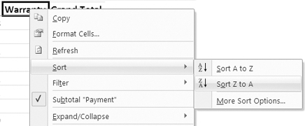
Figure 6-14. Sorting labels in descending order
- The payment items are sorted in descending order, from left to right, starting with Warranty in cell B7.
You may prefer to use this method for sorting labels if the Sort group on the Ribbon is not visible.
Sorting Labels with the Heading Drop-Down List
While preparing your reports earlier, you manually moved a few of the district labels. You'd like to sort the list of districts in ascending order so they're back to the original list order. Another method for sorting the labels is to use the drop-down arrows on the Row Label and Column Label headings. You'll use this method to sort the district labels in ascending order:
- In the pivot table, click the arrow on the Row Labels heading, in cell A7.
- In the Select Field drop-down list, Rush is the field that is currently showing. Click the drop-down arrow, and choose District, whichis the field you want to sort (see Figure 6-15).
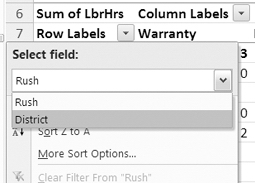
Figure 6-15. Selecting the field to sort
- In the list of sort options, click Sort A to Z to sort the labels in ascending order.
The district labels are sorted in ascending order, as they were originally. You can use this method of sorting if you don't want to select a label before sorting.
Sorting Values
In addition to sorting the labels by their text, you can sort the pivot table by the values. This will move the largest or smallest numbers to the top of the list so you can focus your attention on those items. You'll sort the Grand Total column to arrange the values in ascending order.
Sorting from Smallest to Largest
Under each rush item in the row labels, the pivot table has an alphabetical list of districts. For each rush item, you want to see which districts have the smallest number of labor hours (LbrHrs), so you'll sort by the values:
- In the Grand Total column, right-click one of the district totals in column G. For example, right-click cell G9, which contains the total of labor hours for the Central district for Yes rush work orders.
- In the context menu, click Sort, and then click Sort Smallest to Largest to sort the labor hours in ascending order.
Values within each rush group are sorted in ascending order, showing that the South district has the lowest number of labor hours for rush work orders (Yes) and the Southwest district has the lowest number of labor hours for nonrush work orders (No).
Sorting from Largest to Smallest
The next report you have been asked to create will focus on the payment type. In your pivot table there is a column for each payment type, with labels in cells B7 to F7. In the Account column (F), you can see the number of labor hours for each district. Currently, the districts are listed under the rush labels, so there are two numbers for each district in the Account column—one in the Yes section and one in the No section.
You want to see which districts have the highest number of labor hours (LbrHrs) with an Account payment type, so you'll modify the pivot table to create one number for each district in the payment columns. After you make that change to the layout, you'll sort on the values in the Account column.
To create one number for each district, you'll remove the Rush field from the pivot table layout:
- In the PivotTable Field List pane, remove the check mark from the Rush field. The Rush headings are removed from the pivot table layout, and the pivot table shows the total labor hours for each district. Even though you changed the layout, the Grand Total column is still sorted in ascending order.
- Right-click one of the district values in column F. For example, right-click cell F8, which contains the Account labor hours for the Northeast district.
- In the context menu, click Sort, and then click Sort Largest to Smallest to sort the labor hours in the Account column in descending order.
Values in the Account column are sorted in descending order, showing that the North district has the largest number of labor hours (238) paid on account (see Figure 6-16). The Southwest district has the smallest number (6).
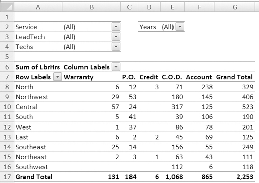
Figure 6-16. Account column values in descending order
Sorting a Grand Total Row
Besides sorting a column's values in ascending or descending order, you can also sort a row's values. Currently, the payment labels in row 7 are sorted in descending alphabetical order, with Warranty at the left and Account at the right. You'll sort the payment grand totals so the payment type with the largest number of labor hours is at the left. In the Grand Total row, you can see that the C.O.D. payment type has the highest number, so it should move to the left when you sort by the Grand Total values.
- Right-click one of the payment grand totals in row 17. For example, right-click cell B17, which contains the grand total for the Warranty column.
- In the context menu, click Sort, and then click Sort Largest to Smallest to sort the labor hours in descending order, left to right.
The Grand Total values in row 17 are sorted in descending order. In row 7, the payment labels have been sorted with the grand totals. At the left is the C.O.D payment type, which has the largest number of labor hours, and at the right is the Credit payment type, which has the smallest number of labor hours. The Grand Total column (G) is not affected by the sort and remains at the far right of the pivot table.
Sorting from Left to Right
You're preparing a report for the North district, and instead of sorting by the Grand Total row, you'd like to sort the values in the North district row. Although the Grand Total row can be sorted easily, sorting other rows requires a few more steps.
Currently, the grand total amounts are sorted in descending order, with C.O.D. at the left and Credit at the right. You'll sort the North district, in row 8, by its labor hour amounts so the column with the largest number of labor hours in the North district is at the left. In that row, cell C8 has the largest number, so after the sort, the Account column should be at the far left.
- In the pivot table, select a cell in the North district row. For example, select cell B8, which contains the C.O.D. total for the North district.
You can't use the Sort Largest to Smallest command on the context menu to sort any row of values, except the grand total. To sort the North district row, you'll open the Sort By Value dialog box.
- On the Ribbon, under the PivotTable Tools tab, click the Options tab.
- In the Sort group, click the Sort button to open the Sort By Value dialog box.
- Under Sort options, select Largest to Smallest.
- Under Sort direction, select Left to Right. In the Summary section, you'll see a summary of the sort settings (see Figure 6-17). The Summary section indicates you will sort using values in the North row.
- Click the OK button.
The labor hours for the North district are sorted largest to smallest, from left to right. The Account column is now at the far left, because it has the largest number of labor hours for the North district. Labor hours for other districts, such as Central, may not be in descending order, since the column order has been set by the North district.
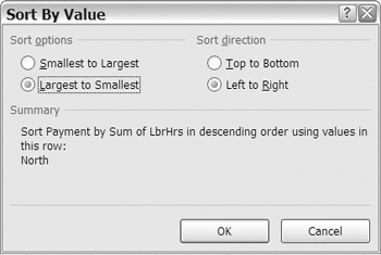
Figure 6-17. Sort By Value dialog box
Sorting Automatically When the Pivot Table Changes
When you sorted the pivot table values, you didn't apply any report filters, so all the work orders were summarized. You want to see the data for Michner only, so you'll choose that name from the LeadTech report filter and see the effect of applying a filter when the values are sorted.
Currently, the Account column is sorted in descending order, and the North district row is sorted in descending order.
- In the LeadTech report filter, select Michner.
- Click OK to filter the pivot table data for that technician's data.
The Account column remains sorted in descending order, and the Central district now appears at the top of the list of districts. That is the district in which Michner has the largest number of labor hours that were paidon account.
The values in the North district row have also changed, and this affected the column order. The P.O. column has moved to the left because, in the North district, it is the payment type with the largest number of labor hours (four) for Michner (see Figure 6-18).
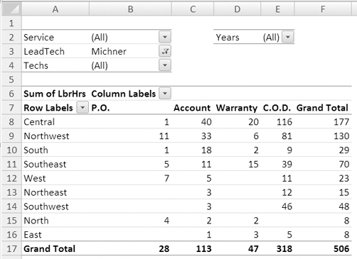
Figure 6-18. Row and column sorted with report filter applied
Preventing Automatic Sorting
In some cases, you may prefer that the sort order not change when the pivot table changes. You'll change a setting so the districts will remain in their current order, even if the report is filtered. First you'll remove the filter to restore the previous order, and then you'll change the sort setting for districts:
- In the LeadTech report filter, select (All), and then click OK. The filter is removed, and the columns and rows are returned to their previous orders.
- In the pivot table, right-click a district label cell. For example, right-click cell A8, which contains the North district label.
- In the context menu, click Sort, and then click More Sort Options.
- The Sort dialog box opens, showing the name of the current field, District, in the title bar of the dialog box (see Figure 6-19).
In the Sort options section, Descending (Z to A) By, is selected and shows that the districts are sorted by Sum of LbrHrs.
In the lower half of the dialog box, the Summary section shows that the Account column values are used for the sort order.
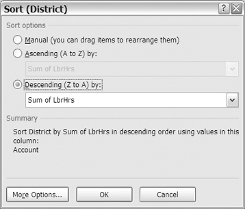
Figure 6-19. Sort dialog box
- At the bottom of the dialog box, click the More Options button.
- The More Sort Options dialog box opens, showing the name ofthe current field, District, in the title bar of the dialog box (see Figure6-20).
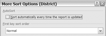
Figure 6-20. More Sort Options dialog box
- In the AutoSort section, remove the check mark from Sort Automatically Every Time the Report Is Updated (see Figure 6-20).
- Click OK to close the More Sort Options dialog box, and then click OK to close the Sort dialog box.
Note The sort for the Payment labels changes when the District AutoSort is turned off. You could reapply this filter later, if desired.
You'll choose a technician name from the LeadTech report filter to see the effect of changing the sort update setting:
- In the LeadTech Report Filter, select Michner.
- Click OK to filter the pivot table data for that technician's data.
The districts remain in the previous order, with North at the top, even though the North district does not have the largest amount in the Account column.
Restoring Automatic Sorting
You'll open the Sort dialog box to see how the sort settings have been changed and to restore the previous settings:
- In the pivot table, right-click a cell that contains a district label.
- In the context menu, click Sort, and then click More Sort Options.
The Sort dialog box opens, and in the Sort options section, Manual is selected, instead of Descending (Z to A). This setting was changed automatically to prevent the district labels from sorting when you filtered the report.
- Select Descending (Z to A), and from the drop-down list, choose Sum of LbrHrs. This will sort the districts by their values in the LbrHrs field.
- At the bottom of the dialog box, click the More Options button.
This opens the More Sort Options dialog box, where you'll turn the AutoSort option on again and select a column in which the values should be sorted.
- In the AutoSort section, add a check mark to Sort Automatically Every Time the Report Is Updated.
In the Sort By section, Grand Total is currently selected. You'll change this so it sorts on the values in the Account column, which is column C.
- In the Sort By section, select Values in Selected Column, and type $C$8 in the column box so the Account column will be used for sorting (see Figure 6-21). Instead of $C$8, you could type the address of any cell in the Account column.
Tip Instead of typing the address, you can click a cell in the pivot table's Account column on the worksheet.
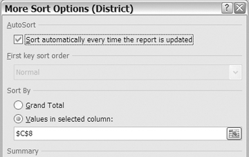
Figure 6-21. Restoring the AutoSort settings
- Click OK to close the More Sort Options dialog box, and then click OK to close the Sort dialog box.
The pivot table is sorted by the values in the Account column, and the Central region is at the top, since that is the largest amount for Michner (see Figure 6-22).
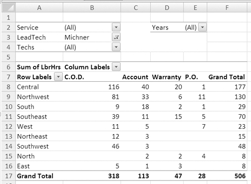
Figure 6-22. Pivot table sorted by amounts in the Account column
Now that you have restored the sort settings, the sort order for the district labels will update automatically when the pivot table changes.
Sorting Labels in a Custom Order
In some situations you may want labels sorted in a custom order that is not alphabetical or numerical. For example, when including the service types in a pivot table, you may need to list them in the following order to match other reports produced in your company:
- Install
- Replace
- Repair
- Assess
- Deliver
You could manually rearrange the service type labels after you add them to the pivot table, but it would be easier to have the labels automatically sorted in this custom order. You'll move the Service field to the Row area of the pivot table and sort them alphabetically. Later, you'll sort them in a custom sort order.
- Select a cell in the pivot table.
- In the PivotTable Field List pane, move the Service field from the Report Filter section to the Row Labels section, below the District field.
- Right-click a cell in the service labels, and in the context menu, click Sort. Then click Sort A to Z.
The service types are listed under each district in ascending alphabetical order.
Creating a Custom List
You'll create a custom list of service types in the order in which you want them sorted automatically:
- Click the Microsoft Office Button on the Ribbon.
- At the bottom right, click the Excel Options button.
- In the Excel Options dialog box, click Popular.
- In the Top Options for Working with Excel section, click Edit Custom Lists. The Custom Lists dialog box opens and shows all the existing custom lists. You can add your own lists by typing them or by importing lists from a worksheet.
- In the Custom Lists dialog box, under Custom lists, select NEW LIST.
- Click in the List Entries section, and type a list of the service types, pressing the Enter key after each service type: Install, Replace, Repair, Assess, Deliver (see Figure 6-23).
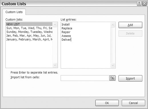
Figure 6-23. Creating a custom list
- Click the Add button to add your list to the Custom Lists area.
- Click the OK button to close the Custom Lists dialog box, and then click the OK button to close the Excel Options dialog box.
Sorting with a Custom List
After creating a custom list, the custom sort order isn't automatically applied to fields that are already in the pivot table layout. You'll refresh the pivot table to apply the custom list sort order:
- Right-click any cell in the pivot table, and click Refresh.
The service types are listed under each district in the custom list order.
Sorting Without Using a Custom List
If you don't want to use custom lists when sorting in a pivot table, you can change a pivot table setting to block their use:
- Right-click any cell in the pivot table, and click PivotTable Options.
- In the PivotTable Options dialog box, click the Totals & Filters tab.
- In the Sorting section, remove the check mark from Use Custom Lists When Sorting (see Figure 6-24), and then click OK.
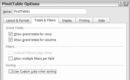
Figure 6-24. Using custom lists when sorting
The custom sort order is removed, and the service types are sorted in ascending alphabetical order.
Note Changing the Use Custom Lists When Sorting setting will affect all fields in the active pivot table.
Filtering Row and Column Labels
Another feature that will help as you focus on specific data in the pivot table is filtering the row and column labels. You don't have to move a field to the Report Filter area to filter it; you can keep the pivot table layout as it is and filter the labels to reduce the amount of data that's shown in the pivot table.
Filtering for Begins With
Currently, all the districts are visible in the pivot table. You have been asked to create a report that shows only the districts in the north—North, Northeast and Northwest—so you'll use a label filter to hide the other districts.
The names of all the districts in the north begin with North, so you'll filter for that text string:
- Click the drop-down arrow in the Row Labels heading.
- In the Select Field drop-down list, choose District.
- Click Label Filters, and then click Begins With (see Figure 6-25).
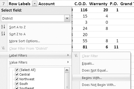
Figure 6-25. Label filters for Begins With
- In the Label Filter dialog box, the drop-down box at the left shows begins with. Where the cursor is flashing, type North (see Figure 6-26), which is the text string you want to filter, and then click OK.
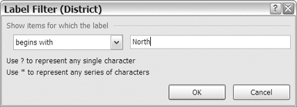
Figure 6-26. Label Filter dialog box
Note The filter is not case sensitive, so items that begin with north or NORTH would also be visible after the filter is applied.
In the district labels, only the labels that begin with North are still visible. All other districts are hidden, and the grand totals show the amounts for the filtered districts only. The LeadTech report filter is still applied, so the results are for Michner only. You can see that more than half of the labor hours for Michner in the three northern districts were paid by C.O.D.
The drop-down arrow on the row labels shows a filter icon to indicate that a filter is currently applied to the labels. In the PivotTable Field List pane, a filter icon is visible to the right of the District field.
Filtering for Contains
For your next report, you need to list all the districts that are in the east or west. These districts have the text east or west in their names. When you filtered the district labels to show only the labels that begin with North, you may have noticed the long list of options for filtering. You'll use a different option in your next filter to filter for districts in the east and west.
- Click the drop-down arrow in the Row Labels heading.
- In the Select Field drop-down list, choose District.
- Click Label Filters, and then click Contains.
- In the Label Filter dialog box, the drop-down box shows contains. Where the cursor is flashing, type e*st (see Figure 6-27). The asterisk is a wildcard that represents any series of characters or no characters.
Because you used the * wildcard, the filter will return district names that contain East, because those names have an e and then one character and then st. The filter will also return district names that contain West, because those names have an e and then no character and then st.

Figure 6-27. Label Filter dialog box
- Click the OK button.
All the districts that contain east or west in their names are visible in the pivot table, and the other districts, such as North and Central, are hidden.
Viewing Filter and Sort Information
After applying a filter or sort to the row or column labels, you can quickly view a summary of the current status. You'll view the current filter and sort information:
- Point to the drop-down arrow in the Row Labels heading.
- In the tool tip that appears, the current filter and sort information is listed for the fields in the Row Labels area (see Figure 6-28).
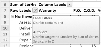
Figure 6-28. Filter and sort information in tool tip
Removing Filters
After applying a filter to the row labels, you can remove it to show all the labels again. You'll remove the filter that you applied to the district labels:
- Click the drop-down arrow in the Row Labels heading.
- In the Select Field drop-down list, choose District.
- Click Clear Filter from "District" (see Figure 6-29).
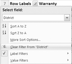
Figure 6-29. Clearing the filter
The filter is removed from the district labels, and all the districts are visible again.
Filtering Values
In addition to filtering the row and column labels, you can filter the values in the pivot table. You may want to view only the values that are within a certain range or exceed a specific amount. By filtering the values, you can limit what's shown in the pivot table and focus on only the values that are of current interest.
Filtering Values for Row Fields
Currently, the pivot table is showing Michner's labor hours. In the Grand Total column, you can see the number of hours that Michner spent on each service type in each district. You want to focus on the service types and districts where Michner spent most of his time, so you'll filter the grand totals for the service rows.
By reviewing the grand totals, you can see that most of the totals are less than 30 hours, so you decide to use that as your cutoff point. You'll apply a filter so only the amounts greater than 30 hours are visible for any service in a district:
- In the pivot table, click the arrow on the Row Labels heading, in cell A7.
- In the drop-down list, in the Select Field list, choose Service.
- Click Value Filters, and then click Greater Than.
- In the Value Filter dialog box, the title bar shows the name of the current field, Service.
- The first drop-down box shows Sum of LbrHrs, and the second drop-down box shows is greater than. Leave those settings unchanged (see Figure 6-30).
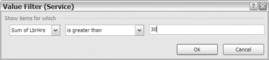
Figure 6-30. Value Filter dialog box
- In the third box, enter 30 as the number of hours you want to exceed, and then click OK.
The filter is applied, and only four service labels remain visible, three in the Central district and one in the Northwest district (see Figure 6-31). The total for Assess in the Central district shows as 30, but if you select the cell and look in the Formula Bar, you'll see that it's actually 30.25. Therefore, it meets the filter criteria and is displayed in the filtered pivot table.
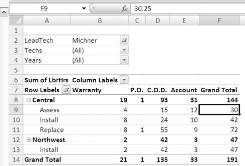
Figure 6-31. Pivot table with value filter applied
Filtering Values for Column Fields
At the bottom of the pivot table, the grand totals for the Column fields can also be filtered. To focus on the payment types with the highest number of labor hours, you'll filter the grand totals for the Payment columns, so only the amounts between 100 and 200 hours are visible.
- In the pivot table, click the arrow on the Column Labels heading, in cell B6.
- Click Value Filters, and then click Between.
- In the Value Filter dialog box, the title bar shows the name of the current field, Payment.
- The first drop-down box show Sum of LbrHrs, and the second drop-down box shows is between. Leave those settings as is (see Figure 6-32).
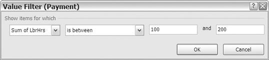
Figure 6-32. Value Filter dialog box
- In the third box, enter 100 as the minimum number of hours.
- In the fourth box, enter 200 as the maximum number of hours.
- Click the OK button to apply the filter.
Only the C.O.D. column remains visible, because its grand total is between 100 and 200 hours.
Note The values entered in the minimum and maximum boxes are included in the filter results.
Filtering for a Date Range
The accounting manager has asked you to create a report that shows the fees that were collected for work done in April 2007, with totals for one- and two-technician jobs. To analyze the data for a specific date range, you can use date filters.
To start the report, you'll change the pivot table by adding a date field to the Row Labels area and then filtering for a date range. Using the date range filters will let you focus on the results for a specific time period to see whether the results are what you expected.
Clearing the Filters
You've finished analyzing the work done by one of the lead technicians, so before working with the date filters, you'll clear the pivot table and rebuild it with different fields:
- Select a cell in the pivot table.
- On the Ribbon, under the PivotTable Tools tab, click the Options tab.
- In the Actions group, click Clear, and then click Clear All.
Because another pivot table in the workbook is based on the same data as the pivot table you're clearing, you'll see a message warning you that Grouping, Calculated Items, Calculated Fields, and Custom Items will be removed from all the pivot table reports.
- Click Clear PivotTable to continue with the Clear, because you don't need to save the grouped items in the other pivot table.
- To rebuild the pivot table, add the TotalFee field to the Values area, add the WorkDate field to the Row Labels area, and add the Techs field to the Column Labels area. The Techs field shows whether one or two technicians were assigned to the job.
- To make the pivot table easier to read, format the Sum of TotalFee value field as a number with two decimal places and a thousands separator.
- Although the dates are in dd-mmm-yy format in the Excel table, in the pivot table they appear in short date format. To format them, right-click a date cell, and in the context menu, click Field Settings.
- Click Number Format, and in the Format Cells dialog box, select the Date category and the dd-mmm-yy format. Then click OK twice.
The pivot table now shows results for all the dates in the source data, from January 2006 to December 2007 (see Figure 6-33).
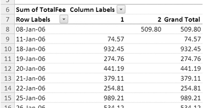
Figure 6-33. Formatted dates in the Row Labels area
Filtering for a Specific Date Range
To create a report for the date range that the accounting manager requested, you'll apply a filter to view only the data for the first two weeks of April 2007:
- In the pivot table, click the arrow on the Row Labels heading, in cell A7.
- Click Date Filters, and then click Between to open the Date Filter dialog box.
- In the first drop-down, is between is selected. Leave that setting unchanged.
- To the right of the second box, click the calendar icon to open the date selector (see Figure 6-34).
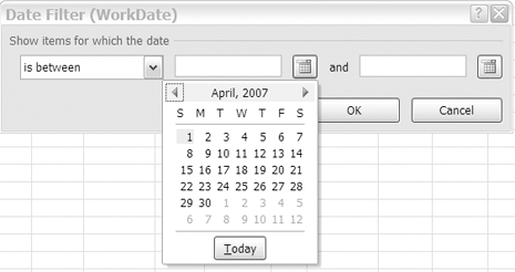
Figure 6-34. Date filter for specific date range
- Use the arrows at the top of the date selector to move to April 2007, and then click April 1 to select it.
- To the right of the third box, click the calendar icon to open the date selector.
- Use the arrows at the top of the date selector to move to April 2007, and then click April 14 to select it.
- Click OK to close the Date Filter dialog box.
The pivot table now shows results for work done from April 1, 2007, to April 14, 2007.
Filtering for a Dynamic Date Range
The accounting manager likes the report you created for the April 2007 fees and asks whether you can create a report each Monday to show fees collected during the previous week. To make this task easier, you can use a date filter with a dynamic date range. Instead of specific dates, these are time periods relative to the current date. For example, you can filter for last month, next week, or tomorrow.
You'll apply a dynamic filter to show the data from the previous week. The pivot table filter can do this dynamically, so you don't have to enter specific dates each week to see the updated summary.
- In the pivot table, click the arrow on the Row Labels heading, in cell A7.
- Click Date Filters, and then click Last Week (see Figure 6-35).
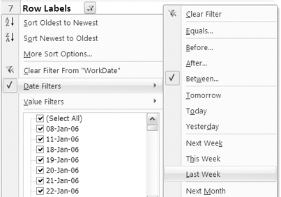
Figure 6-35. Date filters for last week
The pivot table now shows results for work done in the previous week (assuming that some of the records in the source data are from the week previous to you applying the filter).
Note When the filter criteria can change automatically, such as with Last Week or Next Month, it is called a dynamic filter.
Applying a Manual Filter
Instead of using the filter options, you can manually select or deselect the items in a field drop-down list. You can use this option if you want to filter for specific items that can't be filtered by using a common or dynamic filter. For example, you may want to see the data from three specific dates when the service department was short staffed. You'll apply a manual filter to see those dates:
- In the pivot table, click the arrow on the Row Labels heading, in cell A7.
Because you're interested in only three dates, you'll remove all the check marks so no dates are selected, and then you'll select the three dates for the filter.
- In the list of dates, remove the check mark from (Select All) to remove all the check marks from the list.
- Add check marks to the three dates you want to see: 01-Feb-06, 02-Feb-06, and 10-Feb-06 (see Figure 6-36), and then click OK.

Figure 6-36. Manual filter for specific dates
The pivot table now shows results for work done on the three selected dates, and you can focus on that data only. The Techs field in the Column Labels area now shows only a label for 1. The column for 2 is not visible, because no two-technician work was done on those short-staffed days.
Including New Items in a Manual Filter
If you manually apply a filter to a field and then update the pivot table, some new items may appear in the pivot table and not be affected by the filter. For example, if you manually filter for specific dates and then add new records to the source data, the filter may include the new items, even if they are not records for the date selected in the manual filter. You can change a setting in the field to specify whether new items are included.
You'll change one of the records in the source data to create a new work date. Then you'll refresh the pivot table to see how the revised record is handled.
- On Sheet1, in the source data in cell G2, change the date from 08-Jan-06 to 09-Jan-06. This date did not previously exist in the pivot table's WorkDate field.
- On Sheet5, right-click a cell in the pivot table, and click Refresh.
The revised record's data does not appear in the pivot table. Now you'll change a pivot table setting to show new data even if it doesn't meet the filter criteria.
- In the pivot table, right-click a cell in the WorkDate Row labels, such as cell A8.
- Click Field Settings.
- On the Subtotals & Filters tab, in the Filter section, add a check mark to Include New Items in Manual Filter, and then click OK (see Figure 6-37).

Figure 6-37. Including new items in manual filter
You'll change another record in the source data to create another new work date. Then you'll refresh the pivot table to see how the revised record is handled with the new setting in effect.
- In the source data on Sheet 1, in cell G3, change the date from 11-Jan-06 to 12-Jan-06. This is another date that did not previously exist in the pivot table's WorkDate field.
- On Sheet5, right-click a cell in the pivot table, and click Refresh.
The revised record's data appears in the pivot table, below the existing records, even though it doesn't meet the filter criteria. You can turn this setting on if you want to ensure that you notice new records when they're added, and then you can manually deselect them after they appear. If you don't want new records to appear in the filtered pivot table, remove the check mark from the Include New Items in Manual Filter option.
Filtering by Selection
To quickly filter the items in a pivot table, you can select one or more labels and then use the selected labels to filter the pivot table. You'll select a few dates in the WorkDate field and then hide all the other dates.
First you'll clear the filter, and then you'll apply a filter by selection.
- Right-click a cell in the WorkDate labels, click Filter, and then click Clear Filter from "WorkDate." All the dates are visible in the Row Labels area.
- In the Row Labels for WorkDate, click 19-Jan-06 to select that label.
- Hold the Ctrl key on the keyboard, and click three other dates to select them.
Tip The selected items can be in adjacent cells or any location in the list.
- Right-click one of the selected labels.
- In the context menu, click Filter, and then click Keep Only Selected Items (see Figure 6-38).
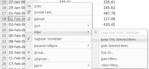
Figure 6-38. Filter to keep only selected items
Only the four selected dates are visible, and all the other data is hidden. This is like manual filtering. If you look at the list of dates in the Row Labels drop-down, the four selected dates have check marks, and all the other dates have their check marks cleared.
Showing Top and Bottom Items
The final filtering method you'll test is the filter to show the highest or lowest values in a value field. You'll filter the pivot table to show the five days with the highest total fees. The filter option you'll use is called Top 10, but you can use this feature to filter for top or bottom values and use numbers other than 10.
Filtering for the Top Items
The accounting manager wants to know which days you collected the largest amount in fees. You'll use the Top 10 feature to view the five work dates with the highest total fees.
Note The current filter does not have to be cleared, because you are applying a new filter to the WorkDate field, and it will automatically override the previous filter applied to that field. By default, multiple filters per field are not allowed. You can change this setting on the Totals & Filters tab in the PivotTable Options dialog box.
- Click the drop-down arrow in the Row Labels heading.
- Click Value Filters, and then click Top 10.
- In the Top 10 Filter dialog box, select Top from the first drop-down list.
- In the second box, enter 5.
- Select Items in the third box, select Sum of TotalFee in the last box, and then click the OK button.
The pivot table shows only the five days that have the highest grand totals for the TotalFee field.
Note If there are ties in the Grand Total values, more than the specified number of items may be returned in the filter. For example, if six dates had total fees of 20,000, all six would be listed.
Filtering for the Bottom Percent
In the previous filter, you viewed top items. Now that you have seen the top five days, you'll focus on days with the lowest amount of fees collected. You could filter for a specific number of days, as you did for the top days. Instead, you'll filter the pivot table to show the days that comprise the bottom 10 percent of the total fees.
First you'll clear the filter to see the grand total when all records are visible:
- Right-click a cell in the WorkDate labels, click Filter, and then click Clear Filter from "WorkDate."
With all the records visible, the pivot table shows a grand total of $634,376.28 for the sum of TotalFee. You'll filter the pivot table to see the days with the lowest totals for TotalFee that combine to total 10 percent of that overall grand total, or approximately $63,437.
- Click the drop-down arrow in the Row Labels heading.
- Click Value Filters, and then click Top 10.
- In the Top 10 Filter dialog box, select Bottom from the first drop-down list.
- In the second box, enter 10.
- Select Percent in the third box, and select Sum of TotalFee in the last box.
- Click the OK button.
The pivot table shows a long list of days with the lowest totals for TotalFee that combine to total $63,474.24, which is just over 10 percent of the overall grand total.
You could use this type of filter to determine where to focus your improvement efforts. There may be only a few clients or products that contribute to the top 10 or 20 percent of your sales and several hundred that comprise the remaining percent of sales. Using a top or bottom filter can help you identify those clients or products.
Filtering for the Top Sum
The final option for the Top 10 filter is to specify a sum. You'll filter to find the top days that combine for a total of at least $50,000:
- Click the drop-down arrow in the Row Labels heading.
- Click Value Filters, and then click Top 10.
- In the Top 10 Filter dialog box, select Top from the first drop-down list.
- In the second box, enter 50000.
- Select Sum in the third box, and select Sum of TotalFee in the last box.
- Click the OK button.
The pivot table shows only the eight days with the highest totals for TotalFee that combine to total at least $50,000 (see Figure 6-39).

Figure 6-39. Filtering for the top sum
Summary
In this chapter, you learned how to add multiple filters to the pivot table and arrange multiple report filters at the top of the pivot table. You manually arranged field items by dragging, using commands, and typing. You sorted the field items automatically by using Ribbon commands, using context menus, and using field heading drop-downs. Value items were sorted by column or by row, from largest to smallest or smallest to largest. By creating a custom list, you were able to automatically sort items in a custom order.
You filtered the row and column labels for specific text and viewed the sort and filter information in a tool tip. You filtered the values for the row and column grand totals, and you filtered for dates in a specific range or in a dynamic range. You manually filtered the pivot table by checking items in the field drop-down list and filtered by selecting items in the row labels. Finally, you filtered for top and bottom items in the pivot table, by items, by percent, and by sum.
By creating a pivot table, you can quickly and easily summarize all the data in an Excel table. Filtering and sorting in the pivot table allow you to focus on specific items or highlight the high and low results. These tools add to the value of a pivot table and can help you identify problem areas that should be addressed.