
CHAPTER 11
Creating a Pivot Chart
In this chapter, you'll create pivot charts using the food sales data you worked with in Chapters 8 and 9. A pivot chart paints a picture of the data in a pivot table and can make the data easier to understand. Instead of a table full of numbers, a pivot chart can use columns, bars, or pie slices to illustrate the numbers, and a pivot chart lets you easily compare results between years, regions, or products. Or, a pivot chart can use lines to show how results change over time (see Figure 11-1).
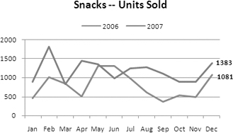
Figure 11-1. Pivot chart comparing 2006 vs. 2007 sales
To start, you'll create a simple column chart with the default chart settings. You'll modify that chart's layout, change its appearance, and move the pivot fields to produce a custom-tailored chart that presents your data effectively. Then, you'll create a line chart from the pivot table data to compare sales over two years. You'll add labels, titles, and trend lines to the chart to ensure that your chart is easy to understand.
Finally, you'll see how easy it is to use the pivot chart filters to instantly create a chart that shows results for a different product or region. With one click of the mouse, your chart can focus on cookie sales instead of snacks or on the east instead of the north. What might take hours to achieve with regular charts will take seconds to create with a pivot chart.
Creating a Default Pivot Chart
The sales manager at your food sales company is preparing for a regional sales meeting and wants a chart that compares each region's sales for each product type. You'll create a pivot chart with the default settings, and then you'll modify the chart to improve its appearance.
To start, you'll open the sample food sales workbook and prepare the pivot table:
- Download and open the sample file
RegionSales_03.xlsx, available from the Apress web site. - Activate the Pivot_Regions worksheet, which contains an empty pivot table.
The pivot table is based on sales data for the East and North regions for 2006 and 2007. The chart should compare sales in the two regions for all the product types, so you'll add the Region, ProdType, and TotalPrice fields to the pivot table layout and then create a pivot chart from the pivot table.
At this point, you aren't sure how the fields should be arranged for the pivot chart, so you'll add the fields where they'd make sense in a pivot table report. After you create the pivot chart, you can change the layout, if required.
- Select a cell in the empty pivot table, and in the PivotTable Field List pane, add the Region field to the Row Labels area, add the ProdType field to the Column Labels area, and add the TotalPrice field to the Values area.
This creates a concise summary of the data, and you can compare the sales between regions for each product type.
- To create a pivot chart, select a cell in the pivot table, and on the keyboard, press the F11 key.
- A chart sheet, Chart1, is inserted in the workbook, with a pivot chart based on the current pivot table (see Figure 11-2).
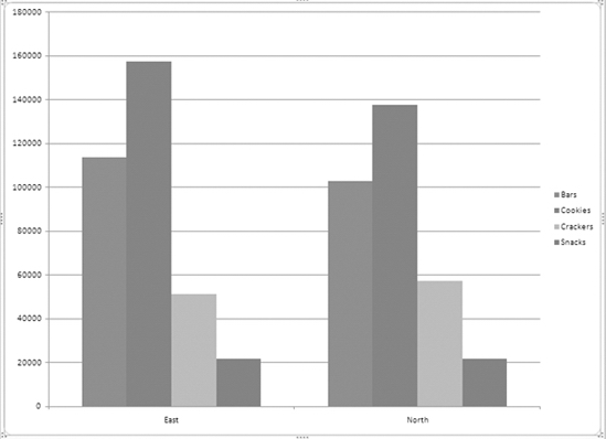
Figure 11-2. A default pivot chart
Exploring the Pivot Chart
The chart that was created is the default chart type, a clustered column chart. In the PivotTable Field List pane, the Row Labels area has changed to the Axis Fields (Categories) area, and the Column Labels area is now called the Legend Fields (Series) area (see Figure 11-3).

Figure 11-3. The area names have changed in the PivotTable Field List pane.
The region names are shown on the category axis, which is the horizontal axis across the bottom of the chart. Above each region name on the axis is a cluster of colored columns.
The product types from the ProdType field are shown in the legend at the right of the chart. The ProdType items are series in the chart, and there is a column that represents the total sales for each product type in each region. The colored square beside the ProdType name in the legend indicates which color its columns are. For example, the two blue columns represent the bar sales, one for the East region and one for the North region.
- Point to one of the blue columns, and a tool tip will appear to show the name of the series (Bars), the region, and the value that column represents (see Figure 11-4).
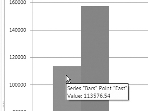
Figure 11-4. A tool tip shows information about the column.
Tip You can point to any element in the active chart and see its name in a tool tip, if tool tips are enabled.
The red column in the East region is the tallest column in the chart. The legend shows that red columns represent sales of cookies, so cookies in the East region are the best-selling product type per region. Snacks in the East and North regions have the smallest columns, indicating that sales of snacks are the lowest, and they look very close in sales for the two regions.
- Point to each of the purple Snacks columns to see the value each column represents and to determine whether the values are the same. The value for the North region is slightly higher than the value for the East region.
Using the PivotChart Filter Pane
In addition to the PivotTable Field List pane, when the pivot chart is active, a PivotChart Filter Pane becomes available (see Figure 11-5). This lets you sort and filter the fields, just as you can in a pivot table, and you can use the row labels, column labels, and report filters.
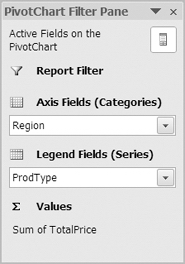
Figure 11-5. The PivotChart Filter Pane
You'll use the PivotChart Filter Pane to temporarily filter the product types to show only the snacks. This will remove the product types with more sales and will let you focus on snacks and see the small difference between the values those columns represent.
- In the PivotChart Filter Pane, click the drop-down arrow for ProdType in the Legend Fields list.
- In the Filter list, remove the check marks from Bars, Cookies, and Crackers, and then click OK.
The color for the Snacks column changes to blue, because that is the color used for the first column in the chart. The scale in the vertical axis at the left changes and shows a much smaller range of numbers. Previously, it went from 0 to 180000, and it now goes from 21500 to 21720. This magnifies the difference between the two columns, and you can clearly see that the North region had more sales (see Figure 11-6).
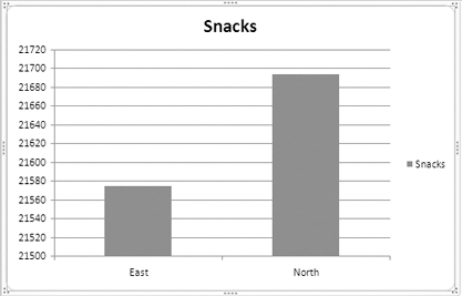
Figure 11-6. Pivot chart filtered to show only snacks
Now that you've focused on the snacks sales, you'll remove the filter from the pivot chart so it shows all the product types:
- In the PivotChart Filter Pane, click the drop-down arrow for ProdType in the Legend Fields list.
- In the Filter list, click Clear Filter from "ProdType."
All the product types are visible again, and the vertical axis scale starts at zero and goes to 180000.
On the PivotChart Filter Pane is a Field List button that lets you show or hide the PivotTable Field List pane. You'll hide the PivotTable Field List pane temporarily to see how the pivot chart looks when it's hidden:
- Click the Field List button (see Figure 11-7) at the top right of the PivotChart Filter Pane to hide the PivotTable Field List pane.
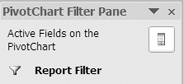
Figure 11-7. Field List button on the PivotChart Filter Pane
This creates more room on the screen for the pivot chart, so you may want to hide the PivotTable Field List pane after you have finished the pivot chart layout and are formatting the pivot chart. For now, you'll turn the PivotTable Field List pane back on.
- Click the Field List button at the top right of the PivotChart Filter Pane to show the PivotTable Field List pane.
Moving Fields in the Pivot Chart
Currently, the chart shows all the product types for the East region in one column cluster at the left of the chart. At the right of the chart is another column cluster that shows all the product types for the North region. This is an ideal arrangement for comparing the product type sales within each region.
To make it easier for the sales manager to compare the results for each product type between regions, you want the related product type columns displayed side by side. Instead of a cluster for each region, you want a cluster for each product type (see Figure 11-8).
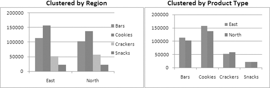
Figure 11-8. Cluster columns by region or by product type
Just as you can move fields in a pivot table, you can also move fields in a pivot chart. You'll change the position of the ProdType and Regions fields to create the layout you want for the chart:
- At the bottom left of the PivotTable Field List pane, add a check mark to Defer Layout Update. This will allow you to make changes to the field layout, without immediately changing the pivot chart.
Note If the PivotTable Field List pane is not visible, you may have clicked outside the pivot chart. Click in the pivot chart to activate it, and the PivotTable Field List pane should become visible. If it is still not visible, click the Field List button at the top right of the PivotChart Filter Pane.
- In the PivotTable Field List pane, move the ProdType field from the Legend Fields (Series) area to the Axis Fields (Categories) area.
- Move the Region field from the Axis Fields (Categories) area to the Legend Fields (Series) area.
- In the PivotTable Field List pane, click the Update button to update the pivot chart.
- In the PivotTable Field List pane, remove the check mark from Defer Layout Update.
The pivot chart now shows the product type names along the category axis and the region names in the legend. The East region's sales are represented by blue columns, and the North region's sales are represented by red columns. It's easier to compare the product type sales between regions when the columns are side by side (see Figure 11-9).
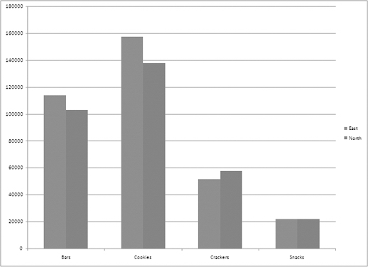
Figure 11-9. The product type names on the category axis
With the columns clustered by product type, it's easy to see that sales of bars and cookies are greater in the East, cracker sales are higher in the North, and snack sales are almost equal in the two regions.
Changing the Pivot Chart Layout
Before you send the pivot chart to the sales manager, you want to make it a bit more visually appealing. A title could explain the chart contents, and the legend might be easier to read in a different position in the chart.
When you create a pivot chart, a chart layout is automatically applied. The current layout has the legend at the right, grid lines running horizontally across the chart, and no chart title. You'll select a different layout to quickly give the chart a different appearance.
On the Ribbon, under PivotChart Tools, there are four tabs—Design, Layout, Format, and Analyze—that contain commands you can use when working with a pivot chart. You'll use these commands as you work with the pivot charts in this chapter.
- Select the pivot chart, and on the Ribbon, under PivotChart Tools, click the Design tab.
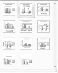
- In the Chart Layouts group, click the More arrow to open the Chart Layouts gallery (see Figure 11-10).
The Chart Layouts gallery shows miniature representations of the layouts that are available. For example, Layout 1 looks similar to the current layout, with grid lines and a legend at the right, but it includes a chart title. Layout 4 has the legend at the bottom, no grid lines, and numbers at the top of each column. You'll choose Layout 2, which has a chart title and legend at the top, no grid lines, and numbers at the top of each column. It also shows that the columns will be slightly separated.
Figure 11-10. The Chart Layouts gallery
- In the Chart Layouts gallery, click Layout 2 to apply that layout to the active pivot chart.
The chart layout you clicked is applied to the pivot chart. This layout has a chart title, and the legend is displayed at the top of the chart, where it's easier to see. The grid lines have been removed from the chart, as has the value axis that was at the left side of the chart. Instead, the values are displayed at the top of each column, and the columns are slightly separated in each cluster.
Next, you'll change the chart title so it shows information about the food sales instead of the generic text.
- Click the Chart Title to select it. When it is selected, the chart title has a small round handle in each corner (see Figure 11-11).
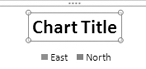
Figure 11-11. The chart title is selected.
- In the chart title, select the existing text, Chart Title, and press the Delete key to remove the text.
- Type the new text, Food Sales 2006-2007, and then click outside the chart title to complete the change.
Changing the Chart Style
Now that the chart layout is the way you want it, you'll change the chart style, which controls the colors and effects that are used in the chart. When you create a pivot chart, a default chart style is automatically applied. You'll select a different chart style to quickly give the chart a more dramatic appearance.
- Select the pivot chart, and on the Ribbon, under PivotChart Tools, click the Design tab.
- In the Chart Styles group, click the More arrow to open the Chart Styles gallery.
In the Chart Styles gallery, Style 2 is selected, because that is the style currently applied to the pivot chart. The sales manager has asked for blue coloring in the pivot chart, so you'll select one of the options in the third column of styles.
- In the Chart Styles gallery, click Style 27, which is the fourth style in the third column to apply that style to the active pivot chart (see Figure 11-12).
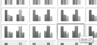
Figure 11-12. Select a chart style.
The chart style you clicked is applied to the pivot chart. This style uses light and dark blue tones to color the columns, and the columns have a beveled appearance. There is good contrast between the column colors for the two regions, and the chart is clean and easy to read (see Figure 11-13).
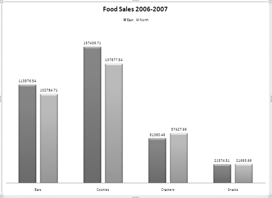
Figure 11-13. The completed pivot chart
Now that it's ready, you can send the pivot chart to the sales manager.
Adding Fields to the Pivot Chart
The sales manager thinks the pivot chart will be a helpful tool for the sales meeting and asks whether you can create another chart showing the same information but with the region totals broken down by city. For example, in the column that shows sales of cookies in the East, how much was sold in Boston and how much was sold in New York?
You'll add the City field to the pivot chart layout so the chart will show the amount per city for each product type. You'll also change the chart type so the cities for each region will be displayed in a single column in the chart.
- Select the pivot chart, and in the PivotTable Field List pane, add a check mark to the City field.
The City field is added to the Axis Fields (Category) area, and the cities are displayed along the category axis in the pivot chart, within each product type. The columns for the cities are colored according to region, but the chart is crowded and difficult to read. The city totals for each product type are displayed, but the chart no longer shows a direct comparison of the totals per region for each product type.
On the category axis, you want the product type to remain where it is, and above that, you want the region names as they were before. The legend should show the city names so you can identify the cities in the chart's data. To create this layout, you'll change the position of the Region and City fields in the chart layout.
- In the PivotTable Field List pane, move City to the Legend Fields area, and move Region to the Axis Fields area, below the ProdType field.
The chart layout is now close to what you need, but instead of a cluster of cities for each region, you want a single column for each region. In the next step you'll change the chart type, and this will achieve the layout you need.
Changing the Chart Type
When you create a pivot chart by pressing the F11 key, the default chart style is used. Unless you have changed the settings, the default chart style is a clustered column chart. In this chart, you want the cities for each region stacked in a single column for each product type. You'll change the chart type so the columns are stacked instead of clustered.
- Select the pivot chart, and on the Ribbon, under PivotChart Tools, click the Design tab.
- In the Type group, click Change Chart Type (see Figure 11-14).
Figure 11-14. Change Chart Type command on the Ribbon
The Change Chart Type dialog box opens and shows a list of chart types at the left. At the right are the subtypes available for each chart type. You can point to a subtype and see its name in a tool tip.
You'll continue to use the Column chart type for this chart, but you can see the other chart types that are available in Excel:
- Column and bar charts are almost the same, except that bars are displayed horizontally across the chart and columns are vertical. Both of these chart types work well for comparing specific values, as you're doing in your chart.
- Line charts and area charts connect the points that represent values and are good for illustrating changes over time. The charts are the same, except that the area charts are filled with color.
- Pie charts and doughnut charts show the percentage that each value comprises in the overall total. The pie chart type works well when there is a single series and value, such as total quantity per region. A doughnut chart can show multiple series.
- Surface charts and radar charts are specialized chart types that you can use to show differences in the data or aggregated data.
Note Although they are available in the list of chart types, you cannot use the XY (Scatter), Bubble, or Stock chart types when creating a pivot chart.
In the Change Chart Type dialog box, the current chart type, Column, is selected, and in the Column section at the right, the current chart subtype, Clustered Column, is selected. You'll select Stacked Column instead so the city data is stacked in a single column instead of being displayed in multiple columns.
Tip Avoid using the three-dimensional chart subtypes, because they will distort the representation of the data in your charts.
- In the Column chart subtypes, click Stacked Column to select it (see Figure 11-15).

Figure 11-15. Select the Stacked Column chart type.
- Click OK to close the Change Chart Type dialog box.
With stacked columns, the chart is now easier to read, but it's difficult to distinguish the cities, since the legend colors are so similar. You'll change the chart layout and style to make it easier to identify the cities.
- On the Ribbon, under the PivotChart Tools tab, click the Design tab.
- In the Chart Layouts group, click the More button to open the Chart Layouts gallery.
- Click Layout 3 to apply a layout with the legend at the bottom of the chart and numbers on the Values axis at the left of the chart instead of crowded numbers on the columns.
Note If you select a layout that includes a chart title, the existing title will be retained.
- On the Ribbon, in the Design tab, click the More button to open the Chart Styles gallery.
- Click Style 10 in the second row and the second column to apply a multicolored style, with fine white borders around the column segments (see Figure 11-16).
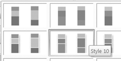
Figure 11-6. Select Style 10 in the Chart Styles gallery.
With the different colors in the chart, it's easier to identify each city's sales in the stacked columns (see Figure 11-17). You can send the revised chart to the sales manager.
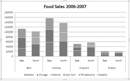
Figure 11-17. The completed stacked column chart
Viewing the Pivot Table
Now that you've finished working on the pivot chart, you'll return to the pivot table on which the pivot chart is based to see the effect that these changes to the pivot chart have had:
- Activate the Pivot_Regions worksheet to return to the pivot table.
- The City field is in the Column labels area of the PivotTable Field List pane and in the pivot table layout on the worksheet because it was added to the Legend Fields (Series) area of the pivot chart.
- The ProdType and Region fields are in the Row Labels area because they were both in the Axis Fields (Categories) area of the pivot chart.
The pivot table and pivot chart are connected, and the changes you make to one will affect the other. In some cases, this won't be a problem, and you can lay out the pivot table and pivot chart as you require. However, sometimes you've spent a considerable amount of time setting up a pivot table or pivot chart and want it to stay in that layout for your weekly or monthly reports.
In these situations, you can create a second pivot table from the source data and create a pivot chart from that pivot table. Use the first pivot table for your printed reports, and when you make changes to the pivot chart, it will affect the second pivot table, which isn't used for your printed reports.
Creating a Line Pivot Chart
The sales manager has asked you to create another report for the sales meetings. In this chart, you should show the monthly quantities of bars sold in 2006 and 2007. At the meeting, this chart can show whether bar sales are going up or down and will show the strong and weak sales months for each year.
When you created the first chart, you used the F11 key to create a default chart. This time, you'll use a Ribbon command to create the chart so you'll have more control over the chart setup.
You don't want to affect the existing pivot chart, so you'll create a copy of the pivot table and base the new chart on the pivot table copy. First you'll copy the pivot table, and then you'll change its layout to include the fields you'll need in the new pivot chart:
- Make a copy of the Pivot_Regions worksheet, and rename the copied worksheet Pivot_Years.
- In the pivot table on the Pivot_Years worksheet, change the pivot table layout so OrderDate is in the Row Labels area, Qty is in the Values area, and ProdType is in the Report Filter area.
- In the report filter, select Bars so only its data is summarized in the pivot table.
- In the Row Labels area, group the OrderDate field by Years and Months. By grouping the dates by year, you will be able to show the years separately in the pivot chart.
Now that the pivot table layout includes the fields you need, you can create the pivot chart.
- Select a cell in the pivot table, and on the Ribbon, under the PivotTable Tools tab, click the Options tab.
- In the Tools group, click PivotChart (see Figure 11-18).
Figure 11-18. PivotChart command on the Ribbon
In the Insert Chart dialog box, the default chart type is selected. Unless you have changed the setting, this is the Clustered Column chart type. A column or bar chart works well when comparing specific values, as you did in the previous chart. Because the new chart will show changes over time, a line chart will be best, so you'll select that chart type for your new pivot chart.
- In the Insert Chart dialog box, in the list of Chart Types at the left, click Line.
In the chart subtypes at the right, the default line type, Line with Markers, is selected. For this chart, you prefer a line without markers, so you'll select a different line chart subtype.
- In the line chart subtypes, click Line, which is the first subtype shown, and then click OK to create the pivot chart.
A line chart appears on the Pivot_Years worksheet, showing the bar sales for 2006 and 2007 (see Figure 11-19).
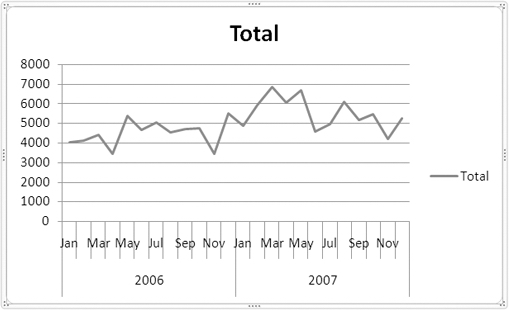
Figure 11-19. Pivot chart with Line chart type
The pivot chart contains the data you need for the sales manager, but it needs a few improvements before it's ready to send.
Creating Multiple Series
In the pivot chart, the two years are shown in a single line, with the dates stretching across the axis at the bottom. The legend shows a line for this series, with its name of Total. Instead of this layout, with a single series, you want each year shown as a separate line, and the legend should show an entry for each year. The Category Axis should show the months but not separated into years.
To create a series for each year, instead of a single series, you'll change the field layout in the PivotTable Field List pane. You want the years in the legend, so you'll move the Years field there.
- Select the pivot chart.
- In the PivotTable Field List pane, move the Years field from the Axis Fields area to the Legend Fields area.
This layout change creates two series, one for each year, and both show up in the legend. The category axis shows the 12 months, and the lines show the quantity of bars sold each month. However, when the 2006 series was created, it received the default formatting of a line with markers, so you'll change its formatting.
Formatting a Series
In the pivot chart, the 2006 series is formatted as a line with markers. You'll change it so its formatting is the same as the 2007 series. To format any element in the chart, you can select the element and then apply the formatting.
- Select the pivot chart.
- On the Ribbon, under the PivotChart Tools tab, click the Layout tab.
- In the Current Selection group, click the drop-down arrow to see a list of elements in the pivot chart (see Figure 11-20).
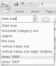
Figure 11-20. Chart Elements list on the Ribbon
Tip The Chart Elements list is also available on the Format tab of the Ribbon.
The Chart Elements list shows all the elements in the active chart, and you can click any element's name to select that element in the chart. Using this list is an easy way to select the elements and to ensure you're selecting the element you intended to select.
- In the Chart Elements list, click Series "2006."
Tip In the pivot chart, click an element, such as a line, or the legend to select it.
In the pivot chart, the line for the 2006 series is selected, and now you can format it.
- Just below the Chart Elements list, in the Current Selection group, click Format Selection.
The Format Data Series dialog box opens, with a list of formatting options for the selected data series. When you click an option in the list, the formatting options appear at the right. For example, you could click Line Style and change the line width and dash type. You want to remove the markers from the selected series, so you'll change the marker options.
- In the Format Data Series dialog box, click Marker Options.
- For Marker Type, click None, and then click Close (see Figure 11-21).

Figure 11-21. Marker Options command
In the pivot chart, the markers in the line for the 2006 series have been removed.
Adding a Chart Title
Currently, the pivot chart does not have a title, so you'll add one to explain the contents of the chart. In the previous chart, you applied a chart layout that included a chart title, but in this chart you don't want a package of chart formatting. You want to keep the formatting that already is applied and just add a chart title at the top of the chart.
Instead of using a chart layout, you'll use a different command from the Ribbon:
- Select the pivot chart.
- On the Ribbon, under the PivotChart Tools tab, click the Layout tab.
- In the Labels group, click Chart Title to see a list of options for the chart title (see Figure 11-22).
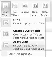
Figure 11-22. Chart Title options
If the chart had a title you wanted to remove, you could use the first option, None. Since you want to add a title, you'll use one of the other two options. The second option, Centered Overlay Title, adds a title at the top of the chart on top of whatever elements are already there. This option is ideal if there is plenty of blank space at the top of the chart and you can display the title there without blocking the other elements.
The third option, Above Chart, will make the chart area smaller and add the chart title in the newly created blank space above the chart area. This option is best if there are other elements at the top of the chart and you don't want to cover them. For your chart, this will be the best option, since the lines are near the top of the chart.
- Click Above Chart to add the default chart title.
- In the pivot chart's chart title, select the existing text, and type Bars -- Units Sold, and then click outside the chart title to complete it.
Changing the Pivot Chart Legend
You can also use the Ribbon commands to change the legend position. Currently the legend is at the right of the chart. If you move it to the top, there will be more space for the 12 months that are displayed on the category axis at the bottom of the chart.
- Select the pivot chart, and on the Ribbon, under the PivotChart Tools tab, click the Layout tab.
- In the Labels group, click Legend, and then click Show Legend at Top.
Tip You can click the legend to select it, point to the legend's border, and drag it to any position in the chart area.
Resizing a PivotChart
When you create a pivot chart, it is automatically sized. You can change the chart size by manually adjusting it or by setting an exact width and height. You'll make the pivot chart a bit smaller so it doesn't overlap the pivot table:
- Select the pivot chart.
- On the chart area border, point to one of the sizing handles.
- When the pointer changes to a double-headed arrow shape, press the left mouse button, and drag toward the center of the chart to make the chart area smaller (see Figure 11-23).
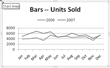
Figure 11-23. Manually resizing the pivot chart
Tip To make the pivot chart a specific height or width, enter a value in the Shape Height or Shape Width box in the Size group on the Ribbon's Format tab.
Moving a Pivot Chart
When you use the Ribbon command to insert a pivot chart, it is inserted in the center of the worksheet window. You can drag the pivot chart to a new location on a worksheet or cut it and paste it onto a different worksheet.
You can also use a command to move the chart to a different location. You'll use a command to move the pivot chart to its own chart sheet. This will make the chart larger, and it will be easier for the sales manager to see the details in the chart.
- Select the pivot chart.
- On the Ribbon, under the PivotChart Tools tab, click the Design tab.
- In the Location group, at the far right, click the Move Chart command.
Tip You can right-click the chart area of a pivot chart and choose Move Chart.
- In the Move Chart dialog box, click New Sheet, and type Chart_Years as the name for the new sheet.
- Click OK to move the pivot chart.
The pivot chart is moved to a new sheet, where there is more room to display all the elements without crowding.
Adding Data Labels to a Series
When you create a pivot chart, there are no labels on the data to show the values that the lines or bars represent. In some charts, you may want to add labels to some or all of the points on the line or to the columns or bars in the chart.
Before you send this chart to the sales manager, you'll add data labels to the lines. First you'll add data labels to all the points in both lines to see how that looks:
- Select the pivot chart, and on the Ribbon, under the PivotChart Tools tab, click the Layout tab.
- In the Labels group, click Data Labels.
- In the list of Data Label options, click Above to add a data label above each point in each of the lines.
Adding the data labels has cluttered the pivot chart, and where the lines overlap, it's hard to read the numbers and to tell which number belongs to which line (see Figure 11-24).
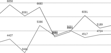
Figure 11-24. Overlapping data labels
Instead of having each point labeled, you want to label just the last point on each line. You'll remove the data labels and then label just the last points to show the final value for each year.
Tip To quickly add a label with the series name and value to the last point of each line, click the Design tab on the Ribbon, and in the Chart Layouts, click Layout 6. However, this layout will apply other formatting options in addition to the last point label. You could apply the layout first and then finish formatting the chart.
- Select the pivot chart, and on the Ribbon, under the PivotChart Tools tab, click the Layout tab.
- In the Labels group, click Data Labels.
- In the list of Data Label options, click None to remove the data labels.
- Click the 2007 line to select that series. Each point in the series will be selected and will show handles.
- Click the last point at the far right of the 2007 line. Now that point is the only one selected and is the only one that has handles (see Figure 11-25).
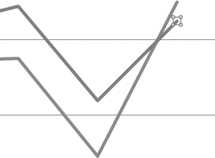
Figure 11-25. The last point on the line is selected.
- On the Ribbon's Layout tab, in the Labels group, click Data Labels.
- In the list of Data Label options, click Right to add a data label to the right of the selected data point.
- Select the last point on the 2006 line, and add a data label to its right.
Tip You can select each data label and format it with a font color that matches the data series line.
Adding a Trend Line
Next, you'll add a trend line to each year's line to see whether sales are going up or down over the year:
- Select the pivot chart, and click the 2006 line to select it.
- On the Ribbon, click the Layout tab.
- In the Analysis group, click Trendline, and then click Linear Trendline.
- Select the 2007 line, and add a trend line to it.
The trend line for 2006 rises slightly over the year, and the 2007 trend line is downward. The trend lines have also been added to the legend as Linear (2006) and Linear (2007). To make the trend lines stand out a bit more in the chart, you can make the lines thicker and format each with a different color:
- In the Chart Elements list on the Ribbon, select Series "2006" Trendline 1.
- On the Ribbon, click the Format tab, and in the Shape Styles group, click Shape Outline.
- Click Weight, and then click the 1.5-point line.
- Click Shape Outline again, and click a color for the trend line.
- Select the 2007 trend line, and format it with a thicker line and a different color (see Figure 11-26).

Figure 11-26. Trend lines added to the pivot chart
You send the updated chart to the sales manager for discussion at the sales meeting. Perhaps a plan can be devised to increase the bar sales in 2008.
Creating a Variable Chart Title
Soon after you send the chart, the sales manager calls to ask whether you can create a similar chart for each of the product types. Perhaps the other product types also have declining sales and should be discussed at the sales meeting.
Instead of creating separate charts, you'll show the sales manager how to select a different product type during the meeting. You'll change the chart title so it will show the name of the selected product type. To make the chart title variable, you'll create a formula on the pivot table worksheet, and then you'll link the chart title to that cell.
- On the Pivot_Years worksheet, select cell F1. You'll use this cell to create a formula that shows the name of the selected product type and the rest of the text for the chart title.
- Type an equal sign, and then click cell B1, which contains the product type name.
- Type the rest of the formula, which is & " -- Units Sold", as shown in Figure 11-27.
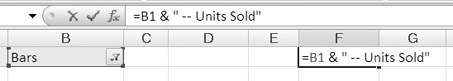
Figure 11-27. Formula for variable chart title
- Press the Enter key to complete the formula, and activate the Chart_Years sheet.
- In the pivot chart, select the chart title.
- Type an equal sign, then activate the Pivot_Years sheet, and finally click cell F1, which contains the formula.
- Press the Enter key to complete the link in the chart title.
The chart title will remain the same, because Bars is still selected as the product type. The title will change when a different product type is selected.
- To select a different product type, click the Report Filter drop-down on the PivotChart Filter Pane, and click Cookies.
The chart title changes to show that Cookies is the selected product type, and the lines show the monthly quantities of cookies sold. During the meeting the sales manager will be able to select any product type from the PivotChart Filter Pane and lead a discussion on that product type's sales results.
Instead of creating four separate charts, one for each product type, you were able to create a dynamic chart that can be changed with the click of the mouse during the meeting. It will be easier for the sales manager to work with one chart, instead of several, and you saved considerable time in preparation.
Exploring Other Pivot Chart Features
When you select a pivot chart, four tabs with pivot chart commands are available on the Ribbon on the PivotChart Tools tab. In the examples in this chapter you used some of these commands to format and design the pivot charts, and many others are left for you to explore on your own.
When you create a pivot table, experiment with the options and features that are available, and see what works best to enhance your pivot charts. For example:
- On the Layout tab, use the Data Table command to show the values that are represented in the chart in a table format. This works best if there are very few values and the table is not too crowded to be legible.
- On the Format tab, use the Shape Styles and WordArt Styles to add color, effects, and font formatting to the pivot chart. You can use these features in moderation to highlight a specific part of the pivot chart or add an eye-catching brief comment.
- On the Layout tab, use the Axes and Gridlines commands to change the appearance of these elements. You can make the grid lines a lighter color so they are less intrusive on the chart, or you can format the text and numbers on the axes to use the space effectively.
Try to keep the chart's message clear, though, and not buried under a load of unnecessary formatting and frills.
Summary
In this chapter, you created pivot charts to illustrate the data in a pivot table. This can make the data easier to understand and provides a visual comparison of the data.
First, you created a default pivot chart by pressing the F11 key. Then, you used the Chart Styles gallery and the Chart Layout gallery options to change the appearance of the pivot chart. You changed the chart type to show related items in a single column, instead of multiple columns. After making the changes, you viewed the pivot table to see that the pivot chart changes had also affected the pivot table on which it was based.
You also created a pivot chart by using the Ribbon commands and modified it to show multiple series, instead of a single series. You formatted the series to remove the markers and added a chart title. You moved the chart legend and then resized and moved the pivot chart. You added data labels to show the numeric value of the last points in each of the series lines and added trend lines to show whether sales were increasing or decreasing over each year.
Finally, you entered a formula on the worksheet and linked the chart title to that cell. This created a dynamic chart title, which will change when the chart filter is changed. With these tools, you have a powerful tool for data analysis that can be changed with one click of the mouse.