Lynne Truss
In the days of traditional work and fixed office routines, how you dressed was all important. Today, in the age of flexible working and mobile communication, the way you write your email has taken over as the ‘textual dress code’ of the twenty-first century. This chapter covers the fourth element of crafting excellent emails and includes:
- Guidelines on writing the content/body to convey the right message, right first time to reduce the rounds of email ping-pong.
- Bridging the gender gap to improve relationships.
- Guidelines on fonts to use for email that can be read regardless of device and visual impairment.
- Timesaving software functions to help you write an email, such as text templates.
Why should an email be as perfect as a letter?
In addition to the fact that email creates a picture of you in the mind of the reader, there are two other reasons why well crafted content is critical:
- Professional business brand and personal images can take years, if not generations, to build, yet can be destroyed in a nanosecond by a sloppy, ill-thought-out email. Take the one sent at 14.45 on 9 September from Jo Moore (a civil servant) to Stephen Byers, the then Transport Minister. She said that ‘Today (9/11) would be a good time to “bury” some controversial stories.’ Both their personal reputations were damaged and Ms Moore was moved sideways. Dealing with email media disasters like these costs time and often money as a damage limitation campaign must be launched. For more email disasters, see www.brilliant-email.com.
- Emails can be used as legal evidence in court. This aspect of email is dealt with in Chapter 17.
The ‘Three Cs’ of a good email
If you can’t explain it simply, you don’t understand it well enough.
Albert Einstein
How often have you lost time reading and re-reading an email but still could not understand what it is saying, let alone what is being asked of you? Often this confusion of meaning is caused by one-word responses, as in this example:
![]()
Frank is responding to a revised quotation sent by Clare.
To: Clare Mann
From: Frank Brown
Subject: Budget for project management workshop
Hi Clare
Regards Frank
What does OK mean? ‘OK, Frank has accepted Clare’s quotation’; ‘OK, Frank will discuss it with his manager’? Or simply, ‘OK thanks, Clare, I will get back to you’?
Then there are those long, densely packed emails that often spread to at least three quarters of a page. In my own case, both these types of emails are usually parked in a pending folder until I find time to try to sort out just what is happening (usually by phone).
Emails that are easy to comprehend generally follow the ‘Three Cs’ rule. They are:
- Concise – tell you up-front the essential information you need to make a decision.
- Crisp – use simple words conveying exactly what is intended and make sense.
- Clear – are well laid out to make them easy to read (on any size screen).
Making emails easy to read
Look at the emails you have received today and pick one which was quick and easy to read and one which was hard. Compare them and pick out the features which made them easy versus hard. Use the template in Table 13.1.
| Easy to read – aspects | Hard to read – aspects |
|---|---|
How well does your list compare with the ‘Three Cs’ rules?
The ‘Three C’s’ of writing emails will help you gain and maintain the reader’s attention and respect. They are a way of ensuring an email is easy to read, regardless of the device being used, any visual impairment and command of the English language. In today’s global business world it is also critical to make sure your message can be understood by those whose mother tongue may not be English. Words can often be easily misinterpreted and cause problems. Moreover, and perhaps not surprisingly, there are often gaps between the way men and women word and interpret emails.
To help you bridge these gaps and improve the probability of conveying the right message first time, in the following section we provide guidelines on:
- wording
- layout
- fonts and colour
- bridging the gender gap.
These will help you apply the ‘Three Cs’ and be an even more effective email communicator.
Wording
What happens when it (punctuation) isn’t used. Well if punctuation is the stitching of language, language comes apart, and obviously all the buttons fall off. If punctuation provides the traffic signals, words bang into each other and everyone ends up in Minehead.
Lynne Truss from Eats Shoots and Leaves
Email’s lack of surrounding contextual information means ‘KISS’ in all its forms for email is vital – Keep It Short and Simple. Keep It Simple, Stupid. Keep it Simple and Straightforward.
Based on my work with clients and some of the best emails I have received, here are some guidelines about wording of emails to help you save time.
![]()
Do
- Write in grammatically correct English sentences.
- Punctuate correctly (for example, distinguish between ‘its’ and ‘it’s’).
- Use words that most people will understand.
- Use industry-specific terminology as appropriate.
- Spell check before sending but be careful that the meanings of words are not changed (for example, ‘inconvenience’ to ‘incontinence’, ‘public’ to ‘pubic’).
- Add unusual words to the dictionary to ensure they are correctly spelt in future.
- Add accents as appropriate.
Don’t use
- Jargon and slang, as both can easily be misunderstood.
- Text-speak and emoticons.
- Words that might be regarded as racist, defamatory and discriminatory.
- Copyright material, unless you have permission.
One client has a handbook of preferred phrases and words, which includes those to be avoided as they may be problematic if used in a court of law.
Layout
After picking the right words, how you lay them out is the next most important aspect of a good email. Have you ever wondered why some emails look like alphabet spaghetti when you open them? Fancy formatting and fonts are often lost in transmission, especially if the sender and recipient are using different email software systems. Also, if one party is using a handheld email device, much of the formatting can be lost.

Break up and space out the content of an email.
Save time as a sender and help preserve the impact of your content by minimising the time spent formatting emails (as in italics, fancy bullet points and colour). Instead, maximise the use of white space between different points.
Here are seven simple ways to enhance your message by adding visual impact. This will create synergy with the words you have used rather than distract from them. After all, there is not much point in spending time carefully phrasing the content if the finished article is hard to read, either because the original layout was poor or it has been lost in transmission.
Top seven tips for laying out an email to enhance the impact of the words
- Use the top-down newspaper approach – start with the headline and then add any supporting information.
- Structure the content just as you would a letter.
- Number and separate each key point/section with white space (i.e. a blank line).
- Use plain text rather than HTML and rich text, as not all email software translates and renders HTML properly.
- Avoid capitals (they look like you are shouting) and italics (they are hard to read).
- Limit the content to half a page (any more and it suggests you need a properly formatted document sent as an attachment).
- Keep to one topic per email – don’t slip in an extra topic at the end of the email. This is highly likely to be missed.
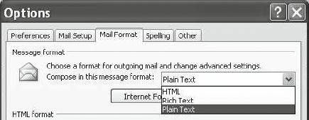
Most email software allows you to select what format you use for your emails. In Outlook go to ‘Tools/Options’ and select the ‘Mail Format’ tab (Figure 13.1). Then select ‘Plain text’ from the ‘Message format’ drop down menu.
Fonts and colour
Many organisations have set standards based on their branding. For those who have the choice and want some guidelines on how to make your email look professional and legible on most devices and to most people, here are some suggestions. Use:
- sans serif fonts, which are easy to read onscreen, such as Arial, Verdana or Courier
- font size of between 10 and 12pt
- black or blue for the text. They are generally regarded as the easiest colours to read and are neutral in the image they create
- consistent colour and font throughout, including the signature block.
The options above also reduce the email’s size, hence storage space, and the amount of paper and toner consumed if your email needs printing – all of which helps the green economy.
Catering for visual impairment
Through my Times Crème ‘PC Stress Busters’ column, I acquired an email penfriend, the late Bishop Richard Hare, whose sight was failing him. He wrote the most eloquent and informative emails. We emailed for nearly five years about everything from families to politics. I used a large font – minimum 16pt to make it easy for him to read. Richard was very IT-literate and knew how to enlarge the font if I forgot. Others may not be so IT capable.
If you are emailing someone who is visually impaired, here are four ways to help them. These are based on emailing Richard and working with Wessex Disability and guidance from their CEO Nikki Haswell.
- Never assume what font or format the visually impaired recipient will need: ask each one because there are a great number of different kinds of visual impairment that affects what they can see.
- If you are sending documents as attachments, check in which format to send it. This is because screen reader software does not always work properly (for example) with a pdf but does with Word.
- Keep messages concise and to the point. It takes longer for a screen reader to read out the text of a message than it would for a sighted person to scan an email, and reading magnified text is also slower.
- Remember that highlighting words in a different colour or bold will not work for someone using screen reader software.
Bridging the gender gap
Is there a noticeable difference between the way men and women use email?
Take an email from a male and a female colleague and compare using the template below.
Table 13.2 Differences in men and women’s email
| Criterion | Male colleague’s email | Female colleague’s email |
|---|---|---|
| Greeting | ||
| Tone | ||
| Focus | ||
| Sign-off | ||
| Others |
Did it strike you that there were differences? How well do these variations mirror the differences between how your male and female colleagues behave and communicate in general?
Not surprisingly, research, including my own, has shown that the differences between how men and women operate in business (and socially) carries over into how they communicate. For an in-depth review see Gender and Communication at Work edited by Mary Barrett and Marilyn Davidson. Drawing on earlier work in Managing in the Email Office by Monica Seeley and Gerard Hargreaves, here is a summary of some of the common difference in email communications.
Table 13.3 Summary of common differences in emails
| Criterion | Men and email | Women and email |
|---|---|---|
| Deleting | Often | Hoarders, keeping too much ‘just in case’ |
| Subject line | Limited | More accurate |
| Salutation | Often none | Nearly always included |
| Tone | Terse | Flowery |
| Content | Shorter, crisper and to the point | Rambling and often flowery |
| Gossip | Often – the main culprits of email media disasters | Rarely |
| Imagery | Rarely included, but occasional text-speak emoticons | Often use stationery and smileys |
| Sign-off | Professional, bland but can be terse | Flowery, often use colour and fancy fonts |
Do you recognise yourself?
To benchmark whether your emails are from Mars or Venus go to www.brilliant-email.com and use the ‘Email Clarity’ checklist.
Here are the top five tips to bridge the gender gap and make sure you continue to convey the ‘right message right first time’.
Table 13.4 Bridge the gender gap
| Men should | Women should |
|---|---|
| Vary opening and closing to reflect the status quo and level of the business relationship | Vary opening and closing to reflect the status quo and level of the business relationship |
| Omit the text-speak | Use a plain black font throughout and forget the stationery and smileys |
| Add feelings | Shorten emails and focus on the task in hand |
| Stop gossiping online about your sex life | Hit ‘Delete’ more often |
![]()
One female client who felt she had quite an abrupt manner often sent her emails to a colleague to check for tone and textual imagery before sending them to the client. She felt this significantly improved how her emails were received and hence their impact on the business relationship.
Software functions to help you save time
Do you ever need to re-send the same email content to different people at different times? For example, when responding to job applicants, confirming arrangements for a meeting, thanking people for a contribution to an article/book?

Creating templates of re-usable text is a great timesaver when you need to send a similar email to multiple people at different times.
There are a number of ways to create templates of text:
- Copy and paste the text from a previous email.
- Use the signature block in Outlook 2003 and Entourage.
- Quick Parts in Outlook 2007.
![]()
- Adopt the ‘Three Cs’ rules for writing – Concise, Crisp and Clear.
- Structure the content and separate out key information.
- Before hitting ‘Send’, check that your emails are all ‘PEARLS’, crafted to save time and contribute positively to the business relationship:
P PROPERLY laid out E Written in plain grammatically correct ENGLISH A Have an ACCURATE subject line R RELATE to business L LESS than half a screen in length S About a SINGLE topic - Use a plain black 10 or 12pt font consistently throughout the email.
- Increase the font size only when sending to those who are visually impaired.
- Develop a style guide for your business if one doesn’t already exist.
- Use software functions to help save you time.