
 Note “And now for something completely different.” (Monty Python)
No doubt you’ve heard Windows 8 introduced as “Windows reimagined,” and you simply cannot argue with how huge the paradigm shift is between Windows 8 and any previous iteration of Windows.
I remember well the first time I used Windows 8 and tried to grasp the concepts around using the edges and corners of the screen, discerning the desktop from the new UI, searching within an app from the Charms bar, and even just restarting the system!
The departure from an old paradigm is evident from the very first screen. Figure 1-1 shows what a user sees when logging in to Windows 8.
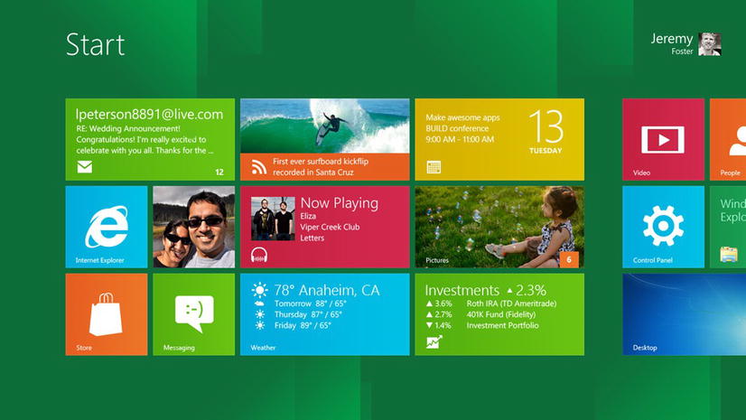
Figure 1-1. The start screen in Windows 8
Compare this to Figure 1-2, which is what we saw just after logging in to Windows 7.
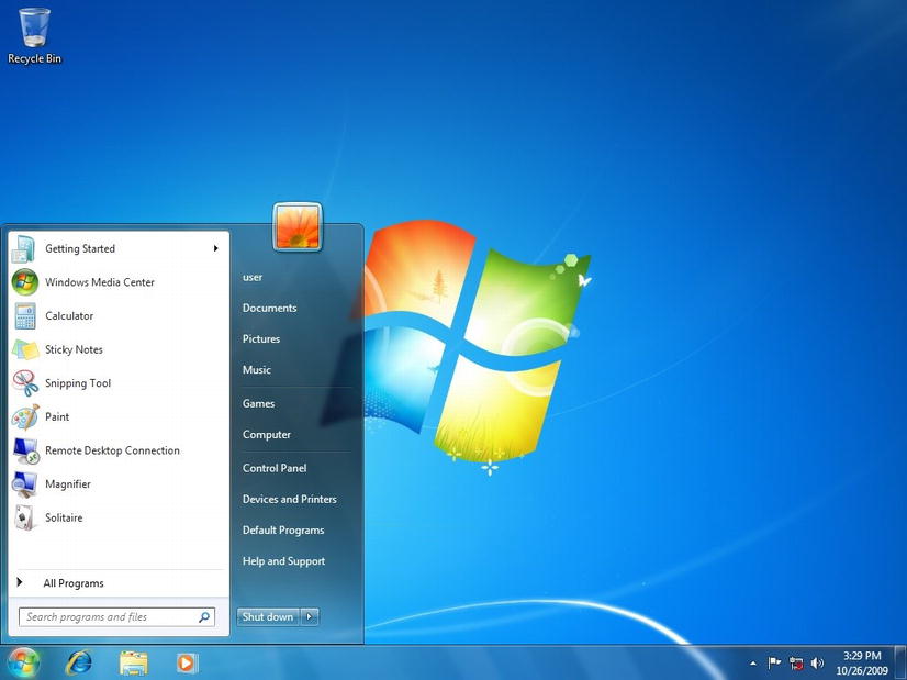
Figure 1-2. The desktop in Windows 7 showing the start menu
The start screen replaces the start menu. Eye tracking studies have proved that once a user has opened the start menu in Windows 7, an overwhelming majority of them did not look anywhere else on the screen. The concept of a full screen being dedicated to the start experience then makes perfect sense. Think of the start screen as an app and see how Windows has created an immersive start experience.
In fact, of all the changes introduced by Windows 8, I think the most relevant to us as app designers is this immersion of the user into their task and into their content. Windows 8 dedicates every pixel of the screen to your app, and your app stands alone on stage to be tried and judged by the user.
You don’t have to go far to find a good example of an app with an immersive experience. The built-in Maps app in Figure 1-3 is an excellent one.
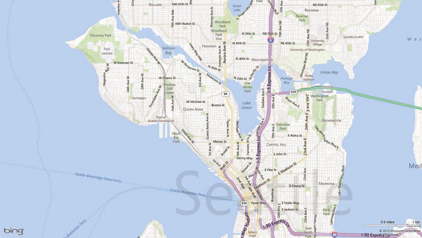
Figure 1-3. The Maps app demonstrates well how immersive Windows 8 apps are. Absolutely every pixel on the screen is dedicated to the app
With Windows 8, Microsoft delivers us not just a good design, but a good design framework. Microsoft is delivering not only an app development language, but a design language as well. This design language is very thoroughly documented and forms a foundation for your app’s design.
The design language for Windows 8 is documented at http://design.windows.com. This subsection of MSDN’s robust developer site focuses on the entire design process that a great app demands. This includes advice on things like:
- Scoping your app and helping you decide what your app will be great at
- The monetization strategy for your app
- The recommended size of the left margin
- The placement of commands in the app bar
Designing your app precludes your choice of UI language. You can implement good design using Microsoft’s XAML language just as well, but we’re going to be using HTML and CSS. We’re going to design first and then implement that good design. Some of the design principles might seem a bit esoteric at first, but it’s important to see what they offer for guidance. Don’t worry because we’ll get much more concrete near the end of the chapter when we learn how to implement our good design.
We’ll explore good Windows 8 app design by looking at some traits of a well-designed app.
Traits of Great Windows 8 App Design
Some characteristics of a well-designed Windows 8 app are enumerated in the design.windows.com site at http://msdn.microsoft.com/en-us/library/windows/apps/hh464920.aspx. In this chapter, I will step through each of these traits exactly as they are presented on Microsoft’s site and unpack them each with my own perspective and experience.
If there is one concept you take away from a chapter on Windows 8 design, may it be this: Windows 8 design is all about immersing the user in their content.
What is content? An app’s content is the reason a user launched the app. For a financial app, the content is the stock price or a financial article. For a social app, the content is the friend or the conversation. For a photo app, the content is the photos.
Instead of wrapping content with ancillary information about the content, Windows 8 pretty much just shows the content. When you’re looking at a photo, you’ll usually just see a photo stretched from one edge of the screen to another, and when you’re looking at a friend’s profile on a social network, you’ll see a view dedicated to the essence of information about that friend.
This is not the next step in the evolution of user interface. This is a departure from the current trend, which has been to cram everything into one screen so that everything is a single click away. It’s not uncommon to find 25% or even less of a view’s design surface dedicated to the content itself. The trend’s flaw, however, is that when too much is added to a view, then none of it serves its purpose of making life easier for the user because the individual parts lose their significance and the whole of the parts loses the user.
Everything on the screen that is not content is chrome. Chrome is a term from the automobile industry where polished metal parts are added to attract buyers even though they play no role in the vehicles function. There’s nothing wrong with a mere aesthetic, but the problem with chrome in an app is that it detracts from the app by distracting the user from their content.
The Windows 8 design principles attempt to put content before chrome. It’s not that chrome will never exist, but an app designer should be careful to introduce it. Your app should always prioritize content and eliminate distractions. Notice in Figure 1-4 how the Xbox Music app in Windows 8 shows only content from edge to edge.
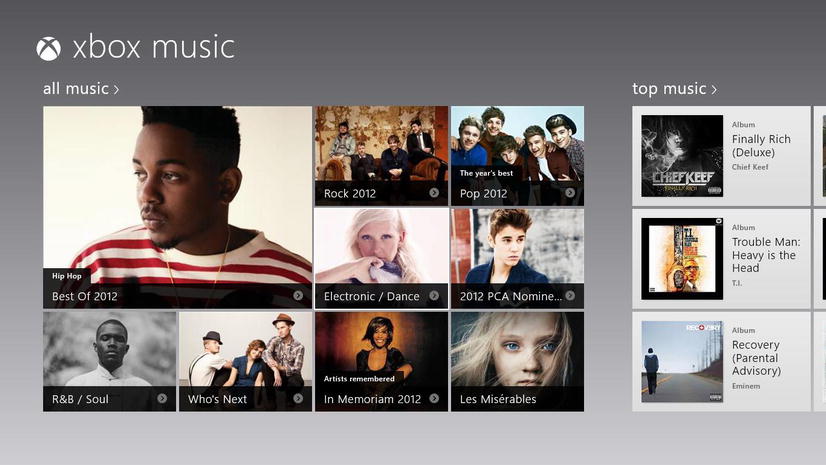
Figure 1-4. Windows 8 apps dedicate 100% of the space to content
There are three classic reasons that chrome is added to a view: navigation, interactions, and layout. These play a significant role in an app’s usability, however, so we must replace them—not remove them. Let’s take a look at how the function of each of these types of chrome is facilitated without distracting from the content.
Navigation
Static navigation is guilty of creating a lot of chrome. We’re all familiar with the standard website model containing a header at the top of the page with navigation links just below or along the left side of the page.
In an effort to avert the click, many go so far as to fill in the navigation menu with multiple levels of hover-activated popout menus or even include a tree view of the entire site’s structure. Tabs are another popular, modern form of static navigation.
The problem with static navigation is that it doesn’t fall in line with our app’s primary purpose which is to deliver the user’s content. Static navigation is information about where a user might want to go next, but it tells the user nothing about where they are, therefore it’s not a recommended practice in a Windows 8 app. How do we facilitate navigation then? We do so by designing our app with a clear information hierarchy that naturally directs the user to subordinate or subsequent content.
There are two primary recommended navigation models for Windows 8 apps. I’ll cover each briefly, but read more at http://msdn.microsoft.com/en-us/library/windows/apps/hh761500.aspx#hierarchical_system.
The first model is the three-tier, hierarchical navigation model. In this model, all site content exists in three tiers—the hub, the section, and the detail. This navigation model is just the right number of levels for a content-driven app. Any fewer and an app would not be able to categorize, and thus facilitate, navigation for all of its content. Any more and users tend to get disoriented and lose their place.
Hub
The hub is the entry point to an app and serves as an overview of the entire app. A hub can’t show all content in the app, of course, but it can show just enough of each section to interest the user. A shopping app, for instance, wouldn’t show all products from a category, but might instead show the first few featured products and invite the user in to see more.
Section
If the user chooses the header of one of the hub’s sections, they will be taken to the section page. The section page is responsible for relaying any general information about the section as well as giving the user access to all of the individual items or entities that fall under that section. To use the cliché products and categories example again, the tools section would be responsible for getting the user to all available tools. That doesn’t necessarily mean that all tools show up immediately on the section page. Often times filter and sort functionality makes the user’s life easier.
Detail
After the user has reached an individual entity in the app, such as a specific product, they are brought to the detail page. The detail page is responsible for presenting all of the information about that specific entity. A detail page might contain a photo, a description, some related entities, a list of categories, or who knows what else. The bottom line is that the detail page is the dedicated place for informing the user about an entity.
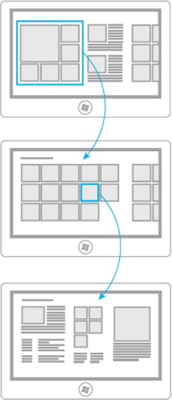
Figure 1-5. A diagram of the three-tier navigation model showing the hub, section, and detail tiers
Flat navigation
Content-driven apps work well in a three-tier navigation structure, but some apps don’t really have a content structure. Some apps are just a collection of similar views—all peers to one another. Internet Explorer is a great example and it follows the flat navigation pattern, because the browser instances in a session don’t relate hierarchically to each other.
In an app that implements flat navigation, the upper app bar (which is conventionally used for navigation) provides access to these peer pages as seen in Figure 1-6.
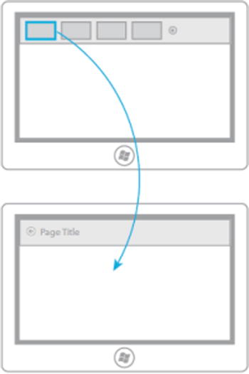
Figure 1-6. A diagram of the flat navigation model
The second common reason that chrome is added to a page is for interactions. Interactions are things like buttons that give the user a chance to interact with the app.
Giving your user an opportunity to interact with your app is certainly a good idea, but traditional controls on the design surface are not necessarily the best way to provide that interaction. Crowding the design surface with controls that the user may or may not even need is secondary to immersing the user while still giving them an opportunity to call up some interactions when and if they need to.
On-screen content can often speak for itself and a user will know or learn quickly how to interact with it. A user (even a young child) will often be able to intuit that touching some bit of content will bring you more information about it. Likewise, you don’t need to repeat other commands to affect the content on screen, but can instead allow the user to select one or more items and then select a command from the app bar. Putting commands in the app bar puts the user in control because the app bar doesn’t take any space at all until the user elects for it to.
We want to design our Windows 8 apps so that the content commands for itself. Usually, that simply means that content is clickable. You can see an example of content commanding for itself in Figure 1-7.
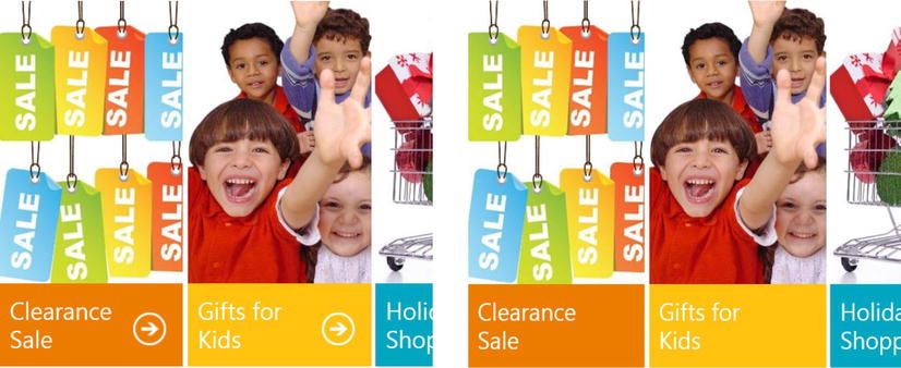
Figure 1-7. Extra command buttons for seeing more information about content items is often unnecessary. It’s better to let users interact directly with content
Sometimes commands can’t be represented directly by the content, and in that case we are advised to leverage the edge. This means that some of the commands which would otherwise be cluttering our design surface can be relegated to the system-wide Charms bar or to the lower or upper app bar. It’s called leveraging the edge because these bars are “hiding” off the edge of the screen precisely until the user calls upon them. Here we are putting the user in control again.
Figure 1-8 shows an app with its app bar visible. This app bar is called up by the user by a swipe gesture from off screen, by right clicking the mouse, or by pressing WIN + Z on the keyboard. This bar is the home for commands that belong to the app. More specifically, it is where you put the commands that affect the view the user currently has in context.
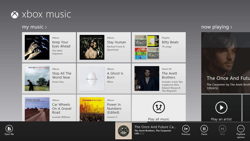
Figure 1-8. The app bar is always ready to bring app-level commands to the user, but it’s not there until the user actually requests it
Figure 1-9 shows an app with the Charms bar visible. This bar is called in by the user by a swipe gesture from off screen right, by hitting the top-right or lower-right corner of the screen with the mouse, or by pressing WIN + C on the keyboard. The Charms bar is not something that we as developers actually change. It is baked in by Windows. We are able to implement certain code contracts in our apps however, so that our app will respond to the user activating the charms. For instance, our app can be enabled to share, search, share to a device, and provide application settings.
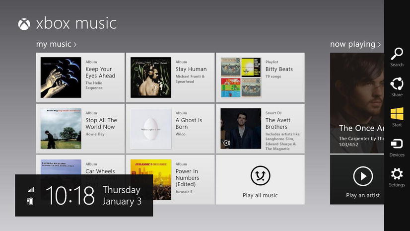
Figure 1-9. The Charms bar brings system-level commands to every app in a predictable way
Commands on the app bar are specific to a given app and it’s nice that they’re in a consistent location, because users that have spent any time at all with Windows 8 will know exactly where to find them. Users will quickly get used to the workflow of searching and sharing and will be glad to have the same workflow in every app.
Keep in mind that if a command is a part of an essential workflow, then it should not be hidden from the user, but should instead be placed on the design surface. The start and stop buttons for a stopwatch app are a good example of this. Hiding those buttons would make no sense at all and in fact an argument could be made that these commands are actually themselves the app’s content.
Finally, apps get cluttered by chrome that serves merely to separate content. We’re talking about lines and boxes and dividers. Actually, in most cases layout chrome tends to disappear when navigation and interaction chrome does, because layout chrome is often separating content from navigation or content from interactions more than content from content.
Because we’re starting with the entire screen as the canvas for our app, instead of drawing lines and boxes, we can spend the space on just space—empty space as shown in Figure 1-10. In Windows 8, we’re not afraid to put breathing room between things.

Figure 1-10. Windows 8 is not afraid to use significant amounts of space as breathing room for your content
We also create good layout with good typography. The typography in Windows 8 has meaning and purpose. The standard font and standard font sizes give us a type ramp for representing hierarchical relationships between elements on the screen and naturally separating them by their role or significance as shown in Figure 1-11.
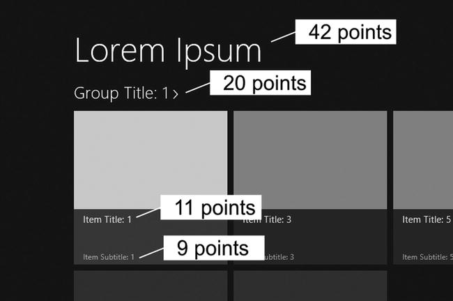
Figure 1-11. The type ramp conveys the significance and hierarchy of type
Your app should also implement what’s called the Windows 8 design silhouette. The design silhouette is the standard margins, header placement, content padding, type faces, and type sizes that give users a strong familiarity, as shown in Figure 1-12. This consistency should be coupled with unique design style that gives your app not only familiarity but also its own personality.
Figure 1-12. Standard margins and header placement give Windows 8 users some consistency
Be Fast and Fluid
Windows 8 apps should always operate in a fast and fluid way. A fast and fluid app responds immediately, flows nicely, and uses purposeful animations and sharp, clean graphics.
Part of a great user experience is a user feeling like they are directly interacting with information instead of with a system that is relaying that information. Touching content and dragging it around in real time is a great user experience, but only if the content precisely follows the user’s finger instead of jittering, lagging, or falling behind.
For the most part, Windows 8 apps that you create will be fast and fluid even if you don’t think about it. This is because a lot of the built-in controls and functions are designed with this in mind, and it’s also because the Windows API—the Windows Runtime or WinRT—provides asynchronous calls only for any method that might take too long (and too long in this case is defined as 50 ms).
Sometimes, however, you as the developer will be in direct charge of the performance of elements moving around on the screen and interacting with the user. Whenever this is the case, you should make certain that the performance would be considered fast and fluid.
Animations also do a great deal toward making a user feel like he’s interacting with an organic system. We’ll talk in much more depth about animations in Chapter 6.
Snap and Scale Beautifully
Windows 8 is not bound to fixed hardware. There are hundreds of PC models and many form factors that will be happy to run Windows 8 and your app. Consequently, your app should be adaptable and you should intentionally consider the appearance of every page in every possible view state.
The typical Windows 8 view states that you’ll be dealing with are:
- Fullscreen landscape: the entire screen, which is more wide than tall
- Fullscreen portrait: the entire screen, which is more tall than wide
- Snapped: just the left (or right), and is 320 pixels of landscape
- Fill: remaining space when another app is snapped
You don’t have to support portrait view, but you must support snapped and fill views. Your user will be able to snap your app or snap an app next to yours whether you like it or not. Even if your app makes it through certification without intentionally handling these states, it will be embarrassing when your users discover it.
Use the Right Contracts
One of the main reasons we put operating systems on our computers is to abstract away all of the menial tasks that we want to work in a consistent way without our having to recreate them for each app. Printer drivers didn’t used to exist, so instead each app had to be programmed to talk to any printer that might possibly be in use. Arduous is a suitable word for this task.
One modern-day norm that is a candidate for abstraction is social networking, or to be even more general—sharing. Windows 8 abstracts the concept of sharing away from our apps and wraps it in what’s called a contract that you as a developer can implement. A contract, in case you’re not familiar, is simply a pattern that is followed in your code that fulfills what Windows is expecting to find when it attempts to ask your app to share or search or whatever. Implementing a contract in your code is not a difficult endeavor. The tremendous advantage of this is that as long as your app is capable of sharing and correctly implements the contract and then it is suddenly capable of sharing with every app that participates in the same contract. It’s even capable of sharing with apps that didn’t exist until after you put yours into the Store!
Searching is another popular and often used contract. With the right contract implementation (again a rather simple task), your app can be searched by a user even before they’ve launched your app, and you get to determine what happens when your app is searched and how to bring about search results.
There are plenty for Windows 8 contracts and I recommend adding any to your app that can add real value.
Invest in a Great Tile
Live tiles are Start screen tiles that are updated with new information or imagery. Live tiles are effective because they’re informational. I find myself getting all the information I need sometimes with only a quick glance at my start screen. I can see the weather for the day, my next appointment, and the headline news without launching any apps at all.
Keep in mind that the tile for your app not only informs the user, but it also invites them into your app. You want your user to use your app and use it often, and you can promote that usage by investing in the quality and functionality of your live tile.
There’s little reason not to put in the miniscule time required to create rich tile support. Making a wide version of your tile is excellent and allows a user to make your app more prominent on their start screen. If you make a wide tile, it’s recommended that you give it live tile functionality. A double wide that does nothing at all is a bit disappointing.
Feel Connected and Alive
One of the design goals of a Windows 8 app should be to help users feel less like they’re interacting with a device and more like they’re interacting directly with their information.
Many of the principles we’ve talked about so far help to achieve this, but one especially critical way to keep users connected and give their information a sense of vitality is to actually interrupt whatever they’re doing with an onscreen notification and audio prompt. After all, live tiles are informative, but more of a user’s time will be spent working in an app than staring at their start screen. For notifications that the user deems significant, they’ll expect to be interrupted from whatever they happen to be doing at the time.
Make a user feel like their device is alive by notifying them when they receive a call or instant message, when they are outbid in an online auction, and certainly when their lottery ticket is drawn.
Roam to the Cloud
Roaming to the cloud is a catchy, modern phrase that simply means that we save certain information to an internet-hosted location instead of to the device. That way when the user reloads the operating system on his device or logs in to another one, the settings and preferences they’ve elected in the past are seamlessly available.
The great thing about roaming in Windows 8 is that it’s extremely easy for the developer. All that’s required is that you save settings through the roaming storage API that Windows provides. The setting is actually stored locally, but Windows is responsible for synchronizing all of those settings with the user’s Microsoft account (not to their SkyDrive). Listing 1-1 shows an example setting saved to roaming storage just to show you how easy it really is.
Listing 1-1. The user’s favorite color being saved to a roaming setting so it will be available on any device
//JavaScript snippet
var appData = Windows.Storage.ApplicationData.current;
appData.roamingSettings.values["favoriteColor"] = "blue";
Consider roaming not only your user’s data, but also their tasks. If a user is in the middle of something, help them to pick it back up when they continue on a different computer. If you’ve used the Netflix app that’s already in the Windows Store, you may have noticed that it saves the timestamp that represents where you are in the movie you’re watching and restores it when you return even if you return to a different device. Users love that and you should look for applications of the principle in your own app.
Follow the Design Principles
We’ve looked at a number of traits of well-designed Windows 8 apps, and we have one more. The final trait is that an app should follow the Windows design principles. I’ll enumerate and explain the design principles next. These principles are a bit less pragmatic and seemingly more esoteric than the traits we’ve been looking at, but I would caution you not to overlook them. Understanding and following these general principles will guide you in designing your app even when you’re not starting with a project template.
The Windows 8 design principles are fully documented and more extensively explained on MSDN at http://msdn.microsoft.com/en-us/library/windows/apps/hh464920.aspx#traits_8_embrace_metro. They are simple, high-level, guiding principles. They are values that Windows 8 apps should respect for the purpose of making apps that do their job and delight the user.
According to Microsoft, the principles are:
- Show pride in craftsmanship
- Do more with less
- Be fast and fluid
- Be authentically digital
- Win as one
The principle that an app designer/developer should show pride in craftsmanship certainly illustrates how general these principles are. It means that you should never avoid spending the extra time it takes to get the details right. You should worry about just how the animation behaves and just how the colors match. You should concern yourself with the exact size of the left margin and the user’s experience in the edge cases.
Let me put some teeth to this principle with an illustration that I run into unfortunately often. Tell me if you can see anything wrong with the view in Figure 1-13.
Figure 1-13. A typical grid layout but with one subtle design flaw
I hope you noticed that the list items in the left most group of tiles are almost but not quite in alignment. Even if your user doesn’t consciously notice something so apparently trivial, they will notice it subconsciously and it will be a detractor.
To do more with less means that you break the modern trajectory of adding so much stuff to the screen that none of it even serves its purpose.
The word to keep in mind when you’re designing the usage flow that your user will follow is essence. Ask yourself if you’re presenting the essence of the information and giving the user the essential commands. Information and commanding that is not essential will be not only superfluous but worse yet it will be distracting.
Remember, just like Windows itself, you’re not trying to be ultimately discoverable. It’s far better to be ultimately immersive.
This principle will sound familiar because it’s a repeat from the design traits, which speaks to the significance of the concept. The feeling a user gets when he uses an app that he would describe as “fast and fluid” is one of those things that’s hard to describe, but you know it when you see it.
Don’t be afraid to spend some money on professional design help that has experience not just with static graphics, but with dynamic screens and user experience.
I believe that more philosophy than science goes into app building. If you zoom out of the last 30 years and look at the mass adoption of computing, it’s quite clear that developers are still trying to figure out good architecture and usability.
We held on to the paradigms that we knew and dragged them into our digital systems all the while grimacing at their ill fit. Perhaps only now we’re learning that digital systems have their own rules, and that often those rules are more liberating than those of our analog world, and that users can come to learn and even love the digital world.
As we build our apps, we take advantage of the full extent of the digital systems we have and we avoid app design that accepts constraints of the analog world that are irrelevant in the digital world. We are, after all, working with pixels on a screen—an essential truth to be embraced.
Users don’t use apps; they complete tasks. Sometimes those tasks involve a single app, but very often they involve an orchestration of apps. Imagine for a minute the following scenario.
Your app helps users make reservations at restaurants. Your user may use your app on its own, but more likely your user will:
- Step onto an escalator at the airport
- Check their trip management app to find their hotel’s location
- Check for restaurants in the hotel’s vicinity
- Pick a restaurant based on user reviews
- Make a reservation at the restaurant (using your app!)
- Send the reservation confirmation to a colleague and then step off the escalator
That user is a delighted user. He has not just used an app; he has accomplished something significant in very little time. All during the escalator ride, the complimentary and informative animations were important, all of the thought that went into the UX of each app was very important, and the app-to-app sharing was crucial.
To make a successful Windows 8 app, you have to think about the user. Part of that is making sure your app will work well with other apps and devices to complete entire usage scenarios.
Another aspect of this design principle is taking advantage of established conventions, standards, and recommendations. By doing so, you’ll be taking advantage of what users have already learned about Windows 8 apps. They’ll feel secure and familiar in your app.
We’ve looked at a number of design traits and principles that will hopefully help you when you’re going through the process of designing an app. Let’s walk through a fictional app design right now.
Design Scenario
In my opinion, there’s just one measure of what makes a successful app. It’s not the number of installs. It’s not the number of launches. It’s not the great ratings or the great reviews, and it’s not even the dollars that end up in your bank account.
The measure of a successful app is the amount of value it brings to the lives of the users.
Never lose sight of that. If you build an app that brings value, you’ve built an app that will bring dollars. Unfortunately, we cannot directly quantify value added, so I’m sure we’ll continue to measure our app on the many other factors and I’m sure you’ll continue to appreciate the positive cash flow.
Scope
One of the best ways to win at app development is to do a good job at defining your app’s scope. Your app should do one thing and do it well. We call this your app’s “best at” statement.
Likely you notice the trend in today’s software world and especially in the mobile space away from a few apps that do everything and more toward many apps that each do one thing well. You’re not going to break anybody’s heart if your app does also do their taxes and make their coffee. If it does the one thing it’s intended to do and does it well, your users are going to love it, and rate it well, and send you cash.
Doing one thing well means scoping your app well. This means that before you write any code, you determine what it is your app will and will not do. You may already know that it’s often more difficult to determine what it will not do—to say no to features—than it is to add new ones.
To be clear, the enormous, robust and full-featured apps have their place, and if you have the means to take that on, then let that be your scope. If you’re an individual developer, however, then you’ll need to practice cutting features. Just because you can implement something and just because it would be really cool doesn’t mean you should. As developers, we tend to be idealists, and we tend to want very much to add in features to prove to ourselves that we can.
To keep features in reign, I recommend using a best at statement. Your best at statement is a single, concise sentence formed by filling in the blank in the following sentence:
This app is the best in its category at ________________.
Be sure your answer is specific, concise, and clear. Here’s an example:
This app is the best in its category at helping users find local volunteer opportunities for helping the elderly or disabled with house work, yard work, or other chores.
Notice how specific the statement is about who is involved—volunteers plus elderly and disabled people. The statement is also short and concise. The app is not going to organize volunteer events or help with fund raising or accept donations for non-profits. It’s only going to help a user find a volunteer opportunity.
This statement does a great deal toward defining the scope of your app by stating clearly what it does and by exclusion what it will not do. Helping people find volunteer opportunities may, however, involve more than one usage scenario.
Usage Scenarios
The vision for our app is shaping up, but it’s still abstract, so to solidify it, we will determine what the usage scenarios are. For this app, how about the following:
- Allow a user to browse potential volunteer opportunities in the vicinity of their current location and in the near future (next two weeks perhaps) and filter the opportunities by location and date.
- Allow a user to see all of their current volunteer opportunities.
- Allow a user to communicate with other volunteers and with those receiving assistance.
You might generate a lot of scenarios while you’re brainstorming, but the list should be trimmed to include only those which directly support the best at statement.
These usage scenarios each imply a number of supporting features or functions. For instance, providing potential volunteer opportunities implies that we provide the user with full details of each opportunity to include things like its location and duration, what tools might be required, and more. Generally these usage scenarios tend to form the sections that we’ll see on the hub page.
At this point, it’s quite helpful to have some graph paper or even some specialized app design paper to get ideas on paper without the encumbrance of actual implementation. I have created a Windows 8 app design sheet and made it available as a PDF at http://codefoster.com/designsheet. The first page includes frames for designing the standard three-tier navigation model for your app, and the second page is simply a full-page 1366 x 768 design surface with a light grid and guidelines for the recommended margins, for snapped view, and for the app bar. Hopefully this resource will help you when designing your app.
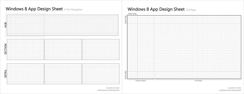
Figure 1-14. The Windows 8 app design sheet from codefoster.com/designsheet
Let’s use this design sheet to sketch out a hub page. We’ll call our app Good Help, and we’ll have three sections: my gigs, connect, and nearby gigs. These sections map directly to our three usage scenarios.
Notice that the app does follow the basic Windows 8 design guidelines, but we’ve gotten a little bit creative (perhaps not enough so) with the layout to give our app some of its own personality. The opportunities in both the my gigs section as well as in the nearby gigs section are using relatively large rectangles to allow us to bring some images and a good amount of information to the hub page if necessary. The connect section provides a single column of smaller rectangles to resemble a chat session since this section facilitates communication between app members.
Remember that the hub page should serve as a glimpse of the entire scope of the application, so we should find a place for each of our usage scenarios. Users like to feel oriented in an app, and a well-designed hub can provide this by constantly offering the user an overview and making it easy to dive into more information about a given section or entity.
There’s obviously not room on the hub page for everything available in the app. The nearby gigs section for instance may have 400 opportunities within, but the hub is only going to show some subset of those. In this case it makes sense to bring the closest opportunities to the user’s hub as those might be the most likely for him to sign up for.
The hub is giving us access not only to the sections available in our app, but direct access as well even to some of the items. In the concept drawing in Figure 1-15, there are three items populating the my gigs section indicating the user has signed up for these three volunteer opportunities. Touching one of those items will navigate the user directly to the details of that opportunity.
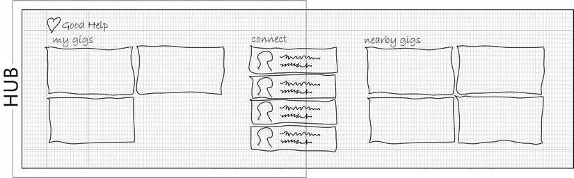
Figure 1-15. A first sketch of the Good Help app’s hub page
Let’s continue our app’s design and draw the concept for one more page. We’ll design the gig page, which will relay the complete details of any one gig. This is the page a user would navigate to by touching one of the opportunities on the hub. Figure 1-16 shows the concept.
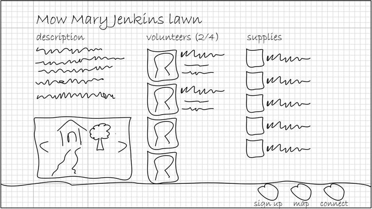
Figure 1-16. A sketch of a detail page
And that does it for this design scenario. I hope this obviously fictional application is close enough in concept to the app you’re working on that you’ll be able to apply the design principles here quickly.
Summary
In this chapter, we looked at a number of traits of a well-designed Windows 8 app as well as some design principles to keep at the front of your mind to help guide you through the process of designing and implementing your app.
The most significant design trait we visited encourages us to use Microsoft’s design style which includes immersing the user in their content and doing all we can to eliminate distractions. Windows 8 apps are less about discoverability and more about content immersion and consistency.
App developers have to break the habit of using the design surface for chrome which might be static navigation, user interactions, or explicit layout. Instead, we learn techniques for replacing this functionality without taking the user’s eye off their content. For instance, we learn how to navigate by letting content do its own commanding. We learned how to allow the user to interact by leveraging the screen’s edge—using the app bar and the Charms bar. Finally, we learned how to lay out our content without explicit layout artifacts by using space and typography intentionally.
We concluded by running through part of a design scenario where we worked on the scope of our app and then roughly defined its hub page and one detail page. This exercise is roughly the same process (though on a smaller scale) as the process you’ll go through on every app you create.
The design process is great and certainly critical and prerequisite, but it’s time to get our hands dirty, jump into code, and learn the basics of creating an actual Windows 8 app.