
 Note HTML gives us standard elements and WinJS extends them with custom controls. All we need to style them well.
We’ve learned how to select and style elements with style rules. We’ve learned that we author these rules in style sheets. And we’ve learned that the WinJS library that is available in your Windows 8 app provides us with two themed versions of a style sheet that give our app that Windows 8 personality. The style sheets affect things like the background color, the font face, and the text size.
The style sheets in the WinJS library also affect all of the standard HTML controls. When you declare a button control in your HTML, it comes out looking like a Windows 8 button because of the WinJS style sheet. When you add a select box, text box, checkbox, or any of the other built-in HTML controls, they will look like Windows 8 controls, and again because of the WinJS style sheet.
But WinJS also gives you some more controls (and a framework to write your own controls), and has defined them to render in such a way that you can affect their styling to give them the personality of your own app.
The styling of these built-in HTML controls and of the WinJS extended controls are what we’re going to cover in this chapter. We’ll look at the default styling of each and we’ll look at the custom classes that are added and the pseudo-elements that are defined that will give us good control with our style rules.
Remember that WinJS provides us with two different CSS style sheets: ui-dark.css and ui-light.css. Their names do reveal their purpose. The ui-dark.css style sheet provides us with a black background and a white foreground and ui-light.css gives us the inverse. We’ll be looking at the ui-light.css file only for simplicity’s sake, since both are identical in structure.
Besides the two themed style sheets, we discuss two themed classes that can apply the dark or light themes not to the entire app, but to certain subsections of it. Don’t be confused between the style sheets (ui-dark.css and ui-light.css) and the classes (win-ui-dark and win-ui-light).
We saw some classes in the previous chapter that were prefixed with win-, and we’ll see more here. It’s convenient to have this naming convention in place to remind us of what is there because of WinJS versus what’s baked in. Most of the classes that we’ll cover belong to or apply to a certain control, but the win-scrollview class can be tacked on to most any element. It applies just four style properties that give the target element the ability for the user to swipe (with touch) or scroll (with the mouse) to see more from off-screen.
The HTML standard defines a number of controls. Actually, there are a fair number of them that were recently introduced in the latest version of HTML—in HTML5. The HTML controls cover a lot of common user interactions tasks and the Windows 8 app developer is encouraged to use HTML controls when they exist and fit the job.
For each of the HTML controls I will discuss the default styling that the WinJS style sheet assigns to them, the pseudo-classes and pseudo-elements that are available for them, and any classes that can be added to the element to affect the way it is rendered. I will discuss the following HTML controls:
- Button
- File upload
- Text input
- Radio buttons
- Checkboxes
- Range
- Select box
- Progress indicator
Unlike WinJS controls, HTML controls don’t get “messed with”. When you put something like <img src="mypicture.png"/> in your markup, it goes all the way to the client unchanged. WinJS controls work much differently. You put a WinJS control in your markup, but it gets processed by some JavaScript before it’s rendered for the user. We’ll talk about this in a later section.
For our HTML controls (elements), we’ll just look at how the style sheets in the WinJS library style these controls by default. Do keep in mind that you’ll be able to completely override these styles and we’ll research that endeavor exhaustively in Chapter 10.
Button
A button issues a command. Users know buttons, and have been pushing them since long before computers came about. And buttons have long been a part of HTML too.
There are multiple ways to declare a button in HTML. You can declare a button using the input element and determine its behavior using one of the type attributes in the three following snippets: <input type="button"/>, <input type="reset"/>, and <input type="submit"/>. The buttons will look the same, but their functionality will vary.
- A type of button declares a button without any functionality at all. It would require that some JavaScript be written to assign it some actual functionality.
- A type of reset declares a button that when pressed will reset all other controls in the form to their initial values.
- A type of submit creates a button that, when pressed, will issue a POST HTTP request that includes all of the form values.
HTML5 introduces a new and slightly simpler way to define a button—with the button element. The button element is equivalent to <input type="button"/> in that it declares a button but does not assign any functionality. The button element is more semantic than the input element. By that I mean that it is more readily apparent to the human reader. I recommend using the button element exclusively.
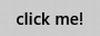
Listing 9-1. A super simple button
<!-- HTML snippet -->
<button>click me!</button>
Figure 9-1. A simple button
For this first control, let’s discuss discovering the applied style properties on an element. To discover applied properties for a button element, follow these steps:
1. Create a new Windows 8 project (or a new page in an existing project) in Visual Studio 2012
2. Add a simple HTML button to your HTML
- <button>My Button</button>
3. Start your app with debugging by pressing F5
4. Switch back to Visual Studio and go to the DOM Explorer tab. If you don’t have a DOM Explorer tab then go to the Debug menu, to Windows, and then choose DOM Explorer.
5. Press the Select Element button at the top-left corner of the DOM Explorer. You should be switched automatically to your running app.
6. Hover over your button and notice the blue outline, and then click the button. You should be switched automatically back to Visual Studio still in debug mode.
7. Click the Trace Styles tab in the right pane of the DOM Explorer.
The Trace Styles panel lists all of the style properties affecting the selected element and tells you where those properties were defined and will even render the properties with a strikethrough if they’ve been overridden by another rule elsewhere. In the Trace Styles panel for the button you made in the above steps, you should see a rule that has a heading of ::-ms-browse background-color. Under that property there is a rule for button:hover (as well as other chained selectors) and it defines the background-color to be rgba(205,205,205,0.82). This method can be used to determine all applied style properties affecting any of the elements in your document.
Regardless of which method is used to declare a button, WinJS determines that the button should have a minimum width of 90 pixels and a minimum height of 32 pixels. One of the primary reasons for this minimum button size is to preserve touchability. Even large fingers should be able to consistently land on a button and anything smaller than 90 x 32 may be too small.
Buttons are also given a little padding, a 2-pixel border, and an 11-point font. The background color of a button is gray and slightly transparent with an actual color value of rgba (182,182,182,0.7), and as we saw in the previous exercise, its hover color is slightly lighter. This difference in background color creates a subtle but important visual cue that the button is being hovered over.
There are many other properties that are in effect for a button too, and you can find all of them in the Trace Styles panel of the DOM Explorer.
All of these properties together make a button look at home in Windows 8. You can see the simplicity of the Microsoft design style coming through strong in Figure 9-2.
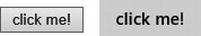
Figure 9-2. The default rendering of a button in IE10 compared with the version that appears in a Windows 8 app after the WinJS style sheets are applied
The following pseudo-classes are pertinent to a button element:
- :hover. As mentioned before, the background-color of a button being hovered is slightly lighter than normal.
- :disabled. Disabled buttons have by default a transparent background and white text and borders with low (40%) opacity.
If you declare a button and include a class of win-backbutton, the WinJS style sheet will turn that button into a back button. Back buttons are round with an arrow glyph rendered inside. This characteristic Windows 8 feature can be added to your app with the following very simple HTML markup:
<button class="win-backbutton"/>
File Upload Control
The file upload control is not new to HTML5, but it has received some significant improvements. It looks mostly the same in the browser—simply displaying a text box and a browse button. The control allows the user to upload one file or multiple files at once.
Listing 9-2. An input with a type of “file” will render a file upload control.
<input type="file"/>
Figure 9-3. The default file upload control
Since the file upload control renders multiple visual elements (namely the text box and the browse button), it has been difficult in the past to target for styling. The composite element could easily be targeted, but it was not possible to target the text box and the browse button separately. In Internet Explorer, however, the ::-ms-value and ::-ms-browse pseudo-elements are recognized and allow this finer level of control.
WinJS styles the file upload control to by 340 pixels wide by 32 pixels high with a custom margin around it. The ::-ms-value (which represents the text box) and the ::-ms-browse (which represents the browse button) both have 2-pixel borders.
Text Input Controls
Some of the HTML controls amount to a single control with a single behavior, but the input element is not one of them. The input element’s behavior depends on the value of its type attribute. However, many of the values result in a control that looks to the user like a text box and accepts (as one would expect) alphanumeric keyboard input. Any of the following values in the type attribute will result in an alphanumeric text box: text, password, email, number, tel, url, or search. Additionally, a textarea element will also result in a text box that accepts alphanumeric input. The styling for all of these resulting controls will work mostly the same, so we’ll look at them all together in Listing 9-3.
Listing 9-3. Seven ways to declare a text box
<!-- HTML snippet -->
<input type="text"/> text<br />
<input type="password" /> password<br />
<input type="email" /> email<br />
<input type="number" /> number<br />
<input type="tel" /> tel<br />
<input type="url" /> url<br />
<input type="search" /> search<br />
<textarea></textarea> textarea
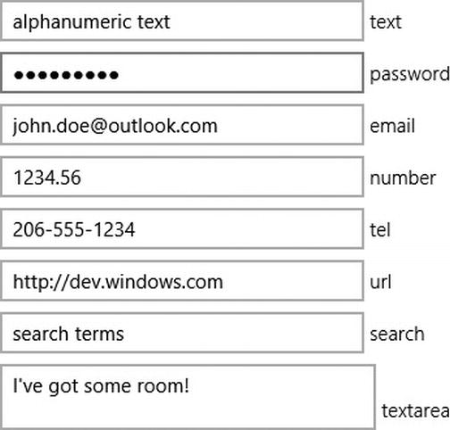
Figure 9-4. Several different text box types
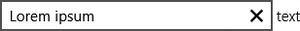
As of HTML5, Internet Explorer and Windows 8 apps render most of the text box types with a small X on the right that allows a user to clear the text box value more easily. In Internet Explorer 10 and Windows 8 apps, you can target this small glyph for styling by using the ::-ms-clear pseudo-element. That’s very helpful for people that want very fine control over their styling.
Figure 9-5. A small “x” glyph is rendered in text boxes to make it simple to clear out the box
Likewise, for password text boxes, Internet Explorer and Windows 8 apps render a small eyeball glyph that will reveal the password that’s been typed into the field only as long as the user presses the glyph. When a user knows that nobody is lurking over their shoulder or watching via screen share, it is helpful to be able to see the password that was typed to be sure there are no mistakes.
Figure 9-6. A glyph is also rendered for a password field to temporarily unmask and reveal the contents
Text boxes are at least 28 pixels high and 64 pixels wide with 2-pixel, solid borders.
The textarea element is a minimum of 39 pixels high by 260 pixels wide and has the same 2-pixel, solid border. For textarea elements, the vertical overflow is set to scroll by default, so if a user enters too much text, a scroll bar will be rendered and still enable the user to access and edit all of their text.
You can add a win-textarea class to any element to give it the style characteristics of a textarea regardless of what the actual element is.
Radio Buttons
Radio buttons are for choices—either or choices. You give your users radio buttons when you want them to decide on a single value only. Most people will recognize the familiar small round radio buttons. Listing 9-4 shows how they look in Windows 8.
Listing 9-4. Three radio type inputs are specified with labels. All three elements have the name “fruit” so that they will function mutually exclusive (selecting one will deselect the others)
<!-- HTML snippet -->
<label><input type="radio" name="fruit" value="Apple"/> Apple</label><br />
<label><input type="radio" name="fruit" value="Orange"/> Orange</label><br />
<label><input type="radio" name="fruit" value="Banana"/> Banana</label>
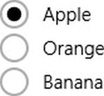
Figure 9-7. Three radio buttons ready for interaction
Radio buttons (and their closely related siblings, the checkboxes) are filled with a glyph when they are selected, and the developer can target that glyph itself using the ::-ms-check pseudo-element. If you want a more colorful dot in your radio button, this pseudo-element is going to be your only hope.
Like a lot of Windows 8 controls, radio buttons have a 2-pixel, solid border. They are also given a default size of 23 pixels square.
Checkboxes
Checkboxes and radio buttons have a lot in common behind the scenes, but for the user they are entirely different. Checkboxes are for options; they’re for binary flags. If this is what you’re shooting for, however, you should consider the ToggleSwitch control that WinJS offers. It is a bit friendlier and more touchable control with a lot of Windows 8 personality. More importantly, the ToggleSwitch implies to the user that the change is going to take effect immediately, whereas checkboxes imply that a change will take effect only after a form is submitted. Listing 9-5 shows a basic sample of checkboxes being laid out in a vertical list.
Listing 9-5. The type is now “checkbox”.
<!-- HTML snippet -->
<label><input type="checkbox" value="Apple"/> Apple</label><br />
<label><input type="checkbox" value="Orange"/> Orange</label><br />
<label><input type="checkbox" value="Banana"/> Banana</label>
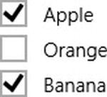
Figure 9-8. Checkboxes are rendered allowing multiple items to be selected
By default, a checkbox will be 21 pixels square and have the typical 2-pixel, solid border.
Range
A range (or slider control) is a new control for HTML5. The range control gives the user a user interface (UI) for easily selecting from a range of values such as an integer range of values.
Listing 9-6. A simple input of type “range” is declared
<!-- HTML snippet -->
<input type="range" />
A number of the parts that make up a range control can be targeted with pseudo-elements.
- ::-ms-track. - the track the slider follows that represents the range of possible values
- ::-ms-thumb. - the part the user drags that represents the current value on the control
- ::-ms-ticks-before. - applies to the tick marks that appear on top (in left-to-right layout) or on the left (in top-to-bottom layout) of the track
- ::-ms-ticks-after. - applies to the tick marks that appear on the bottom (in left-to-right layout) or on the bottom (in top-to-bottom layout) of the track
- ::-ms-fill-lower. - applies to the portion of the track from the smallest value to the current value
- ::-ms-fill-upper. - applies to the portion of the track from the current value to the largest value
As you can see in the example in Figure 9-9, range indicators render as a simple rectangle with a small thumb slider and with the lower portion of the range filled in with color. As you can also see, the range control shows up horizontally by default. You can add the win-vertical class value to it, however, and it will appear vertically instead. Decide whether your range indicators will be horizontal or vertical based on your own unique UI.
Figure 9-9. A Windows 8-style range control is rendered
Select Box
A select box is practically an antique in the HTML world. This control has one or more options in a list. It can be configured to either show the entire list of options or to show only a single option, in which case the rest will be listed when the user expands the list. It can also be configured to allow a single selected value or multiple values.
Listing 9-7. Three fruit are declared as options to a select list, but only one of them is selected
<!-- HTML snippet -->
<select>
    <option selected>Apple</option>
    <option>Orange</option>
    <option>Banana</option>
</select>
Figure 9-10. A select list is rendered with the selected value showing
Select lists, by default, adopt the same flat, basic, unadorned look as other controls with a 2px rectangular border. The expansion glyph that is rendered on the right side of the select list appears as a simple chevron, but it can be targeted with the ::-ms-expand pseudo-element, so you can change that glyph very easily. You can also use the ::-ms-value pseudo-element to target the individual elements in the list.
Progress Indicator
Progress indicators are ubiquitous and, frankly, very helpful. You saw them on the web before HTML5 introduced its semantic-tag version, but they were custom and they were a bit difficult. Now declaring a progress indicator is extremely simple; as is styling it. Listing 9-8 actually declares three progress indicators in the same number of lines of code.
Listing 9-8. Progress indicators set to render as the 3 basic types
<!-- HTML snippet -->
<progress value="1"></progress>
<progress></progress>
<progress class="win-ring"></progress>
Figure 9-11. The 3 basic types of progress indicator
You can target the bar that fills the progress indicator by using the ::-ms-fill pseudo-element.
If you don’t override and specify otherwise and you don’t add any classes to your progress indicator, it will be 180 pixels wide and 6 pixels tall with no border. Like all of the other controls, the default styling for the progress element amounts to a clean and simple UI element.
If you don’t provide a value for the value attribute of your progress control then it will be considered an indeterminate progress indicator. That means that it will not render as a bar that fills up to full, but instead will just be fancy, flying dots that indicate that a task is running but will not commit to when that task might be done. You can select indeterminate progress elements using the :indeterminate pseudo-class.
There are a few classes that are recognized by the WinJS style sheets, so you can add them to your progress element to affect its appearance. They are:
- win-medium. Progress indicators with a class of win-medium will be 280 pixels wide instead of the default 180 pixels.
- win-large. Progress indicators with a class of win-large will snap to 100% width in their parent container.
- win-paused. The moment a determinate progress indicator is assigned a class of win-paused, it will animate from full opacity down to 50%. So in plain terms, when you pause a progress indicator, it fades out.
- win-error. When a progress indicator is in error (when it has a win-error class) the ::-ms-fill of the indicator will be hidden entirely.
- win-ring. Add a class of win-ring to your progress indicator to completely transform it into a spinning circle of dots. This compact format may fit better in your design.
WinJS Controls
Like HTML elements, WinJS controls result in UI that allows the user to interact with an app. That’s about where the similarities end however. HTML elements are indicated once in your markup and then rendered on the user agent. A WinJS control, on the other hand, starts out as a div element with a special data-win-control attribute, is then processed by the JavaScript in the WinJS library, and finally results in the rendering of HTML elements that the user agent knows what to do with.
Consequently, in this section, we’re going to look not only at the default styling of the controls, but we’ll look extensively at what exactly gets rendered by the JavaScript processing. We’ll actually use the very valuable DOM Explorer to take the exact HTML rendered and see everything it includes.
You’ll see that the rendered HTML elements are painted with class values that act as handles for you to add styling to the various aspects of each possible complex control. Let me give you an example of what I’m talking about.
A DatePicker control results in multiple elements that represent the components of a data. If you need to add some styling to the month component alone, you’re in luck, because the month component will be rendered in an HTML element that WinJS has decorated with win-datepicker-month.
All of these classes begin with win-datepicker-, so they should be easy to spot and easy to differentiate.
Let’s go ahead and detail the many WinJS controls, what they render by default, and how they allow you to control their styles with class values. We’ll look at the following WinJS controls:
- Binding Template
- DataPicker
- TimePicker
- Rating
- ToggleSwitch
- ListView
- SemanticZoom
- FlipView
- ViewBox
- HtmlControl
- Page
Most of the WinJS controls are found in the WinJS.UI namespace, but the Template control is in the WinJS.Binding namespace because of its close relationship to the features of that namespace.
Templates are used to create a boilerplate into which objects may be rendered. Renders are intended to allow a developer to write terse HTML that represents an object, but allows for the display of any object that might eventually be rendered into it.
Not a lot needs to be said about the styling of templates because most of the styling is left up to the developer. A single value—win-template—is added to the class of a template, however, and that allows you to target them effectively.
DatePicker
DatePicker and the rest of the WinJS controls that we’ll discuss are found in the WinJS.UI namespace. Just like its name states, DatePicker allows the user to pick a calendar date. It’s a very simple control that really just renders three HTML select lists to the markup—the month, the date, and the year. A default DatePicker looks like the one in Figure 9-12.
Listing 9-9. A DatePicker control from WinJS, declared using a standard div with a data-win-control attribute
<!-- HTML snippet -->
<div data-win-control="WinJS.UI.DatePicker"></div>
Figure 9-12. A DatePicker is rendered as three select boxes
It should be apparent when you look at the output in Figure 9-12 that the one line of HTML markup has been processed. The result contains three separate select boxes. Let’s look at Listing 9-10 at the HTML that has actually been created in the processing.
Listing 9-10. The DatePicker in Listing 9-9 and Figure 9-12 results in three select lists for month, date, and year (shortened for brevity)
<!-- DOM Explorer snippet -->
<div class="win-datepicker " role="group" lang="en-US" dir="ltr"
    data-win-control="WinJS.UI.DatePicker">
    <select tabindex="0" class="win-datepicker-month win-order0 "
        aria-label="Select Month">
        <option value="January">January</option>
        <option value="February">February</option>
        <option value="March">March</option>
        ...
        <option value="October">October</option>
        <option value="November">November</option>
        <option value="December">December</option>
    </select>
    <select tabindex="0" class="win-datepicker-date win-order1 "
        aria-label="Select Day"><option value="1">1</option>
        <option value="2">2</option>
        <option value="3">3</option>
        ...
        <option value="28">28</option>
        <option value="29">29</option>
        <option value="30">30</option>
    </select>
    <select tabindex="0" class="win-datepicker-year win-order2 "
        aria-label="Select Year">
        <option value="1912">1912</option>
        <option value="1913">1913</option>
        <option value="1914">1914</option>
        ...
        <option value="2110">2110</option>
        <option value="2111">2111</option>
        <option value="2112">2112</option>
    </select>
</div>
If you understood how the DatePicker works, you’ll have no trouble with TimePicker. They’re almost identical. Instead of rendering select lists for month, date, and year, the TimePicker control provides hour, minute, and period.
Listing 9-11. All WinJS controls use this same syntax for declaration
<!-- HTML snippet -->
<div data-win-control="WinJS.UI.TimePicker"></div>
Figure 9-13. The TimePicker control also uses three select boxes
Again, we’ve added a single line of HTML markup and yet our output contains three distinct select boxes. Listing 9-12 shows the resulting HTML from the DOM Explorer.
Listing 9-12. The TimePicker from Listing 9-11 and Figure 9-13 results in three select lists for hour, minute, and period (shortened for brevity)
<!-- DOM Explorer snippet -->
<div class="win-timepicker " role="group" lang="en-US" dir="ltr"
    data-win-control="WinJS.UI.TimePicker">
    <select tabindex="0" class="win-timepicker-hour win-order0 "
        aria-label="Select Hour">
        <option value="12">12</option>
        <option value="1">1</option>
        <option value="2">2</option>
        ...
        <option value="9">9</option>
        <option value="10">10</option>
        <option value="11">11</option>
    </select>
    <select tabindex="0" class="win-timepicker-minute win-order1 "
        aria-label="Select Minute">
        <option value="00">00</option>
        <option value="01">01</option>
        <option value="02">02</option>
        ...
        <option value="57">57</option>
        <option value="58">58</option>
        <option value="59">59</option>
    </select>
    <select tabindex="0" class="win-timepicker-period win-order2 "
        aria-label="Select A.M P.M">
        <option value="AM">AM</option>
        <option value="PM">PM</option>
    </select>
</div>
Rating
Many apps include functionality for allowing users to rate goods and services for the good and service of other users. The 5-star rating system is a popular one, and that’s exactly what the Rating control provides you by default, though it’s not limited to 5 and it’s not even limited to stars. Figure 9-14 shows you what you’ll get with a typical Rating control.
Listing 9-13. A WinJS Rating control
<!-- HTML snippet -->
<div data-win-control="WinJS.UI.Rating"></div>
Figure 9-14. A Rating control is be default rendered using the popular 5-star system
A quick look at the DOM explorer to see how a Rating control is composed reveals the code in Listing 9-14.
Listing 9-14. The resulting DOM markup for a default rating control
<!-- DOM Explorer snippet -->
<div tabindex="0" class="win-rating " role="slider" aria-readonly="false" aria-valuenow="Unrated"
    aria-valuemin="0" aria-valuemax="5" aria-label="User Rating" aria-valuetext="Unrated"
    data-win-control="WinJS.UI.Rating">
    <div class="win-star win-empty win-user "></div>
    <div class="win-star win-empty win-user "></div>
    <div class="win-star win-empty win-user "></div>
    <div class="win-star win-empty win-user "></div>
    <div class="win-star win-empty win-user "></div>
    <div class="win-star win-average win-full win-user " style="-ms-flex: 0 0 auto;
        padding-right: 0px; padding-left: 0px; border-right-color: currentColor;
        border-left-color: currentColor; border-right-width: 0px; border-left-width: 0px;
        border-right-style: none; border-left-style: none; display: none;"></div>
</div>
Adding a class of win-small to your Rating control will result in a rating control that’s half the size of a standard Rating control. The stars will be 14 pixels instead of the normal 28. Don’t think that normal and small are your only options for sizing the Rating control. As with all of these controls, the power is in your hands as the developer. You could, for instance, use huge stars for your rating control by using a style rule like the one in Listing 9-15. We’ll see many more of these overrides and extended styles in Chapter 10, but here’s a taste of what I’m talking about.
In Listing 9-15, we see the style rule (included in WinJS) to make the starts smaller, and in the same listing we see a custom rule called win-huge that does the opposite and makes the stars bigger.
Listing 9-15. A custom style rule to increase the size of the stars
/* .win-small (from WinJS) */
.win-rating.win-small .win-star {
    width: 14px;
    height: 14px;
    font-size: 14px;
    padding: 0 3px;
}

/* custom .win-huge style */
.win-rating.win-huge .win-star {
    width: 56px;
    height: 56px;
    font-size: 56px;
    padding: 0 12px;
}
As I mentioned previously, the ToggleSwitch control is a great alternative to the traditional checkbox. The ToggleSwitch is a larger and touch-friendlier target for binary decisions. Use it, for example, to give your users the option to turn their in-game music on or off.
Listing 9-16 shows the control and Figure 9-15 shows what a typical ToggleSwitch looks like.
Listing 9-16. A WinJS ToggleSwitch control
<!-- HTML snippet -->
<div data-win-control="WinJS.UI.ToggleSwitch"></div>
Figure 9-15. The ToggleSwitch is a more user-friendly way of answering a binary question such as Yes/No
The HTML that is generated for the ToggleSwitch control might surprise you. HTML doesn’t have a native element that looks like a toggle control. It simply doesn’t exist. Yet, WinJS controls do not render new graphic elements. The Windows team got creative in this case and used a progress indicator, but changed the dimensions of the bar itself and the slider to look like a toggle. You can see the progress indicator in resulting HTML in Listing 9-17.
Listing 9-17. The resulting DOM output for a default ToggleSwitch control
<!-- DOM Explorer snippet -->
<div class="win-toggleswitch win-off " data-win-control="WinJS.UI.ToggleSwitch">
    <div class="win-title " id="ms__id32" role="note"></div>
    <div style="display: -ms-grid;">
        <div class="win-label ">On</div>
        <div class="win-label win-hidden ">Off</div>
        <input class="win-switch " role="checkbox" aria-checked="false"
            aria-disabled="false" aria-labelledby="ms__id32" type="range"
            max="1" step="1"></div>
</div>
Notice that the ToggleSwitch control is actually implemented using an <input type="range"/> element. A max value of 1 and a step value of 1 make the range control act like a binary switch. It’s a very clever way to reuse something that already exists.
Because the ToggleSwitch uses a range control, all of the same pseudo-elements that apply to the range element can apply to the ToggleSwitch as well. The range element within the toggle is given a class of win-switch, so a CSS selector of #myToggle .win-switch::-ms-thumb would select the slider of a ToggleSwitch with an id of myToggle. Here is that list of pseudo-elements once again: ::-ms-thumb, ::-ms-tooltip, ::-ms-ticks-before, ::-ms-ticks-after, ::-ms-track, ::-ms-fill-upper, and ::-ms-fill-lower.
ListView
The ListView is an important control in a Windows 8 app. I introduced you to its functionality in Chapter 7, but now it’s time to dissect the control for its classes and figure out how we can style it the way we want. Figure 9-16 shows you again what that ListView from Chapter 7 looked like.
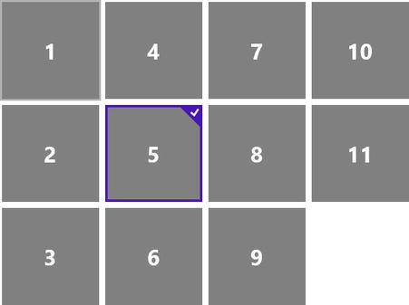
Figure 9-16. A typical ListView borrowed from Figure 7-19 in Chapter 7
The syntax for declaring a ListView is the same as every other WinJS control as you can see in Listing 9-18, but that declaration alone results in an empty ListView that you can’t even see when you execute your app. Consulting the DOM Explorer assures us that it’s there, however, and you can see the result in Listing 9-19.
Listing 9-18. Declaration for a simple (and empty) ListView control
<!-- HTML snippet -->
<div data-win-control="WinJS.UI.ListView"></div>
In Listing 9-19, the DOM Explorer shows us the HTML generated by a simple ListView control with no data bound to it at all.
Listing 9-19. The markup for an empty ListView
<!-- DOM Explorer snippet -->
<div tabindex="-1" class="win-listview win-swipeable " role="listbox"
    style="position: relative;" data-win-control="WinJS.UI.ListView">
    <div tabindex="-1" class="win-viewport win-horizontal " role="group"
        aria-label="Scrolling Container">
        <div id="ms__id31" aria-flowto="ms__id32"></div>
        <div class="win-surface ">
            <div class="win-backdrop " aria-hidden="true" style="width: 0px; height: 0px;"></div>
            <div class="win-backdrop " aria-hidden="true" style="width: 0px; height: 0px;"></div>
            <div class="_win-proxy"></div>
            <div tabindex="0" aria-hidden="true"></div>
            <div style="left: 0px; top: 0px; width: 100%; height: 100%; position: absolute;">
            </div>
            <div tabindex="0" aria-hidden="true"></div>
        </div>
        <div id="ms__id32" x-ms-aria-flowfrom="ms__id31"></div>
    </div>
    <div tabindex="0" aria-hidden="true"></div>
    <div aria-hidden="true" style="left: 50%; top: 50%; position: absolute;">
        <div tabindex="0" aria-hidden="true"></div>
        <div aria-hidden="true" style="width: 0px; height: 0px;"></div>
        <div tabindex="0" aria-hidden="true"></div>
    </div>
    <div tabindex="0" aria-hidden="true"></div>
</div>
As you can tell, there’s a lot going on with this one (and keep in mind this is an empty list!) Let’s take a look now at a ListView with just a little bit of data populating it.
Listing 9-20. HTML and JavaScript for not only declaring a ListView, but populating it too
<!-- HTML snippet -->
<div data-win-control="WinJS.UI.ListView"></div>
<div data-win-control="WinJS.Binding.Template">
    <span data-win-bind="innerText:this"></span>
</div>

// JavaScript snippet
var list = new WinJS.Binding.List(["one", "two", "three"]);
var listViewElement = element.querySelector("[data-win-control='WinJS.UI.ListView']");
var templateElement = element.querySelector("[data-win-control='WinJS.Binding.Template']");
listViewElement.winControl.itemDataSource = list.dataSource;
listViewElement.itemTemplate = templateElement;
Listing 9-21. The resulting DOM markup for a ListView with some data bound to it
<!-- DOM Explorer snippet -->
<div tabindex="-1" class="win-listview win-swipeable " role="listbox" style="position: relative;"
    data-win-control="WinJS.UI.ListView">
    <div tabindex="-1" class="win-viewport win-horizontal " role="group"
        style="opacity: 1; -ms-scroll-limit-x-min: 0px;" aria-label="Scrolling Container">
        <div id="ms__id42" aria-flowto="ms__id35"></div>
        <div class="win-surface " style="width: 35px; opacity: 1;">
            <div class="win-backdrop " aria-hidden="true"
                style='left: 35px; top: 0px; width: 0px; height: 390px;
                background-image: url("data:image/png;base64,…");'></div>
            <div class="win-backdrop " aria-hidden="true"
                style='left: 0px; top: 0px; width: 0px; height: 390px;
                background-image: url("data:image/png;base64,…");'></div>
            <div class="_win-proxy"></div>
            <div tabindex="0" aria-hidden="true"></div>
            <div style="left: 0px; top: 0px; width: 100%; height: 100%;
                position: absolute; clip: auto;">
                <div class="win-container " style="left: 0px; top: 0px;
                    width: 25px; height: 20px;">
                    <div tabindex="0" aria-hidden="true"></div>
                    <span class="win-item " id="ms__id35" role="option" aria-posinset="1"
                        aria-setsize="3" aria-flowto="ms__id37" x-ms-aria-flowfrom="ms__id42">
                        one
                    </span>
                    <div tabindex="0" aria-hidden="true"></div>
                </div>
                <div class="win-container " style="left: 0px; top: 30px;
                    width: 25px; height: 20px;">
                    <span class="win-item " id="ms__id37" role="option" aria-posinset="2"
                        aria-setsize="3" aria-flowto="ms__id39" x-ms-aria-flowfrom="ms__id35">
                        two
                    </span>
                </div>
                <div class="win-container " style="left: 0px; top: 60px;
                    width: 25px; height: 20px;">
                    <span class="win-item " id="ms__id39" role="option" aria-posinset="3"
                        aria-setsize="3" aria-flowto="ms__id43" x-ms-aria-flowfrom="ms__id37">
                        three
                    </span>
                </div>
            </div>
            <div tabindex="0" aria-hidden="true"></div>
        </div>
        <div id="ms__id43" x-ms-aria-flowfrom="ms__id39"></div>
    </div>
    <div tabindex="0" aria-hidden="true"></div>
    <div aria-hidden="true" style="left: 50%; top: 50%; position: absolute;">
        <div aria-hidden="true" style="width: 0px; height: 0px;"></div>
    </div>
    <div tabindex="0" aria-hidden="true"></div>
</div>
There’s obviously even more going on in this data-bound ListView, including a few things that I want to bring to your attention:
- Notice that the entire ListView is in an element that has a class of win-listview. This becomes a convenient handle for the entire control.
- Notice the use of the class win-swipeable. If you look up the styling on win-swipeable in the default style sheet, you’ll see that it’s responsible for the scrolling behavior.
- Notice the use of the win-horizontal class. ListView controls can be set to vertical as well, and this is the class that ends up determining the orientation and behavior.
- Notice the win-container and win-item elements around each individual item in the list. When you need to style the items in your list, one of these two classes is a great way to narrow down your selection to just list containers or list items.
- Notice the absolute positioning. The first item is set with a top value of 0px, the second with 30px, and the third with 60px.
- Notice the use of the win-viewport and win-surface classes. The distinction between these two components is important as you’ll see in a second.
The article at http://msdn.microsoft.com/en-us/library/windows/apps/hh850406.aspx on the Windows Dev Center is extremely helpful in visualizing the visual (and functional) components that make up a ListView. Have a look at Figure 9-17, which comes from that article. It’s absolutely essential to understand the win-listview, win-surface, and win-viewport classes.
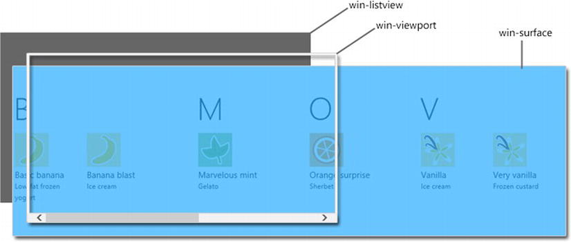
Figure 9-17. A diagram showing the various components that make up a ListView, which is very helpful when trying to add or override styles that affect this relatively complex WinJS control
Think of the win-viewport as a frame behind which the win-surface can slide as the user is scrolling. Add or manipulate style properties on the win-listview if it should affect the entire control. The win-viewport contains the scrolling behavior (overflow-x and overflow-y). Style win-surface if you want to affect the background that actually appears behind your list items.
SemanticZoom
Related to the ListView is the SemanticZoom control. A SemanticZoom control is meant to contain two ListView controls—the standard ListView (the near view) and another that represents a logically zoomed out view of the same data (the far view). Typically, the far view shows groups representing the data in the near view. A list of groups is terser than the complete set of data, and an additional feature is the ability for the user to select a group from the far view and be navigated directly to that group in the near view.
Figure 9-18 shows a simplified model of a semantic zoom control. In the first image, multiple groups are displayed with their associated items. After the user does a pinch zoom gesture on the list, they are animated and converted to the second image where the groups are displayed, but not their items.
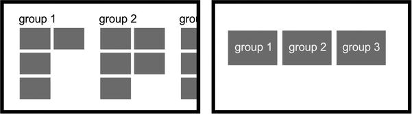
Figure 9-18. Semantic zoom orients the user and facilitates navigation as well
Notice that the third group is not entirely visible in the zoomed in list (the first image in Figure 9-18) but it is in the zoomed out list. Semantically zooming out of a list of data becomes a way to not only orient and digest a large list but also becomes an easier way to navigate one.
Semantic zoom is a feature unique to Windows 8 and is intended to help a user more easily orient to and navigate large lists of data.
You may need to target your SemanticZoom control either to style it or to otherwise manipulate it. The rendered version of a SemanticZoom control is a little on the complex side, but to reference one it suffices to know the class that WinJS assigns it. You can see in Listing 9-23 that that class name is win-semanticzoom. You can also see the complexity I was referring to. The near and far view lists have been collapsed and dimmed in the listing and still quite a bit of markup exists. This markup styles and positions the control as well as adding transformations and transitions to it to give it the unique personality and behavior that is a Windows 8 SemanticZoom control.
Listing 9-22. The HTML, CSS, and JavaScript for creating a SemanticZoom control
<!-- HTML snippet -->
<div data-win-control="WinJS.UI.SemanticZoom">
    <div id="list1" data-win-control="WinJS.UI.ListView"></div>
    <div id="list2" data-win-control="WinJS.UI.ListView"></div>
</div>
<div id="itemtemplate" data-win-control="WinJS.Binding.Template">
    <span data-win-bind="innerText:this"></span>
</div>
<div id="grouptemplate" data-win-control="WinJS.Binding.Template">
    <h2 data-win-bind="innerText:this"></h2>
</div>
<div id="semantictemplate" data-win-control="WinJS.Binding.Template">
    <div data-win-bind="innerText:this"></div>
</div>

/* CSS snippet */
.lst0922  #list1 .win-item { width:80px; }

// JavaScript snippet
var numbersList = new WinJS.Binding.List([1,2,3,4,5,6,7,8,9,10]).createGrouped(
    function(item) { return (item <= 5 ? "1-5" : "6-10"); },
    function (item) { return (item <= 5 ? "1-5" : "6-10"); }
);
var list1 = element.querySelector("#list1").winControl;
list1.itemDataSource = numbersList.dataSource;
list1.itemTemplate = element.querySelector("#itemtemplate");
list1.groupDataSource = numbersList.groups.dataSource;
list1.groupHeaderTemplate = element.querySelector("#grouptemplate");

var list2 = element.querySelector("#list2").winControl;
list2.itemDataSource = numbersList.groups.dataSource;
list2.itemTemplate = element.querySelector("#semantictemplate");
Listing 9-23. The resulting DOM markup for a SemanticZoom control (with lists dimmed and collapsed for brevity)
<!-- DOM Explorer snippet -->
<div class="win-semanticzoom " role="ms-semanticzoomcontainer" aria-checked="false"
    style="overflow: hidden; position: relative;" aria-label=""
    data-win-control="WinJS.UI.SemanticZoom">
    <div style="left: 0px; top: 0px; width: 1264px; height: 400px; overflow: hidden;
        position: absolute;">
        <div style="left: 0px; top: 0px; width: 1264px; height: 400px; overflow: hidden;
            visibility: visible; position: absolute; transition-property: transform;
            transition-duration: 0s; transition-timing-function: linear;">
            <div style="transform-origin: 695.615px 200px; transition: transform 0.33s
                ease-in-out 34ms, opacity 0.33s ease-in-out 34ms; left: -680.61px; top: 0px;
                width: 2625.23px; height: 400px;overflow: hidden; position: absolute;
                opacity: 1; transform: scale(1);">

                <div class="win-listview win-swipeable win-groups" id="list1" ...>...</div>

            </div>
        </div>
        <div style="left: 0px; top: 0px; width: 1264px; height: 400px; overflow: hidden;
            visibility: hidden; position: absolute; transition-property: transform;
            transition-duration: 0s;transition-timing-function: linear;">
            <div style="transform-origin: 78.2px 200px; transition: transform 0.33s
                ease-in-out 34ms, opacity 0.33s ease-in-out 34ms; left: -63.2px; top: 0px;
                width: 1390.4px; height: 400px; overflow: hidden; position: absolute;
                opacity: 0; transform: scale(1.53846);">

                <div class="win-listview win-swipeable" id="list2" ...>...</div>

            </div>
        </div>
    </div>
    <button tabindex="-1" class="win-semanticzoom-button win-semanticzoom-button-location ltr "
        style="visibility: hidden; opacity: 0;"></button>
    <div tabindex="-1" aria-hidden="true"></div>
</div>
The FlipView control is an excellent choice for many cases. It can be used to provide browsing for images, articles, or entire sections of your application. A simple swipe gesture from side to side is all it takes to command the FlipView to switch to its next item, complete with animation, easing, and snapping.
A FlipView is another one of those controls that takes a bit of code to demonstrate and the reason is that it is a data-bound control. This means that, just like the ListView, we’re going to bind our FlipView to a WinJS.Binding.List object and whenever anything in that List changes, our FlipView will automatically respond without us having to manually catch that event and update the items in our FlipView.
Also, like the ListView, the FlipView gives us the opportunity to specify a template which is used to render each item.
Listing 9-24. A FlipView with some simple images bound to it
<!-- HTML snippet -->
<div id="flipview" data-win-control="WinJS.UI.FlipView"></div>
<div id="template" data-win-control="WinJS.Binding.Template">
    <img data-win-bind="src:this"/>
</div>

/* CSS snippet */
.lst0924 .win-flipview {
    width: 480px;
    height: 320px;
}

//JavaScript
var flipview = element.querySelector("#flipview").winControl;
var template = element.querySelector("#template");

var fruitList = new WinJS.Binding.List([
    "/pages/chapter9/lst0924/peaches.png",
    "/pages/chapter9/lst0924/grapes.png",
    "/pages/chapter9/lst0924/orange.png
"]);
flipview.itemDataSource = fruitList.dataSource;
flipview.itemTemplate = template;
Figure 9-19 appears to be a single image, but you can see that arrows are rendered on each edge. The arrows are visible so a mouse user has something to click, but a touch user can simply swipe the list to change to a new image.
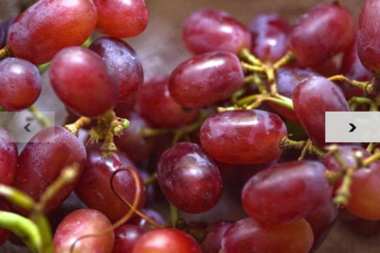
Figure 9-19. When you’re using a mouse to interact with Windows 8, next and previous arrows are rendered onto each side of the FlipView. You can always use a swipe gesture to switch too
The entire FlipView itself gets a win-flipview class, which makes it easy to refer to the FlipView control(s) in your running app. The items that populate your FlipView, however are rendered onto an embedded div that is given the win-surface class. Like the ListView, you can think of this element as a long strip that contains all of the items and that slides to reveal one frame at a time.
Finally, the FlipView has the two navigation buttons that appear only if the user is using a mouse. There’s no need for the navigation buttons to appear if the user has been using touch to interact, because a simple swipe gesture is all it takes to navigate forward or backward. You can see the markup for these buttons in Listing 9-25. They are HTML buttons and they have been granted class values of win-navbutton and win-navleft or win-navright. You certainly don’t have to be content with the left and right arrows that render for a FlipView by default. You can override this by referencing those class values. We’re going to learn much more about that in Chapter 10.
Listing 9-25. The markup that results from WinJS FlipView declaration
<div tabindex="-1" class="win-flipview " id="flipview" role="listbox" style="overflow: hidden;"
    aria-label="" data-win-control="WinJS.UI.FlipView">
    <div style="width: 100%; height: 100%; position: relative; z-index: 0;">
        <div tabindex="0" aria-hidden="true"></div>
        <div class="win-surface " role="group" style="-ms-scroll-snap-x: mandatory
            snapInterval(0px, 480px); width: 100%; height: 100%; position: relative;
            -ms-overflow-x: scroll; -ms-overflow-y: hidden; -ms-scroll-limit-x-min: 240000px;
            -ms-scroll-limit-x-max: 240960px; -ms-overflow-style: none;"
            aria-label="Scrolling Container">
            <div style="width: 100%; height: 100%; position: relative;">
                <div id="ms__id5" aria-flowto="ms__id36"></div>
                <div style="left: 240000px; width: 480px; height: 320px; overflow: hidden;
                    position: absolute;">
                    <div class="win-item " style="-ms-overflow-style: auto;">
                        <div tabindex="0" aria-hidden="true"></div>
                        <div tabindex="0" class="win-template " id="ms__id36" role="option"
                            aria-selected="true" aria-posinset="1" aria-setsize="3"
                            aria-flowto="ms__id37" x-ms-aria-flowfrom="ms__id5">
                            <img src="/pages/chapter9/lst0924/peaches.png"
                                data-win-bind="src:this">
                        </div>
                        <div tabindex="0" aria-hidden="true"></div>
                    </div>
                </div>
                <div style="left: 240480px; width: 480px; height: 320px; overflow: hidden;
                    position: absolute;">
                    <div class="win-item " style="-ms-overflow-style: auto;">
                        <div tabindex="0" class="win-template " id="ms__id37" role="option"
                            aria-selected="false" aria-flowto="ms__id38"
                            x-ms-aria-flowfrom="ms__id36">
                            <img src="/pages/chapter9/lst0924/grapes.png"
                                data-win-bind="src:this">
                        </div>
                    </div>
                </div>
                <div style="left: 240960px; width: 480px; height: 320px; overflow: hidden;
                    position: absolute;">
                    <div class="win-item " style="-ms-overflow-style: auto;">
                        <div tabindex="0" class="win-template " id="ms__id38" role="option"
                            aria-selected="false" aria-flowto="ms__id6"
                            x-ms-aria-flowfrom="ms__id37">
                            <img src="/pages/chapter9/lst0924/orange.png"
                                data-win-bind="src:this">
                        </div>
                    </div>
                </div>
                <div style="left: 239040px; width: 480px; height: 320px; overflow: hidden;
                    position: absolute;">
                    <div class="win-item " style="-ms-overflow-style: auto;"></div>
                </div>
                <div style="left: 239520px; width: 480px; height: 320px; overflow: hidden;
                    position: absolute;">
                    <div class="win-item " style="-ms-overflow-style: auto;"></div>
                </div>
                <div id="ms__id6" x-ms-aria-flowfrom="ms__id38"></div>
            </div>
        </div>
        <div tabindex="0" aria-hidden="true"></div>
        <button tabindex="-1" class="win-navbutton win-navleft " aria-hidden="true"
            style="visibility: hidden; z-index: 1000; opacity: 0;" aria-label="Previous"
            type="button">·</button>
        <button tabindex="-1" class="win-navbutton win-navright " aria-hidden="false"
            style="visibility: hidden; z-index: 1000; opacity: 0;" aria-label="Next"
            type="button">·</button>
    </div>
</div>
ViewBox
The function of a ViewBox was covered in Chapter 7, but let’s review it quickly. A ViewBox snaps to the size of its parent container and then scales a single child item (it can have only one) without affecting its aspect ratio to fit the size of the ViewBox. It responds to changes in view state as well, so when the user rotates their tablet, the ViewBox handles the scaling of its contents accordingly.
We didn’t take the time in Chapter 7 to see how a ViewBox is actually implemented. So let’s see that now complete with the entire DOM Explorer output of a rendered ViewBox.
In Listing 9-26, we have a parent div which contains a ViewBox which contains a child div. Notice in the CSS that the parent is oriented vertically with a width of 100 pixels and a height of 300 pixels. Notice too that the child is oriented horizontally with a width of 300 pixels and a height of 100 pixels. Instead of clipping the child, stretching the parent, or rendering scroll bars to reveal hidden content, the ViewBox has preserved the child element and simply scaled it to fit in the parent div.
Listing 9-26. A parent div that contains a ViewBox that contains a child div
<!-- HTML snippet -->
<div class="parent">
    <div data-win-control="WinJS.UI.ViewBox">
        <div class="child"></div>
    </div>
</div>

/* CSS snippet */
.lst0926 .parent {
    width: 100px;
    height: 300px;
    border: solid 2px gray;
}

.lst0926 .child {
    width: 300px;
    height: 100px;
    border: solid 2px;
}
Listing 9-27. The ViewBox has scaled the child div to fit right in its parent
<div class="parent">
    <div class="win-viewbox " data-win-control="WinJS.UI.ViewBox">
        <div class="horizontal" style="transform-origin: left top;
            transform: translate(0px, 133.333px) scale(0.333333); "></div>
    </div>
</div>
One huge advantage of the behavior of the ViewBox is that the child div can contain any manner of content and yet it will be scaled and positioned the same. It’s an excellent way to take, for instance, an entire game board and scale it to fit either in landscape mode or portrait mode.
The HtmlControl makes it really simple to bring HTML in from another document and render it into any area of another. You might use HtmlControls to build up a page out of smaller page components that might be easier to maintain or collaborate on.
Listing 9-28. An HTML snippet that uses a WinJS HtmlControl to “import” the HTML in a separate file
<!-- HTML snippet -->
<div class="parent">
<div data-win-control="WinJS.UI.HtmlControl"
data-win-options="{uri:'/pages/chapter9/lst0928/page.html'}">
</div>
</div>
/* CSS snippet */
.parent {
border: solid 2px gray;
width: 200px;
padding: 5px;
}
<!-- page.html -->
<!DOCTYPE html>
<html>
<head>
<title></title>
</head>
<body>
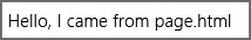
Hello, I came from page.html
</body>
</html>
Figure 9-20. The result of importing external HTML into a div
You can see that the “Hello, I came from page.html” is in a separate HTML file, but we have used an HtmlControl to declaratively (there is no JavaScript in Listing 9-28) import it into the HTML in the snippet.
Listing 9-29. The resulting DOM markup for an HtmlControl includes a pagecontrol class
<!-- DOM Explorer snippet -->
<div class="parent">
    <div class="pagecontrol " data-win-options="{uri:'/pages/chapter9/lst0929/page.html'}"
        data-win-control="WinJS.UI.HtmlControl">
        Hello, I came from page.html
    </div>
</div>
The div that we originally gave the data-win-control and data-win-options attributes is also given a class name of pagecontrol which will again make it easy for us to identify and target.
Page
A page in WinJS is a complete set of HTML, CSS, and JavaScript that represents a single view. In traditional web development, pages were most often navigated between using hyperlinks. That style of navigation is certainly still supported in Windows 8, but it’s usually a better idea to use the built-in framework for doing single page navigation. When implementing this navigation model, a logical page is still an actual HTML page (and usually a CSS and a JavaScript file as well), but you won’t typically hyperlink to it. Instead, you’ll use the navigation framework to navigate to it, which will result in the final rendering of the page being appended to the DOM of the starting page (default.html).
Understanding the way these pages are identified becomes rather important for a few reasons. Fortunately, it’s a very elegant and easy to understand convention.
Just inside the body element of each page’s HTML file, you’ll find a div element with two class names. The first is the name of the page and the second is fragment. The helloworld page would then look something like what you see in Listing 9-30.
Listing 9-30. A page using WinJS’s navigation model contains a fragment—a simple div with two class names that make it easy for WinJS and for us to target
<!-- helloworld.html -->
<!DOCTYPE html>
<html>
<head>
    <meta charset="utf-8" />
    <title>Orders Page</title>

    <!-- WinJS references -->
    <link href="//Microsoft.WinJS.1.0/css/ui-light.css" rel="stylesheet" />
    <script src="//Microsoft.WinJS.1.0/js/base.js"></script>
    <script src="//Microsoft.WinJS.1.0/js/ui.js"></script>

    <link href="helloworld.css" rel="stylesheet" />
    <script src="helloworld.js"></script>
</head>
<body>
    <div class="helloworld fragment ">
        <section aria-label="Main content" role="main">
            <p>Hello, World!</p>
        </section>
    </div>
</body>
</html>
Notice the bolded class names. The first matches the name of the page and the second is fragment. It is this entire fragment that is going to be injected into the default.html page.
You can use these classes as handles of your own, though, too. If you want to create a style that affects pages, you can prefix it with .fragment. If you want to apply a style that affects only the helloworld page, you can prefix it with .helloworld.
This glimpse into the styling of the basic HTML controls and the extra controls given to us by WinJS is not enough to thoroughly understand this robust library for creating Windows 8 apps, so I suggest that you spend some quality time in the ui-light.css document to understand what it’s doing to the various controls and thus what you can extend or override.
The next chapter is all about extending and overriding. If WinJS has determined that a button’s border is gray and you’d rather it be dark green, then that would be an override. If WinJS doesn’t say anything at all about that button’s background color, but you need one, then that’s an extension to the button’s styles.
Summary
In this chapter, we’ve learned that WinJS helps us out a lot in a Windows 8 app. WinJS provides a number of controls that are composed of nothing more than native HTML elements. They provide richer user interaction and a more consistent Windows 8 experience.
WinJS also gives us a massive collection of CSS style rules that apply to the native HTML elements and the WinJS controls alike. These style rules make it simple to get the visual elements in your app laid out and styled to look like a Windows 8 app and also to give it its own unique flavor.
The WinJS library makes its controls easy for us to declare while it handles the processing of our simple declaration to turn it into native HTML elements. While it’s creating the HTML that ends up being rendered, it adds helpful class names to the various parts so that we have “hooks” that we can use to style the control at large or target individual components.
It’s all an effort to provide the user a balance of great control and great ease of development, and it’s quite effective.