
 Note The WinJS library provides a ton of CSS that has already been written for you-almost 4,000 lines of it actually. This big collection of style rules makes your app look right at home in Windows 8.
In this chapter on what I’m dubbing the global styles, we’re going to look at the styles from the WinJS library that affect the general environment and typography of your Windows 8 app. We’ll also look at the styling of the app bar, the settings pane, flyouts, and menus. There are a lot of rules that go in to styling the WinJS controls, and Chapter 9 is dedicated to just that.
I highly recommend two methods for quickly and fully learning CSS for Windows 8. First, spend time scrolling all the way through the ui-light.css file that you’ll find in the References section of any Windows 8 JavaScript project in Visual Studio. You can find some very helpful references on this file at http://msdn.microsoft.com/en-us/library/windows/apps/hh465498.aspx. Second, learn the class names that inherently exist on the various controls and structures in this chapter. Once you know, for instance, that the element that contains the settings flyout contains a class value of win-settingsflyout, you can scope styles to that element and add styling of your own, using a simple class selector.
Typography plays a very important role in Windows 8 apps. The font face and size is chosen purposefully to convey information about the relative significance of the various bits of content on the screen. A large title positioned consistently is quickly and subconsciously identified by the user and progressively smaller type is easy to locate and easy to relate.
The primary Windows typeface is Segoe UI (pronounced SEE-go). It is a clean, modern, sans serif font that supports the Latin, Cyrillic, Greek, Arabic, Hebrew, Armenian, and Georgian alphabets, so it’s super versatile. The Windows 8 design guidelines do not strictly require the use of the Segoe UI font for your app. It is a good choice though because it gives your app that familiar feel that helps users to feel like it’s part of a cohesive platform. If your brand has a standard font, however, that people might identify as a characteristic of your brand, then it might be a better choice.
The Calibri typeface is also a recommended font for Windows 8 apps. It acts as more of a reading or writing font than Segoe UI and it supports Latin, Greek, and Cyrillic alphabets. Calibri is good for things like email and chat apps. Finally, the Cambria typeface is used for bigger blocks of reading text that you would find in a book reader or the like. More extensive coverage of the typographic guidelines in Windows 8 can be found at http://msdn.microsoft.com/en-us/library/windows/apps/hh700394.aspx.
One of the first things that the WinJS style sheets does is define (using @font-face like we learned in Chapter 4) a number of font-family values around Segoe UI. They are all the same font, but they use different values for the font weight. The font weights are:
- Segoe UI Light - 200 weight
- Segoe UI Semilight - 300 weight
- Segoe UI - 400 (normal) weight
- Segoe UI Semibold - 600 weight
- Segoe UI Bold - 700 weight
To use these, you only have to specify a CSS font-family property with the defined font family name (i.e., Segoe UI Light, Segoe UI, etc.).
Type styles are the style rules defined by WinJS that affect text in your app.We learned in Chapter 1 that the type ramp is that standard set of font sizes that gives a Windows 8 app its characteristic and identifiable look. The type ramp from largest to smallest is 42 points, 20 points, 11 points, and 9 points. This is a rather broad font size spectrum and the reason for it is to provide a quick visual hierarchy of text content on the screen. Seeing a header in 42 point and a sub-header in 20 point will cause the content to speak for itself about its structure and relative significance.
You can see a typical example of this type ramp in effect in Figure 8-1. Notice how easy it is to discern the title of the app, to differentiate the parts from one another, and to read the headings and content of the body text. Also notice that this was accomplished with the type ramp and some strategic use of space. Our layout did not require any lines or boxes to separate out the various parts of the app.
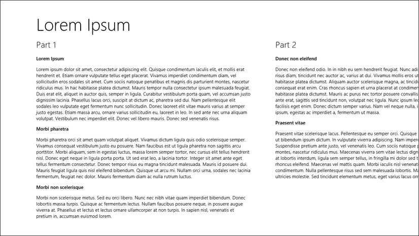
Figure 8-1. Windows 8’s type ramp makes it easy to discern the relative significance of content
The sample app screen in Figure 8-1 is using the standard Windows 8 light theme (ui-light.css). This theme is the cause for the white background and the black text. In stark contrast, a dark theme (ui-dark.css) is also available. Figure 8-2 shows the same view using the dark theme this time. The app developer gets to choose which of the themes to use, and it’s an app-by-app decision. It is not controlled by an operating system level setting. The type ramp in the dark theme is obviously still just as effective in communicating structure.
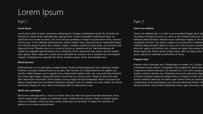
Figure 8-2. The same view as Figure 8-1, this time using the ui-dark theme
The 42-point page title is relatively large and makes it quick and easy for a user to become oriented with the current page. This may not seem important, but it very much is. When a user is switching from one app to another, snapping apps beside, and launching new apps, an unconscious glance at the top of the screen provides a remedy to application vertigo.
The 20-point section headers will quickly become a familiar organization indicator to users who will look for them to see how the app is categorized or sub-divided. A user will see the sections spilling off the right side of the screen and naturally swipe to see more content.
The 11- and 9-point subheader and body text is certainly readable, but it’s also obviously less significant than the page title and section headers.
Listing 8-1 defines header text at all six levels and also paragraph text, and Figure 8-3 shows the rendered results. Notice that heading 3, heading 4, heading 5, and the standard paragraph text are all the same point size (11) and differ only in their weight.
Listing 8-1. The six header levels and a paragraph
<!-- HTML snippet -->
<h1>Heading 1</h1>
<h2>Heading 2</h2>
<h3>Heading 3</h3>
<h4>Heading 4</h4>
<h5>Heading 5</h5>
<h6>Heading 6</h6>
<p>Paragraph text</p>
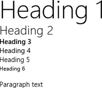
Figure 8-3. The rendered result according to the WinJS style sheet
Each of these heading styles applies only when you define a heading tag (h1, h2, h3, h4, h5, and h6) in the HTML, but for each there is also a corresponding class that can be added to any element you wish.
The class equivalent of h1 is win-type-xx-large, of h2 is win-type-x-large, of h3 is win-type-large, of h4 is win-type-medium, of h5 is win-type-small, and of h6 is win-type-xx-small. There is also a style for win-type-x-small, though it does not map to a heading level.To use one of these styles, you have only to add the right class to whatever element you’re attempting to affect.
You would choose to use a style when you want to match the type ramp but without explicitly using a heading tag. Heading tags have certain behaviors that you may not always want, the biggest is that it is a block level element. Listing 8-2 provides a standard button (for comparison) followed by a button that has been given a class of win-type-x-large to effectively give it the look of an h2. The larger text in the second button in Figure 8-4 is obvious. You should think twice before changing the styling of any default element, and move forward only if it is an intentional change to support your apps overall design.
Listing 8-2. The win-type-x-large class is defined on a standard HTML button
<!-- HTML snippet -->
<div><button>Button 1</button></div>
<div><button class="win-type-x-large">Button 2</button></div>

/* CSS snippet */
.lst0802 button {
    margin: 5px;
}
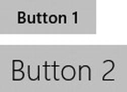
Figure 8-4. The result is a button that is styled like an h2 element
There are two more win-type style rules, which are win-type-ellipsis and win-type-interactive.
The win-type-ellipsis definition contains the text-overflow property with a value of ellipsis (“...”), which renders an ellipsis character when text does not fit in its container.
The win-type-interactive style rule is very helpful for causing text to render like a link even when it is not actually a link as is common in Windows 8 apps that follow the standard single-page app navigation pattern.
WinJS gives us a standard style for text that has been selected by the user, too. Selected text is identified using the ::selection pseudo-element. In the light theme, for instance, selected text is given a background color that is a variation of blue with a text color of white.
Keep in mind that class-based style rules can be applied in combination with an element, because multiple classes can be specified on a single element. In Listing 8-3, a span of text in the middle of a paragraph is given multiple classes to render it like an h3 and to make it interactive. In Figure 8-5, you can see the effect of simply adding this class to a span.
Listing 8-3. Two classes are applied to a span that surrounds some paragraph text
<!-- HTML snippet -->
<p>Lorem ipsum dolor sit amet, <span class="win-type-x-large win-type-interactive" >consectetur adipiscing elit</span>. Maecenas hendrerit posuere nulla...</p>
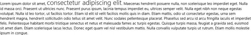
Figure 8-5. The span of text is rendered larger than the rest and will provide hover feedback because of the win-type-interactive class
An app is snapped by a user when he wishes to keep it available (though in a smaller format) while working on another app. It’s a great feature for the user to get a terse, vertical view of a secondary task while using Windows 8. For the developer it’s a design consideration, and a necessary one because there is no way to configure your app to disallow snapping. A lot changes when your app is snapped; most notably, your available horizontal pixels go from at least 1024 down to only 320. Absolutely every app can be snapped, so you must account for the case even if it’s only to inform the user that the app is not capable of functioning normally until it’s unsnapped.
At least some of the work of transforming your app for snapped view is done for you by WinJS. The CSS files in WinJS define a media query to detect that your app is in snapped view and sets various style properties to maintain your app’s usability and design.
Figures 8-6 and 8-7 show a sample app in the fullscreen state and then in the snapped state. In this case, no provisions have been made to adjust the app when snapped, so it’s essentially just showing the left 320 pixels of the full screen app. First, this is definitely a behavior you should avoid delivering to the Windows Store.
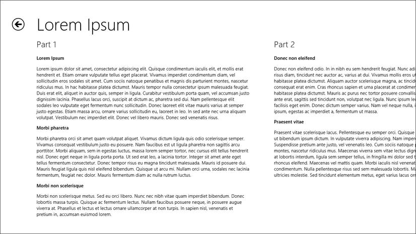
Figure 8-6. A sample app displayed in fullscreen landscape
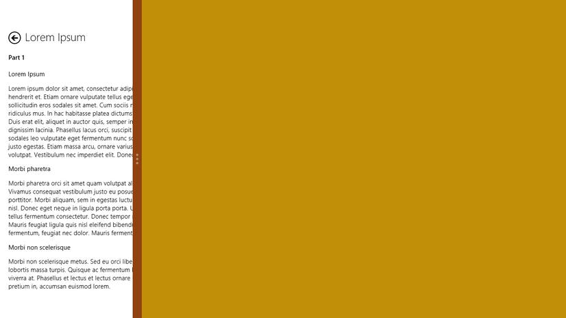
Figure 8-7. The same app snapped to the left side of the screen illustrating the inherent differences in style between the fullscreen view state and the snapped view state
You can see, however, that there are a few differences between the full-view view and the left-most 320 pixels in the snapped view. The app title is smaller, because the h1 element and the win-type-xx-large class are changed to use a 20-point font instead of the normal 42-point. The section titles (Part 1 and Part 2) are smaller too, because the style rules for the h2 element and the win-type-x-large class are changed to use an 11-point font instead of the normal 20. The back button is smaller too. All of this is built-in functionality in WinJS.
Obviously this app is not entirely in support of snapped view, but with a few more media queries and style properties it could be.
Windows 8 apps have app bars that are optional. A developer can choose to define a lower app bar that can slide up from the bottom of the screen or an upper app bar that can slide down from the top. Both app bars can obviously be defined as well. A simple swipe, right mouse click, or keyboard shortcut (Win + Z) is all it takes for the user to access either.
Remember how I mentioned in Chapter 1 that a core principle of good Windows 8 design is to immerse the user and remove the distractions. This is why app bars are a great place for commands, because they don’t distract the user from their content and they don’t demand valuable design surface until the user elects.
Figure 8-8 shows the Bing Maps app with the lower app bar revealed. This lower app bar should be used for commanding. Commands are a means for the app user to interact with the app or issue commands. Most often commands will be buttons and should conform to the recommended design—a round button with a simple icon. If the command can be represented using one of the default Windows 8 icons, then it should be. Only create a custom icon if it cannot be represented using one from the built-in collection.
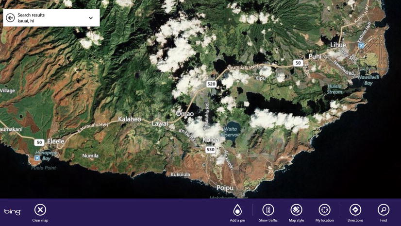
Figure 8-8. Unless the lower app bar is revealed by the user, the Bing Maps app shows you nothing more than a map. This is what it means for a user to be immersed in content
Besides a lower app bar for commanding, an upper app bar is available to developers and should primarily be used for navigation of some form. In Figure 8-9, you can see the Internet Explorer 10 app (Windows Store version), and you can see that the upper app bar is used to display thumbnails for browser tabs.
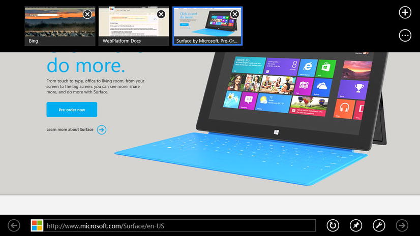
Figure 8-9. Internet Explorer implements both an upper and alower app bar
Figure 8-10 illustrates the Sports app that is built by the Bing team and is pre-installed in Windows 8. In this app, the lower and upper app bars are both in use. The upper is used for navigating to the various available sports while the lower app bar avails an option to refresh sports data.
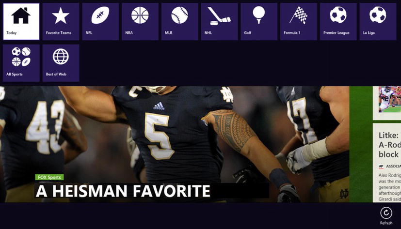
Figure 8-10. The upper app bar in the Bing Sports app navigates the user to the different sporting events available
It is important for app bars to have uniform appearance and functionality across apps, so you’ll find that you don’t usually need to add style rules to your app bar. More often than not, their default styling is sufficient.
What we really want to do in a book about using CSS to style your app, is understand the general structure of an app bar and what classes it is decorated with so that we have some hope of customizing it by adding or overriding styles. To do this, we’ll look at the complete code for implementing an app bar and then we’ll see what the resulting DOM looks like and highlight the significant parts (see Figure 8-11).
})();
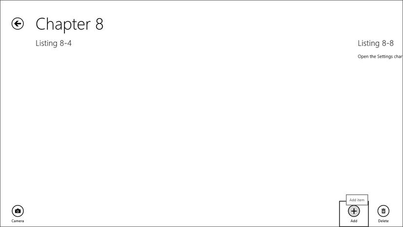
Figure 8-11. An app bar is created from only declarative markup and has all of the personality of a Windows 8 app bar
In Listing 8-4, we have declared an app bar (in bold) complete with command buttons. The declaration of these elements is simple, yet it results in a robust control composed of many native HTML elements being built out in the DOM.
Listing 8-4. Full implementation of an app bar in a Windows 8 app
<!-- lst0804.html -->
<!DOCTYPE html>
<html>
<head>
<meta charset="utf-8" />
<title>Listing 8-4</title>

<!-- WinJS references -->
<link href="//Microsoft.WinJS.1.0/css/ui-light.css" rel="stylesheet" />
<script src="//Microsoft.WinJS.1.0/js/base.js"></script>
<script src="//Microsoft.WinJS.1.0/js/ui.js"></script>

<link href="lst0804.css" rel="stylesheet" />
<script src="lst0804.js"></script>
</head>
<body>
<div class="lst0804 fragment">
<section aria-label="Main content" role="main">

</section>
<div id="myAppBar" data-win-control="WinJS.UI.AppBar">
<button
                data-win-control="WinJS.UI.AppBarCommand"
                data-win-options="{ id:'cmdAdd', label:'Add', icon:'add', section:'global',
                    tooltip:'Add item' }"></button>
<button
                data-win-control="WinJS.UI.AppBarCommand"
                data-win-options="{ id:'cmdDelete', label:'Delete', icon:'delete',
                    section:'global', tooltip:'Delete item' }"></button>
<button
                data-win-control="WinJS.UI.AppBarCommand"
                data-win-options="{ id:'cmdCamera', label:'Camera', icon:'camera',
                    section:'selection', tooltip:'Take a picture' }"></button>
</div>
</div>
</body>
</html>

/* lst0804.css */
(empty)

// lst0804.js
(function () {
    "use strict";

    WinJS.UI.Pages.define("/pages/chapter8/lst0804/lst0804.html", {
        ready: function (element, options) {
            //empty
        }
    });
Notice that the CSS and JavaScript files are essentially empty. An app bar and its buttons can be created entirely declaratively. I’ve included the .css and .js files just so you know there’s no magic happening.
The lst0804.html file in Listing 8-4 will define our app bar, but it does not represent the actual HTML that ends up in the DOM while the app is actively running. This is because of the way that WinJS handles controls. You create a control by adding a data-win-control attribute to a standard HTML element. Then, when the WinJS.UI.processAll function is executed, all of these declared controls get transformed into the real deal. In this process the class names are added to each element as are some inline styles in many cases.
To get a good idea of what’s going on in this process, let’s look at the DOM Explorer while our app is running and see the real live DOM. The app bar in the previous example resulted in the code in Listing 8-5.
Listing 8-5. The DOMthat results from the app bar we have created
<!-- HTML snippet from DOM Explorer -->
<divclass="win-overlay win-appbar win-commandlayout win-bottom" id="myAppBar" role="menubar"
style="visibility: hidden; opacity: 0;" aria-label="App Bar"
    data-win-control="WinJS.UI.AppBar" unselectable="on">
<buttonclass="win-command win-global" id="cmdAdd" role="menuitem" aria-label="Add"
        type="button" data-win-options="{ id:'cmdAdd', label:'Add', icon:'add',
        section:'global',
 tooltip:'Add item' }"
        data-win-control="WinJS.UI.AppBarCommand">
<span tabindex="-1"class="win-commandicon win-commandring" aria-hidden="true">
<span tabindex="-1"class="win-commandimage" aria-hidden="true"> </span>
</span>
<span tabindex="-1"class="win-label" aria-hidden="true">Add</span>
</button>
<buttonclass="win-command win-global" id="cmdDelete" role="menuitem" aria-label="Delete"
        type="button" data-win-options="{ id:'cmdDelete', label:'Delete', icon:'delete',

        section:'global', tooltip:'Delete item' }"
        data-win-control="WinJS.UI.AppBarCommand">
<span tabindex="-1"class="win-commandicon win-commandring" aria-hidden="true">
<span tabindex="-1"class="win-commandimage" aria-hidden="true"></span>
</span>
<span tabindex="-1"class="win-label" aria-hidden="true">Delete</span>
</button>
<buttonclass="win-command win-selection" id="cmdCamera" role="menuitem" aria-label="Camera"
        type="button" data-win-options="{ id:'cmdCamera', label:'Camera', icon:'camera',

        section:'selection', tooltip:'Take a picture' }"
        data-win-control="WinJS.UI.AppBarCommand">
<span tabindex="-1"class="win-commandicon win-commandring" aria-hidden="true">
<span tabindex="-1"class="win-commandimage" aria-hidden="true"> </span>
</span>
<span tabindex="-1"class="win-label" aria-hidden="true">Camera</span>
</button>
</div>
The bolded content in Listing 8-5 is the class attributes that have been added into the DOM elements. These class names act as handles for us to select the different parts of the control and add or override style rules for them.
The app bar itself (the highest level div in Listing 8-5) has been given four class names: win-overlay, win-appbar, win-commandlayout, and win-bottom. Each of these classes applies to the app bar a style rule that is defined in the WinJS CSS, and each of the classes serves a distinct purpose; that’s why there are four classes instead of just one. A developer may elect, for instance, to set the app bar’s placement option to top to render it at the top of the screen, in which case the win-bottom class would be omitted and replaced with win-top.
The goal, once again, is to understand the structure of our HTML so we can add or override styles that affect it. Let’s take one example and follow it through. The buttons that we declared on our app bar have each been given content that makes them look like a proper app bar button—a circle with an icon and a label below. This is achieved using span elements with classes defined. The ring is given the classes of win-commandicon and win-commandring, and the label below is a span with the class of win-label. Imagine that our project requirements state that our app bar buttons should have a border of gray instead of the standard white when the user hovers their mouse over them.
First, let’s look at how the buttons get their white border by looking into ui-light.css at lines 2511–2599 (Listing 8-6). Pay special attention to the bolded section. This style rule affects the element with a class of win-commandring that is a child of a button that is currently being hovered over. That’s exactly what we’re looking to override.
Listing 8-6. From ui-light.css (lines 2511–2599), we can see the styles that the circle around our command buttons gets when the user hovers over one
/*
Command ring colors.
*/
...
.win-commandring, button:active .win-commandring {
    background-color: transparent;
    border-color: rgb(0, 0, 0);
}
button:hover .win-commandring {
    background-color: rgba(0, 0, 0, 0.13);
    border-color: rgb(0, 0, 0);
}
button:hover:active .win-commandring {
    background-color: rgb(0, 0, 0);
    border-color: rgb(0, 0, 0);
}
button:-ms-keyboard-active .win-commandring {
    background-color: rgb(0, 0, 0);
    border-color: rgb(0, 0, 0);
}
button:disabled .win-commandring,
button:disabled:active .win-commandring {
    background-color: transparent;
    border-color: rgba(0, 0, 0, 0.4);
}
button[aria-checked=true] .win-commandring,
button[aria-checked=true]:active .win-commandring {
    background-color: rgb(0, 0, 0);
    border-color: rgb(0, 0, 0);
}
button[aria-checked=true]:hover .win-commandring {
    background-color: rgb(33, 33, 33);
    border-color: rgb(33, 33, 33);
}
button[aria-checked=true]:hover:active .win-commandring {
    background-color: transparent;
    border-color: rgb(0, 0, 0);
}
button[aria-checked=true]:-ms-keyboard-active .win-commandring {
    background-color: transparent;
    border-color: rgb(0, 0, 0);
}
button[aria-checked=true]:disabled .win-commandring,
button[aria-checked=true]:disabled:active .win-commandring {
    background-color: rgba(0, 0, 0, 0.4);
    border-color: rgba(0, 0, 0, 0.4);
}
Although it’s not related to our current requirement of modifying the border color, notice that the background color is getting an opacity value of 0.13 when it’s being hovered. This makes the button somewhat less than entirely transparent only when the user hovers over it.
The border color is what we’re trying to affect, and the border color in this case is exactly the same in a hover state as it is in its normal state. We cannot modify the ui-light.css file, but we can override the style rule in question. If we add the style rule from Listing 8-7 to our own page’s CSS file, then we will get the effect we are looking for. Figure 8-12 shows that effect with a gray border around it.
Listing 8-7. A slight overriding style change to the border-color for the hover state
button:hover .win-commandring {
    background-color: rgba(0, 0, 0, 0.13);
    border-color: gray;
}
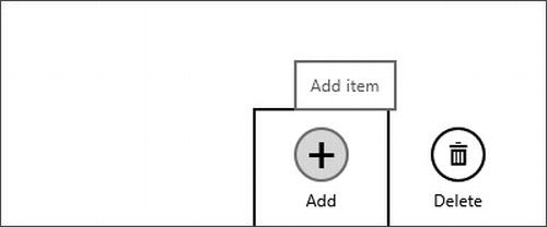
Figure 8-12. Hovering over a command button now changes the circular border around it to be gray
The thing to note here is that nothing is hidden from the developer. All of the style properties used to create Windows 8 apps are available to browse, append, and override.
Like the app bar, the settings pane in Windows 8 apps is predictable for the user. It’s always accessible by swiping the Charms out from the right side of the screen and selecting the Settings charm (see Figure 8-13). Choosing a settings category from the main settings pane flies a specific settings pane out from the right side of the screen. This specific settings pane is the one we’re going to customize using a WinJS.UI.SettingsFlyout control.
Figure 8-13. The Settings charm is always visible as the gear icon on the bottom of the charms bar
Unlike the app bar, the settings pane is a blank slate that the developer is expected to design and implement, so you have a lot of freedom, but you’re not without help. There are many styles that affect the settings pane and give it a standard Windows 8 design. I’ll highlight those here.
Consider the snippet of HTML in Listing 8-8 and the resulting settings pane in Figure 8-14.
Listing 8-8. Complete definition of a settings flyout
<!-- lst0808.html -->
<!DOCTYPE html>
<html>
<head>
<meta charset="utf-8" />
<title>Listing 8-8</title>

<!-- WinJS references -->
<link href="//Microsoft.WinJS.1.0/css/ui-light.css" rel="stylesheet" />
<script src="//Microsoft.WinJS.1.0/js/base.js"></script>
<script src="//Microsoft.WinJS.1.0/js/ui.js"></script>

<link href="lst0808.css" rel="stylesheet" />
<script src="lst0808.js"></script>
</head>
<body>
<div class="lst0808 fragment">
<section aria-label="Main content" role="main">

<p>Open the Settings charm and choose Listing 8-8 to see the resulting settings pane</p>

<!-- BEGINSETTINGSFLYOUT -->
<div id="sampleSettings" data-win-control="WinJS.UI.SettingsFlyout"
            aria-label="App Settings Flyout">
<div class="win-ui-dark win-header">
<button type="button" onclick="WinJS.UI.SettingsFlyout.show()"
                    class="win-backbutton"></button>
<div class="win-label">Preferences</div>
</div>
<div class="win-content">
<div class="win-settings-section">
<h3>Toggle switch</h3>
<p>Use toggle switches to let users set Boolean values.</p>
<div id="Toggle1" data-win-control="WinJS.UI.ToggleSwitch"
                        data-win-options="{title:'Download updates automatically',
                            checked:true}">
</div>
<div id="Toggle2" data-win-control="WinJS.UI.ToggleSwitch"
                        data-win-options="{title:'Install updates automatically'}">
</div>
</div>
</div>
</div>
<!-- ENDSETTINGSFLYOUT -->
</section>
</div>
</body>
</html>
/* lst0808.css */
// lst0808.js
(function () {
    "use strict";
    WinJS.UI.Pages.define("/pages/chapter8/lst0808/lst0808.html", {
        ready: function (element, options) {
            addSettingsContract()
        }
    });
    function addSettingsContract() {
        app.onsettings = function (e) {
            e.detail.applicationcommands = {
                "sampleSettings": {
                    title: "Listing 8-8",
                    href: "/pages/chapter8/lst0808/lst0808.html"
                }
            };
            WinJS.UI.SettingsFlyout.populateSettings(e);
        };
    }
})();
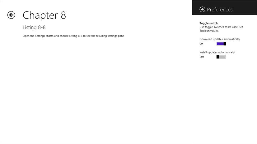
Figure 8-14. The settings flyout is available from the settings pane
The styles rules for this settings pane already exist, and we simply apply them by writing the structure and then decorating the elements with the right CSS class values.
Once again we’ll use DOM explorer to look at the resulting DOM in Listing 8-9. The classes and styles added by WinJS are shown in bold. Also in bold are two div elements (win-firstdiv and win-finaldiv) that are added, though those don’t concern us too much now since they don’t have much to do with the styling of the control
Listing 8-9. Here’s how the settings flyout looks once it’s rendered into the live DOM
<!-- HTML snippet from DOM Explorer -->
<divclass="win-overlay win-settingsflyout" id="Div1" role="dialog" aria-hidden="true"
style="left: auto; right: -346px; display: none; visibility: hidden; opacity: 1;"
    aria-label="App Settings Flyout" data-win-control="WinJS.UI.SettingsFlyout"
    unselectable="on">
<div tabindex="0" class="win-firstdiv" role="menuitem"
        aria-hidden="true" style="display: inline;"></div>
<div class="win-ui-dark win-header">
<button class="win-backbutton" aria-label="Back"
            onclick="WinJS.UI.SettingsFlyout.show()" type="button"></button>
<div class="win-label">Preferences</div>
</div>
<div class="win-content win-ui-light" style="opacity: 1;">
<div class="win-settings-section">
<h3>Toggle switch</h3>
<p>Use toggle switches to let users set Boolean values.</p>

            ...

</div>
</div>
<div tabindex="0" class="win-finaldiv" role="menuitem" aria-hidden="true"
        style="display: inline;"></div>
</div>
The div element that contains the back button and the settings title is decorated with win-ui-dark and win-header class values, and the background-color is set using the only style rule we had to write in the CSS snippet. The back button is a standard HTML button with the win-backbutton class, which is identical to the way the back button is declared for pages. The two back buttons are not the same, however, and the way the CSS discerns is with the use (again in the ui-light.css document) of a style rule with a selector of .win-settingsflyout .win-backbutton. As you can likely tell by the presence of .win-settingsflyout, this style rule will be limited to back buttons that are within a settings flyout.
Flyouts and Menus
Flyouts and menus are offered by the WinJS library and are more global, app-level controls, so I’ll cover the styling of them now.
Flyouts and menus are closely related since they both have similar behavior. Both flyouts and menus appear as on overlay over the existing design surface (much like dialog boxes in most any programming framework). They are also light dismiss, which means the user can dismiss them by simply touching or clicking anywhere outside.
Flyouts give you free reign in formatting the contents, whereas menus are more structured and make it easier to create consistent menu systems. You can find much more information about flyouts and menus at http://msdn.microsoft.com/en-us/library/windows/apps/hh465325.aspx.
The flyout is just an HTML container, so you’re free to create anything inside it that you want. Flyouts are an excellent way to prompt the user for input by displaying a small input panel very near where the user initiated the action. You could, for instance, prompt the user to add a new item by providing them an Add user button, and then when the user touches it, show a flyout near the button prompting them for a name. Listing 8-10 and Figure 8-15 show an Add user button that shows a flyout (positioned to the right of the button). When the user touches it, an event is executed which shows the flyout. Again, we’ll see the full example for implementing the button and the flyout as well as the resulting DOM created by WinJS.
Listing 8-10. A complete example of a flyout implementation
<!-- lst0810.html -->
<!DOCTYPE html>
<html>
<head>
<meta charset="utf-8" />
<title>Listing 8-10</title>

<!-- WinJS references -->
<link href="//Microsoft.WinJS.1.0/css/ui-light.css" rel="stylesheet" />
<script src="//Microsoft.WinJS.1.0/js/base.js"></script>
<script src="//Microsoft.WinJS.1.0/js/ui.js"></script>

<link href="lst0810.css" rel="stylesheet" />
<script src="lst0810.js"></script>
</head>
<body>
<div class="lst0810 fragment">
<section aria-label="Main content" role="main">
<button id="showFlyoutButton">Add user</button>

<div id="flyout1" data-win-control="WinJS.UI.Flyout"
                data-win-options="{placement: 'right'}">
<label for="input">Name</label>
<input type="text" />
</div>
</section>
</div>
</body>
</html>

/* lst0810.css */
(empty)

// lst0810.js
(function () {
    "use strict";

    WinJS.UI.Pages.define("/pages/chapter8/lst0810/lst0810.html", {
        ready: function (element, options) {
            var showFlyoutButton = element.querySelector("#showFlyoutButton");
            var flyout = element.querySelector("#flyout1");
            showFlyoutButton.onclick = function(e) {
                flyout.winControl.show(showFlyoutButton);
            }
        }
    });
})();
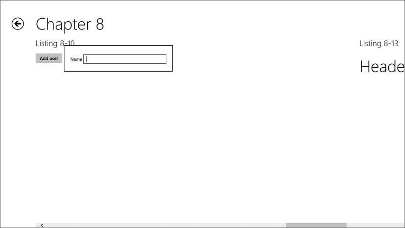
Figure 8-15. A Flyout control prompting the user to enter a username
Listing 8-11 is the resulting DOM with added classes and inline styles added by WinJS shown in bold
Listing 8-11. The resulting DOM for a flyout control
<divclass="win-overlay win-flyout win-ui-light" id="Div1" role="dialog"
    aria-hidden="true"style="left: 210px; top: 146.5px; right: auto;
        bottom: auto; display: none; visibility: hidden; opacity: 0;"
        aria-label="Flyout" data-win-options="{placement: 'right'}"
    data-win-control="WinJS.UI.Flyout" unselectable="on">
<div tabindex="0" class="win-firstdiv" role="menuitem" aria-hidden="true"
        style="display: inline;"></div>
<label for="input">Name</label>
<input class="win-hidefocus" type="text">
<div tabindex="0" class="win-finaldiv" role="menuitem" aria-hidden="true"
        style="display: inline;"></div>
</div>
Like all other controls, a flyout control is instantiated using a standard HTML element—most often a div element. You can refer to any flyout you create using the ID that you gave it, of course, but what if you want to reference every flyout in your application? If you know that every flyout control is given a win-flyout class in the resulting DOM, then you know that you can refer to all of the flyouts in your app (or in any given scope you choose) by using a class selector (.win-flyout). The CSS in Listing 8-12, then, would set the flyout controls in your app to have a gray background and a thin, dark blue border.
Listing 8-12. Affects all flyouts with a gray background and a dark blue border
/* CSS snippet */
.win-flyout {
    background-color: gray;
    border: 1px solid darkblue;
}
Menus are made up of one or more MenuCommand objects. Listing 8-13 and Figure 8-16 include a complete example of a Windows 8 page with a header menu. A header menu is a recommended design for navigating the user from one part of the app to another quickly. A small chevron symbol is rendered next to the page title and gives the user the clue that the title is a menu and can be touched to invoke the header menu.
Listing 8-13. A WinJS.UI.Menu is declared in HTML and JavaScript is added to show it when the user clicks
<!-- lst0813.html -->
<!DOCTYPE html>
<html>
<head>
<meta charset="utf-8" />
<title>Listing 8-13</title>
<!-- WinJS references -->
<link href="//Microsoft.WinJS.1.0/css/ui-light.css" rel="stylesheet" />
<script src="//Microsoft.WinJS.1.0/js/base.js"></script>
<script src="//Microsoft.WinJS.1.0/js/ui.js"></script>
<link href="lst0813.css" rel="stylesheet" />
<script src="lst0813.js"></script>
</head>
<body>
<div class="lst0813 fragment">
<section aria-label="Main content" role="main">
<h1 class="menu win-type-ellipsis">
<span class="title">Header Menu</span>
<span class="chevron win-type-x-large"></span>
</h1>
<div id="headerMenu" data-win-control="WinJS.UI.Menu">
<button data-win-control="WinJS.UI.MenuCommand"
data-win-options="{id:'s1',label:'Section One'}"></button>
<button data-win-control="WinJS.UI.MenuCommand"
data-win-options="{id:'s2',label:'Section Two'}"></button>
<button data-win-control="WinJS.UI.MenuCommand"
data-win-options="{id:'s3',label:'Section Three'}"></button>
<hr data-win-control="WinJS.UI.MenuCommand"
data-win-options="{id:'separator',type:'separator'}" />
<button data-win-control="WinJS.UI.MenuCommand"
data-win-options="{id:'sHome',label:'Home'}"></button>
</div>
</section>
</div>
</body>
</html>
/* lst0813.css */
. lst0813 .chevron {
vertical-align:8px;
}
// lst0813.js
(function () {
"use strict";
WinJS.UI.Pages.define("/pages/chapter8/lst0813/lst0813.html", {
ready: function (element, options) {
element.querySelector(".menu").onclick = function () { showHeaderMenu(element); };
}
});
function showHeaderMenu(element) {
var title = element.querySelector(".menu");
var menu = element.querySelector("#headerMenu").winControl;
menu.anchor = title;
menu.placement = "bottom";
menu.alignment = "left";
menu.show();
}
})();

Figure 8-16. The title has been transformed into an operational menu
Now that you’ve seen how to create this simple menu, let’s have a look at the HTML that is actually rendered for the app. This can be found using the DOM Explorer.
As you can see from the bolded text in Listing 8-14, each of the buttons has been given a class of win-command. This is very convenient for us as consumers of the WinJS.UI.Menu control because it means that it’s going to be easy enough to apply a style to all menu items.
Listing 8-14. The resulting DOM for the menu created in Listing 8-13
<!-- HTML snippet from DOM Explorer -->
<div class="win-overlay win-flyout win-ui-light win-menu " id="headerMenu" role="menu"
style="display: none; visibility: hidden; opacity: 0;" aria-label="Menu"
    data-win-control="WinJS.UI.Menu" unselectable="on">
<buttonclass="win-command" id="s1" role="menuitem" aria-label="Section One"
        type="button" data-win-options="{id:'s1',label:'Section One'}"
        data-win-control="WinJS.UI.MenuCommand">Section One</button>
<buttonclass="win-command" id="s2" role="menuitem" aria-label="Section Two"
        type="button" data-win-options="{id:'s2',label:'Section Two'}"
        data-win-control="WinJS.UI.MenuCommand">Section Two</button>
<buttonclass="win-command" id="s3" role="menuitem" aria-label="Section Three"
        type="button" data-win-options="{id:'s3',label:'Section Three'}"
        data-win-control="WinJS.UI.MenuCommand">Section Three</button>
<hrclass="win-command" id="separator" data-win-options="{id:'separator',type:'separator'}"
        data-win-control="WinJS.UI.MenuCommand">
<buttonclass="win-command" id="sHome" role="menuitem" aria-label="Home" type="button"
        data-win-options="{id:'sHome',label:'Home'}"
        data-win-control="WinJS.UI.MenuCommand">Home</button>
</div>
Let’s modify the CSS with the bolded style rule in Listing 8-15.
Listing 8-15. The CSS from Listing 8-13 with an override to the menu buttons to italicize them
/* menus.css */
.lst0813 .chevron {
    vertical-align:8px;
}

.lst0813 .win-command {
    font-style: italic;
}
As you might expect and can see in Figure 8-17, each of the menu commands has been italicized.
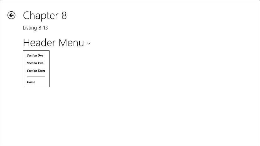
Figure 8-17. Applying a style to the win-command class has affected every menu item
Windows 8 accommodates users with low vision by providing a high-contrast mode that the user can choose from PC settings | Easy of Access and expect that the choice will apply to all apps on their system.
For the most part, if you use the standard styles and methods for creating the visual elements in your app, you won’t have to do anything to implement high-contrast support in your app. You may have custom considerations, however, regarding visibility in high-contrast mode, and you should be familiar with the styles you’ll need to override to make that happen.
High-contrast styles are applied by way of a media query. A vendor-specific value of -ms-high-contrast is available as an expression to media queries and will be true when the user has chosen high-contrast mode on his device.
There are high-contrast style rules to control virtually every visual aspect of your app.
I’ll draw just one example of a style property that affects your app in high-contrast mode and show you how to override it. Line 2848 in ui-light.css begins the main media query for high-contrast mode, and lines 3068–3074 (Listing 8-16) define the styles for the win-appbar class.
Listing 8-16. Just one of the many style rules defined in the -ms-high-contrast media query
@media (-ms-high-contrast)
{
    ...

    /*
    AppBar high contrast colors.
    */
    .win-appbar {
        background-color: ButtonFace;
        border-color: Highlight;

    ...
}
Let’s pretend that the customer we’re developing for has determined that a pure white app bar background is just as visible and matches their branding better and has asked us to override the default value. To do so, we need only clone this style rule (including the media query) in our page’s CSS file, as you see in Listing 8-17.
Listing 8-17. An override to the background color of the app bar in high contrast mode
@media (-ms-high-contrast)
{
    .win-appbar {
        background-color: white;
}
If you do need to override the built-in high-contrast styles, be careful to maintain good visibility at all times. An app that does not do a good job of providing a high-contrast mode will likely be caught in the app certification process and, worse still, will exclude low-vision users from enjoying your app.
Summary
In this chapter, we’ve seen the many ways that WinJS affects the style of our app and extends it to us as developers so that we can not only take on the personality of the Windows 8 ecosystem, but can also display our own personality.
We’ve seen how to style our app’s typography, the app bar, settings pane flyouts, and menus, and we’ve learned how high-contrast mode is implemented and how to extend it where necessary.
In the next chapter, we’re going to remain in the same vein, but look more at the styling of the many controls provided to us by WinJS.