
Transforms, Transitions, and Animation Properties
 Note Animation is much more than an embellishment in a successful Windows 8 app; rather, it makes itself essential by engaging the user and bringing the app to life. And an engaging and lively app is a successful app.
A Windows 8 app without enough animation is going to leave the user with at least a subconscious sense that something is lacking or something is dead. Too much animation threatens to detract, distract, and possibly even annoy. So animation should be just enough to make your app’s visual artifacts come to life, and no more.
The right amount of animation is a core tenet to Windows 8 design. One of the principles that cover Windows 8 design is to be authentically digital—that is, to embrace the capabilities and liberties of a modern digital system and shake the constraints of physical ones. Animations and transitions that accentuate the users’ tasks fall in line with this principle.
There’s another principle that relates to the subject—that your UI should be fast and fluid. Not only should your interface never have hiccups in performance or in contact with the user, but it should flow from one screen to the next. There’s good reason to animate a UI, and there’s even better reason not to animate too much.
In animations, Microsoft has again embraced and implemented the W3C standards and then extended them where necessary to enable the demands of modern applications. And since your animations are running native in Windows 8, they’ll have the tremendous advantage of the operating system’s hardware acceleration. You don’t have to accept a performance penalty for working with the web stack.
In this chapter, we’ll discuss all things related to CSS and animation. We’ll cover transforms, transitions, and animation both in two dimensions as well as in three. Many more pages could easily be dedicated to these broad subjects than we have time and space for now, but I hope to convey the concept and get you excited about what’s possible.
Transforms are simply changes. It might be a change of width, a change of color, or some other property. You know already, though, that these properties’ changes can be done by simply modifying property values, so why would you want to add a transform, for instance, to move an element some pixels to the right, when you could simply adjust its position properties and see the same effect? Or why would you apply a scale transform to cause something to grow, when you could just increase its width and height properties?
The answer is that a transform is easy to apply and remove (programmatically even). It affects the target element after it has already been rendered, and it affects the entire target element, children included.
Additionally, transforms allow you to affect your elements in ways that are not possible with properties alone. You cannot add rotation to an element without a transform, for instance. In fact, there is an entire subset of CSS transforms that affect the element with 3D-like effects, and these effects would certainly not be possible with standard properties.
There are many transformational effects available, and yet there are only about six CSS properties to remember, and they are perspective, perspective-origin, backface-visibility, transform-origin, transform-style, and transform. There are many more details about these properties. You can see a full list at http://www.w3.org/TR/css3-transforms/#transform-property.
The most interesting property by far is the transform property. For its value it expects a list of one or many transform functions. I’ll describe each of the transform-related properties first and then focus in great detail on the transform property.
Don’t get confused about the difference between this property value and the perspective() function that will be discussed soon. They have the same visual effect, but this one (the perspective value for the transform function) affects the transforms of all of its children, whereas the perspective() function only affects the transform of the element it’s on. I’ll wait until the next section to describe the actual effect of the perspective() function. The perspective property value only affects 3D transformed elements.
The perspective-origin property is the virtual camera’s deviation (using x and y coordinates) from directly in front of the target element. If you’re looking at the wall of a square building and you step to the right far enough, the wall will change shape from your perspective, and this is exactly what you should think of when you’re modifying this property. Like perspective, perspective-origin affects the transforms of its children’s transforms, but not its own.
The backface-visibility property determines what happens to an element’s contents when we spin it around and see the back of it. Set it to visible if you should see the back of the content in that case or to hidden if you should not.
If you stuck a pin near one corner of a square and rotated it, you would get a different result than if you stuck your pin in the square’s center. This is what the transform-origin property does for you. It indicates which part of an element the transformation should originate at. It behaves a bit differently depending on the transform.
You can specify either flat or preserve-3d as values for the transform-style property. If you choose preserve-3d, then nested elements will preserve their location relative to each other in their 3D space. If you choose flat, however, then all elements collapse to a shared plane.
The transform function is the one that does most of the heavy lifting. Its value can be quite large because it’s composed of one to perhaps many of the available transform functions (separated by spaces). There’s a lot of complexity involved in the transform property and all of its many functions. You are welcome to go to w3c.org and get your fill of the formulas and theories, but I’m going to keep all of my descriptions and examples rather simple and pragmatic. I’ll talk more about the reasons you might choose to use transforms for your application than I will the math and theory behind doing it.
There are a lot of transform functions to choose from. You can affect your target element with any of the following two dimensional transforms: rotate(), scale(), scaleX(), scaleY(), skew(), skewX(), skewY(), translate(), translateX(), translateY(), or matrix().
There’s nothing obscure about the purpose of the rotate function. It rotates the target element in a clockwise direction by a specified number of degrees. The degree unit is deg and follows a value from negative infinity to positive. Negative values will rotate the target element in the counter-clockwise direction and positive values in the clockwise direction.
The rotate() function is perfectly willing to accept numbers greater than a 360-degree, full rotation, with which it will just continue rotating. A value of 440deg, therefore, will rotate the target one and a half times in the clockwise direction and will end up being equivalent to a value of 180deg.
Listing 6-1 demonstrates identical div elements with three different rotation values.
Note You may notice in the code listings in this chapter that the parent container may have its display value set to either -ms-flexbox or -ms-grid. For now, just know that these are layout techniques. The flexbox is great for lining its children up next to each other, and the grid is used in this case to stack them on top of each other. We’ll talk much more about these and other layout techniques in Chapter 7.
Listing 6-1. A text block at 5deg, -45deg, and 180deg respectively
<!-- HTML snippet -->
<div class="parent">
    <div>Lorem ipsum dolor sit amet...</div>
    <div>Lorem ipsum dolor sit amet...</div>
    <div>Lorem ipsum dolor sit amet...</div>
</div>

/* CSS snippet */
.parent {
    display: -ms-flexbox;
}

.parent div {
    border: 2px solid gray;
    width: 200px;
    height: 200px;
    padding: 5px;
    margin: 5px;
}

.parent div:nth-of-type(1) {
    transform: rotate(5deg);
}

.parent div:nth-of-type(2) {
    transform: rotate(-45deg);
}

.parent div:nth-of-type(3) {
    transform: rotate(180deg);
}
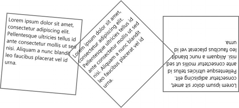
Figure 6-1. Transformed elements with various levels of rotation
Scaling is the resizing of the target element and all of its contents, and it takes effect after the target has been rendered. This means that child content of the element is not going to be laid out based on the resizing of its parent element, but rather scaled along with it.
The scale() function asks for a multiplier for a value. A value of 0.5 would scale an object to half its original size, 1 would leave it unchanged in size, and 2 would double it. Listing 6-2 goes through that exact scenario.
Listing 6-2. Scaling an object to half and then to twice its original size
<!-- HTML snippet -->
<div class="parent">
    <div>Lorem ipsum dolor sit amet...</div>
    <div>Lorem ipsum dolor sit amet...</div>
    <div>Lorem ipsum dolor sit amet...</div>
</div>

/* CSS snippet */
.parent {
    display: -ms-flexbox;
}

.parent div {
    border: 2px solid gray;
    width: 200px;
    height: 200px;
    padding: 5px;
    margin: 5px;
}

.parent div:nth-of-type(1) {
    transform: scale(1);
}

.parent div:nth-of-type(2) {
    transform: scale(0.5);
}

.parent div:nth-of-type(3) {
    transform: scale(2);
}
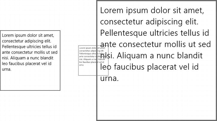
Figure 6-2. Three levels of scale
Notice how after being scaled, the divs in Figure 6-2 are actually overlapping. This doesn’t seem possible based solely on legacy HTML experience. The fact that the scaling occurs only after the target element has been fully rendered means that it’s quite a different effect than simply specifying alternate values for the width and height properties.
Consider the div element in Listing 6-3. It has a paragraph for its contents, and its dimensions are 400 pixels wide by 200 pixels high.
Listing 6-3. A 400 pixel by 200 pixel div element with text content
<!-- HTML snippet -->
<div id="textDiv">
    <p>Lorem ipsum dolor sit amet...</p>
</div>

/* CSS snippet */
#textDiv {
    width: 400px;
    height: 200px;
}
Now let’s look at Listing 6-4, wherein we resize the div using the width and height properties. You’ll notice that the paragraph text has reacted to the change in size of its parent.
Listing 6-4. Resizing the div to 800 pixels by 400 pixels by manipulating the style properties
/* CSS snippet */
#textDiv {
    width: 800px;
    height: 400px;
}
Figure 6-4. The div text has been layed out to fit its larger container
And now, in contrast, Listing 6-5 scales the element instead. You’ll notice that the paragraph text has not changed its layout but remains the same shape, albeit at twice the size.
Listing 6-5. Scaling up the div using a transform instead of sizing
/* CSS snippet */
#textDiv {
    width: 200px;
    height: 100px;
    transform: scale(2,2);
}
Figure 6-5. The text is laid out exactly as it was in the smaller container and only scaled afterward
Scaling can be done on both the x and y axes uniformly or to one of the axes independently of the other. The functions scaleX() and scaleY() exist and will transform only the appropriate axis, but the same thing can be accomplished by simply providing two values to the scale method and being sure to set one of them to a value of 1. The two expressions in Listing 6-6, then, are identical.
Listing 6-6. Two alternate ways to double the width of the target element
/* CSS snippet */
div {
    transform: scale(2,1);
}

div {
    transform: scaleX(2);
}
The skew() function translates opposite sides of the target element in opposite directions, distorting the shape of the element and its contents. It can be used to create a variety of effects.
A skew can be used to show perspective. Also, a skew can be used to show acceleration and deceleration of elements if you’re animating them on the screen, but that’s an animation. The skew transform on its own is static.
Listing 6-7 shows a basic skew transform, this time again affecting a paragraph of text.
Listing 6-7. A basic skew of text along a single axis
<!-- HTML snippet -->
<div class="parent">
    <div>Lorem ipsum dolor sit amet...</div>
    <div>Lorem ipsum dolor sit amet...</div>
    <div>Lorem ipsum dolor sit amet...</div>
</div>

/* CSS snippet */
.parent {
    display: -ms-flexbox;
}

.parent div {
    border: 2px solid gray;
    width: 200px;
    height: 200px;
    padding: 5px;
    margin: 5px;
}
.parent div:nth-of-type(1) {
    transform: skew(0deg,10deg);
}

.parent div:nth-of-type(2) {
    transform: skew(-5deg,0deg);
}

.parent div:nth-of-type(3) {
    transform: skew(15deg,15deg);
}
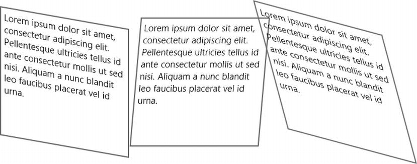
Figure 6-6. A vertical skew, a horizontal skew, and then a combination of the two
Like the scale transform, the skew transform comes in the skewX() and skewY() variety as well, but again, I don’t personally find it worthwhile to use them because it’s just as easy to use skew(n,n) and pass in two values.
Like its cousins scale and skew, translate is available in independent axis versions, which are, as you might guess, translateX() and translateY(). Did I mention that I don’t personally find them worthwhile?
The translate transform is a very important one. To translate means simply to move. The translateX() function moves its target left and right along the x axis, and the translateY() function moves it up and down along the y axis. The translate() function then takes two values and can move its target anywhere along the xy plane. You can likely imagine how many uses there might be for such a function.
Listing 6-8 uses a flexbox to lay 5 div elements out next to each other. They’re all give a predetermined size of 75 pixels square, some margin, and a white border to differentiate. The highlighted block, then, picks out the 5th div and applies a transform to knock it out of place by 20 pixels to the right and down.
Listing 6-8. A combination of rotate(), scale(), and translate() give the first letter some pizazz
<!-- HTML snippet -->
<div class="parent">
    <div>Lorem ipsum dolor sit amet...</div>
    <div>Lorem ipsum dolor sit amet...</div>
    <div>Lorem ipsum dolor sit amet...</div>
</div>

/* CSS snippet */
.parent {
    display: -ms-flexbox;
}

.parent div {
    border: 2px solid gray;
    width: 200px;
    height: 200px;
    padding: 5px;
    margin: 5px;
}

.parent div:nth-of-type(1){
    transform: translate(0,0)
}

.parent div:nth-of-type(2){
    transform: translate(20px,20px);
}

.parent div:nth-of-type(3){
    transform: translate(0,0);
}
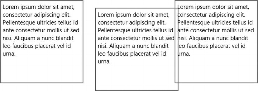
Figure 6-7. The div in the center has been moved from its original location 20 pixels to the right and 20 pixels down
All of the functionality behind the functions we’ve looked at already and a lot more are available with the matrix function. The matrix function is not for the faint of heart. It’s tedious and it’s complex, but when you need to get under the hood and make your transforms look just so, then this function (along with a little review of that linear algebra book on your shelf) will get you there.
First of all, the term 3D is a bit of a misdirection. These so-called three-dimensional transforms are no more three dimensional than anything else that happens on your two-dimensional computer screen, but the thing that defines 3D techniques on the computer is the 3D space that objects are rendered in before being projected to your two-dimensional screen. The effect gives a 3D appearance at best.
There are many available three dimensional transform functions. You can choose from perspective(), perspective-origin(), rotate3d(), rotateX(), rotateY(), rotateZ(), scale3d(), scaleZ(), translate3d(), and translateZ(),and matrix3d().
For all of the 3D transforms, you should imagine your flat, rendered elements standing up in 3D space with a virtual camera pointed at them. Some of the properties are going to manipulate the position of this virtual camera, and others are going to manipulate the position of the rendered elements.
The perspective() function manipulates the virtual camera of the element being transformed. It takes a length value with higher values, meaning that the virtual camera is further from the object and the element will appear more flat, and lower values, meaning that the virtual camera is closer to the object and the element will appear to have more depth.
It’s easy to notice the dramatic depth introduced as the perspective() function is configured to bring the camera closer to the object. Listing 6-9 shows the visual effect of reducing the perspective.
Listing 6-9. Three divs all rotated the same with perspective values of none, 400px, and 200px
<!-- HTML snippet -->
<div class="parent">
    <div>Lorem ipsum dolor sit amet...</div>
    <div>Lorem ipsum dolor sit amet...</div>
    <div>Lorem ipsum dolor sit amet...</div>
</div>

/* CSS snippet */
.parent {
    display: -ms-flexbox;
}

.parent div {
    border: 2px solid gray;
    width: 200px;
    height: 200px;
    padding: 5px;
    margin: 5px;
}

.parent div:nth-of-type(1) {
    transform: rotate3d(1,1,1,45deg);
}

.parent div:nth-of-type(2) {
    transform: perspective(400px) rotate3d(1,1,1,45deg);
}

.parent div:nth-of-type(3) {
    transform: perspective(200px) rotate3d(1,1,1,45deg);
}
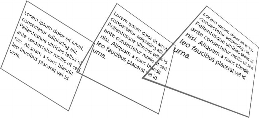
Figure 6-8. Decreasing perspective values causes an increase in the apparent depth
As I mentioned previously, you should be careful not to confuse this perspective() function with the perspective property. Again, the function affects the transform of the elements that it’s applied to. Also keep in mind that perspective will not have any effect on an object that doesn’t have any other 3D transform functions applied to it.
Of course, rotation was available to us when we were looking at the 2D transforms as well, but you might expect some additional capability in the 3D environment, and you’d be right. In our new space, we’ll be able to rotate about all three axes using rotate3d(), rotateX(), rotateY(), and rotateZ(). There’s nothing the latter three functions can do that the first can’t. The rotate3d() function takes four arguments. The first three are the x, y, and z coordinates of a vector, which will be normalized to a unit vector, and the fourth is the number of degrees (clockwise) about which to rotate the element around that vector.
Calling rotate3d(1,0,0,45deg), then, will rotate the element 45 degrees clockwise about the x-axis; rotate3d(0,1,0,45deg) will rotate it the same 45 degrees clockwise about the y-axis; and rotate3d(1,1,0,45deg) will rotate it 45 degrees about a vector that starts at the origin and projects directly in between the x and y axes on the xy plane.
In any of the rotation functions, a positive angle value will rotate the element clockwise around the axis or unit vector, and a negative value will rotate it counter-clockwise.
Listing 6-10 rotates a flat element in 3D.
Listing 6-10. The rotate3d() function used to rotate a div around the x-axis, the y-axis, and then a combination of both
<!-- HTML snippet -->
<div class="parent">
    <div>Lorem ipsum dolor sit amet...</div>
    <div>Lorem ipsum dolor sit amet...</div>
    <div>Lorem ipsum dolor sit amet...</div>
</div>

/* CSS snippet */
.parent {
    display: -ms-flexbox;
}

.parent div {
    border: 2px solid gray;
    width: 200px;
    height: 200px;
    padding: 5px;
    margin: 5px;
}

.parent div:nth-of-type(1) {
    transform: rotate3d(1,0,0,45deg);
}

.parent div:nth-of-type(2) {
    transform: rotate3d(0,1,0,45deg);
}

.parent div:nth-of-type(3) {
    transform: rotate3d(1,1,0,45deg);
}
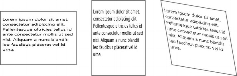
Figure 6-9. A rotation around the x-axis just looks like the element is being squished vertically, around the y-axis looks like it’s being squished horizontally, and with the combination it starts to look like it’s actually 3D
Note Technically, any of the three transformations above could have been achieved using just the right two-dimensional transform functions, but that requires a coordinate system mapping. In other words, let’s imagine you’re trying to cause a square visual element to appear as though it were opening toward the user like a saloon door. To do this using two-dimensional transforms would require you to figure out what combination of skewing, scaling, and translating would cause this effect. Using three-dimensional transforms, however, would only require a single rotateY() function call and almost no thought at all!
Once you’ve brought your elements into three dimensions, all of the major transformation functions—rotate, scale, and translate—must be implemented. The scale3d() function, like its counterparts, is accompanied by scaleX(), scaleY(), and scaleZ() functions, and again, the scale3d() function can perform any function the others can. Are you detecting a pattern?
The scale3d() function asks us for three arguments, which are the scale factors along the x, y, and z axes. Listing 6-11 uses three subsequent scale3d() function calls to best illustrate the difference.
Listing 6-11. One div configured not to scale (1,1,1), a second configured to scale down (0.8,0.8,0.8), and a third scaling up in the y and z axes and scaling down in the x-axis
<!-- HTML snippet -->
<div class="parent">
    <div>Lorem ipsum dolor sit amet...</div>
    <div>Lorem ipsum dolor sit amet...</div>
    <div>Lorem ipsum dolor sit amet...</div>
</div>

/* CSS snippet */
.parent {
    display: -ms-flexbox;
    perspective: 800px;
}

.parent div {
    border: 2px solid gray;
    width: 200px;
    height: 200px;
    padding: 5px;
    margin: 5px;
}

.parent div:nth-of-type(1) {
    transform: rotate3d(1,1,0,45deg) scale3d(1,1,1)
}

.parent div:nth-of-type(2) {
    transform: rotate3d(1,1,0,45deg) scale3d(0.8,0.8,0.8)
}

.parent div:nth-of-type(3) {
    transform: rotate3d(1,1,0,45deg) scale3d(0.5,1.2,1.2);
}
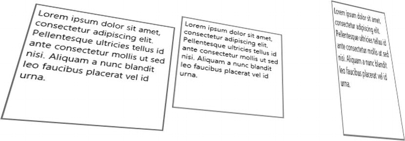
Figure 6-10. The results of three dimensional scaling
When it comes to moving your element around in two dimensions, the translateX() and translateY() functions cover the bases, but with the third dimension comes demand for a translateZ(), and so it is. The translateZ() function moves things closer to and further from the viewer (assuming the viewer is still in his or her original location of perspective-origin: 50% 50%).
Listing 6-12 shows an example with three opaque elements stacked directly on top of each other. Some distance has been added between the stacked elements using a 3D translation along the z axis. The entire scene has been rotated to reveal the hidden elements.
Listing 6-12. Style rules to rotate and translate three elements. The .parent rule is overridden to use a grid to cause the elements to stack on top of one another
<!-- HTML snippet -->
<div class="parent">
    <div>Lorem ipsum dolor sit amet...</div>
    <div>Lorem ipsum dolor sit amet...</div>
    <div>Lorem ipsum dolor sit amet...</div>
</div>

/* CSS snippet */
.parent {
    display: -ms-grid;
}

.parent div {
    border: 2px solid gray;
    background-color: white;
    width: 200px;
    height: 200px;
    padding: 5px;
    margin: 5px;
}

.parent div:nth-of-type(1) {
    transform: rotate3d(1, -1, 0, 45deg) translate3d(0, 0, 0);
}

.parent div:nth-of-type(2) {
    transform: rotate3d(1, -1, 0, 45deg) translate3d(0, 0, 60px);
}

.parent div:nth-of-type(3) {
    transform: rotate3d(1, -1, 0, 45deg) translate3d(0, 0, 120px);
}
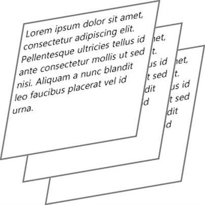
Figure 6-11. The rotation of the scene and the varying levels of translation of each element enable us to see each element even though they are stacked
The matrix3d() function is the mother of all of the other transformation functions. All of the others are based on it, so it’s capable of doing everything the other functions can do and much more. The only drawback is that it’s rather difficult to figure out how to use it unless you have an advanced math degree.
I only have a minor in mathematics, so Listing 6-13 borrows an example of the matrix3d function from the MSDN website (http://msdn.microsoft.com/en-us/library/windows/apps/jj193609.aspx).
Listing 6-13. Sixteen values for the matrix3d() function cause a combination of transformations to occur to the target element
<!-- HTML snippet -->
<div class="parent">
    <div>Lorem ipsum dolor sit amet...</div>
</div>

/* CSS snippet */
.parent {
    display: -ms-flexbox;
}

.parent div {
    border: 2px solid gray;
    width: 200px;
    height: 200px;
    padding: 5px;
    margin: 5px;
}

.parent div:nth-of-type(1) {
    transform: matrix3d(
         0.359127,  -0.469472, 0.806613, 0,
         0.190951,   0.882948, 0.428884, 0,
        -0.913545,   0,        0.406737, 0,
         0,          0,        0,        1
    );
}
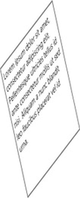
Figure 6-12. A combination of transformations done using the matrix3d() function
A transform is a change, but it’s a static one that’s applied when your app’s view is rendered and remains as long as the view does. What we really need to do is to get things moving. When switching from one page to the next, for instance, we may need the subtlest of animations to indicate that one flies in and the other flies out. When we change the font from normal to bold, we may wish for the text to embolden instead of merely becoming bold in an indiscernible instant.
To get things moving, we’re going to need to use transitions.
You may consider animations to be a scripting function and wonder what they’re doing in CSS instead of JavaScript. Transitions and animations are all about style, though. The only difference is that they take into account not only the static state of styles but also the dynamic in-between.
Transitions offer an implementation for the style in between the styles. They are the description of what should happen from here to there. When an element is suddenly added to the screen, how should it get there? When it’s removed, how should it leave?
Just like transforms, there aren’t a large number of CSS properties that apply to transitions—just four, actually, plus a shorthand. You can choose from transition-property, transition-duration, transition-timing-function, and transition-delay, or you can skip the long property names and roll them all together into the transition shorthand method. This is the more common approach.
Transitions take effect, and their animation begins once an element is targeted by a style rule. In the examples below, you’ll see that our transition is in a style rule with a :hover pseudo-class in the selector. This means the user will hover over an element and at that point will become a target of the style rule that contains a transition; therefore, instead of simply changing the style properties from what they were to what the new rule says they should be, they will be transitioned.
If a transition is the in-between of two states, then we are obviously dealing with some starting state and some ending state. Transitions are always defined by the ending state. If we’re transitioning a div from short to somewhat taller, then the transition is defined by the style rule that defines the taller state.
Listing 6-14 and Figure 6-13 show a very simple transition. A div element starts off with a size of 100 pixels on each side. It has a white background and a gray border for visibility. A second style rule is defined that applies to the box when it is in its hover state—that is, when the user hovers their mouse over the div. The second frame represents the moment the user hovers.

Figure 6-13. Five frames of the transition attempting to illustrate the resulting animation
In that second rule, we specify two properties and then an extremely simple transition property that simply indicates that it should take two seconds for all of the properties in this style rule to take effect. This means that the five frames represents two seconds, and that’s how long it will take for the white box to become gray and for the square edges to acquire a border radius.
Listing 6-14. A very simple transition configured to take two seconds and apply to the background-color and border-radius properties when the target element is hovered
<!-- HTML snippet -->
<div id="box">
</div>

/* CSS snippet */
#box {
    width: 100px;
    height: 100px;
    border: 2px solid hsl(0,0%,70%);
}

#box:hover {
    background-color: gray;
    border-radius: 25px;
    transition: 2s;
}
In the last example, we created a transition that omitted any properties and consequently applied to them all. If you want to limit what properties the transition actually applies to, you must specify them. Listing 6-15 shows an alternate version of the #box:hover style rule from the previous example, and Figure 6-14 shows the result. The difference, of course, is that while the border-radius appears to be animating just as before, the background-color is no longer taken into consideration by the transition property because an explicit list of properties exists and background-color wasn’t invited. The div, therefore, turns gray the moment the user hovers over it, and in our Figure 6-14, the second and subsequent frames depict exactly that.

Figure 6-14. Results in an exlusion of background-color from the translation properties and an obvious immediate application of the background-color in the second frame
Listing 6-15. The border-radius property being included explicitly in the transtion property
#box:hover {
    background-color: gray;
    border-radius: 25px;
    transition: border-radius 2s;
}
Specifying that the transition should take two seconds assumes that the progressive changes to the object should occur according to the ease function. The ease function acts a bit more the way that a real object—constrained by gravity—would in our world, in that it starts off a bit more slowly and finishes a bit more slowly too. The ease function is easy on the eyes, since even if it’s subconscious, it looks like what our human brains are used to seeing.
We don’t have to follow this function, though. In Listing 6-16, notice that the shorthand property is still in use, but we now have specified that the linear function should be used. The change to the animation would be too subtle to detect in my 5-frame animation, so you’ll just have to try this on your own. The valid values for a timing function are linear, ease, ease-in, ease-out, ease-in-out, cubic-bezier(), step-start, step-end, or steps().
Listing 6-16. The linear timing function added to the transition shorthand property
/* CSS snippet */
#box:hover {
    background-color: gray;
    border-radius: 25px;
    transition: border-radius linear 2s;
}
The linear, ease, ease-in, ease-out, and ease-in-out values are convenient, and cubic-bezier() allows you to specify any continuous function you wish. The step-start and step-end values and the steps() function allow non-continuous timing so that the transition takes effect in stairstep fashion.
Finally, if you don’t specify a value for the transition-delay property, then there will be no delay and the transition will begin the moment the CSS style rule takes effect. Adding a delay value of 2s would begin transitioning a full two seconds after the state change.
You can also apply multiple transition properties, but you don’t do so by adding multiple style properties. Instead, you put the multiple properties into the same transition property and separate them with commas.
Listing 6-17 will animate both the background-color and the border-radius of our div, but the background-color will not begin for 2 seconds and will take 10 long seconds to complete. Hopefully, this example sets your imagination running on the possibilities of CSS transitions.
Listing 6-17. Different timing specified for the two properties
/* CSS snippet */
#box:hover {
    background-color: gray;
    border-radius: 25px;
    transition: border-radius 2s, background-color 10s;
}
Not every CSS property is a candidate for transitioning, but nearly so. The actual list of transitionable properties, according to the W3C, contains background-image, background-position, border-color, border-width, border-spacing, bottom, color, crop, font-size, font-weight, grid-*, height, left, letter-spacing, line-height, margin, max-height, max-width, min-height, min-width, opacity, outline-color, outline-offset, outline-width, padding, right, text-indent, text-shadow, top, vertical-align, visibility, width, word-spacing, z-index, and zoom.
Transitions give us some good control over what happens to an element as it goes from one state to another. If we’re really going to get a grip on how things move around our app, though, we’ll need to dive into the subject of proper CSS animations.
CSS animations give us a lot more control over their target elements than transitions do. Transitions allow us to define a single transition from a start state to an end state, but animations allow the definition of an arbitrary number of keyframes that the entire animation can sequence through. With a transition I could change my div from white to gray, but with an animation I could change it from white to red to green to purple and then to gray, and I’d have control over the timing at each and every one of those steps along the way.
Animations are a little more complicated than transitions but, like most CSS concepts, are certainly not too much to understand. Animations are done in two separate steps.
The first step is to define your animation itself apart from any target elements that it might eventually apply to. This is done using a similar syntax to the definition of media queries and the definition of font faces. An animation definition looks like Listing 6-18.
Listing 6-18. The basic structure of an animation definition
@keyframes myAnimation {
    {keyframe1} {
        {properties}
    }
    {keyframe1} {
        {properties}
    }
    ...
    {keyframeN} {
        {properties}
    }
}
Animations can have any number of keyframes. The identifier for each keyframe can be either from, to, or a numeric percentage value. The from value is equivalent to 0% and the to value is equivalent to 100%. You don’t have to specify a starting keyframe (from) or an ending keyframe (to). If you leave either off, it will get the property values of the target element back to where they were before the animation was applied.
Listing 6-19 defines an animation that will turn its target element from whatever color it was to gray, and then back again.
Listing 6-19. A single mid-point keyframe (start and end keyframes would be implicitly assumed)
/* CSS snippet */
@keyframes toGrayAndBack {
    50% {
        background-color: gray;
    }
}
The second step is to apply your animation to an element. This is done simply by adding the animation-name property to an elements style collection (or applying a class to an element which contains the animation-name property).
Like transitions, animations begin the moment this application takes effect. If an element is defined with an animation-name property, then the animation will begin the moment the page is loaded. To trigger an animation using JavaScript, you can apply the animation to a style and then programmatically add that style to the element you wish to animate.
The animation properties are animation-name, animation-duration, animation-timing-function, animation-iteration-count, animation-direction, animation-play-state, animation-delay, animation-fill-mode, and the animation shorthand property. I recommend using the animation shorthand property since it makes for much more readable code.
An animation application might look like Listing 6-20, which would determine the animation called myAnimation to wait for a one second delay, then follow an ease timing function for five seconds, and repeat that three times.
Listing 6-20. The application of the myAnimation animation to the element called myElement
#myElement {
    animation: myAnimation 5s ease 1s 3;
}
Notice the way the name myAnimation was defined in Listing 6-19 and the fact that the same exact animation name was used in Listing 6-20 to apply it. If these names don’t match exactly, then the animation will not apply.
In Listing 6-21, then, we’ll bring the definition and the application together. The code takes the toGrayAndBack animation that we created and applies it to a div element. You can see the div in Figure 6-15 taking four seconds to turn from white to gray and then back again. Notice that the first (from) and last (to) states are not defined in this animation. Only the middle (50%) is defined. The div is therefore white because no other background-color has ever been applied to it, and that’s the state that the animation defaults to.

Figure 6-15. Five frames showing the animation of the element’s background color from white to gray and back to white again
Listing 6-21. The animation definition and application together
<!-- HTML snippet -->
<div id="box"></div>

/* CSS snippet */
@keyframes toGrayAndBack {
    50% {
        background-color: gray;
    }
}
#box { animation: toGrayAndBack 4s; }
Now we’ll progress some by defining more than a single keyframe. Listing 6-22 includes three keyframes in which the first and the last are not assumed from the object but specified explicitly. Keep in mind that if your first and last keyframes are not identical, then you’ll have a hard time creating a looping animation without introducing a jarring transition.
Listing 6-22. The start and end keyframes included explicitly
<!-- HTML snippet -->
<div id="box">
</div>

/* CSS snippet */
@keyframes toBlackToGray {
    start {
        background-color: white;
    }
    50% {
        background-color: black;
    }
    end {
        background-color: gray;
    }
}

#box {
    animation: toBlackToGray 4s;
}
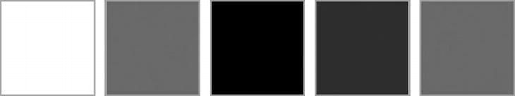
Figure 6-16. Five frames illustrating the animation of the background from white to black and then to gray
I should note a convenient shortcut here. The keyframe names such as start, 50%, and end can be combined and separated with commas if the block definitions are identical. Many times you’ll start and end with the same set of properties, and you can shorthand that with this method. Listing 6-23 offers an example of this technique for taking its target element from white to black and back again to white.
Listing 6-23. Two keyframes being defined together . It is fine to define keyframes out of order.
/* CSS snippet */
@keyframes toBlackAndBack {
    start, end {
        background-color: white;
    }
    50% {
        background-color: black;
    }
}
Finally, Listing 6-24 progresses us even further by using three intermediate keyframes to move one div in orbit around another.
Listing 6-24. HTML and CSS to create two div elements and animation, the orbiting of one around the other
<!-- HTML snippet -->
<div id="fixed"></div>
<div id="orbit"></div>

/* CSS snippet */
#fixed {
    background-color: black;
    width: 100px;
    height: 100px;
    position: relative;
    left: 150px;
    top: 250px;
}

#orbit {
    background-color: gray;
    width: 100px;
    height: 100px;
    position: relative;
    left: 0px;
    top: 0px;
    animation: orbit 10s linear infinite;
}

@keyframes orbit {
    25% {
            left: 300px;
            top: 0px;
        }
    50% {
            left: 300px;
            top: 300px;
        }
    75% {
            left: 0px;
            top: 300px;
        }
}
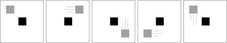
Figure 6-17. The gray div follows a linear timing path around the black one
Besides just a list of properties that should take effect, a keyframe can also specify a timing function. This means that you can either specify one timing function for all of your keyframes to adopt by putting it in the animation application on the target element, or you can specify multiple timing functions inside each keyframe and have them each work however you would like, even if they’re different from one another.
It’s impressive that so much animation can be done with declarative CSS alone, but it’s quite likely you’ll need to incorporate some logic into the animation of your visual assets, and you’ll need to use JavaScript for that. In a card game, for instance, you don’t know what choices a user is going to make until he or she makes them, and you’ll need to respond and animate accordingly.
One of the first provisions you get for CSS animations is the ability to capture animation-based events. The available events are animationstart, animationiteration, and animationend, and the function of each is quite likely evident from its name, so I’ll spare you the explanation. These events are fired on the target element, so you can wire up your event handler like Listing 6-25.
Listing 6-25. Implementation of an event handler for the animationstart event
ready: function (element, options) {
    document.querySelector("#myElement").addEventListener("animationstart", function(e) {
        // do something
    });
}
The animation events are certainly very helpful when you need to react logically to the state of animation on some element. As an example, you may wish to trigger the start of an animation when another animation ends. That code might look like Listing 6-26, in which a class is added to elementB when elementA has completed its animation.
Listing 6-26. Addition of a class to an element to trigger an animation when another ends
ready: function (element, options) {
    var elementA = document.querySelector("#elementA");
    var elementB = document.querySelector("#elementB");
    elementA.addEventListener(“animationend”, function(e) {
        elementB.classList.add(“flash”);
    });
}
We’ve discussed a myriad of ways you can apply CSS properties to improve your app with transforms, but the discussion would be incomplete without an introduction to the MSCSSMatrix object. Besides all of these properties that you specify in your CSS file, the MSCSSMatrix JavaScript object allows you to apply all of the transformations we’ve discussed so far in your script. This implies that you can add logic and more complex timing to them.
A simple example should make it clear. Listing 6-27 includes no CSS at all, but only HTML and JavaScript. Assume the JavaScript exists inside of a ready method that fires when the DOM is ready.
Listing 6-27. A simple div with text instructed by JavaScript to rotate ten degrees counter-clockwise about the z-axis
<!-- HTML snippet -->
<div class="parent">
    Hello world
</div>

// JavaScript snippet
var d = document.querySelector(".parent");
d.style.transform = new MSCSSMatrix(d.style.transform).rotate(0, 0, -10);

Figure 6-18. The resulting, rotated text, accomplished with no explicit CSS written
In this example we’ve utilized the rotate function, but all of the other transformation functions are available, and of course, you can still set your matrix values manually too.
It’s exciting to imagine what can be done with the power of the CSS transformations available to us in JavaScript. You can find much more information about the MSCSSMatrix object on the Microsoft MSDN website at http://msdn.microsoft.com/en-us/library/windows/apps/hh453593.aspx.
The introduction of transforms, transitions, and animations in CSS3 are just some of the reasons why the web stack is one of the world’s most powerful (as well as ubiquitous) user-interface technologies in existence.
Summary
So far, we’ve been looking at examples that include only a handful of basic elements. In a real app scenario, you would be required to get more visual assets on the screen and to lay them out in a way that has meaning and implements good design.
The layout elements and techniques that you’ll get in CSS, as well as some assistance from the WinJS library, will give you the power you need to turn your design into a working model, and we’ll look at those layout techniques in the next chapter.