
 Note There’s something extremely compelling about great typography that will make users love your app.
If you have already read the first chapter then you know how to select elements and you know how to define style rules for those elements, and now, you are ready to turn mere structure into something beautiful as well as functional.
We’re going to take a detailed look at some of the many style properties. In this chapter we’ll cover typography-related properties—the properties that pertain to the text in your app. We’ll look at text color and font properties for determining things like what font face your text is rendered in and what size and weight it is. We’ll explore multi-column layouts that are much more popular in Windows 8 apps than in traditional web design, and we’ll learn how to control the hyphenation in our text columns.
Let me take the time to convince you of the importance of high-quality typography in your Windows 8 app. Typography is more than just making text look fancy—at least it is in a Windows 8 app. In Windows 8, typography is used to convey style, but also to convey structure and hierarchy. It helps a user’s eye and brain quickly determine the significance of the content on the screen. It’s used to help them differentiate between the title of your app, the category of a section, and the body of text that makes up the app’s content.
So, spend the time to learn how to get great control over the display of text inside your app, and then consider the very first of the Microsoft design style principles—show pride in craftsmanship. This means you should take the time to make sure your app is polished, and being intentional and beautiful with your typography is one massive way to polish your app.
Text
Text on a page has a basic function of relaying information, but being careful about your choice of typography and your text layout can spell the difference between an app that looks like a dictionary and one that really draws users in.
In this section, we’re going to look at some basic text properties that will give us control over things like the color, opacity, weight, size, and font face of our text. Let’s start with color and opacity.
Color and opacity
The color property determines the foreground color of the selected element. It primarily affects the text that an element contains.
There are three common places to define color: the color property, the background-color property (see Chapter 3), and the border-color property (again, see Chapter 3), and colors are always defined the same way—ways actually—there are four common ways to define a color:
- by color name
- by hex value
- by the rgb() or rgba() functions
- by the hsl() or hsla() functions
Named Colors
Defining colors using their name is likely the most intuitive for most people, so if a named color exists that fits your requirement then by all means use it. You define color by name by simply providing the color name as the value to the color property. There are 147 named colors in the HTML/CSS standards, and you can see a list of all of them at http://www.w3.org/TR/css3-color/#svg-color. Some of them are basic like: Red, Green, and Blue. Some of them are derivations of the basics like DarkRed, LightGreen, and DarkSlateBlue. And some of them are altogether esoteric like DarkGoldenRod, LemonChiffon, and PapayaWhip. The named colors are not case sensitive, so papayawhip works just as well as PapayaWhip.
Hex Colors
Defining colors using their hex value opens you up to far more than 147 colors—actually it’s more like 16.8 million colors. Perhaps you recall the advice from earlier days in web development that you should stick to a narrow band of “web safe colors,” but that advice is hardly relevant in this modern age where browsers that are limited to a narrow color palette are extremely few and far between. If you’re creating a Windows 8 app, then you know you’re working with the very latest in web standards with the Internet Explorer browser engine and you certainly don’t need to worry about legacy compatibility issues like this.
A hex color value is a six-digit hexadecimal value preceded by a hash (#). For example, #FFEFD5 would give you the equivalent of PapayaWhip, and the hex values are not case sensitive either, so #ffefd5 would work fine as well. The first pair of hexadecimal digits represents the level of red, the second the level of green, and the third the level of blue.
Table 4-1. A few hex values and their color equivalents
| Hex Value | Color |
|---|---|
| #000000 | black |
| #ffffff | white |
| #ff0000 | red |
| #00ff00 | green |
| #0000ff | blue |
| #ffff00 | yellow |
| #00ffff | cyan |
| #ff00ff | magenta |
Even the more avid number jockeys among us take some time to convert decimal and hexadecimal, so it’s convenient that any modern graphics software package should provide the hex equivalent of any color you choose. Designating colors using a hex value makes no provision for opacity, so if you need some degree of transparency in your color then just read on.
A shorthand method for designating hex values exists for hex values with repeating pairs like #000000, #ffffff, or even #aa33dd. If you designate a hex value with only three characters, then it will repeat each of the three values into pairs. Use this shorthand technique to use #000 for #000000 (black), #fff for #ffffff (white), or #ff0 for #ffff00 (yellow).
RGB Colors
Defining colors with the rgb() and rgba() functions is quite simple. The rgb() function works just like the hex value except the three color components are passed in as decimal arguments to the function instead of being three hexadecimal pairs. A color value of rgb(0,0,0) will result in black just like a hex value of #000000. The rgba() function goes an extra step in accepting an alpha value. The alpha value defines the opacity of the color; that is, it determines to what degree the color appears versus letting its background come through. It’s the opposite of transparency. The color blue at full opacity (zero transparency) is the color blue and completely covers its background, whereas, the color blue at half opacity (half transparency) let’s some of the background through as if it were blue tinted glass. As an example, rgb(0,0,255) would be entirely blue and rgba(0,0,255,0.5) would result in something like the blue tinted glass.
The values for red, green, and blue can either be an integer value from 0 to 255 or a percentage value (succeeded by a % symbol). The alpha value should always be a decimal value from 0.0 (fully transparent) to 1.0 (fully opaque).
HSL Colors
Similar to rgb() and rgba(), you can use the hsl() and hsla() functions to specify a color based on its hue, saturation, and lightness values. HSL is an alternate method for representing unique colors. The hue represents the color’s position in the rainbow, the saturation roughly corresponds to how rich the color is, and the lightness is how light or dark the color appears. The nice thing about using HSL values instead of RGB is their relative intuitiveness. Once you have the right hue, you can adjust its saturation and lightness values to make sensible adjustments to the color, which can’t be said for RGB. Small changes to any of the RGB values results in colors of an entirely different hue. This is especially useful when creating color ramps where a hue is chosen as a theme color and varying saturation or lightness value are used to create the application’s visual assets.
The functions take their first argument (hue) as an integer from 0 to 255, their second and third arguments (saturation and lightness) as a percentages, and hsla() takes the fourth argument (alpha) as a decimal from 0.0 (fully transparent) to 1.0 (fully opaque).
Opacity
The opacity property is related. The opacity of text determines how much of the background is allowed to show through the text. Setting the opacity of text explicitly is the same as (and can be used in conjunction with) using the alpha value in the rgba() or hsla() function. Opacity is actually the inverse of transparency, so a maximum value of 1.0 will result in text that does not allow any of the background through (100% opacity or entirely opaque) and a minimum value of 0.0 will let the background through fully (0% opacity or entirely transparent).
Opacity becomes an even more useful and relevant topic when we start animating. It’s common to animate the opacity of something from 0 to 1 to cause it to fade in or from 1 to 0 to cause it to fade out.
The majority of typography related properties (the preceding examples excluded) begin with text- or font-, and you’ll see many of them now. The font properties are numerous enough that a shorthand property exists and is quite helpful. I’ll introduce the individual properties before I talk about the shorthand syntax. A more extensive examination of what’s possible with fonts will follow in a subsequent section.
The font-style property is primarily used to italicize your text. The values (besides the inherit value that all properties share) are actually normal, italic, and oblique. Using italic will choose the italicized version of whatever font is in use. Using oblique is awfully similar, though, and you may scratch your head wondering about the difference between them. The difference is that, while italic chooses the italicized version of the font, oblique only skews the normal version of the font. Often they look very much the same, but sometimes they are actually quite different.
Most typographers frown about the use of oblique rather than taking advantage of a proper italic face, but it will certainly work in a pinch. If you don’t care so much about perfect typography then it will save you the hassle of embedding an additional italic subset font. The code in Listing 4-1 defines each of the three values for font-style and Figure 4-1 portrays the results.
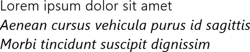
Figure 4-1. In most cases, oblique text appears the same as italic, but using it as a substitute for a font with an actual italic version may be frowned upon by serious typographers
Listing 4-1. Using the font-style property to make text italicized or oblique
<!-- HTML snippet -->
<div class="normal">Lorem ipsum dolor sit amet</div>
<div class="italic">Aenean cursus vehicula purus id sagittis</div>
<div class="oblique">Morbi tincidunt suscipit dignissim</div>

/* CSS snippet */
.normal { font-style: normal; }
.italic { font-style: italic; }
.oblique { font-style: oblique; }
font-variant
The font-variant is a very simple one with only normal and smallcaps for values. Small caps can be an interesting and effective variant to standard capitalization. In small caps text, all letters are uppercase, but are rendered only slightly taller than the lowercase letters. You can see an example of the small caps variant in Listing 4-2 and Figure 4-2.

Figure 4-2. Notice that all of the letters in the second line are uppercase, but the actual uppercase letters only only slightly taller than the lowercase letters
Listing 4-2. Using the font-variant property to turn text to small caps
<!-- HTML snippet -->
<div class="normal">Lorem ipsum dolor sit amet</div>
<div class="smallCaps">Aenean Cursus Vehicula Purus ID Sagittis</div>

/* CSS snippet */
.normal { font-variant: normal; }
.smallCaps { font-variant: small-caps; }
font-weight
You’ll likely use the font-weight property rather often to determine whether your text should be bold or not. A normal value will be normal and a bold value will be bold. The weight of the font can be set numerically by specifying any increment of 100 from 100–900. A value of 400 is the same as normal and a value of 700 is the same as bold. You can also use bolder or lighter to make the text incrementally bolder or lighter than the value it has inherited. Listing 4-3 and Figure 4-3 provide an example.
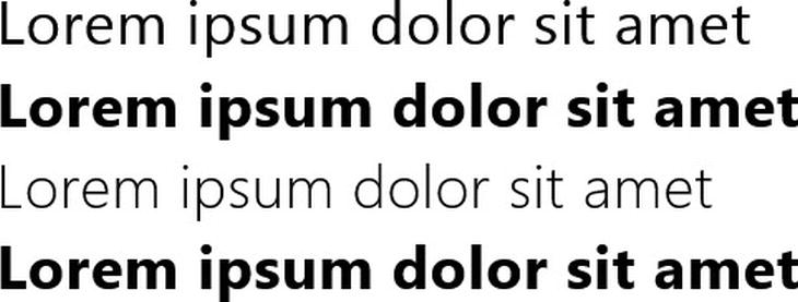
Figure 4-3. The second line (bold) is obviously bolder than the first (normal), the third (100) is obviously lighter, and the last is hardly distinguishable though it is the maximum font weight
Listing 4-3. Using the font-weight property to make the text more or less bold
<!-- HTML snippet -->
<div class="normal">Lorem ipsum dolor sit amet</div>
<div class="bold">Lorem ipsum dolor sit amet</div>
<div class="_100">Lorem ipsum dolor sit amet</div>
<div class="_900">Lorem ipsum dolor sit amet</div>

/* CSS snippet */
.normal { font-weight: normal; }
.bold { font-weight: bold; }
._100 { font-weight: 100; }
._900 { font-weight: 900; }
font-size
You’ve got some options for specifying font sizes.
- absolute sizes. You can use absolute sizes: xx-small, x-small, small, medium, large, x-large, and xx-large. Specifying an absolute size leaves the user agent to decide what the actual size should be.
- relative sizes. You can specify a font size of larger or smaller, which will set the font size one increment larger or smaller than the value it has inherited.
- length. You can use a length value as a font size which will set the font size absolutely without consideration of the user agent.
- percentage. If you use a percentage for a font size, it will set the font’s size relative to its parent’s font size.
We’ll be primarily concerned with pixels for Windows 8 apps - at least for elements that are to appear on the screen. Keep in mind that Windows 8 automatically scales up for higher resolution displays, so the developer does not need to modify font sizes dynamically. Listing 4-4 and Figure 4-4 show a variety of font sizes in use.
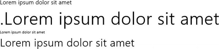
Figure 4-4. The differences in font size speak for themselves
Listing 4-4. Using the font-size property to make text larger or smaller
<!-- HTML snippet -->
<div class="pt">Lorem ipsum dolor sit amet</div>
<div class="in">.Lorem ipsum dolor sit amet</div>
<div class="px1">Lorem ipsum dolor sit amet</div>
<div class="px2">Lorem ipsum dolor sit amet</div>

/* CSS snippet */
.pt { font-size: 12pt; }
.in { font-size: .5in; }
.px1 { font-size: 10px; }
.px2 { font-size: 30px; }
line-height
Similar and related to the font-size is the line-height(also known as leading), which controls the white space above and below each line of text. Values for line-height are also length values and a line-height of twice that of the font-size will effectively make for double spaced text. You can use a percentage value as well. Listing 4-5 and Figure 4-5 show a line height example.
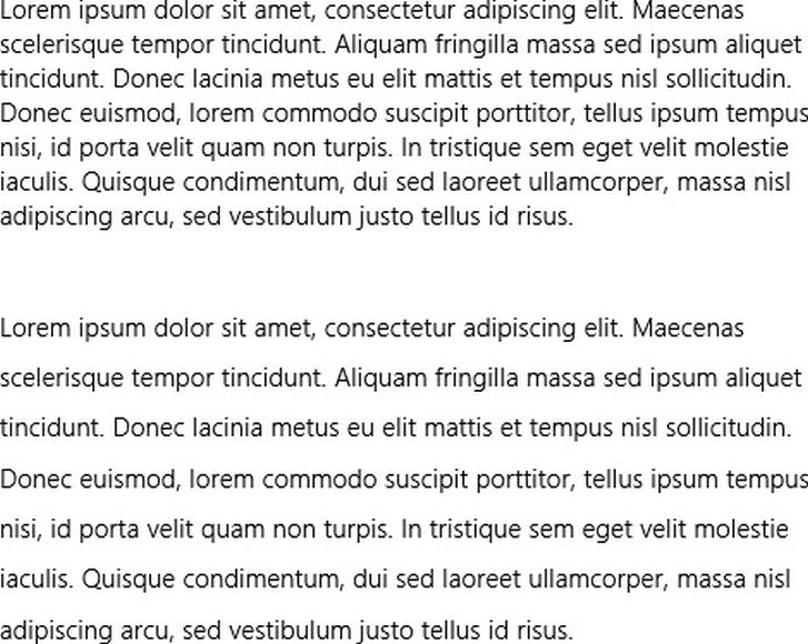
Figure 4-5. The second paragraph is given a double line spacing by specifying 200% for the line-height
Listing 4-5. Using the line-height property to set the vertical space taken by a line of text
<!-- HTML snippet -->
<div>Lorem ipsum dolor sit amet...</div>
<div class="doubleHeight">Lorem ipsum dolor sit amet...</div>

/* CSS snippet */
.doubleHeight { line-height:200%; }
font-family
The value of font-family determines which font is used to render the target element’s text. It is a comma delimited list of system fonts and it’s often referred to as the font stack. The user agent will continue to attempt to apply a font from the font stack until it succeeds at finding one that is actually installed on the user’s system.
Besides actual font names, you can specify any of five generic font keywords: serif, sans-serif, monospace, cursive, and fantasy. If the user agent gets to a generic font in the font stack, it will choose a font from that generic type that is installed on the device. Some sample font-family values are illustrated in Listing 4-6 and Figure 4-6.
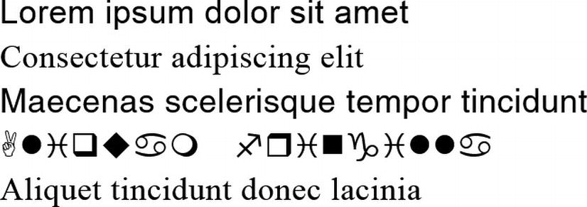
Figure 4-6. The first font available on the system is rendered. Notice the serif and sans-serif fallbacks and notice how the last font – “garbage” – is not found on the system and so the default font is used
Listing 4-6. Using the font-family property to choose a font
<!-- HTML snippet -->
<div class="f1">Lorem ipsum dolor sit amet</div>
<div class="f2">Consectetur adipiscing elit</div>
<div class="f3">Maecenas scelerisque tempor tincidunt</div>
<div class="f4">Aliquam fringilla</div>
<div class="f5">Aliquet tincidunt donec lacinia</div>

/* CSS snippet */
.f1 { font-family: arial, sans-serif; }
.f2 { font-family: 'times new roman', serif; }
.f3 { font-family: trebuchet, helvetica, sans-serif; }
.f4 { font-family: wingdings; }
.f5 { font-family: garbage; }
font shorthand property
All of the preceding font related properties can be encapsulated in the font shorthand property. The font property takes a lot of values, so it’s important to get the syntax right. The most important thing is that they are provided in the right order.
Here is the order that the properties should be provided in: font-style, font-variant, font-weight, font-size, line-height, and then font-family. There are some caveats though.
- The font-style, font-variant, and font-weight are optional and it may work if they are out of order but they must come before the font-size and font-family.
- The font-size and line-height should be delimited with a slash (/) instead of a space.
- The line-height is optional and obviously you shouldn’t include the slash if you don’t include it.
- The font-size and font-family are mandatory. Without either the entire line will be ignored.
Listing 4-7 shows off a couple of font shorthand property values and Figure 4-7 shows the results.
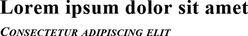
Figure 4-7. If you get the order of property values correct, they will all take effect
Listing 4-7. Using the font shorthand property to set many font properties at once
<!-- HTML snippet -->
<div class="f1">Lorem ipsum dolor sit amet</div>
<div class="f2">Consectetur adipiscing elit</div>

/* CSS snippet */
.f1 { font: bold 36pt trebuchet; }
.f2 { font: italic small-caps bold 24pt/48pt 'times new roman'; }
text-transform
The text-transform property serves to manipulate the capitalization of your text. The capitalize value will capitalize the first letter of each word, the uppercase value will just capitalize the whole thing, and the lowercase value will turn all characters to lower case. The text-transform property is illustrated in Listing 4-8 and Figure 4-8.
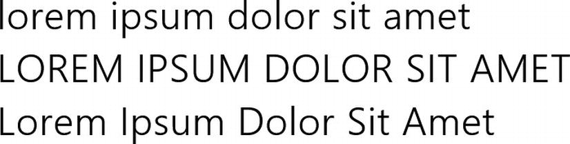
Figure 4-8. The first line is transformed to lower, the second is transformed to upper, and the third is transformed to title case with the first letter of each word capitalized
Listing 4-8. Using the text-transform property to change the case of the text
<!-- HTML snippet -->
<div class="lowerCase">LOREM IPSUM DOLOR SIT AMET</div>
<div class="upperCase">lorem ipsum dolor sit amet</div>
<div class="capitalize">lorem ipsum dolor sit amet</div>

/* CSS snippet */
.lowerCase { text-transform: lowercase; }
.upperCase { text-transform: uppercase; }
.capitalize { text-transform: capitalize; }
ALL CAPS! You’ll notice a number of places in Windows 8 where Microsoft chose to use all caps - menus are one of them. Contrary to what one might assume, using all caps is an effective way of reducing the relative significance of text. The human brain is trained to read lowercase or title case text, but uppercase text acts visually as more of a complimentary element and tends to be referenced more than read. Keep in mind that the same does not hold true for spans of paragraph text in all uppercase. Uppercase paragraph text will draw the reader’s attention, but not in an appropriate way. The Microsoft Manual of Style says that one should “never use all uppercase for emphasis. Use sentence structure for emphasis instead. It’s best to avoid formatting for emphasis, but if you must use formatting for emphasis, use italic formatting instead of all uppercase.” (Microsoft Press, 2012)
Text Decoration
You can change the lines that appear over, under, and through your text using the text-decoration property. Actually, CSS3 calls for an expansion to the text-decoration property to allow for coloring and styling of the line that accompanies your text. The new standard turns the text-decoration property itself into a shorthand property for text-decoration-line, -color, and -style. Unfortunately, this new standard is not implemented yet by any modern browsers at the time of this writing. This includes the Trident engine that powers Internet Explorer 10 and Windows 8 apps.
Until the standards are implemented, just use the text-decoration property with values of overline, line-through, or underline to add scores over, through, or under your text as you can see in Listing 4-9 and Figure 4-9.
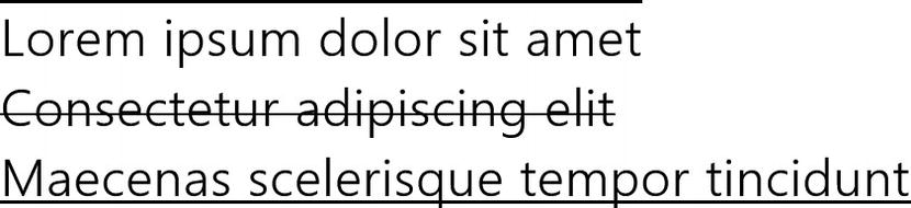
Figure 4-9. Results in lines appearing over, through, and under the text
Listing 4-9. Values of text-decoration set to overline, line-through, and underline
<!-- HTML snippet -->
<div id="style1">Lorem ipsum dolor sit amet</div>
<div id="style2">Consectetur adipiscing elit</div>
<div id="style3">Maecenas scelerisque tempor tincidunt</div>

/* CSS snippet */
#style1 { text-decoration: overline; }
#style2 { text-decoration: line-through; }
#style3 { text-decoration: underline; }
font-face
We’ve discussed how you can specify the color, size, and even the family of your font, but there’s one rather glaring caveat. If you specify font-family: pickle;, then the user has to have the pickle font installed on his machine to see it correctly.
Whether you’re targeting the web or Windows 8, this is a significant problem. There are a few fonts that you can make a good bet will be on your users’ systems, but none can be guaranteed. You can use the generic font types, but that doesn’t assure that your typography is going to look the way you designed it. What you need is the ability to determine for certain that the user will be able to view your page with its intended typography by providing the font for them. That’s where @font-face comes in. @font-face is a custom font definition. The @ syntax indicates that it’s not a property or a value, but a special CSS entity much like the @media keyword.
The @font-face keyword allows us to define a custom font name and the URL to the source of the font. Likely your font will be in your project and I recommend you follow the convention of dropping your fonts into a folder called type. In that case, you can simply provide a root level URL like /type/myfont.ttf.
Listing 4-10 illustrates a simple @font-face definition and then the implementation of that font in HTML. Notice that the font-family value is being defined in the @font-face block and then referenced in the .nifty style rule. This name is your choosing, but the reference must match the definition.
Listing 4-10. A font-face definition referencing a font file stored in the projects type folder
<!-- HTML snippet -->
<span class="nifty">This is my nifty font!</span>

/* CSS snippet */
@font-face {
    font-family: "niftyfont";
    src: url("/type/nifty_n.woff") format(woff)
}

.nifty {
    font-family: niftyfont;
}
You can specify multiple values in the src property to create a compatibility stack, but when you’re working on a Windows 8 app, you have the advantage of not having to worry about other browsers as targets. The format in the example is WOFF, but you may not have had experience with this font format.
WOFF (Web Open Font Format) is an open format standard proposed jointly by Opera, Microsoft, and Mozilla. The WOFF format is not actually a new font format, but rather just a wrapper around existing EOT, TTF, OTF fonts. Wrapping existing fonts in WOFF for use in your app has a couple of strong advantages:
- WOFF is compressed so wrapped fonts are smaller than their associated original fonts.
- Metadata can be included in the font package to deliver information about the font’s origin and even its license information.
Whether you use a traditional font or one wrapped in WOFF, though, adding good typography is a good idea and defining a font (as opposed to just embedding your custom type in a bitmap) is a great one if you want your app to be accessible, adaptive, and searchable.
Microsoft vendor specific text properties
Microsoft offers a handful of vendor specific, text related CSS properties – namely: -ms-text-autospace, -ms-text-align-last, -ms-text-justify, -ms-text-kashida-space, -ms-text-overflow, and -ms-text-underline-position. These properties don’t tend to be used broadly, but in certain situations they are in fact critical.
The -ms-text-autospace property allows the handling of spacing around ideographs - Asian characters that convey an idea.
The -ms-text-align-last property determines how to handle spacing for the very last line of a paragraph whose text is justified.
The -ms-text-kashida-space property controls kashida spacing which is the expansion of certain characters in Arabic writing systems.
Finally, the -ms-text-underline-position property can determine if the underline (if applied) of your text is displayed below or above the characters. The values are above and below, and auto is the default.
Alignment and justification
Alignment is a big part of text layout. Alignment controls the way that the rendering engine handles space before, after, and amid your text both horizontally and vertically. Likely, everyone has experience left aligning, centering, right aligning, and justifying text in a word processor. This is exactly the job of the text-align property.
You can set the text-align property to a value of left, right, center, or justify.
Besides setting the text’s alignment horizontally, you can do a lot to control its vertical layout as well. The vertical-align property will take the following values: auto, baseline, sub, super, top, middle, bottom, text-top, and text-bottom. The default value, baseline, will align the bottom of a line of text (not counting descenders) with the baseline of its parent. The vertical-align property will also accept a length or a percentage value which will act as an offset.
The vertical-align property does not always behave as you might expect. In fact, it behaves a bit differently depending on the type of element it is applied to.
When you use vertical-align on an image tag, it acts like the old valign attribute and determines where the image sits relative to the text that contains it.
When you use the vertical-align property in the cell of a table, it affects the vertical alignment of the text (or other elements) in the cell as in Listing 4-11.
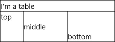
Figure 4-10. The cell text is properly aligned vertically as defined
Listing 4-11. Vertical alignment in a simple table
<!-- HTML snippet -->
<table>
    <tr>
        <td colspan="3">I'm a table</td>
    </tr>
    <tr>
        <td>top</td>
        <td>middle</td>
        <td>bottom</td>
    </tr>
</table>

/* CSS snippet */
table { width: 300px; border-collapse:collapse; }
table tr:nth-of-type(2)  { height: 80px; }
table td { border: 1px solid; }
table tr:nth-of-type(2) td:nth-of-type(1) { vertical-align: top; }
table tr:nth-of-type(2) td:nth-of-type(2) { vertical-align: middle; }
table tr:nth-of-type(2) td:nth-of-type(3) { vertical-align: bottom; }
There are a couple of off-topic things I want to point out about Listing 4-11:
- the border-collapse:collapse; property is used to remove the space that is inherent between cells in a table
- the :nth-of-type() selector is used to select table rows and cells by their position
In the table cells in Figure 4-10, you can see that the text has been vertically centered.
When you attempt to use vertical-align in a div, however, you might get a surprise. Notice in Listing 4-12 how we’re attempting to instruct the div called va to align its text in the center horizontally and in the middle vertically.
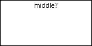
Figure 4-11. The text we provided is not centered vertically
Listing 4-12. A common mistake regarding the use of vertical-align
<!-- HTML snippet -->
<div id="va">
    middle?
</div>

/* CSS snippet */
div#va {
    height: 100px;
    width: 200px;
    vertical-align: middle;
    text-align: center;
    border: 1px solid black;
}
It made it to the center horizontally, but it’s obviously not in the middle vertically. Why is this property being ignored? The vertical-align property isn’t just implemented weirdly in CSS. For table cells, it actually aligns vertically, but if our div contains inline elements (inline elements flow like text and wrap to the next line) the vertical-align does something completely different. It is equivalent to the old valign HTML attribute that adjusts the vertical position of elements relative to the baseline. It doesn’t affect their position within their parent container at all.
This issue has plagued web designers for decades it seems and I know it’s been the cause of some of my own sleepless nights. Web pages were never really designed to specify vertical behavior. The nature of HTML is to flex horizontally and flow contents vertically from top to bottom. The standards have evolved and made progress, but there are still remnants of the past.
A few workarounds have existed to help resolve this issue, but none of them are great, and that’s why the new grid in Microsoft’s implementation of CSS3 is very welcome. chapter 6 will take you in-depth into the implementation of the grid for solving this significant issue.
Another great use for vertical-align is for setting text to be superscript or subscript. The sub and super values will perform this alignment for you. You’ll often find this one inside a span element. The following, for instance, could be used to construct the equation y = x 2.
<div>y = x<span style="vertical-align:super;">2</span></div>
Columns
Many modern HTML apps and sites rely heavily on large amounts of text, and CSS3 has brought these apps into the realm of feasibility with the introduction of multi-column text management. Support for multiple columns was not just snuck in with meager support either. It’s rich and powerful and very full-featured.
Before the introduction of multi-columns, developers were forced to lay out columns manually or programmatically. The new multi-column CSS properties really make any kind of reader app not only possible, but expressive and fun.
Multi-column support is especially important for Windows 8 because the design language lays out content horizontally instead of vertically. I often hear people questioning why this is, so here are a few reasons . . .
- First of all, horizontal panning is unique and differentiating. It’s yet another way that Windows 8 has reimagined user experience and another way that it stands apart from the competition.
- Most of the world’s languages read left to right and thus the paradigm of panning from left to right is a natural one for humans.
- Apps with a lot of text laid out horizontally read like a magazine with new content being revealed from the right. This again makes it a familiar paradigm.
- The anatomy of the human arm and hand move more easily horizontally then vertically. Try swiping left and right and then up and down and you’ll see that.
- Finally, screens have traditionally been in a landscape orientation and have gotten more exaggeratedly so with screen shifting from an aspect ratio of 4:3 to 16:9.
With a vertical layout, it’s entirely possible to have one column the same width as the screen that goes on forever, but with a horizontal layout with new content being revealed from the right, columns become a necessity.
Be aware that one implication of changing from vertical scrolling to horizontal scrolling is that text will no longer be revealed line by line, but rather column by column (Figure 4-12). In Chapter 6, we’ll learn about snap points. Snap points help to land the user at each column of text. The result is much like the turning of a page – a paradigm that e-book readers have been using for years and paper books have been using for centuries.
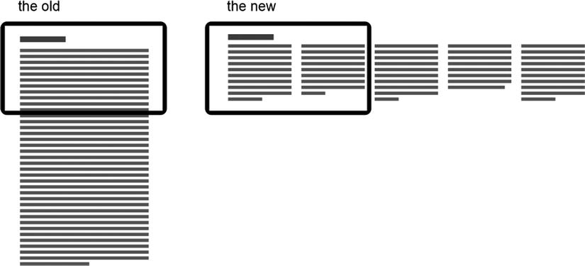
Figure 4-12. Vertical text layout versus horizontal
This difference between vertical and horizontal scrolling amounts to a pretty huge change of layout. Look at Figure 4-13 and Figure 4-14 to see an example of the same content - an article about the city of Paris - in each layout.
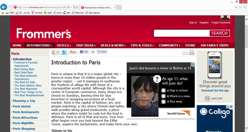
Figure 4-13. A web article using vertical scrolling text running off the bottom of the screen
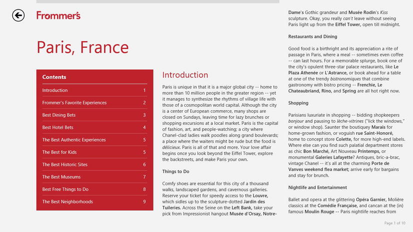
Figure 4-14. The same article laid out horizontally in a Windows 8 app inviting the user to pan to the right
column-width and column-count
You can transform your text blocks into multi-column text blocks by choosing either a column count or a column width - only one needs to be set, and the other will be calculated. If you set a column count of 2 on a device that is 1366 pixels wide, then the columns will be calculated at 683 pixels (minus the width of margins and gutter). Use the column count when you know exactly how many columns you want to be rendered in a given container. Think about your user moving your text to a large screen format. If your user has two columns of text on their small screen and then moves your app to a large screen, do you still want two (now very wide) columns of text? Probably not. More likely, you’ll want to set the column width and let as many columns as will fit be generated on the screen. Look at Figure 4-15 to see what I mean. Larger screens beg for more columns of text.
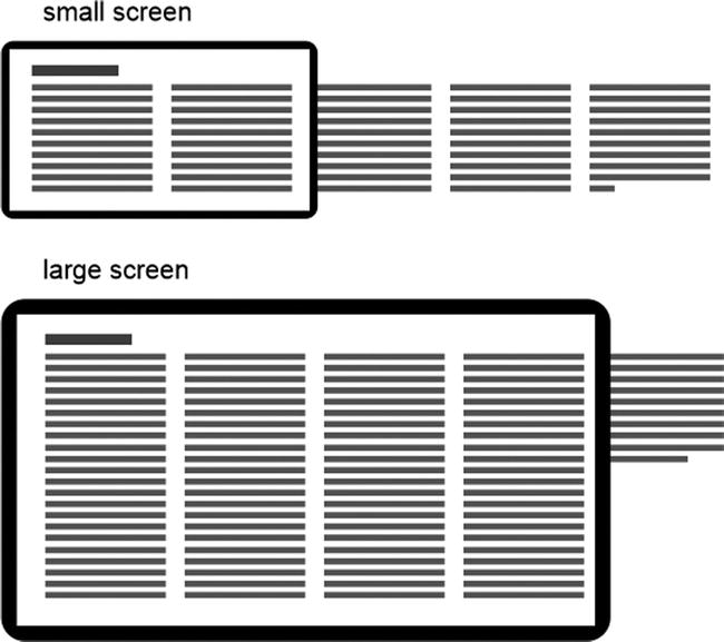
Figure 4-15. Setting column width allows for more columns on a larger screen
The properties themselves are column-width and column-count, and there’s a shorthand property of columns. The interesting thing is that you will seldom need to use both the column-width and column-count, so you might just end up using the one shorthand method most or all of the time.
The shorthand property is called columns. It takes a width or a count or both. As I said, you’ll likely choose one or the other, so usually your column properties will look something like those in Listing 4-13.
Listing 4-13. Typical properties for determining multiple columns
/* CSS snippet */
.columns {
    columns: 4;
}

.columns {
    columns: 200px;
}

.columns {
    columns: 400px;
}
column-gap and column-rule
The column-gap and column-rule properties give you control over what happens in the space between your columns.
The column-gap accepts a length value and determines how much space there is between columns. The Windows 8 design guidelines don’t give a recommendation for the width of gaps between multi-column text, but it does recommend 40 pixels of space between columns in a list and that’s what I would recommend for text columns too.
The column-rule is actually a shorthand property that encapsulates column-rule-width, column-rule-style, and column-rule-color easily all at once. A rule is simply a line to separate text columns. It can be helpful aesthetically, but it can also be a bit gaudy, so use column rules with caution. When two columns of text are unrelated to one another, it may be helpful to add a rule between them for clarity.
column-fill
There are two possible behaviors that the rendering engine can choose from for the flow of the text in the columns. If you have three columns and not quite enough text to fill up all three, the engine could either fill up the first and second columns and let the third come up short, or it could balance the amount of content (vertically) in all three columns.
The column-fill property is how you control which of these behaviors is used. The resulting behavior of the auto and balance values is displayed in Figure 4-16.
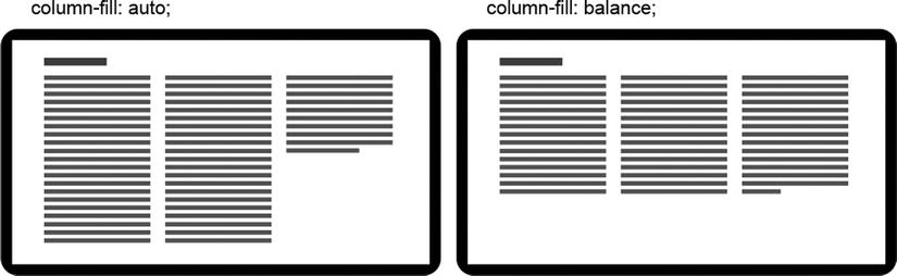
Figure 4-16. The difference between a column-fill of auto and balance
Samples of Multiple Columns
We’ll look at a number of different multi-column configurations and for each we’ll use the same HTML that you see in Listing 4-14.
Listing 4-14. A div with five good-sized paragraphs of text
<!-- HTML snippet -->
<div id="columns">
    <p>Lorem ipsum dolor sit amet ... </p>
    <p>Sed rhoncus, erat in eleifend ... </p>
    <p>Nam mollis iaculis neque ut ... </p>
    <p>In eleifend purus et leo ... </p>
    <p>Sed quis sapien vitae elit ... </p>
</div>
The div with an ID of columns contains five paragraphs of text. I have cropped the actual paragraph text for brevity, but each is actually of typical paragraph size. Let’s look at a number of possible CSS style rules to format these five paragraphs into columns in a variety of ways.
Listing 4-15 and Figure 4-17 show the results of automatic column filling. Listing 4-16 and Figure 4-18, on the other hand, illustrate a balanced column fill.
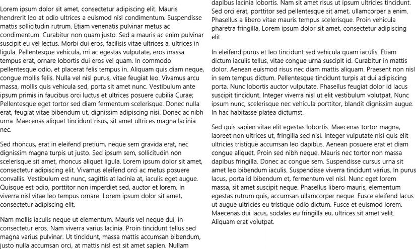
Figure 4-17. Two 400-pixel columns fit and the auto value for column-fill causes each to be is filled to the bottom before spilling into the next
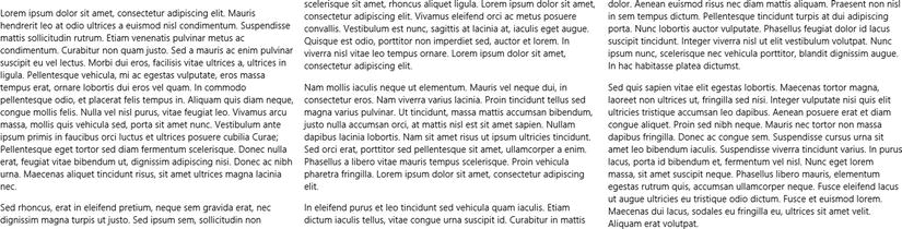
Figure 4-18. Three columns are fit to the space and the text spills so that all have the same amount of text
Listing 4-15. Columns 400px in width with a column-fill of auto
/* CSS snippet */
#columns {
    columns: 400px;
    column-fill: auto;
    height: 600px;
}
Let’s see what we can do to balance the text vertically when we have multiple columns.
Listing 4-16. Three columns with a column-fill value of balance
/* CSS snippet */
#columns {
    columns: 3;
    column-fill: balance;
    height: 600px;
}
Certain types of content do well with narrow columns. I can imagine something like a dictionary that is primarily a list of short bits of content. When you’re considering your design, you may determine that some column gap and some rules between columns can be helpful. Listing 4-17 shows off some narrow columns with a bit of a gap and a light gray rule between the columns.
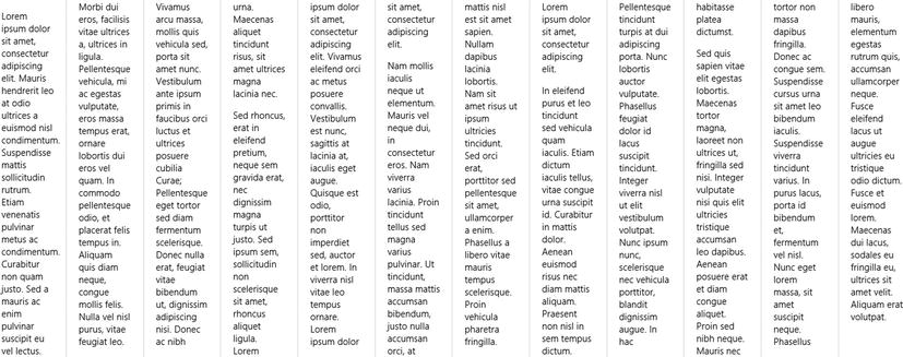
Figure 4-19. Narrow columns with rules looks pretty classy
Listing 4-17. As many 80-pixel columns as will fit with 40-pixel gaps and light gray rules in between
/* columns.css */
#columns {
    columns: 80px;
    column-gap: 40px;
    column-rule: 1px solid #ddd;
}
Widows and Orphans When individual words or lines get stranded at the beginning or end of a column, they tend to look out of place and unintentional. We call these widows and orphans. The only way to avoid widows and orphans using CSS3 is to add break-inside:avoid to the paragraph elements. This will cause a paragraph to attempt to stay together instead of splitting itself between columns. It’s not an ideal solution because it is all or nothing. If a paragraph doesn’t fit by even one line, then the entire paragraph will jump to the next column and may leave a gaping hole that looks even more unintentional than a little widow.
There are two kinds of lists: ordered and unordered. Ordered lists are typically marked with numbers or letters, and unordered lists are typically marked with bullets. You can control them both with the list-style properties: list-style-type, list-style-position, list-style-image, and the shorthand property list-style.
The list-style-type property is interesting because its values can convert a list into either an ordered list or an unordered list regardless of the markup. So if the HTML specifies a ul (unordered list) tag, you can simply apply a list-style-type and it will render as an ordered list as if you had used the ol tag.
Valid values for the list-style-type property are: none, circle, disc, square, Armenian, decimal, decimal-leading-zero, Georgian, lower-alpha, lower-greek, lower-latin, lower-roman, upper-alpha, upper-latin, and upper-roman.
The list-style-position property can be very handy when you’re trying to get your lists to align correctly. A value of outside determines that the bullet is outside of the text and wrapping text indents so the bullet remains hanging on the left. A value of inside, on the other hand, determines that the bullet is within the text and wrapping text lines up with the bullet.
The list-style-image property allows you to specify a custom image to use for your list’s bullets. The value should be in the form of url('folder/image.png').
Listing 4-18 and Figure 4-20 illustrate a standard, unordered list of fruit with no CSS modifications applied.
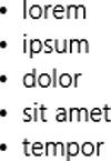
Figure 4-20. There’s nothing surprising about the simple bulleted list that’s created
Listing 4-18. Standard unordered list with no styles applied
<!-- HTML snippet -->
<ul>
    <li>lorem</li>
    <li>ipsum</li>
    <li>dolor</li>
    <li>sit amet</li>
    <li>tempor</li>
</ul>
Listing 4-19 adds a couple of styles to the list to transform the unordered list (which normally uses bullets) into an ordered one (using decimal numbers) and also assures that the numbers will be inside the list. I’ve limited the list to 200 pixels width and repeated the word mangoes just to illustrate that list-style-position property. You can see the result in Figure 4-21.
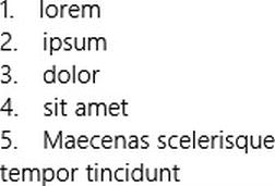
Figure 4-21. An ordered list is created (with numbered values 1–5) even though the markup defines it to be an unordered list. Also, notice the way the 5th item wraps all the way to the level of the numbers
Listing 4-19. Standard unordered list now with styles being applied
<!-- HTML snippet -->
<ul>
    <li>lorem</li>
    <li>ipsum</li>
    <li>dolor</li>
    <li>sit amet</li>
    <li>Maecenas scelerisque tempor tincidunt</li>
</ul>

/* CSS snippet */
ul {
    list-style-type: decimal;
    list-style-position: inside;
    width: 200px;
}
It’s very easy to style lists using CSS, so lists are a good, semantic way to indicate any repeating list of items or entities in your UI. You could, for instance, transform a list of items into a list, a menu, or a bunch of tiles.
Hyphenation
Hyphenation is the breaking of words in the wrapping of a text block for the purpose of improved justification. If the rendering engine is forced to keep entire words together, it can make for some awkwardly large spans of whitespace in a text column. If the engine is, however, allowed to break a word in the middle and continue it on the next line and indicate this with a hyphen then it can have more control over the wrapping of the text.
Until recently, there was no hyphenation in web pages. CSS3 has defined the hyphens property, but it has not been implemented by very many browsers. IE10 and Windows 8 actually do not recognize the standard hyphens property, but they do also support a vendor specific version of the same property. The syntax is the same too with the exception of the vendor specific prefix. The property, then, is -ms-hyphens. Like all of the other vendor specific properties and property values, Microsoft is committed to the CSS standards and as soon as possible, Microsoft will switch over to the standard property by dropping the vendor prefix. Today you use -ms-hyphens, but eventually, you’ll just use hyphens.
-ms-hyphens
Directing a block of text to be hyphenated is extremely simple. Listing 4-20 does so with this single -ms-hyphens property with a value of auto. The -ms-hyphens property can have one of three valid values (besides inherit): none, auto, and manual. A none value will obviously disallow any hyphenation being done. A manual value will only allow hyphenation breaks where break points have been explicitly suggested in the content – indicated either by the presence of a hard hyphen (−) or a soft hyphen (­). A soft hyphen indicates that the word is okay to break at a given point, but the hyphen doesn’t appear unless it actually has to break. An auto value, on the other hand, will allow the rendering engine to break at those suggested points and also in the middle of words where no suggestion has been made.
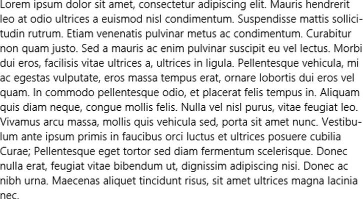
Figure 4-22. Hyphens are used to make the text’s right margin less jagged
Listing 4-20. Using -ms-hyphens: auto to turn on hyphenation
<!-- HTML snippet -->
<p>Lorem ipsum dolor sit amet...</p>

/* CSS snippet */
p {
    width: 500px;
    -ms-hyphens: auto;
}
In most cases, that will be all you need to do, but if you need a bit more control over the way the hyphenation is rendered then you’ll need to look into the other properties.
-ms-hyphenate-limit-zone
The -ms-hyphenate-limit-zone property determines the minimum amount of whitespace that can be left at the end of a line. If you specify a zone of 50px and before justification occurs there would be any more than 50 pixels of whitespace left on a single line, then words from the next line will be hyphenated and pulled up to fill in some of that space. A smaller number will result in less allowance for whitespace and thus more hyphenation. If the zone is too large no hyphenation will occur at all.
If the CSS in Listing 4-21 and Figure 4-23 were to be applied to the same HTML from Listing 4-20, then we’ll end up with one hyphenated line - the one that ends with adipis-. Had that fraction of the word adipiscing not been pulled up and hyphenated, the whitespace after the word dignissim would have exceeded 50 pixels.
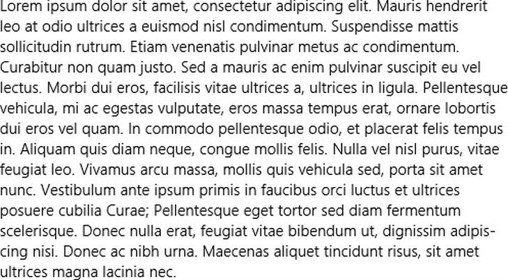
Figure 4-23. The behavior of the hyphenation is affected as you can see if you compare this figure to Figure 4-22
Listing 4-21. Setting the hyphenation zone with -ms-hyphenate-limit-zone
/* CSS snippet */
p {
    width: 500px;
    -ms-hyphens: auto;
    -ms-hyphenate-limit-zone: 50px;
}
-ms-hyphenate-limit-chars
The next of the -ms-hyphenate properties is -ms-hyphenate-limit-chars. This property sets a minimum size for words that can be hyphenated. You can specify a minimum size for the entire word in question, a minimum size for the part of it that would land before the hyphen, and a minimum size for the part that would land after the hyphen. These three values are separated by spaces. A value of 5 2 2 then would indicate that hyphenated words must have a minimum of 5 total characters, and after hyphenation there must be at least 2 characters before the hyphen and 2 characters after it.
You can use the keyword auto in place of any of the three values. The default value for auto is 5 2 2, so if auto replaces the first value then it will represent a 5, the second 2, and the third 2 again. A value of 8 4 4 would be very conservative and would only allow large words to break and would require that at least 4 characters remain on one line and at least 4 characters make it down to the next.
The CSS in Listing 4-22 uses a value of 7 3 3 as an example and notice in Figure 4-24 how the word sollicitudin was allowed to break since it’s greater than 7 characters (and at least 3 of them were able to remain before the hyphen), but Curae was not allowed to break since it only contains 5 characters.
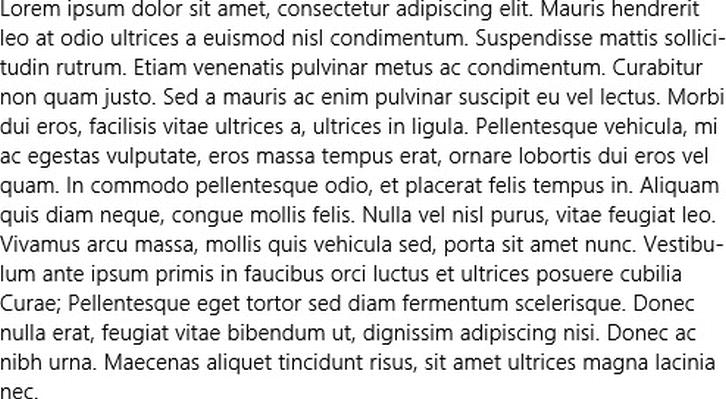
Figure 4-24. Again, the hyphenation behavior has changed from previous examples
Listing 4-22. Setting how large a word must be to be broken and hyphenated
/* CSS snippet */
p {
    width: 500px;
    -ms-hyphens: auto;
    -ms-hyphenate-limit-chars: 7 3 3;
}
-ms-hyphenate-limit-lines
The final member of the -ms-hyphenate family is -ms-hyphenate-limit-lines. This property will make sure that there are no more than the designated number of sequential hyphenated lines. In Listing 4-23, the -ms-hyphenate-limit-zone is set to 3px which is going to result in a lot of hyphenation, but the -ms-hyphenate-limit-lines is set to 2 which means that no more than 2 lines in a row can be hyphenated. If you look at the result in Figure 4-25, you’ll notice that the line that ends with Donec is a candidate for hyphenation with at least 3 pixels of whitespace before the end of the line, but the preceding two lines (ending with Vestibu- and Pel-) are already hyphenated and so it must not be.
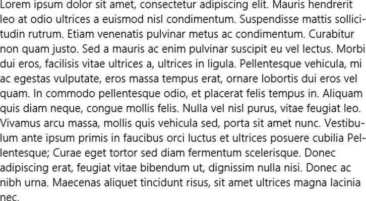
Figure 4-25. The -ms-hyphenate-limit-lines limits the number of contiguous hyphenated lines and can keep your text from looking too chopped up
Listing 4-23. Using -ms-hyphenate-limit-lines to set how many sequential hyphenated lines are allowed
/* CSS snippet */
p {
    width: 500px;
    -ms-hyphens: auto;
    -ms-hyphenate-limit-zone: 3px;
    -ms-hyphenate-limit-lines: 2;
}
Summary
We’ve covered a lot of ground related to styling text in this chapter. We’ve covered the CSS properties that you can use to customize your text’s color and opacity, the variety of ways to affect your fonts, and we’ve covered multiple columns and hyphenation for some powerful text layout control that’s rather new to the CSS world.
The importance of sharp, clean, and purposeful typography in your app really can’t be overstated. It’s a critical tool in the effort to make a Windows 8 app’s design something compelling enough that users are going to love it, talk about it with their friends, and bless your app with a high rating.