
8. List and Table Properties
In This Chapter
Setting the Space Between Table Cells
Collapsing Borders Between Table Cells
Dealing with Empty Table Cells
Setting the Position of a Table Caption
Most of the CSS properties discussed in this book can be applied to tables and lists. However, CSS also includes a few unique properties specifically for tables and lists. The specifications of table and list properties have not changed from CSS2 to CSS3, although Internet Explorer has improved its implementation in the most recent versions.
Although tables should never be used for page layout, as they once were, they are still used to lay out tabular data. Lists, on the other hand, are not only used to create lists (obviously), but have also become the standard way to structure Web site navigation.
Getting Started
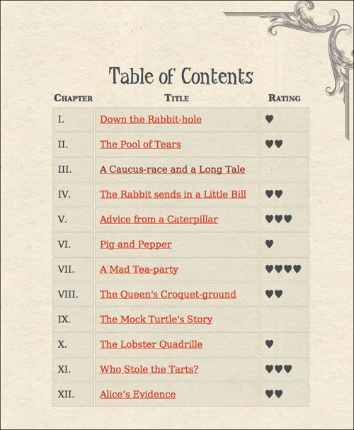
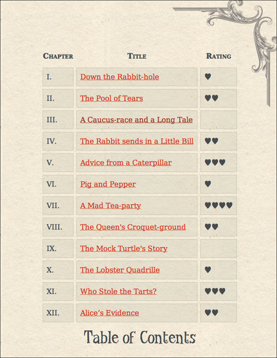
I’ll be styling Code 8.1 in this chapter. It imports the final CSS from Chapters 5, 6, and 7 as well as a new file, list-table-properties.css, that you will build in this chapter. It includes the table of contents from Alice’s Adventures in Wonderland and a list for the colophon and credits. Initially, the page will have standard bullets and an unformatted table  . We are going to add a few styles to control the table width, padding, margins, borders, vertical alignment, and font and text styles (Code 8.1B). Otherwise, the table would not look nearly as nice.
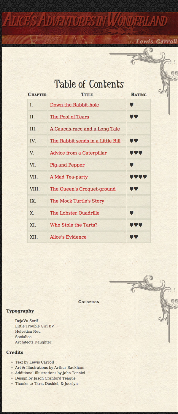
Our Web page for this chapter before adding any list or table styles. So, the browser default styles are applied, plus a few styles are added to style the table.
Code 8.1. The HTML5 code used for examples in this chapter.
<!DOCTYPE html>
<html lang="en">
<head>
<meta charset="utf-8">
<title>Alice’s Adventures In Wonderland | Chapter IV</title>
<link href="../css/font-properties.css" type="text/css" rel="stylesheet" media="all">
<link href="../css/text-properties.css" type="text/css" rel="stylesheet" media="all">
<link href="../css/color-background-properties.css" type="text/css" rel="stylesheet" media="all">
<link href="../css/ch08/10.css" type="text/css" rel="stylesheet" media="all">
</head>
<body id="chapter4" class="book aaiw chapter">
<header class="page">
<hgroup>
<h1>Alice’s Adventures in Wonderland</h1>
<h2>By <cite>Lewis Carroll</cite></h2>
</hgroup>
</header>
<article id="toc">
<table>
<caption>Table of Contents</caption>
<thead>
<tr><th>Chapter</td><th>Title</td><th>Rating</th></tr>
</thead>
<tfoot></tfoot>
<tbody>
<tr><td>I. </td><td><a href="AAIWL-ch01.html">Down the Rabbit-hole</a></td><td>♥</td></tr>
<tr><td>II. </td><td><a href="AAIWL-ch02.html">The Pool of Tears</a></td><td>♥♥</td></tr>
<tr><td>III. </td><td><a href="AAIWL-ch03.html">A Caucus-race and a Long Tale</a></td><td></td></tr>
<tr><td>IV. </td><td><a href="AAIWL-ch04.html">The Rabbit sends in a Little Bill</a></td><td>♥♥</td></tr>
<tr><td>V. </td><td><a href="AAIWL-ch05.html">Advice from a Caterpillar</a></td><td>♥♥♥</td></tr>
<tr><td>VI. </td><td><a href="AAIWL-ch06.html">Pig and Pepper</a></td><td>♥</tr>
<tr><td>VII. </td><td><a href="AAIWL-ch07.html">A Mad Tea-party</a></td><td>♥♥♥♥</td></tr>
<tr><td>VIII. </td><td><a href="AAIWL-ch08.html">The Queen's Croquet-ground</a></td><td>♥♥</td></tr>
<tr><td>IX. </td><td><a href="AAIWL-ch09.html">The Mock Turtle's Story</a></td><td></td></tr>
<tr><td>X. </td><td><a href="AAIWL-ch010.html">The Lobster Quadrille</a></td><td>♥</td></tr>
<tr><td>XI. </td><td><a href="AAIWL-ch011.html">Who Stole the Tarts?</a></td><td>♥♥♥</td></tr>
<tr><td>XII. </td><td><a href="AAIWL-ch012.html">Alice’s Evidence</a></td><td>♥♥</td></tr>
</tbody>
</table>
</article>
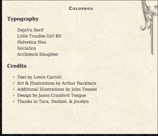
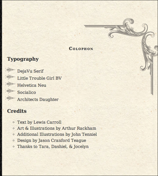
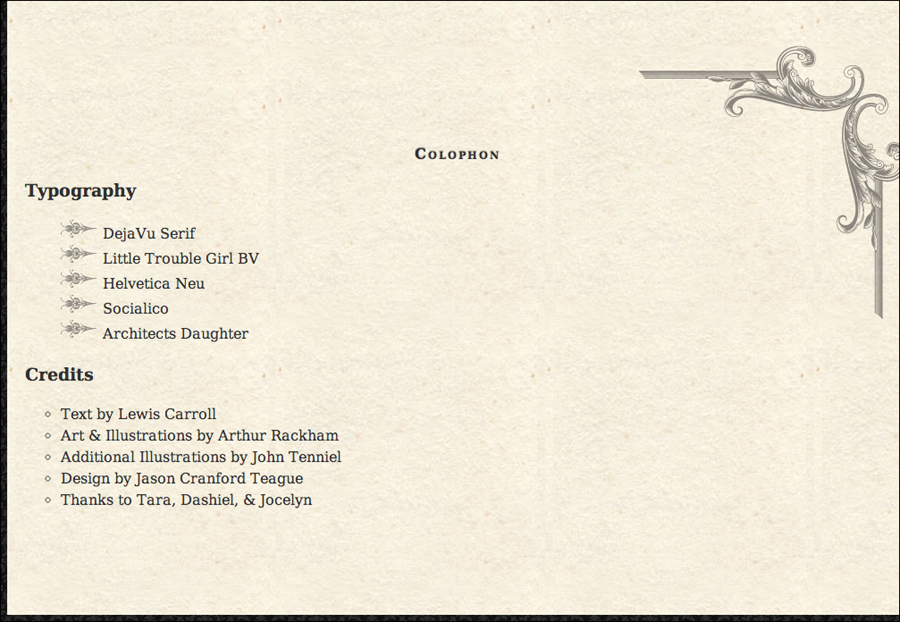
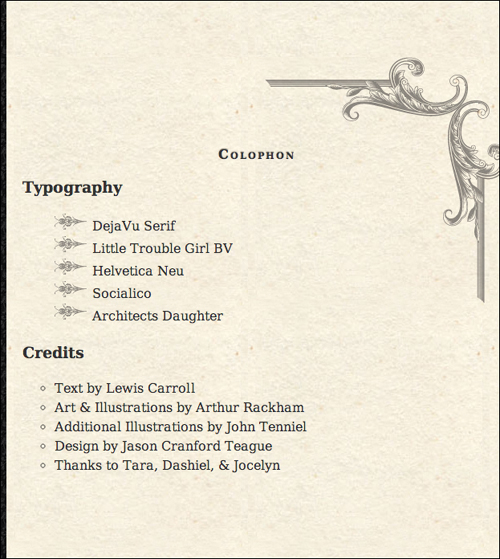
<article id="colophon">
<h2>Colophon</h2>
<h3>Typography</h3>
<ol class="list">
<li>DejaVu Serif</li>
<li>Little Trouble Girl BV</li>
<li>Helvetica Neu</li>
<li>Socialico</li>
<li>Architects Daughter</li>
</ol>
<h3>Credits</h3>
<ul>
<li>Text by Lewis Carroll</li>
<li>Art & Illustrations by Arthur Rackham</li>
<li>Additional Illustrations by John Tenniel</li>
<li>Design by Jason Cranford Teague</li>
<li>Thanks to Tara, Dashiel, & Jocelyn</li>
</ul>
</article>
</body>
</html>
Code 8.1B. The initial code added to list-table-properties.css to create a more attractive table for us to play with.
table {
width: 75%;
margin: 40px auto; }
tr {
font-size: 1.25em; }
td {
verticalalign: top;
padding: .5em;
background-color: rgba(200, 200, 180,.25);
border: 1px solid rgb(200, 200, 180); }
table thead {
font-size: 1em;
font-style: normal;
font-variant: small-caps;
text-shadow: 0px 1px 1px rgba(255,255,255,.6), 0px -1px 1px rgba(0,0,0,.6); }
table {
width: 75%;
margin: 40px auto; }
table caption {
font: normal 3em 'TitleCopy', Corbel, Helvetica, Arial, sans-serif; }
article {
padding: 100px 20px; }
Code 8.2. Added to list-table-properties.css—The list-style-type property is used to choose between the different bullet and number styles for your list .
Code 8.2 applied to Code 8.1: Bullets are changed from discs (default) to circles and the numbers are removed.
/*** list-table-properties.css ***/
ul {
list-style-type: circle; }
nl.list {
list-style-type: none; }
Setting the Bullet Style
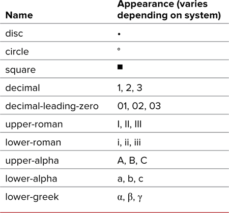
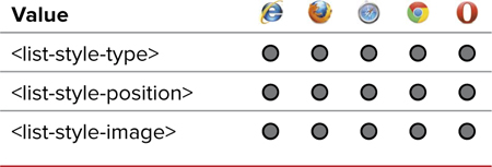
The list-style-type property (Table 8.1) controls the type of bullet to be used for list items—not just circles, discs, and squares, but also letters and numerals and dots and our own custom image bullets.
Table 8.1. List-Style-Type Values
To define the bullet style
1. Add the list style type property to your declaration list. Type list-style-type, followed by a colon (:) (Code 8.2).
list-style-type:
2. Specify the bullet type. Type one of the bullet names listed in Table 8.2, or type none if you do not want a marker to appear.
circle;
Table 8.2. List-Style Bullet Names
Although the list item tag <li> is used in this example, you can turn any element into a list item by adding the CSS list properties along with the definition display: list-item. See Chapter 10 for more information.
You can change the bullet type or image using pseudo-classes such as :hover, :visited, and :active.
Creating Your Own Bullets
You’re not limited to the preset bullet styles built into a browser. You can also use your own graphics as bullets from GIF, JPEG, and PNG files by applying the list-style-image property (Table 8.3).
Table 8.3. List-Style-Image Values
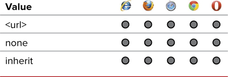
To define your own graphic bullet
1. Add the list-style-image property to your CSS rule. Type list-style-image, followed by a colon (:) (Code 8.3).
list-style-image:
2. Specify the location of your image bullet. To include your own bullet, you have to tell the browser where your bullet graphic file is located.
url(bullet-01.png);
Type the complete Web address or relative path of the image. In this example, bullet-01.png is a local file.
Alternatively, type none to instruct the browser to override any inherited bullet images.
Bullets are placed out of the layout frame by default, so they often will fall outside of the layout box if they are particularly long.
Keep in mind that the text being bulleted has to make space for the graphic you use. A taller graphic will force more space between bulleted items, and a wider graphic will force bulleted items farther to the right.
To be honest, very few developers use the list-style-image property to add image bullets to their designs. Instead, most developers will use the background property with padding to get more precise styling. Want to know how to do this? Check out Chapter 17, “Navigation, Buttons, and Controls.”
Code 8.3. Added to list-table-properties.css—I created a small arrow graphic (saved as a transparent PNG) to be inserted as the bullet using list-style-image  .
.
/*** list-table-properties.css ***/
ol.list {
list-style-image: url(../images/chrome/bullet-01.png); }
The transparent PNG image is 40×21 pixels.
Code 8.3 applied to Code 8.1: The fancy bullet image is used instead of numbers.
Code 8.4. Added to list-table-properties: The list-style-position property allows you to specify how lines of text flow under the bullet .
/*** list-table-properties.css ***/
ul { list-style-position: outside; }
nl.list {
list-style-position: inside; }
Code 8.4 applied to Code 8.1: outside pushes the image bullet over, while inside pulls the disc bullet back.
Setting Bullet Positions
Often, the text of a bulleted list item is longer than one line. Using the list-style-position property (Table 8.4), you can specify the position of wrapping text in relation to the bullet. Wrapped text that is indented to start below the first letter of the first line of text is called a hanging indent .
Table 8.4. List-Style-Position Values
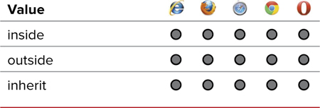
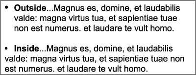
outside is generally how bulleted lists are presented. You may want to override that by using inside.
To define the line position for wrapped text in a list item
1. Add the list-style-position property to your declarations. Type list-style-position, followed by a colon (:) (Code 8.4).
list-style-position:
2. Specify the position type.
inside;
Type one of the following values to set text indentation:
• inside aligns the left edge of the bullet with the left edge of subsequent text.
• outside left aligns the first line of text with subsequent text, placing the bullet as a hanging indent.
Generally, bulleted lists that have a hanging indent (outside position) stand out much better than those without a hanging indent (inside position).
Setting Multiple List Styles
You can use one line of code to set all list properties described in the previous three sections using the list-style shorthand property (Table 8.5), which sets the list-style-type, list-style-position, and list-style-image properties.
To define multiple list-style attributes
1. Add the list-style property to your CSS rules. Type list-style, followed by a colon (:) (Code 8.5).
list-style:
2. Specify the location of your bullet image (optional). Next, type a list-style-image value.
url(arrow_02.png)
To include your own bullet, you must create the bullet graphic and then tell the browser where the graphic is located using either the complete Web address or the relative path of the image. (See “Creating Your Own Bullets” in this chapter for more information.)
Code 8.5. Added to list-table-properties: The list-style property lets you set the type, image, and position all in one definition .
/*** list-table-properties.css ***/
ul {
list-style: circle outside; }
ol.list {
list-style: none url(../../images/chrome/bullet-01.png) inside; }
Code 8.5 applied to Code 8.1: This version is identical to the previous version; only the code is different.
3. Specify the bullet type. Type a list-style-type value from Table 8.3, followed by a space, or type none if you don’t want a marker to appear.
circle
4. Specify the position type. Type a list-style-position value from Table 8.4.
outside;
You do not need to include all of the values to ensure that this shorthand selector will work. Omitted values are set to the default. The following example works just fine:
list-style: inside;
If visitors have turned off graphics in their browsers or if a graphical bullet does not load for some reason, the browser uses the list-style-type that you defined in Step 3.
Setting the Table Layout
Different browsers use different methods to calculate how a particular table sis displayed. Two primary table-layout (Table 8.6) methods are favored:
• Fixed method bases its layout on the width of the table and the width of columns in the first row. This method is generally faster than automatic.
• Automatic uses the table column width along with the amount of content in the table data cell to calculate the table data cell width. This will generally render more slowly than the fixed method, but it also produces more accurate results for widths throughout the table.
Table 8.6. Table-Layout Values
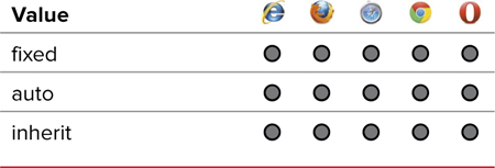
To set the table layout method
1. Add the table layout property to a CSS rule for a table element. Type table-layout, followed by a colon (:) on table elements (Code 8.6).
table-layout:
2. Specify the layout method.
auto;
Type one of the following values to specify which method you want to use when displaying your table:
• fixed will use the first row to calculate the overall width of table data cells in that column of the table.
• auto will allow the browser to calculate the widths of table data cells based on their content and the overall width of the table.
Although fixed renders faster for longer tables, auto generally provides better results unless the rows of data are consistent in size.
Code 8.6. Added to list-table-properties: The table-layout property lets you force the browser to use either the fixed or auto methods for rendering tables .
/*** list-table-properties.css ***/
table {
table-layout: fixed; }
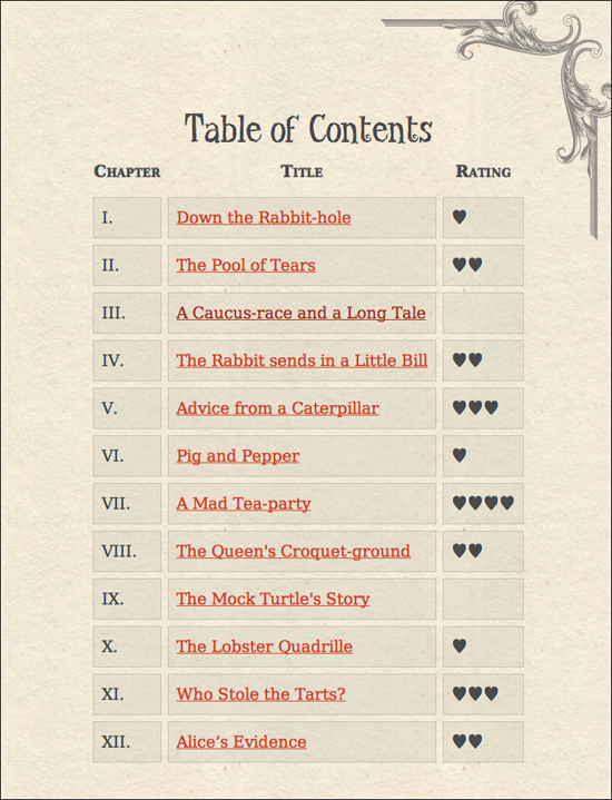
Code 8.6 applied to Code 8.1 with fixed layout: When content is much longer than subsequent rows, the table looks cramped when using fixed.
I recommend auto since short tables will not take long to render, and long tables will need more accuracy. Either way, auto is preferred.
Code 8.7. Added to list-table-properties: The border-spacing property works like a margin around the table data cell .
table {
border-spacing: 8px; }
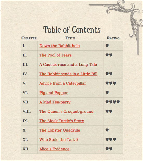
Code 8.7 applied to Code 8.1: Spacing out data cells can make them easier for users to scan.
Setting the Space Between Table Cells
Although table data cells and table header cells can use many of the box properties we’ll explore in Chapter 10, they cannot use the margin property. Instead, CSS has the border-spacing (Table 8.7) property, which sets an equal amount of space between data cells’ top, bottom, left, and right sides.
Table 8.7. Border-Spacing Values

To collapse the borders in a table
1. Add the border spacing property to the CSS rule for a table element. Type border-spacing, followed by a colon (:) (Code 8.7).
border-spacing:
2. Specify the spacing between table data cells.
8px;
Type a length value (such as 8px) to specify the distance between cells. (See “Values and Units Used in This Book” in the Introduction.) Alternatively, use inherit to use the same border spacing as a cell’s parent element.
Collapsing Borders Between Table Cells
Every table data cell defined by the <td> tag has four borders: top, right, bottom, and left. The border-collapse property (Table 8.8) allows you to set a table so that each table data cell will share its borders with an adjacent table data cell rather than creating a separate border for each.
To collapse the borders in a table
1. Add the border collapse property to a table element. Type border-collapse, followed by a colon (:) (Code 8.8).
border-collapse:
2. Specify how borders should collapse.
separate;
Type one of the following to determine how you want to display the borders in the table:
• collapse will make adjacent table data cells share a common border; however, you won’t be able to set border-spacing if borders are collapsed.
• separate will maintain individual borders for each table data cell.
Table 8.8. Border-Collapse Values

Code 8.8. Added to list-table-properties.css—The border-collapse property lets you remove all space between the table data cells, giving each side a single border , but border spacing will be ignored. Use separate to allow border-spacing to work .
table {
border-collapse: separate; }
By using collapse, the border between data cells has been reduced to a single, thin line.
Code 8.8 applied to Code 8.1: With separate set, you can set border-spacing.
The displayed results can vary between different browsers unless you set the border style using CSS.
If the borders being collapsed do not share the same border thickness, the thicker border will be shown and its style used.
If borders have the same thickness but different styles, the border style for the data cell to the left is used.
Dealing with Empty Table Cells
If a table data cell has no data (not even spaces or nonbreaking spaces), it simply appears as a blank box at the default width and height of the column and row. The empty-cells property (Table 8.9) allows you to specify how that empty data cell (and, most importantly, its border) is presented.
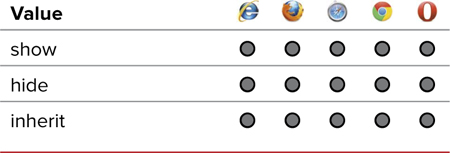
To hide empty table data cells
1. Add the empty-cells property to a table elements CSS rule. Type empty-cells, followed by a colon (:) (Code 8.9).
empty-cells:
2. Specify how empty table cells should be treated.
hide;
Type one of the following to specify how the cells will be treated:
• show will force the empty data cell to display its background and border.
• hide will leave a visual gap in place of the data cell.
Code 8.9. Added to list-table-properties.css—The empty-cells property lets you show (default) or hide empty table data cells .

Code 8.9 applied to Code 8.1: Empty table data cells have been hidden so that their border and background colors are not displayed, leaving an empty gap in the table.
/*** list-table-properties.css ***/
table {
empty-cells: hide; }
Code 8.10. Added to list-table-properties.css—The caption-side property lets you specify whether the caption should appear above (top) or below (bottom) the table .
/*** list-table-properties.css ***/
table {
caption-side: bottom; }
The caption is forced to the bottom of the table rather than its natural position at the top.
Setting the Position of a Table Caption
The <caption> tag lets you embed identifying text in a table. You can set the align attribute in the tag to define where the caption should appear in relation to the table, but this is being deprecated in favor of the CSS caption-side property (Table 8.10), which does the same thing.
Table 8.10. Caption-Side Values
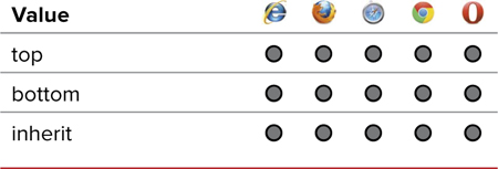
To set the position of a caption in relation to its table
1. Add the caption side property to your CSS. Type caption-side, followed by a colon (:) (Code 8.10).
caption-side:
2. Type a keyword indicating which side of the table you want the caption to appear: top or bottom.
bottom;
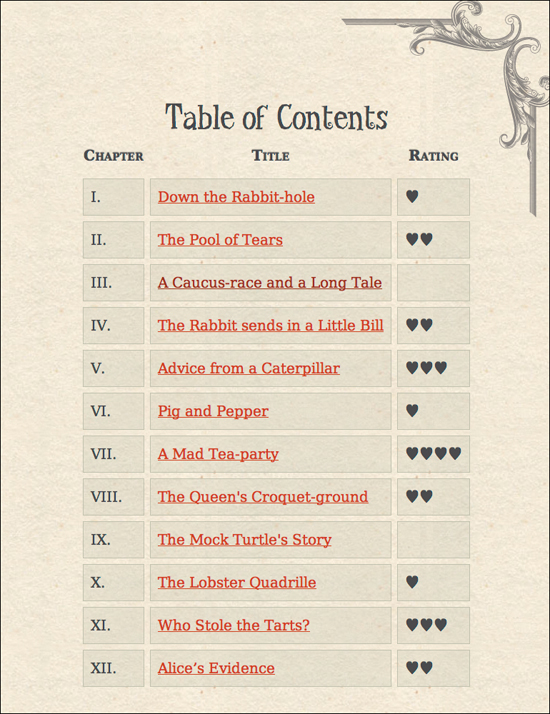
Putting It All Together
Code 8.11 shows the final version of list-table-properties.css using the list shorthand property wherever possible. The caption-side property lets you specify whether the caption should appear above (top) or below (bottom) the table .
Code 8.11. Final list-table-properties.css
/*** list-table-properties.css ***/
ul {
list-style: circle inside; }
ol.list {
list-style: none url(../images/chrome/bullet-01.png) inside; }
table {
table-layout: auto;
border-spacing: 8px;
border-collapse: separate;
empty-cells: hide;
caption-side: top;
width: 75%;
margin: 40px auto; }
tr {
font-size: 1.25em; }
td {
vertical-align: top;
padding: .5em;
background-color: rgba(200, 200, 180,.25);
border: 1px solid rgb(200, 200, 180); }
table caption {
font: normal 3em 'TitleCopy', Corbel, Helvetica, Arial, sans-serif; }
table thead {
font-size: 1em;
font-style: normal;
font-variant: small-caps;
text-shadow: 0px 1px 1px rgba(255,255,255,.6), 0px -1px 1px rgba(0,0,0,.6); }
article {
padding: 100px 20px; }
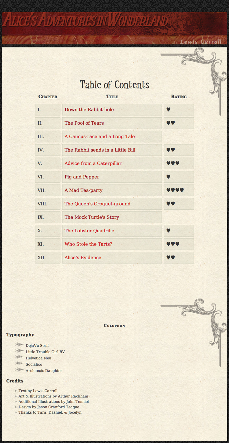
The final appearance of the Table of Contents.