
Chapter 8. Messin’ with Mother Nature
It may not be nice to fool with Mother Nature, but it sure can be a whole lot of fun. Even Mother Nature can use a little help every now and then, right?
The projects in this chapter are almost as diverse as Mother Nature is. In fact, you’ll use a variety of tools and techniques in Paint Shop Pro as you work through this chapter. From selections and cloning to filters and layer blending effects, this chapter has it all. Now go out and shoot some stormy skies and cityscapes and get started with the digital darkroom fun.
Project 1: After the Storm (New Sky Background)
Project 2: Overgrown Gardens
Project 3: Faking Photo Filters (Gradient Skies)
Project 4: Me, Monet, and I
Project 5: Bridging the Gap with Panoramas
Project 1. After the Storm (New Sky Background)
This first project is a fairly easy operation—nurse, do you have the patient’s new background ready? We’ll simply remove the current sky and replace it with something a little more dramatic.
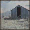
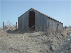
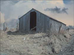
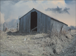
I shot the first photograph a number of years ago (see Figure 8.1). When I travel I’m always on the lookout for old buildings, windows, and doorways. I don’t really know why, but they fascinate me as a subject. It must be a texture thing. In any event, I passed this old building at one point and then went back to shoot it a couple of days later. As it happened, the weather was gorgeous—just what you want when on vacation but not what you might want for a dramatic photo. I like the old building, but it’s not really dramatic enough on its own to hang in a hallway for all to see. That bland sky can be fixed, though.
Figure 8.1. An old farm building.
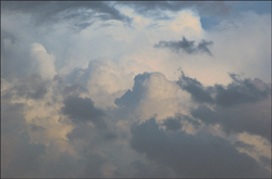
Fast forward to the recent past when we had just had a great summer afternoon storm. Right outside my own front door, without even going out to the street, I could see the most amazing skies. Naturally, I ran to get my camera and shot about a dozen or so quick shots. One of these will now become the new background for the old farm building (see Figure 8.2).
Figure 8.2. Post–summer-storm skies.
1. To get started with this project, open a couple of images you think would work well with this project, or, if necessary, download the images (Storm Clouds.tif and Old Farm Building.tif) I’m using from the companion website.
Different resolutions? Regardless of whether it shows, these two photos were taken with different cameras, with different lens, and even in totally different locations. Will that matter? Not in this case; in fact, it’s a bit of a bonus because the photo of the storm skies is larger (6MP) than the farm building (3.3MP). This means I can apply the new background in a variety of ways, even resizing it down a little if needed.
2. With both images open, make the farm building the active document by clicking its title bar.
Out with the Old Sky
Before we can use the new atmospheric cloud image as the new sky, we have to remove the existing sky. For the most part, that looks fairly trivial with the sky being mostly a distinct shade of blue, but each image has its own idiosyncrasies.
3. Use your favorite method of background-ectomy to remove the sky from the image. Before you attempt this photo-saving operation, though, duplicate the Background layer and work on the duplicate. This preserves a copy of the photo along with the project and, though it may take up more room on your hard drive, it can end up saving you time at some point in the future.
I used the Magic Wand tool with a fairly low Tolerance setting of 10 to select portions of the sky, deleting them as I selected them. Because I was deleting the selected areas as I worked, I selected the Add mode for the Magic Wand tool.
You can try toggling the Contiguous setting on and off as you work. Some parts of the image need to be removed. The puddles along the right side, for example, should be filled with the sky to help with the illusion.
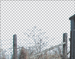
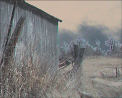
I also used the Selections, Modify Select Similar, Select Color Range command as I worked, keeping an eye on areas I knew would be troublesome, such as the fence and bush area (see Figure 8.3). I wanted to get rid of as much of the sky as I could but without removing the wire fence and the shrub. It’s delicate work, but certainly well worth the effort.
Figure 8.3. Removing the sky, but not the fence or shrub.
Tip
Zoom in and out every so often to make sure you’re not removing anything you don’t want removed. It’s easy to get caught up in the work and go a little overboard. You can get back with a few undos (select Edit, Undo or press Ctrl+Z), but it’s best to keep the selections as close as possible without going too far.
Tip
If you zoom out only to realize that the last selection has bitten off way more than you want, there is a solution that doesn’t involve starting the selection over. Simply select the Magic Wand, set its Mode to Remove, and then draw around the areas you don’t want included in the selection. This can be especially helpful if you have the Contiguous option turned on as you make your selections.
And In with the New
Pasting in the new background in this image is great fun. The image I chose for the clouds is a far bit larger than the image that will be getting the new sky. This means we can move the clouds around until the background looks right—right being whatever you feel is good because you are the artist, after all.
4. After the sky (or at least most of it) is gone, activate the stormy skies image and choose Selections, Select All to grab the entire image. Select Edit, Copy to copy the stormy skies image to the Clipboard. Close the Stormy skies image because we won’t need it from here on in.
5. Make the Background layer in the farm building image active by clicking its layer in the Layers palette. Select Edit, Paste As New Layer to place the stormy sky between the original farm photo and its copy with the sky removed. You should now be able to see the new sky background (see Figure 8.4).
It’s Time to Handle the Details
If you take a close look, you’ll see that the puddles have been filled in and seem to blend better than they would have if the bright blue sky were still visible in their reflection.
This image already looks pretty good, and mostly convincing. There are only a couple of small troublesome areas.
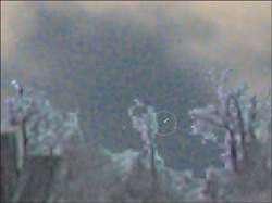
The wire fence is still a little bright for my liking, and the area of trees in the distance on the right has a bit of a halo that really needs to be fixed (see Figure 8.5).
Figure 8.5. Troublesome trees.
6. To fix the trees in the background, I used the Eraser tool with the Size set to 9 and the Hardness set to 33. Zooming way in can be a big help (see Figure 8.6). Try not to deforest the area and remove only as much as necessary to help with the illusion. Remember you can always undo a brush stroke.
Figure 8.6. Zooming in to help with the task at hand.
7. To help with the fence and shrub, select the Lighten/Darken Brush tool. The default is for the left mouse button to lighten and the right button to darken. I toggled the Swap Mouse Buttons option so the left button would darken (note that this is a matter of personal preference and is not necessary to complete this project). I also set the Size to 16, the Hardness to 50, and the Opacity to 40.
8. With the brush configured with these settings, I dragged over the shrub and fence a number of times, zooming in and out to see that my work was helping the area to blend with the new sky.
There’s a bit of a halo along the roof, but it looks like it’s catching some light so I’ll leave that. However, I will zoom in and fix the puddle’s halos using the same eraser method I used for the trees.
That should pretty much do it. I’m sure you’ll agree that the finished image in Figure 8.7 is much more dramatic than the original.
Figure 8.7. The final digital image.

The troubles and techniques outlined in this project are exactly the same kind of thing you’ll come up against when you tackle projects of this nature with your own images. Take your time, and don’t be afraid to back up a little and start again if it isn’t working out. The practice will be helpful and, as you get better, the work will get better and go more quickly. Have fun.
Project 2. Overgrown Gardens
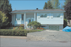
I have a great neighbor. We help each other out, and he was the first guy I met when we moved into our crescent. The only thing about my neighbor is his perfect yard. I won’t compare him to Hank Hill, but his lawn and yard are pretty darn close—much closer than my own yard.
At the same time, we have a couple other neighbors who have prize-winning gardens. One of them, though, is wild looking and filled with great colorful flowers, some of them quite exotic (at least for our clime).
There has also been some recent water main trouble and the machines were just in here digging up the pavement. Sounds like a great combination for some photo fakery fun.
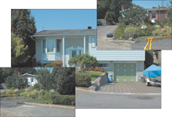
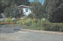
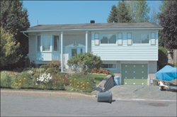
1. To get started, I’ll open the photo of my neighbor’s house along with a couple of the houses with the water trouble and the garden (there’s two of them). You can see all three images (Neighbor House 1.tif, Neighbor House 2a.tif, and Neighbor House 2b.tif) in Figure 8.8.
Figure 8.8. Three photos to be combined.
Fixing the Driveway
The first thing I want to do is replace that great driveway. It’s actually 25 years old, but it looks better than most of the driveways in the neighborhood.
2. To replace the driveway, activate the image with the road showing. It’s the one with the yellow barrier to the left.
3. Use the Freehand Selection tool with the Selection type set to Point to Point to select an area of the road where it’s all messed up from the work. Figure 8.9 shows the selection I made. With the pavement selected, choose Edit, Copy.
Figure 8.9. Selecting some torn-up pavement.
4. Activate the image with the house that we’re fixing, and select Edit, Paste As New Layer. This places the selected section of road directly above the image of the house.
Move the new driveway into place over the old one (see Figure 8.10). Be sure it covers the old driveway.
Figure 8.10. Moving the new driveway into place.
5. Toggle off the visibility of the new driveway layer. To do so, click the small Eye icon next to the layer in the Layers palette.
6. Use the Freehand Selection tool to make a rough selection of the existing driveway.
7. Toggle the new driveway layer’s visibility back on and activate the layer.
8. From the Layer palette’s pull-down menu, select New Mask Layer, Show Selection. What just happened is that a mask was built from the selected old driveway. That mask is what’s letting the old, torn-up road show through—but only where the old driveway was (see Figure 8.11). This is a good thing because we can adjust the mask as necessary to get the pavement to really assume the place of the old driveway.
Figure 8.11. The new driveway masked and in place.
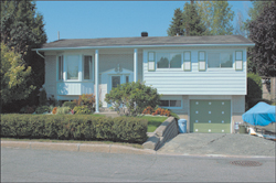
The driveway looks pretty good from here, but zooming in will reveal some places where the mask needs to be bent and twisted into shape. We’ll worry about that later, though.
Adding a New Garbage Can
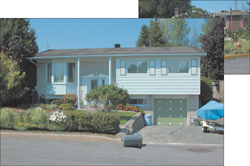
From the other photo, the one with the barrier on the right, I want a couple of things: I want to clone some of the plants into the photo we’re changing, and I want that garbage can that’s over on its side. I think it’ll make a great addition to the makeover.
Tip
Placing the garbage can worked well in this project because the two images shared a common setting: The sun was in the same place, the photos where taken at the same time of day, and so on. This won’t always be the case, and you’ll have to pay attention to things like shadows. One misplaced shadow can spoil the whole effect and make the resulting photo unbelievable.
9. Using the Freehand Selection tool, draw a selection around the garbage can. Make sure you grab its shadow. Select Edit, Copy, and then activate the main image (the one we’re changing, that is) and select Edit, Paste As New Layer.
10. Move the garbage can into place and then zoom in and remove any extra material using the Eraser tool. You can see my result in Figure 8.12. Note that I also rotated the can a little to the right to get it to look as though it belonged there.
Figure 8.12. Dropping a new garbage can into place.

Time for Some Gardening
It’s time to do a little gardening. We’ll use the Clone Brush to copy the wild plants from one image to another.
11. Activate the image with the plants to be copied. I used the image with the barrier on the right because the plants seemed to match up well in size to the existing hedges we’ll be covering.
12. Select the Clone Brush and right-click in the image over the plants. I set the brush size large enough to cover the plants I wanted to copy—about 280 pixels.
13. With the Clone Brush still active, click and drag in the image we’re working on. This paints the wild flowers over the existing hedges (see Figure 8.13).
Figure 8.13. Adding some wild flowers.
14. Finally, go back and paint into the mask a little to let more of the boat trailer and its wheels show through the mask. Note that the mask is grayscale, but we’ll need to use only black and white. Where the mask is white the new driveway (the old wrecked bit of pavement) will show through and cover the old driveway. Where the mask is black the underlying photo will show through. That means I added a little black using the Paint Brush tool to get the rest of the trailer to show through. My final image is shown in Figure 8.14.
Figure 8.14. My neighbor’s house.
There’s more that could be done to this image. If the lighting were right, for example, I’d take the shutters and set them askew; I might darken things a little and change the bright blue sky to something a little more dismal. Before you know it, I’d be living next to the Addams Family.
Project 3. Faking Photo Filters (Gradient Skies)
When I first started taking photographs, I was amazed at the number of filters available. There were (and still are) filters to soften, filters to darken, filters to change the way light of different colors is permitted to affect the film, and so on.
Some of the coolest filters, though, are the ones that have a gradient to them. They can have dark blue blending to a gold, which is good for those ocean sunset shots, I guess. There are also filters that affect part of the image, such as the top and bottom without affecting the middle. Pretty cool stuff. If you like that kind of idea but don’t know if you want to spend the money on some of these filters, or even whether they’ll fit your camera, stay tuned. I’ll show you how to build your own arsenal of photo filters in this project.
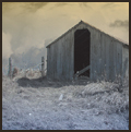
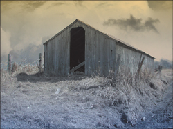
1. To get started, you need to open an image. I’ll use the old farm building from the project earlier in this chapter (see Figure 8.15). You can use just about any image for this project, though.
Figure 8.15. The old farm building.
Building a Gradient Filter
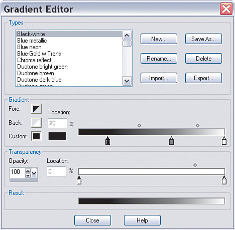
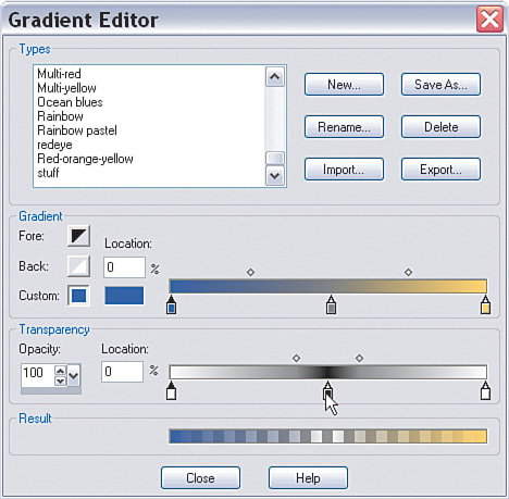
2. Click the Foreground and Stroke Properties icon in the Materials palette. In the Material Properties dialog box, click the Gradient tab to display the gradient properties; then click the Edit button to edit the gradient. Doing so brings up the Gradient Editor (see Figure 8.16).
Figure 8.16. The Gradient Editor dialog box.
Note
In the middle of the Gradient Editor dialog box ‘are several sliders to the right. You can change the positions of these sliders by clicking and dragging them; this changes the gradient. Give it a try. You won’t break anything, I promise. You can also change the color of a slider and even delete or add it.
3. For now, drag one slider to the left and one to the right. If you don’t have a slider in the middle, click below the gradient line to add one (see Figure 8.17).
Figure 8.17. Adding a gradient slider.
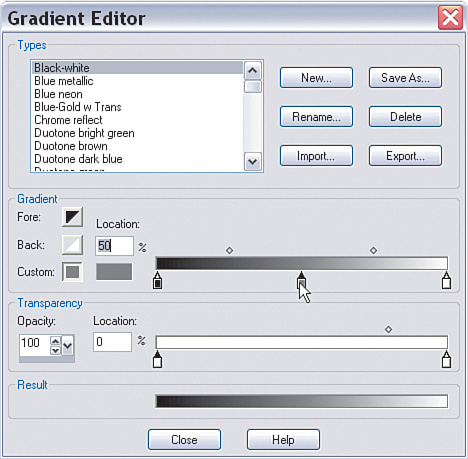
4. Set the color of the left slider to a deep blue by clicking the small, rectangular color icon below the Location option. The Color dialog box opens (see Figure 8.18). I used R: 60 G: 69 B: 142.
Figure 8.18. The Color dialog box.
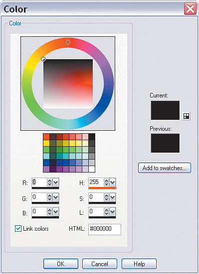
5. Set the color of the right slider to a goldish color. I used R: 252 G: 214 B: 96.
6. Below the color sliders is another slider. Using the settings in this one, you can set part of your gradient to be transparent. You can also control how the transparency interacts with the colors by sliding the small diamond-shaped sliders at the top of the gradient, just as you can affect how the colors blend with those same icons at the top of the color gradient.
Set the Opacity of the end sliders of the Transparency gradient to 100.
Add a slider at Location 50 and set its Opacity to 0.
Drag the diamond-shaped icons in fairly close. I set them to 80 and 20, respectively (see Figure 8.19).
Figure 8.19. Setting the transparency of the gradient.
7. Click the Save As button and give your gradient a name. Before you exit the Material properties, set the Angle to 0.
Painting with the New Filter
Now that the fake photo filter has been created, it can be used to add some atmosphere to the existing image.
8. Add a new Raster layer by clicking the New Raster icon in the Layers palette. Choose Selections, Select All. This step, although not really needed, makes removing the gradient and starting again (if necessary) easy.
9. Select the Flood Fill tool and click in the image to apply the gradient (see Figure 8.20).
Figure 8.20. Adding the gradient layer.
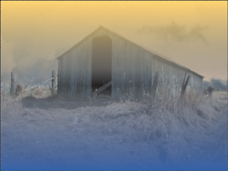
If you’re not satisfied with the colors, press the Delete key to remove the gradient fill. Then reset the gradient’s values by clicking the Foreground and Stroke Properties icon in the Materials palette and following the same steps as used previously to create the gradient. Don’t forget to adjust the transparency, as well, if you feel it’s needed.
10. When you’re satisfied with the colors, you can also set the blending mode and the opacity of the gradient layer by playing with the sliders at the top of the Layers palette. I set the Blending mode to Color (Legacy) and the Opacity to 50. You can see my final result in Figure 8.21.
Figure 8.21. The final “filtered” photograph.
The blending modes can be fun to play and experiment with. Try duplicating a layer and playing with the blending modes. You might be surprised at what you find.
Project 4. Me, Monet, and I
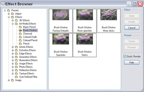
Paint Shop Pro contains some wonderful effects. There’s a whole menu of effects for you to explore. Some books devote a whole chapter to these filters. They’re fairly easy to use and, if you are unfamiliar with what they do (some are fairly obvious from their names, but others are not), there’s even an effects browser. To view the browser, select Effects, Effect Browser to open the Effect Browser dialog box (see Figure 8.22).
Figure 8.22. The Effect Browser.
Tip
If you find the thumbnails are too small, simply resize the dialog box by clicking and dragging the lower-right corner.
Clicking through the small folders on the left side of the dialog box shows different filters and several preview thumbnails with various settings of a particular filter. For example, in Figure 8.22 you can see the effects of the Brush Strokes filter. Pretty simple, right?
I guess the simplicity is one of the things I like least about these effects. They can be cool, for sure, but some of them are relatively simple with few options and settings. That means it would be trivial for someone to create exactly the same “look” with a few mouse clicks. Part of the reason you shoot photographs, I’m assuming (especially since you’re reading this book right now), is to explore your creativity. I think it’s hard to be creative when so many others can create something similar—and so easily.
Is there a solution? I think there is. I like to explore the various filters from time to time, often with an idea in mind (as with this particular project, for example) and sometimes just for the sake of exploring.
I love impressionism! The colors, the shapes, all suggesting or giving the impression of something. Monet’s garden paintings are a great example of this type of artwork. You get more of an impression of the garden than anything else. The details seem to give way to...well, an impression.
This project works well for the type of image I’ve chosen. I encourage you to play around with some of your images to see whether this technique does them justice. If not, play with the settings, or choose some other combination. Remember to have fun and that you can’t really break anything by doing so.
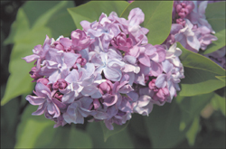
This project will show that it’s possible to get something more original than just the default settings simply by adding a couple more steps to the process. In fact, we’ll apply one filter to a copy of a background and change a couple of the settings on the new layer—and that will be it. By combing these steps, though, we’ll take the digital photo of a flower from my wife’s garden and transform it into an impressionist masterpiece. Well, maybe not a masterpiece, but perhaps something worthy of printing and displaying.
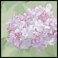
1. If you are working along with me, you can open the file from the website, or you can open one of your own images that is similar, at least in content. The photo I’m using in this project (Purple Flower.tif) is shown in Figure 8.23.
Figure 8.23. The original digital photograph.
2. With the file open, right-click the Background layer in the Layers palette and select Duplicate from the menu.
Note
Usually I ask you to copy the background layer to preserve it and make it easy to get back to the starting point without reopening the file. This time, though, I have an ulterior motive. To create the final effect, the layer with the effects on it must be combined with the underlying layer. That is, the image you see will be a combination of the original layer and the layer with the effect applied to it.
Applying the Effect
The duplicate layer will be active, so we’re ready to go. ‘We’ll be applying the Charcoal effect; you’ll probably wonder at first why I chose charcoal when we’re talking impressionism and so many wonderful paint effects are available. The truth is, I played around until I got the effect I saw in my mind’s eye, and that’s the one I used. To apply the effect, do the following:
3. Select Effects, Art Media Effects, Charcoal.
Set the Detail to 73 and the Opacity to 71. You can see from the Preview in Figure 8.24 that a lot of the color has been washed out and much of the detail is gone.
Figure 8.24. Applying and previewing the Charcoal effect.
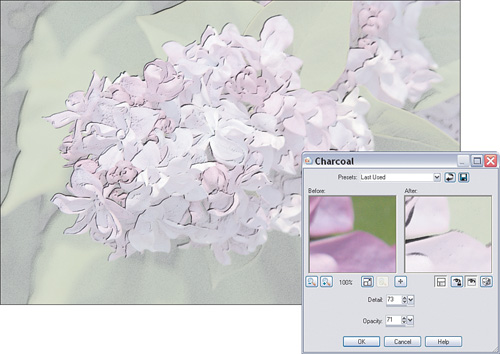
It seems as though this might have gone all wrong. But wait, there may be hope. This is what I was talking about earlier: Don’t just apply the effect and think you’re done. The effects are cool, and it’s easy to do, but remember that, if you can do it, so can someone else. It might be best to disguise the effect a little to see whether that will help make it more unusual and make it harder to duplicate and therefore more original and creative.
Changing the Layer Settings
Sometimes it’s the little things that make the biggest difference. In the next couple of steps, small changes to the opacity and blending mode of the layers will make a real difference in the image. Read on to see what I mean.
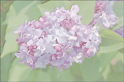
4. Set the Blending mode of the new layer to Luminance.
5. Finally, set the Opacity of the new layer to about 75 to allow some of the original photograph to show through. This is what I was talking about when I said the layers would blend together to create the final effect.
My impressionist painting...um, digitally altered photograph...is shown in Figure 8.25.
Figure 8.25. I’m not sure Monet would be impressed (please pardon the pun), but he would certainly be amazed.
Project 5. Bridging the Gap with Panoramas
Panoramas can be fun. They can be fun to shoot and fun to display and view. The problem is in creating the darn things. Of course, the final process involves combining two or more photographs into one in such a way that the photographs look as though they were taken with a special camera.
Tip
One quick way to fake a panoramic shot, depending on the photo you are working with, is to simply crop a long horizontal area from the image. Depending on the resolution of the original, how much detail you want to preserve, and so on, this might be a viable alternative to stitching photos together.
Third-party programs are available that would probably do the job. In fact, there are probably even some Paint Shop Pro plug-ins that help create panoramas. I’ve tried at least one fairly high-end plug-in, but I wasn’t that impressed with it. In fact, I ended up simply creating the image myself using the best visual processor and inputs I had on hand—my brain and eyes. I believe I (and you, for that matter) can do a better job of telling when the images are lined up (not to mention correct any small problems that crop up—and they will crop up) and when the colors match than those giant piles of plastic, metal, and silicon that occupies most of our precious desktop real estate.
A lot of the work in this project takes place behind the lens of your camera. Planning ahead will save you time and trouble in the long run. Here are a couple of things that will help you get the best results when you finally get back to your digital darkroom:
• Use a tripod—I can’t overstate how important this is. I know, I know, I hate carrying that thing around, too (mine likes to bite and it’s quite heavy), but without it you have less chance of lining up your separate images. Trust me, carry the tripod this one time; it will be worth the effort.
• Don’t use too wide an angle zoom setting—Doing so distorts things and makes stitching the results together more difficult.
• Try not to shoot toward the sun—Doing so can introduce color shifts that are difficult to deal with. Of course, if it’s a sunset you’re shooting, then that’s different.
• If possible, try to use the manual settings on your camera—The automatic settings can change as you turn the camera to get more of the landscape, for example. The change can be reflected in the colors of the image. If the colors are shifted too much, it is one of the toughest things to deal with. (It’s not impossible, but it can be very difficult.)
• Try to get the camera as level as possible—Your camera or tripod might have a level, like mine does, or it might have a visible grid you can turn on. Whatever it takes, try to get your camera as level as possible.
• Make sure you have enough of an overlap in the images that you’ll be stitching together—Having more overlap is better than not having enough.
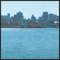
1. Open all the files you’ll be stitching together. I’ll be using the two (RightPanorama.tif and LeftPanorama.tif) in Figure 8.26.
Figure 8.26. Two photos about to be stitched together.
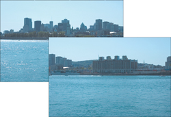
Note the boat in the middle of the photo. I only realized later that this might be a problem—that’s something to watch for next time, I guess. For now, there’s always the Clone Brush tool.
Resizing, Copying, Pasting—Lather, Rinse, Repeat
Whoa! Say that five times fast. It actually gets a little musical. Now where were we? Ah, yes, the panoramic.
I’ll stitch only two images together, but you can put as many together as you like. Simply follow the directions in this project, but set the canvas size to reflect the size of your final image.
2. Select one of the images; it doesn’t really matter which, but I’ll choose the one on the left and paste the other to its right after resizing the canvas. Activate the image you’ve selected by clicking its title bar.
3. Select Image, Canvas Size to open the Canvas Size dialog box (see Figure 8.27).
Figure 8.27. The Canvas Size dialog box.
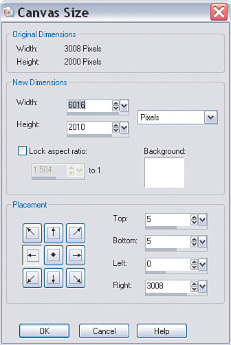
Because I chose to start with the left image, I’ll set the Placement to the left.
The only other setting I’ll make is that I will double the Width so I can paste the second image in. I set the Width to 6016 pixels.
Click OK and you’ll see that the image’s canvas size has doubled in width, with the original photo tucked away to the left of the newly resized image.
4. Activate the second photo by choosing Selections, Select All, Select Edit, Copy. Activate the first image and select Edit, Paste As New Layer.
Positions, Everyone
This next part is pretty crucial. The images need to be lined up properly so the rest of the project falls into place. Take your time with this part and pay special attention to how the two images fit together.
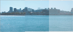
5. It’s time to get the images together. To do so, lower the Opacity of the new layer. This will enable you to see the lower layer behind the new layer and help you get the two matched up. I set the Opacity to 70. This setting was enough so that I could easily see both images overlapping (see Figure 8.28).
Figure 8.28. Lowering the opacity to allow the underlying image to show through.
Tip
At this point, you can close the second image to free up the memory it’s using. It won’t be necessary unless we make a really big mistake and have to start over.
Note
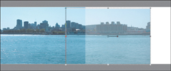
You’ll notice that you can’t necessarily line up all the points in the image. We’ll fix that to some extent, but for now concentrate on the edge where the two images meet. After that, you can concentrate on where they meet, or near, the top—for instance, where the first high-rise buildings meet in this project’s example. With that point lined up, we can fix the rest, at least any of it that will impact the final result.
6. Select the Pick tool and move the upper layer into position. Don’t worry about getting it exact at this point. Just get it roughly into place. You can use existing objects that stand out to help you place the image. For example, the tops of buildings or something prominent in the overlap will help you get the two images lined up. You did shoot with enough overlap, right?
7. With the images roughly in place, zoom in so you can get a better view of where the images overlap.
Select the Pick tool again and use the arrow keys to nudge the top layer into place. You can use the Ctrl key to move in larger increments and the Shift key to move in even larger increments.
Resizing, Reshaping, and so on
I noticed that the images weren’t exactly the same size and that they didn’t line up. They aren’t very different, but enough to spoil the effect. This means the upper layer needs to be resized.
8. To help with the process of aligning and resizing the upper layer, drag the canvas out a little to you have some room around the images (see Figure 8.29).
Figure 8.29. Enlarging the canvas to help with sizing and placement of the layers.
9. Select the Pick tool and drag the bounding box to resize the new layer as necessary. I zoomed in and made sure the walkway was lined up. It might take some trial and error, and you might have to zoom in and out a couple of times to get it right.
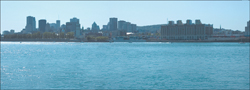
10. When you’re satisfied that everything’s in place, zoom out to take a look, paying attention to the seam (see Figure 8.30).
Figure 8.30. Checking the stitching between the layers.
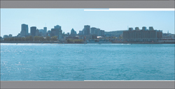
Figure 8.30 shows that the sky matches up quite well. This means, of course, that the colors in the two images are fine. If this isn’t the case with your image, you’ll have to play with the color settings of one of the images so it matches the other. Doing so can be a tricky proposition. If you do need to start changing the color, do so in a slow and methodical way, making very small adjustments as you go. I realize this might not be of great help or of much comfort, but the truth is entire books have been written about color and every image is different, so there’s no magical fix. Following the shooting tips at the beginning of this project can help you prevent this from happening, too.
The trouble I thought I’d have with one of the boats seems to have taken care of itself when I upped the opacity. At worst, though, I would have simply cloned it out if necessary.
Hiding the Seams and Final Crop
The only things left to do are to fix the visible seam in the water and crop the image.
11. To fix the visible seam, select the Clone Brush tool. Then, using a brush size that will cover the seam, clone other parts of the water over the seam. If you need a refresher on the Clone Brush’s use, see Appendix B,“Paint Shop Pro X in a Nutshell.” I cloned to a new layer to make it easier to go back and start again if problems arise with the cloning process.
Tip
Move around a lot as you sample and clone, and then resample and clone again. Keep things moving and as random as you can; change the brush size, the brush Hardness, and even the Opacity settings to see if they can help you blend the two areas together without any seams showing. Also, try not to rework an area too much because doing so can introduce patterns that will be visible in the final result.
12. When you’re happy with the result of the coverup—or the seams, that is—select the Crop tool and use it to crop out the part of the image you want to print. I removed the areas of the image where there was some white left over from the copy and paste. My final result is shown in Figure 8.31.
Figure 8.31. The final panoramic shot digitally stitched together from two separate photos.
Note
As I mentioned earlier, if you have other photos to blend in, simply follow the directions outlined here. The idea will be the same, but your panoramic will be all the more spectacular.
Wrapping Up
I really like the potential of the projects in this chapter. So much to play with and yet so little time. Speaking of time, do try some of these ideas with your own images if you have the time. I know you won’t be disappointed with the results. And I’m sure you’ll have fun along the way. Just watch out for that disgruntled neighbor if he catches a glimpse of the “photo” you created of his front yard.
The next chapter has some really fun projects. Along with seeing how some other composites work, you’ll learn more about the techniques involved in creating your own images. Before you get into that, though, you might want to take a break and head out with your camera. Keep in mind some of the projects you’ve worked on as you compose new photos. And above all else, have some fun. It will definitely show in your work.