
Chapter 9. Montages
You know, when a couple of things like some of your photos, your wacky imagination, and Paint Shop Pro get together, crazy things can happen. Montages happen when you combine photographs of a couple of weird things, such as a shot of a friend on a ladder and a shot of a skyscraper. Flip through some of the projects in this chapter to see what I mean. In fact, you may find, for example, that (digital) graffiti can be therapeutic.

Project 1: Graffiti
Project 2: Crazy Highway and Billboard Signs

Project 3: Hangin’ Around (Fun with Skyscrapers, Bridges, Ladders, and Friends)
Project 1. Graffiti
I live in a suburb of a fairly large North American urban center, so graffiti is not something new to me. In fact, the way things are these days, I don’t even have to go into town to see a good amount of graffiti—there happens to be a good bit of it here in my own neighborhood. Notice that I didn’t say good graffiti, but a good bit of graffiti.
Although I do enjoy some of the “art”, I don’t agree with unsanctioned graffiti, whether it’s painted on private, public, or commercial property. That said, doing some of your own digital graffiti can be fun, and it makes a great photo project.
As with some of the other projects in this book, you can go about this one in a number of ways. If you take a look at the wanted poster project in Chapter 6, “Printable Fun for Kids of All Ages,” for example, you’ll find that I created my own wall using a built-in Paint Shop Pro texture. You can do that with this project, as well, or you can shoot something you like. Of course, if you like, you can use the same image I will be using by downloading (UnionShoesSmall.tif) it from the companion website.
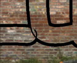
You can see the shot of a very weathered wall that I’ll be using in Figure 9.1.
Figure 9.1. A beautiful, weathered old wall.

Regardless of whether you opened the same image, created one of your own, or used another photograph, you’ll need something to use as graffiti. One thing you could do is apply a photograph to your image of the wall using a layer blending mode, which is one of the techniques we’ll use for this project. If you’re handy with CorelDRAW, you could also draw something and import it into the wall image. What I’ll be doing, though, is creating a tag (the nickname/signature art that graffiti artists use)…a sort of anti-character.
Let’s see, how to begin? What about starting with some of the things I like? I like noodles—love ‘em actually. I also love my niece Zoe and Zs are kind of cool, too. Zoe, Z, and noodle…how about Zoodle? That works, because Zoe loves animals. What about dropping the d and the e from the end? That leaves Zool. Okay, we’re onto something here. It has a certain ring to it…Zool…. It kind of rolls off the tongue. What about substituting a u for the oo, giving us Zul? I think that will work for a simple bit of graffiti. No one but you and I will know what it means and that will lend it that certain graffiti air, that quality.
Note
You’ll see your text appear on the image. Don’t be surprised if it’s way too big, out of place, not the right font, and so on. We’ll fix all those properties and more as we work.
Now that we have the image and the graffiti that we’ll be using, we can get started.
With the image open and the graffiti in mind, we can get started. The graffiti I’ve decided on is some simple text that can be applied with the Text tool:
1. Make sure the image you’ll be using as a backdrop is active by clicking its title bar.
2. Set the Foreground and Stroke properties to black in the Materials palette. Set the Background and Fill Properties to white in the Materials palette.
3. Select the Text tool and click somewhere in the image to activate the Text Entry dialog box. Then enter the text. I, being the great graffiti artist Zul, will of course enter Zul. Actually, when I started to play with the settings, I realized that it would look more like graffiti if I used a capital L, so I really entered ZuL.
4. Using your mouse, click and drag to select the text in the Text Entry dialog box. Selecting it this way will enable you to make changes and have those changes reflected immediately over the image (see Figure 9.2).
Figure 9.2. The digital graffiti in place waiting to be worked on.

There are a couple of Create As settings for text in Paint Shop Pro. You can create text as Vector, Selection, or Floating. I’ll use vector for this project because it’s best for the design I want: a thin line on the inside of the characters where the u and the L intersect and a thicker line on the outside of all the letters. Having the vector text will work best for that because, if I need to make changes to the text, it’s much easier to do so when it’s vector-based. Note that you can set the text type from the Create As pull-down in the options bar.
Selection text is simply text that comes in as a selection. Anything you can do with any other selection, you can do with type created this way. For example, you can select Edit, Copy and Edit, Paste to copy and paste an area of a photo that was below the text.
Floating text comes in as a filled and stroked floating selection in its own layer. It’s quite useful, but I still want the editability of vector text versus the bitmap text you get with the floating choice.
Tip
At some point, you might want to do something with the text you’ve entered, like repositioning it within the image. You can do so by clicking the Apply button to apply your text, selecting the tool you need, and so forth. When you’re done, you can get back to editing the properties of the type by reselecting the Text tool and clicking the type in the image. Doing so brings up the Text Entry dialog box with your text in it. Don’t forget to reselect the text in the dialog box so the changes will appear in the actual text as you make your edits.
The text I used in Figure 9.2 has the following properties:
The Font is Comic Sans MS. I chose this font because it resembles graffiti. You might be able to find another font that you like better. Explore, and see what you can find.
The Size is 12 points. If you use pixels or use a different image, you will probably need to adjust this. Play around and keep an eye on the text in the image until you find a good size. Use Figure 9.2 as a starting point.
I set the font style to Bold to give more weight to the graffiti text.
Because I used only one line of text, the alignment isn’t important. If you have more than one line, though, you might explore the centered setting.
I left the Anti-alias setting at Sharp. Antialiasing helps smooth out curves and such, and Sharp is a good setting for a fairly high-resolution image. The other settings include None and Smooth. Experiment with each to see the difference. You might have to zoom in to see the effect each setting makes on the text.
I set the Stroke Width to 4.00. I do want a thicker border, but I can get that in the next couple of steps. 4.00 is what I want for the line that joins the Z and the u and the u and the L.
5. With all the settings in place for your text, click Apply to apply the text and its settings to its own layer in the image (see Figure 9.3).
Figure 9.3. The digital graffiti text on its own layer.

In Figure 9.3, I’ve expanded the Vector 1 layer (remember that I chose Vector for the Create As type when I entered the text), so you can see the actual text layer.
Creating the Text Outline
It’s time to create the thicker outline I mentioned earlier. Here’s how to do so:
6. Select the Magic Wand tool and set the Mode to Add.
Click in all three letters, or whatever number of letters your graffiti happens to have, so that all the letters are selected.
Click in the black outline of the letters to select the outline and add it to the areas already selected. You should have all the letters and their outlines selected, as in Figure 9.4.
Figure 9.4. Use the Magic Wand to select the letters and their outlines.

7. Click the icon in the upper-left corner of the Layers palette and select New Raster Layer to create a raster layer for the outline.
8. Choose Selections, Modify, Expand. In the Expand Selection dialog box, enter 5.
9. Select the Flood Fill tool and click in the selection to fill it with black. (I’m assuming that the foreground color is still set from the beginning of this project.)
Fine-tune the Outline
At this point, you have some black, blocky text on the image that doesn’t look like graffiti so much as it resembles something that might have happened if the spray can had exploded. The next couple of steps will fix that:
10. Choose Selections, Modify, Contract and enter either 10 or double the amount you expanded the selection by in the previous steps.
11. Press the Delete key to erase the middle of the selection, leaving you with a nice thick outline.
12. Select the Pick tool and doubleclick the text in the image. Then in the Vector Properties dialog box, turn off the Fill for the text.
13. Right-click the vector layer that holds the text in the Layers palette and select Convert to Raster Layer.
14. Right-click the uppermost layer and select Merge, Down. Then zoom in and use the Eraser tool to clean up the extra lines (see Figure 9.5).
Figure 9.5. Erase the extra outlines from the overlapping letters.
Alternatively, use the Freehand Selection tool to select the areas you need to remove; then simply erase those selected areas by pressing the Delete key.
You should end up with something that resembles Figure 9.6.
Figure 9.6. The finished text outline.
Time to Get Colorful
It has been my experience that most graffiti is quite colorful. So, I think it’s time to add some color to the text.
15. Select the Magic Wand and set the Mode to Add. Click anywhere within the letters to make an initial selection. Click in the remaining letters so that all of the inside of all the letters is selected.
16. Create a new raster layer by clicking the icon in the upper-left of the Layers palette. Drag the new layer below the layer with the outlined text on it.
17. Click the Foreground and Stroke Properties icon in the Materials palette, and select a nice bright yellow. Select the Flood Fill tool and click in the selection to fill it with yellow. You might have to click in each letter to fill them all.
18. Choose Selections, Select None. Then select Adjust, Blur, Gaussian Blur. Set the Radius to 17.00 and click OK.
19. Right-click the current layer (the one with the yellow fills) in the Layers palette and select Duplicate from the menu. Click the layer below the active one in the Layers palette to activate it. Then turn off the visibility of the layer above the currently active layer.
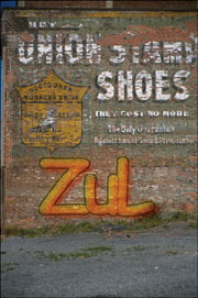
20. Select Adjust, Color, Channel Mixer. In the Channel Mixer dialog box, set the sliders to –200 for both the Blue and Green output channels and set them to 200 for the Red; then make sure that the check box for the Monochrome setting is not checked. Doing so converts the yellow fill to a bright red, as shown in Figure 9.7.
Figure 9.7. Adding some color to the graffiti.

21. Select the Pick tool and move the red fill down and to the right a little. This layer will actually act as a bright drop shadow or 3D effect. Turn the visibility of the yellow layer back on to see how it’s coming.
Adding the Final Touches
Phew! Almost there. All that’s needed now is to change a couple of layer settings and the graffiti will be complete. Not bad considering you won’t have to worry about getting any paint on your hands.
22. Set the blending mode of both fill layers to Soft Light using the menu in the Layers palette. This allows the brick patterns and textures to show through, making the effect more realistic.
23. Finally, lower the opacity of the outline layer just enough to take some of the hardness away. I set it to 40 so that I could see the brick through the black outline.
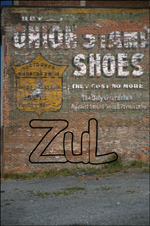
Changing the opacity of the outline and the blending mode of the fills means that we won’t need to do any other tricks to help the text blend in, such as adding noise to simulate grain. You can see my final image in Figure 9.8.
Figure 9.8. Darn that ZuL guy and his stupid graffiti.
Project 2. Crazy Highway and Billboard Signs
Maybe I just spend way too much time in traffic. I find I get a little tired of reading the same billboards and highway signs every morning and evening. With nothing to do in traffic but look around (while making sure I don’t run into someone else, and vice versa), my mind sometimes wanders.
It was during one of those wanderings that I imagined all of the highway signs pointing to some fictitious place. I mean, really, where are all those people going, anyway?
If you’d like to play around with a shot of a highway sign or billboard, grab a friend and your camera. With your friend driving the car, point your camera out the car window. You never know what you’ll see.
Note
Please don’t attempt to shoot photographs while you’re actually driving your car. Doing so would rank right up there with talking on the phone, having breakfast, or shaving while driving. Simply not a good idea.
For this project you’ll need only one photo. It should contain a sign from the roadway and, depending on what you want from the end result, other elements, such as traffic, an empty road, and so on. If you don’t have something like that to work with, grab the photo I’m using (UnionShoesSmall.tif) from the companion website.
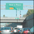
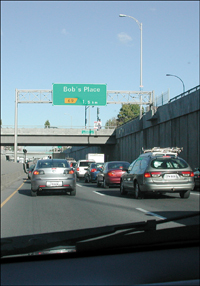
1. Open the photo you’ll be using in Paint Shop Pro. You can see the photo I’ll be working with in Figure 9.9.
Figure 9.9. Humdrum shot of traffic?

Clearing the Current Text
Depending on the amount of text in the sign and what you want to replace and with what, you’ll have to do some copying and pasting or some cloning with the Clone Brush. I want to leave the bottom text with the exit number and the kilometers to that exit. The rest must go!
Note
Figure 9.9 is a shot of morning traffic. It’s not really unusual in any way—unless you look closely. I’ve already modified the visible license plates using the same technique that I’ll be using on the highway sign. I’m not sure if it will be visible in the book, but I’ve placed a small Easter egg in the photograph, as well. Think “promotional sign” and see if you can spot it. Anyway, let’s get on with the project.
2. Select the Zoom tool and use it to zoom in so you’re close enough to see most, if not all, of the sign in the document window (see Figure 9.10).
Figure 9.10. Where are we all going?
Note
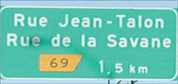
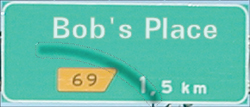
This photo was taken in the Canadian province of Quebec. In Quebec, the signs are in French. The word rue means street and de la means of the. In other words, the exit coming up in 1.5 kilometers (in French, they use a comma instead of a period as a separator, and 1.5 km is a little less than mile) is for Jean-Talon Street and for Street of the Savane.
By zooming in, as in Figure 9.10, you’ll also get a better look at any potential pitfalls. For example, in this photo the sign is just slightly crooked due to perspective. Of course, this will affect the application of the fake text.
Also, there’s a shadow across the sign from a nearby lamp post. I’d like to preserve that shadow. Also, take a look at where the shadow crosses the 1,5 and the outside upper-right corner of the yellow exit indicator. It’s easier to add a shadow than it is to remove one.
Not to worry, though. Paint Shop Pro has ways to help with those types of problems; this is exactly the kind of thing it was designed for, after all.
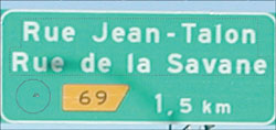
3. Now that you’re zoomed in, you can use your favorite technique to paint out the text you want removed. I’ll remove the two street names.
The method I’ll use in this case is to select the area around the text using the Selection tool. With the text selected, there’s no way that I can paint outside the lines, as it were, meaning that I can play around quite a bit without messing up the original.
4. To further add to the easy-to-back-out method, all the cloning can be done on a separate layer. Because you’ve just opened the image, the Background layer is active. Click the New Raster Layer icon in the upper-left corner of the Layers palette and click OK in the New Raster Layer dialog box to add a new layer for the cloning. Optionally, you can change the name of the new layer before you click OK or afterward by clicking the layer in the Layers palette. I’ve named the layer Clone.
5. Select the Clone Brush and set the size so the brush fits into an area that you can use to paint out the text (see Figure 9.11).
Figure 9.11. Set the Clone Brush to an appropriate size.
Set the Aligned mode option to Off and set the Use All Layers to On. With the Aligned option off, you can recopy easily from the same starting point. The Use All Layers option means that you will be cloning to the newly created layer—and that’s a good thing.
6. Right-click with the Clone Brush and then start painting away. If you need a bit of a refresher in the use of the Clone Brush, take a quick look at Appendix B,“Paint Shop Pro X in a Nutshell.”
Tip
With the Aligned mode off, you can click, move the mouse over, and click again, rather than clicking and dragging. This starts the mouse over again at the same starting point each time you release and reclick the mouse. In this case, this setting is the best solution because of the cramped size of the area that can be cloned.
7. After cloning out the text and turning off the selection (Selections, Select None), you might notice some harsh lines from where the edges of the selection were. Use the Clone Brush to clean those up (see Figure 9.12).
Figure 9.12. Clean up the hard edge left from the selected/cloned areas.

You might be wondering why you should bother with the Clone layer. Why not just clone over the text and be done with it? Here’s the reason: In the quest to help the new text and the new shadow appear as realistic as possible, having the old text and shadow readily available by turning off the visibility of the Clone layer, is like…well it’s like…let’s just say it’s really, really good.
Creating the New Text
This part is fairly easy. You need some text to replace the text that was cloned out in the previous steps.
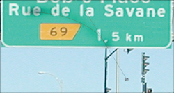
8. Select the Text tool and click in the image to bring up the Text Entry dialog box; then enter the text you want to use. For the photo I’m working on, I want everybody to be headed to “Bob’s”. So, I’ll type in Bob’s Place.
9. Select a san-serif type such as Verdana or Vrinda (the typeface I’m using). Some people might be purists and say that you should find the font that is used for the signs. You can try that, but I doubt the sign police will find out if you use a different font.
Set the size and color of the font. I used pure white, but it’ll be toned down later in the process. I even played around by making the text bold and setting the stroke width to 1.0.
Note
As it happens, I have a very close friend whose name happens to be Bob. We find it quite humorous that there are so many Bob references around. There’s “Bob’s your Uncle”, Bob from Mainframe (the long-defunct 3D television cartoon about life inside a computer), and on my last vacation I found signs for “Bob-fm.” Sheesh, now the guy’s even got his own radio station. Where will it end?
10. With the text entered, select the Pick tool and use it to position the text. As with this particular image, rotate the text to match up with the sign. You might want to temporarily turn off the visibility of the Clone layer to help you place the text and get it rotated properly. For example, I used the text in the photo to help me get the angle of the new type as close as possible to the original.
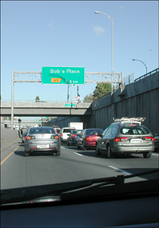
You can zoom out and take a look at the big picture to see how everything is fitting together (see Figure 9.13).
Figure 9.13. Zoom out to see the big picture.

The photo already looks pretty good, and with a little more work it will be ready to print and give to Bob.
Scuffing Things Up a Little
The text looks good—too good, in fact. I think it needs a little work. It should resemble the 1,5 km more than it does now.
11. Zoom back in, using the Zoom tool; take a look at the new text; and compare it to the existing text.
12. After comparing the two, I set the Font to Univers and the Size to 36. I also set the Stroke color to a medium dark, muddy greenish-gray to match up with what I saw in the existing text.
Finally, I set the Opacity on the text layer to 85 to allow just enough of the background color of the sign to come through and tint the white of the new text.
Zooming out so that the entire image is displayed again will let you know how it’s coming along (see Figure 9.14).
Figure 9.14. Are we there yet?
We’re almost done. The shadow is the last bit that needs to be worked on.
Tip
If your sign or your image is different, you might have to do a little more to the text. For example, if the image you’re working with is a bit grainy (say it was taken with fairly fast film or a higher ISO setting on your digital camera), you can experiment with adding noise (Adjust, Add/Remove Noise, Add Noise) to the text. You’ll have to rasterize it first (turn it from vector-based shapes to pixels). You can rasterize it by selecting Layers, Convert to Raster Layer. Before you do so, however, consider duplicating the text layer so you can keep the text properties along with the saved pspimage file.
The Shadow Knows
This image could actually be left this way (see Figure 9.14). With the softened edge of the shadow and its shape, it’s quite convincing, even if you had a chance to see the original. On the other hand, I’m a bit of a stickler, and I want to show you this cool technique for adding a shadow. You might find, too, that not adding that shadow, or leaving off some other small and irrelevant detail, lets people looking at your image know that there’s something wrong that they just can’t put their fingers on. You’ll find that it’s better to take care of at least some of these types of details so the viewer’s brain can relax and be fooled into believing your photo.
13. Select the Zoom tool and zoom back in.
14. Turn off the visibility of the Clone layer so you can see the original shadow. This lets the original text show through, making a bit of a mess on the screen, but the only way to get this shadow right is to see the original as you work.
15. Make sure the layer with your new text is active. Then click the arrow to the right of the small icon in the upper-left corner of the Layers palette and select New Vector Layer to create a new layer to hold the shape of the shadow that needs to be added. Also, take this opportunity to rename this layer Shadow Shape to help keep track of it.
16. Select the Pen tool. Set the Background and Fill Properties to Transparent in the Materials palette. Set the Width to 9.00.
17. Click at the end of the top of the shadow. Release the mouse and then click at the bottom end of the shadow. A straight line appears. Don’t release the mouse! Instead, drag the handle around until the curve of the line matches the underlying line of the existing shadow (see Figure 9.15).
Figure 9.15. Matching the curve of the existing shadow.
Ahhh, it’s truly a thing of beauty (see Figure 9.16). There’s no better way to re-create this shadow. Getting the curve just right with the Clone Brush or any selection tool simply wouldn’t do the job.
Figure 9.16. The vector curve in place over the existing shadow.

Finalizing the Shadow
With the vector curve in place, a selection can be created from it. That selection can then be manipulated so that it effectively mimics the original shadow. Here’s how:
18. Right-click the Shadow Shape layer in the Layers palette and select Create Raster Selection. This creates a selection around the pen-stroked vector curve.
19. Create a new raster layer by clicking the small icon in the upper-left corner of the Layers palette. This layer will hold the new shadow. Name the layer Shadow.
Turn off the visibility of the Shadow Shape layer by clicking the small eye icon in the Layers palette for its layer.
20. Choose Selections, Modify, Feather to bring up the Feather Selection dialog box. Enter 5 for the Number of pixels and click OK. This softens the edges of the shadow.
21. Select the Flood Fill tool. Set the Foreground/Stroke Properties to black and click in the selected area to fill it with black.
22. In the Layers palette, set the Opacity to 26 and the Blending mode to Hard Light. You should see something that resembles Figure 9.17.
Figure 9.17. The completed shadow in place.
23. Finally, select Adjust, Blur, Gaussian Blur and set the Radius to 5.00. This softens the shadow so it resembles the original even more.
Use the Zoom tool to zoom back out so you can see the entire image on your screen. You should find that it’s a pretty convincing illusion. You can see my final image in Figure 9.18.
Figure 9.18. Hmmm, there must be a party going on at Bob’s.
Tip
The results of this type of project would be a good starting point for party invitations, birthday cards, and so on.
Project 3. Hangin’ Around (Fun with Skyscrapers, Bridges, Ladders, and Friends)
Have you ever seen images or video of those guys who climb really tall buildings? You wonder, of course, if someone would actually be crazy enough to do that, and if someone was, would he possibly live around the corner from you? Unlikely.
However, you might find a neighbor crazy enough to go three steps up a ladder while you take his photo from below. It’s the head-scratching look afterward that always gets me, though. “You want to do what with the photo?” Life can certainly get interesting, even here in our little crescent.
The ingredients for this project are as follows:
A photo of a high-rise building. I’ll be using one I shot with slide film a number of years ago.
A photo of someone, probably a really good friend, perched up on a ladder. I’ll use the one I shot this morning using a digital camera, but with the same lens as the shot of the high-rise.
It helps if the photos were taken with the same, or similar, lens and if they were taken from the same angle. I couldn’t persuade my friend to climb a 40-foot ladder, though, so we’ll let the magic of Paint Shop Pro give us a hand in fixing the small differences.
1. If you have, or can take, photos like these, open them in Paint Shop Pro. If you don’t have something like these, head over to this book’s companion website, download the images (MikeOnLadder.tif and Skyscraper.tif) I’ll be using, and open them in Paint Shop Pro.
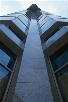
You can see the photo of the building in Figure 9.19.
Figure 9.19. A fairly tall building.
Note
To get this shot I used a short lens, about 18mm, and stood really close to the building looking almost straight up. I had my wife stand behind me, which helped because it was a bit dizzying getting this shot. Much better, though, I would guess than the reverse—standing at the top pointing my camera downward.
Figure 9.20 is that of my friend standing on a ladder.
Figure 9.20. A friend helping with the project.

Note
The photograph in Figure 9.20 was taken, as I mentioned earlier, with the same lens at the same focal length. You can see that it is a pretty extreme angle. I was kneeling on the ground and my friend was perched a few rungs up on the ladder looking down at me for his “portrait” shot. Ahhh, good friends….
A Background-ectomy, a Little Copy and Paste…
2. Use your favorite method to remove the background portions of the image of the guy on the ladder. If you need some help with this, see Appendix B.
You can see my effort in Figure 9.21. Remember to look for areas within other areas. For example, if your photo has someone with his arm away from his body but his hand touching his hip, you’d need to remove the area created between his arm and body.
Figure 9.21. What appears to be a man hanging freely in space.

Looking at the end result, I bet I could do something cool with a trampoline. I wonder how I could convince my wife that it would be great for photos.
3. With background and the ladder removed, choose Selections, Select All. Then select Edit, Copy. Make the image of the building active by clicking its title bar and then select Edit, Paste As New Layer.
4. Select the Pick tool and move the image of the friend into place. You might also need to resize the pasted image. To do so, make sure you drag the corner handles, not the sides. Doing so preserves the width-to-height ratio and prevents distortion.
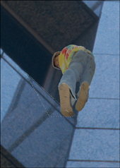
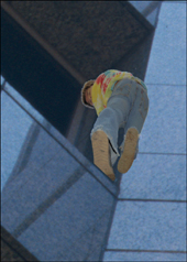
Figure 9.22 shows my friend perched precariously on the side of the building. I wonder if it’s windy up there.
Figure 9.22. Man meets building.
Solving a Couple of Small Problems
Zooming in will, of course, reveal several small problems. The first is that my friend looks almost like a bug against the windshield (see Figure 9.23).
Figure 9.23. This image needs more work to be believable. Maybe a Spiderman costume would help.

My friend definitely needs to be more integrated with the building and his new surroundings. A couple of things will help. For example, copying a portion of the ledge over the bottom of the foot on the left will make it appear more as though my friend is actually standing outside this building.
5. Select the Freehand Selection tool and set the Selection type to Point to point. Then use the Freehand Selection tool to create a selection along the ledge (see Figure 9.24). Make sure you get enough to cover the bottom of his foot.
Figure 9.24. Select the ledge.
6. Make sure the layer with the building is active; then select Edit, Copy.
Make the layer with my friend in it active, and then create a new raster layer by clicking the New Raster Layer icon in the Layers palette.
7. Select Edit, Paste into Selection. Doing so pastes the selected part of the ledge over the bottom of the left foot (see Figure 9.25).
Figure 9.25. Copy and paste the ledge into place.
Note
At this point, you can take a look to see how the person blends into the building. That is, if you missed some of the background when you selected him (or her if you’re working with a female friend’s photograph), you might want to use the eraser to help fix those areas. You might notice in Figure 9.25 that there’s a bit of a halo around my friend’s hair. I purposely left that there to help separate him from the new background a little. After all, he’ll be quite small in the final image.
Adding a Drop Shadow
There are a number of ways to add a drop shadow in Paint Shop Pro. This time, we’ll use the easiest way to help move this project along. Other projects will demonstrate other ways to go about adding shadows, including this chapter’s earlier project, “Crazy Highway and Billboard Signs.”
8. Make the layer with my friend active by clicking it in the Layers palette.
9. Select the Zoom tool and, in the Options area, click the rightmost icon to fit the image into the screen so you can see the entire image. This will help you choose the settings for the shadow effect.
10. Select Effects, 3D Effects, Drop Shadow to bring up the Drop Shadow dialog box (see Figure 9.26).
Figure 9.26. Adding a drop shadow effect.

In Figure 9.26, you can see that having the entire image in view helps you choose the correct settings to help the new shadow mimic that of the upper part of the tower. If you’re using these images, set the values as in the figure. Otherwise, play with the various settings until the shadow looks right.
Making Some Noise
If you zoom in using the Zoom tool, you’ll see that the shadow blends in quite well against its new background. You might notice, however, that the person doesn’t quite match up. In the case of the two images I’m using—one shot on slide film and the other digital—the trouble is that the digital image has no grain. Fixing that problem should be the last hurdle to making this image believable.
11. Use the Zoom tool to zoom way in. I’ll be near 400% so that my friend is completely visible.
12. Select Adjust, Add/Remove Noise, Add Noise to bring up the Add Noise dialog box (see Figure 9.27).
Figure 9.27. Adding some noise.

You can see in Figure 9.27 that I’ve added 6 percent noise and that I selected Gaussian and Monochrome. This works best for the images I’m using, but feel free to experiment with other settings. You can’t break anything, so have some fun.
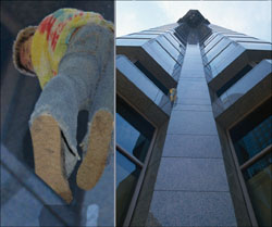
Figure 9.28 shows the final result with both a full-size image and a close-up view.
Figure 9.28. It’s the amazing Multicolored Shirt Man. Watch him scale tall buildings.
Wrapping Up
I hope you found these projects as fun to do as I did. If it’s raining outside, go grab a hot drink or a glass of water, stretch a little, and then settle into the next chapter. Otherwise, grab your camera and go shoot more photos for your own projects—and be sure you have fun; it will show in your final images and in the photos themselves.
As you travel around with your camera looking for material, keep some of the ideas from this chapter’s projects in mind. See whether you can come up with some ways to use the people you know in some of your own projects.
If you’re reading this at a time when some of your favorite holidays are near, you’re in luck. The next chapter deals with some holiday photos that can be fun to put together. Maybe you should take a quick peek before you head out with the camera—just in case it sparks an idea or two.