The Art of Transparency
Ansel Adams wrote that once he had mastered photography of the grand landscape, he “gained the freedom to see with more sensitive eyes the full landscape of our environment, a landscape that included scissors and thread, grains of sand, leaf details, the human face, and a single rose.” From my viewpoint, the entire universe can be encompassed by tiny objects, and there is as much to study in small things as in large things, inside as well as outside.
In the previous part of Creative Garden Photography, I explored techniques for photography of gardens writ large. In this part, photographic subjects get smaller: We look at the world close-up and personal, and explore techniques for bringing the outside garden inside. To start with, I’ll show you how to create high-key floral compositions for transparency using a light box.
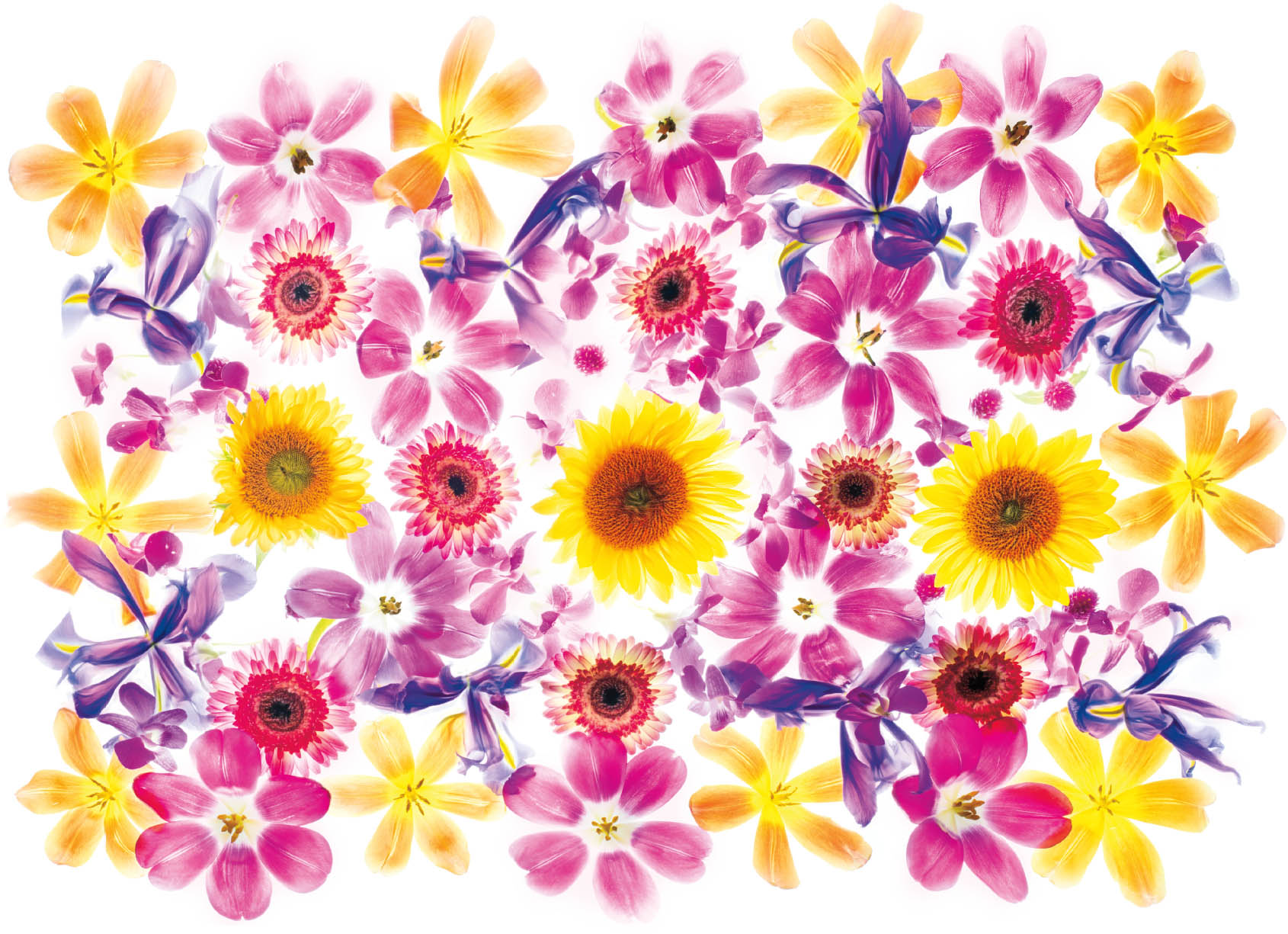
Pale Garden—In Pale Garden, on the light box I used the idea of a garden of flowers with individual stalks. This is a fairly common style of light box composition, but in Pale Garden, I emphasized the translucency of the petals by choosing more of the high-key exposures when I made my blends in post-production. In doing this, I pre-visualized an image where the final appearance would be reminiscent of stained glass. To accomplish this result, I laid the tulips with stems and the dark orange clivia on the light box before I added the blue clematis, and the frilly Iris ensata ‘Azuma-kagami.’
Nikon D850, 55mm Zeiss Otus, nine exposures with shutter speeds ranging from 1/50 of a second to 5 seconds, each exposure at f/14 and ISO 64, tripod mounted.
How Light Box Photography Works
What happens to the background if you take a pure white card, and place a floral arrangement on the card, back light the setup, and photograph straight down on the card? (See page 72 for information about backlighting.) You might want to try this as an illustrative experiment.
The answer you’ll find, if you expose for the flowers using the camera’s idea of the correct exposure, is that the white background will turn gray. This is as it should be—you could alternatively expose for the white background, and the flowers would then turn black in silhouette—and this also happens when you photograph the same flowers on a light box rather than a white card.
But, of course, gray isn’t very attractive as a background, and white is. So one of the primary purposes of light box photography combined with high-key HDR post-production is to generate an image of floral or other subject matter on a very white background.
Another somewhat more difficult way to accomplish the same goal would be to control separate lighting of the white background and the floral subject. Note that a botanical image on a white background can easily be added to many kinds of textured backgrounds in post-production.
The other reason for light box photography is to create the illusion of transparency.
There is no such thing as complete transparency. An image that is 100% transparent is by definition invisible. Therefore, what we are interested in is actually translucency—defined as partial transparency.
In the light box process, translucency in varying degrees is achieved using the variety of bracketed exposures that were made with the image on the light box. You have precise control over how much of each backlit petal you want to show in the final image. This means that a light box image can look very different in the end than the same composition appears to the naked eye on the light box.
One other factor comes into play: translucency itself is an optical illusion generated by chiaroscuro. As Renaissance painters including Leonardo da Vinci discovered, the illusion of depth in painting is obtained using contrasts of lights and darks. This technique is known as chiaroscuro. It also works with photography. Chiaroscuro is one of the most important aspects of light box post-production.

Star Magnolia—The Magnolia stellata, named for its star-like shape, is one of my favorite flowers. It grows abundantly and almost wild in the early spring near where I live.
In this close-up light box image, I aimed to show the translucency of the petals on a single blossom, and enhanced the chiaroscuro effect by “painting” in the branch below the petals.
Nikon D850, 85mm tilt-shift macro, five exposures with shutter speeds ranging from 1/80 of a second to 0.3 seconds, each exposure at f/21 and ISO 125, tripod mounted.

Duet of Daffodils—I love daffodils, one of my favorite flowers, and a harbinger of spring. When I see the daffodils poking their green shoots up, and then blooming, I know warmer weather is on the way.
My idea in creating this image of a pair of daffodils was to echo the aesthetics of a Dutch watercolor painting. After photographing the daffodils on a light box, and merging down the layers in post-production, I used a flatbed scanner to digitize an old and yellowed piece of paper. Then, I placed the daffodil image, layered above the scanned paper in Photoshop to create a visual background.
Nikon D300, 85mm tilt-shift macro, five exposures with shutter speeds ranging from 1/13 of a second to 1 second, each exposure at f/21 and ISO 125, tripod mounted.
In summary, the light box process for floral transparency is intended to create a pure white background, control the relative density of translucency in individual flower petals, and use the optical power of chiaroscuro to maximize the translucent effects.
These goals can be accomplished using the following general steps:
- Set up your light box in a nice stable place (usually on the floor) where you have plenty of room to work, and can control ambient light directed on the light box. For more about what kind of light box to use, see the next section.
- Gather tools such as scissors and pruning shears, along with the flowers that you will be using to make your composition. My favorite kinds of flowers for transparency can probably only be grown oneself because of how quickly the blossoms fade after clipping, for instance, many species of papaver. However, I also often buy flowers at a florist or local supermarket—and there is no shame in doing so! At least some of the flowers you select should have translucent petals that look good when they are backlit.
- Arrange the flowers to create an attractive composition on the light box. For more about light box arrangements, see pages 237–241.
- With the camera on the tripod, as parallel as possible to the composition on the light box, create a bracketed series of increasingly light exposures. This is a high-key bracketed HDR sequence (for more about high-key photography on a light box, see pages 242–249).
- When you are satisfied with the bracketed sequence, copy the images from your camera to the computer, and process the layer stack that has been created in Photoshop.
- Finish the image in post-production to your taste using many tools, including backgrounds, textures, filters, and LAB inversions.
Each of these general steps in the process of creating a transparent floral image using a light box is explained in more detail below.
What Kind of Light Box Works Best?
I’ve heard it said that you can’t be too rich or too skinny. While these are very debatable principles, I do feel that you can’t have a light box that is too big. If I could, I would have a light box that is room sized. As a matter of common sense, it is hard to create large tableaus or panoramas on a small light box.
That said, the size of a usable light box is to some degree limited by simple geometry. If you are photographing more-or-less straight down on a light box, as you should so you can be parallel with your subject, then there’s a limit to the distance you can get above the light box (without employing extraordinary implements like a derrick and gantry!). Note that wide-angle lenses are impractical because they distort the subject on the light box and also “scoop in” subject matter that is beyond the borders of the light box.
This means that the best light box should be sized so that you can photograph straight down on it using a “normal” roughly 50mm focal-length lens and tripod, and still manage to look through the camera on the tripod (a step ladder and a flip LCD screen will help with this). For my money, a roughly 26" x 36" or an A1-sized light box works best. But, don’t worry if your light box doesn’t meet these somewhat gargantuan dimensions. Smaller light boxes have virtues, too. For example, they are more portable. I’ve made many very lovely images on much smaller light boxes.
When I first started photographing flowers on a light box for transparency, I used a slide sorting table originally from the film days with dimensions of about 26" x 36" and lit with daylight fluorescent tubes. These days, I more commonly use an A1-size LED light panel. Another, less expensive option if you are a handy person, is to build your own light box. As a starting place, you’ll find a link to a bill of materials and plan on my website at digitalfieldguide.com/faqs/faq-photographing-flowers-for-transparency.

Flowers that Remain Behind—When I give a workshop about light box flower techniques, generally we use this as an excuse for overwhelming the workshop room with masses of flowers. There are always flowers that remain behind after the workshop is over, like those shown here. I used the mass of flowers to create a single blanket-like appearance that is unusual for my compositions, since there’s no clear underlying structure.
Nikon D850, 55mm Zeiss Otus, eight exposures with shutter speeds ranging from 1/15 of a second to 8 seconds, each exposure at f/16 and ISO 64, tripod mounted.

Bounty of the Garden—With this panoramic high-key HDR image photographed on a light box, the poppies, peonies, and campanulas all came from my personal garden.
Nikon D800, 55mm Zeiss Otus, seven exposures with shutter speeds ranging from 1/30 of a second to 2 seconds, each exposure at f/13 and ISO 100, tripod mounted.
You might think that the color temperature of the light box is very important. However, it is surprising but true that the color temperature of the light source used in a light box doesn’t matter very much. You can always correct color temperature in post-production, provided you are photographing using RAW files.
Another technique is to use your camera to measure the color temperature of your light source, and then adjust the white balance in your camera to the fixed kelvin number that you have determined (check your camera manual to see if your camera has these capabilities, and to find out how to adjust this setting).
As the saying goes, the best camera to use is the one you have with you. In much the same spirit, the best light box to use is the one that you have handy. I’ve seen some excellent light box work from some improvised light boxes. So don’t let the quality of your light box stop you from experimenting with this exciting technique.
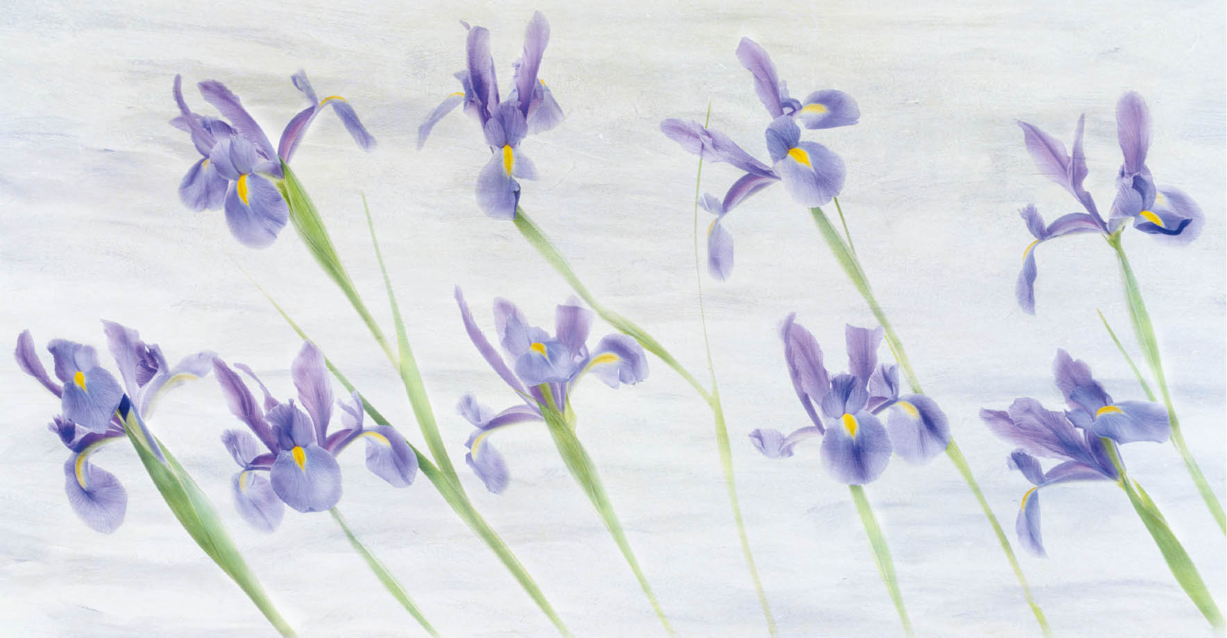
Study in Iris—In this image of irises with a texturized background, I wanted to create the illusion of flowers bending in a breeze. So I positioned all the iris blossoms and stems leaning in one direction, much as they would if they were in a field in the wind.
Nikon D800, 55mm Zeiss Otus, five exposures with shutter speeds ranging from 1/15 of a second to 2 seconds, each exposure at f/16 and ISO 100, tripod mounted.

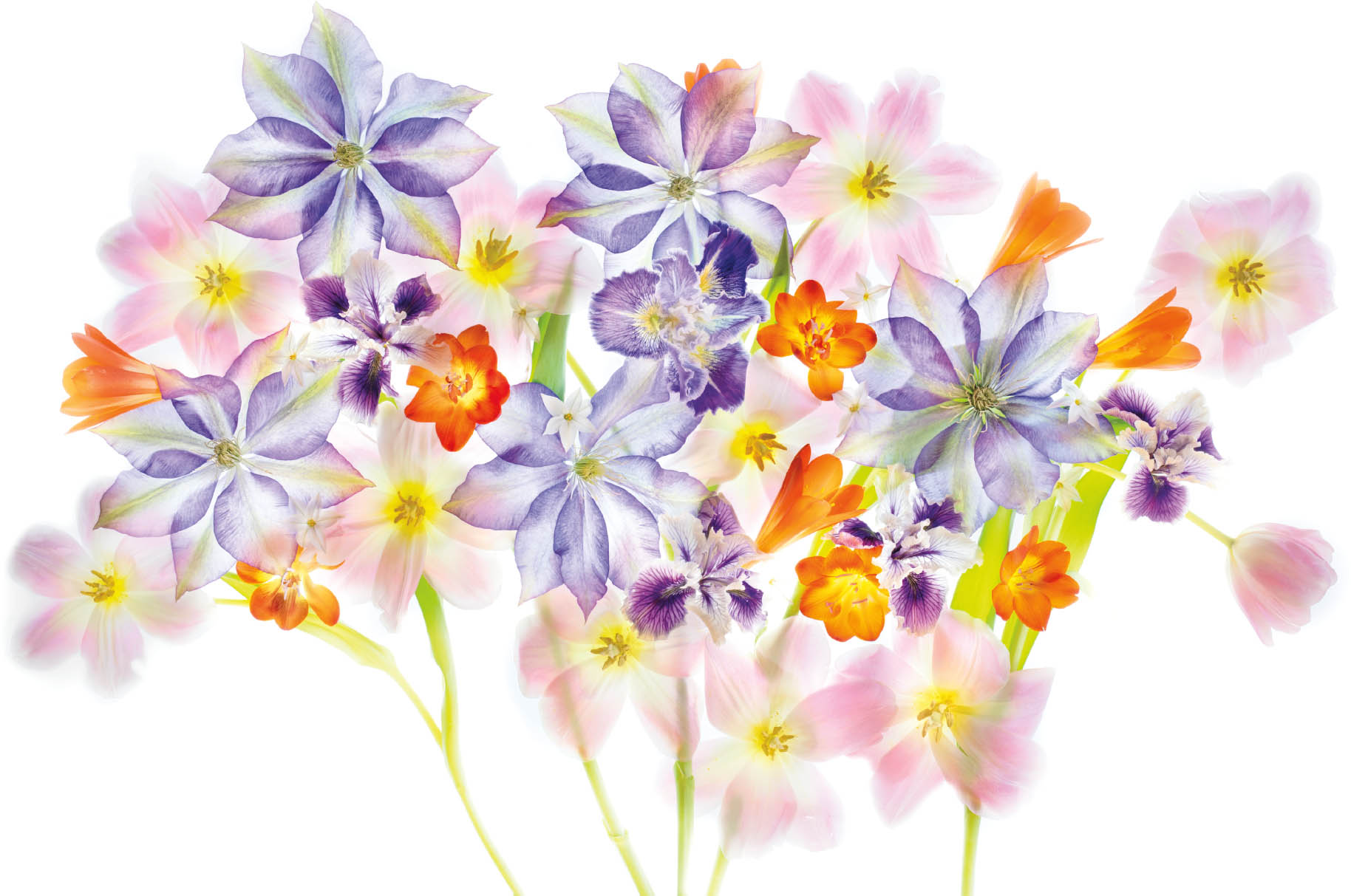
Flowers of Spring’s Desire—With this composition of a number of different-colored tulips, white iris, daffodils, and a few purple lobelias added on top for accent, my idea was to create an entire garden structure in a single photographic image.
Nikon D850, 55mm Zeiss Otus, eight exposures with shutter speeds ranging from 1/15 of a second to 8 seconds, each exposure at an effective aperture of f/16 and ISO 64, tripod mounted.
Arranging Flowers on a Light Box
It’s truly said that the one thing you cannot change in photography is the basic composition of your image. With digital, this isn’t entirely true, but there is still a great deal of truth to it. It is always easier to get something right in the camera if you can. The way your subject matter is composed is probably the single most important aspect of “seeing” photographically.
In this spirit, I wholeheartedly believe that the most important aspect of light box photography of flowers for transparency is the arrangement of the flowers. It is certainly not possible to teach floral arranging in a few paragraphs, so I suggest that you see if there is a florist you can learn from, or perhaps there is a course in Ikebana—Japanese floral arrangement—that you can attend.
In the meantime, it’s important to realize that a floral arrangement for photography should have directionality. In other words, some important aspect of the flowers, blossoms, and petals should be “looking” at the camera, or at least in an unified direction.
Another crucial aspect of an effective floral composition for transparency is structure. Most good floral light box compositions are organized, even if the organizational structure is not always clear at first glance.
Believe me! There are only so many times you can throw petals on a light box and pretend you are Jackson Pollock and get a good composition out of it. So if you start with an organizational principle in mind, you are likely to end up with a better image.
Two of the most frequently used and effective organizational principles for photographing flowers for transparency are the bouquet or stem view (see an example on page 210), and the circular mandala (see and example on page 219).
In the stem view, the organizational principle is one or more flower stems or stalks coming up into the blossom part of the arrangement, with the blossoms apparently attached to the stems. An extension of the stem bouquet is to create and entire “small garden” with the stalks extending to the bottom of the frame (see pages 236–237 for an example).
Traditionally, mandalas are thought of in art as meditation pieces. They are circular compositions of blossoms, often around an important central element. “Mandala” is the Sanskrit word for “circle.”
One or two blossoms by themselves can make a very effective image, and is of course the simplest of organizational principles. Sometimes the simplest ideas are the hardest to pull off!
A clear pattern—it may or may not be repeating—where one petal touches another without an obvious white background is another kind of structure that I enjoy creating in my floral work (see pages 242–243 for an example).
From time to time, I like to use iconography from various artistic traditions as the basis for the structure of my floral composition. Do not be surprised if you can see a Celtic knot or a hieroglyph as the underlying form to which I have added the decorative aspects of flowers.
To summarize, I suggest eschewing the “Jackson Pollock” approach of simply throwing petals at a light box, and starting with one of the five following structural approaches to your light box composition:
- The “bouquet” approach, sometimes implemented as stems and garden.

Clematis on Black—A sweet, light purple Bee’s Jubilee Clematis vine grows across the top of my garden gate. The very translucent blossoms from this vine are great fun to photograph, and I do so every spring when it is flowering. For this version, I inverted the original light box photo to create a black background using the techniques explained starting on page 258.
Nikon D850, 55mm Zeiss Otus, four exposures with shutter speeds ranging from 1/8 of a second to 2 seconds, each exposure at f/21 and ISO 125, tripod mounted.
- The circular mandala.
- The single blossom, see facing page (under the right circumstances this can be extended to two or three blossoms).
- Recognizable iconography that makes visual sense as a glyph.
- A patterned image where petals are “cheek to jowl” next to each other, possibly in a repetitive arrangement. This doesn’t mean simply piling petals on top of each other.
As I’ve noted, floral arrangement is the key aspect of photographing flowers on a light box. This means that it is worth taking the time to learn and practice floral arrangements, whether these arrangements are in a vase or on a light box. Playing with flowers is so much fun!
Light box arrangements often mimic in two-dimensions the three-dimensional presentation that works best in vases, sometimes with the blossoms turned more toward the camera than in a real-life bouquet.
You should give thought to previsualization and your image and how this is going to be supported by the underlying structure before you even put a single petal on the light box. Time spent in contemplation will pay dividends in the quality of the work that is created.
Flying Dragon—I completely adore the idea and visuals of that mythical creature, the dragon. My thought with this petal composition was to recreate the iconography of a flying Chinese dragon.
Nikon D850, 55mm Zeiss Otus, six exposures with shutter speeds ranging from 1/20 of a second to 2 seconds, each exposure at f/16 and ISO 64, tripod mounted.
Try to set aside a serene place to do your light box arrangements, and look at this fun process as very much a form of meditation. I find that I do my best light box work while listening to music that I enjoy. If you get the arrangement substantially “wrong,” and it just doesn’t look right to you, nothing you do in photography or post-production will make it right. Get the arrangement flowing, feel satisfied with it yourself, and the rest is simply managing a technical craft, sometimes with a bit of your own special sauce.
Light Box Photography
The idea behind light box photography is to create an HDR bracketed sequence of images, where all that matters is the high-key portion of the sequence (for general information about how to create HDR bracketed sequences, see pages 179–191).
There are two ways to think about high-key bracketed sequences. The first is the most important. Different petals have different thicknesses, and therefore different degrees of translucency and opacity. To capture all of these different degrees of translucency—which are never seen all at the same time by the human eye—requires multiple different exposures. You can think of this as one exposure for each of the different degrees of translucency, with a systematic process of bracketing exposures by 1 EV certain to get each of the different translucent densities. In effect, the purpose of exposure bracketing is to end up with a deconstructed layer set, with each layer representing a different translucency value.
The second way to think about a high-key exposure bracket is that the intended pre-visualization is a bright image, with a great deal of white in it. So, of course, one is photographing for brightness and lightness, and erring on the side of overexposure.
Remember that photographing straight down on a backlit white card creates a gray, not white, photo. As I mentioned before, a wonderful consequence of high-key bracketed photography on a light box is that it is possible to create a bright, white background—which otherwise would not be possible without using specialized lighting techniques.
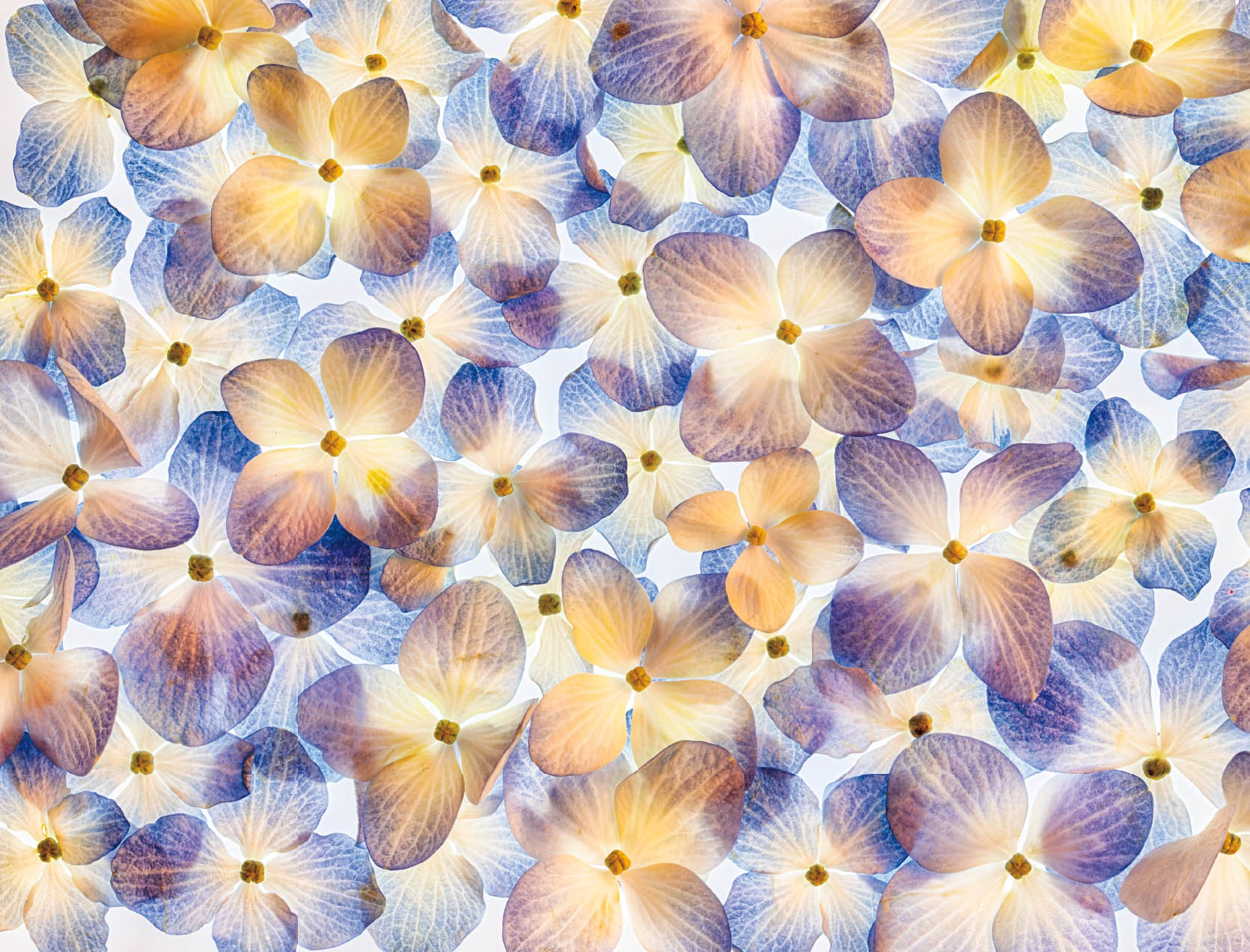
Hydrangea Blossoms—The hydrangea is often thought of as an old-fashioned flower beloved of grandmothers, aunties, and boomers. But there’s been a revolution in hydrangea hybridization in the last few years. Some of these hydrangea flowers are stylish, modern, and magnificent!
If you’ve ever looked at a hydrangea blossom up close, you’ll see that each apparent flower is made up of myriad small petal constructions, each with its own core. To make this image, I snipped the almost microscopic inner hydrangea flowers off the larger blossom, arranged them on a light box in a repetitive pattern, and photographed them with a macro lens.
Nikon D850, 50mm Zeiss Makro-Planar, five exposures with shutter speeds ranging from 1/8 of a second to 5 seconds, each exposure at f/22 and ISO 64, tripod mounted.
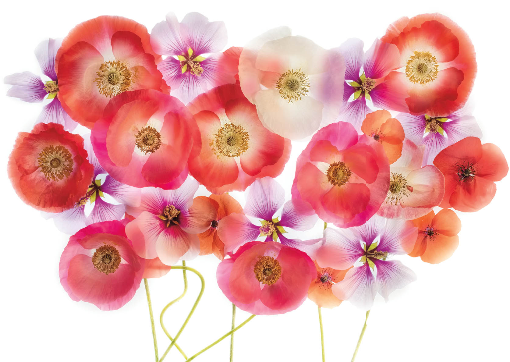
Poppies and Mallows—I was excited to have a beautiful crop of Papaver rhoeas (corn poppies) from my garden, which made a gorgeous combination with purple blossoms from a nearby mallow shrub.
Nikon D850, 55mm Zeiss Otus, eight exposures with shutter speeds ranging from 1/13 of a second to 4 seconds, each exposure at f/16 and ISO 64, tripod mounted.
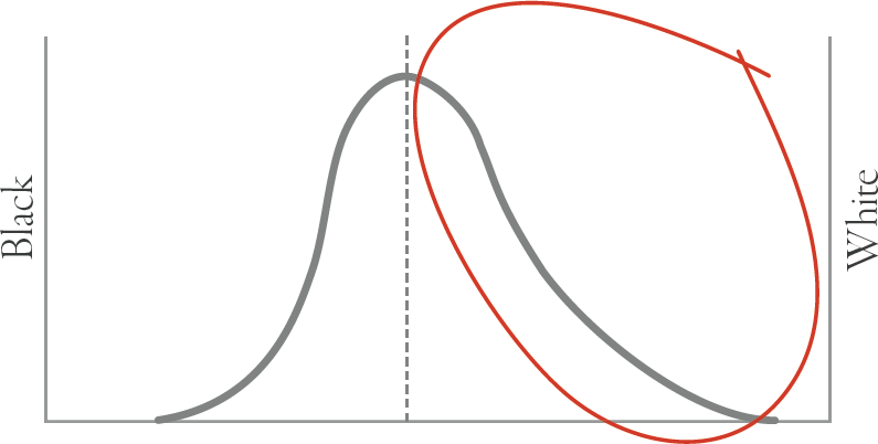
Looking at the exposure issues involved in floral light box photography leads naturally to a discussion of exposure histograms. As you may know, your camera will show you the exposure histogram for a subject before you make a capture, or after you have captured a photograph. Once you learn to read them, exposure histograms tend to be a more accurate measure of the validity of an exposure than the reproduction of the scene on your camera’s LCD.
An exposure histogram is a bar graph of the values from dark to light in the subject that you are photographing. If everything in front of the camera is dark black, then the exposure histogram will show a spike on the left side—and nothing else. In contrast, if you are photographing a completely white, bright subject, then the exposure histogram will spike on the right side.
It is sometimes believed that you don’t want an exposure that’s biased to either side of the histogram, and certainly not “pinned” to either the dark or light side. This concept of the “correct” or proper exposure suggests that the best exposures are something like a parabola, centered or near centered around the midpoint of the histogram between dark and light.
I like to think of my way of exposing a bracketed sequence of HDR photos for the light box as more like that of Luke from the Star Wars series, where it is important to go over to the light and to avoid the dark side. To put this in the context of the exposure histogram, in light box work there is absolutely no reason to care about anything to the left of the center. We simply don’t need the dark values. All we need are the values of the subject at a correct exposure (and sometimes we don’t really even need those), heading over to the light side.
This relationship is shown in Figure 16 below, where a nominal histogram for a “proper” exposure is indicated by a parabola with the maximum on the midpoint, and the red-circled portion are the only exposure values that we actually care about. You can go ahead and photograph the darker values if you want, but with a backlit subject on a light box, you almost certainly won’t be using them in the final blend.

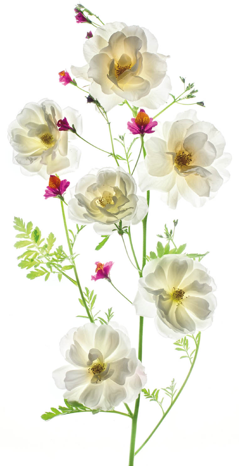
Translucency of Rosa—In creating this image, my idea was to use something close to a repetitive pattern. Note that a purple clematis blossom (see page 239 for a close-up of this flower) anchors the center of the frame. Extraordinarily translucent old-fashioned white roses provide a top layer over the clematis and more opaque roses. An inverted version of this image is shown on page 262.
Nikon D810, 55mm Zeiss Otus, nine exposures with shutter speeds ranging from 1/30 of a second to 15 seconds, each exposure at f/16 and ISO 64, tripod mounted.
In a practical context, here’s how I use this information about exposures, exposure histograms, and bracketed HDR sequences to make my light box imagery.
First, I gauge the proper exposure based on an overall reading from my camera’s light meter. Next, I generate a bracketed sequence of images, using either manual exposure or the camera’s bracketing feature. Each exposure should be +1 EV brighter than the previous exposure, with the bracket made using shutter speed as the variable in the exposure triangle that is varying (see page 85 for more about the exposure triangle).
The idea is to keep bracketing until you have essentially a white image with almost no more visual information remaining. Often this requires somewhere between eight and twelve bracketed images with a ±1 EV difference between them.
Note that I do not always use all the images that I capture to create the final version of the image. Also, once you have the gauge of the exposure range that is needed to go from the “correct” exposure to all white, of course it does not matter which “direction” you do the sequence in. So you could certainly alternate, and start with one sequence going from the “correct” exposure to all white, with the next exposure sequence going from all white to the “correct” exposure.
Finally, another important variable involves the ambient or other light that you use to front light your floral subjects. Obviously, you have to be careful with front lighting: the more front lighting there is, the less back lighting, and the less of a translucent effect that you will get. But many floral compositions do work better with just a touch of front lighting, and that may modify the breadth of the exposure sequence that you will need—usually by compacting the entire dynamic range.
Photography of a floral subject backlit using a light box is far more of a low-tech art or craft than a science. However, this is really a fun kind of photography to experiment with, and as you do experiment, you’ll get the hang of it pretty quickly. I urge you to play with floral compositions, make many exposures, process the exposures as I explain in the next section, and have fun learning to do this with your own unique style!

Low Geostationary and Decaying Orbits around the Clematis Inversion—Even though this image was tedious and time-consuming to make, it was great fun! I started with the clematis in the center, then added jade blossoms around it to create a sense of circular orbit, perhaps inspired by the music I was listening to as I made this composition, English composer Gustav Holst’s orchestral suite The Planets.
Nikon D810, 50mm Zeiss Makro-Planar, eight exposures with shutter speeds ranging from 1/40 of a second to 8 seconds, each exposure at f/22 and ISO 64, tripod mounted.
Post-Production of High-Key HDR Images
Photographing a composition on a light box for high-key HDR can be thought of as an act of radical deconstruction: each of the different exposures captures a different value of petal translucency. The art and craft of putting the deconstructed photographs back together in post-production means recombining the deconstructed images, in an act of imaginative reconstruction.
The goal is to create a harmonious whole. This means using the dynamic values of specific petal translucencies in the final result without over-writing those desired results with the darker values of the same petals that were captured at a darker point of the bracketed exposure sequence. The process is diagrammed in Figure 17 below. In practice, this is simpler than the theory makes it sound.
My first step is to start by running the bracketed high-key HDR sequence through an automated HDR program (see pages 183–186 for more about automated HDR). The result of this process is a file that you should set aside for now. The automated HDR file will primarily be used to add dynamic range and structure to the centers of flowers, and does not usually work very well for translucent and soft petals. The HDR background may also be somewhat gray rather than straight white.
To create the main layer stack as shown in Figure 17, start with the lightest image on the bottom of the stack and work your way up. Next, add each subsequently darker exposure as a new layer to the layer stack you are creating. As each layer is added, it is masked out (in Photoshop, using a Hide All black layer mask). The specific areas of petal translucency that you are interested in are painted in on each layer using the Brush tool.

Note that there are alternative possibilities that modify this workflow. For example, all the exposures could be exported in one “fell swoop” from Lightroom to Photoshop as a layer stack. You still have to make sure that the layers are in the right order—from white at the bottom of the layer stack to the darkest exposure at the top of the layer stack—and you still have to paint in the areas of each exposure that you specifically want using the Brush tool.
I liken the resulting layer stack to a wedding cake: there’s much more of what you want toward the bottom, brighter part of the stack, and very little of the upper, darker layers are actually painted in. You do want to be careful not to “paint over” the wonderful translucent, luminous colors on the bottom of the layer stack with darker exposures that are moving toward opaque.
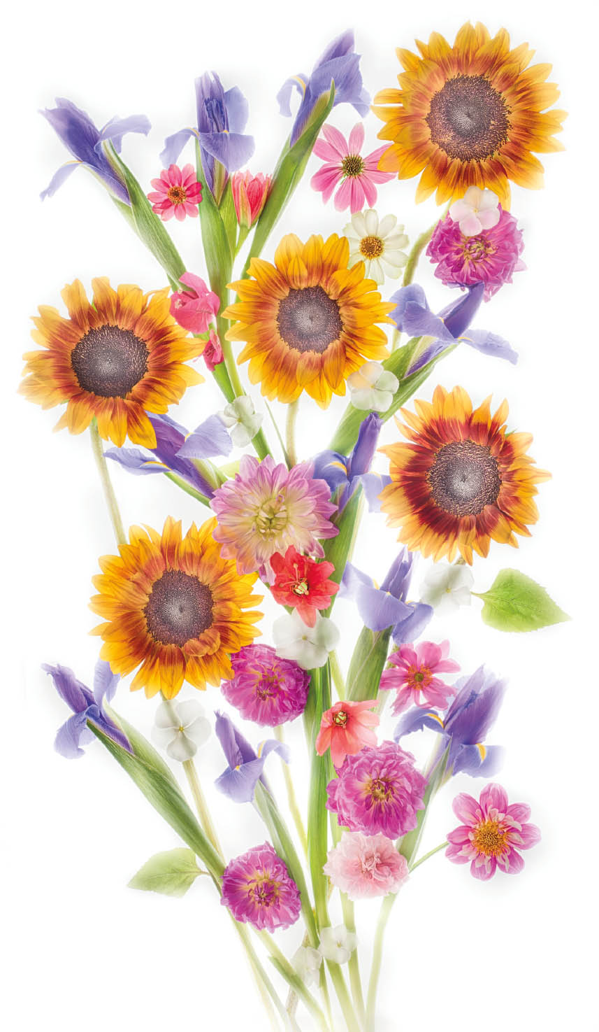
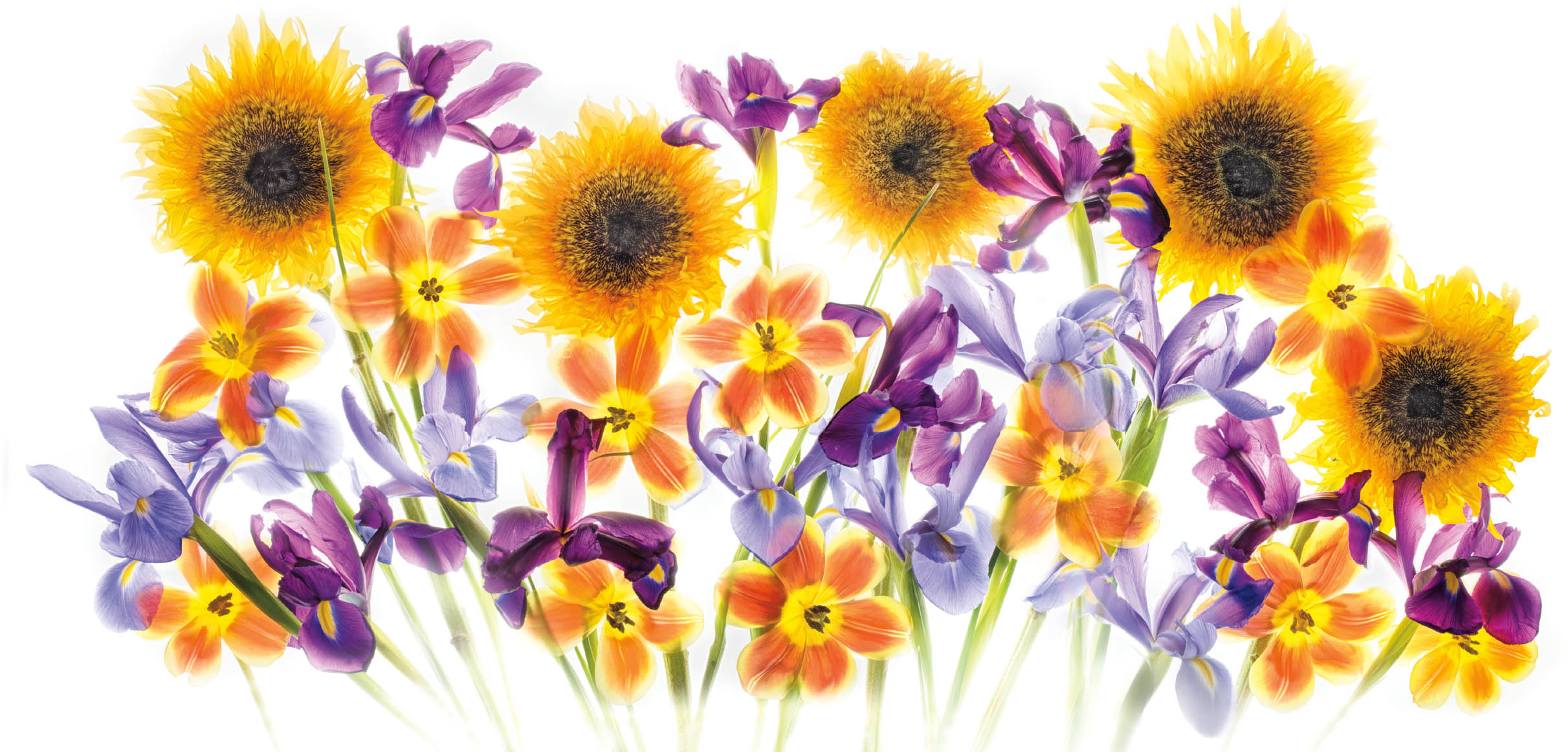
Sunflower and Friends—I love sunflowers to the end of time, but they are not the world’s most translucent flowers. They still look great on a light box, particularly in this composition where I combined the yellow sunflowers with the color-complimentary purple-blue iris in a bouquet-like composition.
Nikon D810, 55mm Zeiss Otus, six exposures with shutter speeds ranging from 1/4 of a second to 8 seconds, each exposure at f/16 and ISO 64, tripod mounted.
It is at least theoretically possible to use a single RAW capture that has been sliced, diced, and recombined with successively lighter exposures for the same kind of post-processing as with a bracketed exposure sequence (for more about multi-RAW processing a single image file, see pages 169–178). However, I have found in my own practice that a single exposure, while it tries my patience less at the time of photography, rarely yields results as good as a high-key multiple exposure. In fact, most of the time, I feel that the more exposures in the bracketed high-key sequence, ultimately the better.
Once I am happy with my layer stack created from the bracketed exposures, I then add a little of the reserved automated HDR blend, usually into the centers of the flowers to increase sharpness and tonal range in contrast to the more light, luminous, and diaphanous petals.
When the entire layer stack is pleasing, it should be archived before merging the layers down. That way, if you want to make changes in the future, you won’t have to start from scratch.
Flowers Are—Surely, whatever else you can say about flowers—“flowers are naughty, flowers are nice”—flowers are there. The attractiveness of flowers to us is what draws us to them, and leads us to propagate them. Hence, the survival of more flowers, and there you are. . . .
Nikon D850, 55mm Zeiss Otus, eight exposures with shutter speeds ranging from 1/30 of a second to 8 seconds, each exposure at f/16 and ISO 64, tripod mounted.
Et chorus sinit ire cum flores—Roughly speaking, my image title translates from the Latin to “Let’s take flowers with us and dance!” The thought stems from my somewhat gloomy meditation on the state of the world. Finally I said to myself, “what the hey, so long as I can take flowers, photograph them, and make images, something is okay in my world!”
Nikon D810, 55mm Zeiss Otus, 18 total exposures consisting of two panels of 9 exposures each; the two panels combined to make a panorama; each panel with shutter speeds ranging from 1/8 of a second to 15 seconds, each exposure at f/16 and ISO 64, tripod mounted.
Once you’ve merged down the layers, you can create further effects using post-production software. These include (but are not limited to):
- Painting directly on petals to use chiaroscuro to emphasize translucency and depth.
- Using filters and plug-ins, such as those from the Nik Collection of software from DxO, and Topaz Labs.
- Adding textures and backgrounds.
- Inverting the image using the LAB color space to swap whites for black, and blacks for white. The LAB color inversion process is explained starting on page 258.
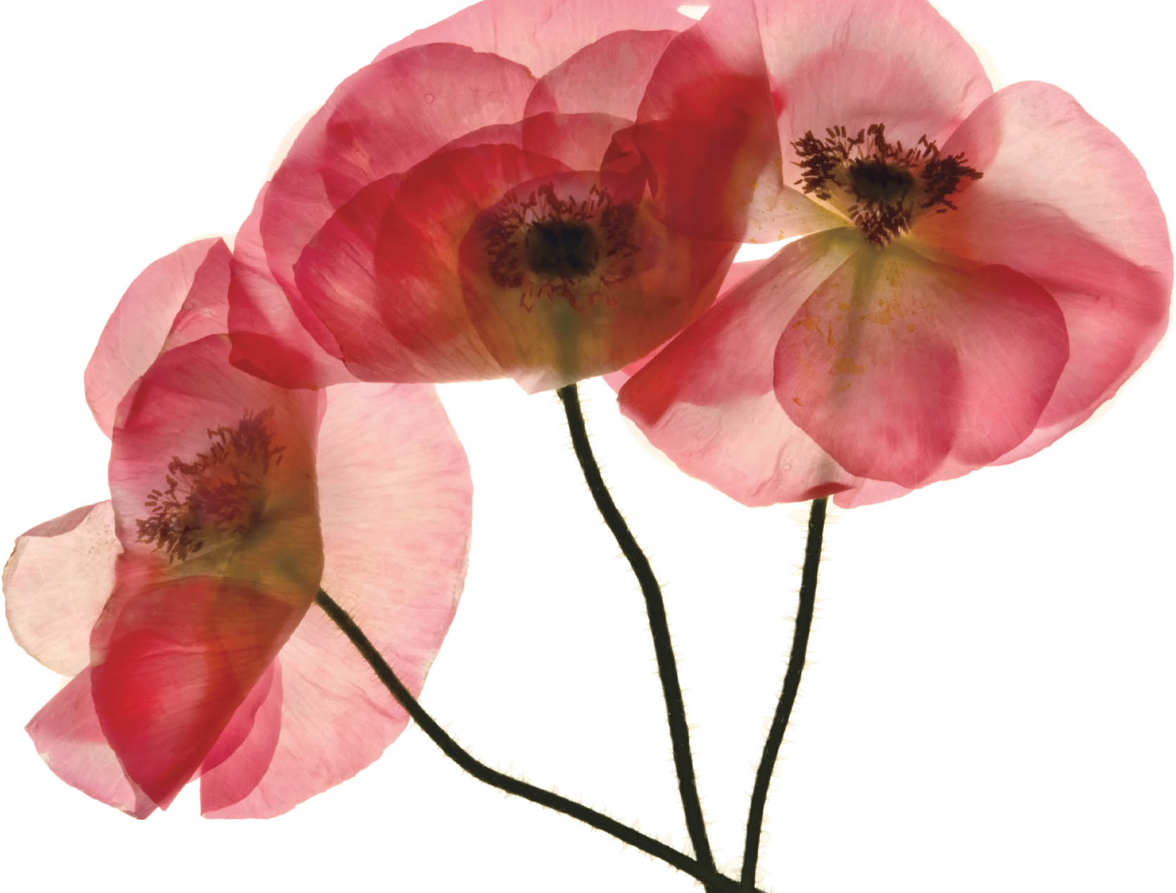
Transparency—The Papaver rhoeas, commonly known as the corn poppy, is one of my favorites. This is a beautiful translucent papaver, perfect for light box photography. The blossoms are very ephemeral, so photography must be done shortly after the flower blooms.
This was one of my first successful light box images, made after a great deal of experimentation. It’s been used in numerous publications, as a wrap-around book cover, a poster, and more. For the inverted version on black, turn to pages 258–259.
Nikon D850, 85mm tilt-shift macro, five exposures with shutter speeds ranging from 1/10 of a second to 8 seconds, each exposure at f/21 and ISO 125, tripod mounted.
Inversions in Post-Production
Exchanging a white background of a floral light box image for a black background using the LAB color space in Photoshop is a kind of “twofer”—two for the price of one. I already have the image on white, and now in a few simple steps I can have the image on black.
The way this works is pretty simple. I’ll show you the mechanics in a minute. But before we get to the mechanics, there are a few things you’ll need to understand.
Understanding LAB Color
First, a “color space” is a definition and model of the way that colors are referenced and displayed for reproduction on a monitor or for printing. The most commonly used color spaces are RGB—which is universally used on the internet and on display monitors—and CMYK, which is used to reproduce images in offset printing for books, such as this one. In RGB, the letters RGB stand for the three channels of the color space—Red, Green, and Blue. In CMYK, the letters are short for the four channels, Cyan (C), Magenta (M), Yellow (Y), and Black (K).
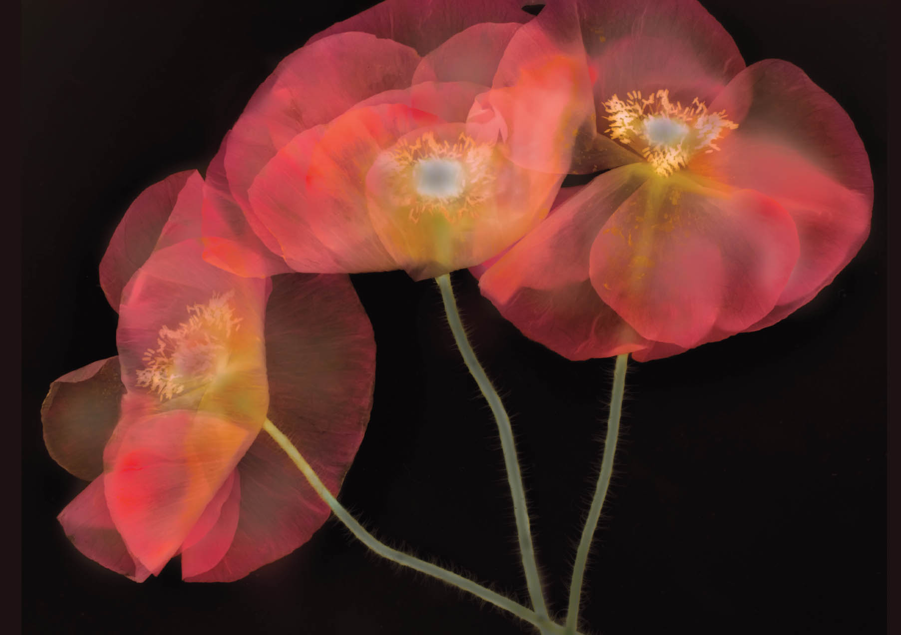
Transparency on Black—This Papaver rhoeas composition presented on a black background is an LAB L-channel inversion of the light box image on a white background shown on pages 256–257.
Nikon D850, 85mm tilt-shift macro, five exposures with shutter speeds ranging from 1/10 of a second to 8 seconds, each exposure at f/21 and ISO 125, tripod mounted.
LAB is an alternative color space first specified by a 1930s consortium of physicists specializing in color. There are a number of attractive aspects to the LAB color space, particularly that it is the widest gamut color space, meaning that more colors can be defined under LAB than under RGB or CMYK.
Leaving aside other interesting and useful aspects of LAB color, the twofer inversion uses a few particular properties of LAB. The first is that the structure of LAB specifically separates grayscale information, which is entirely contained in the L (Lightness) channel, from the color information, which is contained in the A and B channels. Neither RGB nor CMYK easily implement this separation of grayscale.
In addition, the color channels in LAB are color opponent. This means that each channel contains all the values of a color—and its opposite. So the L channel goes all the way from completely light (white) to completely dark (black).
Using the L-channel, swapping channel values—which is also called inversion, or inverting a channel—swaps whites for blacks, and blacks for whites. This is the mechanism I use for my twofer.

Left: Schizanthus grahamii and Iceberg Roses and Right: Ghost Flowers—The idea for this composition started when I noticed some ‘Iceberg’ white roses growing in a corner of my garden. The lovely white-on-white shapes of these flowers appealed to me very much, but I knew that this very white-on-white aspect would cause photographic difficulties.
Every light box composition needs underlying structure (see page 237). To create a structure for my Iceberg roses, I laid a stem of Schizanthus grahamii on the light box. Schizanthus is sometimes called the “butterfly flower” because the vibrant but small purple blossoms attract butterflies and are shaped themselves like a colorful butterfly.
Using high-key HDR photography and post-production, I carefully laid-on the layers, emphasizing those layers at the high-key end of the dynamic spectrum, so that the final image would show tonal separation without too much unattractive gray.
Once I was pleased with the delicate look of this composition on white, I decided to try an LAB L-channel inversion to see what it would look like on black. This worked quite well because the limited grayscale in the flowers themselves translated to a limited grayscale once the L-channel had been flipped. The inverted version, shown opposite, is slightly spooky compared to the version on white (hence the image title), but an interesting image in its own right.
Both: Nikon D300, 40mm macro, six exposures with shutter speeds ranging from 1/100 of a second to 1 second, each exposure at f/10 and ISO 100, tripod mounted.
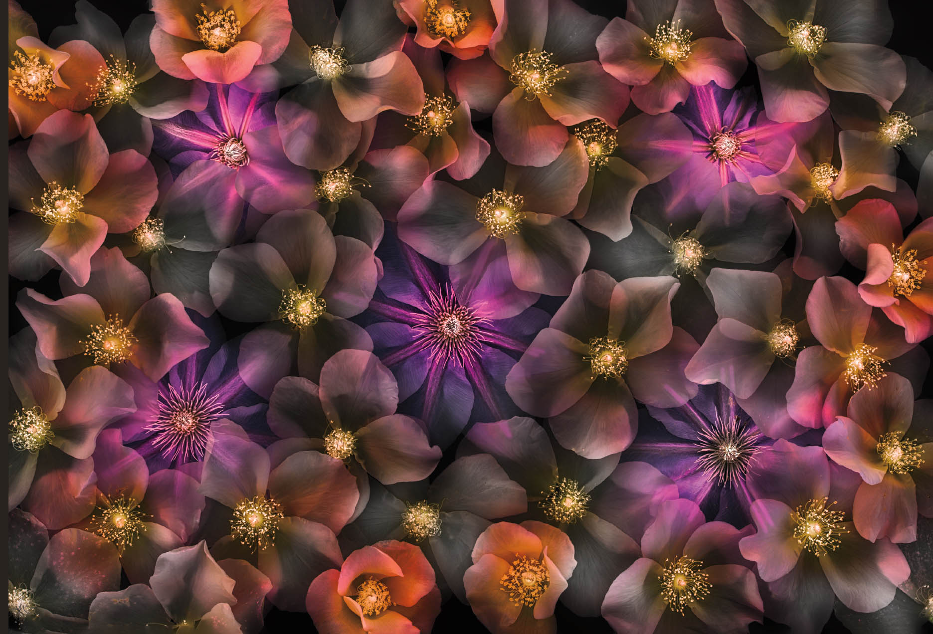
Translucency of Rosa on Black—The original version of this image, photographed on a light box, is shown on page 246–247. This LAB L-channel inversion maintains the compositional structure of the original version, and adds some dramatic flair, while perhaps loosing some subtlety. I have had collectors interested in prints of both versions of this image. Which do you prefer?
Nikon D850, 55mm Zeiss Otus, nine exposures with shutter speeds ranging from 1/30 of a second to 15 seconds, each exposure at f/21 and ISO 125, tripod mounted.
There’s one important caveat to make plain before we get started. How well this works depends upon the particular characteristics of the image. Since all white values and all black values are swapped, if an image on white has a great deal of white in the floral parts of the image, those white areas will become gray or even black. I’ll show you one possible way to deal with this issue toward the end of this section (see page 267).
If you want to create an inverted image so that something like the original image appears on a black background, it may require considerable work masking in Photoshop. But for many images where the floral portions do not contain extreme light values, an LAB inversion can work perfectly as a very low-effort twofer.
Inverting a White Background to Black
Here are the steps to convert a light box image on a white background to an image on a black background using Photoshop:
- Convert the image to the LAB color space, either by choosing Image
 Mode LAB color or by selecting Edit Convert to Profile, and then choosing LAB color from the Profile drop-down list.
 - Make sure the Channels panel is open.
- In the Channels panel, select only the L (Lightness) channel and using the Eyeball, make sure all channels are visible.
- Choose Image Adjustments Invert. The image will swap blacks and whites, and appear on a black background. The appearance of the floral arrangement will vary depending on the grayscale values within the flowers, and you may need to do further Photoshop work in these areas.
- Returning to the Channels panel, make sure all three LAB channels are selected. This is really important because otherwise you will be selecting only one channel and not the entire image.
- Return the image to the RGB color space by choosing Image Mode RGB.
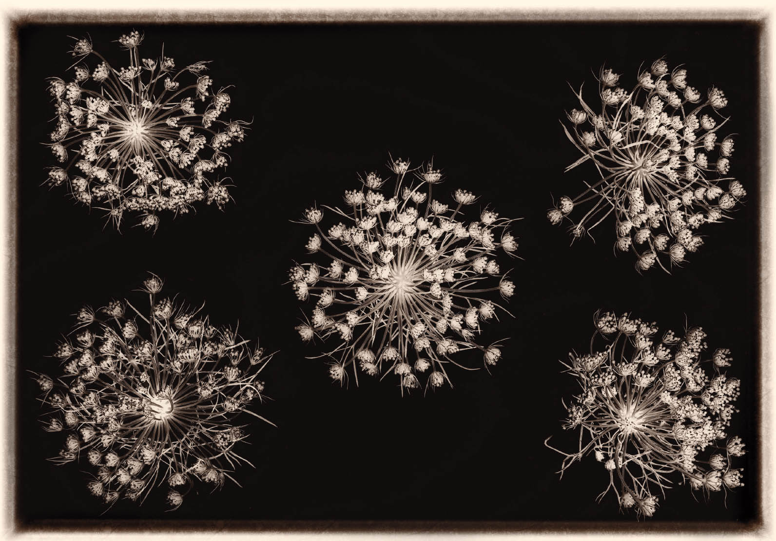
Queen Anne’s Lace—Queen Anne’s Lace, Daucus carota, makes wonderful lacy subject matter, but is usually captured as dark against light. To reverse the conventional iconography of this plant, I photographed this subject on a light box, then inverted the L-channel in LAB color.
To add an effect that resembles the work of the great naturalist-photographer Karl Blossfeldt, I also added a sepia tint and border in post-production. Keep in mind that L-channel inversions can do more than simply swap blacks and whites. This is an effect that is worth experimenting with to create a wide range of imagery—often glowing spectacularly—that cannot be made in any other way.
Nikon D850, 55mm Zeiss Otus, 0.4 seconds at f/16 and ISO 64, tripod mounted; sepia tint and border added in post-production.

Orchid Rockrose—I photographed this Cistus purpureus (orchid rockrose) close up on a light box using a telephoto macro lens (the Nikkor 200mm f/4) and an extension tube to get even closer than the macro lens would let me. After I processed the image, it seemed to me that the flower would look great on a black background. So using the L-channel in the LAB color space, I applied a Inversion adjustment. This worked fairly well for the background, which became black. However, there was quite a bit of gray in the flower itself and it seemed dull to me. So I applied a Curves adjustment to the Lightness channel (see text above for the details). This not only brought out the special colors in the rockrose, I was also able to mask the effect to add an attractive white glow behind the flower.
Nikon D300, 200mm macro, 24mm extension tube, 1 second at f/11 and ISO 100, tripod mounted.
That’s all there is to it! What an easy twofer. Many of my floral arrangements that appear on black were originally photographed on a white light box background, and are very appealing.
You should understand that this process produces images on black that differ radically from flowers originally photographed with a black background. Working with a black background, as opposed to converting to black in post-production, will be explored in the next section staring on page 272.
Brightening Images after Inversion
As I noted when I explained the idea behind LAB L-channel inversion, there is a potential fly in the ointment: swapping black for white, and white for black, changes grayscale values in the floral subject as well as the white light-box background. This can be adjusted in Photoshop.
As you likely know, there are always myriad ways to accomplish any goal in Photoshop. Here’s an easy technique for fixing problematic gray in a light box image where an L-channel inversion has been applied to convert the image so that it has a black background:
- With the image still in the LAB color space, duplicate the Background layer and make sure the Background layer is selected in the Layers panel.
- Choose Image Adjustment Curves. The Curves dialog shown in Figure 18 below opens.
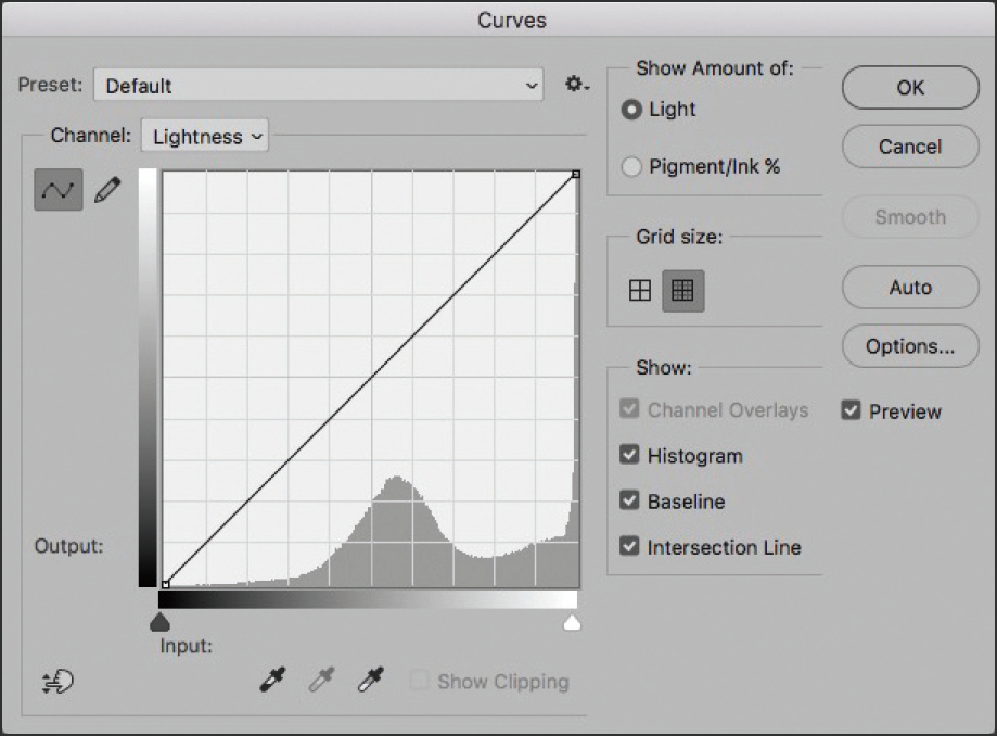
Figure 18. The Curves Adjustment dialog. Make sure Lightness is selected from the Channel drop-down list.
- 3. Make sure the L-channel is selected from the Channels drop-down list.
- 4. The main part of the Curves adjustment window looks like a graph with a grid. Using your mouse pointer, grab the White Point handle at the upper-right corner of the grid and pull it radically to the left across the top, as shown in Figure 19 below. This is an unusual and exaggerated move in the Curves dialog, intended to make everything across the entire image whiter.
- 5. Click OK to accept this over-the-top Curves adjustment. The duplicate layer of the image now should be largely white without the gray problem. The remaining issue may be that your flower is also too light now. This can easily be fixed; carry on!
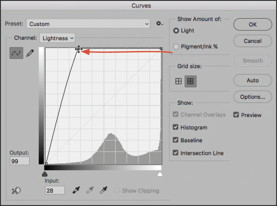
Figure 19. Curves dialog: Drag the White Point handle to the left, across the top of the grid window, to make everything whiter.

Curled Epiphany—To create the photo composition you see opposite, I started with the light box composition shown on pages 252–253. First, I rotated the horizontal image to make it vertical. Next, in LAB color, I checked out both the LAB three-channel inversion and the L-channel inversion. The L-channel inversion is the one shown “on top” with the LAB three-channel inversion added using a virtual curl.
Having gone this far, I was definitely in a surrealist state of mind. So I got out my macro gear, found a pushpin on a corkboard in my office, and made an extreme close-up of it. If you look closely, you’ll see that the three push pins in this image are different versions of one photo rotated, and they are also larger in scale than they would be in “real life.”
Finally, once you have push pins, you need something to pin them into. So I added my composition to a textured background that seemed to me rather wall-like, and used a warp transformation in Photoshop to create the curl.
Three images combined in post-production:
Floral Inversions using the image shown on pages 252–253, Nikon D850, 55mm Zeiss Otus, eight exposures with shutter speeds ranging from 1/30 of a second to 8 seconds, each exposure at f/16 and ISO 64, tripod mounted.
Push pin: Nikon D850, 85mm tilt-shift macro, 36mm extension tube, three exposures on a black background at shutter speeds ranging from 1/8 of a second to 1/2 of a second, all exposures at an effective aperture of f/64 and ISO 64, tripod mounted.
Background, wall in Galicia, Spain: Nikon D850, 55mm, 1/250 of a second at f/8 and ISO 64, hand held.
- 6. Add a Hide All black layer mask to the curve-adjusted duplicate layer.
- 7. Using the Brush tool loaded with white, with the black Hide All layer mask selected in the Layers panel, paint on the image window to reveal and restore the flower back to its original charismatic and colorful glory.
- 8. When you are satisfied with your adjustment, archive a copy of the image with the two layers before merging the layers down and converting the image back to RGB.
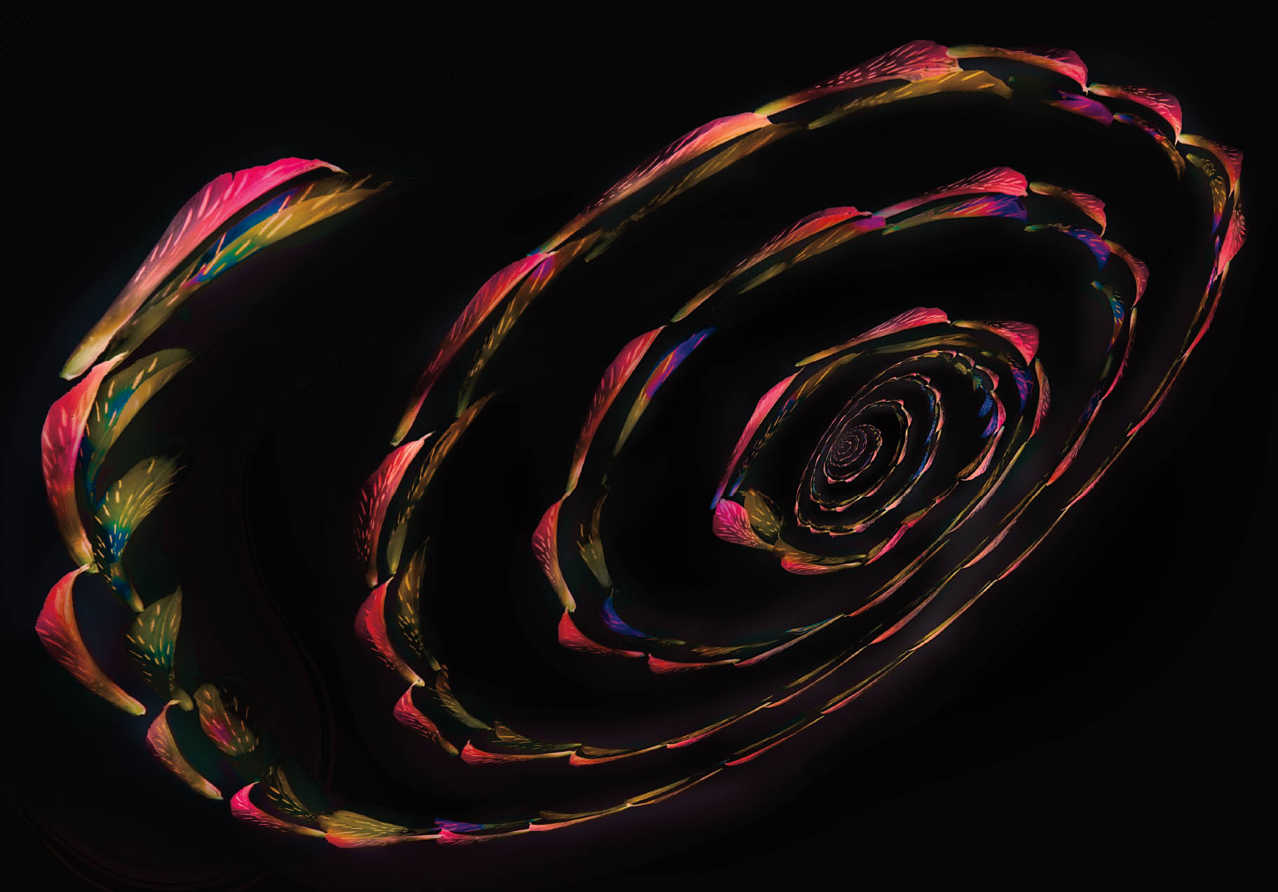
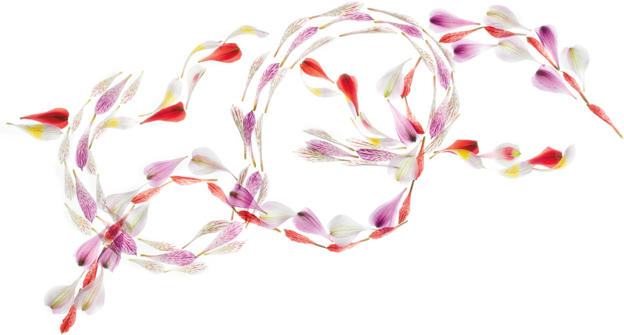
Spiral Arm of the Petal Galaxy—One of my favorite underlying structures for light box photography is the circular mandala. Of course, with any idea I like to see how far I can take the thing. There is nothing like experimenting!
With this image, I started using a palette of Alstromeria petals that my family helped me pick and sort. I arranged and photographed the circular structure you see in the center of this spiral, and made a high-key HDR bracketed sequence just of the central mandala. Next, I created an expanding spiral as a separate image with an empty space at its center. This spiral, too, became the subject of a bracketed HDR sequence.
I processed and combined the two bracketed sequences for a fractal-like effect. Next, I inverted the LAB L-channel to put the image on a black background. The colors in the petals became a little washed out, so I gave them a boost using the Curves adjustment technique explained starting on page 267.
Nikon D850, 55mm Zeiss Otus, five exposures with shutter speeds ranging from 1/15 of a second to 2 seconds, each exposure at f/16 and ISO 64, tripod mounted.