
We’ve shot our video, now it’s time to capture and edit it into final form. Though many detailed books have been written on video editing, we can break it down into a seven-step process and cover the most important points in a single chapter—when you’re producing for business or educational use, the editing is typically focused and simple.
Of our three scenarios—executive briefing, group discussion, and interview—the interview is clearly the most complex from an editing perspective; you’ll be weaving multiple sources of video, interview footage, cutaways, and noddies into one video. For this reason, I’ll use interview footage to demonstrate the points made in this chapter.
I’ll start by describing how to split, trim, sequence, and integrate your clips into a cohesive video; these in my view are among the most important tasks we discuss in this book. I’ll describe how to create titles and credits, covering issues such as where to put your titles, which fonts to use, and how to make them legible when streaming at low bitrates. Then I’ll discuss still-image overlay, including how to add your logo or watermark to the video, and conclude with a quick look at fading in and out of your video.
Admittedly each video is different and requires customized fine tuning. However, the steps outlined here probably account for 90 to 95percent of your editing efforts on each project, and should get you a long way towards completion.
Basically, there are two types of projects: those with time limitations (the duration of the video), and those without. Working without time limits is certainly easier; you lay out all of your footage, add the necessary garnish (titles, fades, logos), and render your project.
Of course, even if your project has no stated time limit, often sheer watchability imposes its own limitations. If you want audiences to enjoy watching your video, you’ll need to remove the extraneous to highlight the relevant. Obviously, when your project has a strict time limit—whether it’s two, five, or ten minutes—identifying what to leave in and out is, without question, the most important editing function.
So before you start editing, identify the target duration for the project. Then it’s time to capture or import your video into your video editor, and begin massaging it into shape.
First, let’s take care of a couple housekeeping issues.
Most video editors have an auto save function that saves a project at a specified interval. Find this function in your editor (search the help files for Auto Save or Save), make sure the feature is active, and set it to a reasonable interval, such as five or ten minutes is usual. That way, if your computer crashes mid-edit, your losses are limited.
Put together a file storage strategy. I create a separate folder on my capture drive for each project, and configure my editor to capture and write all temporary files created during editing to that folder. That way, I’ll know where to find the files to delete or reuse after the project is done. On the Windows front, most editors default to Windows XP’s My Documents folder for file storage, often making files nearly impossible to find. So, find a Preferences, Options, or Setup dialog in your editing program, pick a folder or file path, and make sure you know where your files are going.
Video capture procedures are program-specific and generally well covered in product manuals or help files, so I’ll defer to those materials. My only caveat: make sure you capture with “scene detection” enabled.
Part of the information stored on the DV tape is the start point and stop point of each shot taken with the camcorder. During capture, video editing tools use this information to “detect scenes” and create separate clips for each time you started and stopped the camera. In my project, this won’t break up the interview footage into separate clips as it was shot without turning the camera on or off, but the editor does place most of my cutaways, establishing shots, and noddies into separate clips, which are then easy to identify and use. I always capture with scene-detection enabled—usually a single-click selection in your editor’s capture preferences (though you may have to set scene-detection “sensitivity,” too).
After capture, all video editors insert the captured clips into some kind of library (also called bin or collection), which generally opens automatically when you close the capture window and switch to edit mode. However, capabilities and features differ substantially from program to program, as I’ll discuss in the next section.
Editing styles differ, and there’s no right or wrong way to start. However, when I’m editing, my first goal is to finalize my audio track. This means identifying all clips containing audio I want to include in the final video—usually interview footage, noddies, and some B-Roll—and inserting them into the project. This will create a complete and final audio track that will run throughout the project, regardless of the video that may accompany it at any given time. After the audio track is set, I’ll insert noddies without audio, cutaways, and establishing shots, then work on logos and titles.
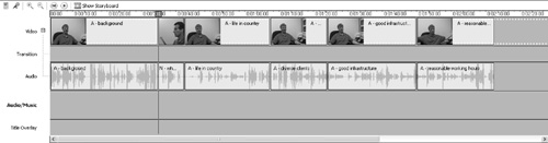
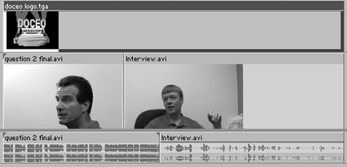
How I categorize and isolate clips from the captured video depends on the program I’m using. Many programs allow you to split clips up in the library (or wherever the captured video is stored), which simplifies the process of identifying keeper clips and discarding the rest. Figure 5.1, a screen shot from Microsoft’s Movie Maker 2, illustrates this.

Figure 5.1. Microsoft’s Movie Maker in Storyboard view. Note the video assets in the “Collection” on the upper left, which I’ve already cut into discrete usable chunks, and the storyboard on the bottom, where I sequence my clips.
The upper left window displays the library (called Collection in Movie Maker and Album in other programs) containing my project video. After capture, I split all captured video into the smallest usable chunks, for example cutting each response from the physician into a separate segment. You probably can’t read the descriptive names in Figure 5.1, but I created separate clips for the doctor’s explanation of the challenges of his practice, describing his diverse client base, and the like. I also split the cutaways, questions, and noddies into separate clips the same way.
Most programs have a “split” or “razor” tool for scene-splitting; with Movie Maker, it’s the “razor” icon on the left beneath the monitor window in the upper right. To split a video in the album, you touch the video with your cursor, which makes it appear in the monitor window, use the playback controls to move to the frame where you’d like to split the video, and then click the icon. The program will then create a new clip containing the second portion of the original clip, and display it in the album.
After splitting the clips, I drag them down to the storyboard—the sequential presentation of clips on the bottom half of Figure 5.1. Not all programs have a storyboard, but when they do, it’s a great place to sequence your videos into the proper order. Generally, you move the videos into the storyboard window, where you can move them around like checkers on a checkerboard.
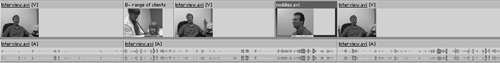
Once I’ve imported all the clips into the project, I’ll switch to Timeline view, shown in Figure 5.2, for further editing. Where the storyboard shows each clip as the same size, irrespective of duration, the timeline is a time-based graphical representation of the project, with the length of the clip shown on the screen proportional to its actual duration in the project. The squiggly lines beneath the video clips are audio waveforms, a graphical representation of the audio shot with the video, while other “tracks” or layers in the timeline are available to add background audio, transitions, and titles.
In Timeline view I’ll trim the video, removing unwanted frames from the front and back of a clip. When I split clips in the album, I’m not trying to be precise; I’m just isolating all the videos I’ll include in the project. Once in the timeline, I’ll trim the videos, front and back once again, until only the desired footage is included.
Virtually all programs trim the same way: you touch the clip, hover your cursor over the edge you want to adjust, then grab and drag the edge to the desired location. Typically, as you drag the edge of the video, the monitor will display the then-current frame to assist your positioning.
Note that many prosumer tools don’t allow you to split clips in the clip library, or create a storyboard, so you have to do all this work on the timeline. When editing with these tools, I drag the primary video (in this case the interview footage) down to the timeline, and split and trim the video into the final chunks there.
Generally, splitting on the timeline is similar to splitting in the album. You use playback controls to locate the edit line (see Figure 5.3) to the desired split position, and then click on the razor icon or similar tool. The video will split into two clips, each of which you can trim separately, or delete for that matter. As virtually all editors are “non-destructive,” you can delete clips in the album or timeline without actually deleting the captured video.

Once you’v assembled all the clips that contribute audio to the project on the timeline, it’s time to start adding other shots. Before we get to this, let’s look at some of the goals to consider while editing.
Take another look at Figure 5.2. Remember that I’ve trimmed all the clips of the doctor to remove unwanted frames from the beginning and end, so the clips don’t flow smoothly from one to the other. For this reason, when the video moves from one clip to another, it’s likely the image will jump from the frame shown on the left in Figure 5.4 to the frame shown on the right.

Figure 5.4. A “jump cut” showing the last frame of the fifth video and the first frame of the sixth.
This is called a “jump cut,” because the video looks like it’s jumping around. One moment viewers are watching the doctor with his hands on the chair, and the next moment they’re seeing his arms waving in the air. Jump cuts are very disconcerting to the viewer because they make no visual sense.
And, they create a problem any time you edit video of a relatively static scene and subject shot with a fixed camera. Fortunately, jump cuts are easy to avoid, if you take the time to shoot cutaways or noddies. This is illustrated in Figure 5.5.

The screenshot in Figure 5.5 shows an editor that offers multiple video tracks, which makes the concept of avoiding jump cuts easier to visualize. Basically, you have three choices:
Insert a cutaway or noddie to obscure the first frame of the second video in the jump cut. In Figure 5.5 the cutaway video inserted at the start of Clip 5 hides the jump cut between clip 4 and Clip 5. 2.
Insert a cutaway or noddie to obscure the final frame of the first video in the jump cut. In Figure 5.5, the noddie inserted at the end of Clip 5 hides the jump cut between Clip 5 and Clip 6. 3.
Insert a cutaway that obscures both the final frame of the first clip in the jump cut and the first frame of the second clip (not shown).
Inserting cutaways or noddies using editors with multiple video tracks is simple. You drag the video to the target location; sever the link between the audio and the video in the inserted clip (usually a right-click command that “unlinks” the audio and video) and then delete the audio. Or, you can simply mute the audio if that is easier.
With most multitrack editors, after deleting the audio, you can click and drag the newly inserted cutaway down to the main video track to free the space and avoid inadvertently shifting the cutaway clip during subsequent edits. This is shown in Figure 5.6, where the cutaway and noddie are now part of the main track.
If you’re working with an editor that doesn’t have multiple video tracks, inserting cutaways is a bit more complicated, though most editors are up to the task. Technically, the procedure is called “insert editing,” so check the program’s help files or manual for that term and instructions on how to perform this edit in your tool of choice.
What if you don’t have noddies or cutaways to hide the jump cut? This happens frequently when you’re editing group discussions or executive brief-ings and you’re trying to consolidate the footage. Typically, I’ll insert a short transition, such as a dissolve, between the two clips to let the viewer know that there was a change in time, which is the basic purpose of a transition.
Briefly, transitions are effects that smooth the flow from clip to clip and can range from simple dissolves, where the first clip smoothly blends into the second, to more visual effects such as the ’60s-era flower-power effects used in the Austin Powers movies. Most of the time, I’m pretty conservative with transitions and almost exclusively, stick with dissolves—especially for business videos.
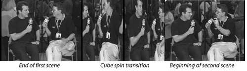
Unfortunately, in jump-cut scenarios, where there’s minimal change between the first and second scene, a dissolve can be practically invisible, as are most static two-dimensional effects such as wipes. In these instances, I’ll either use a push transition (this pushes the first scene off the screen and pulls the second on screen), or an unobtrusive three-dimensional transition such as the cube spin shown in Figure 5.7.
A split edit is any edit where the video and audio move from one scene to the next at different times. If you watch television interviews, you’ll notice that the sound and video seldom cut to the next scene simultaneously, as this is less interesting to the viewer. For example, if Larry King was asking O.J. Simpson, “Did you do it?” what you really want to see is O.J.’s face as the question is asked, not Larry King’s.
Of course, Larry has the benefit of using multiple cameras so the producer can cut from camera to camera at any time. We don’t have that luxury. More often than not, usually, you would ask the question in the field, get the response, then come back and record asking the question again while shooting the noddies. Showing O.J.’s face while asking the question is a classic split edit, in this case called an “L-cut” for reasons that will become obvious momentarily.
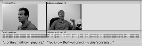
Figure 5.8 shows two clips on the timeline. O.J. declined to be interviewed for this book, so we’ll have to use our doctor instead. The first clip shows me prompting, “Tell me about the quality of the small town practice.” Then, both audio and video cut simultaneously to the physician as he responds, “You know, that was one of my chief concerns ...”
In Figure 5.9, I’ve extended the video from the second clip over the audio from the first, allowing the viewer to watch the doctor as I ask the question. The L-cut gets its name from the shape the audio makes in the timeline when it’s extended beneath the second track. You get this whenever you cut from one scene to another on the video track, but let the audio from the first scene continue.

Figure 5.9. An “L-cut” edit is where the audio from the first clip continues under the second clip, forming an L shape.
Sometimes you want the audio from the second clip to start while the video from the first clip is still showing, generally to presage the content of the second video. In Figure 5.10, for example the first video is Dr. Sumie commenting, “Patients really make the practice.” And the second video clip is an examination where he’s saying, “Breathe deeply, now.”

Figure 5.10. Creating a “J-cut,” where the audio from the second video creeps under the video from the first.
Here, I’ve cut the audio to the second clip before the video, so while the viewer is still watching Dr. Sumie nod with affirmation after commenting, “Patients really make the practice,” they’re listening to the examination under way. The audio presages the video, which is a much more interesting presentation to the viewer. Since the audio from the second clip creeps under the first clip roughly in the shape of a J, this is called a J-cut.
When I’m editing, I use L-cuts and J-cuts as frequently as possible to avoid cutting audio and video simultaneously. Producing these split edits varies from program to program, but, as with insert edits, “unlink” the audio from both video files so that you can move the audio independently from the video.
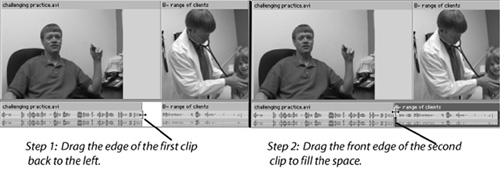
To produce an L-cut, you adjust only the video track, as shown in Figure 5.11. Regardless of what editing program you use, creating an L-cut always includes these steps:
Click and drag the right edge of the first video clip to the left a second or two to clear space for video from the second clip. Note that you’re shortening the video, not dragging the entire video to the left.
Drag the video from the second video clip over the top of the audio from the first clip.

With a J-cut, you adjust only the audio track, as shown in Figure 5.12, exactly the same way you manipulate the video to create an L-cut. Specifically:
As I mentioned earlier, the purpose of a transition is to clue the viewer of a change in scene or time. Unless your video includes changes in scene or time, you shouldn’t insert transitions between the individual video sequences with one notable exception: to avoid a jump cut. Even then, it’s better to use a cutaway or noddie rather than a transition.
The best way to understand how transitions are used in business type footage is to watch interviews on the evening news, or programs such as 60 Minutes. You’ll notice that transitions are rarely used; when they are used, they’re nearly always-dissolves or fades to black.
Inserting transitions is generally very simple. Typically they sit in their own library or collection bin, and you simply drag them into the timeline or story-board between the two clips.
Titles are text screens that convey information such as the title of the video, closing credits, locations, and the names and positions held of people appearing onscreen. Virtually all video editors have built-in titling functions that are easy to use and generally well-documented. Here we’ll address implementation details like choosing a font, its size and color; where to place your titles within the video screen; and how long those titles should remain onscreen.
When producing titles, you need to consider several factors; some are mechanical and some are artistic. I’ll list them here in order of importance, and discuss each point in detail below.
Your title must be visible onscreen, so it must be placed within the title-safe region.
The colors used must be “broadcast safe” so they are visible on television screens. Note that if you’re producing video solely for computer playback, neither of these restrictions applies.
Your titles must be legible, which means using a font you can read in the correct size and color, and on a background to provide contrast when necessary.
Your titles must be appropriate, which means placed onscreen according, which we’ll go into below.
Your titles should be consistent in all major aspects.
In this section we’ll discuss the six most common types of titles:
Video title—presenting the name of the video and other pertinent details.
Name/title or affiliation—identifying the person in the video.
Information screen—essentially a text message to be read by the viewer.
Bullet points—listing items that underscore the audio portion of the video.
Closing credits—naming individual(s) and organization(s) that contributed to the video.
Copyright text—identifying the copyright holder and the year.
This overview provides an outline for this section; now let’s jump in and look at some details.
If you’re producing titles for display on a television set, either via DVD or by writing to VHS or other analog formats, note that television sets don’t display the outer edges of the video—an area called “overscan.” If you place your titles or graphics in the overscan area, they won’t be seen by your viewers.
To help avoid this, most titling utilities can display a “safe zone” comprised of one or two boxes such as those shown in Figure 5.13. The innermost square is called the Title Safe region, which represents the 80 percent of the screen that all televisions should display. Position your title within this title safe area and your television viewers will be able to see it; go beyond the region, and it may be cut off.
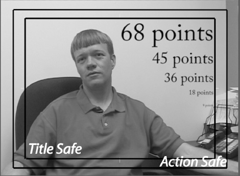
The outer square represents the Action Safe region. Video within this outer box will most likely display without being cut off by the television set, but action outside of this box will most likely be obscured as overscan. Note also that these boxes do not actually appear onscreen after you apply the title.
Note also that when a computer plays a video file, it displays all pixels in the video file. Accordingly, the concepts of overscan, title safe, and action safe are not applicaple to streaming video or other video that will never appear on a television set. While you shouldn’t position your titles at the very edges of the video, a few pixels in from any side should work well.
Simply stated, computers can display more colors than a television set, particularly the brighter spectrum of colors like red, yellow, and green. For this reason, when producing your titles on a computer, you want the colors to be safe for television, in other words or “broadcast safe.” Otherwise, the color may appear distorted or may pulse visibly on the TV screen.
Many prosumer programs display warnings if you select a color that isn’t broadcast safe. Such a warning is shown on the left in Figure 5.14. If your program doesn’t provide a warning, you can ensure that your colors are broadcast safe by making sure that all three Red, Green, and Blue values have at least 15 bits of color. As shown on the right in Figure 5.14, adding color bits corrected the problem with the overly red title color in the example.

Figure 5.14. To make your colors broadcast safe, make sure all RGB values have at least five bits of color.
As with the title safe and action safe zones, title color isn’t an issue for videos displayed solely on a computer; in this case, achieving the right aesthetics and contrast are the primary factors in choosing a color for your titles.
Your first consideration when choosing a font should be legibility, or the viewer’s ability to read onscreen text. Note that this metric varies according to screen size and whether the video is compressed and to what extent. This is shown in Figure 5.15.

To produce Figure 5.15, I created a title using the named fonts at 36 points for the larger text, and 18 points for the smaller text. After creating the title, I rendered twice—once at 128Kbps (shown on the left), and then at 32Kbps (shown on the right), both times using Microsoft’s Windows Media Format with output at 320×240 resolution.
On top is Times Roman, an “Old Style” font with serifs, the little pointy edges you can see at the ends of many of the letters. If you scanned a book or magazine, you would notice that most text is printed in Old Style fonts such as Times Roman because it is highly readable.
However, Old Style fonts have two characteristics that don’t work well at high compression. First, as you can see on the right, the serifs tend to disappear at high compression, degrading the appearance of the font. In addition, if you closely analyze the font, you’ll notice a variance in the thickness of some of the letters. Compare, for example, the upper left regions of lower case o’s and e’s with the right side of letters like lower case m’s and d’s. This is important, because at high compression, these thinner lines tend to disappear, degrading the appearance even further.
Beneath Times Roman is Arial, a sans serif font. If you study books and magazines, you’ll notice that most chapter and heading titles are in sans serif fonts such as Arial. That’s because, as you can see in Figure 5.15, sans serif fonts stand out. In this regard, they’re easier to browse than serif fonts, and better for quick hits of information, but not as readable over the long term.
For our purposes, note also that Arial, like most (but not all) sans serif fonts, is “monoweight,” which means all lines are the same thickness. This makes Arial the most easily compressed font of the group, with great readability even at 32Kbps.
Next time you’re watching a television program, make a mental note to determine whether they’re using serif or sans serif fonts. In my experience, when the issue is readability (news, advertisements, public service announcements), sans serif fonts are used almost exclusively, as they are in most high-volume streaming media.
Back to our font comparison. I included Palatino, an Old Style font, because I like its appearance and use it frequently. It’s slightly thinner than Times Roman, but otherwise shares the same characteristics regarding readability and lack of compressibility.
The final is Park Avenue, a “script” font, which means it’s designed to look as if handwritten. It shares the serifs and nonuniform line size of Times Roman, but carries much more detail. Predictably, it quickly degrades at high compression ratio.
Interestingly, at 128Kbps, all fonts retain close to original quality, so with most video produced for DVD, television, or desktop viewing, post-compression readability shouldn’t dictate the font. It’s worth noting here that EIA-708, the FCC regulation that delineates the requirements for closed captioning on U.S. television, prescribes the use of eight font types, including serif, sans serif, and script fonts, meaning that all the fonts shown in Figure 5.15 would be “legal” for a closed-captioned feed. But at high compression rates, Arial or other sans serif fonts are the obvious choice. (See Chapter 11 for a full explanation of how to produce closed captions.)
Clearly there’s is no absolute right or wrong way to go in font selection, but over the years I’ve adopted the following conventions for producing my titles. (Assume that I’m not producing for high compression (in which case I’d simply use Arial.)
Video title—. Since this title is usually short and large (e.g., highly readable), I use an artistic font that matches the storyline. As you’ll see in the country doctor video, I used Rosewood Standard fill, a serif font with a “country” feel.
Name/title or affiliation—. Here I use Palatino or a similar Old Style font I made this choice solely based on aesthetics. I just like the way they look, and think Arial looks particularly dowdy in titles.
Information screen—. I always use Palatino, Times Roman, or another Old Style font for their overall readability.
Bullet points—. I go with Arial or another sans serif font for readability and common usage.
Credits—. Arial or another sans serif font again for the reasons above.
Copyright text—. Again, Arial.
Obviously, being consistent with font usage—within a single project, and among similar or related projects—is as important as your choice of fonts. For this reason, most organizations create standards regarding fonts, font sizes, colors, duration, and other title attributes.
In the next few sections, I’ll show you the standards I use for most business-oriented productions. Note that many of these are my own personal preferences; as I said, there is no true right or wrong. What is important for you is to recognize the need to create and apply similar standards and consistencies in your own videos.
Many parameters like font, font size, color, and positioning need no further explanation. Before introducing my standards, let me briefly describe some parameters that may not be so obvious.
Template—. Most video editors have text or title templates that control title attributes like font, font size, font color, background, and positioning. If you’re using a template in your production, obviously you’ll want to note which one. Once you go through the process of standardizing your titles, you may also want to see if your video editor can save that information as a custom template—also a fairly common feature that will make it simple to achieve future consistency.
Background—. When displaying titles over video, the background behind the text is critical to title legibility. In some instances, you can use the video itself as a background, but often the colors in the video are too varied to produce the consistent contrast necessary for a legible title. For each title, I’ll discuss the most appropriate background or backgrounds for the title.
Transition effects—. I invariably fade my titles in and out, which is simple to do in most programs. This is an aesthetic choice that you don’t have to adopt, but this parameter should be considered when you select your own titling standard.
Animation—. Other than scrolling credits at the end of my movies, I typically don’t animate my titles, so they don’t fly in from the left or scroll up and down like the Star Wars introduction. If yours do, save the effect in the appropriate style box.
With this as prologue, let’s move to the opening title sequence.
The opening title is used at the very start of the video (shown on the left in Figure 5.16). With educational or training usage, be sure to identify both the speaker and the topic, and any other relevant information to let the viewer know the subject of the video (they’ll want to know what they’re watching the correct video).

If your video has discrete sections you’d like separate by titles, use similar parameters, but a smaller font size, around 35 to 50 points. These are the titles shown on the right in Figure 5.16. I also use the same approach and font for the “The End” screen that I include in many productions, generally using a point size of around 50.
Title | Opening title. |
Template | N/A. |
Font | Choice dictated by artistic considerations (for example, Rosewood Standard fill used in Figure 5.16 for the “country” look). |
Size | 40-80 points (35-50 points for section titles). |
Justification | Centered. |
Position | Upper half vertically, centered horizontally. |
Color | Varies according to background; choose for maximum contrast. |
Background | Usually displayed over video (as shown) or black background. |
Duration | 15-20 seconds; note that with most editors, you adjust title duration by dragging the right edge of the title to make it longer or shorter. |
Insert when | At the very start of the video. |
Transition effects | Half-second fade in and out. |
Animation effects | None. |
Miscellaneous | Use similar parameters for titles between discrete sections in the video (e.g., Introduction, Section I, Section II). |
These titles identify speakers when they appear onscreen. Use a consistent background on all name titles; I prefer to make the title background semi-transparent (see the title shown on the left in Figure 5.17); this creates sufficient contrast to make the text readable without appearing obtrusive, though not all programs support this.

Borders around titles (such as those shown on the upper right of Figure 5.17) look good in video produced for television, but the lines degrade severely at high compression. For this reason, I also avoid drop shadows and inner and outer strokes on titles used in videos destined for high compression. Keep it simple is the best advice at high compression ratios.
Title | Name/Title or Affiliation. |
Template | N/A. |
Font | Palatino (Old Style) for appearance (see san-serif fonts in both titles on the right). |
Size | Name-25-35 points; affiliation or title-20-25 points (go no lower than 18 points). |
Justification | Left justify. |
Position | Lower third, on the left; however, when multiple individuals are identified simultaneously, attempt to place the title directly beneath each individual. |
Color | Choose for maximum contrast—generally white or yellow against a blue or black background for maximum legibility. |
Background | Black or blue (or template), set to about 40-50% opacity. |
Duration | Twice as long as it would take to read the title; 5-10 seconds max. |
Insert when | A few seconds after the initial appearance (not simultaneously); if video is more than five minutes, insert again approximately every five minutes or so. |
Transition effects | Half-second fade in and out. |
Animation effects | None. |
Miscellaneous | Always use a background to provide contrast. |
After the opening titles comes an information screen; this is text intended for the viewers to read (Figure 5.18). The small caps font shown on the right is a popular technique for many information screens.
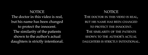
Using upper and lower case (shown on left), is considered easier to read, because readers recognize the words as words, rather than having to read the individual letters and decipher the word. Experiment with both to see which you feel is more readable.
Title | Information screen. |
Template | N/A. |
Font | Palatino (Old Style font) for readability. |
Size | 30-35 points; aim for no more than 30-35 words per screen. |
Justification | Center. |
Position | Center. |
Color | White. |
Background | Black. |
Duration | Twice as long as it takes to read the words out loud. |
Insert when | If necessary, at the start of the video. |
Transition effects | Half-second fade in and out. |
Animation effects | None. |
You may have to adjust the “leading” controls in the titling utility to achieve the vertical spacing between the lines. For example, the leading controls for both titles in Figure 5.18 were set to 10, increasing the interline spacing considerably. Controls will vary by product, but your goal should be no more than 7 to 9 lines of text per screen (and for Web output, no more than 3 to 4). |
Bullet points are titles introduced to highlight certain audio portions of the video. For example, while the physician in our video was outlining the benefits of the small town practice, you might produce a title with the bullet points shown in Figure 5.19.

Figure 5.19. Bullet-point titles shown against two backgrounds. The image on the right with the background darkened, is much more legible than the one on the left.
While you can certainly build these titles against a flat black or blue screen, I like to use a thematic background, when available, as shown in Figure 5.19. When the image is too bright to provide the necessary contrast (as shown on the left), darken the background image, either within the video editing application or using an image editor, to improve readability (on the right).
Title | Bullet points. |
Template | N/A. |
Font | Arial or similar sans serif font for fast word recognition. |
Size | Title should be between 45-55 points, bullet points 35-45. |
Justification | Left (center is also popular, so the choice is up to you). |
Position | Vertical Center, horizontal on the left. |
Color | White. |
Background | Solid or thematic background dark enough to provide contrast. |
Duration | Keep up as long as relevant to the audio. |
Insert when | To correspond with audio. |
Transition effects | Half-second fade in and out. |
Animation effects | None. |
Miscellaneous | As with PowerPoint slides, you also need to set a capitalization policy. I generally capitalize all words in the title (except ands, ins, and similar prepositions), and only the first word of each bullet point, plus proper nouns. |
Closing credits generally don’t contain mission-critical information, so you’re free to get a bit more creative. A range of font and background options are shown in Figure 5.20. The options in the style guide are those used in the larger title on the left.

Title | Closing credits. |
Template | N/A. |
Font: | Sans serif font such as Arial. |
Size | 20-35 points. |
Justification | Center. |
Position | Center. |
Color | White. |
Background | Appropriate background from video or solid black or blue. If you have interesting footage (post-interview conversation, etc.), most programs support the split-screen approach shown on the bottom right of Figure 5.20; this give’s your video a very professional look. |
Duration | Twice as long as it takes to read the words. Almost invariably, you adjust duration by dragging the right edge of the title to make it longer or shorter. |
Insert when | After “The End.” |
Transition effects | None—scroll in and out. |
Animation effects | Scrolling. |
Miscellaneous | Many producers scroll credits while showing video from the interview, discussion, or briefing in the background. To produce the contrast, you may need to darken the video slightly using the video editor’s brightness and contrast controls. |
Technically, all video is copyrighted whether or not it contains a notice like that shown in Figure 5.21. Nonetheless adding copyright notices “discourage” copyright infringement, or the use of your video without your written permission. It also keeps legal types off your back, and insulates you from barbs from bosses or co-workers asking, “Where’s the copyright notice?”

Figure 5.21. Various versions of the copyright notice; the notice on the upper right contains the minimum required information.
To be complete, the copyright notice must contain the copyright “bug” © or the word copyright, plus the year of creation and the name of the copyright holder. I go beyond that with the large copyright notice shown on the left in Figure 5.21, moving towards a more minimalist approach on the upper right.
Title | Copyright notice. |
Template | N/A. |
Font | Sans serif font such as Arial. |
Size | 20-25 points. |
Justification | Center. |
Position | Center. |
Color | Center. |
Background | Appropriate background from video or solid black or blue. |
Duration | 5-10 seconds. Almost invariably, you adjust duration by dragging the right edge of the title to make it longer or shorter. |
Insert when | After closing credits. |
Transition effects | Fade into copyright notice; fade to black after notice. |
Animation effects | None. |
When producing video and titles for streaming video, keep these points in mind.
The good news is that streaming video is almost always watched on a computer screen, which displays much greater detail than a television set. However, when producing for low-bitrate streaming at reduced resolutions, such as 320×240, you’re essentially cutting the point size of your fonts in half. That’s because when you shrink the video from 640×480 to 320×240, you shrink everything in the video by 50 percent. This means your highly readable 20-point font becomes a tiny, smudged-looking 10-point font.
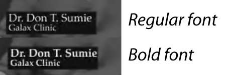
This won’t matter for larger titles like the opening title and bullet points, but will affect many smaller titles, particularly name/affiliation tags. When producing for a 320×240 window, boost the point sizes for these titles by about five points for improved legibility. In addition, consider bolding the text, because bold text survives compression with much greater legibility. This is shown in Figure 5.22, where both video files were compressed to 32Kbps.
Though it will seem like the larger font size is consuming gobs of space, remember that you can ignore the safe zone when you’re working with streaming video (since it isn’t displayed on a television set). For this reason, you can reclaim the space by moving the title much closer to the bottom or left edge of the video.
Many organizations place their logo over all videos, which is typically called a watermark. Most editing programs except for Microsoft’s Movie Maker 2, which doesn’t offer this function allow you to do this fairly easily.
Most programs use a feature called “overlay” or “chromakey” to superimpose the still image over the background video; I explain this fully in Chapter 6. As they relate to video, chromakey and overlay can get pretty complicated. However, using these techniques with still images is simple.
To use chromakeying, produce your logos over a solid blue background. I’ll show you how to achieve this in a moment. Alternatively, if you know how (or if a graphics artist is creating the logo), save the logo as a 32-bit TGA (Targa) file with a transparent background alpha channel.
Briefly, an alpha channel specifies which portion of the image should be transparent when merged with another image or video. With a logo file, you (or your graphics artist) would designate the background of the image as transparent, so when merged with the video file, all but the logo will disappear.
To insert the logo into your video project, drag it onto a separate video track above the main video track, (shown in Figure 5.23). As with titles, typically, you adjust duration by dragging the right edge of the logo to make it longer or shorter. If your program doesn’t have multiple video tracks, check documentation for “adding logos” or “overlaying still images” onto your video.
If you create a 32-bit image with an alpha channel, most video editors will recognize that you want the background eliminated, and do this automatically. If you create an image with a blue or black background, after placing the image on the timeline, you’ll see the logo with background superimposed over the video, as you see on the left in Figure 5.24.

Figure 5.24. After applying the chromakey filter, use an eyedropper or similar tool to select the background color to eliminate.
To eliminate the background, use the chromakey filter, (which I’ll explain in the next chapter) program controls to apply the video editor’s chromakey filter to the logo. At a high level, these tools work by eliminating a color from the top video and inserting what’s not eliminated into the background video. Operationally, the first step is to identify the color you want removed from the logo, typically using an eyedropper or similar tool like that shown on the left in Figure 5.24.
With still images, the background is perfectly consistent, so selecting it with the eyedropper usually makes the background disappear immediately. If not, find the filter’s “similarity” or “color tolerance” adjustment, which expands the range of colors excluded by the chromakey filter. Increase the tolerance control slightly and the background should completely go away.
Once you’ve eliminated the background color, use the program’s two-dimensional (2D) motion controls to shrink the image to the desired size and move it to the target location, making sure that you’re within the Action Safe region. To make the image translucent, find the program’s transparency control and adjust it to the target value. A translucent logo is shown on the image on the right in Figure 5.25.
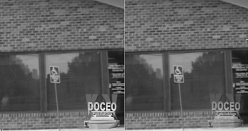
Figure 5.25. Logo, after shrinking and moving to the right bottom corner (left), and then adjusting the transparency values (on the right).
Virtually all video editors can import digital images and convert them to video. This includes not only digital pictures and logos, but also the output of programs such as PowerPoint, Visio, AutoCAD, and other electronic design programs. Adding images to video is a great way to explain your work or product and can help break up otherwise monotonous talking-head footage.
Adding still images to your editor is also fairly simple. Generally, you drag them down to a video track and grab the right edge to set duration. Most programs let you add transitions between still images and adjust color, brightness, and similar values with the same filters available for video.
However, when adding line art and other finely detailed images, you must keep several critical points in mind. First, the resolution of video is limited. Even a high-quality format like MPEG-2 (used in DVD) has a resolution of 720×480 pixels, while streaming files are often produced at 320×240 pixels. Suppose you included a high-resolution image such as an architectural drawing produced in AutoCAD 2004 shown in Figure 5.26.
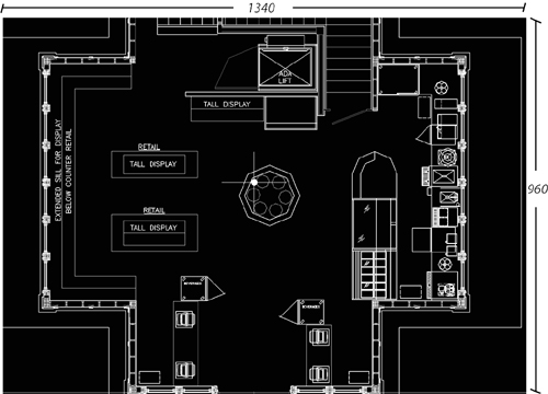
The image has a resolution of 1,340×960. If you’re encoding for DVD at 720×480 resolution, there aren’t enough lines of pixels in the video file to display all the pixels in the image. To convert from the 1,276×820 source to the 720×480 output during encoding, the video editor will discard image detail, degrading image quality.
Plus a television set’s inability to display fine details with accuracy only compounds the problem. Basically, it’s almost impossible to display high-resolution images in a video file without losing detail.
To workaround, cut your image into smaller chunks as shown in Figure 5.27. Then, import the files into your video editor and display them in the desired order.
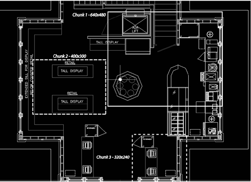
You can do this in two ways. First, divide the image up into separate images—each containing the desired views—using an image editor like Ulead’s PhotoImpact or Adobe Photoshop. When using this approach, keep the following rules in mind:
For best results, make sure each image has an aspect ratio of 4:3, meaning four horizontal pixels for every 3 vertical pixels. Figure 5.27, for example, includes chunks of 320×240, 640×480, and 400×300, all of which adhere to the 4:3 ratio. The easiest way to calculate this is to divide the number of horizontal pixels in the image by four, then multiply by three to produce the desired vertical resolution.
Also, make sure each image has a lower vertical resolution than your target output. If producing for DVD, this means less than 480 lines of resolution.
After you input each image file into your video editor, use 2D image controls to zoom the image to full screen, making sure that you zoom proportionately, meaning equally on both the horizontal and vertical axis. Otherwise, you could distort the image.
As you become more familiar with your video editor, you’ll find the easiest way to show portions of an image is to insert a high-resolution version into the video editor and use the editor’s zoom and positioning controls to show only the desired region of the image. Take a mental break for a second, and I’ll explain the procedure.
Imagine you were at Mount Rushmore with your camcorder. You stand in one spot and zoom in to shoot George Washington, where it all began. Then you zoom out to show President Washington with President Jefferson. Then you zoom back in and pan across to President Lincoln, then President Roosevelt.
Obviously, the magnificent carved mountain is there the entire time; you’re just using the camera’s zoom controls to zoom in and out and your own two-dimensional positioning controls (hands and arms) to move the camera around the mountain. Most video editors have controls that work the same way, allowing you to pan and zoom around high-resolution images to show only low-resolution sections.
Once you’ve imported the image into the editor, you can zoom into and out of the image with magnification controls, and pan around the image using positioning controls. The only segment of the image the editor will include in the rendered video appears in the viewport; the other regions of the image are still there, but out of camera.
This is illustrated in Figure 5.28; the black area is the viewport, and the gray regions are out of the camera’s current scope. Basically, you drag that portion of the image to display into the viewport, and use zoom controls to zoom into or away from the image.

Figure 5.28. Two-dimensional (2D) editing controls allow you to show different regions of an image at different magnification levels.
The only caveat is to keep the viewport smaller than the output resolution of the video, just as you did for each subset of the image you isolated in your image editor. The image editor will automatically set the viewport to the correct output resolution, so you don’t even have to worry about choosing a 4:3 ratio. This is faster and simpler, and while the interface may vary from what’s shown in Figure 5.28, virtually all editors offer these controls.
I start almost all productions by fading in from black and end by fading to black. Some programs have a dedicated filter to accomplish this (most notably Movie Maker 2), though the predominant general technique is to apply a dissolve transition to the beginning or end of the video file. This topic should be well-documented, so if you’re not sure how to fade in and out, check your manual or help file.
Once you’ve accomplished your first and last fades, you can skip to Chapter 7 to learn how to render your project for distribution to your viewers.
The workbook for this chapter features two main components. First, there are separate pages for each titling standard discussed in the chapter, which you can use in your own productions.
Second, there are program-specific instructions for the seven editing steps as outlined in this chapter. Go to www.doceo.com/dv101.html for a list of currently supported video editors.