
8
Employee Turnover Analysis
In Part 1, Data Storytelling Concepts, you learned about the theory and principles of data storytelling. In Part 2, Looker Studio Features and Capabilities, you familiarized yourself with Looker Studio. This chapter is the first of Part 3, Building Data Stories with Looker Studio, which demonstrates how to apply what you’ve learned to build effective Looker Studio reports through a series of examples. This chapter will walk you through the process of building a detailed multi-page report for analyzing the employee turnover of a fictitious company. The report will highlight various factors affecting employee turnover in a particular year. We will be following the 3-D approach to data storytelling defined in Chapter 1, Introduction to Data Storytelling, to build the report: determine, design, and develop. First, you will understand the example scenario and the importance of analyzing employee turnover in a company. Then, you will build the report step by step while following the aforementioned three stages. You will determine the audience and objectives of the report and then design the relevant metrics, visualizations, and layout of the report at a high level. Finally, based on the report objectives and the high-level design, you will develop the report by configuring the charts and other components as needed.
In this chapter, we are going to cover the following topics:
- Describing the example scenario
- Building the report - Stage 1: Determine
- Building the report - Stage 2: Design
- Building the report - Stage 3: Develop
Technical requirements
To follow the implementation steps for building the example report in this chapter, you need to have a Google account so that you can create reports with Looker Studio. It is recommended that you use Chrome, Safari, or Firefox as your browser. Finally, make sure Looker Studio is supported in your country (https://support.google.com/looker-studio/answer/7657679?hl=en#zippy=%2Clist-of-unsupported-countries).
You can access the example report at https://lookerstudio.google.com/reporting/c54a3754-0300-4661-9dd6-e3c46627adf9/preview, which you can copy and make your own. The data source for the report can be viewed at https://lookerstudio.google.com/datasources/6bbc47b8-fe1d-4a53-80f0-318d6c90525c.
Describing the example scenario
Employee turnover refers to the number of employees who leave a company in a given period. Employees leave an organization either voluntarily through resignation or retirement or involuntarily through layoffs, firings, removal of their position, and so on. Employee turnover is sometimes interchangeably discussed with employee attrition or churn. However, these two phenomena are distinct in a key way. With turnover, the employer intends to replace the employees who left. On the other hand, attrition refers to a scenario where the employees who left will not be replaced by the company. In addition, attrition occurs only when employees leave voluntarily to retire, go to school, work for a new company, and so on. On the other hand, turnover encompasses both voluntary and involuntary loss of employees.
Employee turnover results in heavy costs. Hiring new talent and onboarding them effectively is expensive. Research by Allied HR shows that, on average, it takes up to 8 months for a new employee to be fully effective. The Society for Human Resource Management (SHRM) reports (https://lrshrm.shrm.org/blog/2017/10/essential-elements-employee-retention) that replacing an employee can cost the company an amount equivalent to 6 to 9 months’ salary for the employee. Beyond these direct costs, high employee turnover results in low morale and decreases the overall productivity of the remaining employees. All of these can have a significant impact on the company’s bottom line.
High employee turnover may indicate problems such as employee disengagement, mismanagement, poor onboarding, burnout, limited growth opportunities, lack of purpose, poor recognition, and more. Organizations must measure and benchmark employee turnover rates and understand the contributing factors and root causes so that appropriate measures can be taken to increase employee retention levels.
In this chapter, we are going to work with a custom dataset based on the fictional employee attrition dataset created by IBM data scientists. It provides a snapshot of employee data on various attributes related to job characteristics, work environment, employee demographics, and more and whether the employee is active or terminated. For this example, we can assume that the fictitious company belongs to the life sciences industry and that the dataset represents a snapshot as of the end of 2018. Based on these assumptions, we can identify the industry global employee turnover benchmark as 13.2% from the 2018 Workforce Trends Report by Radford.
This original dataset is available for public use through Kaggle and data.world. Kaggle is a machine learning and data science community, which allows the public to find and publish datasets, among other things. data.world is a cloud-native enterprise data catalog and it hosts the world’s largest collaborative data community. Anyone can leverage these two communities by creating free accounts. For this example, I’ve enhanced the dataset with a few additional data points and also cleaned it up a little bit to serve the current purpose of reporting. I’ve hosted this dataset on data.world to walk you through the steps of creating a Looker Studio data source using the data.world community connector. You can access the dataset at https://data.world/sireeshapulipat/employee-turnover-analysis. You can find the dataset as a CSV file at https://github.com/PacktPublishing/Data-Storytelling-with-Google-Data-Studio/blob/a31bf2de1ca10db433cf9d0ecb15c3cf4fa882d2/employee_turnover.csv. You can use the File Upload connector to create the data source in Looker Studio using this CSV file.
The company’s Human Resources (HR) department works toward the goals of increasing employee engagement and productivity and reducing undesirable attrition. Employee turnover analysis enables them to understand the reasons why employees leave the company and identify attrition risk factors. The HR department wants to understand the extent of employee turnover during the year and identify factors causing the employees to leave the company for various reasons. They want to look at relevant employee surveys, demographics, and job characteristics data to identify problem areas. The objective is to generate actionable insights that can help reduce the employee turnover rate in the future. To serve this purpose, the data story takes the form of a report with a detailed analysis of various attributes.
As a recap, the 3-D approach to data storytelling consists of three stages:
- Determine
- Design
- Develop
Let’s look at each of these stages in detail.
Building the report - Stage 1: Determine
The first stage of the data storytelling approach involves determining the business questions to answer, identifying the target audience, and finding and understanding the data needed to build the report.
The target audience of the report is primarily the HR leaders, who like to delve into the employee turnover patterns and how various employee and job attributes are associated with and influence voluntary attrition and involuntary turnover. The target audience primarily wants to understand the who, when, and why of the employee turnover phenomenon. The key business questions that the HR executives like to answer include the following:
- How do we compare against the industry benchmark?
- What are the cost and productivity implications of employee turnover?
- At what rate did we lose our star employees compared to others?
- When did employees leave the company regarding their association with the company?
- What are the top reasons for employees leaving the company voluntarily?
- What types of jobs, departments, and office locations suffer from the highest turnover?
- How do employee satisfaction and involvement levels impact the turnover rate?
- Which employee gender and age demographic group(s) are more susceptible to leaving the company voluntarily?
- How do job conditions such as overtime, work-life balance, commute distance, current manager, and so on affect employee attrition?
The available data includes 32 data points for all 1,470 employees, as follows:
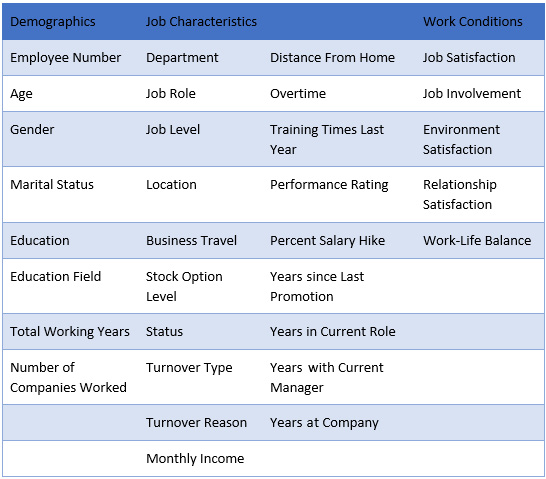
Table 8.1 – List of dataset fields
Data is not available on costs associated with employee turnover. Specific reasons for voluntarily leaving the job beyond resignation versus retirement are also not captured in the dataset. Hence, the report will not be able to address these aspects. Based on the business questions that the target audience wishes to be answered and inputs from the subject matter experts, a subset of the aforementioned attributes is chosen to be included in the report. Initial exploration of the data also suggested that some of the attributes are correlated with others, so they can be excluded as they do not provide any additional information. For example, Years in Current Role is highly correlated with Years with Current Manager, where the latter is deemed more useful to identify whether turnover indicates poor management. The following table lists the attributes that will be included in the report:

Table 8.2 – List of attributes to be analyzed in the report
Given the open-ended nature of the report’s purpose, the report should allow the users to interact with the visualizations and enable meaningful comparisons.
In practice, as a report developer, you will be conducting a thorough requirements gathering process in the determine stage to identify precise comparisons, slices, filters, interactions, and more that the report needs to include. In some cases, the target users may also provide specific visualization requirements such as chart types, report navigation, and more. The current approach works out many of these details during the design stage based on an understanding of the target audience and their objectives. Best practices are applied while designing and developing the report and some of the details may be refined iteratively based on user feedback.
Building the report - Stage 2: Design
In the design stage, you identify and define the key metrics needed to perform the analysis. You choose the right visualization types to present the data effectively. Then, you design the layout of the report and determine key interactive elements that may be needed. The idea is not to flush out every single detail in this phase; instead, it is to create the overall narrative and identify key elements, making sure the high-level design meets the needs of target users. It also often happens that some of the design decisions made in this stage may have to be modified or adapted during development, to improve their overall effectiveness and visual appeal. The extent of changes usually depends on both the level of thoroughness of the design process, as well as unforeseen technical challenges that arise during development. It is in this phase that you may also look at the data more closely and identify any data preparation and cleansing needs.
Note
Looker Studio is not built for robust data manipulation, so it is recommended to prepare the data outside the tool. The underlying dataset platform can be leveraged for this purpose, if possible. For flat files, you can use applications such as Google Sheets for data manipulation.
In Looker Studio, the data source is the logical abstraction of the underlying dataset. You can enrich the data source by defining appropriate data types for the fields and adding new derived fields and metrics.
Defining the metrics
The following key metrics help analyze employee turnover in useful ways:

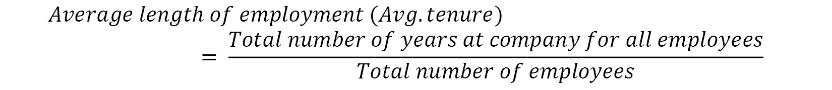
The average total number of employees (for the year) is calculated as the average of the number of employees at the beginning of the year and the number of employees at the end of the year:

The overall turnover rate is the basic metric that needs to be measured and tracked against benchmarks and targets. Turnover can be either voluntary or involuntary and it helps to look at this metric for each type of turnover to identify patterns and determine the right strategies to address issues:


If the voluntary turnover rate through resignation is high, this usually means employees are leaving for better opportunities. Changes to recruiting, hiring, and career growth practices can be considered to address this. Similarly, if the turnover through retirement seems high, proper succession planning could be implemented in time. A high involuntary turnover rate may indicate poor hiring decisions:
Understanding the average length of employment for all employees, as well as for those who leave the company, enables HR professionals to plan for timely interventions to increase retention. The turnover of recently hired employees results in sunk costs as they leave before they become fully productive. A very high new hire turnover rate also affects the company’s reputation. A better recruiting process is key to making sure the right people are sourced and hired. The onboarding experience also often plays a key role in new employees leaving the company:

A high turnover rate of low-performing employees, whether voluntarily or involuntarily, is a good sign. The costs usually outweigh the gains from these employees, so losing them is a benefit. Higher retention rates of low-performing employees may also impact others’ morale and productivity adversely. However, you need to keep the overall proportion of low-performing employees low in the company:

On the other hand, you want the high-performing – that is, star – employees to stay with the company as long as possible and keep their turnover rate as low as possible:

A composite employee satisfaction score can be calculated for each employee based on job satisfaction, environment satisfaction, and relationship satisfaction levels, as follows:

This composite score offers simplicity by allowing you to balance the individual satisfaction scores and providing a single value to measure the employee turnover against overall employee satisfaction in the job and work environment.
Choosing the visualization types
The Key Performance Indicators (KPIs) can be depicted as single numbers. Scorecards serve this purpose well. To compare the turnover rate against the industry benchmark (and company target), a bullet chart is a fine choice. Gauges can also be used for actual versus target comparisons.
The report needs to present the turnover rate metric for various attributes and allow effective comparison and pattern identification. Except for monthly income, all the other attributes are categorical. Bar charts can be used to compare the turnover rate by job roles, departments, and even office locations. The office location cities can be represented on a geographical map. However, only three cities are spread across different continents in the dataset. Plotting those three data points on a world map, while feasible, may not provide any additional utility. A bar chart, on the other hand, can visualize this data more effectively. Another aspect to keep in mind is not to use too many chart types in a report just for variety’s sake.
Dimensions such as Years at Company, Years since Last Promotion, Job Satisfaction, and others are ordinal. Hence, line charts can be leveraged to visualize those attributes. Combination charts with both bars and lines help depict multiple metrics along the same dimension effectively.
Donut (or pie) charts help show the proportion of turnover across categorial dimension values, especially those with only a few values. Examples include Gender and Overtime (whether or not an employee did overtime).
Considering the filters and their interactions
The report includes a detailed analysis of employee turnover while considering several attributes depicting patterns, comparisons, proportions, and more. This helps provide the maximum flexibility possible for users to interactively look at different cross-sections and slices of data. This can be achieved through cross-filtering, which allows users to understand the impact of different combinations of attribute values on turnover. With cross-filtering enabled for a chart, any user selections of data in the chart are applied as filters to all other charts on the report page.
Cross-filtering is more intuitive and offers greater flexibility in analyzing how specific dimensions and metrics affect each other than providing a bunch of explicit filter controls. Cross-filtering doesn’t provide any visual cues for users to filter in particular ways as opposed to filter controls, so it is not intrusive. Interactive filter controls, however, are useful for filtering the components by attributes that are not visualized on the page. These can be added as needed based on how the report is organized.
As a good practice, filter controls and cross-filtering should be added minimally to the reports. They should ideally only allow the desired and useful analytical journeys to meet the purpose of the report and not attempt to provide every possible way of slicing the data. Offering too many pathways may distract the users and make the report less effective. Furthermore, a large number of filters overloads the report and affects its performance.
For our current report, which presents a detailed analysis, enabling cross-filtering makes sense, as the users need the greatest flexibility in interactively analyzing various factors that influence employee turnover. In Looker Studio, cross-filtering is configured at the visual level and is enabled by default.
Designing the layout
Given that the report needs to include a detailed analysis of a large number of attributes, it can span multiple pages. It is important to ensure the report doesn’t look cluttered while at the same time providing a cohesive picture. The specific number of pages can be determined based on logically grouping the attributes either related to each other or providing interesting insights when they’re analyzed together. So, the layout largely depends on the scope, level of detail, and logical flow of the analysis.
The current report’s narrative can be organized into three pages:
- Overview: This depicts the overall key metrics and basic attributes such as department, job role, job level, location, and more
- Job characteristics: This depicts the turnover rate and its distribution across job attributes such as overtime, commute distance, years since last promotion, years with current manager, income, and more
- Employee demographics & perceptions: This depicts the metrics by key employee demographics such as gender and age group, as well as employee perceptions on satisfaction and work conditions
On each page, you can allow users to choose to visualize either overall or specific types of turnover – resignation, retirement, layoff (involuntary), and so on – dynamically. Interesting insights gleaned from the analysis can be called out on each page for the user’s benefit.
The next step is to create a wireframe of the report that depicts how various visuals and report components can be arranged on the canvas. On the Overview page, the key metrics are displayed at the top and the turnover rate by department, job role, job level, tenure at the company, and office location are arranged at the bottom, as shown in the following diagram. The insights are also placed in a relatively prominent place to capture the user’s attention:

Figure 8.1 – Handdrawn sketch demonstrating the wireframe of the Overview page
The Job characteristics page presents a series of charts visualizing turnover metrics for the job attributes – overtime, commute distance, years with current manager, years since last promotion, income, and amount of training in the past year. The insights are placed at the top:
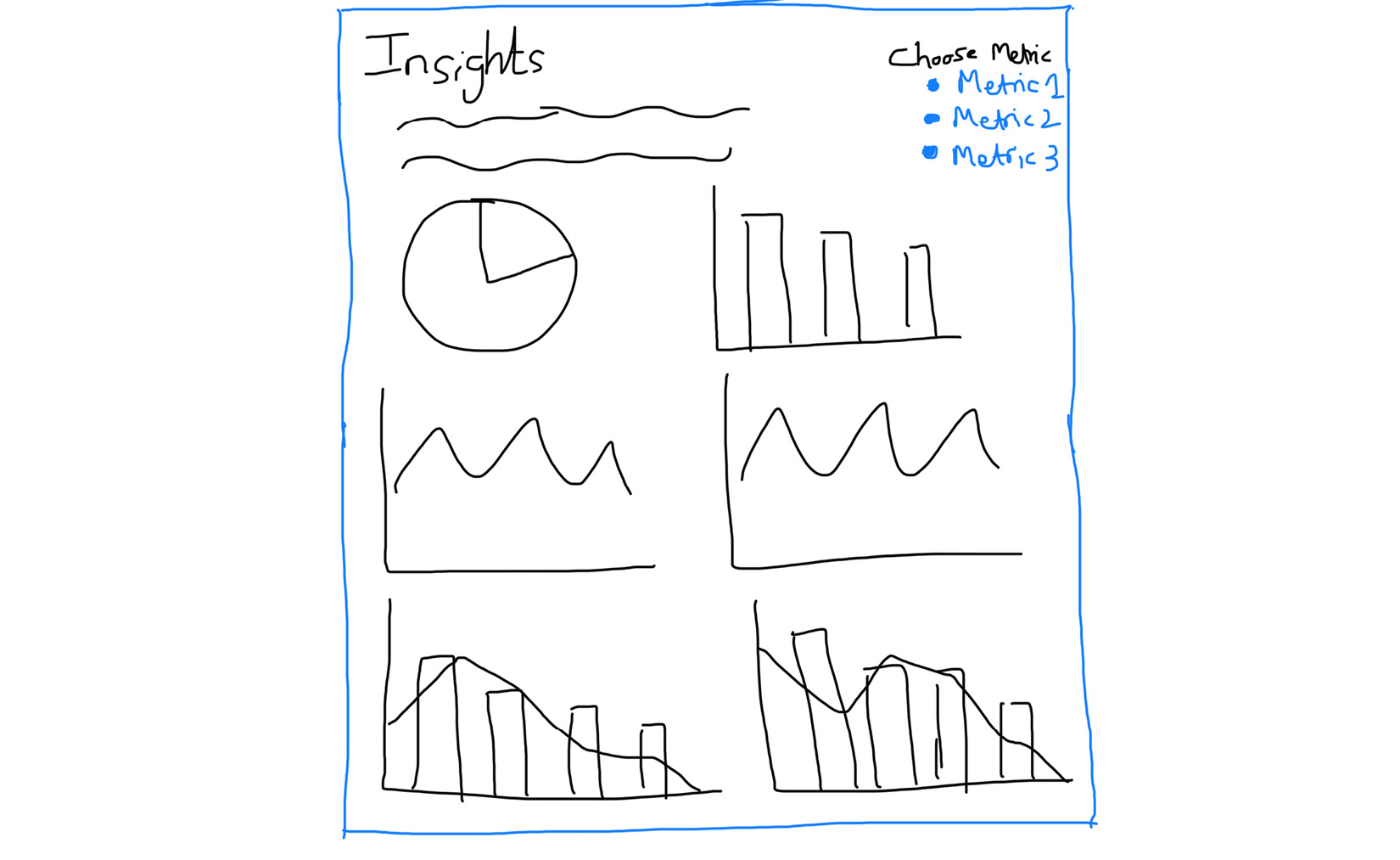
Figure 8.2 – Handdrawn sketch demonstrating the wireframe of the Job characteristics page
Likewise, the Employee demographics & perceptions page shows various charts that visualize the turnover metrics for employee demographics such as gender, age, and the total number of companies worked at, as well as employee perceptions of overall satisfaction, job involvement, and work-life balance:

Figure 8.3 – Handdrawn sketch demonstrating the wireframe of the Employee demographics and perceptions page
The design decisions that are made during this phase inform and guide the development of the report, which is the final stage in the process.
Building the report - Stage 3: Develop
Beyond the high-level design considerations made in the previous stage, implementing the report involves deliberations on details such as report theme and styling configurations, additional user interactions, calculated fields needed, and so on.
Setting up the data source
First, we must connect to the dataset using the data.world community connector and create the data source. Follow these steps:
- From the Looker Studio home page, select Create | Data source.
- On the Connectors page, search for and select the data.world partner connector and rename the data source Employee Turnover.
- If this is the first time you are using this connector, you need to authorize Looker Studio to use it:

Figure 8.4 – Authorizing Looker Studio to use the partner connector
- Clicking the Authorize button prompts you to allow the data.world connector to access your Google account (used with Looker Studio):
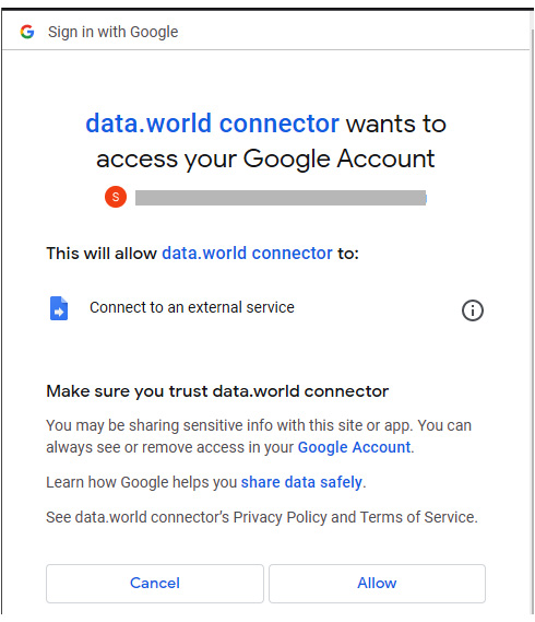
Figure 8.5 – Allow data.world connector to access your Google account

Figure 8.6 – Authorizing data.world
- Sign in to data.world:
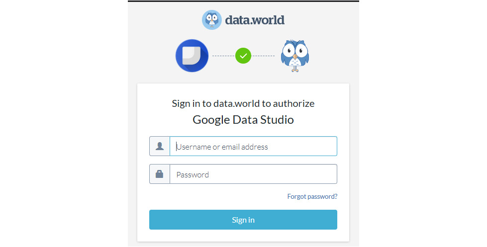
Figure 8.7 – Signing into data.world
- Provide the dataset details as follows and click CONNECT:
- Dataset or Project URL: https://data.world/sireeshapulipat/employee-turnover-analysis
- SQL Query: SELECT * FROM hr_employee_turnover_employeeturnover_tsv:
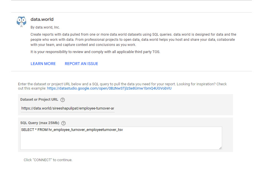
Figure 8.8 – Providing the dataset details
With that, the data source has been created.
Another way to add the data.world dataset to Looker Studio is by selecting Open with Google Looker Studio directly from the dataset page. This auto-populates the Project URL and SQL Query fields once the necessary authorization is in place:

Figure 8.9 – Looker Studio integration in data.world
In the data source editor, review the list of fields, their data types, and default aggregation methods to make sure they are appropriate. Make the following edits to the fields:
- Change the data type for monthlyincome to Currency (USD – US Dollar ($))
- Update the default aggregation for employeenumber to Count
Some fields in the dataset contain numerical encoded values that correspond to actual text values, as per the mappings provided on the data.world project page at https://data.world/sireeshapulipat/employee-turnover-analysis. You must add new derived fields with the decoded values to the data source to facilitate user reporting, as follows:
- Job involvement:
CASE jobinvolvement
WHEN 1 THEN 'Low'
WHEN 2 THEN 'Medium'
WHEN 3 THEN 'High'
WHEN 4 THEN 'Very High'
END
- Performance rating:
CASE performancerating
WHEN 1 THEN 'Low'
WHEN 2 THEN 'Good'
WHEN 3 THEN 'Excellent'
WHEN 4 THEN 'Outstanding'
END
- Work-life balance:
CASE worklifebalance
WHEN 1 THEN 'Bad'
WHEN 2 THEN 'Good'
WHEN 3 THEN 'Excellent'
WHEN 4 THEN 'Outstanding'
END
Now, you must create a new composite employee satisfaction score based on individual scores of job satisfaction, environment satisfaction, and relationship satisfaction.
- Composite satisfaction score:
ROUND((jobsatisfaction + environmentsatisfaction + relationshipsatisfaction) / 3, 0)
Now, you must map the scores to meaningful text values with an additional field.
- Overall employee satisfaction:
CASE Composite satisfaction score
WHEN 1 THEN 'Low'
WHEN 2 THEN 'Medium'
WHEN 3 THEN 'High'
WHEN 4 THEN 'Very High'
END
A common way to analyze age is by defining generations.
- Generation:
CASE
WHEN age <= 25 THEN 'Gen Z'
WHEN age <= 41 THEN 'Millennials'
WHEN age <= 57 THEN 'Gen X'
WHEN age <= 67 THEN 'Boomers II'
WHEN age <= 76 THEN 'Boomers I'
WHEN age <= 94 THEN 'Post War'
END
Generational analysis relies on the common formative events and experiences that shape each cohort while interpreting their attitudes and behaviors. The generational beliefs and behaviors may vary based on geography and are not truly global. For this reason, given that the current company has a global workforce, using a more generic age group categorization to define the cohorts of employees makes more sense. An added advantage to using age groups is that they are easier to interpret and understand compared to generational cohorts, which requires some mental processing and contextual knowledge of the users. Bucketing the age attribute allows you to analyze turnover by different age groups.
- Age group:
CASE
WHEN age < 25 THEN '24 and under'
WHEN age < 35 THEN '25-34'
WHEN age < 45 THEN '35-44'
WHEN age < 55 THEN '45-54'
ELSE '55 and above'
END
Now, you must create the various turnover metric fields needed for use throughout the report. These formulas are based on the definitions we determined in stage 1. To calculate the average total number of employees in the year, we must create a dimension field that identifies whether an employee is a new hire or not.
- Is new hire:
CASE yearsatcompany
WHEN 0 THEN 1
ELSE 0
END)
- Average number of employees:
((COUNT(employeenumber) – IFNULL(SUM(Is new hire), 0)) + COUNT(employeenumber)) / 2
Similar to the calculation of the Average number of employees metric, for calculating the turnover rate metric, we must compute the number of employees who left the company during the year as a separate field.
Note
Breaking down the components of a complex calculation into separate derived fields means easily interpretable and simpler formulas. It also allows reusability of the individual components and makes it easier to make changes to the logic when needed.
- Is employee terminated:
IF(status = 'Terminated', 1, 0)
- Turnover rate:
SUM(Is employee terminated)/ Average number of employees
- Voluntary turnover rate:
SUM(IF(turnovertype = 'Voluntary', 1, 0)) / Average number of employees
- Resignation turnover rate:
SUM(IF(turnoverreason = 'Resignation', 1, 0)) / Average number of employees
- Retirement turnover rate:
SUM(IF(turnoverreason = 'Retirement', 1, 0)) / Average number of employees
- Involuntary turnover rate:
SUM(IF(turnovertype = 'Involuntary', 1, 0)) / Average number of employees
- New hire turnover rate:
SUM(CASE
    WHEN Is new hire = 1
  AND Is employee terminated = 1 THEN 1 END) / SUM(Is employee terminated)
- Star employees terminated:
SUM(IF(performancerating = 4,Is employee terminated, 0))
- Star employees turnover rate:
Star employees terminated / SUM(Is employee terminated)
- Low-performing employees terminated:
SUM(IF(performancerating = 1,Is employee terminated, 0))
- Low-performing employees turnover rate:
Low-performing employees terminated / SUM(Is employee terminated)
- Terminated average tenure:
AVG(CASE
    WHEN status = 'Terminated' THEN yearsatcompany END)
Update the data type of all the “rate” metrics from Number to Percent in the data source. These are the basic calculated fields that you can create up front. Any additional fields that are needed during the report development can be added at that point.
Creating the report
From the data source page, select CREATE REPORT to create a new report and provide confirmation for adding the data to the report. Name the report Employee Turnover Analysis. Choose any desired report theme. I’ve chosen a custom theme generated from an image. In the LAYOUT tab of the Theme and Layout panel, choose the desired navigation type. I chose Tab navigation. Also, increase the height of the canvas to 1200 px to accommodate all the planned components on a page. These layout settings are shown in the following screenshot:

Figure 8.10 – Report layout settings
Build the pages using the wireframe that we sketched during the design phase as guidance. Prepare to adjust, modify, and fine-tune it as needed.
Page 1 – Overview
The first page of the report is the Overview page, which provides the list of key metrics and visualizes basic attributes. The finished page looks as follows. Let’s go through the development process and design choices for each component on this page:

Figure 8.11 – Fully developed Overview page of the report
To show the overall turnover rate against the industry benchmark of 13.2%, you can use a combination of bullet charts and scorecards. A bullet chart enables you to visually compare the actual value, not only against the target but also against defined ranges. The goal of the company is to keep the employee turnover below 12%, which you can use as one of the ranges. The Bullet chart type in Looker Studio does not allow you to display the actual and target values. The actual employee turnover value can be shown by using a scorecard and placing it near the bullet chart. Similarly, you can use the Text control to display the target value. The bullet chart data configurations are as follows:
- Set Turnover rate to Metric. Turnover rate is a calculated field that you created earlier in the data source.
- For the Range Limits values set 0.1 for Range 1, 0.12 for Range 2, and 0.18 for Range 3.
- Select Show Target and set Target value to 0.132.
You can retain the default styling settings.
The scorecard is created by selecting the Turnover rate metric in the SETUP tab. In the STYLE tab, set the decimal precision to 1 and apply a conditional formatting rule to display the metric value in red font if it exceeds 12%. Under Conditional formatting, click Add and define the rule, as shown in the following screenshot:
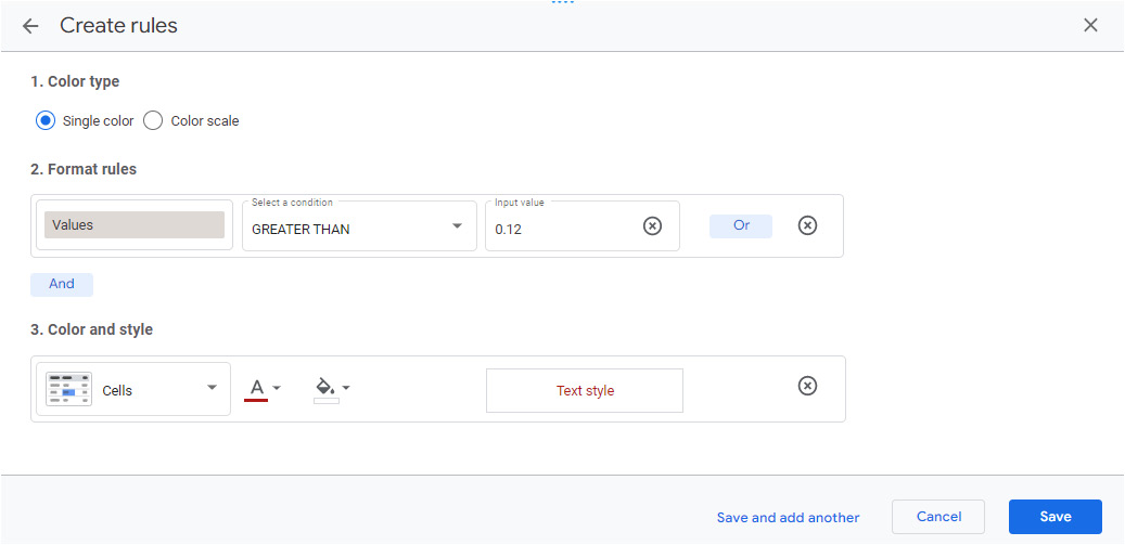
Figure 8.12 – Conditional formatting rule for the KPI scorecard
Show the other KPIs using four table charts, with each table presenting a set of related metrics. Tables are used instead of the obvious choice of scorecards to display these metrics, but only to achieve this specific look and feel. For each table, define the following configurations:
- The SETUP tab:
- Add the desired metrics
- Remove the default dimension that gets added to the table
- The STYLE tab:
- Increase the font sizes for Table Header to 20px and Table Labels to 36px
- Choose the appropriate color for the header background
- Uncheck Row numbers and Show pagination
- Set Decimal precision for each metric to 1
- Select Do not show for Chart Header
For the rest of the visuals, plot the turnover rate by job role, department, job level, performance rating, and length of employment, also known as tenure. The user can choose the type of turnover rate to view in these charts by selecting one from the list on the right. This can be achieved using parameters and calculated fields, as follows:
- Click ADD A PARAMETER from the data source editor (or the Available Fields pane of the report designer) and create the Turnover Type parameter with four values, as shown in the following screenshot. Choose Overall as the default value:
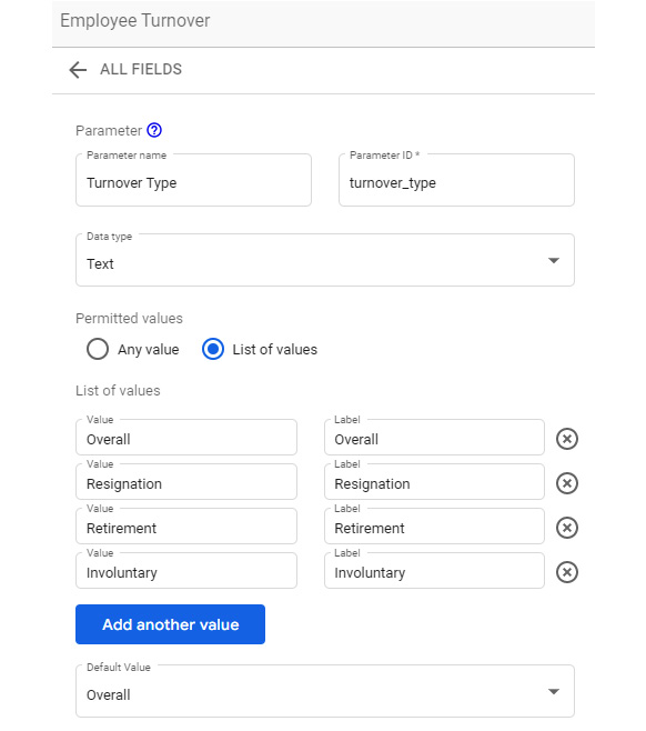
Figure 8.13 – Creating the Turnover Type parameter
- Create a calculated field called Turnover metric in the data source by clicking ADD A FIELD and using the following formula:
CASE Turnover Type
WHEN 'Resignation' THEN Resignation turnover rate
WHEN 'Retirement' THEN Retirement turnover rate
WHEN 'Involuntary' THEN Involuntary turnover rate
WHEN 'Overall' THEN Turnover rate
END
- Add a fixed list control to the canvas and choose the Turnover Type parameter as the control field. Choose an appropriate background color and text color. For both the header background and text, choose the same color that you chose for the control background. This hides the header text.
- The charts on the page, which are built using the new Turnover metric field, display the appropriate turnover metric based on the parameter selection.
You should visualize job roles, departments, and office locations using horizontal bar charts instead of vertical bar charts to allow the long attribute values to be displayed properly. Job roles and departments can be depicted within the same chart using the drill-down/up capability. The roles in each department are mutually exclusive except for the manager role, which exists in all three departments. So, it’s not a strict hierarchy. You must choose jobrole as the default dimension to display as there are only nine roles in total; this provides a more useful view of the data. The following configurations must be made for this:
- The SETUP tab:
- Choose department and jobrole as dimensions
- Enable Drill down and set Default drill down level to jobrole
- Add Turnover metric (which is driven by the parameter defined previously) as the metric field and rename it Turnover rate
- Sort the chart by Turnover metric in Descending order
- The STYLE tab:
- Remove the gridlines by setting Grid color to Transparent
- Hide Legend by choosing None
Build the chart for presenting the turnover rate by office location in the same way, using Turnover metric and just a single dimension with no drilldown. Once you have configured the data settings, you can copy and paste the styling from the previous chart you built. To do this, first, copy the job role chart. Then, select the office location chart, right-click, and choose Paste special | Paste style only. This is a quicker way to apply the same styling to different charts.
You can visualize the job level as a line chart since it is an ordinal dimension. Similar to the previous charts, build this chart with the parameter-driven Turnover metric field. Make sure that you sort the chart by the job level instead of the metric.
To analyze turnover by employee performance, in addition to looking at the turnover rate, it is useful to compare the proportions of total employees and those who left for each performance group. For top-performing groups, it is desirable to have the proportion of employees who left much lower than the proportion of all employees. Losing a star or high-potential employee has greater financial and reputational impacts than losing a non-star employee. You can use a combination chart to present this analysis. The following configurations must be made for this:
- The SETUP tab:
- Add the calculated Performance rating field as the dimension.
- Add employeenumber as a metric with Count or Count Distinct as the method of aggregation. Set Comparison calculation to Percent of total. Rename the field % Total employees.
- The next metric is based on the number of employees who left. To compute this number based on the Turnover Type parameter selection, a new calculated field is needed. Create it in the data source (rather than within the chart) as follows:
Is employee terminated – Turnover Type:
CASE Turnover Type
  WHEN 'Overall' THEN Is employee terminated
  WHEN 'Resignation' THEN Has employee resigned
  WHEN 'Retirement' THEN Has employee retired
  WHEN 'Involuntary' THEN Is employee laid off
END
Has employee resigned, Has employee retired, and Is employee laid off are derived fields that can be calculated as follows, respectively:
- IF(turnoverreason = 'Resignation', 1, 0)
- IF(turnoverreason = 'Retirement', 1, 0)
- IF(turnoverreason = 'Layoff', 1, 0)
Add this metric as the second metric field in the chart configuration with Sum as the method of aggregation. Set Comparison calculation to Percent of total and rename the field % Total employees left.
- Add Turnover metric (a dynamic metric driven by the Turnover Type parameter) as the third metric field and rename it Turnover rate.
- To sort the axis by performance rating, use the numerical performancerating field with Average as the method of aggregation. This ensures that the axis is sorted by the rating scores instead of the displayed textual values.
- The STYLE tab:
- Select Bars for the first two series and Line for the third series. Choose appropriate colors for all the series.
- Change the position of the legend to Bottom.
The final chart on this page is a line chart that represents the turnover rate by length of employment. A cumulative line is also added to depict the proportion of employees who left with each increasing year at the company. This shows that over 50% of the employees who left did so within 4 years of their tenure at the company. It’s also interesting to see that over one-third of new hires left the company within their first year. The following configurations must be made for this:
- The SETUP tab:
- Add yearsatcompany as the dimension.
- Add the Turnover metric field as a metric and rename it Turnover rate. Immediately, you will notice that the turnover rate value for 0 years tenure is high at 73%. Inspecting the data and calculations reveals that Average number of employees with 0 years at the company returns 22, whereas 44 employees are hired during the year. In this case, you should consider all the new employees to accurately compute the turnover rate. Hence, the turnover rate’s calculated metrics need to be modified as follows:
- Turnover rate:
SUM(Is employee terminated) /
CASE
WHEN SUM(yearsatcompany) = 0 THEN SUM(Is new hire)
ELSE Average number of employees
END
- In all the calculated fields where Average number of employees is used as the denominator, replace it with the following:
CASE
WHEN SUM(yearsatcompany) = 0 THEN SUM(Is new hire)
ELSE Average number of employees
END
- The following calculated fields need to be modified:
- Turnover rate
- Involuntary turnover rate
- Voluntary turnover rate
- Resignation turnover rate
- Retirement turnover rate
This change doesn’t impact any other charts.
- Sort the chart by yearsatcompany in ascending order.
- The STYLE tab:
- Set Cumulative to Series #2.
- Add a reference line of the Constant value type and set the value to 0.5 to represent the 50% line. Choose an appropriate color and label text.
- Change the position of the legend to Bottom.
Add a rectangle shape to the page to enclose the bottom charts. Send the rectangle back from the Arrange menu. This rectangle provides a visual cue to the users that the turnover type selected from the list applies to only these charts.
Add titles to all the charts using Text control. Also, add insights in a text box under the KPIs section. If needed, adjust the canvas size from the Current Page Settings panel’s STYLE tab to make sure all the charts can be arranged properly with enough whitespace for an uncluttered look.
Page 2 – Job characteristics
The second page of the report includes an analysis of various job characteristics, including overtime, commute distance, years with the current manager, years since the last promotion, monthly income, and the amount of training in the past year:

Figure 8.14 – Fully developed Job characteristics page of the report
The turnover metrics depicted in all the charts on this page are determined by the turnover type that the user selects. Copy the fixed control list from the previous page and paste it into the top right on the second page.
A donut chart is used to visualize the proportion of employees who left according to whether they did overtime or not. To create this chart, you need a new dynamic field that is driven by the Turnover Type parameter. Create the field as follows:
Is employee terminated – Turnover type:
CASE Turnover Type WHEN 'Overall' THEN Is employee terminated WHEN 'Resignation' THEN Has employee resigned WHEN 'Retirement' THEN Has employee retired WHEN 'Involuntary' THEN Is employee laid off END
Choose this field as the metric for the donut chart. While this is useful information, the users may also need to look at the actual turnover rate for each category to understand the impact overtime has on turnover. A simple line chart can be used to represent the turnover rate. Since there are only two values, you must make it look like a slope graph by hiding the axes and other chart elements. Then, you must add category labels using text controls. The following configurations must be made for the Overtime line chart:
- The SETUP tab:
- Add overtime as a dimension and Turnover metric as a metric. Rename the Metric field Turnover rate.
- Sort by overtime in Descending order. This ensures that the order of categories does not change based on the metric value and that we can use static text labels for the categories.
- The STYLE tab:
- Set the line color to black (so that it matches the text color).
- Select Show Points and Show data labels.
- Unselect Show axes. For Y-Axis, set Axis Max to 0.6 to reduce the slope of the line. This limit works with our data as the turnover rate doesn’t exceed this value for any combination of attribute selections.
- Hide the gridlines by making the color transparent. Keep the legend in the default Top position.
Commute distance, Years with current manager, Years since last promotion, and Number of trainings in the past year can be analyzed by visualizing three metrics:
- Turnover rate
- Percent total employees
- Percent total terminated employees
Comparing the percent total terminated employees against the percent total employees for different values of the attribute allows users to identify any significant differences in proportions that may indicate a problem area.
You can use combination charts to visualize Years with current manager, Years since last promotion, and Number of trainings in the past year. For Commute distance, use lines for all the series as it is not preferable to use bars for a large number of categories. These four charts use the same configurations, as follows:
- The SETUP tab:
- Use the appropriate field as a dimension (distancefromhome, yearswithcurrmanager, yearssincelastpromotion, or trainingtimeslastyear).
- Add the employeenumber field as a metric, set Comparison calculation to Percent of total, and rename it %Total employees.
- Add Is employee terminated – Turnover Type as the second metric. Set Comparison calculation to Percent of total and rename it % Total employees left.
- Add Turnover metric as the third metric and rename it Turnover rate.
- Sort by the Dimension field in Ascending order.
- The STYLE tab:
- Except for the commute distance chart, select Bars for Series #3, which represents Turnover rate.
- Hide the gridlines and change the position of the legend to Bottom.
Since the monthly income is a continuous value, you must use a scatterplot to visualize it. Since income is correlated to the job level, it can be used as the second metric on the y axis. Each bubble represents an individual employee and the color of the bubble indicates which employees are no longer with the company. To identify only the employees who left by the user-selected turnover type, a new calculated field needs to be created, as follows:
Status – Turnover Type:
CASE Is employee terminated - Turnover type
  WHEN 1 THEN 'Terminated'
  ELSE ' '
END
The following configurations need to be made for the scatterplot:
- The SETUP tab:
- Add employeenumber to the Dimension field.
- Add the newly created Status – Turnover Type field as the second dimension.
- Choose monthlyincome for Metric X and rename it Monthly income. Use Sum as the method of aggregation.
- Choose joblevel for Metric Y and rename the field Job level. Use Average as the method of aggregation.
- Choose employeenumber with Count aggregation for Bubble Size Metric. This returns the same value for each data point, so the bubble size doesn’t vary. However, choosing a bubble size metric field enables you to adjust the bubble size in the STYLE tab. By doing so, you can make the bubble bigger or smaller.
- The STYLE tab:
- Adjust the bubble size on the slider
- Choose Status – Turnover Type for Bubble Color and select the appropriate colors
- Select Show axis title for both axes
- Set the position of the legend to Bottom
Note
In the chart legend, I’ve hidden the bubble associated with the empty value by overlaying a circle shape with a white background (so that it matches the chart’s background) on top of it.
Add appropriate titles for the charts using Text controls. Also, add the identified key insights at the top.
Page 3 – Employee demographics & perceptions
The final page of the report provides information on how turnover may be affected by employee age, gender, and the total number of companies that employees worked for in their careers. It also visualizes the turnover rate by employee perceptions of work-life balance, job involvement, and overall work satisfaction. Similar to the other pages, the users can select the type of turnover metric to look at on this page as well by selecting the parameter value from the fixed list control:

Figure 8.15 – Fully developed Employee demographics & perceptions page of the report
For analyzing turnover by gender, use a donut chart and minimal line chart, similar to what we did for the Overtime attribute analysis. The donut chart displays the proportion of male and female employees who left the company during the year, while the line chart shows the turnover rate for each gender type. Use the calculated Is employee terminated – Turnover Type field for the donut chart and the Turnover metric field for the line chart. Refer to the previous section for detailed configurations for these two charts.
To understand patterns of turnover by employee age, the turnover metrics must be plotted for different age groups. A pie or donut chart can be used, as originally envisioned in the wireframe or mockup, to depict the proportional breakdown of the turnover metric by different age groups. However, upon working with the data during the development process, providing additional context is deemed to help with effectively analyzing this attribute. A bar and line combination chart is the appropriate choice here. The proportion of total employees and the terminated employees for each age group are visualized to help users understand variations in the distributions, along with the turnover rate. The following configurations must be made for this combo chart:
- The SETUP tab:
- Add the calculated Age group field as a dimension.
- Add employeenumber as a metric with Count as the method of aggregation. Set Comparison calculation to Percent of total and rename the field % Total employees.
- Add Is employee terminated – Turnover Type as the second metric with Sum as the method of aggregation. Set Comparison calculation to Percent of total and rename the field % Total employees left.
- Add Turnover metric as the third metric field and rename it Turnover rate.
- Sort by Age group in ascending order.
- The STYLE tab:
Analyzing the remaining attributes while visualizing only the turnover metric is sufficient and provides the necessary insights. Use the parameter-driven Turnover metric field as a metric in each of these charts. Plot Employee satisfaction and Job involvement as bar charts, and the remaining two attributes as line charts. The following configurations need to be made for this:
- The SETUP tab:
- Use the appropriate field as a dimension for each chart – that is, numcompaniesworked, Work-life balance, Overall employee satisfaction, and Job involvement.
- Add Turnover metric as a metric and rename it Turnover rate.
- Sort by the Dimension field in Ascending order. For Work-life balance, Overall employee satisfaction, and Job involvement, use the respective numerical encoded fields – that is, worklifebalance, Composite satisfaction score, and jobinvolvement – to appropriately sort the attribute values along the axis. The following screenshot shows the data settings for the Work-life balance chart:

Figure 8.16 – Setup configurations for the Work-life balance line chart
- The STYLE tab:
- Hide the gridlines and legend
Add the appropriate titles to all the charts using Text controls. Then, display the identified insights at the top. Adding a description of the overall employee satisfaction attribute for the corresponding chart is helpful.
Cross-filtering is enabled by default for all charts. In this report, just leave the default behavior as is to allow the users to interact with the charts flexibly.
Throughout this report, care has been taken in the following areas:
- Colors were used consistently and sparingly. This mainly means not using too many different hues, using color purposefully, and using the same color to represent the same dimension or metric across various charts.
- The report components were organized, aligned, and formatted properly. This includes using consistent text and other forms of styling, aligning charts and axes uniformly, arranging the components intelligently to improve readability, and more.
- Enough whitespace was left to avoid clutter. This avoids or minimizes chart junk (any design elements that do not add information).
Now, let’s summarize what we’ve learned in this chapter.
Summary
In this chapter, you developed a detailed report for analyzing a fictitious company’s employee turnover to address the HR department’s business questions. You used a public dataset available on the open data community called data.world. You followed the three-step approach to building data stories. First, you determined the target audience, their objectives, the questions they want to get answered, and the data available and needed for the analysis. Next, you defined the key metrics, chose the right visualizations to present data effectively, identified the filters and interactions needed to meet the objectives, and created wireframes for the report pages. Finally, you went through the report development process and reviewed many of the implementation considerations, including creating calculated fields and parameters, chart configurations, and other report elements. In the next chapter, we will work on a different example and use a dataset from Google BigQuery.