
11
Monitoring Report Usage
When you have one or more dashboards built and shared with the target audience, you may want to understand how users are engaging with and using these dashboards. After all, when you get a sense of how well the data story you've created is being received, you can then take any actions needed to increase adoption. Looker Studio allows you to monitor report usage through Google Analytics (GA). GA is a web and mobile application Analytics service offered by Google that tracks and reports user traffic. This chapter will examine what tracking report usage involves and walk you through the process of leveraging GA for this purpose. You will learn about relevant GA concepts and its built-in reports for analyzing usage. Alternatively, you can leverage Looker Studio to visualize the usage metrics. Furthermore, you can analyze raw usage data in BigQuery by exporting it from GA.
In this chapter, we are going to cover the following topics:
- Usage monitoring overview
- Google Analytics primer
- Monitoring Looker Studio report usage with GA4
- Exporting GA4 data to BigQuery
Technical requirements
To follow the implementation steps in this chapter, you need to have a Google account that can be used with GA and Looker Studio. It is recommended that you use Chrome, Safari, or Firefox as your browser.
Optionally, you will need access to Google BigQuery if you wish to follow the steps on exporting GA data. BigQuery Sandbox is available to anyone with a Google account. You can learn about getting access to the sandbox at https://cloud.google.com/bigquery/docs/sandbox. This does not require a billing account and has limited capabilities. The sandbox serves the purpose of this chapter. Another option is to sign up for a 90-day free trial of Google Cloud Platform (GCP) at https://cloud.google.com/free, which offers a full breadth of capabilities and features.
Usage monitoring overview
Monitoring the usage of reports has several benefits. Knowing how various reports and dashboards are being used helps in both demonstrating your impact and prioritizing your efforts. Even if Looker Studio makes it very easy to create reports, it takes a decent amount of effort and time to build a well-thought-out and properly designed dashboard. You want to invest your efforts where the users will find the results to be most beneficial. Analyzing user traffic data and patterns also helps you identify potential usability issues. Then, you can optimize your reports appropriately to increase their utility. For example, a low engagement rate may indicate that many users do not find the dashboard very useful or find it hard to understand.
Tracking report usage enables you to get answers to questions such as the following:
- How many users are viewing the dashboards?
- How long are they spending on different dashboards?
- How often are they visiting the dashboards?
- Which dashboards are the most popular and show an increasing adoption rate?
- Which dashboards exhibit a decreasing trend of usage?
- Which devices and screen resolutions are being used to view the dashboards?
- Which geographical location do the users belong to?
Dashboard proliferation is a common scenario where a lot of dashboards get created, many of which do not exhibit any sustained use. A lack of or low usage can signify one or more of the following issues:
- The problem or objective that the dashboard addressed isn’t relevant anymore
- The dashboard doesn’t meet the needs and expectations of the target users
- The dashboard isn’t intuitive or is difficult to understand and navigate
- Data is inaccurate or stale
- Users can't find the dashboard easily or do not have access
Upon noticing low or no report usage, follow up with the target audience to uncover specific problems. Then, you can take appropriate action to address the concerns and make the dashboards usable. A common cause of low dashboard adoption is a lack of good requirements understanding and poor design upfront. Improving the design to fit the audience’s needs may help in increasing the dashboard’s utility. In the case of obsolete or changed needs, you can delete or repurpose the dashboards, respectively.
In addition to the usage or engagement level, understanding user device attributes such as device type and screen resolution helps you adapt dashboard design based on changing patterns. For example, if users are increasingly using mobile devices and other lower-resolution displays to view the dashboards, you may want to reduce the canvas size and reorganize the report layout to provide a better user experience.
Alternatively, you might want to create different versions of the report to provide the best layout for different screen resolutions.
Looker Studio provides a built-in way to track report usage through GA.
Google Analytics primer
This section provides a brief overview of GA concepts and its built-in reports. If you are already familiar with GA, you can skip this section and move on to the next. GA is a web Analytics service that tracks website (and mobile application) traffic and provides tools to analyze it. It is part of the Google Marketing Platform brand and is primarily used for digital marketing and search engine optimization purposes. For instance, it helps you measure site and campaign performance, understand your customer demographics and device attributes, and so on.
GA is a user-friendly and free tool, the latest version of which is called GA 4, or GA4 for short. GA4 supersedes Universal Analytics (that is, GA3), which was introduced in 2012 and will reach end-of-life by June 2023. At the time of writing, Google Universal Analytics is still used by millions of sites and applications. Compared to the Universal Analytics version, GA4 uses a completely new data and measurement model.
The premium or paid version of GA is called GA 360, which provides larger event collection limits, better integrations with marketing tools, advanced customizations and Analytics, service-level agreements (SLAs), and guaranteed data freshness. Understanding GA and its features and use cases comprehensively is a huge topic by itself. In this chapter, we will focus only on GA4 and touch upon a subset of concepts and features relevant to our current purpose – that is, Looker Studio report usage monitoring.
GA4 comprises the following hierarchy:
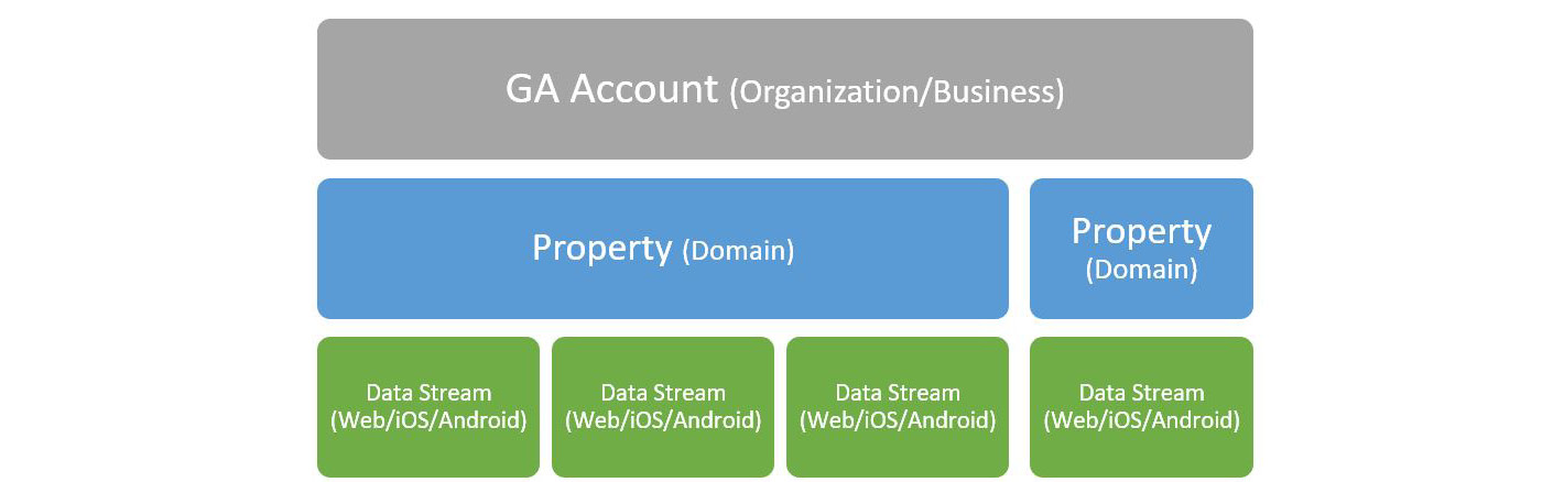
Figure 11.1 – GA4 hierarchy
A GA account is associated with your Google account. As a rule of thumb, you only need a single GA account for a business or an organization. You can create more than one GA account if you are managing multiple organizations.
A property is defined for a domain – that is, a single website or an app. All the subdomains are automatically tracked by the property. This property provides the reporting view of all the data tracked for that site or app. Multiple properties are needed only when you have different logical applications to track. A property receives data through data streams. A data stream can be one of three types – web, iOS, or Android. You can create multiple data streams for a property to track data from different channels – the website, iOS app, or Android app – of a single application. For example, an eCommerce application that has a website and an iOS app will need two corresponding data streams to be created so that you can look at user traffic and engagement across the two and analyze them together. When you want to track two different applications, such as supplier management and customer service, you must create two properties – one for each – and analyze the reports separately.
Understanding GA reports
Out of the box, GA4 provides a rich set of reports and charts under the following categories:
- Acquisition: This depicts new and returning users, and channels of acquisition such as direct, organic search, social media, campaigns, and so on.
- Engagement: This provides reports on user activity such as events, views, engagement time, and conversions. You can view these metrics for specific web pages or app screens as well.
- Monetization: This displays metrics regarding purchasing activity and revenue generated from eCommerce, in-app purchases, subscriptions, and ads.
- Retention: This helps you understand returning users through trends, cohort analysis, and lifetime value.
- User demographics: This provides user segments based on demographic attributes such as geographic location, age, gender, and interests. This data can be captured through Google Signals for users who have signed into their Google account and turned on Ads Personalization. Having user-level data helps in understanding the cross-device behavior of users.
- Tech: This presents metrics on the technological factors such as platforms, devices, operating systems, browsers, app versions, and more that users use to access and interact with the application.
You can view these reports for different times by selecting appropriate values such as This week, Last 28 days, Last 30 days, This Year, and so on or by defining a custom date range. You can also compare the metrics for subsets of users to analyze these reports meaningfully. For example, you can compare overall engagement with that of users of a certain age group or look at the trends of new customers acquired in three different countries, and so on.
You can also add additional attributes to tables to further break down the metric values. These attributes are referred to as secondary dimensions. Other ways you can interact with and customize the built-in reports include pivoting data, adjusting the sampling size to optimize it for either greater precision or for faster response (sampling is used when the data volume hits the sampling threshold or when advanced analytics are employed), and more.
If you are completely new to GA and haven’t set it up for any application yet, you can use the demo account provided by Google to explore and examine the standard reports. The demo account consists of two GA4 properties:
- Google Merchandise Store (with a web data stream): Tracks data for the eCommerce website that sells Google-branded merchandise.
- Flood-It (with three data streams each corresponding to the web, iOS app, and Android app): Tracks analytics data for the Flood-It strategy puzzle game in which players need to flood the game board with a single color within the allowed number of steps.
These properties can be accessed as a viewer using the following links:
- GA4 – Google Merchandise Store: https://analytics.google.com/analytics/web/#/p213025502
- GA4 – Flood-It!: https://analytics.google.com/analytics/web/#/p153293282
You can find these links and details of the demo account in the GA Help documentation here: https://support.google.com/analytics/answer/6367342.
The following screenshot shows Reports snapshot, which provides an overview based on the detailed reports and acts as the landing page for the Reports section. You can customize Reports snapshot and determine charts and metrics that are shown as part of it. You can also create an overview report and set it as a Reports snapshot:
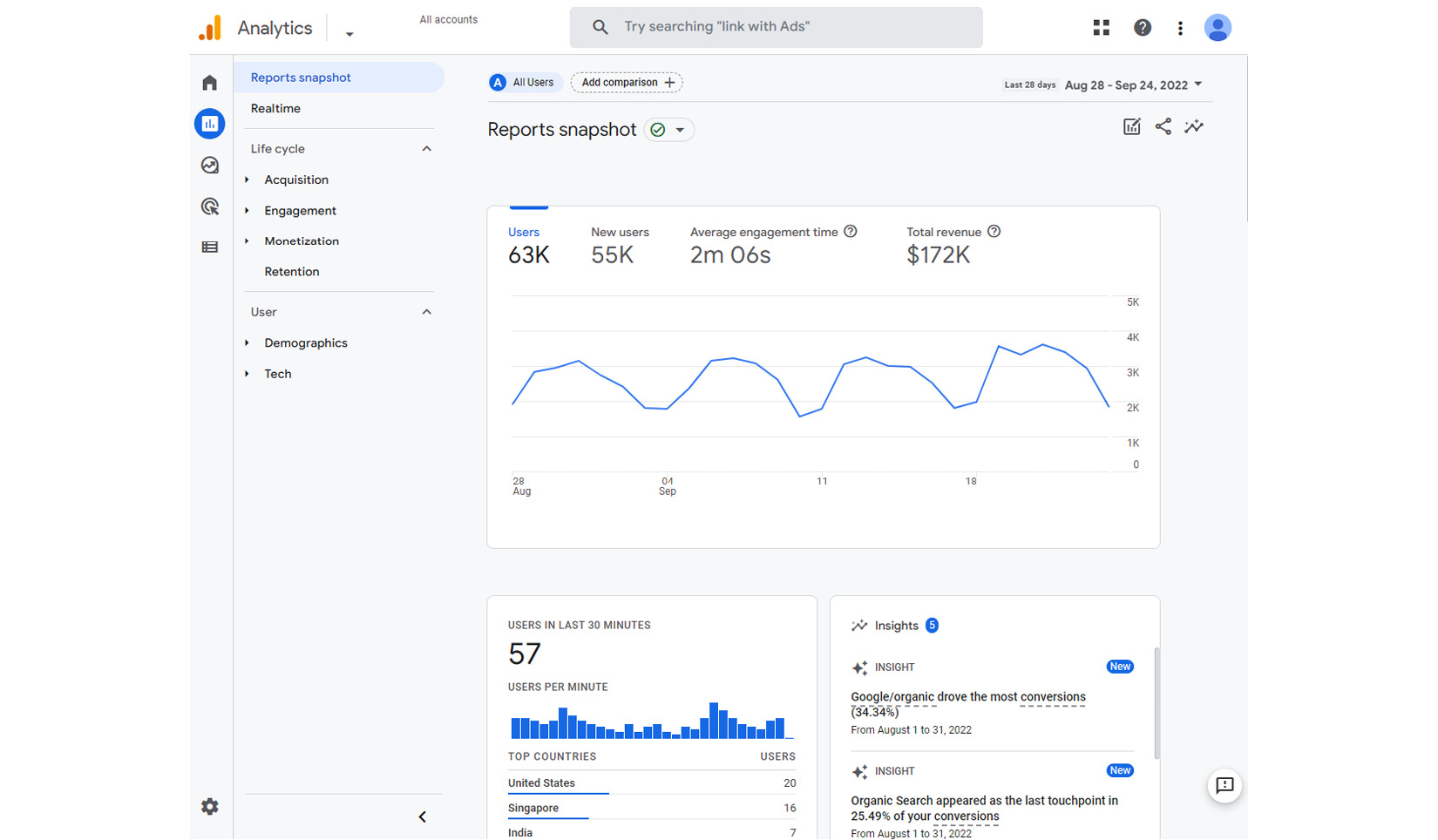
Figure 11.2 – GA4 Reports snapshot provides an overview of all standard reports
In addition to all the built-in reports and the ability to customize them to suit your needs, you can also create new charts and reports based on existing reports using templates or build from scratch.
It takes about 24 to 48 hours for the data to flow into GA. The Realtime view enables you to monitor user activity in real time. It shows key metrics such as the number of users, events, conversions, and so on for the last 30 minutes. If there has been no activity in the past 30 minutes, the Realtime report shows no data. The following screenshot displays the Realtime report for the Flood-It application:
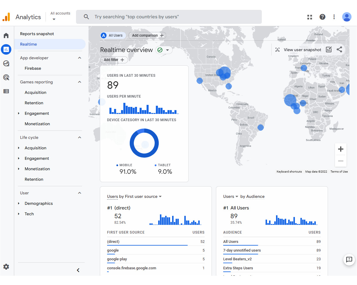
Figure 11.3 – GA4 Realtime report depicts user activity in the last 30 minutes
GA makes it easy for you to analyze and understand this data by providing automated insights. These insights are generated using machine learning (ML) and other intelligent processes by automatically detecting unusual trends and changes in data. These insights are surfaced as small cards on the Analytics home page and Reports snapshot. You can click on View all insights to view the Insights dashboard. Clicking on an insights card shows additional details on the right, as shown in the following screenshot:
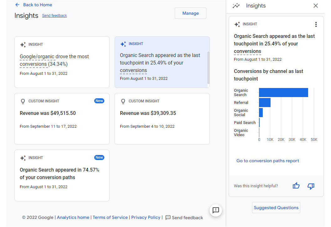
Figure 11.4 – GA4 provides automated insights based on trends and emerging changes
You can create custom insights to detect and alert on conditions that are meaningful to you. You can base your custom insights on suggestions such as anomalies in daily users, daily conversions, daily views, and more, or create them from scratch by defining your own rules. You can access relevant insights from any report by clicking the insights icon at the top right and choosing the desired insight. The following screenshot shows the list of available insights in the form of questions on the Engagement overview report, which you can then select and get the answers to:
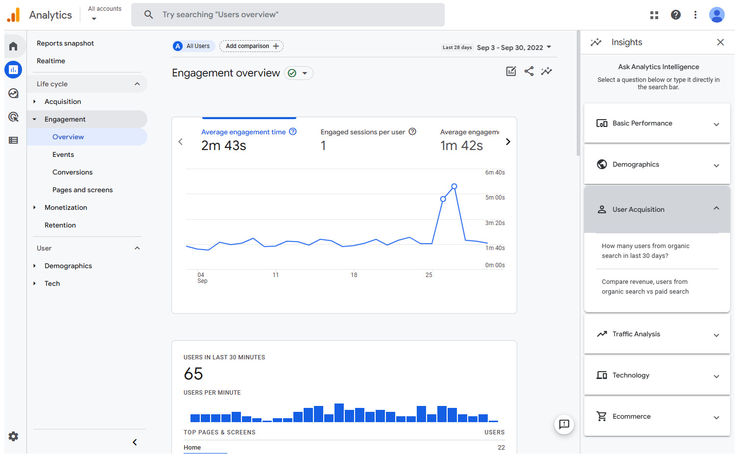
Figure 11.5 – Accessing the relevant insights for each report
Explorations are another feature of GA that enable you to analyze data in more detail and perform ad hoc queries. This provides additional flexibility in interpreting the data and helps in uncovering deeper insights.
Note
Explorations enable you to look at more granular data - at user and event level - but only for a limited timeframe, subject to the data retention settings that GA has in place. You can choose the desired length of retention within the limits. At the time of writing, GA4 allows you to retain the unaggregated granular data for up to 14 months. This restriction applies to only the Explorations reports. All the standard reports show aggregated data, and the data retention setting does not affect them.
To monitor Looker Studio report usage, some metrics and reports are more useful than others. The most applicable and relevant are as follows:
- No. of users – new and returning
- No. of views
- Average engagement time
- Engaged sessions
- Views and users by Pages
Monetization metrics are not relevant to Looker Studio reports. While you can define events such as scrolls or page views as conversions, it’s not meaningful in this context. Analyzing user demographical and technological attributes may be useful in a limited way, especially if the reports are shared with a large user base – either publicly or widely distributed within an organization and/or its clients, partners, and so on.
In such cases, it helps to analyze key metrics by user categories such as location, age group, device, platform, and so on, and identify any interesting patterns. For example, consider a report shared broadly within a global organization. If the usage by users from a particular country or city is steadily decreasing, you may suspect that the needs of the team or business group that is based in that location changed and they do not find the report useful or relevant. Then, you can follow up with that team and determine the next steps. Technology attributes such as operating system and app version are not useful to you as Looker Studio users, as it is a browser-based tool that’s managed by Google.
GA enables you to track individual users so that they can be identified across devices, browsers, sessions, and more. This helps in better understanding user journeys and accurately measuring unique users, and it generally helps with attribution. The user ID should be generated by the application and not contain any personally identifiable information (PII) in it, such as name, email address, phone number, and so on. Looker Studio does not provide this information at the time of writing.
Monitoring Looker Studio report usage with GA4
You can monitor Looker Studio report usage by adding a GA Measurement ID to each of the reports.
Setting up GA4 for Looker Studio report monitoring
Let’s walk through the steps of setting up GA4 for Looker Studio monitoring and tagging the reports for tracking:
- Visit https://analytics.google.com. Log into your Google account if you haven’t done so already.
- If you haven’t used GA before, you will see the welcome screen. Clicking the Start measuring button will take you to the Account setup page. Alternatively, if you have used GA before, you can create a new account from the Admin page.
- Provide the following details:
- Account name
- Property name
- Optionally, account data sharing settings and business information
- Click Create and accept the terms of service and data protection terms.
- Next, you will see the ADMIN page, where you can set up a data stream to collect the data:
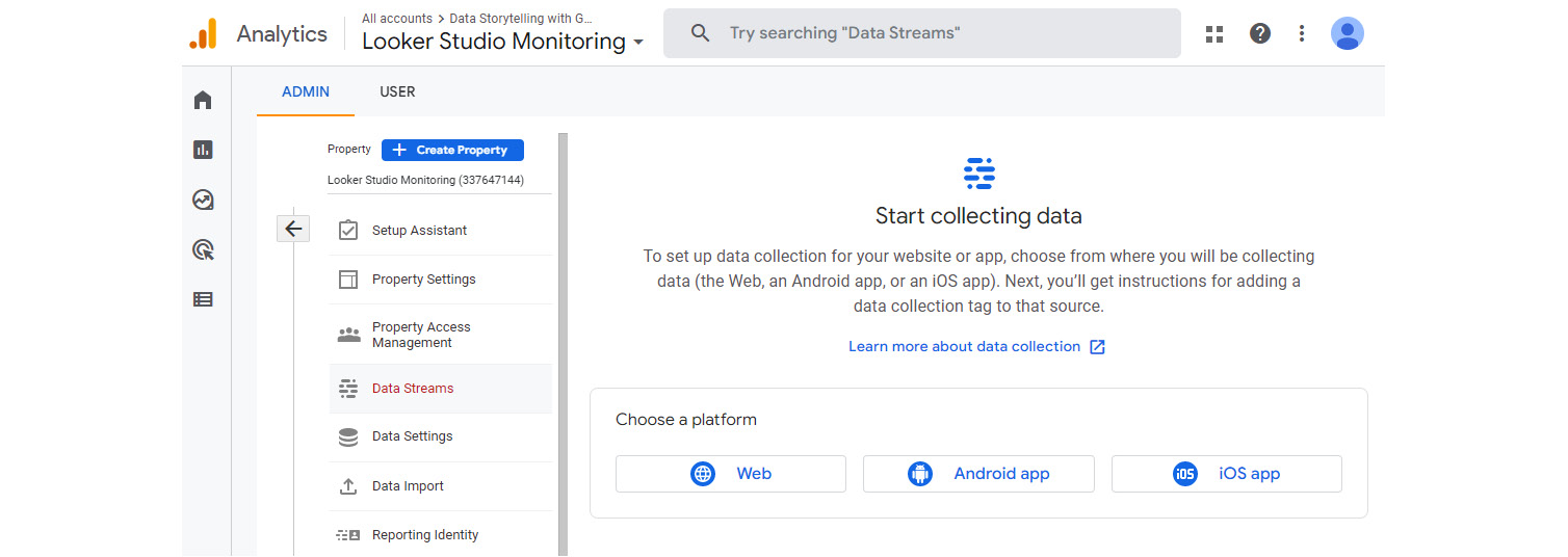
Figure 11.6 – GA4 account admin settings
- Choose Web and set Website URL to https://lookerstudio.google.com; also, provide an appropriate Stream name. Leave Enhanced measurement turned on, which tracks events such as page views, scrolls, outbound clicks, and more. Then, click Create stream:
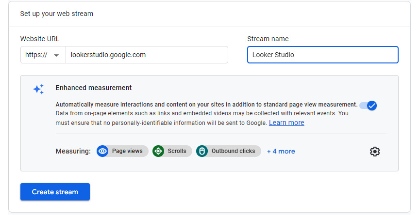
Figure 11.7 – Setting up a web data stream to collect data
- From the Web stream details page, copy the MEASUREMENT ID property to add it to Looker Studio reports:
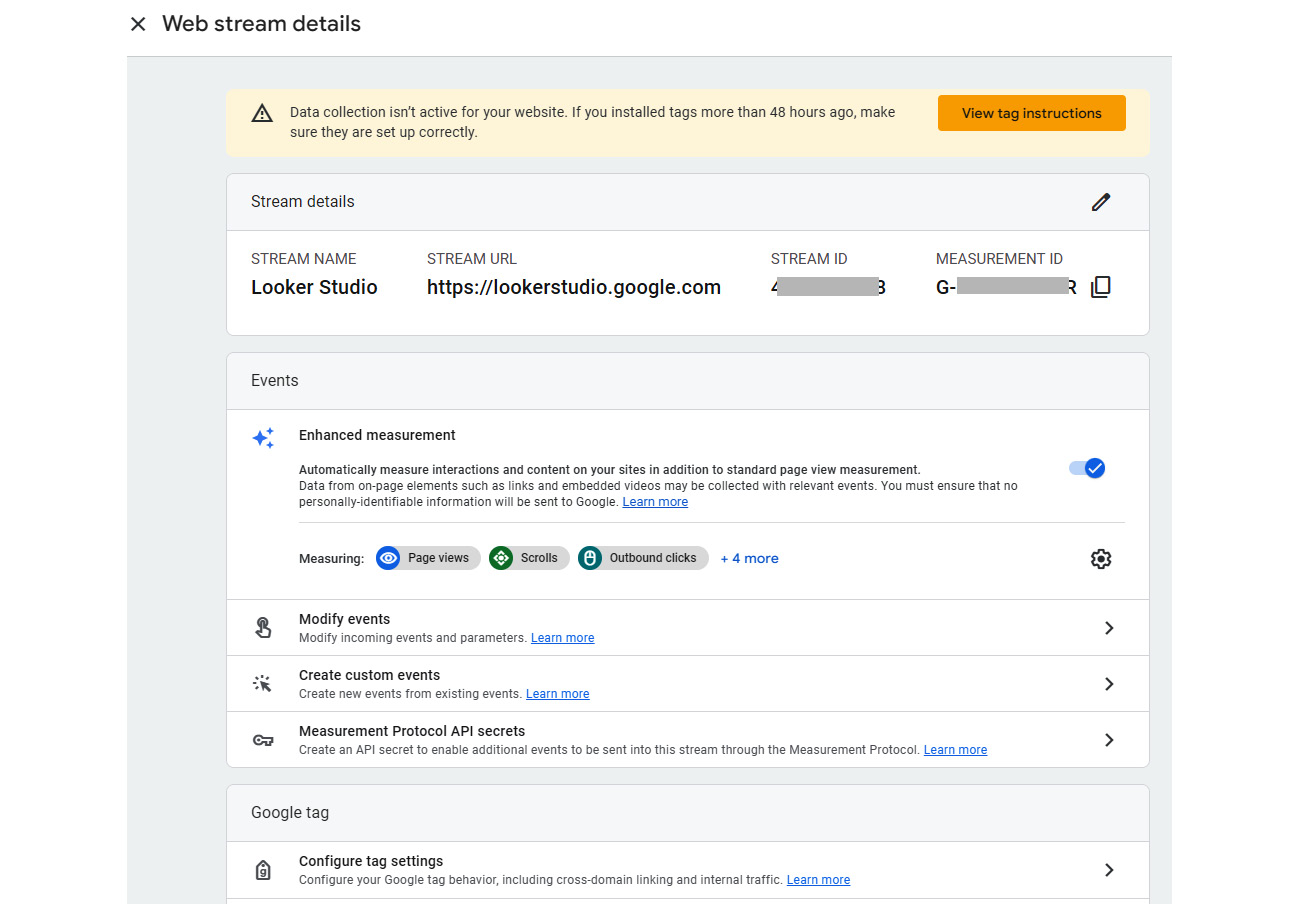
Figure 11.8 – Getting the Measurement ID from Stream details
- Open your Looker Studio report in Edit mode and from the File menu, select Report settings. Enter the measurement ID from the GA4 web stream. Do this for all the reports that you would like to track usage for:
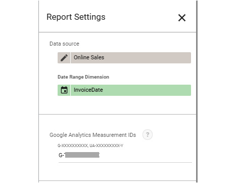
Figure 11.9 – Adding the measurement ID to Looker Studio reports
Data will start flowing into GA within 24 to 48 hours and you can peruse the built-in reports to monitor their usage. Instead of plowing through the significant number of standard reports to find the relevant information and review their usage, you can create custom reports within GA using just a handful of relevant dimensions, metrics, and charts that serve your purpose and needs.
Creating a custom report in GA4
In GA, you can create a detailed report by choosing the dimensions and metrics of your choice and an overview report by choosing the visualization cards from the existing detail reports. These reports can then be organized into collections and topics. A collection is a top-level container that appears as a section in the left navigation panel within Reports. A collection can have one or more topics, each of which represents a sub-collection of reports typically organized around a single theme or analysis. Each topic can have, at most, one overview report and one or more detail reports. In the following screenshot, Life cycle represents a collection, which contains multiple topics – Acquisition, Engagement, Monetization, and Retention. The Acquisition topic contains an Overview report and two detail reports – User acquisition and Traffic acquisition:
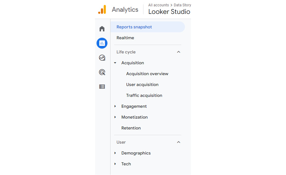
Figure 11.10 – Reports are organized into collections and topics
Follow these steps to create a collection and topic:
- From the Reports left navigation, select Library at the bottom. Select the Create new collection tile under the Collections section. Then, select Blank. You can also create a collection using the templates available.
- Provide a name for the collection, such as Looker Studio Report Usage. Click Create new topic and specify the name as, for example, Report usage.
- You can drag and drop detail and overview reports under the topic from the available list on the right. These reports include all the out-of-the-box reports as well as any custom reports you have created. For this collection, we will create custom reports and add them later:
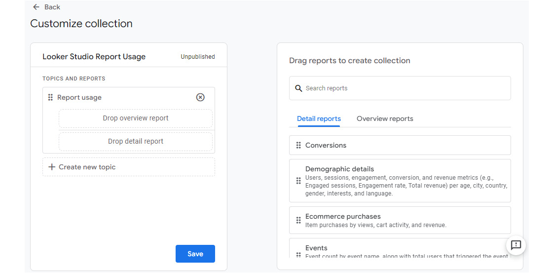
Figure 11.11 – Customizing the collection by adding topics and reports
- Save the collection.
To create a custom detail report, follow these steps:
- From the Reports left navigation, select Library at the bottom. Click Create new report and choose Create detail report:
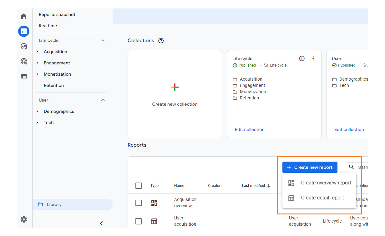
Figure 11.12 – Create detail report
- On the Create new screen, choose Blank. Alternatively, you can choose to start from the templates provided.
- The detail reports in GA have a standard layout and offer a limited set of options to customize. You can have, at most, two visualization charts on the top and a detailed table below them.
- Select the desired dimensions and metrics from the right panel. You can set one of the chosen dimensions as the default, which gets depicted in both the top charts and the table below by default. You can view these charts by other dimensions by choosing the desired dimension from the table while viewing the report. You can add up to 12 metrics to a report and they are used in the charts in the order they appear in the list. I’ve added the following dimensions with Page title set as the default:
- Page title
- Browser
- City
- Device category
- Screen resolution
- Date _ hour (YYYYMMDDHH)
The metrics chosen include the following:
- Views
- Total users
- Engaged sessions
- Average engagement time
- The charts can be any of the three types – Bar Chart, Scatter Chart, or Line Chart. You can hide one or both charts by clicking on the eye icon to exclude them from the report. No further customizations are available for these charts. The table below displays all the metrics for the default dimension.
- Apply your changes and save the report and provide a name – for instance, Report usage - detail. The report will look as follows:
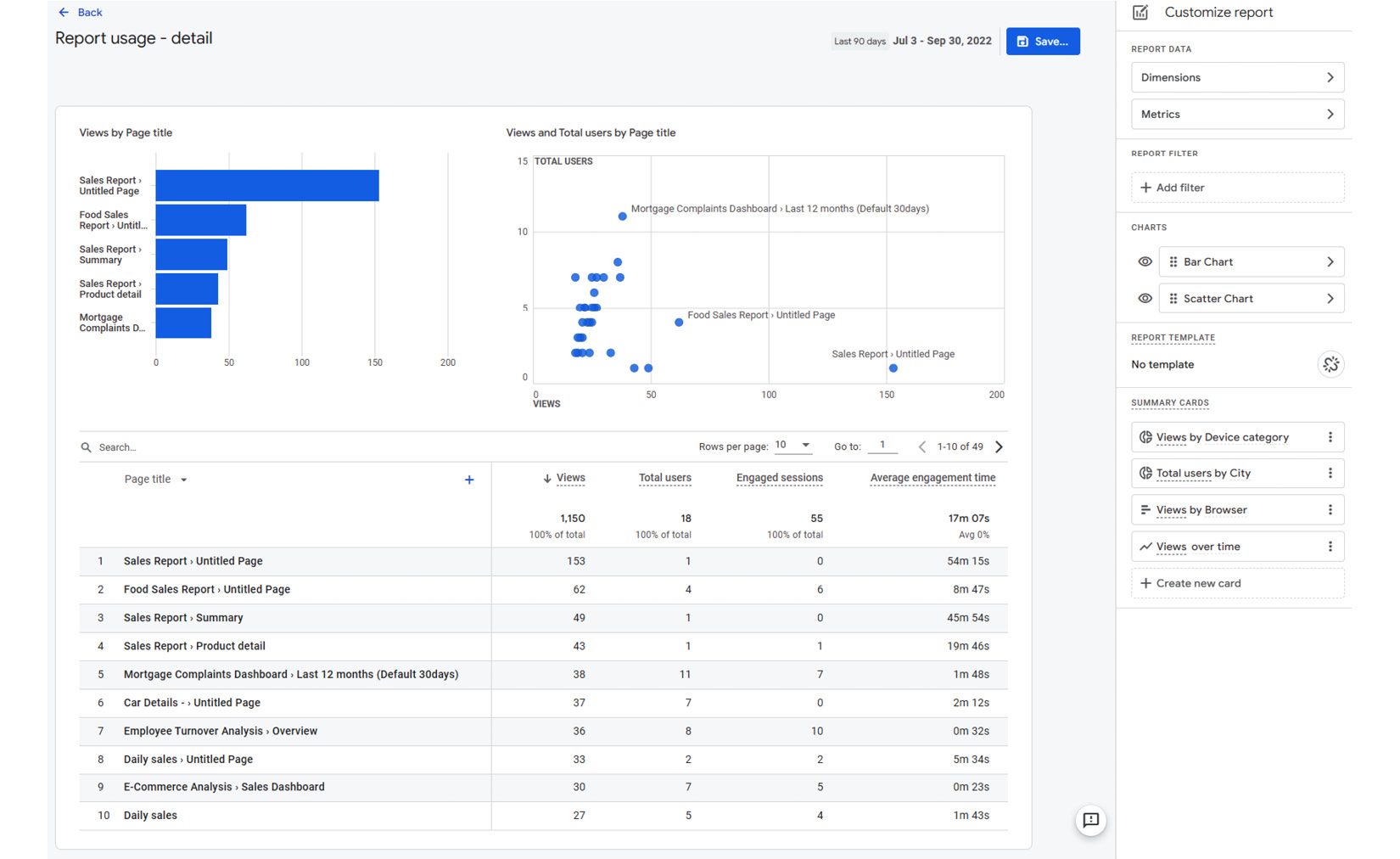
Figure 11.13 – Finished custom detail report
- You can create summary cards that depict custom charts based on the report metrics and dimensions. These summary cards do not appear within the detail report itself. However, they can be added to an overview report. The summary card can be one of four visualization types: bar, donut, line, or table. Choose the desired dimensions and metrics from the report data and select the appropriate visualization type. The settings for the Total users by City summary card are shown in the following screenshot:
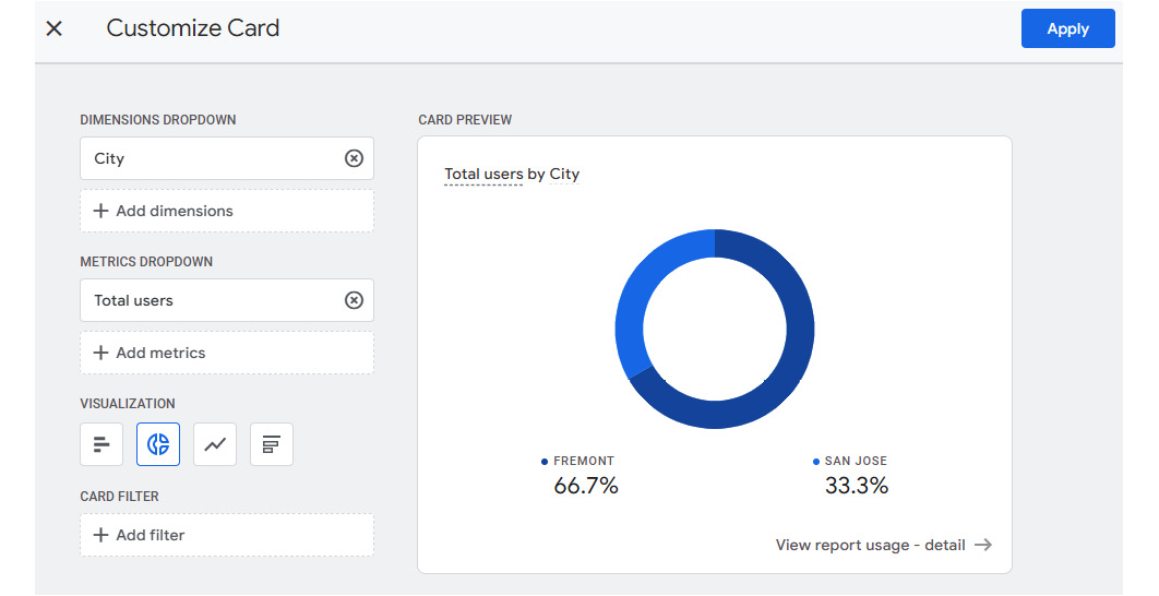
Figure 11.14 – Creating a summary card
- From the Library page, click on Edit collection for the Looker Studio Report Usage collection you created earlier, and drag and drop the detail report you just created under the collection. Save the collection. Back on the Library page, click the ellipses icon for the collection and select Publish. Publishing a collection makes it appear in the left navigation.
Now, let’s create an overview report using the summary cards from the custom detail report, as well as from the built-in reports:
- From the Library page, click Create new report and select Create overview report.
- From the right panel, click Add Cards and choose from the available Summary Cards and Other Cards. You can add up to 16 cards to an overview report:
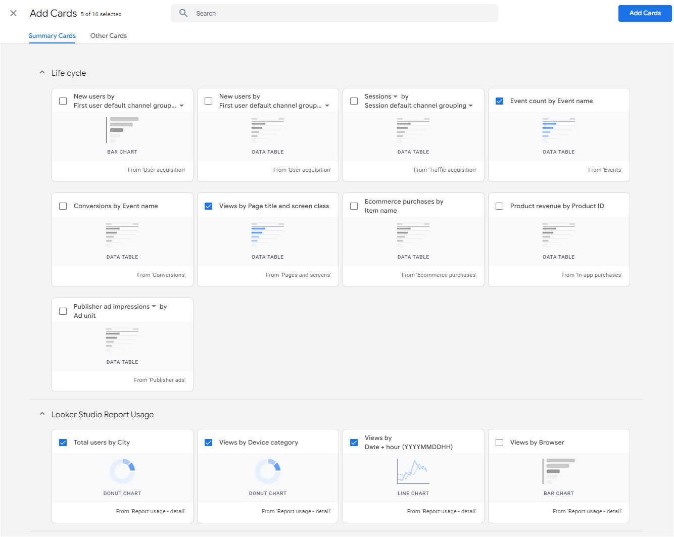
Figure 11.15 – Adding cards to the overview report
- Rearrange the order of the cards in the right panel to adjust the layout of the report. Click Save and set the report’s name to Report usage overview. The report will look as follows:
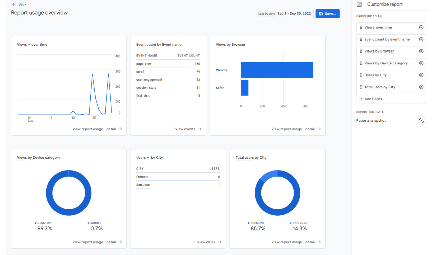
Figure 11.16 – Finished overview report
- Add the overview report to the collection by clicking on Edit collection from the Library page and dragging the newly created overview report under the collection. Then, Save the collection.
- Back on the Library page, publish the collection from the action menu. This enables GA users can access the custom collection and its associated reports from the left navigation, as shown in the following screenshot:

Figure 11.17 – Custom collection and reports displayed in the left navigation
While GA provides a lot of built-in reporting and enables you to perform fast customizations and explorations, visualizing this data externally in Looker Studio is useful for a few reasons:
- Users can view and access the usage report in a single tool along with all the other reports instead of having to switch to GA. Users may also be unfamiliar with how to navigate and explore GA reports.
- Looker Studio offers more types of visualizations and configuration settings. You can also create more powerful reports in Looker Studio by using advanced features such as calculated fields, parameters, and so on.
- Looker Studio also enables you to better define and manage how users can interact with the report. For example, a user with viewer access to the GA property can modify data that is depicted in the reports by adding secondary dimensions, creating segments, and so on. In Looker Studio, you can determine how little or how much users can change the data that appears in the report through the appropriate use of features such as optional metrics, cross-filtering, filter controls, and more.
GA tracking data, when coupled with Looker Studio’s visualization capabilities, enables you to analyze and monitor report usage more effectively.
Visualizing in Looker Studio
You can create a usage dashboard in Looker Studio by connecting to the GA4 property that tracks Looker Studio reports. The following simple dashboard depicts key usage metrics:
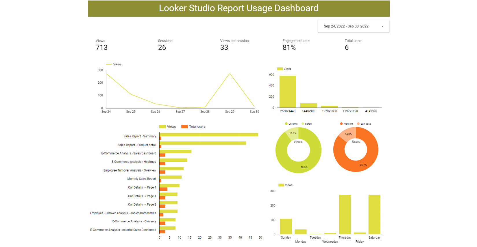
Figure 11.18 – A sample report usage dashboard built in Looker Studio
Follow these steps to build such a dashboard:
- Create a blank report from the Looker Studio home page. Then, from the Add data screen, select Google Analytics.
- Select the appropriate GA account and property defined for the Looker Studio domain:
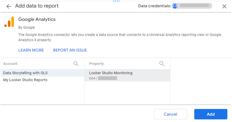
Figure 11.19 – Adding GA4 data to a Looker Studio report
- From the Data panel, use the available list of fields, which includes dimensions and pre-defined metrics, to build the necessary charts. The illustrated sample dashboard comprises the following components:
- Scorecards to display the overall metric values. In the sample dashboard, one each is created for Views, Sessions, Views per session, Engagement rate, and Total users. Engagement rate represents the proportion of engaged sessions out of all sessions. An engaged session is one where the user has spent 10 seconds or more or viewed multiple screens/pages.
- A horizontal bar chart to display views and users by each report page, which helps in identifying the most popular reports during the selected period.
- Visualizing views by screen resolution helps users understand the most commonly used screen resolutions to inform any layout changes in the dashboards to improve user experience. A column bar chart serves this purpose quite well as there are only a few dimension values and the labels are short.
- Donut charts to represent the proportion of views by web browser and the proportion of users by their location. There are just two values for each dimension, so using a donut is apt. As the number of dimension values increases to a much higher number, alternate visualizations such as bar charts, geo maps for location, and more can be considered.
- It is interesting to view the distribution of page views on different days of the week to understand the patterns of concurrent usage, especially when the report is configured for a longer period spanning multiple weeks. A column chart or even a line chart is a good choice here as the dimension values have a natural order to them.
- Date range control to allow users to choose different periods. The GA data source defaults to the last 28 days.
The sample dashboard considered here is a simple one using basic visuals and metrics. Depending on your needs, you can augment with additional functionality and data. For instance, you can map user location data with your organizational departments using data blending and monitor the usage for different departments.
Exporting GA4 data to BigQuery
Exporting GA4 data to BigQuery, Google’s cloud data warehouse, helps you analyze large volumes of data and perform complex data transformations and queries efficiently. While it may seem like overkill for Looker Studio report usage monitoring, especially at smaller data volumes, exporting raw Analytics data to BigQuery provides benefits such as the following:
- Combining Analytics data with other sources of data easily, either within BigQuery itself or by exporting it to other systems from BigQuery as needed
- Querying and reporting on complete data without any sampling involved
- Manipulating data in ways not easily possible with GA and Looker Studio
- Performing historical analysis beyond the GA limit of 14 months
- Access to more granular data (session-level, event-level, user-level) and additional attributes (for example, geographical hierarchy).
Follow these steps to export GA4 data to BigQuery:
- From the GA4 ADMIN page, select BigQuery Links under the PRODUCT LINKS section. Select Link to create one:
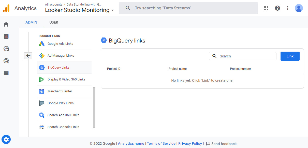
Figure 11.20 – Enabling BigQuery export
Select the BigQuery project that you have access to and that has been set up to be used for this export. If you do not have BigQuery set up yet, you can get access to the free BigQuery sandbox using the instructions provided at https://cloud.google.com/bigquery/docs/sandbox. This will suffice to follow along with the current implementation. The project should be configured as follows:
- The BigQuery API is enabled (it’s enabled by default unless explicitly disabled by project admins). Verify this from the APIs & Services dashboard in the Google Cloud console, which is accessible from the hamburger menu:
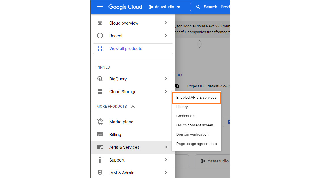
Figure 11.21 – Verifying that the BigQuery API is enabled in the Google Cloud project
- Add [email protected] to the project with Editor access. From the hamburger menu, select IAM & Admin | IAM and click ADD at the top. Provide the service account and the role, as shown in the following screenshot:
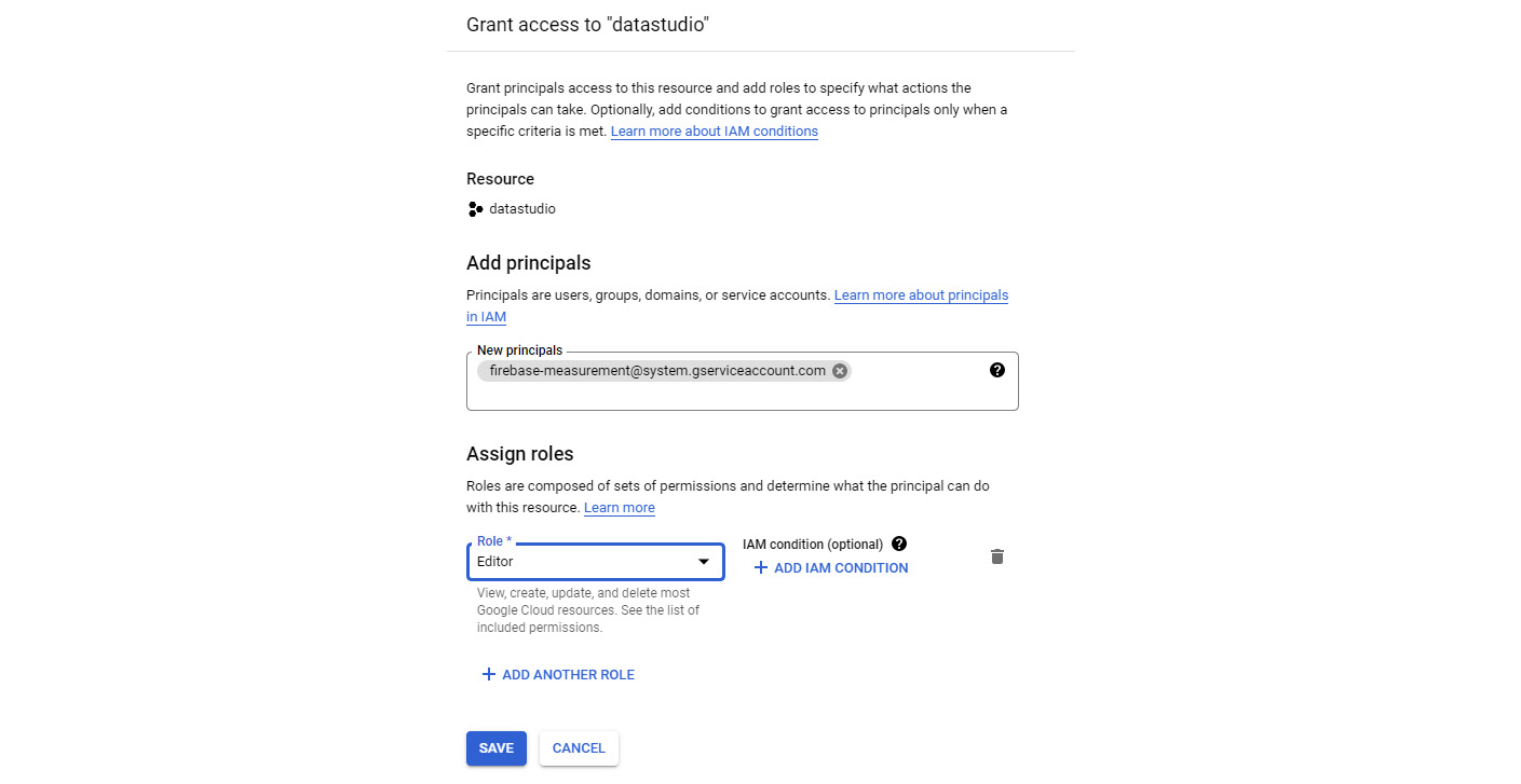
Figure 11.22 – Adding a service account to the Google Cloud project
- Choose a location for the BigQuery dataset that will hold the GA data. Once selected, this location cannot be changed.
- Choose the data streams to export and specify any events to be excluded. Set Frequency to Daily. If your BigQuery project is enabled with billing (and not just a sandbox), you can enable Streaming as well:

Figure 11.23 – Configuring the settings for enabling BigQuery export
A separate table is created in BigQuery each day called events_YYYYMMDD that contains the full daily export of events data. The following screenshot shows how it appears in the BigQuery console:
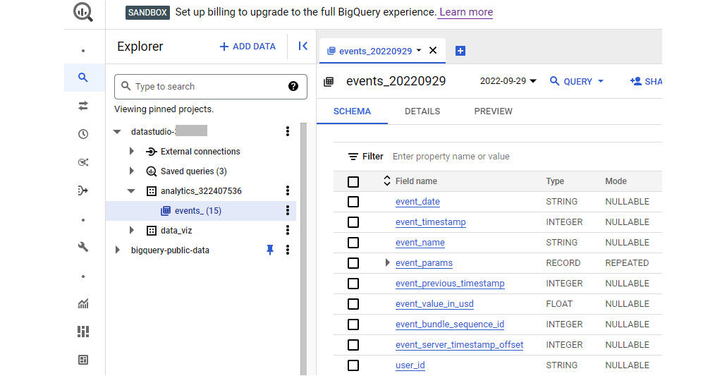
Figure 11.24 – Enabling BigQuery export
Then, you can write SQL queries to look into this data and analyze it within BigQuery. A simple query to find the number of events that occurred by metro area is as follows:
SELECT
  geo.metro,
  COUNT(*) AS events
FROM
  'datastudio-xxxxxx.analytics_322407536.events_*'
GROUP BY
  1;
You can use wildcard tables to query multiple tables together in a concise way. The preceding query reads the data from the union of all daily events tables. You can also explore and analyze this data in Looker Studio and other integrated tools.
Summary
Monitoring report usage activity is a good way to measure the effectiveness and usefulness of reports. In this chapter, you learned how to monitor Looker Studio reports using Google’s web Analytics service, GA. You examined the steps of setting up GA4, the latest version of the service, to track user activity. You also explored the various built-in reports within GA4 and learned how to create custom reports. Visualizing the usage data in Looker Studio allows you to limit the information presented, as well as depict it in more flexible ways than possible within GA4. By doing so, you understood how you can export raw event data to BigQuery so that you can perform advanced and complex analyses on granular and unsampled data.
This was the final chapter of this book. I hope this book helped you learn how to use Looker Studio to build compelling dashboards through a step-by-step approach. I hope it also provided you with foundational knowledge about data storytelling and visualization principles. Looker Studio, as a tool, evolves continuously, and so should your journey as an analyst and data storyteller. Bon voyage!