
5
Looker Studio Report Designer
A report is the core element of Google Looker Studio and allows you to build data stories through visual components. It is a collection of visuals that enables you to monitor key performance metrics, describe trends and relationships, and explain relevant phenomena. In the previous chapter, you learned how to access Looker Studio and gained an understanding of its major entities – data sources, connectors, reports, and explorers. Now, you are ready to use it to build reports. Whether it is creating a view-at-a-glance dashboard depicting the overall performance of a business or a detailed report on a specific function or problem, the Looker Studio Report Designer provides a flexible, feature-rich, and easy-to-use interface.
This chapter lays out various components of the Report Designer and how you can use its key capabilities. By the end of this chapter, you will have gained an understanding of the major components of Looker Studio’s Report Designer and learned about configuring elements such as dimensions, metrics, filters, non-data graphics, external content, and more. This chapter does not discuss these features concerning any specific chart type, but rather provides a general understanding of them. You will continue building your first Looker Studio report by creating a new report using the Call Center data source that we set up in the previous chapter. You will add data visualizations to this report in the next chapter, where you will learn about building and configuring various chart types. Similar to the previous chapter, this chapter is mainly about honing into the many useful features of Looker Studio. Interesting applications and related insights will be shared in the future chapters.
In this chapter, we are going to cover the following topics:
- Report designer overview
- Working with data for charts
- Implementing filters
- Adding design components
- Embedding external content
- Styling report components
- Building your first Looker Studio report – creating a report from the data source
Technical requirements
To follow the implementation steps for the various operations described in this chapter, you need to have a Google account so that you can create reports with Looker Studio. It is recommended that you use Chrome, Safari, or Firefox as your browser. Finally, make sure Looker Studio is supported in your country (https://support.google.com/looker-studio/answer/7657679?hl=en#zippy=%2Clist-of-unsupported-countries).
Report Designer overview
You can develop a dashboard or a report using Looker Studio’s Report Designer. As an author and editor of a report, you spend almost all your time in the Report Designer. It allows you to add data to your report, build and configure charts, and add text, images, and other controls. Here, you can define filters, add pages, manage navigation, and choose color themes. The following screenshot highlights the major sections of the designer, all of which we will be reviewing in detail in the rest of this chapter:
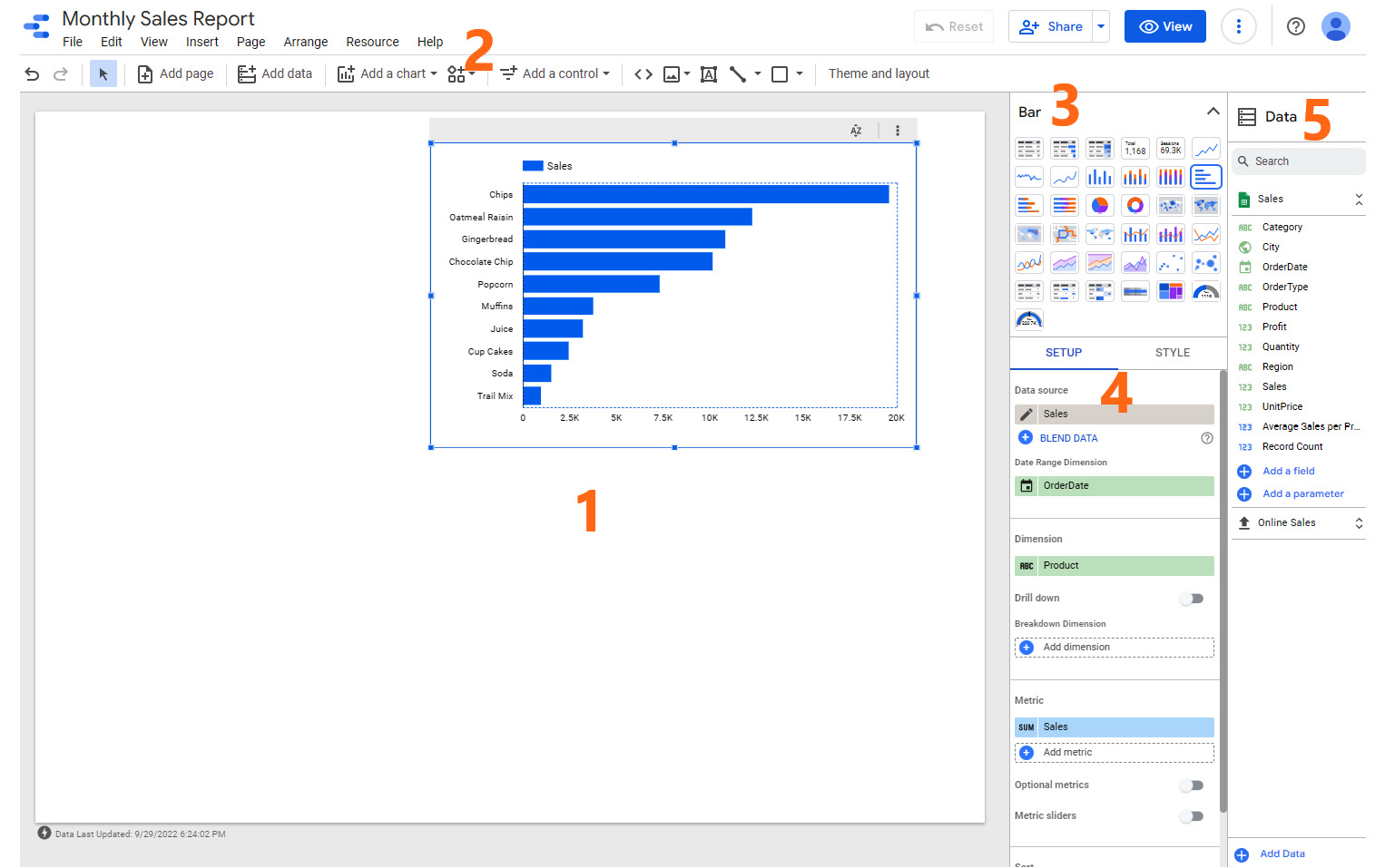
Figure 5.1 – Major sections of the Report Designer
Let’s look at each of these components, which have been numbered, in detail:
- Canvas: In the center is the canvas, which is where you place visuals and other elements.
- Toolbar and menu: At the top is the toolbar, which provides shortcuts to some common operations and controls, as well as more comprehensive menu options.
- Chart picker: You can easily switch between different chart types from the chart picker at the top right. This section only appears when a visual is selected on the canvas and it can be collapsed and expanded as needed.
- Chart configurations – SETUP and STYLE: Below the chart picker are the SETUP and STYLE properties panels for the selected chart. The SETUP tab is where you choose the appropriate data source and add different fields – dimensions and metrics that make up the chart. You also define sorting, date ranges, filters, and more from here. The STYLE tab provides you with options and settings that determine how the chart looks – colors, axes, legends, gridlines, and so on.
- Data panel: A report can include multiple data sources and the Data panel on the right displays all the data sources that have been added to the report. You can view the list of available fields for each of these data sources, which you can drag and drop either on the canvas directly or in the SETUP tab to configure charts. This panel allows you to search for fields across data sources, which makes it easy to discover and use the right data fields, especially when there are more than a few data sources. You can also make the experience more manageable by expanding and collapsing the data sources as needed.
Other sections and panels appear on the right when appropriate selections are made, such as page navigation, themes, page settings, report settings, and so on.
Adding charts to the canvas
When you create a new report, the first step is adding a data source to it. Next, you must add charts and other components to the canvas to start building your dashboard. You can add a chart to the canvas in one of three ways:
- Dragging the fields from the Data panel to the canvas. This creates a table visual, which you can then change by selecting the appropriate chart type from the chart picker on the right.
- Clicking Add a chart from the toolbar, selecting the required chart type, and placing it on the canvas. Then, you can add the appropriate dimension and metric fields to the SETUP tab for this chart.
- Choosing Insert | Chart type from the menu and dropping it on the canvas. Then, you can choose the dimension and metric fields to be represented in the chart in the SETUP tab.
The canvas is a free-form area in which you can move different components around and arrange them as needed. The grid lines on the canvas allow you to align the visuals appropriately. The smart guides help you with this alignment. You can adjust the grid properties such as size, padding, offsets, and more from the options provided under the View menu. Using Shift and the appropriate arrow key allows you to move the components in smaller steps, giving you more control in adjusting the positioning. The Arrange menu’s options assist you further in organizing content on the canvas by grouping visuals and associated components, aligning and distributing components properly, and more.
Adding additional data sources
Often, your dashboard may need to represent data from different datasets and you may need to add additional data sources to your report to complete your analysis or data story. There are multiple ways in which you can add data to an existing report:
- Select Add data either from the toolbar at the top or from the Data panel on the right to view the Add data to report screen and add either a new embedded data source or an existing reusable data source.
- You can add any reusable data source accessible to you directly from the SETUP panel. Click on the current data source’s name to expand the dropdown of the list of data sources available to you. Choose the one you need and add it to the report. You can also add an embedded data source by clicking on the ADD DATA option at the bottom, as shown in the following screenshot:

Figure 5.2 – Adding another data source from the SETUP tab
- You can also add new data from the report data sources screen by going to Resource | Manage added data sources from the menu.
In the next section, let’s learn how to add and manage pages.
Adding and managing pages
A Looker Studio report can span multiple pages. This allows you to build detailed reports while organizing different sections on different pages. You can add a page to the report by selecting the Add page option from the toolbar. You can also add a new page from the Page menu. Having more than one page in a report changes the Add page icon to the page navigation control.
The Report Pages panel can be opened either by selecting the page navigation control on the toolbar or by choosing Page | Manage pages from the menu. The Report Pages panel is a one-stop place to create, rename, delete, copy, and hide pages, among other things. You can add expandable sections, dividers, and headers to organize the pages effectively. Sections help create tiered, multi-level groupings of pages. Icons can be added to the pages, as well as other top-level organization elements.
Looker Studio offers three ways to display report page navigation:
- On the left, listing the pages and top-level content holders vertically (as shown in the following screenshot)
- As tabs at the top that are laid out horizontally side by side
- At the top left, enabling you to navigate through the pages sequentially (next, previous)
The Left navigation type provides the most complete support for all content elements – that is, sections, headers, and dividers. You can collapse and expand the pane as needed. Adding icons to page elements is especially useful with the Left navigation type. When collapsed, icons are still displayed in the pane, enabling easier navigation. Navigation type is set from the Theme and layout panel’s LAYOUT tab. The Left and Tab layouts are visible in Edit mode by default, in addition to View mode. You can turn off this setting from the View menu by unchecking Show navigation in edit mode:
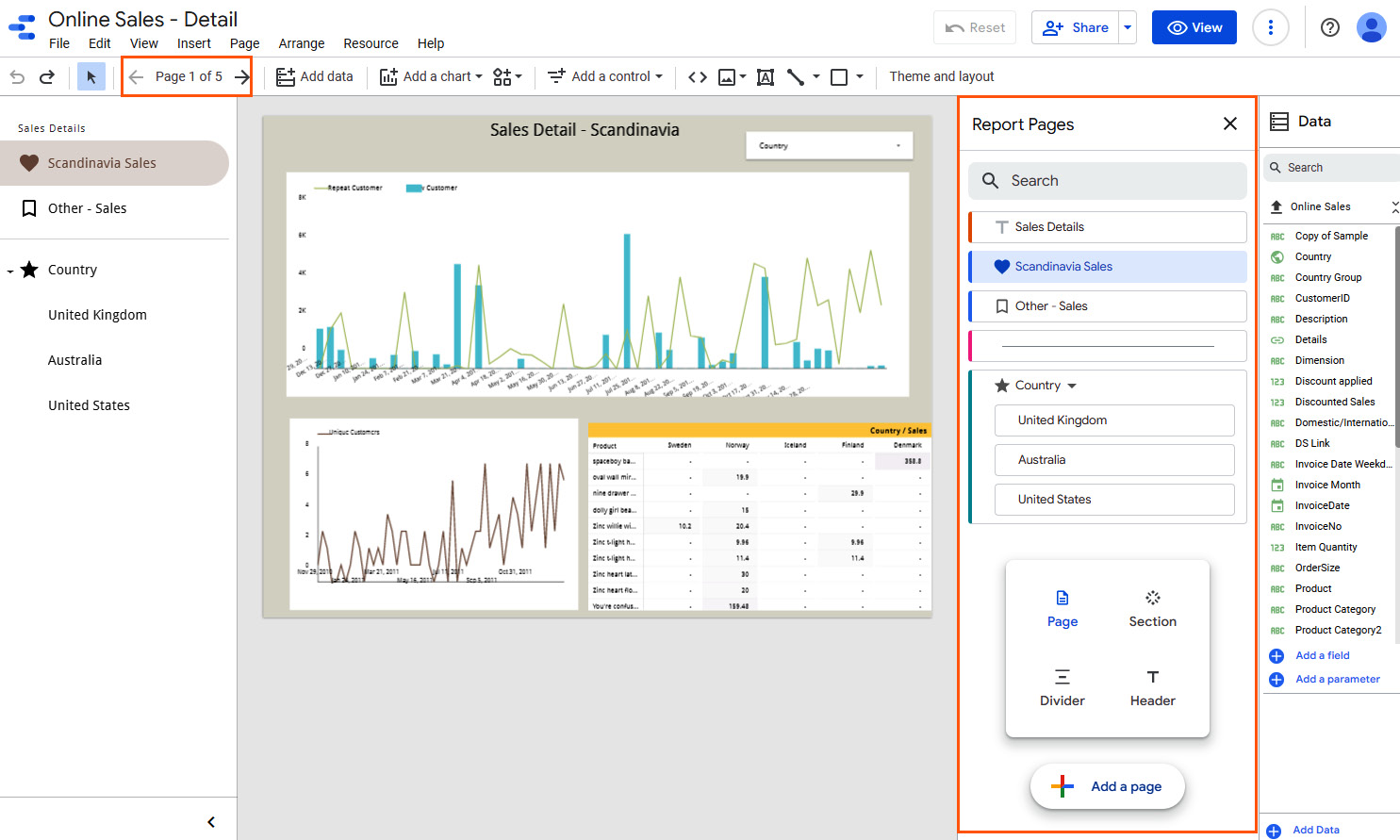
Figure 5.3 – Managing report pages
You can have different charts on a report page to visualize data from different data sources. However, you can set a default data source to use at the page level. This ensures that when there are multiple data sources attached to your report, any visuals you add to the page use the desired data source by default. This can be done by using the Current Page Settings panel that appears on the right by choosing Page | Current page settings from the menu:
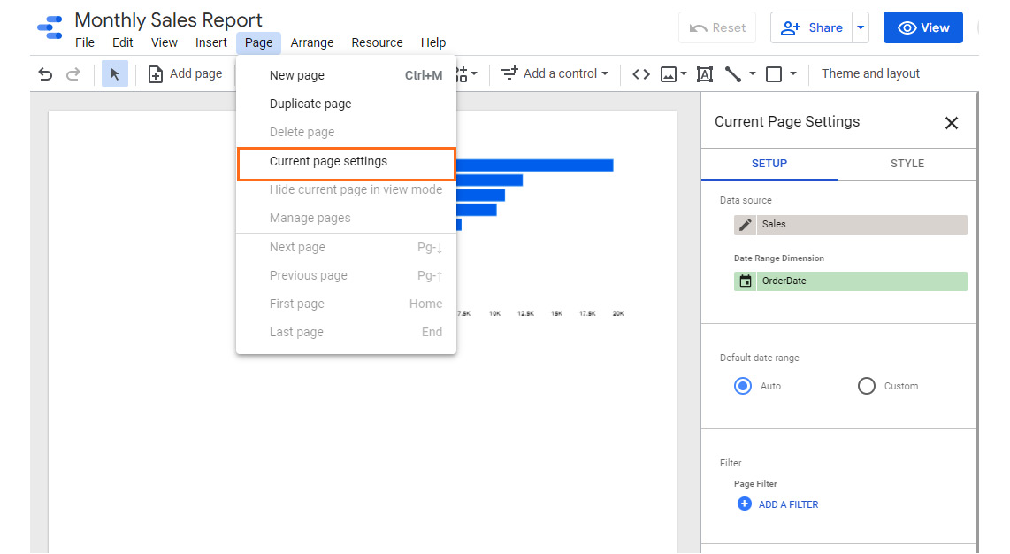
Figure 5.4 – Current page settings – choosing the default data source for the page
The STYLE tab under the Current Page Settings panel allows you to set background color and canvas size properties for this page. The ability to define these properties at the page level allows you to be consistent across the page, as well as to customize each page of the report differently. For example, you may want to display wide tables on a particular page and adjust the canvas size accordingly.
The Page menu provides additional options such as navigation, duplicating the current page, deleting the current page, and so on. You can also choose to hide the current page in View mode, either from the menu or via page options from the Report Pages panel.
Choosing a report theme and layout
You can customize the look and feel of the entire report using the Theme and layout options. A report theme configures default settings such as chart palette, background, font styling, and so on for the report and its components. Looker Studio provides a list of built-in themes for you to choose from. These built-in themes offer a good range of options – light versus dark background, monochromatic versus polychromatic color scheme, muted versus bright hues, and more. If none of them meet your needs or suit your taste exactly, you can customize a given theme and adjust the settings appropriately. Click on Theme and layout from the toolbar to make the panel appear on the right, as shown in the following screenshot:
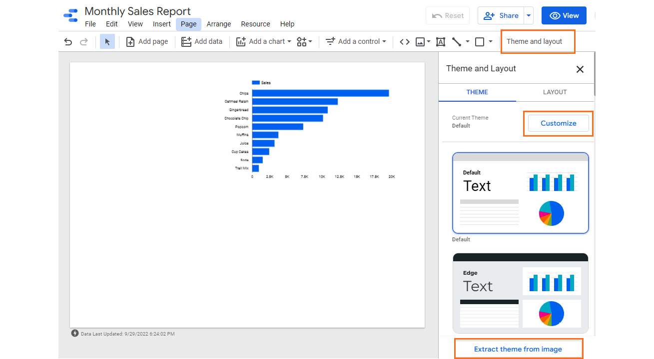
Figure 5.5 – Choosing and customizing a theme for the report
Looker Studio also allows you to generate a theme based on an image, such as a logo or any other relevant image. I’ve provided the image of the Packt logo (displayed on the left in the following screenshot), and Looker Studio has generated three themes that I can choose from based on the logo colors, as shown on the right of the following screenshot:
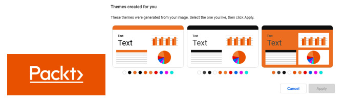
Figure 5.6 – Generating themes from an image
Several layout properties can be set for the entire report that determine how the report and its components look and are arranged by default. Some key layout settings you can define consistently across the report include the following:
- Canvas size
- Grid properties
- Page navigation position
- Header visibility for the charts
The report theme and layout determine the default settings for the report components, which can be changed and customized for individual components later.
Defining Report Settings
Similar to Page Settings, you can define certain properties at the report level. This makes it easy for you, as a report editor, to apply consistent settings throughout the report. You can access Report Settings by choosing File | Report Settings from the menu. This displays the appropriate panel on the right, as shown in the following screenshot:
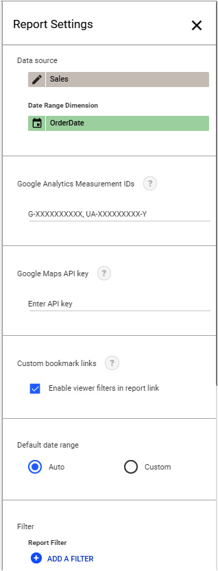
Figure 5.7 – Report Settings
First and foremost, you can set a default data source for the entire report, which you can override at any page or visual level as needed. You can also provide your Google Analytics measurement ID and Google Maps API key under the Report Settings area. The former helps you track the report usage using Google Analytics, while the latter enables you to use a greater number of Google Maps loads in the report than the free quota allowed by Google.
You can apply data filters at the report level as well. An example scenario where this is useful can be where you are creating an employee absenteeism dashboard for a particular department, such as finance. Your data source includes data from other business units as well and you do not want to expose any non-finance employee data in the dashboard. You can define a report filter on the department field, which then applies to all charts within the report.
Date Range Dimension is another setting we can define at the report level to achieve consistency. This field determines the timeframe of the data that can be shown for a component. For example, if we always want the report to show only the current quarter orders, we can set Date Range Dimension to Order Date at the report level and choose the range as This quarter.
As report viewers view and interact with the report, Looker Studio preserves any filter changes and goes back to default values when it’s reset. Viewers can save the links to specific filtered views as bookmarks when we enable this capability at the report level under the Custom bookmark links setting. Filter settings are then automatically added by Looker Studio to the report URL as encoded JSON strings. These links can then be shared with others or bookmarked for later reference. Report editors cannot generate such encodings within Looker Studio at the time of writing.
Current report view
Another way to obtain a report view link that reflects all current filter selections is by using the Get report link property via the report’s Share options. This shortened URL can then be shared with others or bookmarked as needed.
Working with data for charts
This section will help you understand the major data configurations for charts and controls and how to use them. When a component is selected on the canvas, the SETUP and STYLE panels display the chart data and style formatting configurations, respectively. The SETUP tab allows you to choose the right data source and appropriate fields for the dimensions and metrics for the selected chart. The Data panel displays the list of fields that are available from the chosen data source. You can also set other properties such as sorting, filters, and so on. Figure 5.8 shows the options for the table chart type.
Adding dimensions
A dimension is a field that represents the value for each row of the dataset. They are usually descriptive attributes of your data. You can drag and drop the fields from the Data panel onto the appropriate position under the Dimension section. Alternatively, you can click on the Add dimension button to select the field from the dropdown that appears, as shown in the following screenshot:
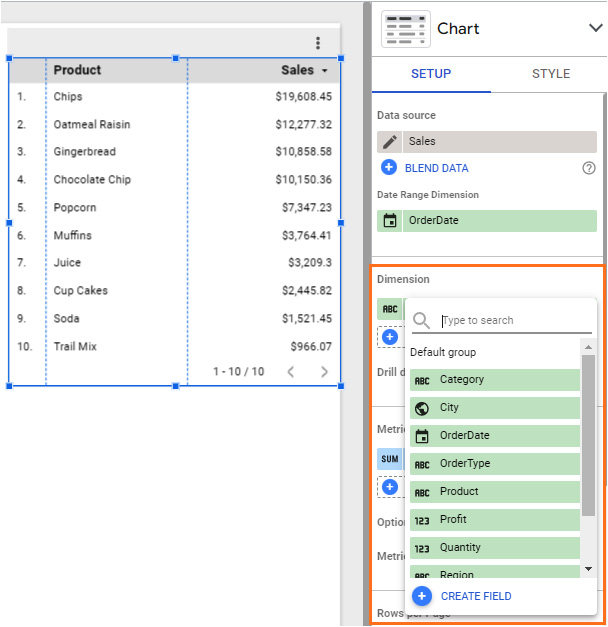
Figure 5.8 – Adding a dimension in the SETUP panel
You can change the data type and format of the dimension to be used for this specific chart by clicking on the left of the dimension name, which displays the default data type defined in the data source. You may want to change the data types for the chart fields in the SETUP tab in two situations:
- The default data types are not set properly at the data source level and you do not have access to edit the data source
- You need to present the data within the chart using a different format than the rest of the page or report
A common example of when you will want to do this is when you’re changing the format of the date field to a less granular one such as Year Month or Year Quarter, where the timestamp is Hour. Depending on the default data type of the field, only those types and formats applicable are enabled for selection. For example, you cannot set the data type for a date field to Boolean or change the text data type to Number. The following screenshot shows the format options available for the Order Month field:
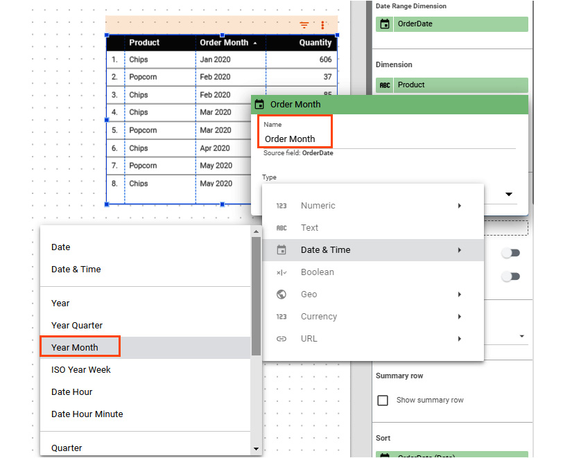
Figure 5.9 – Changing data type and format of a dimension
You can also provide a more user-friendly name to be displayed in the chart for a field. In the preceding example, the Order Date field is set to use the Year Month format and has been renamed Order Month. It is this name that is displayed in the chart – in table headers, legends, axes labels, and so on.
In addition to the available fields from the selected source, you can create a new custom field as a dimension within the SETUP panel. Just like in the data source, you can choose any of the existing fields and built-in functions to derive a new field. Examples could be concatenating or splitting two fields and extracting a substring. However, this field is only available within the context of the associated chart. Hence, it cannot be reused across multiple charts.
Note
As a best practice, refrain from creating calculated fields within the charts and the reports as much as possible and instead implement them in either the underlying dataset or in Looker Studio's data source. That way, you do not need to keep making the same transformations over and over again in different charts and reports.
Date Range Dimension
Looker Studio provides the option to choose a date range dimension at different levels – chart, page, and report. It defines the timeframe for the data depicted in the chart, page, and report, respectively. Looker Studio automatically chooses the first date column in the field list as the date range dimension. You can change this selection to a more appropriate date field as applicable. You can also manually choose a field if Looker Studio cannot identify a date field from the data source.
An exception to this behavior is for components built using a Google Analytics data source, in which case the date range dimension is automatically set based on the properties defined in Google Analytics and cannot be changed in Looker Studio:
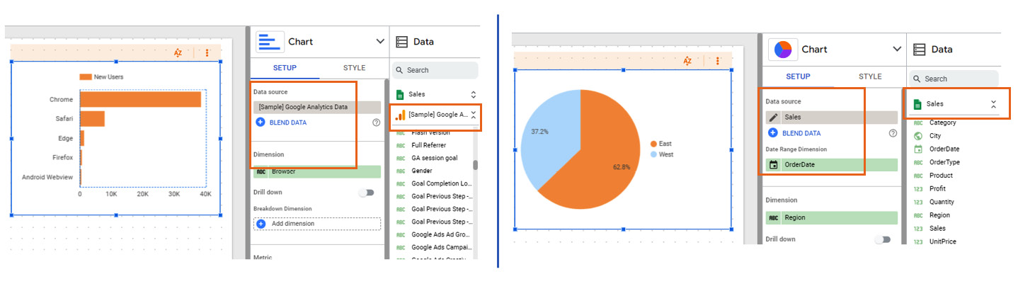
Figure 5.10 – The Date Range Dimension configuration option is not available for Google Analytics data sources (screenshot on the left). Chart configuration using a Google Sheets data source is displayed on the right for comparison
You can define the default date range for the chosen date range dimension. You can find this section a little further down in the SETUP tab. There is the Auto range option, which is different for different data sources based on the settings defined in the connector. For example, the auto date range for Google Analytics is Last 28 days, while for Google Sheets, it’s all the data in the sheet. You can customize the default date range applicable to the chart by selecting Custom and choosing the appropriate range from the options available:
- Fixed: This allows you to define a fixed start date and end date for your chart
- Pre-defined ranges: For example, Today, Last n days, This week, This month to date, and more
- Advanced: This allows you to define flexible rolling date ranges
The following screenshot shows a custom date range setting that includes only the past 3 completed months:

Figure 5.11 – Advanced date range settings
Some chart types such as tables, scorecards, time series, and others in Looker Studio allow you to compare data for the current date range against a past date range. For example, if you have defined your default range as Last 7 days, you can choose to compare it against the 7 days before that. There are different options to define your comparison date range, similar to the default date range:
- Fixed: Define a specific period in the past with a fixed start date and end date
- Previous period: Matching timeframe before the default date range
- Previous year: Same timeframe as the previous year
- Advanced: Flexible rolling range
For the example depicted in the preceding screenshot, where the default date range is defined as the most recent 3 completed months – Noember 2021 to January 2022 – the comparison date range is set to the same 3 months exactly 1 year ago – from November 200 to January 2021 – when the Previous year option is selected.
Adding metrics
Similar to the dimensions, you can add metrics from the list of available fields. Metrics represent summarized values aggregated over multiple rows of data. Metrics can be predefined in the data source to facilitate consistent and easy use by different report editors. It is possible to add either a metric field or a dimension field from the list as a metric for the chart. When a dimension field is chosen as a chart metric, the values are aggregated. However, you can only choose a dimension field as a dimension for the chart.
Methods of aggregation
When a dimension field is selected as a metric, it is suitably aggregated for the dimensions defined for the chart. The method of aggregation typically defaults to Sum if the field is a numerical or Boolean field and Count Distinct for string and other fields. You define these default aggregation methods for the fields within the data source. You can choose a different method of aggregation for a chart in the SETUP panel. Click on the left of the field name that shows the aggregation type to view the options available. Looker Studio provides the following aggregation methods:
- Sum
- Average
- Count
- Count Distinct
- Min
- Max
- Standard Deviation
- Variance
These options vary based on the data type of the field. The following figure shows the methods of aggregation that are possible with numeric, date, and text fields (from left to right):
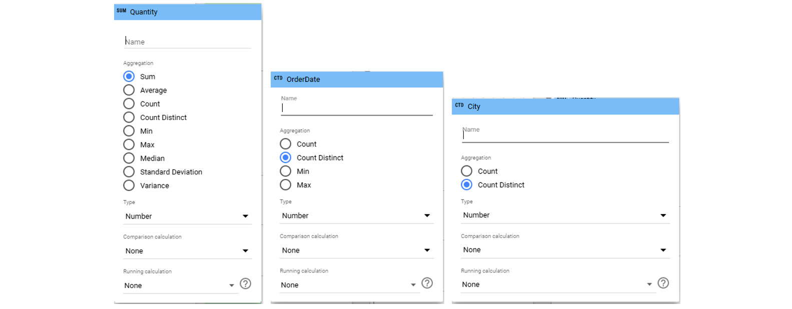
Figure 5.12 – Methods of aggregation for a metric
Similar to dimensions, you can provide an appropriate and user-friendly name for the metric to be displayed in the chart. The default is the actual field name from the data source. For example, when you are visualizing the first order date in a chart, change the aggregation for Order Date to Min and name it First Order Date, as shown in the following figure:
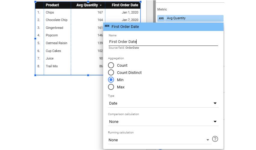
Figure 5.13 – Providing user-friendly names to dimensions and metrics
You can change the format of the value that’s displayed in the chart under Type. For a numeric metric, it could be a plain number, a percentage, the time duration in seconds, or any of the currencies. For a date metric, you can choose to display it as any part of the date, such as quarter, month, day of the month, week, hour, minute, and so on.
You may find yourself in a situation where you want to display the actual values of a metric, rather than some aggregation. You can achieve this by adding the most granular dimension to the chart. For example, to display the sales amount of each order, add OrderID as dimension and Sales as metric. A metric is always aggregated even if it’s against a single row. In the prior example, the Sales metric can be aggregated as Sum, Average, Median, Min, or Max because all these provide the same result as the unaggregated order sales amount. Keep in mind that the purpose of a dashboard is to summarize and display insights from your data, not to display it outright. Accordingly, metrics are usually aggregated to some degree over multiple rows.
Comparison metrics
Many analyses involve metrics that compare two different aggregations of a metric. An example could be the percent of total sales generated by each product, where the sales of each product are compared to the total sales. Looker Studio allows you to compare metric values in a chart to the corresponding total or max values. The options available include the following:
- Percent of total
- Difference from total
- Percent difference from total
- Percent of max
- Difference from max
- Percent difference from max
The following screenshot shows a table chart that displays different comparison metrics for product sales. You need to add multiple instances of the Sales field under the Metrics section and choose different comparison calculations for each to display all these metrics together in the table:
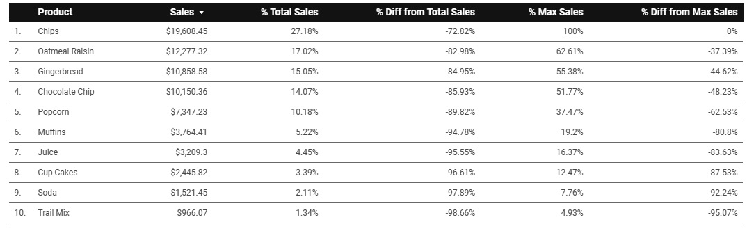
Figure 5.14 – Table chart displaying comparison sales metrics
When you define a comparison date range for your chart, you can compare current period data with past period data. In such scenarios, you can choose the comparison metric (the total or max value you are comparing the actual metric value to) for the past data to be either the one that corresponds to the current data or the past data. The two options are available for each of the comparison calculations, as shown in the following screenshot:
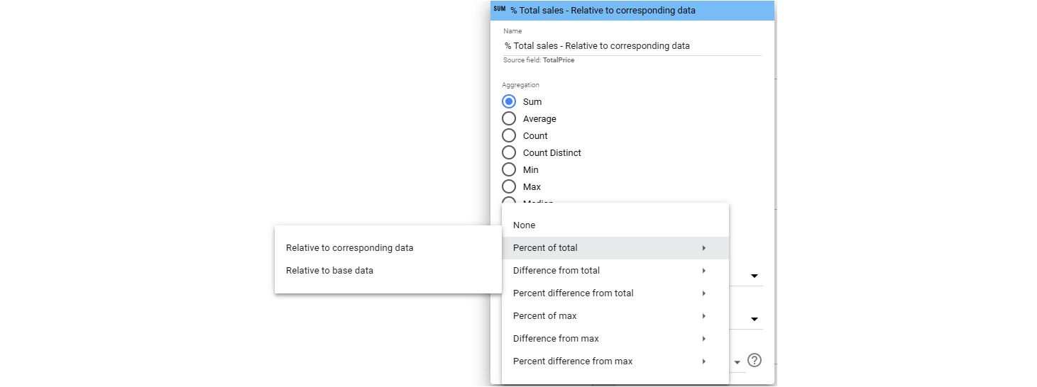
Figure 5.15 – Comparison metric options when using the comparison date range
This functionality can be better understood using an example. Consider a situation where, for a monthly time series chart, you have defined the year 2021 as the current date range and the previous year (that is, 2020) as the comparison date range. When you want to use a comparison metric such as the percent of total yearly sales, you can compare the 2020 monthly sales value to the total sales of either 2020 or 2021. Choosing the Relative to corresponding data option calculates the percent total sales for each month in 2020 against 2020’s yearly total sales. On the other hand, selecting the Relative to base data option compares 2020’s monthly sales against the total sales for the default date range, which is 2021. Remember that this choice only affects the comparison calculation for the comparison date range (for example, past data) and not the default date range (for example, the current data):
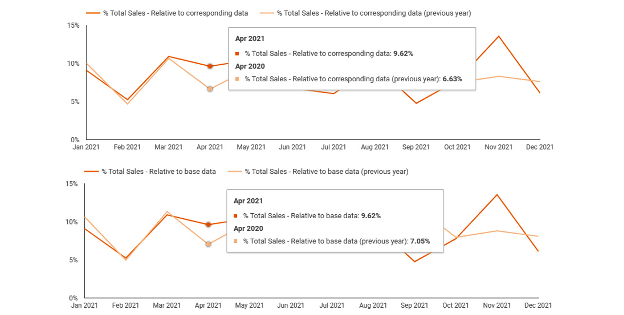
Figure 5.16 – % Total Sales for the comparison date range (2020)
The preceding screenshot shows two instances of the time series chart, each calculating the % Total Sales value for 2020 against different baselines.
Running calculations
Looker Studio allows you to compute and visualize running aggregations for a metric within a chart. For example, you can calculate running totals, running differences, running averages, and more. The available options are as follows:
- Running sum
- Running average
- Running min
- Running max
- Running delta
- Running count
By definition, these metric values vary based on how the data in the chart is sorted. These cumulative calculations have multiple applications. They are especially useful when you are interested in not only the final metric value but also the granular data leading toward it. This includes tracking progress toward meeting sales targets, calculating the number of users acquired, determining the bank account balance, and more.
Optional metrics
You can provide end users with the flexibility to choose one or more metrics to be displayed in a single chart by enabling optional metrics in the SETUP panel and selecting additional metrics. This helps in two ways:
- It declutters a chart that is displaying multiple metrics simultaneously by allowing the end users to choose only one or more metrics at a time
- It optimizes the real estate on the dashboard and reduces redundancy by having a single chart to present multiple metrics sliced by the same dimension, which the end users can interactively choose one or more from
The following bar chart enables report viewers to interactively choose which of the three metrics they would like to see in the chart at a time:
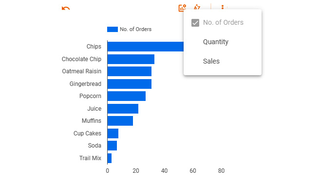
Figure 5.17 – Optional metrics enabled for the bar chart
Some chart types do not provide the ability to use optional metrics – that is, scatterplots and maps.
Sorting data in the charts
Often, you will want to sort the chart data in a specific way to make the visual most effective and easy to read. Say, for example, you created a table chart displaying a long list of salespeople, their targets, and actual sales, and you want to see salespeople with the highest actual sales value at the top of the table. Or maybe you have a bar chart depicting the quantity sold by product. It makes sense to order the products by the highest quantity sold. The sorting options in the SETUP tab enable you to set the order in which data in a chart is displayed. You can define how to sort the data visualized in the chart – column values in a table or dimension values on an axis – by any of the chart fields, a new derived field, comparison calculations, and running calculations, as well as other available fields in the data source. Looker Studio allows you to sort the chart data using up to two fields, as shown in the following screenshot:
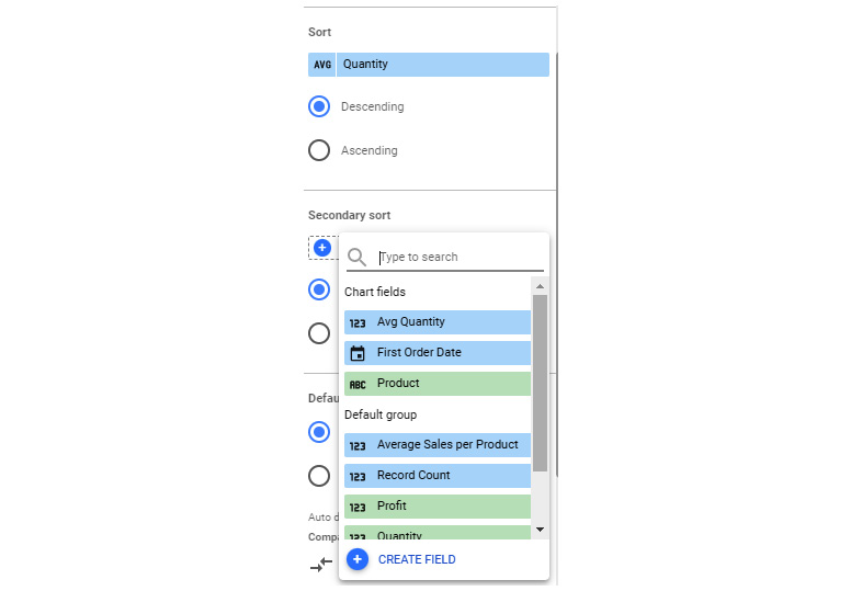
Figure 5.18 – Primary and secondary sort options
For certain chart types, such as bar charts, line charts, and pie charts, you can allow report viewers to change sorting interactively using the chart configuration. To do so, you can choose Change sorting from the SETUP tab.
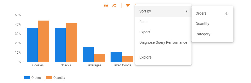
Figure 5.19 – Change sorting from the chart header
This setting is usually enabled by default. Report users can change the sorting order as well as chart dimensions to sort by from the chart header options.
Implementing filters
Depending on your objective and the data story you are going to tell, you may want to represent only a subset or slice of data in your report. You can visualize just a subset of data from the data source by defining filters. As a report editor, you can define and apply filters to one or more charts, a page, or the entire report. These filters, referred to as editor filters, are not visible to the report viewers, so they cannot be manipulated by them. Editor filters are used to visualize certain subsets or slices of data in the chart to answer specific questions. For example, you want to display sales from only the new customers over time to compare against their cost of acquisition. Or, you want to look at the top products sold in the United Kingdom. Editor filters also help in tightly controlling the user interpretation of data by limiting the data they can view within the chart. To allow report viewers to slice and dice the data in the visuals interactively without them needing to edit the report, you add interactive filter controls to the report canvas. We will discuss these controls later in this section. First, let’s review editor filters.
Understanding editor filters
Filters are reusable elements in a Looker Studio report. You can define a filter on any data source available to the report. You can create them from the SETUP properties panel for a chart, Current Page Settings for a page, or the Report Settings pane for the report. When a filter is created from any of these locations, the filter is automatically applied to the corresponding chart. By doing this, the filter can be reused for any other charts using the same data source. Let’s say that you created a Region filter for a bar chart from the SETUP panel and filtered for West Region, as shown at the top of the following figure. This filter is then available for you in the Filter picker area to apply to any other charts, controls, or pages across the report. This can be seen at the bottom of the following figure:
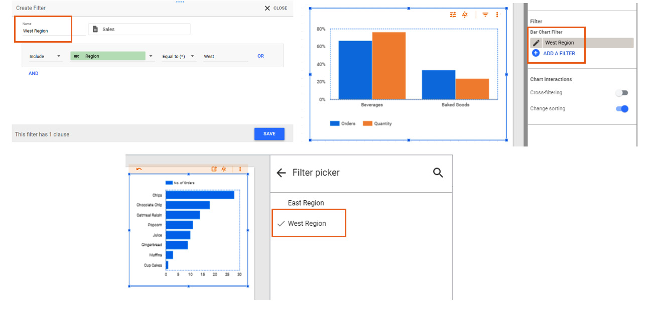
Figure 5.20 – Creating filters once and reusing them across the report
You can also create and manage a filter independently from the menu. Select Manage filters from the Resource menu to view the Filters page:
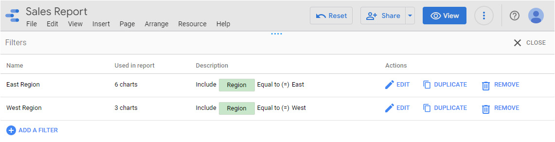
Figure 5.21 – The Filters page
From the Filters page, you can edit, duplicate, or remove existing filters. You can also edit the applied filters directly from the SETUP tab, page settings, or report settings. However, you cannot duplicate or delete filters from there. Removing filters from anywhere other than the Manage filters pane will only detach the filter from the corresponding element – that is, the chart, page, or report. The filter itself remains available for use within the report.
From the Manage filters page, you can create filters on any data source that was added to the report. Whereas, when creating the filter from report settings, page settings, or chart SETUP panel, the data source is automatically set to the one configured for the report, page, or chart, respectively. You cannot change the filter data source in these cases.
Adding an editor filter
To create a filter at the chart level, select the chart on the report canvas and select ADD A FILTER from the SETUP panel. If it’s the first filter you are defining in the report, this directly opens the Create Filter pane at the bottom. Otherwise, the Filter picker area will appear with the available filters to use. Then, you can select CREATE A FILTER to create a new one. Optionally, you can specify a name for the filter. Providing appropriate names for filters enables you to easily reuse them across your report. The data source that’s used by the chart is set as the filter data source. Then, you can specify the conditions:
- Include or Exclude: Include retrieves the data rows that match the filter condition, while the Exclude option retrieves all the rows that don’t match the criteria specified.
- Field from the data source: This can be either a dimension or a metric.
- Operator: The options available differ based on the data type of the field selected. For string fields, you can choose from options such as Contains, Starts with, RegExp Match, RegExp Contains, In, and so on. For numeric and date fields, the options include comparison operators such as Greater than, Less than, Between, and more.
- Value: The value that is operated upon and being compared to.
The filters can be simple with just one condition clause. They can also be complex, allowing you to combine different conditions using OR and AND logic:
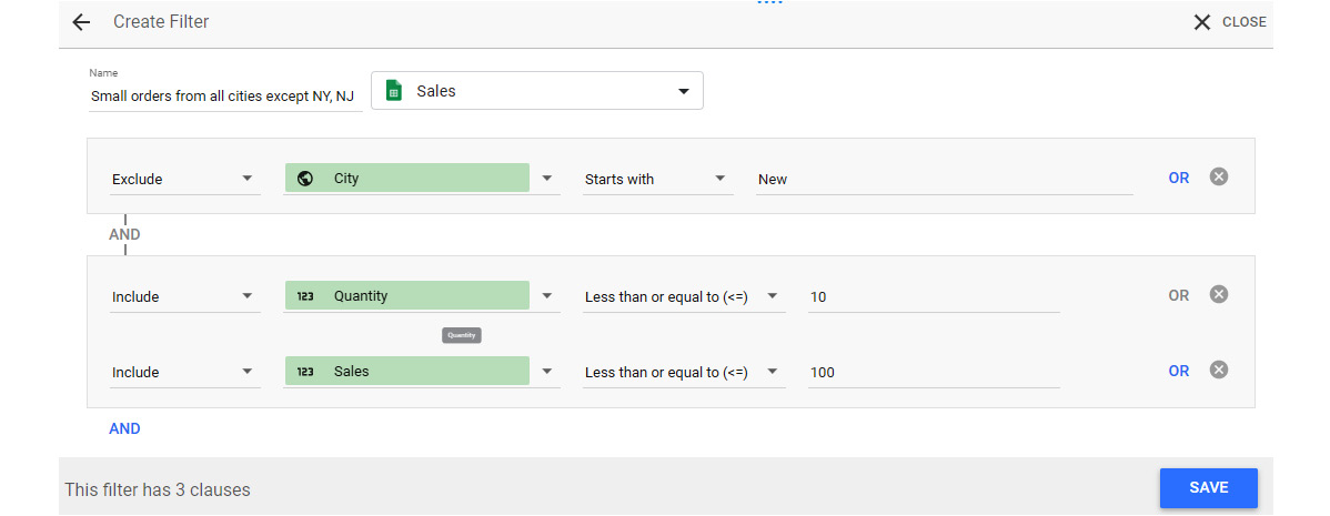
Figure 5.22 – Filtering with multiple condition clauses
In the preceding screenshot, the filter is defined with three clauses: one to retrieve orders from all cities except New York and New Jersey (identified by the Starts with New condition) and the other two to define small orders – conditions on sales amount and quantity, either of which qualifies as a small order.
You can also add a filter to a group of charts on a page. First, group the charts by selecting them and choosing the Group option from the Arrange menu, using the right-click context menu, or using the Ctrl + G keyboard shortcut. Select the group by clicking on any of the component charts; you will see the Group Properties pane on the right, as shown in the following screenshot. You can add a filter to the group from here:
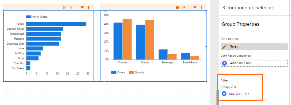
Figure 5.23 – Adding filters to a group of charts
Similarly, you can add a filter to a page from the Page Settings pane, which appears upon selecting Page | Current page settings from the menu. Select the appropriate data source from the SETUP tab and then select ADD A FILTER. You can either choose from the available filters in the Field picker area or create a new one. The filter data source for the new filter is set to the chosen data source for the page. Adding a filter at the report level also works the same way. You can get to the Report settings pane by choosing File | Report settings from the menu.
All these filters are part of the report design and are completely transparent to end users. Providing report viewers with the ability to filter the data presented in the report by one or more fields empowers them to look at different slices of data and generate insights. Interactive filter controls serve this purpose.
Interactive filter controls
Interactive filter controls are report components that you add to your report, along with the visuals on the canvas. Looker Studio offers the following controls to use as interactive filters:
- Drop-down list
- Fixed-size list
- Input box
- Advanced filter
- Slider
- Checkbox
- Date range control
All these controls enable you to create end user filters based on dimension fields from the data source. You can add a control to the canvas from the toolbar, as shown in the following screenshot:
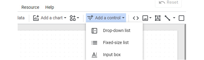
Figure 5.24 – Adding a control to the report canvas
Once you add a filter control of a specific type to the report, you can change it to another type from the control drawer at the top of the Properties panel. Choosing a different control type retains the relevant properties of the existing type. This makes it easier for you, as a report editor, to switch between various types while building the report without having to build the control from scratch every time:
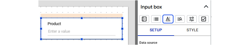
Figure 5.25 – Changing the control type easily from the control drawer
When you add a filter control to the canvas, it affects all the charts on the page that use the same data source as the control. They also filter charts based on different data sources that use the same fixed schema connector, such as Google Analytics, Google Ads, and others. This is because those datasets share the same internal identifiers for the fields.
It is possible to make a filter control applicable to the entire report across multiple pages. Select Arrange | Make report-level from the menu to make the control appear on every page of the report automatically in the same position on the canvas. This allows the user to interact with the filter from any page and affects the entire report. You can revert this by choosing Arrange | Make page-level from the menu:
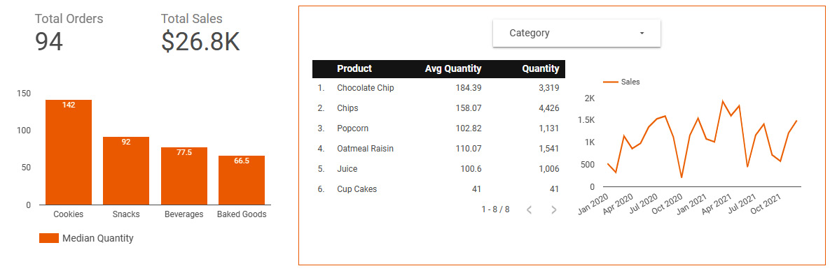
Figure 5.26 – Applying a filter control to a subset of charts on the page
You can limit the scope of the control by grouping one or more charts along with the control. This allows the user to filter only a subset of components on the report page using the control. It is good practice to highlight this group visibly in some way – enclosed by a shape, common background color, proximity, and so on – so that report viewers can easily understand that they are related. Otherwise, it leaves the users confused as to what data is impacted based on their filter selections. The preceding screenshot shows an example report page where the Category filter is only applied to the table and line charts on the right.
Drop-down list
The Drop-down list control enables the report viewer to choose one or more values of the chosen dimension field. The field can be of any data type – string, numeric, date, and so on. This control just lists all the distinct values of the field. As the report editor, you can provide default selection values to filter on. When you specify nothing, all the values are selected by default. First, choose the appropriate data source for the control and then pick the control field to use as the filter.
Optionally, the Drop-down list control allows you to display a metric for each of the dimension values. Just like adding a metric to a chart, you can choose existing metrics from the data source or generate one from the dimension fields by choosing the appropriate method of aggregation. You can also create a custom metric. The following screenshot shows a Category drop-down list control with Cookies and Baked Goods as the default selections and displays Quantity as the metric:
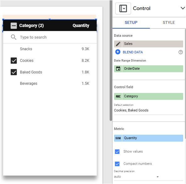
Figure 5.27 – Drop-down list control
You can sort the list values either by the chosen metric or by the dimension values themselves. You can hide the metric from the control by unchecking Show values. It is not necessary to show the metric values in the control to sort the dimension values by the metric. You can define the number of dimension values to make available in this control. The default is 5,000. However, you can choose from the options available. This can be as low as 1 up to 50,000 values:

Figure 5.28 – Important style options for the drop-down list control
By default, the control allows you to select multiple values. You can change this behavior and make it a single selection from the STYLE tab. You can also determine whether to include the search box in the control. While having the ability to search for the dimension values is helpful for longer lists, it might be a distraction if the dimension only has a few distinct values to choose from.
Fixed-size list
The Fixed-size list control has the same properties and behaves the same as the drop-down list control except that it displays all the values in a fixed-size box that you set as the report editor:
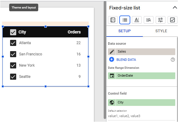
Figure 5.29 – Fixed-size list control
To configure the control, you must select the data source, specify the control field, provide any default selection values, add a metric, sort the values, and so on, as shown in the preceding screenshot.
Input box
The Input box control enables the user to type in specific dimension values to filter on for the associated charts. While this is not a user-friendly and commonly used filter control, it can be useful in scenarios where there are too many dimension values and the users know exactly what they are looking for. The Input box control matches the user input value against the chosen dimension and filters the chart data. By default, it checks for an exact match. However, you can make it easier for the users by determining how the matching happens. You can choose the appropriate search operator from the options available in the STYLE tab:
- Equals (default)
- Contains
- Starts with
- RegExp
- In (comma-separated values):
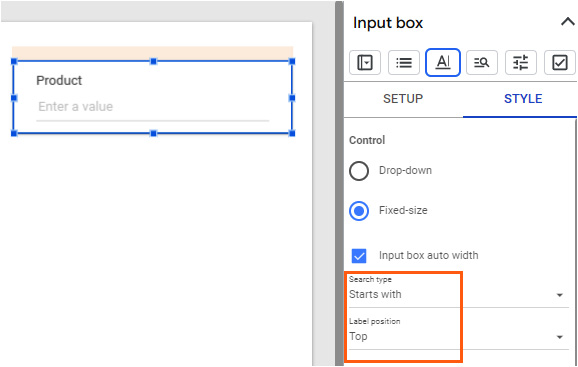
Figure 5.30 – Setting the search type for the Input box control
Note that searching in Looker Studio is case-sensitive by default, though it can vary based on the connector.
Advanced filter
The Advanced filter control is similar to the Input box control except that it allows the report viewers to interactively choose the search type to use. In the case of the Input box control, once the search type is set by the report editor, it cannot be changed by the report viewer. It may also not be evident to the end user as to how the matching happens with the Input box control without the editor leaving explicit instructions:
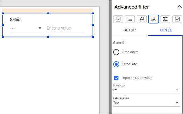
Figure 5.31 – The Advanced filter control with the default search type
The Advanced filter control takes this ambiguity away and empowers report viewers to choose the appropriate search type to suit their needs. You can set the default search type to be displayed in the control from the STYLE tab.
Slider
The Slider control allows the user to filter data by a numerical field. If you choose a field of any other data type, an error is displayed in the control. You cannot use a metric (which is an aggregation over multiple rows of the data source) field, such as average price, total gross margin percentage, and others, though. It has to be a dimension field. You can define the minimum and maximum values that the slider represents from the STYLE tab. By default, the full range of field values is included. However, you can choose a custom range for the end users to interact with. There are four slider modes to choose from:
- Range: The user can set both the minimum and maximum value of the field
- Single value: This lets the user select a single value of the field
- Locked min: The user can only adjust the max end of the slider range
- Locked max: The user can only adjust the lowest end of the slider range:
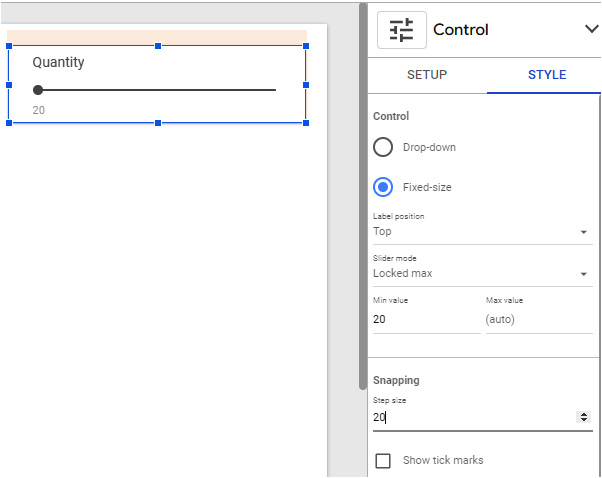
Figure 5.32 – The Slider control’s style options
Another useful style property is Step size. You can define how much the values should increment as the user interacts with the slider. The preceding screenshot shows the various important style properties for the Slider control.
Checkbox
Checkbox is another data type-specific control. It can only be used with Boolean fields. This control allows you to filter the data in the charts for either true or false values, but not both. So, use this control carefully. This control just displays the name of the Boolean field and the user can click on the name to check it, which represents the true value, and filter the charts accordingly:
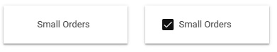
Figure 5.33 – The Checkbox control with a Boolean field when unselected (left) and selected (right)
This control acts as a toggle and the user can click on the control again to uncheck it and reverse the filter condition to match the false value. The preceding screenshot shows the two states of the Checkbox control. Selecting the checkbox causes the affecting charts to display only small orders, whereas unselecting the checkbox displays only non-small orders.
Date range control
The Date range control allows the end users to set the timeframe for the chart data without editing the report. It provides a calendar widget with several pre-built date ranges to choose from, such as last week, last year, this month, and so on. Report viewers can also define custom date ranges as per their needs. These are the same features and options that are available to report editors in the chart SETUP panel while configuring the report.
The Date range control requires you to just choose a default date range to apply. The specific date field in the data source that gets filtered is set for each component separately. The Date Range Dimension option can be set at any level – chart (in the SETUP tab), page (Current Page Settings), or the entire report (Report settings). For a chart, the first data field (alphabetically by field name) from the associated data source is automatically chosen as the date range dimension. You can change it to an appropriate date field as needed:
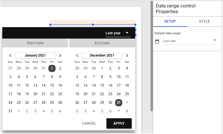
Figure 5.34 – Date range control options
The Date range control is the only one where you do not choose the control field in its properties. The generic nature of this control enables you to leverage just a single control to filter different date fields as applicable to various charts. Beware that if the Date range dimension property is not set for any chart, the Date range control will not filter the data in the chart even if the chart uses a date field as regular dimension.
Metric sliders
Metric sliders are another interactive filter option available for end users to determine what data is displayed in a visual. However, this filter only applies to metrics. This filter is built into the chart and you must enable it from the SETUP panel for the specific chart. Metric sliders allow the report viewer to filter the chart by metric value. By default, the full range of metric values is included. The end user can choose to view only a subset of data based on the aggregated metric value. If multiple metrics are depicted in a chart, sliders are provided for each, as shown in the following screenshot:
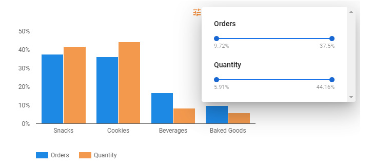
Figure 5.35 – Metric sliders to filter the chart by metric values
You can enable the Metric sliders option from the SETUP tab. At the time of writing, you can enable either the Optional metrics or Metric sliders option for a chart, but not both.
Cross-filtering
Cross-filtering allows you to use a chart to filter all the other charts in a group or on the report page. It provides an intuitive way of filtering and drilling through different dimensions by directly interacting with the charts. You can select one or more dimension values from any chart, including specific date ranges in time series charts to filter other charts accordingly. The following screenshot shows an example of Google Search Console data analysis, in which the time series chart and donut chart serve as filters for each other, as well as the remaining clustered bar chart.
It represents the application of cross-filtering to depict the distribution of clicks and click through rate for the top 10 countries based on search traffic originating from Desktop devices between April 10 and April 17:
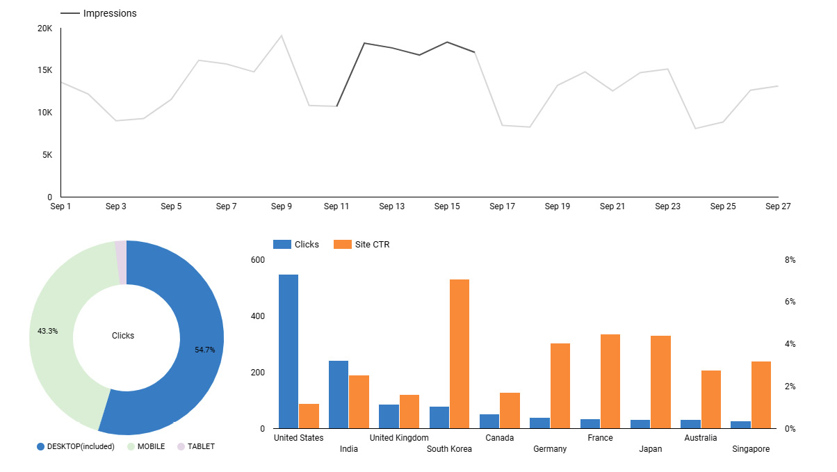
Figure 5.36 – Filtering charts interactively through cross-filtering
In many cases, cross-filtering eliminates the need to have explicit filter controls and helps save space in the dashboard. Filter controls are still useful for providing greater flexibility in selecting values, such as choosing built-in and custom date ranges, using sliders, and so on. Sometimes, explicit filter controls can also be a design choice based on end user preferences.
You can enable or disable cross-filtering for each chart in its configuration. Using cross-filtering may heavily slow down the report. So, limit cross-filtering by enabling it for only a few charts, if appropriate.
Adding design components
Besides the charts, which we will explore in the next chapter, and the interactive controls, there are other components that you can add to the report canvas that aid in designing the report. They are as follows:
- Images
- Text
- Lines
- Shapes
Static images, such as logos, can be displayed in the report as a separate component. Alternatively, you can use an image as a background for a chart or page by increasing the transparency of the image and overlaying the charts on top of the image, not that it’s a good practice. You can either upload the image or provide a URL to add the image to the report.
The text component is useful to add anything from the report header to chart titles to annotations and more. It allows you to insert hyperlinks as well. You can link to relevant external content or a different page within the same report, thereby creating your own desired page navigation. Text is perhaps the most helpful design component while creating data stories with Looker Studio. Lines help connect various report elements or to separate them. This basic element is something you want to have in your design arsenal.
A common way to use the rectangular and circular shapes is to enclose data or report elements to visually group related components, as shown in Figure 5.22. Shapes can also be leveraged to highlight certain data points in the charts, as shown in Figure 5.23.
Embedding external content
Apart from the aforementioned design components, you can also embed external content into your Looker Studio report. You can embed any content that is accessible via a URL, so long as embedding is allowed on the content by its provider. Examples include YouTube videos, Google Drive documents (Docs, Sheets, Slides, Forms, and so on), Google Calendar, and other web content, including non-Google sites.
You can even embed a Looker Studio report within another report. Just enable embedding for the Looker Studio report that you want to embed from its report settings. Report users need to have access to the embedded content to be able to view and interact with it appropriately.
To embed external content in the report, select the URL Embed icon from the toolbar and provide the content URL in the properties pane. The embedded content is displayed within the embed component and the users can interact with it as if they are doing so in the content’s native environment. This capability enables you to create a better user experience for your report by bringing together all the relevant pieces of information and content in one place. A useful scenario is where you can embed a Google Sheet with the glossary of terms relevant to the report on a separate page, as shown in the following screenshot:

Figure 5.37 – Embedding Google Sheets in the Looker Studio report
This enables report users to look up metric definitions in the glossary and get the needed context to understand and interpret the report, all without leaving Looker Studio:
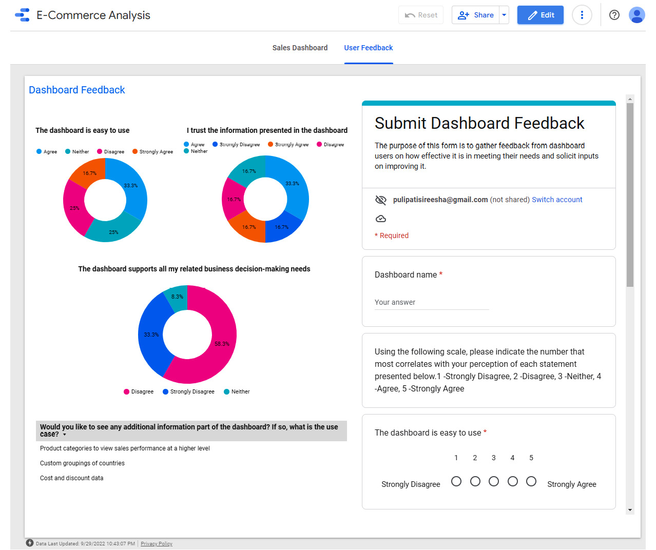
Figure 5.38 – Embedding Google Forms in the Looker Studio report
Another use case is where you can collect feedback from report users through an embedded Google Form. You can choose to visualize the aggregated responses in the same Looker Studio report, as shown in the preceding screenshot.
Styling report components
For any component you add to the report canvas, there are style properties that define how the component looks. Some properties are unique to a component type, while some others are common across different types of components. Some properties affect the structure or functionality of the component beyond just appearance. Examples include Search type for the Input box and Advanced filter controls, the number of bars in a bar chart, and so on. In this section, we will only focus on some general appearance-based style properties. Style properties that alter the functionality of a component are described in the respective sections throughout this book (for example, the Charts section in Chapter 6, Looker Studio Built-in Charts).
Background and Border
This is the one style property that applies to all report components – be it a shape, control, or chart. The only exception is the line element. You can set the following properties under this style:
- Background color
- Opacity/transparency
- Border line properties – color, weights, line type, and rounded corners
- Border shadow:
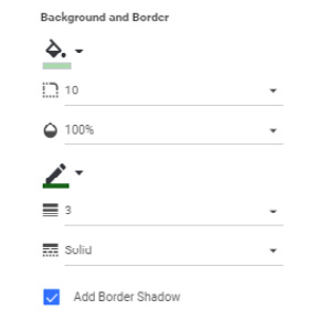
Figure 5.39 – Background and Border style properties
The preceding screenshot shows an example selection of these properties.
Text styles
Text appears in several forms in report components – data labels, axis labels, headers, and so on. Some components have more text elements than others. For example, a scorecard chart type only has a data label property, a drop-down box list control has header and data label properties, and a bar chart has text properties for axis labels and legend labels. General font-based properties you can configure include the following:
- Font color
- Font size
- Font type
The Text box, Table, and Scorecard components are purely text-based and provide additional properties to customize the appearance, such as text padding and text alignment, among others. Choose the appropriate values for these properties to elevate the report’s look and feel. The following screenshot shows the label and padding properties for the scorecard chart:
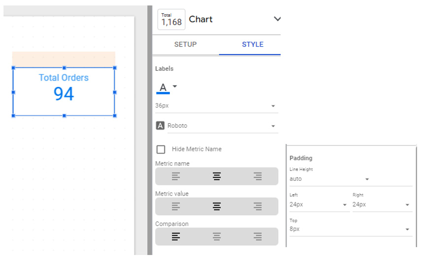
Figure 5.40 – Label style properties for a scorecard chart
Text and labeling are important elements of dashboards that should be focused on as much as the charts themselves.
Common chart style properties
For chart components, you can style common elements such as axes, grid lines, legends, and chart headers. These elements apply to most chart types.
Axes
First of all, you can choose to not display axes in your charts. This might be helpful when you would like to have a cleaner look and the axes lines do not contribute to the message intended. The following bar chart is an example. Here, text labels are used to indicate each category. The objective of this chart is to communicate the popularity ranking of different products based on quantity sold and the scale or metric values are not relevant. At the time of writing, it is not possible to hide only one axis in Looker Studio:
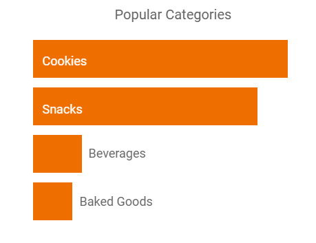
Figure 5.41 – Chart with axes hidden
When you display axes, you can choose to show or hide axis titles. You may not want to show axis titles if the dimensions and metrics represented are indicated via chart titles or other means. You can also reverse the direction of the axes – either the x axis, y axis, or both – if it aligns better with the dashboard’s and audience’s needs:
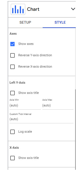
Figure 5.42 – Axes properties for a bar chart
When the axis represents a metric, you can configure the minimum, maximum, and custom tick interval values for the axis. You can use a shorter axis range to display only a subset of data, exclude outliers, and more. You can also make the axis logarithmic. This is useful when you are representing a metric with a very large range of values on the axis. Be careful not to place a chart with a logarithmic scale, and a chart with a standard scale too close to each other without making the difference in scales clear. Their proximity will encourage comparison, and the user may not notice the different scales and may draw incorrect conclusions. The preceding screenshot shows the style properties available for its axes.
Grid
The grid properties allow you to configure several aspects of the chart:
- Axis font properties – color, size, and type
- Data label font size
- Gridlines color
- Chart area border and background
The following screenshot shows a scatterplot with custom grid configurations. Note that the color selection for the axis applies to the legend labels as well by default. However, you can set the legend label color separately under the Legend properties. You can remove gridlines from the chart by choosing Transparent from the color palette. At the time of writing, Looker Studio does not provide an option to customize horizontal and vertical gridlines separately:
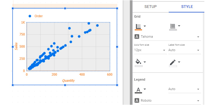
Figure 5.43 – Grid options allow you to configure axis labels, gridlines, and the chart area
Legend
Legend properties enable you to define the display position of the legend concerning the chart area – top, bottom, or to the right. You can also choose not to show the legend by selecting the None position. You can set the font properties for the legend labels – that is, color, size, and type. You can determine the proper alignment of the legend corresponding to its display position – left, right, or center when displayed on the top or bottom of the chart and top, middle, or bottom when displayed on the right.
When there are more than a few series that need to be represented in the legend and they do not all fit within the chart area, those labels are shown in multiple lines that can be accessed using navigational arrows:
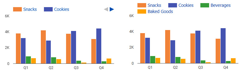
Figure 5.44 – Styling chart legends (Max Lines=1 on the left, Max Lines=2 on the right)
When you choose to display the legend at the top of the chart, you can define the maximum number of lines that a legend can use to show the labels instead of displaying them in a single line with navigational controls to scroll through all the values. The preceding screenshot depicts two instances of the same bar chart with different max lines settings for the legend.
Chart headers
Chart headers enable report viewers to interact with the chart and perform the following actions:
- Sort by different chart fields
- Export chart data to CSV or Google Sheets
- Drill up and down – available when drill down is enabled for the chart
- Explore the chart – opens the chart in Looker Studio Explorer
- Choose from optional metrics – available when optional metrics are enabled
In the following screenshot, the chart header is set to Always show to let users readily choose optional metrics from the header:
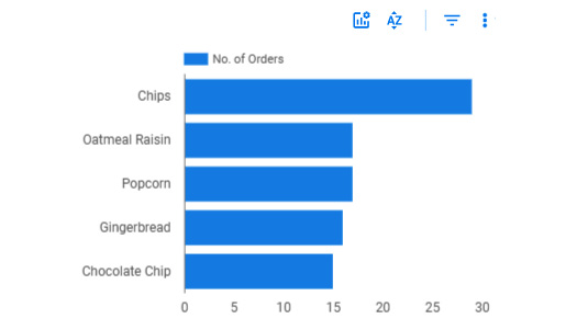
Figure 5.45 – The chart header can be set to “Always show” and displayed in any desired color
The default setting for the chart header is to show on hover. This is an ideal choice that provides full functionality and at the same time does not clutter the report page. However, you can choose to always show it, if needed. The other option available is not to show it at all. When you do not show the chart header, the end users can still access all actions except optional metrics and metric sliders from the contextual menu upon right-clicking. Optionally, you can customize the color of the chart header icons so that they match the chart and report colors.
Configuring style properties in report themes
You can set default style properties for various aspects of components across the whole report through report themes. You choose a theme from the list of built-in themes, create new ones by customizing existing themes, or generate a new theme based on an image. Report themes allow you to apply consistent styles across the entire report. Key style properties that can be set in a report theme include the following:
- Background: For the report pages and separately for the components
- Text style: The default font properties for all forms of text – text boxes, data labels, legend labels, and so on
- Chart palette and other colors: For series, dimension values, grids, chart headers, and more
The theme settings can be overridden for any individual component. These customizations stay put even when you switch to a different theme. You can always revert a component to the theme settings if you do not like your changes.
Building your first Looker Studio report – creating a report from the data source
In the previous chapter, Chapter 4, Google Looker Studio Overview, you created and set up the data source using the call center dataset available at https://github.com/PacktPublishing/Data-Storytelling-with-Google-Data-Studio/blob/master/Call%20Center%20Data.csv. In this section, you will create a report from that data source, configure some settings, and add a couple of components. Follow these steps:
- Open the Call Center data source from the Looker Studio home page.
- Click the CREATE REPORT button at the top to create a new report and confirm this to add this data to the report.
- Rename the report Call Center Analysis
- Open the Report Settings pane by selecting the appropriate option from the File menu. Set Call Center for Data Source and add CallDateTime for Date Range Dimension.
- From the File menu, select the Current page settings option to open the pane on the right. Make sure that Data source is set to Call Center. Choose CallDateTime for Date Range Dimension. Keep Default date range set to Auto:
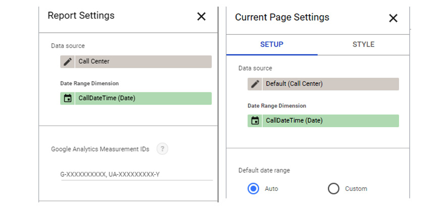
Figure 5.46 – Data source and Date Range Dimension configuration at the report and page level
- Switch to the STYLE tab in the Current Page Settings pane and increase the canvas size to 1000px or as needed.
- From the toolbar, select Theme and layout and choose the Groovy built-in theme or anything else that you wish to use.
- Delete the table chart that gets added to the canvas by default.
- Add a text box to the canvas by selecting the respective icon from the toolbar. Place it at the top of the canvas and give the report a title – for example, Call Center Analysis Dashboard. With the component still selected, configure the text alignment, font size, and any other desired formatting from the Text Properties pane. Increase the font size to 40px and center align the text:
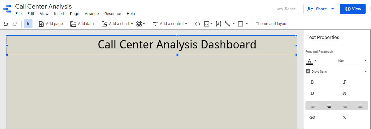
Figure 5.47 – Adding a title to the page using the Text control and configuring the properties
- Add a date range control to the page by selecting the appropriate option from the Add a control toolbar dropdown. Place it in the top-right corner. From the STYLE tab for this control, make the background color Transparent:
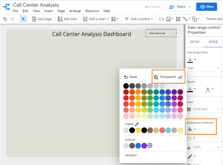
Figure 5.48 – Date range control style properties
You will add charts to this report in the next chapter.
Summary
As a report editor, you will spend most of your time working in the report designer, adding and configuring charts and controls. In this chapter, we explored various elements of the Report Designer. At the report level, you can add additional data sources, manage report pages, and choose report themes and other settings. We also looked at ways to add charts and additional data sources.
Designing a report component usually involves setting the appropriate data and style properties. You can define the data format, sorting, and aggregations for data fields that are represented in the component. You can add interactive filter controls to the report to enable report viewers to slice and dice the data without needing to edit the report configuration. There are some non-data components such as lines, shapes, and images that you can use to enhance the look and utility of your report.
In the next chapter, we will look into various chart types and how to configure them.