
9
Mortgage Complaints Analysis
The example dashboard in this chapter pertains to the analysis of American consumer complaints about mortgage products and services using the data provided by the Consumer Financial Protection Bureau (CFPB). This chapter will guide you through the process of building an operational dashboard that helps CFPB to monitor and analyze complaints data. While CFPB and the complaints data are real, the premise of the dashboard is made-up and rests on assumptions about the target audience and their objectives. The complaints database is available as a public dataset on BigQuery, Google’s Cloud data warehouse. A short primer on BigQuery is provided, which highlights its key features and how to use it for analytics. The dashboard building process involves three main stages – Determine, Design, and Develop.
In this chapter, we are going to cover the following topics:
- Describing the example scenario
- Introducing BigQuery
- Building the dashboard - Stage 1: Determine
- Building the dashboard - Stage 2: Design
- Building the dashboard - Stage 3: Develop
Technical requirements
To follow along with the implementation steps for building the example dashboard in this chapter, you need to have a Google account that allows you to create reports with Looker Studio. Use one of the recommended browsers – Chrome, Safari, or Firefox. Make sure Looker Studio is supported in your country (https://support.google.com/looker-studio/answer/7657679?hl=en#zippy=%2Clist-of-unsupported-countries).
You will need access to Google BigQuery, where the dataset used for this example lives. The BigQuery sandbox is available to anyone with a Google Account. Using the sandbox does not require a billing account and is free to use. The usage is subject to a few limitations though, in terms of storage and compute capacity, and table expiration time. The sandbox serves the purpose of this chapter, however. Another option is to sign up for the 90-day free trial of Google Cloud Platform (GCP), which offers the full breadth of capabilities and features. While some level of prior knowledge of Structured Query Language (SQL) for querying data from BigQuery is helpful, it is not mandatory for following this chapter. For those who cannot access Google BigQuery for some reason, I’ve made the dataset needed to build the dashboard available as a CSV file at https://github.com/PacktPublishing/Data-Storytelling-with-Google-Data-Studio/blob/master/cfpb_mortgage_complaints_dataset.csv. The CSV file contains 6 months of mortgage complaints data.
You can access the example dashboard at https://lookerstudio.google.com/reporting/0130033c-e1eb-4aff-b61f-a8d52be675c3/preview, which you can copy and make your own. The enriched Looker Studio data source used for the report is available to view at https://lookerstudio.google.com/datasources/390f38b5-2f83-497e-898c-5fa3a68c01de.
Describing the example scenario
The CFPB is a U.S. government agency that implements and enforces federal consumer financial law. It empowers consumers by providing useful information and educational materials. It supervises financial institutions and companies to ensure that markets for consumer financial products are fair, transparent, and competitive. It also accepts complaints from consumers and helps connect them with financial companies to get direct responses about their problems. The CFPB regularly shares this data with state and federal agencies and presents reports to Congress. Accordingly, the CFPB closely monitors the incoming complaints data and their responses to identify key patterns in the problems that consumers are facing.
The CFPB makes complaint data available for public use by publishing complaints to the Consumer Complaint Database (https://www.consumerfinance.gov/data-research/consumer-complaints/). Complaints that are sent to companies are only included in the database after the company confirms a commercial relationship with the consumer, or after 15 days, whichever comes first. This data is by no means a truly representative sample of the overall experiences of consumers in the marketplace.
The complaints database includes complaints made since 2011, when the agency was established, on various products such as credit cards, prepaid cards, consumer loans, student loans, debt collection, mortgages, money transfers, and bank accounts, among other things. The complaint process works as follows:
- A complaint is submitted by the consumer or gets forwarded by another government agency to the CFPB.
- The CFPB sends the complaint to the concerned company for its review.
- The company communicates with the consumer as needed and generally responds within 15 days. In some cases, the company can set the response as “in progress” and provide a final response within 60 days.
- The CFPB publishes the complaint to the database after removing any identifiable information.
- The CFPB lets the consumer know when the company responds. The consumer can review the company response and provide feedback within 60 days.
Google hosts the complaints database on BigQuery and makes it available to the general public for easy access and use. This enables us to readily analyze this data using SQL and integrated applications such as Sheets and Looker Studio.
There are three major types of dashboards based on their purpose – operational, tactical or analytical, and strategic:
- An operational dashboard helps us understand what is happening now and provides a snapshot over a short time period – for example, the last 7 days, the last 30 days, the current month, or the last 90 days. The appropriate time period varies based on the underlying processes. The scope of operational dashboards is usually narrow, often depicting only a single process or a few related processes. This type of dashboard focuses on monitoring operational processes and measuring performance against targets and helps with daily decision-making.
- Tactical or analytical dashboards provide a much broader perspective at the department or business unit level and generally include a larger volume of data. The objective here is to generate insights from historical data and investigate trends. Analytical dashboards help perform deeper and broader analyses to aid problem-solving and medium-term decision-making.
- Strategic dashboards serve executives and higher leadership by providing an at-a-glance view of the organization’s performance measured against its strategic long-term goals. These typically include high-level metrics, aggregations, and summary data. Strategic dashboards also often provide multi-year analyses to understand long-term trends and patterns.
For this chapter, we assume that the CFPB has small individual teams for each product type responsible for managing the respective incoming complaints, communicating with the companies concerned, and other operations. In the current example, we will be building an operational dashboard that can be leveraged by the mortgage analysis team within the CFPB. This dashboard monitors mortgage complaints data for the last 30 days, helping the mortgage team track operational processes and related metrics.
In the next section, a brief overview of BigQuery is provided. As a Looker Studio developer, learning about BigQuery helps you maximize the effectiveness of Looker Studio due to its deep integration with BigQuery. BigQuery is easy to use and powerful. It helps you examine complex and large datasets effortlessly.
Introducing BigQuery
BigQuery is a highly scalable distributed cloud data warehouse from Google that is purpose-built for running analytics. It is fully managed by Google and serverless, allowing users to use the service without worrying about setting up and managing infrastructure.
BigQuery is optimized for Online Analytical Processing (OLAP) workloads that perform ad-hoc analysis over large data volumes. This is in contrast to relational databases such as MySQL and PostgreSQL, which are built for Online Transactional Processing (OLTP). OLTP systems are optimized for capturing, storing, and processing transactions in real time.
BigQuery is highly performant and can process terabytes of data in seconds and petabytes of data within a few minutes. This is possible due to the decoupling of the storage and compute in its architecture, which allows BigQuery to scale them independently on demand. BigQuery charges you separately for storage and processing. Storage pricing is based on the total volume of data stored. Compute charges, on the other hand, are based on the amount of data scanned by a process or query, not the size of the result set. For the compute, you can either use the on-demand model and pay for use or purchase a specific capacity for unlimited use.
Getting started with BigQuery
To get started with BigQuery, you need a GCP account. You can use an existing Google Account (Gmail or any email registered as a Google Account) or create a new one. A valid credit card is required to complete the setup. If you are eligible for a free trial, the card will not be charged during the 90-day trial period. At the end of the trial, the resources are paused and you have 30 days to upgrade to a paid account and resume your work. Whether part of the GCP trial or a regular account, BigQuery always has a free tier, which allows you to query the first terabyte of data per month free of charge. The steps to create a GCP account are as follows:
- Go to https://cloud.google.com/ and click Get started for free.
- Provide a Google Account email address or create a new one.
- Fill in the name, address, credit card, and other details.
- Click Start my free trial.
The free trial offers a credit of $300 and you will be prompted to upgrade to a regular account when the credit runs out or the trial period ends, whichever happens first. The free trial provides the full breadth of GCP services and capabilities and helps you evaluate any and all Google Cloud products.
In addition to broader GCP access, BigQuery provides a sandbox environment for users to try out the service without requiring a credit card and billing enabled. However, only a limited set of features (https://cloud.google.com/bigquery/docs/sandbox#limitations) are supported in the sandbox. The BigQuery sandbox is available to anyone with a Google Account. It doesn’t require you to create a GCP account first. You can open the sandbox directly using the following URL: https://console.cloud.google.com/bigquery.
To use any Google Cloud resource, including BigQuery, you need to create a Google Cloud Project first. If it’s a brand-new account, the home page shows the Create project link for you to get started. In an existing account, a new project can be created from the project selection dropdown displayed in the blue header at the top.
In Google Cloud, a Project is a logical container that organizes cloud resources and helps define configurations for them. A resource can belong to only one Google Cloud Project. BigQuery resources follow a hierarchy as follows:
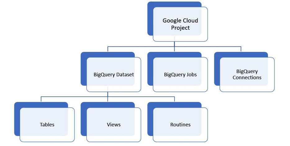
Figure 9.1 – The hierarchy of BigQuery resources
BigQuery datasets are logical containers that are created in a specific Google Cloud location such as us (multiple regions in the United States), us-west-1 (Oregon), europe-north1 (Finland), or asia-south2 (Delhi). At the time of writing, Google Cloud is available in 334 regions around the globe. BigQuery datasets are akin to databases or schemas in other database systems. You create tables, views, and routines such as functions and procedures inside a dataset.
BigQuery is SQL-based and supports the ANSI SQL 2011 standard. You can interact with BigQuery through a web console, a command line, and client libraries in Java, Python, or C#, as well as REST APIs. In general, feature parity exists between all these methods. The rest of this section focuses only on the web UI and SQL interaction methods.
The web UI looks similar to the following image. Explorer lists the datasets, tables, and other BigQuery resources that you have access to. The Query editor allows you to write SQL queries and scripts. The query results, execution details, and other outputs are shown below the editor. BigQuery automatically stores the history of all executions and displays them in the bottom panel, which you can expand and collapse as needed:
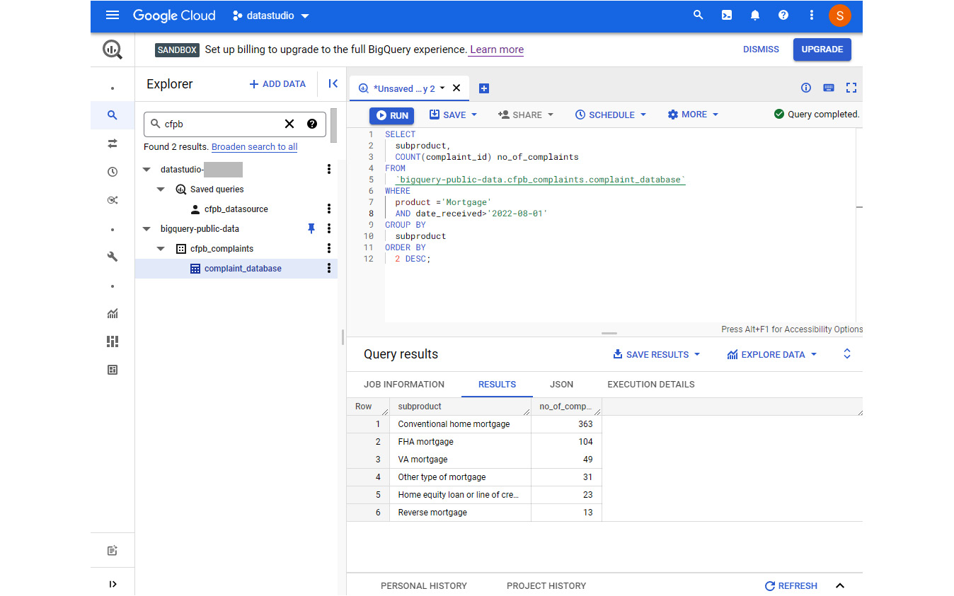
Figure 9.2 – The BigQuery web user interface
Before running the query, the editor indicates how much data will be processed by the query. This helps us understand the billing implications and provides an opportunity for us to optimize the query to scan a lesser volume of data, if possible. You can query data across multiple datasets, as well as projects, as long as the concerned datasets share the same location.
Note
In Google Cloud, different projects can be set up with different billing accounts and methods. Compute charges will be made against the project that is executing the query. In the UI, the project in use is displayed in the top blue header bar. Storage charges will be incurred by the projects under which the datasets and tables are defined.
Getting data into BigQuery
One way to get data into BigQuery is using the Create table option from the dataset. To create a dataset first, click on the project from the Explorer panel and select Create dataset from the ellipses. The steps to create a new table are as follows:
- Click on the dataset name from Explorer to open it in the right pane. Select CREATE TABLE. This opens the Create table pane.
- Set Source to one of the following
- Empty table - To create an empty table.
- Google Cloud Storage - Google Cloud’s object storage system.
- Upload - To upload files from your local machine.
- Drive - The files stored in Google Drive. The file can be in a CSV, JSON, Avro, or Google Sheet format.
- Google BigTable - A wide-column NoSQL database.
- Amazon S3 - AWS’ object storage system.
- Azure Blob Storage - Azure’s object storage system.
- Depending on the source type selected, provide the source file or data details.
- Specify the destination table name. You can keep the auto-populated project and dataset details or choose a different destination if you change your mind.
- Check the Auto detect checkbox to let BigQuery automatically detect the schema of the source. Alternatively, you can define the list of fields and corresponding data types.
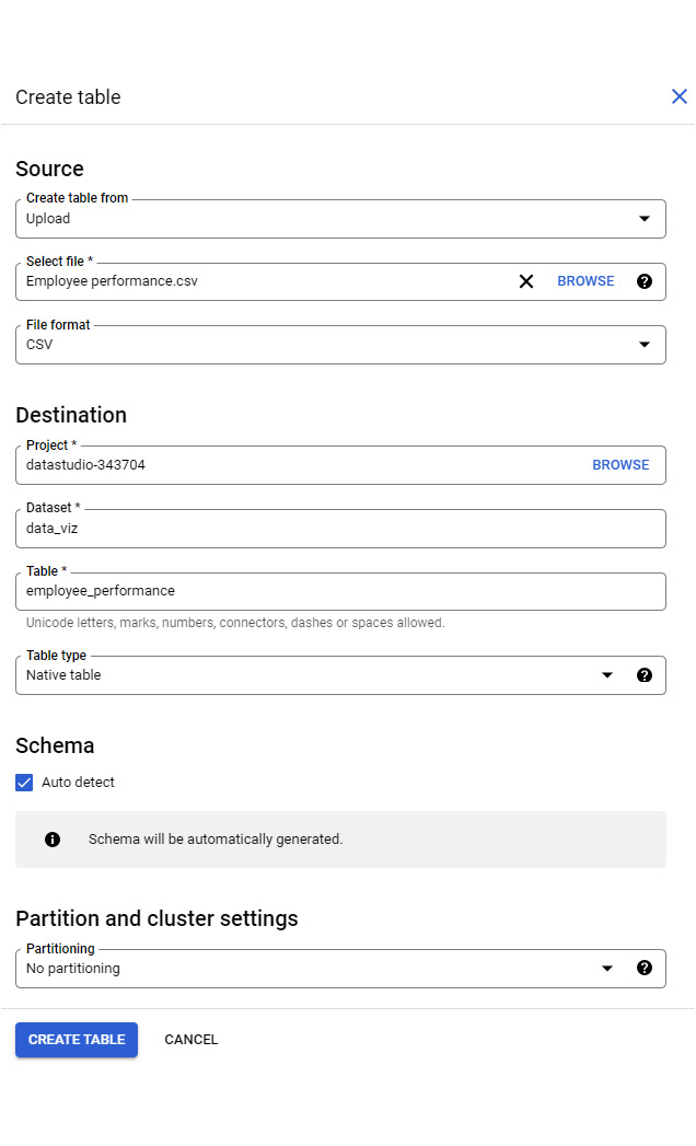
Figure 9.3 – Creating a table from the web UI
There are two types of tables that BigQuery can create for you:
- A native table
- An external table
A native table is where data gets transferred from the source and is stored in BigQuery. Creating an external table, on the other hand, does not involve any data movement. The data remains in the source. Instead, BigQuery just creates and stores the schema and other metadata. You can query an external table just as you would a native table using SQL. Certain source types such as Drive and Amazon S3 only allow you to create an external table from the Create table form.
You can also get data into a new table by copying it from another dataset or project. To copy the baseball games data from the public datasets project, the following steps can be used:
- Search for “baseball” in Explorer. Click Broaden search to all projects to view the results from the bigquery-public-data project.
- Expand the baseball dataset and click on a table. This opens the table details page on the right. Click COPY.
- In the Copy table form, provide the destination Project and Dataset names where the table copy needs to be created. Specify the destination Table name, which should be unique within that dataset:
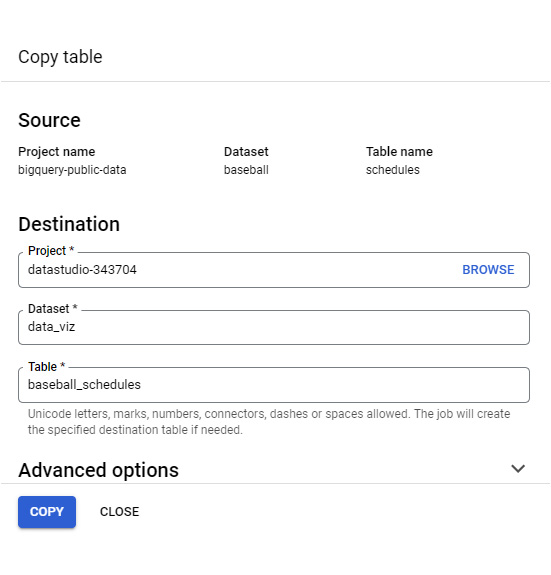
Figure 9.4 – Creating a full copy of a table
Another way to copy data into a new table is using a SQL statement as follows:
CREATE TABLE `datastudio-343704.data_viz.baseball_schedule`
AS
SELECT * FROM `bigquery-public-data.baseball.schedules`
In BigQuery, the fully qualified table name uses the following notation:
`project-name.dataset_name.table_name`
You can also move data into BigQuery using any data integration tool that supports the BigQuery destination. Examples include Google Cloud Data Fusion, Fivetran, and Striim.
Analyzing data in BigQuery
In BigQuery, you can run ad-hoc queries on one or more tables to analyze the data on demand. You can also schedule SQL scripts and queries to be executed regularly. This helps perform transformations and move data on a cadence. Standard SQL provides a rich set of commands and built-in functions that help summarize, manipulate, and transform data in the desired ways. The query results can be explored further in Google Sheets and Looker Studio by selecting EXPLORE DATA from the Query results pane, as shown in the following screenshot:
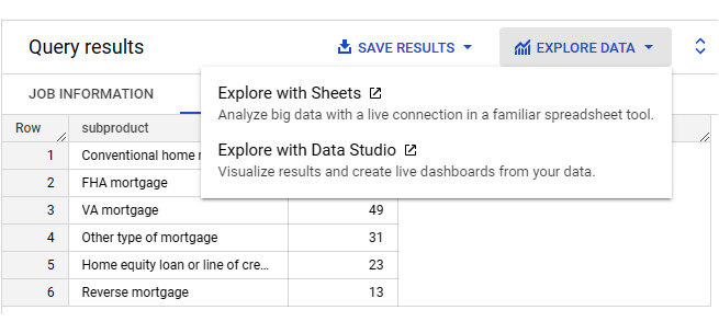
Figure 9.5 – Exploring the query results with Sheets and Looker Studio
Choosing either option creates a live connection to BigQuery using the SQL query that generated the result. This direct integration provides a seamless experience where you can start looking at raw data in BigQuery and then switch to Looker Studio, for example, to visualize data and explore further. When the Looker Studio option is selected, a new report is created with some default visuals as follows:
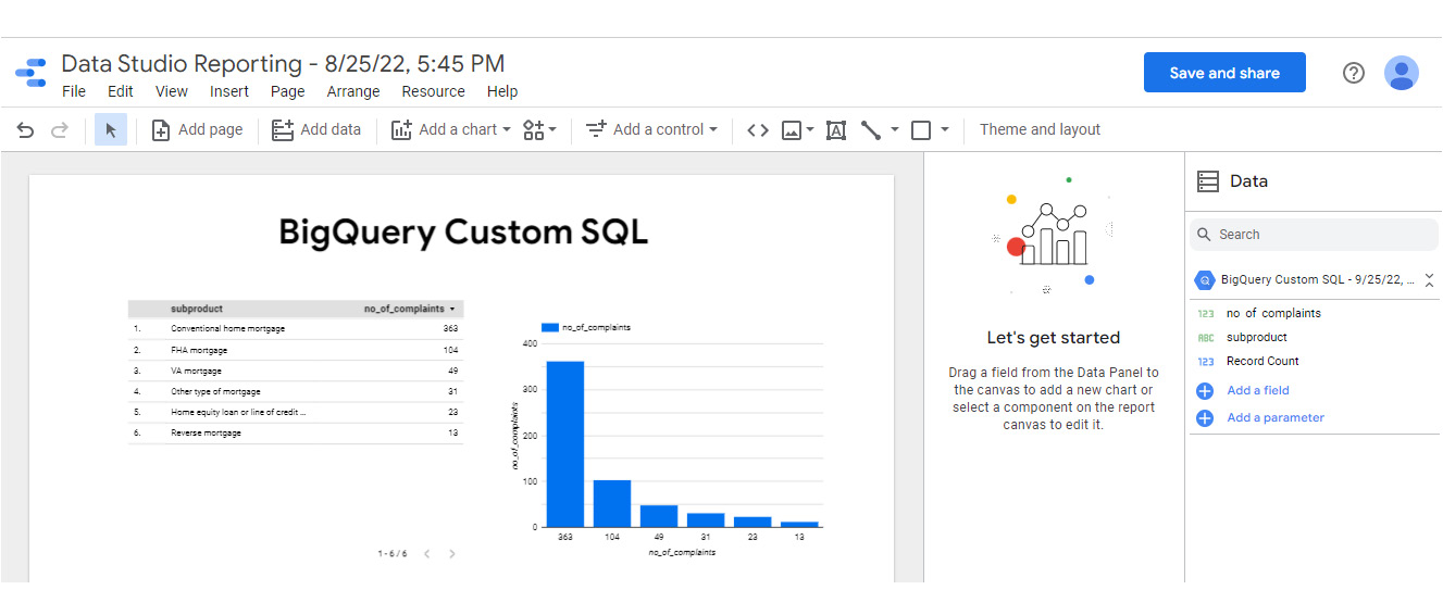
Figure 9.6 – The default Looker Studio report created from the query results
We have barely scratched the surface of the capabilities and features of BigQuery in this section. BigQuery is beyond just an analytical storage and processing system. Some of its other features include the following:
- BigQuery ML – performs ML with simple SQL statements without the need for advanced data science and programming skills
- BI Engine – an in-memory analysis service that offers the sub-second query response time needed for dashboards and reports
- Geospatial analysis – supports geography data types and provides SQL geography functions
- BigQuery Omni – enables data analysis across different clouds (Google, AWS, and Azure)
The rest of this chapter is about building a dashboard in Looker Studio by connecting to the CFPB complaints data stored in BigQuery. The 3D approach to building effective dashboards consists of three stages:
- Determine
- Design
- Develop
Let’s go through each of these stages in detail in the following sections.
Building the dashboard- Stage 1: Determine
In the first stage of the data storytelling approach, you determine the target audience, the purpose, and the objectives of the dashboard, as well as identify the data needed to meet the user needs. The mortgage operational team of the CFPB is the target audience of this dashboard. The team wants to understand current patterns within the issues that the complaints are about and company responses to them for various mortgage products and services. A key operational metric they would like to monitor is the time taken to triage the received complaints and send them to respective companies. The goal is to send the complaints within a day of receiving them. Another aspect the team is responsible for monitoring is the number and rate of untimely responses from the company. Once the company receives the complaint from the CFPB, it should respond within 15 days. Otherwise, it is marked as an untimely response. A higher number or percentage of complaints with untimely responses for a company or an issue type may signify the need for CFPB intervention in terms of imposing penalties or reviewing regulations and laws. Operationally, the mortgage team like to understand the following for the last 30 days:
- What’s the overall complaint volume?
- What’s the proportion of complaints with untimely responses and is it below the acceptable rate of 2%?
- What’s the mean duration taken for the CFPB to process the received complaints and send them to the companies? How does it compare with the desired duration of 1 day?
- Which issue types are the most common and how do companies respond to various issue types?
- What proportion of complaints comes from older Americans and service members?
- Which geographical locations have a higher density of complaints and how does that vary between high-income and low-income geographies?
- What are the top companies by overall complaint volume, untimely responses, and in-progress responses?
- The daily trends for the volume of complaints and other metrics
The database includes 18 fields and over 2 million complaints at the time of writing (https://cfpb.github.io/api/ccdb/fields.html):
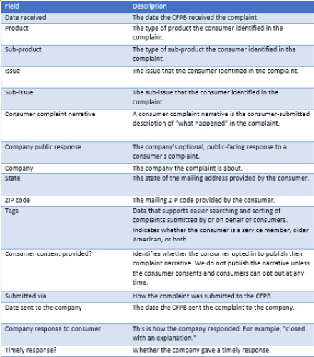
Table 9.1 – A list of dataset fields
Most of these data points are useful in addressing the questions that the mortgage team is looking to answer. The Bureau discontinued the consumer dispute option on April 24, 2017. Hence the Consumer disputed? field is not used in the analysis.
Additional information about the geography and census information such as population and income are required to address the question regarding the geographical distribution of complaints. BigQuery provides this information as part of the census_bureau_acs public dataset. Moreover, the State field in the complaints database only holds the state abbreviation. It would be more user-friendly to display state names on the dashboard instead. The BigQuery tables needed to construct the data source include the following:
- The complaint_database table from the cfpb_complaints dataset
- The zip_codes_2018_5yr table from the census_bureau_acs dataset
- The state_2018_5yr table from the census_bureau_acs dataset
- The zip_codes table from the geo_us_boundaries dataset
A combined data source from different tables in BigQuery can be created using a custom query based on the following data relationships:
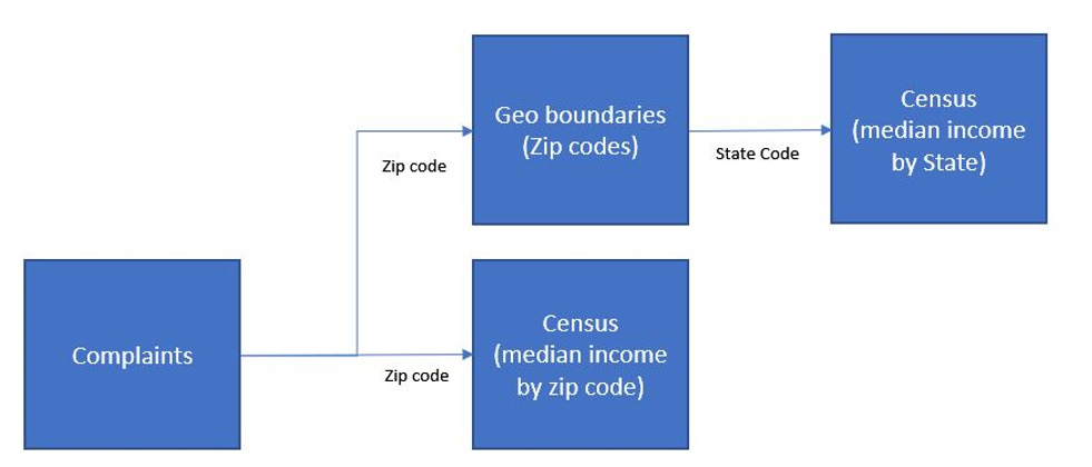
Figure 9.7 – The data model to use for the data source custom query
At the time of writing (June 2022), only the 2018 census information is available in BigQuery. The American Community Survey (ACS) released the 2020 data on March 31, 2022. But this data hasn’t been made available in BigQuery yet. You can download more recent population and income estimates from https://data.census.gov and upload them to your BigQuery project.
Building the dashboard- Stage 2: Design
In this next stage of the process, you define any key metrics needed, assess the data preparation needs, select the appropriate visualizations, and design the dashboard layout at a high level. The current analysis only requires simple aggregations such as counts and calculating the percentage of total counts for specific attribute values as key metrics. Turnaround time, which helps measure the efficiency of the CFPB, can be defined as follows:

The other key metrics include the volume of complaints, the percentage and volume of untimely responses, and the percentage and volume of in-progress responses.
The complaints database contains most of the required data in usable form. On closer inspection, you discover that the ZIP code data is not clean – with non-digit and extra characters.
Analyzing complaints at both the state and ZIP code level provides a zoomed-in and zoomed-out view of the distribution of the consumers who log complaints for various mortgage issues. This helps in identifying any population concentration concerning general and specific types of issues.
Choosing visualization types
Key metrics can be represented as scorecards, showing the rate of change compared to the previous period. For metrics that have benchmarks to be tracked against – untimely responses and turnaround time, gauges can be used to depict the actual versus target comparison.
The number of complaints for different issue types is best presented as a horizontal bar chart to properly display lengthy text labels. A Sankey chart is perhaps ideal to show the relationship between different types of issues that consumers are complaining about and the response categories that companies provide. This chart type is available as a community visualization in Looker Studio. This community visualization has a few limitations though. It doesn’t show any tooltips or allow cross-filtering. While this limits its utility in the dashboard, it provides a very useful representation of the flow and patterns of company responses to complaints on specific types of issues. The Sankey community visualization will inherit any filters applied to the dashboard through filter controls or cross-filtering from other charts.
Geographical distributions of complaints by state and ZIP code can be displayed as maps. Viewing the proportion of complaints based on population for different states and the ability to drill down into individual ZIP codes would be helpful. The Geo chart type in Looker Studio offers drill-down capability. However, the Geo chart does not support a postal code geo-dimension. Postal codes can be plotted using the Google Maps chart type but this doesn’t support drill-down. One approach could be to show the volume of complaints by state as bars and by zip code on a Google Maps chart. Alternatively, the distribution of states can be displayed in its own geographical map chart. Cross-filtering will allow the users to select a state in one chart and only view the corresponding ZIP codes in the other chart.
Consumers are tagged as being either an older American, a service member, or both. The proportion of complaints by consumer type can be visualized as a pie chart or donut chart. A table works best to present multiple measures and a large number of dimension values. Hence, the number of complaints, in-progress responses, and untimely responses associated with various companies can be displayed using a table chart.
Finally, the trends of key metrics over time really help the target audience quickly identify any interesting patterns in the processing of received complaints. A time series chart is apt for this purpose. However, a combination chart with both bars and lines can be used to display multiple measures effectively in a single chart.
Considering filters and interactions
The dashboard will be built for monitoring the last 30 days of data as per the requirement of the target users. Having a date range control filter will enable users to choose a longer time frame to understand broader trends and patterns as needed. The mortgage financial product comprises several sub-products and a drop-down filter can allow users to choose one or a few sub-products at a time in the dashboard.
The ability to cross-filter charts so that metrics can be viewed for one or more slices of issue types, companies, geographies, or consumer types is beneficial. As noted earlier, you cannot cross-filter using the Sankey community visualization chart.
Designing the layout
For this example, I’m going to build a one-page dashboard. Given the level of detail and breadth of information to be visualized, the page may extend beyond the typical desktop screen size. The choice of the number of pages and the page size required usually depends on various factors, such as the amount of information and charts, the number of distinct topics or focus areas, and the ease of navigation and filtering.
The arrangement of report components on the canvas should allow users to effortlessly consume the most important information, easily make comparisons, and intuitively enable interactions. High-level KPIs can be placed at the top of the dashboard with the analysis of different attributes spread below them.
The following image shows the wireframe of the dashboard:
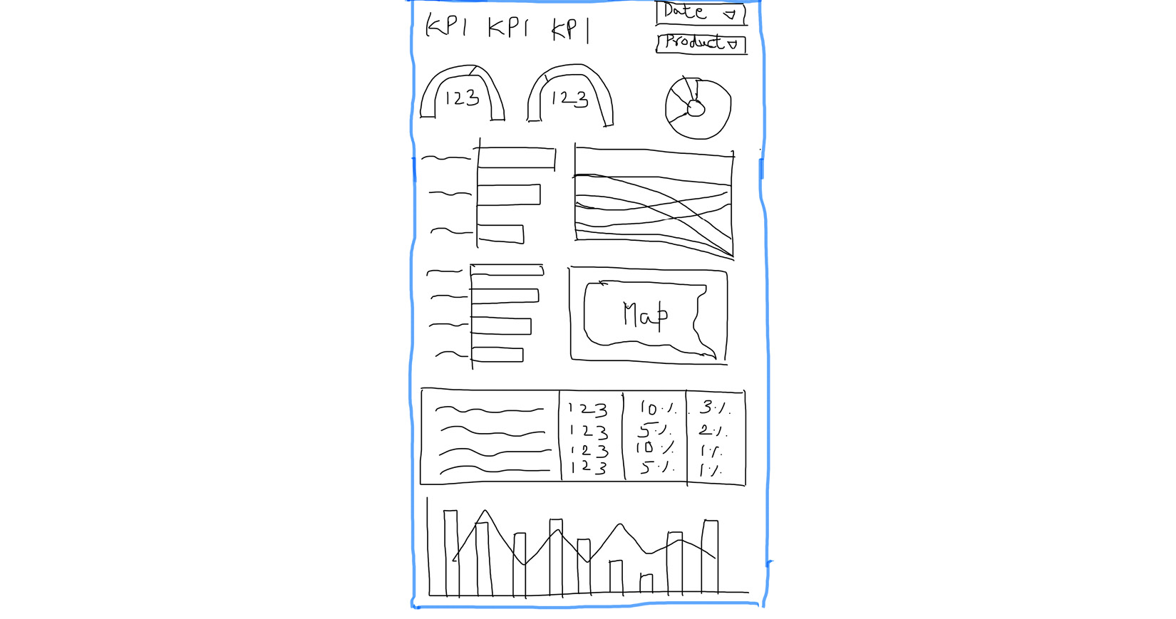
Figure 9.8 – Handdrawn sketch demonstrating the wireframe of the Overview page
The filter controls are placed at the top to indicate that the selections apply to the entire dashboard. Despite being prominently positioned on the canvas, filters can be made as unobtrusive as possible. The charts depicting issue types and company responses are placed side by side. Similarly, visualizations representing geographical dimensions are located together. The most detailed company-related metrics and trends over time are arranged at the bottom of the page. The donut chart showing the proportion of complaints volume by different consumer groups is placed at the top beside the KPIs, more as a convenience than anything else.
The development of the dashboard uses this wireframe and any other design decisions made during this phase as guidelines.
Building the dashboard- Stage 3: Develop
Now, it’s time to start implementing the dashboard. Creating the data source to power the dashboard is the first step.
Setting up the data source
You need to use Google’s BigQuery connector to create the data source. Since the required data resides in different BigQuery public datasets, using a custom query in the connection settings is the best option. Alternatively, if it’s possible for you, you can create a view (as in, a saved query) or table with the required data fields within BigQuery in your own Google Cloud Project and use this view or table as the dataset to connect to from Looker Studio. The BigQuery sandbox or a GCP free trial will allow you to create tables and views, subject to quotas and other limitations.
Note
The BigQuery public datasets project is read-only and you cannot create tables or views in it.
The custom SQL query to use for defining the data source is as follows:
SELECT
  date_received,
  product,
  subproduct,
  issue,
  subissue,
  company_public_response,
  company_name,
  complaints.state,
  cen_zip.geo_id AS zip_code,
  tags,
  submitted_via,
  date_sent_to_company,
  company_response_to_consumer,
  timely_response,
  complaint_id,
  zip.state_name,
  cen_zip.total_pop zip_code_population,
  cen_state.total_pop state_population,
  ROUND(cen_zip.median_income,0) median_income_zip_code,
  ROUND(cen_state.median_income,0) median_income_state
FROM (
  SELECT
    *,
    LEFT(REGEXP_REPLACE(zip_code, r'[^0-9]', ''), 5) zip_code_clean
  FROM
    `bigquery-public-data.cfpb_complaints.complaint_database` ) complaints
LEFT JOIN
  `bigquery-public-data.census_bureau_acs.zip_codes_2018_5yr` cen_zip
ON
  complaints.zip_code_clean = cen_zip.geo_id
LEFT JOIN
  `bigquery-public-data.geo_us_boundaries.zip_codes` zip
ON
  complaints.zip_code_clean = zip.zip_code
LEFT JOIN
  `bigquery-public-data.census_bureau_acs.state_2018_5yr` cen_state
ON
  zip.state_fips_code = cen_state.geo_id;
Using a custom SQL query for the data source connection allows you to perform data transformations and create derived fields beyond just combining data from multiple tables. The first source table in the FROM clause is the complaints database table, with the cleaned-up and transformed ZIP code as an additional field. Any characters other than numerical digits are removed from the original ZIP code field and only the first five characters are selected. This ensures an accurate and consistent format to allow appropriate mapping with the data in other tables. The correct representation of the ZIP codes is also important to make sure it can be defined as a geo-dimension and visualized via Maps in Looker Studio.
This transformed ZIP code field is used to connect the ZIP-code-level census table and extract the population and median household income fields from it. It is also used to connect the geo-boundary table to get the corresponding state name and code. Finally, the state code is used to connect the state-level census data to obtain the total state population and the corresponding median household income.
In the SELECT clause, only a limited number of fields needed for the analysis are included. A ZIP code is chosen from the geo-boundary table instead of from the complaints table to ensure only the standard US geographical information is included. The income fields are rounded to zero decimal places, as we do not need further precision than that. Certain columns are given appropriate aliases.
You can add a WHERE clause to the query to restrict the result set, say, to only mortgage-related complaints received in the last 12 months. In this example, we will leverage date range parameters to dynamically query the underlying data and configure a Product filter at the report level to restrict it to mortgage complaints. This way, the data source is generic enough and can be reused for other reporting purposes.
For any complex data manipulation needs, it is desirable to perform those operations within BigQuery using SQL queries and scripts. For our dashboard, we just need a few simple enhancements, which can be made within the Looker Studio data source.
The steps to create the data source are as follows:
- From the Looker Studio homepage, select Create | Data source.
- On the Connectors page, search for and select the BigQuery connector and rename the data source CFPB Complaints.
- Select the CUSTOM QUERY option from the left-hand pane and choose Billing Project. This is your own Google Cloud Project that gets billed for the queries executed. BigQuery has a free tier, which allows you to process up to 1 TB of data per month.
- Enter the custom SQL query and enable the date range parameters. This enables report users to only query the complaints for a specific time period dynamically through date range control selection. Pass these parameters in the WHERE clause as follows:
WHERE date_received BETWEEN PARSE_DATE('%Y%m%d', @DS_START_DATE) AND PARSE_DATE('%Y%m%d', @DS_END_DATE)
- Click the CONNECT button to create the data source:
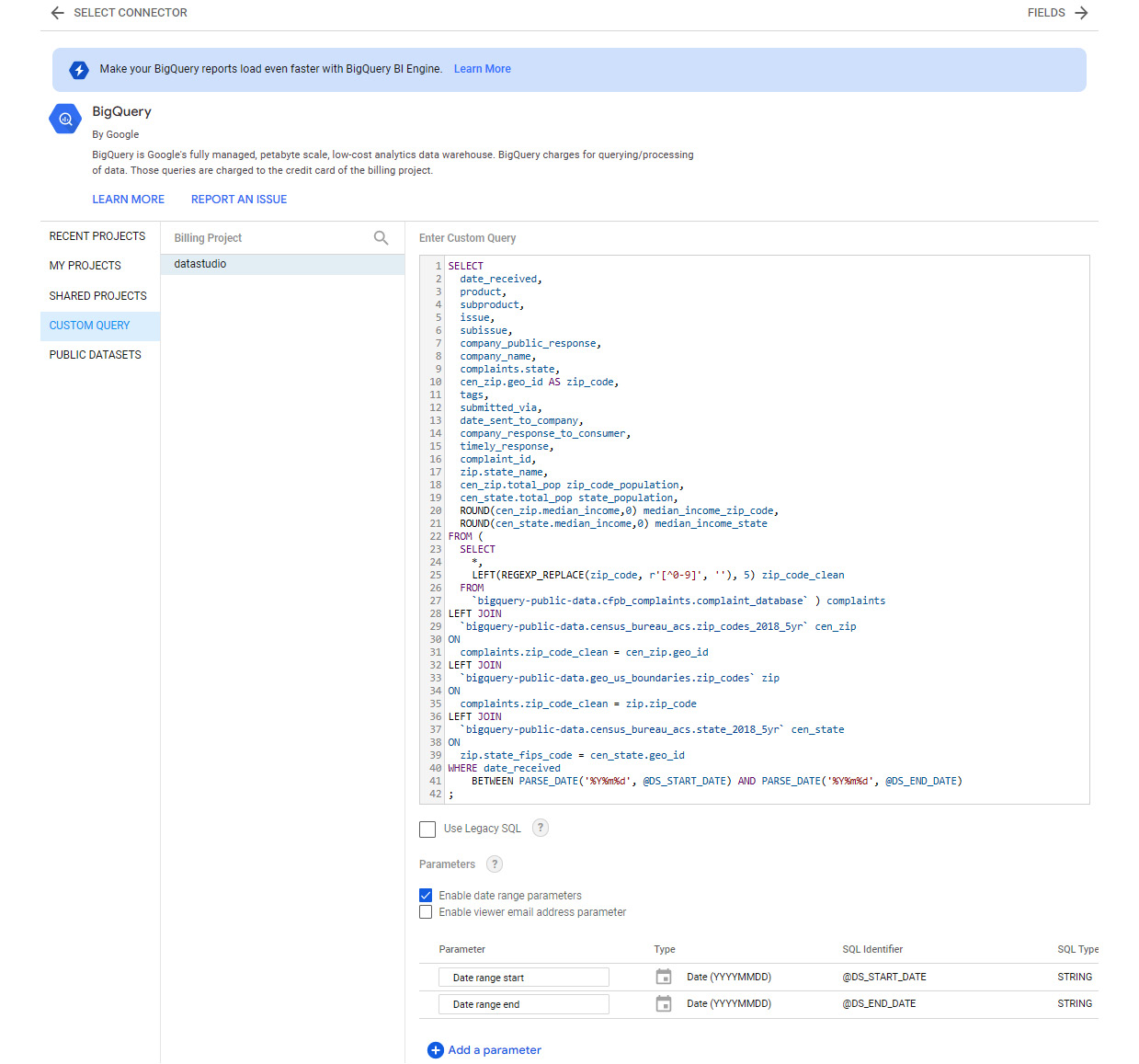
Figure 9.9 – The BigQuery data source connection settings
Enrich the data source by modifying the data types for the following fields:
- median_income_state - Currency (USD – US Dollar ($))
- median_income_zip_code - Currency (USD – US Dollar ($))
- state - Country subdivision (1st level)
- state_name - Country subdivision (1st level)
- zip_code - Postal code
Create the following derived fields to help facilitate the dashboard development:
See the following for is_in_progress:
CASE WHEN REGEXP_CONTAINS(company_response_to_consumer,'.*progress.*') THEN 1 ELSE 0 END
This derived field indicates whether the company responded to the consumer with an “in progress” status to signify that the additional time period, up to 60 days, is needed to provide a valid response.
The accompanying metric field, pct_in_progress, is as follows:
SUM(is_in_progress) / COUNT(complaint_id)
See the following for is_untimely_response:
IF(timely_response = FALSE, 1, 0)
This field simply denotes an untimely response as 1 to allow easy aggregations.
The corresponding calculated metric, pct_untimely_response, is as follows:
SUM(is_untimely_response) / COUNT(complaint_id)
Update the data type as Number à Percent for both the percentage fields.
See the following for turnaround_time:
DATE_DIFF(date_sent_to_company, date_received)
The turnaround time is the time taken in days from the date a complaint is received and the date when it is sent to the concerned company. Update the default method of aggregation for this field to Average.
Individual company responses to a consumer can be summarized into three categories for easier analysis: Closed with relief, Closed with explanation, and Other. The Other category includes untimely responses and in-progress complaints.
See company_response_category:
CASE
  WHEN CONTAINS_TEXT(company_response_to_consumer, "relief") THEN "Closed with relief"
  WHEN CONTAINS_TEXT(company_response_to_consumer, "explanation") THEN "Closed with explanation"
  ELSE "Other"
END
Similarly, issue types can also be grouped into a few meaningful categories as follows.
See issue_category:
CASE
  WHEN CONTAINS_TEXT(issue, "Credit") THEN "Credit report and monitoring"
  WHEN CONTAINS_TEXT(issue, "report") THEN "Credit report and monitoring"
  ELSE issue
END
The tags field provides information on whether the consumer is an older American, a service member, or both. If the consumer is none of these, it shows a NULL value. The following calculated field can be created to display Other when the tags field has no value.
See consumer_type:
IFNULL(tags, 'Other')
Designating states and ZIP codes as either lower income or higher income geographies compared to the national median helps with understanding the patterns in complaints data from the consumers based on household income. We need two derived fields, one each for state and ZIP code. Since the census information is from 2018, we need to use the national median income for 2018 for comparison, which is $61,937.
See state_income_category:
IF(median_income_state <= 61937, "Lower income", IF(median_income_state > 61937, "Higher income", ""))
See zip_income_category:
IF(median_income_zip_code <= 61937, "Lower income", IF(median_income_zip_code > 61937, "Higher income", ""))
Another way to implement these calculated fields is to use a parameter to hold the value of the national median income and reference the parameter in the formulas. This approach allows you to define and manage the value in one place:
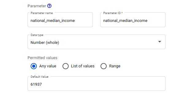
Figure 9.10 – Creating a parameter to hold the national median income value
The formula using the parameter looks as follows:
IF(median_income_zip_code <= national_median_income, "Lower income", IF(median_income_zip_code > national_median_income, "Higher income", ""))
To properly compare the volume of complaints between different geographic locations, you need to consider the per capita volume. To be able to visualize the per capita volumes properly, I used the population in millions for states and the population in thousands for ZIP codes.
See complaints_per_state_population_millions:
COUNT(complaint_id) * 1000000 / MIN(state_population)
A state population is repeated for each complaint originating from that state and we need to select just one value per state. This is achieved by using the MIN aggregation, but you can also use MAX or AVG.
See complaints_per_zip_population_thousands:
COUNT(complaint_id) * 1000 / MIN(zip_code_population)
Creating a report
Create a new report from the newly created data source page by selecting CREATE REPORT. Update the report name to Mortgage Complaints Dashboard. From the Theme and Layout panel, choose any report theme of your choice. I’ve used a custom theme generated from an image.
In the Report Settings (File à Report settings) panel, configure the following settings:
- Data source: CFPB Complaints
- Date Range Dimension : date_received
- Default date range: Use the Advanced option to choose the last 12 months:
- Start Date: Today Minus 12 Months
- End Date: Today Minus 0 Days
- Select ADD A FILTER to define a report filter on Product (Mortgage)
These settings ensure that only limited and appropriate data is queried from BigQuery and used in the report. Configuring the default date range at the report level, in addition to the date range parameters in the query, makes sure that users cannot query complaints that are older than 1 year.
Choose Current page settings from the Page menu to open the panel on the right. From the STYLE tab, set the Height field of the canvas to 2100.
Now, build the report components based on the wireframe and other high-level design considerations made in the earlier stage. Styling, colors, labeling, and other implementation details will be worked out and addressed in this stage.
The following image shows how my implementation of the dashboard looks:
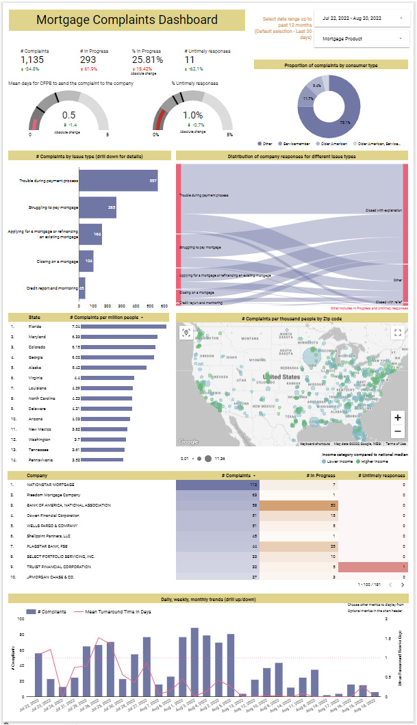
Figure 9.11 – A fully developed dashboard for monitoring mortgage complaints
In the rest of this section, let’s go through the development steps of various dashboard components and their configurations.
Add a Text control to provide a title on the top-right-hand side of the dashboard. Place the date range control on the top-right-hand side and configure Default date range to Last 30 days. To let users readily know that the dashboard presents the last 30 days of data with the ability to extend the date range up to the last 12 months, place a helpful note right beside the filter component. Add the drop-down filter control below the date range control and set Control field to subproduct. Rename the control field Mortgage Product. Use the count of complaint_id as the metric and rename it # Complaints. Filter controls are a great way to show additional information without requiring any extra canvas space.
Create KPI charts, scorecards, and gauges below the dashboard title. Use scorecards for the metrics that do not have a target benchmark to be compared against. These include the volume of complaints, in-progress responses, and untimely responses. The percentage of complaints with an in-progress response can also be displayed as a scorecard.
For each of these scorecards, set Comparison date range to Previous period. This allows the comparison metric to display the absolute change or a percentage of the change between the metric value for the last 30 days and the value for the last 31 to 60 days when the current period is set to the last 30 days using the date range control filter.
For all these metrics, positive growth is undesirable and vice versa. Accordingly, update the comparison metric colors from the STYLE tab. For a % In Progress scorecard, display the comparison metric as an absolute change, as it would be confusing to interpret a percentage change in a percentage metric.
The CFPB mortgage team strives to send consumer complaints to companies promptly, within a single day. Hence, the turnaround time is monitored against this benchmark in a gauge. Similarly, the percentage of untimely responses is measured against the target of 2%. The configurations for the gauges are as follows:
- Set the Metric values to turnaround_time and pct_untimely_responses respectively. Make sure the method of aggregation for turnaround time is set to Average.
- Set Comparison date range to Previous period.
- From the STYLE tab, select appropriate colors for the bars and the comparison metric. Choose red for a positive change and green for a negative change.
- Enable Show Absolute Change.
- Define the range limits:
- Turnaround time: Range #1 to 1, Range #2 to 2, and Range #3 to 3
- % Untimely responses: Range #1 to 0.01, Range #2 to 0.02, and Range #3 to 0.03
- Set the axis limits:
- Turnaround time: Axis Min to 0 and Axis Max to 5
- % Untimely responses: Axis Min to 0 and Axis Max to 0.05
- Enable Show Target and provide the value:
- Turnaround time: 1
- % Untimely responses: 0.02
- Select Hide Metric Name. Use text controls instead at the top to display the desired name.
- Select the Do not show option for Chart Header.
Wherever the comparison metric shows the absolute change value instead of the percent change, add a custom label to that effect using text control.
Visualize the breakdown of the volume of complaints by consumer type as a donut chart and place it to the right of the KPIs. A pie chart can also be used for this purpose, as a donut chart and a pie chart are perfectly interchangeable. Understanding the proportion of complaints from different groups of consumers helps the CFPB to identify any need for intervention to support the affected groups. Using a monochromatic color scheme for the donut chart helps limit the overall number of disparate colors on the dashboard. This helps reduce distraction and creates an elegant look. All effective data stories, whether business-related or otherwise, lend to this principle of minimizing the number of colours to reduce visual clutter.
The next set of visualizations is related to the issue types and company responses. Use a horizontal bar chart to display the volume of complaints by issue category, which is a derived field, and add the issue regular field as the drill-down dimension. The mortgage product doesn’t have any sub-issue types to analyze. Hence, it is not included in the chart. Either use Record Count or the count of complaint_id as the metric to represent the number of complaints. Make sure the chart is sorted by the metric in descending order. Adjust the y-axis to display the label properly. Enable data labels from the STYLE tab. Make sure Show axis title is unchecked. Hide the legend by choosing None. Add a chart title using text control to indicate what the chart is about. I chose to use appropriate chart titles that describe the chart data in lieu of showing axes labels in this dashboard. You can choose either based on your design. You do not need to add both if they provide the same information.
A Sankey chart helps visualize the flow between the type of complaint issue and the company responses. Create the Sankey chart using the following configurations:
- Select the community visualizations and components icon from the toolbar, click Explore more, and choose Sankey from the list.
- Grant consent to allow this community visualization to render the data:
Figure 9.12 – Granting consent to the community visualization
- Select issue_category and company_response_category as the dimensions.
- Set Metric to Record Count or complaint_id. Sort by the metric in descending order.
- From the STYLE tab, choose Node color and Link color. Adjust the opacity as needed. I’ve increased it to 40%.
- Select Show node labels? and set the Node label font size to 10px. Provide appropriate values to Left label offset and Right label offset to make sure the node labels are easy to read. I’ve provided the values 10 and 3 respectively.
- Select the Do not show option for Chart Header.
The generated visualization is as follows:
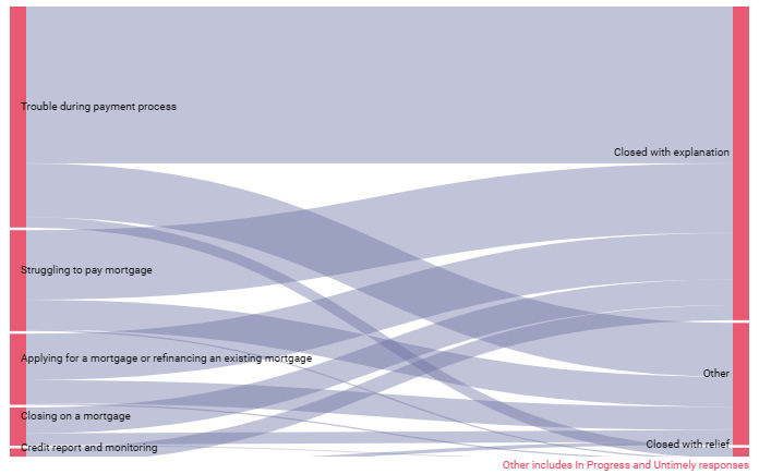
Figure 9.13 – A Sankey chart to visualize the distribution of company responses for different issue types
The width of the link represents the volume of complaints. As noted in the earlier section, the current implementation of the Sankey community visualization is limited in its functionality. It would have been great to see the complaint volume and proportion values in the tooltip.
Create a Google Maps bubble chart to visualize complaints volume by ZIP code. Set Size metric to the complaints_per_zip_populatpon_thousands derived field and rename it # Complaints per thousand people. Set Color dimension to zip_income_category. Rename it Income category compared to national median. These user-friendly names are displayed in the tooltip and legend. At this point, you might notice that the bubbles appear in other countries and continents even though the ZIP codes are US-specific. This is because the ZIP code alone is not enough to identify the geography uniquely. A new derived field combining the ZIP code and state is needed here. Create the new field as follows.
See zip_code_us:
CONCAT(zip_code, ", ", state_name)
Using this field as the Location field in the chart configuration plots all the bubbles within the United States. In the STYLE tab, configure the following:
- Choose appropriate colors for the income categories by updating the dimension value colors.
- Adjust the bubble size under the Bubble Layer settings as desired.
- Unselect Show Street View control under Map Controls.
- Leave Size Legend as Bottom and align it Left. Unselect Show legend title, as the long label gets cut off in the legend. Instead, use the chart title, created with a text control, to describe the value being represented in the chart.
- Leave the position of Color Legend as Bottom and align it Right.
- Select the Do not show option for Chart Header.
Different options work well for displaying complaints volume for different states. Using a Geo chart of Google Maps with filled-in areas is a good choice. Using bubbles instead of filled-in areas allows you to represent higher and lower income states, as with the ZIP code map built just now. Using a horizontal bar chart is another option. This has the added advantage of a more precise comparison of values across states, as humans can detect variation in lengths more accurately than differences in color intensities or areas. As with the map chart, the bars can be colored based on state income category, using the stacked bars option:
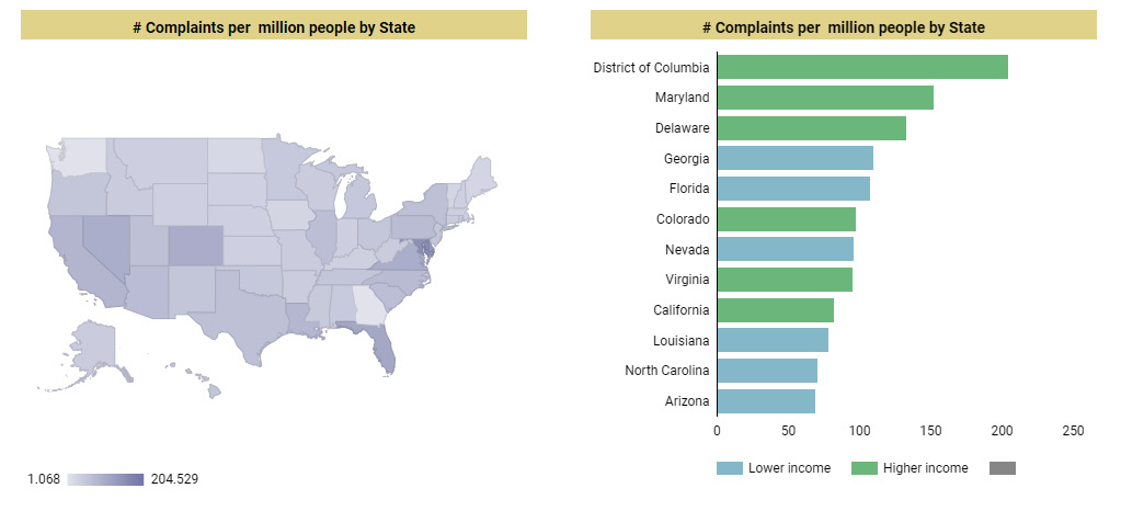
Figure 9.14 – A couple of ways to visualize the volume of complaints by state
The downside of using a bar chart is that only a limited number of states can be displayed clearly within the confined space without the necessity to scroll through a long list of dimension values. A table chart with bars can present all the states and enables users to scroll through all the values. However, depicting higher and lower income states using color becomes tricky without actually displaying the income category in the table. In the end, it’s a trade-off between precision and clarity. I’ve opted for the table chart and displayed the metrics as bars.
Next, use a table chart with a heatmap to display the volume of complaints, in-progress responses, and untimely responses for various companies. Sort the table by the volume of complaints to display the companies with the most complaints at the top. Enable Metric sliders. This allows users to filter the companies by the metric values depicted in the chart.
Display the daily trends in the volume of complaints and other metrics with a combination chart. A time series chart also can handle multiple metrics and display them on both the y-axes. However, using bars and lines to represent metrics on different axes is maybe easier to interpret. Dual axis charts work best only when the units and scale of the two axes are very different from each other. The volume of complaints is represented as bars on the left y-axis. The mean turnaround time, % in progress, and % of untimely responses can be plotted as lines using the right-hand y-axis. Enable the Optional metrics setting to allow users to see only one or more metrics at a time in the chart. The configurations are as follows:
This is the configuration for SETUP:
- Set Dimension to date_received and set Type to Year Month. The monthly view is helpful when the user extends the date range of the dashboard beyond the default 30 days using the date range filter control.
- Add the date_received field again and set Type to ISO Year Week.
- Add date_received one more time and leave Type as Date.
- Enable Drill down and set Default drill down level to date_received (Date).
- Add the following as Metrics and rename them appropriately:
- Record Count - # Complaints
- Average of turnaround_time - Mean Turnaround Time in Days
- pct_in_progress - % In Progress
- pct_untimely_responses - % Untimely responses
- Enable Optional metrics.
- Sort by date_received (Date) in ascending order.
- Disable the Cross-filtering and Change sorting options. The target users do not necessarily want to use this chart to slice the rest of the charts based on date, week, or month. The date range control helps them to focus on a specific time frame.
This is the configuration for STYLE:
- Choose Bars for Series #1 and Line for the rest of the series. Set Axis to Right for the second, third, and fourth series.
- Choose appropriate colors for all the series.
- Add a Reference Line with a Value of 1 on Right Y-axis. Uncheck Show label. Choose the same color as Mean Turnaround Time for the line. Choose a Dotted line type with a weight of 2. This line helps to compare the trend of turnaround time against the benchmark of 1 day.
- Show the axis titles for both the y-axes.
- Switch back to the SETUP tab and move the % In Progress and % Untimely responses metrics under Optional metrics. This ensures that only # Complaints and Turnaround Time are displayed in the chart by default.
Add a note over the chart to inform users about optional metrics. Add chart title on the top similar to other charts.
This completes the creation of the mortgage complaints dashboard that the mortgage team of the CFPB can use to monitor the metrics on a daily or weekly basis. For most of the charts in this dashboard, the chart header is disabled to minimize the overlap of the header with the chart titles. Most of the options available from the header, such as drilling up or down and exporting, are also accessible via the right-click context menu. The exceptions include the Optional metrics and Metric sliders features, which are leveraged in the bottom two charts. Hence, Chart header is set to the default Show on hover for the bottom two charts.
Summary
In this chapter, you learned about the American consumer complaints data on financial products and services from the CFPB, the US government agency that receives these complaints. You walked through the process of building an operational dashboard for a fictional team within the CFPB to monitor the volume of complaints and other related metrics for mortgage products. The complaints database is available as a Google BigQuery public dataset, which we used to create the data source for the dashboard. You were also introduced to BigQuery and its features briefly. In the next chapter, we will go through one more example and create a dashboard using customer churn data.