
10
Customer Churn Analysis
Customer churn is a vital problem for any subscription business. The example dashboard in this chapter presents an analysis of the customer churn phenomenon for a broadband service provider. This chapter will walk you through the process of building the dashboard using the 3-D approach: Determine, Design, and Develop. You will understand the relevant churn metrics and how blending can be used to calculate them in Looker Studio.
In this chapter, we are going to cover the following topics:
- Describing the example scenario
- Building the dashboard – Stage 1: Determine
- Building the dashboard – Stage 2: Design
- Building the dashboard – Stage 3: Develop
Technical requirements
To follow the implementation steps for building the example dashboard in this chapter, you need to have a Google account that allows you to create reports with Looker Studio. It is recommended that you use Chrome, Safari, or Firefox as your browser. Also, make sure Looker Studio is supported in your country (https://support.google.com/looker-studio/answer/7657679?hl=en#zippy=%2Clist-of-unsupported-countries). The dataset is a CSV file and is available to download in compressed form at https://github.com/PacktPublishing/Data-Storytelling-with-Google-Data-Studio/blob/master/customer_churn_data.zip.
You can access the example dashboard at https://lookerstudio.google.com/u/0/reporting/a02f5dd9-1070-42a6-8ebb-93d89947e666/preview, which you can copy and make your own. The enriched Looker Studio data source that’s used for the report can be viewed at https://lookerstudio.google.com/datasources/99469508-0cd4-4269-9522-0f95bf3de996.
Describing the example scenario
Customer churn is a phenomenon where customers voluntarily or involuntarily stop doing business with a company. It affects subscription-based businesses such as Software-as-a-Service (SaaS), media streaming, telecom, and others as well as non-subscription-based businesses such as retail, hospitality, travel, and others. A non-subscription-based business relies on new customers and repeat purchases from existing customers to generate revenue. Their business model is transaction-based, where repeat purchases are not guaranteed.
In contrast, a subscription business has a customer generating a steady stream of revenue for the duration of the subscription. Losing customers implies lost revenue. Measuring and reducing customer churn is more critical to a subscription-based company as its business model is highly dependent on the long-term relationship with its customers.
It is more expensive to acquire new customers than to retain existing ones. The new customer acquisition costs can be up to five times those of retaining current customers (https://www.invespcro.com/blog/customer-acquisition-retention/). It is very important to measure customer churn and minimize it as losing a customer base is detrimental to a company’s bottom line.
The extent to which customers typically churn varies widely across different industries. As per Recurly Research (https://recurly.com/research/churn-rate-benchmarks/), the annual churn rate for subscription businesses varies between 5% and 7%. In general, Business-to-Consumer (B2C) businesses experience a higher churn rate compared to Business-to-Business (B2B). B2B services are usually at a higher price point and involve a more complex purchase process compared to B2C offerings, causing B2B customers to be more thorough in their purchase decisions.
Customer churn can occur as a result of the following issues:
- Cancellations
- Expirations (non-renewals)
- Payment failures
Customers may leave a business by canceling an active subscription for reasons such as not requiring the service anymore, not being happy with the price, issues with the product, not being satisfied with customer service, and so on. Subscriptions can be ongoing or time-bound, such as 1 year, 3 years, and so on. Customers may also voluntarily leave the company by not renewing a time-bound subscription when it expires due to one or more of the same reasons mentioned earlier for active cancellations. If a significant proportion of the churn is due to non-renewals, this may indicate higher termination costs of active subscriptions, which discourage unhappy customers to leave midway. It also signifies an opportunity to provide attractive deals to customers with upcoming renewals.
While voluntary churn is the major component of the overall customer churn, involuntary churn due to payment failures and delinquency is not insignificant and can typically range from 20% to 40% (https://www.profitwell.com/recur/all/involuntary-delinquent-churn-failed-payments-recovery). Some strategies organizations can use to combat involuntary churn include sending timely reminder messages and emails, offering debit and auto payment options, prompting users to verify and update payment information periodically, and so on.
The dataset used in this chapter is available as a compressed CSV file in the GitHub repository associated with this book at https://github.com/PacktPublishing/Data-Storytelling-with-Google-Data-Studio/blob/master/customer_churn_data.zip.
The dataset includes 2 years’ worth of billing, contract, churn, and other information for over 20K customers. In the remainder of this chapter, you will build a dashboard that depicts the customer churn metrics and trends based on this dataset.
Building the dashboard- Stage 1: Determine
In the Determine stage of the dashboard building approach, you determine the target users and objectives of the dashboard. You also identify the data needed to build the dashboard in this stage.
The target audience of this dashboard is the customer success teams in the company. Customer churn is an organizational problem and various departments such as marketing, sales, production, and support have a stake in it. However, the central customer success department is responsible for increasing customer satisfaction, decreasing churn, and driving product adoption.
The purpose of the dashboard is to depict the churn metrics for the last 24 months and help identify potential causes of customer loss. The questions that the target audience aims to answer with this dashboard include the following:
- At what rate do customers leave the company?
- What revenue loss has been incurred?
- When do customers leave the company concerning contract status and overall tenure?
- What are the top reasons for customers to stop using the service?
- Do customers complain before leaving?
- Do customers who use the phone service in addition to broadband leave at a higher or lower rate than those using only broadband?
- How does customer churn vary for various broadband bandwidths?
These questions can be answered using the broadband customer monthly billing dataset, which includes the following information:

Table 10.1 – List of dataset fields
No other data will be considered for this dashboard. However, in the real world, additional information such as the following will help in providing a more comprehensive analysis of customer churn and retention:
- Customer acquisition cost
- Customer demographics
- Net promotor score (this measures the loyalty of the customers)
- Usage patterns (upload, download bandwidth, and so on)
For this dashboard, you can assume that the company aims for a 10% annual customer churn rate, which amounts to a 0.87% monthly churn rate. The target users do not expect to interact with the dashboard to perform any ad hoc analysis.
Building the dashboard- Stage 2: Design
In the Design stage, you define the key metrics to be monitored, evaluate the need for any data manipulation, choose the right visualizations and filters needed, and create a wireframe of the dashboard to organize the various components.
Defining the metrics
The primary metrics relevant for measuring customer churn are the customer churn rate and revenue churn rate. You want the customer churn rate to be as low as possible and the revenue churn rate to be a negative value. A negative revenue churn implies a gain in revenue despite a non-zero customer churn owing to new customer acquisitions and upgrades from existing customers.
A simple way to compute customer churn at a monthly level is as follows:

The monthly churn rate can be extrapolated to an annual or longer period using the following formula:

Here, N = the number of months
Revenue churn provides another lens to look at the health of the customer base. You can consider both Gross Revenue Churn and Net Revenue Churn.
Gross Revenue Churn measures the revenue lost in the current period due to churned customers from the previous period. It does not consider the revenue generated from new customers gained in the current period:

The average monthly Gross Revenue Churn is calculated for the period of interest, as follows:

The revenue churn rate is determined by looking at the current month’s revenue churn versus the previous month’s revenue:

Net Revenue Churn considers the revenue generated from new customers in the current period in addition to the revenue from existing customers:

The monthly average Net Revenue Churn is calculated over time by dividing the Net Revenue Churn by the number of months.

The Net Revenue Churn rate is determined as the ratio of the current month’s Net Revenue Churn and the previous month’s revenue:

Other useful metrics to monitor include the following:
- The average number of customers churned per month:

- The average number of new customers acquired per month:

- The average number of net new customers per month:

You can leverage the dataset in its present form and do not need to perform any data manipulation outside Looker Studio.
Choosing visualization types and filters
Scorecards with accompanying sparkline charts work well for displaying key metrics. Time series charts for customer churn and revenue churn rates help in visualizing the monthly trends. The number of lost customers by the termination reason provided and the broadband service bandwidth used are best represented as horizontal bar charts owing to the long dimension labels.
Customers of the broadband service provider can use their service either with or without a contract. A contract signifies the commitment by the customer to use the service for a set length of time, such as 12 months, 24 months, and so on. Benefits to customers by committing to a contract include low cost and better customer support among other things. The proportion of churned customers by whether the customer has an active contract or not at the time of churn can be displayed using a pie or donut chart.
If a customer has ever had a contract with the provider, it is interesting to see when during the contract or since the contract expiry customers typically leave. A line chart or a bar chart is useful to present this data with the number of months to or since the contract expiry on the X-axis. Irrespective of the timing of customer churn concerning the contract, visualizing the proportion of customers leaving based on the total time they have been with the company is helpful. This also can be visualized as a line or bar chart.
A simple way to address the question of whether the customers who left ever filed complaints with the provider is to visualize the proportion of churned customers with and without complaints. A pie or donut chart fits the bill here. It is more useful to understand the difference in the proportion of churned customers with and without complaints, which can be visualized as a stacked bar chart. The same applies to analyzing customer churn for customers with and without phone service in addition to broadband service.
The dashboard will be set to display the entire 24 months of data by default. A date range control allows users to select a different time-frame. The example dataset used here is a static one and never gets updated with the latest data. In a real-world scenario, the dashboard will be based on a live dataset that gets updated regularly. No other filters are necessary for this dashboard. Cross-filtering will be disabled for all charts as users are not expected to interact with the charts and perform any further analysis.
Designing the layout
It takes some experimentation to arrive at a layout that works for the data and visualizations involved. Place the high-level metrics at the top of the dashboard and detail the breakdown below them. A good way to organize the metrics is by grouping customer churn and revenue churn. The detailed charts depicting customer churn can be arranged around the questions of when customers churn, why they churn, and which customers churn.
The following diagram shows the wireframe of the dashboard:

Figure 10.1 – Handdrawn sketch demonstrating the wireframe of the dashboard
The dashboard includes a single filter control, which is placed at the top right. The location indicates that the filter applies to the entire dashboard. The period that applies to the dashboard is an important piece of information to correctly interpret the overall KPI values. Placing this control at the top quickly helps users understand the dashboard timeline.
The next stage involves developing the dashboard based on the wireframe and other design considerations made so far as guidelines. Refinements and adjustments to these design decisions are expected to be made during development as further nuances are uncovered.
Building the dashboard- Stage 3: Develop
To start creating the dashboard, first, you must set up the data source in Looker Studio.
Setting up the data source
The dataset is a CSV file that you can connect to from Looker Studio using the File Upload connector.
The steps to create the data source are as follows:
- Download the ZIP file from https://github.com/PacktPublishing/Data-Storytelling-with-Google-Data-Studio/blob/master/customer_churn_data.zip and unzip it.
- From the Looker Studio home page, select Create | Data source.
- On the Connectors page, select File Upload and add the customer_churn_data.csv file. If you encounter any upload errors, make sure the CSV file is saved as UTF-8 CSV.
- Name the dataset Customer churn data.
- Once the file has been uploaded, click CONNECT.
Now, the data source can be enriched by renaming the fields appropriately, updating the data types, and adding new derived fields:
- Rename the month field to year_month as it is an integer representation of the billing year and month
- Update the data type of bill_amount to Currency (USD – US Dollar ($))
Based on the metrics and visualizations identified during the design phase, you can add some calculated fields to the data source upfront. The rest may be added later as needed. Often, a data source is enriched with additional fields in an iterative fashion while building the dashboard as it is not practical to envision all the necessary calculations beforehand.
Create the billing_month field to represent the year_month data as a Date. Use the following formula:
PARSE_DATE('%Y%m', CAST(year_month AS STRING))An additional field is required for this purpose as it is not possible to directly change the data type of the year_month field from number to date. First, it needs to be converted into Text; then, the PARSE_DATE function must be applied.
Looker Studio interprets the effective_start_date and effective_end_date fields as being of the Text type. Create new fields to represent these values as dates:
- contract_start_date: PARSE_DATE(‘%m/%d/%Y’, effective_start_date)
- contract_end_date: PARSE_DATE(‘%m/%d/%Y’, effective_end_date)
To analyze customer churn concerning contract status, create the contract_status field to indicate whether the customer has an active contract or not for each billing period:
IF(billing_month BETWEEN DATETIME_TRUNC(contract_start_date, MONTH)
  AND DATETIME_TRUNC(contract_end_date, MONTH), 'In Contract', 'Out of Contract' )
Calculate months_to_contract_expiry to help understand how long before or after the contract ends that customers churn:
DATETIME_DIFF(contract_end_date, billing_month, MONTH)
A negative number for this field indicates the number of months since the contract ended or expired and vice versa.
To calculate and visualize customer churn metrics, the following derived fields will help:
- Create has_customer_churned as a numerical field to facilitate easy aggregation using the IF(current_month_churn = ‘TRUE’, 1, 0) formula
- Calculate churn_rate as SUM(has_customer_churned) / COUNT_DISTINCT(account_no)- Set the data type as Number | Percent.
churn_rate, when visualized for each month, displays the monthly customer churn rate. As defined earlier in the Design stage, the annual or overall churn rate is not just a simple aggregation of the monthly churn rate and the calculation takes into consideration the compounding effect. To compute that, the average monthly value needs to be determined first and the compounded overall churn rate is calculated using the average churn rate. This calls for aggregating an aggregated value. This can be achieved by creating a data blend. Each row in this blend represents the aggregated churn value for each billing month, allowing you to perform computations on these aggregated values. This blend can also be used to calculate revenue churn metrics as they also involve computations on various monthly aggregations. You will create the blended data source from the report designer.
Other metric fields you can create in the data source include the following:
- avg_customers_churned_per_month: SUM(has_customer_churned) / COUNT_DISTINCT(year_month)
- avg_new_customers_per_month: SUM(is_new_customer_account)/COUNT_DISTINCT(year_month)
It is useful to display the net new customers gained per month in addition to these, which can be calculated as follows:
- avg_net_new_customers_per_month: net_new_customers / COUNT_DISTINCT(year_month), where net_new_customers is a derived field calculated as SUM(is_new_customer_account) - SUM(has_customer_churned)
The data source is now in good shape, which means we can start building the visuals. It can be further enhanced as the needs arise while developing the dashboard.
Creating a report
Create a new report from the just-created data source page by selecting CREATE REPORT. Update the report name to Customer Churn Analysis. From the Theme and Layout panel, choose any report theme of your choice. I’ve used the default theme for this example.
In the Report Settings (the File | Report Settings menu) panel, configure the following:
- Data source: Customer churn data
- Date Range Dimension: billing_month
Choose Page | Current page settings from the menu and make sure Data source and Date Range Dimension are chosen appropriately. Set the Default date range as a fixed date range with Start Date set to July 1, 2020, and End Date set to June 30, 2022. If it is a live dataset, you would have set the date range to the last 24 months using the Advanced option:
- Start Date: Today minus 24 months
- End Date: Today minus 0 months
This ensures that the date range control on the dashboard will show the date range by default instead of Select date range. From the STYLE tab, increase the canvas size to 1500x1800. Adjust this as per your needs.
Build the dashboard component by component based on the design considerations we’ve made so far. As you are developing the dashboard, do not lose sight of the dashboard’s purpose and adjust the design appropriately. The following screenshot shows what my implementation of the dashboard looks like. Yours may vary with regards to layout, colors, specific chart types, and so on, and still meet the stated objectives and high-level design elements of the dashboard:

Figure 10.2 – Customer churn analysis dashboard
In the rest of this section, you will go through the implementation process of this example.
Overview section
First, to implement the key metrics, you must create a blended data source. To create a blend that provides monthly aggregation values for churn rate, follow these steps:
- Select Resource | Manage blends from the menu.
- Select ADD A BLEND.
- Under Table 1, set billing_month to Dimension and churn_rate to Metric. Rename the metric monthly_churn_rate.
- Set Data source name to Monthly churn and click SAVE:

Figure 10.3 – Monthly churn blend to calculate the average monthly churn rate
The overall churn rate for the chosen period, whether it’s 6 months, 12 months, or 24 months, can be calculated using the monthly churn rate, as follows:
1-POWER((1-AVG(monthly_churn_rate)), COUNT(billing_month))
You cannot create a calculated field within a blend itself, so this has to be defined as part of the chart configuration. Note that this is a simple blend that contains just one table and provides an aggregated view of the original data source at a monthly level.
Computing revenue churn requires you to determine both the current and previous month’s revenue for churned and new customers. This can be achieved by modifying the Monthly churn blend to include this information. Before that, create the following base-derived fields in the original data source (Customer churn data):
- previous_billing_month: CAST(DATETIME_SUB(billing_month, INTERVAL 1 MONTH) AS DATE )
- new_customer_revenue: IF(is_new_customer_account = 1, bill_amount, NULL)
- existing_customer_revenue: IF(is_new_customer_account = 0, bill_amount, NULL)
- churned_customer_revenue: IF(has_customer_churned = 1, bill_amount, NULL)
- non_churned_customer_revenue: IF(has_customer_churned = 0, bill_amount, NULL)
To calculate the previous month’s revenue, the Monthly churn blend needs to be updated so that it joins the Customer churn data data source on previous_billing_month. Follow these steps:
- Edit the Monthly churn blend either from the Data panel or from the Manage blends page.
- Select Join another table and choose the Customer churn data data source.
- Make the following updates to Table 1:
- Add previous_billing_month as a Dimension
- Add bill_amount as a Metric and rename it current_month_revenue
- Add existing_customer_revenue as a Metric and rename it current_month_existing_customer_revenue
- Add new_customer_revenue as a Metric and rename it current_month_new_customer_revenue
- Define Table 2 as follows:
- Add billing_month as a Dimension
- Add bill_amount as a Metric and rename it previous_month_revenue
- Add existing_customer_revenue as a Metric and rename it previous_month_existing_customer_revenue
- Add churned_customer_revenue as a Metric and rename it previous_month_churned_customer_revenue
- Add non_churned_customer_revenue as a Metric and rename it previous_month_non_churned_customer_revenue
- Configure the join condition between Table 1’s previous_billing_month and Table 2’s billing_month fields. This ensures that the metrics defined in Table 2 are calculated for the previous month:

Figure 10.4 – Extending the Monthly churn blend with a join to the original data source on the previous billing month
- Make sure billing_month is added as the Date range field for both tables. This ensures that the date range control filters the charts based on this blend.
The final blend configuration will look as follows:

Figure 10.5 – Final Monthly churn blend configuration
Create the overall customer churn rate scorecard chart by following these steps:
- Choose the Monthly churn blend as the Data source chart.
- Click on the default metric that was added and select CREATE FIELD.
- Enter 1-POWER((1-AVG(monthly_churn_rate)), COUNT(billing_month)) as the formula.
- Rename the field Overall Churn Rate.
- Set Type to Numeric | Percent.
- Click APPLY.
- From the STYLE tab, increase the font size to 48px under Labels.
For the average monthly churn rate scorecard, use the monthly_churn_rate field from the Monthly churn blend. Set the aggregation to Average. To show the variation from the target value of 0.87%, I've used another scorecard chart and annotated it with the Text control. Arrange these components close to each other to make them look like a single unit:

Figure 10.6 – Average monthly churn rate visualization
For the scorecard showing the variation, use the following steps:
- Create a calculated field in the chart as:
- Diff from target: (AVG(monthly_churn_rate) - 0.0087)/0.0087
- Set the Type as Number | Percent
- In the STYLE tab, configure the following:
- Set Decimal precision as 0.
- Update label font size as 24px.
- Select Hide Metric Name
- Add two conditional formatting rules to show the value in Red color when the variation is greater than 0 and in Green color when the variation is 0 or negative.

Figure 10.7 - Conditional formatting rules for the scorecard displaying the variation from the target churn rate
Reminder
As discussed earlier in this book (Chapter 2, Principles of Data Storytelling), while green and red are universally associated with good and bad, respectively, they are not completely inclusive. People with color vision deficiency often (depending on the type of deficiency) see these colors differently and may not always be able to differentiate between them. When using any other colors for this purpose, users need additional cues in the form of a legend or notes to help them. A recommended approach is to use icons such as a smile and a frown (in addition to color) to indicate desirability and undesirability. At the time of writing, Looker Studio does not provide this capability out of the box. While using red and green as colors has some caveats, they are not taboo and are still commonly used in visualizations effectively. So, use these colors in your reports and dashboards at your discretion and with due consideration.
Depict the number of customers lost and acquired per month on average for the selected period as scorecards with respective sparklines to provide general trend information. Show the net new customers acquired metric in the same fashion:

Figure 10.8 – Scorecards with accompanying sparkline charts depicting the number of customers lost
For each of these metrics, configure the charts as follows:
- Use Customer churn data as a Data source
- For each of the scorecards, use the following fields as metrics, respectively:
- avg_customers_churned_per_month; rename it Customers Lost per month
- avg_new_customers_per_month; rename it New Customers Acquired per month
- avg_net_new_customers_per_month; rename it Net New Customers per month
- Update the label size for scorecards to 36px or as desired from the STYLE tab.
- Use the following metrics for each of the sparkline charts:
- has_customer_chured with Sum as an aggregation; rename it Customers churned (the label appears in the tooltip)
- is_new_customer_account with Sum as an aggregation; rename it New customers acquired
- net_new_customers; rename it Net new customers
- For sparkline charts, make sure billing_month is added as a Dimension with Type set to Year Month.
Adjust the chart sizes and arrange them side-by-side, as shown in Figure 10.7. Add lines between the three pairs of charts to provide separation and a sense of boundary.
For the Gross Revenue Churn and Net Revenue Churn charts, create the custom metric fields in the respective chart setup configurations. Use scorecards to display the average revenue lost per month, and create the metric fields as follows:
- Gross Revenue Lost per month: (SUM(previous_month_churned_revenue) + SUM(previous_month_non_churned_revenue - current_month_existing_customer_revenue))/(COUNT_DISTINCT(billing_month)-1)
- Net Revenue Lost per month: (SUM(previous_month_churned_revenue) + SUM(previous_month_non_churned_revenue - current_month_existing_customer_revenue)- SUM(current_month_new_customer_revenue))/(COUNT_DISTINCT(billing_month)-1)
You divide the total revenue lost by the number of months minus 1 because the revenue lost for the first month in the range is always 0, and we wouldn’t want to dilute the average value by including that month in the denominator.
Net revenue lost is derived by excluding the revenue generated from new customers from the Gross revenue lost. However, when using blends, all calculated metrics are chart-specific and hence cannot be reused:
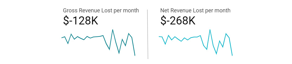
Figure 10.9 – Scorecards with accompanying sparkline charts depicting the amount of revenue lost
For the corresponding sparkline charts, calculate the revenue churn for each month by just using the numerators from the aforementioned formulas:
- Gross Revenue Lost: (SUM(previous_month_churned_revenue) + SUM(previous_month_non_churned_revenue - current_month_existing_customer_revenue))
- Net Revenue Lost per month: (SUM(previous_month_churned_revenue) + SUM(previous_month_non_churned_revenue - current_month_existing_customer_revenue)- SUM(current_month_new_customer_revenue))
Implement the scorecard and sparkline charts for the revenue churn metrics using the corresponding formulas and make sure you set Type to Currency (USD – US Dollar ($)):

Figure 10.10 – Setting the data type of the revenue lost metrics to Currency (USD – US Dollar ($))
Similarly, the revenue churn rate can be calculated by dividing the sum of monthly revenue lost by the previous month’s revenue. The formulas are as follows:
- Gross Revenue Churn Rate: (SUM(previous_month_churned_revenue) + SUM(previous_month_non_churned_revenue - current_month_existing_customer_revenue))/SUM(previous_month_revenue)
- Net Revenue Churn Rate: (SUM(previous_month_churned_revenue) + SUM(previous_month_non_churned_revenue - current_month_existing_customer_revenue)- SUM(current_month_new_customer_revenue))/SUM(previous_month_revenue)
In addition to this high-level representation of key metrics, visualizing customer and revenue churn rates as time series helps in quickly understanding any peaks and valleys over time, as shown in the following screenshot:
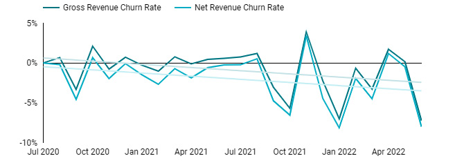
Figure 10.11 – Time series of monthly revenue churn rate
Follow these steps to create the revenue churn rate time series chart:
- Click Add a chart from the toolbar and select Time series chart.
- Choose Monthly churn as a Data source.
- Make sure billing_month is added as a Dimension with Type set to Year Month.
- Create the Gross Revenue Churn Rate and Net Revenue Churn Rate metrics in the SETUP tab using the formulas specified earlier. Set Type to Percent to display the values as a percentage.
- From the STYLE tab, select Linear trendlines for both metrics.
- Choose colors appropriate for the two series. Make sure that you use the same colors for the respective revenue lost sparkline charts.
Build the customer churn rate time series chart with similar configurations but using the original data source – Customer churn data. Add trendlines to help users understand the overall trend easily. From these charts, you will notice that the monthly customer churn rate has a slightly increasing trend, while the monthly revenue churn rate has a significantly decreasing trend.
It is interesting to observe that customers churned at the highest rate of 1.39% in Nov 2020, whereas the greatest revenue churn happened in Nov 2021, with a positive revenue loss. As desired, much of the revenue churn is negative, indicating overall revenue gain despite customer churn.
Detail section
The visuals so far provide an overview and trend of the relevant key metrics. The rest of the dashboard will delve into the details regarding when, why, and which customers leave. The overall proportion of customers regarding whether they are in contract or not when they stopped using the service can be visualized using a donut chart. It is also useful to see the actual number of customers churned over time broken down by their contract status when they left. This helps identify whether more or fewer customers churn during any specific period than others. Using the stacked area chart type with a gray color for the out-of-contract status to deemphasize it enables the users to easily perceive the trend of customers who churned while still in an active contract. It also helps them understand the trend of overall customers lost from the top line:
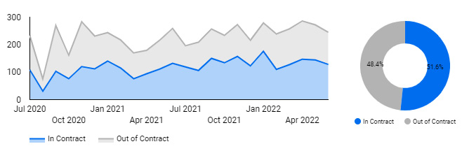
Figure 10.12 – Customer churn by contract status
The configuration steps for the area chart are as follows:
- From the toolbar, click Add a chart and choose Stacked area chart.
- Choose Customer churn data as a Data source.
- Add billing_month as a Dimension and set Type to Year Month.
- Choose contract_status as a Breakdown dimension.
- Add has_customer_churned as a Metric and rename it Customers churned.
- Make sure Breakdown dimension sort is set to contract_status in Ascending order.
- Choose appropriate colors from the STYLE tab.
- Update the legend’s position to Bottom.
The donut chart is created using the same fields: contract_status and has_customer_churned. Make sure that you use the same colors to depict the contract status dimension values and that the legend position also matches for uniformity.
From the preceding charts, we can see that about half of the customers who left were still in a contract. It’s helpful to understand how long before or since the contract ends that customers leave. Plotting the number of customers churned by the number of months to contract expiry as a line chart shows that a majority of customers who leave do so right when their contract ends, as shown in the following screenshot:
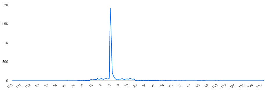
Figure 10.13 – Customers lost by the number of months to contract expiry
This also shows that some customers are on very long contracts and also continue to use the service long after their contract ends. It will be more useful to take a closer look at the proportion of customers leaving during 1 year before and after the contract ends. Depending on the patterns observed, this will signal the need for timely intervention. To build such a visual, it helps to bucket the number of months to contract expiry with user-friendly labels.
To do so, create the field in the data source by selecting Add a field from the Data panel. Then, Specify the name of the calculated field as months_to_contract_expiry_buckets and the formulas as follows:
CASE
  WHEN months_to_contract_expiry = 0 THEN '0 months to contract expiry'
  WHEN months_to_contract_expiry > 0 THEN
CASE
  WHEN months_to_contract_expiry <= 3 THEN '1-3 months to contract expiry'
  WHEN months_to_contract_expiry <= 6 THEN '4-6 months to contract expiry'
  WHEN months_to_contract_expiry <= 9 THEN '7-9 months to contract expiry'
  WHEN months_to_contract_expiry <= 12 THEN '10-12 months to contract expiry'
  WHEN months_to_contract_expiry > 12 THEN '>12 months to contract expiry'
END WHEN months_to_contract_expiry < 0 THEN CASE
  WHEN months_to_contract_expiry >= -3 THEN '1-3 months since contract expiry'
  WHEN months_to_contract_expiry >= -6 THEN '4-6 months since contract expiry'
  WHEN months_to_contract_expiry >= -9 THEN '7-9 months since contract expiry'
  WHEN months_to_contract_expiry >= -12 THEN '10-12 months since contract expiry'
  WHEN months_to_contract_expiry < -12 THEN '>12 months since contract expiry'
END
  ELSE 'NA'
END
Use a horizontal bar chart to visualize this information. The configurations are as follows:
- From the toolbar, click Add a chart and choose a horizontal Bar chart.
- Choose Customer churn data as a Data source.
- Add months_contract_expiry_buckets as a Dimension.
- Choose contract_status as a Breakdown dimension.
- Add has_customer_churned as a Metric and rename it Customers churned. Select Comparison calculation as Percent of total to display the proportion of customers churned.
- From the STYLE tab, check the Stacked bars option and choose appropriate colors for the contract status dimension values.
You will want to sort the bars from the longest duration to the contract end to the longest duration since the contract ended. Since the buckets defined earlier cannot be naturally arranged in this order based on their labels, you will need another derived field with numerical values to achieve the desired order. Create a field in the data source and name it months_to_contract_expiry_buckets_sort. Then, use the following formula:
CASE
  WHEN months_to_contract_expiry_buckets = '0 months to contract expiry' THEN 6
  WHEN months_to_contract_expiry_buckets = '1-3 months to contract expiry' THEN 7
  WHEN months_to_contract_expiry_buckets = '4-6 months to contract expiry' THEN 8
  WHEN months_to_contract_expiry_buckets = '7-9 months to contract expiry' THEN 9
  WHEN months_to_contract_expiry_buckets = '10-12 months to contract expiry' THEN 10
  WHEN months_to_contract_expiry_buckets = '>12 months to contract expiry' THEN 11
  WHEN months_to_contract_expiry_buckets = '1-3 months since contract expiry' THEN 5
  WHEN months_to_contract_expiry_buckets = '4-6 months since contract expiry' THEN 4
  WHEN months_to_contract_expiry_buckets = '7-9 months since contract expiry' THEN 3
  WHEN months_to_contract_expiry_buckets = '10-12 months since contract expiry' THEN 2
  WHEN months_to_contract_expiry_buckets = '>12 months since contract expiry' THEN 1
  ELSE 0
END
Add this new field to the Sort property in the chart configuration and set the aggregation to Average. Select Descending to see the bars in the desired order:

Figure 10.14 – Proportion of customers lost by the number of months to contract expiry (grouped)
The tenure of customers with the company adds another lens to look at the timing of churn. Again, given the broad range of tenure, it is helpful to group the tenure months into buckets. Create a new field called tenure_buckets in the data source, as follows:
CASE
  WHEN tenure <= 6 THEN '<=6'
  WHEN tenure BETWEEN 7
AND 12 THEN '7-12'
  WHEN tenure BETWEEN 13 AND 18 THEN '13-18'
  WHEN tenure BETWEEN 19
AND 24 THEN '19-24'
  WHEN tenure BETWEEN 25 AND 36 THEN '25-36'
  WHEN tenure BETWEEN 37
AND 48 THEN '37-48'
  WHEN tenure BETWEEN 49 AND 60 THEN '49-60'
  ELSE '>60'
END
You can visualize churn for these dimension values in a vertical bar chart, as shown in Figure 10.14, as the labels are short and there aren’t too many values. The chart configurations are as follows:
- From the toolbar, click Add a chart and choose Column chart.
- Choose Customer churn data as a Data source.
- Add tenure_buckets as a Dimension and rename it Tenure (months).
- Choose contract_status as a Breakdown dimension.
- Add has_customer_churned as a Metric. Set Comparison calculation to Percent of total to display the proportion of customers churned.
- Sort by the tenure field in Ascending order. Use Average as the method of aggregation.
- From the STYLE tab, select Show axis title for X-axis:
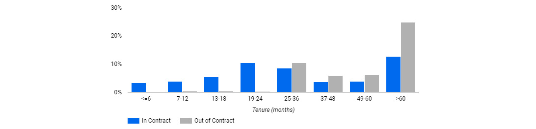
Figure 10.15 – Customers lost by tenure
Note
If you have set the colors for the contract status dimension values in the earlier charts, rather than choosing series order or bar order, the same colors will be applied throughout the dashboard for those values.
To understand why customers are leaving, visualize the top reasons provided by churned customers using a horizontal bar chart. From these reasons, you can deduce that Overdue termination refers to involuntary churn, whereas the rest refer to some form of voluntary churn, where customers stopped using the service deliberately. You can use color to differentiate involuntary churn from the rest, as shown in the following chart:
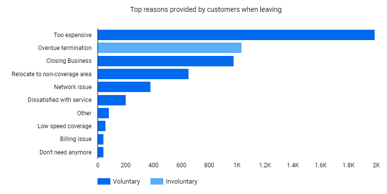
Figure 10.16 – Top termination reasons provided by churned customers
For this, you need to create a new derived field by using churn_type and setting the formula to IF(term_reason_code = ‘ODTR’, ‘Involuntary’, ‘Voluntary’).
Follow these steps to configure the chart:
- From the toolbar, click Add a chart and choose a horizontal Bar chart.
- Choose Customer churn data as a Data source.
- Add term_reason_description as a Dimension.
- Choose churn_type as a Breakdown dimension.
- Add has_customer_churned as a Metric. Set Comparison calculation to Percent of total to display the proportion of customers churned.
- Sort by the metric field in Descending order.
- From the STYLE tab, set the legend position to Bottom and choose appropriate colors for the churn_type dimension values.
Finally, to understand which customers are leaving, you can consider the broadband bandwidth used by customers, whether customers subscribed for phone service in addition to broadband, and whether customers complained before they stopped using the service. Visualize the number of customers churned concerning the bandwidth they subscribed for when they left using the horizontal bar chart, as follows:
- From the toolbar, click Add a chart and choose Bar chart.
- Choose Customer churn data as a Data source.
- Add bandwidth as a Dimension.
- Add has_customer_churned as a Metric. Rename it Customers churned.
- Sort by the metric field in Descending order.
- From the STYLE tab, select Show data labels.
- Enter a large number such as 10000 for the Custom Tick Interval setting for Bottom X-Axis. This makes the X-axis disappear in the visual.
The resultant bar chart is shown in the following screenshot:
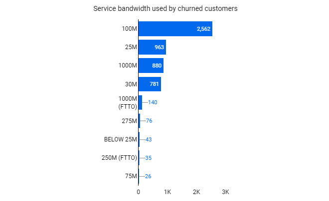
Figure 10.17 – Customers lost by tenure
To represent churned customers by whether they use phone service or not, use the with_phone_service field. It has TRUE or FALSE text values. Create a derived field to provide user-friendly labels by using with_phone-service_desc and setting the formula to IF(with_phone_service = ‘TRUE’, ‘Broadband and Phone’, ‘Broadband only’).
Similarly, to understand whether churned customers complained before they left or not, a categorical field can be derived from the complaint_cnt field of the dataset. To do so, use has_complaints_desc and set the formula to IF(complaint_cnt > 0, ‘One or more complaints’, ‘No complaints’).
There are two ways of analyzing churn for these two dimensions:
- Out of all churned customers, what proportion of them use the phone service or had complained?
- Out of all the customers, do customers churn at a higher or lesser proportion between those who use phone service and those who do not, or between those who complained and those who didn’t?
The former can be represented simply as a pie or donut chart using existing fields, whereas the latter can be shown as a 100% stacked bar chart and requires a little more complex setup. A simple way to implement these charts is to create a new field to accurately calculate the number of non-churned customers and use it to configure the chart.
To do so, use non_churned_customers and set its formula to COUNT_DISTINCT(IF(has_customer_churned = 0, account_no, NULL)).
The chart can be set up as follows:
- From the toolbar, click Add a chart and choose Bar chart.
- Choose Customer churn data as a Data source.
- Add with_phone_service_desc as a Dimension.
- Add has_customer_churned as a Metric. Rename it Churned.
- Add non_churned_customers as another metric and rename it Not Churned.
- From the STYLE tab, select Stacked bars and 100% Stacking.
- Choose appropriate colors and set the legend position to Bottom.
The resultant chart will look like this:

Figure 10.18 – Inaccurate representation of non-churned customers
As you can see, this is incorrect. This is because the non_churned_customers calculated field does not count the number of distinct customers correctly. This is a known Looker Studio issue at the time of writing where COUNT_DISTINCT does not work well when a date range filter is applied. The current report page is configured for a defined date range, hence the incorrect result. You can verify this by displaying the metric on a separate page without any date range applied; by doing so, you should see the correct count.
An alternate approach to building the desired visuals is to use blending. First, create a new derived field called churn_status in the main data source to provide user-friendly labels called Churned and Not Churned. To do so, set its formula to IF(has_customer_churned = 1, ‘Churned’, ‘Not Churned’).
This field will be used in the new blend. Create the blend by following these steps:
- Select Resource | Manage blends from the menu and select ADD A BLEND.
- Choose Customer churn data as a data source for Table 1.
- Add account_no, has_complaints_desc, with_phone_service_desc, and churn_status as Dimension properties.
- Add billing_month as a Date range dimension.
- Name the blend Customers and click SAVE:

Figure 10.19 – Configuring the Customers blend
This blend provides unique customer information concerning complaints and the phone service dimension. Now, you must build the stacked bar charts correctly so that they look as follows:

Figure 10.20 – Proportion of churned and non-churned customers
To do this, follow these steps:
- From the toolbar, click Add a chart and choose Bar chart.
- Choose Customers blend as a Data source.
- Add with_phone_service_desc as a Dimension (has_complaints_desc for the respective chart).
- Choose churn_status as a Breakdown dimension.
- Add account_no as a Metric.
- Sort by the metric in Descending order to sort the dimension values along the axis and use churn_status in Ascending order as the Secondary sort field to determine the order in which the stacks inside the bars appear.
- From the STYLE tab, select Stacked bars and 100% Stacking.
- Choose appropriate colors for the churn_status dimension values and set the legend position to Bottom.
With that, you have created all the charts. Next, arrange them appropriately using the wireframe as a guide and adjust them as needed. Make sure that you align the boundaries and axes of the charts as much as possible to achieve an orderly look. Use white space, lines, and text labels to add clarity and additional information. Use them sparingly so as not to create a cluttered, disorganized, or busy look. Use fewer colors and use them uniformly. In my implementation, I used blue as the main color for all customer churn metrics. For revenue churn, I used a couple of shades of teal. I’ve chosen the neutral color gray to emphasize the data displayed in blue.
Disable cross-filtering and sorting for all the charts as the target users do not expect to interact with the dashboard. Given the large volume of data coupled with some complex calculations and blending used, the dashboard may not be very responsive already. Adding further interaction will only lead to a worse user experience. You can disable these options from the SETUP tab of the chart configuration.
You can choose to add some cross-filtering in the detail section, especially for the visuals depicting termination reasons, service bandwidth, and time series. This will help users delve into deeper slices of data. Grouping all the components in the detail section limits the scope of the cross-filtering to just the detail charts, leaving the overview charts unaffected.
Summary
In this chapter, you learned about the customer churn problem in subscription businesses and went through the step-by-step process of building a dashboard to monitor key customer churn metrics for a broadband service provider. You used the 3D approach to dashboard building by first Determining the target audience, the business questions that the dashboard needs to address, and the data available to meet the needs. Then, you defined the right metrics, chose the appropriate visualization types, and Designed the wireframe of the dashboard. After that, you Developed the dashboard by setting up and enriching the data source and then building various visualizations and components based on the dashboard’s objectives and the wireframe. You used blending to implement certain complex metrics. In the next chapter, you will learn how to track and monitor Looker Studio report usage using Google Analytics.