
7
Looker Studio Features, Beyond Basics
In the previous three chapters of this book, you have learned about how to get started with Looker Studio and explored its major entities. You understood how to use the many fundamental features of the tool to build effective data visualizations and reports. This chapter explores some additional capabilities that will allow you to create truly powerful and insightful data stories.
We will learn about calculated fields, which allow you to create new data values based on the existing data and support effective analytics and data representation. We will look into parameters that let you dynamically change the output of calculated fields or data source connection settings based on the user input. We will also learn about data blending, which helps create charts and controls based on multiple data sources within a report by combining those data sources through blending. Data blending has many interesting applications. A gallery of community visualizations equips you with new chart types and custom functionality that helps build more potent reports and dashboards. Report templates provide ready-to-use analyses for standard schema data sources and offer a great starting point for any custom report development. These reports are optimized to be highly responsive and fast-loading, resulting in a rich user experience. In this chapter, these topics are covered in the following main sections:
- Leveraging calculated fields
- Using parameters
- Blending data
- Adding community visualizations
- Creating report templates
- Optimizing reports for performance
Technical requirements
To follow the example implementations in this chapter, you need to have a Google account that allows you to create reports with Looker Studio. Use one of the recommended browsers – Chrome, Safari, or Firefox. Make sure Looker Studio is supported in your country (https://support.google.com/looker-studio/answer/7657679?hl=en#zippy=%2Clist-of-unsupported-countries).
This chapter uses BigQuery, Google Cloud’s serverless data warehouse platform, as a data source in a couple of examples. If you do not already have a Google Cloud account with access to BigQuery, you can create a trial account (https://cloud.google.com/free), which provides $300 of credit for you to use on any Google Cloud resources. You need a valid credit card to enroll in the trial, but you will not be charged. Create a Google Cloud project to start using any resources.
BigQuery charges for the amount of data processed by the queries as well as for the storage of data. It has a free tier, which allows you to query up to 1 TB of data per month for free. You will be charged (or will use up the credits) only beyond this limit. Some examples in this chapter leverage data from BigQuery public datasets, which are available to anyone with a Google Cloud account. To understand using parameters with the BigQuery connector better, some familiarity with Structured Query Language (SQL) is expected.
Several datasets are used in this chapter to illustrate the various features and capabilities most appropriately. You can follow along by connecting to these datasets from Looker Studio. The details are as follows:
- Online Sales: The sales data of a UK-based retail company. The dataset is available at https://github.com/PacktPublishing/Data-Storytelling-with-Google-Data-Studio/blob/a31bf2de1ca10db433cf9d0ecb15c3cf4fa882d2/online_sales.zip. Unzip it and save the CSV file to your local machine. Use the File Upload connector to create the data source in Looker Studio. To ensure the upload is successful, make sure to save the file in a UTF-8 compatible format. This dataset is taken from the UCI Machine Learning Repository. This dataset is used to demonstrate calculated fields, parameters, and blending. The enriched Looker Studio data source is accessible at https://lookerstudio.google.com/datasources/68a943df-886d-4c34-96bc-33eadde983c2.
- Product info: This contains the unit cost information for the products sold by the aforementioned UK-based retail company. This can be used together with the preceding Online Sales dataset. This is available in Google Sheets at https://tinyurl.com/ukprodinfo. You can also access it as a CSV file at https://github.com/PacktPublishing/Data-Storytelling-with-Google-Data-Studio/blob/master/Product%20Info.csv.
- Book Recommendation: This dataset is available from Kaggle (https://www.kaggle.com/datasets/arashnic/book-recommendation-dataset). Only the Books.csv file is required for the current purpose. A community connector exists to allow you to connect directly to Kaggle. You can refer to the connector’s GitHub page (https://github.com/googledatastudio/community-connectors/tree/master/kaggle) for instructions. However, this connector is not verified or reviewed and so should be used with caution – you can expect some issues. Alternatively, you can also download the dataset on your local machine and upload it to Looker Studio to set it up as a data source to follow along. As always, make sure to save the CSV file in a UTF-8 compatible format to be able to successfully upload it to Looker Studio. The dataset includes an image field and is used to create image-based calculated fields.
- Air Quality data is available as a public dataset in Google BigQuery. Google sourced this data from U.S. Environmental Protection Agency’s internet database (https://www.epa.gov/airdata). A step-by-step walkthrough for creating a BigQuery data source is provided in Part 3 of this book, as part of Chapter 9, Mortgage Complaints Analysis.
You can review the examples explained in this chapter using the following Looker Studio reports:
- Online Sales: https://lookerstudio.google.com/reporting/9771fb7c-ee72-4887-903e-3211674010a9/preview
- Book Recommendation: https://lookerstudio.google.com/reporting/d6d2f65d-4904-42ef-b464-47fbd819b017/preview
Make these reports your own by connecting to your own data sources and exploring the features further.
Leveraging calculated fields
Calculated fields are custom fields that you can add to data sources and charts. These fields are derived from existing fields in the data source, including other calculated fields. A calculated field can be either a dimension or a metric.
Looker Studio provides several functions grouped under six categories to help create useful calculated fields. These include the following:
- Arithmetic
- Conditional
- Date
- Geo
- Text
- Aggregation
- Miscellaneous
Calculated fields serve many purposes. They enable you to implement business logic, create user-friendly representations of data, and create complex metrics beyond simple aggregations.
Arithmetic functions enable you to perform mathematical operations such as computing logarithms, exponentials, trigonometric values, or nearest integers on numeric data. You can also do simple math using regular operators for addition, subtraction, division, and multiplication. With date functions, you can parse and format dates, extract date and time parts, and perform simple date arithmetic. Text functions allow you to work with textual data – concatenate different values, remove extraneous white space, find, extract, and replace specific pieces of text. Regular expressions enable you to match specific sequences of characters and provide greater flexibility in finding and filtering data. Looker Studio provides four regular expression functions to use with text data.
Looker Studio functions under the geo category return the names of the specified geo-location codes, for countries, regions, cities, continents, and subcontinents. With conditional functions, you can handle null values and apply branching logic using conditional expressions. Looker Studio offers different forms of conditional functions and statements such as IF, CASE, NULLIF, and COALESCE. These functions are extremely useful and have many different applications. We will see some of them throughout this chapter. You can create hyperlinks and image fields and perform explicit data type conversions using the functions provided under the miscellaneous category.
You can use aggregation functions, such as SUM, AVERAGE, and PERCENTILE, to create metric fields. By definition, an aggregation is calculated across different rows and hence the resultant calculated field is always a metric. All the other functions work on a single row of the data source and result in a dimension field. It is possible to use multiple functions in appropriate ways within a calculation so that you can apply non-aggregate functions to an aggregated output and vice versa – for example, CEIL(AVG(Score)) or AVG(CEIL(Score)). Both expressions result in a metric field, as aggregation is involved. The former formula first computes the average score for all the relevant rows of data and then returns the closest integer greater than the average value. On the other hand, the latter calculation gets the closest larger integer for each score first and then calculates the average of all the integers.
Calculated fields can be created at the data source level or for a specific chart. Those created from the SETUP tab for a chart are specific to that chart and are not available for use with other charts and controls. As a general practice, we should minimize creating chart-specific calculations and lean towards defining calculated fields in the data source. This enables you to reuse calculations as well as manage them easily from a central place. Data source calculated fields can include other calculated fields in their formula. However, while creating chart-specific fields, you cannot use other chart-specific fields in the calculation, even those defined within the same chart.
There are certain specific cases where chart-level calculated fields make sense or are the only choice, particularly when using blended data sources. We will explore data blending in a later section in this chapter. You may also need to create a chart-specific calculated field when you do not have edit access to the data source being used.
At the data source level, you can create a calculated field either from the Edit screen of the data source or from the DATA panel in the report designer. Click on ADD A FIELD and provide the following values:
- Field Name – Provide a name unique to the data source.
- Field ID (optional) – You can accept the default unique ID that Looker Studio generates or provide your own. You cannot change the Field ID once the calculated field is saved.
- Formula – Type in the formula to perform the calculation. The editor has a code complete feature, which shows helpful information on how to use a particular function. You can view and add the existing fields from the Available Fields section. You can also easily format the formula, no matter how complex, just by clicking the FORMAT FORMULA button.
Looker Studio displays a green check at the bottom to indicate that the formula is valid. Any errors associated with an invalid formula specification are displayed in red. The errors could be field-related, related to the incorrect use of functions, or something else. The data type of a calculated field is determined based on the component fields and the functions involved in the formula. You can change its data type from the data source editor or in the New Field pane for chart-specific calculated fields:

Figure 7.1 – Creating and editing a calculated field at the data source level
Looker Studio uses field IDs to allow you to filter data across multiple unconnected data sources. Say your report is based on multiple data sources with one or more common columns. By specifying the same Field ID for a particular field in all the data sources, you can create a filter control based on the field from one of the data sources and have it filter relevant charts based on all the data sources automatically. Since you cannot change the Field ID of an existing field, you will have to create calculated fields based on the existing fields and then specify the same desired Field ID in all the data sources.
Consider a scenario where you have created a report using two separate data sources: Online sales and Product info. Let’s say the two data sources have the following fields:
- Online sales:
- Country
- CustomerID
- StockCode
- Description
- InvoiceDate
- Quantity
- UnitPrice
- Product info:
- ProductCode
- ProductName
- UnitCost
The report includes separate visualizations based on each of these two data sources. The Description field in the Online sales data source maps to the ProductName field in the Product info data source. If you would like to filter the report by product, you can easily do so using a common field ID without having to blend or join the data together. As noted earlier, the field IDs of any existing fields cannot be changed. So, create new calculated fields in each of the data sources with the following configuration:
- Field Name: Product (you can provide the same name in both the data sources or different names)
- Field ID: field_product (you must provide the same value for both the calculated fields). Take care to provide the value before clicking the SAVE button
- Formula: Drag and drop the Description and ProductName fields from the Available fields section for the two data sources respectivel
Click SAVE:

Figure 7.2 – Creating and editing a calculated field at the data source level
Now, you add a single filter control using either of the newly calculated fields. The selection will filter the entire report.
In the rest of this section, we will go through some useful and interesting applications of calculated fields in Looker Studio with some examples. Most of the examples in this section use the Online Sales dataset, which you can access at https://github.com/PacktPublishing/Data-Storytelling-with-Google-Data-Studio/blob/a31bf2de1ca10db433cf9d0ecb15c3cf4fa882d2/online_sales.zip. The underlying dataset is obtained from UC Irvine’s Machine Learning Repository and the File Upload connector is used to create the data source from the CSV file. Make sure the file is saved in a UTF-8 compatible CSV before uploading it to Looker Studio.
Organizing dimension values into custom groups
A CASE statement provides the greatest flexibility for creating fields with conditional logic. It can be used to match a field to a single value or multiple values. You can either compare against literal values or expressions using other functions and fields. You can nest multiple case statements and also use logical operators to combine different conditions. A common application of a CASE statement is to group a dimension field’s values into different categories to facilitate key analyses.
There are a couple of different ways in which you can use the CASE statement. In the simplest form, you can match a field to a literal value to derive a new field as follows:
CASE WEEKDAY(InvoiceDate)
  WHEN 0 THEN 'Weekend'
  WHEN 6 THEN 'Weekend'
  ELSE 'Weekday'
END
This calculated field indicates whether the invoice date falls on a weekday or a weekend. This allows you to understand the invoice processing needs over the weekend, for example.
Another use case is to categorize order size based on the quantity ordered. The following formula uses a slightly different syntax that enables you to specify the comparison condition on the Quantity field. This syntax is powerful and allows you to implement complex logic by using expressions and combining different conditions:
CASE
  WHEN Quantity <= 5 THEN 'Small Order'
  WHEN Quantity <= 10 THEN "Medium Order"
  ELSE "Large Order"
END
For text fields, you can compare multiple values in a single condition using the IN operator as shown in the following example. This is a more compact way of writing the formula compared to making individual matches in separate WHEN clauses.
CASE
  WHEN Country IN ('Iceland', 'Norway', 'Sweden', 'Finland', 'Denmark') THEN 'Scandinavia'
  ELSE Country
END
The IF function can also be used to create custom groupings or other conditional-derived fields. However, it may become unwieldy and difficult to read with multiple nested levels or complex conditions. Let’s say you want to analyze two random samples of orders. You can denote a subset of individual orders as Sample 1 or Sample 2 using the IF function as follows:
IF(RIGHT_TEXT(CustomerID, 1) = '3', CONCAT('Sample' , '1'),
IF(RIGHT_TEXT(CustomerID, 1) = LEFT_TEXT(InvoiceNo,1), 'Sample2', ''))
This calculated field indicates whether an order belongs to Sample 1, Sample 2, or neither. The conditional logic used here is just an attempt to introduce some randomness into the sample selection. This example illustrates that you can use expressions and functions in a condition clause or result. The same calculation can be achieved using the CASE statement as follows:
CASE RIGHT_TEXT(CustomerID, 1)
  WHEN '3' THEN CONCAT('Sample' , '1')
  WHEN LEFT_TEXT(InvoiceNo, 1) THEN 'Sample2'
END
As a general guideline, use an IF function when the conditional expression has binary outcomes and a CASE statement when there are multiple conditions or multiple outcomes.
Manipulating text with regular expressions
Regular expressions (regex) enable you to match patterns of text in data. These patterns can be as specific or as general as needed. Looker Studio uses the RE2 syntax. The complete syntax reference can be found at https://github.com/google/re2/wiki/Syntax. Regex has universal utility and is used across applications. While regex is powerful, it can be quite complex and has a steep learning curve. The current objective is not to make you well-versed with using regex syntax, but rather, to provide a glimpse into its versatility and potential to create calculated fields within Looker Studio.
A very brief introduction to regex
At the most basic level, a regex pattern can be the exact characters to match. For example, the data pattern matches the text “data”. However, the data pattern does not because regex patterns are case-sensitive by default. You can make a pattern match case insensitive by using a flag (?i) as follows:
"(?i)data"
The power of regex is not matching exact characters though. You can use character classes and metacharacters to define a generic pattern that can match a wide range of values. Character classes indicate specific characters or a range of characters. Examples include [a-z] for the entire lower-case alphabet, [0-9] for the digits, or [abc] for the specific letters a, b, or c.
To match whether a given text starts with the alphabet (in any case), use the pattern "[a-zA-Z].*". This is equivalent to "(?i)[a-z].*". In these expressions, [a-zA-Z] and [a-z] are called character classes that represent the alphabet. “.” And “*” are the metacharacters. “.” represents any character, whereas “*” means “zero or more occurrences of the preceding character.” So the "[a-zA-z].*" pattern matches any string that starts with a letter followed by zero or more of any character.
A few example strings that the pattern matches include the following:
- Abacus
- C
- Price = $12.99
Similarly, to match text that ends with a letter, use the ".*[a-zA-Z]" pattern.
To check for one or more occurrences of a character, use the “+” metacharacter. For example, the ".*[0-9]+" pattern matches any text that ends with one or more digits such as “sample12” or “Test 4”. You can also reverse the selection using the “^” negation metacharacter. To match text that doesn’t contain any letters, use the "[^a-zA-Z]+" pattern. It returns true for the text “$12.99,” as it does not contain one or more letters (so, any). Any metacharacters can be matched as literal characters by escaping them using the “” character. The"\$[0-9]+\.[0-9][0-9]" pattern matches any text that starts with a dollar sign, followed by a number with one or more digits before the decimal point and exactly two digits after the decimal point such as “$12.99”, “$3.02,” or “$245.50.” You can see that you need to use two backlashes each to escape the metacharacters “$” and “.”. You can use the raw string literal prefix, R, instead to just use one backslash as follows:
R"$[0-9]+.[0-9][0-9]"
More examples can be found on the Looker Studio help page at https://support.google.com/datastudio/answer/10496674. Regular expressions enable you to match more complex patterns and the syntax provides a robust set of options to represent any pattern.
Note
If you're new to regex, it can be overwhelming to understand. Websites like regex101.com provide a regex translation tool that can help you generate the regex syntax for the transformation you're trying to accomplish. Looker Studio uses the "re2" flavor of regex. It's denoted as the Golang flavor in regex101.com. Make sure to choose this flavor to generate expressions that you can use within Looker Studio.
Regex functions in Looker Studio
Currently, Looker Studio offers four regex functions to use with text data. You can check whether a field or expression contains a specific pattern using the REGEXP_CONTAINS function. This is similar to the CONTAINS_TEXT function, which identifies whether a text field or expression contains a specified substring. As with any text matches in Looker Studio, CONTAINS_TEXT is case sensitive. The regex function enables you to perform case-insensitive matches more easily due to its nature of allowing broader patterns.
In the Online Sales data source, the Description field provides the product name associated with the orders, mainly in uppercase. Let’s convert this into a more readable proper case first using Looker Studio’s text functions as follows. This formula separates the first character of the field value using the LEFT_TEXT function. The rest of the product name is obtained using the SUBSTR and LENGTH functions, which is then converted to lowercase using the LOWER function. Any trailing spaces are removed using the TRIM function. These two pieces are finally concatenated using the CONCAT function to form the complete product name.
Create the field named Product as follows:
CONCAT(LEFT_TEXT(Description, 1), TRIM(LOWER(SUBSTR(Description, 2, LENGTH(Description) – 1))))
The Product Type field can be derived from the preceding Product field using REGEXP_CONTAINS as follows:
CASE
  WHEN STARTS_WITH(Product, 'Set') OR REGEXP_CONTAINS(Product, '(?i)(cases)') THEN 'Set/Case'
  WHEN ENDS_WITH(Product, 'bag') THEN 'Bag'
  ELSE 'Other'
END
The derived field groups products into three categories:
- Products with names that either start with Set or that contain the text (cases) as Set/Case. The regex pattern matches the text (cases) in the Product field whether it is uppercase or lowercase.
- Products with names that end with bag as Bag.
- The rest as Other.
The preceding formula also demonstrates the use of the STARTS_WITH and ENDS_WITH text functions to match the start and end of the product name respectively to the corresponding substrings.
Product Type can be derived using CONTAINS_TEXT instead as follows, which involves converting the product name into lowercase or uppercase using the LOWER or UPPER functions to make the comparison:
CASE
  WHEN STARTS_WITH(Product, 'Set') OR CONTAINS_TEXT(LOWER(Product), 'cases') THEN 'Set/Case'
  WHEN ENDS_WITH(Product, 'bag') THEN 'Bag'
  ELSE 'Other'
END
While REGEXP_CONTAINS enables you to match substrings in a text field based on a pattern, REGEXP_MATCH allows you to match the entire field value against the specified pattern. In the current example, REGEXP_MATCH can be used instead of REGEXP_CONTAINS as follows:
REGEXP_MATCH(Product, '.*(?i)(cases).*')
REGEXP_MATCH provides greater flexibility and helps match standard formats such as IP addresses and email addresses.
With REGEXP_EXTRACT, you can extract substrings from a text field or expression that matches a given pattern. The following formula creates a field that represents the number of items in each product by extracting the number included in the product name:
IFNULL(CAST(REGEXP_EXTRACT(Product, '([0-9]+)') AS NUMBER ), 1 )
The function returns the first number it encounters in the product name. When no match is found, NULL is returned. When the product name doesn’t include any number, it implies that the product comprises a single item. This is handled using the IFULL function.
REGEXP_REPLACE allows you to replace all the occurrences of a pattern with the given text. For example, you can retrieve the first and last words in the product name using REGEXP_REPLACE as follows:
REGEXP_REPLACE(Product, '\s.+\s', ' ')
The regex in the preceding formula represents text that appears between the first and last words of the product name, as indicated by the text that lies in between two spaces, including the spaces. For example, for a product name of Pink knitted egg cosy, the pattern matches the text “knitted egg”, which is then replaced by a single white space by the function. The function returns “Pink cosy” for this product. REGEXP_REPLACE has varied applications and is commonly used to remove parameters from an URL field.
Using MAX and MIN across multiple fields or expressions
The MAX and MIN functions allow you to find the maximum or minimum value respectively of a single field or expression. They generate a metric field, which represents an aggregated value. However, in scenarios where you want to find the maximum or minimum value across multiple dimension fields or expressions, NARY_MAX and NARY_MIN functions come in handy. These functions compute the result for each row of the data source and return unaggregated dimension fields.
These functions are especially useful when the data is in a pivot or crosstab form. Let’s say the data source has sales for each Scandinavian country as separate columns for each invoice month and you want to find the maximum sales amount across all countries and months. First, create the following NARY dimension fields to find the maximum and minimum sales value for each month across all countries:
- Max Scandinavian Sales:
NARY_MAX(Denmark, Finland, Iceland, Norway, Sweden)
- Min Scandinavian Sales:
NARY_MIN(Denmark, Finland, Iceland, Norway, Sweden)
The data looks as follows:

Figure 7.3 – Using the NARY_MAX and NARY_MIN functions
Now, to find the lowest monthly sales amount across all countries, you can apply the MIN aggregation to the Min Scandinavian Sales field. Similarly, for the highest monthly sales across all Scandinavian countries, apply the MAX aggregation to the Max Scandinavian Sales field.

Figure 7.4 – An application of NARY functions
The NARY functions take at least two arguments, which can be literal values, fields, or expressions. At least one argument should use a data source field. Let’s say in the preceding example, you want to set an upper limit for the minimum sales across countries to be 100. The formula will look as follows:
NARY_MIN(Denmark, Finland, Iceland, Norway, Sweden, 100)
You can use NARY functions to determine the highest and lowest among multiple aggregated values or metrics as well:
NARY_MAX(AVG(Sales), MEDIAN(Sales))
Displaying images and hyperlinks
With IMAGE and HYPERLINK functions, you can make your tables more interesting and useful by displaying hyperlinks and images. To illustrate these functions, let’s use the Book recommendation dataset from Kaggle (https://www.kaggle.com/datasets/arashnic/book-recommendation-dataset). Use the Books.csv file for this example.
The dataset includes URL fields for the book cover images in addition to the book attributes such as title, author, and ISBN. Let’s say we want to display the list of Agatha Christie’s books along with the book cover images and appropriate hyperlinks. To achieve this, we need to create the image- and hyperlink-derived fields in the data source.
Image fields can be created using the IMAGE function by providing an image URL and optionally, alternative text. The image URL can be an existing field or an expression resulting in a valid URL. The following formula creates an image field with Image-URL-S as the image URL field and Book-Title as an alternative text field:
IMAGE(Image-URL-S, Book-Title)
Adding this field to the table displays static images in the column. To make the images clickable and open in a separate tab, we need to create a hyperlink field. The HYPERLINK function allows you to create a hyperlink based on a URL field or expression. You also need to provide a field or expression to the function to represent the link label. You add a hyperlink to an image field by specifying the image as the link label as follows:
Book Cover = HYPERLINK(Image-URL-S, IMAGE(Image-URL-S, Book-Title)
In the following figure, Book Title is also shown as a hyperlink, created using a custom-generated link to Google Books based on ISBN with the following formula:
HYPERLINK(CONCAT('http://books.google.com/books?vid=',CAST(ISBN AS TEXT)), Book-Title)
Figure 7.5 – Images and hyperlinks in a table
Any web-accessible URL can be used to create images and hyperlinks. One caveat is that images from untrusted sources will not be displayed in Looker Studio.
Another example of leveraging hyperlink functionality is to implement drill-through capability by linking to relevant detailed Looker Studio reports or report pages from a summary report. The following image shows a sample sales summary report based on the Online Sales data source. The Details column in the table chart provides hyperlinks to individual detailed Looker Studio report pages corresponding to each Region:

Figure 7.6 – Hyperlinking other Looker Studio reports to achieve drill-through
Create individual detail reports for each Region. They can be different pages of a single report or can be entirely different Looker Studio reports. Use page-level or report-level filters on the detailed report(s) as applicable. Construct the URL in the summary report as the DS URL field using the following calculation:
CONCAT('https://datastudio.google.com/u/0/reporting/xxxxxxxx-xxxx-xxxx-xxxx-xxxxxxxxxxxx/page/',
  CASE Region
    WHEN 'Scandinavia' THEN 'xxxxx'
    WHEN 'United States' THEN 'p_xxxxxxxxxx'
    WHEN 'United Kingdom' THEN 'p_ xxxxxxxxxyy'
    WHEN 'Australia' THEN 'p_ xxxxxxxxzz'
    ELSE 'p_ xxxxxxxxyz'
  END )
Now, create the hyperlink field – Details – as follows:
HYPERLINK(DS URL, CONCAT(Region, ' Detail Report'))
The following image shows the detailed report that is linked to the preceding summary report using the Details field:

Figure 7.7 – An example detailed report for Australia
These individual reports are managed and shared independently. You can add hyperlinks in the detailed reports back to the summary report using the Text control. From the STYLE tab of the Text control, select the Insert link icon and provide the display text and URL, as depicted in the following screenshot:

Figure 7.8 – Inserting a link in a Text control
Through hyperlinks, you can enable navigation across different Looker Studio reports as desired.
Using parameters
Parameters in Looker Studio allow both report editors and viewers to input data values to use with calculated fields and connectors. Parameters enable you to create more dynamic reports. There are three ways in which you can use parameters in Looker Studio:
- In a calculated field, to show the results based on the parameter value set by the report editor or chosen by the report viewer
- To pass query parameters to a custom SQL query for the BigQuery connector
- To pass values to community connector parameters
The parameter values can be set and modified in multiple ways:
- The default value in the parameter configuration (by the data source editor).
- Report components – at the chart level, page level, and report level (by the report editor).
- Interactive controls in the report (by report users).
- In the report link by passing the parameter names and values as URL-encoded JSON strings. This allows advanced users to configure reports programmatically.
To pass the parameter values via a report link, the parameters need to be explicitly allowed to do so. This can be done from the Manage report URL parameters page, available from the Resource menu.
Parameters and calculated fields
Parameters for use in calculated fields are created within a data source, either from the data source editor or the DATA panel in the report designer by clicking the ADD A PARAMETER button. There are four properties you need to set to define a parameter:
- Parameter name – The name that is displayed in the data source and used to refer to calculated fields.
- Data type – This can be number, text, or boolean.
- Permitted values – In the case of numeric or text parameters, you can allow a specific list of values or any value. You can also define an allowed range of values for numeric parameters.
- Default value – The starting value that gets applied by default unless changed.
The next step is to create a calculated field that uses the parameter in its formula. Such dynamic calculated fields have many applications. Continuing with the Online sales dataset, let’s say you want to determine the discount applied based on whether the customer is a new or a repeat customer. You also want to see how the sales amount varies at different values of discount percentage. To accomplish this, let’s first create the Max Discount Applied parameter as shown in the following image. It is defined as a numeric data type that can take decimal numbers. An appropriate allowed range and default value are also provided:

Figure 7.9 – Creating and configuring a parameter
Parameters show up in purple in the data source. This Max Discount Applied parameter is then used in a Discount Applied calculated field as follows:
CASE RepeatPurchase
  WHEN 'Repeat Customer' THEN Max Discount Applied
  ELSE Max Discount Applied * 0.6
END
The Discounted Sales field is then calculated as the following:
Sales * (1 - Discount applied / 100)
As the report editor, you can set parameter values at the individual chart level, page level, or report level. Make sure the appropriate data source is set for the page or report to configure the associated parameters.
The parameter value can be changed from the default value to a different one for a particular chart by the report editor as part of the chart configuration. All the parameters of the data source are displayed at the bottom of the SETUP tab, where you can set specific values to apply to the chart as desired. The three charts in the following image display the Discounted Sales metric with the Max Discount Applied parameter configured as 50, 10, and 0 respectively:
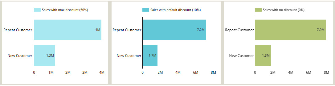
Figure 7.10 – Setting the parameter values in the report through chart configuration
You can allow report viewers to change the parameter values interactively using filter controls. In the following dashboard, a slider control is used to allow users to interactively set the discount value. Just choose the parameter as the control field:

Figure 7.11 – Setting the parameter values in the report using interactive controls
One more example of using parameters with calculated fields is when calculating percentiles. Let’s say, for example, you want to visualize sales at different percentiles such as the 50th (the median), 80th, or 90th in different charts. Instead of creating separate fields to calculate each percentile, you can leverage parameters using the following steps:
- Create a parameter named Percentile and set it to a Number (whole) type. Provide a range of 1 to 99. The default value is 50.
- Create a field named Percentile Sales with the following formula:
PERCENTILE(Sales, Percentile)
- For each chart displaying the Percentile Sales metric, configure the appropriate value for the Percentile parameter in the SETUP tab.
Note that if you desire to show different percentiles within the same chart, you must create individual fields for each.
Another application of using parameters in calculated fields is for allowing users to interactively choose the fields that make up one or more charts in the report. In the following example, the user can select the row dimension and the metric to be depicted in the pivot table.
Looker Studio offers a simpler way using the Optional Metrics feature, which enables report viewers to dynamically choose the metrics for a chart. However, this configuration is not available for all chart types and, of course, is limited to Metrics. And, as it is configured per individual chart, it requires the user to make the selection for one chart at a time. In contrast, the parametric approach is more generic and the selection can be applied to multiple charts at a time.
Two parameters used in this example are created as follows:
Dimension:
- Parameter name: Dimension
- Data type: Text
- Permitted values: List of values
- Country
- Product
- Product Category
- Default Value: Country
Metric:
- Parameter name: Metric
- Data type: Text
- Permitted values: List of values
- Sales
- Sales with Discount
- Quantity
- Default Value: Sales
You need to create two calculated fields corresponding to the two parameters defined:
- Dimension:
CASE Dimension
WHEN 'Country' THEN Country
WHEN 'Product' THEN Product
WHEN 'Product Category' THEN Product Category
END
- Metric:
CASE Metric
WHEN 'Sales' THEN SUM(Sales)
WHEN 'Sales with Discount' THEN SUM(Sales with Discount)
WHEN 'Quantity' THEN SUM(Quantity)
END
Sales with Discount is calculated based on OrderSize and is defined with the formula:
CASE OrderSize
  WHEN 'Large Order' THEN Sales * (1 - Max Discount Applied / 100)
  WHEN 'Medium Order' THEN Sales * (1 - (0.7 * Max Discount Applied) / 100)
  ELSE Sales * (1 - (0.5 * Max Discount Applied) / 100)
END
The following image shows the pivot table, the row dimension and the metric of which can be changed by report users dynamically using the parameter-driven controls:

Figure 7.12 – Using parameters to dynamically choose the fields to visualize
Using parameters within calculated fields in this manner makes reports more interactive and dynamic. Next, you will see how parameters can be used to control the data that the report visualizes from the underlying dataset.
Parameters and connectors
When used with data source connectors, parameters are generally leveraged to retrieve the appropriate data from the underlying dataset based on the values passed. Looker Studio provides a set of official connectors that allows you to connect to data from sources such as SQL databases, Google Sheets, and Google Marketing Platform products. The BigQuery connector enables you to connect to data that is stored on BigQuery, Google’s cloud data warehouse. You can build a custom connector to connect to any web-based data using AppScript. Connectors that are built this way by third parties and made available to all users of Looker Studio (some free and some paid) are called partner connectors. There are hundreds of such connectors available.
The BigQuery connector
BigQuery is Google’s petabyte-scale, serverless data warehouse platform. It’s easy to use and offers powerful capabilities to run analytics and turn data into insights. We will cover BigQuery in some detail in Chapter 9, Mortgage Complaints Analysis, which walks you through the dashboard building process and builds a data story based on the data sourced from BigQuery.
With BigQuery, you can define the data source by choosing a specific table or by providing a custom SQL query. As part of this SQL query, you can pass query parameters as substitutes for arbitrary expressions. Query parameters are commonly used in the WHERE clause of the SELECT statement. They cannot be used to pass values for identifiers, column names, or table names.
Looker Studio offers the following standard parameters, which you can enable to use in the query:
- Date range start with the SQL identifier as @DS_START_DATE
- Date range end with the SQL identifier as @DS_END_DATE
- Viewer email address with the SQL identifier as @DS_USER_EMAIL
The date range parameter values can be passed by report viewers using a date range control to fetch data for the desired time frame into the report. The following query uses the date range parameters to filter the Ozone Daily Summary table from the BigQuery public dataset, EPA Historical Air Quality. This data is provided by the United States Environmental Protection Agency (EPA) through its Air Quality System (AQS) database, which BigQuery makes available for the public to analyze using SQL:
SELECT
  state_name,
  county_name,
  date_local,
  MAX(first_max_value) AS first_max_value,
  AVG(arithmetic_mean) AS avg_value
FROM
  `bigquery-public-data.epa_historical_air_quality.o3_daily_summary`
WHERE
  date_local BETWEEN PARSE_DATE('%Y-%m-%d', @DS_START_DATE)
  AND PARSE_DATE('%Y-%m-%d', @DS_END_DATE)
GROUP BY
  state_name,
  county_name,
  date_local;
Notice that the parameters are parsed as dates in the query. This is because, irrespective of the parameter data type, all parameter values are passed as strings in the SQL query. The appropriate conversion functions need to be used to handle different data types.
The email parameter is used to provide row-level access to the data. The viewer’s email ID is captured in this parameter automatically, which is then used to filter the data in the SQL query. Users, when prompted, need to grant access and allow Looker Studio to pass their email addresses to the underlying dataset.
In addition to these standard parameters, you can also create custom parameters from the connection page to use in the query. For example, a custom parameter can be created as follows to be used in the query to filter the ozone quality data further on a minimum number of observations made per day:
- Parameter name: Observation Count
- Data type: Number (whole)
- Permitted values: Range
- Min: 1
- Max: 17
- Default value: 10
The following screenshot shows the connection settings page for the BigQuery connector, which uses a custom query with parameters:

Figure 7.13 – Enabling standard parameters and creating custom parameters in the BigQuery connection settings
SELECT
  state_name,
  county_name,
  date_local,
  MAX(first_max_value) AS first_max_value,
  AVG(arithmetic_mean) AS avg_value
FROM
  `bigquery-public-data.epa_historical_air_quality.o3_daily_summary`
WHERE
   date_local BETWEEN PARSE_DATE('%Y%m%d', @DS_START_DATE)
  AND PARSE_DATE('%Y%m%d', @DS_END_DATE)
  AND observation_count >= CAST(@observation_count AS INT64)
GROUP BY
  state_name,
  county_name,
  date_local;
When you create a custom parameter of a Text data type allowing a list of specific values, you will notice that there is an additional option called Cardinality. The cardinality configuration of the parameter determines the mode of selection in the corresponding control – that is, Single-select versus Multi-select. The following image shows the configuration of such a parameter and its use in the custom query. This example uses the Air Quality Annual Summary table, which includes pollutant measurements for various pollutants:

Figure 7.14 – Defining and using custom parameters with multi-select cardinality
The query used is as follows:
SELECT
  state_name,
  county_name,
  parameter_name,
  MAX(first_max_value) AS first_max_value,
  AVG(arithmetic_mean) AS avg_value
FROM
  `bigquery-public-data.epa_historical_air_quality.air_quality_annual_summary`
WHERE
  year = 2021
  AND parameter_name IN UNNEST (@pollutant_name)
GROUP BY
  state_name,
  county_name,
  parameter_name;
Since the Pollutant name parameter is configured as multi-select and can hold multiple values, the SQL type is set as an array of strings. This requires that the UNNEST function be used in the query to extract the individual values of the parameter and allow comparison.
Cardinality of parameters
For parameters created within the data source and used in calculated fields, you can only set one value at a time to the parameter. There is no cardinality configuration for these parameters. Only the custom parameters created in the BigQuery connection settings have the option to hold multiple values at a time. It is possible to configure multi-select parameters while building a community, also known as a custom connector. Google provides developer resources for anyone to build custom connectors (https://developers.google.com/lookerstudio/connector). Partner connectors are just community connectors that meet certain requirements and have been published in the Looker Studio connector gallery. Hence, certain partner connectors may provide multi-select parameters as well.
You can hide these parameters in the data source editor page to prevent report editors from changing the values. By default, the parameters are visible and report editors can set their values for report components. They can be made available to report viewers using control fields.
Partner connectors
On the other hand, partner connectors provide certain connection parameters that can be configured by the data source owner or editor in Connection Settings. These parameters allow users to connect to their own data or specific datasets from the associated platform. For example, the Twitter Public Data connector by Supermetrics allows you to configure whether to query user data or tweets based on keywords and users. The Facebook Ads connector lets you select your ad accounts or choose a conversion window.
The developers of these connectors can make some of the parameters overridable. This means the values for such parameters can be modified in reports by the report editors and viewers. This allows report users to interactively query and visualize different datasets on demand. The data source editor can decide whether to make these overridable parameters available to the report users or not. Let’s examine how to use parameters with partner connectors by walking through the Twitter Public Data connector example.
Select Create | Data source from the home page and search for the Twitter Public Data connector. Choose the one provided by Supermetrics. It’s not a free connector but it offers a 14-day free trial. When using the connector for the first time, you begin by authorizing Looker Studio to use the connector by confirming the Google account used with Looker Studio. Then, you need to authorize the connector to connect to your data by clicking the corresponding Authorize button, as shown in the following image:
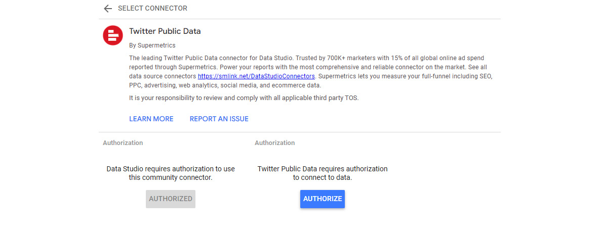
Figure 7.15 – Setting up the connector for the first time
You are then prompted to sign in to your Twitter account and authorize the connector app to access your account as follows:

Figure 7.16 – Authorizing the connector to connect to your Twitter account
Once all the authorizations are completed, you can see the connection settings page with the licensing, Twitter account, and other pertinent information. If you are using a trial version, you may be asked to fill out a form with your contact details at this point before the connection options are displayed:

Figure 7.17 – Twitter Public Data connection options
Choose Query type before proceeding to the next options. This connector provides three query types that enable you to connect to different types of Twitter data:
- Twitter tweets by keyword
- Twitter user data
- Twitter user tweets
Depending on the query type chosen, the appropriate connection options are then displayed on the next screen as seen in the following image. Overridable parameters are those that have the Allow to be modified in reports option. When the corresponding checkboxes are selected, these parameters are available to report users to change their values interactively and request additional or different data. Click the Connect button and confirm the Allow parameter sharing? prompt to complete the creation of the data source:

Figure 7.18 – Configuring the overridable parameters in the connection settings
You can toggle to show or hide any of these connector parameters from the data source editor page to prevent the report users from configuring these values from the report designer:

Figure 7.19 – Hiding/showing parameters from the data source editor page
Create a report using this data source and add controls for each of these parameters to allow users to interactively pull a higher or lower number of tweets based on different keywords and different types:

Figure 7.20 – Setting values to connector parameters from the report
The preceding image depicts an example in which the three controls are used to fetch 50 popular trending tweets about Queen Elizabeth.
Blending data
Data blending is the process of combining data from multiple data sources. The resultant resource is called a blend. Blends are useful in two primary ways:
- To bring additional information into your visualizations and controls from disparate data sources
- To perform reaggregations, that is, aggregating an already aggregated metric such as calculating the average of averages or the maximum of distinct counts
Often, you may want to analyze data that resides in multiple underlying datasets together. While you can easily visualize this data in separate charts powered by the respective data sources in the report, the challenge is when you want to represent information from these different data sources together in a single component. Blends come to the rescue in such scenarios. Blends incorporate fields from constituent data sources, called tables, and can serve as a source for charts and controls. Through blending, Looker Studio makes it easy for you to combine data from different sources with a completely no-code approach.
Blends can only be created within a report and hence are embedded in it. There are three ways to create a blend:
- From the SETUP tab for a selected chart. Click BLEND DATA under the data source to join additional data sources.
- From the Manage blends page accessed from the Resource menu.
- Select multiple charts and click Blend data in the right-click menu.
The rest of this section explores how to create, manage, and use blends with some examples.
Blending disparate data sources
The Online Sales dataset contains the Unit Price data for various products. It would be interesting to look at the unit price for the products along with their unit cost to understand the profitability of various products. Since the unit cost information is available in a separate dataset, you can create a blend to visualize these different metrics together. The steps are as follows:
- Add the two data sources to the report. Use the enriched Online Sales data source, which contains the Product calculated field, with the cleaned-up product names. Alternatively, add the Online Sales dataset using the File Upload connector and create the Product calculated field with the following formula:
CONCAT(LEFT_TEXT(Description, 1), TRIM(LOWER(SUBSTR(Description, 2, LENGTH(Description) – 1))))
Add the Product Info dataset using the Google Sheets connector.
- Build a bar chart using the Product and UnitPrice fields from the Online Sales data source. Select the method of aggregation for the metric as MIN. It displays the top 10 products with the highest unit price.
- Keep the chart selected and click BLEND DATA in the SETUP tab:

Figure 7.21 – Blending data from the SETUP tab
- This opens up the Blend data pane with Table 1 dimensions and metrics that have already been chosen based on the selected chart. Click Join another table and select the Product Info data source. So, each table in a blend is based on a data source and typically contains a subset of fields and metrics.
- Set Dimension to ProductName and Metric to UnitCost for Table 2.
- Click Configure join between the two tables. You can choose between the different types of join operators that determine how the matching rows are returned. The options include the full spectrum of possibilities:
- Left outer join – returns all rows from the left table and only the matching rows from the right table
- Right outer join – returns all rows from the right table and only the matching rows from the left table
- Inner join – only returns the matching rows from both tables
- Full outer join – returns all rows from both the left and right tables irrespective of the match
- Cross join – no match happens in this type of join and returns every possible combination of rows from both tables

Figure 7.22 – Specifying the join configuration between two tables in a blend
Left outer is the default selection. Choose the Inner join for this example. You then need to specify the join conditions. You can match the tables on one or more fields. The multiple conditions are applied together with a logical AND operation. Blending only supports equality conditions at the time of writing. If your join logic needs are complex and cannot be met by blending, you need to combine the data appropriately outside Looker Studio or use custom SQL for supported data sources.
- Provide names to each of the tables and the blend itself as shown in the following image:
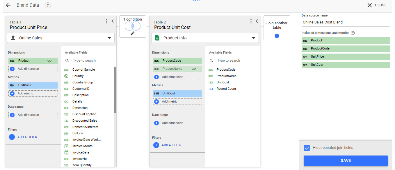
Figure 7.23 – Blending two data sources
Notice that the blended data source lists all fields, including the metrics from the constituent tables, as dimensions. These dimensions can be aggregated appropriately within the charts.
- Save the blend. The blend is now set as the data source for the chart. In this example, UnitCost is added as a metric to the chart automatically, as it’s the only numeric field from the joined table in the blend. Add the desired fields and modify the chart configurations appropriately to visualize this combined information in a meaningful way. Refer to Chapter 6, Looker Studio Built-in Charts, for further details on the appropriate chart types in Looker Studio and how to configure them:

Figure 7.24 – A chart based on a blend depicting the metrics from two different underlying data sources
Once a blend is created, you can rename the tables or the blend itself, and add or remove fields from the blend by editing it. You can edit a blend by clicking on the pencil icon from the data source field in the SETUP tab or from the Manage blends page under the Resource menu.
It is not possible to create calculated fields within the blend itself. However, you can create chart-specific calculated fields using the fields from the blend. In the current example, to display the top products with the highest profit, you need to create a calculated field within the chart configuration as shown in the following image:

Figure 7.25 – Creating calculated fields when using a blend as the data source
At the time of writing, you can join up to five tables in a single blend. You can specify different configurations for each join, which means that all the tables need not be joined by the same set of fields or use the same join type. Joins are evaluated in the blend from left to right and you can join a table with any of the preceding tables on its left. The utmost care should be taken when specifying the correct join conditions and operators – otherwise, the blend can result in a large number of duplicate rows and can lead to a “too much data requested” error in the chart.
While the current limit of five tables per blend may be increased in the future, it does prevent us from abusing data blending. Blending is computationally intensive and can slow down your report considerably if overly used. As a best practice, limit the use of blending to a few individual charts and only with a handful of fields. Do not attempt to build blends to power an entire report with a large number of fields from all the constituent data sources. Perform any complex or large-scale operations outside Looker Studio in platforms such as databases and data warehouses. Also, Looker Studio currently allows you to choose only up to 10 dimensions and 20 metrics from each of the tables in the blend. This limitation also helps in not going too far with blending and easing the computational burden on Looker Studio.
The next example showcases a more complex blending use case that involves blending five different data sources. The five corresponding underlying datasets belong to the BigQuery public dataset – epa_historical_air_quality (in BigQuery parlance, a dataset is a collection of tables). This BigQuery dataset contains several tables that provide summary data hourly and daily for locations across the United States on various air pollutant levels. The following five tables are added as separate data sources for this example:
- co_daily_summary
- no2_daily_summary
- o3_daily_summary
- pm25_frm_daily_summary
- so2_daily_summary
These five tables provide the daily average measurements of carbon monoxide, nitrogen dioxide, ozone, fine particulate matter, and sulfur dioxide levels respectively. These tables are huge and contain the pollutant levels data for each day from the year 1990 to 2019 across different locations in the United States. Also, some of these pollutants are measured for different sample durations such as 1 hour, 8 hours, and so on.
Note
It is preferable to use a custom query with BigQuery to combine data from different tables or views into a single data source rather than resorting to blending within the report. However, a couple of scenarios where this may not be feasible include 1) when there is a lack of sufficient SQL skills and 2) when the underlying datasets reside in different locations and cannot be queried together.
For this example, let’s visualize the median daily values for all five pollutants across different states in a single chart using data blending. Given the complexity and the large size of the datasets, care must be taken to configure blends with the right fields, filters, and join configurations. The steps are as follows:
- Add the five pollutant BigQuery tables as separate data sources to the report.
- Open Report settings from the File menu and set Data source to co_daily_summary (you could choose any of the five data sources). Set the Default date range to Dec 1, 2019 to Dec 31, 2019. One month of data is sufficient for our purpose and setting this report property limits the amount of data queried from BigQuery for this report.
- Select Resource | Manage blends from the menu and click ADD A BLEND.
- Choose co_daily_summary as the data source (or whichever data source you set at the report level in step 2) for Table 1:
- Add date_local, state_code, state_name (rename it State), and sample_duration as the dimension fields.
- Add first_max_value as the metric, which represents the highest pollutant measurement value for the day. Rename it co and set the aggregation to Median. The underlying dataset is highly granular with data provided for different locations identified by latitude and longitude. In this table, we are computing the median pollutant level for each state across all its locations.
- Select date_local as the date range dimension. This applies the report level date range selection to this table.
- Add a filter for Sample Duration equal to 1 HOUR. The co_daily_summary data source provides measurements for more than one sample duration. We need to choose one specific measurement type to accurately aggregate and analyze the data.
- Click Join another table and select no2_daily_summary as the data source. Add date_local and state_code as the dimensions. Select first_max_value as the metric and rename it no2. Configure the join by selecting the Inner join operator and setting the join fields to date_local and state_code. There is no need to join sample_duration for this table because the no2 data source only has measurements for one sample duration.
- Add Table 3 by joining o3_daily_summary to Table 1 with a similar configuration as Table 2.
- Add Table 4 and Table 5 using the pm2.5 and so2 data sources respectively. The join conditions for these tables should include sample_duration besides date_local and state_code. These tables are directly joined to Table 1 as well.
- Give the individual tables and the blend itself user-friendly names. The final blend configuration looks as follows:
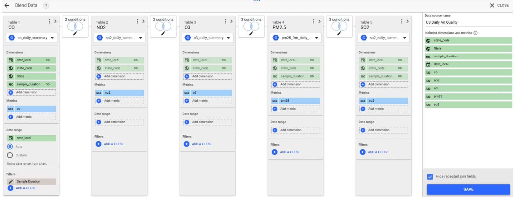
Figure 7.26 – Blending the five BigQuery tables
- Add a table chart to the report canvas and choose the blend as the data source. Select State as the dimension and co, no2, o3, pm25, and so2 as the metrics. Set the aggregation to Average. This calculates the average of the median pollutant level for each state for December 2019. You can configure the chart as needed:

Figure 7.27 – A chart visualizing the data from five different data sources using blending
For the representation depicted in the preceding image, I’ve sorted the table by State and turned-on axis for all metrics.
Blending charts
You can also use the preceding blend to visualize the pollutant measurements for each date. However, if you would like to see the data at a higher granularity of date, such as by week, the current blend results in duplicate data, as shown in the following image:
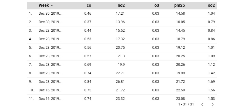
Figure 7.28 – Blends can result in duplicate data if not appropriately configured
This is because the tables are combined based on the date rather than the week. A different blend that is based on week needs to be created specifically for this purpose. At the time of this writing, you cannot change the granularity of the date fields in the tables of the blend directly. What you can do instead is build individual charts for each of the data sources with the following configuration and select Blend data from the right-click menu:
- Add a table chart to the canvas.
- Add state_code, state_name (needed only for the first chart), and date_local as the dimensions. Change the type of the date_local field to ISO Year Week and rename it Week.
- Add first_max_value as the metric and set the aggregation to MAX (to get the maximum value of the measurement for the week). Rename the metric to the appropriate pollutant name.
- Add a Sample Duration filter equal to 1 HOUR for charts using the co, pm25, and so2 data sources.
The five table charts are shown in the following image:
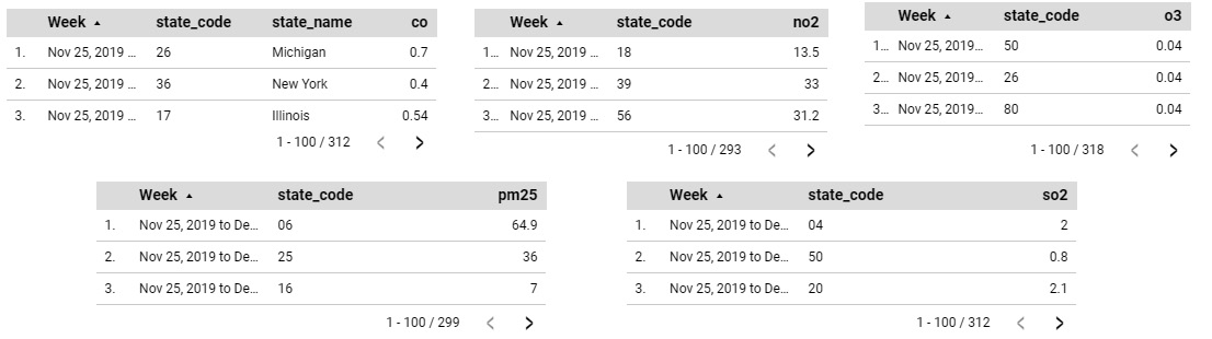
Figure 7.29 – The individual charts to be blended
A blend is created automatically and a new table chart using the blend as the data source is added to the canvas:

Figure 7.30 – The resultant blended chart
Edit the resultant blend to verify the join and other configurations. Tables are ordered in the order in which the charts are selected. The tables are joined using the default join operator, the Left outer join. Change the configurations as needed. Remove state_code from the blended chart. Change the chart type to a Pivot table with a heatmap and specify Week as the column dimension. Sort the columns by Week. The resultant visual looks as follows:

Figure 7.31 – Modifying the blended chart to visualize the data appropriately
When charts of different types are blended, the resultant chart type is usually based on the first individual chart selected. This is true when all the individual chart types are compatible with each other (for example, vertical and horizontal bar charts, or pie and donut charts). For incompatible chart types, the blended chart is created as a table by default.
When multiple charts are blended, the resulting blended chart typically includes all the fields from the blend. With the exception of only blending scorecards, all other blends simply add the additional metrics from the blend as appropriate. When two scorecard charts are blended, the resultant scorecard shows the ratio of two metrics from the individual charts based on two different data sources (Online Sales and Product Info) as the metric, as shown in the following figure:
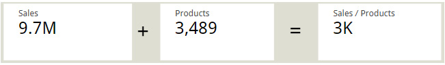
Figure 7.32 – Blending scorecards
By default, the resultant scorecard displays the metric as a percentage. For this example, the type is changed to Number and the format is updated to display compact numbers. This is an easy way to display KPIs without having to create blends and calculated fields manually.
Note that these types of blends can also be created from the charts using the same data source. However, it is always preferable to create the required calculated field directly within the data source when possible and use blends only when absolutely necessary.
Next, you will learn about another common scenario where blends are useful.
Reaggregating metrics using blending
You can see how we aggregated an already aggregated value in the preceding example – we calculated the average of the median pollutant levels. This is a powerful application of data blending. In a blend, the individual tables are created first and then combined based on the join configurations. You perform the first level of aggregation within the table. The resulting blend fields are all non-aggregated dimensional fields, which can then be aggregated as desired in the charts.
If you want to reaggregate a field within a data source, create a blend with itself. For example, you can find the maximum weekly sales of each country as follows. Use the Online Sales dataset for this example:
- Add a table chart to the report with Country and InvoiceDate as the dimensions. Change the format of the InvoiceDate field to ISO Year Week. Add Sales as the metric.
- Click BLEND DATA in the SETUP tab. Add the same data source as Table 2 with only Country selected as a dimension. Specify the join condition on the Country field and save the blend:

Figure 7.33 – Blending a data source with itself allows the reaggregation of data
- In the chart, remove the InvoiceDate field and change the aggregation of the Sales metric to MAX. Update the display name to Max Weekly Sales. The chart now displays the maximum weekly sales for each country. The resulting chart and its configuration look as follows. You can change the chart to a different type as desired:
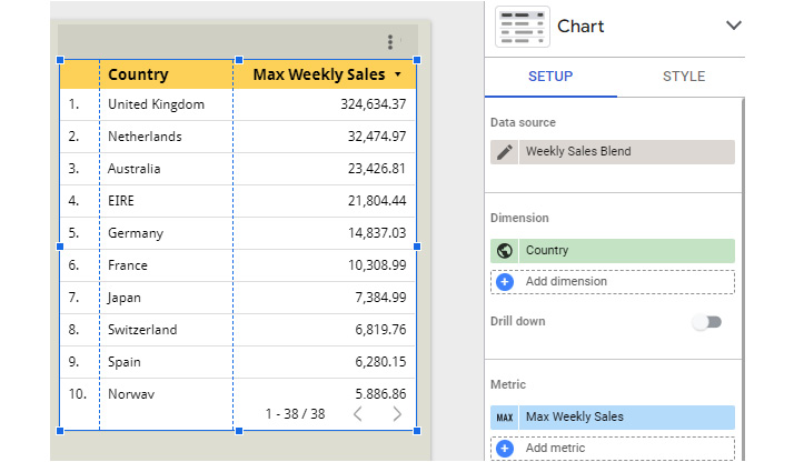
Figure 7.34 – Calculating the maximum weekly sales using blending
Blending is a powerful capability that allows you to visualize data from multiple data sources together and implement reaggregation. Beware of the pitfalls though, as blends can lead to slower reports and data inaccuracies. Effective blending involves choosing the right join conditions and a limited number of fields from the original data sources.
Adding community visualizations
Community visualizations are custom visualizations developed by third-party developers and partners. They are available from the Looker Studio Report Gallery, as well as in the report designer. To display data using community visualizations in a report, they need to be allowed access to the associated data source(s). This option is enabled by default for any data source that uses Owner’s credentials. It can be turned off from the data source editor page. Community visualizations cannot be used with data sources that use Viewer’s credentials.
From the toolbar, select the Community visualizations and components icon. You can choose from the featured visualizations or click on + Explore more to select from the full collection in the gallery:

Figure 7.35 – Adding community visualizations to the report
You are then prompted to grant consent for the report to display the data in the visualization. When consent is not provided, the visualization is not rendered. You can configure the community visualization chart using the DATA and STYLE tabs just as with the built-in charts. Any community visualization types added to the report are marked as Added report resources. You can view the number of instances of each added visualization type in the Manage visualization resources page reached from the toolbar icon, as well as from the Resource | Manage community visualizations menu:

Figure 7.36 – Managing community visualization resources
You can also revoke consent to any visualization resources from this page. If any report components are based on this resource, revoking consent will break those components.
Community visualizations enable you to leverage new and different visual representations beyond the built-in chart types available, as well as implement custom functionality. You can also build your own custom visualizations using the Google developer resources (https://developers.google.com/lookerstudio/visualization) and use these visualizations in your reports. You can choose to publish your community visualization to Looker Studio Gallery and make a submission to Google for review. This allows you to share your creation with the wider Looker Studio community.
A key concern for many using community visualizations is how secure they are. While the visualization needs access to your data to render it, all community visualizations are subject to a content security policy (CSP) that restricts these visualizations from talking to any external resources. This mitigates the risk of a community visualization sending data to an external server. Moreover, the review process mandates third parties to link to their own terms of service and privacy policies from the visualization. Review these carefully before using any published partner community visualizations.
At the time of writing, even the unpublished visualizations that you have developed yourself are enforced by the CSP and cannot make requests for external resources. Some community visualizations may be built and provided by Google using the same process as other community visualizations. These are directly covered by Looker Studio’s terms of service and privacy policy. They also do not need explicit user consent to render the data. In the preceding figure, you can see that the Waterfall visualization resource built by Google is Always Allowed.
Creating report templates
Report templates allow you to share your reports widely, outside your organization, and with the public. Templates allow others to use your reports with their own data. In Chapter 4, Google Looker Studio Overview, you learned about what report templates are, where to find them, and how to create reports from a template. In this section, you will learn how to create and share a report template.
Template creation is a very simple process and any report can be turned into a template just by adding /preview to the end of its URL. However, there are a few things that need to be kept in mind and followed through to ensure its wider utility.
First and foremost, templates should be based on standard schema data sources or connectors. This makes sure that others will be able to use their own data with the template and create reports from it as needed. Templates made out of non-standard and custom data sources have limited use, if any. You can either share your templates with specific users and groups or publicly with anyone.
The steps to create a report template are as follows:
- Create and design a Looker Studio report using a data source with a standard schema. Make sure this is a schema that your intended target users can access. You can use connectors with fixed schemas such as Google Ads, Google Analytics, Facebook Ads, and Salesforce, or standard open datasets. Do not use your own personal or confidential data to build the report. Make sure only sample data sources or publicly available data are used. If you would like to use an existing report to create a template, make a copy of the report and replace the data sources with sample data.
- Use Owner’s Credentials for the data sources used in the report.
- Name the report appropriately (for example, Sales Performance Analysis Template).
- Enable Link sharing by selecting the Anyone with the link can view option from the report sharing settings.
- Add /preview to the end of the report URL and share this link with others.
- You can also submit your template to the Looker Studio Report Gallery (https://lookerstudio.google.com/gallery). Google periodically reviews all these submissions and publishes a handful of them to the gallery.
So far in this chapter, we have explored various advanced features, their applications, and how to use them. We have seen how calculated fields, parameters, and data blending capabilities help build more powerful and useful reports. We have looked at community visualizations and how they provide additional chart types and enhanced functionality. We have also learned about how to create report templates that enable us to share our reports widely. Next up is the final major topic in this chapter, which talks about ways to optimize Looker Studio report performance.
Optimizing reports for performance
Fast report load times and responsiveness are paramount for a good user experience in any visualization tool. Certain design and implementation choices may adversely impact report efficiency. In this section, you will learn about several techniques that will help you optimize Looker Studio reports performance-wise. Some of the considerations here may only be relevant when dealing with truly large volumes of data.
Optimizing data sources
A major reason for lag in Looker Studio is the volume or size of the data being queried. Hence, the first place you can look to for improving the performance of your reports is the data sources.
Modeling the data source
Data sources in Looker Studio are logical constructs and do not pull data from underlying datasets unless this is requested from reports and explorations. Typically, date ranges and other filters defined at the report level determine the maximum volume of data the report can retrieve and visualize – for example, filtering the report on a specific product to analyze the corresponding sales performance, or setting the default date range of the report to the past 6 months of sales transactions.
However, report editors can override report filters at the individual page or component level by disabling filter inheritance. Whenever possible, it’s a good practice to limit data at the data source level itself to ensure report queries will not retrieve large result sets inadvertently. Not all connectors have this provision though.
Some connectors allow you to limit the number of rows for a data source through parameters. Earlier in this chapter, you may have seen that the Twitter Public Data connector provides a parameter – # tweets per keyword – to limit the data that you can connect to. Not allowing this parameter to be overridden in the report ensures that more data cannot be retrieved. For SQL-based datasets, you can use the Custom SQL Query option with a WHERE clause to filter the data as needed by date or other attributes.
Aggregating the data appropriately either using a custom SQL query in the connector settings or in the underlying platform itself also helps optimize the data source by limiting the dataset size. For example, if your analysis is only based on weekly or higher date granularity, there is no need to connect to data that is at a daily or hourly granularity.
The number of fields in the data source does not typically affect the report performance, owing to the logical nature of the data source. However, defining data sources with only the fields that are required and used in the reports has its benefits. First of all, a smaller data source is more manageable, easier to work with, and reduces overhead. When the underlying dataset is SQL-based, such as databases (MySQL or Postgres) and data warehouses (BigQuery or RedShift), you can use a custom SQL query to select only the fields that are needed. While connecting to data in Google Sheets, you can choose a range instead of the entire worksheet. The range has to be continuous though. Equally, depending on the connector, there may be certain connection properties that will help you choose a limited number of fields from the underlying datasets.
Secondly, the ability of the underlying data platform to efficiently query a handful of fields from a very wide dataset can affect report performance. Data warehouse systems that use column-oriented storage can query datasets with hundreds of fields and retrieve one or a few columns very efficiently compared to database platforms that use row-oriented storage. Other kinds of platforms may have their own quirks. So, designing the dataset with an appropriate number of fields becomes key for certain data platforms.
Extracting a data source
There may be some situations when you are not able to limit the data (the fields and rows) in a data source as desired and therefore experience poor performance in the associated reports. This can include the following:
- The connector does not provide options to choose the fields or limit the rows
- No access to the underlying platform to create the dataset with the desired aggregation, fields, and filters
In such cases, you can leverage the Extract data capability to extract a subset of data from an existing data source. Extract data retrieves a copy of the data and creates a snapshot in Looker Studio. This provides higher performance benefits compared to an equivalent data source based on a live connection. It can be leveraged for any existing data source that is slow so that the associated reports and explorations can be made more responsive and faster to load.
The extracted data is created as a separate data source in Looker Studio and can be used with reports and explorations just as with regular data sources. The following are the steps to create and use extracted data:
- Select Create | Data source from the home page or Add data from within a report.
- Choose Extract Data from the connectors list.
- Select the data source from which to extract the data. When creating the extracted data source from the home page as a reusable data source, only other reusable data sources are available to choose from. Equally, when extracting data from within a report, the extracted data source is created as an embedded data source and it can only be based on the data sources added to the report. You can add any available reusable data source to the report on this screen and use it for extraction as well:

Figure 7.37 – Extracting data from a data source to improve performance
- Choose the fields to extract as dimensions and metrics, add filters, and set the date range as needed for your purpose. Selecting only a handful of fields from the chosen data source creates an aggregated result set. It can be customized and reduced in size further by defining the filters and the date range. You cannot create calculated fields here. Create them in the base data source if you want to aggregate them on a derived field. For any calculations needed for reporting based on the extracted data, create them within the extracted data source itself.
- The extracted data source creates a snapshot of data and is not updated by default. You need to explicitly enable Auto Update and set a schedule to refresh it regularly.
- Click SAVE AND EXTRACT to create the extracted data source.
- You can now create new reports and explorations using this data source. You can also replace the corresponding live-connection-based data source with the extracted one in existing reports to speed them up.
Extracted data sources can only contain up to 100 MB of data. So, they cannot be used for reporting on really large datasets. Extracting data for specific reporting needs rather than serving a wide range of use cases is a good approach.
Setting the optimal data freshness frequency
Each chart and control in a Looker Studio report issues a separate query to the underlying dataset. Looker Studio stores the query result of each chart in its own cache. Any change in the filter selections or the date range for new values triggers new queries, for which data is retrieved directly from the dataset. Looker Studio remembers the previous queries for each report component and stores the result sets in the component cache.
Looker Studio also refreshes the data source periodically even if no queries are generated from the report to ensure the report reflects up-to-date data automatically. All data sources have a data freshness setting that determines how often the cache is refreshed by directly querying the underlying dataset at regular intervals. It could be every 15 minutes, every hour, 12 hours, or daily. The default refresh rate and the frequency options available depend on the data source connector type. Between the refresh intervals, data is fetched from the cache for all repetitive queries.
A data source refresh clears the cache and all the previous queries are forgotten. So, after each refresh interval, all the queries from the report components go directly to the dataset. If the underlying data is not updated frequently or the report does not need to reflect the most up-to-date data, you can choose a longer refresh interval for your data sources that suits your needs. For example, when the underlying dataset only gets updated twice a day, the corresponding Looker Studio data source need not be refreshed more than every 12 hours. Moreover, for a sales performance dashboard built using this data source, daily updates may suffice.
It is always faster to get data from the cache compared to querying the dataset directly. A Looker Studio report slows down considerably when a lot of queries are sent to the dataset. Setting the refresh interval as too frequent generates new queries for all the components too often. This can also sometimes overload the underlying platform and further degrade performance.
Performing data manipulation outside Looker Studio
Looker Studio allows you to transform your data and manipulate it via calculated fields and blending. You can create derived fields to create custom groupings of dimension values, perform arithmetic and mathematical operations, and manipulate text. However, it is not the best place to do any considerable data transformations due to the following reasons:
- Looker Studio is not built for robust data preparation
- Looker Studio has a limited breadth of data manipulation capabilities
- Performing any significant data preparation within Looker Studio slows down the reports
It’s always preferable to transform and prepare data outside Looker Studio in Google Sheets or underlying databases, for example. Limit the number of calculated fields within a data source to a handful and keep them simple (as opposed to complex multi-level branching logic).
Use blending with caution. Data blending is also a form of data manipulation. Using blends heavily on a number of charts in a report affects the performance considerably. Keep the columns and tables in a blend to a minimum, and specific to one or a few charts and controls for the best experience.
Optimizing reports
There are a couple of things you can consider while designing and building the report to avoid slower load times and response times. You want to keep the report as light as possible, with fewer components and computations, to ensure the best performance. These aspects are described in detail in the following subsections.
Refraining from overloading the report
As the number of charts and controls within a report increases, the responsiveness and load times tend to suffer. This is because Looker Studio generates individual queries for each component.
Consider consolidating information into a small number of charts with clever design choices – for example, displaying multiple measures in a single bar or line chart rather than in separate charts when appropriate (this only works when the metrics are on the same or similar scale), or using tables or pivot tables to represent multiple dimensions and metrics together. Limiting the level of detail in a chart also helps, as the query returns a much smaller result set with fewer dimensions used. Also, use drill-through purposefully. Choosing the right chart type also impacts the performance in certain cases. For example, when you are interested in total metric values, use scorecards rather than time series or tables. Enabling chart cross-filtering for all charts also contributes to performance degradation, as each chart interaction can result in new queries for all the affected charts on the report page. Regulate cross-filtering by limiting the affected scope (for example, using groups), as well as only enabling this capability for a handful of charts, to support carefully planned user interaction flows.
A report with a lot of charts, especially when coupled with large datasets, makes the report interactions and thereby the user experience cumbersome and less than ideal. In such scenarios, organize your visualizations and controls into multiple pages that provide a logical grouping around different business questions or themes. This kind of report layout results in better report performance, besides making it easier for the users to consume all the information. You may also want to limit the number of pages in a report for better manageability. It’s a best practice to keep each report lightweight and focused on a limited scope.
Using fewer calculated fields
Following the same theme of keeping a report lightweight, do not create too many calculated fields within the chart configurations. Both the number and complexity of calculated fields contribute to increased load times. Looker Studio tries to push down computations to the underlying dataset as much as possible. However, it cannot always be done, especially with platforms with limited or no processing capabilities.
Try to perform the majority of calculations in the underlying dataset itself and keep the derived fields in Looker Studio to a minimum. Examples of valid scenarios include data conversions that are not possible in the underlying platform, and ratios and rate calculations that are not cumulative and that change based on the granularity of the chart query.
A non-performance-related reason to limit calculations in Looker Studio concerns business logic and rules. It’s almost always not a good idea to implement business logic in a reporting tool. This is because it limits accessibility and the consistent implementation of said logic across multiple visualization tools used in an organization. Key metric computations and business logic are better served by managing them in a more centralized backend system.
Underlying dataset performance
A key external factor that affects Looker Studio performance is the platform or system where the underlying dataset resides. Looker Studio connects to the underlying dataset through a live connection. This means that Looker Studio queries the underlying dataset to render visualizations and controls within a report or exploration. The performance of the underlying platform is a critical factor that impacts Looker Studio load times and responsiveness. Data platforms differ in their capability and efficiency when processing data and supporting analytical queries. Most do well for small datasets and simple queries.
When the data volume or query complexity increases, many suffer from low performance. For example, platforms such as Google Sheets have limited processing capabilities. Meanwhile, data warehouse systems such as BigQuery are purpose-built for large analytical use cases and can handle massive volumes of data (think terabytes and petabytes) and complex processing very efficiently. While relational databases such as MySQL can also provide great performance, they are not ideal for large-scale reporting use cases due to their physical architecture. However, with reasonable volumes (think 100s of megabytes to gigabytes) and an appropriate, logical data design, they serve analytical and reporting needs well.
In addition to the platform itself, the way the data is organized is also important, as in, whether it is normalized into multiple underlying tables or denormalized into a single flat table, the latter being more performant for reporting use cases. Often, you will not have a choice about where your dataset is hosted or how it is designed. If you do, choose an appropriate platform and data model that can support your data volumes and analytical complexity.
You may also run into performance issues when a large number of users are interacting with the report at the same time. The generated individual queries from all these users can easily overload the underlying dataset platform if it cannot support such a workload. This invariably increases the query response times and leads to further degradation of the report performance.
BigQuery provides an in-memory analysis service called BI Engine that provides sub-second query response time and allows a high number of concurrent queries. This allows you to build faster, more responsive dashboards and explorations in Looker Studio without having to worry about scale or complexity.
Summary
In this chapter, you gained an understanding of several advanced concepts in Looker Studio. We explored the corresponding features and looked into some interesting ways to use them. Calculated fields enable you to enrich the data source and manipulate the data to meet your reporting and analytical needs. Parameters allow you to capture user input and use it to perform dynamic calculations, limit the data retrieved from the dataset, and even drive the content displayed in a visual.
Data blending helps you visualize data from multiple data sources together or perform reaggregations. You learned about how to use community chart types and create report templates easily. A report that loads quickly and responsively is important for a good user experience. In this chapter, you also learned about several factors that affect report performance and optimization strategies to address them. This concludes Part 2 of the book, which described the many useful features and capabilities of this tool. From the next chapter onward, we will now go through a few examples of building dashboards step by step from start to finish using various datasets.