
Chapter 5. Overlays
Overlays are really just lightweight pop ups. We use the term lightweight to make a clear distinction between it and the normal idea of a browser pop up. Browser pop ups are created as a new browser window (Figure 5-1). Lightweight overlays are shown within the browser page as an overlay (Figure 5-2). Older style browser pop ups are undesirable because:
Browser pop ups display a new browser window. As a result these windows often take time and a sizeable chunk of system resources to create.
Browser pop ups often display browser interface controls (e.g., a URL bar). Due to security concerns, in Internet Explorer 7 the URL bar is a permanent fixture on any browser pop-up window.
By using either Flash or Ajax-style techniques (Dynamic HTML), a web application can present a pop up in a lightweight overlay within the page itself. This has distinct advantages:
Lightweight overlays are just a lightweight in-page object. They are inexpensive to create and fast to display.
The interface for lightweight overlays is controlled by the web application and not the browser.
There is complete control over the visual style for the overlay. This allows the overlay to be more visually integrated into the application’s interface (compare Figure 5-1 and Figure 5-2).

Lightweight overlays can be used for asking questions, obtaining input, introducing features, indicating progress, giving instructions, or revealing information. They can be activated directly by user events (e.g., clicking on an action, hovering over objects) or be provided by the web application at various stages in the completion of an action.
Tip
Never use browser overlays. They are expensive to create, hard to control, slower than lightweight overlays, and visually unappealing.
We will look at three specific types of overlays: Dialog Overlays, Detail Overlays, and Input Overlays.
Dialog Overlay
Dialog Overlays replace the old style browser pop ups. Netflix provides a clear example of a very simple Dialog Overlay. In the “previously viewed movies for sale” section, a user can click on a “Buy” button to purchase a DVD. Since the customer purchasing the DVD is a member of Netflix, all the pertinent shipping and purchasing information is already on record. The complete checkout experience can be provided in a single overlay (Figure 5-3).

Considerations
Because the overlay is a lightweight pop up, the confirmation can be displayed more rapidly and the application has complete control over its look and placement.
Lightbox Effect
One technique employed here is the use of a Lightbox Effect. In photography a lightbox provides a backlit area to view slides. On the Web, this technique has come to mean bringing something into view by making it brighter than the background. In practice, this is done by dimming down the background.
You can see the Lightbox Effect pattern used by Flickr when rotating images (Figure 5-4).

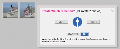
The Lightbox Effect is useful when the Dialog Overlay contains important information that the user should not ignore. Both the Netflix Purchase dialog and the Flickr Rotate dialog are good candidates for the Lightbox Effect. If the overlay contains optional information, then the Lightbox Effect is overkill and should not be used.
Modality
Overlays can be modal[24] or non-modal. A modal overlay requires the user to interact with it before she can return to the application. In both the Netflix example (Figure 5-3) and the Flickr example (Figure 5-4), the overlays are modal: users cannot interact with the main Netflix or Flickr page until they perform the action or cancel the overlay. In both cases, modality is reinforced with the Lightbox Effect. Dimming down the background cues the user that this portion of the interface cannot be interacted with.
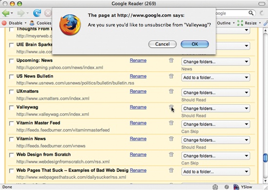
Sometimes overlays are non-modal. An example of this can be found in the Netflix site. When a DVD is added to the user’s shipping list (queue), a confirmation overlay is shown (Figure 5-5). While it may appear that the only way to dismiss the overlay is by clicking the “Close” box in the upper-right corner, in reality the user can click anywhere outside the overlay (in the dimmed area) and the overlay will dismiss. In this case the Lightbox Effect is used to focus the user’s attention on the confirmation and recommendations available.

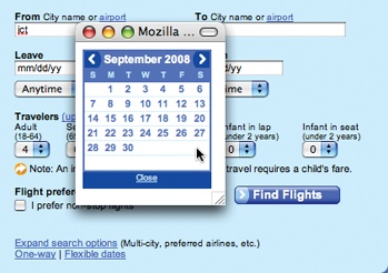
The Lightbox Effect emphasizes that we are in a separate mode. As a consequence, it is not needed for most non-modal overlays. As an example, refer back to Figure 5-2, the Orbitz calendar pop up. Since the overlay is really more like an in-page widget, it would not be appropriate to make the chooser feel heavier by using a Lightbox Effect.
Tip
Use the Lightbox Effect to emphasize modality or call attention to special information in an overlay.
Staying in the flow
Overlays are a good way to avoid sending a user to a new page. This allows the user to stay within the context of the original page. However, since overlays are quick to display and inexpensive to produce, sometimes they can be tempting to use too freely, and in the process, may actually break the user’s flow.
Anti-pattern: Idiot Boxes
Alan Cooper states a simple principle:
Don’t stop the proceedings with idiocy.[25]
In the context of flow he describes how egregious it is to interrupt the user needlessly:
One form of excise is so prevalent that it deserves special attention.... Flow is a natural state, and people will enter it without much prodding. It takes some effort to break into flow after someone has achieved it. Interruptions like a ringing telephone will do it, as will an error message box. Some interruptions are unavoidable, but most others are easily dispensable.... Interrupting a user’s flow for no good reason is stopping the proceedings with idiocy and is one of the most disruptive forms of excise.[26]
This is a clear anti-pattern that should be avoided. We call these types of overlays Idiot Boxes.
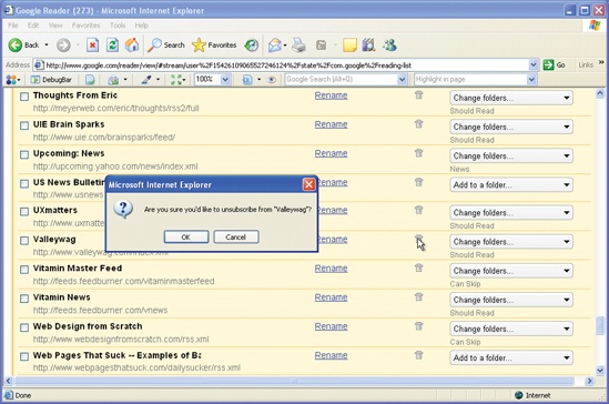
One of the clearest examples of Idiot Boxes is the way certain confirmation overlays were used in Yahoo! Photos. When users selected a set of photos and dragged and then dropped them onto an album, they were treated with not just one confirmation, but with two (Figure 5-6).


A fundamental problem in this interaction is the lack of clear invitations and feedback at just the right moment. Lacking feedback when the user drags over the album (to signal you will be dropping it on the “Paris06” album) and after it has been dropped is often “remedied” by the heavy-handed use of pop-up overlays to state the obvious. We will discuss these concepts in more detail in later chapters.
Tip
Mind the interesting moments in an interaction. They can remove the need for Idiot Boxes.
Using JavaScript alerts
It is tempting to use the alert mechanism built into the browser for some confirmations. The problem with using this type of alerts is two-fold.
First, they do not present themselves consistently across different operating systems. Under Microsoft Windows they will appear centered in the browser window, but with the Macintosh they will slide out from under the title bar. Depending on where the action takes place, users may have to move their mouse a lot further each time they need to dismiss the alert (Figure 5-7).
Second, there is no way to control the look and feel of the alert pop up. With lightweight overlays, any valid web interface can be created to interact with the user.
The alert shown in Figure 5-7 has recently been replaced with a lightweight overlay (Figure 5-2).
Detail Overlay
The second type of overlay is somewhat new to web applications. The Detail Overlay allows an overlay to present additional information when the user clicks or hovers over a link or section of content. Toolkits now make it easier to create overlays across different browsers and to request additional information from the server without refreshing the page.
Taking another example from Netflix, information about a specific movie is displayed as the user hovers over the movie’s box shot (Figure 5-8).

Considerations
The overlay provides a nice way to reveal a synopsis for a movie. In a sense it is like flipping over the DVD box and reading what is on the back.
Activation
The overlay is displayed when the mouse hovers over a box shot. There is about a half-second delay after the user pauses over a movie. The delay on activation prevents users from accidentally activating the overlay as they move the cursor around the screen. Once the user moves the cursor outside the box shot, the overlay is removed immediately. Removing it quickly gives the user a fast way to dismiss it without having to look for a “Close” box.
Tip
For Detail Overlays activated by a mouse hover, provide a slight delay before displaying.
You can find the same interaction style employed on Yahoo! News. When the user hovers over news story links in various areas (like Most Popular), a sneak peek shows the news photo and lead of the story (Figure 5-9).
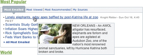
In both cases the user is given the additional context to make a decision about what to do next. In the case of Netflix, a movie’s description or rating prediction may lead to the user renting the movie. With Yahoo! News, since click-throughs to news stories are more intentional, the user will be taken to stories that interest him. This creates a sense of user satisfaction and control, both of which are ingredients to a good user experience.
Anti-pattern: Mouse Traps
It is important to avoid activating the Detail Overlay too easily. We have seen usability studies that removed the delay in activation, and users reported that the interface was “too noisy” and “felt like a trap”. We label this anti-pattern the Mouse Trap.
The reasoning for this is not clear, but Amazon uses the Mouse Trap anti-pattern in one of its “associate widgets”. In Figure 5-10 the link “Ray! Original Motion Picture Soundtrack” activates an overlay providing information on the soundtrack and a purchase option. Presumably, this approach is intended to drive purchases—but it also presents an annoying experience.

Anti-pattern: Non-Symmetrical Activation/Deactivation
When the user moves her mouse over the link, the overlay springs up immediately. The only way she can remove the overlay is by clicking the small close button in the upper right. Using Non-Symmetrical Activation/Deactivation is also a general anti-pattern that should be avoided. It should take the same amount of effort to dismiss an overlay as it took to open it.
Compare the Amazon approach to both the Netflix and Yahoo! News approaches. The activation is slightly harder (pause, slight delay) than the deactivation (immediate when mouse is moved away).
Tip
Make activation and deactivation symmetrical interactions.
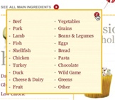
Another example of Non-Symmetrical Activation/Deactivation turns up in a previous version of Yahoo! Foods (Figure 5-11). To see all main ingredients for a recipe, the user clicked a red arrow. This activated an overlay with the ingredients. However, clicking on the arrow again did not collapse the overlay. Instead, the user had to click on the close button (red X).
Anti-pattern: Needless Fanfare
One of the advantages of a lightweight overlay is the ability to pop it up quickly. After a slight delay in activation (recall the half-second delay used by Netflix), you would not want or need the overlay to come up slowly. But in the case of Borders online, this is precisely the approach taken (Figure 5-12). First the activation is immediate (no delay). This creates the noisy, mouse-trap interface just discussed. Second, there’s a needless animation that zooms the box up into place and then back down when the mouse moves away from a book. Needless Fanfare is an anti-pattern to avoid.
The animation takes a full second to complete. Instead of delaying before activation, it delays after activation. Perhaps the design team thought that the animation tied the details to the item it zoomed out from. However, the Netflix approach simply creates a bubble effect that points back to the item it is revealing information for (Figure 5-7, right).
Tip
Once activated, show Detail Overlays immediately without fanfare.
Anti-pattern: Hover and Cover
We discussed the anti-pattern Hover and Cover in Chapter 2, and it’s important to keep this anti-pattern in mind when providing a Detail Overlay. In the Netflix example (Figure 5-7), the overlay does not get in the way of moving to the next box shot. Even though it covers the neighboring box shot, moving the mouse outside the original one removes the overlay immediately, providing a clear path to get an overlay on the next box shot.
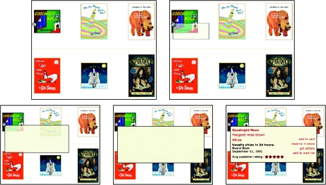
Compare this to the Detail Overlay provided by barnesandnoble.com (Figure 5-13).
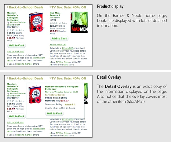
Barnes & Noble uses a Detail Overlay in a completely useless manner. The overlay contains exactly the same information that the page already contained! Not only that, but the overlay almost completely obscures the other item displayed on the page. It also creates another common problem—the book image (dictionary) in the overlay is not positioned the same as the book image on the page (about 12 pixels difference). The shift causes the annoying illusion that the book is wiggling back and forth, which detracts from the experience.
On the other hand, AOL Finance provides a very nice example of pulling detailed stock information into an overlay that fits in a seamless manner, provides additional information, and does not cover up the navigation to the next item that might be of interest (Figure 5-14).

Input Overlay
Input Overlay is a lightweight overlay that brings additional input information for each field tabbed into. American Express uses this technique in its registration for premium cards such as its gold card (Figure 5-15).

Considerations
There are a few things to keep in mind when using Input Overlays.
Clear focus
As the user tabs or clicks from field to field, the field gets wrapped in an overlay. The overlay contains additional input help information. This allows the normal display of the form to be displayed in a visually simple manner (just prompts and inputs). The overlay creates focus on the given input field. Instead of seeing an ocean of inputs, the user is focused on just entering one field.
Display versus editing
Additionally, when the Input Overlay is shown, the prompt is displayed in exactly the same manner as when the overlay doesn’t show. This is critical, as it makes the overlay feel even more lightweight. If the overlay prompt were bold, for example, the change would be slightly distracting and take the focus away from input. The only difference between the non-overlay field and the overlay version is a slightly thicker input field border. This draws the eye to the task at hand—input.
Anti-pattern: Hover and Cover
But what about the anti-pattern, Hover and Cover? Doesn’t this cause the same issues that we saw earlier? For example, in Figure 5-15 (“Obscuring fields”), the “Name on Card” overlay hides the “Home Apt/Suite#” and “Home Phone Number Fields” fields below it. There are several reasons that American Express was able to employ this overlay in forms and “get away” with covering some fields during input:
- Field traversal
The field traversal is side-to-side. The overlay for the “First Name” field (Figure 5-15, Input Overlay) does not obscure the next field, “Last Name”.
- Tab navigation
Since tabbing is a primary navigation for forms, the mouse is not needed to navigate. This allows navigation to fields even if they were covered.
- One-click deactivation
Clicking anywhere hides the overlay. That means that when the “Name on Card” overlay is shown (Figure 5-15, “Obscuring fields”), clicking anywhere in the “Home/Apt Suite#” field will remove the overlay, allowing the user to click in the previously hidden field (Figure 5-15, “Deactivation”).
Two additional touches that would help with field-covering issues include:
Give the overlay a slight translucency in order to faintly reveal the fields below.
Allow a click deactivation to not only deactivate the overlay but click through to the field that was clicked over. This allows the user to click into a field shown through the overlay.