Chapter 3. Direct Selection
When the Macintosh was introduced, it ushered into the popular mainstream the ability to directly select objects and apply actions to them. Folders and files became first-class citizens. Instead of a command line to delete a file, you simply dragged a file to the trashcan (Figure 3-1).
Treating elements in the interface as directly selectable is a clear application of the Make It Direct principle. On the desktop, the most common approach is to initiate a selection by directly clicking on the object itself. We call this selection pattern Object Selection (Figure 3-2).
In this chapter we will look at the following types of selection patterns:
Toggle Selection
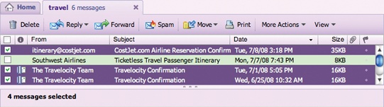
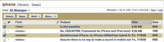
The most common form of selection on the Web is Toggle Selection. Checkboxes and toggle buttons are the familiar interface for selecting elements on most web pages. An example of this can be seen in Figure 3-3 with Yahoo! Mail Classic.

The way to select an individual mail message is through the row’s checkbox. Clicking on the row itself does not select the message. We call this pattern of selection Toggle Selection since toggle-style controls are typically used for selecting items.
Tip
Toggle Selection is the easiest way to allow discontinuous selection.
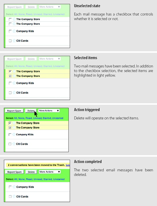
Once items have been check-selected, actions can be performed on them. Usually these actions are performed on the selection by clicking on a separate button (e.g., the Delete button). Gmail is a good example of actions in concert with Toggle Selection (Figure 3-4).
Considerations
Toggle Selection with checkboxes has some nice attributes:
Clear targeting, with no ambiguity about how to select the item or deselect it.
Straightforward discontinuous selection, and no need to know about Shift or Control-key ways to extend a selection. Just click the checkboxes in any order, either in a continuous or discontinuous manner.
Clear indication of what has been selected.
Scrolling versus paging
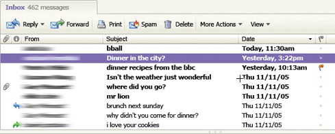
The previous examples were with paged lists. But what about a scrolled list? Yahoo! Mail uses a scrolled list to show all of its mail messages (Figure 3-5). While not all messages are visible at a time, the user knows that scrolling through the list retains the currently selected items. Since the user understands that all the messages not visible are still on the same continuous pane, there is no confusion about what an action will operate on—it will affect all selected items in the list. Sometimes the need for clarity of selection will drive the choice between scrolling and paging.
Tip
Toggle Selection is the normal pattern used when content is paged. Actions normally apply only to the selected items on the visible page.
Making selection explicit
With Yahoo! Bookmarks you can manage your bookmarks by selecting bookmarked pages and then acting on them. The selection model is visually explicit (Figure 3-6).

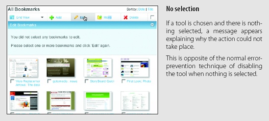
The advantage of this method is that it is always clear how many items have been selected. Visualizing the underlying selection model is generally a good approach. This direct approach to selection and acting on bookmarks creates a straightforward interface.
One interesting question: what happens when nothing is selected? One approach is to disable any actions that require at least one selected item. Yahoo! Bookmarks takes a different approach. Since buttons on the Web do not follow a standard convention, you often can’t rely on a color change to let you know something is not clickable. Yahoo! Bookmarks chose to make selection very explicit and make it clear when a command is invalid because nothing is selected (“No selection” in Figure 3-6). This is not normally the optimal way to handle errors. Generally, the earlier you can prevent errors, the better the user experience.
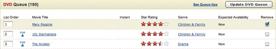
Netflix disables the “Update DVD Queue” button when nothing is selected and enables it when a movie gets selected (Figure 3-7).

Collected Selection
Toggle Selection is great for showing a list of items on a single page. But what happens if you want to collect selected items across multiple pages? Collected Selection is a pattern for keeping track of selection as it spans multiple pages.
In Gmail, you can select items as you move from page to page. The selections are remembered for each page. If you select two items on page one, then move to page two and select three items, there are only three items selected. This is because actions only operate on a single page. This makes sense, as users do not normally expect selected items to be remembered across different pages.
Considerations
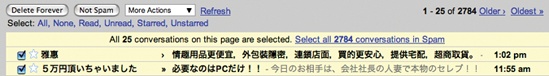
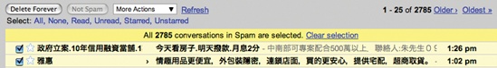
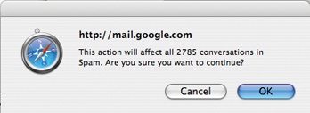
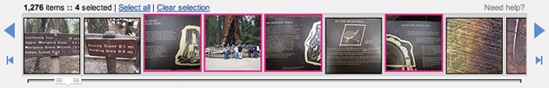
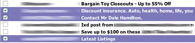
Gmail does provide a way to select all items across different pages. When selecting all items on a individual page (with the “All” link), a prompt appears inviting the user to “Select all 2785 conversations in Spam”. Clicking that will select all items across all pages (Figure 3-8). The “Delete Forever” action will operate on all 2785 conversations, not just the 25 selected on the page.
Keeping the selection visible
The real challenge for multi-page selection is finding a way to show selections gathered across multiple pages. You need a way to collect and show the selection as it is being created. Here is one way that Collected Selection comes into play.
LinkedIn uses Collected Selection to add potential contacts to an invite list (Figure 3-9).
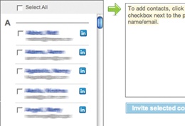
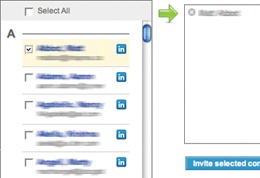
The list of potential invitees is shown in a paginated list on the lefthand side. Clicking the checkbox adds them to the invite list. The invite list becomes the place where selected contacts across multiple pages are remembered.
Any name in the invite list can be removed by clicking the “X” button beside it. Once the complete list of invitees is selected, clicking the “Invite selected contacts” sends each selected contact a LinkedIn invitation.
Collected Selection and actions
When Yahoo! Photos was working its way through an early design of its Photo Gallery (see Figure 3-13, later in this chapter), the plan was to show all photos in a single, continuous scrolling page (we discuss virtual scrolling in Chapter 7). In a long virtual list, the selection model is simple. Photos are shown in a single page and selection is easily understood in the context of this single page.
However, due to performance issues, the design was changed. Instead of a virtual page, photos had to be chunked into pages. In order to support Collected Selection, Yahoo! Photos introduced the concept of a “tray” into the interface (Figure 3-10). On any page, photos can be dragged into the tray. The tray keeps its contents as the user moves from page to page. So, adding a photo from page one and three more from page four would yield four items in the tray. As a nice touch, the tray would make itself visible (by sliding into view) even when the user was scrolled down below the fold.
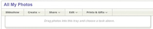
There was a problem with the design, however. In the menu system it was hard to discern whether the user meant to operate on the selection (photos on the page could be selected through an Object Selection model) or on the collected items in the tray. To resolve this ambiguity, the drop-down menus contained two identical sets of commands. The first group of commands in the menu operated on the collected items in the tray. The second set of commands operated on the selected objects. Needless to say, this was confusing since it required the user to be fully aware of these two selection models when initiating a command.
One way to remove this ambiguity would have been to have a single set of commands that operated on either the tray or the photos—depending on which had the focus. This would require a way to select the tray and a way to deselect it (by clicking outside the tray). A possible approach would be to slightly dim the photo gallery when the tray is selected (causing it to clearly have the focus), and do the opposite when the tray is not the focus.
Object Selection
As we mentioned earlier, Toggle Selection is the most common type of selection on the Web. The other type of selection, Object Selection, is when selection is made directly on objects within the interface.
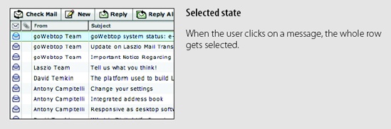
Sometimes using a checkbox does not fit in with the style of interaction desired. Laszlo’s WebTop mail allows the user to select messages by clicking anywhere in the row. The result is that the whole row gets highlighted to indicate selection (Figure 3-11).

Considerations
Desktop applications tend to use Object Selection. It is also natural that web-based mail applications that mimic desktop interactions employ this same style of selection. Instead of showing a control (like a checkbox), the object itself can be selected and acted on directly.
Object Selection can be extended by holding down the Shift key while clicking on a different item. The Command key (Macintosh) or Control key (Windows) can be used to individually add items in a discontinuous manner. The downside to this approach is that it is not obvious to use the modifier keys for extending the selection. Toggle Selection’s use of toggle buttons makes the selection extension model completely obvious.
Flickr is a simple example of the keyboard being used to extend the selection in a web application. In the Organizr tool, multiple photos can be selected by using modifier keys to extend the selection (Figure 3-12).
Desktop-style selection
For now Object Selection is not as common on the Web. Given that most sites have been content-oriented, there have been few objects to select. Also, with the Web’s simple event model, Object Selection was not easy to implement. In typical web pages, keyboard events have rarely made sense since they are also shared with the browser. However, all of this is changing as the capabilities of web technologies continue to improve.
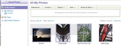
Most desktop Object Selection interactions include ways to use the mouse to drag-select objects. Yahoo! Photos introduced this same type of object selection to its photo gallery (Figure 3-13). Individually clicking on a photo selects it. Using the Shift key and clicking also extends the selection. In addition, using the Control key and clicking discontinuously selects photos. And like most desktop applications, you can drag a selection box around a group of items to add them to the selected set (in this case, photos).
Hybrid Selection
Mixing Toggle Selection and Object Selection in the same interface can lead to a confusing interface. Referring back to Yahoo! Bookmarks, you’ll see an odd situation arise during drag and drop (Figure 3-14).


Considerations
There are a few important issues to consider when using Hybrid Selection.
Confusing two models
In the left panel of Figure 3-14, one bookmark element is selected (notice the checkbox Toggle Selection). The second bookmark element (“Dr. Dobb’s”) is unselected (the checkbox is clear). In the right panel of Figure 3-14, clicking and dragging on the unselected bookmark element initiates a drag. The drag includes both the selected element and the unselected element. Since only one is shown as selected, this creates a confusing situation.
This occurs because three things are happening in the same space:
Toggle Selection is used for selecting bookmarks for editing, deleting, etc.
Object Selection is used for initiating a drag drop.
Mouse click is used to open the bookmark on a separate page.
The problem is that more than one interaction idiom is applied to the same place on the same page. In this case, if you happen to try to drag, but instead click, you will be taken to a new page. And if you drag an unselected item, you now have two items selected for drag but only one shown as selected for other operations (Figure 3-14, right). This is definitely confusing. Simply selecting the item (automatically checking the box) when the drag starts would keep the selection model consistent in the interface. However, it might lead the user to expect a single click to also do the same (which it cannot since it opens the bookmark).
So, mixing the two selection models together can be problematic. However, there is a way to integrate the Toggle Selection and Object Selection and have them coexist peacefully as well as create an improved user experience.
Blending two models
Yahoo! Mail originally started with the Toggle Selection model (Figure 3-15). When the new Yahoo! Mail Beta was released, it used Object Selection exclusively (Figure 3-16). But since there are advantages to both approaches, the most recent version of Yahoo! Mail incorporates both approaches in a Hybrid Selection (Figure 3-17).
Hybrid Selection brings with it the best of both worlds. You can use the checkbox selection model as well as normal row selection. You get the benefit of explicit selection and simplified multiple selection that Toggle Selection brings. And you get the benefit of interacting with the message itself and direct object highlighting.
Tip
Combining Toggle Selection and Object Selection is a nice way to bridge a common web idiom with a common desktop idiom.
There is an additional meaning applied to Toggle Selection versus Object Selection. Clicking on a row with the checkbox has the benefit of selecting the message without loading its contents in the message pane (think spam!). Clicking on a message itself will load the contents in the message pane.