
Chapter 13. Lookup Patterns
A good portion of application interfaces is involved in looking up information. Whether an application is performing direct searches, filtering search results, or aiding in input, there are a lot of opportunities to provide lookup assistance.
Since lookup is really a shot in the dark for the user, any real-time feedback will be valued as users work to complete their tasks. There are four lookup patterns we will apply the principle of React Immediately to:
Auto Complete
Auto Complete is a powerful pattern that benefits from a reactive interface. As the user types input into a field, a drop-down menu of matching values is displayed. When done right, the choice that best matches will be auto-selected. The user can stop typing and accept the choice that has been matched or choose a different value from the list. The selected value is then entered into the field. Yahoo! Mail uses Auto Complete for email addresses (Figure 13-1).

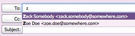
The Yahoo! Mail Auto Complete has a singular purpose: help users find an email address from their contact list. However, the user can choose to ignore the displayed value and instead enter a new email address. This distinguishes Auto Complete from a normal drop-down selection box. Selection boxes provide a limited set of valid values. Users are not free to add their own values. For example, entering a U.S. state is best done with a select box and not Auto Complete since you don’t need to create new states.
Considerations
At first glance Auto Complete can seem like a simple interaction. However, there are a few key interesting moments to consider.
Typing
How long should you wait to display feedback as the user types? In the case of Auto Complete, feedback should be sent after each character is typed. Since the focus is on entering a value in a field, the set of choices should be shown instantaneously. However, it is acceptable to delay retrieving values between keystrokes if the user is a fast typist.
Matching
In the case of Yahoo! Mail, the typed character(s) are matched against any part of the contact’s name and email address. This is important since sometimes the user recalls part of an email address and other times is typing the contact’s first or last name.
Yahoo! Mail also highlights the matched contact as well as displaying the matched characters in bold text. This clearly indicates which contact was matched as well as how the match was made.
The Up and Down arrow keys can modify the matched value. They simply move up and down through the list of partially matched contacts.
Selecting
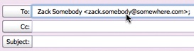
Once an item is matched, it should be straightforward for the user to accept the match. In the case of Yahoo! Mail, hitting the Tab key enters the matched contact into the input field.
This might seem obvious. However, it is not uncommon for Auto Complete interactions to miss this crucial step. A counterexample to Yahoo! Mail ironically comes from Yahoo! as well. The Yahoo! Travel Farechase product provides an Auto Complete feature for entering origin and destination airports (Figure 13-2).
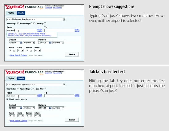
Farechase handles the delay during typing well but fails in the way it handles matching and selecting. Neither of the two airports that match the phrase “san jose” gets highlighted. The only indication of which airport Farechase thinks is the best match is based on position. Since “San Jose, CA—SJC (San Jose International Airport)” is the first airport in the list, it seems that this might be the best match. But hitting Tab reveals that neither was considered worthy of choosing. Instead the user gets to keep a partially typed phrase, “san jose”.
The only way to get it to work correctly is to use the Up and Down arrow keys (or the mouse) to explicitly choose an airport from the drop-down set of choices. This is a cumbersome, unnecessary step that is easily avoided by automatically selecting the first matched item in the list.
Kayak Auto Complete
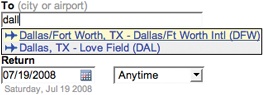
Kayak.com is a good example of getting typing, matching, and selecting correct for Auto Complete. In Figure 13-3, the user wants to fly to Dallas, TX. He isn’t sure what the airport code is, but he wants the one in Dallas/Fort Worth. Typing “dall” gets two matches: DFW and DAL (Love Field). Realizing that DFW is the correct airport and seeing that it is already highlighted, he hits the Tab key. It enters the correct value for the DFW airport in the input field.

The only critique of this system is the use of light yellow for the selection color. In most cases it is too subtle. However, unlike Farechase, Kayak just does the right thing when the user hits the Tab or Enter key. There’s no need to use the down arrow key to select the first item: just press the Tab or Enter key to accept the match.
Tip
Auto Complete should never make the user scroll through the drop-down to choose the already selected item! The Tab key should enter the matched item.
This follows one of Jakob Nielsen’s 10 usability principles: Error Prevention. Providing immediate reactions and the proper cues prevents the user from entering the wrong value (e.g., “dall”) and having to go back to correct a mistake that should have been avoided in the first place.
Live Suggest
A very close cousin to Auto Complete is the Live Suggest pattern (also known as winnowing). While Auto Complete provides suggested real-time values for an input field, Live Suggest provides real-time search term suggestions for creating a search. The context switch from input field to search box and from input value to term suggestion puts a different twist on the interaction.
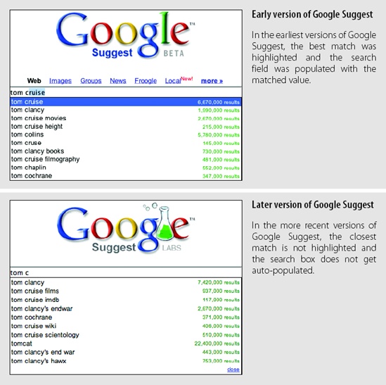
Google Suggest was one of the first examples of Live Suggest on the Web. As the user types in the Google Suggest search box, the top search terms that match the user’s input are shown in a drop-down. Figure 13-4 shows two versions of Google Suggest with different approaches to matching and choosing.
Considerations
Just as in Auto Complete, Live Suggest has three interesting moments to focus on: typing, matching, and selection. Let’s look at how both versions of Google Suggest handle these.
Typing
The two versions handle reactions to user input the same way. As the user types, suggestions are presented in real time with no noticeable delay. If the user pastes a phrase into the search box, it will just display results for phrase and not attempt to display results for individual characters.
Matching
The most powerful aspect of Google Suggest is its ability to narrow in on good search terms based on partial input. Here is how Google describes the service:
As you type into the search box, Google Suggest guesses what you’re typing and offers suggestions in real time. This is similar to Google’s “Did you mean?” feature that offers alternative spellings for your query after you search, except that it works in real time. For example, if you type “bass,” Google Suggest might offer a list of refinements that include “bass fishing” or “bass guitar.” Similarly, if you type in only part of a word, like “prog,” Google Suggest might offer you refinements like “programming,” “programming languages,” “progesterone,” or “progressive.”
Our algorithms use a wide range of information to predict the queries users are most likely to want to see. For example, Google Suggest uses data about the overall popularity of various searches to help rank the refinements it offers.... Google Suggest does not base its suggestions on your personal search history.[50]
What this means is that by progressively applying the suggestion algorithm to the current input, the search terms are narrowed to yield a good search result. It also has the potential of producing novel or intriguing suggestions.
Providing real-time feedback can have a negative side effect. If what is shown diverges from what the user is actually looking for, instead of narrowing in, the process becomes distracting. This is the tension in all suggestion-based systems. Are you distracting the user or helping her narrow in on better results? You should continue to make live suggestions only if you are certain you can narrow and not distract. Otherwise, take a more conservative approach and change the suggestions less frequently.
Tip
Suggestions should always narrow toward the user’s goal and avoid distracting her with needless information.
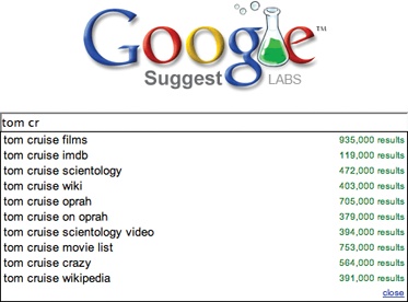
Narrowing suggestions are powerful. For example, typing “tom cr” shows a number of common Tom Cruise searches. Continuing to type “tom cruise crazy” yields specific common searches (see Figure 13-5).

Yahoo! Search also provides a Live Suggest for its searches (see Figure 13-6). One difference between Google Suggest and Yahoo! is that Yahoo! provides feedback on matched terms.
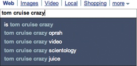
At first glance it seems that Yahoo! is highlighting the wrong thing. Recall the Yahoo! Mail Auto Complete example earlier in this chapter (see Figure 13-1). The characters that matched the user’s input for each matched contact are displayed in bold. But in Yahoo! Search, just the opposite happens. Instead of highlighting the matched text, it highlights the difference. This twist shifts the focus to how each suggestion will narrow the search.
This illustrates how dependent interaction styles are on context. With Auto Complete, we are trying enter a direct value. The suggestions are possible matches. With Live Suggest, we are trying to formulate the right query for a search. Each suggestion has a unique context to offer. When the words “is”, “oprah”, “video”, “scientology”, and “juice” are highlighted, users can quickly scan and get the suggestion’s context. Each suggestion provides a way to head off in a different direction.
Both Live Suggest implementations have another nice side effect. Spelling mistakes are caught earlier in the cycle since the guesses are based on implicitly correcting the spelling of the search query.
Selecting
In the earlier versions of Google Suggest, the best match (first item) was automatically chosen. Not only was the suggested term highlighted but also the full matching string was placed in the search box. Typing “tom c” produced “tom cruise” with “ruise” selected (see Figure 13-4). The idea of selecting the portion of the text not explicitly typed was to:
Allow the user to hit Enter to accept the implicit match.
Allow the user to hit Delete to remove the implicitly added string (e.g., “ruise”).
More recent revisions have taken a different approach. Instead the best match is not selected and the search box is never modified by matches found. The idea is to:
Avoid making assumptions that the guesses are what the user wants. Guesses have to be explicitly chosen with the arrow keys or the mouse.
Allow the user a more normal search-box experience.
There are advantages to each approach. The first is more heavy-handed and assumes the guess has a high probability of being the user’s intent. As we saw earlier with Auto Complete, selecting the suggestion as the value to accept makes for a more pleasant experience. But the current approach better captures the idea of a “suggestion”; it’s just that—a suggestion, not an explicit choice.
More Considerations
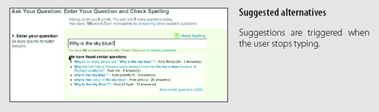
Live Suggest doesn’t have to look exactly like the preceding examples. It can come in other flavors. When users enter a new question in Yahoo! Answers, an alternate set of questions is suggested (see Figure 13-7).
Typing
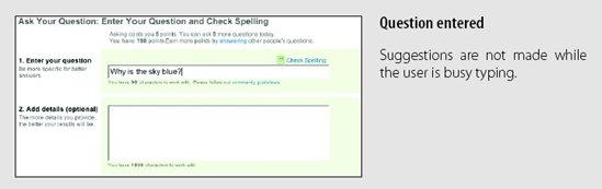
This method departs from the previous Live Suggest examples. Instead of triggering suggestions after each character is typed, suggestions are displayed whenever the user pauses typing. If a complete question is entered without a pause, no suggestions will be displayed until the very end. Showing suggestions too early would be distracting and would not help users narrow down to the question they are trying to formulate.
Matching and selecting
Instead of a drop-down, a list of similar questions is provided in context just below the question asked. The reason? If users pick an alternate question, they don’t need to create a new question. Selecting an alternate question takes users directly to the question and its answers, and out of the task of creating a new question.
Live Search
Yet another close relative to both Auto Complete and Live Suggest is Live Search. As with Live Suggest, a search query is being formulated. But instead of displaying suggested search terms, actual live search results are shown in real time.
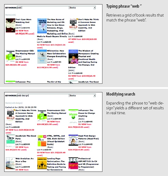
A clear example of this is ZUGGEST[51] for Amazon. Not affiliated with Amazon.com, Francis Shanahan created a Live Search for Amazon products (see Figure 13-8).
Considerations
Providing in-context, real-time results to queries as they are typed is a powerful way for users to find what they are looking for. Live Suggest sets up a tight feedback loop for finding the right query. However, the actual search results are shown outside this iterative feedback loop. Live Search, on the other hand, creates a tight feedback loop directly with the search results themselves.
How does the handling of interesting moments differ between Auto Complete and Live Suggest?
Typing
Since returning search results generally takes longer than the time between typing characters, searching should wait for the user to stop typing. This allows feedback to happen at times when it will not be distracting, as well as providing better user experience performance. While ZUGGEST does not provide a Busy Indicator or Progress Indicator, it is a good idea to provide this feedback as soon as a search is initiated. Otherwise the interface will feel sluggish. Instant feedback improves the perceived performance.
Matching and selection
There is nothing inherently unique in the way search results are matched for Live Search or normal search. Nor is there anything unique about how items are selected. Live Search primarily affects the way searches are retrieved in response to typed queries.
Contextual results
While ZUGGEST presents a full search interface, sometimes the results can be shown in a more compact way. This is especially useful if you want to contain Live Search in a separate tool on the page or in a sidebar.
Firefox version 3 introduced search directly into the URL bar of the browser (Figure 13-9).

In the words of the Mozilla blog:[52]
Dubbed the “AwesomeBar”, it lets you use the URL field of your browser to do a keyword search of your history and bookmarks. No longer do you have to know the domain of the page you’re looking for—the AwesomeBar will match what you’re typing (even multiple words!) against the URLs, page titles, and tags in your bookmarks and history, returning results sorted by “frecency” (an algorithm combining frequency + recency).[53]
While ZUGGEST bases its results strictly on a straight product lookup, the AwesomeBar bases its search on personalized information. Since the browser can keep track of the users’ interest in pages and knows how recently they accessed them, the Live Search can be a powerful aid to finding previous sites they have visited.
The variance in the way these two sites perform matches has to do with context. With a straightforward search, you don’t know if users are looking for something they have seen before or not. And you would rather not limit their results. In the case of the browser URL, chances are that users are heading to a site they have been to before.
Previews in Live Search
When Live Search results are displayed in a drop-down or sidebar, users need enough context to choose the right result. Without the proper detail, users will have to click through to see whether they have really received the result they were looking for. If the result isn’t correct, they have to return to the page and start the search all over again. While the initial live search is fast and easy, the ensuing click-through and failure can be slow and painful.
Any easy way to minimize this happening is to show some preview information for each search result.
In the AwesomeBar example (Figure 13-9), each URL is displayed with its favicon, document title, and the URL.
Another approach is to provide detailed previews on demand. As we discussed in Chapter 3, Hover Details are a way to reveal lots of additional information when the user hovers over an item.
Dunstan Orchard created one of the early Live Search examples on his blog, 1976design.com (Figure 13-10). Previews are displayed in a balloon pop up when the mouse hovers over one of the search results returned. This allows a more compact view of search results, yet helps the user find the right result before clicking through.

Narrowing too quickly
Yahoo!’s Instant Search takes a narrower approach. A balloon pop up shows up with what it feels is the best single match. It’s like an abbreviated Google Suggest and the Google “I’m feeling lucky” button merged into a single interface.
Typing “tom cruise” yields a single result from IMDb (Figure 13-11).

Here are a few caveats:
Users frequently have to type fairly specific, complete search terms. “tom c” does not cut it; “tom cruise” does.
Having a single result is too narrow. In this example, users will always get the IMDb database result for Tom. Is that what they want?
The balloon can be distracting since it calls so much attention to itself and draws users’ eyes away from where they are typing. And when they don’t get the suggestion, they may think they have made a mistake.
Combining Live Suggest and Live Search
It is possible to combine Live Suggest and Live Search in a single interface. In an experimental interface, Yahoo! released (for a short period of time in 2006) AllTheWeb LiveSearch (Figure 13-12).
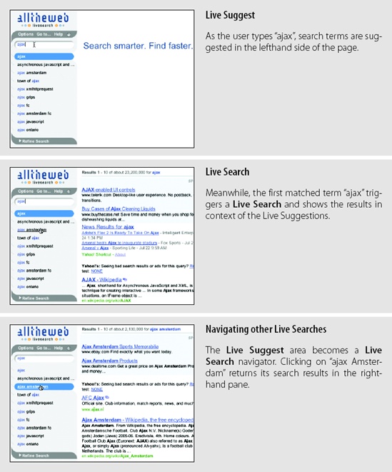
AllTheWeb LiveSearch is no longer live on the Web,[54] however, Yahoo!’s search has evolved to incorporate a variation on combining Live Suggest and Live Search into a single interface.
Tip
Combining Live Suggest and Live Search is a good way to provide a dynamic search experience.
As we saw in Figure 13-6, the main page for Yahoo! Search incorporates Live Suggest in its interface. The search results page incorporates a pull-down shade that contains the Live Suggest results. Changing the search query brings new suggestions in the pull-down shade area. Clicking on any of the suggestions displays new search results for the page (Figure 13-13).

Live Search can be expensive
It is a good idea to keep in mind that Live Search can be an expensive operation. Being able to search instantaneously with every user’s keystroke (or some set of keystrokes) can greatly increase server load.
In an early version of Yahoo! Mail (Beta version), typing a mail search triggered search on each keystroke. This was removed due to heavy server load (Figure 13-14).


Refining Search
Another variation on Live Search is Refining Search. Also known as Faceted Browse, Refining Search provides a set of live filters that allow the search results to be tuned in real time.
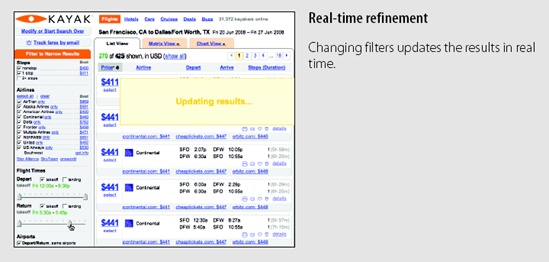
One of the earlier applications that effectively used Refining Search on the Web was Kayak, an online travel search site. The filter bar on the left dynamically updates the flight results on the right (Figure 13-15).

Considerations
As we have shown with Auto Complete, the Live Suggest and Live Search React Immediately principle is a powerful way to narrow in on a desired result. Kayak uses this technique effectively to allow the user to iteratively get a new set of results by tweaking a set of filters. While the filters can be placed anywhere on the page that makes sense, most sites (like Kayak) place the filters in a lefthand sidebar.
Avoid page refreshes
It is important that each iteration of the result is displayed without a page refresh.
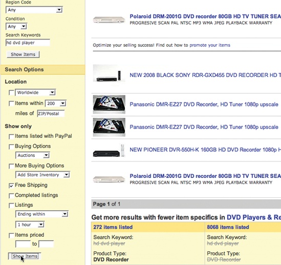
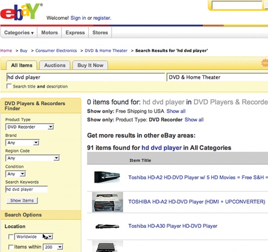
eBay uses a Refining Search (Figure 13-16). However, refinements are triggered only after hitting a “Submit” button. Each search generates an in-between page refresh. While this step may sound minor, it is very disruptive to the action-reaction feedback loop. The page result throws a blank page in the mix and usually scrolls the page back to the top. After each iteration, users have to relocate some element on the page to get their bearings, reposition the page, and analyze what changed. Generally any updates to the results after one of these page refreshes is not immediately noticed by the user. It’s as if the page refresh also refreshed the user’s mind!
Tip
Avoid page refreshes in Refining Search. The point is to quickly iterate to a result. Refreshing the page causes the user to lose her context.
Even smoother transitions
On the opposite end of the spectrum from the eBay page refresh model, Viewzi, a search interface, uses Transitions to smooth out Refining Search iterations. In the “4 Sources View,” results from Yahoo!, Google, Ask, and MSN are shown on the same page. In the first panel of Figure 13-17, only results from Ask are initially shown.
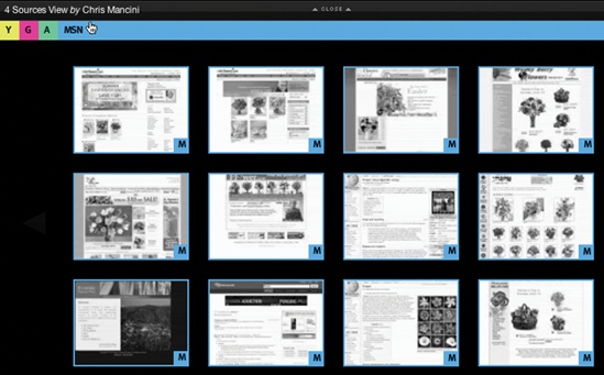
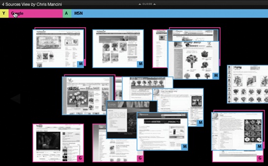

Clicking the pink bar (denoting “display Google results”) brings the Google results into the mix. Notice that the second panel shows the Google results flying into the page. The final panel shows both Ask and Google results displayed on the same page. The in-between fly in Transition makes it clear what got added during the Refining Search.
Custom filters
Roost, a real estate search site, provides an interface similar to Kayak’s. One nice addition is the ability to add custom search terms. Typing custom attributes in the “Custom Search Terms” panel adds them to the set of filters. The terms can then be checked on and off in real time. Like Kayak, Roost makes use of sliders for the Refining Search (Figure 13-18).
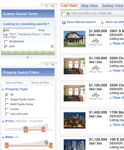
It should be noted that, while visually attractive, sliders can be hard for users to control. If you employ them, you should:
Display a tool tip or other real-time feedback while dragging a slider knob.
Allow clicking anywhere on the background or along the range to set the slider.
Make sure any background graphic gives additional feedback for the values along the range.
Consider an input field for accessibility considerations.
Allow double sliders (a knob for minimum value and a knob for maximum value) to overlap. Otherwise certain ranges can’t be entered. Endless.com is one of the few sites that gets this technique right (Figure 13-19).


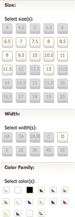
Think outside the box
Filters in a Refining Search don’t have to be just text fields, sliders, and checkboxes. They can be visual controls that provide clear feedback as to what the result will be before it is actually selected.
Like.com is a good example of this approach (Figure 13-20). Colors, shapes, sizes, and textures all are various ways to refine the search. You can even highlight a part of a product to find more like it.

Endless.com provides filters for finding shoes (Figure 13-21). The filters include things like shoe sizes, widths, and color families. The filters more closely represent the values than just simple checkboxes, sliders, or drop-downs.
When to trigger a search
While eBay requires the “Show Items” button to trigger a search and Kayak and Roost perform the search immediately after each refinement, there is a middle ground. Just as in Live Search, sometimes it makes sense to wait before triggering a Refining Search.
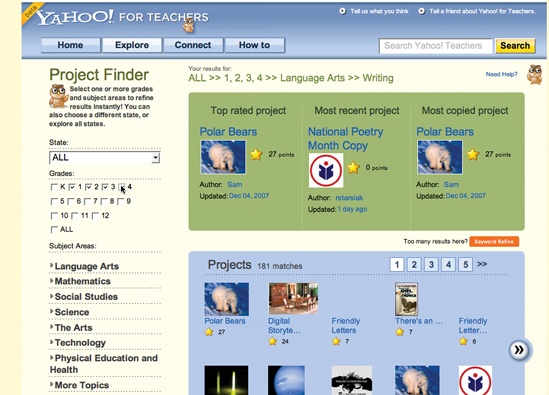
In Yahoo! for Teachers, a Refining Search is used for finding other teacher’s projects and lesson plans (Figure 13-22). Clicking various grade levels in succession only fires the search after the user has stopped interacting (for about half a second). The interface feels responsive, but not too chatty.
[53] See the Mozilla blog at http://tinyurl.com/6mowhb.
[54] You can find a screencast of it at http://www.flickr.com/photos/designingwebinterfaces/2758155472/in/set-72157606696104907/.