
Chapter 9. Static Invitations
By providing cues for interaction directly on the page we can statically indicate to the user the expected interface behavior. Static Invitations provide cues directly on the page. There are two broad patterns of Static Invitations:
- Call to Action Invitation
Invite users to primary task or tasks.
- Tour Invitation
Invite users to explore new features.
Call to Action Invitation
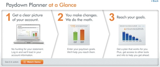
Both Yahoo! Answers and Discover card provide a simple 1-2-3 step explanation of their site (Figure 9-1). These clear steps provide a Call to Action Invitation. For Yahoo! the individual calls to action are ask, answer, or discover.

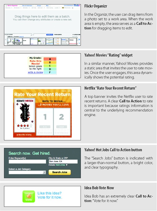
Call to Action Invitations are generally provided as static instructions on the page. But visually they can be provided in many different ways (Figure 9-2).
Considerations
There are some issues to keep in mind when using a Call to Action Invitation.
Visual noise
The problem of course with a Call to Action Invitation is that it competes with everything else on the page. Thinking through what actions you want to call out on a page (before any interaction) is a healthy design exercise that brings clarity to both visual and information hierarchy on the page.
Tip
Use a Call to Action Invitation for a primary action or to call out main 1-2-3 steps.
Like.com is a site for finding items that are similar to other items. Users can shop for similar colors, shapes, and patterns. Given a particular kind of watch, the users can draw a box around some physical feature they really like about it. Like.com will then find similar watches that match the characteristics that were highlighted. For example, highlighting the chronograph face will find more chronograph-style watches (Figure 9-3).
Since this feature is unique, a Call to Action Invitation is placed just above the watch. Titled “Refine by Visual Detail”, it contains a Static Invitation that says “Draw a box on the item to focus your search on that area.”
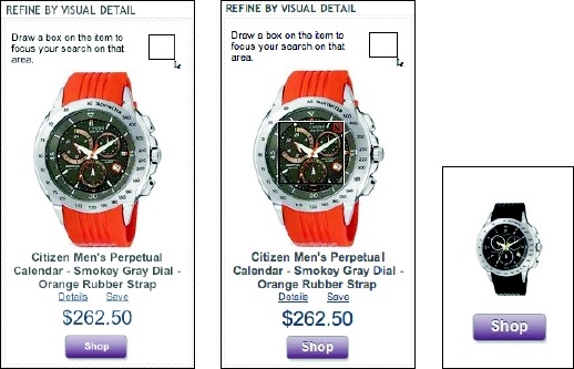
As with any Static Invitation, the question is: does it get lost on the page? The additional graphic that represents a mouse dragging a box adds some visual contrast to grab the user’s attention. In situations like this, only user-testing can verify whether users get it or not.
Blank Slate Invitation
Another type of Call to Action Invitation is a Blank Slate Invitation. 37 Signals utilizes this in its Backpackit application (Figure 9-4).

It’s a simple idea: starting with a blank slate invites the user to fill it in. Recycling what would normally be a blank area to provide clues on how to personalize it is a great way to entice users to create content. The use of the arrow is a nice touch as it allows the user to read the page as normal, but visually ties the invitation back to the toolbar above.
Tip
Recycle blank areas with invitations to interact.
Unfinished invitation
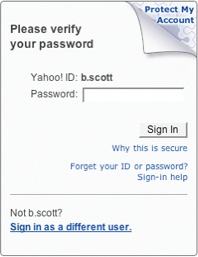
Yahoo! has a security feature that helps users confirm that they are indeed logging in to the official site (and not a spoof site). The setup is simple. Provide an image associated with the login page, an image known by only the user and Yahoo!. When users are on the official site, they will see the image uploaded for the login page.
Tip
Leave an area unfinished to invite the user to complete a task.
The Login team has gone through a couple of iterations on how to cue the user to add a sign-in seal. You can see these two approaches in Figure 9-5. The first renders the corner of the login area as a page turned down. The idea is that something appears out of place, which draws the user to interact with the security feature. We can only speculate, but given the latest revision to the invitation it appears that the first design did not work as well as expected (Figure 9-5, left). In the second iteration, messaging, visual style, color, and proximity have all been combined to create a clear invitation (Figure 9-5, right).

Tour Invitation
Closely related to Call to Action Invitations are Tour Invitations. The situation: you have a newly redesigned site or a whole range of new features. How do you invite the user to interact with the new site correctly and discover these new features?
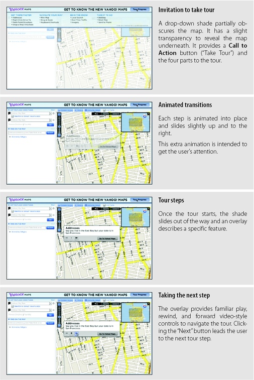
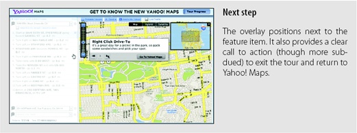
When Yahoo! Maps went through a major interface change they included an Tour Invitation (Figure 9-6). Tours are a great way to introduce new features.
Considerations
While tours can be a nice way to explain design changes to a web application, they are too heavy-handed for showing features at the moment the user interacts with them. And they run the risk of not being used since they are optional to the user’s flow.
Not a Band-Aid
Be careful. It is tempting to use tours as a Band-Aid for a poor interface. If users don’t get it, then creating more instructional text and providing tours will not solve the real problems an interface may have during interaction. But coupled with a well-designed interface, a tour can be just what is needed for users to get started.
Tip
Tours don’t make a difficult site easy to use.
The key to tours is keeping them simple, easy to start, and easy to stop. A tour should just illustrate the live site. Going into a “tutorial” mode separate from the site rarely works.
Keep it simple
When Yahoo! changed its home page in 2006, it launched a way to tour the live interface with a Dialog Overlay (Figure 9-7). The overlay provides a three-step interface: “Search Smarter”, “Find it Faster”, and “Get Personal”. Each step highlights a different part of the interface with a bubble callout explaining the feature (Yahoo! calls this a “Feature Cue”).
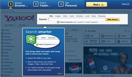
Simple visual techniques like dimming the page and highlighting the key areas works well. Using a Lightbox Effect (discussed more thoroughly in Chapter 11) to highlight features and clearly explaining them are great techniques for keeping tours simple.
Introducing new idioms
Like.com introduces its key features in a large area at the top of the home page: “Detail Search”, “Color Match”, “Shape Match”, and “Pattern Match” (Figure 9-8). Each has a postcard that explains the concept graphically. Each concept is automatically rotated through.
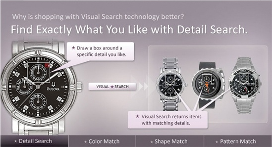
While visually stunning, there are a few issues with this approach:
Users tend to view visually treated areas at the top of a page as an advertisement. In tests of several products that employed this type of site introduction, users failed to even notice the area.
Since the tour is completely disconnected from the site, it is harder for users to map these feature descriptions to the actual site.
However, Like.com is trying to introduce completely new idioms. Creating a nice visual, bold explanation does a very good job of making these features easy to discover and interact with. The real key is that the features are easy to use in the site. The tour becomes secondary and as such may overcome the limitations noted.