
Chapter 11. Transitional Patterns
We have chosen to use the term Transitions to describe special effects that happen over a specified period of time. The term transition seems to catch the right spirit of how these cinematic effects get applied. They provide the grease that smoothes out what happens in the interface. Without transitional effects the user can be left to wonder what just occurred.
There are a number of Transitions available for our use. Let’s take a quick survey of the most popular.
Brighten and Dim
Two patterns that go hand-in-hand are Brighten and Dim.
Brightening an area of the screen focuses attention there. Since there is no way to raise the brightness of a part of the screen, this is typically accomplished by dimming the entire application window and exposing a part of the interface at normal, full-brightness level.
Color changes do not generate the same level of attention in the brain as movement changes. How much attention the dimming and brightening of an area on the screen will get depends on the speed of the color change (faster is more eye-catching) and the contrast between the dimmed and brightened state (greater contrast equals more attention).
Tip
Use Brighten and Dim to control the user’s point of reference.
Considerations
Dimming and brightening an area is an effective way to communicate subtle or secondary changes in an interface. Using Brighten focuses attention on an area. Using Dim in an area causes the elements to be treated as secondary or not in use. Dimming reduces attention to an area. Dim and Brighten can communicate importance, whether an object is in use, and if an interface is ready for interaction.
Importance
A common technique is to Dim a page and show an overlay in the normal, non-dimmed state. The effect seems to brighten an area and dim the rest. This interaction pattern is called a Lightbox Effect.
Wayfaring uses the Lightbox Effect when a user attempts to log in (Figure 11-1).
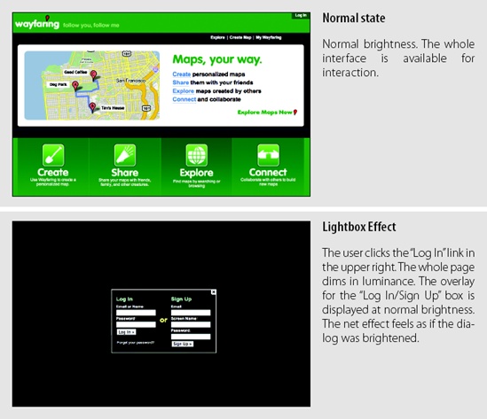
The login box appears brightened (again, in reality the background is the only thing changed—it is dimmed). Brightening an area with this technique makes it the primary focus. Dimming the background indicates that the rest of the interface is not currently part of the interaction at hand.
Recall the Yahoo! home page tour we discussed in a Chapter 9. Each part of the interface introduced is highlighted with the Lightbox Effect (Figure 11-2).

One issue to consider when using the Lightbox Effect is how jarring the change in luminance will be to the user. Dimming the interface and brightening an overlay calls a lot of attention to the dialog. In some ways it can make the overlay feel like a big context switch. If the goal is to quickly show a dialog, get input, and get out of the way, then do not use the Lightbox Effect. Instead use a normal Dialog Overlay.
Active
Another use of Dim and Brighten is to show when an object is being interacted with. An object can be dimmed when it’s not in use and brightened when it is in use. The original version of Measure Map (now a part of Google Analytics) provided a graph detailing the number of visitors to a blog over time. In order to decrease visual noise, the graph was dimmed when not in use (Figure 11-3).

When the mouse moves outside the graph, the image begins to fade in luminance. When the mouse re-enters the graph area, the graph quickly brightens. The dim and brighten effects take about a fourth of a second to transition.
Tip
Use Brighten and Dim to indicate whether or not an interface is active.
Not ready
You can also use Dim to indicate that a part of the interface is not ready for interaction. When searching for hotels in Yahoo! Travel’s Farechase tool, the map displaying the found hotels is dimmed until the search is finished (Figure 11-4).

Once the search is finished, the map result area is brightened and all interaction tools for the map are displayed (zoom, map styles, etc.) Dimming the map is coupled with other indications that the search is not completed.
Brighten/Dim transitions are very useful. You can use them when you:
Need to focus attention on a particular part of an interface (or detract attention from another part of the interface).
Need to provide feedback indicating that an object is being interacted with. A common interaction is to brighten an object when the mouse is hovered over it.
Decrease visual noise in an interface. Elements that are secondary can be dimmed when not in use.
Indicate that a part of the interface is not ready to be interacted with, perhaps when an application is being loaded.
Expand/Collapse
It’s helpful to have additional content or other panels hidden until the user needs them. This is accomplished by using Expand and Collapse to control a panel’s visibility in the flow of the page.
Considerations
There are some issues to keep in mind when using Expand and Collapse.
Expand/Collapse Inlays
In Chapter 5 we discussed Inlays. A typical way to bring an Inlay into a page is with Expand/Collapse transitions.
When these panels are shown, providing an animated transition for expanding the panel open or collapsing the panel closed helps connect the panel to the control that activates it. Expand is visually more eye-catching than Brighten/Dim (because the movement is more dramatic than reducing color slightly).[40]
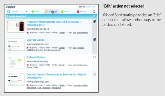
Yahoo! Bookmarks uses Expand/Collapse to hide and show its edit panel for editing bookmark tags (Figure 11-5).
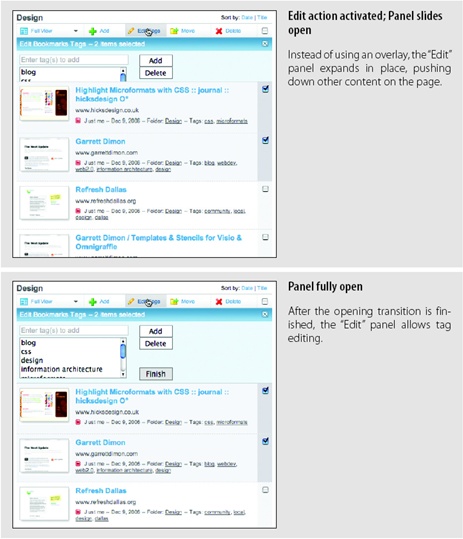
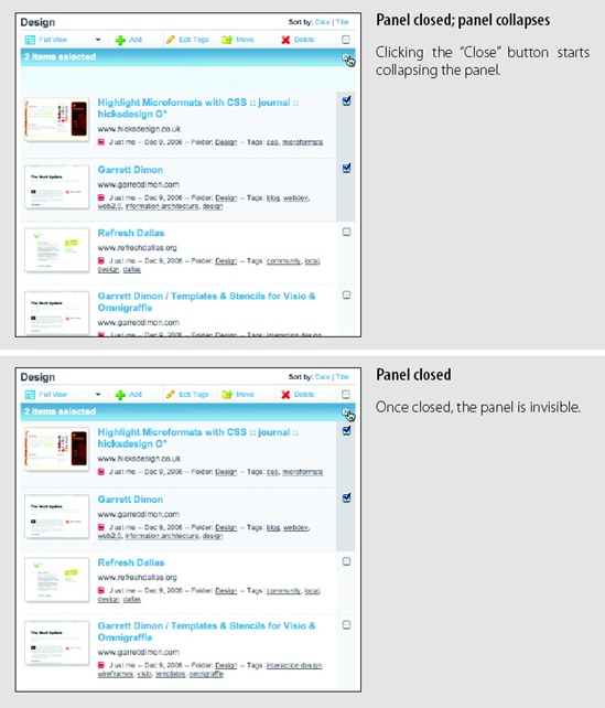
While the same result could have been accomplished with a normal Overlay, the Expand in context makes it apparent that it is connected to the “Edit” button as well as applied to the content. By making it inline, the context is preserved and not hidden.
Tip
Use Expand and Collapse to extend the available screen real estate in the application.
Expand and Collapse within the flow of the page is often used to open details about items within the page. It provides a nice way to toggle open additional content without losing the context of the summary information.
Expand/Collapse as Overlay
A slight variation is to have content Expand/Collapse appear as an Overlay on the page. Instead of pushing content down or out of the way, the panels simply slide out from some part of the page into a layer above the rest of the items on the page. The panel slides out, anchored to the activating control.
Five Runs is a Ruby on Rails application-monitoring tool. It provides a window into the inner workings of Rail’s apps, helping IT groups track down system issues. The Five Runs web application uses slide-out panels for additional controls (Figure 11-6).

Be careful to not overuse Expand. For example, in a photo application, if you provide a rollover to expand photos from thumbnail to a larger size, the transitions will become annoying because the user will see them back-to-back. Either remove the transition altogether or make it extremely fast.
An especially egregious example of overuse of Expand/Collapse is when it is applied to normal drop-down menus. The primary purpose of transitions is to communicate, and no amount of graphic trickery will make a noisy interface compelling. In a recent incarnation of the Nasa.gov website, we can see Expand and Collapse abused with their overuse of animated menus (Figure 11-7).

This type of animation abuse is the anti-pattern Animation Gone Wild.[41]
One problem with animating Expand and Collapse like this is that it makes the interface feel sluggish. It is also superfluous. Do we really need the menus animated? Does it communicate anything? Drop-down menus have been common for more than 25 years. Adding animation is simply gratuitous and unnecessary.
Tip
Avoid gratuitous Animation when expanding and collapsing content.
Buzzword also employs Animation Gone Wild by animating each toolbar button open and closed on hover. While it is a clever way to conserve space when the items are not interacted with, it feels like a series of Mouse Traps (Figure 11-8).

Expand and Collapse can be used to:
Manage lots of content or modules.
Manage real estate on the screen.
Emphasize the currently hovered-over object (e.g., photos in a photo album) as part of a rollover system.
Provide details about an item in a list.
Make content available for edit. Use instead of a pop up if the content being expanded is one of many items and there is a benefit to showing the detail in context with the other items.
Self-Healing Fade
When deleting or moving items, it is often helpful to temporarily expose a “hole” where the object being removed once lived. Animating the remove of the item and the closing of the hole reinforces where the deleted item was removed.
Considerations
This Self-Healing Fade pattern is used when deleting to-do items in Backpackit. Once an item is removed from an area, a hole is left. Next, the hole seals up, effectively healing itself (Figure 11-9).

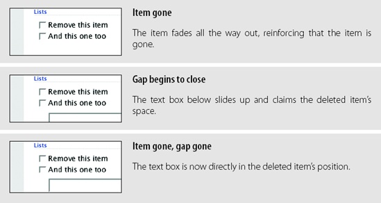
Self-Healing transitions can be used to:
Remove an object from a list or grid.
Convey that the removal happened and where the object was removed from.
Indicate the completion of a drop operation in which the dropped object was moved from one place to another.
Animation
In our everyday world, objects occupy real space and don’t normally instantly appear and disappear. We throw a piece of trash into the trashcan and see it leave our hand and go through the air into the trashcan.
Considerations
In our interfaces, we do not need to mimic every movement from the real world. Interfaces would be dreadfully slow. But by using Animation to show where an object came from or is going, we can make it easier for the user to find the object again or feel confident putting the object away in the future. Using animation to position an object in a grid confirms that it went into the slot. This type of feedback clarifies the user interaction.
Zoom back
My Yahoo! uses a zoom-back Animation if a drop fails. It communicates simply that the module returned from where the user attempted to drag it (Figure 11-10).
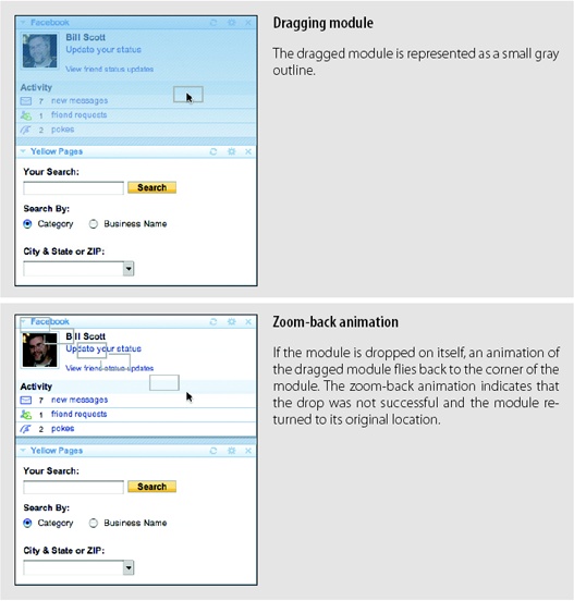
While the use of a small gray rectangle for the drag object is less than helpful (a thumbnail of the object being dragged would be better), the image of a gray rectangle flying back to the module’s original spot is simple and clear enough to communicate what happened.
Tip
Build association between elements on the page with Animation.
Drop animation
Another place to use Animation is when dropping modules on a web page into new locations. In earlier versions of My Yahoo!, the dropped module would animate into place. The earliest version took about one second to animate into place. A later version took it down to less than a half-second.
Cut it in half rule
While discussing the art of motion graphics with a practitioner from the field, I learned a simple rule of thumb about downplaying special effects. To avoid over-emphasizing a luminance effect or timing transition just cut the effect’s values in half.
Applying this rule to transitions, when calculating animation timing (or other transition effects), arrive at the best guess for timing. Then simply cut the effect in half. And maybe half it again. It is too easy to get focused solely on the effect and forget the overall interaction story you are trying to create. This simple rule is a nice way to keep transitions in check.
Tip
After defining a transitional effect, simplify it by making another pass to cut the effect’s values in half.
In the current version of My Yahoo!, the dropping modules process uses no animation at all. The same can be said for iGoogle (Figure 11-11). When a module is dropped, no animation is used to show where the object went.
Why? Well in many ways the animation is gratuitous. The user has positioned the object for dropping. There is plenty of feedback right before the drop, so animating it into place just makes the interface feel slower and doesn’t communicate anything new to the user.

Animation is a great technique when used correctly. It can be used to:
Smooth out a transition when a direct remove-and-appear in another place on the page would be a jarring or confusing way to show what just happened.
Show how an object has changed places or containment on a page.
Spotlight
Spotlights are useful when a change has occurred in an interface. By momentarily highlighting an object, you can subtly notify the user of a change in the interface. The Spotlight is often accomplished by first highlighting the background of an object, then fading out the highlight. An example of this technique is in Backpackit (Figure 11-12).

Considerations
When the title of the list is changed, it is momentarily spotlighted by highlighting its background in yellow. The color fades to the background color in about one second. This does a nice job of communicating that a change has occurred without keeping the notification around a long time. It avoids the Idiot Boxes anti-pattern we discussed in Chapter 5 by using a very subtle indication of change.
Tip
Use Spotlight to temporarily call attention to a change in the interface.
Signaling change
Flickr uses Spotlight when adding photos to the Organizer. A status message is placed in the upper right. If another action is taken, a second status message appears. The first message moves down (visually swaps location with the first) and then fades out. The current message will fade out as well after time passes. This is a simple way to provide confirmation that requires no action and removes itself automatically (Figure 11-13).


Use this strategy in order to:
Show that an object state has changed or has been updated with new information.
Call attention momentarily to a different part of the interface that might normally not be noticed.
There are other Transition patterns,[42] but these are the most common. In the next chapter, we’ll look at the purpose for Transitions.
[40] You can try this for yourself. Put your left hand straight in front of you. While keeping your eyes straight ahead, move your hand to the side until you can just no longer see it from your peripheral view. Now wiggle your fingers. Did you see it? Movement makes something normally invisible, visible.
[41] No, there is no companion DVD available on late-night TV for this anti-pattern ;-).
[42] See http://developer.yahoo.com/ypatterns/parent.php?pattern=transition for the Transition patterns in the Yahoo! Design Pattern Library.