
Chapter 14. Feedback Patterns
Reacting immediately to the user is not only needed for lookup patterns, but in order to provide interactive feedback in other situations. There are several patterns that help keep the user informed about what is happening in the application:
Live Preview
A Live Preview gives the users a glimpse beforehand of how the application will interpret their input once submitted.
We mentioned Jakob Nielson’s Error Prevention principle earlier. This principle says:
Even better than good error messages is a careful design which prevents a problem from occurring in the first place.[55]
Benjamin Franklin seemed to be speaking about the same principle when he uttered the famous quote, “An ounce of prevention is worth a pound of cure.”
Tip
Use Live Previews to prevent errors.
Being reactive to user input is an excellent way to provide that ounce of prevention. Live Previews dispense just the right amount of information, in context and just in time to keep users informed, preventing unnecessary mistakes.
Wundrbar.com is an example of an interface that reacts immediately (Figure 14-1). Wundrbar provides a search layer to a number of third-party services such as purchasing flight tickets, renting cars, or checking gas prices in Des Moines.


Note that before we start seeing action-reactions, we get a nice Static Invitation in the “Examples” section. Once we start typing, this interface perfectly illustrates the principle of action-reaction pairs. Our action of typing the word “fly” leads to the reaction of an Expedia flight search panel being displayed. The panel is shown immediately in context. A total of three invitations is shown in this reaction. The origin, destination, and departure date all have a red dotted underline. This cues the user that the application needs this information.
Emboldened by the intelligence displayed, let’s experiment with some more text. Typing “boston” and “to dfw” each get a reaction as Wundrbar fills out the origin and destination. At this point it does an interesting thing. Sure that it has understood the user’s intent, it changes the way it displays these two pieces of information. The fields are no longer shown needing input, but instead are shown as read-only text (Figure 14-2). This indicates that Wundrbar has interpreted the origin and destination and is ready to move on to other input.


The intelligence continues as the interface correctly interprets “fly bos to dfw on american airlines from July 12 to July 16”.
But what happens if the user gets off the rails and enters something incorrect? By continuing to display what it thinks users mean, Wundrbar gives users the feedback they need just in time. This is a key to reactive interfaces. The reactions must be in real time in order to be effective. In this case, if users see it has interpreted their input incorrectly, they can change their phrase in real time to get the correct response.
If a user did mistype, she would see something like Figure 14-3. The red underline next to the “To” field is very visible. It serves as a nice way to cue the user that the input is incomplete.

Considerations
There are some issues to consider when using Live Previews.
Immediate feedback
Instead of users entering a password, hitting the “Submit” button, and then finding out that their password is “too short,” the Google signup process (Figure 14-4) keeps users informed as they modify their entry. The nice thing about this interface is that it lets users make an informed decision about their password strength before making their final choice.
Google uses a Live Preview to help users choose an adequate password during the sign-up process.

Engagement
The use of a bar that fills up as users strengthen their passwords is reminiscent of the “ring-the-bell” carnival game, where you swing the hammer and try to hit the bell—only getting to a strong password is much easier.
Tip
Use Live Previews to improve user engagement.
Yahoo! Small Business uses Live Preview to help users find a domain name without leaving the current page (Figure 14-5).

In context
The difference between this example and the Google example is the use of a search button to trigger the in-context preview. The search button removes the ambiguity. But instead of going to a different page for showing the results of the attempted domain name creation, the results are provided in context.
In this example, the Live Preview is overlaid directly on the initial search box. The advantage of this approach is that it:
Does not disturb the page by adding more content into the flow of the page.
Feels more lightweight than a page transition.
Gives a clear place to put a progress indicator.
Provides room for a status message and two courses of action: “Search Again” or “See similar name options”.
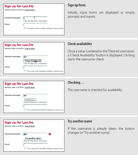
Last.fm also uses a button to check the validity of a field during its “Sign up” flow (Figure 14-6). Typing into the username field immediately reveals a “Check Availability” button. Pressing the button triggers a Live Preview check of whether this username is available. If it is not, a red exclamation point is placed beside the field and the button changes to say “Try another name”.
Notice that a tight feedback loop was created in all three examples. For each significant action, there is an equal and opposite reaction. This is fundamental to the success of using Live Previews in your application.
Showcasing products
Live Previews are not just limited to form input. They also can be used in an online product catalog to preview a product. Strictly speaking, previews have been used on sites for almost as long as there has been a Web. Showing a close-up of a camera on an electronics site is a common technique. But what sets a Live Preview apart from a simple preview is its interactive nature.
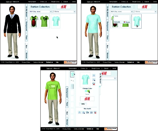
Land’s End uses a tool called My Virtual Model[56] to bring Live Previews to clothes shopping. It is based on the premise that if you can show what the clothes will look like on the shoppers, they will be happier with their purchases. While virtual models can only come so close to reality, users can personalize the model with their height, weight, body shape, and so on. Then when they select shirts, pants, and shoes, their virtual model will appear dressed with the items (Figure 14-7).
The MINIUSA site uses the Live Preview pattern in a similar way. Displaying how different models of Mini Coopers will look with different color combinations instantaneously is a powerful marketing tool (Figure 14-8).
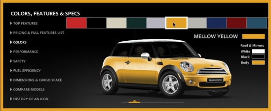

The site also lets the user spin the car around 360 degrees to get a look at the car from every angle (Figure 14-9).

The ability to react instantaneously to the user’s color or perspective changes fits well into the marketing message of cool and zippy. Imagine an old-style interface of “make the change,” and “go to another page and see the result”. Live Previews allow users the freedom to experiment.
Progressive Disclosure
The Progressive Disclosure pattern is related toLive Previews. When users are faced with a series of steps, it is often best to provide hints only when they are needed, instead of cluttering the interface by displaying all the hints at once.
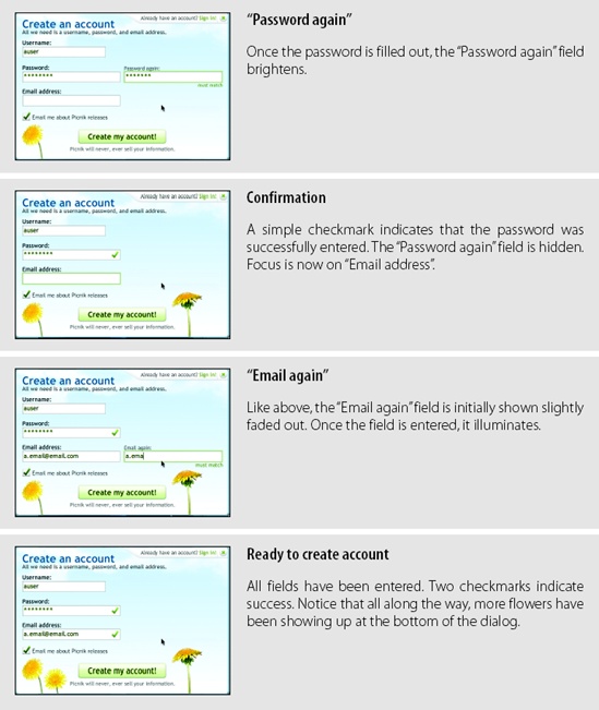
Picnik is a photo manipulation tool that adds photo-editing features to a number of photo-sharing sites. During the “Create Account” flow, it provides Progressive Disclosure of hints and feedback all along the way to keep the user engaged and successfully filling out the signup form (Figure 14-10).

Considerations
Typically, login interfaces get little dynamic treatment. All fields for input are shown with every possible hint revealed. Unfortunately, this kind of full disclosure creates a very cluttered interface.
Keeping it lightweight
The right idea is to make the task feel as lightweight as possible. The Picnik interface says, “It is as easy as 1-2-3,” even though there are really five fields to be entered, not three.
Tip
Use Progressive Disclosure to make a heavier process feel more lightweight.
There are some really nice subtle touches to the feedback in the Picnik form:
The “Password again” and “Email again” fields are revealed only after entering the corresponding “Password” or “Email address” fields.
The “...again” fields are shown at about half the intensity. This hints they are related to what users are entering but does not take over the entire process by immediately becoming full intensity.
The “...again” fields are fully illuminated once entered.
A simple checkmark is used to indicate success.
Flowers keep appearing along the bottom after each successful entry. This provides a subtle feedback that users are making progress.
Progress Indicator
Another opportunity for creating a reactive interface occurs when the application is busy with a lengthy process. Progress Indicators keep a conversation going with the user when the rest of the interface is currently unavailable. This is a common situation on travel sites, as well as many search-based applications.
In Chapter 12, we discussed the way Yahoo! Travel Farechase used transitions to improve perceived performance. Let’s look at a similar example from another travel site, Microsoft’s Farecast service. It provides a variety of Progress Indicators throughout the search process (Figure 14-11).

Considerations
There are some issues to consider when using Progress Indicators.
Perceived performance
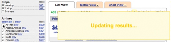
There are actually nine Progress Indicators used by Farecast in this one flow:
Search button label changes to “Searching...”.
Switch to search results page.
“We’re Searching...” animated progress bar.
Daily Low Fare History chart animates from flat line to trend line.
7-Day Low Fare Prediction spinning wheel.
7-Day Low Fare Prediction spinning wheel changes to the “Tip: Wait” graphic.
Progress bar collapses to single line, changes to read “Still searching...”.
First set of results trickle in.
Progress bar disappears.
When I went through this process, it took 24 seconds from the time I clicked the Search button until I got all the results. But because there are so many reactions to my one action, the process seemed much faster.
Tip
Keeping the user informed improves the overall experience.
Compare this to the traditional approach by Orbitz (Figure 14-12).
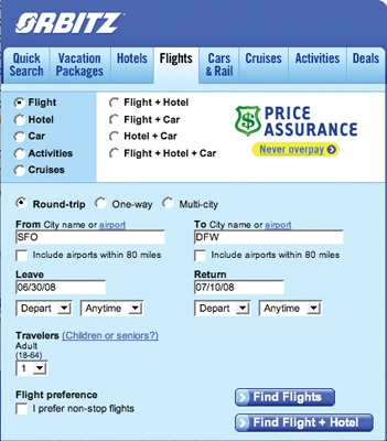

Orbitz is generally twice as fast as Farecast at retrieving flight results. Orbitz pulls results from its own service, while Farecast pulls from multiple services. However, in Orbitz, there is sometimes a noticeable delay before the Progress Indicator is shown. And since there is only one indicator, it stays on the stage longer than any single one of Farecast’s indicators. The net result is that Farecast can feel at least as fast, if not faster, than Orbitz.
Of course Progress Indicators can be really simple. When users search their mail folders in Yahoo! Mail, a simple busy indicator is displayed next to the search box (Figure 14-13).
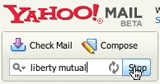
Placing progress indicators next to the place the action was initiated is common. Another variation is to place the Progress Indicator over the area that will be affected by the operation. In the Yahoo! Mail example, this would mean placing a Progress Indicator over the search results area. This technique is common in Refining Search and can be seen in Kayak (Figure 14-14).
Immediate feedback
Progress indication can come in many forms. It is a way to keep the user informed of changing status. In Yahoo! Answers, user are restricted to 110 characters for the question. As users type in the question, the number of characters they have left is updated (Figure 14-15).


This simple feedback loop encourages users to formulate short questions.
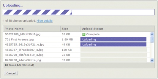
Showing upload status
Progress Indicators are really helpful for showing upload status. Due to constraints on the way files are usually uploaded to the Web, showing status is often hard to do. However, some products have overcome the challenge and provide constant updates on individual file upload status, as well as overall file upload status. The Yahoo! Photos uploader provides this kind of dynamic status (Figure 14-16).
Deferred loading
A final example of a Progress Indicator is one that is useful when there are external services you would like to defer loading until after the page is shown. An earlier design of Technorati used this technique to load its own content quickly, and then used loading indicators in place of the external content (Figure 14-17).

Periodic Refresh
Sometimes an interface needs to showcase new content or new community activity. In such a case, the interface is not really reacting to the users’ input but to the larger community as a whole. Periodic Refresh brings in fresh content on a periodic basis without direct user interaction.
Digg Spy is a feature of the Digg site that allows users to observe real-time activity in the Digg community (Figure 14-18).
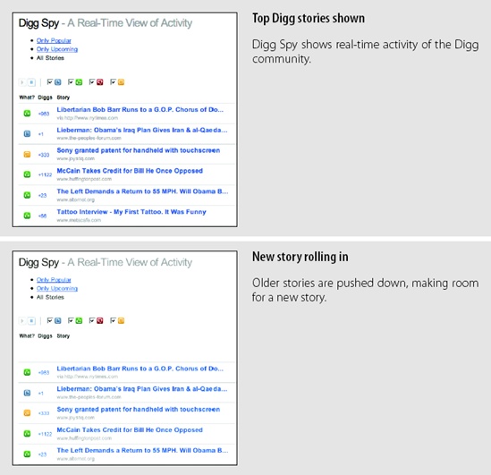
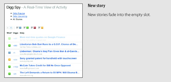
Digg Spy generally shows new stories every few seconds. Each story is a single row in a list of other stories. Keeping the rows compact makes it easier to roll in new content. Each scroll is only the height of a single row.
Tip
Communicate community participation by periodically adding new content into the page.
Considerations
There are a few issues to consider when using Periodic Refresh.
Visual noise
Netflix’s Community section also uses the Periodic Refresh to spotlight recent member reviews (Figure 14-19).
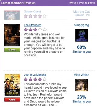
One of the issues with the Netflix version is that each review is taller than a Digg Spy summary. This means each time a new review rolls in, it has to cover a distance equal to the height of a review. While Digg Spy is able to animate a new story into place in about a fourth of a second, Netflix reviews take closer to two seconds. An alternate approach would be to show collapsed review summaries. This would allow more reviews to be displayed and take less time to display each new review.
[55] Nielsen, Jakob. “Ten Usability Heuristics.” See http://tinyurl.com/aruty.
[56] My Virtual Model is a third-party tool for online clothing stores. See http://www.mvm.com/.