
Speed Painting
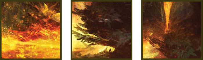
Once a Thriving City, Now Deserted and Taken Over by Vegetation

© Serg S
In any creative process the task of preliminary work and sketching is a proven way to explore ideas before committing to the final piece. Speed painting has become common practice within digital painting and allows artists to experiment with core themes such as color, mood, lighting and composition. In an industry with an ever-quickening pace, this type of painting has carved a niche for itself within the CG sector and has become widely accepted as an effective way of communicating key ideas before any details are evolved. What follows are some different approaches to tackling a similar problem, but each demonstrating the importance of speed painting in establishing the structural devices behind most paintings.
© Carlos Cabrera
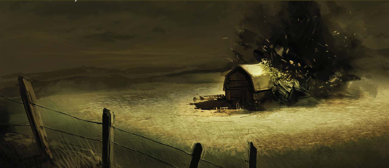
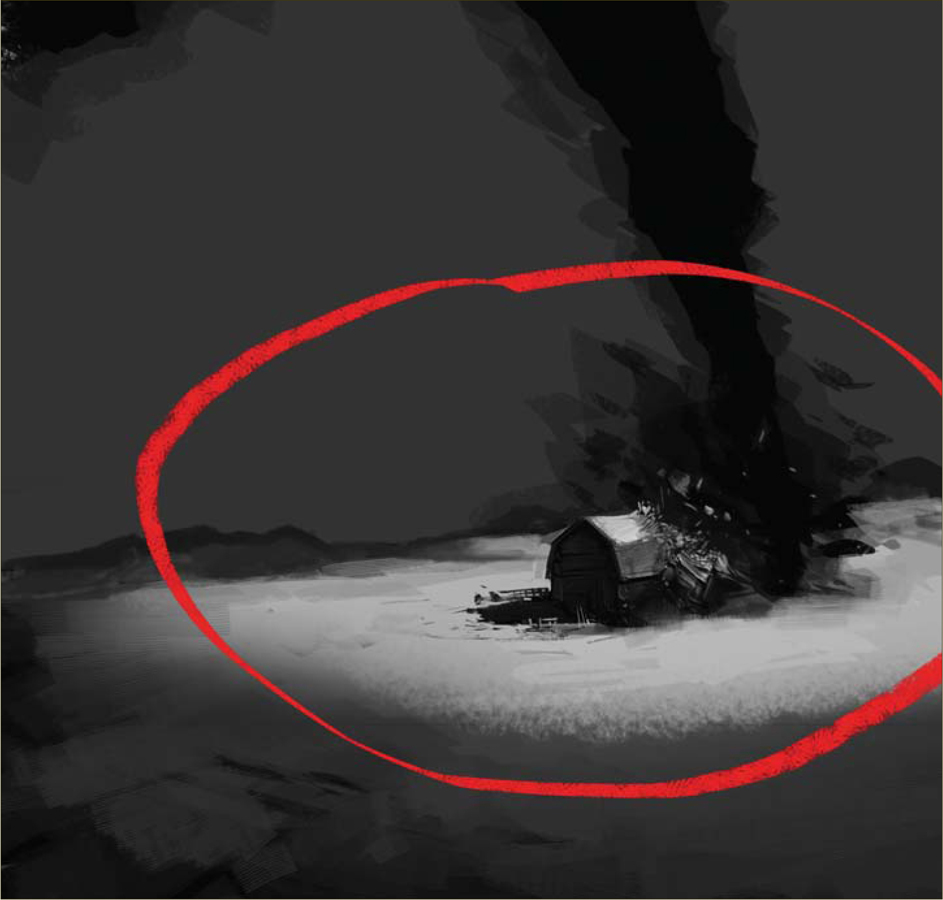
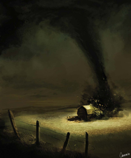
TORNADO MOVING TOWARDS FARMHOUSE
The Sketching Part
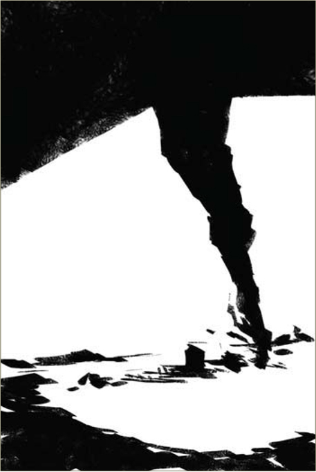
I opened a new document of 2000 by 3000 pixels and started the quick sketching phase with a 50% zoom over the whole document. In this particular step I don’t like to be held back by little details and prefer to work more on the harmony of the illustration, using quick and simple forms. Drawing in black and white is the quickest way that I know of for obtaining good compositional details without wasting too much time; it almost develops on its own and I always encourage people to try this technique. You can see how the twister and the farmhouse are there in the first view with just a couple of strokes (Fig.01). Now it’s time to add some gray colors to the sky and to the ground (Fig.02).

We can start to give the farmhouse a little bit more detail now. For the twister I use black with 50% Opacity; this adds a cloud/smoke effect and allows you to accomplish the effect in a short space of time. After we’ve finished the gray coloring stage, we can start to add more detail to the farmhouse. You can see the chunks of wood on the house’s roof are just little brush strokes – some of which are darker than others. This creates the effect of small, flying pieces of wood. At this stage it’s pretty obvious that you’ll need to work the details in 100% zoom, to be more comfortable. We can then add some grass and a fence to the scene, and then we’ll be done with the farmhouse – that easy, that quick (Fig.03)!
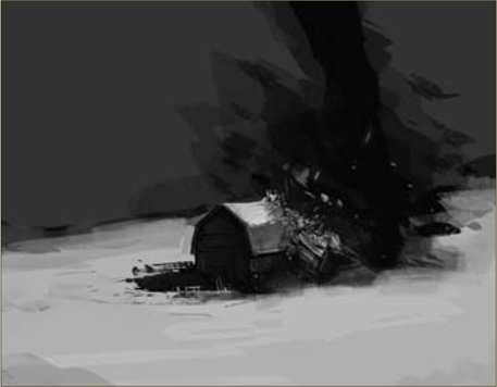
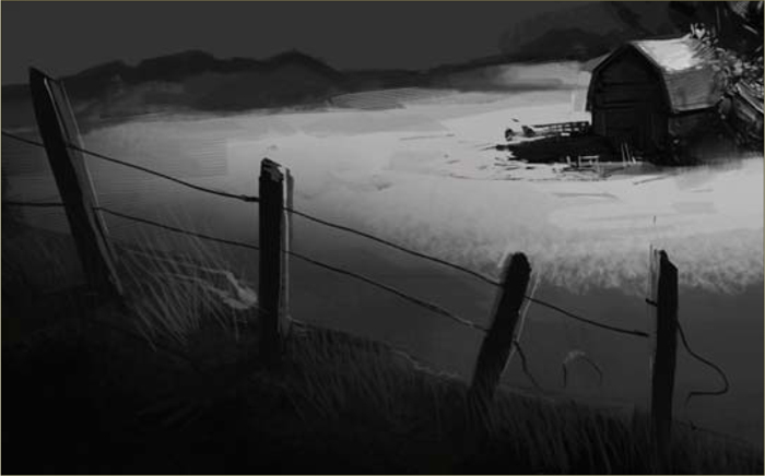
If we compare this step with Fig.02, we can see how throwing some dark color at the farm will focus the viewer’s attention exactly where we want it: on the farmhouse (Fig.04). Now we just need to add some light and shade to complete the drama of our scene. It isn’t really that complicated; if you picture it in your mind it will come out naturally. One thing I added in the foreground was some extra detail (the fence), as I felt there was an empty space there to be filled (Fig.05). You just need to have fun and play with your illustration. There are a lot of rules of composition, but I think the best one is the eye, imagination and mind of each artist. It’s better to be creative and have fun working on your illustration than to work over a preestablished grid.
Now we need to make the twister something scary, and to do this we add a layer on top of everything and start adding some dust and clouds around the body and base of that mean twister – look how big it is! This particular part is pretty fun, and I bet you will spend quite some time on it (Fig.06).
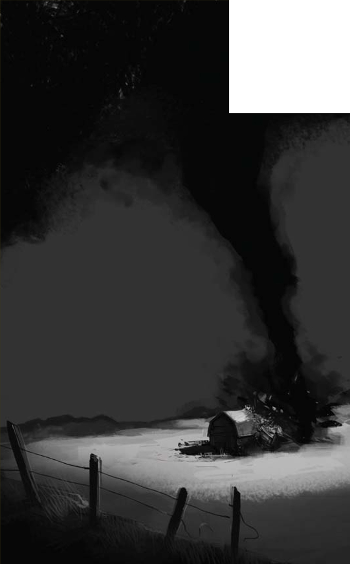
After we’ve finished our twister, we need to go to the next stage of the illustration, and, to be honest, this is the step I personally enjoy the most. By painting wood and dust flying around the house in a mortal ballet, with just a few small strokes we can easily create the path of horror of this twister, and the fallen debris that it leaves behind (Fig.07).
Finally, some Color!
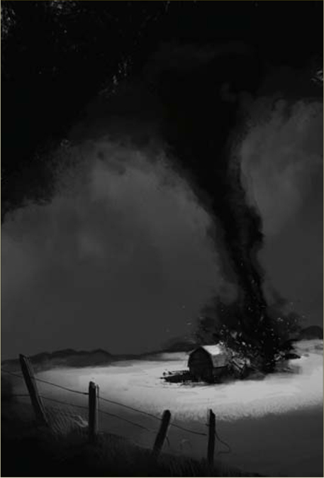
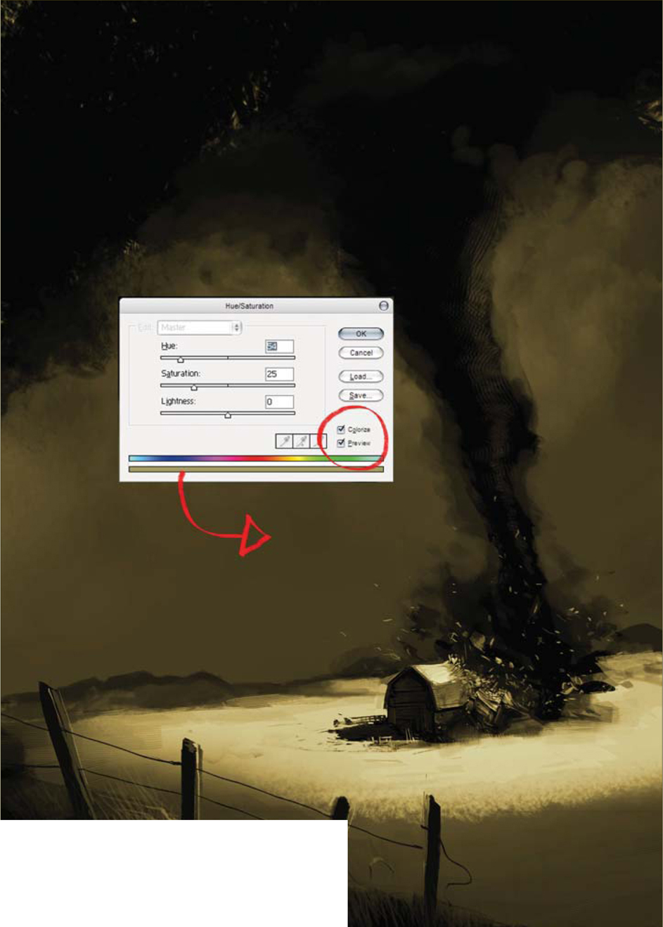
Now we create a new layer and place it above all the others. Press Ctrl + Shift + E on your keyboard to merge all the layers in just one single layer, and then rename this layer “color”. After this, we press Ctrl + U and the Hue window should pop up. We need to check the Colorize checkbox (it will be unchecked by default), and then set the values to Hue: 54, Saturation: 25, and Lightness: 0 (zero) (Fig.08). With these values we will get a nice sepia brown color that we can use for our illustration. We’re almost there now!
The initial grayscale painting technique used with this illustration is often used by artists to clear our minds from the color of our subjects, and to cut straight to the chase. On the other hand it’s also good practice to upgrade our rendering skills, and so it’s very useful either way.
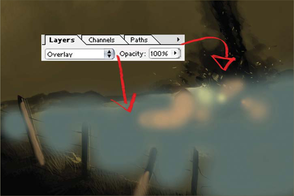
We now create another layer, above all the existing ones, and paint over the farm and the floor with all the colors that you can see added in Fig.09. We switch the layer to Overlay and leave everything at 100%. By doing this we change the floor tint and the farm tint, and finally we have given our illustration a new variety of color and contrast. Lastly, we just need to have some fun applying the last touches, and then we’re done (Fig.10).
© Carlos Cabrera
© Daniel Ljunggren
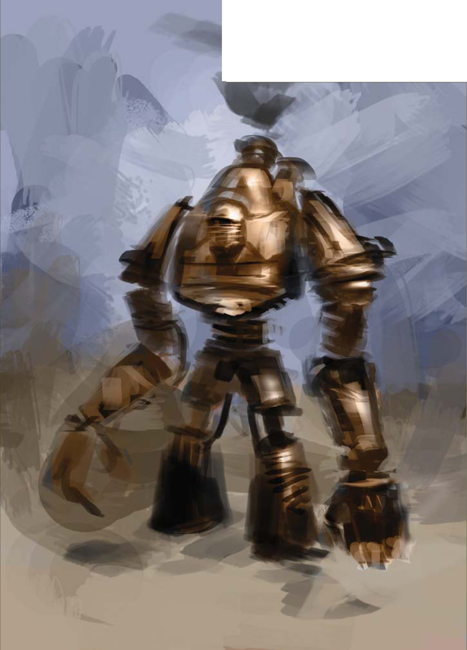
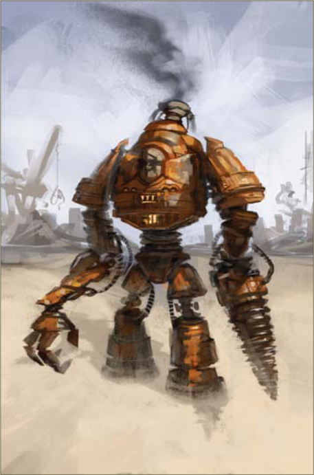
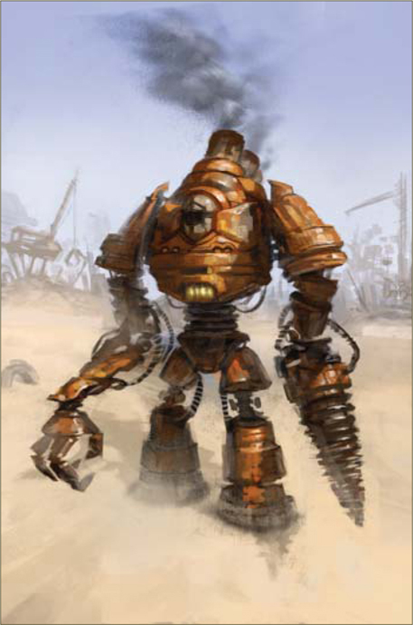
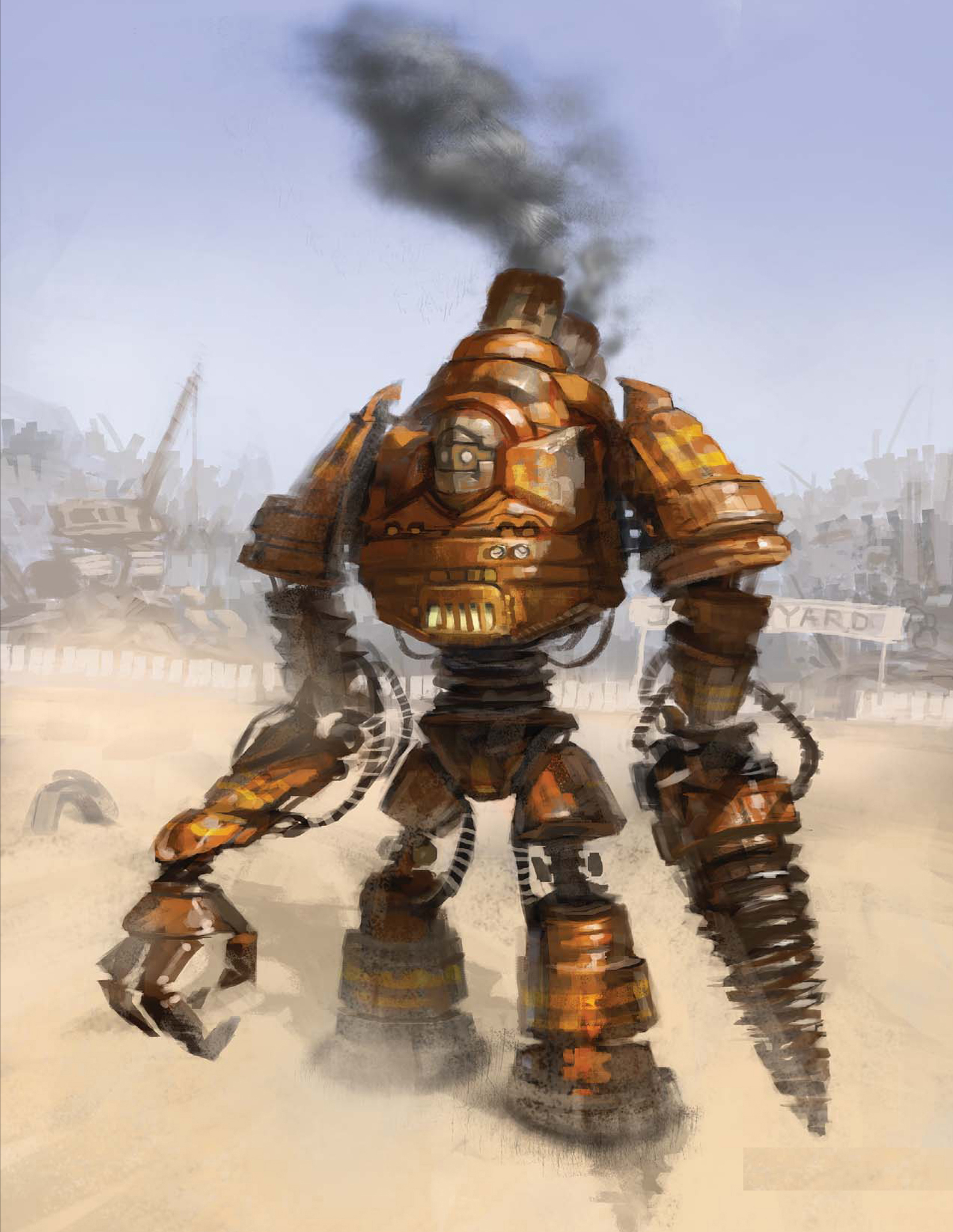
STEAM-POWERED MECHANICAL DESTROYER
Introduction
After thinking about the topic of this speed painting for a while, I started imagining something that would be suitable for a younger audience – perhaps a commercial for toys, with figures you can play with, and one of these toys being the “Steam-Powered Mechanical Destroyer” (or so the description on the back of the box would have you believe). I then thought that it would be more fun if it was a big robot, yet still friendly. The “destroyer” part was the main issue really, meaning I would have to turn it into something not so violent in order to keep the positive mood that I still wanted to achieve.
I could’ve gone another route towards something more serious, dark and violent, but personally, it wouldn’t feel very original. I’m not saying a friendly robot is original either, but perhaps a bit more of an unexpected approach to the subject title. I have interpreted the theme more like a concept artwork than a painting, so please treat it as such.
Step 01
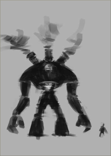
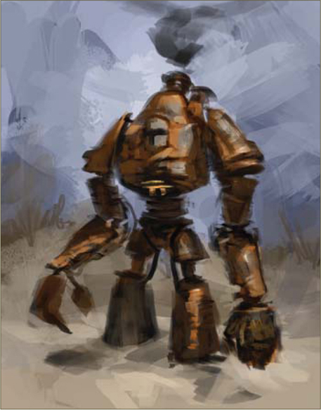
Before starting to draw or paint the full-sized concept with details and all, a great and quick way to find your design is with a few small thumbnail sketches. This allows you to focus on the general shape, the silhouette, and the overall feeling of the concept. After a short while of thumbnail sketching, I see something that shows potential (Fig.01). I also put in a sloppy human figure to get a feeling of scale. Working a bit further with it I find a design and feel that I want to see a fully rendered version of (Fig.02).
Step 02
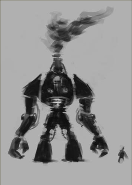
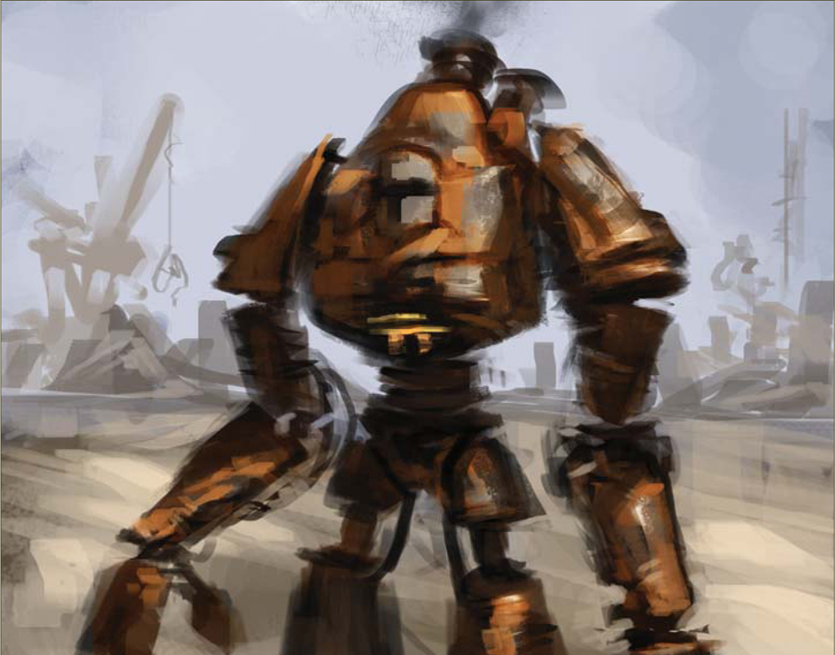
Using the thumbnail as a reference image, and keeping the main subject and the background on separate layers, I start to sketch the robot from a more interesting angle and in higher resolution. I’m still working in grayscale because I can focus on what I want to prioritize for the time being: design, proportions, pose and perspective. I find that the main challenge in this part of the process is to achieve the same feeling in the perspective image as with the thumbnail. If I would go on with the next steps before nailing that feeling, I know I would probably abandon it later on because it didn’t turn out the way I wanted, so being persistent in this step pays off (Fig.03).
Adding some more volume and details to the robot, and some brushstrokes to the background, I try to find the kind of lighting and contrast I want for this image. I add some highlights just to remind myself where the main light source will be (Fig.04).
Step 03
I set my brush to Color mode and paint some big chunks of colors on the background, as well as on the robot (Fig.05). Sometimes I don’t find the color I’m looking for when using this method, because of the values of the painting underneath, but it’s a quick way of deciding what general palette the image will have.
I pause here, thinking about the impression I get from the robot. I figure that I really need to kill those highlights soon, as well as change the color to what I’m looking for. Creating a new layer (Normal mode), I start painting directly with colors, and soon I see something closer to what I had in mind (Fig.06).
Step 04
While developing the concept for this robot I came up with the idea of having it working in a junkyard, where he would be “the destroyer” of metal scraps. This would go well with the overall positive feel I was trying to achieve, and the background would be where I could suggest this (Fig.07).
Step 05
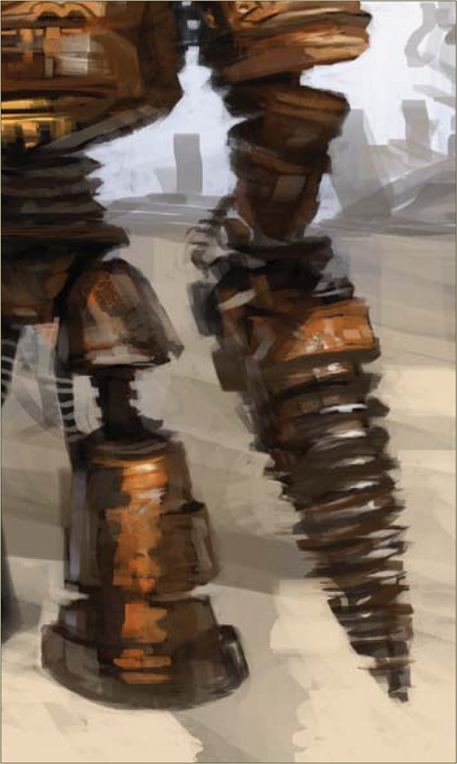
During the previous steps I wasn’t quite sure what to make of the robot’s left arm and hand, but as I tried a few shapes I knew it would gain visual interest instead of having two similar arms. After a few quick designs I decide to go for some kind of drill (this makes the robot fit better with the description of “destroyer”, too). With that done, I feel ready to start working on more detailed shapes and textures (Fig.08).
Moving on to adding more details and rendering (Fig.09), here I’m trying to make it look a bit more realistic; removing a lot of the black from the underlying sketch, as well as thinking of cast shadows and bounce lights from the ground. I put a few strokes on his head as well, trying to figure out what I want that part to be like.
I do some more work on the background now, making the sky clearer and redesigning some of his firebox and chimneys on his back, as well as giving a warmer ground. I still wasn’t sure at this stage what to make of his head (Fig.10).
Step 06 – Final
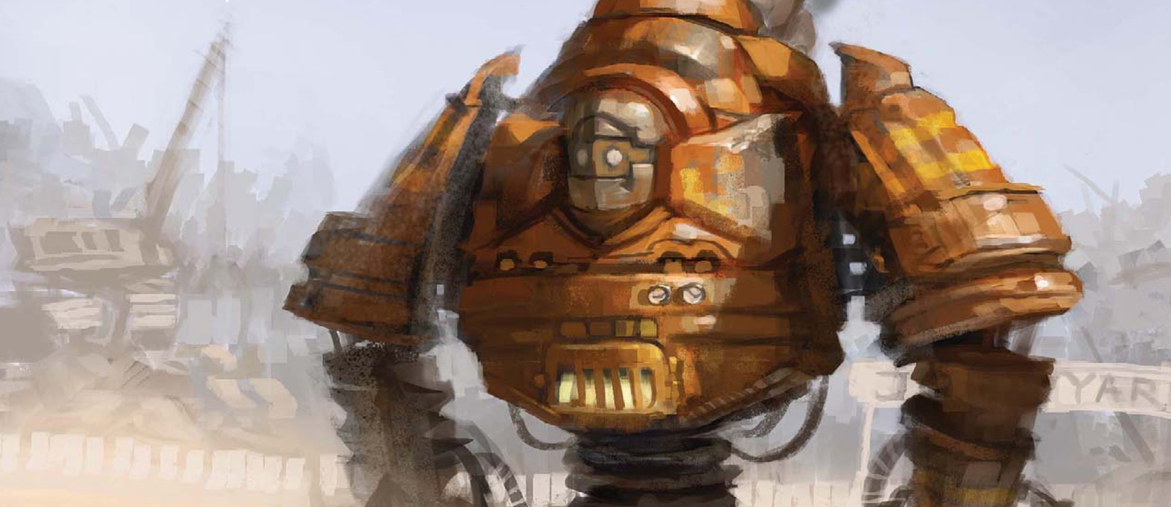
Finally I approach the face of the robot. I considered having the robot being driven by a man for a while (with the head as the cockpit), but with the current scale of things I had trouble making the chauffeur read clearly, so I dropped that idea and went for a kind robot face instead. This also helps strengthen the overall positive feel. I put down some more work into the firebox, showing more clearly that it is something that could open and hold burning coal. Background details are also added here, as well as some stripes on the robot – and then he’s done (Fig.11).
© Daniel Ljunggren
Finally I approach the face of the robot. I considered having the robot being driven by a man for a while (with the head as the cockpit), but with the current scale of things I had trouble making the chauffeur read clearly, so I dropped that idea and went for a kind robot face instead. This also helps strengthen the overall positive feel. I put down some more work into the firebox, showing more clearly that it is something that could open and hold burning coal. Background details are also added here, as well as some stripes on the robot – and then he’s done (Fig.11).
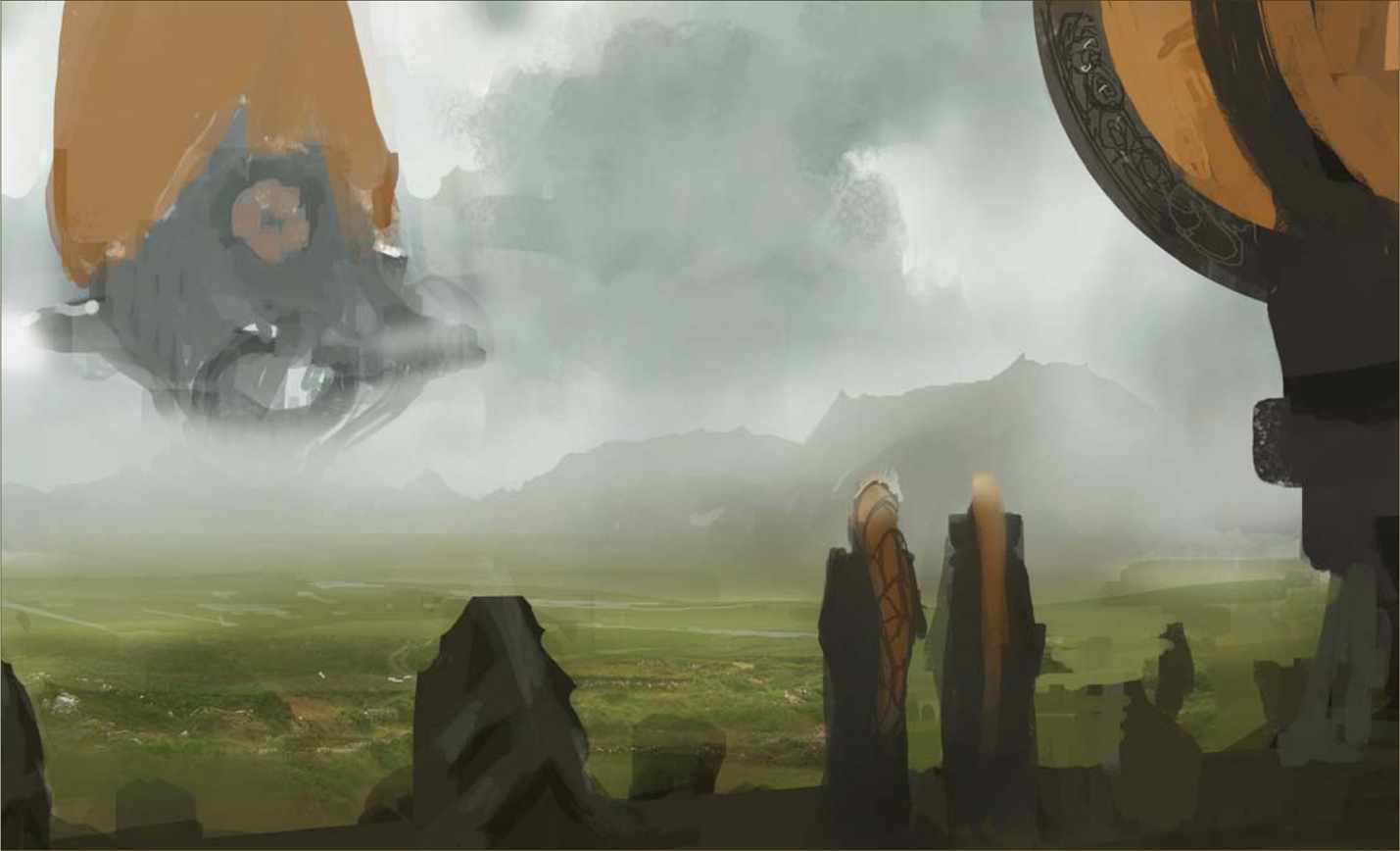
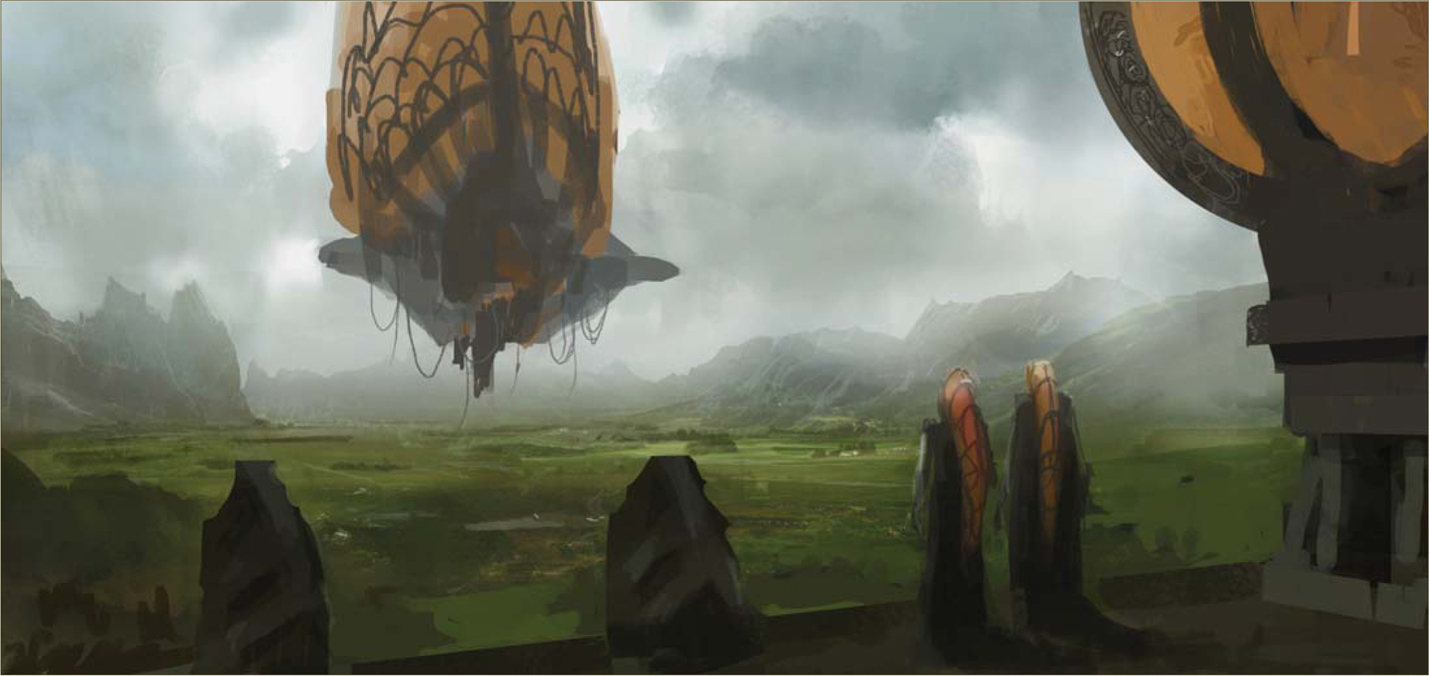
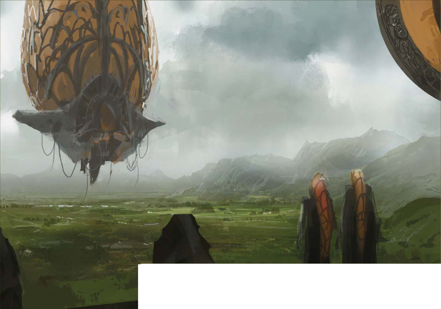
© Emrah Elmasli
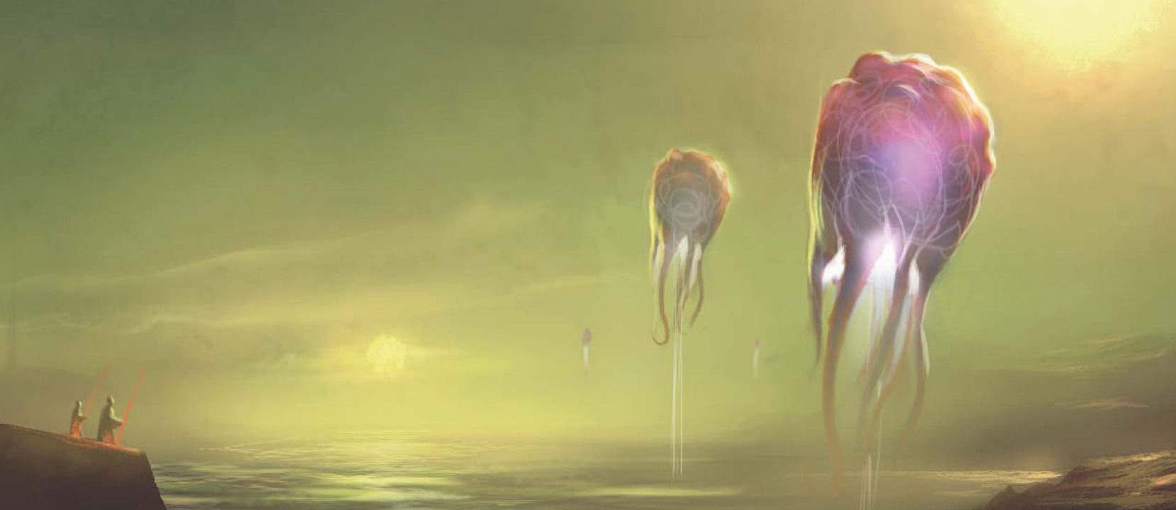
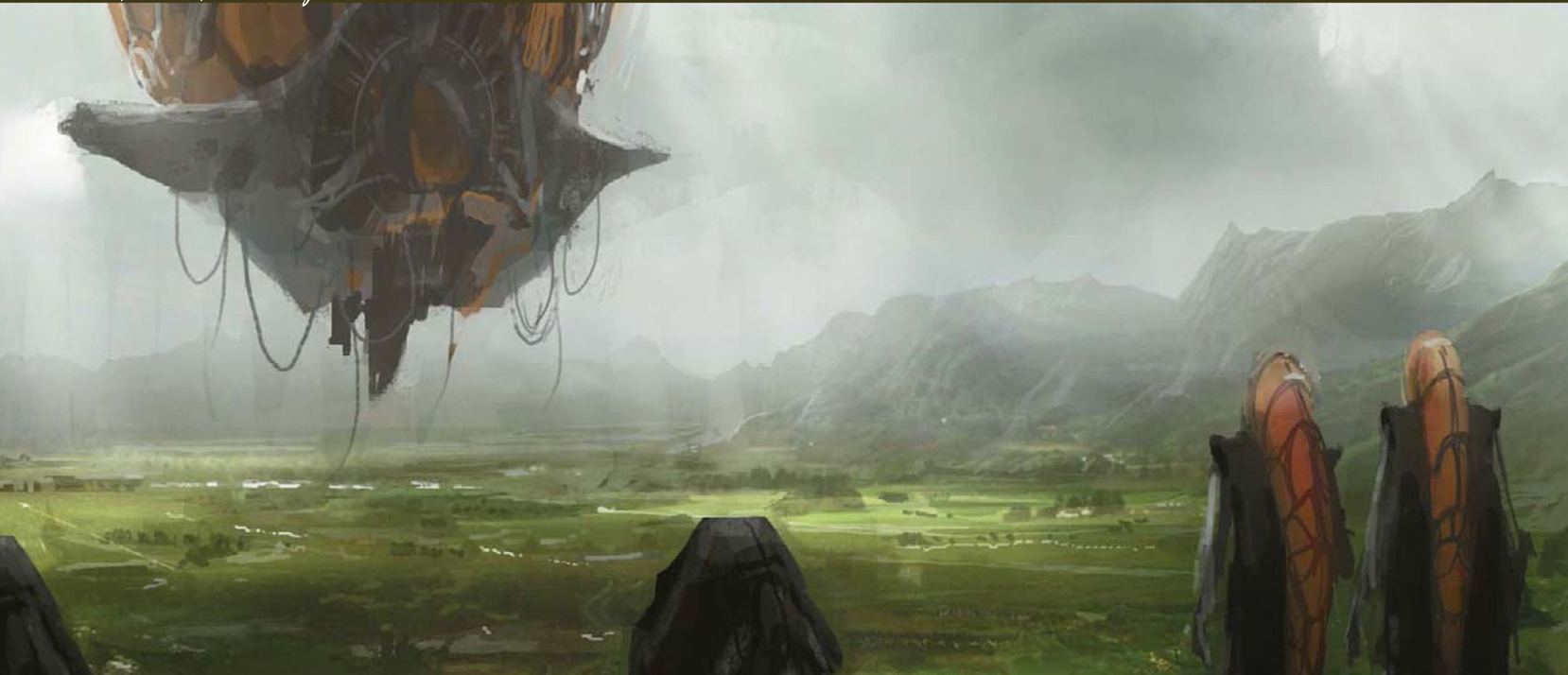
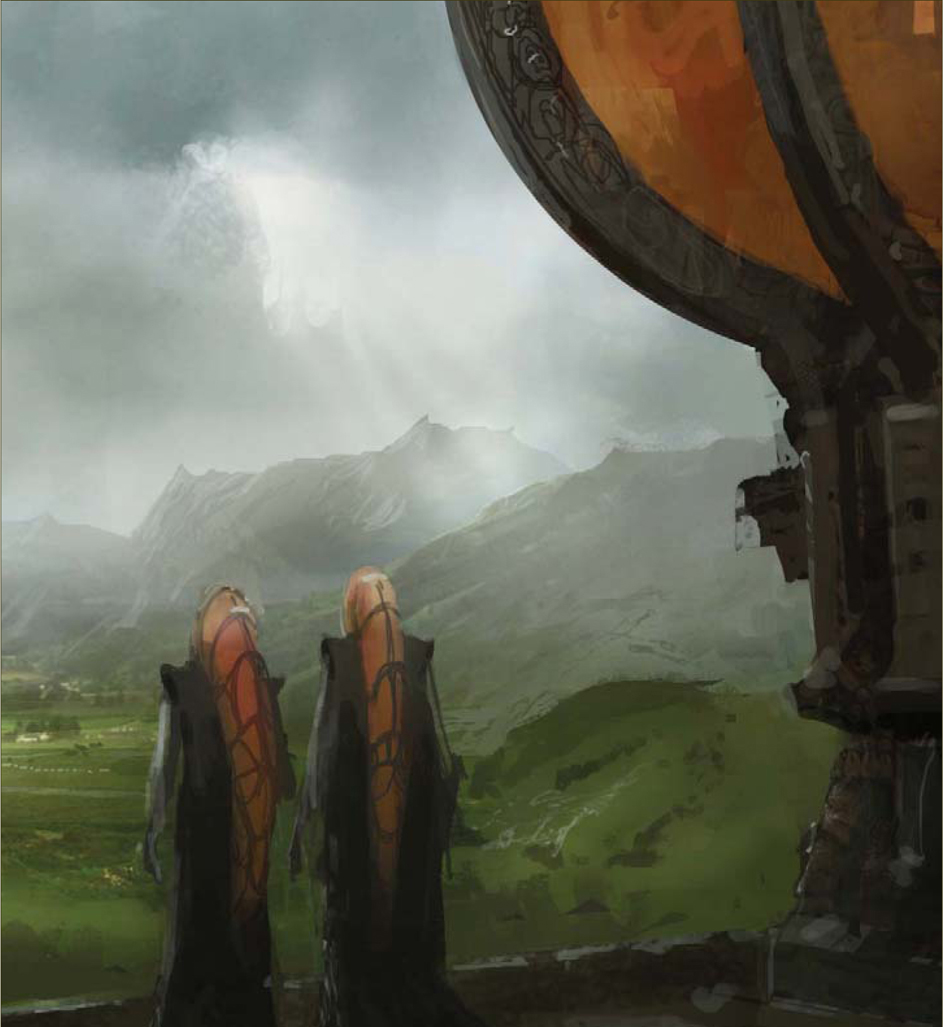
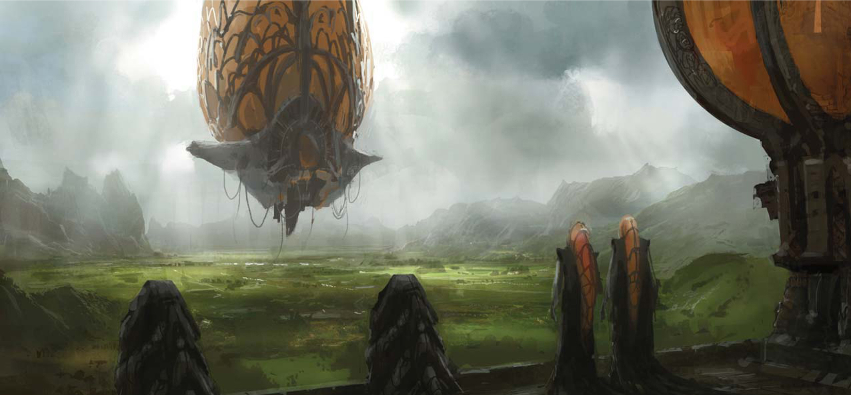
ALIEN HOT AIR BALLOONS
Introduction
When the 3DTotal team first told me about this topic, “Alien Hot Air Balloons”, the scene that I’m going to paint was already in mind. I therefore feel comfortable about what I’m going to do with this tutorial, and after making some initial thumbnail sketches I have enough to start painting.
Step 01
I want to finish this painting in 90 minutes – maybe less than that, but no longer – so this is my target goal. Before starting to paint a “speedy”, I suggest you set a time limit for yourself. This simply helps you not to overdetail your work and lose time in the process.
I’ll use Photoshop CS3 for the entire painting process. I open a new 2200 by 1200 pixel canvas and create a new layer. The scene that I’m going to paint will be an alien world, but I don’t want it to be too different from Earth – some minor changes will do. So the first thing to do is to determine the colors – green and yellow sound cool. Now, let’s block them in. I always use large, textured brushes when I’m blocking colors, so I’ll do the same this time too. By using yellow, green and gray, I quickly create the background and foreground. I want to have two light sources in the scene so I put two suns into the green, alien sky. So that’s it for this step (Fig.01) – let’s now go into more detail.
Step 02
I open a new layer and set it to Color Dodge from the blending mode options tab. I grab a soft round brush and glow both of the suns with a saturated, dark orange color. This gives the soft atmosphere I need. I can now start putting some details in. To do this, I use some textured and scattered brushes in order to create the water effect on the background, and some hard brushes for the rocky feel in the foreground (Fig.02).
Step 03
For this third step I continue to add details using my own custom-made brushes. I also need some contrast in my painting, so I open a Curves adjustment layer and bend the curve to gain some contrast. I do this a lot when I’m painting: I always start with light colors and darken them in the process. I also make some changes to the colors by opening a new Color Balance adjustment layer, adding some blue to the shadows, which makes the painting even richer in color (Fig.03).
Step04
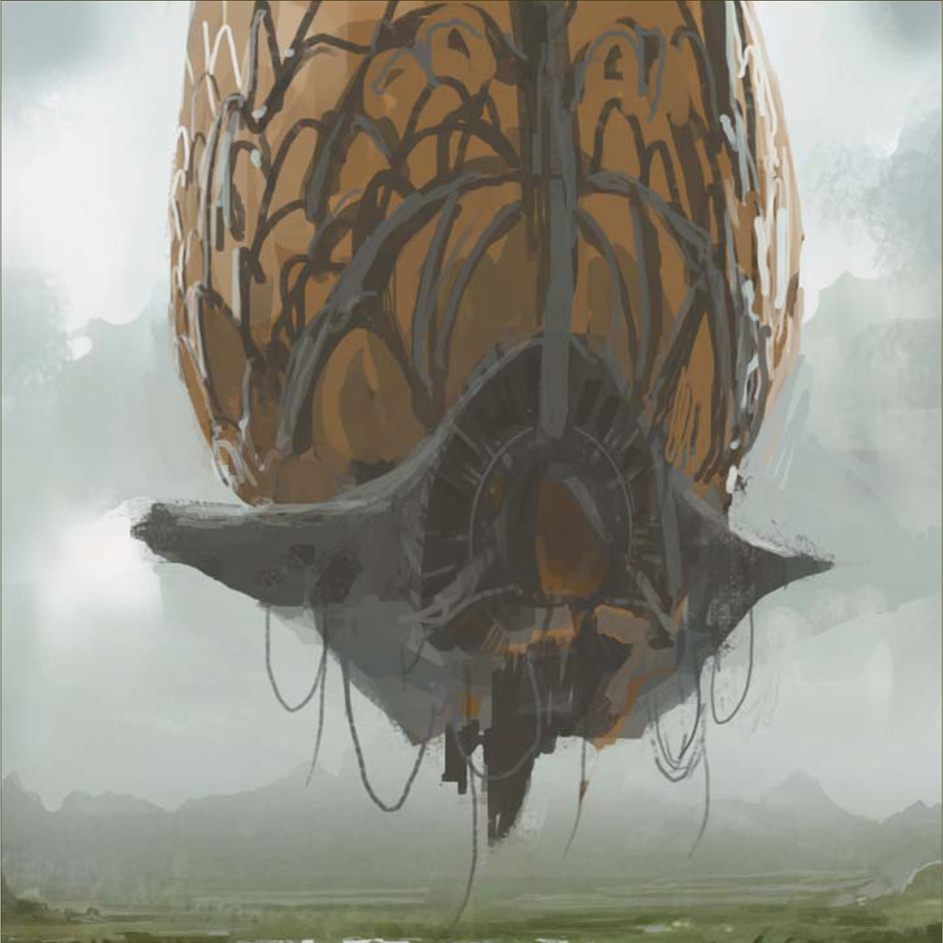
I can hear you asking, “Where is the balloon?” Well, now is the time to add it – or them, in this case. I start painting in the alien balloons with a hard-edged brush. I want them to have arms, like squids, and glowing from inside. Keep in mind that you can always glow anything you want by opening a new layer and setting it to Color Dodge or Linear Dodge, and then paint in with a dark saturated color. My alien balloons are now hovering and glowing (Fig.04).
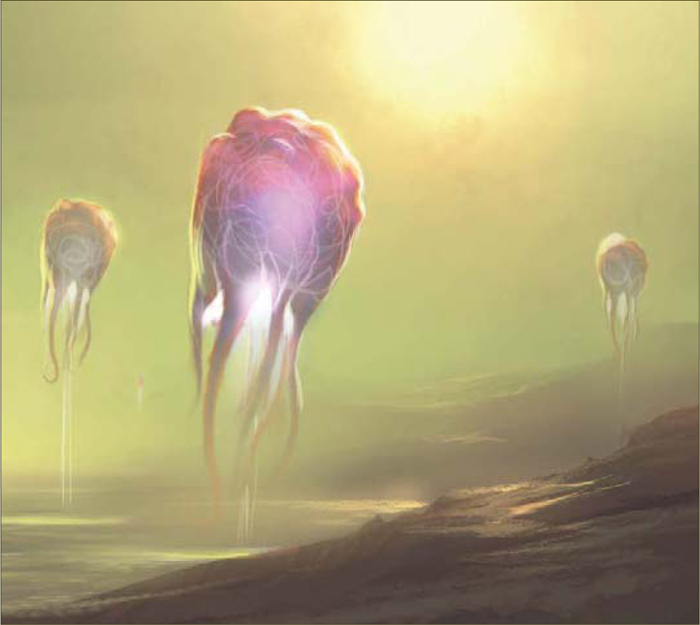
Step 05 – Final
For the final step I simply want to paint in some more details and add more contrast using the Curves again. For the very final touch, I paint two figures with red staffs in their hands into the scene (Fig.05). I think they are aliens too, but I don’t care really because the speedy is now finished: 90 minutes!

© Emrah Elmasli
© Levente Peterffy
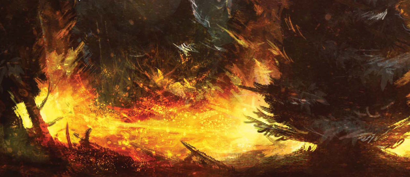
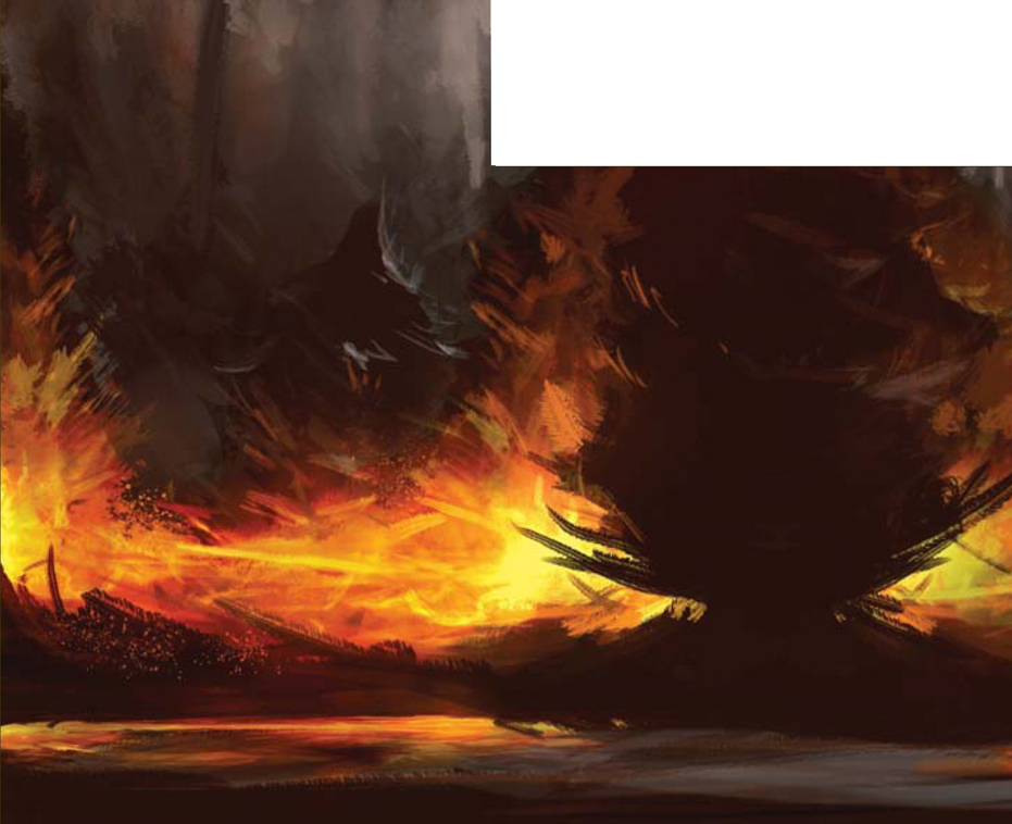
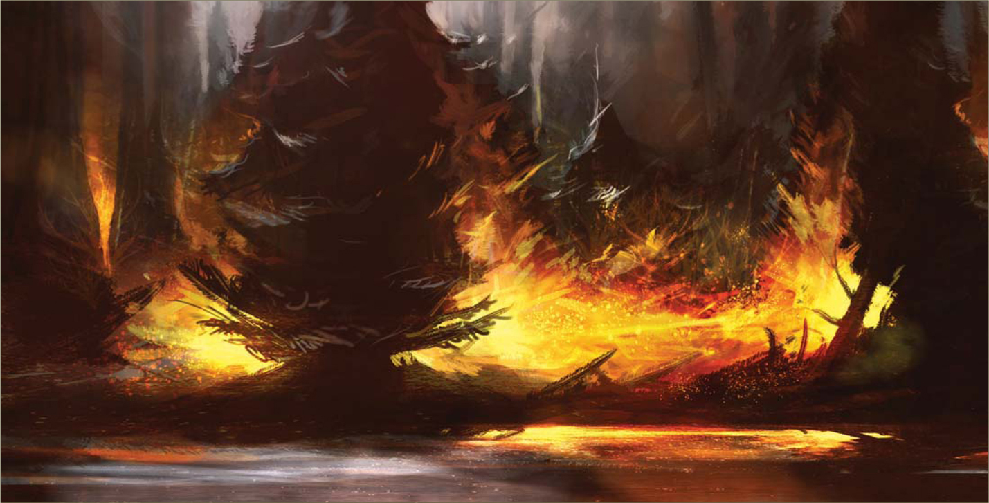
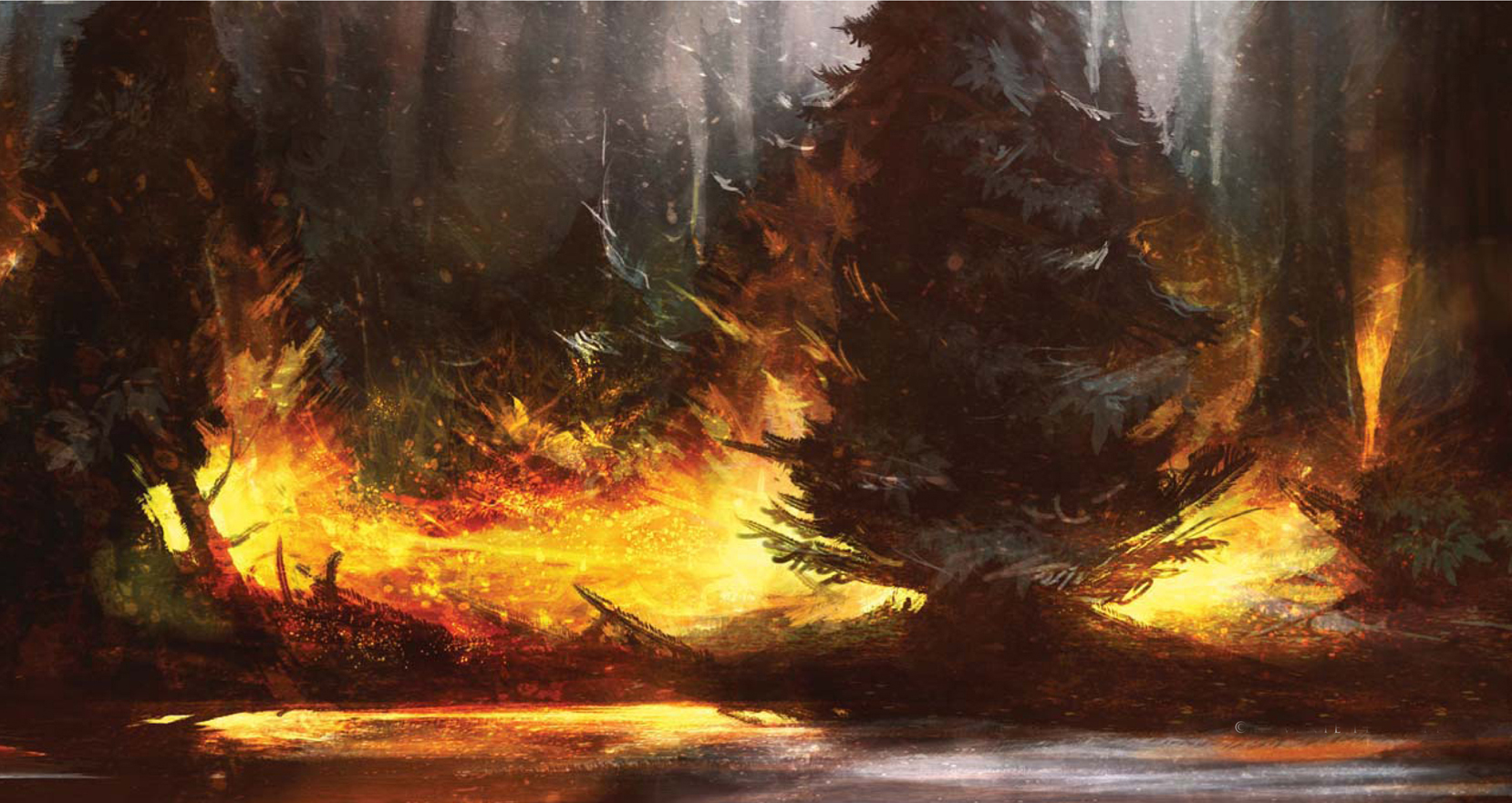
FOREST FIRE
Let it Burn!
In this tutorial I will describe my methods for painting in silhouette, using the theme “Forest Fire”.
Choosing the Right Color
The first thing to do is to choose the right color scheme for your painting, which can depend on a lot of things. The topic is a common one, so I know that I’m going to need to use a lot of red, yellow and orange tones, representing the warmth and heat of the fire. With this clear color scheme in mind, I start by selecting a background color. I chose a red brown tone. I find painting with silhouettes easier if I have a dark background and paint with light colors onto it. I scribble with a brighter color on top of the dark background; I don’t have an exact idea of what I want to paint, so at this point I’m just scribbling (Fig.01).
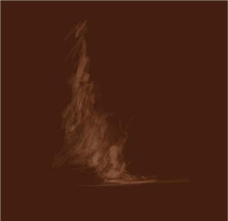
Light the Tree
Here you can see the result after some sketching and testing of colors (Fig.02). I’m using the same brush as before – for this first phase of the painting it’s a rough brush, suitable for sketching. When sketching in silhouette, it’s always important to paint whilst first always considering the light, and secondly the shapes created. For example, I paint the light around the tree and not just the tree itself, as this is a fast way of painting when both light and shape are established. I’m bearing in mind here that I need a dark background, and a lighter color on the brush I’m using.
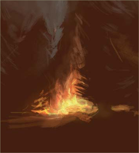
Burning, Burning!
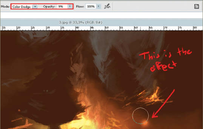
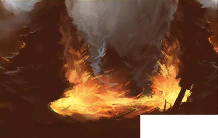
At this point of the painting, the basic colors have already been laid down. So in this next phase you can just reuse those colors to paint more objects, just as I have (Fig.03). The use of the Color Dodge layer style in Photoshop is pretty effective, but it’s very important to always use very low opacity on it; I always have the Opacity set between 5 and 15%. The lighter tones in the fire are painted with the Dodge mode for the brush (Fig.04). I also use a default Photoshop soft-edged brush here to add some of the smoke effects, which have a low opacity on them too. I continue to paint more on the trees, using the same colors as before.
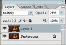
Multiply
This step is simple: I duplicate the painted layer and change the layer mode to Multiply, making the image slightly darker. I also adjust the layer Opacity in order to tone it down a touch (Fig.05a – b).
The Lake
I felt that the bottom of the painting felt empty at this point, so I decide to add a small lake here. The process of creating this lake is as follows: draw a marquee around the painting; press Ctrl + T to make a Free Transform. Flip the image upside down, basically grabbing the top and pulling it down. You then need to squeeze together the image horizontally so that it looks like a narrow, broad box. Finish the Free Transform by hitting Enter on your keyboard. The last thing to do is to erase the hard edges of this flipped box so that it melts together with the background painting (Fig.06).
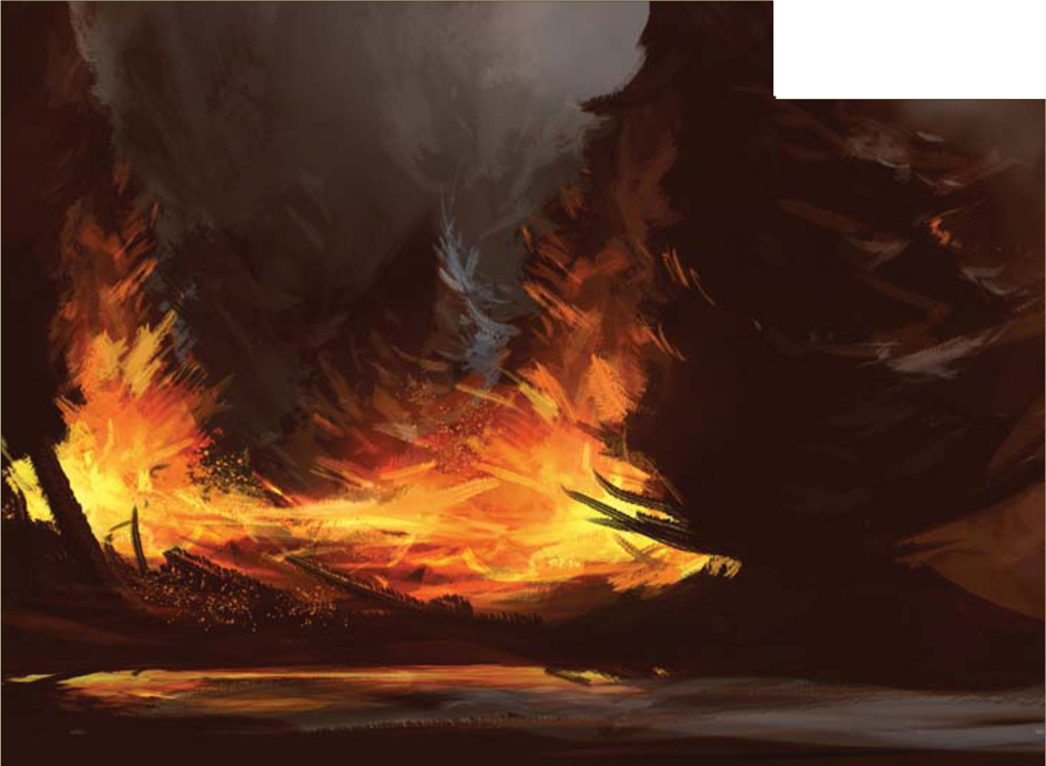
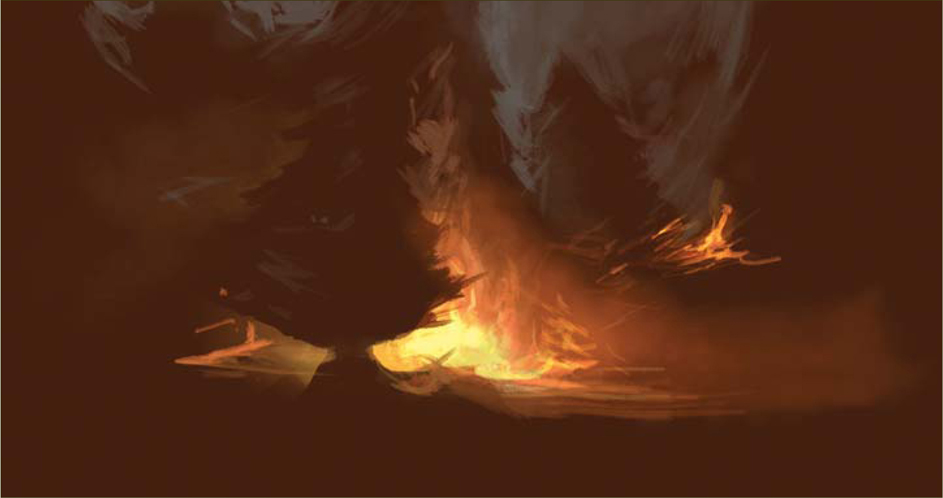
Last-Minute Consideration
I’m not totally happy with the background here because I feel I still have some space to be worked on – and also because I want to create more depth in the image. So, I decide to paint in some more trees, using a hard-edged brush for this task – one of the default brushes in Photoshop (Fig.07).
Texturing
It’s time for texturing at this stage, which is good if you have custom-made brushes just for this purpose. I have a custom-made brush (Fig.08a) that has a sprinkled effect, which I used to create fire sparks (Fig.08b).
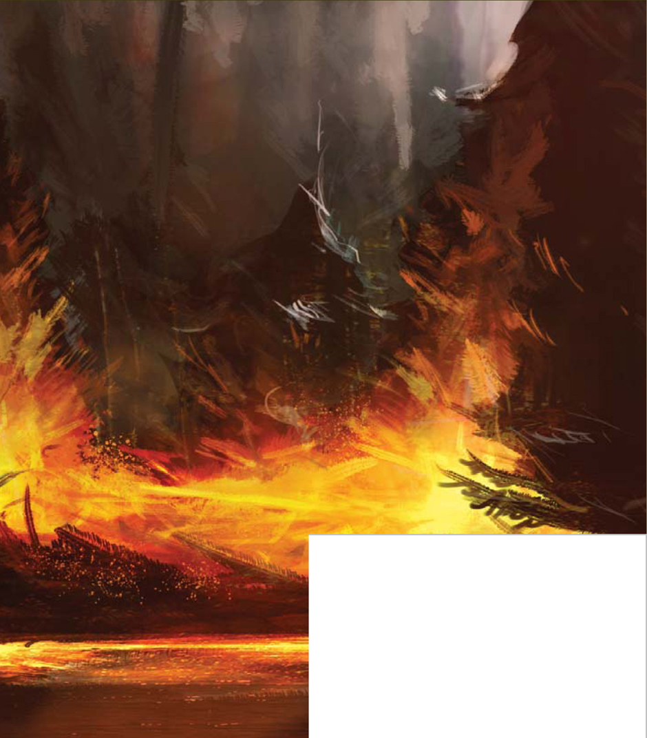
Final Touches
Alright, so the painting is nearly finished now, but I’ve decided to play around by adding some more highlights and enhance the light even more on the lake reflection, treetops, leaves, and so on (Fig.09a – b). There is also a pretty cool trick you can use to make the illustration look rougher: it involves a flat texture – basically any kind used for 3D purposes. Here it is (Fig.10a). I changed the mode of the texture layer to Overlay as well, which was the last thing I did on this painting (Fig.10b).
© Levente Peterffy
I’m very happy with the final painting – I hope you are equally satisfied with your own forest fire scene after following this tutorial.
© Levente Peterffy
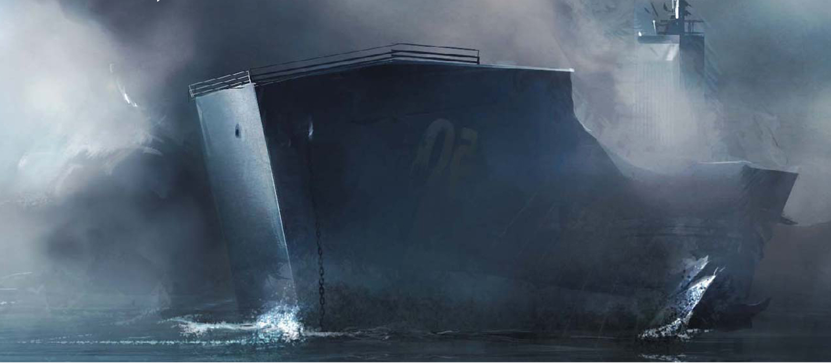
SHIP HIT BY TORPEDO
Introduction
Build your confidence in just an hour: I’m going to show you how to whip-up a “ship hit by a torpedo” with just a few digital strokes! Speed painting is an effective practice used to achieve good composition, color and light-interaction with shapes and forms, and, with the use of brushes – both default and custom-made – you can quickly create and simulate a realistic environment with just a few strokes.
The topic, “Ship Hit by Torpedo”, reminds me of World War II; I don’t really know why, but I’ve always been interested in World War II, and so I was therefore quite taken with the topic set for this tutorial. There are probably a million stories to tell about that time period, which would all be very interesting to illustrate, and in this case it’s a ship being struck by a torpedo. In this tutorial, the focus will be on the fact that realistic images – or colors, if you like – can be achieved quickly with the use of custom brushes and blending modes in Photoshop. The software used to create this speed painting is Photoshop CS2, along with a Wacom Intuos 2. So let’s begin…
Background Color
I start off with a colored background, as you can see in Fig.01. On this background I start to paint with custom soft-edged brushes, often with a very low Opacity of between 10 – 20% (Fig.02). I work in this way until I can see some shapes evolving (Fig.03).
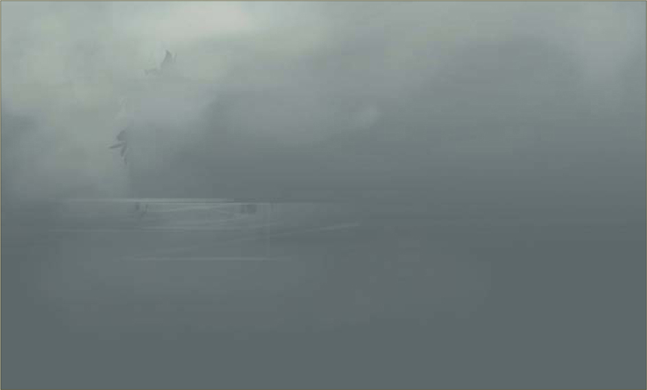

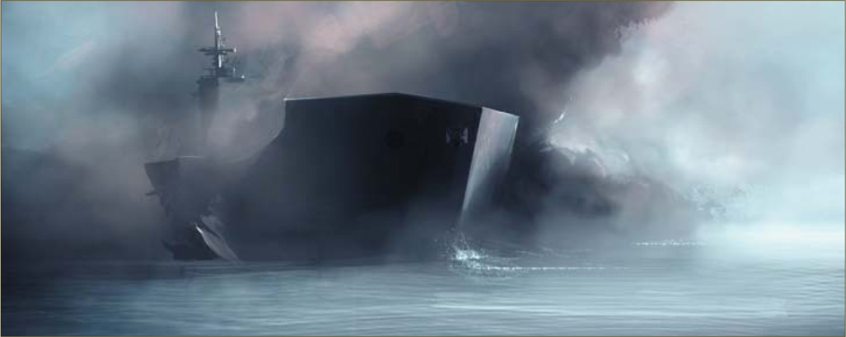
Ship and Fog
At this stage I start to develop more of the shapes from the previous image, which were slowly forming. Already, you can see that it shows the shape of a ship in the foggy atmosphere. I use similar kinds of colors to define the shape of the ship more and more. When I first had my shapes defined I started testing some new colors out. I use a light blue in this case, for the sky, and also define the horizontal sea-line (Fig.04). I used a simple gradient to make the ocean; the colors were all picked from the painting – one light color and one dark.
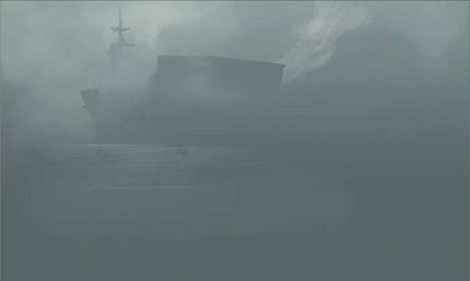
I crop the image at this point, and at this stage I’m able to start going into more detail now. I pick a small, hard-edged brush (Fig.05) and start adding details on the ocean, as well as some smoky clouds (Fig.06). I like to flip my painting horizontally a lot whilst painting, as it helps to refresh my eyes and allows me to see if there are any flaws (proportions, perspective, and so on).

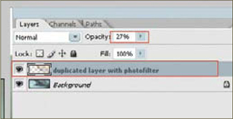
I continue adding details and also building on the background, trying and testing hues of blue for the sky (Fig.07). There is one thing I usually try a lot in my paintings, which is to duplicate the painting layer and then use a Photo Filter on the duplicated layer, increasing the density on the Warming filter to 85. I choose Multiply as the blending mode for the duplicated layer on top. To finish it off, I take the layer Opacity down to a fairly low level, until I feel that the colors are just right (Fig.08). If you want more control you can then erase parts of the top layer, as I have done.

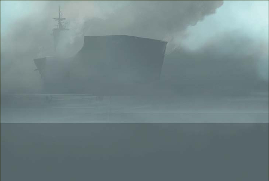
At this stage I add some more detail to the ship (Fig.09). There is an open crack on the ship’s hull, just as if a torpedo tore a hole straight through it (hence the topic for this speed painting).
Detailing
I like adding details. Adding details is kind of like adding more words to a story – there are certain details that you just have to add, simply because they help the picture to make more sense; for example, breaking waves, reflections on the water, and so on. I paint a silhouette of a bird on the left, because I feel that the sky area in that section is a little empty. Another detail which I think will help is the use of a rusty texture – look at the ship’s lower part. I want to create something rusty-looking, so I paint with a custom-made brush, which slightly resembles rust (Fig.10 – 11). I also continue adding more brushstrokes to the smoke (Fig.12).
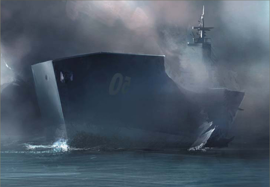

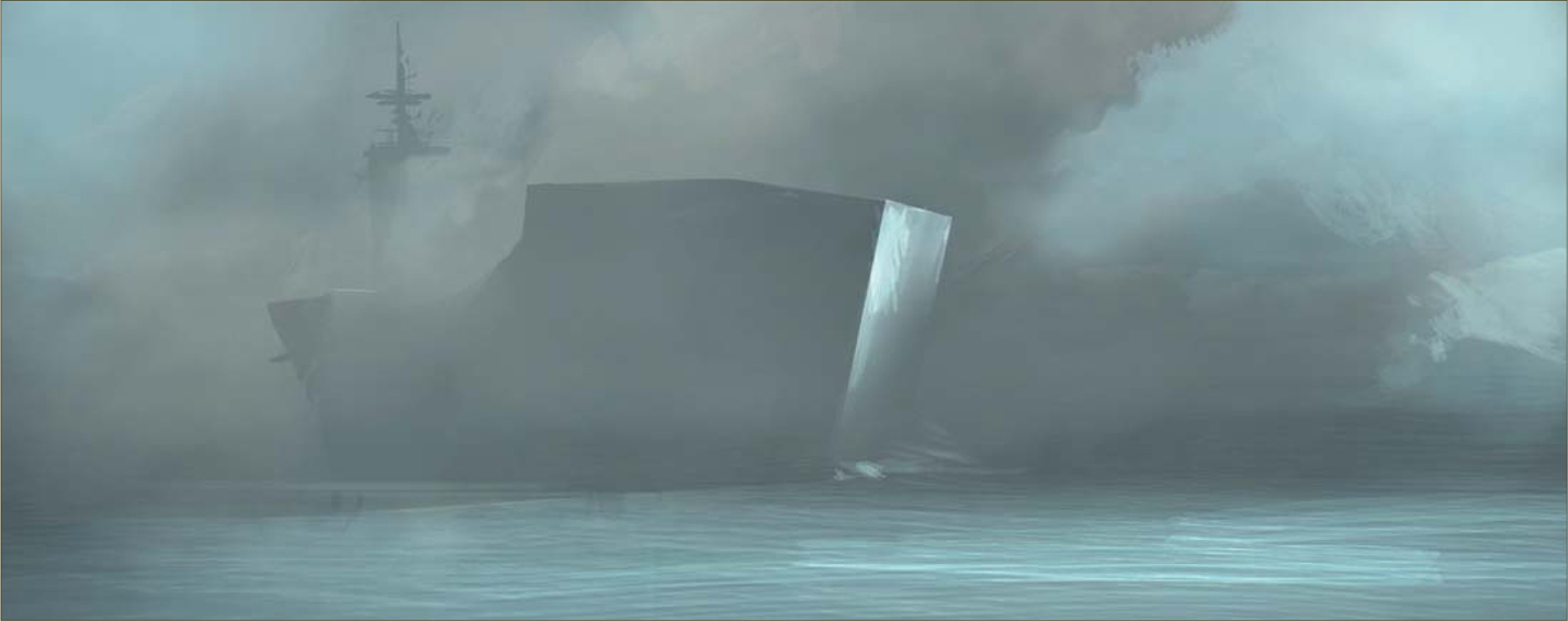
Color Test
These last stages of a speed painting are basically to test the colors to see if you can improve them, and add more to the mood (Fig.13). Again, I find flipping the canvas always helpful to refresh tired eyes.

Final Tweaks
Adjusting the resolution and adding sharpness are the last things that I do to my paintings. And there we go: speed painting complete (Fig.14).
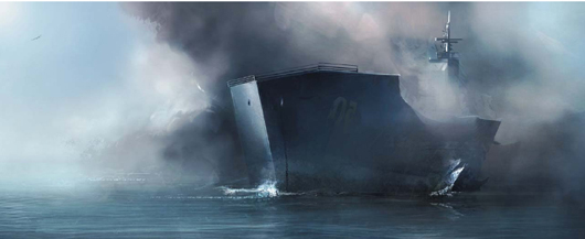
© Levente Peterffy
Artist Tips and Secrets
I can’t stress this enough: practice and practice more. This is the key to success. Even with cool custom brushes as assets, you still need to train your eye to see shapes and colors interacting with light, in order to evolve a painting. Try not to get too dependent on tutorials; dare to experiment a lot, even if you don’t know where to start – just scribble around. There are a lot of forums out there with speed painting threads, so post your work a lot and see what feedback you get. There are people out there willing to help you so use their advice wisely. However, do try to think about the problem for yourself, and try to solve it as best as you can. If you have a hard time starting to paint, then make studies from paintings by some of the Masters, or of screen shots from movies – that should help you to get started, at least.
© Nathaniel West
ALIEN HOT AIR BALLOONS
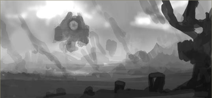
Step 01
For this speed painting I start off sketching freely, with no preconceived notions, and wait to see what will come out about. After a short time of messing around with different shapes and values, I begin to see a vision of a large balloon coming towards a foreground destination. In my mind, I view air balloons as very tranquil, and so the scene began to take on that quality.
When first starting a piece I begin by laying down a rough grayscale sketch (Fig.01). It is very important to have a good value structure first and foremost, with values grouped together to create a graphic and dynamic piece. I would say that this is the single most important stage in a painting, and should be worked out before beginning with color. If your value structure works, then the rest of the painting will follow easily. But, if your value structure is off, then you will find the next stages of the painting to be hopeless efforts until the value structure has been corrected. Often, a painting is not dynamic simply because the lights and darks have not been pushed enough, thus resulting in a “flat” appearance.
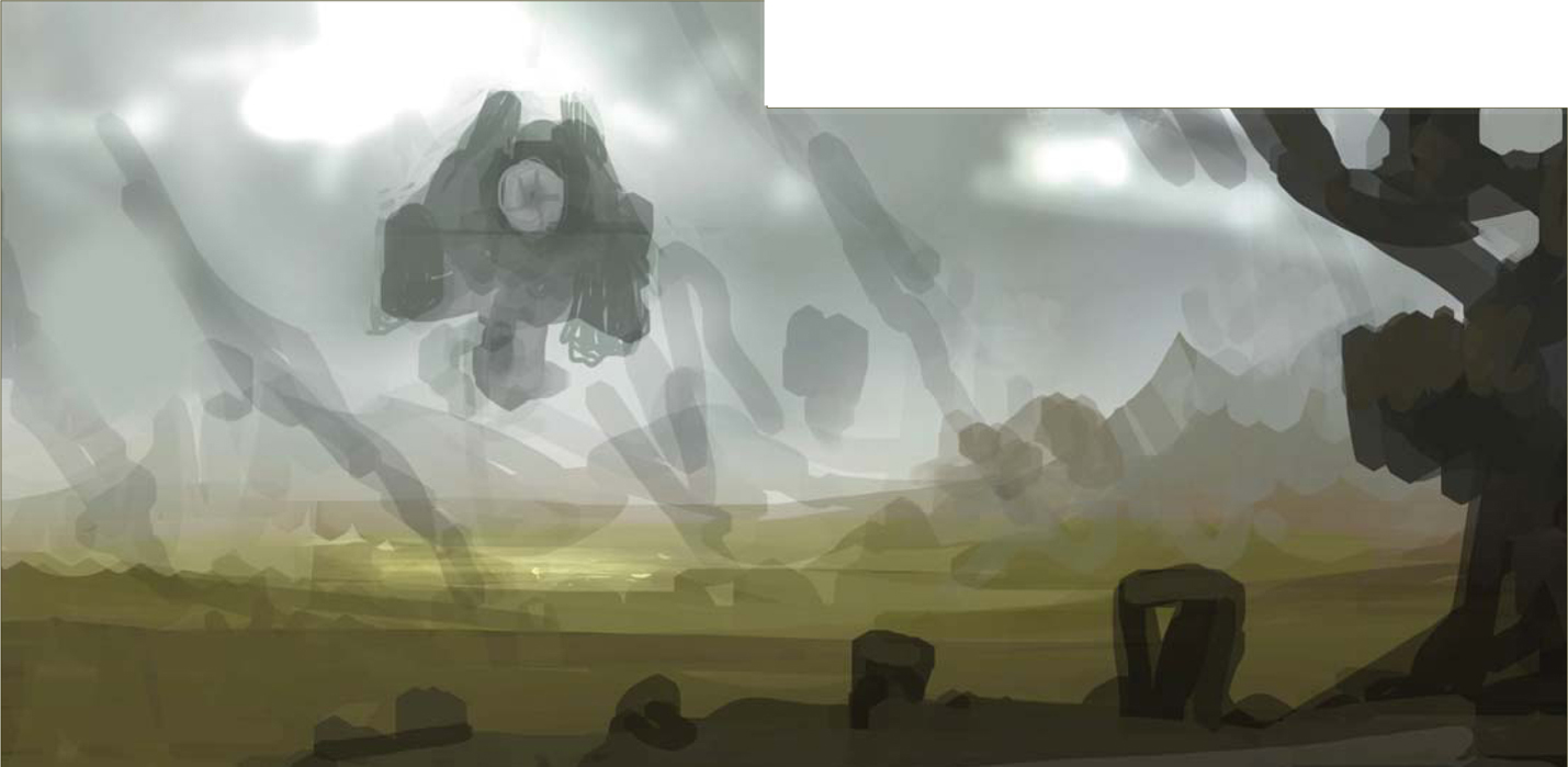
Step 02
Now that my values are worked out, I proceed on to glazing color over the entire painting. This can be subtle or extreme, but either way I glaze the whole painting with one color to keep the palette unified. I then begin to add additional color variations and levels of saturation to develop the piece further. I’m always careful to maintain the value structure throughout this stage of the painting process (Fig.02).
Step 03
With the overall palette of the painting established, I can now begin to further develop some details. I add in the balloon portion of the hot air balloon, and then mirror it with the same color and shape in the upper right corner. I also add a couple of figures and decide to give them the same color and shape language (Fig.03). This is all in an effort to tie the balloon and the foreground together, from a story point of view. I had indicated some trails of smoke coming off of the ground, but I decide at this stage to get rid of them, so as not to disrupt the landscape too much. The sky begins to get tightened up now, along with the mountains.
Step 04
I continue detailing the landscape further, introducing textures and color washes to achieve the desired effect. The air balloon has changed quite a bit, and its design has started to take shape. I’m also introducing additional color shifts into the sky as well (Fig.04).
Step 05
I’m now going to focus solely on the balloon, as that is our main subject matter. I give some loose detail to it, and then blend it into the environment with some ambient lighting on the outer edges of the balloon (Fig.05a – b).
Step 06 – Final
I now add in additional details to the landscape and foreground. Once done with all the detailing, I put some rays of light coming through the clouds, hitting a couple of areas with some highlights, and push the contrast in some areas to make the scene a touch more dramatic. I add in some highlights on the edge of the foreground to help separate it from the landscape, and then happily call the painting done (Fig.06a – c).
© Nathaniel West
© Serg S
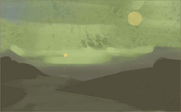
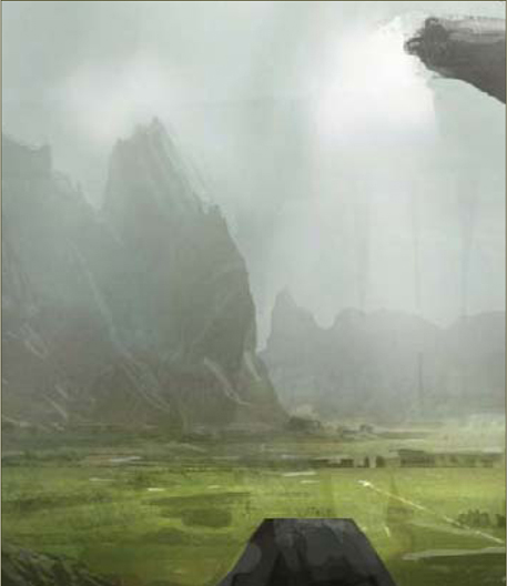
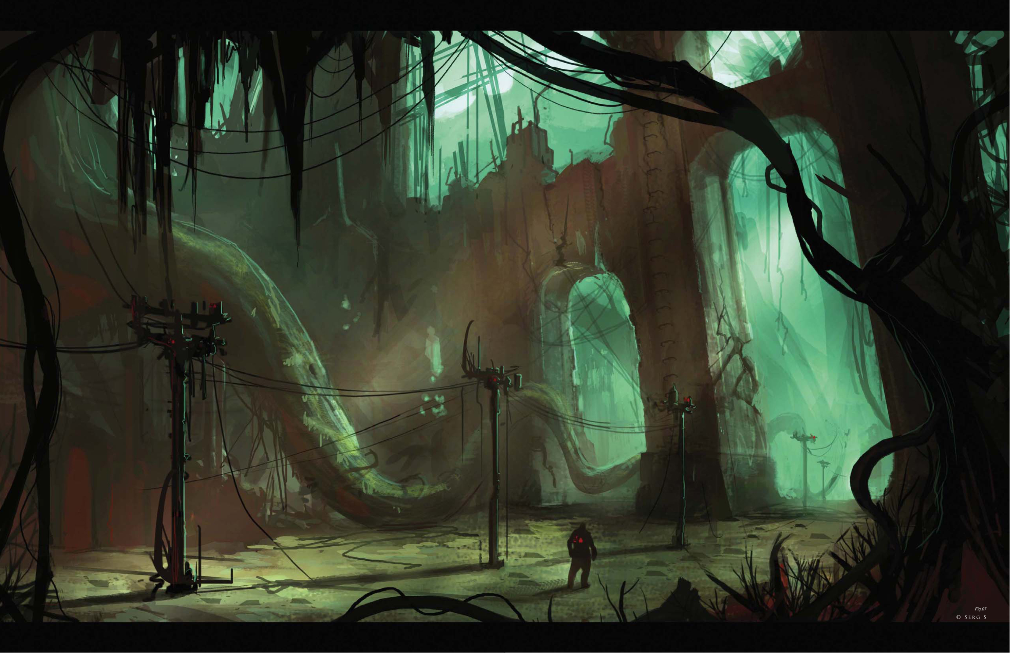
ONCE A THRIVING CITY, NOW DESERTED AND TAKEN OVER BY VEGETATION
Introduction
The outcome of a painting cannot be determined in the first stages of its creation; an image usually evolves with the artist over time. The process that I used to approach this brief started out with some research into interesting shapes. It’s always a good idea to have some kind of reference for whatever you’re drawing, but this time around I wanted to see what I could achieve from a two-hour speed painting without using any specific references. So here we go…
Step 01
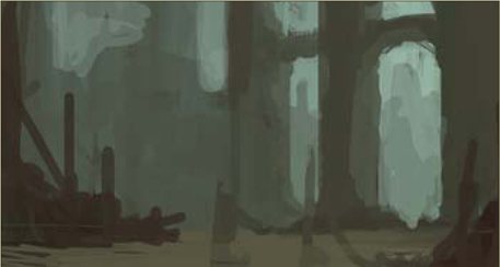
For this painting, I start off with a standard round brush, size 13, with Pressure Dynamics turned off and Opacity set to 75%. The colors I went for, with the theme of an overgrown city in mind, were all neutral and earthy tones (Fig.01)
Step 02
In the beginning stages I try to focus on shapes and the negative space of the image, and aim to not let the perspective of the piece hinder my search for these shapes. At one point I had a cityscape, but it then turned into an interior shot once I put in the three vertical structures, and so I’m going to follow that path instead. I try not to put in perspective lines when starting an image, as I like to be able to search for shapes with the greatest freedom. At this point I decide on the composition and that the space I am painting is going to become the base of a building that has been taken over by vegetation, as the brief suggests (Fig.02).
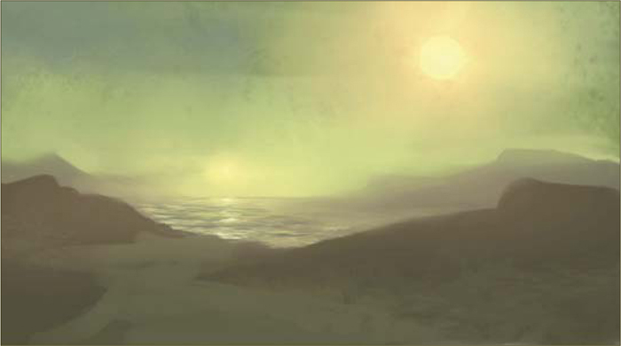
Step 03
Once the composition has been decided upon, I start to think about the lighting and shadows. Adding a complementary light source from the bottom left helps with the color contrast, and I use red to indicate rubble and to introduce some warmer color to the shadows (Fig.03).
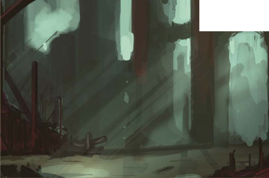
Step 04
At this stage, adding some perspective lines helps me out with the repetition of objects, and in defining the shapes discovered in Step 01. At this point it’s a good idea for me to check the values in the image. The order of values I used were: a value of 10 for the foreground, a value of 4 for the mid-ground (the area where the light hits the floor), and 6 for the background (Fig.04). A good way of thinking about this is: light, dark, light, dark – it’s never ending! When you have dark next to dark, you lose the edge (although sometimes you may want that).
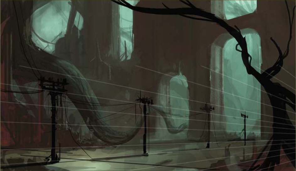
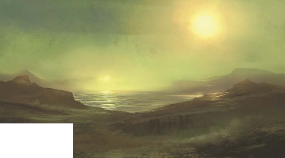
Step 05
After adding a figure to set the scale, I decide that I want to create an uneasy feeling for the character. Having verticals in your image creates stability, and so angling them to the left and darkening the values of the image seems to help create the illusion that I’m aiming for. I then paint out one of the center pillars of the image in order to give the feeling of more hope, and to lose some of the repetitiveness (Fig.05).
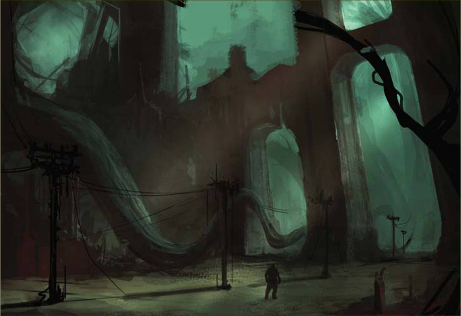
Step 06
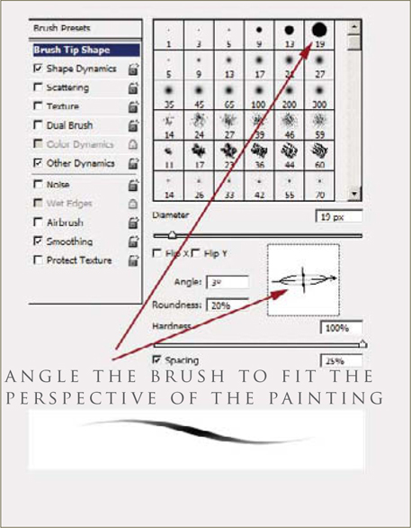
At this stage I start bringing it all together. I add more detail using a standard brush with the texture option checked, and I angle the brush to the perspective of the image (Fig.06). The main change here is to separate the values of the atmospheric perspective of the image where the objects seem to become closer in value as they recede into the space (Fig.07).
© Serg S
Final Thoughts
At this point I was happy with the image because it conveyed the mood, environment and scale I had initially hoped for. If this image was to be used as a piece of concept art, it would give the 3D artist a good starting point to work from. If it was a matte painting then the use of photographic textures would be the next step, as well as cleaner edges and greater use of the Selection tool.