Environments
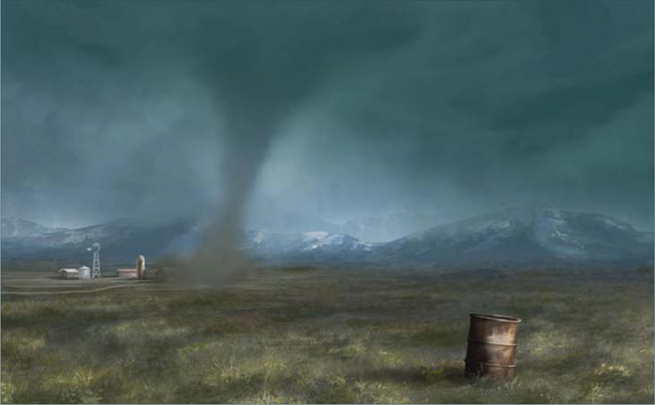
Rainstorm
© Carlos Cabrera
In today’s world of ever-increased specialization, many artists have adopted roles specific to certain areas of expertise. One of these is an environment artist, and, as well as creating original designs, it often involves adjusting an established scene and creating variations. This chapter looks primarily at how a base image can be manipulated to reflect different weather conditions, and shows how the same scene can be transformed dramatically to convey a diverse range of moods.
© Carlos Cabrera
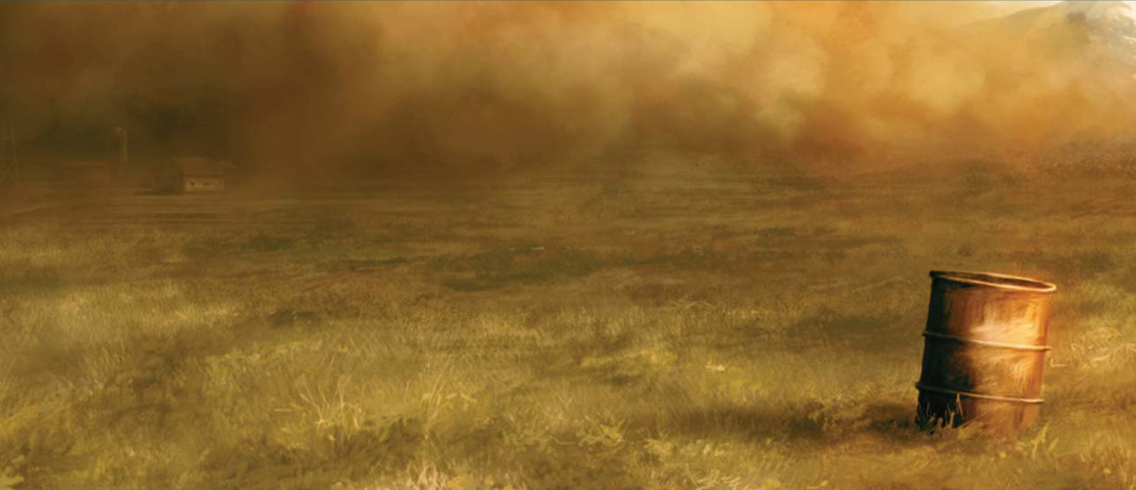
SANDSTORM
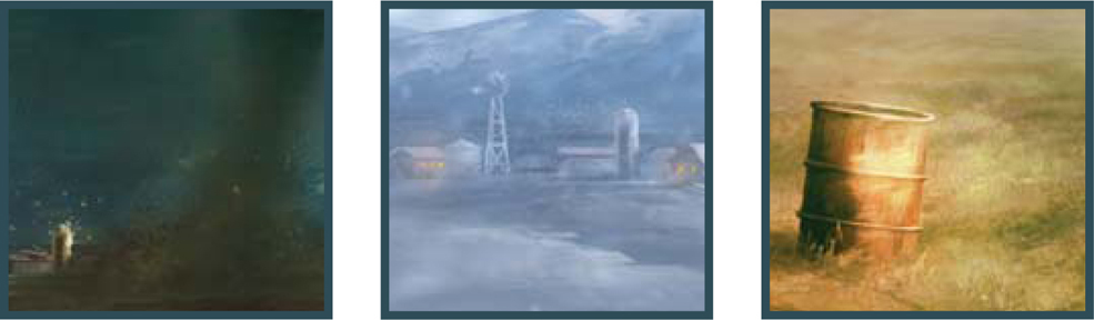
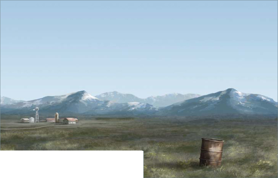
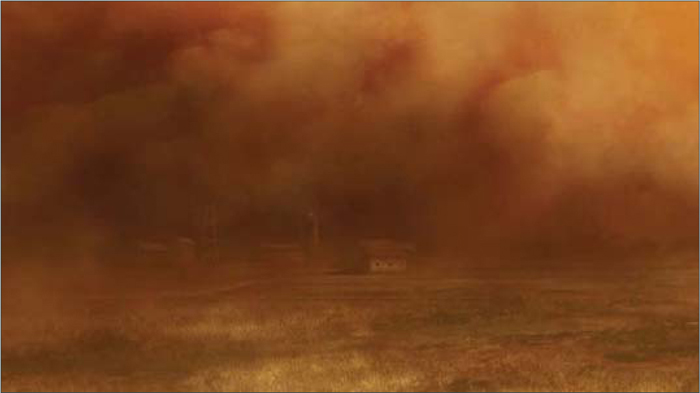
In this first of five tutorials, we will learn how to transform a basic given scene into the five different weather conditions. In this first tutorial we’ll be tackling a sandstorm! This tutorial is perfect for anyone who is looking to create a sandstorm effect in any landscape painting (Fig.00 – base image).
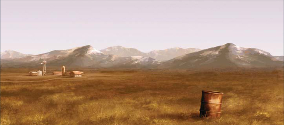
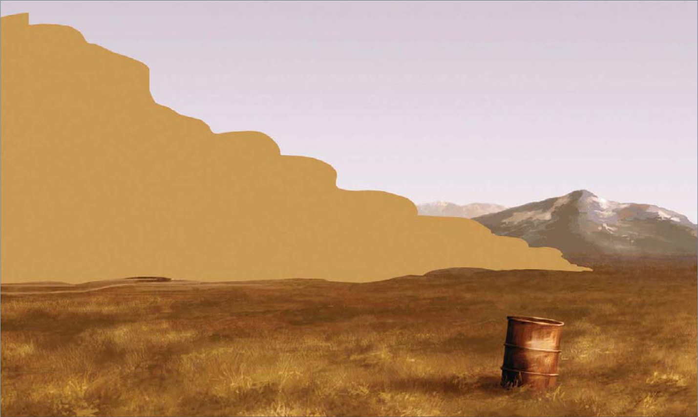
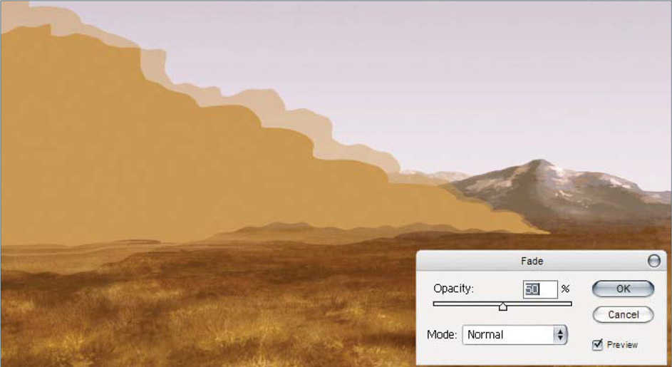
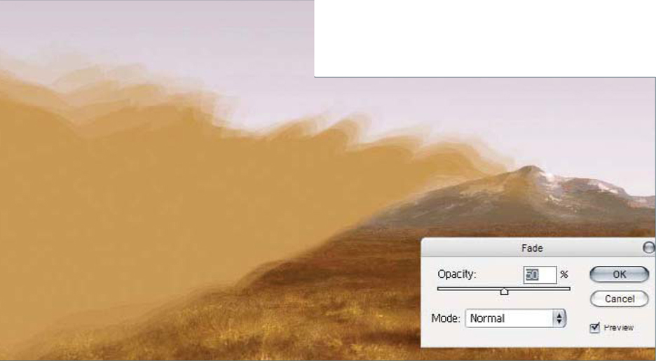
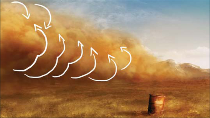
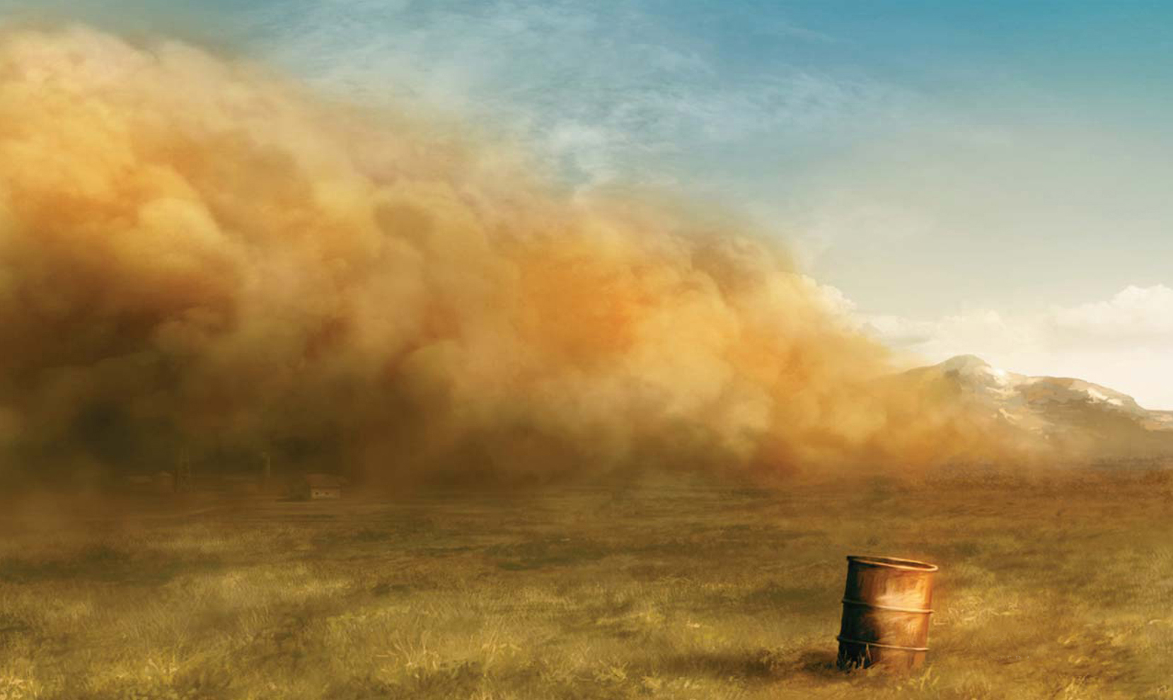
First of all, open the image you want the sandstorm to be added to, and then change the Color Balance of the entire image to something similar to the following settings: Shadows −2, +11, +18; Midtones +85, 0, −62; Highlights +23, 0, −4. With these settings you should achieve an orange atmosphere (Fig.01). Alright, now you’re ready to create a new layer and paint the shape of your sandstorm with a brown color (RGB 196, 147, 81). I decided to paint a triangular shape in order to increase the size of the effect over the other objects in the scene (Fig.02). Now go to Filter > Distort > Wave and apply a nice distortion to your shape. Pay close attention to this step; when you finish applying the Wave effect, press Shift + Ctrl + F (Fade), change the Opacity to 50%, and you will see your last Wave effect duplicated with a nice opacity. Repeat this step three or four more times and you will create a perfect cloud shape. These effects have much better results if you change the parameters of the Wave filter before applying the Fade effect (Shift + Ctrl + F) (Fig.03 – 04).
Well, we now have a good cloud shape; the color is okay and the shape is perfect, but it needs more detail. You can now either search through your personal collection of textures to find a good photographic image of a mammatus cloud, or you can search the internet for some good images. We need this photograph to add a realistic touch to our sandstorm shape. Select your chosen mammatus cloud photograph and search for a good shape within it. When you find what you’re looking for, select it with the Lasso tool and paste it into a new layer. Change the layer’s blend mode to Overlay and move your mammatus cloud into your sandstorm shape (Fig.05).
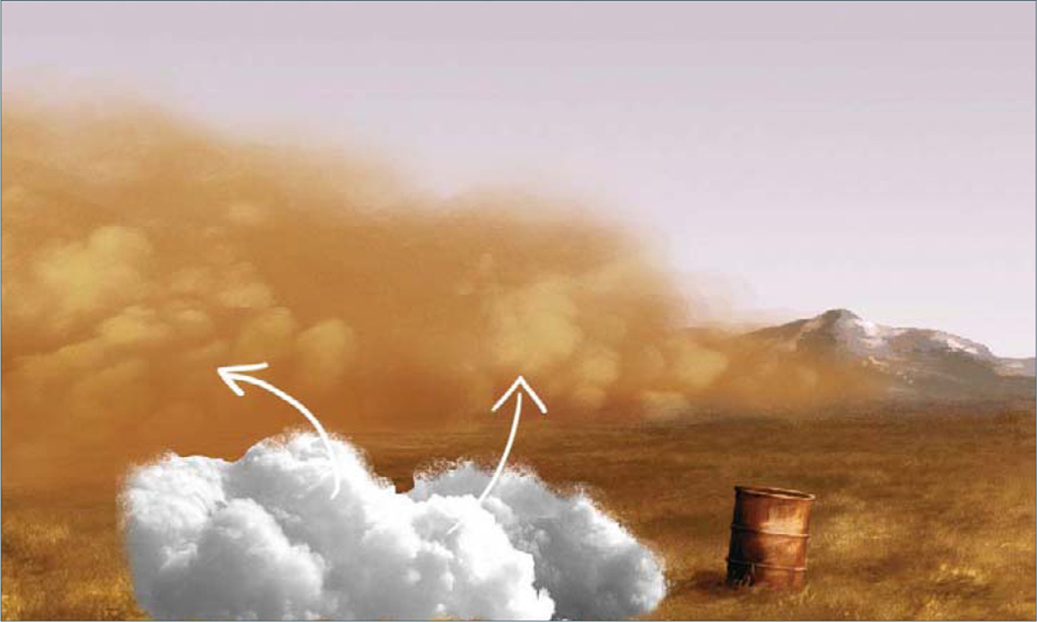
As you can see, the pasted photograph looks good but we don’t yet have the quality that we need. Remember that we are using this photograph only as a base from which to paint our own clouds. Now create another layer and change the blend mode of it to Overlay, and set it to 80% Opacity; select a gray color and start painting your own clouds. (Note: Don’t use white in Overlay blend mode for the clouds because the white color will burn the image below, and we don’t want a shiny cloud; we need a matte brown one.) So, paint the highlights using gray on your sandstorm cloud, and then – with black or a dark gray color – start painting in some shadows. Play around with the opacity of your brush to achieve some interesting shapes. Tip: If you use the numbers on your keyboard whilst painting then you can quickly and easily change the opacity of your brush – try it! This short cut is very helpful.
Let’s now go back to our cloud to smooth the edges. For this you can either use the Smudge tool (R) or paint several strokes using a low opacity brush (I always use the latter technique). When you finish you should have an image such as Fig.06. It looks good but it needs more light and shading work, don’t you think? Check the bottom of the cloud: it doesn’t have a great amount of shadows at the base, and so to fix this simply create a new layer in Multiply blend mode, and paint using a brown color at the base of your cloud. When done, change the Opacity of the layer to around 40%. Now create another layer in Overlay blend mode, and paint with a big soft brush at the bottom of the cloud. (Note:Remember not to paint using a high opacity brush – always use 50% or less when painting clouds or smooth surfaces.)
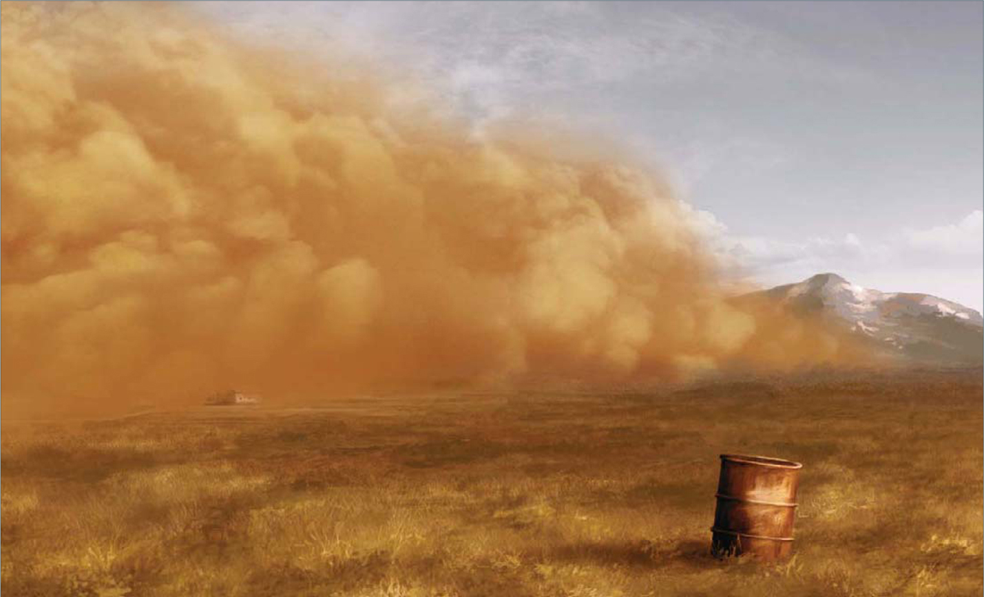
The shadows are okay now, so let’s start work on the highlights. Repeat the same procedure that we used for the shadows: create a new layer in Overlay mode and paint in the highlights using gray. Try to follow the direction of the clouds to create volume (Fig.07). The cloud is now perfect … but where is the farm? We now need to show the farm again because it’s an important object in this scene. Simply go to the background layer (the one that holds the base painting) and select the farm using the Lasso tool (it doesn’t have to be a perfect selection). Press Ctrl + J to duplicate the selection you just made into a new layer, and move it over the top of the Cloud layer. Change the blend mode of this new farm layer to Luminosity, and move the Opacity slider to about 10% (Fig.08).
If you want, you can leave the painting at this stage, but if we go on to tweak the colors a little you will see just how much better it can look! To do this, create a new adjustment layer (from the black and white icon positioned at the bottom of the Layer window) and select Color Balance. Click on the Shadows option (Color Adjustment > Tone Balance) and move the sliders to Cyan −22, Green +12 and Blue +7. Then click on the Highlights button and move just the Yellow slider to −13. If you check your image now, the shadow changes into a greenish-gray (Fig.09). This shadow color stands out the Sandstorm effect. You can then create another new adjustment layer and play with the Curves. I always use these last few steps to tweak my paintings, and it’s also a good way to check if everything is okay or needs to be changed at the end.
© Carlos Cabrera
The best way to learn Photoshop is simply to experiment with it. Try every tool, read tutorials and books – anything which will help you to learn this program. And practice; practice all the time!
You can download a custom brush (ABR) file to accompany this tutorial from www.focalpress.com/digitalartmasters, along with the base painting (JPG) that Carlos starts from so you can take greatest advantage of this tutorial.

© Carlos Cabrera
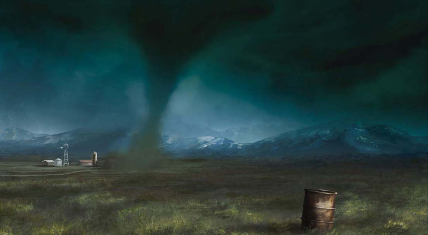
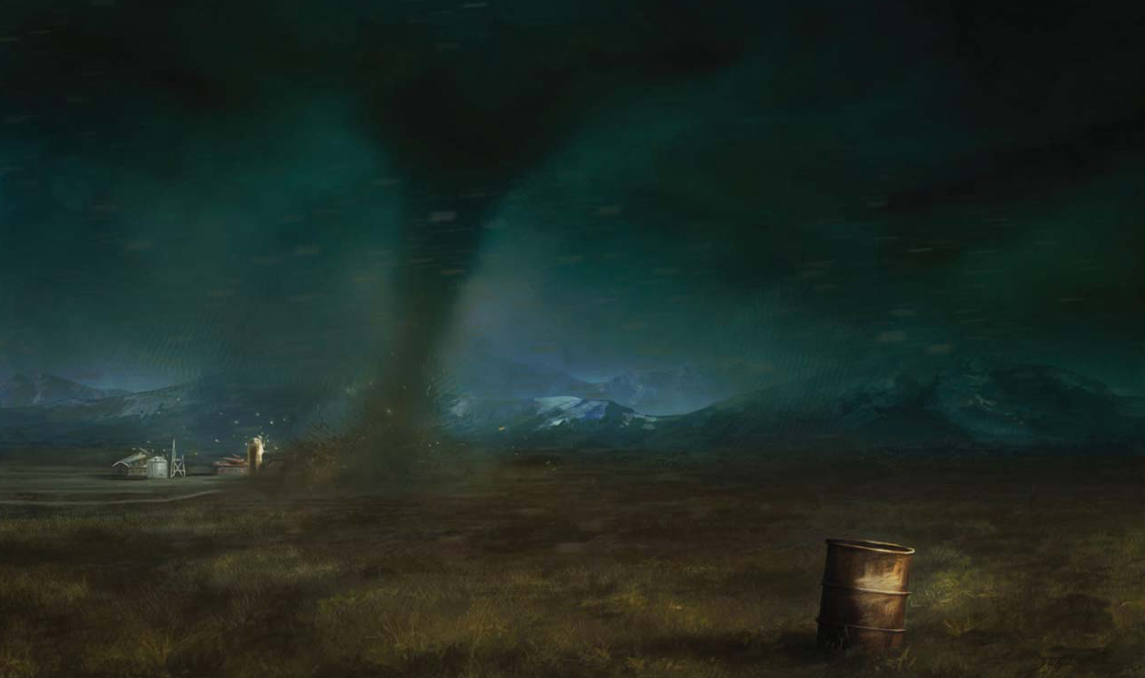
TWISTER
Are you prepared to transform a calm landscape base image into a scene featuring a dramatic twister? Okay, well let’s begin!
If you don’t have too much of an idea about what a particular scene looks like, then I always recommend you use the internet to find some photographs that can help you in your work. Years ago, artists needed to have hundreds of books in their studios to help them find good reference images for their works, but now, with the internet, we have the opportunity to instantly find the images that we are looking for. So, find some good reference images of what you need, and study the colors and atmosphere of them. You can learn a lot if you look at and study any images, not just artists’ works. You can learn lots of things from photographs, too.
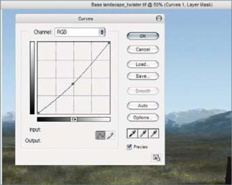
Fig.00 shows the base image that I will use for this demonstration. So, let’s see the first step in transforming the scene and adding a twister. First of all, we need to change the light of this image a little. Go to Image > Adjustments > Curves and make a curve, similar to the one you can see in Fig.01.

It’s not a huge change of color, but this is just the first step. Now we have to work hard on the clouds. This may be both the hardest and most enjoyable part of the painting, as we have to create a cool twister mixed in with the clouds. For the dark color of the twister pick a dark blue color (RGB 93, 117, 130), and for the brighter area of the twister select a sky blue color (RGB 137, 163, 179). With these two colors we are going to create a cool-looking twister…
To create the effect of the clouds and twister, I use a custom brush. First, I will show you how you can paint clouds easily using this brush. The first thing we need is a base color, so let’s use the dark blue color that we picked before, and paint an irregular cloud shape. This brush has the pressure Opacity turned on, so you can create some nice and interesting effects with it. The next step is adding light to this cloud shape, so pick the light color and paint on the area of the cloud where the light hits. Use the pressure of your pen to smooth between the dark and bright area of the cloud (Fig.02).
A simple way to smooth two colors is using a brush with a low opacity, so let’s try using 30% or 40% for this image. Pick the brighter color and paint over the darker color with a low opacity. Then select the Eyedropper tool (press the Alt key) and pick this freshly mixed color. Continue doing this a couple of times and you’ll see how the edges of your cloud begin to smooth, without the help of the Smudge tool.
Fig.03 shows the path of my brush strokes when creating these cloud formations. It’s easy, don’t you think? Try doing a couple of extra clouds in a new document before you continue with the twister.
Ready? Okay, so now let’s paint the twister … With the dark color (RGB 93, 117, 130), paint the twister’s body and mix it in with the clouds. Spend some time painting and smoothing the clouds as this is the most important part of this illustration, so do your best here. Now, with the light color (RGB: 137, 163, 179), paint the edge of the twister’s body. With this last step you are going to separate the twister from the background. Pick an earth color and paint the base of the twister with this color. Try to paint something like what you can see in Fig.04.
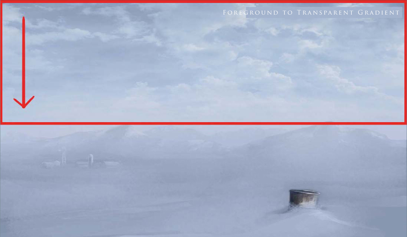
We now have to darken the sky, so pick a green color (RGB 121, 166, 151) and paint on a new layer using the Gradient tool (Foreground to Transparent) from top to bottom. Change the properties of the layer to Multiply and change the Opacity to 91%. This will change the sky to a green/gray color (Fig.05), although it’s still much too bright at this stage.
Now create another layer and change the properties to Color Burn. We need the Opacity to be lowered here, too, so change it to around 80%. Again, select the Gradient tool and paint over the clouds with this green/gray color (RGB 164, 178, 170). Now it is dark; you can see just how dramatically the image has changed from this adjustment (Fig.06).
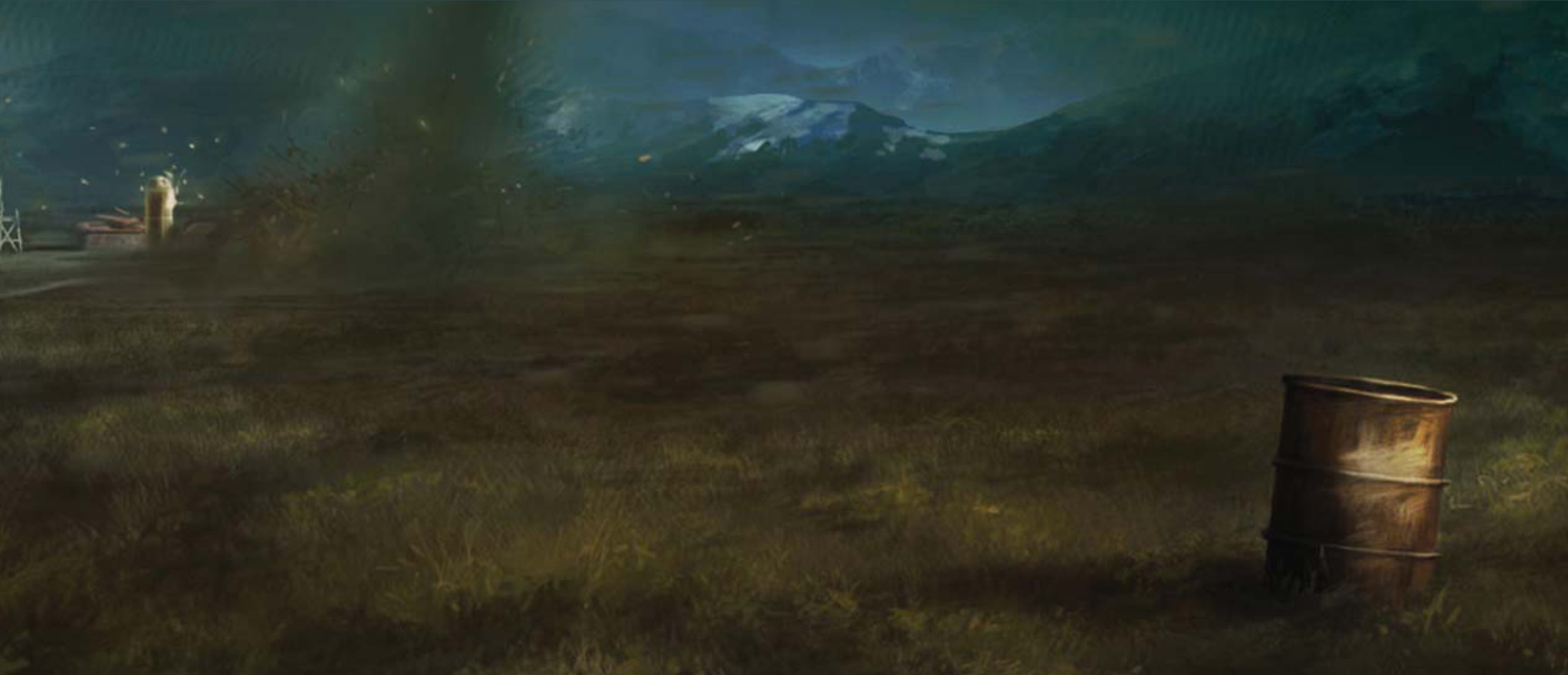
It’s now time to destroy the farm. Create a new layer and paint – using a hard round brush – the trash, earth and wood that will be flying around the base of the twister. This is a fun part, so spend some time putting the details in here (Fig.07). You can paint cows flying around the tornado too if you like – or maybe even a farmer?
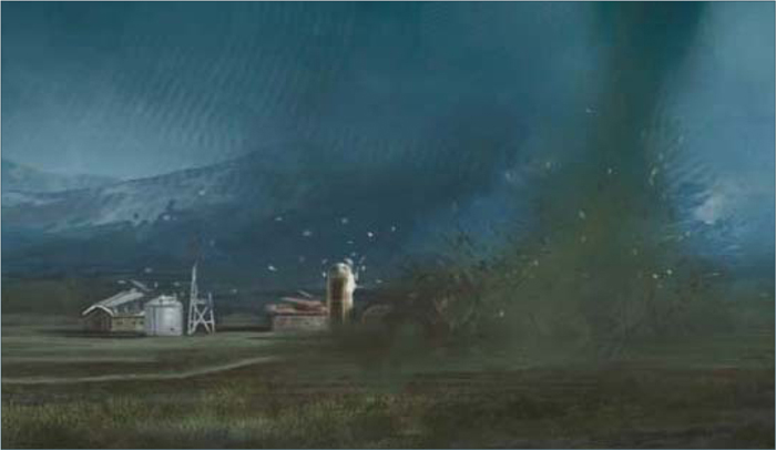
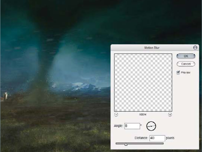
The farm is ready and the tornado looks scary now, but we still need to add the Wind effect to the entire scene. Create another layer and paint some random dots on it – any place is okay. We will transform these dots into a foreground of flying trash. Pick any bright color from the image to paint these dots, and when you’ve finished go to Filters > Motion Blur and apply these settings: Angle 8; Distance 40 pixels (Fig.08).
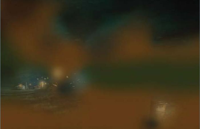
We are almost finished with this image at this stage. Let’s now create the last layer. This layer is very important, so take your time on it. I’m going to show you what I did but it’s not a technique as such, just a final tweak of the image. You can continue modifying the image until you personally feel that the illustration is finished. Remember that only you know when a painting is finished! Some artists flip the entire image to see errors; others zoom in and out of the image to see and feel what is wrong. Try to find your own way. So in this last layer we’ll change the properties to Overlay (Opacity 52%) and paint with browns, greens and yellows over the image, in order to enhance the different areas. In Fig.09 you can see the layer without the Overlay properties. Compare this with the final image (Fig.10).
© Carlos Cabrera
And this is the end of the tutorial. Try to apply these steps to any image you create, and learn to feel comfortable with what you do.
You can download a custom brush (ABR) file to accompany this tutorial from www.focalpress.com/digitalartmasters, along with the base painting (JPG) that Carlos starts from so you can take greatest advantage of this tutorial.

© Carlos Cabrera
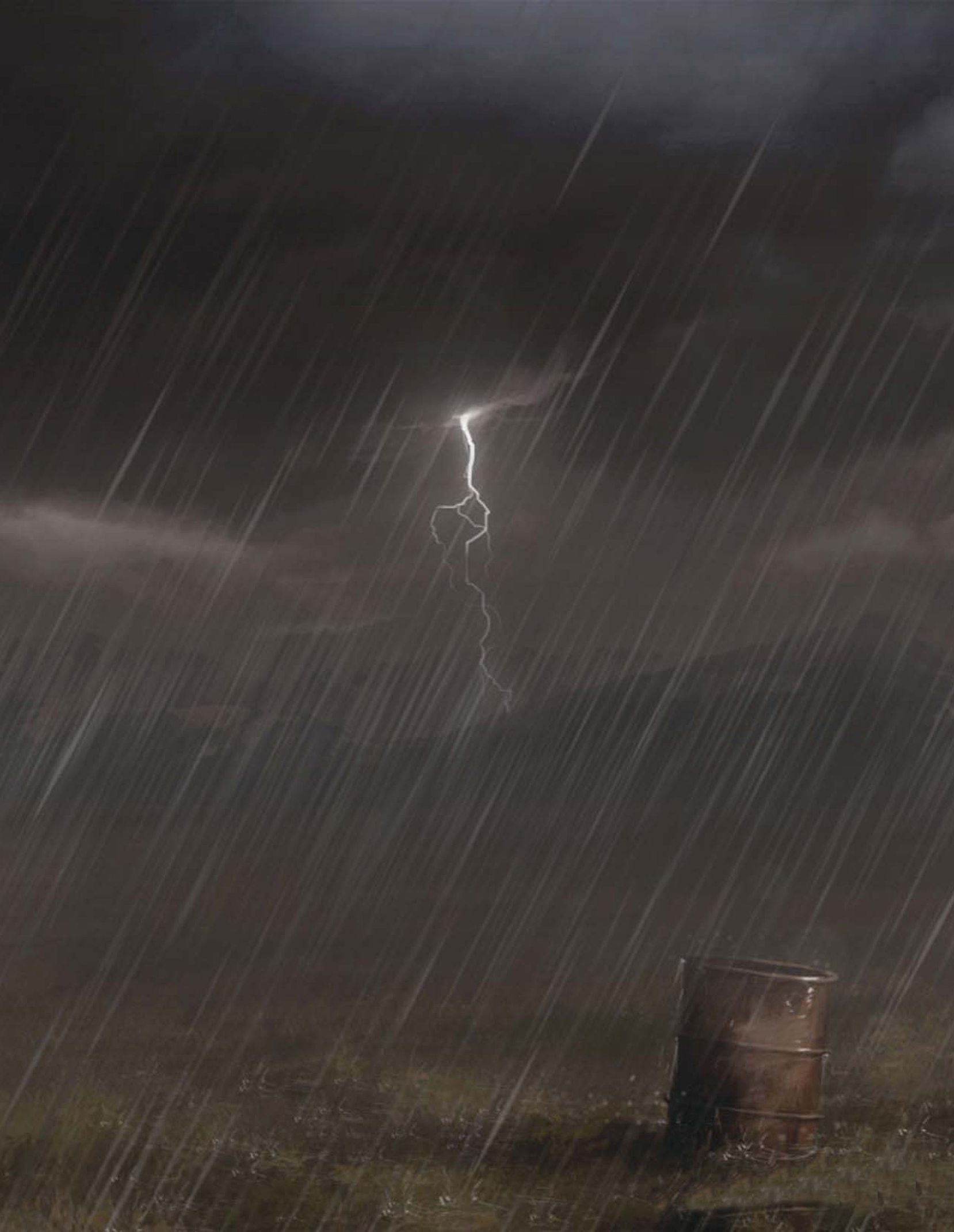
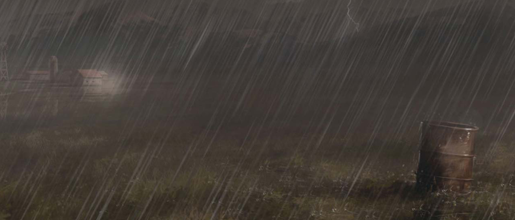
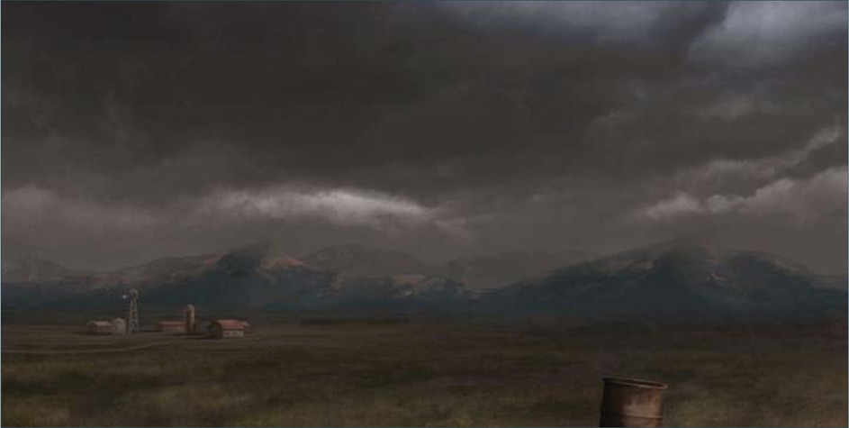
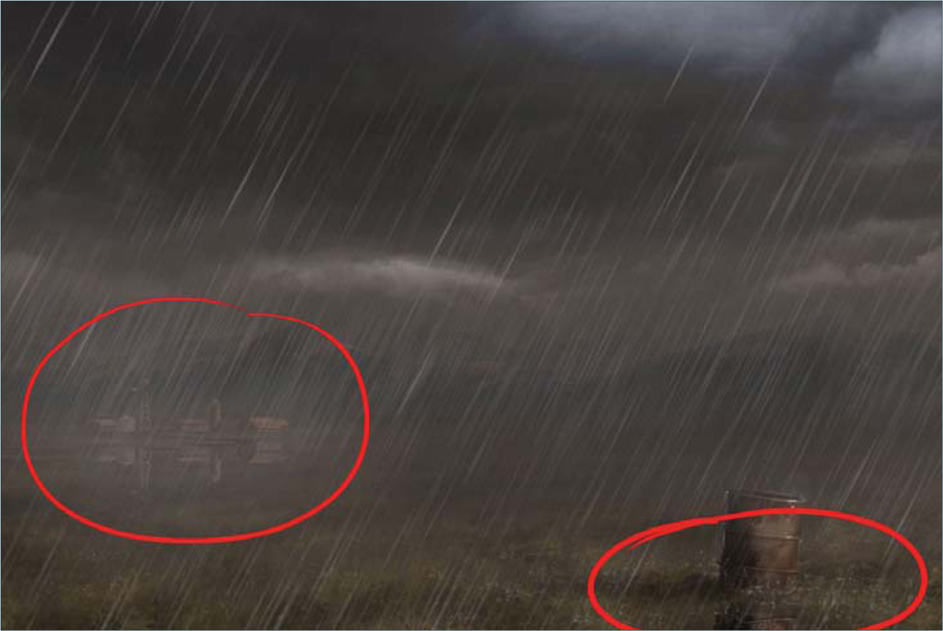
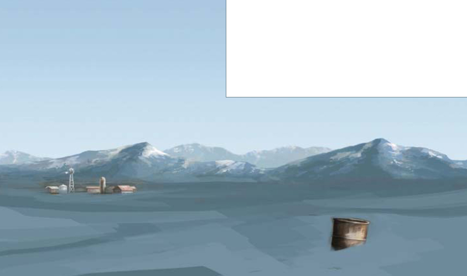
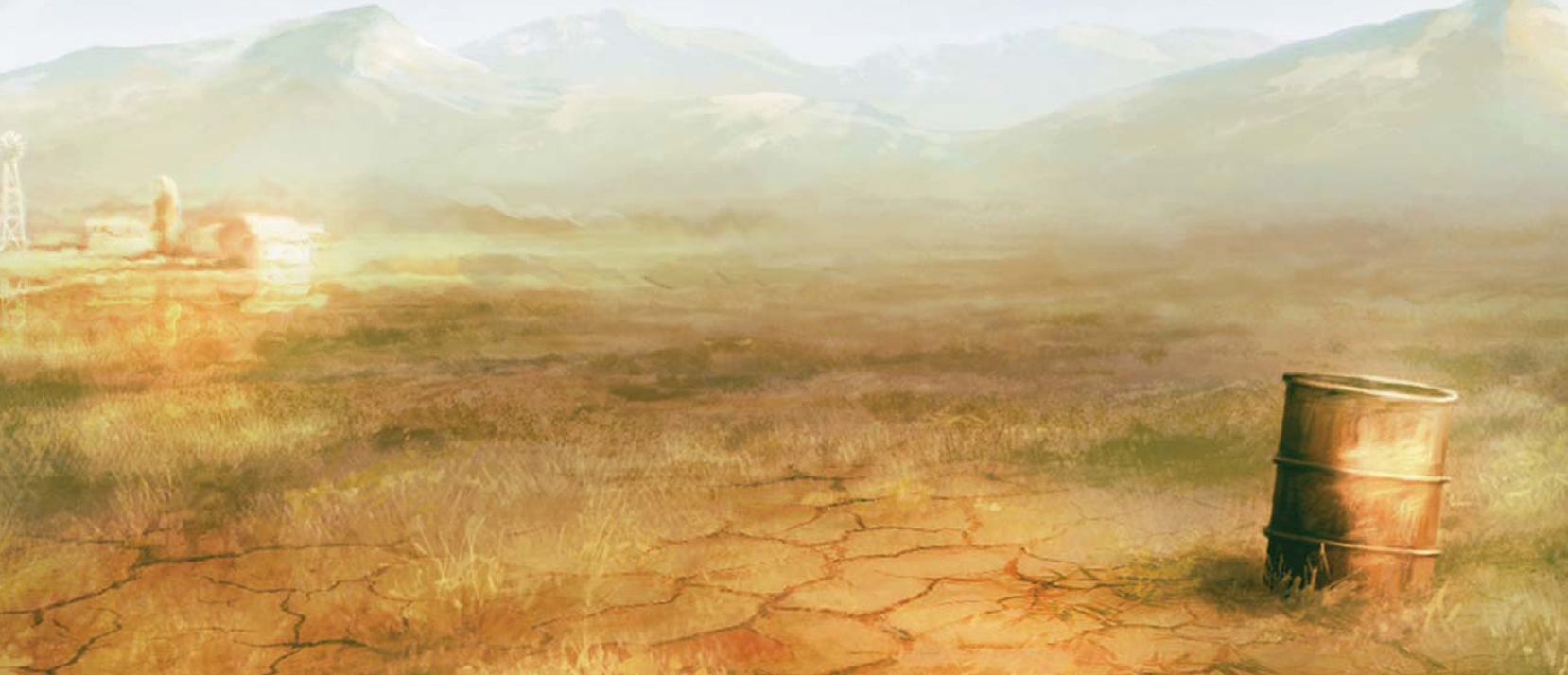
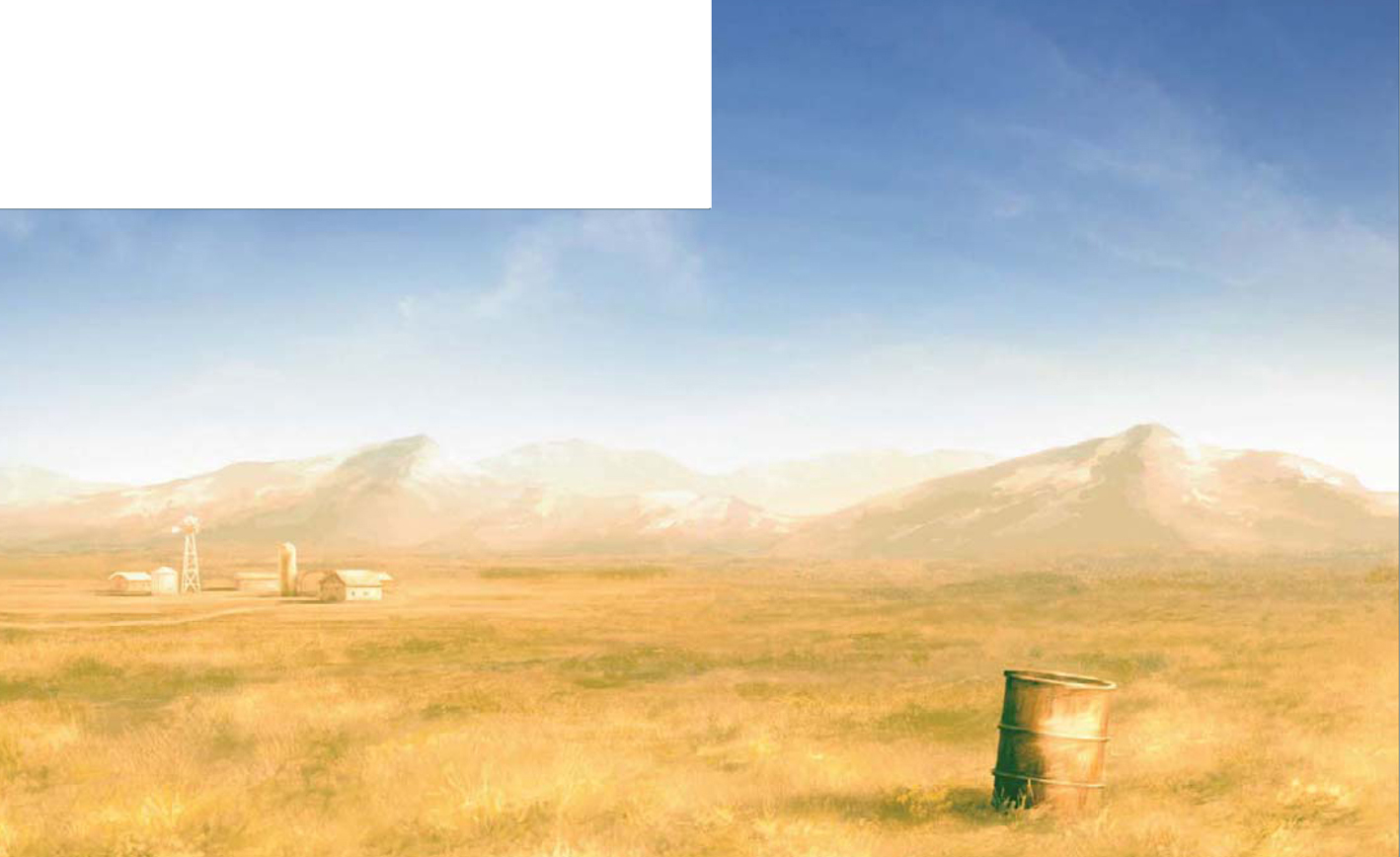
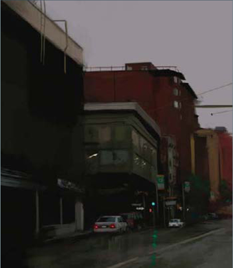
RAINSTORM
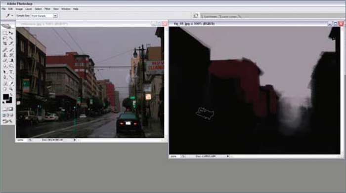
The first thing we need to do is to grab reference images (I always use Google Images to search) in order to understand how the colors change in different weather conditions. Remember that we are only using the reference photographs as a color guide for our painting. In this tutorial I will show you the steps that I followed in order to transform a base illustration into a stormy scene, but it is essential that you also practice and create your own techniques, too.
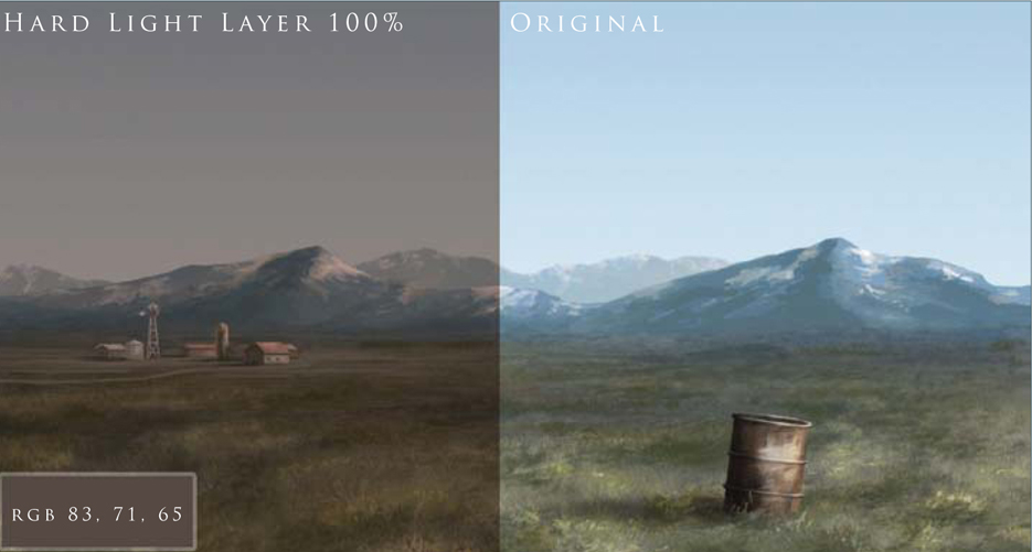
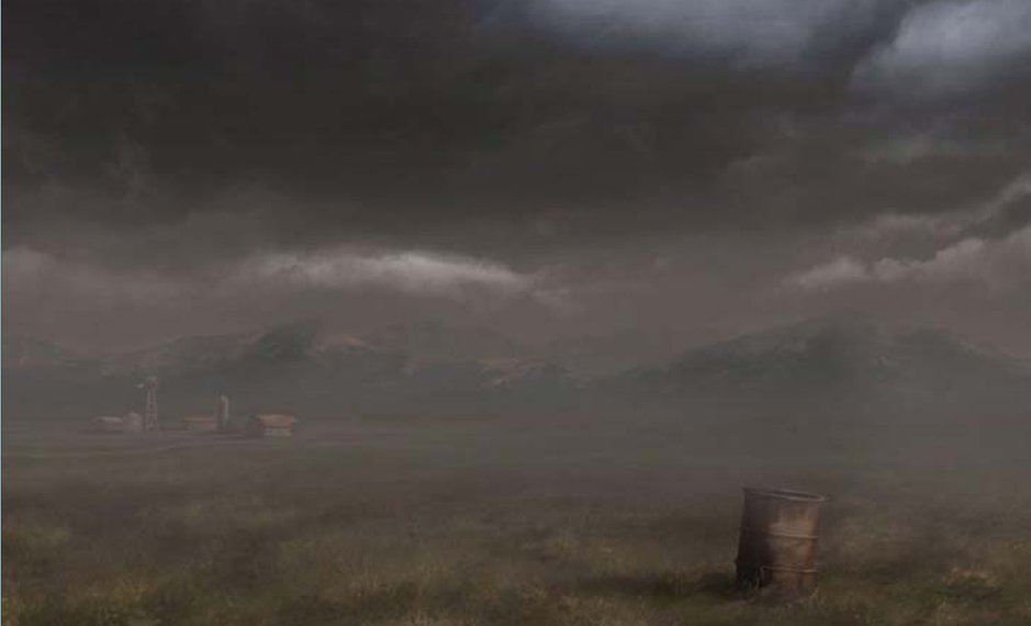
Our first step is to change the ambient color of the entire scene. Let’s pick a gray/brown (RGB 83, 71, 65); this color is going to give us the stormy, ambient color that we are looking for. Create a new layer (Hard Light 100%) and fill it with our ambient color. Do you see how it changes with only one color (Fig.01)? And this is only the first step! Let’s continue.
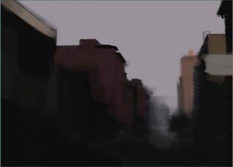
Now we need some clouds. In this step, if you have a cool cloud picture to hand then you can use that. If you don’t have one that you can use, simply do a search for some interesting cloud images, or take some of your own photographs. Create a new layer (Overlay 100%) and paste your cloud picture onto it. Or, if you’re feeling confident, then try doing it like me and paint your own clouds! Remember that we must only paint with this gray color on this layer because we don’t want to dramatically change the brown ambient color (Fig.02).
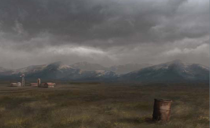
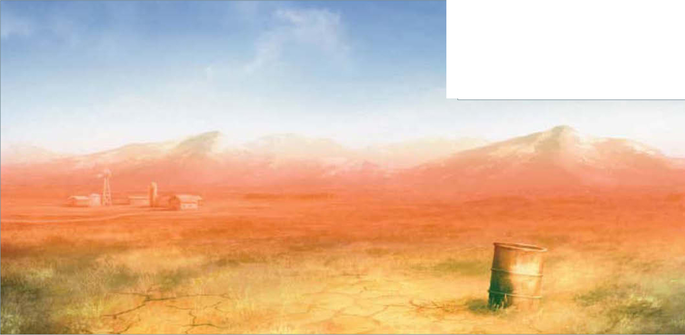
Create another new layer (Normal 100%) now in order to add some fog to the mountains in the distance. In a storm scene such as this then fog is really important. The image still looks too bright for a stormy day, so let’s darken it a little more. Create another new layer (Overlay 100%), select a Gradient tool (Foreground to Transparent) and paint the layer with a dark color (RGB 59, 56, 53). Now it’s looking like a stormy day (Fig.03), don’t you think? We need to add more fog in the distance now, so select a soft round brush (Size 300; Opacity 50%) and paint on the horizon line (Fig.04).
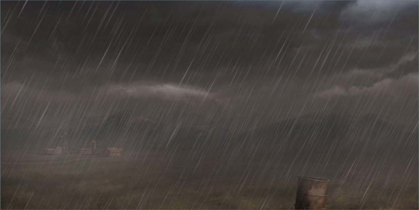
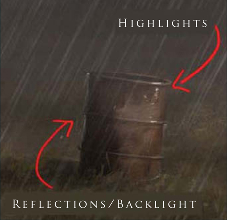
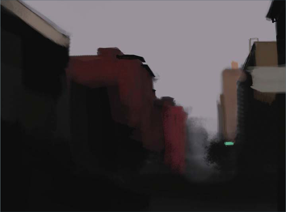
Now it’s time to add the rain. To paint the rain I created a simple custom brush. Select a bright rain color (RGB 100, 97, 96) and paint over the entire scene using your Rain brush, trying to put more rain on the horizon line (Fig.05). In a new layer we are now going to add a Wet effect to the trash can in the foreground. With just a few white strokes in the area where the light hits the trash can, and a simple reflection/back-light on the back of it, we will achieve a nice wet-look effect (Fig.06). To increase the wet/rain effect we have to add water splashes, too. I created another simple brush for this effect, as well (this brush doesn’t have any special configurations). So, select the brush, create another new layer and paint in the little rain splashes around the trash can.
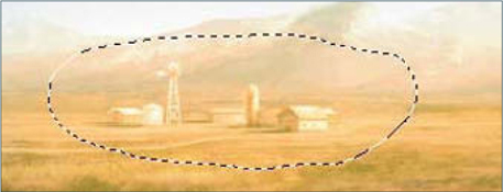
We still need to add the reflection from the farm and the trash can over our wet floor. This step is very important so pay attention here. Create a new layer and merge the visible layers (Shift + Ctrl + Alt + E). Now you have all the painting in one unique layer, but you can still see that other layers are there, too. Select the farm and the trash can with the Lasso tool, (Ctrl + J), and we will automatically obtain a copy of our selection in a new layer (Fig.07). Now go to Edit > Transform We still need to add the reflection from the farm and the trash can over our wet floor. This step is very important so pay attention here. Create a new layer and merge the visible layers (Shift + Ctrl + Alt + E). Now you have all the painting in one unique layer, but you can still see that other layers are there, too. Select the farm and the trash can with the Lasso tool, (Ctrl + J), and we will automatically obtain a copy of our selection in a new layer (Fig.07). Now go to Edit > Transform > Flip Vertical, move the duplicates below the original farm and trash can, and erase the edges with a soft round brush. You should obtain a similar result to what can be seen in Fig.08. To increase the reflection, change the layer properties to Overlay; this will create the Reflection effect on the floor.

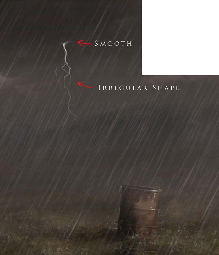
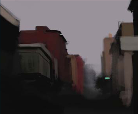
Let’s now add our lightning to this storm scene. First of all, we have to darken the top of our painting a little more, because the lightning needs some contrast. Create another new layer, pick a darker color (RGB 65, 61, 59) and paint again using the Gradient tool over this new layer. Change the properties of the layer to Overlay and reduce the Opacity to 50%. Now we can easily paint a couple of highlights over this dark sky. To create the lightning in this storm you’ll have to paint an irregular shape in a bright color; you can then smooth the top of the lightning, as if it is coming from inside the clouds (Fig.09). Create another new layer (Normal) and add the first lightning glow (yes, we will add another one in just a couple of minutes) with a soft round brush. To increase the Light effect, add a reflection to the base of the clouds. Create an Overlay layer and paint the second glow Effect with white over the lightning. You can see the difference of some lightning with a glow and without in Fig.10.

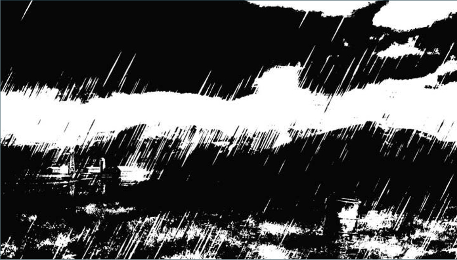
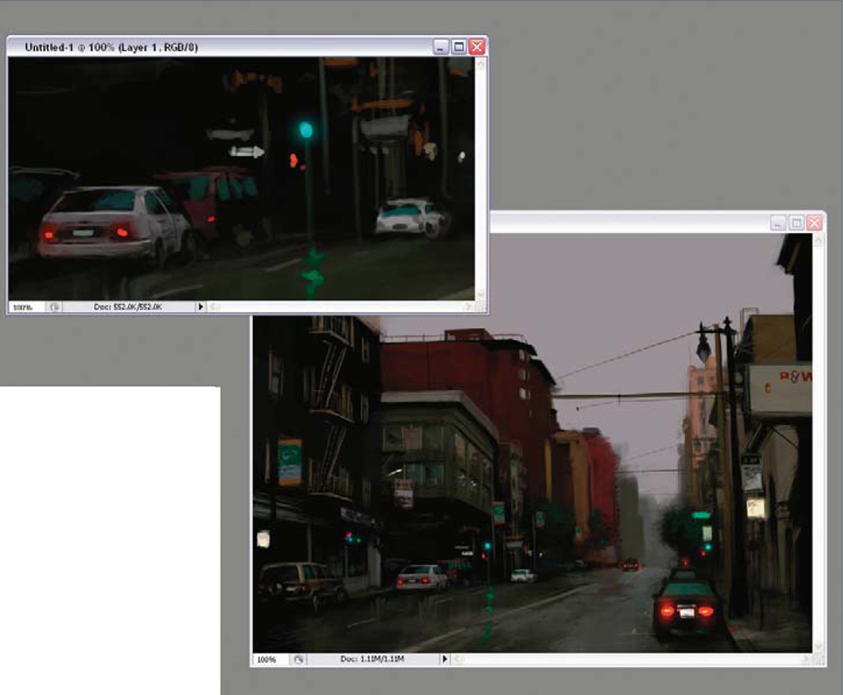
And for the final step we are going to add a technique that I always use to add texture to a painting and increase the shadows. Create a new layer and merge all the visible layers again. Do you remember how to do this? Simply press Shift + Ctrl + Alt + E. Now we have the entire scene merged, go to Image > Adjustments > Threshold and play with it until you obtain a result similar to Fig.11. Do you see how it looks as an old ink drawing? Well this technique is a good one to use in order to check whether your painting has good light and shadow work. Now select this new black and white layer and change its layer properties to Multiply. We have to reduce the Opacity to 5% in this particular case, but remember that if you use this technique then the maximum Opacity is something like 15%, because you don’t want to cover all of your cool paintings.
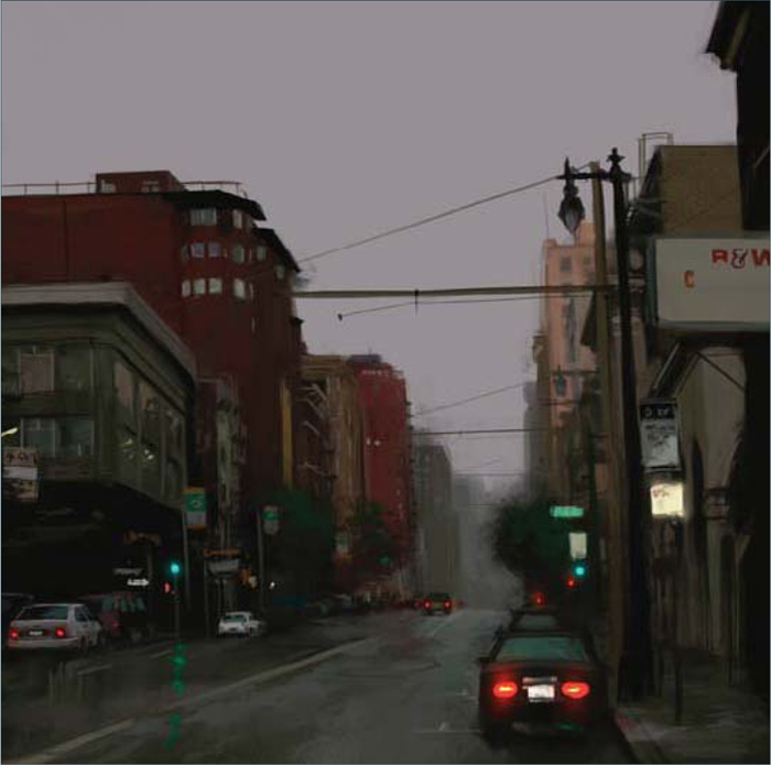
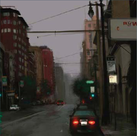
Well I think we can now say that this image is finished (Fig.12). I hope this tutorial has helped you to try some of these steps or techniques in your images. Practice every day and force yourself to speed up your skills, because in this business speed and quality are very important!

© Carlos Cabrera
You can download a custom brush (ABR) file to accompany this tutorial from www.focalpress.com/digitalartmasters, along with the base painting (JPG) that Carlos starts from so you can take greatest advantage of this tutorial.

© Carlos Cabrera
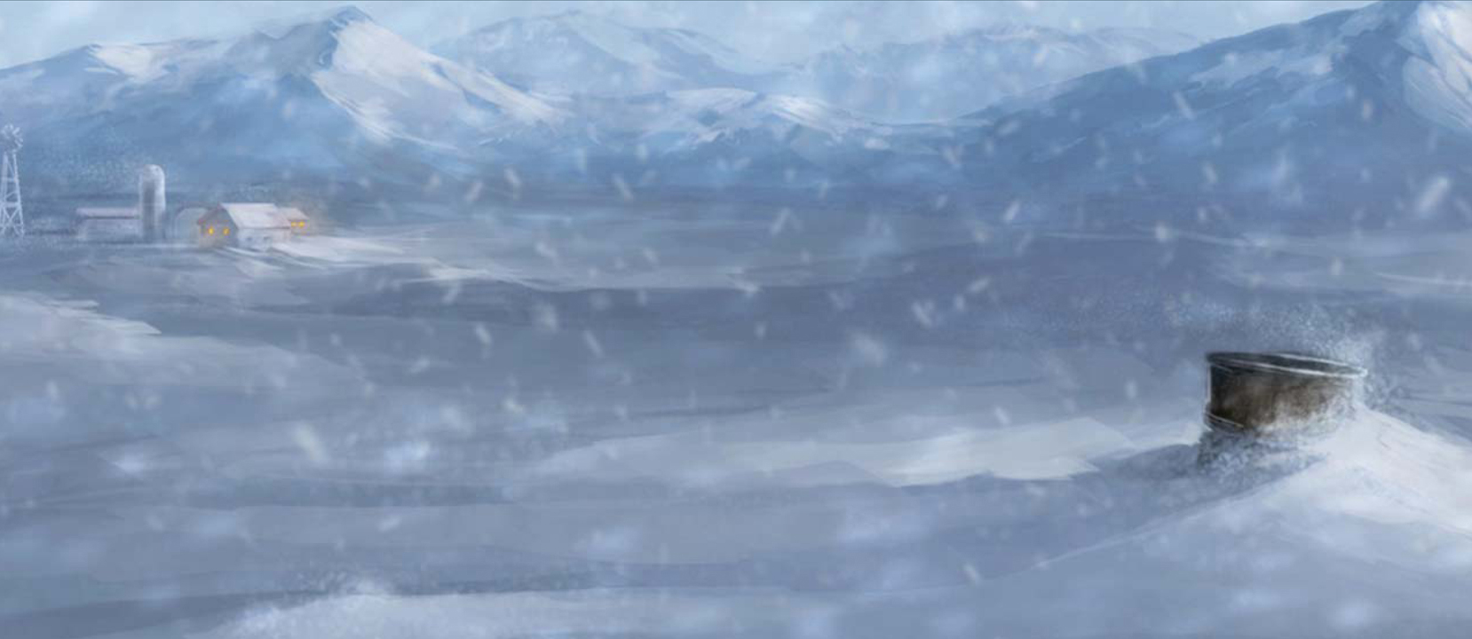
SNOWSTORM
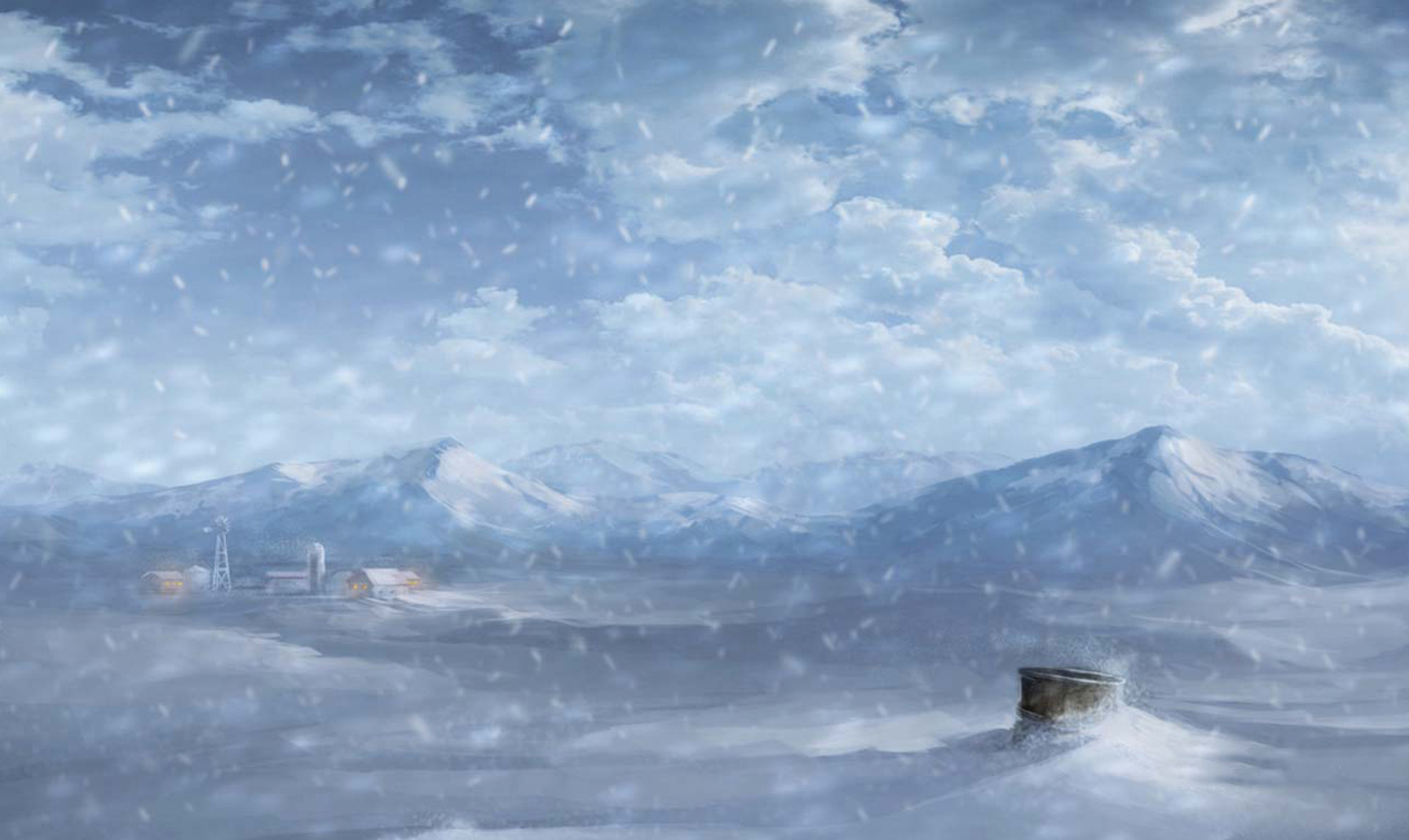
In this tutorial I will show you how to create a snowstorm from the first to the last stroke. We need some specific steps to transform this painting (Fig.00); one of these steps is to add the snow – a lot of it! The next step is to change the Color Balance to blue, and finally add some fog. You can follow these steps or you can create your own, unique way. Please use this method only as a guide or for reference, rather than a rigid way of doing things.

Create a new layer and start painting the snow. Use a blue/gray color for the snow. I used these colors: RGB 84, 112, 126 for shadows and RGB 113, 140, 157 for the highlights. Please try your own palette – you can even use a photograph of some snow for reference, if you like. Paint – with fast strokes – the shape of the snow and cover all the grass that you see in the picture (Fig.01). This is a quick step, so don’t waste too much time on it – we will add more details later on.
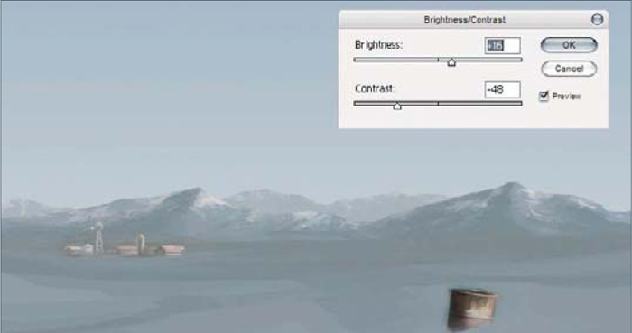
Change the Brightness and Contrast of the whole image. I used these settings: Brightness +16, Contrast −48 (Fig.02). Can you see how the atmosphere in the whole image changed with just a few color tweaks? Well this is just the beginning. The next step is to change the atmospheric color to blue. To do this, create a new layer and fill it with this color: RGB 161, 173, 197. Change the layer’s properties to Color 100% and check your new atmospheric color.
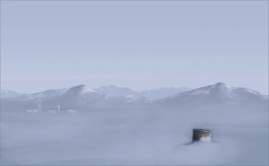
Now let’s smooth the snow a little bit, on the ground. Create another layer and start painting with a soft round brush at 50% Opacity. Try to use the Eyedropper tool a lot – this is very important – and please do not use the Smudge tool in this case. Create another layer and paint the fog on the horizon, with a brighter blue color. Use a soft round brush at 30% Opacity for this (Fig.03). Let’s put more fog in the sky now. On another layer (Normal layer, 82% Opacity), paint with this blue color (RGB 127, 184, 208) and try to merge the mountains with the sky. The new atmosphere looks very good, don’t you think? With a good brush, you can now paint some more detailed snow. You should spend a lot of time on this step because we need a good-looking snow environment!
On another new layer, paint the clouds using shades of gray, and change the properties of this layer to Overlay at 85% Opacity (Fig.04).
You can use a photograph for the clouds, but remember that the photograph must be grayscale, because we don’t want to change the blue/gray color of our own sky. But now we have a problem … The sky is too bright to be a stormy sky. So let’s fix this really quickly. Create another layer and fill it with a gradient. Use the color RGB 81, 91, 103, and change the layer’s Opacity to 48%. Don’t fill the whole image with the gradient, just the upper middle section (Fig.05).
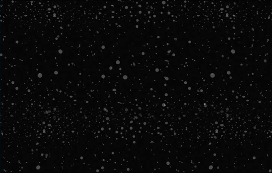
Now is the time to add some snowflakes. Create a new layer and fill it with black paint. Paint random dots onto it in a gray color (RGB 128, 128, 128). You can paint the snowflakes one by one, you can make a custom brush, or you can duplicate the layer (Ctrl + J) and change the Opacity to simulate distant snowflakes. When you paint the dots use different sizes of brushes, too (Fig.06). And pay attention! Change the properties of the layer to Color Dodge and find a good opacity level – I used 78% Opacity, but see what is better for your own painting. You can see how the black is gone now, with the Color Dodge property, and the white is now there. Well, those white dots are our snowflakes. But they still need some adjustments. The snowflakes need Motion Blur, so go to Filter > Motion Blur and set these parameters: Angle 20, Distance 25 pixels, and then add a Gaussian Blur (3%), too. To increment the Snowflake effect, you can duplicate the layer and transform it a couple of times and obtain an image such as Fig.07.
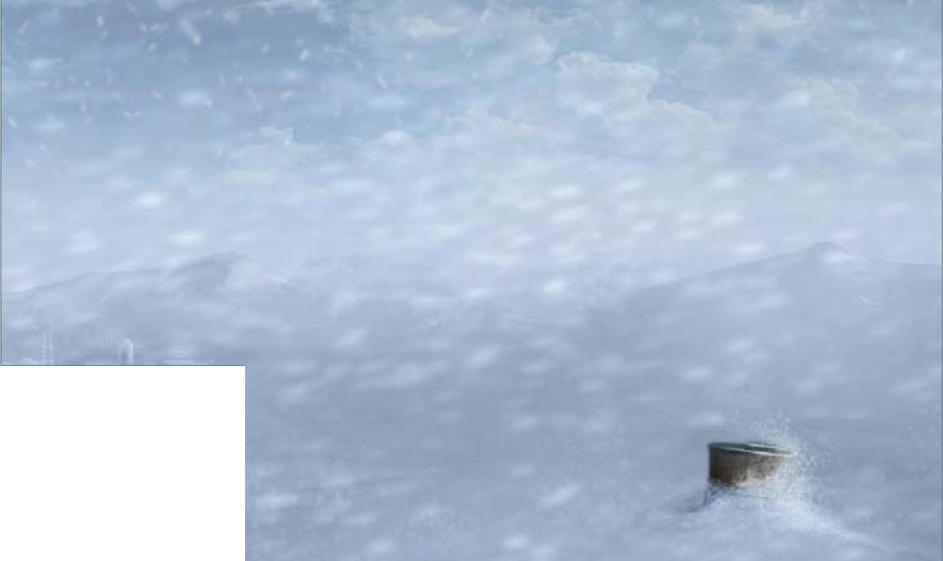
Now it’s time to add some little tweaks and the image is then done. We need to draw more attention to the trash can in the foreground, and the farm in the background. To do this, create another layer (Overlay, Opacity 77%) and fill it again with the Gradient tool and the color RGB 58, 60, 66, from the top right corner to the left corner. Now, on another layer, paint the windows from the farm in orange. Add another layer with Soft Light properties, and set the Opacity to 68%. Play with this last layer to change the amount of light coming from the windows. In this final step you can add whatever you want – use your imagination.
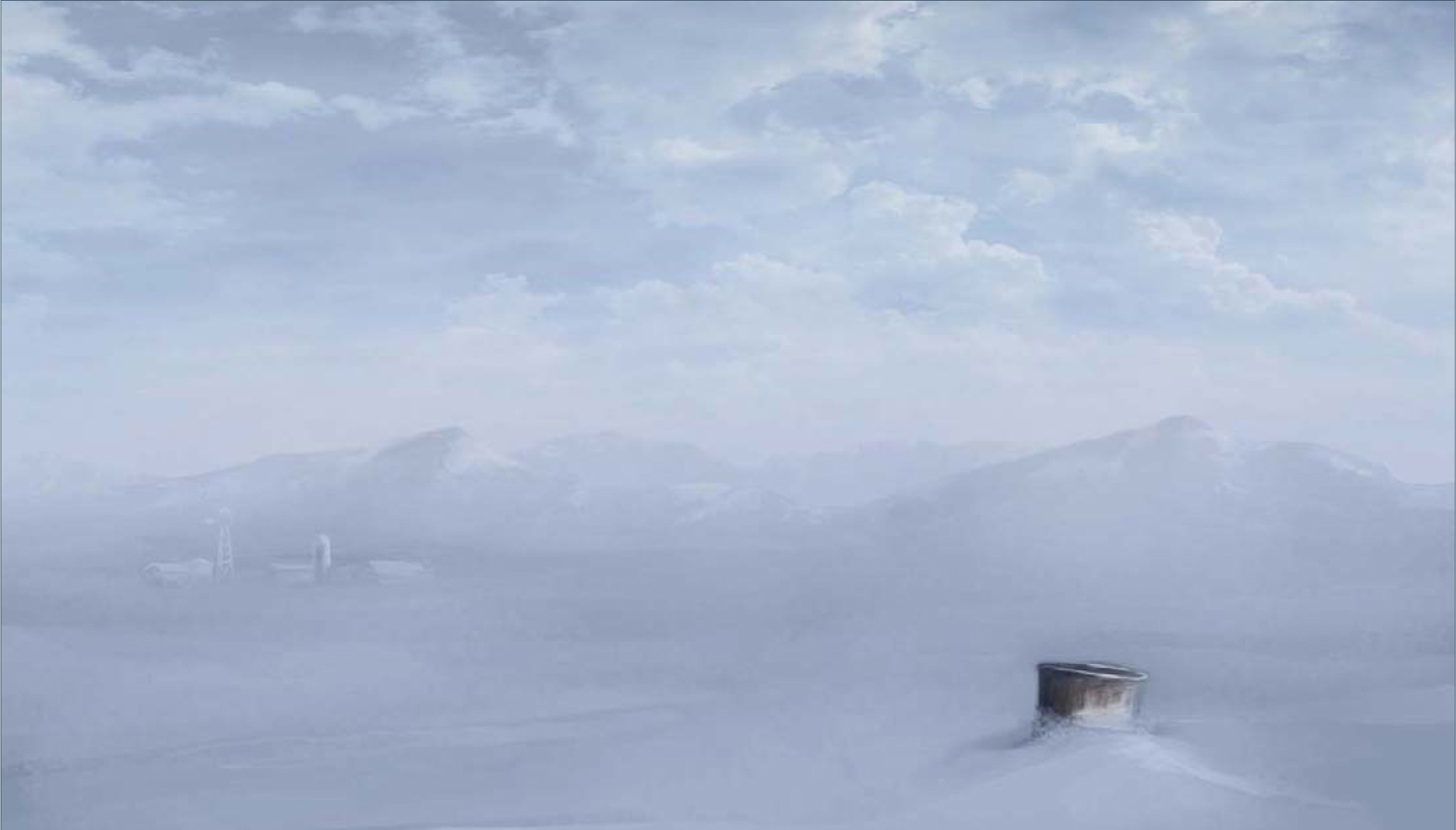
For the final layer I painted, using a soft round brush, some more fog onto the horizon, and the final color tweak was a Curves adjustment. So, open the Curves pop-up menu (Ctrl + M) and enter these settings: Input 172, Output 120 (Fig.08). If you want to, you can paint more snow on the trash can and maybe add some more snowflakes to the scene. Use all of your skills in this final step and add more details. When you feel that the image is done, save it and upload it to your portfolio! You can see how I added more snow detail on the ground and mountains in the final image (Fig.09); I did this with several low opacity strokes in the dark area of the snow.

© Carlos Cabrera
You can download a custom brush (ABR) file to accompany this tutorial from www.focalpress.com/digitalartmasters, along with the base painting (JPG) that Carlos starts from so you can take greatest advantage of this tutorial.

© Carlos Cabrera
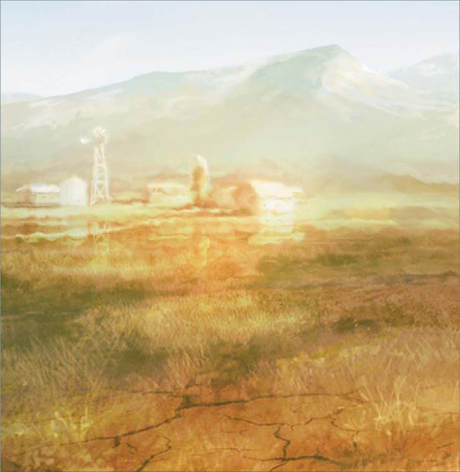
HEAT WAVES
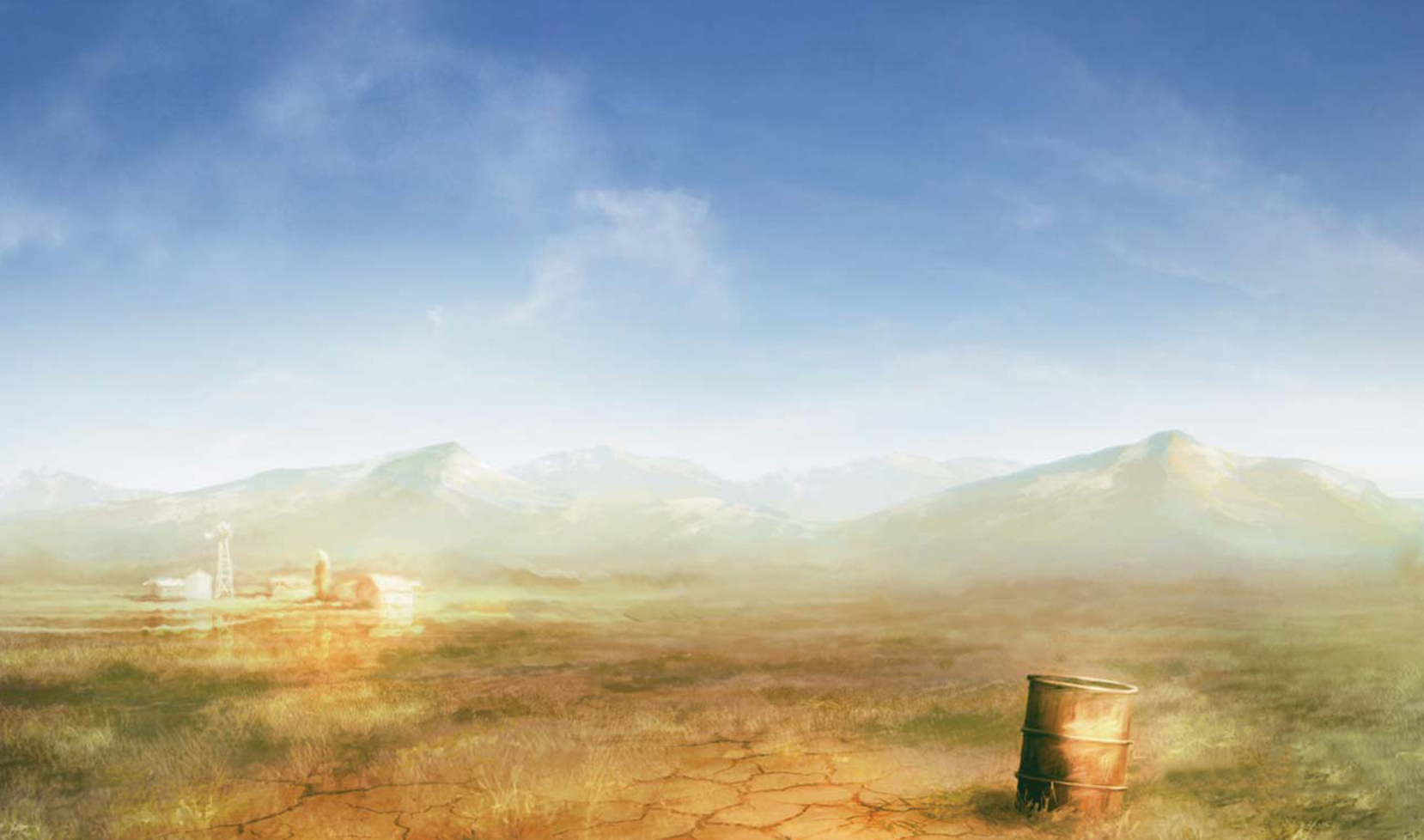
Before we begin painting we need more information about the subject. In this case we have to transform this image (Fig.00) into a warm desert. The first thing you have to do is find all the material you can get from internet about the subject: images, photographs, references, and so on. From this material, check the type of color schemes that usually have a desert-like, warm environment. If you check one of your reference images you will see that the colors are usually warm orange hues in this type of environment. One of the perfect examples of this kind of weather would be a photo from Africa, where you would see how the horizon line disappears because of the hot weather, and you’ll find that the heat waves distort distant objects. Well, this is exactly the weather effect we need, so let’s begin.
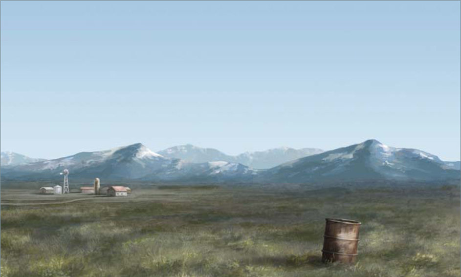
Open your base painting and check if you have something to modify. This particular base image is perfect for this brief: the grass is short, the sky is clean, and the solitary trash can in the foreground is ideal for this subject. The first thing we have to do is change the color scheme of the entire image to orange. Go to the little round icon in the bottom of your Layer window; create a new adjustment layer, then select Color Balance. Adjustment layers can be used for making many types of adjustments to your work, without actually doing anything to the original layer. This is perfect if you have to do modifications to your final image, so remember that these kinds of layers allow you to make non-destructive corrections to your images. For example, if you create a Curves adjustment layer, you can go back to the Curves dialog box later and change the settings at any time.
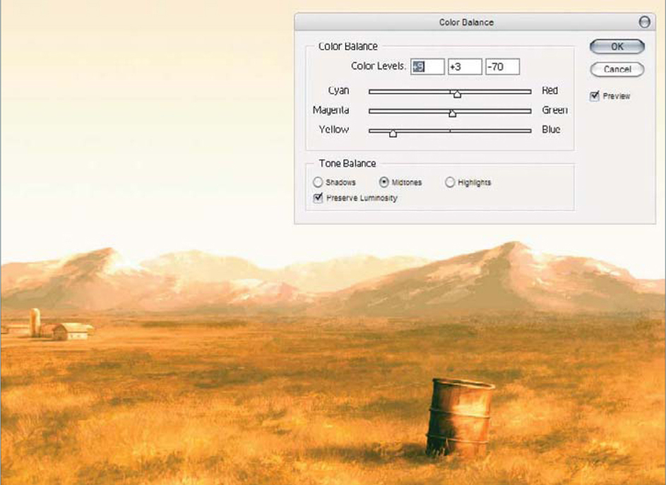
In the Color Balance dialog box, select Shadows and move the Cyan value sliders to −23, the Yellow values to −10, and leave the Magenta and Green values at zero. Now go to Midtones and move the value sliders to Red +9, Green +3 and Yellow −70. Now we have the shadows and midtones finished, so it’s time to change the highlights. Click on Highlights and move the value sliders to Red +100, Yellow −44, and leave the Magenta and Green values at zero. What do you think (Fig.01)?
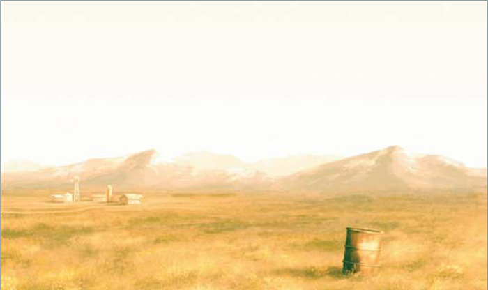
The image is orange now, but it doesn’t look like a desert, so we’ll have to desaturate the image a little. Let’s create another adjustment layer. Go to the little black and white round icon and select Levels. Into the three Level boxes input the values: 0, 1.62 and 244. The image looks really good now (Fig.02).
Now it’s time to add a simple sky. You can find one of these on the internet, or – even better – create one yourself. I painted this sky using the default Photoshop round brush with a low opacity (something like 30%). I painted the sky on the right-hand side because I felt that the image was going to be too heavy on the left side. When you paint the sky in a new layer, change the blend mode to Hard Light and move it below the adjustment layers. This step is very important because the sky must have the same color balance as the image (Fig.03).
We’ve finished with the sky and the color scheme of this scene now, so it’s time to change the ground a little. Create a new layer and move it below the sky and the adjustment layers; select the default round brush and paint a cracked, dry earth near the trash can. If you prefer, paste a texture instead of paint, but remember to change the blend mode of this layer to Pin Light or Hard Light, with low opacity (Fig.04).
Now we are going to create a heat reflection on the horizon, so go to Image > Duplicate and click on Duplicate Merged Layers Only. In this new merged image, select the Lasso tool and draw a selection over the farm, as you can see in the next image (Fig.05). Press Ctrl + C to copy the selected image and paste it (Ctrl + V) onto your original painting. Now, on this new farm layer, go to Edit > Transform > Flip Vertical, and position it as a reflection of the original farm. With the Eraser tool (E), erase – with a soft round brush – the contours of this flipped farm. If you change the blend mode of this layer to Overlay you can see how the reflection looks more real. We’ve almost finished the painting now, so let’s move on to the final step.
In this last step we’re going to use the mask mode to do a smooth selection. So press the Quick Mask mode icon in the tools palette (or press Q on your keyboard), select the Gradient tool and select a Foreground to Transparent gradient. Change the gradient from Linear gradient to Reflected gradient and paint – with black – the horizon line, as you can see in Fig06. Now go back to Standard mode again (Q). Create a new layer and press Shift + Ctrl + Alt + E and merge all the visible layers in this new clean layer. You still have the selection from your Quick Mask mode, so press Delete and erase the selection.
Why do we make all this mess? Well, it’s because we have to create the heat weaves. Rename this layer “heat waves”, then go to Filter > Distort > Wave and select a good value for your heat weaves. When you’ve finished it, you’ll have an image like Fig.07a – b. And viola – we’re done!
© Carlos Cabrera
You can download a custom brush (ABR) file to accompany this tutorial from www.focalpress.com/digitalartmasters, along with the base painting (JPG) that Carlos starts from so you can take greatest advantage of this tutorial.

© Daarken
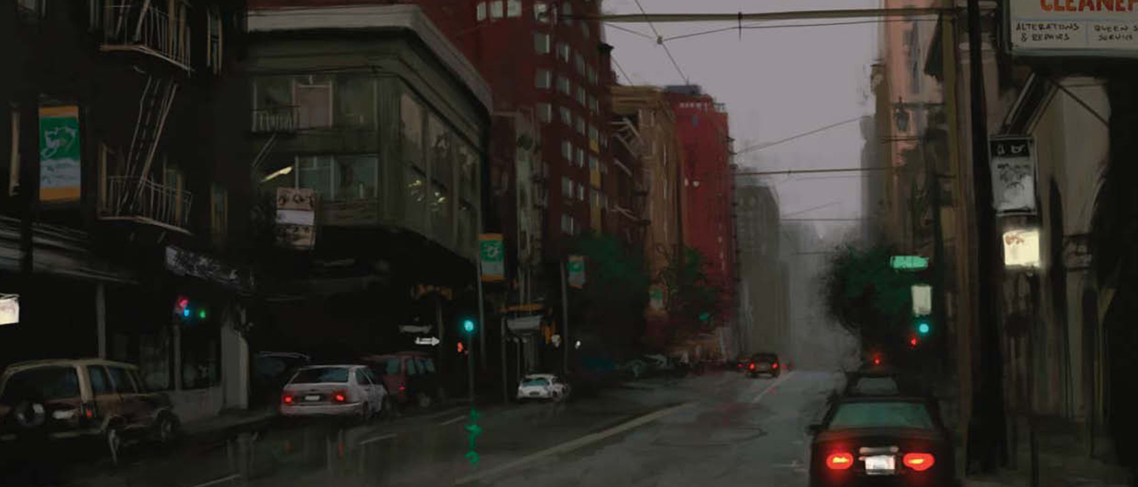
“ANOTHER RAINY DAY”: PAINTING A CITYSCAPE
Concept
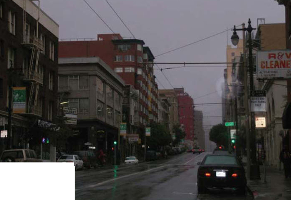
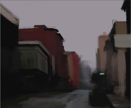
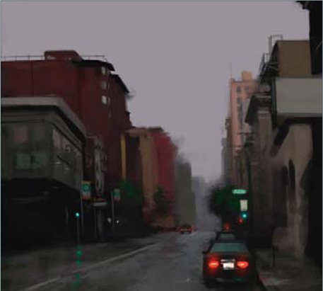
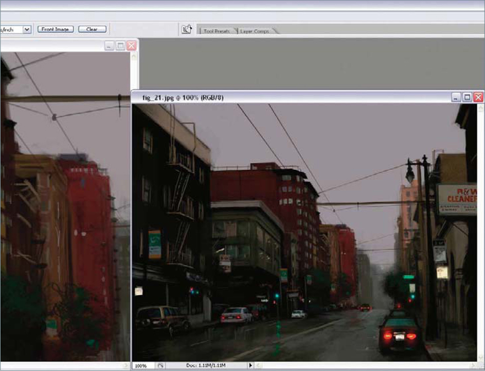
In this tutorial I will be showing you how to paint a rainy day scene without having to paint any weather effects, but rather the feeling will be conveyed purely based around color, mood, and some reflections on the street. I took the reference photograph for this image myself, a long time ago (Fig.00). It is a good idea to always shoot your own reference material, because that way you don’t have to worry about any copyright issues, especially if you want to sell your painting. When you are taking your reference, be sure not to use the flash. Using the flash will destroy any kind of lighting scheme you wanted and will also wash out the subject.
Daarken
The Block-In
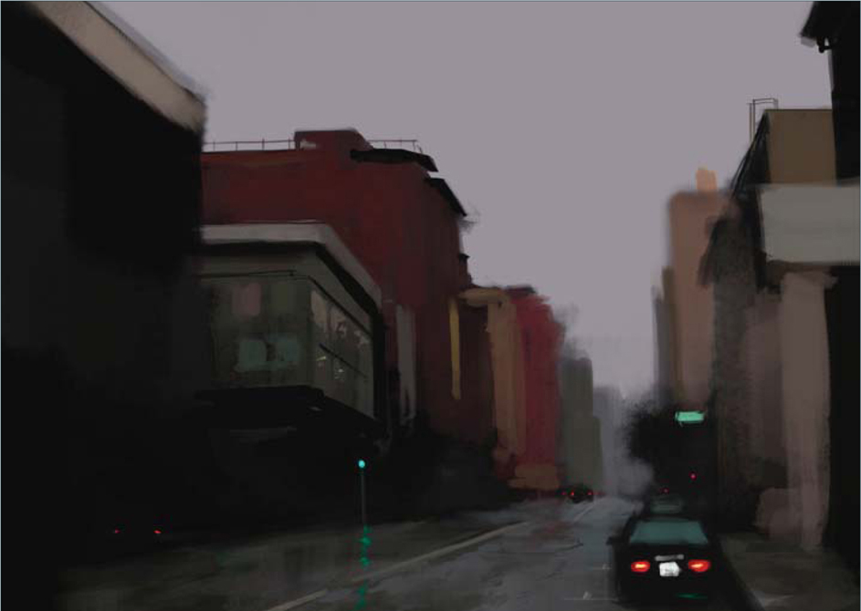
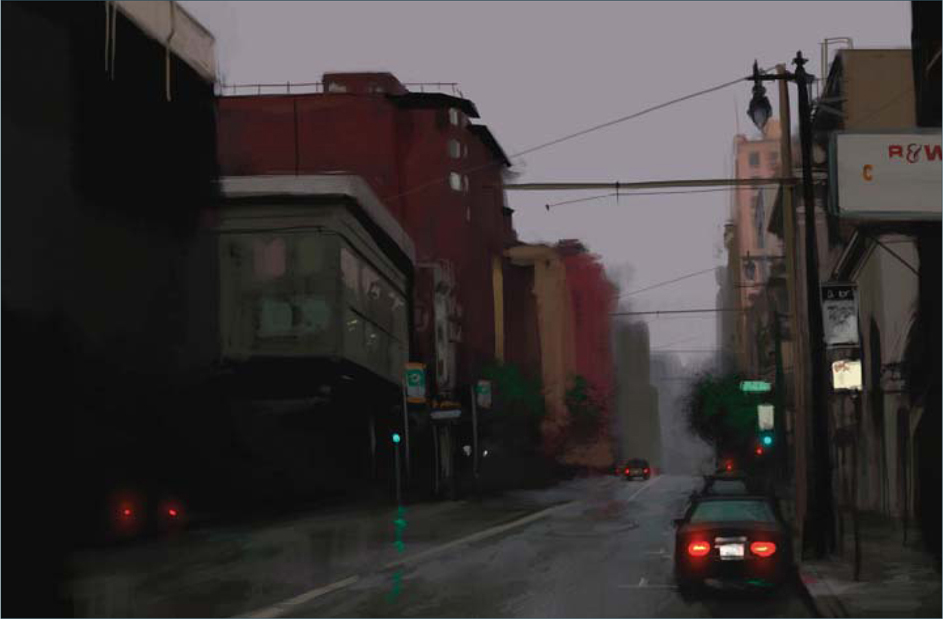
For the most part of this tutorial I will just be using two different brushes for this painting; a round brush and a rectangular brush. When I am painting from reference material I open the reference and place it next to my canvas (Fig.01). This way I can always look over at the reference while I am painting. I start out by painting in the color of the sky, and then block in the main silhouettes of the buildings in a dark color, but not pure black. Right now I am using the natural, rectangular brush. I like using this brush because it is very versatile in the fact that you can get soft shapes as well as hard edges. You can also rotate the brush to get brush strokes in different directions.
After I have all the main shapes in place I need to put in the base color of the buildings (Fig.02 – 03). Using the same brush I paint the buildings in the background with less pressure, as opposed to the buildings in the foreground. Usually things further away are softer, and things closer are sharper. Even when I know a building isn’t going to be dark in color, I will still block in the silhouette as a dark color because that way I can get some of the dark color to show through (Fig.04). This will give the surface some more texture and depth; otherwise it will look too flat.
I continue to work all around the canvas and try not to focus on any one particular element (Fig.05). This will allow me to get a greater feel for the image as a whole and not to worry about spending too much time on something, only to have it be out of place or in the wrong perspective.
Adding the Detail
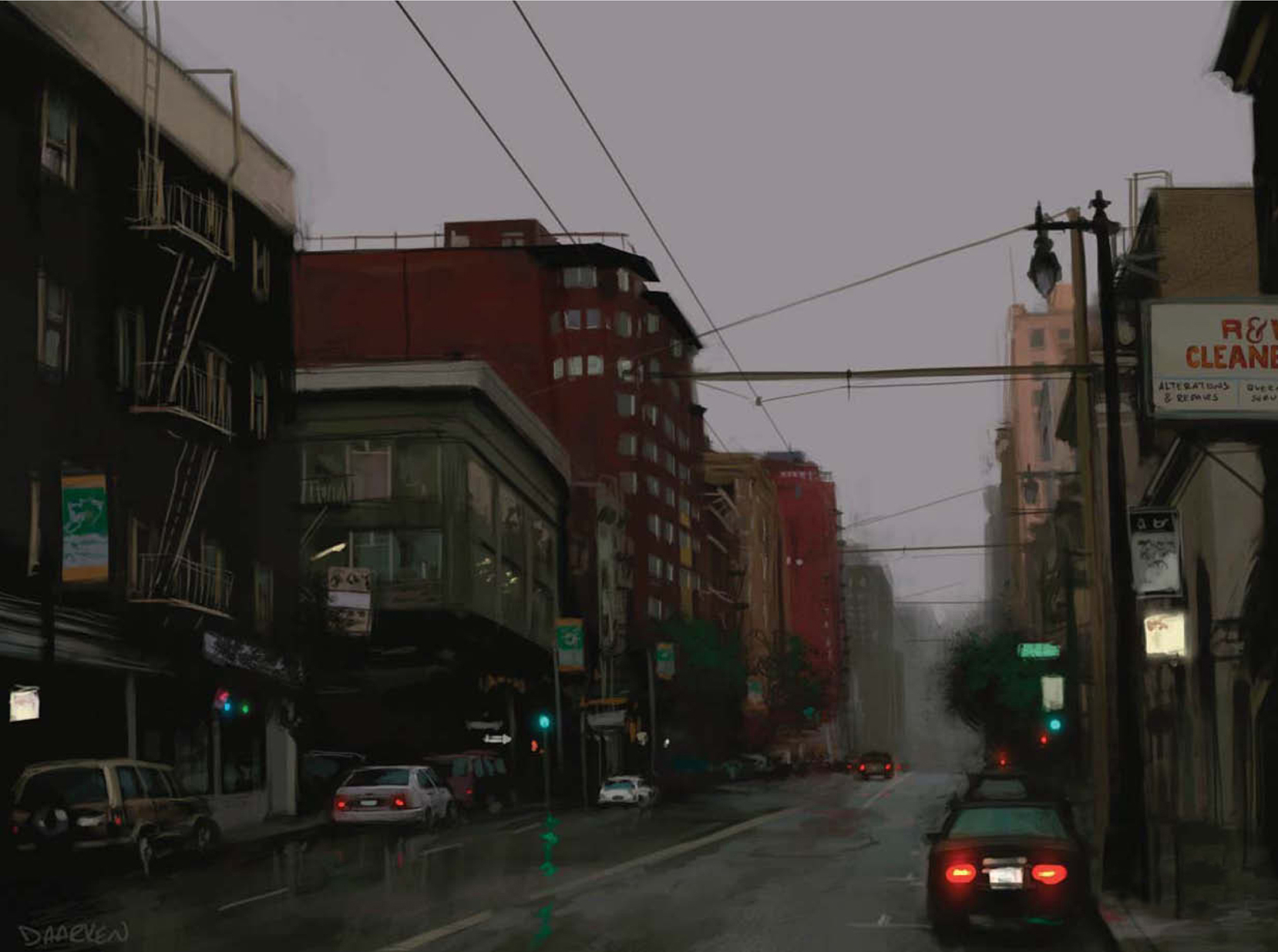
One of the really cool elements in painting a cityscape is the lights. The red tail lights of the cars act as a directional element that lead the viewer’s eye throughout the piece. Adding lights will also give your illustration a livelier feel to it, almost as if it were alive itself (Fig.06 – 07).

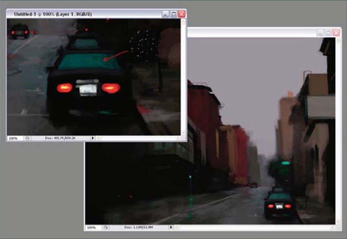
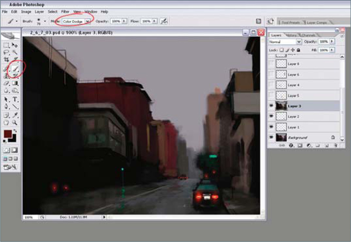
The brush I used to simulate rain droplets on the rear window of the car is a type of speckled brush (Fig.08) (I also use this brush a lot when I am painting facial hair on men). The red tail lights look okay right now, but I really wanted them to feel like they were glowing. An easy way to do this is the use the Color Dodge setting on the brush (Fig.09). Do not use the actual Dodge tool because this will desaturate and wash out your painting, but instead use the Brush tool, and from the drop down menu select Color Dodge. Using this setting will preserve color in your painting and will make it glow. I usually pick a darker color than what I want, because otherwise you will risk over-exposing your image. In order for this to work you will need to use this brush on a layer that has your entire illustration on one layer. If you are working in layers just hit the Ctrl + A hot keys to select the entire canvas, and then again hit Ctrl + Shift + C to copy all layers. Now just hit Ctrl + V to paste the illustration into a new layer. Now you can use the Color Dodge brush on this layer.
The other brush that I used a lot in this illustration was just a Photoshop default, round brush, with the Opacity set to Pressure. Using this brush will give me some harder edges than the rectangular brush I used for blocking in the main shapes (Fig10 – 12). Edge control is a very important aspect of a painting, and can cause an illustration to either succeed or fail. Most of the time I use the hard round brush for when I am painting elements such as railings, poles, and wires. I try not to use the Shift key for drawing straight lines, but instead I just do them freehand. Doing this will give more life to your painting and it won’t look so mechanical. Some of the lines look pretty straight, but that is only because I will keep redrawing the same line over and over until I am satisfied with the way it looks. Remember that the Ctrl + Z (Undo) hot keys are your friends.

For many of the colors I have been picking color directly from the photo, simply because it saves a lot of time. I would actually advise against doing this because it doesn’t require any thought. In time you will start to lose the understanding of color and you will not be able to identify which color is which. You will begin to catch yourself thinking, “Is that color more blue or yellow?” It is good practice to look at a color in a photo and try to pick the color yourself just by looking at it. Also, picking colors from a photo is generally bad practice simply because colors in photos are usually not very accurate, and can be washed out or dull. But anyway, I am being bad and color-picking here.
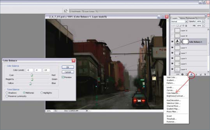
I wanted some more color harmony in my piece, so I decided to change the Color Balance of the illustration (Fig.13). An easy way to do this without actually changing your painting is by clicking on the half-black, half-white circle at the bottom of your layers palette; doing this will open up a window in which you can choose different options to change. I chose Color Balance. The Color Balance dialog box will open, and it is here that you can change your colors. I pulled the sliders towards more Yellow, Magenta, and Cyan. You can also change the tonal balance by selecting Shadows, Midtones, and Highlights. It is fun to play around with these different settings.
The Final Touches
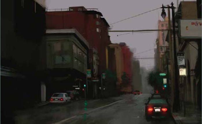
All that is left now is to add in some of the final details to the buildings, like the windows, signs, and railings (Fig.14 – 17). I am also adding in the rest of the cars on the left-hand side. These steps only take a few minutes because I am painting pretty loosely. One of the things I always battle with is how refined I should make an illustration. For this painting I wanted a more painterly feel, and not something that looked too photorealistic. You can see from the detailed shot that the cars are pretty loose, especially the ones that are further away from the viewer (Fig.18). Even when I am painting something this small I still paint zoomed out to about 25%. This allows me to keep things looser, and I can also judge what it will look like zoomed out at the same time.


I think the hardest thing that I battled with in this illustration was the sign on the right (Fig.19 – 21). Adding lettering to any illustration is tricky, because people like to read things in paintings, and often they take a lot of focus away from the rest of the piece. I didn’t want the sign to be too much of a focal point, and I had been avoiding finishing the rest of the text. In the end I finished the text, but I tried to keep the value range between the letters and the background fairly similar so as to not call too much attention to it (Fig.22).
© Daarken
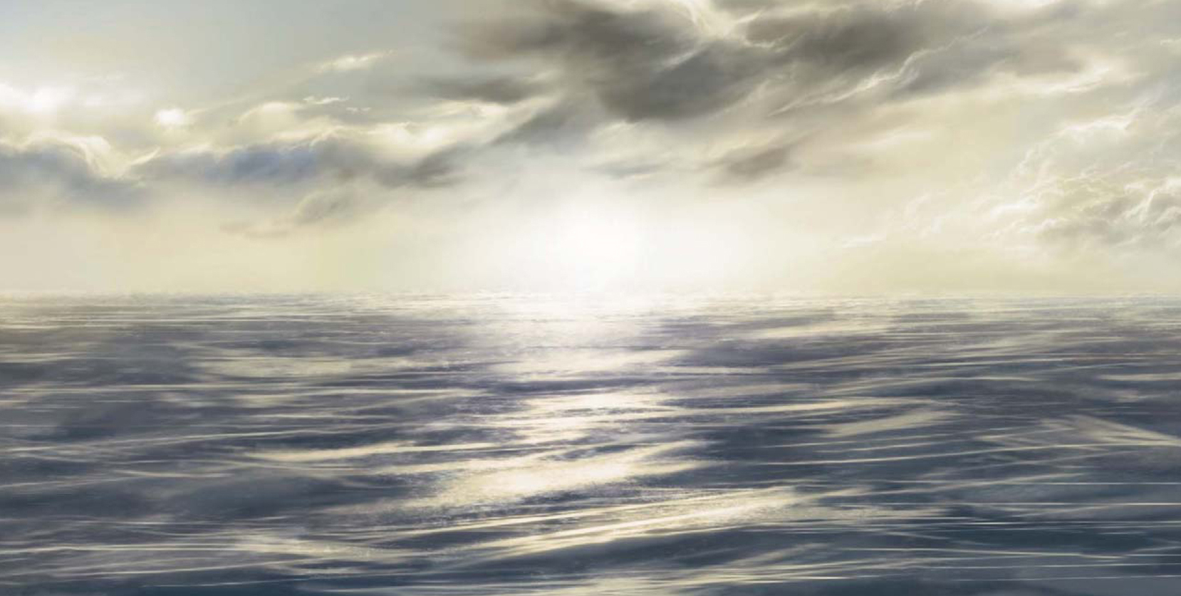
PAINTING A WATER SURFACE/WAVES
During this tutorial I will try to outline one way to go about painting water that is representative of a calm sea. Now, this is a subject that varies greatly and is dependent on so many factors that it is almost impossible to lay down strict rules and guidelines. Water by nature is highly fluid and transformable, and therefore does not have a particular form to it. It is both transparent and at the same time very reflective, and so is always at the mercy of its environment and surroundings in the way it is perceived by the human eye. It is also affected by light, weather conditions and gravity, and so can appear in an infinite number of ways. Awaterfall or fast flowing rapids look white and opaque compared with a still pool for example, and the color of the ocean always reflects the sky above it. Therefore the way we go about painting water is always reliant upon a number of issues and aspects in our scene, and all of these must be considered before we begin. As I have already mentioned, this particular tutorial concerns a relatively calm sea and so the only real issue to be mindful of is the sky. If we were to include land masses or trees, for example, then these elements would undoubtedly have a bearing on our painting.
Step 01
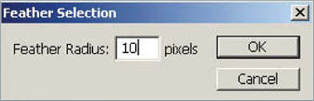
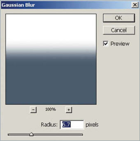
So the first thing to do is block in our horizon line and color of the sea. I have decided to start with a dull gray blue, but this can easily be changed later on. On the background layer fill in the whole picture with a white, and then, using the Rectangular Marquee tool, create a selection area at the base of the image. Then go to Select > Feather, enter about 10 pixels and fill in with a blue color, as seen in Fig.01a – b. With this done, select the entire image and go to Filter > Blur > Gaussian Blur and enter around 6.7 pixels. This will sufficiently soften our horizon line and lessen the transition between the sky and sea (Fig.01c). This of course is not always how we perceive the horizon – sometimes it is very crisp, but for the purposes of the tutorial we shall create a bit of atmospheric perspective.

Step 02
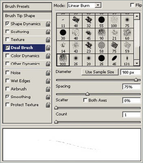
With the two colors blocked in the next thing to do is start to create the reflections across the surface, which will define the motion of the water. I decided to make a reasonably calm sea without too much turbulence, but enough to create a pattern. For this I started with a standard soft round Airbrush, and under the Brushes tab added a sample tip as a Dual Brush with settings similar those shown in Fig.02a – b. I then created random strokes across the blue on a separate layer using a variety of brush diameters and using a pure white (Fig.02c). I then set the layer Opacity to 50% (Fig.02d).
![]()
Step03
The next stage involves creating a new layer and doing exactly the same thing, except creating marks in different areas (Fig.03a). Set the blending mode of this layer to Pin Light and turn the Opacity down to around 70% – you can see the two layers combined in Fig.03b.
Step 04
In this exercise I am going to have a setting sun in the center of the image, just above the horizon line, and so will need stronger reflections at this point. So again, on a new layer, using the same process as before, add in some extra highlights below the position that the sun will occupy, as seen in Fig.04. You will notice that my marks are quite rough, but do not be worried about that at this stage as we are far from finished. When you are happy with the layer, set the blending mode to Linear Dodge and leave it at full Opacity.
Step 05
Make a copy of this layer and then add a Gaussian Blur, similar to the amount seen in Fig.05. Keep this layer set to Linear Dodge.
Step 06
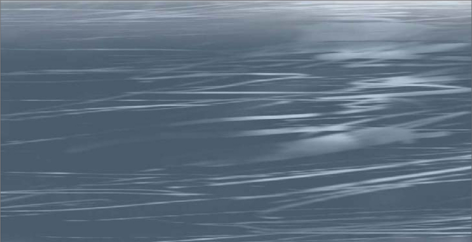
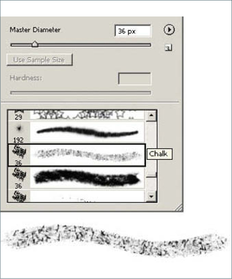
So far I have only used one brush to paint the highlights, but to give the water a shimmering quality I will need to use a different brush – in this case a standard Chalk brush (Fig.06a). This will break up the edges of the light reflecting on the surface and help create the impression of a sun low on the horizon. Concentrate the brush marks near the horizon where perspective reduces the visibility of the waves, as seen in Fig.06b. You will also notice that I have added in a simple sky to help contextualize the water and show how the two are codependent.
Step 07
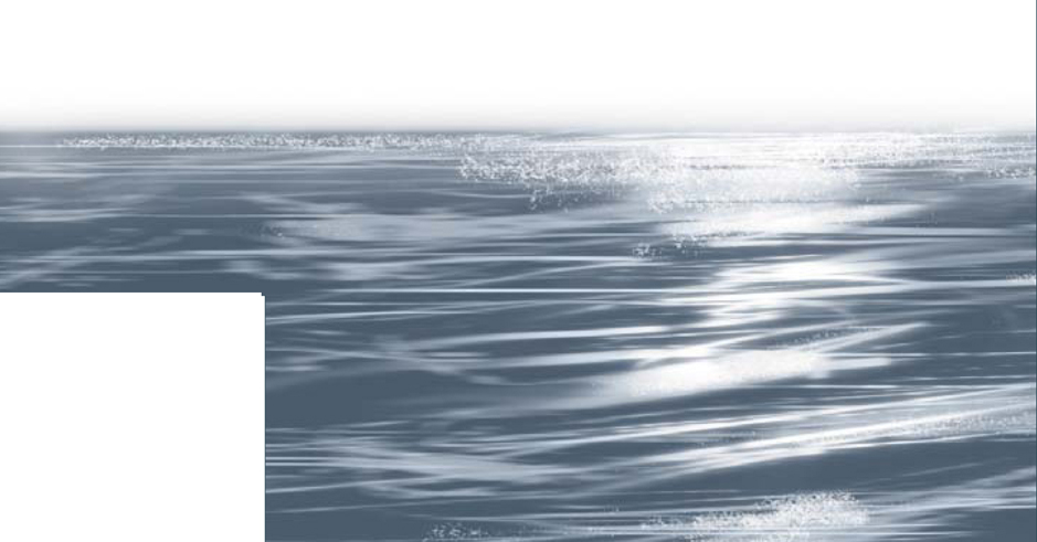
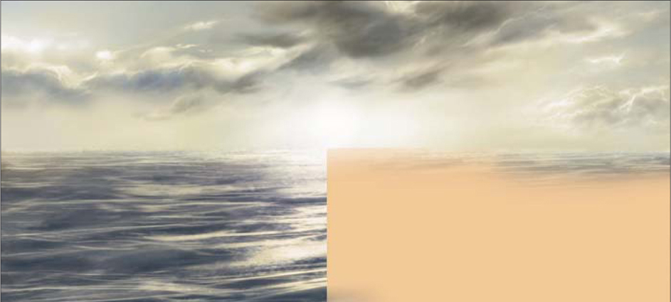
Using the Chalk brush I have added some marks across the water, but concentrating around the central section of the image on two separate layers, similar to the way I made the initial highlights. I then blurred both layers slightly to soften the effect, and the result can be seen in Fig.07.
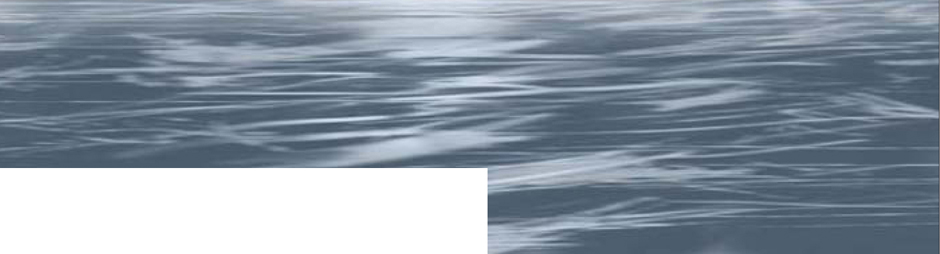
Step 08
There is no need to really add too much more detail on the water now. We have reached a stage where we have enough information to interpret the brush marks but have not labored over them too much. The overall image remains very blue and suggests an almost early afternoon light, but as the sun is low in the sky it seems as though an Overlay would help imply an evening light. The first thing to do is select a dull pink with an RGB value of 146, 134, 136, and fill a new layer entirely. Then set the layer mode to Lighten and erase areas near the base of the image and across the clouds (Fig.08). This will produce the subtle impression that more light is bouncing off the water in the mid-distance from a low sun, which will help the sense of perspective. On the left of Fig.08 you can see the line where the layer has been added, compared with the right side which is as it was after the previous step.
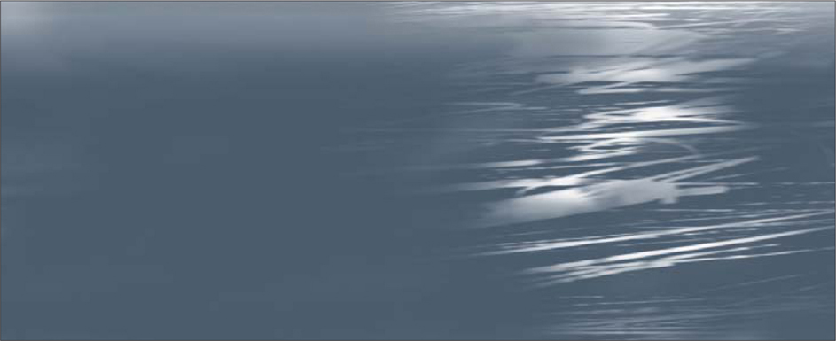
Step 09
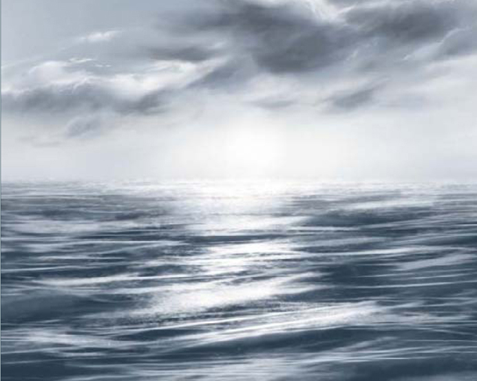
We are now going to add a warmer Overlay across our sky and the lighter areas of the water. We can limit the areas we apply the color to by going to Select > Color Range, and using the eyedropper to select the highlights. Once done, feather the selection by no more than 2 pixels, and again, on a new layer, fill in with an orange yellow and set the blending mode to Color at around 25% Opacity. In Fig.09 you can again see the before and after effects of this, and how the yellow has been limited to the lighter areas.
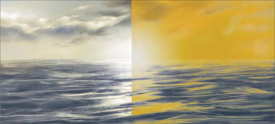
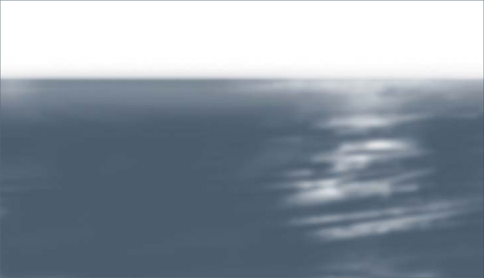
Step 10
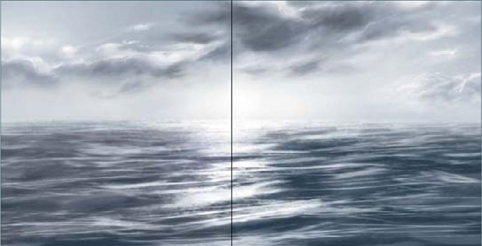
Last of all we are going to add one more Overlay to the water only, so that the sun is the brightest area in the picture. Choose a pale orange and fill in an area across the whole of the water, and then set the blending mode to Multiply at around 20% Opacity. In Fig.10 you can see how this looks before we change the blending mode, and how it looks afterwards. On this layer I have erased some of the color across the sky so there are some cooler blue tones remaining, in order to avoid too much uniformity.
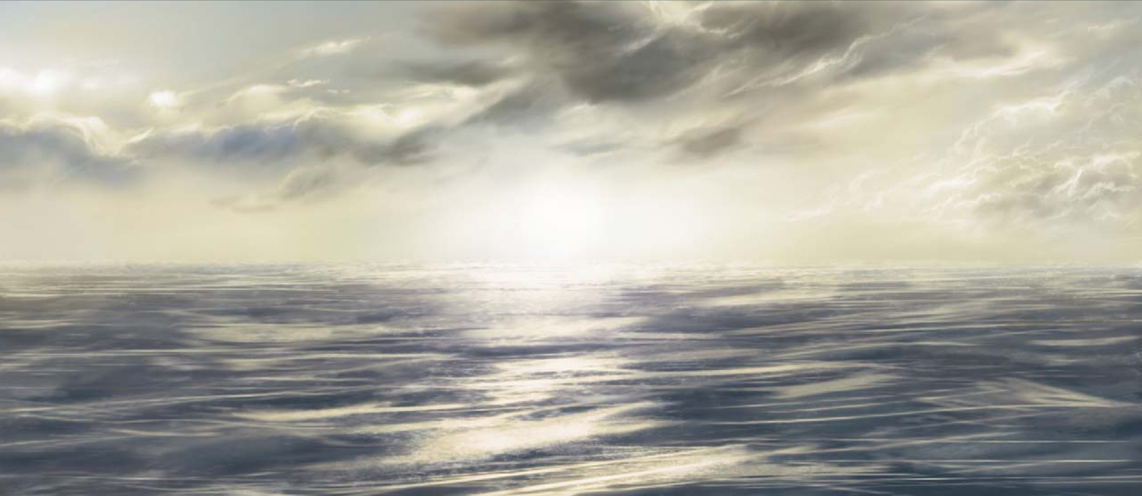
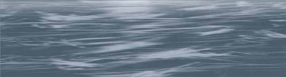
That about concludes this tutorial; as always refinements could be made but hopefully it will prove useful to many people wishing to paint seascapes. The final image can be seen in Fig.11.