
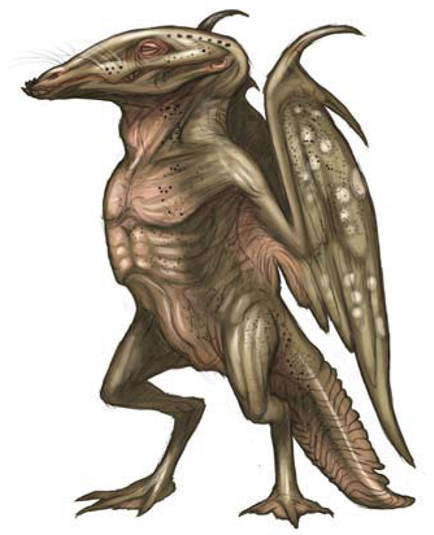
Creatures
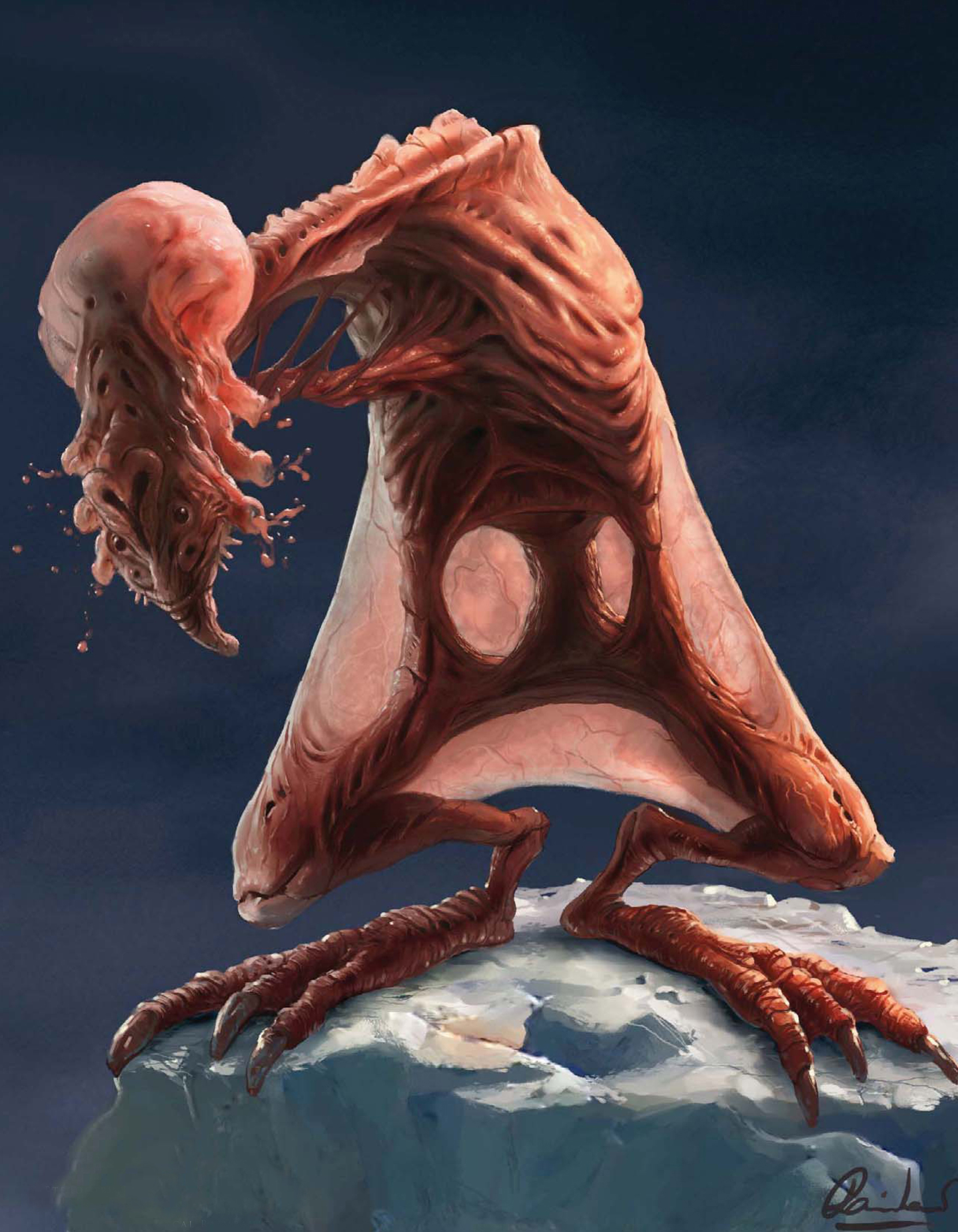
Similar to being an environment artist, many find themselves dedicating their time to character and creature design which involves a very different set of skills, namely knowledge of anatomy. Creature design forms a huge part of many projects stretching from video games to film and TV, and covers both animals existing in the real world through to aliens – think of films such as Jumanji and the Star Wars saga. This chapter will offer a vision of the issues to consider not only when painting animals but also in the creation of original designs.

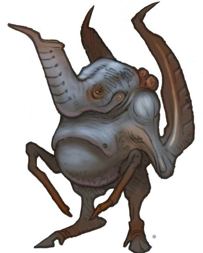
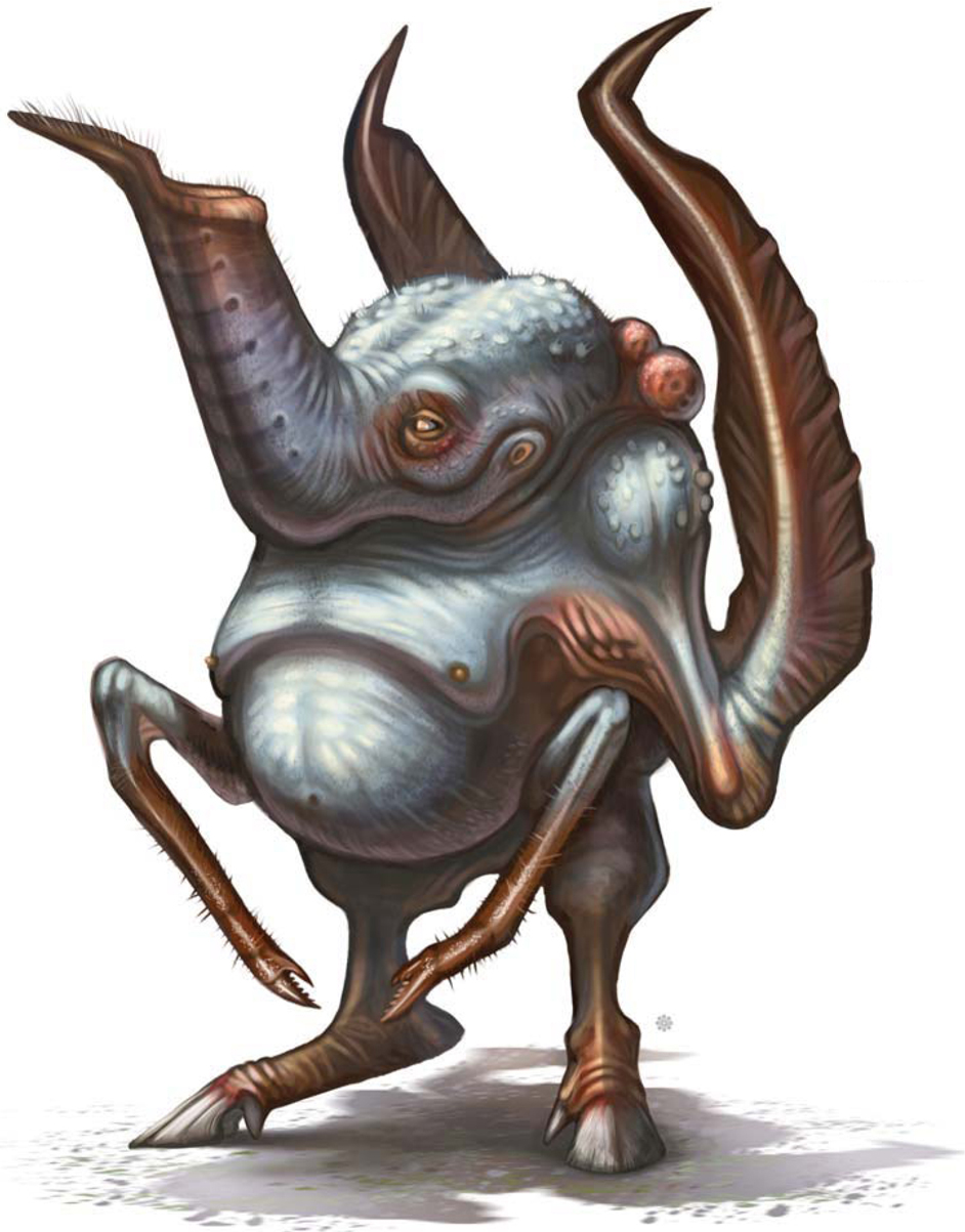
©Matt Dixon
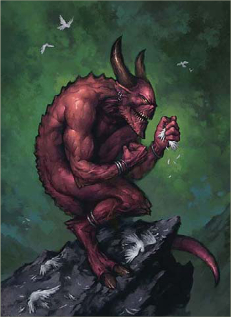
THE MAKING OF “BIRD CATCHER”
Here I’m going to try to explain my Photoshop painting process, from the first doodle through to a finished painting. As I go along, I’ll detail both what’s happening on the canvas and what’s going around my head. I’ll be working on a 2480 by 3508 pixel canvas (A4 at 300 dpi). This is high enough resolution, should I ever want to print or publish the image in the future, and also fits nicely on my monitor at 25% magnification which allows me to see the whole image as I work; except where stated in the text, the painting is being worked on at this magnification throughout.
A Note on Brushes
I use my own custom brushes for all my paintings, though I’m not going to go into any detail on brush creation during this walkthrough. There are two reasons for this:firstly, there are plenty of excellent brush tutorials already and I don’t feel that I have much to add to the information already available; secondly, Photoshop’s brush engine is very easy to use and I hope anyone with an interest in custom brushes will take the time to experiment with the settings on offer to find their own custom brush settings – it really is a lot of fun, and certainly the best way to learn!The brushes I use fall into three basic categories: soft edged, hard edged and texture. I’ll mention which I’m using as I go along and it really doesn’t matter exactly what brush is being used as long as they fit into those basic categories. The standard Airbrush, Dense Stipple 56 (Natural Brushes set), and Rolled Rag – Terry 120 (Faux Finish set) Photoshop defaults will do just as good a job as any fancy custom creation if used correctly. Whatever brush I’m using, I have my graphic tablet set up the same; stylus pressure controls opacity and nothing else. I use the square bracket keyboard shortcuts to control the size of my brush while I work, and I vary this regularly to break up the marks I’m making.
One final brush setting to be aware of is Texture. I use this a lot to help break up my brush marks, and it’s worth spending some time experimenting with this area of the brushes palette to see what kind of effects can be had. Again, the Photoshop defaults are perfectly acceptable in most situations, particularly the Texture Fill and Rock Pattern sets.
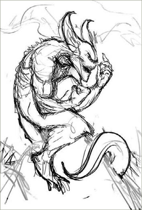
Sketch
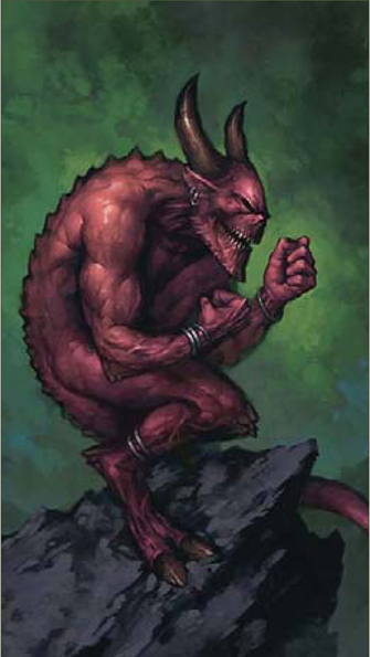
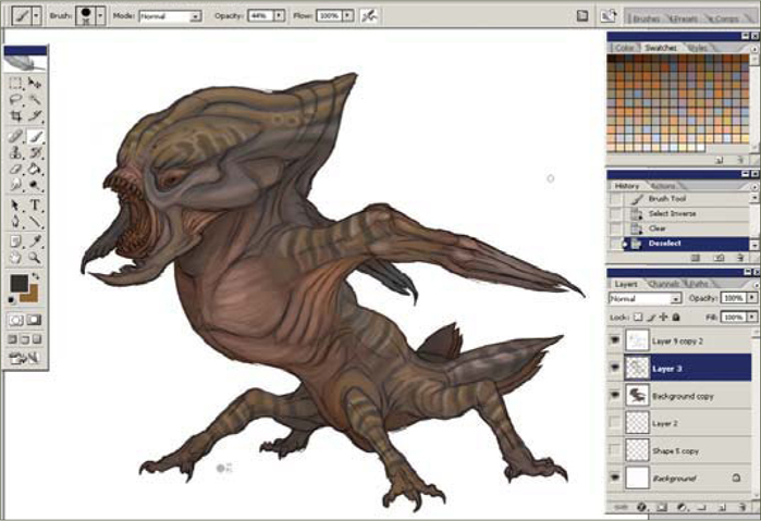
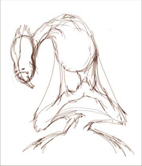
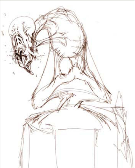
I begin by sketching out a rough idea for my image (Fig.01). I’ve decided to paint something fun for myself, so I’ve chosen a fantasy demon character, but that’s as far as my concept goes at this stage so I just doodle around for a while. The hunched-over pose was suggested by imagining the character’s spiteful, covetous personality; I find it really helps to try and get into the spirit of the image I’m working on so there’s a fair amount of face-pulling and growling going on while I scribble away. As you can probably see, I’m not that fond of working with lines, so as soon as I have something that feels right, however rough, I’m ready to move on.
Value
Here’s where the painting begins. I’m much happier here than with a sketch, and I’ll often begin a piece by jumping straight into this stage. I create a new layer, filled with a midgray, and proceed to block in a tighter version of the image working mostly with a large, hard-edged brush (Fig.02). I’ll click my working layer off to reference the sketch every once in a while, but I’m not concerned with tracing any part of it – I’m looking here to refine the idea into a strong composition. Ideally, I’m trying to compose an image that can be read by silhouette alone for maximum impact, so I’m working with just two or three mid-to-dark tones. I think I’d consider this stage the most important part of the painting process – these basic values are the “bones” of the image and if it doesn’t work here, no amount of work with color or detail will rescue it.
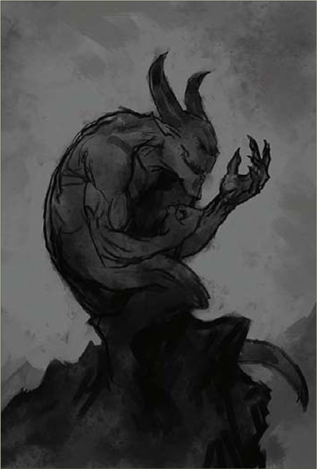
Once I’m happy with the placement of values in the composition, I’ll begin to define the significant forms a little, again working with just a couple of tones to keep things bold (Fig.03). I take the opportunity to tweak the position of the demon’s hand here, so he appears to be looking more directly at its contents. What is he holding? It needs to be something bright to draw the viewer’s eye to that point, but I still haven’t decided quite what it should be. I often leave trivial elements like this undecided as I find it helps to keep me interested in the picture as it progresses. Generally speaking though, this is bad practice and I’d recommend working things like this out thoroughly at this stage.
Under-Painting
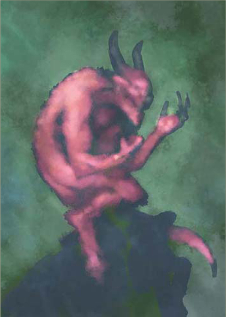
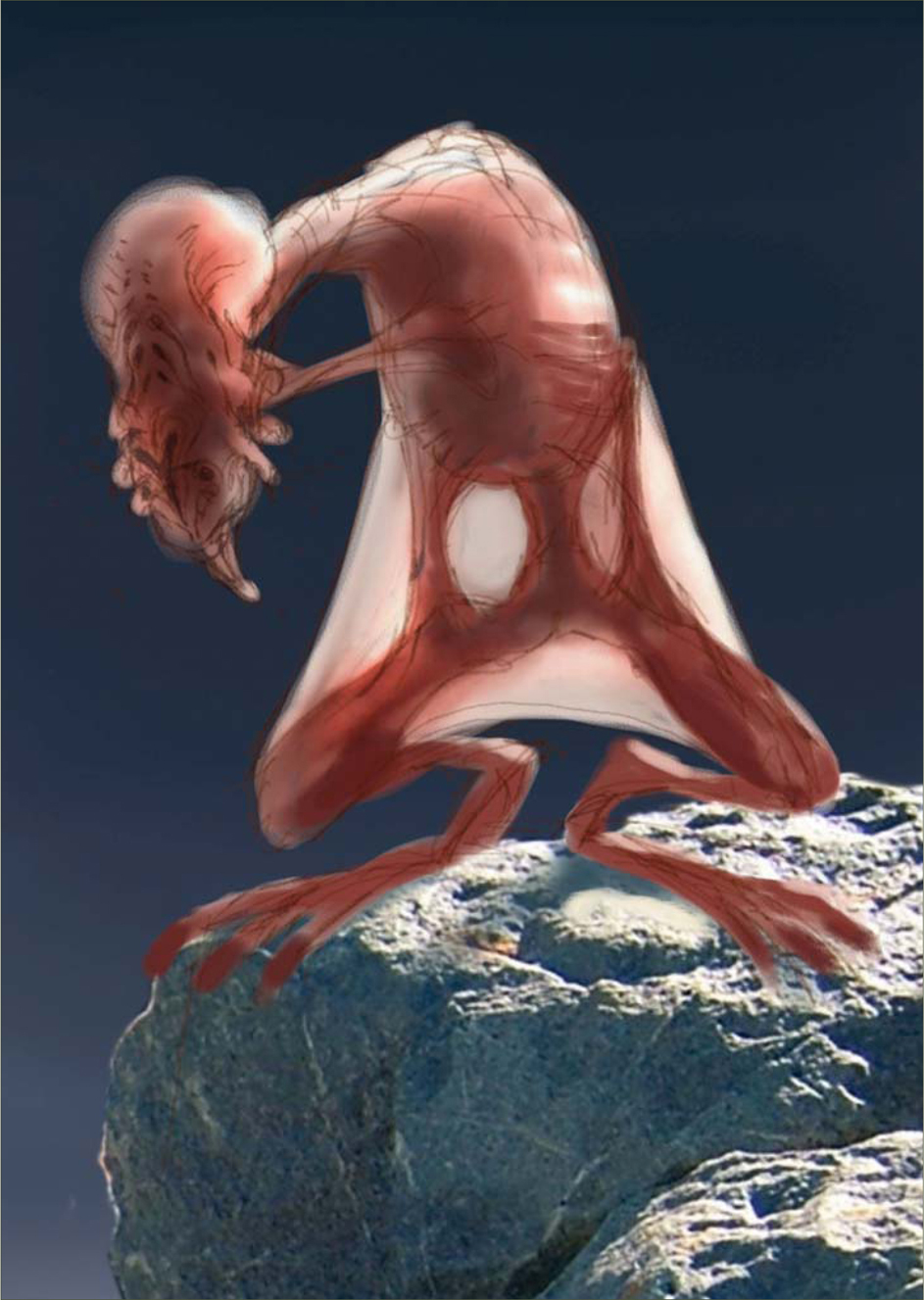
Next, I duplicate the painting onto a new layer which I then set to Multiply, with the Opacity dropped to around 70%. On the layer beneath, I begin to lay down some basic colors (Fig.04). I want the overall color scheme to be quite cool, but with some warm tones in the demon’s flesh to pull him out of the background, so I begin by filling the base layer with a gray-green color. On top of this, I work some lighter tones into the background with a large, soft brush to strengthen the character’s silhouette – I’m adding some bluish hues here to cool off the green base. Now it’s time to work on the demon, so I roughly block in the character’s form with a desaturated purple to give a little contrast with the green/blue background, before adding pink and orange flesh tones on top. Essentially, all I’m doing here is coloring in the value sketch – I’m not concerned with adding any extra definition to the painting just yet, as you can see from the rough-and-ready state of the base layer (Fig.05). When I’m done here, I flatten the image. That’s the last time I’ll use layers on this painting until the very final stages.

A Note on Layers
As far as possible, I like to work on a single layer when I paint. This allows me to focus simply on the painting process and not layer management – I always seem to end up painting on the wrong one if I have more than two layers, anyway. There’s very little in the way I work that actually requires layers – if I make a mistake I’ll paint it out, or use the history palette to undo that stroke.
Rendering
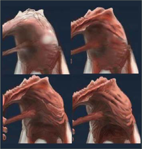
With the basic colors established, I can start rendering (Fig.06a). I find it easier to gradually build up the rendering from dark to light – this first pass will define the forms with mid-tones. Hopefully the detail shots will help to show how I approach this stage (Fig.06b – d).
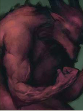
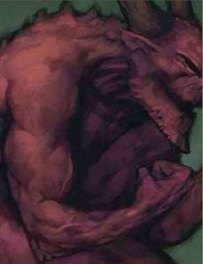
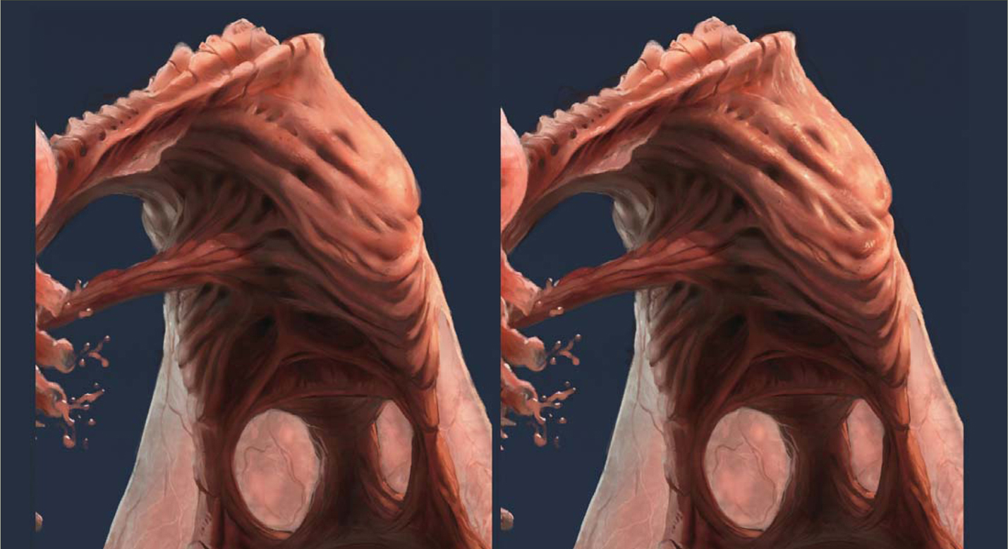
I begin by color picking from the area of the painting that I intend to work on (the shoulder and upper arm in this case), then shift that color to be slightly brighter to provide me with my mid-tone, perhaps also shifting the hue to make it slightly warmer depending on where I’m working. I’ll then use a soft brush to dab this color back onto the area I want to render up, working very gently to keep the opacity low. This lifts the general brightness in the area, without obscuring too much of the under-painting. Now I’ll swap to a hardedged brush and begin to slowly work up the forms I approach this very much as if I were using pencil crayons, or scumbling with oils, gradually building up the color with a series of light, repeated strokes. Using a texture on your brush (see “A Note on Brushes”) really helps here. In some places (veins and around the chin and eye) I may use a heavier stroke to introduce some hard edges, working back over them with soft strokes if necessary. I’m mostly adding lighter tones here, just occasionally color picking a dark color to add a hard edge here and there.
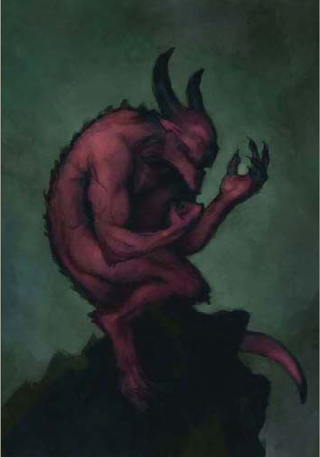
This process continues around the image, taking care to work within the overall pattern of values laid out at the beginning (Fig.07). For the most part I’ll remain at 25% magnification for this stage, though I’ll zoom in to 50% here and there where I want to tighten things a little further.
Background
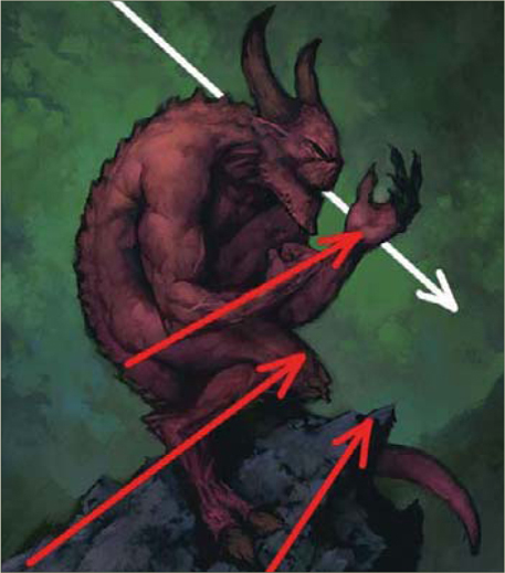
Now it’s time to throw in a background (Fig.08a). I follow a very similar pattern here to the rendering process above – color picking in the area that I intend to work in, shifting the color to provide me with the hue I want, then dabbing with soft and texture brushes before finally working in around the character with hard-edged brushes. I choose quite a strong green here as I like the way it contrasts with the red flesh, and then introduce some blues around the bottom.
An abstracted background such as this can be very useful in balancing out the composition. The flow of the picture up to this point is very much on the diagonal, from bottom left to mid-right, through the angle of the rock and the placement of the demon’s limbs (Fig.08b). I’m hoping to balance this by introducing a contrasting flow in the background (white arrow). If I’ve done it right, the flow should converge on the demon’s open hand, reinforcing it as the principal focus in the image.
Details
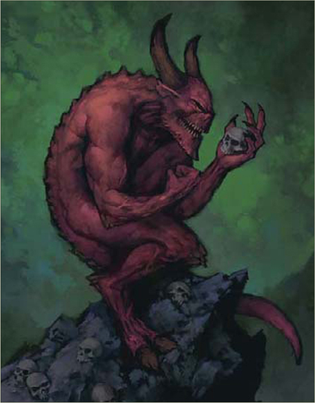
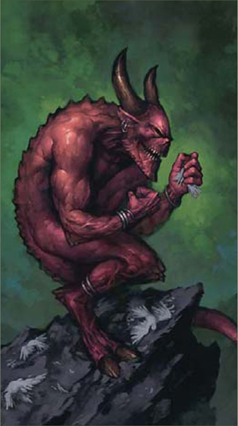
I can’t put off tackling the contents of that hand any longer. Several ideas have come to me while I’ve been working – a captive fantasy damsel, a kitten, the remains of a brave warrior … None of them seem right somehow, so I decide to play safe and go for a skull, with a few other skulls scattered on the rock (Fig.09). I build up the skulls in the same way as the rest of the image – painting in dark base tones first, and then layering lighter colors on top until they’re at the same mid-tone rendered level as everything else.
Final render
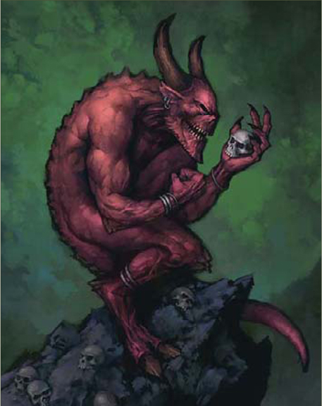
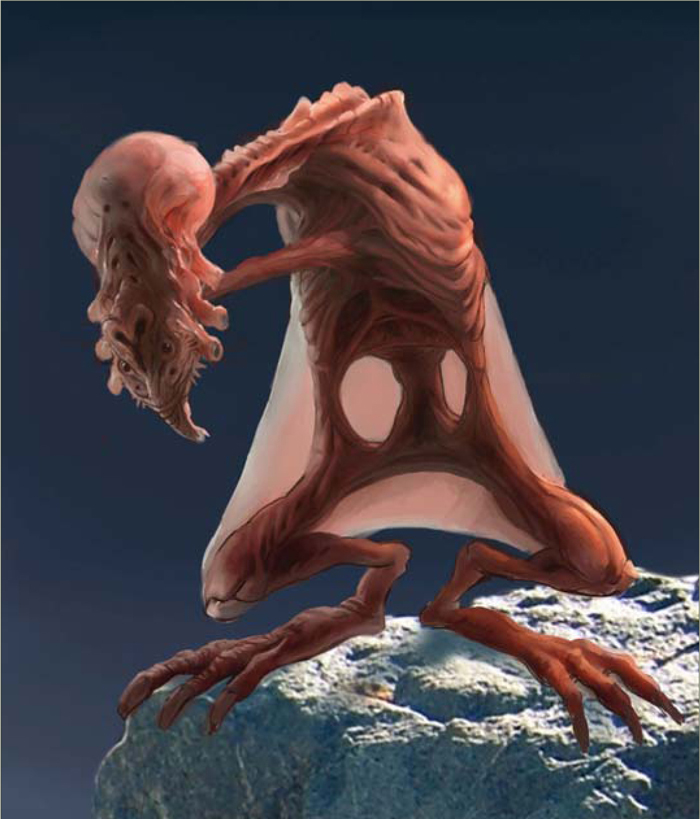
Time for a final render pass! I follow the same technique as before, dabbing with a soft brush and refining with a hard-edged brush, but with progressively lighter tones (Fig.10). I don’t want to overload the painting with details, so I’m treading very lightly and trying to pick out only what’s necessary – the shoulder, arm and fist, the demon’s face and the skull in the hand. I know I still have highlights to come, so I’m not taking things too far. I also added a few simple pieces of jewelry to help add some interest in those secondary areas not picked up in this render pass. Again, I’ll jump to 50% zoom here and there for the more detailed work.
Highlights
Less is definitely more when it comes to highlights (Fig.11). If the rendering has been handled carefully, all that should be necessary here is a few well placed strokes. Bright highlights will draw the eye, so it’s particularly important not to spread them into areas where I don’t want the viewer’s eye to settle. I use a hard-edged brush to accent the same principal elements as before – the arm, face and skull, with a few carefully placed marks on the horns, hoof and jewelry to help communicate their hard, shiny surface properties.

I add the highlights on a separate layer, so I can quickly swoop in with the Eraser if I feel like I’m overdoing them. I’m also balancing a few other areas of the image, adding some more bones and details to the rock, and working into the background with some brighter tones, trying to up the contrast around the demon’s face and hand to hold the focus in that area. I think I’m just about done at this point, so I leave the painting to rest overnight so I can look at it with fresh eyes in the morning.
Fresh Eyes
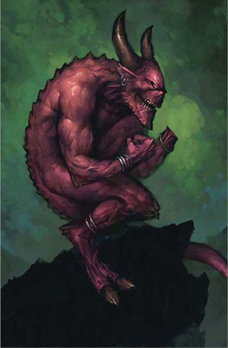
Spending a few hours away from an image can really give you a different perspective – the skulls just aren’t working now I look at it again. I said that leaving certain elements undecided was bad practice; I should listen to my own advice! At least digital paintings are easy to adjust, so I paint out the hand and rock and prepare to begin again (Fig.12).
Reworking
I paint the rock back in, this time with a more neutral color as I think the blue I used before was oversaturated (Fig.13). The previous rock had lost its flow (see Fig.08b) as I added details, so I’m careful to try and reemphasize that as I work. Elsewhere, I’m working from broad, soft strokes and refining with smaller, harder marks. The basic rock is painted against the dark base color using just two tones.
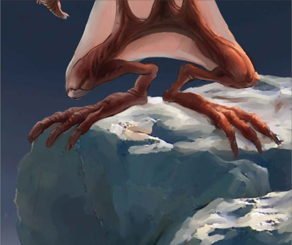
Now I have to tackle the problem of what the demon is doing up there on the rock again. The skulls didn’t work because they didn’t add anything to the picture – I want something that will help communicate the character’s evil personality and suggest some kind of narrative. Perhaps wanton destruction of something beautiful, delicate and innocent? The idea of a spiteful child pulling the wings off insects pops into my head, so I decide to have him perched up there catching birds, and I paint the hand back in as a fist.
Birds
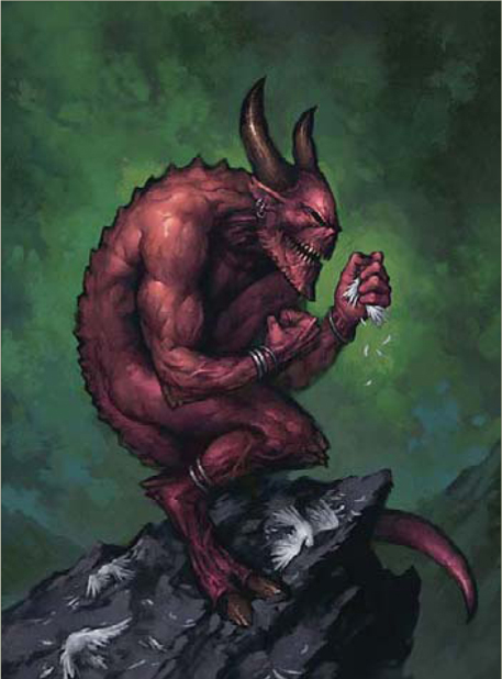
Here I’m painting in the birds – following the same technique of working from dark to light, first roughly defining the shape of the dead birds on the rock with a dark color (Fig.14), then laying down a mid-tone to add some form with a final round of highlights on top (Fig.15). I want them to stay quite loosely rendered so as not to pull focus from the demon’s face and hand. I’ve purposely hidden most of that unlucky bird inside the demon’s fist so as not to make the painting too graphic, and hopefully lend a little ambiguity to the scene – the idea being that the image will reveal itself more slowly if the viewer has to notice the other more obvious birds in the scene before realizing that the bunches of feathers protruding from the hand belong to an unfortunate dove being crushed within the fist.
Tidying Up
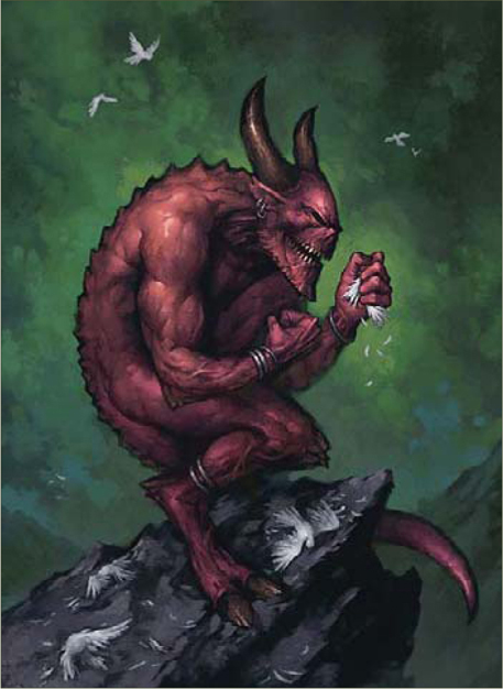
Almost done! I’m much happier with the birds than I was with the skulls, so I’m just working around the painting picking away at any areas that still bother me. I paint in the flying birds in the background, keeping them very simple, add a few highlights to the demon’s fist and work into the rock a little more (Fig.16).
Final Touches
I really hated that glowing eye from the earlier version so I paint in a more conventional eye here, choosing a yellow/green hue that will hopefully stand out from the blue/green in the background (Fig.17). I also feel that the background is a little unbalanced, so I use a soft brush to stroke across some of the textures around the edge of the painting to reduce their contrast, which should draw the focus more towards the center, and touch some of the blue from the horizon into the top of the picture in an attempt to balance the distribution of colors a little better.
Conclusion and Critique
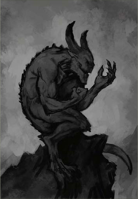
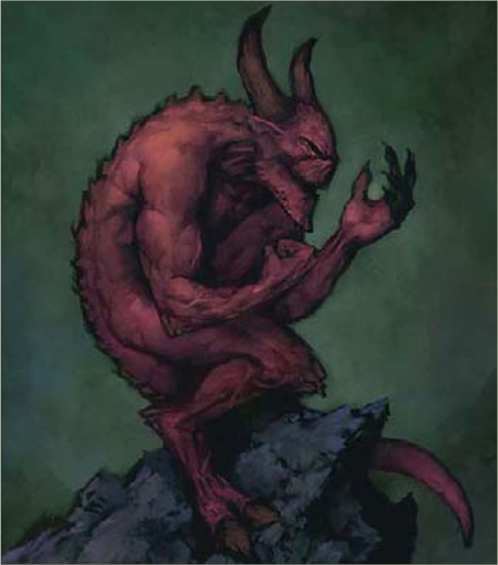
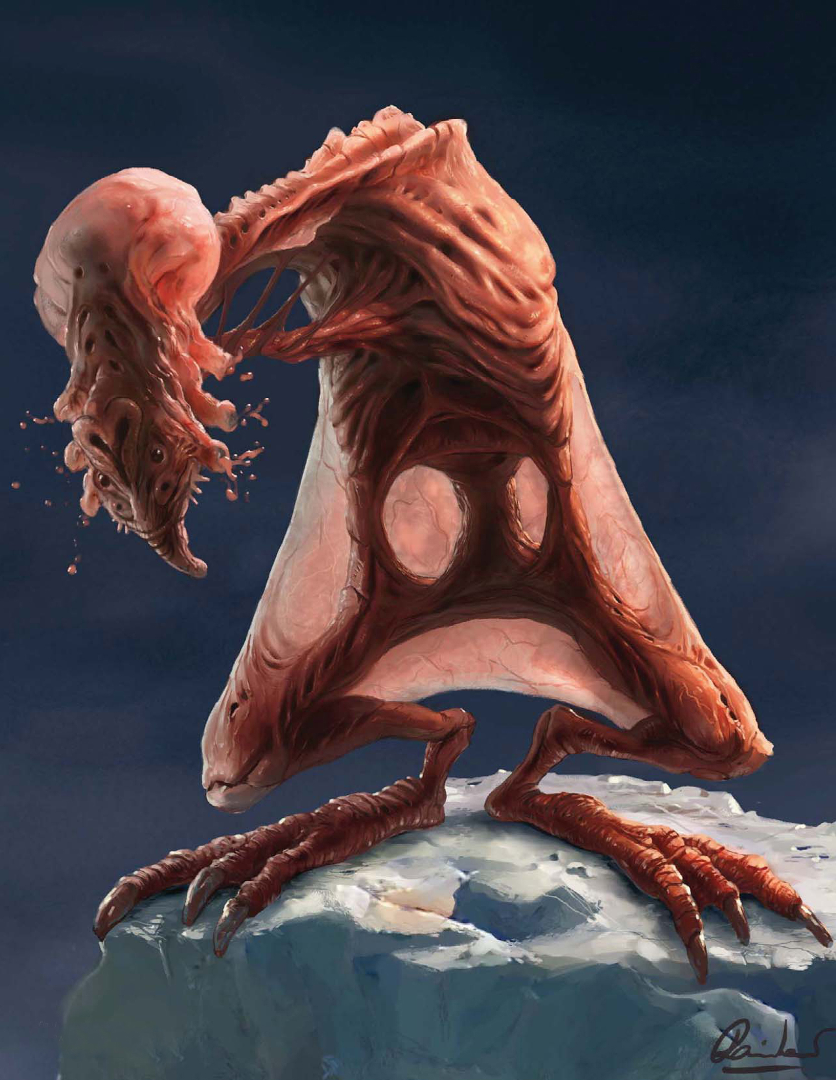
The painting feels complete, so I add my signature and give it a gentle pull with the Levels tool in Photoshop to add a little extra punch (Fig.18). Done! Now is a good time to look back and see if the image is a success. It’s often interesting to compare the final product against those early value sketches to see what’s changed – I think that comparison holds up well, with the composition and basic distribution of values remaining consistent throughout. I like the way the demon’s flesh has ended up, though some more variation in hue across his body would be an improvement, in my opinion. The jewelry does its job connecting the less well defined areas of the character’s body, but looks a little like an afterthought – perhaps some more significant metalwork, maybe a belt or ornamentation on the horns would help to solve this? There are always lots of little niggles like this that I try to remember for the next time. The big one this time around is to make sure I have the contents of demon’s hand worked out well before I start to paint!
©Matt Dixon
©Michael Corriero
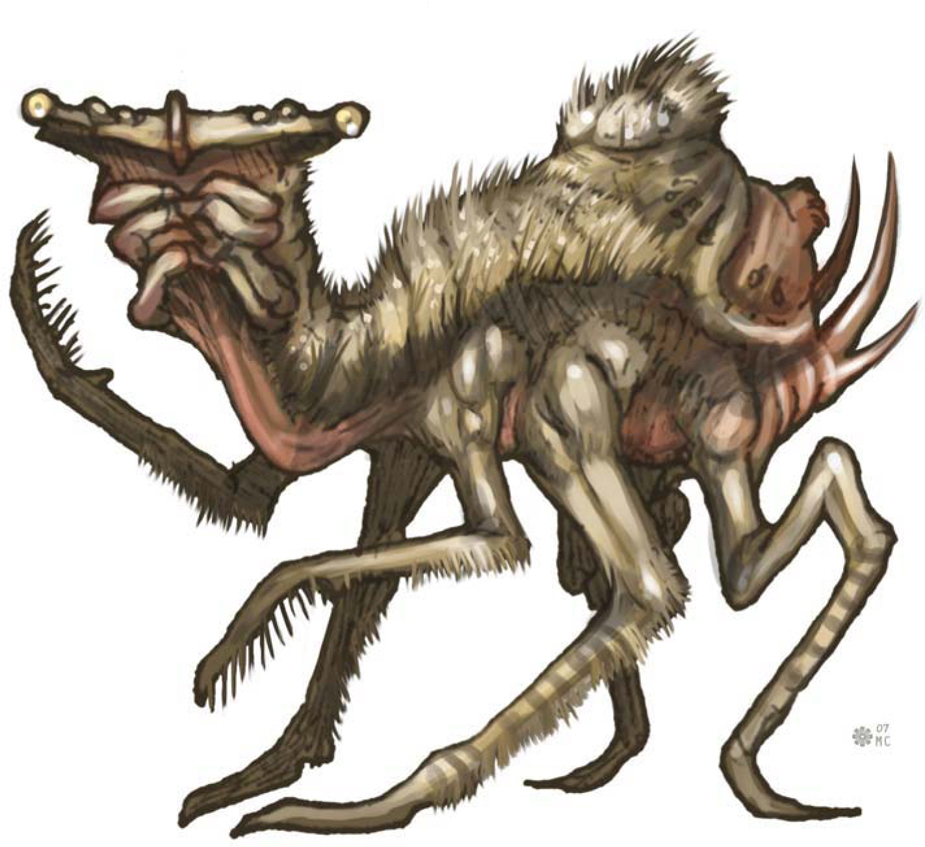
CREATURE CONCEPT DESIGN 101
In this tutorial I’ll provide you with the necessary information to create your own unique concepts – from scratch. This series will discuss verbally and visually the philosophy behind the make-up of a conceptual creature. Throughout this tutorial you’ll gradually obtain a reference library stretching from the basics in animal anatomy to much more complex ways of exploring what is actually possible and plausible, or what would be considered thinking “outside the box”. There really are no limits to what’s considered a conceptual creature!
Part 1: A Starting Base for your Designs: Reference Library
Relation to Real World Life Forms
All creature designs come from a mix and match of existing biology. Whether it’s the biological make-up of a tiny flea or the structure of a massive Sauropod, all creature designs are made up of what an artist has researched and studied in life and history.
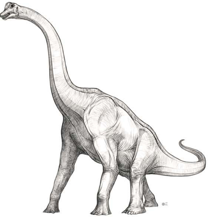
A group of lizard hipped dinosaurs were the largest living land animals in history, known as “Sauropods” (Fig.01 – Brachiosaurus – Vertebrate – Dinosaur).
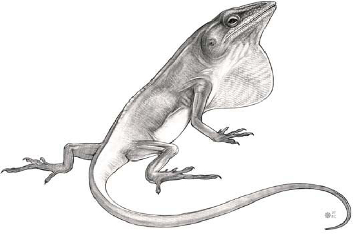
Descendants of the largest of all land animals, lizards still roam the Earth today. Dinosaurs were once just as distinct from species to species as reptiles and birds remain today (Fig.02 – Anole – Vertebrate – Reptile).
Discussing Species
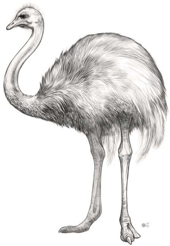
There are literally millions of different species on Earth. Land based animals alone can range from limbless animals like gastropods and annelids, to bipeds, tetrapods, quadrupeds and arthropods. The ostrich is the largest living flightless bird. There are approximately 9000 species of birds (Fig.03 – Ostrich – Vertebrate – Bird).
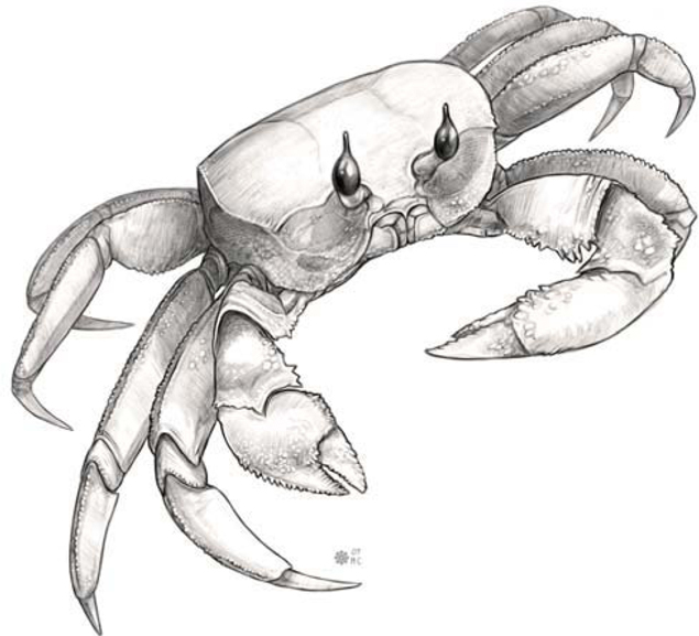
Mammals largely fall into the quadruped and tetrapod group. Arthropods make up a large range of species including insects, crustaceans, arachnids and myriapods. Crabs have four pairs of walking legs and two pinching limbs (Fig.04 – Ghost Crab – Invertebrate – Crustacean). Arthropods are characterized by segmented bodies, jointed limbs and hard exoskeletons protecting their inner organs. Invertebrates make up approximately 97% of the Earth’s entire species!
Amphibians range from frogs to newts, salamanders, toads and caecilians (Fig.05 – Axolotl – Vertebrate – Amphibian). They are capable of living both below and above water with both swimming and terrestrial traits.

Adjusting Existing Anatomy with Plausible Justifications
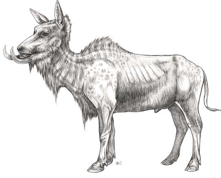
I lengthened the neck, the forearm and hind legs of a water buffalo while taking away some of the weight in the stomach (Fig.06 – Manipulated – Mammal – Water Buffalo). I also adjusted the shoulder hump. I removed the horns and extended the mandible to be utilized as tusks for foraging. These variations on the anatomy of the original animal really make a big difference in the overall nature behind the habits of this creature. There should always be reasons for the changes you make!
Part 2: Taking the Next Step into Imaginary Creature Anatomy
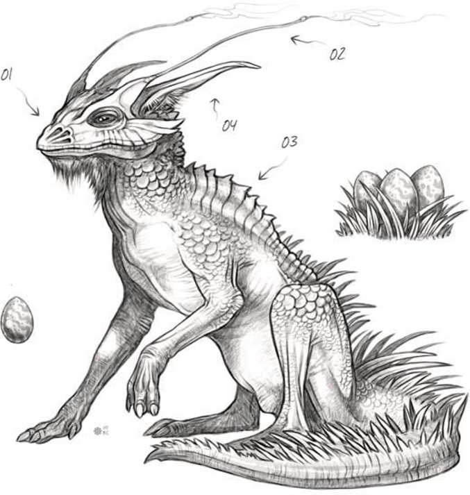
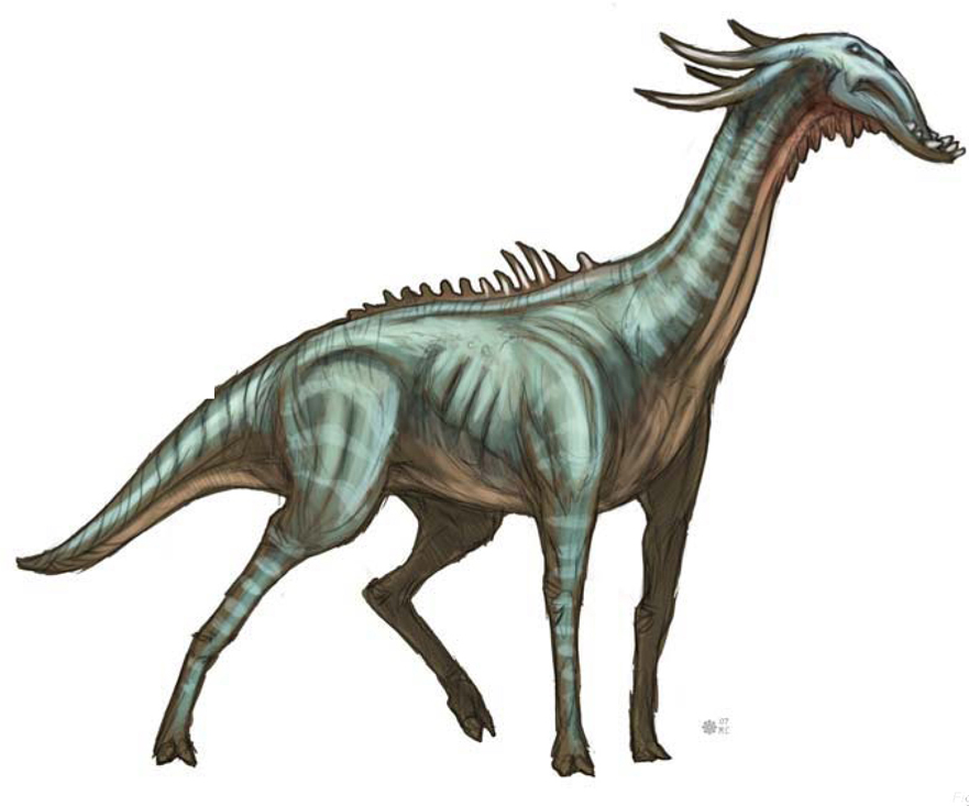
In this design you’ll notice that the overall body shape resembles something of a warthog; although in all areas this design was conceived through the understanding of how animal anatomy works, it was not referenced (Fig.07). The spiked vertebrae protect the back of the neck from predators (01). The tufts of fur on its forearms could be a distinction between male and female (02). The tail (03) is there to help balance during running while it also serves to cool the body down. 04 shows why the lower jaw is constructed the way it is, in order for the upper incisors to fit properly in the mouth when closed.

Amphibians lay clusters of tiny soft eggs stuck together in clumps (Fig.08) (01). A large sack of loose skin under the lower jaw allows the creature to create a distinctive vocal call (02). The reason the eyes are located at the top of the head is so that only the nostrils and eyes need to breech the surface of the water (03). This creature has some modified differences that set it apart from any known amphibians. It has a heavier, sturdier jaw lined with rows of sharp teeth. A pair of fin-like appendages is found on the rear to act as rudders for quick maneuvering underwater (04).

The long thin tube on the face contains a proboscis, much like that of a butterfly (Fig.09). When the creature is startled or feels threatened, it will quickly fill this membrane which is capable of stretching to an enormous size until it bursts, releasing a noxious gas inside (01).
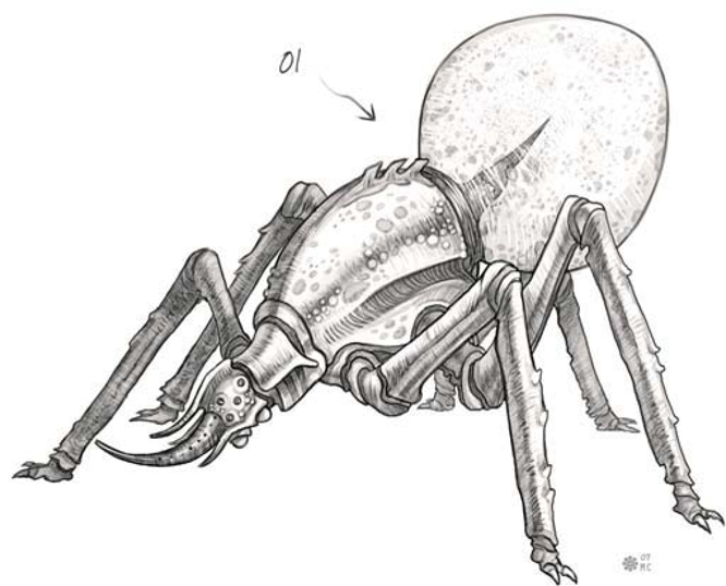
Fig.10 shows a large carnivorous bird containing talons on the ankles of its feet and a deadly fork pronged beak (01). Like its ancestors and the inspiration for its design, it is an egg laying creature. (02) It creates a nest underground that is lightly covered with dirt. (03) It is also equipped with rear facing horns to defend and protect the back of its head and neck during attack. (04) Adding yet another means of attack and defense I’ve given it a tail with a split spiked tip.

Setting it apart from modern day lizards, this creature has a body structure similar to that of a mammal (Fig.11). It has long legs designed for an upright running cycle. Its nasal cavity is split into three sets of nostrils (01). A pair of long thin antenna acts as extra sensory appendages (02). The back is lined with an extremely tough, scaled hump leading down to a thick powerful tail (03). To set the creature apart from any reptile it contains a pair of mammal-like ears and fur under the neck (04).
Part 3: Design Process, Bone Structure and Skin Texture
Installation of Research
This concept is a combined mixture of my knowledge and memory of insects I’ve come across in life or viewed pictures of in books and on the internet (Fig.12). Unlike most insects it has more than one set of eyes, which would put it somewhere in the class of arachnid; however, it only has three pairs of legs, two of which are for walking. So you see how this creature can resemble an insect, but it doesn’t contain the specific traits insects or arachnids are made up of.
Weight Distribution and Size
The size of a creature needs to factor in a lot of rules in regards to how its weight is handled, and how it is distributed and supported. When you look at nature, you’ll notice the smaller an animal or insect is the less gravity affects its weight, which in turn affects the construction of its body type. A very large creature needs to take into account how the massive body fat, muscle and large bones will be held up. An animal like that is not likely to run with long strides and would certainly not be capable of jumping. It’s just more plausible to think of these things in terms of real world animals first, and then go on a creative spree.
Classes Combined
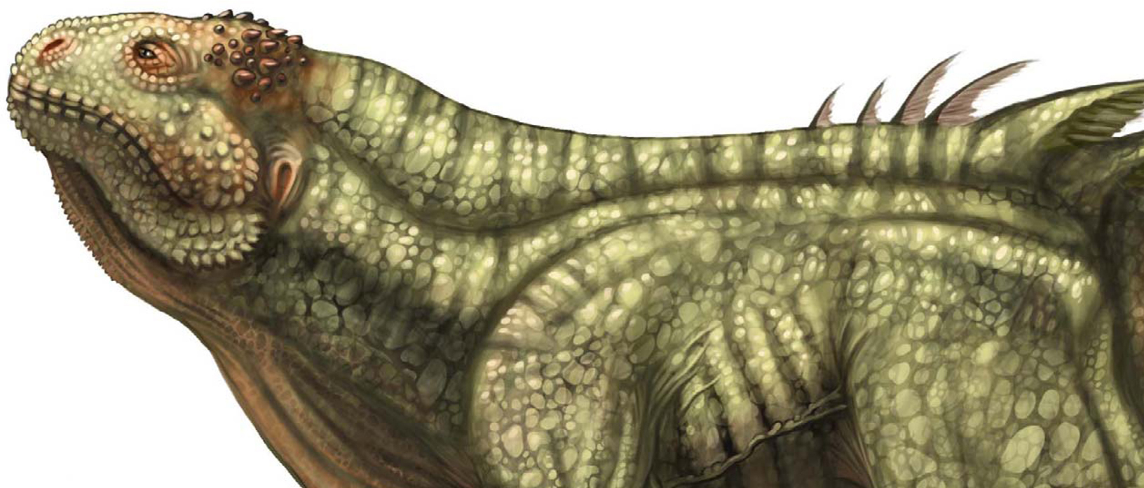
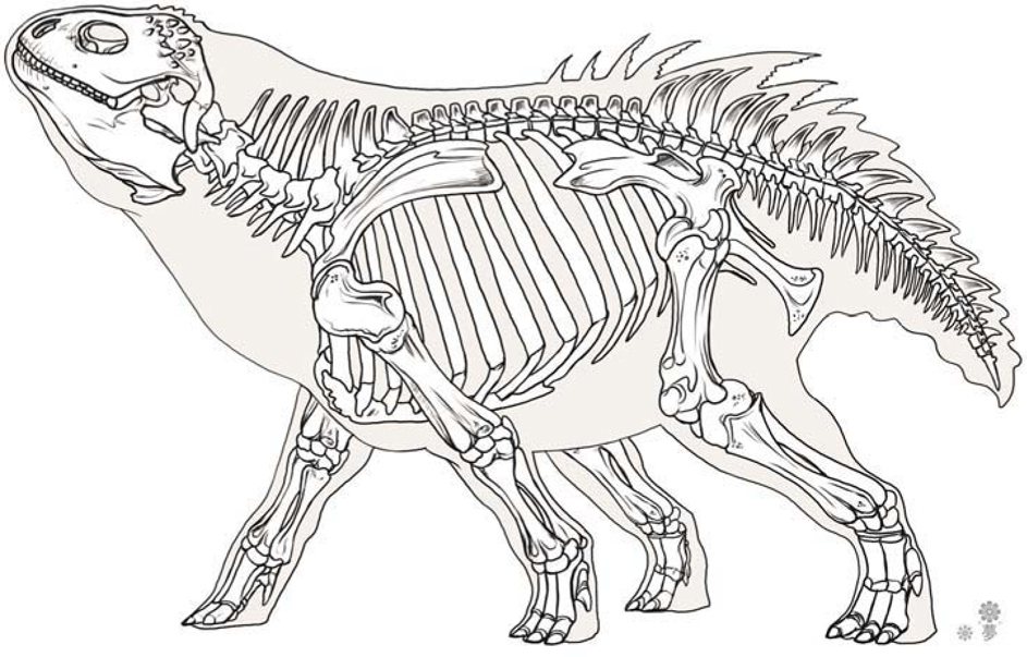
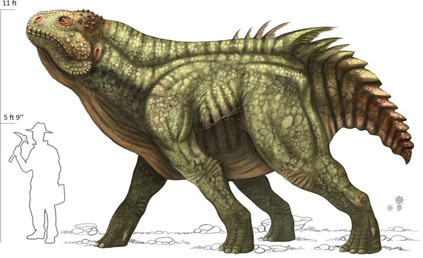
In order to create a believable fictional creature from skeleton to fully rendered color and skin texture, it’s sometimes very helpful to base the bones on what you know (Fig.13). The design of this fictional skeleton is based on the head of an iguana, although modified in various ways of length, thickness and boney spikes on the skull. The body is modified slightly from that of a cow and given the addition of a dinosaur-like tail, while the vertebrae were modified to fit the new back structure of this creature and its tail. There are aspects, such as the fins on the back, that you could never expect to see just from observing the bones. That kind of thing is where you get to be creative and remember, this is a concept so have some fun.
Color and Skin Texture
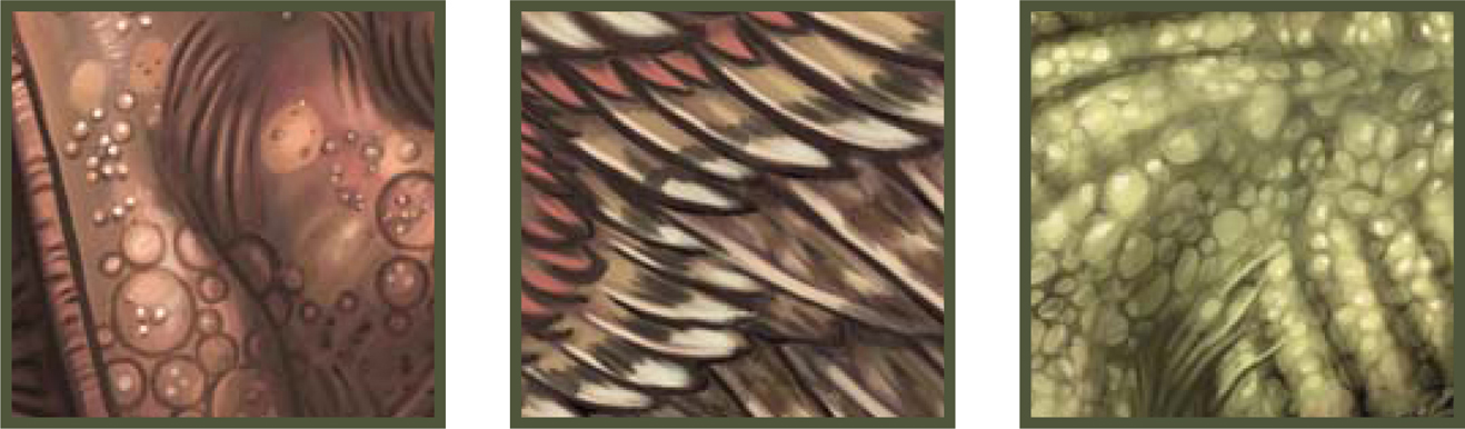
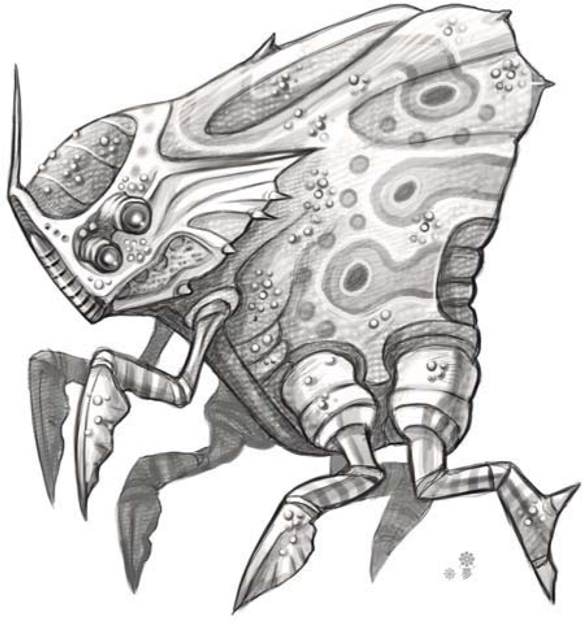
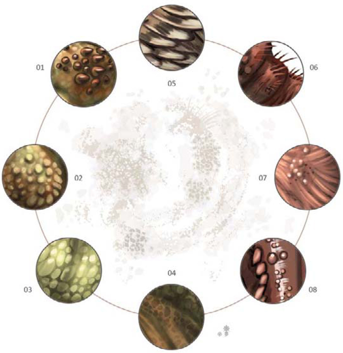
Something that is important to remember when applying any type of texture is that it’s a texture, not a pattern (Fig.14). Applying complimentary colors, even in a subdued form such as this, helps to provide a nice flow from the front to the back in color scheme. You can follow the hints of red and warmer tones from the head to the tail. The imperfections in textures are the key to making them more believable (Fig.15). This insect-like creature contains elements of birds, beetles and even a bit of crustaceans, so the textures vary throughout.

Texture Chart
You can see here that, although I’ve only touched upon two different creature designs, I came out of it with quite a few varying surface textures (Fig.16). Imperfections and variations in size and shape are what help sell a texture. They show the viewer that it’s a texture of a living creature, not a repeated pattern.
Part 4: Head Design, Eyes and Construction of the Mouth
Warming Up
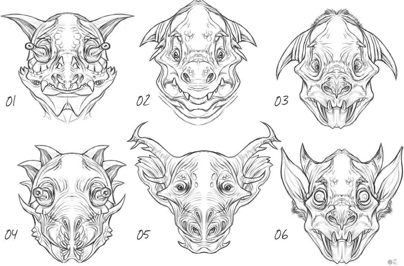
A simple way to effectively produce some warm up sketches without wracking your brain too hard is to use the mirrored effect of a front view (Fig.17). It’s possible that you can sometimes find a great design this way.
Herbivore with its Jaw Closed
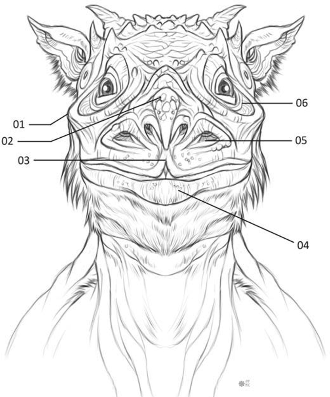
Mammals have lips (Fig.18) (04) which help with the intake of food; it’s the soft organ covering the bridge of the mouth and the teeth, and it also aids in vocal sounds. The cheek bone here is very visible (01). In creatures you can use this to give them a unique appearance. It surrounds the eye socket (06). You can add multiple nasal cavities to provide a more interesting nose or lack thereof (05). The additional pairs could each be used for separate purposes. Leading up toward the forehead from the nostrils is the bridge of the nose (02). The bridge of the nose is an extension of the nasal cavity that leads back down into the mouth, which allows a creature to intake air. A prehensile split upper lip helps grasp foliage, twigs and other food sources (03).
Front View of the Opened Mouth
The gums are visible and showing the tooth as it continues to the root (Fig.19) (01). I decided for this creature I wanted one large incisor that is split, but connected close to the root (02). Molars are unique to many different species of animal so they can appear in many different shapes and sizes (03). Taste buds found on the top of the tongue are used to distinguish what’s edible (04). A set of small rear incisors were given to the creature (05), as well as a secondary set of incisors
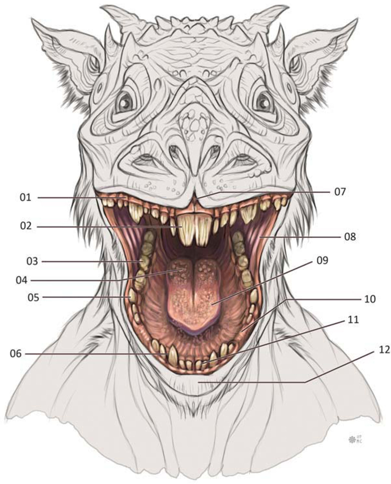
located in the usual place towards the front of the mouth (06). You’ll also notice a gap between the prehensile lips where it splits (07). The inner muscle of the cheek connects the upper and lower jaw, which is stretched with the mouth open wide (08). The tongue is a muscular organ used for the ability of speech along with the lips (09). An empty space of gum in between the incisors allows the upper incisors to fit comfortably (10). A common set of four small incisors for sheering of various food sources are not meant for grinding like the molars (11). Finally, the large lower lip is capable of a flexible amount of movement (12).
Pupil Design of the Eye
This is a generic pupil shape, as seen in many humans and other mammals (Fig.20): a perfectly round iris and round pupil (01). A horizontal pupil can really provide a strange look, often found in mammals like goats or amphibians (02). What is unusual about this type of eye is the black sclera (03); this can be seen in animals such as horses. Quite the opposite, here we have an eye design containing no iris, and a very small pupil can also produce an eerie effect (04). Here is a typical reptilian eye, usually found in snakes and some lizards or frogs (05). Just to show you how you can take the pupil in any direction you like, with this one I split the iris up into three separate points all connected by a randomly shaped iris (06).
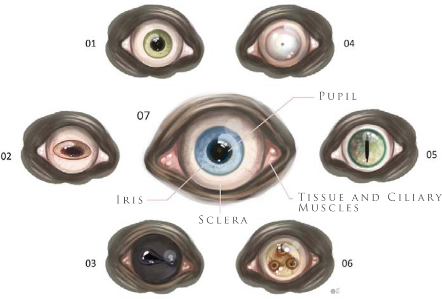
The eye is made up of a few simple parts (07). There is the black portion called the “pupil”. Then there is the iris which contracts and opens the pupil. The soft tissue found around the edge and corner of the eye is the ciliary muscle holding the eyeball in place within the eye socket. The sclera is the fibrous membrane and often white portion of the eye that can also be black in coloration. It, along with the cornea, forms the external covering of the eyeball.
Part 5: Body Structure and Body Variations
Low-Backed Creatures
This type of creature tends not to be capable of running fast because the lower back and short legs do not allow for long strides (Fig.21); its back is constructed of large bone plates to prevent rear attacks. This type of body, where the front shoulders are higher in proportion to the hind legs, gives the animal the appearance of a strong upper body and forward attack motion. Considering it would be incapable of running at high speeds, it may be more of a scavenger.

Lowered Heads and Shoulder Blades
This creature’s lowered head allows it to charge, making good use of its horns (Fig.22). The eyes and ears are conveniently located atop the head where the vision isn’t obstructed by the horns. If you decide to design something like this, understand that the weight of those horns and its head need to be counter balanced by a stronger neck and short strong legs to distribute the weight toward the rear.

Obese Creatures
You’ll notice that creating an obese creature that is both wide in girth, and surrounded by body fat overall, restricts the design to shorter legs (Fig.23). You could provide it with longer legs but then it may not seem as obese, as it would seem just big in general.

Long-Necked Designs
This is a slim version of a long-necked creature with a streamline body and flexible neck (Fig.24); its overall body design is built more for speed. A longer neck might suggest it feeds off leaves on high trees.
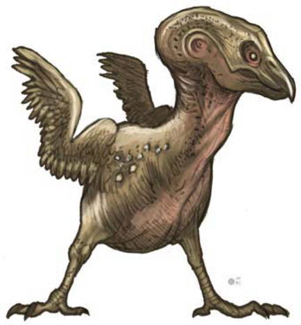
Biped Creature
Here you’ll notice a conceptual bird-like creature. It has two legs, a neck, a head and vestigial wings (Fig.25). What is stopping it from appearing humanoid is the lack of an upright torso and human arms. In Fig.26, you can see that I’ve given this creature a humanoid torso. This shows you two variations with a similar color scheme on two biped designs.
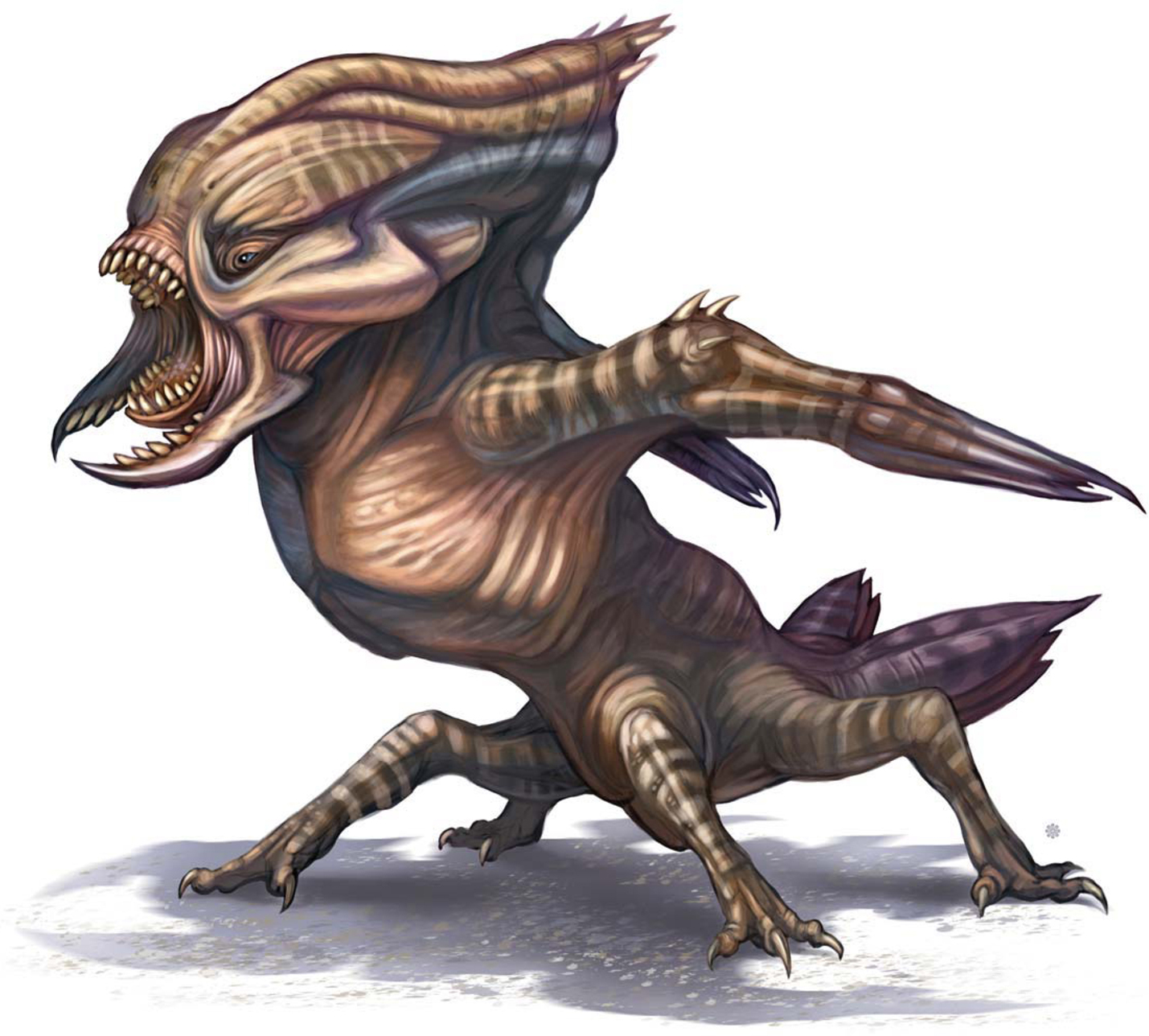
Original Invertebrate Designs
This design does not follow a specific body plan found in nature; it breaks a rule by including traits that come from multiple orders or phylum (Fig.27). This design jumps past classification due to modified skin texture and its body plan. It’s more closely related to the arachnid order, but it’s only a quadruped with two feeding appendages and two sets of eyes. Its body is actually a variation of skin and bone with portions of exoskeleton make-up. This is how you begin to step outside that box – an insect body structure that’s made up of skin and bone, not an exoskeleton.
Part 6: Colors, Patterns and Final Renderings
Base Color
Using all the prior discussed information, at this point you can set out and begin a rough sketch for a unique creature design (Fig.28). Once you refine the design, set the sketch layer to Multiply so you can easily select the negative space, invert it, and then fill in a dark neutral color to begin painting on top of (this will serve as the base tone). You can see here that even below the sketch I started working out some of the main colors and a bit of pattern. In this base color, areas around the mouth, eyes, chest, elbows and armpit are a warmer pinkish red. Overall I’m keeping the base colors close to the mid-value range before applying any real highlights. The light source can change what happens to the colors and shapes.
Final Color Rendition
Once the design of the creature is laid out and the base color is defined, the next step is to start working out the light source and strengthening the forms (Fig.29). The form of the creature is determined by how you lay down the light and dark values of your color scheme in order to explain to the viewer visually how thick a body part is or how the shape is formed. Painting in the direction of the form, providing wrinkles, imperfections in the skin, variations and changes in the local skin tone and texture, will strengthen the overall design. Patterns can help reveal the shape of the forms (the stripes in this design, for example).
The posture and pose of the creature I’ve designed, along with the shapes and sharp nails, teeth and spikes, suggest the predatory nature of its character. The design of the mouth with the inclusion of beetle-like pinchers also suggests that it’s a carnivore and equipped with deadly instruments meant for ripping flesh and killing its prey.
Base Color Blue
The local color of this creature is blue (Fig.30); however, red is applied to areas of the design meant for harming prey or protecting against predators as well as joints and sensory appendages. Working from dark to light, and not the other way around, it is easier to define a shape by applying a highlight, especially when working on a white background.
Final Color Rendition
If you take a look you’ll notice here that I fixed the top of the skull from the work in progress (Fig.31). I started laying down highlights of soft blue and highlighting areas of the limbs where light would create a shiny streak following the shape of the form. An important aspect of a “focal point” is that areas falling in shadow will lack detail, whereas the highlighted portions will contain more detail. This concept focuses on cooler tones as the highlighted portions and the shadows fade to a darker red or purple. When you’re ready to call a design complete, go back and ask the question why once more, look it over, and then call it a rap!
Fig.31 All images
© Michael Corriero
©Pascal Raimbault
CREATURE DESIGN FOR LOW ATMOSPHERIC CONDITIONS
First of all, let’s try to find real animals that could live in this very specific environmental condition. It’s always good to reference nature – it’s the best source of inspiration to me, personally. The higher the altitude, the lower the pressure and atmosphere should become. Existing animals that live in high mountains, like llamas and deer mice, have adapted their physiology in order to survive in such extreme conditions. This could therefore be a good starting point to find design ideas for our creature. These animals have to get more oxygen into their blood to transfer it to their bodies’ tissues. This means that our creature could have a reddish skin color. They also need less food, so our creature could be skinny. The depth of respiration increases, which means the creature could also have a large rib cage.
“Pressure in pulmonary arteries is increased, ‘forcing’ blood into portions of the lung which are normally not used during sea level breathing. The body produces more red blood cells to carry oxygen. The body produces more of a particular enzyme that facilitates the release of oxygen from hemoglobin to the body tissues.”
(Source: http://www.himadventures.net/articles/highaltitudehealth.txt)
For humans, high altitude can cause some dangerous side effects, which can also give us ideas for the design headaches, dizziness, fatigue, shortness of breath, loss of appetite, nausea, disturbed sleep, and a general feeling of malaise. The illness referred to as “HAPE” (High Altitude Pulmonary Edema) results from the build-up of fluid in the lungs, so let’s add holes to the rib cage. HACE (High Altitude Cerebral Edema), another illness associated with high altitude, is the result of swelling of brain tissue from fluid leakage. The creature can therefore also have holes in its head, to excrete such fluids. We should also consider adding large nostrils to our creature, in order for it to get more air into its lungs. We could possibly even add nostrils all over the body? I think it would be a good idea for him to also have two necks in order to double the volume of air coming in from the nostrils on his head.
The name I have chosen for my creature is “Pterocephalys”; “ptero” means flying and “cephalys” refers to the head. Most of the time, when the atmosphere is low on a planet, the gravity is also low. Our creature could therefore be adapted to this condition, as well. He could be jumping very high into the sky and may even fly using membranes, just like flying squirrels! The Pterocephalys will therefore need strong thigh muscles to be able to do this.
I am going to use Painter X and a Wacom tablet Intuos 3 to draw and paint this creature, as follows.
Step 01
First of all, let’s make a very quick sketch of this creature and see how he could move (Fig.01a). This gives us an indication on the proportions of the Pterocephalys. It could be something between a bird and a squirrel, for the legs. So let’s now make a quick sketch just to get started with the global shapes and proportions. Sometimes I scan a traditional sketch done with pencil and put color on it with Painter. In this case I will start directly in Painter using the Pencil brush. The Pterocephalys will be able to walk and jump, but he will not be a good runner at all (Fig.01b).

Step 02
I am going to refine the sketch a little bit now, focusing on the head a little more. I have added holes to the head; the purpose of these holes is to excrete liquid that could cause a cerebral edema. Huge nostrils and smaller ones are added to the face. I also add a quick rock form to the sketch in order to encourage me think about the environment as well (Fig.02).
Step 03
Here I am adding rough colors and reusing rocks from a photo I took in New Zealand, in order to get a sense of the lighting and environment. This rock was actually a small one, but it’s a good base for a paint-over. I am using three layers at this stage: character, rocks and sky. I use Painter’s Airbrush for the sky and the round oil pastel with low opacity to add color over the character. If we look at the rock’s lighting, the main light (which is the sun) is coming from behind, and we also get an ambient blue light coming from the sky (Fig.03).
Step 04
I want to focus on the head again now, to help me figure out this creature’s personality. I don’t want him to look too aggressive as he doesn’t need to eat very often; he is not a predator and probably just needs to eat some rare flowers once a week (Fig.04).

Step 05
I am pretty much detailing the body by going down the neck and rib cage at this stage, mainly using the Oil Pastel for details and the Airbrush to get more of the volumes. I want this creature to have holes all over its body and a fleshy feel to the skin. It has to be skinny also, as mentioned previously. I am using featherless chicken and furless cat photos as a reference, to get ideas about skin rendering and skin folds (Fig.05).
Step 06
Now let’s work on the lower body area. I need to rework the lines to get a clearer idea of his anatomy before adding details. I could have focused on the lines first and just done a black and white first pass on the whole thing, but I am more used to playing with the colors very early on in the process (Fig.06).

Step 07
Here I am adding volume and details to the legs using the same tools, as well as using the Glow tool to get a warmer highlight color from the sun (Fig.07).
Step 08
Now I am painting over the rock photograph element so that it blends in more with the rest of the painting; this will also allow me to tweak the rock more easily later on (Fig.08).
Step 09
Here I am just adding shadows under the feet and details on the lower part of the body. Cerebral fluid has also been added, escaping from his head; it’s kind of floating about in the air because of the low gravity present (Fig.09).

Step 10
Now let’s focus on the highlights and the shape of the second neck. Because this creature has holes all over its body to excrete liquids, it makes sense to add more of a wet skin effect to it. The neck shape was a bit too straight for my liking as well – it was not looking organic enough – and so I changed it a little here. The creature has so many holes on it that I wanted the lower neck to look almost like an external organ. This makes him look a little more fragile, but it’s OK as he has adapted to escape most dangers by jumping very high (Fig.10a – b).

Step 11
I cropped the image in this final stage so that we could get a closer look at the creature. I also removed some of the rock underneath the right knee to improve the composition. The middle toes are now also smaller on the creature, which was done to break up the uniformity of them and the rather boring proportions. As the final finishing touch, I add more contrast to the image, and that’s it – done (Fig.11)!
©Pascal Raimbault
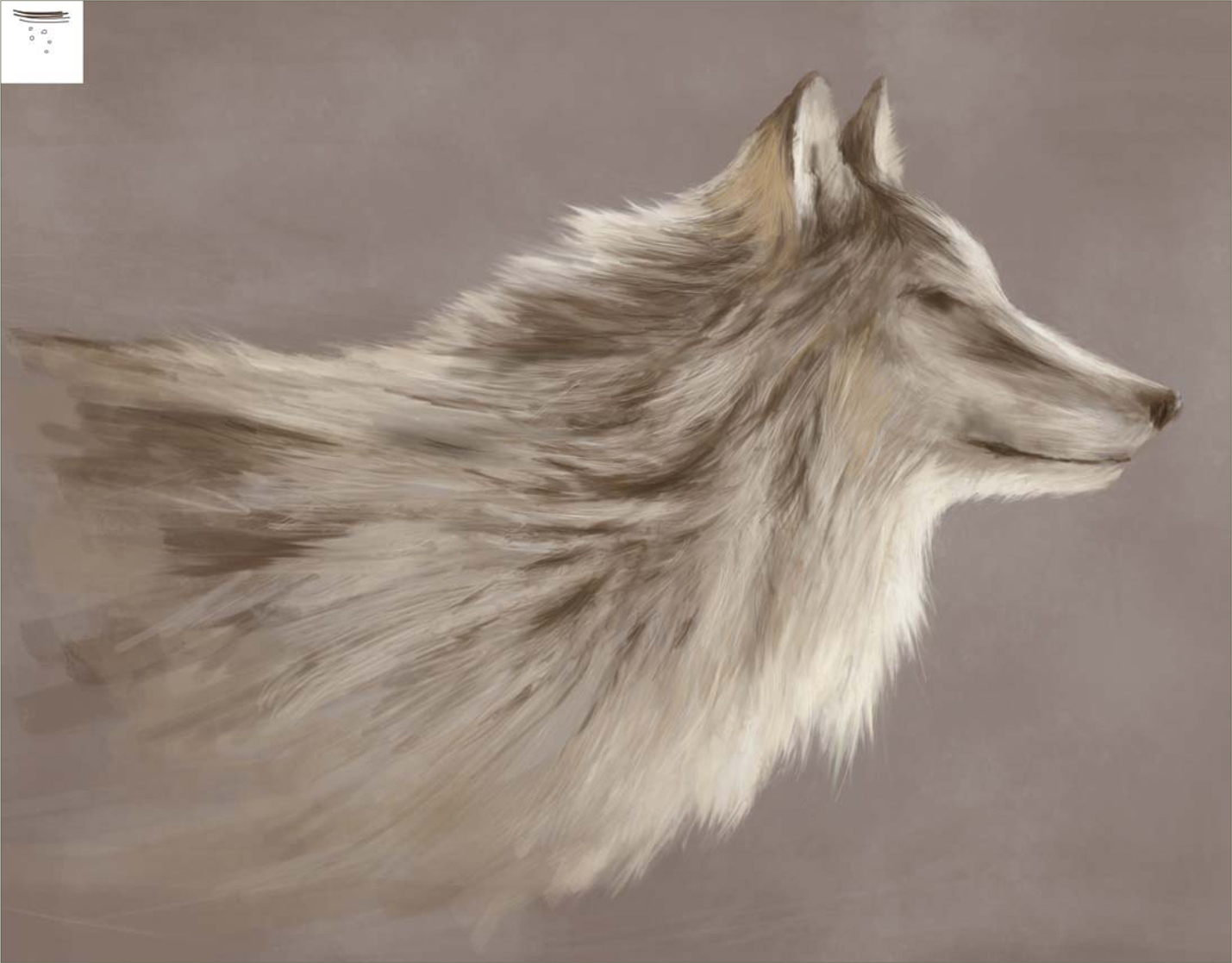
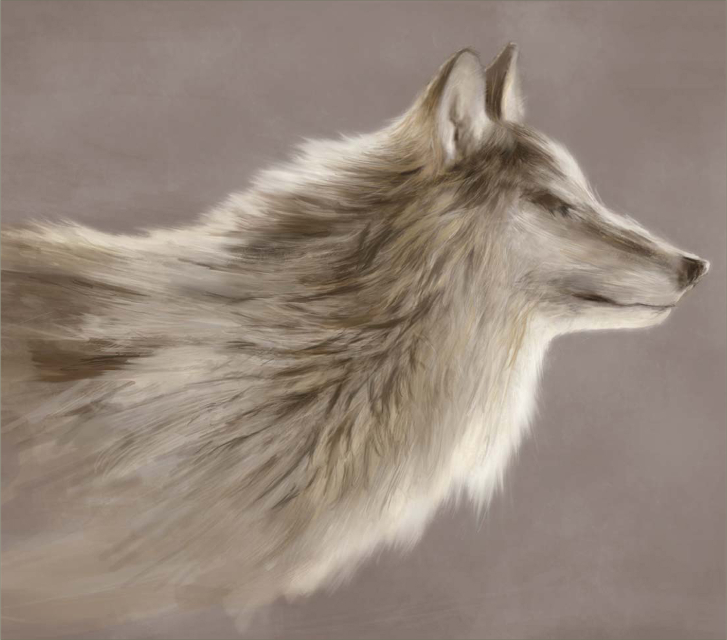
PAINTING FUR
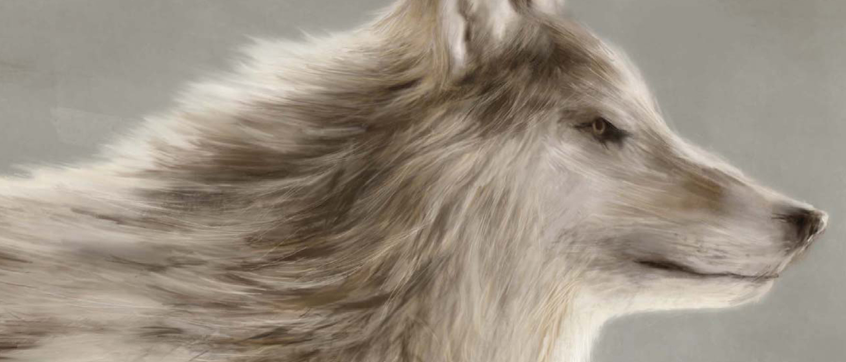
In this tutorial I will be attempting to paint fur, and for this exercise I will be using a wolf as a context to create the image, in order for it to make sense and not appear just as a semi-abstract picture. Before starting to paint, I search the internet for various references and photographs to help guide me in the creation of a convincing representation of fur. When you begin to look at your subject, which in this case is a wolf, you will realize how varied it is, not only from animal to animal but also in the types of fur evident in a single type of creature, such as our wolf. When I began researching the subject I soon discovered how wolves vary in color and how their fur changes in length across their bodies. For example, the fur around their legs is quite short and looks almost matted, similar to a bear, and yet around the shoulders it is longer and shaggier in appearance. So with our research done and references gathered, let’s paint!
Step 01
Once you have enough reference material at hand it is time to make a start, which I will do by filling in the background color of a blank canvas with a non-descript warm gray, over which I can create a new layer for my drawing of a simple outline of a wolf (Fig.01). I always like to get rid of the white early on – any tertiary color is suitable really, and this is only a personal preference.

Step 02
On a new layer I start to paint in the key colors, which compose mainly of warm browns and yellows in this instance. As there will be no definitive shadows and highlights I have sketched everything in on one layer. In Fig.02 you will notice that I have made some provisional rough marks below the shoulder to denote some of the thicker fur that appears darker beneath the surface, similar to a husky. I use a paler color along the edges to show where the light manages to show through, and basically paint in the main areas. You will also notice that the brush marks also roughly follow the direction that the fur has grown, as indicated by the arrows.

Step 03
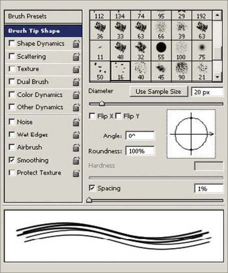
The next stage involves using a custom brush in conjunction with the Smudge tool so that the edges may be softened somewhat and create the appearance of numerous strands of hair. In Fig.03 you can see the shape of the brush in the upper left corner along with the marks it produces, and in Fig.04 you can see the settings used, which are simple enough. Notice that the Spacing is turned down in order that the brush leaves uninterrupted lines when used. With the brush size set quite small, select the Smudge tool and start dragging outwards from the edges – you may wish to alter the strength on the toolbar to around 55%. You can see how this has made a difference in the latest version. I also use a standard Airbrush set to between 1 and 3 pixels wide and add in some more hair to help blend the sections. Remember that you do not really need to illustrate every strand of hair, but rather just a few here and there to suggest the illusion of fur.
In the case of the head, I paint in some lighter areas using various tonal ranges and omit any real detail. I place a few random lines around the neck line to help blend the head and body and suggest some longer fur, but do not labor on this. The eye, nose and mouth areas are darkened to help the overall impression, but you can see that the picture is much improved from just a minimal amount of detail.
Step 04
So far I have tried to create the impression of fur using tonal ranges, a small amount of smudging, and with as little attention to painting actual individual hairs as possible. What I have essentially aimed for is a good and general impression with as much economy as I can muster, so that I have a clear target for finishing the picture. Now that I have established the key areas I will begin the process of refinement.
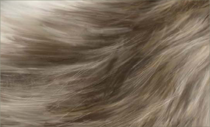
In Fig.05 I use the same Airbrush as in the previous section to paint in a series of fine strokes that help blend the various tonal passages and show actual strands of fur. These range from the neck to the top of the back and follow the rough direction of the body, but keep mindful to draw in random directions in order to add a natural feel. You can see, particularly on the shoulder area, that the dark sections flow towards the back as well as the chest, and some of the lighter hairs on the neck are almost at right angles to the general flow.
Step 05
We now reach the final phase of the tutorial which proceeds along the same lines. I add in more fine strokes as well as a few that are a bit wider, to resemble some clumps of fur. Remember to vary your strokes in direction and width as well as the color. So, for example, in darker areas add in some lighter strokes, and vice versa.
In the final version (Fig.06a – b) you will notice that I have left rougher and wider strokes along the shoulder to portray the thicker fur, and kept the finer strokes to areas towards the outer edges and head. The crucial thing to remember is randomness. The last areas to be completed are the eyes, a few facial details, and a color change to the background.


©Stephanie Loftis
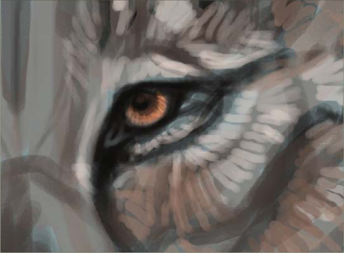
PAINTING ANIMAL EYES
This is a tutorial for coloring/painting animal eyes in Photoshop 7, but you should be able to follow it with Photoshop CS and most other versions of PS and similar programs. I will also be using a graphics tablet for the pen pressure sensitivity.
Step 01
It’s always nice to start with a sketch. I like to use a neutral colored background and a large black brush to sketch with, keeping the sketch and background on separate layers (Fig.01). My brush of choice is the Airbrush Pen Opacity Flow brush that comes with Photoshop by default. I like to go into the Brushes Presets and check the Wet Edges box, as this gives the brush a nice watery effect that is easy to blend. Throughout this tutorial this is the only brush I’m going to use, though I have made many variations of it for different purposes (you may want to save variations made to your brush as separate brushes, so that you don’t have to always mess with the settings every time you want to use them). You don’t want to paint in 100% brush Opacity; the pressure sensitivity and low opacity will help with blending.
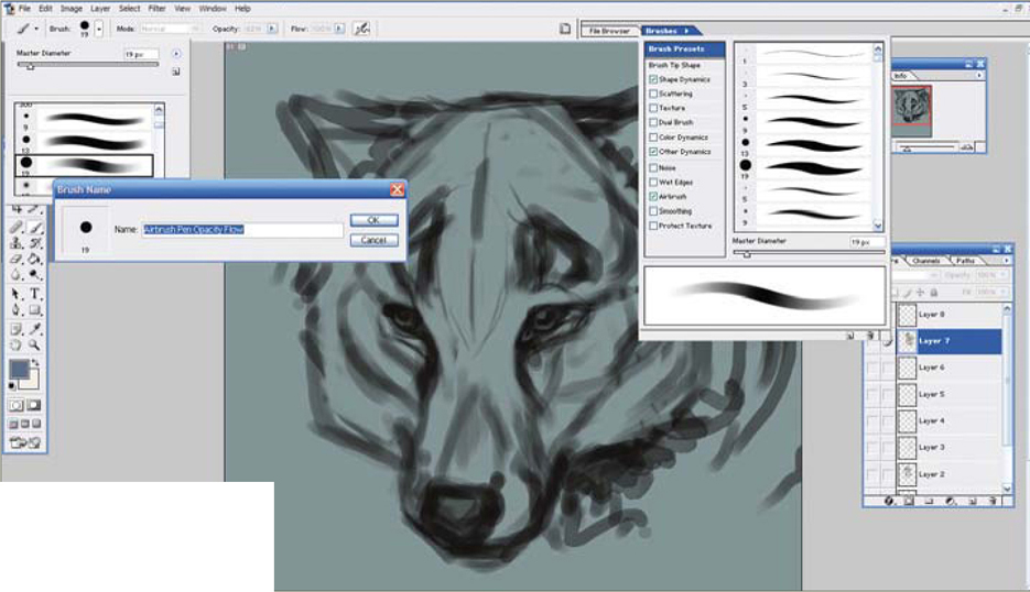
I tend to draw my eyes as sort of an upside-down, obtuse triangular-type shape, and I make them generally all black with a small outline of where I think I’ll want the highlight to be. I also either enlarge my sketch or draw big; the bigger your image, the more detail you can add, and also the better quality the image will be. I’m pretty much comfortable going as small as 2400 by 3000 pixels.
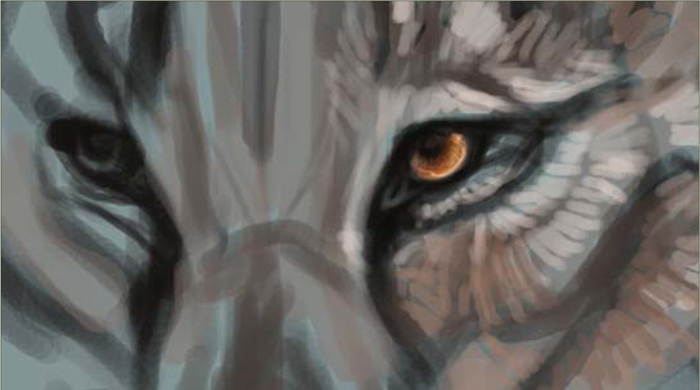
Step 02
This is usually when I start adding the base fur on another layer. Often, I don’t work on the eye until most of the fur work is done. The eye is a very important feature on a face and the fur around the eye is also very important in giving the eye that three-dimensional look. It also makes the eye looks like it “belongs” there (Fig.02).

Step 03
To start the eye, zoom into 100% and create a new layer. What I have done here is taken a neutral color and colored the shape of the iris. I’ve also tried to further define the shape of the eye and pupil with a black brush. The color in the center of the pupil was placed there in order to help me figure out where I thought the pupil should be (Fig.03).

Step 04
Here comes the fun part of painting an eye! This can very easily go wrong though, so you can make a new layer if you want to feel safe. I basically follow a star-shaped pattern with the pupil being the center. I first take a dark colored, very tiny brush and draw from the center downwards, in quick strokes (Fig.04).
Step 05
Then, on top of that, I take a lighter colored brush of about the same shape and do the same thing around it – not necessarily on top; we’re trying to get different segments of color. I then like to try and redefine the roundness of the iris with a quick swoop of the same color (Fig.05). I repeat dark color, bright color, dark color, bright color. You don’t need to use the same colors; I used black, a dark burnt orange, a bright orange and some orangey yellows, followed by some swoops to redefine the circle of the iris at the bottom (Fig.06).

You may need to zoom in and out of the eye to make sure you aren’t making a mess of your painting. I also recommend that you paint both eyes at the same time, so that they have the same colors and look like a pair.
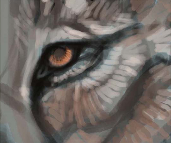
Step 06
You should now re-add your pupil with a large black brush in the center (Fig.07). I feel pretty good about my colors at this point so I continue to work by adding some of the final touches. This time I take a small black brush and, instead of dragging it to the bottom of the iris, just go about halfway – this really emphasizes the pupil (Fig.08). I then add my final swoop of color which acts as a reflection of light on the eye (Fig.09).
Step 07
Now you can start working on the other details associated with a convincing pair of eyes: the dots of light reflection, the eye lids, and tear ducts. It’s basically all just about taking much lighter colors that stand out in order to give the illusion that the eye looks moist. You can also add eye lashes, too – I can’t think of a furry creature that doesn’t have eye lashes!
To paint the eyelashes I take a light brown color – I don’t want them to be bright white because they’ll cross over the eyeball just painted and will stand out more than I want them to. You just need to paint quick strokes for your eyelashes, and then outline them in black so that they don’t get lost in the other colors of the eye (Fig.10).
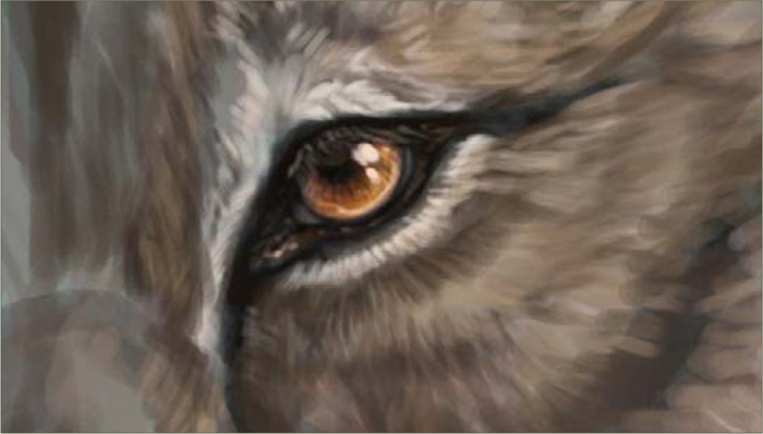
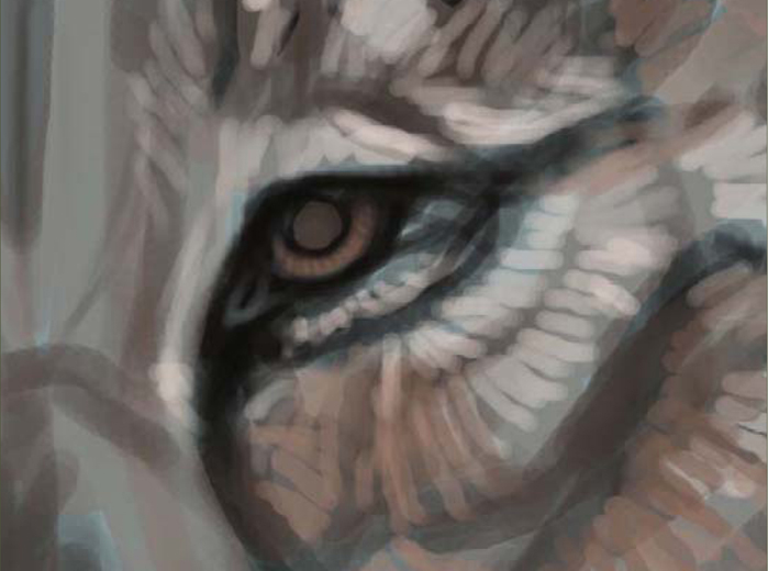
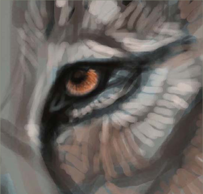
Step 08
And that’s basically it for the eye itself, but the surrounding area is also pretty important. When you’ve finished detailing your eye, zoom out and take a look at your creation. With my painting I had to edit them a little to fit the head and to make sure both eyes worked together convincingly in the creature portrait. I could then continue rendering the creature’s fur until I was satisfied with the illustration (Fig.11 – 12).

©Stephanie Loftis