Matte Painting
Renaissance
© Marco Bauriedel
What was once a traditional art form has now adapted to become a purely digital practice. This very particular discipline allows film makers to create scenes that would prove either too expensive or impossible to film, and has become one of the staple ingredients in this industry. This chapter looks at the techniques behind matte painting and explores the value of photography and painting skills to seamlessly blend two distinct attitudes.
© Marco Bauriedel
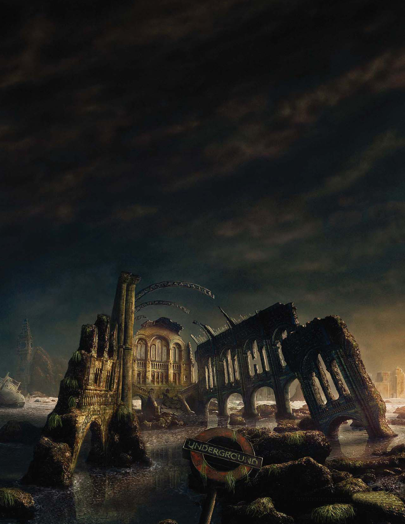
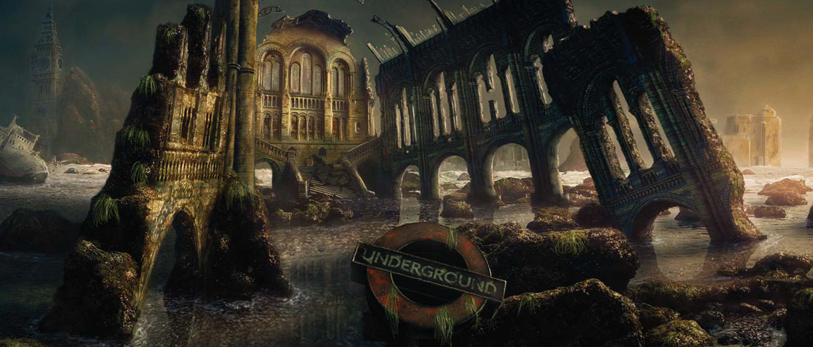
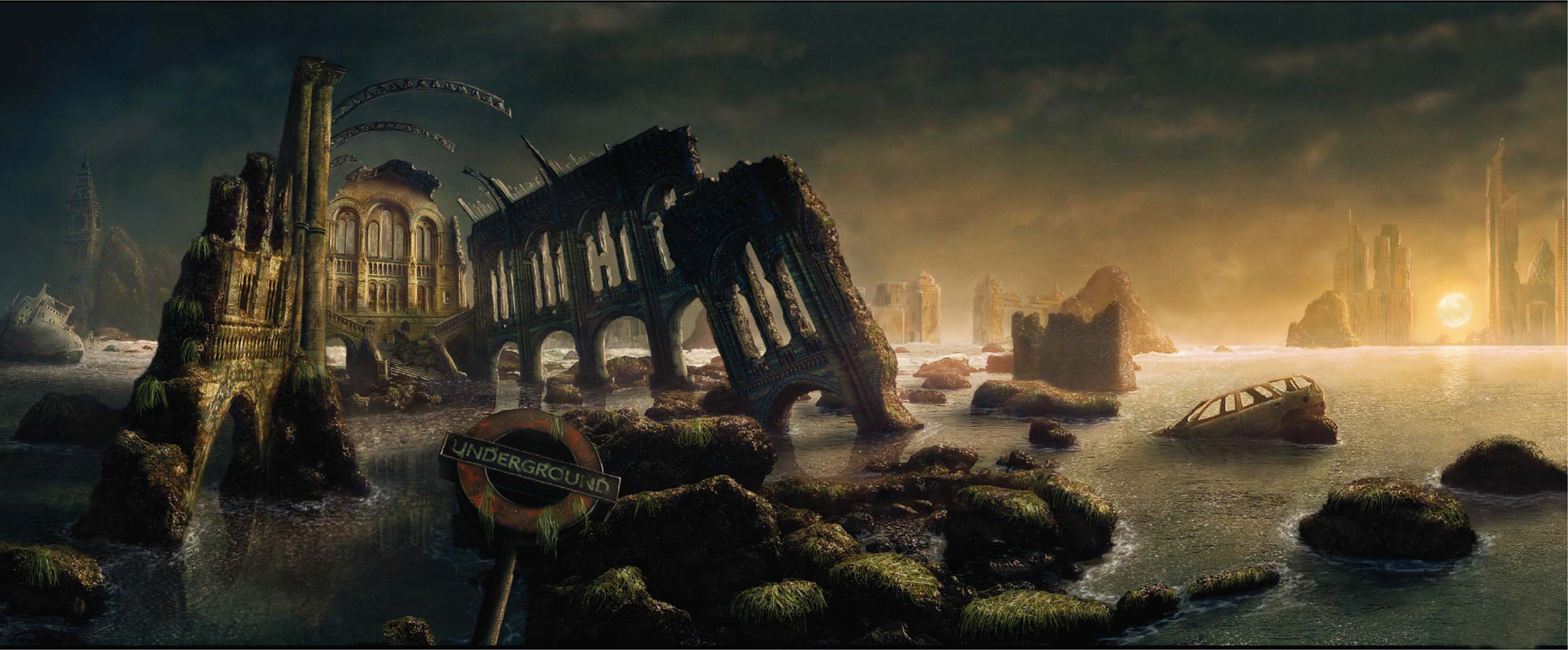
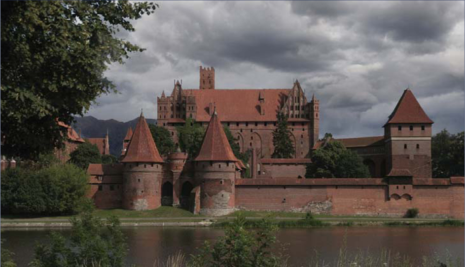
THE MAKING OF “RENAISSANCE”
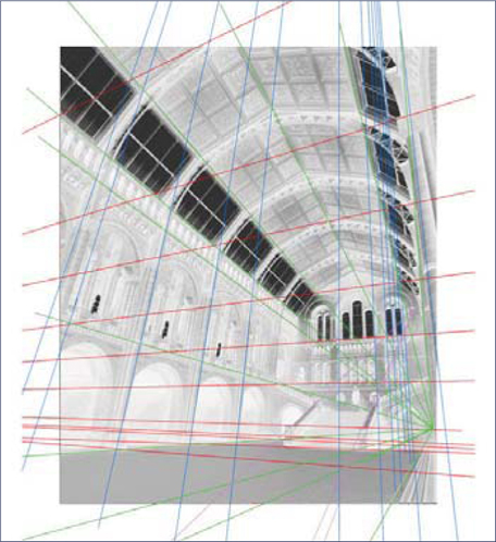
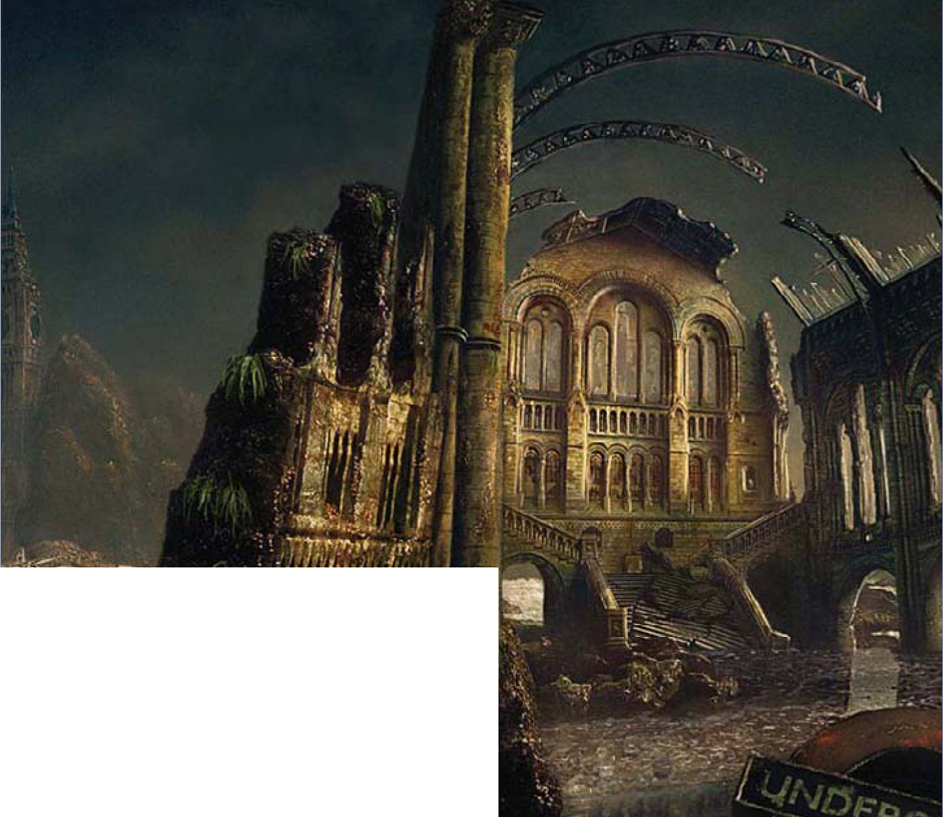
The base image needed to be cleaned up first before anything else (Fig.01a). The second stage was to create an extension of the image, following the concept of leading onto a matte painting in which the National History Museum would be set in a natural environment, as if in existence sometime in the future. I started off by taking the base image of the National History Museum and painting/Clone Stamping the people out of it (Fig.01b). The Lasso tool was used to select parts of the image, which were then copied, rotated, flipped and scaled to fit into another location (Fig.01c). Making selections of a shape by guessing how it would continue in a covered/extended area, then Clone Stamping in some noise from a similar part of the image and color correcting it, is another nice way to work (Fig.01d).
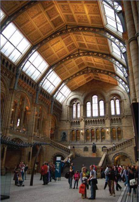
It is important to give some visual variation to duplicated parts. You can easily achieve this by painting some dirt, erasing things, or using the Sharpen brush. The idea is to imitate the colors, and the overall sharpness and grain of photography. After cleaning up the image, perspective lines were used to extend the image (Fig.02 – 03).

I created some concepts in order to get an idea about how to put the museum into a natural environment. Clone Stamping some photography into your painted concepts might also help to imagine the desired look very early on in the process. For the concept to work it was important to color correct the building in a way that it could be integrated into the background scene (Fig.04). To be honest I should have spent more time thinking about perspective issues in the concept phase. As you can see here, I didn’t take a lot of care with the rocky shore concept (Fig.05); I wanted to sort of zoom out of the building to give the viewer a glimpse of the surrounding landscape, although I did expect to encounter a lot of problems with the lens distortion of the original photograph with this idea.
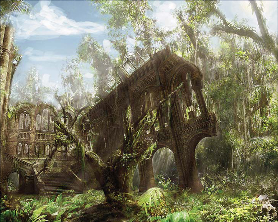
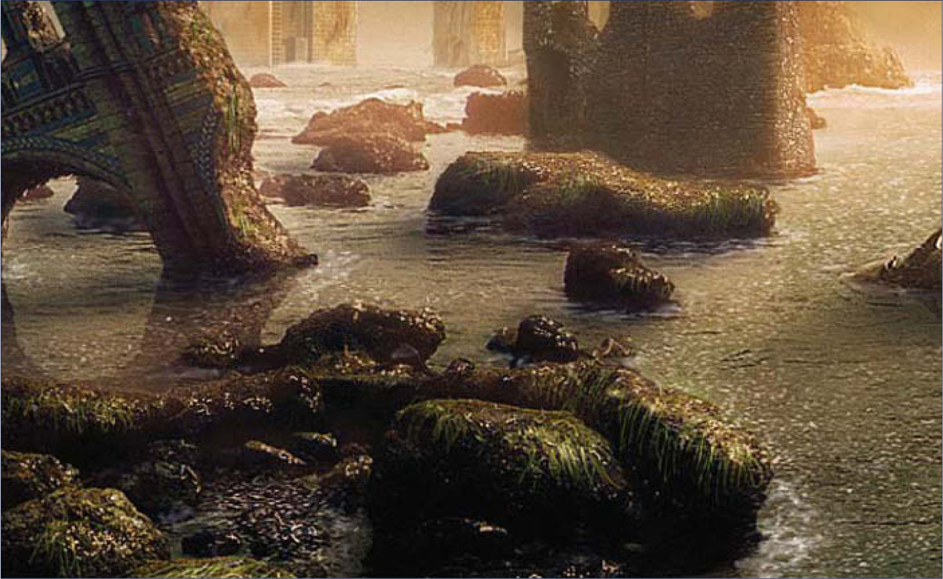
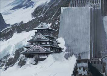
I decided to continue with the rocky water landscape concept, because of the drama that it expressed to me. And so I started by extending a rocky shore photograph (Fig.06). Sharpness, shapes and colors were imitated, without copying elements one-to-one from the landscape image, by painting and Clone Stamping. After extending and color correcting the image, a sky and several objects were then added. The National History Museum was roughly adjusted into perspective and shaped to match the look of the concept. Adding some rough reflections and shadows helped me to tie the image together at this stage, and allowed me to spot any problems (Fig.07).
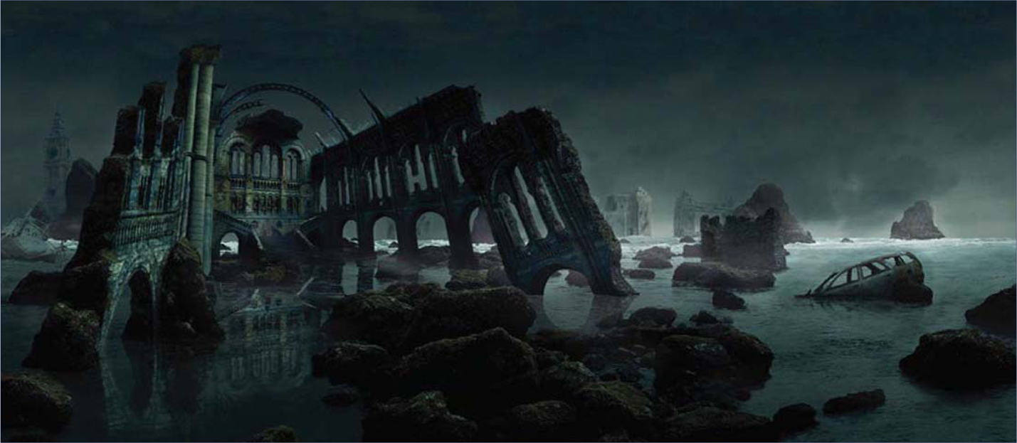
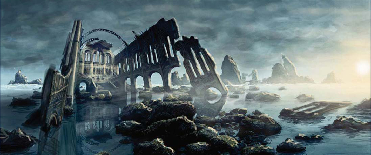
I chose to get away from the dark mood and went for a warmer color instead. Adding the sun and lighting, the whole scene was done by painting light on different layers, with some set to Dodge blending mode. To achieve the glossy look of the stones, I painted sharp highlights, such as on the water’s surface. I used a custom brush that scattered the tint depending on the pen pressure, and used a motion-blurred noise layer for most highlights (Fig.08). I was then able to add all of the really fun details.
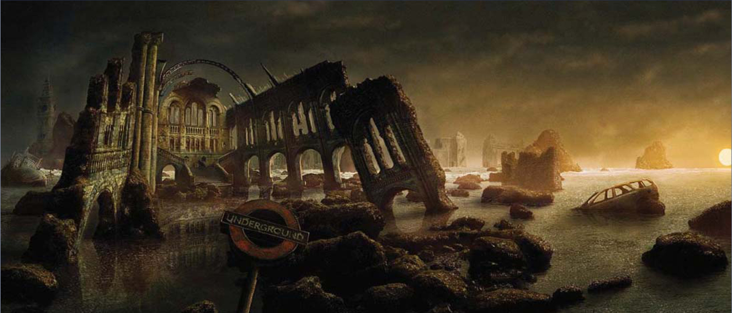
Finally, some more perspective correction of the building was done, without destroying the drama of its alignment in the whole image. Seaweed and water movement were painted around the foreground rocks to get some more variation in the whole piece. The cityscape on the right was also added at this point, and the background rock beside Big Ben was given a more realistic, hazy look to set it further into the distance. The stairs of the National History Museum were then broken down into pieces, and the lighting was adjusted accordingly (Fig.09 – 10).
And here is the final image. Sometimes it’s hard to keep photorealism in photographic parts when color correcting and painting. Of course, the perfection of those skills comes with time, and I’m always personally learning and trying to improve and hone my techniques. I’d like to thank Dave Edwards for providing the photo for this matte painting; I hope this tutorial can give you an interesting insight into how an image such as this can be created.
© Sergey Musin
THE MAKING OF “FINDING UNKNOWN KADATH”
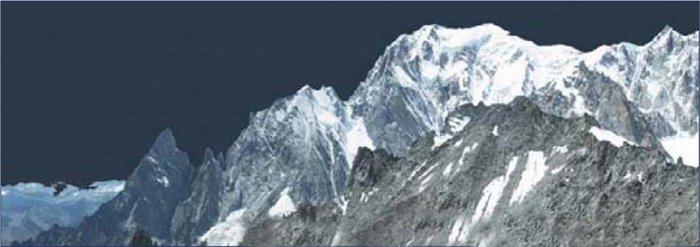
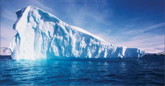
The Dream-Quest of Unknown Kadath is considered a combination of several Lovecraft stories. It features Randolph Carter, a mystic whose unique gifts allow him to walk through dreams. He uses these talents to locate Kadath, a fortress of the Gods. Carter’s adventures include traveling to good and evil dimensions, talking to cats, and sailing on the seas. After reading this novella by H.P. Lovecraft I was mostly interested in the idea about The Dream-Quest of Unknown Kadath. Before starting, I searched the internet for reference images to free my imagination and to ensure that I would get the right idea for the concept (Fig.01 – 02). I wanted the scene to be set in a snowy climate, so I also searched for reference images of snow (Fig.03 – 05).
Source: Corbis
Source: Corbis

© Sergey Musin
Source: http://www.wpanorama.com
Source: Corbis
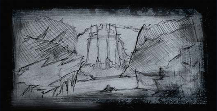
The concept sketch was drawn on white paper (Fig.06). I then turned the horizon line in order to achieve an effect similar to that of a film camera. I scanned the sketch and opened the file up in Photoshop CS2. The black and white picture was showing, and on top of that I built up a layer of color using the Multiply blending mode (Fig.07).
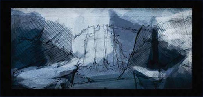
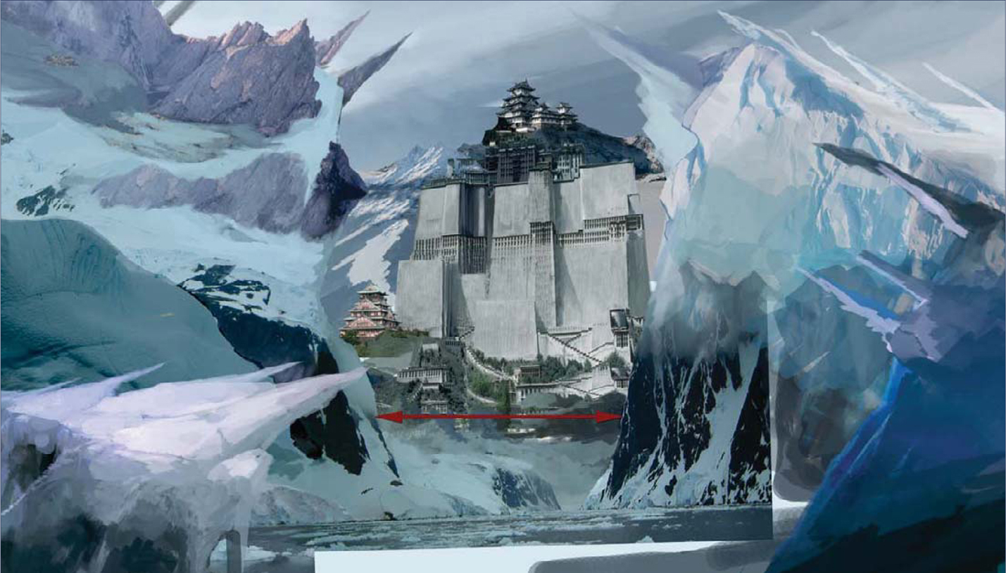
I created a new layer under the sketch to use as the fundamental color draft, with the Opacity set to 60%. I removed the original black and white sketch at this point as I no longer needed it and was happy working with the blocked-out colors as a guide. I started building up my scene using the photos that I found as reference, layering them up following my concept (Fig.08 – 09). I found the main object in the sketch looked too clear at this point, and Kadath’s fortress was being “squeezed” by the two iceberg cliffs, so I decided to move them apart to open up the scene a bit (Fig.10).
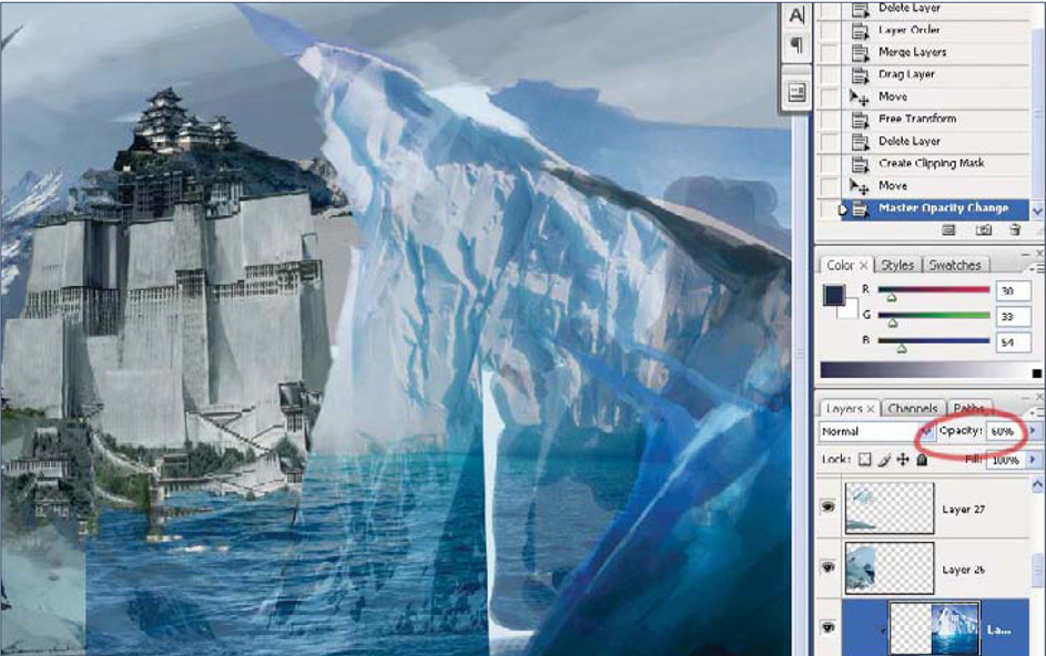
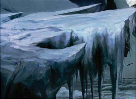
You’ll notice that, for this piece, I was using photo references of mountains without skies. I removed the sky from the mountains by looking at the color channels from the original image and selecting the one with the most contrast between the sky and the rest of the image. I duplicated the blue channel and used the Curves to increase the contrast until the black and white image separated the sky from the foreground. To create texture on the mountain on the right, I used a photo of an iceberg (see Fig.05) and created a clipping mask layer (Alt + click between two layers) on the layer of painted ice. I changed the upper layer’s Opacity to 60%, and then cleaned things up using the Eraser tool. On the left, I used another photograph of a mountain (Fig.11) and rotated it. I painted out the forest from the icy mountain in Fig.11.

Source: Corbis
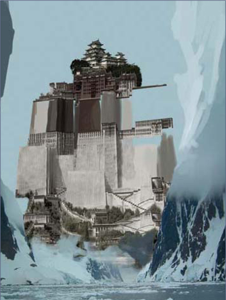
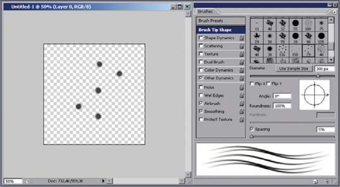
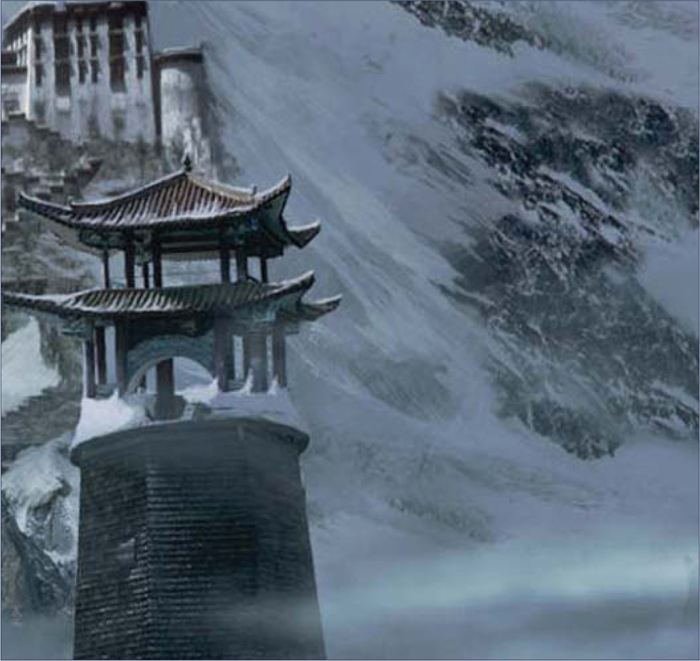
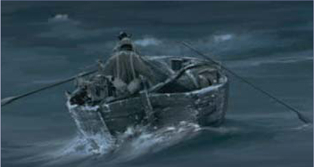
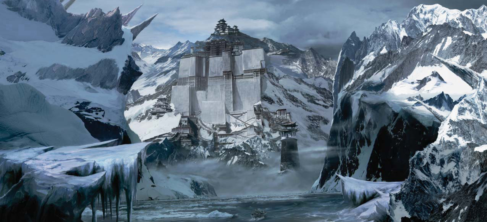
To paint Kadath itself, I used a clear-cut, jitter brush, and the Clone Stamp tool, taking reference from the photographs which I cut up into three parts (Fig.12 – 13). I painted the walls and lengthened them. I hand-painted and copied the stairs several times to increase the imposing height. Painting the snow and ice was very tedious. Most parts of this piece were painted using a hard brush (between 1 and 4 pixels in size). The block of ice in the foreground (Fig.14) was painted thoroughly using a small standard brush (sometimes as little as 1 pixel), and custom brushes with 50% Opacity to achieve cross movement (Fig.15). The picture was finished off with lots of mist to achieve good depth of field. I also decided to add an observation tower to increase the interesting features of the composition (Fig.16). The man in the boat was also hand-painted (Fig.17).
To finish off the painting, I created a new layer for the shadows set to 50% Opacity. I used a firm brush, and with the Opacity set to 35% I painted in the areas that needed some attention – in the lower right area and on the mountains on the left – because the sunlight could not reach there. I then created some adjustments layers with alpha masks, that is, Hue/Saturation and Brightness/Contrast, to achieve a single gamma. I painted onto the adjustment layers on the mask, to create the different tones and contrast areas on various sections of the picture. Here you can see a breakdown of the final set of layers used to complete the image (Fig.18). With all layers combined, the final image was complete, as can be seen in Fig.19 (5600 by 5200 pixels in size).
© Sergey Musin
SEASON CHANGE: A WINTER SCENE MATTE PAINTING
This tutorial is aimed at beginners to matte painting, as well as those who already have some experience; however, please note that advanced knowledge of Photoshop is required in both cases. If you are not familiar with adjustment layers, layer masks or channels (RGB), you should read about these topics prior to starting this tutorial.
Introduction
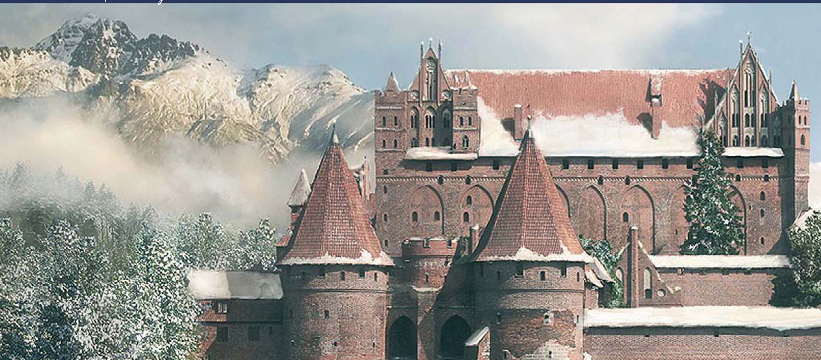
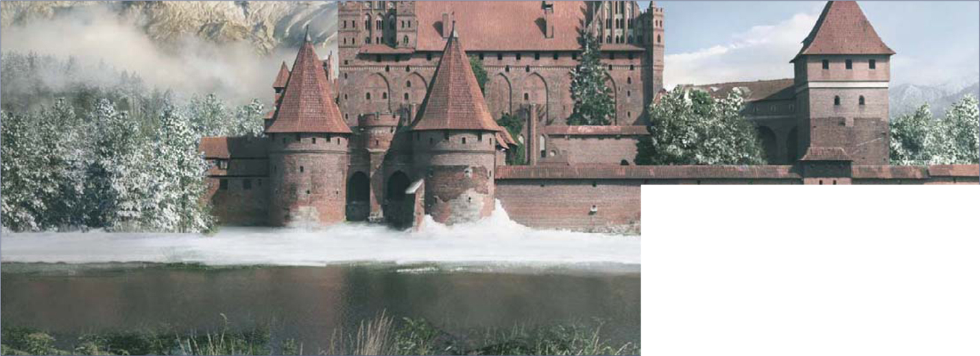
We will start with a common transformation: season change. More specifically, we’ll be turning our base image into a winter scene. While the process itself is not hard, the difficult part is in finding the right shapes, shades and places for the snow, as well as finding a cool (literally) yet realistic color palette.
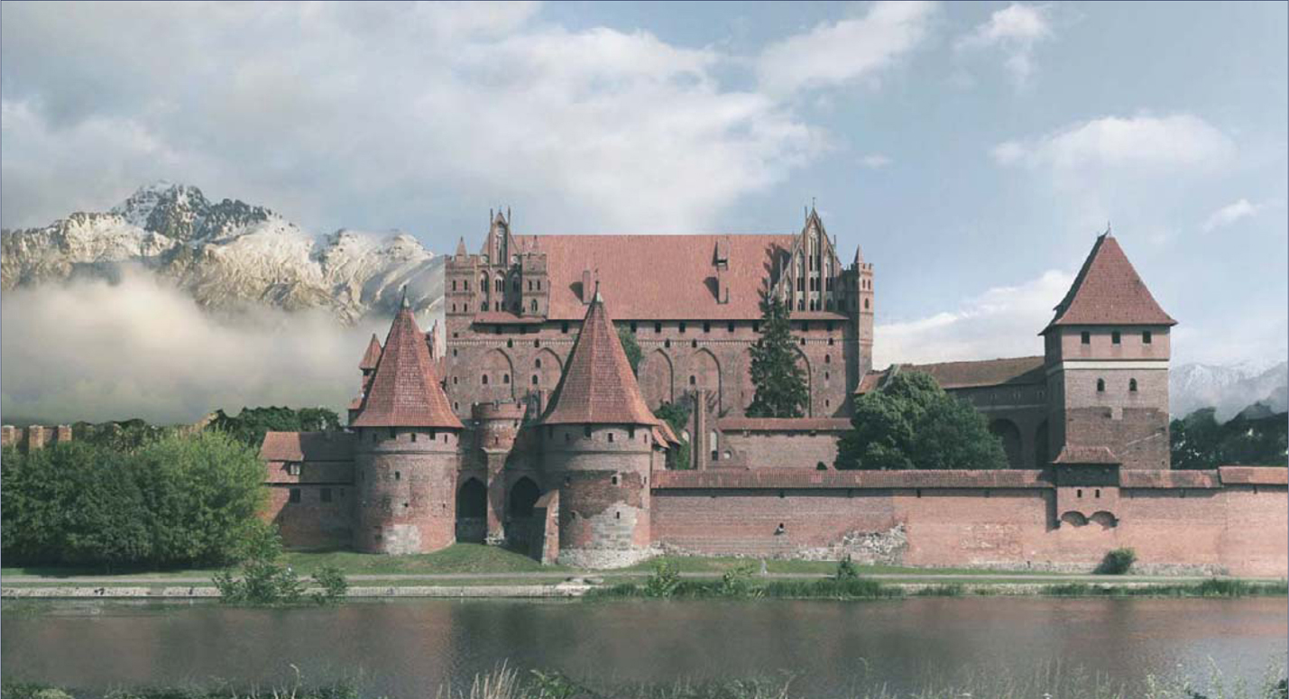
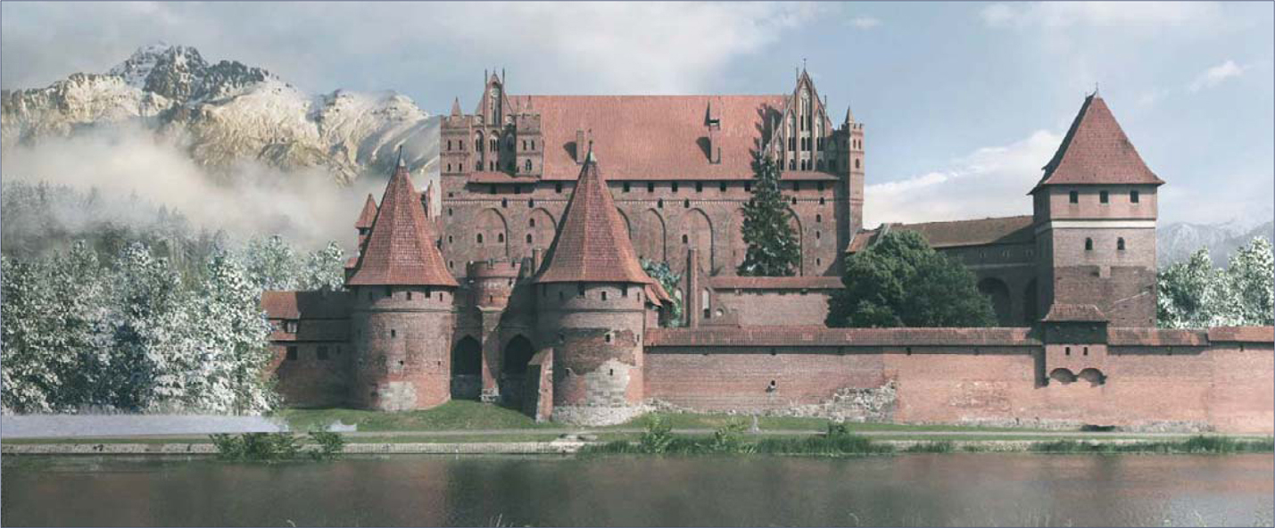
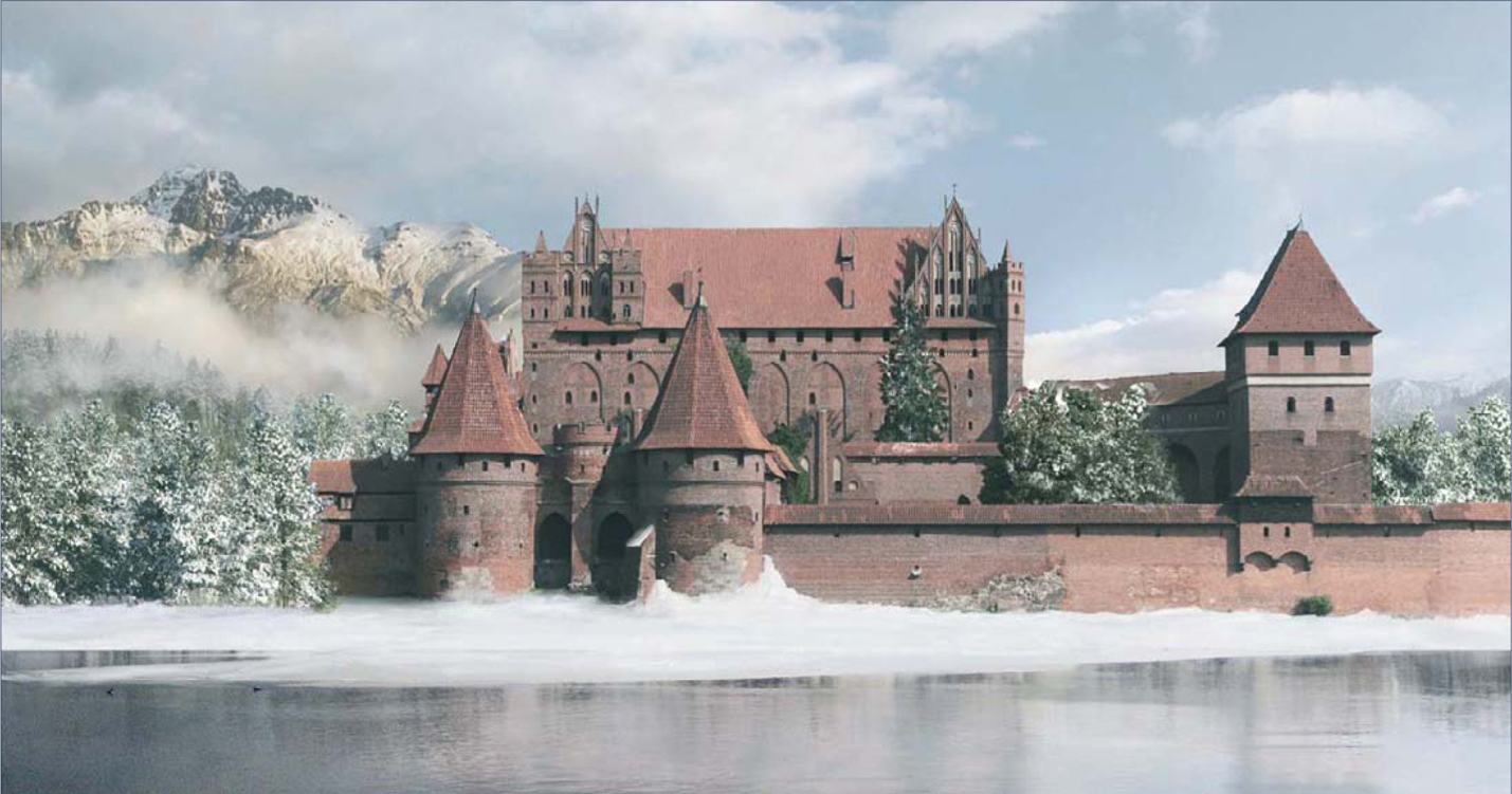
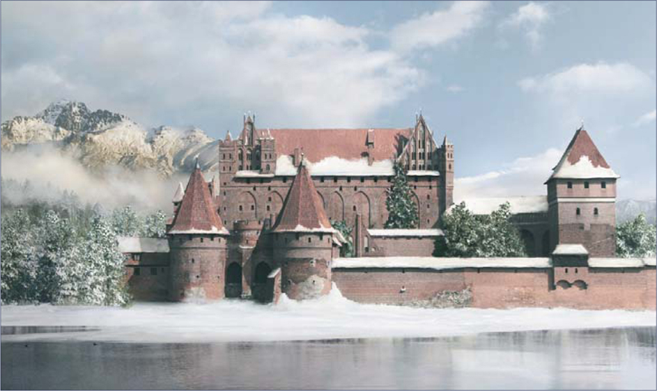
In Fig.01 you can see the before and after results of this tutorial, so let’s get to work.

What are we after?
So, we are after a winter scene. We have been provided with a raw photo which, as you can see (left of Fig.01), was taken most likely during the summer, and we want to see how it will look six months later. The problem with this photo is that it’s full of green trees that will lose their leaves in winter; however, we have no information of what’s behind them and we can’t recreate that information from other parts of the image (we are not going to change architecture, so no Clone Stamping!). This case is perfect tutorial material, because we will do more than just the average summer to winter; we will see how to get a little creative, even if limited by certain restrictions.
I’m going to try to show you a good working habit that can be applied anywhere – not just in matte painting – which will save you a lot of time and nervousness. The key is to think and plan your image. Sure, as artists we often tend to rush ahead under the heat of passion, but as professionals we should first of all learn how to tame that fire, and to make it last as long as we need it to, especially when we work on big and long-term projects.
So, the first step is to think about what you are after. See what you have and, more importantly, what you don’t have. See what you need to get for the project (maybe you have to ask your team mates for a 3D render or a cloud formation). When you feel like you have everything you need, plan your creation steps so that you don’t work chaotically and lose precious time.
In this case, we are after a summer-to-winter transition. We have a raw photo (see left of Fig.01) which shouldn’t be altered too much in terms of elements, so this is pretty straightforward as far as material is concerned. So let’s plan out the creation steps and see what we are supposed to do. Let’s say we have two major restrictions:
• We must not make major alterations to the castle architecture
• We should keep the size and placement of all the major elements (such as the river, position of the trees, and so on).
So with all this in mind, I’ll start by planning the steps I will need to take:
• Firstly, I should begin by changing the color palette into a colder, less saturated one. I also want to reduce the contrast
• I want to “move” this castle to somewhere in the mountains, which will contribute to the overall cold feel and will give more depth. So for this next step, I will need to replace the sky and the background, and add some nice mountain peaks. I will also want to remove the large tree in the foreground on the left
• I should consider recreating the mid-areas, especially the group of trees on the left and right of the castle. I should also connect these areas with the background, probably with an in-between forest and some mist. This is a process often referred to as “surgery”
• Then it’s time to adjust the front lake/river, give it a frosty look, paint some snow over it and then paint some snow in front of the castle
• When all this is done we should start painting in the snow on the castle itself; firstly on the basic parts, then onto the more obscure/hidden parts
• After I’m done with the snow painting I should refine the atmosphere and light. I don’t like the fact that the original plate is so uniformly lit, so I’ll want to change that as well.
Basic Steps
In any matte painting, the key is to work with many layers and use adjustment layers for transformation in order to achieve a lot of flexibility. By painting the layer’s mask, you can select which areas to affect and you can discard/modify any layer at any time.
Everything begins with the preparation of our working area. In this case we are going for a cold atmosphere, yet not too overcast, so we must do a series of adjustments, amongst which will involve reducing the contrast and desaturating and moving the hues towards colder values, like cyan and blue. Depending on your base image, it might take some time to create the proper feel, so have patience and experiment with various adjustment layers. There’s no recipe for this, but I’ll try to point out the most important changes that you should make:
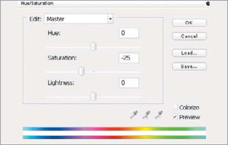
Reduce the Saturation & Contrast
This is usually done with a Hue/Saturation adjustment layer; in our case I’ve used −26 for Saturation (Fig.02) and I’ve also slightly increased the brightness. You can also use this layer to shift the hues a little, but don’t go too wild – a plus/minus 4 maximum will do.
As for reducing the contrast, there are tons of ways of doing this, amongst which are: using a Curves adjustment layer; using a Brightness/Contrast layer and reducing the contrast (not as accurate as Levels/Curves); using layer transitions, and so on. (I always use Curves and Color Balance adjustment layers to create moods because, from my experience, it creates better results than using just one of them alone.)
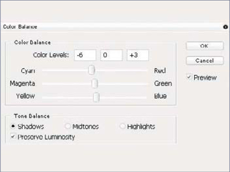
Move the Hues towards Colder Values
This is generally done with a Color Balance adjustment layer using a combination of Cyan/Blue sliders, where needed. The amount and size depends on the hues of your base image. In Fig.03 you can see my values for the shadow part. Note that the values are quite small, but they produce very visible effects, so don’t go too wild. Also note that while this effect is applied to the entire image, it alters the hue by keeping the contrast with its neighbors, which means that for low values the effect is subtle and suitable for in-detail hue changes. Don’t forget that if you have more areas which need different adjustments, you can use several layers and paint into their mask.
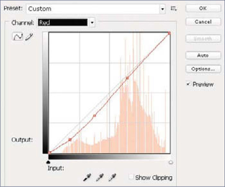
Change the Overall Mood with a Curves Adjustment Layer
We will use the red channel of a Curves adjustment layer to pull the levels towards Cyan. Some people prefer to use just Color Balance, whilst others will tell you anything but Curves is wrong. However, I have found that using both (with smaller intensities) produces much better results. In the end, it doesn’t matter what tool you use as long as you produce good results, so feel free to experiment (Fig.04).
After applying all the changes I have ended up with what you can see in Fig05. It doesn’t seem very “cold” right now, but that’s just because there’s a lot of greenery in the scene which affects the overall mood. However, if you look at the original image you’ll see the difference already (see left of Fig.01 for reference).
Chang ing the Background
Luckily for us, the original image has a clear sky which means changing the background should be pretty easy. First of all, find a nice mountain stock photo that suits the image, and which also doesn’t load the image too much. We already have a lot of positive space so we need as much sky as possible to compensate. The general process of replacing the background involves the following steps:
• Creating a mask for the new background layer
• Selecting the sky (and other areas you want to replace) from the original layer
• Going into the mask, inverting the selection and filling it with black (which will render those parts invisible while keeping the rest of the layer) (Fig.06). What is more or less difficult, depending on the base image, is the extraction of the area(s). There are several methods to do this. In our case, which is one of the simplest, we can simply use the Magic Wand tool to quickly select the sky. Moderate problems arrive when the area you want to replace has many ungrouped hue values, or, on the contrary, the whole image has shades of the same hue (think of sepia) and/or the separation edge contains many small details (like a tree, for instance). In this case the most common method is channel, extraction, generally using the blue channel, which has the best contrast. Lastly, the hardest cases are those which combine all of the above and, in addition, have also about the same brightness levels, or their distribution is random. These require hand work, combining the Lasso tool with painting into their mask. Here’s what I get after roughly replacing the background (Fig.07).
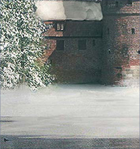
Adjusting the Middle Ground and Foreground
Now that we have moved the castle it’s time to adjust the rest of the elements to fit their new location. We will start by recreating the left middle-ground part, which was in the original photo behind the big tree in the foreground. Since we don’t know exactly what was there, we have a lot of freedom for this step (unless we are given specific instructions, of course), so it’s up to us to choose what to place in there. For this tutorial, I’ve decided to replace this part with some pine trees, obviously covered with snow. The fastest way to do this is to find a nice stock photo; it doesn’t have to be a full forest – two trees are enough. You can then duplicate them all around and modify their edges for variety. However, do pay attention to the scale. In this image, one of those front towers has the height of a two-to-three story building, so the pine trees should be scaled accordingly.
Now we’re done with the last step, I feel the need to connect the group of trees with the distant mountain for more natural depth. This is achieved by adding a distant forest in between and painting some mist over it to help integration. I also enhance the mist at this point by adding more details to it (Fig.08).
It is now time to powder some snow over the two trees inside the castle ground, to match in with the rest of the scene. This is done with a hard round brush with a Scattering effect applied. In the end, I roughly paint some snow in front of the castle as well, to get a better idea as to whether I am on the right path, and also to spot any flaws (Fig.09).
Finally, we need to adjust the water in order to give it a frosty, cold, wintry look. What contributes the most to this effect is some drastic desaturation and snow painting on the places where the lake meets the shore. And don’t forget about reflections! Once it’s been frosted over in places it will reflect much more detail than in the original photo (Fig.10).
Starting to Look Cold…?
One thing that I don’t like at this point, which is a heritage from the original photo, is the fact that the whole image is quite uniformly lit. There’s nothing wrong with this in terms of realism but since the subject is so big and centered, the eye gets lost in the image. One way to correct this, at least partially, is to create a gradually increasing brightness from left to right, but we’ll address this later.
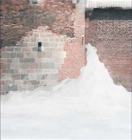
Painting the Snow
At last, we get to take care of our castle. For some, this might prove to be a boring step because it involves a lot of thinking and detail painting. You have to go in and check every spot where snow would naturally fall; a high quality original will help the process a lot. When painting snow, use a rough brush to create irregular shapes. Choose two colors: one for the regular snow (a white) and one for the shadowed parts (a gray or a slightly bluetinted white). Painting snow involves working alternatively with these two colors. In Fig.11 you can see a suggested palette for painting snow and ice with realistic shades (not too saturated).
Begin by adding snow on the edges and small parts where the snow would naturally fall. Then move on to the roofs and bigger areas (always do this afterwards because it will be easier to spot details before you do it). The hardest part of this process is to think about how the snow would actually look on the structure and not just mindlessly spray it everywhere. If in doubt, reference photos will help. Don’t be ashamed to type “castle in winter” into Google and look at some photos.
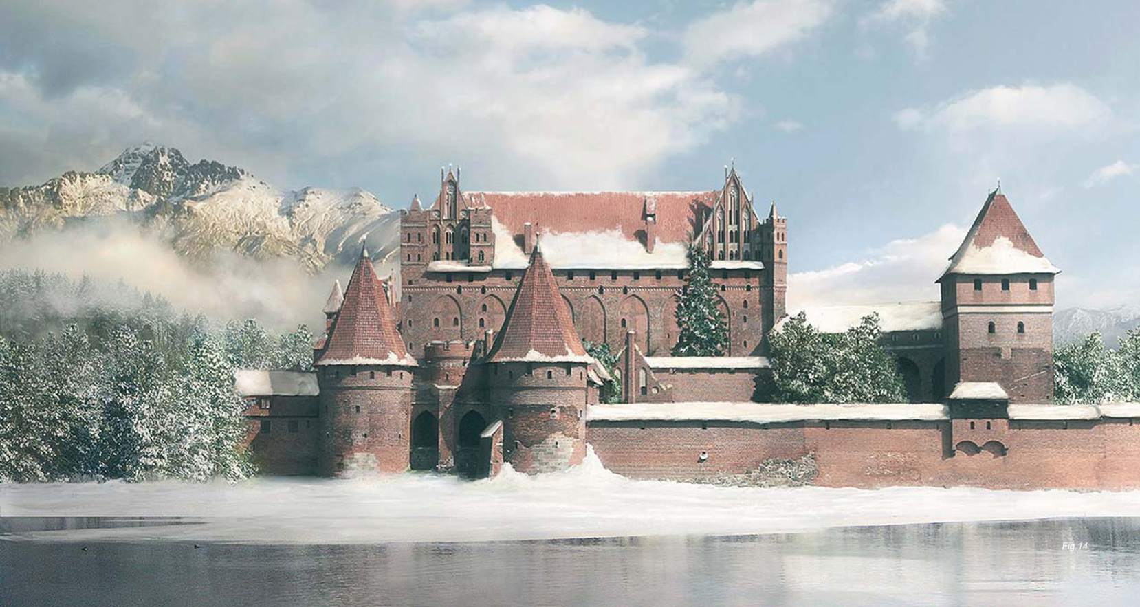
Don’t forget to paint in at least 1.5 times higher resolution – double resolution is recommended. Here’s a close-up of the painting (Fig.12a – b). And after all the painting work is complete, this is what I end up with (Fig.13).
Refining the Atmosphere
Finally, when we have everything ready, it’s time to create that gradual transition I was talking about. Using two Levels adjustment layers – one that makes everything darker and one that makes everything brighter – I paint in (using their mask) shadows and highlights to break up the monotony and make the image more interesting; darker to the left, brighter to the right. I’ve also move the highlights a little towards yellow to match the sun’s natural color for this kind of setting (Fig.14).
You can download the photo (JPG) used as a plate in this matte painting tutorial from www.focalpress.com/digitalartmasters.

PYROTECHNICS: FIRE AND SMOKE
Again, this tutorial is aimed at beginners to matte painting, as well as those who already have some experience; however, please note that advanced knowledge of Photoshop is required in both cases. If you are not familiar with adjustment layers, layer masks or channels (RGB), you should read about these topics prior to starting this tutorial.
Introduction
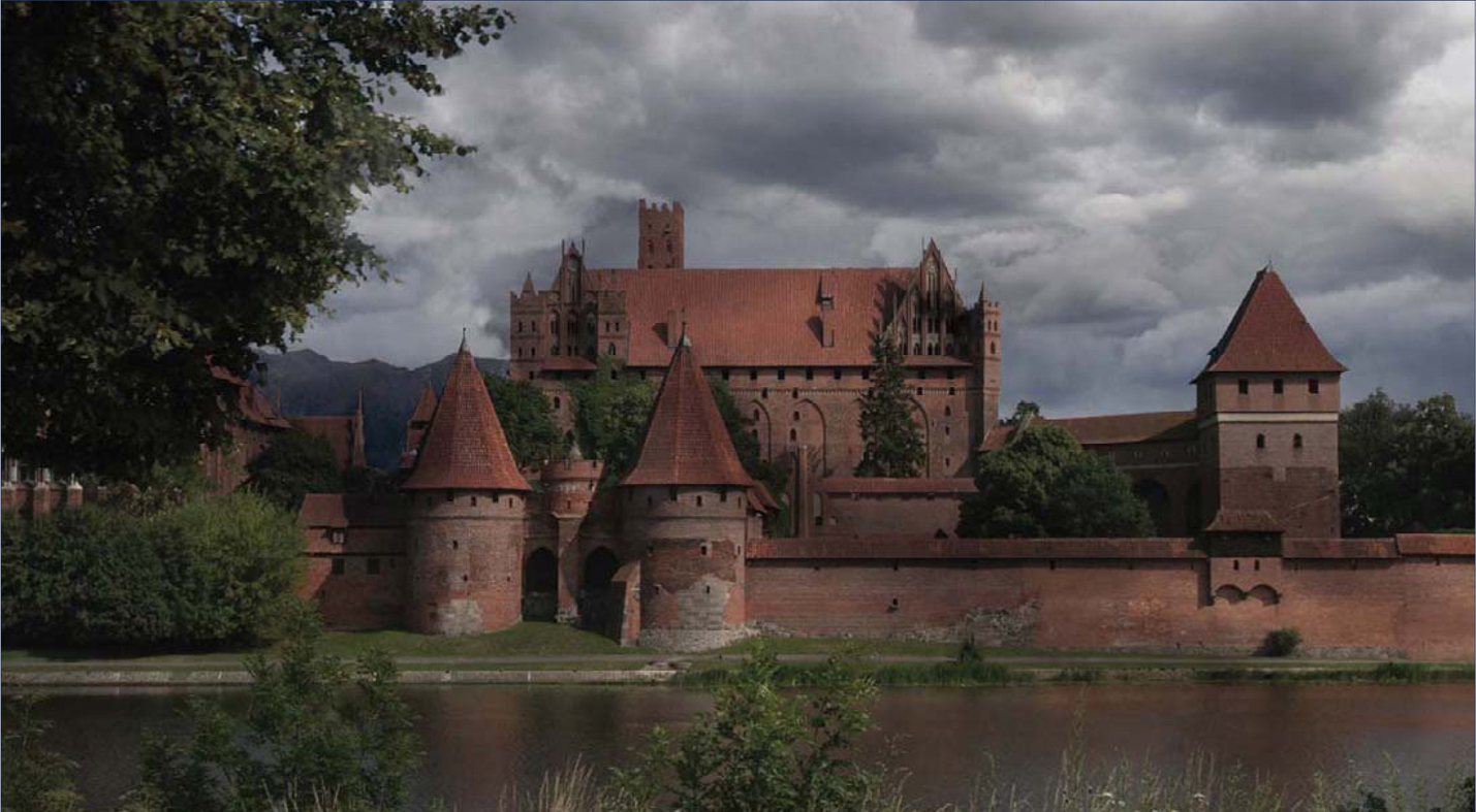
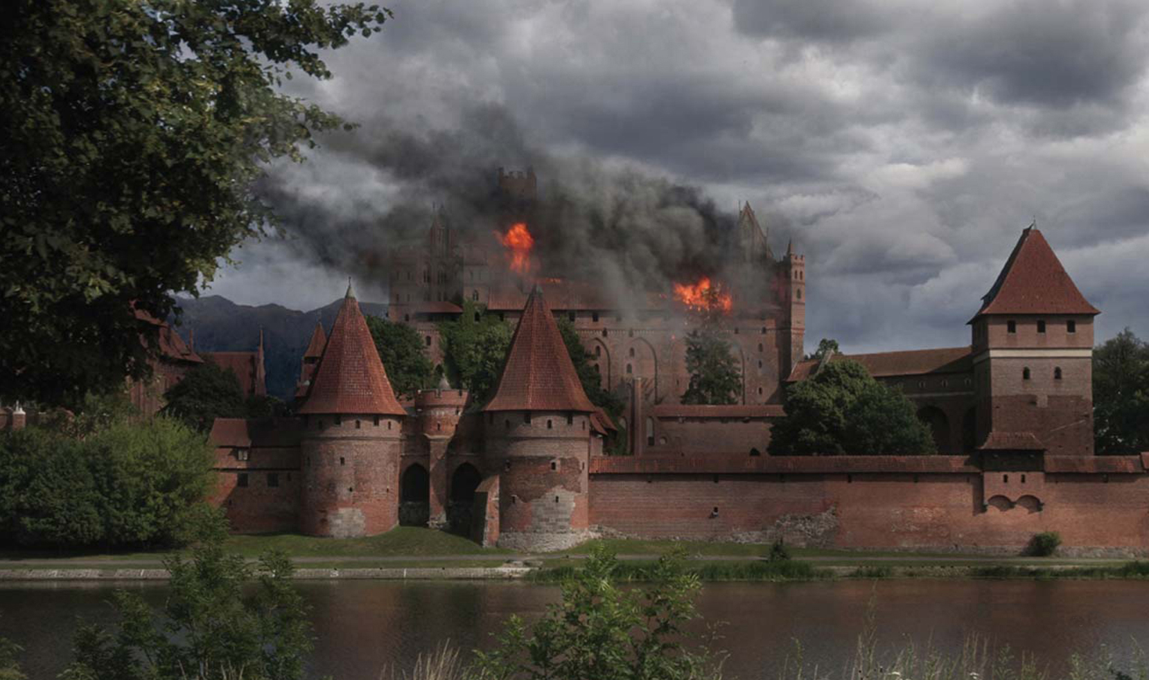
Here we go with our next matte painting workshop. This time we will tackle some pyrotechnic effects as we will try to set our nice castle on fire. What?! Well, at least we’re not doing it for real!
I must say from the beginning that fire and smoke have an illustrative character and are not the subject of classical matte paintings, which are supposed to be “invisible art” and not contain any moving elements such as smoke, water and birds, and so on (which are later added to the live plate by means of compositing). However, as before, we will assume that this is an establishing shot or an illustration of some sort and carry on tackling this brief. So let’s get started!
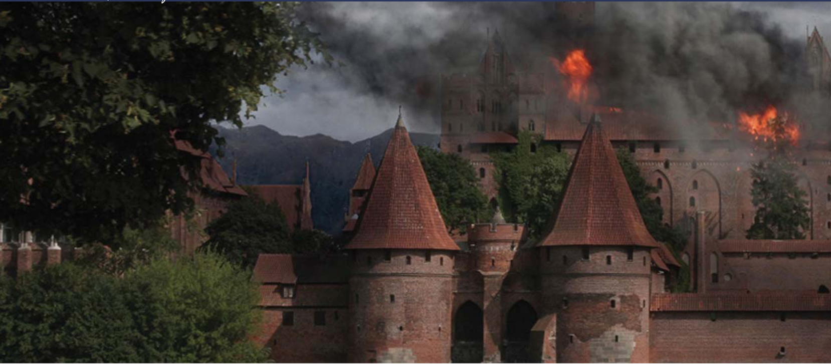
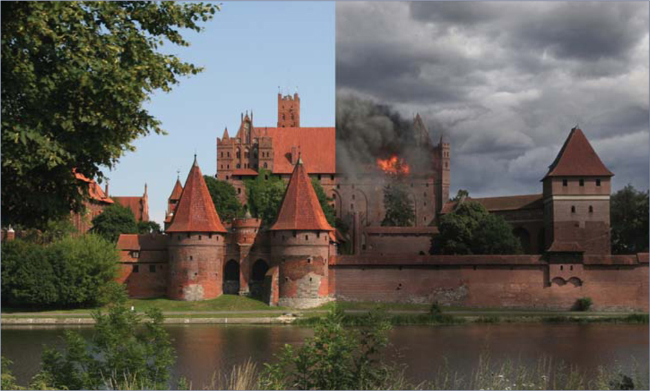
In Fig.01 you can see the before and after results of what we’re going to do.
What are we after?
So we’ve taken our sunny castle and subjected it to the wrath of winter … Now let’s see how it will handle fire! We will assume that some heavy explosion took place just 15-minutes ago in the upper part of the castle. So, with that in mind, we will focus less on adjusting the rest of the scene and more on how to create the pyrotechnic effects. Let’s start as we should do by thinking things through.
Scene Preparation
As mentioned at the beginning of this tutorial, we’ll consider this to be an illustrative piece. It is therefore very important that we sell the subject using appropriate moods and lighting to emphasize the feeling. For this very reason I choose to replace the sky with an overcast one, in order to bring more heaviness upon the scene.
The process of replacing the sky by using a mask is the same as in the previous article on the winter scene, so I won’t go into too much detail on this again here. Now we need to tone down the rest of the scene to match both the sky and the scenario. We will have to bring down the saturation and also darken it. We will bring down the saturation using a Hue/Saturation layer and we’ll darken it using two identical Levels layers, half valued (Fig.02 – 03). The reason I used two layers is because I wanted to simulate hints of light passing through the clouds by painting in the second one’s mask, and I thought this would give me better control. The result of my adjustments can be seen in Fig.04.


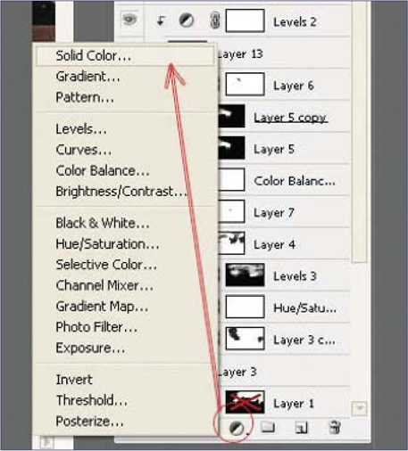
Next we will break the monotony of the highlights in the original photo by creating scarce cloud shadows. We will do this by simulating random cast shadows by painting into the mask of a Solid Color layer with a fairly dark color set to about 65% Opacity (Fig.05). Note that because the distance between the clouds and the land is relatively high, the shadows cast are always going to be blurry and rather diffused. If the clouds are quite small, or the sun manages to peak through, you will see those typical cloud shadowed areas on the land.
You can control the shadow intensity by various means, like a gray shade used in the mask, overall Opacity value, or the transfer mode, but pay attention never to exceed the 60 – 70% of the value of direct shadows (which you can reference from the original photo). For our scene I choose a pretty light and diffused shadow for more subtlety (Fig.06).
Let it Burn!
Fire and smoke have always been considered pretty tough elements to paint if you’re aiming for realism in your work. In matte painting, you have the optional choice of finding a stock photo that fits your needs (although these are rare), or to use a smoke or gas simulation software (but the result is not always so good with this option). However, shockingly enough, we won’t talk about either of these here. Instead, I’ll show you how you can paint realistic smoke using custom brushes and some good old thinking!
Creating the Brush
When creating the custom brush we have to consider the various smoke properties and think how they can be translated into brush properties. The most important aspects that should be taken into account are shape, opacity and variation.
General Considerations :
Although smoke has a structure that resembles a cloud formation, its composition is different from a chemical point of view, and that affects the expansion pattern and speed. Smoke disperses a lot faster than a cloud. Another important difference is that smoke is generated; hence it’s thicker near the source and breaks up as it goes farther.
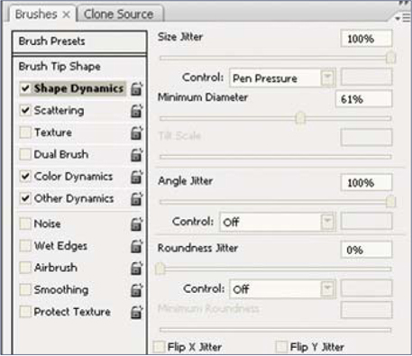
Brush Para meters :
• Shape – Smoke has a typical shape with irregular edges and resembles a cloud structure. The basic brush shape can be sampled from an existing cloud texture – almost any would do. The element should be around 120 to 200 pixels in size. See Fig.07 for an example.
• Shape Dynamics – Smoke tends to gather in clusters of various sizes, which disperse faster or slower depending on their densities and composition. We can mimic this by using a Shape Dynamics modifier set to Pen Pressure (Fig.08).
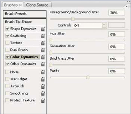
• Scattering – This completes the above effect by scattering around the groups within a certain limit. Use both axes at about 120 to 130%
• Color Dynamics – This assures a variation in shades. Apply a darker color to the foreground and a lighter one to the background, and then set the foreground/Background Jitter to around 30% (Fig.09)
• Other Dynamics – Finally, we also have to simulate the gaseous nature. The smoke is thicker if the density is higher, and it gets less opaque as the volume increases and the particles scatter around. We will set the Flow Jitter to Pen Pressure and that should do it. If you need better control for some areas you can also set the Opacity Jitter to Pen Pressure.
Applying the Brush
Now that we have our brush we can go ahead and paint the fire and smoke. Because fire will be painted in the same manner, I usually start with the smoke, but if it helps you to visualize better you can start with a quick fire placeholder – the choice is yours.
Before starting it’s good to take into consideration wind direction and speed, because this will affect the way the smoke evolves, how fast it disperses, and its trajectory. Most of the time, considering a good smoke source and the strongest wind, the farthest smoke reaches without dissolving too much, which translates into a smaller occupied volume and higher density (a.k.a. higher opacity). In opposition to this, when there’s almost no wind, smoke evolves on a vertical trajectory and expands quickly, reaching large volumes in the upper parts with lower densities. If the scene already has a predefined wind (either from a story or existing elements), you should be consistent with it; otherwise pick one before starting and try to stick with it.
With your new custom brush and all these factors in mind, you can now start creating the smoke. Since this is not a video tutorial I am rather limited to what I can show you in process images, but I can at least talk you through the process. It is important to be patient and to not expect immediate results, as this is a long and tedious process that often requires plenty of trial and error. Like with any painting, you should start by blocking down the basic shape of the smoke with a neutral color.
At this point you are after two things: shape and opacity. Take your time refining them as it will be harder to do this later on. I have made a quick example to show you what I mean, but normally you would want to spend more time on this than I have done here (Fig.10).
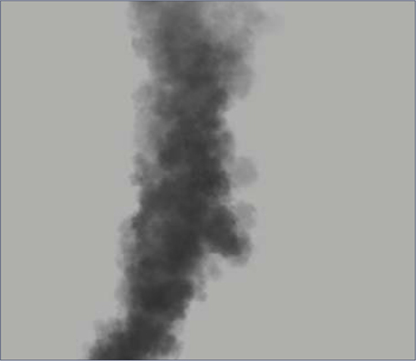
The next step is to lock the layer (including Opacity) and start adding different shades. For the beginning choose only two – one for highlights and one for shadows – which should of course match your scene’s lighting scenario, as well as smoke composition. Use fairly large sizes for the brush at this point (Fig.11).
After you lay down the basic shading you can then get into the details (painting with smaller brush sizes) and additional shades. Remember that you’ll have lighter shades on the parts exposed to light, and darker shades in shadows and near the fire source. Again, don’t expect immediate results; keep doing this until you’re satisfied. You can also pick slightly colored smoke – it doesn’t have to be grayish, and it will of course depend on your scene. For the particular scene that I’m working with, it took me about 1 to 2 hours to paint the smoke. You can see the result here (Fig.12).
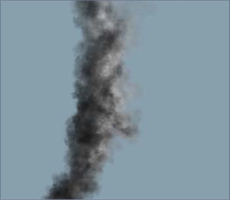
Fire is very simple to paint if you start with the smoke. The fastest and easiest trick is to pick a middle-toned orange, set the brush transfer mode to Color Dodge, and paint over the smoke. Or, use an extra layer and set it to Color Dodge transfer mode. The latter offers you better control as you can later apply filters to just the fire alone, without affecting the smoke. With smoke, it takes a while to achieve the desired effects, so be patient and experiment!
Additional Steps
You can also enhance your smoke by adding subtle motion blur to it; this can often add a great deal of realism because smoke tends to evolve a bit faster than the camera shutter, plus it’s a moving element of course. For this, use Filters > Blur > Motion Blur and choose the direction of your smoke. The intensity should be around 10 to 15, depending on the size.
You can download the photo (JPG) used as a plate in this matte painting tutorial from www.focalpress.com/digitalartmasters You can also download Fig.07 as a JPG file so you can use it as a sample for your own cloud/smoke brush experiments.

MATTE PAINTING TIPS AND TRICKS
Introduction
You’ve seen how Photoshop can be a great tool and how, with only an average knowledge of it, you can achieve some pretty nice effects. But matte painting isn’t actually just about Photoshop, and all that I have shown you so far have just been the basics, which are meant to give you a taste and to get your attention. You are now standing at the beginning of a wonderful road, but you should know that matte painting is much more than photo manipulation and, as the name suggests, involves a lot of art theory and real world understanding, too. That’s why in this tutorial, we will try to understand these aspects and see what matte painting is really all about.
Origins
Matte painting is all about mimicking photography. We don’t try to reproduce how the human eye sees environments, but rather how the camera captures them. Traditional matte painting was developed initially in around 1959 for the movies and was done optically, by painting (literally) on top of a piece of glass to be composited with the original footage – hence the name “matte painting” (painting done on glass with a mask = matte). Nowadays, digital matte painting is less about painting and more about virtual set creation, yet it retains its old name because it shares the same goal with its grandfather. Matte paintings are used widely for any kind of application that requires a virtual set. But, of course, movies are still where they are used the most; the goal being to produce realistic environments (sets) where actors can perform naturally, as if they were really there.
Playing by the Rules
All the rules from traditional art are transferred here and, in addition, a matte painter has the difficult task of making everything photorealistic. There are several elements that tell the eye it’s watching something that exists (even if it doesn’t):
• Depth – This is the natural progression of colors and focus that you see in nature. In the distance, elements have less saturation and contrast and details are harder to spot. In the extreme distance you will only notice two shades (highlights and shadows), while the objects tend to have a bluish tone, due to the heavy atmosphere filtering. On the other hand, the foreground (meaning the objects that are close to you) has normal saturation and contrast, full black levels, and you can see all the details in them.
• Lighting – While this is obvious in nature, one has to be careful when creating a matte painting so that all the highlights and shadows match the source light and direction.
• Scale – Again, it’s very important to match the scale of every element. You don’t want a tree to be as tall as mountain, even if it might sound cool in a fantasy setting!
Depth: In the Real World
Depth, or better said “the way an object behaves with distance”, is one of the most essential aspects of realism. This includes two sub-aspects:
• How sharpness is affected
• How color and contrast recede/fade.
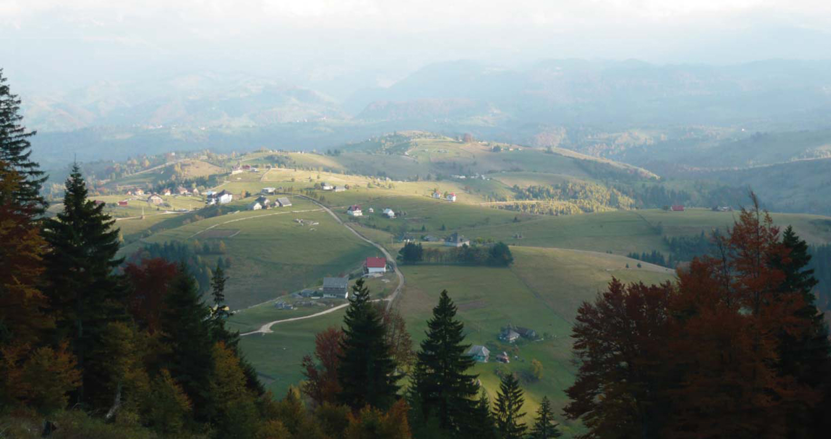
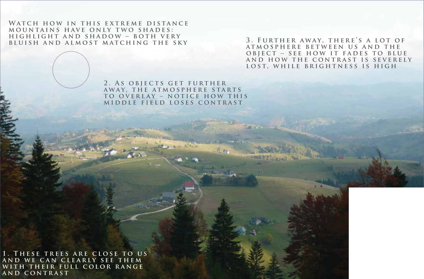
The first is of less importance for us (but not unimportant). It’s the classic photographic depth of field: on normal shutter settings, objects that are further away are blurred. How much or how less varies from scene to scene. The second one is more delicate and it’s the main issue we are interested in (Fig.01). In a normally lit environment, the objects in the foreground have a high contrast, high levels of black and high saturation, while the objects in the distance tend to fade towards the color of the atmosphere because there’s more “air” between our eye and them, which acts as a filter and only lets certain light frequencies pass through (light is an electromagnetic wave, by the way). This translates into low contrast, high brightness and low saturation. You’ll tend to know this effect as “haze”.
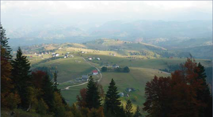
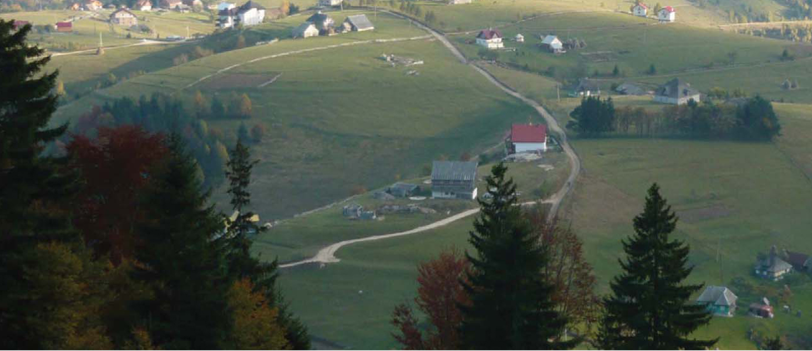
Take a look at Fig.02. Notice how in the extreme distance the mountains have only two shades: highlights and shadows (both are very bluish and almost match the sky). The pine tree in the foreground is close to us and can be clearly seen in its full color range and with full contrast. As objects get further away, the atmosphere starts to overlay – notice how the forest starts to lose contrast. Even further away still, there’s a lot of atmosphere between us and the objects, and they start to fade into blue – contrast is severely lost here, whilst the brightness is high. Of course, this is something that applies to Earth and our atmospheric observation. If you create an alien world matte painting then you’d have to take into consideration how the atmosphere on the planet would behave when deciding upon how much haze you should have.
Depth: Mimicking the Real World
Creating haze is quite easy, and there are many ways to do it. Out of these ways, two seem to suit almost every situation.
Method 1 – If you have many different layers (e.g., a layer for a mountain on the left, another for the mid-range one, and another for the far right cliff, and so on), which is the best way to work? Simply select each layer and apply a Solid Color adjustment layer on top. Choose the color of the sky (use the color picker – it’s the fastest way to do it) and reduce the Opacity according to the distance (e.g., for a very distant mountain you may use 50 – 60%, but for a mid one you might use 20 – 30%). Don’t forget to link this solid layer to the layer that you wish to affect, otherwise it will affect everything (press Alt and click between the layers) (Fig.03).
Method 2 – If you don’t have everything on individual layers then it’s time to clean your tablet and start painting haze. Use a softedged round brush set to Pen Pressure on both Opacity and fading, and gently paint haze, more onto distant elements and less onto close ones. Use a layer mask to brush out if you paint too much. As before, choose a color for the sky using the color picker and try to paint evenly.
Regardless of the method you use, you may also want to adjust the individual levels if they still don’t fit, even after the haze. For that, use a Levels adjustment layer beneath the solid one and ever so slightly move the black levels towards the right or the white levels towards the left, as you need – less shadow intensity or less highlight intensity.
Scale: In the Real World
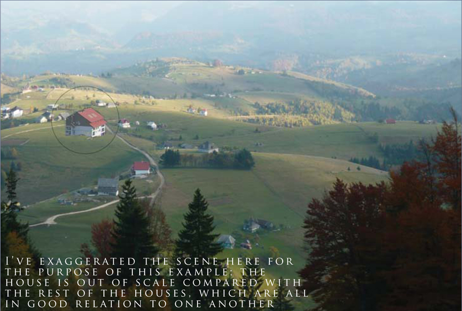
Scale seems natural and quite a trivial thing for many people. Yet, together with perspective, it’s the main source of errors for many new artists (and not only them). It is important to have a good understanding of these aspects because, together with depth, they are the main elements which create the illusion of distance. The human eye and the brain relate to objects in the scene versus already known sizes in order to determine how big another one is (or in our case to spot errors). It’s all contextual and relative. For instance, we all know how big an average house is from our daily life experience. Seeing it in an image next to a pine tree which is half as small and with no other reference objects around it would make us believe the pine tree is still young (because we know an adult pine tree should be much bigger). However, take the same house and put it next to a whole forest which isn’t taller than half of the house, and you’d know something was out of whack! The one that is wrong – forest or house – will depend on the other elements that are in the scene. See Fig.04 for an example (which is exaggerated for the purpose of this tutorial).
Scale: Mimicking the Real World
Obviously, making the right scale is easy, tool-wise. Simply use the Transform tool to scale down. It’s a good idea to have the object rendered very big and scale it down, rather than scale it up and paint to compensate for lost quality. The trick is to choose the right scale. Look around the area where you want to place the object, see what else is there, and then scale it in relation to the surrounding objects.
Perspective
When it comes to matte paintings, the most common error you see is that of the angle of views. With this technique, the artist uses samples and objects from many different sources, so it is important that all of them share the (almost) same perspective. The second aspect of perspective is that of camera distortion. Because we try to mimic photography and not the real world we should “copy” the way camera lenses affect an image.
Finally, a matte painting may be required to have unusual perspectives, like 1-, 2- or 3-point perspective, or special ones like cycloramas (take a look at Star Wars cyclorama matte paintings – those that have been made public, anyway).
To achieve all of this, you have to plan your elements well and use your references wisely. Don’t torture your photograph by stretching it until it breaks – you won’t solve anything with that. Instead, try to paint and imply the right perspective; use another reference or make a 3D object and pose it at the right angle.
Light: In the Real World
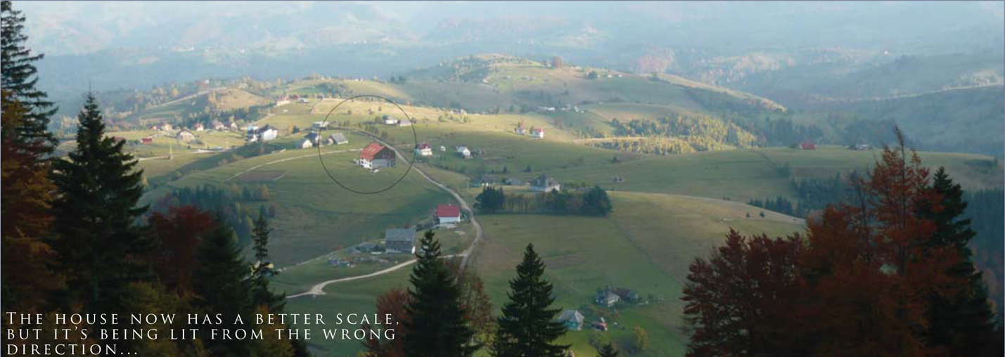
Last but not least, another important element of a successful matte painting is light – that is the way that objects are illuminated and shadows form; something that is so natural, yet, as before, can also be a great source of errors. Light can be your friend, but also your enemy. Use it properly and it can make your scene dramatic while at the same time hiding imperfections (in fact this is the main “trick” used by matte painters: hiding imperfections in shadows or mist). However, use it improperly and it will destroy your scene. The main mistake that you can see among new artists is having objects lit from different directions, like one from the left, another one from the right, and another one from the top (Fig.05). You can immediately spot that there’s something wrong with the house in Fig.05. In this case, a simple flip would solve the problem … but what happens when that’s not enough?
Light: Mimicking the Real World
Creating the proper light is often the most time-consuming step of a matte painting. Usually it’s impossible to find references that fit together and which are also lit from the same direction (unless you are provided with plate shots), and so you must spend a considerable amount of time correcting the light and making everything match. There are three main difficulty levels, which are as follows:
Level 1 – If the image you want to use is lit from the same azimuth/pitch but opposite direction, then a horizontal flip usually works. However, while this is OK for landscapes, it doesn’t work so well on architecture or recognizable patterns.
Level 2 – The second difficulty level is when light doesn’t match, but the shadows are not too hard-edged (either overcast or with low intensity/blurred). In this case, the typical process of correcting the element is as follows:
• Apply a Solid Color adjustment layer (see Fig.03) with a dark color (that obviously matches the hue/shade of shadows from the rest of the scene), and set the Opacity to around 50 – 70%, depending on your needs
• Duplicate the object layer, dramatically increase its contrast, and then set it to Screen with Opacity 60 – 100% – again, all depending on your scene’s needs
• Create a mask for this layer and brush out the parts that are in the shade (hence you will see the dark layer below), leaving only the parts that you want to be lit.
Level 3 – The hardest situation is when the shadows are many and hard-edged (think of some sort of a cliff). For this, either find another reference or start painting in shadows and highlights based on the colors you pick from the original plate.
Conclusion
Matte painting is all about creating the illusion of reality. Depth, scale, perspective and light are the most important elements that trick the eye into believing. And, besides having them right, you can also use light and scale to your advantage in order to bring drama to your images and make your scenes epic (Fig.06)!