
Sci-fi & fantasy
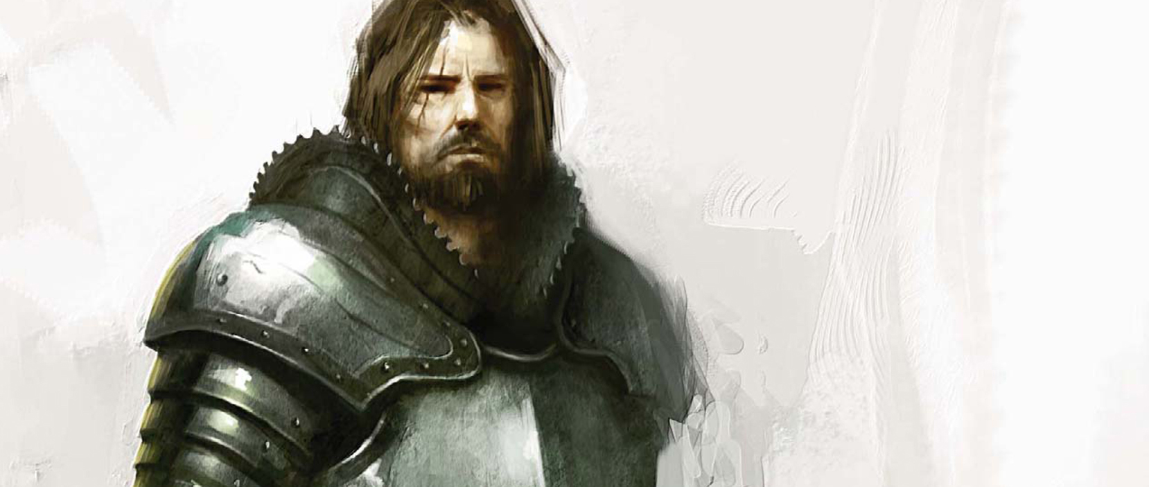
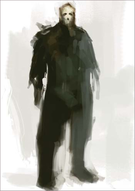
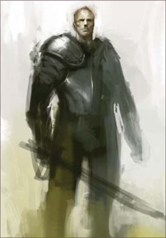
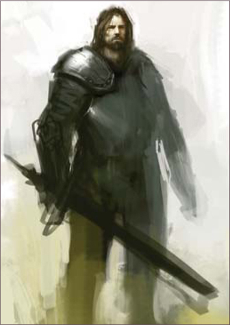
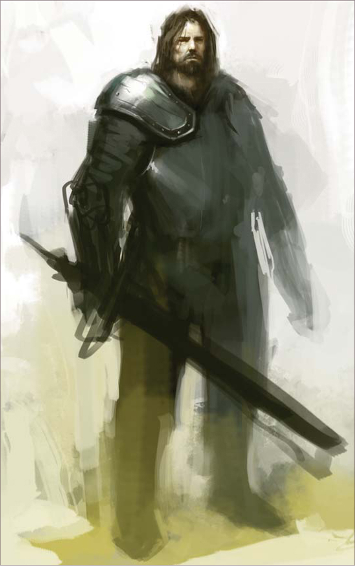
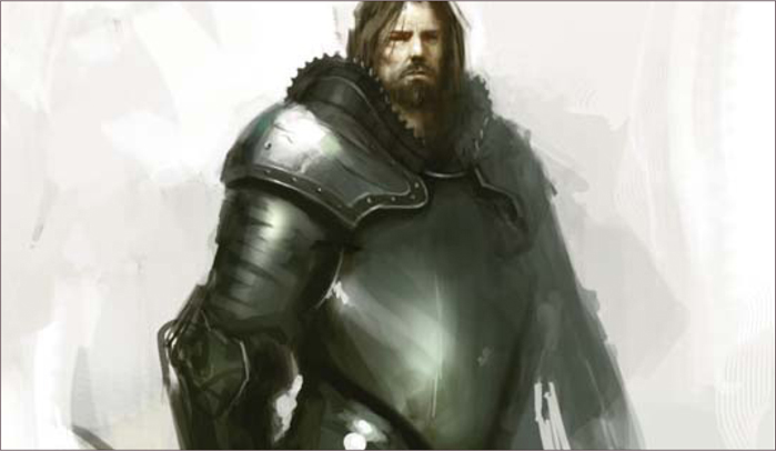
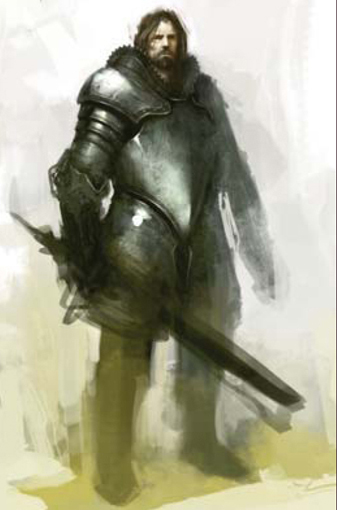
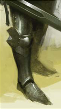
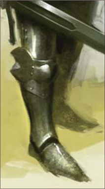
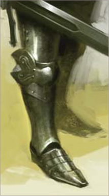
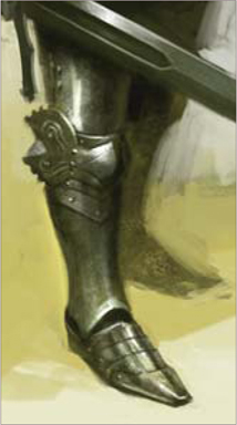
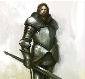
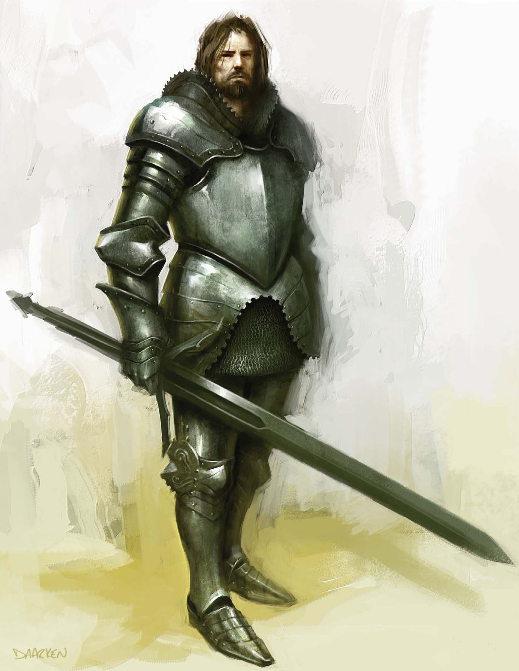
European Knight
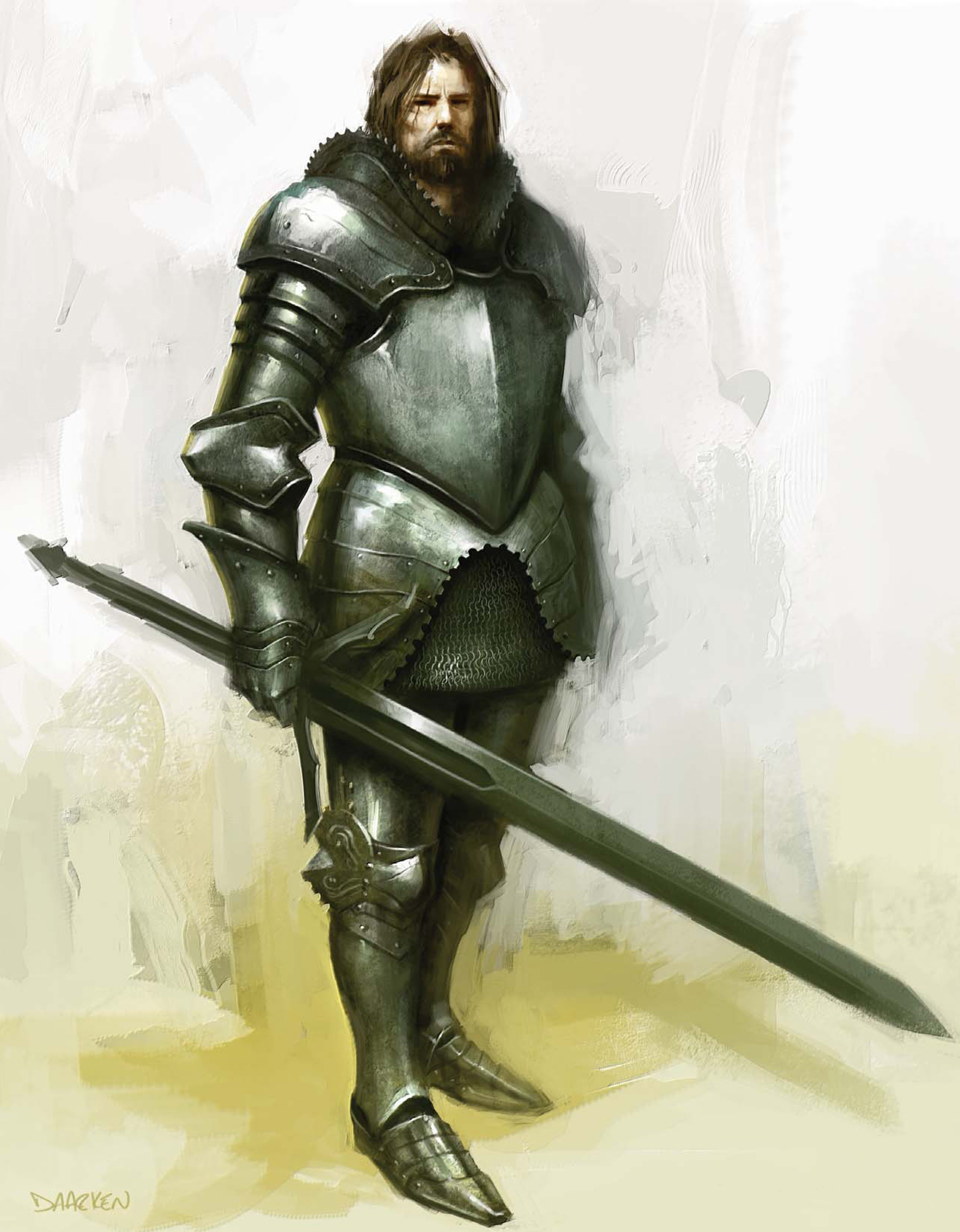
© Daarken
These subjects are two of the most popular themes explored by modern digital artists today, and together form a large proportion of popular artwork adorning desktops around the globe. More than any subjects, these two allow an expansive base for creative freedom, and thus have attracted and inspired many artists who have become well respected within this field. Over the next few pages we take a look at how three very different artists approach varying subjects and exploit their tools to good effect. Ranging from the ancient through to the futuristic, we see how each has been inspired by this genre to produce imaginative pieces.
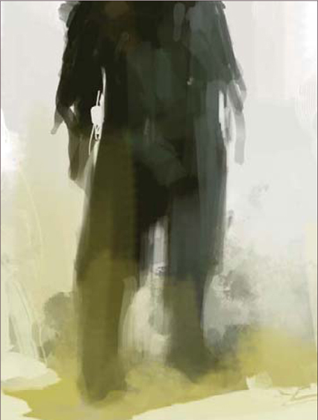
© Daarken
PAINTING ARMOR: EUROPEAN KNIGHT
Gather Information
The first thing I usually do when I get a project is to collect all of the reference material that I am going to need. Most of the time you can find everything you need by just Googling it. For this project I gathered some images from different museum websites. It is a good idea to start building up a large reference folder on your computer so that the next time you need some armor references you will already have them. Now that we have our reference material, we can start the illustration.
Get Ready
This painting is going to be done primarily in Photoshop CS2, with a little bit of Painter IX at the end. If you want to try out my CS2 brushes (available for free download from www.focalpress.com/digitalartmasters) simply click on the Brush tool, and then right-click on the canvas. Your Brush menu should now open. In the top right corner is a small triangle button – click on it and go to Load Brushes, then select the file that you have downloaded. As for what size of a file you should work in, I always paint at 300 dpi and usually around 3000 pixels wide. This artwork is 2404 by 2905 pixels.
The Block-In
Start by blocking in the main shapes of the figure (Fig.01). At this point you are just trying to get the basic shapes of the figure, so don’t worry about the details just yet. Next, lay in the basic color and shapes for the face (Fig.02). I felt the need for some more colors in the background, so I added some yellows to the ground and brought them up behind the character, and also onto his legs (Fig.03).
Add Detail
Usually I block in more of the armor shapes before I work more on the head, but this time I am going to finish up the head first so that I can focus more on the armor (Fig.04a). I want this guy to be a rough and tough knight, not just another big brute but one that is proud and charismatic. Another way to make someone look more heroic is to elongate their proportions. Usually I make them around 8 – 9 heads tall. Now that I have the head down, I can start blocking in the armor. I wasn’t really sure what the armor was going to look like, so I just started throwing down paint (Fig.04b). The shape I put down for the pauldron didn’t really make any sense, so I start cutting away pieces and trying to give it some more form and function (Fig.04c).
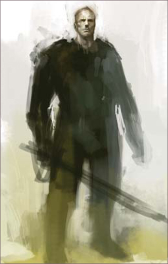
One thing you always need to be aware of when designing a character is whether or not they could actually function. It’s nice to make them look cool, but a lot of the time, especially in the gaming industry, the character will need to be able to animate. This is where your references come in handy. Study how real armor is put together and try to figure out why it was designed a certain way and how it works. I felt like the character was leaning too much, so I rotated him a little counter-clockwise, and gave him hair and a beard (Fig.04d).
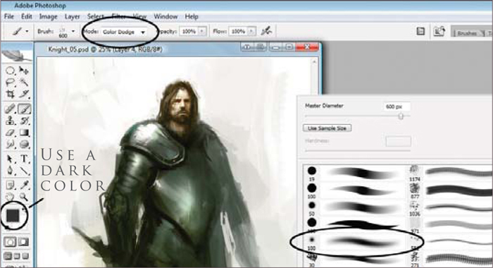
There are many ways to paint in the highlights, one of which is to use the Color Dodge tool (Fig.05a – b). I know people always say avoid using Color Dodge, but when used correctly it is a great tool. First you need to pick a dark color. If you pick a light color you will overexpose the illustration very quickly. Next, click on the Brush tool and go up to the Mode pull down and select Color Dodge. You can use any brush you like, but I find it easier to use a soft brush. Sometimes the area you paint will become very saturated, so just go back in with the desaturate brush.
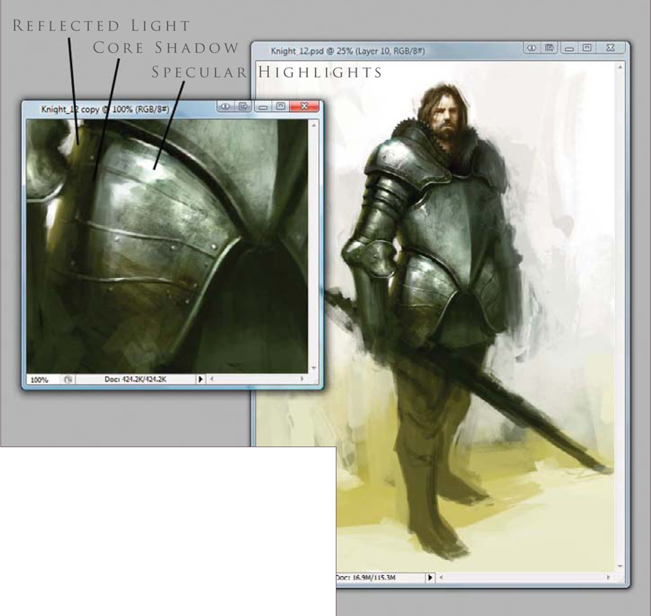
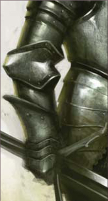
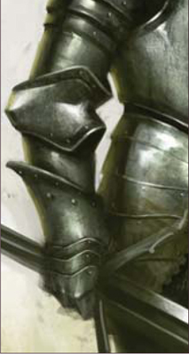
For the plates on the arm, I first paint in the curved shadows that they create (Fig.06a – b). Then I put in some specular highlights, the core shadow, reflected light, and a highlight to the rim of the plates (Fig.06c).
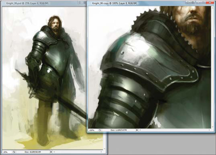
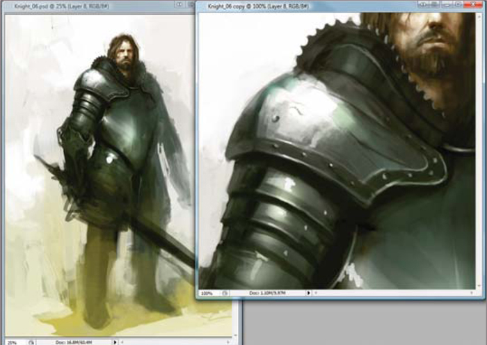
A lot of people ask me how to get textures in their paintings (Fig.07). Most of the time I just paint my textures in manually with my brushes, but sometimes I will overlay a texture from a photo. For this particular piece, I found a texture by Barontieri (http://www.barontieri.com) which works really well. The easy way to add texture to a painting is to take the texture, copy and paste it onto your illustration, and set the layer property to Overlay. You can then knock down the opacity to whatever looks good. In this case I lowered the Opacity to 45%.
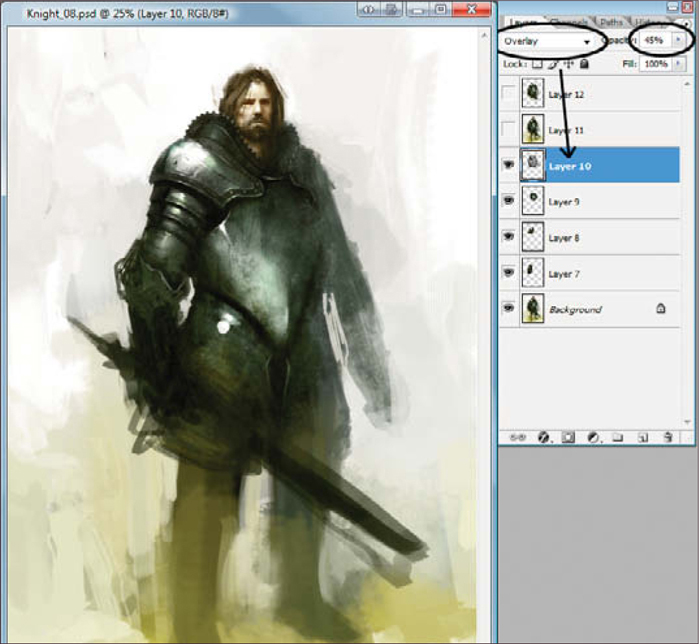
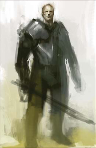
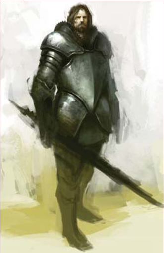
I wasn’t really feeling that his pose was fitting with what I had in mind, so I changed around his stance to a more confident pose (Fig.08 – 09). Again, whenever you are painting something, be sure to remember that there are several parts to describing form, such as the core shadow, reflected light, and the highlights (Fig.10).
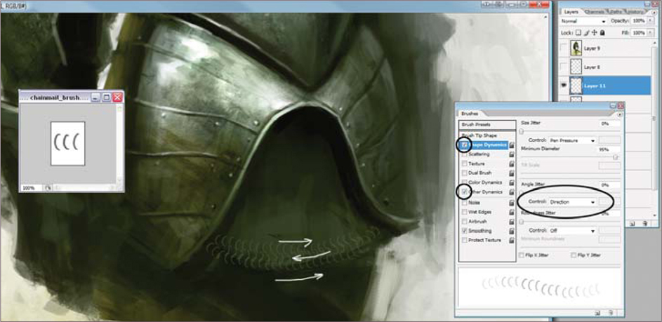
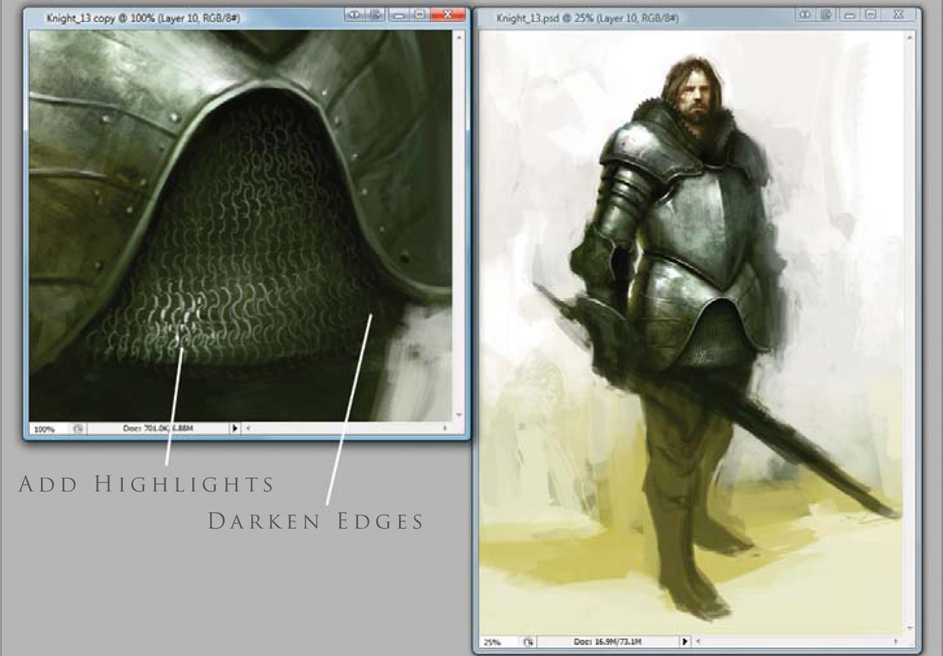
Another really cool part of armor to paint is chain mail. Painting chain mail is really easy and looks cool when you are zoomed out. This time I decided to make a Chain Mail brush for the purpose of this tutorial. Open a new document and draw a few “C” shapes. Make that into a brush and go to the brush controls. Click the box next to Shape Dynamics and under Angle Jitter set the control to Direction. Doing this will cause the C-shapes to follow the direction of your brush. Also click the box next to Other Dynamics so that you can have opacity control with your stylus. First lay down one row of chain mail by painting from left to right, then you can paint the next row simply by painting from right to left. The reason we can do this is because we set the Angle Jitter to Direction, allowing us to paint the C-shapes in both directions without having to rotate the brush. This will let you get the basic idea down. Now go back in and pop in some highlights and darken the edges (Fig.11 – 13).


The armor on the arm is going to be handled the same way I handled the chest armor. First paint in the basic color, then add in the shadows and highlights (Fig.14a). After that I drop in a Texture Overlay layer (Fig.14b). On top of that I use the Color Dodge brush to pop in some more highlights (Fig.14c). Go through the same process on the legs as we have used with the arms (Fig.15a – f).


It is a good idea to occasionally take breaks from your painting so that when you come back to it you can see mistakes you have made more easily (Fig.16). You should also regularly flip the image horizontally to see any flaws. I felt like his head needed to be a little bit bigger, so I enlarged that and changed his left arm as well (Fig.17).
Final Touches
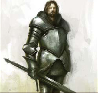
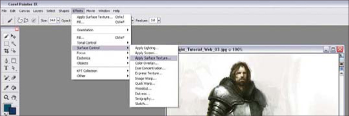
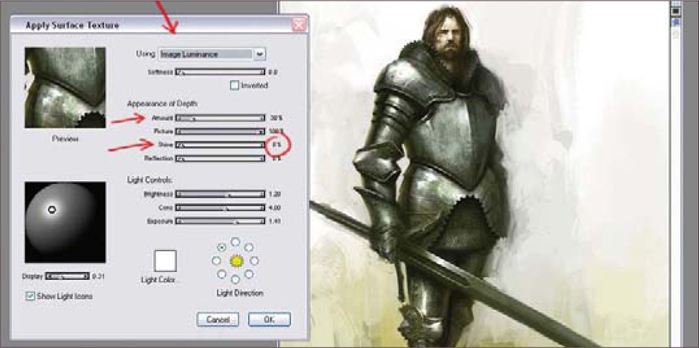
Now I am going to move to Painter IX to add in some final textures (Fig.18). Open the image. It is better to add the texture to another layer so that you can erase out parts you don’t want. To do this you will need to make a copy of your illustration. Select the entire canvas (Ctrl + A) and then, with the Move tool selected, hold down Alt and then left-click. This will create a duplicate layer. Now go to Effects > Surface Control > Apply Surface Texture. A dialog box appears with the different settings. Change the Using drop down to Image Luminance (Fig.19). Now go down and make sure that Shine is set to 0% Adjust the Amount to an amount that looks good to you, and then click OK. Finally, just erase out the parts that you do not want, flatten the image, and you are done (Fig.20).
You can download a custom brush (ABR) file to accompany this tutorial from www.focalpress.com/digitalartmasters

© Daarken
© Dr. Chee Ming Wong
PLANETS AND STARFIELDS
Nebulas
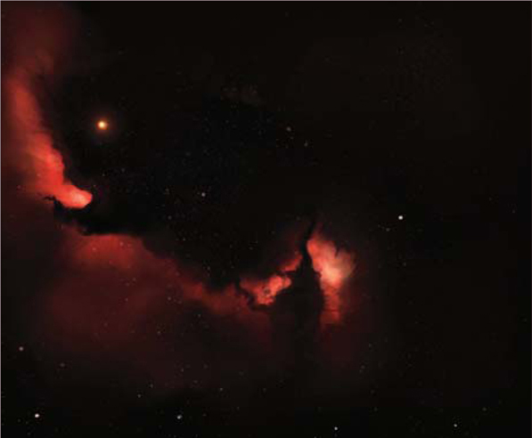
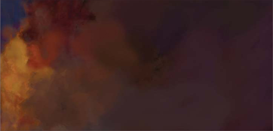
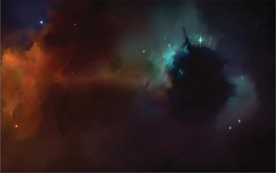
Space and the vast firmament of the heavens have always inspired. Like a vast bespeckled canvas stretching across the night sky, mankind has long dreamed about reaching forth and imagining life amongst the Gods. So let us begin with the jeweled clouds in the night sky: the nebulas.
As an oversimplification: if you can paint clouds, you can paint nebulas! The way to approach painting nebulas is to think of them as multicolored layered clouds (an interstellar cloud of dust, hydrogen gas, and plasma) that represent a birthing pool of stars. Most famous of all is the Eagle Nebula and the Pillars of Creation image.
When one is painting nebulas you tend to be less constrained by reality, and you are able to paint as abstractly or creatively as you wish. As such, nebulas and clouds are one of my favorite types of images to paint. For where else can one paint a rainbow cloud and get away with it as reality-disguised-as-fantasy-disguised-as-abstract art?
Smoke and Clouds
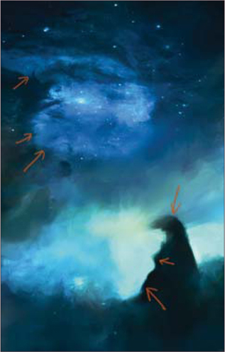
Studies of clouds and smoke will suggest that there is a hard and soft edge to each form (Fig.01). Similarly, nebulas can be likened to space clouds, with a few things to note:
• Dense areas tend to glow brightest or eliminate all light (darkest) as dark matter
• Only the brightest stars or spiral galaxies will shine through within or in front of a nebula.
Nebulas have hard edges (that tend to be brightest/denser) with an adjacent darker area and a soft opposing area (Fig.02). As a simple experiment, try pouring a moving viscous fluid into a lesser one, e.g., cordial into water. Alternatively, observe the smoke that trails from a lit cigarette or from burning incense.
In this tutorial, we are going to recreate similar images to that seen in the Eagle and Crab Nebulas, and our color palette choices are as follows:
• Primary: red – green complementary as the main color palette
• Secondary: orange/yellow – blue/green.
Painting a Nebula
The Initial Rough-In: Start the initial canvas with purely the rough colors worked in. Any hard brush will do. For personal preference, an ideal brush that has a mix of a hard edge with some soft elements would be useful to act as a Cloud brush.
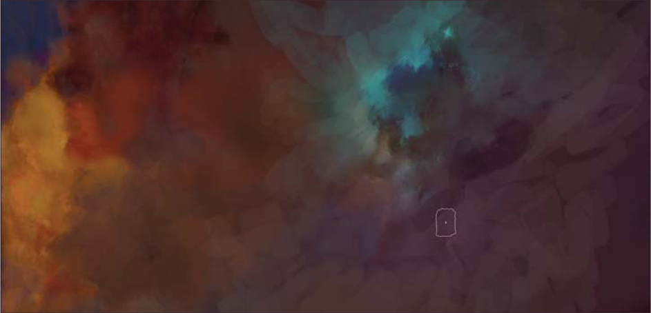
Basic Lighting and Detail: Apply a brighter area of color and establish your lighting so that it recedes into a darker area; a simple method is via establishing a gradient (in order to stimulate the way in which light falls off from bright to dark). In addition, this also helps to establish a good range of values to work with (Fig.03).
Lighting: Subtle use of the Color Dodge in areas where your main light emissions are will help provide a brighter overall source of light. Imagine a global light emerging just behind a cloud layer. A nebula is similar in principle. A secondary complementary light source is included to help provide contrast and accentuate a subtle difference (Fig.04).
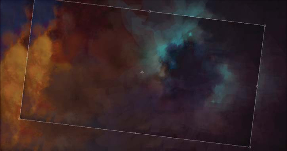
Transform to Your Ideal Composition: To establish a larger and wider shot, we should consider how the nebulas themselves form an aesthetically pleasing composition. Simply duplicate and apply the Free Transform tool (Ctrl + T) to rotate and shrink the overall image. You can repeat this step a few times, until you reestablish a more pleasing overall image (Fig.05).
Dark and Light: To ensure a realistic feeling, ensure various colors and values from the foreground are mixed into the background, and vice versa. Repeat this until you achieve an overall, even blending.
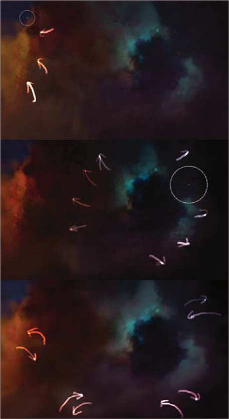
Stars: On a new layer, add a few bright stars in by hand across the whole image (Fig.06). As a simple rule of thumb, areas which are the lightest (well lit and bright) have the highest density of stars. And in a nebula region, only the brightest stars are prevalent.
The resulting image is a rough composite. It is by no means finalized, but some people may choose to stop here (Fig.07).
Cleaning up a Background Illustration
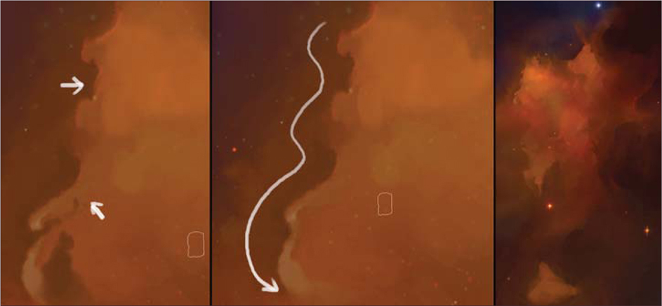
Critical to improving the overall image is the understanding and observation of edges. From here on, the whole process is about tidying up, correcting basic shapes and applying hard and soft edges, whilst subtle colors tweaks are added, as follows (Fig.08):
• Whorls and Edges: Tidy up the whorls and observe the edges of clouds as having a hard form
• Movement of Forms: Sinuous forms (that follow the movement of a heavier gas within a lighter gas form) should be observed
• Soft and Hard Light: Ensure only certain stars shine brighter than other focal points of light.
It’s a Love-Hate Thing!
Often, when working on an image, an artist may find themselves starting to overanalyze and dissect the image worked upon umpteen times. With this illustration (see Fig.07), I stared at it long and hard and decided that the overall image was lacking spontaneity and had become sterile. Working the image from left to right (Fig.09), here are a few approaches to loosening the overall illustration:
• Topsy-Turvy: Rotate the image at 90 degree increments. This allows us to analyze the image in a new perspective and pick out errors or differences not seen before. Sometimes expanding the canvas frees up new compositional opportunities
• Go Large: Now paint everything out with a hard brush; do not worry about being tight or precise – use the biggest size you think you’re comfortable with and then make it even bigger and paint in big, large strokes.

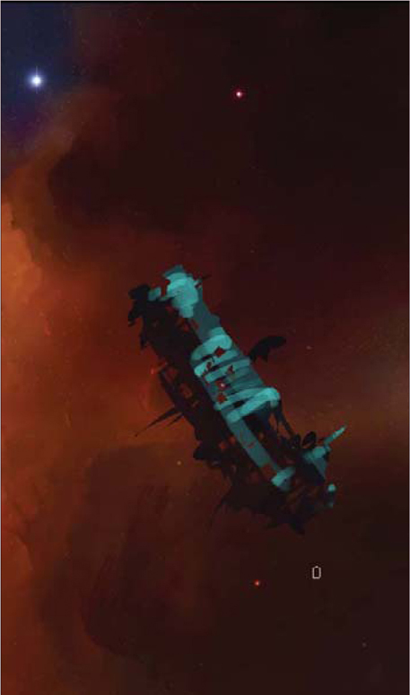
Object Focus: Using a Nebulous Backdrop
To complete the illustration, a small manmade object is utilized containing elements of a retro early space pioneer – effectively translated into large, chunky and cylindrical shapes (Fig.10 –Fig.11).
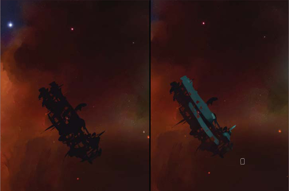
Block in: Use a large brush and project some rough shapes. Subsequently, select out areas to add more blocks of shapes.
Dark-to-Light Side: Lock the transparency on your new layer. This will allow you to paint freely within the blocked-out shape without worrying about straying beyond into the background. Ensure your strokes are parallel to the planar surface being described.
Blend: Now soften everything by working those two values back and forth to gradually show only the stronger light source (from the left), and faintly add a rim light (from the far right). To accentuate the overall form, you can lighten the immediate background around the derelict vessel in order to make it read better.
This should hopefully tie in all the various new elements of science, aesthetic and color visuals to allow you to produce your own fabulous and nebulous backdrops limited only by your own imagination and creativity.
Barren Worlds
Knowledge of atmosphere, and the lack of, accounts for how accurate and realistic our depiction of any Earth-like (blue) environment versus an alien unknown climate (for example an atmosphere with high methane content resulting in a green sky). As such, we will focus primarily on our companion, the moon, to provide a basis and working understanding for us to transfer to other exotic environments.
Lunar Landscape
The lunar landscape is firstly said to have generally no atmosphere (actually, contrary to popular belief, there is a very thin atmosphere; however, it is insufficient to block out solar radiation, wind and cosmic rays). For the painter this translates as a minimal atmospheric perspective, i.e., a thin, transparent haze. There are traces of gasses, such as radon, from out-gassing or micrometeorites. In addition, the solar wind can charge (a photoelectric effect) fine layers of moon dust that may present as electrostatic levitated dust. Coupled with exposure to cosmic rays, solar flares and solar wind, and the frequent impact of micrometeorites, this presents a hostile and relatively harsh, demanding condition. Closer inspection of the lunar landscape shows:
• A gray-colored surface
• Loose overlying debris covering most of its < surface, otherwise known as “regolith”
• A fine scattering of lunar dust
• Dark patches (maria/mare) of ancient solidified lava to form the “sea”
• Light patches (terra) containing highlands with pockmarked craters.
The Dark Side of the Moon: The South Pole Aitken Basin
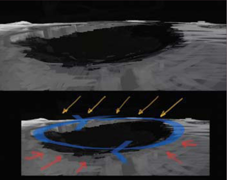
The initial objective of lunar colonization is to find a suitable location. For mankind, it will probably be easiest to locate a base within an area that is protected from sunlight, but within easy reach of solar radiation (for solar-based power) and study/research on the transition zone between light and dark. For this, the lunar south pole of the Aitken basin is ideal; it contains a small number of illuminated ridges within 15 kilometers of the pole, each of them much like an island of no more than a few hundred meters across in an ocean of eternal darkness. Of particular interest is the almost perfectly circular Shackleton crater, which NASA plans to colonize in the near future. The key features of the Shackleton crater are:
• A band of PELs (Peak of Eternal Light) on its crater rim which describes a point on a body eternally bathed in sunlight, therefore allowing for external power generation and studies of solar activity
• A low-temperature interior functions as a cold trap that may capture and freeze volatile sheds during comet impacts on the moon
• A permanently dark central core which is ideal for building a semi-covered base in (to account for radiation and exposure).
Painting a Lunar Crater
Bleak and Gray: Painting craters is an excellent study in defining a shallow, fairly elliptical shape using low contrast, and low value styled painting techniques (Fig.12).
Relative Perspective: As a general rule, craters form oval-shaped depressions which are more circular nearer the viewer and more elliptical the further away they get.
Lighting: Lighting (of the moon) is quite uniform, and in this instance comes from the top right, hitting the inner rim of the crater to recreate the (bright) band of PELs (Fig.13).
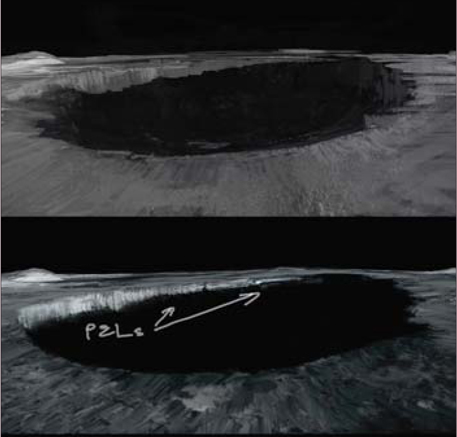
Why a Dark Side?: In contrast, everything within the crater rim is otherwise a uniform dark shadow (as the moon is tidally locked in relation to the Earth; i.e., there is always only one side facing the Earth permanently, and all other areas facing away are known as the “dark side of the moon”).
Building a Lunar Base
Once a base is established, the key economy provided will be lunar colonists mining for Helium 3 (He3). Used within fusion reactors, this is an alternative, cheap, abundant and lucrative energy source (estimated to be a net profit of $300 – 400 USD billion per 100 tons of He3). Extraction would involve heating up lunar soil to above 600 degrees Celsius and therefore evaporating other volatiles in the soil.
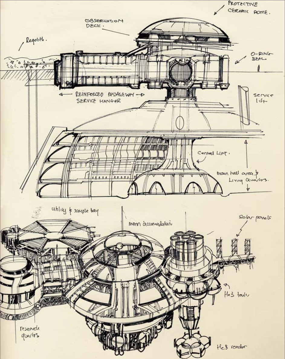
The lunar base is fleshed out on pen and paper (Fig.14). It is depicted as semi-cylindrical living quarters being slowly installed within the dark center of the Shackleton crater. Each cubicle is interlocked by short, sealed rings. I also took the liberty of considering an external power source/reactor that relies on He3 Deuterium fusion, assuming that the shielded reactor cores on the far right were relatively safe. In the main quarters, habitation is serviced by a dome-like structure with a central lift system to connect all levels of the base together. And finally, on the far left of the drawing, both a research and advanced propulsions works unit is coupled with the external hangar bay/transport bay area.
Moon Base: Version 2
Using the base schematics, we use this opportunity to refine the moon base design further (Fig.15).
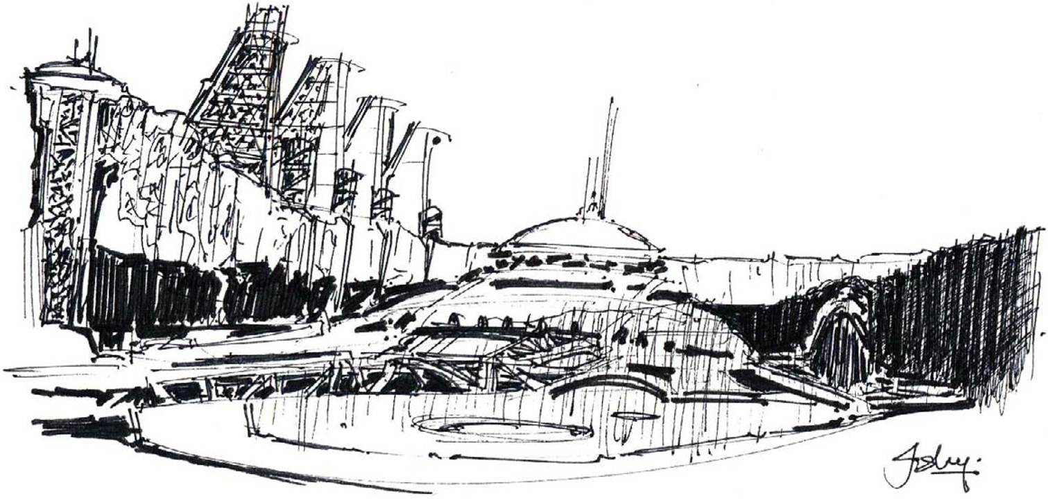
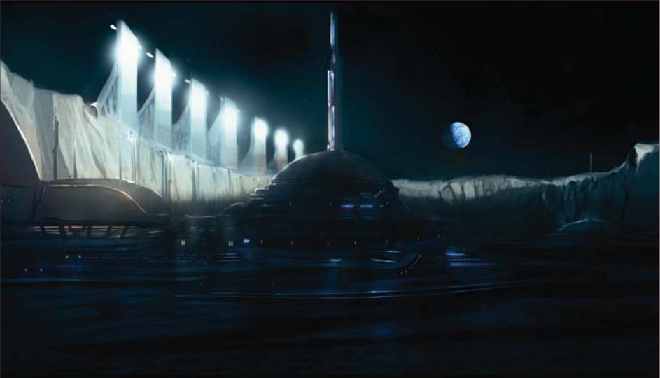
Initial Set-up: This rough thumbnail (see Fig.15) aims to simplify and tackle composition, form, and lighting all in one pass, utilizing a simple two-point perspective and focusing on the main dome which is protruding from the craterfloor.
Retro Design: In the design, a marriage of the best elements of retro space and futuristic designs are merged, namely the white featureless planes and curves accentuated with angular tones; these few things bring a certain familiarity whilst still providing an evocative composition.
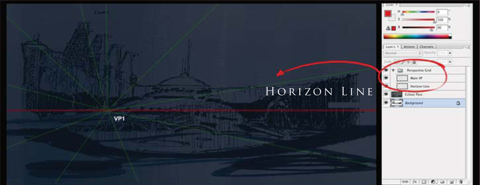
Perspective: Using a simple one-point perspective I aligned the main horizon and various objects with the main vanishing point (located slightly off center, to the left) (Fig.16).
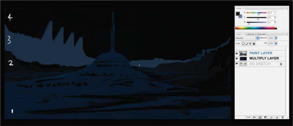
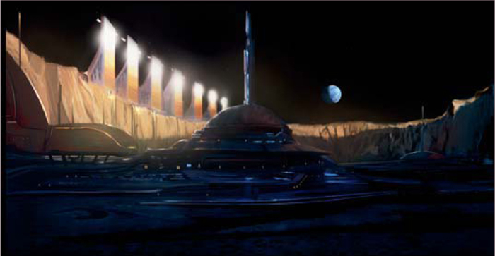
Color Pass One: For a basic color pass, I separated the image into four basic values, showing a hierarchy of values to project depth and distance (Fig.17). The initial composition should resemble a simplified graphic shot that the eye can interpret easily. This will allow you to now work on various areas, according to tone.
Subtle Hues: In this instance, we know that the lunar surface is not entirely a bleak gray, but is variants of gray with streaks of maroon, copper, green, gold, and dark orange. In this respect, it might perhaps be advisable to take a more artistic license and use a deep saturated blue to suggest areas of shadow.
Lighting: The far rim of the crater, stretching from the far left to the middle, suggests light through the use of a warm tone, complementary to the blue (Fig.18). This unfortunately breaks up the lovely values which we established early on, but if you keep in mind the value structure established then you can try to work back to the original as much as possible.
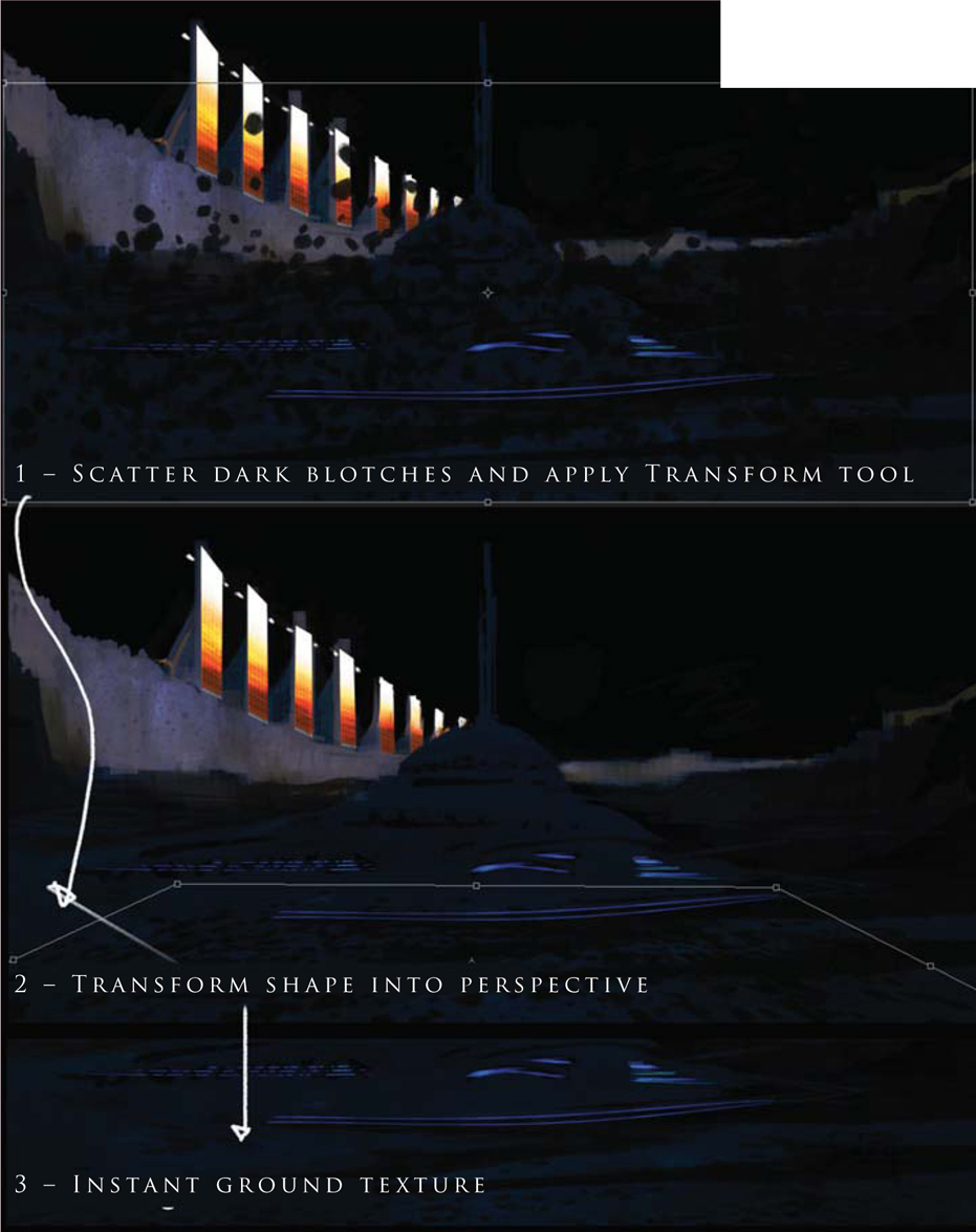
Ground Texture: A good and simple way to apply ground texture is to initially paint your desired surface in a rectangular shape. In this instance, we simple scatter a few dots with a dirt brush. Apply the Transformation tool (Ctrl + T) and manipulate it into the correct perspective (Fig.19).
From here on we’ll consider two final outcomes: a lunar realistic-type rendition and an impressionistic space art style rendition.
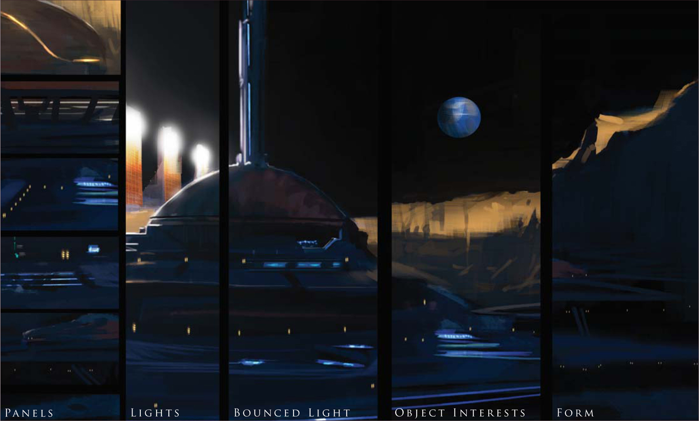
Detailing: Well, this part can get a bit tedious; however, now that the values, composition, layout and lighting have all been established, you can really take the image to town by rendering every nut, rivet and bolt according to your needs! Here is a simplified checklist that I try to tend to adhere to (hopefully it can simplify and make your life easier during this stage) (Fig.20):
Note: Desaturate does not accurately depict a grayscale value, but can be used as an approximate.
• Panels: Neon lighting and subtle mixtures of angular and sweeping forms make for a simple and retro sci-fi image
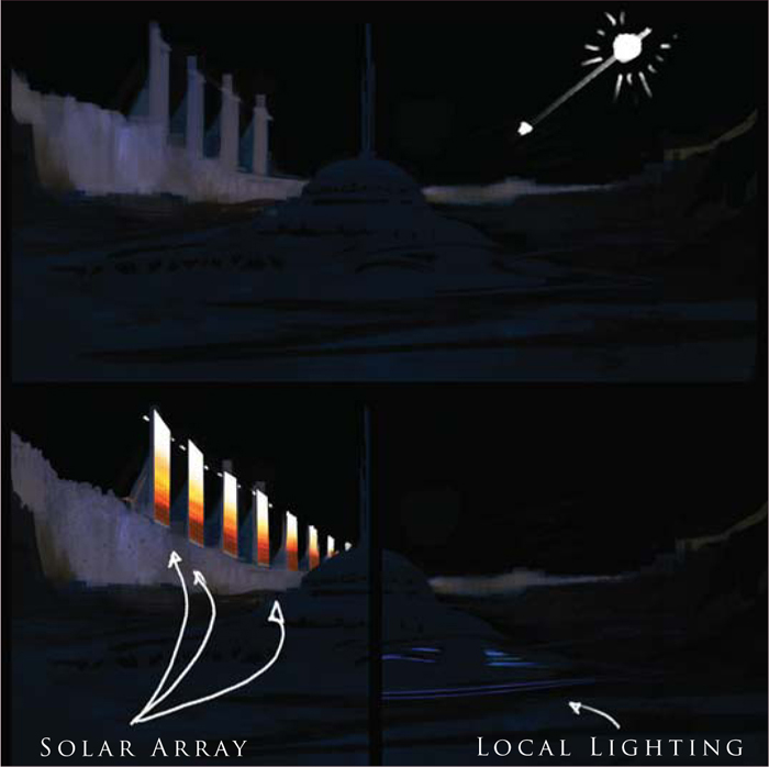
• Lights: To ensure the glows are soft and project through mist, dust or clouds accordingly
• Bounced Light: Gives that extra special magic from local light sources and is a good way to describe a form moving within a shadowed/darkened area if you have no focal light source
• Object Interests: The main challenge of adding detail, I find, is that you can add too much hyper-detail throughout the canvas. More often than not if you add detail in the key areas, the mid-ground and background can have large simplified forms that can be left loose and the mind’s eye will automatically fill in further details
• Forms: Ensure the large forms read and don’t conflict with one another; a good method to check this is by squinting at your image frequently, or having a second monitor set up with the image size set to 50% or less.
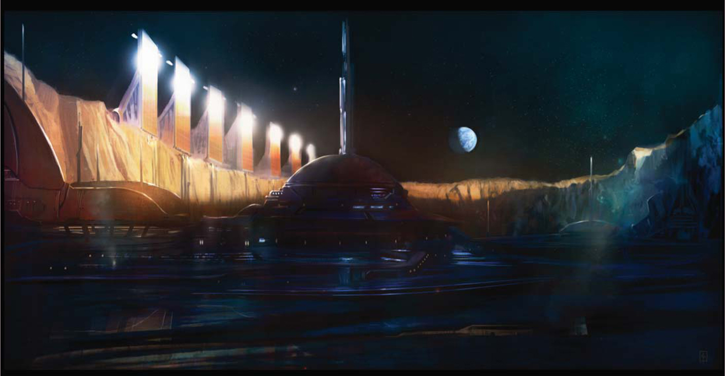
And there you have it. I have also taken the liberty of adding a few more details, such as piping from the solar arrays and additional antennae. It is these small details that help to make your image look that much more convincing.
Finally, we will end our exploration of barren worlds here with two alternate images (Fig.21 – 22). Fig.21 shows a final monochromic illustration which is more suited towards a lunar-styled environment and projects a more brooding, cold feeling. Ultimately, I love color and have also produced a more impressionistic space art version in Fig.22, blending in the main primaries of gold and deep blue/violet. And here is the final image for this part of our tutorial (Fig.23).
Barren Planets
In this third part of the tutorial, we’ll take a planetary-wide look at how planets are formed, depict the destruction and death of planets, and explore the farthest regions of our known solar system. But first of all, let’s take you back to the beginning … to the birth of the solar system.
The Solar System – a Fiery Birth and its Destruction
Imagine going back roughly 10 billion years after the Big Bang. A large star is about to die, having expended all its fuel, and from this its core eventually collapses inwards until it explodes as a supernova – sending a shock wave through the galaxy. It is from the remnants of this long distant star, and many others, that eventually a new star is formed – our sun – via the fusion of hydrogen atoms in a process called “nucleosynthesis”.
Illustrating a Dying Star
For our first painting we will look at illustrating the last moments of a dying star, transitioning before it explodes in a spectacular nova (which in the case of a large star is a supernova), for it is from the remnants of a dead star that the raw matter of a new star and solar system can come into being. In this instance it is probably more interesting to take a more impressionistic approach to space art, whilst working from a position of informed knowledge (Fig.24).
Colored Approach: We start by depicting a loose bluish-green background with flat washes over the canvas. Incorporating a circular styled composition, the illustration is planned to spiral outwards from its point of origin – the dying sun.
Level 1 Details: You can start to consider various aspects like stars and local objects at this juncture (as they are easy to forget later on in the process). Remember that the background stars will probably be very faint and only the brightest will shine through.
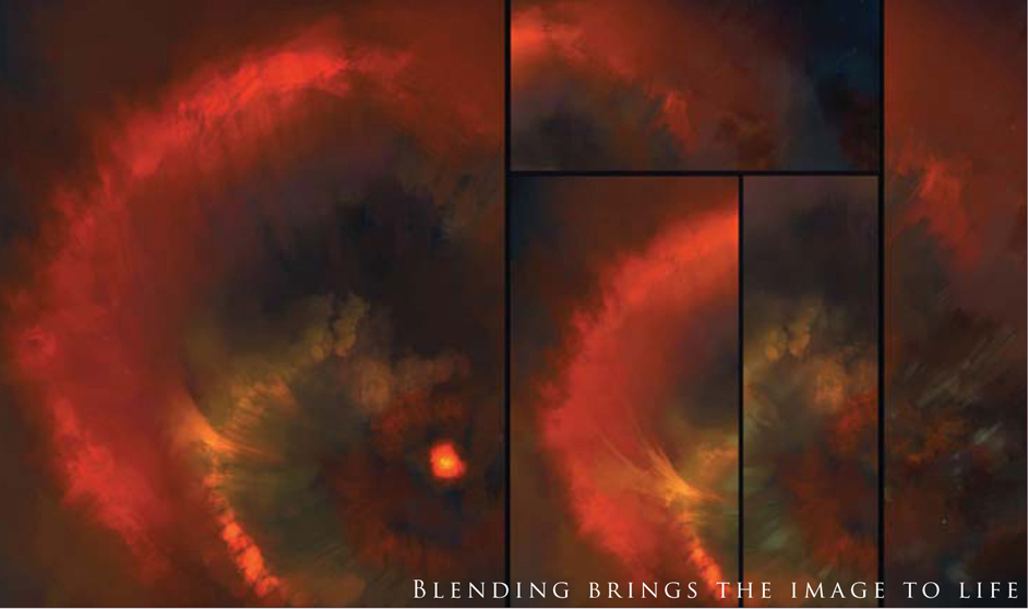
Blending: The next part brings the illustration to life as it allows the establishment of mid-tone values, allowing various colors to bleed into one another and providing a softer, more realistic feel of an expanding cloud of gases (Fig.25).
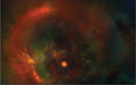
Level 2 Details: Once the general disparate colors are blended, the next step to consider is the level 2 details. This means taking that extra care and taking additional attention to ensure that the key areas of the illustration harmonize and “sing” together. In this image, it means adding a subtle blend of gold, jade, and turquoise with faint highlights and glows to make it all work together (Fig.26)
Illustrating the Birth of a Solar System
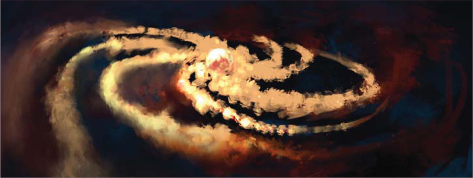
Following the death of a star, a vast and widespread cloud of raw material is scattered across a region. When sufficient interstellar clouds (giant molecular clouds) of raw elements collapse under gravity, the center gets heavier and heavier and the rotation also gets faster and faster. Eventually, clouds of hydrogen become fused together until sufficient mass is reached to form a proto sun disc in a process called “Stellar Accretion”. It is this process, through which a star is born, that a stable solar system forms. And it is this transition between the formation of a stable Stellar Accretion and a proto sun that we will try to illustrate in this tutorial, at this point (Fig.27).
In the initial stage we start with a rough layout of the proto stellar disc, using just pure deliberate color choices on the main canvas. Using similar principles to those before, we can continue.
Flat Washes: Paint in a background of deep saturated blues and greens initially, and then sprinkle a scattering of faint stars.
Work Briskly: Then, very quickly and loosely, just paint in the basic layout of a central red and orange clump of clouds that spiral outwards in a ring.
Technical Data: Different artists depict this – the proto sun – as a geometric ring, and others as faint arms within a red disc. For the purpose of clarity here, we will first depict the thin edges of the arms, and subsequently lay in the red proto disc.
The Problem of Establishing Highlights Early On: Other issues to consider are the use of Color Dodge and brighter glows. I would like to stress that, in the initial stages it is often too easy to use Color Dodge or add highlights straight away. If you do wish to do this here, try to limit these actions purely to the central portion only.
Contrast to Make Things “Hotter”: This is due to the fact it is very hard to add further information/pixel data onto a white value. This illustration has almost pure white in the center but, due to the contrasting red surrounding it, it appears even hotter (in fact, it is merely a light desaturated yellow).
Minor Details: The ends of the disc should be depicted as wispier clouds (of raw elements). Using the method of blending as shown previously, establish your mid-tones early on. If all of these points have been considered, the early draft of your image should look pretty impressive (Fig.28).
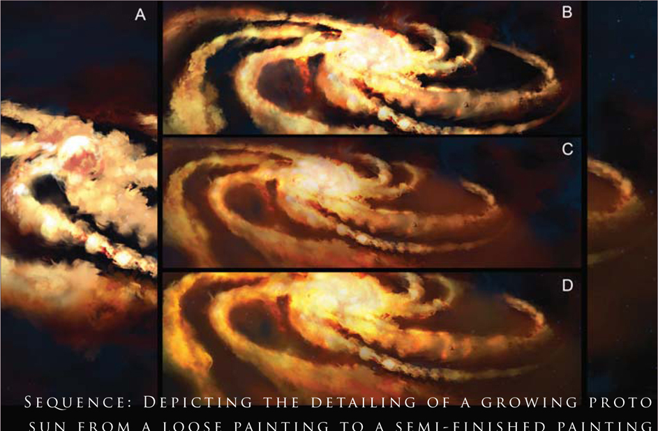
Maturing the Illustration
The next stage to consider is to “work up” the initial composition into something respectable. Thereafter, one can spend an indeterminate amount of time perfecting every tiny detail or star, perhaps even adding a foreground element like an asteroid or some space transport of sorts – basically working till your heart’s content. The following stages refer to the Fig.28 sequence:
• A: The foreground elements of the edge of the stellar clouds have more color and mid-tones applied. Moving inwards, brighter glows – with judicious use of Color Dodge – can be applied closer to the center
• B: The central disc is thickened, with a more nebulous ring of circular globes that cumulatively form a rough spherical aspect
• C: The mid-range of the disc has more orange blended within. This lends a bit of an aspect of atmospheric perspective, however it does detract from the brightness of the original draft
• D: Additional details and blending are added to harmonize the overall feel. A faint wisp of red is eventually seen to emanate from the central aspect.
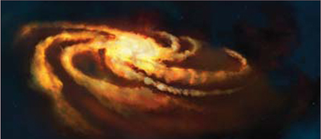
To finalize, the edges of the illustration are color balanced and lightened to provide relief and contrast to the final illustration (Fig.29).
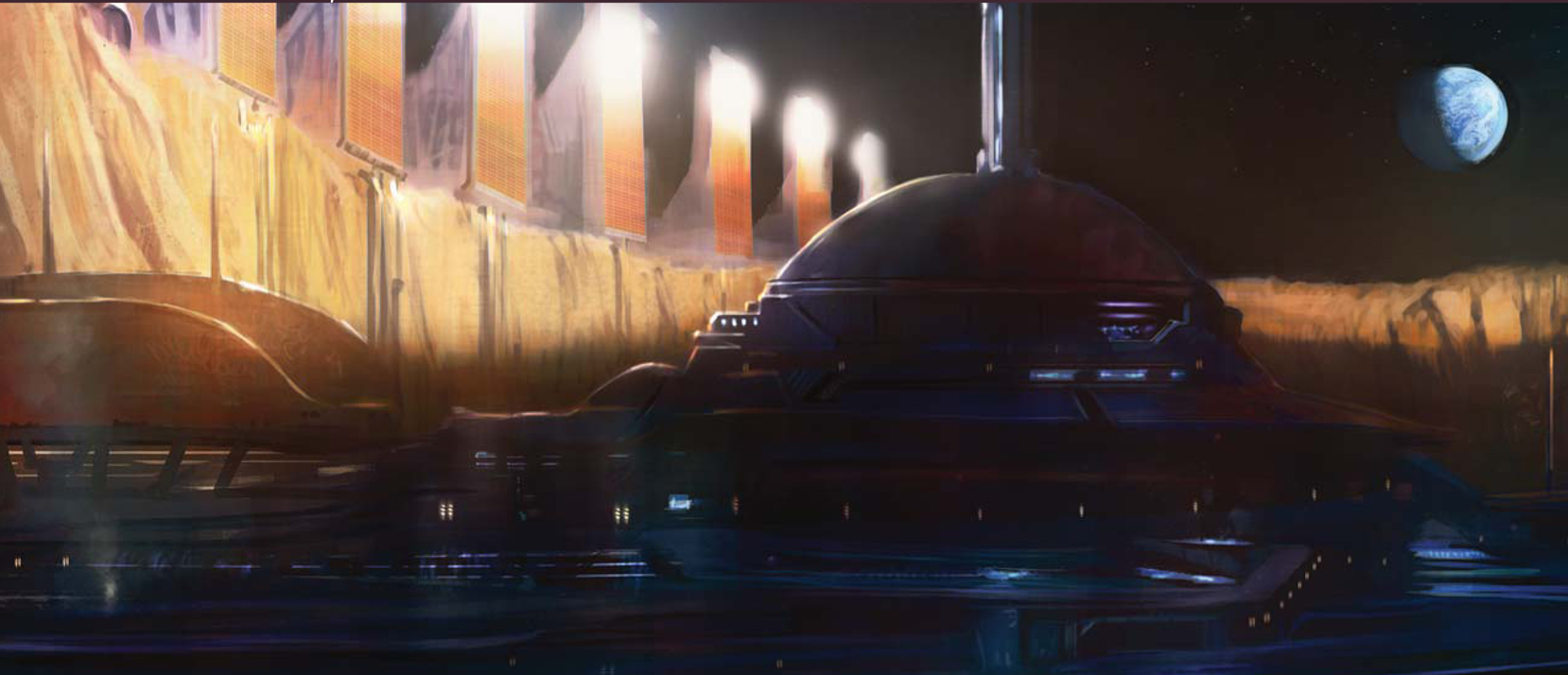
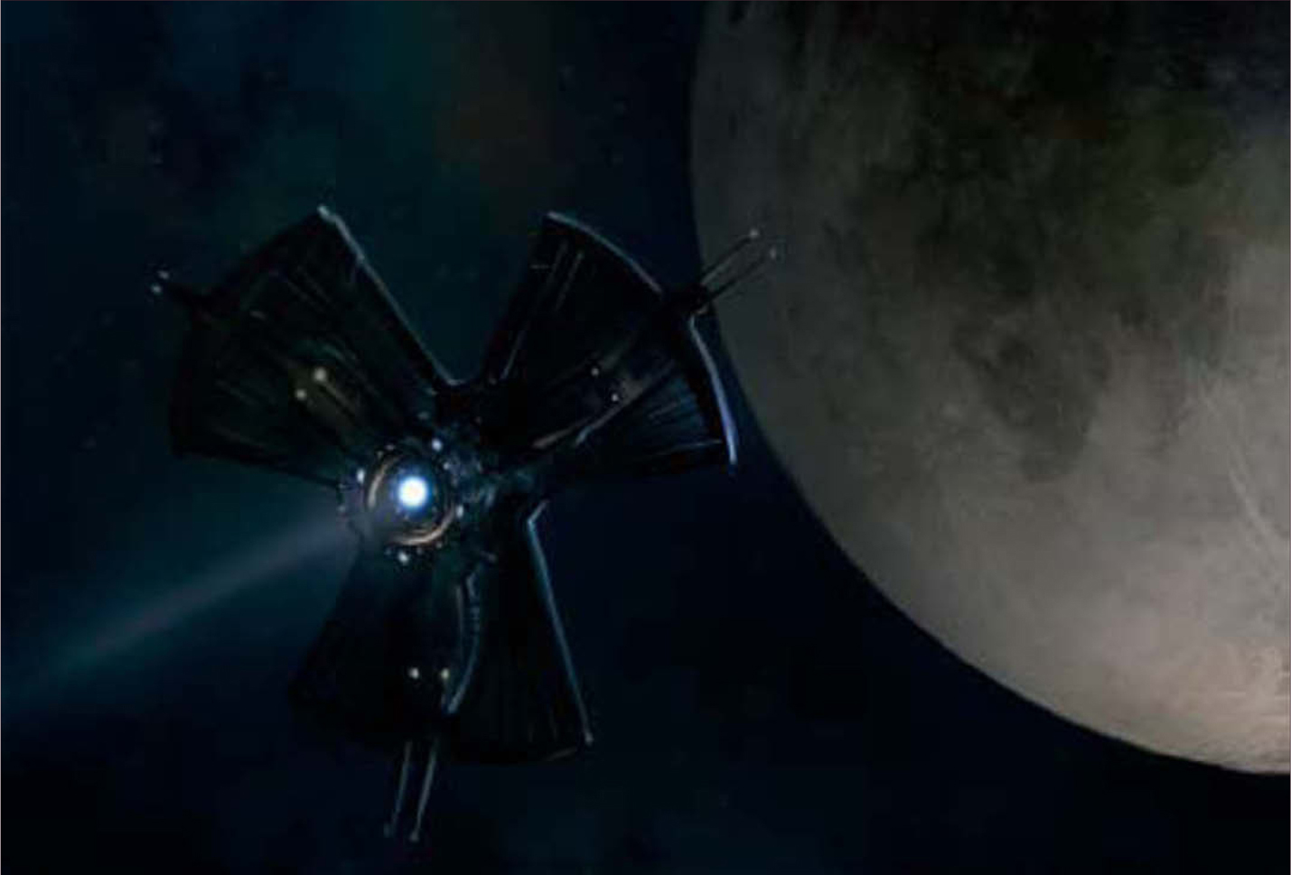
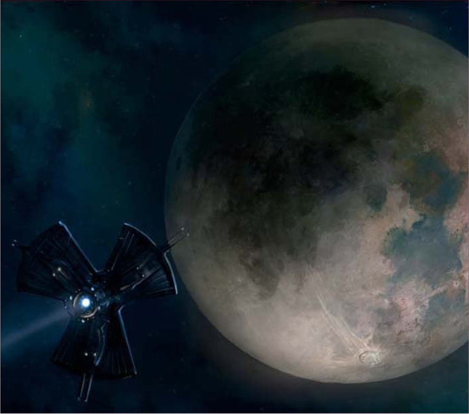
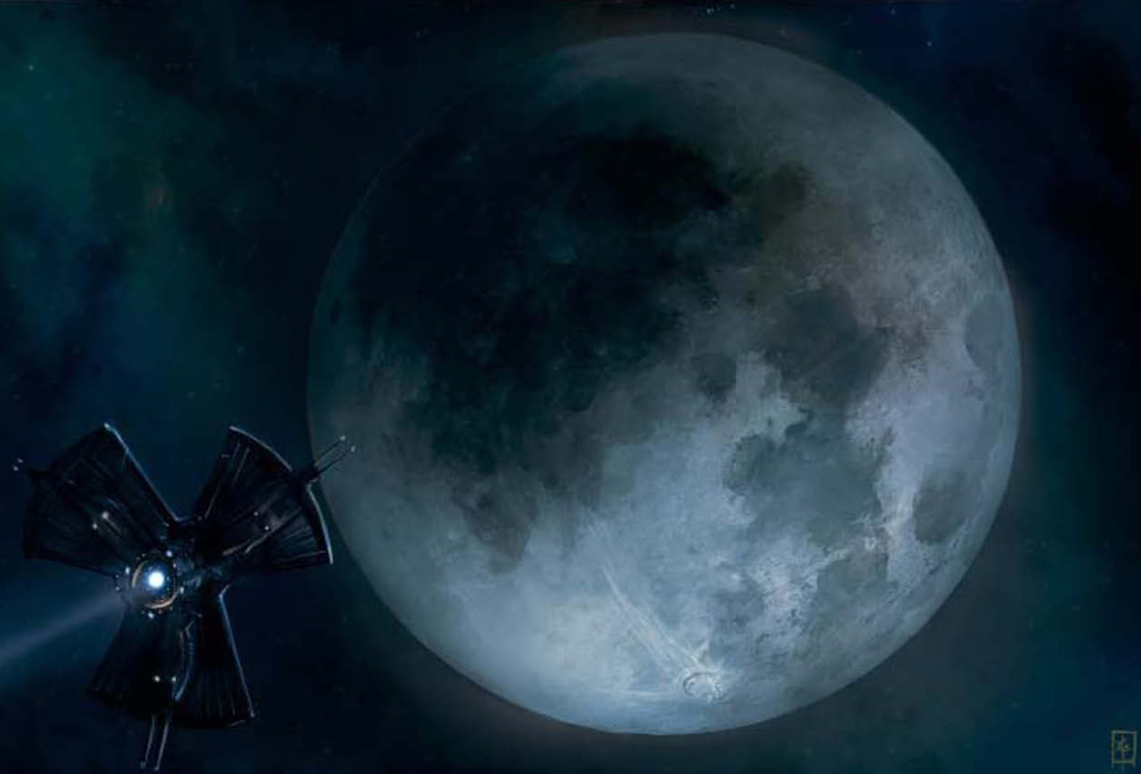
A Space Probe over a Dead Planet
For the purposes of object interest, let us now design a space probe that can look to the stars. And perhaps, to project it even further, one that could look at past events or travel back in time! Often, the challenge of producing space imagery is the lack of providing relative scale between the viewer and the main object of interest. This will often be a large astronomical object, such as a planet, star and asteroid field, or the heavens above.
For our design, we end up with a simple robust space probe that has a few additional features (Fig.30) in addition to the beneficial features listed above:
• The ability to deploy solar sails
• Multiple probe modules – allowing easy
• deployment to explore different planets for various scientific endeavors.
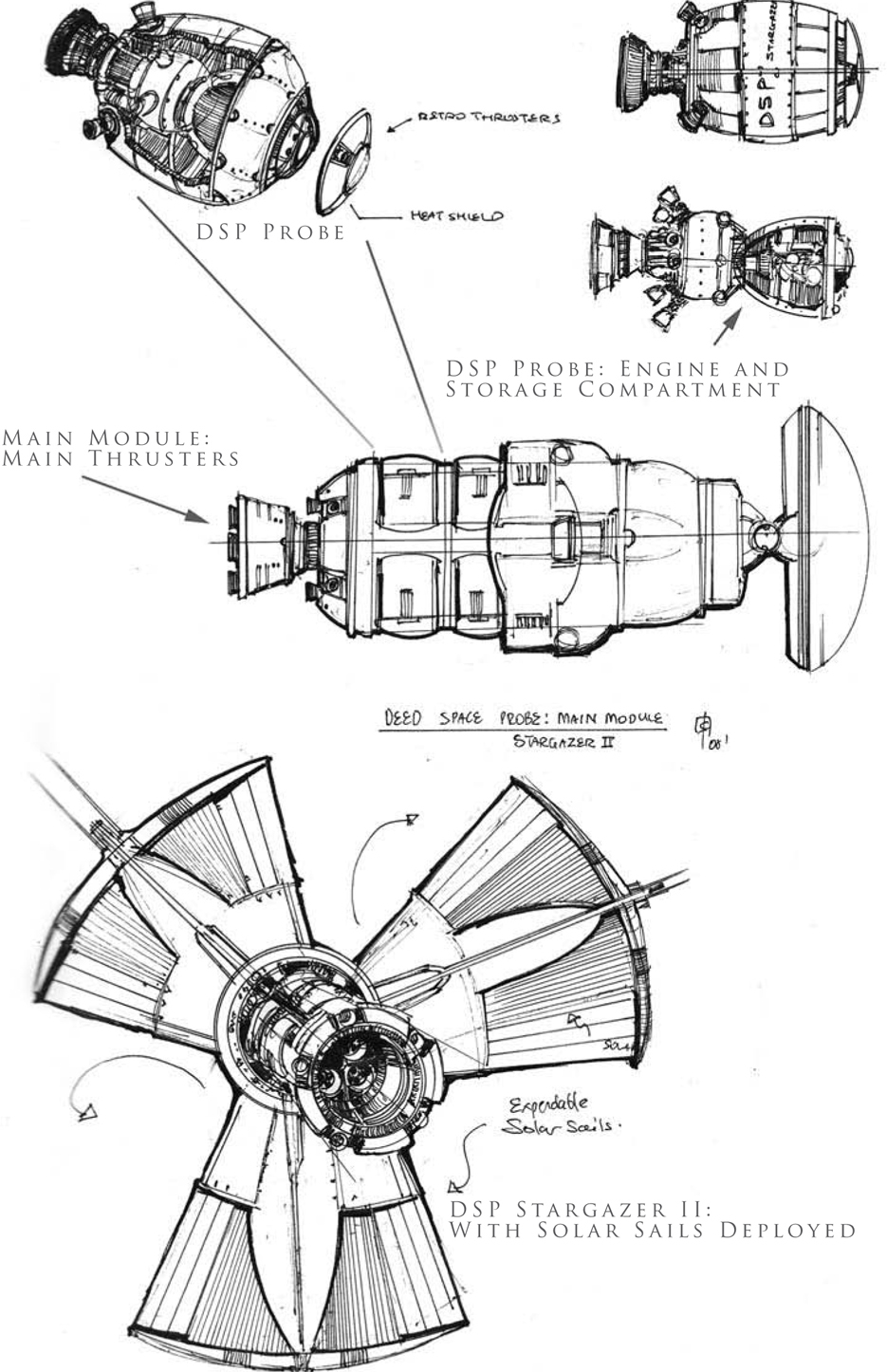
As a backdrop, let’s use our own natural satellite, the moon, in full color, to depict a barren planet. Often, the lunar surface is depicted in a bland gray, or a false desaturated blue color. However, the advent of webcams and improved technology now show that the moon is indeed more colorful than previously thought (color photography provided from the 1994 DSPE [Deep Space Program Science Experiment] Clementine satellite).
Craters on the Moon
The key issue to consider when drawing any large circular object on Exaggerated depiction of circular craters a curved body, such as a planet, moon or asteroid, is the perspective. In contrast to the other aspects throughout the tutorial, perspective is the key primary determinant when drawing craters (Fig.31). In general:
• The closer (or more perpendicular) a crater is towards the viewer, the more circular it appears
• The further away a crater is, the more elliptical it appears.
Lastly, nature is random, and thus, to achieve both aesthetic and an accurate rendition of the moon, try to vary the size, depth and discoloration of the craters.

Illustrating the Moon
Some things to consider when illustrating the moon are that there is a nearside and a far side. Because our moon is tidally locked to the Earth’s gravitational pull, the view of the moon is always fixed relatively to Earth. In the example of the moon, it is said to be tidally locked to a larger body of the Earth. The dark patches seen on the moon by the eye are said to be called the “Lunar Mare/Maria” (dark regions made of basalt which give a dark green-blue color cast).
Initial Layout and Composition
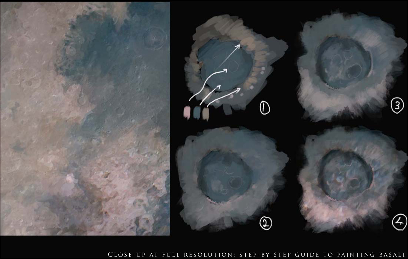
Initial Layout: Using the Circular Marquee tool, paint a base of light yellow/gray in large flat washes to represent the base of the moon.
Palette: A color palette of dark, mid and light tones will help in the overall production of the image using only color. Optionally, one can choose to start out in grayscale and work out the base values based on the reference of the near and far side; however, it will take some work to make it appear painterly and naturalistic in the final outcome (Fig.32).
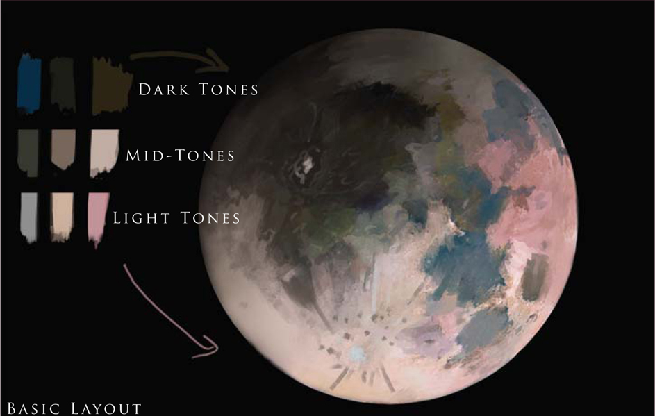
Base Shapes: Using the dark tones, lay down the dark basaltic mares, tempered with the mid-tones of pink and yellow. Finally, the lighter tones can be used to inscribe the edges of large and small craters. For a naturalistic feel, do not describe the whole shape of the crater, but rather just the edges that may catch light (Fig.33).
Adding Details
Work Big: For this piece, the overall image is at 6000 pixels wide. This allows many tiny details to be “faked” by using purely color complementaries.
Painting Basalt: Using a base of sea green, mix in a desaturated pink to suggest crater edges and highlands, and mix it in with the base green and yellow to get a good blend.
Craters: Try adding long light streaks emanating from some large craters. These can be thought to be leftover trails from micro meteorite impacts or smaller showers (Fig.34).
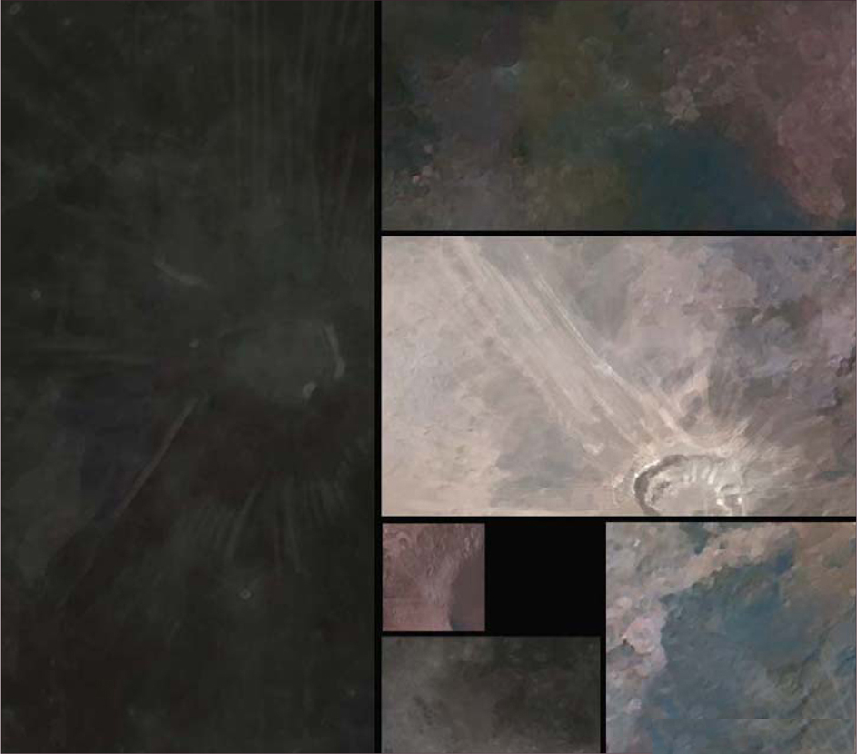
For that final finish, try adding various foreground elements, such as the space probe previously designed, or the whole illustration can be color-graded to a more traditional monochromic look (Fig.35).
In Conclusion
Well, this has been a quick ‘whistle stop tour’ of the life and death of the solar system and its constituents and stars. I hope you have found the various processes and workflow approaches informative and relatively concise. To round up this final part of the workshop you can see the final moon painting variations created for this tutorial (Fig.36 – 37). All the information provided here has been researched as best as possible and any factual errors rest solely on my shoulders.
© Graven Tung
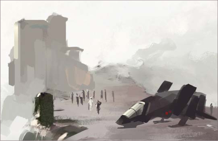
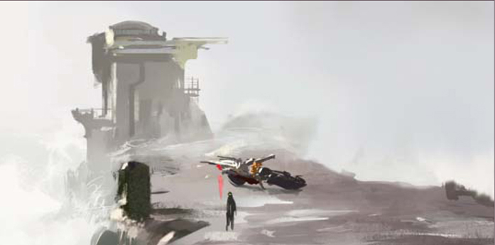
THE MAKING OF “PIER DUTY”
This particular tutorial is a simple study that will hopefully explain some of the thoughts and techniques I use during my painting process. I’m usually not in the habit of questioning myself on why I do things a certain way; in fact, this is the first time I’ve been asked to paint for a tutorial, so bear with me here.
I started off by Googling for some ideas. I try to avoid jumping into a painting without at least having a general direction. This is to prevent myself from falling into the “safe zone” and repeating similar subjects over and over. So I dug up a few interesting shots after some random image searches. There’s something cool about those waves crashing on the pier. I haven’t done anything like that before, and it looks like fun.
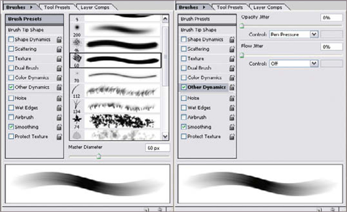
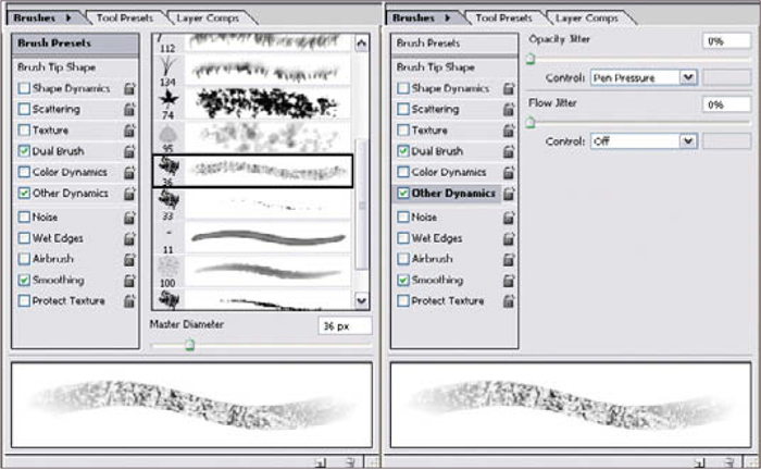
Before we start, here are the two brushes I often use, especially for blocking in rough sketches. As you can see they’re simply the two default Chalk brushes that come with Photoshop CS, with a little change in settings (Fig.01a – b). Some people ask why I only have the Opacity Jitter set to Pen Pressure and not the Size as well. It’s simply a personal preference. I tend to adjust the brush size with the [and] keys anyway, so it all works out!
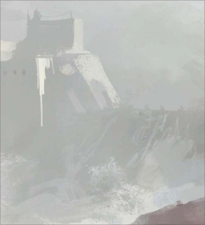
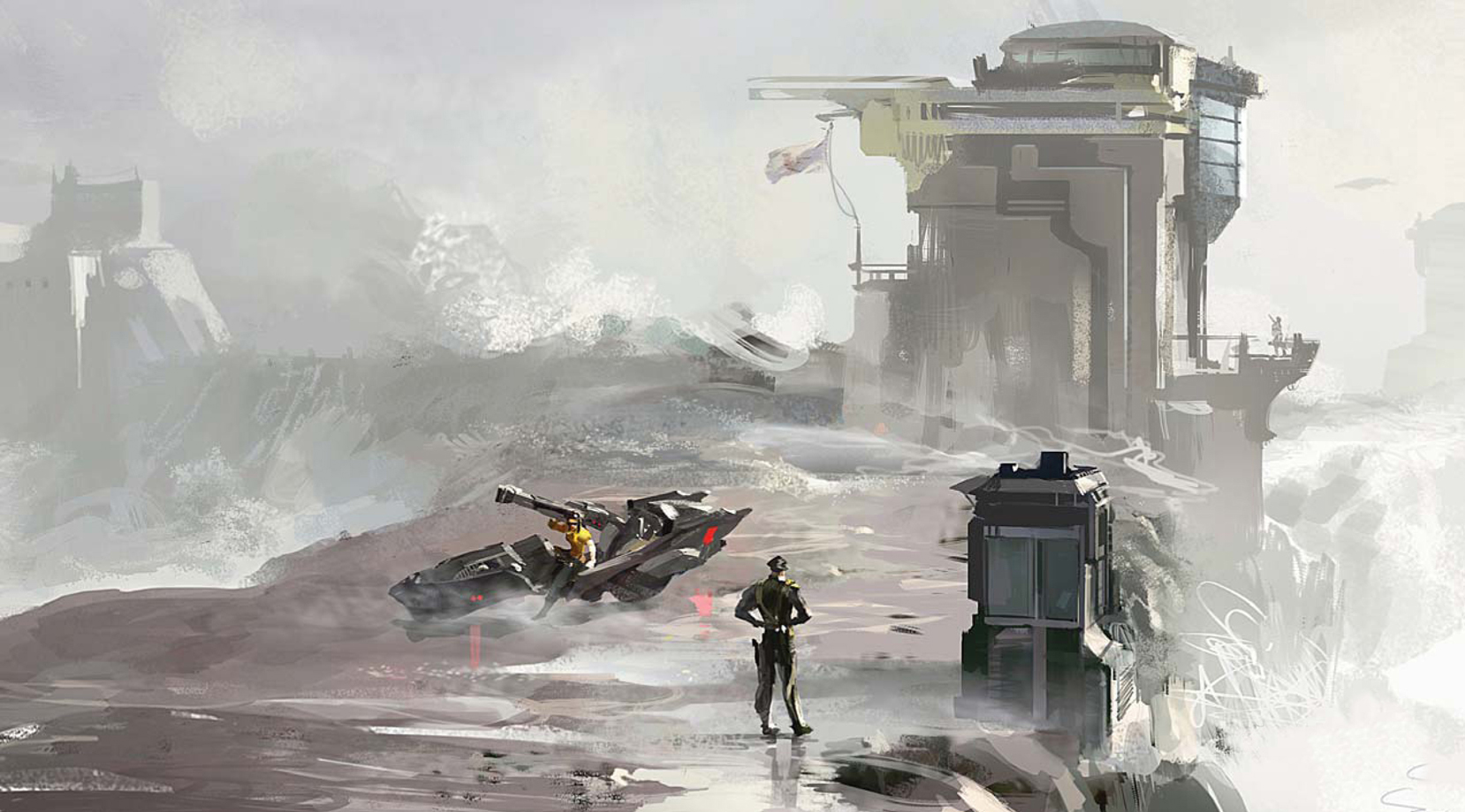
I open up a random canvas and loosely sketch in something that looks like a pier leading into a washed-out, misty background (Fig.02). Now, I’d be lying if I said I know exactly what I’m going for at this point; the purpose of this step is to quickly establish a value range while testing the scene to see if it actually captures the right mood. It’s almost like giving me an inkblot test. I just push and shove shapes around till I see something I like. This is where I like to spend as much time as I want to make sure a shot works (assuming there’s no deadline, of course). In this case I kind of like the dark shapes on the sides; they can easily be some manmade structures or even rocks; the warm highlights seem to suggest a side-lit situation which can work out nicely in this shot. The shape at the far end of the pier could be a building or small island, so we have something in the background as well.
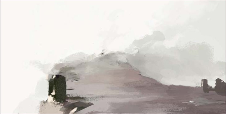
Continuing on with the block-in (Fig.03), I extend some rock formation to the left to balance out the composition, and I also scatter some warm highlights across the background sky. I figure the cloud/wave/moisture in the air would likely catch the sun here and there. It also helps to emphasize the light source. At this point that shape jutting out to the right is starting to look like a tall wave going over the pier, which is good.
Next I plant a building on the left to give it some focus (Fig.04). It also serves as something that leads us from the foreground to the background. I’m not worried about its details yet. At this point it’s better to focus on the right palette than trying to work out any specific designs. Right now the building is nothing more than a bulky shape with a touch of highlight, which is all we need.
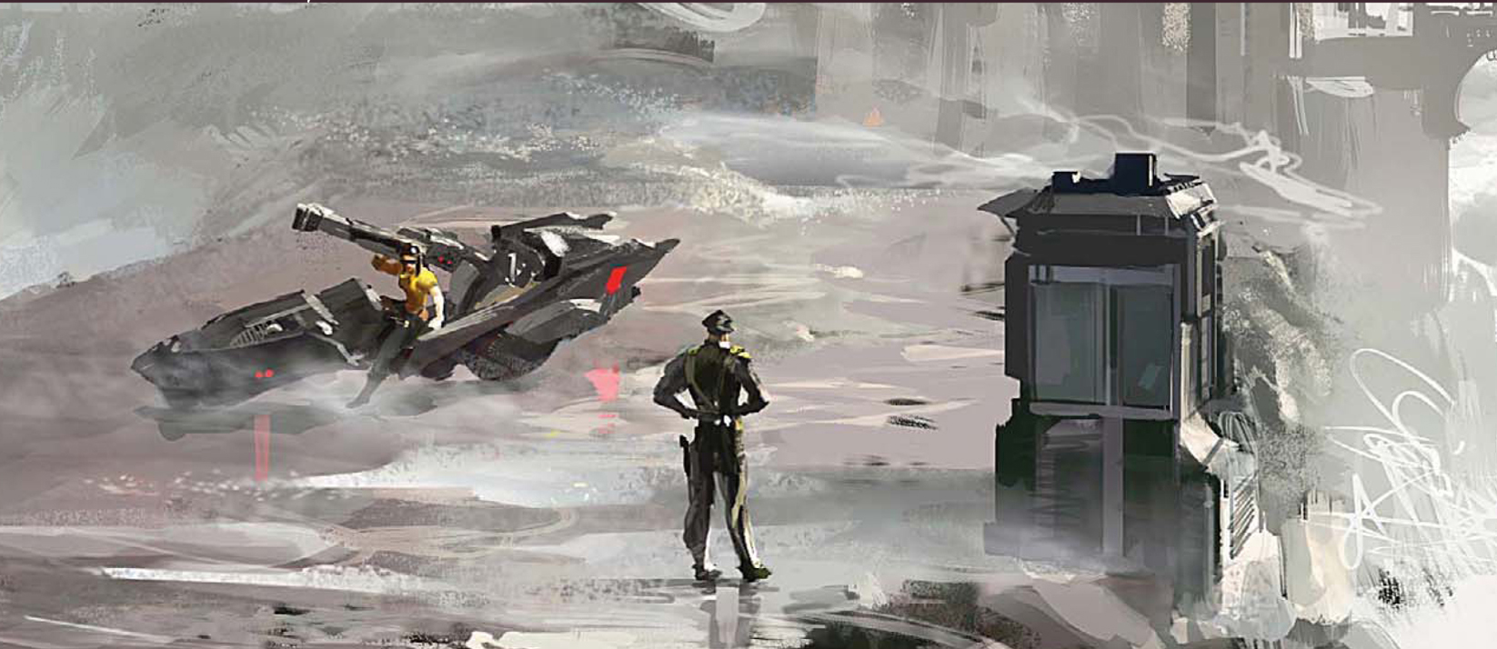
The composition is starting to take shape, but we’re still missing something in the foreground. Since it’s already looking a bit military, I’ll go along with that theme. Here you can see a couple of attempts to work in some figures and maybe a vehicle (Fig.05 – 07). I eventually settle on the bike because I want to paint a biker chick carrying a big bazooka. I wish there were other deeper reasons, but sometimes you’ve just got to go with your gut instincts!

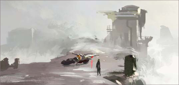
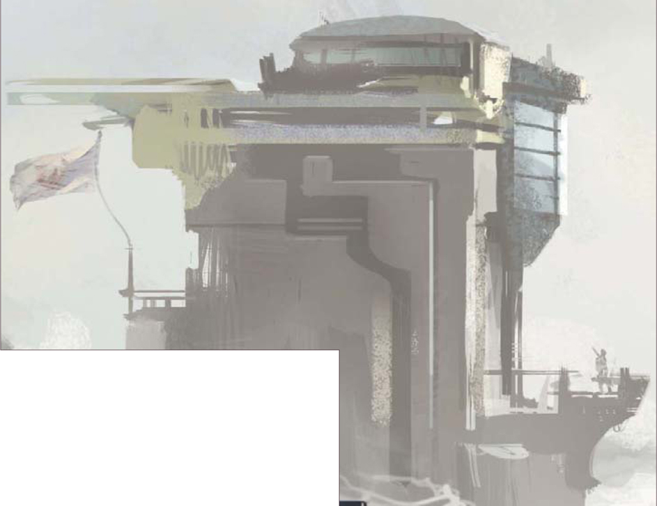
Now is a good time to clean up the background building on the far right; I put in another building on the left to give it more depth (Fig.08). I spend some time working out a simple design of the main building. Again, it still looks rough but we’ll get back to it later (Fig.09).
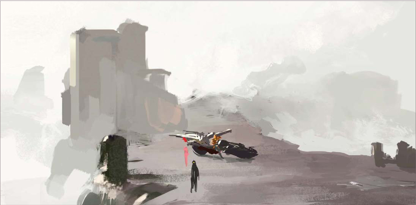
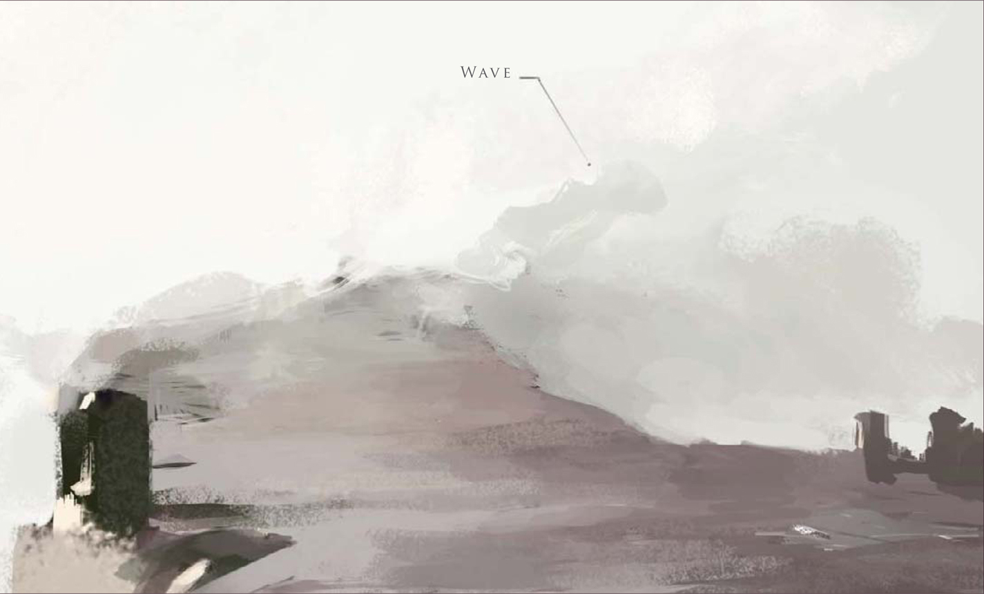
Time for some weather effects; this place needs a good, strong side wind. I open up a new layer and quickly indicate some moisture being blown across in front of the main building, as well as adding some puddles on the ground (Fig.10). The good thing about doing this on a layer is that I can still use a big textured Chalk brush to lay down a large shape, and come back with a small Eraser and erase into that shape to carve out the details. I also throw in a little bit of highlight on the building in the back to make it look like that wave is casting a shadow over the structure. Perhaps the wave is getting a little off scale here? I mean, that thing is like, 250 feet tall now! We’ll have to fix that later on…
The sketch is coming along nicely for the most part, but the sky still seems a little too flat. I was hoping to keep it simple and have everything blending into the misty atmosphere, however right now it’s just not creating enough eye movement. To fix this I open up a new layer and put down a subtle gradient using a large Airbrush (Fig.11). I change the layer option to Multiply (Fig.12). This helps to tone down the background value and emphasize the light source.
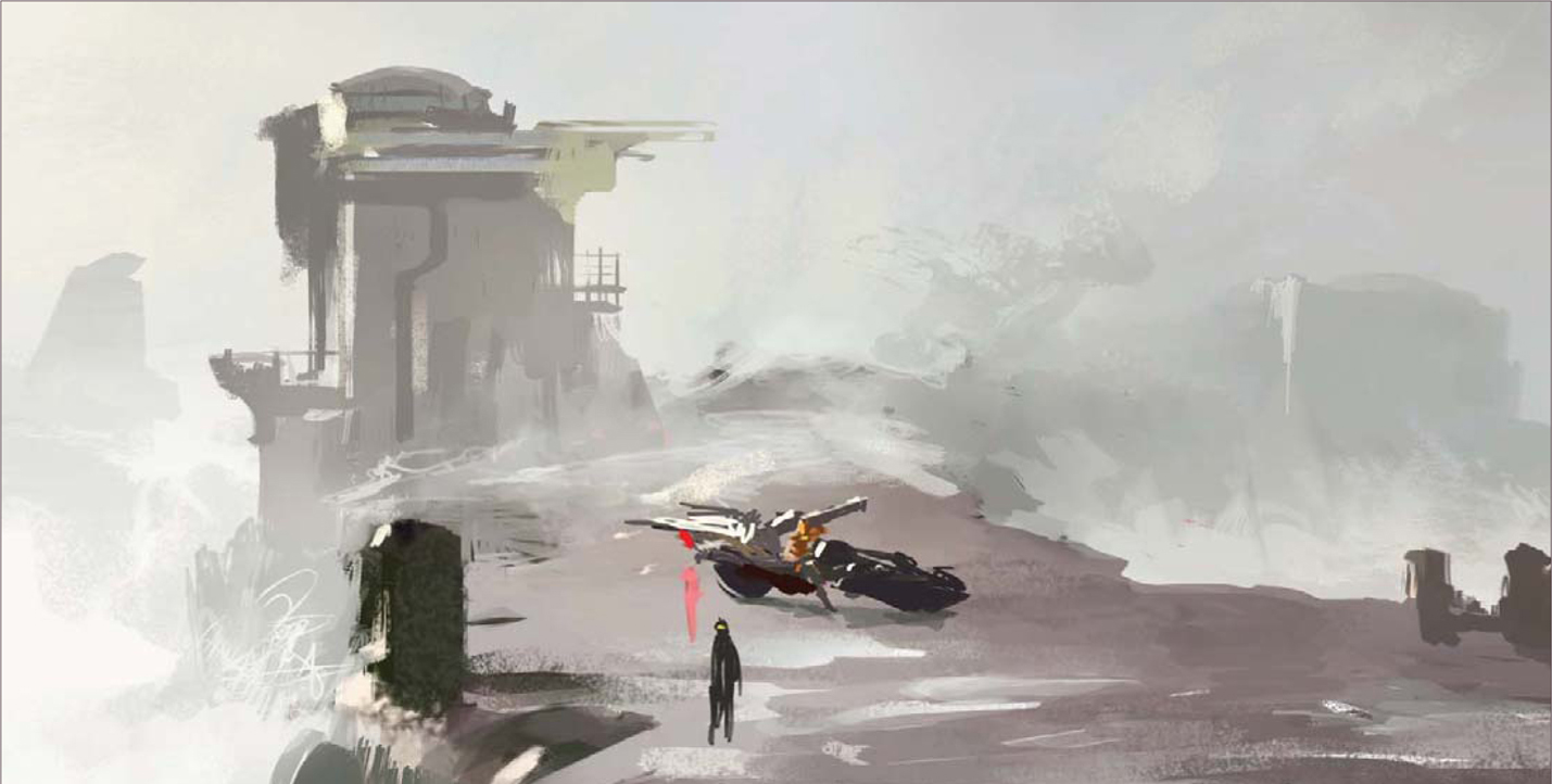
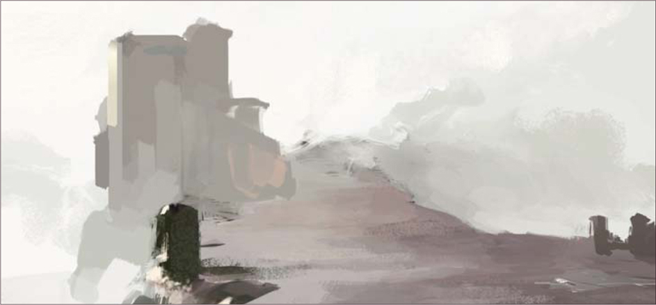
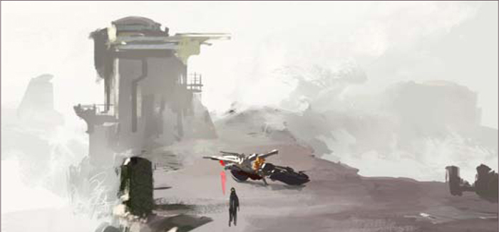
Next I flip the canvas to check the composition (Fig.13). I also decide to crop in on the two characters, to sort of bring them closer to the center and making them the focus (Fig.14). The standing figure can be a guard; the shape to the right can be his booth or something, and I sort of like the potential drama between him and the biker chick. Of course, the composition will have to be adjusted since cropping in has kind of killed some of the depth the piece had before, but at this point the basic “staging” is done. From now on it’s just a matter of detailing it out till I can call it done.
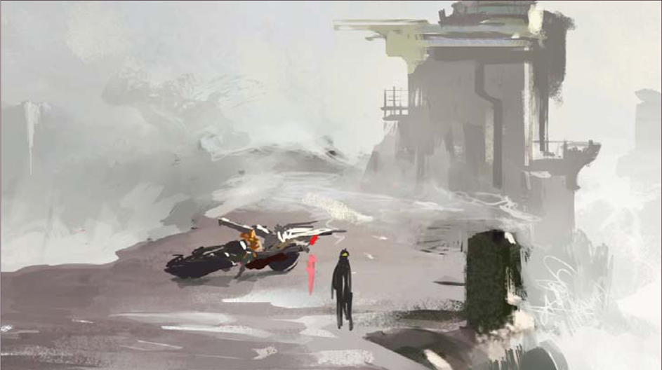
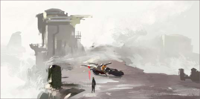
Here’s the image after some polishing (Fig.15). The actual rendering process can seem quite dull, even on a loose piece such as this one. I was pretty much moving all over the place, sampling colors and working on things in no particular order. But it’s really nothing special, just the same old things I did during the blockin only repeated on a finer scale. I’ll do my best to sum up some key steps:
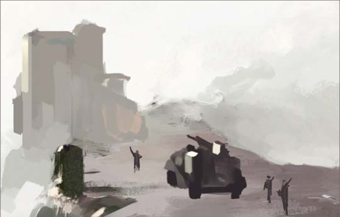
• I simply raised the structure and added some minimum details. I indicated a path leading up to the building to add some interest. If you look closer at the waves at the bottom you can see I actually used the default Maple Leaf brush to mimic scattered waves, and went back in with a Smudge tool to kill a few hard edges here and there (Fig.16).
• I toned down the killer wave. It still looks tall, but at least not like some tsunami from hell. Other than that I simply laid down patches of textured shapes with a large brush on a layer, and carved out the details with a small Eraser (Fig.17) (as mentioned before).
• I further detailed out the main structure, added windows and a flag, and also threw in a soldier on the balcony to make it more interesting. I refined the building in the back, and popped that flying thing up there just for kicks (Fig.18).
• I made the booth larger so it looks like the guard can fit in there. The rest was pretty straightforward, just detailing out the characters and the bike with a small brush. The chick must have some insane strength to lift that cannon, but I actually like it that way. Who knows, maybe she’s a cyborg (Fig.19)?
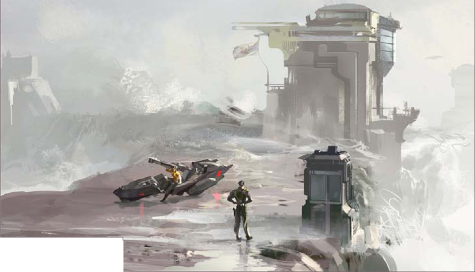
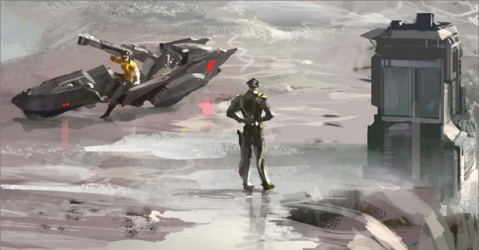
The painting is almost done now. I give it a once over just to clean up some minor areas that were still bugging me; throw in a layer of smoke effect in front of the bike; adjust the Levels; sharpen it with a filter, and the thing is finished (Fig.20). Of course there is always room for improvement and revisions, but for now the piece does what it needs to do.
© Graven Tung