
Complete Projects
Keep A Sharp Eye
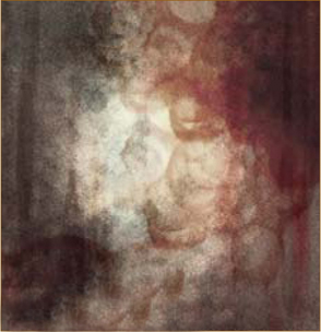
© Ron Crabb
This part of the book is perhaps the overture to what has preceded, and allows a glimpse into the thought process and creative approach behind three artists. Each addresses the human condition in diverse ways and hopefully, through comparing the different stylistic approaches, we will gain an insight into both the technical and emotive aspects that run through their work.
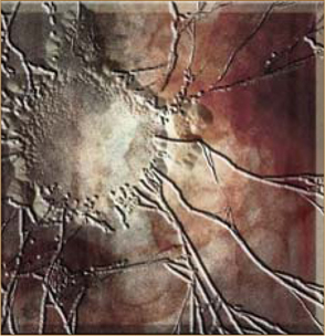
©Daniela Uhlig
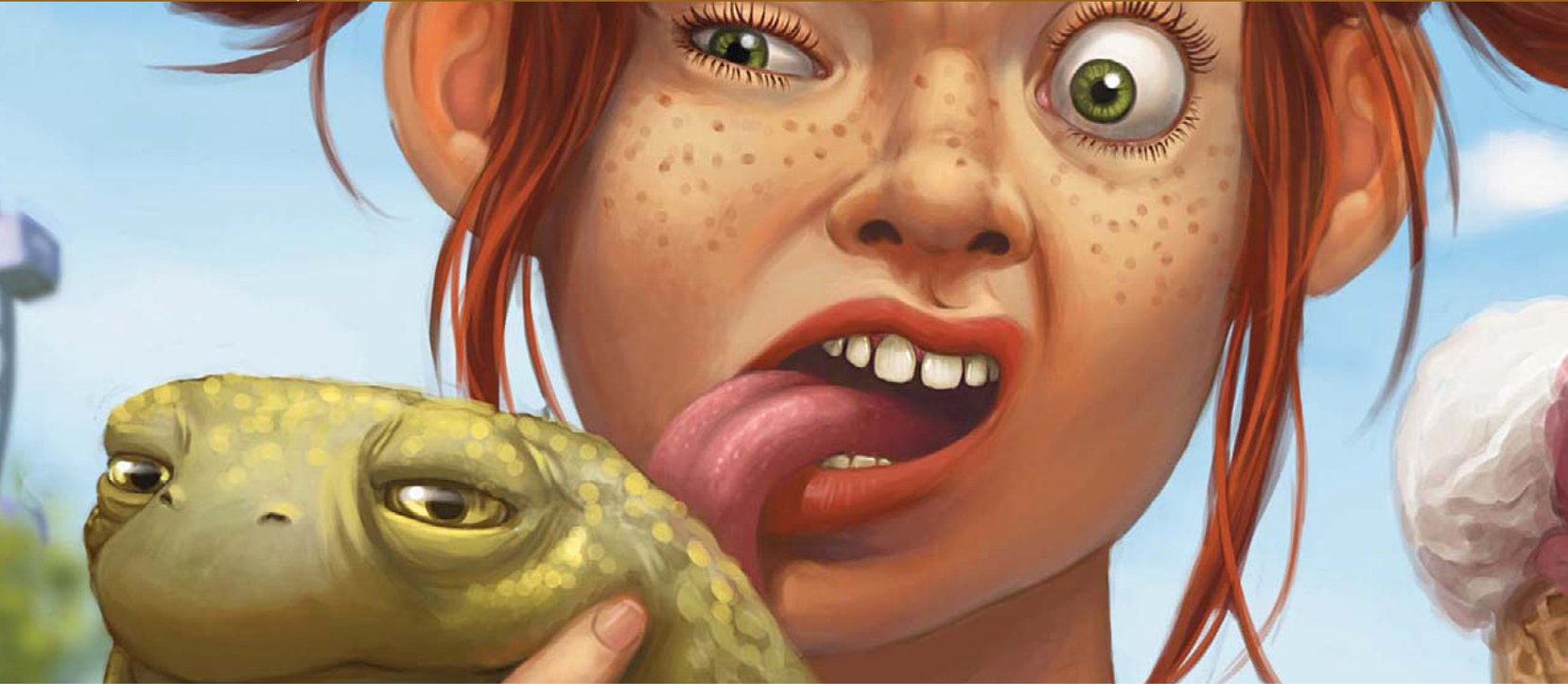
THE MAKING OF “FUNFAIR”
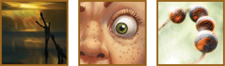
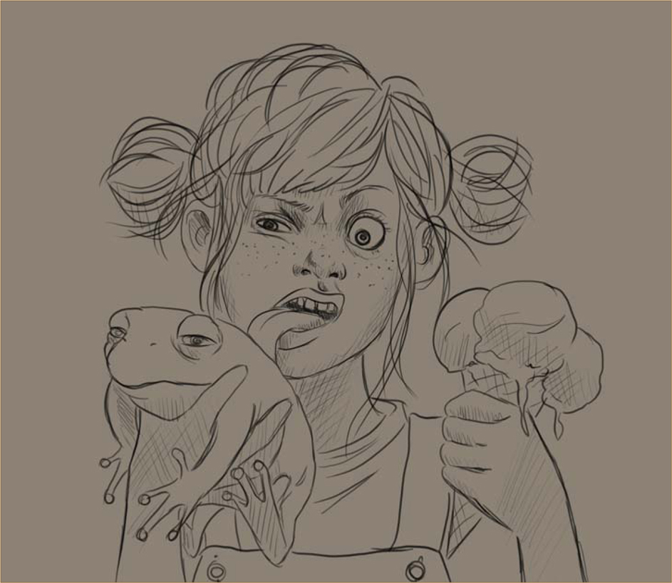
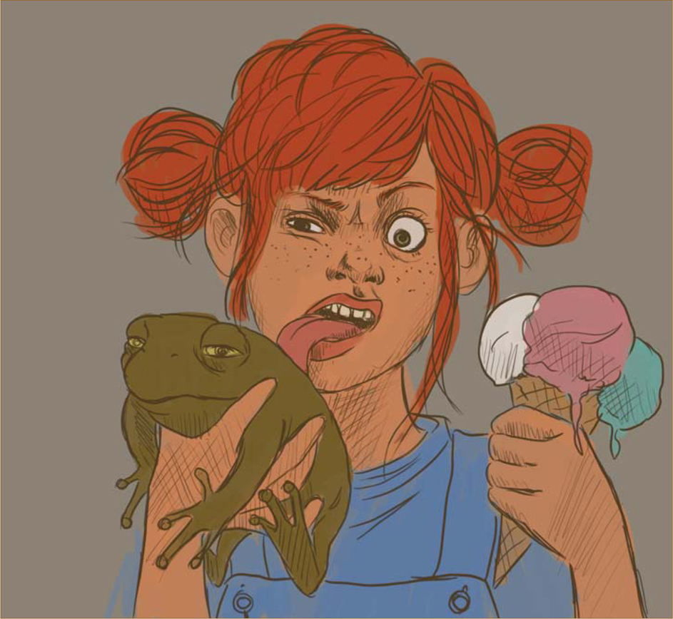
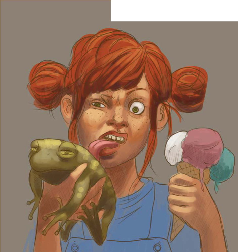
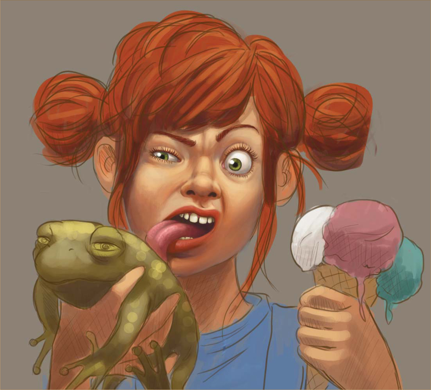
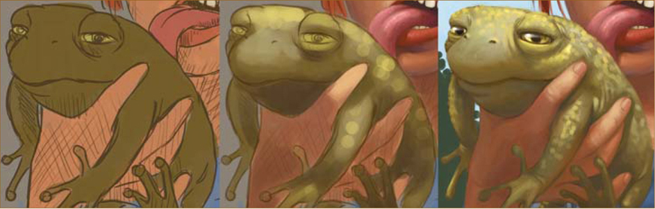
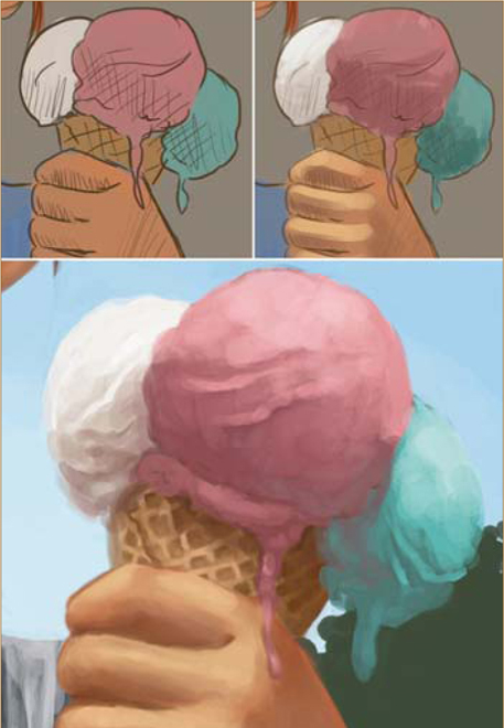
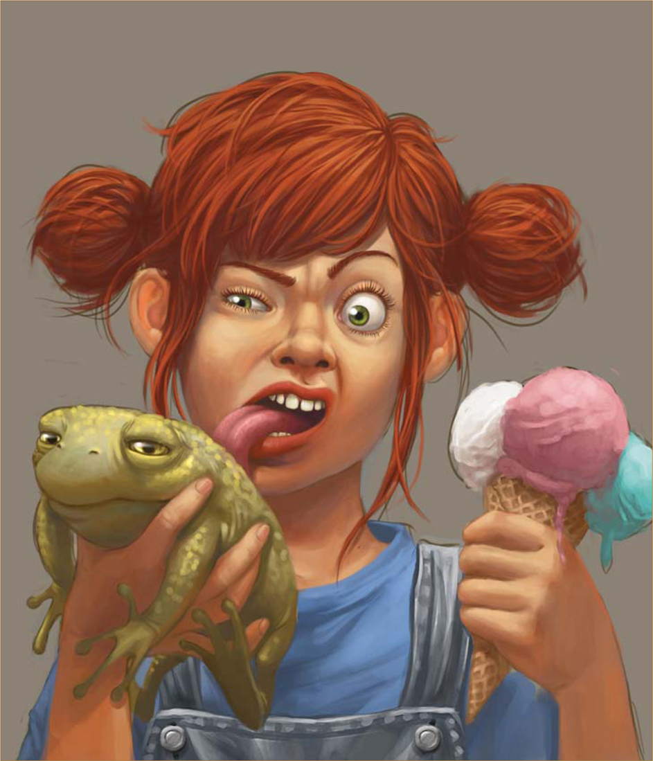
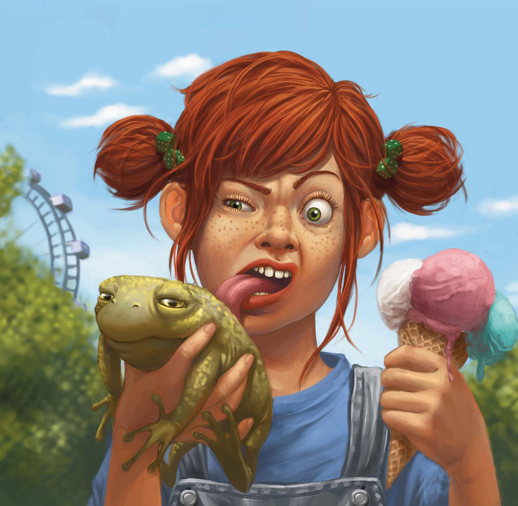
I like my pictures to describe funny or strange situations, such as in my picture, Funfair. The idea for Funfair came about when I was sitting in the park on one of my lunch breaks. A friend and I were eating ice-cream when a small insect landed on hers … her face instantly turned into a funny grimace, and I just had to hold onto that facial expression by drawing it.
Step 01
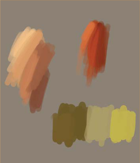
As a starting size, I use around about a 3000 by 3000 pixel canvas, at 300 dpi. First I draw the sketch in Photoshop using a small, pressure sensitive paintbrush (Fig.01a). The background and the sketch both have their own layers. I then set up the basic colors that I think I might use for the sketch (Fig.01b). I always try to use very loud colors in order to enhance the surreal situations that you find in my pictures.
Step02
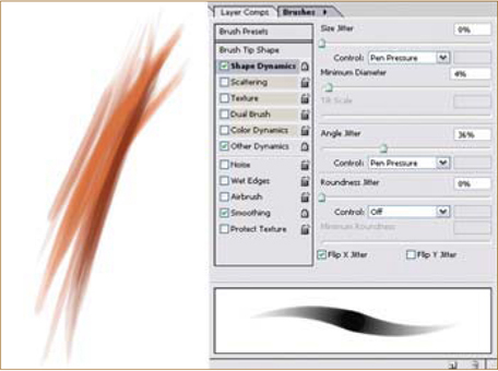
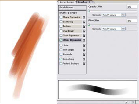
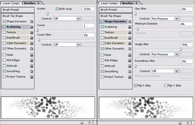
I create a layer behind the sketch layer and fill it roughly with my chosen basic colors (Fig.02a). The lighting and shading are set up with the chosen basic colors, again using a new layer (Fig.02b). For this piece I choose a daylight situation, in order for a summery, sunny ambiance to be achieved. I use a hard round brush; to get a smooth transition between the colors, the Other Dynamics and Pen Pressure settings were used (Fig.02c).
Step 03
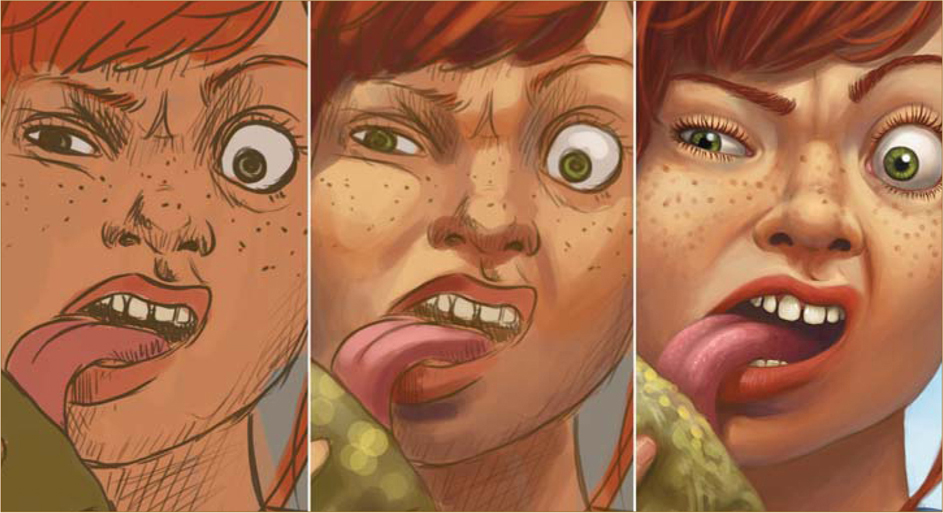
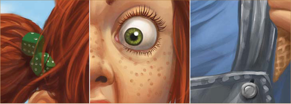
At this point I have the basic frame upon which I can start adding all the details. By creating a new layer I make sure that the sketch layer will still be there. On the new layer I just start drawing over the sketch lines – ignoring them completely. I start with the face because this is the main point of focus. By creating a general idea of the face, I am then able to work on the details such as the nose, mouth, eyes, teeth, and of course – very importantly for my nasty red-headed teenage girl – some freckles, using the same settings as before but working more precisely this time. For the detailed parts, for example the eyelashes or other fine lines, you can use the helpful setting, Shape Dynamics (Fig.03a – c). The hard round brush gives us a nice, painterly character, unlike when using Airbrush, as this feature always looks a little cleaner. After finishing up her face I then start work on the rest…
Step 04
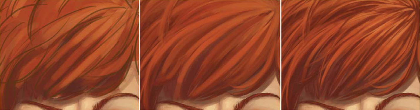
The next step is the hair. Earlier on I set up
the basic colors, one of which was chosen for her hair color. I enhance the lighter and darker shades of red in her hair using single wisps. I don’t want my character to look all prim and boring, and so for this reason I paint single wisps sticking out of the hair. This way her hair looks less combed and more out of order, which also gives her a cheeky look. The more luminous spots you apply to the hair, the more it will shine and the silkier it will look. This time I didn’t want to use effects like that because I wanted the hair to look a bit shaggier, for the reasons I mentioned before (Fig.04).
Step 05
Moving on to detail the frog, I paint bright yellow colored spots where the light is to be hitting his body. This way the frog looks all wet and slippery, and you also get that typical pimply skin effect that frogs have (Fig.05a). I then work on the ice-cream cone; to get that characteristic ice-cream surface, the line management has to be more inaccurate and I finish up with the Unsharp filter (Fig.05b). Looking at a real ice-cream cone would also help here.
I then work on the hands and clothes; you could either do these both on one layer, or each one on a separate layer, on top of the sketch. After finishing all this, the sketch is now barely visible (Fig.05c), so I hide the sketch layer and everything else is merged into one layer. You should always merge layers together when you finish working on each layer – this way you can save a huge amount of calculating capacity. However, in order to have some kind of back-up, I also save jpeg files every couple of steps – but it’s up to you if you wish to do the same.
Step 06
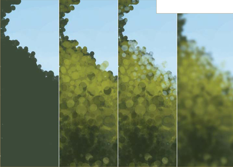
The background needs to support the picture, whilst not becoming a key focal point. The coloring has to be bright and strong to achieve that summery look for the whole scene which I described earlier. So I start with a rough green area that is to later on display trees and bushes (Fig.06a). I fill this area with darker and lighter shades of green, using a brush I created myself very easily (Fig.06b – c).

I erase some parts of the edge of the green area using the same brush, and to achieve depth of field I use the Gaussian Blur filter on the trees (Fig.06d). Behind these trees a Ferris wheel is depicted to signify the name and action of the picture. Of course, the Gaussian Blur also has to be applied here, as well. The lowest layer of the background holds the sky and a few clouds – both were sketched only roughly.
Step 07
I can never really stop working on a character – there is always something to improve or change. A useful way to do this is to create a “correction layer”. On this I can then, for example, change the light beam in the corner of an eye, or change how the T-shirt falls. For a nice finish I also give her hair bands with green dice on them, which creates a nice contrast to her red hair (Fig.07a – b). And we’re done.
©Daniela Uhlig
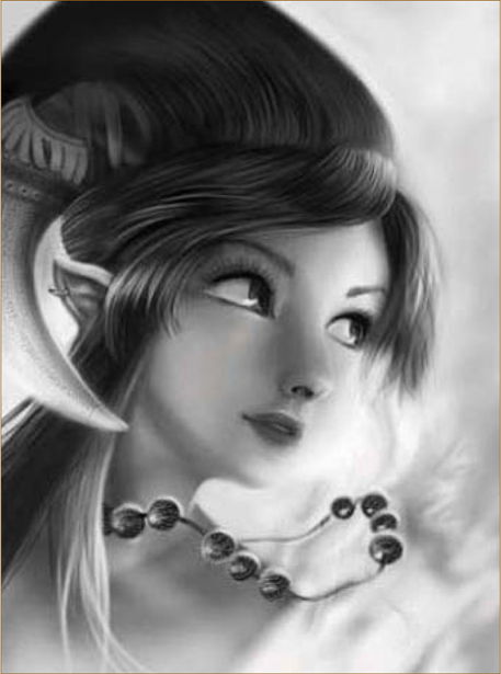
© David Revoy
CREATING A 2D IMAGE FROM SCRATCH
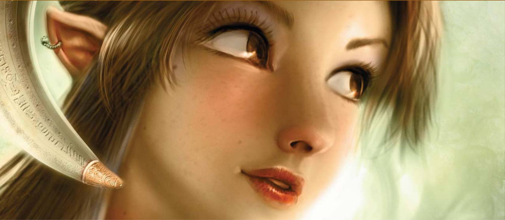
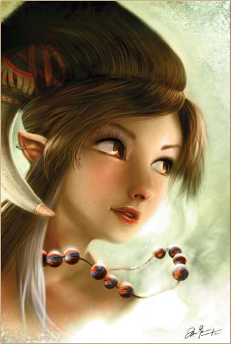
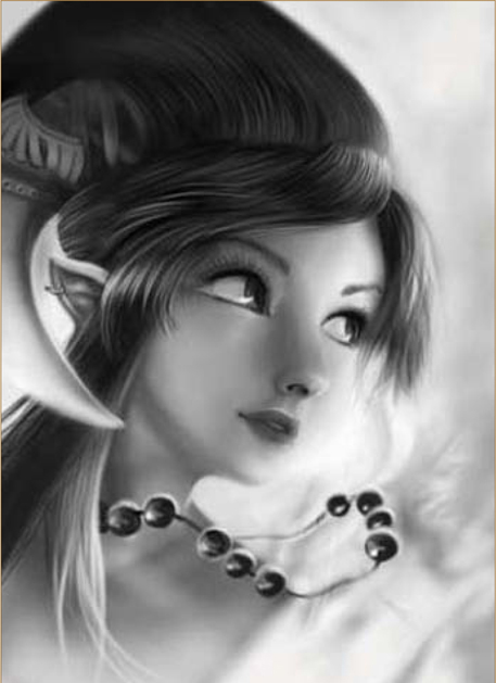
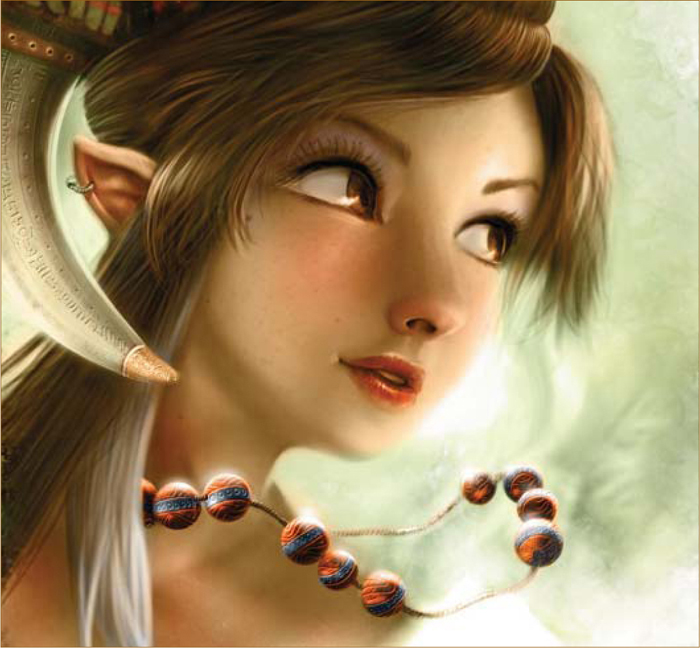
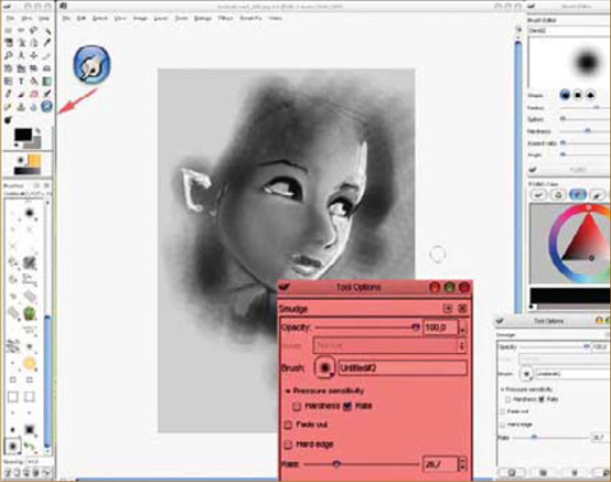
Here I have tried to create a simple step-by-step tutorial on the creation of my image, Collar of Magic Pearls (Fig.01). I originally intended to write the article as a “making of” for TDT3D. com; however, whilst writing I realized that a lot of the techniques and software used, and quickly developed it into a tutorial (later published on TDT3D.com). The painting was made using a combination of software: Corel Painter IX and Photoshop CS2; however, most of the techniques explained in this tutorial will also be applicable to other 2D programs. I have reserved space at the end of this tutorial for the conversion of the following programs: Artweaver and GIMP – both free and open source software.
Setting up in Painter
Firstly, I begin by launching Painter. I prefer this software for global creation as there are a lot of pre-made tools here to satisfy my needs, and it helps me to remember my old work as a traditional artist. I often start with a simple black marker on a warm, light-gray canvas. The size I use is always around 2000 by 2000 pixels. I usually start with a 3000 by 3000 pixel square canvas, and crop it to suit my requirements. Here, I directly enter the value 2970 by 2100 pixels to be sure to have a ratio equal to A4 – normal-sized European paper (almost equal to the Legal standard for the rest of world).
Tip: If I want to make a 16-9 ratio, I simply enter 1600 by 900 pixels. For my workflow organization, I like to work with the Hue/Saturation/Light, a panel of custom tools (more short-cut tools than custom) and a standard color selector. I like to keep the layer panel reduced next to my toolbox, to keep an eye on whether I need to add or change an effect if I’m not too sure about a layer. Normally, however, I like to work without layers, as I would with a traditional drawing.
Black and White Drawing
(Fig.02) I start with a simple line drawing, using thin marker tools. I try to start out working with good shapes, and then enlarge my tool to quickly create shadowed areas. Setting the background to white, I take the Eraser and add some highlights; taking the Blender tool, I then start to smooth the light/shadowed areas and, with an Airbrush, I make my shadows darker and my light areas glow more brightly.

See Fig.03 for a close-up detail of the work. I continue the same process; adding details with the Marker/Airbrush/Eraser and blending my shapes. The main idea progresses gently. At first, I want to add a skull ring, and to represent dark elves; however, I decide that violet skin and red eyes would be too “disco” for my color preferences. Even when I’m working with black and white colors, I try to imagine the color values. It is necessary not to have the colors too dark or too light, which is why I try to keep neutral zones that will be the best places to express the colors (lips/skin, etc.).
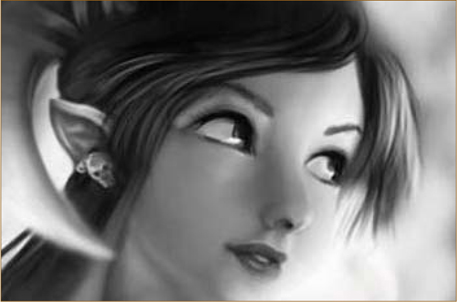
Fig.04 is a mirror image of the work, which is a good way to refresh your eyes and spot any mistakes. During the process, I mirror the drawing a lot (I even have a short cut on my Wacom express keys, as I work with an Intuos 3), as this is the best way to catch mistakes. It wakes up tired eyes and self-criticism (your brain believes it’s a new picture, and instantly starts to analyze it differently).
Composition Enhancement and Resizing
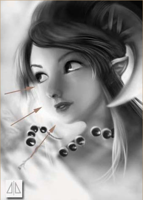
The arrows in Fig.05 show that a part of the face is too large, and the mouth is slightly out of alignment, so we need to work on the composition now to correct these flaws. Firstly, save your work and go to Photoshop. I always prefer to do any modification, moving of areas/resizing of the drawing, etc. in Photoshop. With practice, it has become easier this way. I aim for good composition using three simple methods: (1) draw lines from corner to corner – the “big cross” – to show the dynamic axis of reading pictures; (2) 1/3; 1/3; 1/3 – cutting the image into nine frames – to show where to align the vertical-horizontal main lines (not in a boring way); (3) two circles, drawn to show a representation of the two circles of the eyes and the focal point in the middle where detail will be observed first.
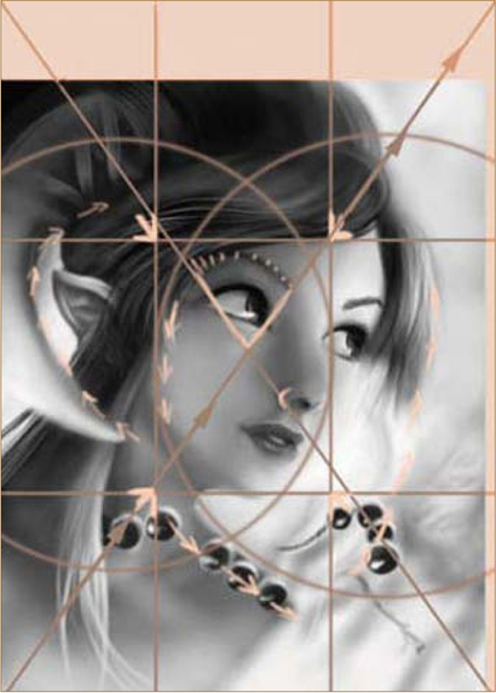
It can be interesting to place circular main lines around shapes to make the effect more efficient. Of course, I don’t usually draw these compositional lines, I simply imagine them when I need to, but if you are used to drawing then you will subconsciously build your picture in this way. For now, it is best for cropping and resizing your picture, which is why I added a soft pink area to the picture, to achieve better composition (Fig.05 – 06). The hand-drawn details are done using a digital Airbrush with Painter, so I save the work and go back to Painter where, with a thin Airbrush, I simply define the main details; most of them are made using a simple black or white line, using a mixture of different pressures on my pen.
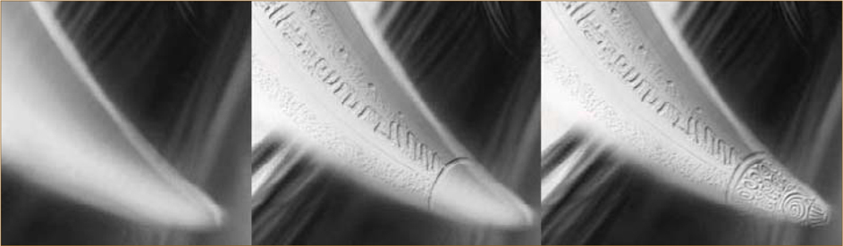
Bevel and Emboss
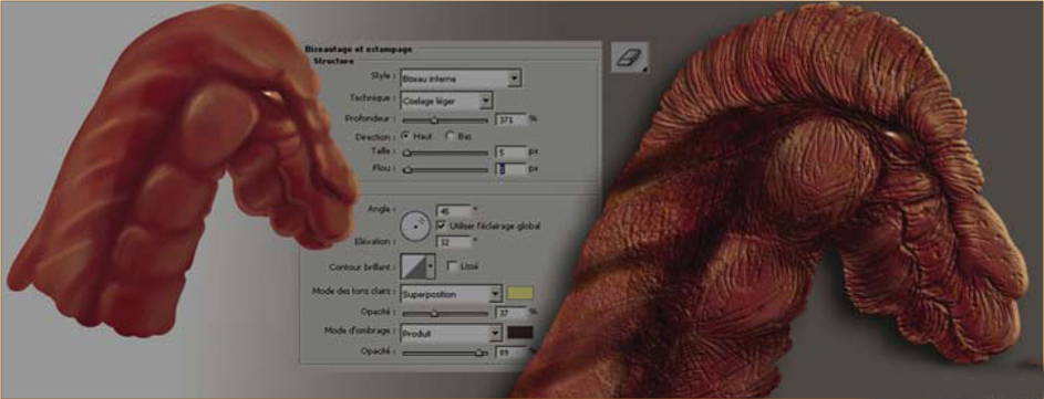
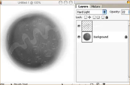
(Fig.07) From left to right: the horn without bevel and emboss; the horn with one layer; and the horn with the final layer. My prefered method for adding these cool details is an easy technique which I have learnt from forums and websites: Save and go to Photoshop, and duplicate the background layer; apply a Bevel and Emboss effect on the new top layers; draw with the Eraser … easy! You can change the parameters of the effect to have colored shadows/light, and alter their direction (Fig.08). The only thing to take care of is the frame on the border that appears around the second layer (square, embossed appearance). At the end of your engraving work, apply the effect and erase the border of the top layer. You can now collapse your layers and repeat the process to include a lot more detail.
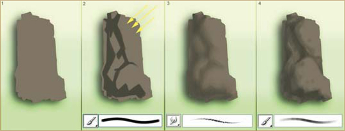
Bump up your Textures!
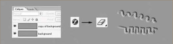
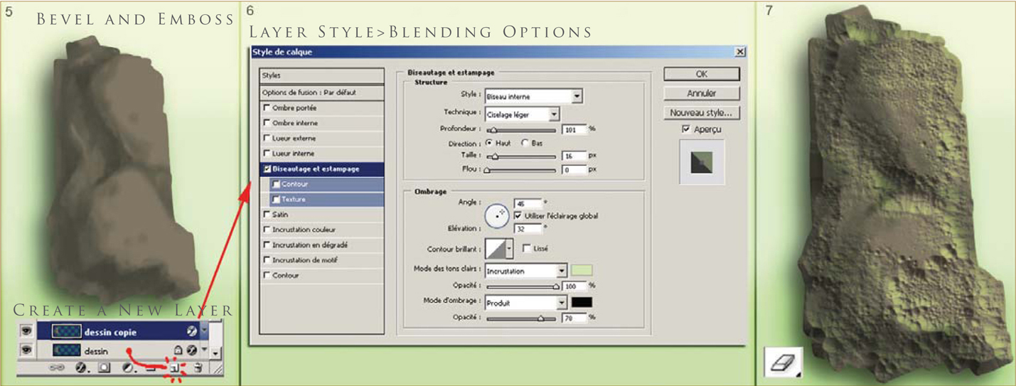
The complexity of this effect warrants a brief tutorial in itself (Fig.09): (1) in Photoshop, draw a rock on a new layer using a basic brush; (2) draw some solid shadows; (3) blend them using the Smudge tool (increase the value of the Smudge tool to make it work faster and better); (4) use a brush to add some finer details, such as the material color. Now for the effect (Fig.10): (5) duplicate the layer of your rock by dragging and dropping onto the Create a New Layer icon; (6) double-click on the right part of the layer to add an effect, choose Bevel and Emboss, and play with the Blending Options; (7) on the top layer, use an Eraser and set a good sparkled “grunge” shape; erase, and the relief appears!
Here are two other quick examples which I have painted to help understand when and where to use this technique I’ve just described (Fig.11 – 12). This little touch always adds a little more life, and doesn’t take too long when you think of the amount of detail generated. There are other examples as well, such as flat textures; this will also be of interest to 3D artists. Step 1 for Fig.13, 14 and 15 is without a bump map, and steps 2 and 3 use different bump maps (Fig.13a – 15c).
© David Revoy
© David Revoy
© David Revoy
source:http://www.mayang.com/textures/
© David Revoy
Back to the Collar of Magic Pearls painting; the bump map for this work was made using 3 – 4 layers to give different levels of engraved details. The lowest layer utilized a lot of line, using a 1-pixel wide tool to create grungy lines on the materials. The largest use of this effect was using a large Eraser to write inscription on the horn, on the left of the painting (Fig.16). You can see the Bevel and Emboss effect layers in action here.
Colors
The color steps are made on a separate layer, which will incrust color onto the gray painting. To add color, we create – on the top of our layers (I collapse them all, so I keep only one black and white layer open) – a layer with the Color layer blending mode. This layer will transform the gray value in the color tone applied to that value. I start to apply a green color over all colors, and add additional colors to the painting step-by-step (Fig.17). I first discovered this technique used in a 2D painting tutorial by Steven Stahlberg.
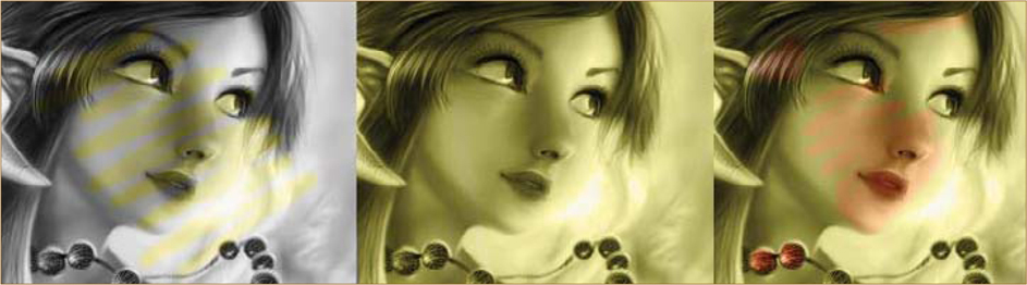
To explain color schemes, I have used tones/colors and arrows to demonstrate (Fig.18). A good trick for skin tone is: (1) add a little blue/violet on the eyes; (2) give a touch of a warm, red/blood color on the cheek; (3) apply a little violet around the corners of the nose; and (4) add more red and saturation to the nose and ears.
Layers and Details
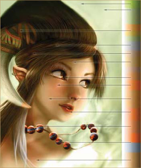
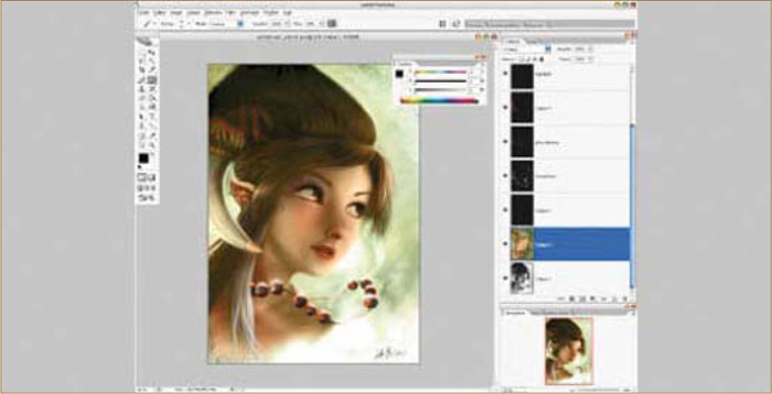
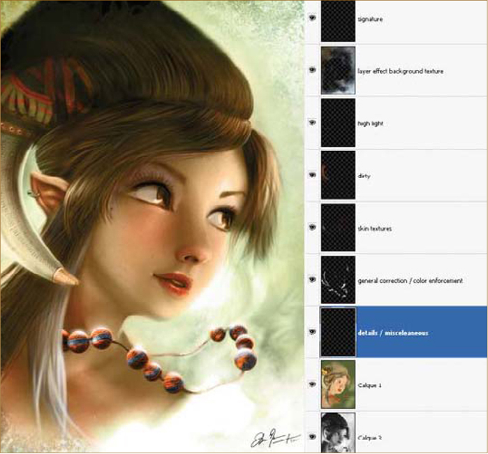
See Fig.19 for a screenshot of my working method in Photoshop. As usual, my favorite tools are the palettes of Hue/Saturation and Brightness/Contrast. Details of my layer composition for the artwork can also be seen here (Fig.20). I keep the two layers (in the example shown “Calque” is the default French term for “Layers” in Photoshop, which means “copy”) and add as many layers as I need to get my picture as I want it. The layers enforce some color simply by using an Airbrush, adding highlights, and adding some grain to the skin and texture to the pictures – which is all fairly easy to do (Fig.21).
Tips and Tricks
Two tips which you can try after finishing an artwork, to make your picture even better (for publishing, etc.) are: (1) go to a 3D online gallery, browse your favorite artists’ pictures, analyze their artwork and try to comment on their images constructively. After this, return to your 2D painting; (2) it’s always good to have insight from another person, so post your final image in a WIP forum – experts and hobbyists will happily give you precious advice on how to enhance the quality of your artwork, and in turn you can help them with their own art.
References
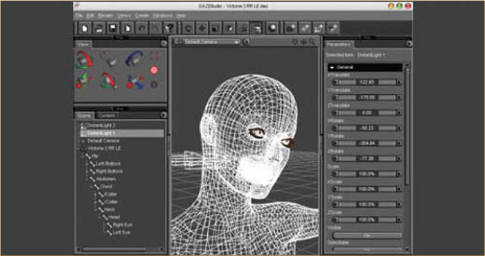
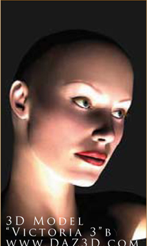
Most photographs are already the artworks of a photographer/artist, so you mustn’t copy them – even if you like the shadows/characters, it would still be a derivative of an original artwork. Another way is to become a drawing master and to have a mental image in mind. The last way is to use your own reference material, from your personal photos. It’s not easy to ask all of your friends to pose for your artwork, which is why I find my working method most efficient: using 3D software which is distributed freely, for example DAZ Studio with Mike and Victoria models (http://www.daz3d.com), which is likely to have models with the ability to move their arms, change their pose, change lighting and background, etc.
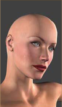
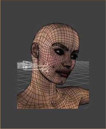
For this artwork I didn’t actually use this method, but I have simulated the method for you here, as I would have done it if I had needed to (personally, I use DAZ Studio for my hand and feet poses, and for an idea of general lighting). I have included some screenshots to demonstrate the helpfulness of such software (Fig.22 – 23c). The interface is full of great things, but the best way to learn is by reading the Help section of the software. Fig.24 shows the wireframe render inside the 3D viewport. Rendering is perhaps not as realistic as a photograph; however it’s a good base to start an artwork with an idea of how the light will move on a face. This job was approximately 15 minutes quicker than undertaking a big internet search for photos, or asking a friend to pose for me.

Conversions
I have detailed some conversions for you here, which are useful if you desire to use other software to create your work. This will not reproduce the Tool effects of Painter and Photoshop, but will help you to achieve a similar method when working with software such as GIMP (free and open source) and Artweaver (freeware), and will concern only the important points:
1. Using the Smudge tool/Blender tool – to mix the colors;
2. Applying a bump map;
3. Applying a color layer to color your grayscale artwork.
For a Windows user, the ideal method is to work with Artweaver; I work with Painter and tend to use GIMP in the same way I would use Photoshop on my Mac. It is ideal to begin your investment in your 2D digital painting studio with a purchase of a graphics tablet before even thinking about software, because you can find software such as GIMP and Artweaver which are completely free and legal to use.
Conversion for GIMP
GIMP is surely the most famous free and open source 2D editor, and can be downloaded for all systems – Win/Mac/Linux – and is still in use by a large community. The version which I like to use is a portable version of the 2.2. This version can be on a USB key, as well as your drivers for your graphics tablet display. It’s ideal to have all of this on a USB key ready to work with anywhere on a computer. GIMP is free and open source, so it is legal to install it on another computer or to execute it from the USB key anywhere. That’s why it’s such a powerful 2D tool to consider in professional work.
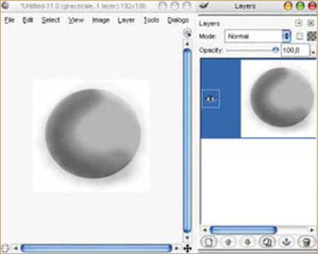
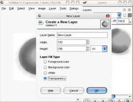
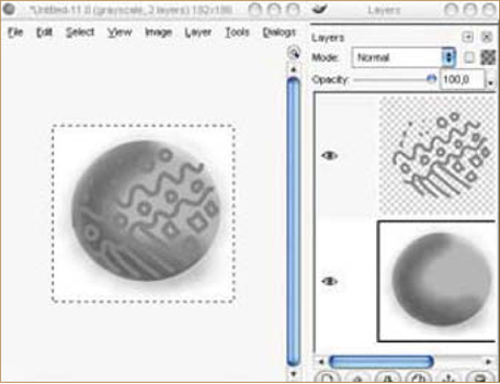
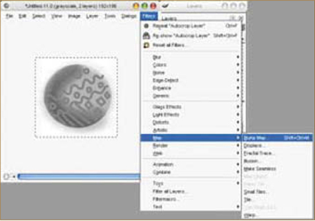
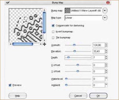
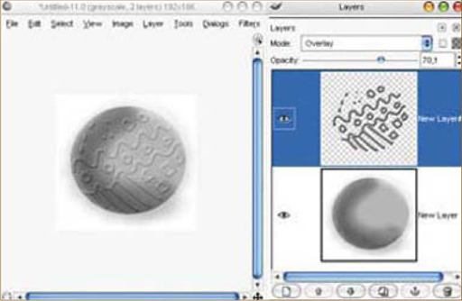
Use the Smudge tool configuration to blend artwork efficiently – see Fig.25 for a screenshot of the general organization. Bump is supported by GIMP but is not as efficient as the Photoshop method. A sphere is airbrushed onto the base layer (Fig.26), and then a new transparent layer is added (Fig.27). Draw onto it with a hard brush to engrave a pattern (Fig.28). To apply a bump map to your image, go to Filter > Map > Bump Map (Fig.29); Fig.30 shows the Bump Map filter in action. The result, with 70% Opacity set to Overlay mode, can be seen in Fig.31. See Fig.32a – b for the color layer, where I experimented with a 5-minute color test, made using GIMP, with some saturation tones (apologies for the colors used here – I randomly selected them to illustrate this example).

Conversion for Artweaver
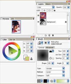
Artweaver is a Windows freeware program by Boris Eyrich, which simulates natural brush tools, such as Painter from Corel (Fig.33). This software is excellent and will have everything that you need to work through this tutorial. What I personally like is: (1) the color selector – the turning pyramid; (2) many natural tools; (3) an incredible computing speed for brushes; (4) imitation of Painter and Photoshop mixed – so if you learn this one you will never be lost in other standard commercial and professional software; (5) the history, start-up launching speed, filters and extensions – AWD (Artweaver), BMP, GIF, JPEG, PCX, TGA, TIFF, PNG, and PSD (has no layer support); (6) the pen tablet support for a realistic feeling and a lot of language support.
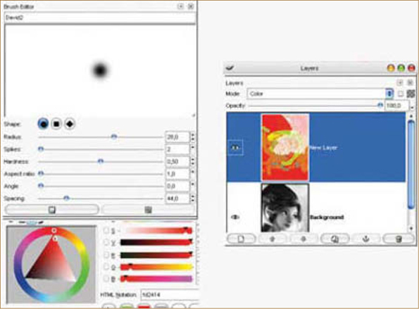
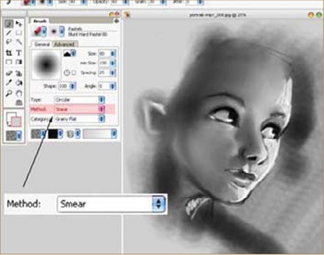
For tool compatibility, select in the tools Airbrush > Digital Airbrush. All of the tools are almost the same as in this tutorial (icons), so it will be easy for you to follow the same steps. For Smudge/Blend tools, use the Artweaver brush editor (Fig.34), which can configure any tool as a Smudge tool. Brushes can be transformed to become a good Smudge/Blend tool using the Smear option in the Method menu. In Fig.34 you can see the blending of half of the face, made quickly in Artweaver using a 2970 by 2100 pixel canvas. A good tip is to keep the height Spacing value at just less than half of the brush size; so, for example, if using brush size 80, the Spacing for the smear should be optimal between 30 and 40. If using brush size 30, the Spacing for the smear should be optimal between 12 and 15.
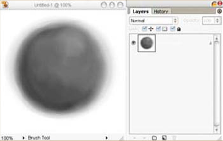
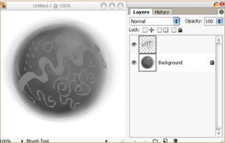
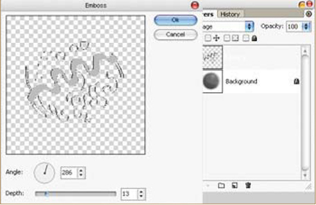
Bump maps are not supported, but a trick is to quickly airbrush a sphere onto the base layer (Fig.35). On a separate new layer, add some patterned engravings (Fig.36). See Fig.37 to see the Emboss filter in action with an Angle selector; see Fig.38 for the result, after a little blur.
For the color layer, create a new layer in Artweaver, where it is easy to change the color mode. See Fig.39a – b for a 5-minute color test made with some red/violet/peach colors, which are blended extremely well on the gray tones. Color layers in Artweaver are great – it may, in fact, have the greatest existing color layers! In other software, color layers are often made too unsaturated by mixing them too much with gray layers underneath. This is why yellow and orange are sometimes poor in this working method, but with Artweaver the problem is solved. This proves just how much the software has a future place in the 2D professional industry.
© David Revoy
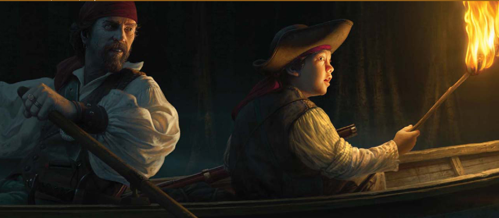
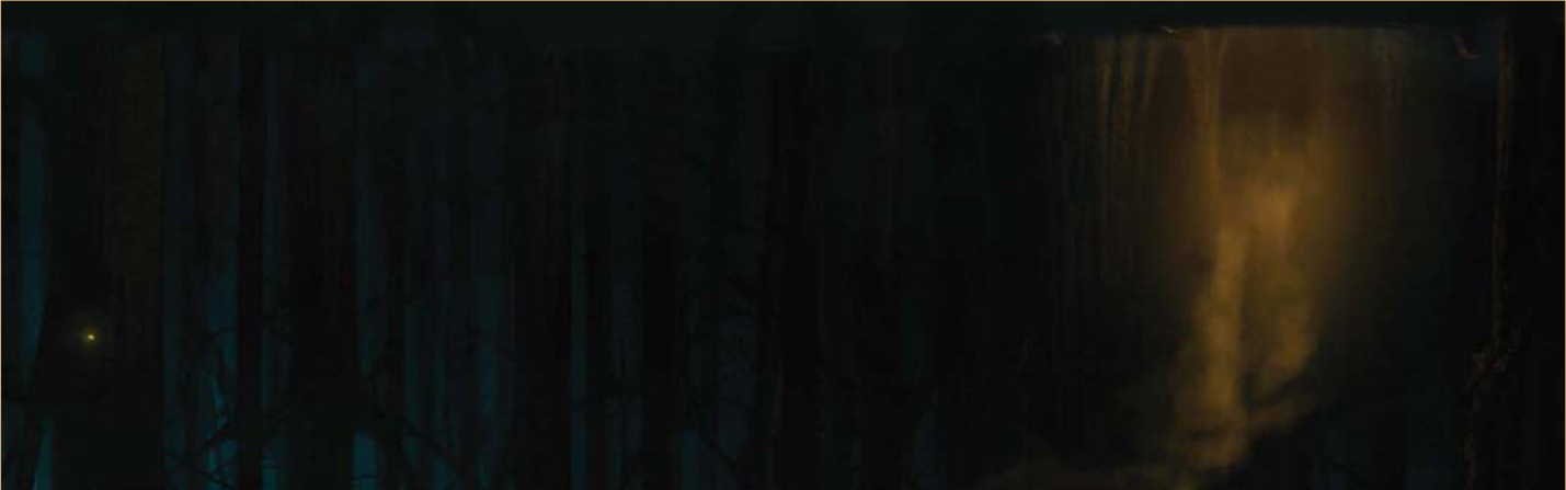
© Ron Crabb
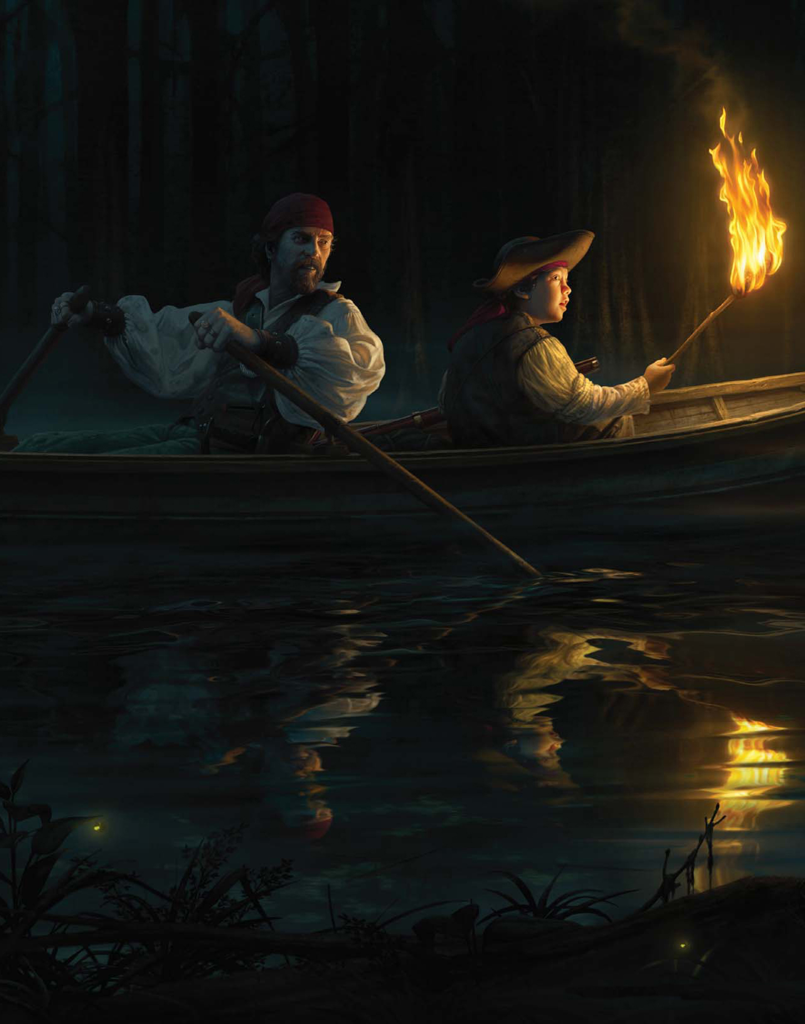
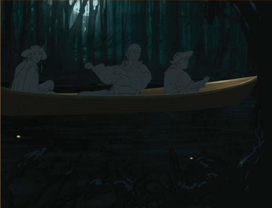
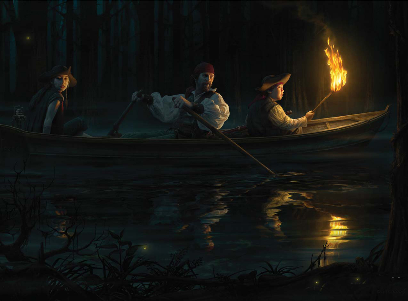
THE MAKING OF “KEEP A SHARP EYE”
Introduction
The digital painting, Keep a Sharp Eye, had its genesis in my desire to return to my roots as an illustrator. Most of my recent commercial work consisted of matte painting work for film and television, which has occupied a lot of my time for a number of years now. More recently I’ve found myself longing to get back to some figurative work and do some storytelling with my illustration abilities (it’s the variety of things I get to do that makes me love being an artist). To that end, I came up with an idea to create images that feel like they have a great story behind them, even though that story hasn’t been written yet. Keep a Sharp Eye is the first in the series that I’m calling “Illustrations from Untold Stories”.
The Concept
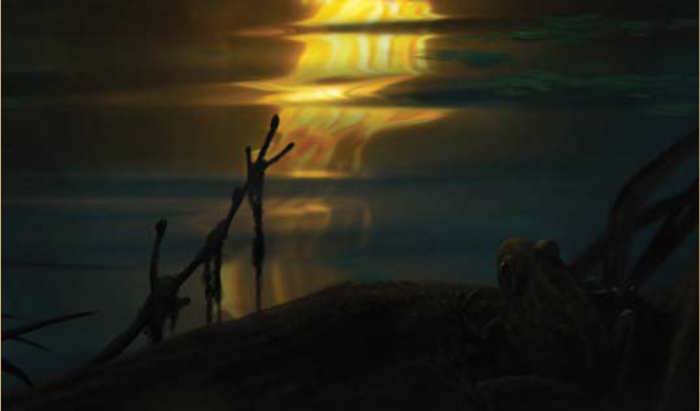
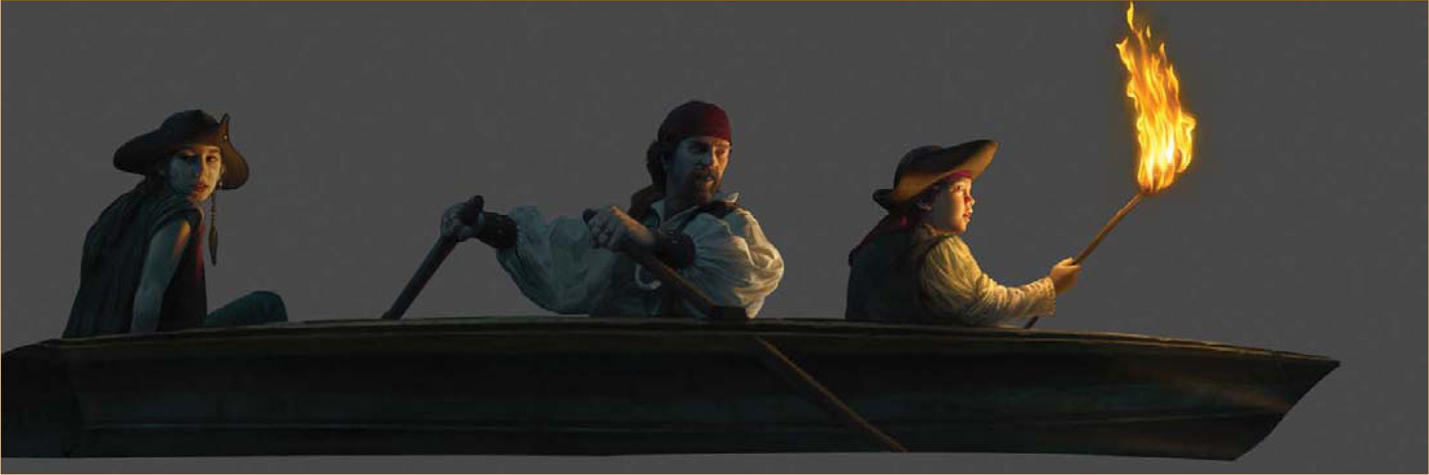
I had a number of ideas that had been in my mind for quite some time, but the one that jumped to the front of the line was a concept that developed during a trip to Louisiana. I‘ve traveled most of the United States looking for artistic inspiration (and good location photos) for fine art, and I once found myself on a swamp tour boat in the bayous west of New Orleans. It was daytime, and I was on a pontoon boat sitting comfortably above the water (and alligators), but I instantly imagined going back in time and being there on a small skiff, gliding through those spooky waters at night with nothing but lamplight. That basic idea is the one I expanded upon for this digital painting.
All the work was done in Photoshop with just a little assistance from Cinema 4D; I’ll talk you through now how it all came together.
The Sketch
Normally, for a paying client, I would do a pretty good concept sketch. Since I was the client for this piece I already had a good idea of what I wanted to do, so I just did a very quick, rough sketch – just to know what problems I might need to solve. This process allowed me to figure out lighting positions, model poses and prop requirements (Fig.01).
Gathering References
I then began collecting references from a number of sources, as well as online. I needed swamp images, period boat references, pirate costume details, and water ripple patterns. Once I decided to switch from lamplight to torchlight, I also needed flame references. This all came together quickly and I was then ready to photograph some models.
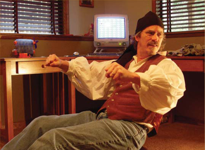
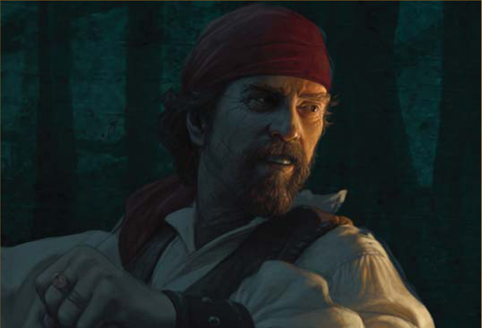
The Model Shoot
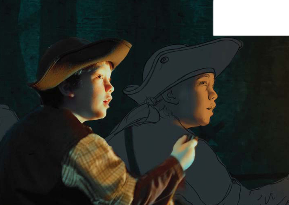
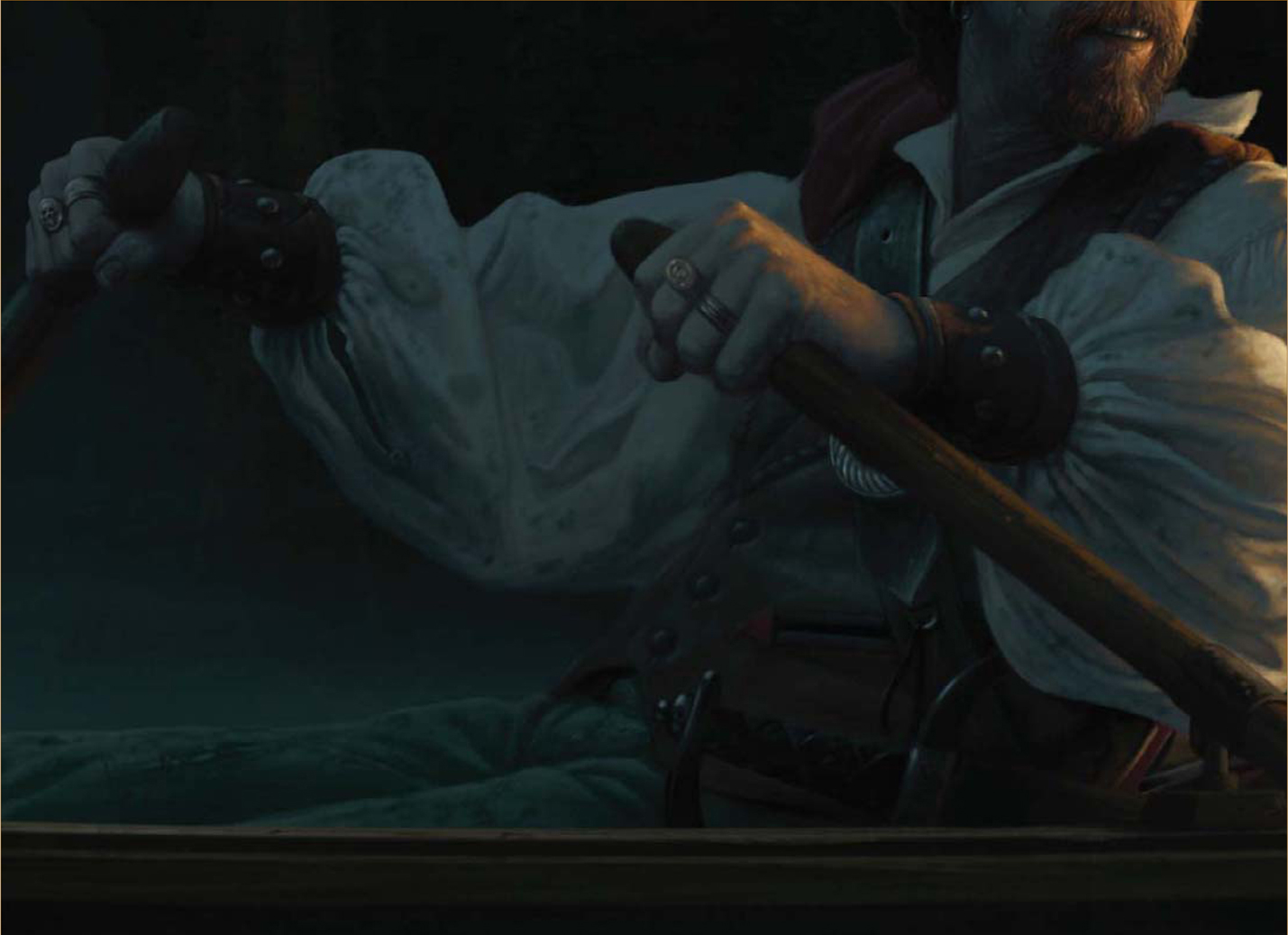
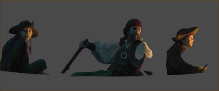
For the older pirate I needed a rough-looking old guy with nice scars. Since there aren’t many pirates in my neighborhood, I decided to use myself as a model (a lot of artists do this), and I could then roughen and scar myself to an appropriate degree in the painting process. I also found two very willing children close by who were happy to help out.
A note about model shooting: I don’t go overboard in trying to get everything just perfect in the photo shoot because I find that the process of correcting things during the painting phase allows for quite a bit of creativity. It forces me to think hard about lighting conditions and shapes, as well as final poses. I take many photos and often end up combining elements from a number of them to get exactly what I want (Fig.02).
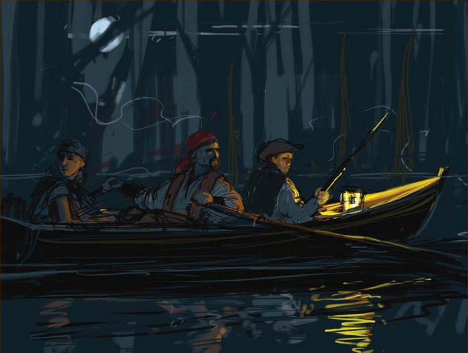
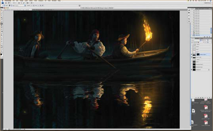
Starting the Painting
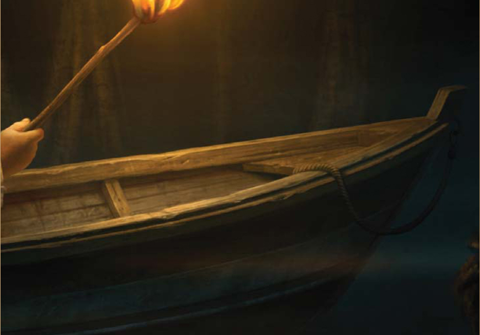
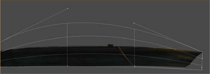
With all my photos and references in hand, I began the painting process. I created a quick background just to get a base going, using simple, hand-painted tree silhouettes (Fig.03). I also did a quick boat model in Cinema 4D (you could use any 3D software application to do the same), just to make sure I got the shape right. I then placed the basic boat into the picture, which gave me the platform to position my characters (Fig.04).
A note about 3D: While not traditionally thought of as an illustration tool, 3D is becoming more commonplace as just that. It can really enhance your options as an artist and fuel creativity. Free programs such as Google SketchUp can get you started on it, should you decide to add 3D to your toolbox. I know I’m glad I did!
I pieced together my model references, combining body positions with preferred facial expressions, and did some color correcting to get close to the desired lighting and coloring. During this process I decided to make a slight change in lighting and to get rid of the bright moonlight that I had indicated in the rough sketch. I felt that having it darker, without an overly bright rim light on the characters, would make it moodier; more like a classical painting than a movie poster. I would still add some ambient moonlight, but much less pronounced than originally planned. I wanted that torch to really pop.
I positioned the corrected photo layers and roughed some quick positioning sketches over them. I then moved the photo reference off to the side and began sketching in more details (Fig.05). I did this for two reasons: one, it’s more fun to draw than trace; two, it allows me to make the changes I want to make and be creative. For instance, I often make a man’s head slightly smaller in relation to his body size and his hands slightly larger. It’s a common illustrator tip I picked up from a Norman Rockwell book ages ago. I also make kids’ eyes slightly larger – it adds to expressiveness. None of it is dramatic, but I think it helps the storytelling.
Tip: All through this process I keep all my elements separated into many Photoshop layers. I combine as I go, once I’m satisfied with each layer.
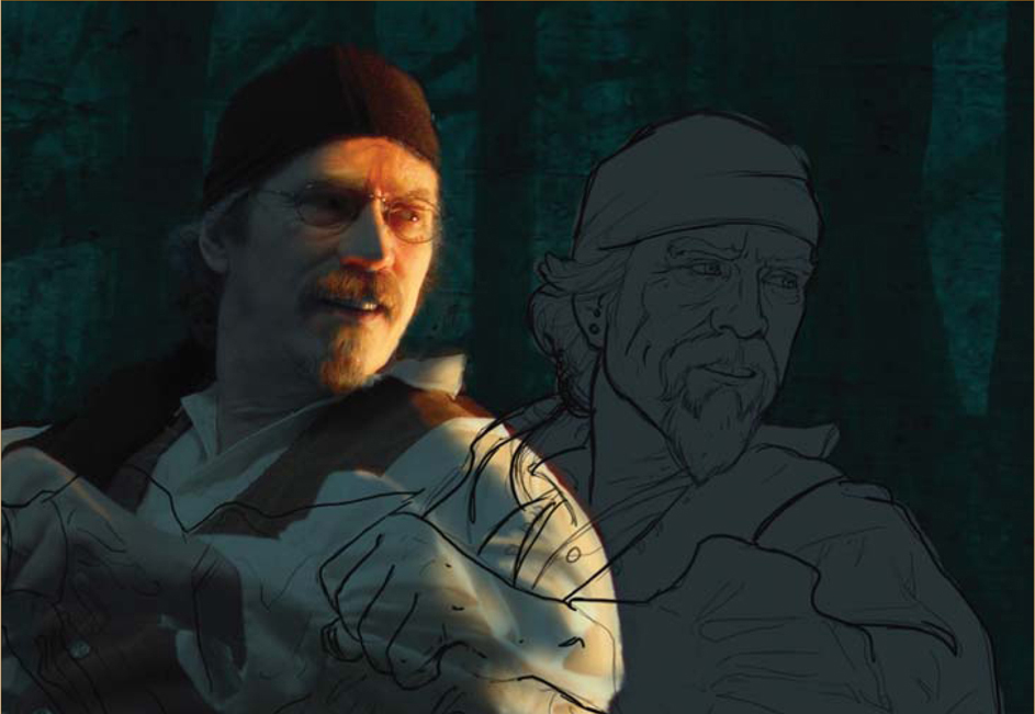
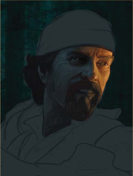
Painting Faces
I seem to always start with faces. That’s because that is where the story is, and the rest supports the mood that is captured there. Plus it’s the most fun part. Once I had the line work in (as a separate Photoshop layer), I painted a new layer that was a silhouette of the characters as a base to work on (Fig.06a). I chose the medium level value of the ambient moonlight color as a starting point (Fig.06b).
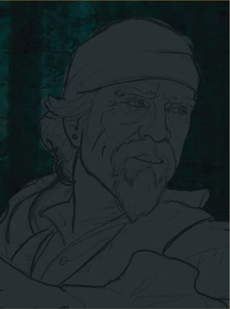
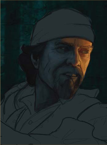
That way, when I started painting, I was thinking about the torchlight; how it would hit the shapes and where the resulting shadows would be. Even when copying from photo references, it is good to really understand what is going on with shape, lighting and color.
Continuing the Face
I created a new Photoshop layer under the line layer and above the character base layer. I set the transparency for the line layer to around 50% and started blocking in color with a custom brush that has a chalk pastel kind of feel to it (Fig.06c – e). I find this brush gives me results similar to those I get when oil painting with worn sable brushes. I worked quickly and started reducing the size of the brush as details emerged. It was a pretty straightforward painting at this point, but I constantly kept in mind the underlying bone structure and my two light sources (torch and ambient). I also made the character change by making the nose more chiseled than my own rounder one. I enhanced the cheekbones a bit, and weathered and scarred the face considerably. I also gave him a better goatee than I have. Artistic license is a great thing! As I neared the detailed work, I turned off the line drawing layer, or made it very transparent, and merged it down. I then fine-tuned the sharper details.

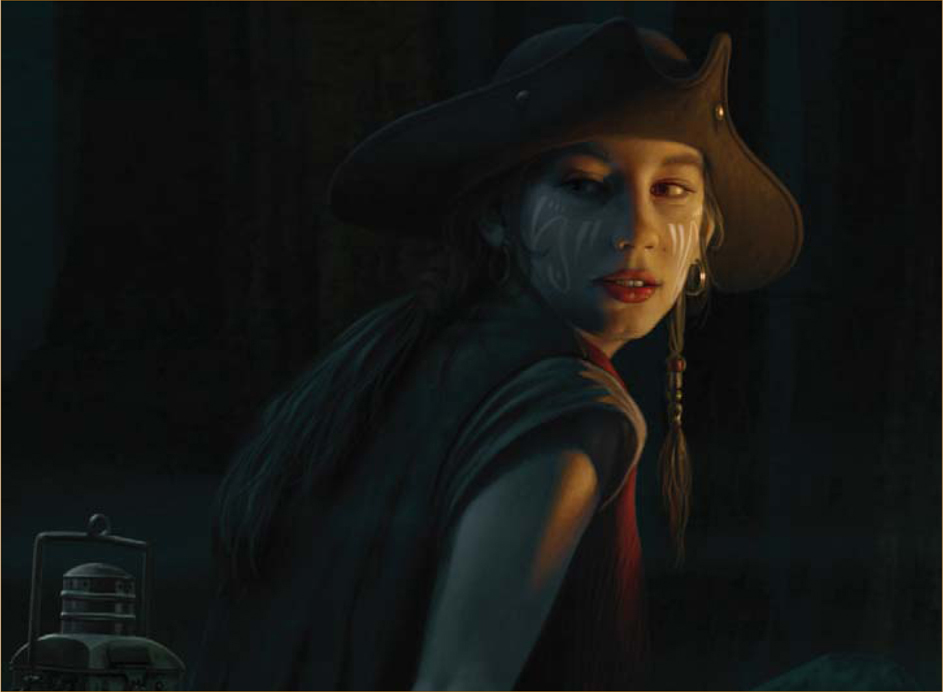
The Kids
I continued in the same way with the kids. During this process, I decided to age the girl from a nine-year-old into a young teen. I felt this would add a better range of character ages and complicate the potential story a little. It also replaced cute with beautiful, again making for a broader range of emotional appeal. I now had a cute boy (Fig.07), a young and beautiful girl (Fig.08), and a rough-looking pirate – all in the same boat. There has to be a story there!

Moving On
I got the people to an almost finished point and moved on, knowing I would return to them later for final adjustments and detail additions. I painted a quick torch to establish its exact location for lighting purposes, and then began the boat by painting on a layer above the 3D base. Compared with the people, this all went fairly rapidly and I moved quickly from boat to torch, and then to the background.
The Background
Back when I used oil paints, I almost always did the background first – just for the practical reason of working back to front. In the digital realm this is not necessary, and in this case it allowed me to determine just what I wanted to do with the environment, based on the look of the characters. I decided to leave the trees in the distance somewhat graphic in style, with overlaying transparency levels. I think this gives it a ghostly appearance and fits with the mood. It also leaves the underlying texture visible, which adds suggested detail without the need for a lot of painting. I only enhanced areas on the tree trunks that would pick up light from the torch. It was also at this point that I started defining foreground elements and decided to make them detailed in shape, but silhouetted in nature. I then added some fog layers.
Details
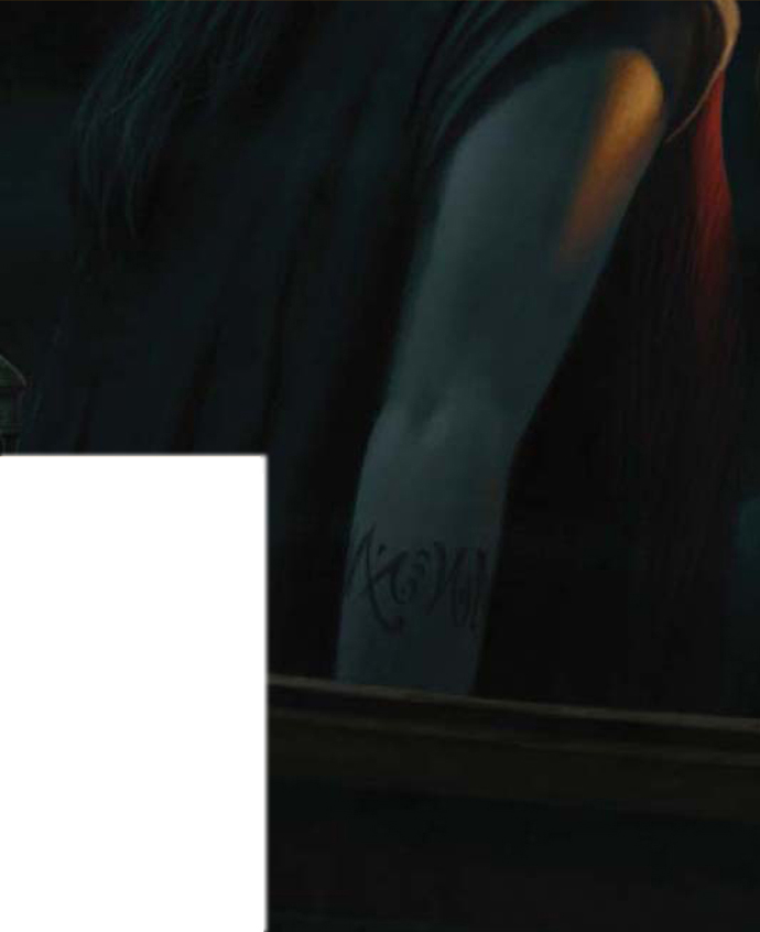
After getting the background just about right, I went back and added some details to the boat and everything inside it. I added the tattoos on the girl’s arm, the sword and baldric (scabbard) on the pirate, a rifle, some jewelry, stitching and other small details (Fig.09a – e).
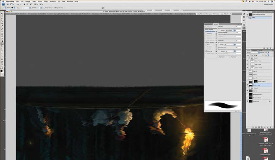
The Water
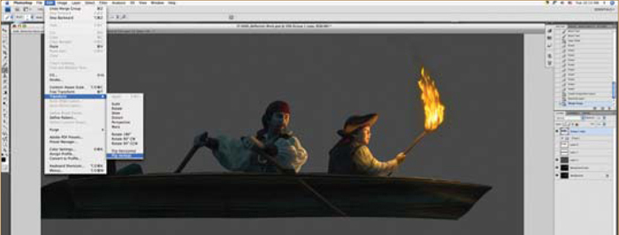
Since everything in the upper half of the image needed to be reflected in the water, I naturally had to do the water last. But it wasn’t as easy as simple copying and flipping the image. The reflection would have a slightly different angle on the people in the boat and the boat itself, so after making separate copies of the people, the boat and the background, I cut and pasted elements and shifted them so that they would have the correct perspective – or at least a reasonably close one (Fig.10a – d). I then flipped the image and used a combination of Photoshop smudging and painting (Fig.10e – g).

More Details
At this point I was almost there, and just went around adjusting details and doing slight color corrections. Once I considered the painting part done, I made some overall Color Correction layers to fine-tune the focus on the people.
After Some Feedback
Here’s where the global community of artists came in nicely. Once this image was posted I got some great critiques that I went back and applied. They included better rendering of the flame and some lighting adjustments to the boy and girl to account better for light fall-off. I had knowingly cheated the lighting (artistic license again), but apparently a bit too much (it’s great to have the whole world of artists available to give you some good advice – use them!).
Reflection Fine-Tuning
After it was all done, I discovered that I didn’t like the water reflections and could improve it a bit more (so it wasn’t done after all). I decided to take advantage of 3D to get a more detailed rendering of water reflections. I took the image that had been adjusted for the reflection perspective and mapped it onto a plane in Cinema 4D (again, you could use any 3D application of choice). I loaded it into the illumination channel so that the image itself would be the only light source. I then rendered a number of water reflections at different scale settings. I could then take them into the Photoshop file and combine them – very much like the hand-done version – so that the reflection represented the correct water flow dynamics (or was at least close). I ended up combining some of the original hand-painted with the new 3D to get exactly what I wanted (Fig.11a – b).

The Final Image
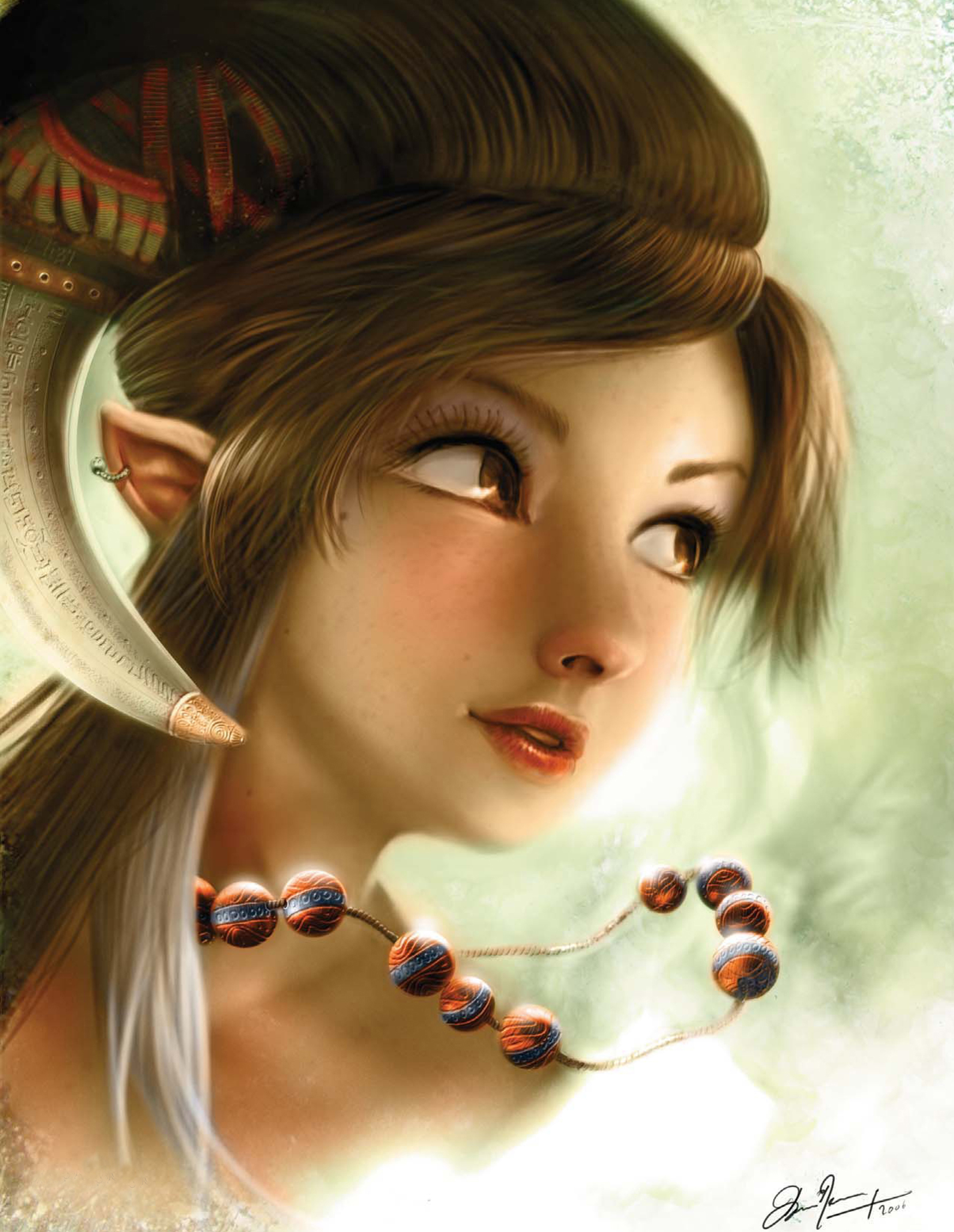
The whole process took about four days – maybe five (I was working on this in the midst of commercial jobs). The final resolution was 6000 by 4496 pixels. I’m planning on doing giclée prints of this image and hope to do more in my Illustrations from Untold Stories series. I hope you can glean something valuable from hearing about the creative process that went into the production of this image (Fig.12).
© Ron Crabb