
A CSS Primer for Drupal
So now you have wet your chops and know some HTML. Recall that HTML stands for HyperText Markup Text. And it’s exactly that: a way to mark up the structure of your web pages. Well now you’ll want to style those web pages with some CSS magic. Cascading Style Sheets (CSS) is a simple design language intended to simplify the process of making web pages presentable. CSS handles the “look and feel” part of a web page. Using CSS, you can control the color of text, the style of fonts, the spacing between paragraphs, how columns are sized and laid out, and what background images or colors are used, as well as a wide variety of other effects.
In this chapter you will learn to add CSS to HTML outside the Drupal framework to gain a basic understanding of what CSS can do. Then in Chapter 6, you’ll learn to add CSS into the Drupal framework to style the HTML in your custom Drupal module.
A Quick Look Back at the Limits of HTML
Before diving into CSS, let’s take a moment to look at the limitations of some basic HTML. Consider again the following code from Chapter 3:
<html>
  <head>
    <title> HELLO WORLD </title>
  </head>
<body>
  <h1>HELLO WORLD!</h1>
  <p>  This is a paragraph. </p>
  <p><b> This is bold text. </b></p>
  <p><i> This is italicized text. </i></p>
</body>
</html>
Figure 5-1 shows how this code will display in a browser—absolutely boring and without much style (CSS).

Figure 5-1. Some boring basic HTML, with no CSS
So what can you do to add some color and pizazz? Read on.
Styling Your Text with an External Style Sheet
CSS provides you with many ways to style your text. This section starts with a simple example. You’ll use some CSS styles to turn some of the black text blue, in order to call more attention to it. To do this, you’ll create an “external style sheet.” An external style sheet is a separate file used to store CSS—with an external style sheet, your CSS styles are not stored within the same file as your HTML.
External style sheets encourage a uniform look and feel for a site, and they encourage only needing to define a style once in your CSS code, to be used throughout your site. A good coding practice is always to avoid redundant code! It will be easier to manage and keep track of all your site’s styles, and it will be easier to rework styles when you’re ready for your site’s big redesign someday as well. Preference in the development community is most definitely to use external style sheets, which provides better code organization.
Let’s practice creating an external style sheet and adding a reference to it in your HTML file.
- Open Komodo Edit or your favorite code editor and, in the same directory in which you saved your HTML file, create a new file named something like some_style.css. (You can actually name this file anything you want, but it does need the .css extension.)
- In the HTML file you created previously, after the opening <html> tag, start a new line and type the following:
<head>
<link rel="stylesheet" type="text/css" href="some_style.css">
</head>
Your HTML should now look as follows in your editor:
<html>
  <head>
    <title> HELLO WORLD </title>
    <link rel="stylesheet" type="text/css" href="some_style.css">
  </head>
  <body>
    <h1>HELLO WORLD!</h1>
    <p>  This is a paragraph. </p>
    <p><b> This is bold text. </b></p>
    <p><i> This is italicized text. </i></p>
  </body>
</html>
So these magic lines you just added tell your browser that when it loads up this HTML page, it also needs to load up a style sheet called some_style.css.
- In some_style.css, put in these lines (these CSS styles):
h1 {
  color: blue;
}
This code, known as a “CSS rule,” will make any text in your HTML page that is wrapped in an <h1> tag blue. In this case, the only text marked up by the <h1> tag is “HELLO WORLD!” Each CSS style rule has three parts: the selector (in this case the h1 element), the property (in this case color), and the value (in this case blue).
- Save this CSS file and then reload your HTML file. Your web page should resemble Figure 5-2.

Figure 5-2. Some HTML with very basic CSS styling
Wow, that’s some style—the text within the <h1> tag is now blue! Joking aside, I provide the simplest example just to show how easy CSS can be. Throughout the rest of this chapter, we’ll take it up a notch.
Using <div> and <span> Tags
The preceding example used the simple color CSS style, which sets the color of text. Rest assured, there are plenty of other ways to decorate your web page. This section looks at how <div> and <span> HTML tags are used to box up sections of your HTML for styling with CSS.
Take this slightly modified HTML—try this now on your own as well in your code editor.
<html>
  <head>
    <link rel="stylesheet" type="text/css" href="some_style.css">
  </head>
  <body>
    <span id="the-title"><title> HELLO WORLD </title></span>
    <h1>HELLO WORLD!</h1>
    <p>  This is a paragraph. </p>
    <div class="to-the-right"><b> This is bold text. </b></div>
    <i> This is italicized text. </i>
  </body>
</html>
Notice the <div> and <span> tags. These tags simply “wrap” some HTML, often for the sole purpose of having CSS act on that wrapped HTML, which is the HTML that appears between the opening and closing <div> or <span> tags. Without CSS rules decorating them, the <div> and <span> tags will not change how your HTML document looks by themselves, except that a <div> will put your code in a “box.” Then, anything after the <div>, will be put on a new line. The <span> tag also puts any HTML code within it in a “box,” but it doesn’t force there to be another line for any content after the closing </span> tag. Even these default behaviors can be overridden with CSS rules.
Also notice the <span> in the preceding code has an id of "the-title", and the <div> has a class of "to-the-right". You will use these id and class tags later in this chapter to identify in the CSS what to decorate in your HTML.
Commenting Your CSS
Like HTML, CSS has a way for you to leave comments within your code. Again, the browser will ignore these comments, but they will serve as good documentation for your code. All good coders (who work well as team players) document their code well; it also helps you to remember what you’ve done, not a trivial thing as a professional programmer when you’re writing thousands of lines of code!
In CSS you put your comments between /* and */, as follows:
/* This is a comment, which will be ignored by the browser. */
Creating Additional Styles
Blue text isn’t all that exciting. In this section, you’ll take your CSS a bit further, by adding a background image and some other pizazz. Take a look at the following CSS, with comments, to clue you in on what each line does—and the resulting change in your HTML:
/* The CSS style below takes everything that is wrapped in
the body tag and slaps a background image called ocean.jpg
behind it. */
body {
  background-image:url('ocean.jpg');
}

/* The CSS style below colors all text wrapped in an h1 tag
blue. */
h1 {
  color: blue;
}

/* The CSS style below takes all text wrapped with the div
with an id of "the-title" and centers it. Notice that to
reference an id in your HTML you just put a # sign in front
of the id name in order to use it within the CSS file. */
#the-title {
  text-align: center;
}

/* The CSS style below takes all text wrapped with a div
with class "to-the-right" and gives it a margin of 200px.
"px" stands for pixels and is one commonly found standard
of measurement in the world of CSS. Notice that to reference
a class in your HTML you just put a dot "." in front of the
class name (in this case "to-the-right" is the class name).
*/
.to-the-right {
  margin-left: 200px;
}
- Take the preceding CSS and put it into the CSS file you created earlier in this chapter—just replace the CSS that was in there previously.
- Save any image you like to replace ocean.jpg in the CSS. Make sure the image is a .jpg, .gif, or .png file. (I’m referring to the file’s extension here . . . what comes after the period in the filename.) Replace the filename ocean.jpg in the CSS with the filename of the image you want to use.
USING A FOLDER FOR YOUR IMAGES
If you put your image file in the same directory as your HTML file, you won’t need to change the code shown. But if you want to put the image in an images folder (and the images folder is in the same directory as your HTML file), the new CSS would look like what’s shown here (the URL, or uniform resource locator) to the image is relative to where your HTML file lives in the file system).
Here’s how it looks if you move the ocean.jpg image into an images folder:
body {
background-image:url('images/ocean.jpg');
} - Save your CSS file and then refresh your browser with the HTML you’ve written with its new CSS. It should look something like Figure 5-3. Much more stylish than before!

Figure 5-3. Some HTML jazzed up using the CSS background-image property
You can see that some basic CSS styling can jazz up the page, rather than just presenting plain text to web site visitors.
Choosing Between Classes and IDs
When creating CSS rules, you usually will pick between using a class or using an id. Use classes when that CSS style will be used in more than one place on your site. This is convenient when you have, say, a header that occurs often in your site and you will frequently be reusing this same header elsewhere in your site. By using a class, you won’t have to put in another CSS rule. Instead, you’ll be able in your HTML to just use the same class name to wrap some HTML. That same look and feel you defined for that CSS rule will then show up wherever in your HTML you wrap HTML in that same class name! Very convenient—and a core idea of CSS. CSS allows for easily maintaining a consistent look and feel on web sites. You can make sure that you’re using the same font, for instance, across all the pages of your site.
Conversely, use a CSS id tag when referring to something that will occur only once on any given HTML page. For example, the top blog post on your home page might have unique styling because it’s a featured post, and so you would use an id rather than a class. You cannot have the same id name show up multiple times on a single HTML page. Although the page will display, you’ll quite possibly be scratching your head later trying to figure out why you’re seeing strangeness in the rendering of your HTML document or misbehavior of your JavaScript.
Working with Conflicting Styles
So what if there are conflicting styles? The more specific that style, the higher the precedence it takes. For example, if you have a CSS style on the body element of your web page and on a class within the body element, those are conflicting styles.
For example, consider the following HTML:
<html>
<head>
<link rel="stylesheet" type="text/css" href="some_style.css">
</head>
<body>
  <span id="the-title"><title> HELLO WORLD </title></span>
  <h1 class="specific-class">HELLO WORLD!</h1>
  <p>  This is a paragraph. </p>
  <div class="to-the-right"><b> This is bold text. </b></div>
  <i> This is italicized text. </i>
</body>
</html>
And this CSS:
  h1 {
   color: blue;
 }

 /* The style above would not take precedence over
    the one below, which is more specific, so the
    text color would become red and not blue. */

 h1.specific-class {
    color: red;
 }
You can see you can “chain” elements, classes, and ids together to tell CSS what elements you want to target with your CSS styles.
For example, consider the following HTML:
<html>
<head>
<link rel="stylesheet" type="text/css" href="some_style.css">
</head>
<body>
  <title> HELLO WORLD </title>
  <div id="my-id-name"><h1>HELLO WORLD!</h1></div>
  <p>  This is a paragraph. </p>
  <div class="to-the-right"><b> This is bold text. </b></div>
  <i> This is italicized text. </i>
</body>
</html>
To be specific about the preceding bold line, you could write the following two rules. The second rule, being much more specific, would win out, and in a browser the line would show as red (not blue):
h1 {
  color: blue;
}

/*  The line below wins, not the one above, so the text is red, not blue. */
body #my-id-name h1{
  color: red;
}
Knowing how to be more specific to override a specific piece of CSS, as was just discussed , is a great thing to understand. Next, we’ll talk about using internal style sheets.
Using Internal Style Sheets
So far we’ve introduced you to declaring an external style sheet in the <head> of your HTML document referencing your external CSS file. It is preferable to use an external style sheet (or sheets) to manage all your CSS for all your web pages in one central place You can also put your styles directly within the <head> portion of the HTML file, as follows (this is known as using an internal style sheet):
<html>
<head>
<style>
body {
  background-image:url('ocean.jpg');
}

h1 {
  color: blue;
}

body #my-id-name h1{
  color: purple;
}

#the-title {
  text-align: center;
}

.to-the-right {
  margin-left: 200px;
}
</style>
</head>
<body>
  <title> HELLO WORLD </title>
  <div id="my-id-name"><h1>HELLO WORLD!</h1></div>
  <p>  This is a paragraph. </p>
  <div class="to-the-right"><b> This is bold text. </b></div>
  <i> This is italicized text. </i>
</body>
</html>
Again, the code we’re interested in is shown in bold. Notice, to put the styles directly in your HTML document you need to put your CSS styles within <style> tags, and the style tags need to live nested within the opening and closing <head> tags. If you’re just making a single, quick page of HTML, you might use an internal style sheet. If you’re going to create multiple pages or an entire web site, you’re better off to use an external file (known as an external style sheet) to hold all your CSS. The external style sheet, as mentioned previously, can define styles across web pages—you won’t need to rewrite the same CSS rules multiple times. Using this approach keeps your styles consistent among your different web pages.
You can also include “inline styles,” which take precedence over any internal or external styles. Following is an example of an inline style:
<p style="color:purple;margin-left:200px">This is a paragraph
with inline styles being applied to it.</p>
I do not recommend the use of inline styles because to override these styles you’ll have to locate all the inline styles in your code to change them. I mention inline styles here so you know they exist, but again, I don’t see them used often, because it’s a better practice to use external style sheets. For example, if you set it up it so that a class name turns all your text blue and one day you decide you want your text red, you have to first change the CSS in your external style sheet to make it red. Easy enough, right? But what if you forgot you had some inline styles in your code that make the text blue? Then you would have to go and hunt down all the inline styles and manually change them all. Either that or you would have to remove them all so that your external style sheet can control things again.
Understanding the Cascade Order
Cascading Style Sheets get their names because, when multiple methods of styling are applied to an element, the styles “cascade” in order of precedence. Following is the cascade order, or the order of precedence, that your styles will be displayed in, when the same element is styled in multiple conflicting ways:
- First the browser’s default styles will be used for the element, each browser by default will show elements a certain way.
- Next, external style sheets will be considered.
- Next, internal style sheets will be looked at and will override any styles defined in steps 1 or 2.
- Next, inline styles will be used and will take precedence over any styles defined in steps 1–3.
Working with Commonly Used CSS Styles
Although it would take an entire book to cover all of the available CSS styles, this section describes some commonly used CSS styles: text styles, fonts, links, tables, backgrounds, and positioning. In the following sections, you’ll learn to apply each of these styles.
Text Styles
You can change the color of your font with the color property, which you used earlier in this chapter. Following is an example that would color all your text within the <body> tags of your document red:
body {color:red;}
If you want more control over your colors—that is, you want a wider variety of colors to choose from—you can use color codes. For example, the following code, using color code #006400, would apply a nice green color to your text:
body {color: #006400;}
 Note For a list of all the available HTML color codes, check out www.w3schools.com/html/html_colornames.asp and http://html-color-codes.info/.
You can also align text right, left, or center. Consider the following two examples:
/* The next line centers the h1 text on the page. */
h1 {text-align:center;}

/* The next line puts text in the paragraph with the class of
"heading-top" aligned to the right of the page. */
p.heading-top {text-align:right;}
You can indent text as seen in the code that follows:
/* The CSS below indents all paragraph text 25 pixels. */
p {text-indent: 25px;}
You can also decorate text by underlining it or by adding a strikethrough (a line through the letters of text). Following are examples:
/* The following CSS puts a line through all text in paragraph
tags that have the class "line-through". */
p.line-through {text-decoration:line-through;}

/*  The following CSS below underlines text within a paragraph
tag that has the class "underlined-text". */
p.underlined-text {text-decoration:underline;}
Fonts and Font Sizes
You can set a “font family,” where you name several fonts you want to use in order of preference. If the user’s browser supports the first font in the list, that font is used; if not, the browser uses the next font in the list, if available, and so on. You can list as many fonts as you like. If the font name has multiple words in its name, it must appear in quotes. Here’s an example:
p{font-family:"Times New Roman", Arial, "Comic Sans MS";}
You can set the font style:
/* The CSS style below sets all text in a paragraph tag that
has a class of "normal" to have a normal default style. */
p.normal {font-style:normal;}

/* The CSS style below sets all text in a paragraph tag that
has a class of "italic" to be in italics. */
p.italic {font-style:italic;}
You can also set the font size:
/* The CSS style below sets all h1 text to have a size of
40 pixels. */
h1 {font-size:40px;}

/* The CSS style below sets all h3 text to have a size of
20 pixels */
h3 {font-size:20px;}

/* The CSS style below sets all text within paragraph tags
to have a size of 12 pixels. */
p {font-size:12px;}

/*You could also combine a bunch of these styles into one
CSS rule like this:*/
p {
    font-family:"Times New Roman", Arial, "Comic Sans MS";
    font-size:20px;
    font-style:italic;
  }
Links
You can style the different states of links on your HTML page, having one style to show an unvisited link, another for a link a user has already clicked (a visited link), a style for when you mouse over a link, and a style for a selected link. Here’s the code.
a:link {color:#254117;}      /* An unvisited link will show
as forest green, which is color code #254117 */

a:visited {color:#6CC417;}   /* A visited link will be alien
green, which is color code :#6CC417; */

a:hover {color:#99C68E;}     /* A mouse-over link will show as
frog green, which is color code :#99C68E; */

a:active {color:#0000FF;}    /* A selected link will show as
the color snake green, which is color code #6CBB3C; */
Tables
You can also style tables with CSS. If you want your HTML table to have a border, you could use the following code for example, which gives the table a solid black border 1 pixel wide:
table {
  border: 1px solid black;
}
Here’s a full example with an internal style sheet showing a table with a border created via CSS. You’ll notice that the td and th elements are assigned the CSS style as well giving the elements a border.
<!DOCTYPE html>
<html>
<head>
<style>
table, td, th
{
border:1px solid black;
}

</style>
</head>

<body>
<table>
<tr>
<th>Firstname</th>
<th>Lastname</th>
<th>Attending?</th>
</tr>
<tr>
<td>Peter</td>
<td>Pumpkineater</td>
<td>yes</td>
</tr>
<tr>
<td>Green</td>
<td>Lampost</td>
<td>yes</td>
</tr>
</table>
</body>
</html>
Figure 5-4 shows how it looks.

Figure 5-4. A basic table created using HTML
You can also set the table to have padding, which is the amount of white space surrounding the content in a table cell:
td {
  padding:25px;
}
The preceding CSS rule would make the earlier table cells look like Figure 5-5, with 25 pixels (px) of whitespace:

Figure 5-5. A basic HTML table with some CSS padding (25 px)
Here is a rule giving the table double the padding as it had previously:
td {
  padding: 50px;
}
The table with double the whitespace (double the padding) in each cell looks like the one shown in Figure 5-6.
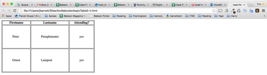
Figure 5-6. A basic HTML table with even more padding (50 px)
You can set the table width and height using CSS either in pixels or with a percentage:
table
{
  height: 200px;
  width:  250px;
}
You can align text in cells left, right, or center.
td {
  text-align: left;
}
You can set a background color for the table itself or its header.
th, table{
background-color:green;
color:white;
}
You can set the background color for an element. In the CSS rule that follows, the background of the entire HTML document would be green. The text is set to white so that it will show up well on the green background.
body
{
background-color:green;
color: white;
}
In the following CSS style, a background image is set to be included behind the entire body element:
body {
 backgound-image: url('my_sample_image.jpg');
}
Positioning
You can position elements on the page in a fixed manner, or with relative or absolute positioning with CSS. With fixed positioning, the position remains fixed on the screen, even if the user scrolls the window. With fixed positioning, you specify exactly where the content should display on the page. Following is an example rule using fixed positioning:
/*  In this CSS rule the element is placed 35 pixels from
the top and 55 pixels to the right on the page. */
.positioned-element{
  position:fixed;
  top:35px;
  right:55px;
}
An element can also be placed on the screen using relative positioning. This means the element will move relative to where it would have normally have displayed on the page if not acted upon by CSS positioning rules.
/* With the CSS rule below, whatever text or HTML is wrapped
in the class "positioned-element" is brought up on the page
from wherever it would have normally been by 50 pixels (even
if it means it will overlap with other text or HTML). */
.positioned-element{
  position:relative;
  top:-50px;
}
Absolute positioning is another way to position an element in a spot that you specify, but it is placed relative to the first parent element that is not a fixed element.
.positioned-element{
  position:absolute;
  left:100px;
  top:150px;
}
The CSS snippets from the preceding section are some of the most commonly found CSS rules you’ll come across. In the next section, I introduce you to a piece that is important to understanding CSS and page layouts: the CSS box model.
Working with the CSS Box Model
Consider the following HTML, named boxmodel.html. You’ll see that there is also an included style sheet, boxmodel.css (a discussion of which follows the HTML discussion), which is invoked in the <head> of the HTML document.
<!DOCTYPE html>
<html>
  <head>
    <link rel="stylesheet" type="text/css" href="boxmodel.css">
  </head>
  <body>
        <title>  Drupal Web Essentials Primer </title>
        <div class="one box"> Here is a box with a class of one.
</div>
  <div class="two box"> Here is a box with a class of two. </div>
  <div class="one box"> Here is another box with a class of one. </div>
  <div class="two box"> Here is another box with a class of two.
</div>
  <div class="three box"> Here is a box with a class of three,
  absolutely postioned on the page using pixel coordinates. </div>
  <div class="four box"> Here is a box with a class of four,
  positioned using pixels relatively to where the element would
  normally have been displayed on the page based on the HTML. </div>
  </body>
</html>
The preceding HTML creates a bunch of boxes, and without the style sheet boxmodel.css, it looks Figure 5-7. Notice that you don’t really see any boxes at all; you just see that where there are <div> elements surrounding text, the <div>s force the text to a new line. In reality, <div>s don’t just force text to a new line; they create a “box” around the HTML and text that is nested within them. The CSS file, when we allow it to load, showcases this CSS “box” model behavior.
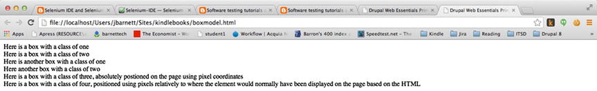
Figure 5-7. The box model with no CSS applied, so the boxes created aren’t apparent
Figure 5-8 shows what the page looks like when you add the style sheet boxmodel.css.
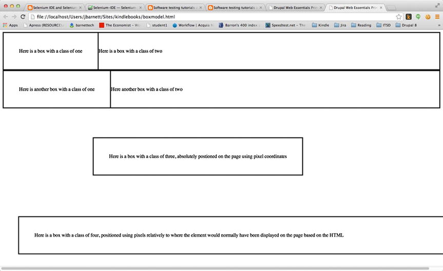
Figure 5-8. Some HTML showing the CSS box model with some CSS to showcase the boxes created
So let’s look at the CSS in the boxmodel.css file.
/* This line tells the browser to keep the boxes with a class
of "one" to the left and let other elements "float" around it.
This will allow the boxes with a class of "two" to 'float'
immediately to the right of it. */
.one {
  float: left;
}

/* This CSS rule applies to all the boxes, apply some padding
to it (to make the box bigger) and put a solid border around
each box so we can really see each box created clearly. */
.box {
  padding: 50px;
  border: solid;
}

/* This CSS rule will put the box with a class of "three" at
the position specified using absolute positioning, so the box
as you see in Figure 5.5 is a bit farther down the screen and
to the right. */
.three {
  position:absolute;
  left:300px;
  top:350px;
}

/* This rule positions the box with a class of "four" using
relative positioning, and it positions it relative to where
the box would normally fall on the page. */
.four {
  position:relative;
  left:50px;
  top:350px;
}
The CSS you just added to the boxmodel.html file serves to illustrate that the <div>s and classes within those <div>s carve up our HTML into boxes so you can better position them and create a layout for your HTML to achieve your theming goals. Remember that <div>s create boxes and force elements that come after it to another line; <span>s create boxes and don’t force a new line. (CSS can override these behaviors as well.) Then your CSS can “manage” these boxes. What you’ve just learned is called the CSS box model.
Summary
This chapter looked at CSS. Each CSS rule has a selector, a property, and a value. When working with CSS, it’s best practice to use an external style sheet, placing all your CSS rules into an external file. You can also use internal style sheets, placing all your CSS rules into the head section of your HTML file. Or you can use inline styles, which allow you to place CSS rules directly into the flow of your HTML (although it’s not best practice to do so). This chapter showed that when there are two conflicting CSS rules, the more specific rule always wins out. Finally, you looked at the cascade rules that CSS follows, showing the order in which the CSS rules are carried out and how this affects any conflicting styles.
In the next chapter, you’ll look at how to use the CSS you just learned about within the custom Drupal module you began working on earlier.