Chapter 11
Using Tables
Key Skills & Concepts
• Understand the Concept and Uses of Tables in Web Pages
• Create a Basic Table Structure
• Format Tables Within Web Pages
• Format Content Within Table Cells
At this point in the book, you’ve made it through the majority of the basic tags used to create web pages. The next few chapters deal with content that can sometimes seem a bit more complicated than tags for lists and links. Don’t worry, though, because even the pros struggled with these concepts when they first start (myself included).
Understand the Concept and Uses of Tables in Web Pages
Although you might not recognize the terminology, you have undoubtedly seen tables in other printed or electronic documents. In fact, throughout the course of this book, I’ve used tables to give order to certain sections that might otherwise be confusing. Quite simply, a table is a section of information, broken up into columns and/or rows of blocks, called cells.
Those of you who use Microsoft Word may be familiar with a menu item in that program called Table that enables you to create tables just like those used in web pages. Microsoft’s word processor isn’t the only one with tables. Most word processors are capable of letting you format content in tables.
TIP
When considering whether or not to use a table in a web page, first think of how you’d present that same information in a standard word processing program. If you’d use a table in the word processor, you likely should use one in your web page as well. If not, consider another method of presenting that information in your web page.
Another form of a table, either printed or electronic, is the spreadsheet. Along these lines, you might think about a table as a large piece of grid paper, where you get to decide the size of the cells that will hold the information.
To make decisions about how large or small your cells and table should be, you need to do a little planning. Even though HTML tables are created in digital documents, the best way to plan out tables is to use a pencil and paper when you’re first learning. As you become more familiar with the structure of a table, you may be able to plan it in your head without first drawing it.
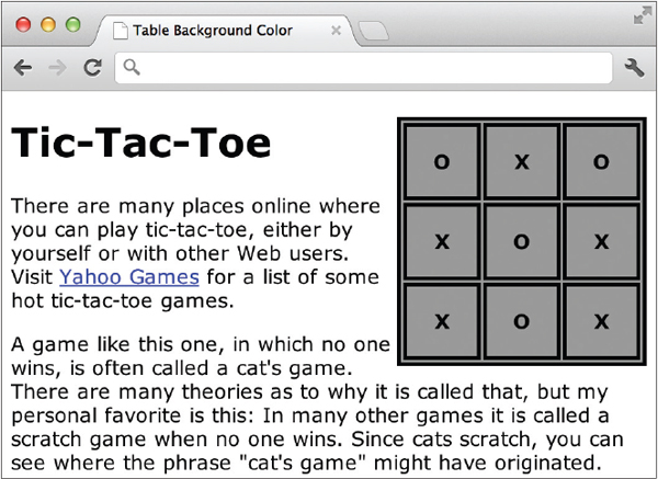
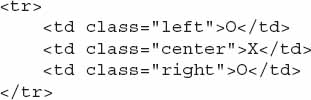
Let’s first consider what a table would look like for a simple tic-tac-toe game.
1. Draw a large box on your piece of paper.
2. Divide that box into three columns and three rows.
3. Place an X or an O in each of the boxes, leaving no boxes empty.
Following these steps will probably get you a piece of paper with a drawing similar to mine.

Now, imagine you want to translate this tic-tac-toe game into a web page. How would you do that? You’ve already learned that in HTML, you cannot simply tab over to the next column and type an X as you might in a spreadsheet application. You can, however, use a table to lay out the tic-tac-toe game’s structure.
Create a Basic Table Structure
First, decide how large you want your table, or in this case, how large you want your tic-tac-toe game. Remember, pixels are the units of measure on the screen; inches or centimeters won’t get you far in HTML. In the beginning, it’ll probably be useful for you to write out your measurements on your drawings. Don’t worry, though. Nothing you’re doing now is set in stone. You’ll be able to make changes later as needed.
After planning out the dimensions of the table, it’s time to get started working on the table structure in HTML.
Table Structure
You need to know about four basic table tags, as described next:

With these tags in mind, you can create both basic and complex table structures according to your needs. Say you want to create a basic table structure, such as the following:
Your code might look like that shown next:

NOTE
While you’re not required to indent your
td or th tags, I did so here to help you differentiate between table rows and cells.Opening and closing
table tags surround the entire section of code. This tells the browser that everything inside these tags belongs in the table. And there are opening and closing tr tags for each row in the table. These surround td or th tags, which, in turn, contain the actual content to be displayed by the browser.NOTE
Some browsers show a border around each cell by default. I discuss more about borders in the section titled “Borders and Margins.”
Cell Content
You can include nearly any type of content in a table cell that you might include elsewhere on a web page. This content should be typed in between the opening and closing
td tags for the appropriate cell. All tags used to format that content should also be included between the td tags.TIP
Want to include a blank cell with no content? Type the code for a nonbreaking space (
) between the opening and closing td tags, and your cell will appear blank. If you have a lot of blank cells, you could add empty-cells: show; to the style declaration for your table tag.If we return to our tic-tac-toe game, the following is the markup for that table:

If you were to create a basic HTML page with this code, save it, and preview it in your browser, you’d see something like the following:

By default, the size of each cell is only as large or as small as the content of the cell. (We’ll talk about changing the size of the cell shortly.) If you typed three Xs or Os in each cell and added a sentence in the center cell, the table would change to look like that shown next:

After a certain number of characters, the browser may wrap the content. This means it stops printing on that line and continues on the next line. This usually doesn’t occur until the table runs up against another element within the page or hits the edge of the window. The default point at which the content wraps varies according to the browser.
Text
You can customize the text within each cell using the elements you learned in previous chapters. For example, you can use the
strong element to add emphasis and make the text within a cell bold:

Enclosing the words “tic-tac-toe board” in the center cell with the opening and closing versions of the
strong element tells the browser to add emphasis to the text and make it bold.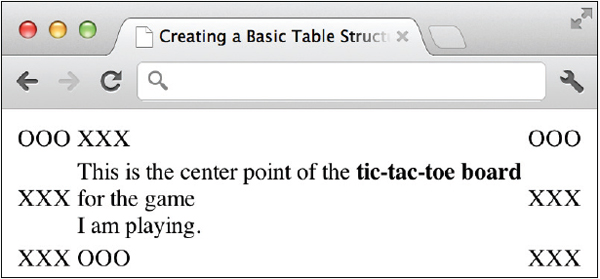
If you want to make all the text in every cell take on the same characteristics, the best solution is to use a style sheet with the
td tag as the selector. For example, the style sheet in the following example can be placed between the opening and closing head tags to change the face and size of text within all the cells created by td tags throughout the entire page:
Images
You can also add images to any of the cells in your HTML tables. To do so, add the image reference (using the
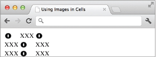
img element) inside the cell in which you want it to appear. In the following example, I used a graphic of an O instead of text wherever the O appeared in the game board:

When viewed in the browser, the image Os appear where the text Os used to appear, as shown next:
You can also combine text, images, and other types of media (such as animation, sound, and video) within table cells by drawing on many of the elements discussed in previous chapters. The key is determining which pieces go in which cells.
Format Tables Within Web Pages
You may have noticed by now that all the text in a table appears aligned to the left side of each cell. This, and many other features of a table, can be easily customized with your style sheet.
Borders and Margins
Tables, by nature of their design, have internal and external borders. By default, most browsers set the border size to zero, making them invisible. However, borders can be quite useful for tables of statistical information, for example, where it’s necessary to see the columns to understand the data better. The key is understanding the three attributes related to the use of these borders.
TIP
When a table with borders is viewed in a text-based browser (i.e., a browser set to display plain text only, with no extra formatting or images), the borders are represented as dashes for the horizontal borders and as pipes (|) for the vertical borders.
The border Attribute
Even if you ultimately want your table borders to be invisible, a great way to see how your table is shaping up while you’re building it is to turn on all the table borders temporarily. You can do so by adding the
border attribute to the opening table tag and specifying a value of 1:
Changing the border size to 1 for my tic-tac-toe table lets you see more clearly where each cell begins and ends because it turns on all the internal and external borders. The border attribute accepts values of 0 and 1 to turn the borders off or on, respectively.

Border Properties
You can also use the
border properties in a style sheet to format the borders of your tables, specifically the border-width, border-style, and border-color properties. See Chapter 3 for details.The latest version of the CSS specification also provides an additional style sheet property to alter table spacing in web pages. Specifically, the
border-collapse and border-spacing properties are useful when you need to eliminate or customize the space between the cells. The border-collapse property might be used in either of the following two ways:•
border-collapse: collapse Turns off all the space between the cell borders.•
border-collapse: separate Maintains the space between the cell borders.When the
border-collapse property is set to separate, you then use the border-spacing property to specify exactly how much space should be included:
In this code example, I’ve told the browser to maintain space between the cell borders, and then specified exact dimensions for that space. If two units are included—as they were here—then the first identifies the horizontal space and the second identifies the vertical space. When only one unit is listed, it is used for both the horizontal and vertical space measurements.
Spacing Properties
You can also use the
padding and margin properties with style sheets to format the spacing in and around table cells. Note that entire tables can be styled with both the padding and margin properties, while individual cells can include padding, but no margins. Refer to Chapter 3 for details.Width and Height
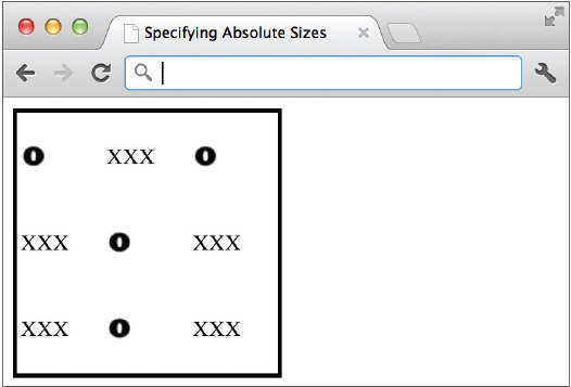
When I first introduced tables, I mentioned planning out the size of your tables ahead of time. This is particularly important if the table you are creating needs to fit within a predetermined amount of space on your page. When adding tables to your pages, it is considered good practice to specify the size of the table with the
height and width style sheet properties. If you don’t specify them in your code, the browser chooses the size based on the amount of content within each cell and the amount of available space in the window, which means it may or may not display the table as you expect.Let’s say I want to include that tic-tac-toe game in my web page, but I only had an available space on my page that measured 200 pixels wide by 200 pixels high. Because tables have a tendency to “grow” according to the amount of content in them, I might want to restrict the height and width of my table to avoid it growing out of that 200 × 200–pixel area I designated for it. I could do so by specifying the dimensions in my style sheet. Provided there was only one
table element on my page, I could even use table as my selector:
NOTE
If there were multiple tables on my page, I could style each one independently by adding the
class attribute to each opening table tag and then styling the classes uniquely in my style sheet.In this case, I would specify an absolute size for my table, one that shouldn’t change if the browser window were larger or smaller.
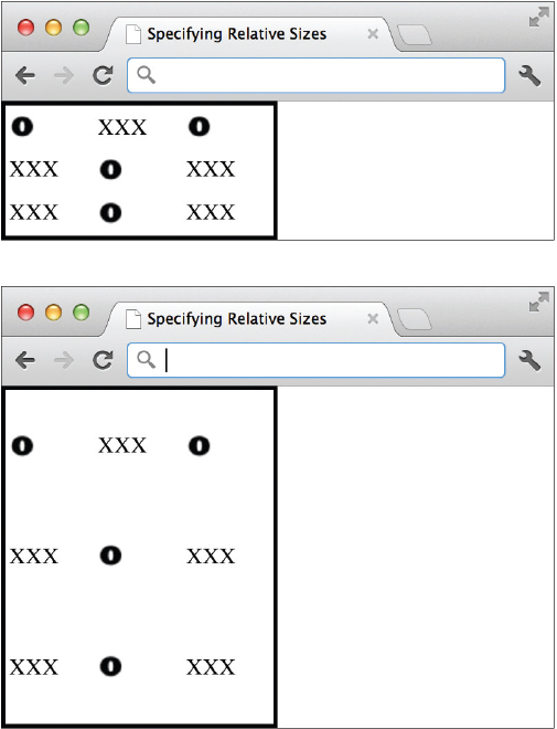
On the other hand, if I didn’t care about the exact measurements of my table, but I only wanted it to take up 50 percent of the window and no more, I could use a percentage in the value of those attributes:
This is called relative sizing because I’m not specifying absolute pixel dimensions but, instead, sizes that are relative to the browser window opening. Compare the next two illustrations to see how, with relative sizing, the table size varies according to the window size.
Ask the Expert
Q: Wait! When I try that, my table doesn’t fill 50 percent of the screen vertically, only horizontally!
A: If you’re following along by typing these code examples into your own HTML editor and then viewing the pages in your own browser, you may have hit a snag when trying to duplicate my example of a table set to 50 percent of the browser window’s height. Never fear—there is an explanation for this problem, and it lies in how your browser actually defines what 100 percent of the height is.
You see, when you specify that the table should be 50 percent, most browsers read that as “50 percent of the parent object.” In this case, the parent object is the HTML page itself. Because HTML pages aren’t block-level elements, they don’t automatically fill all the available space. This causes a dilemma if you want your table to fill half the screen, especially when the browser thinks the “screen” stops as soon as your page content does.
The solution is to add a simple bit of code to your style sheet to force the browser to behave like a block-level element, or rather to fill the entire browser window, regardless of the amount of content visible:

Once you’ve done that, the
height:50% declaration will actually work on your table tag!Basic Alignment
As discussed in Chapter 8, you can use the
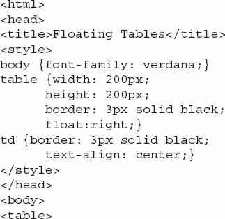
float property to cause an image, or in this case a table, to be aligned to the right or left of any surrounding text. If only one table exists on the page, you can even use the table element as your selector, like this:
The following illustration shows our tic-tac-toe table aligned to the right of the window, with text flowing around it on the left. The complete source of the page is also listed here to give you a better idea how the style sheet affects the table formatting.


Colors
To change the background color of an entire table, you can add the
background-color property to your style sheet, using the table tag as the selector. The following example shows how this might look in an internal style sheet, supposing the table you’re formatting is the only table on the page:
But what if you did have several tables on your page? Be aware that using the preceding code would cause all tables on the page to be rendered with the same background color. To create specific styles for each table on a page that included multiple tables, you might use classes:
Then, you’d reference the class name (without the period) from the opening
table tag, as in
Depending on which browser renders the table, the background color you specify may or may not appear within the borders. Test your pages in multiple browsers to be sure.
Background Images
The
background-image property can be added to your style sheet to apply an image to the entire table background. The background-image property works the same when applied to a table as it does applied to other web page objects. This means it automatically repeats from left to right, top to bottom. However, you can use the other background properties discussed in Chapter 8 (such as background-repeat and background-attachment) to change the repeating options if desired.Adding a background image is one way you could achieve a textured or patterned table background, as shown in Figure 11-1. This only requires a small repeating image, such as the following:

Figure 11-1 The
background-image property can be applied to the table to produce a patterned effect.
and a bit of code added to your style sheet:
Captions
The
caption element enables you to specify captions for your tables. This isn’t an attribute of the table element; it’s a stand-alone element used after the opening table tag but before the first table row. Here is the first portion of the table markup: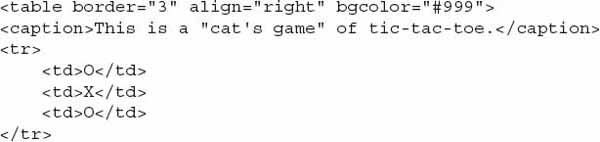
Opening and closing
caption tags surround the actual text you want to display as a caption for the table. By default, the caption is aligned at the top-center of the table. Two CSS properties are useful in changing the caption alignment:• text-align Use this to adjust whether the text is aligned left, right, or center on whichever side it is placed.
• caption-side Use this to specify on which side the caption should be placed (top, right, bottom, or left).
With those properties in mind, can you figure out how to align a caption along the bottom edge of a table and then set the text to be right-aligned along that edge? Figure 11-2 shows a visual example, and the following code provides the answer:
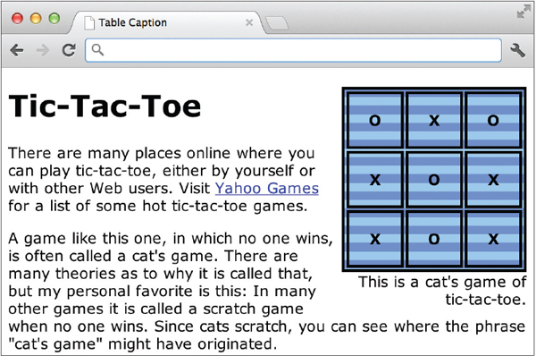
Figure 11-2 The
caption element is styled to specify the exact alignment of the text in the caption.TIP
You can also use additional formatting properties to draw more attention to a caption, such as making it bold or different colors.
| Try This 11-1 | Create a Basic Table |
Tables are particularly useful for allowing customers to compare products and/or services. You’ll use the skills you just learned to add such a table to a web page. Goals for this project include
• Creating a basic table structure
• Adding text content to the table structure
• Formatting the table
1. Open your text or HTML editor and locate a page where it would be appropriate to add a table of services or products.
2. Create the table on the page, using the following table as a guideline. Note the first row is a table header row.

3. Specify a border size of 1.
4. Add a Level 1 headline above the table, as well as a brief paragraph explaining its purpose.
5. Save the file.
6. Open your web browser and choose File | Open Page (or Open File or Open, depending on the browser you’re using). Locate the file you just saved. Make sure it appears as you want.
7. If you need to make changes, return to your text editor to do so. After making any changes, save the file and switch back to the browser. Choose Refresh or Reload to preview the changes you just made.
NOTE
Is your table missing when you try to view the page? If so, check to make sure you have closed your
table tag (</table>). For more tips, see Appendix C.Tables are used in a wide variety of ways throughout the digital and print industries. This project gave you practice creating a basic table structure, using a product/service comparison chart as the basis for your table.
Format Content Within Table Cells
Just as you can format the entire table, you can format each of the individual cells within the table. This means changing the alignment, width, height, and background colors, as well as restricting line breaks and spanning content across multiple columns or rows.
Alignment
If you refer to the table you created in Try This 11-1, you may notice the alignment appears different for some of the cells, depending on how much content is in each cell and how wide the browser window is open. For example, the cells in the first row might contain text that is centered, while the remaining cells in the other rows might be left-aligned.
To change vertical and horizontal alignment, you can add the
text-align property for horizontal alignment or the vertical-align property for vertical alignment to the tr, th, or td tags.•
tr Adding the text-align or vertical-align properties to the opening tr tag causes the alignment you specify to take effect for all the cells in that row.•
td, th Adding the text-align or vertical-align properties to an opening td or th tag causes the alignment you specify to take effect for only that cell.Table 11-1 lists the possible values for these two properties when used in tables.

Table 11-1 Text Alignment Options for Tables
NOTE
The default values for the
text-align and vertical-align properties are left and middle, respectively. For header cells (using the th tag), however, the horizontal alignment defaults to center instead of left.If you want to align all the cells in your table in a similar manner, it’s easy to use the
td tag as the selector in your style sheet in the following manner:
But what if you wanted each column of cells to be aligned differently? You could create three classes:

and then reference each class from within the appropriate td tag. Figure 11-3 shows the result of this type of style sheet when applied to our tic-tac-toe board.

Figure 11-3 Three different classes were created to align the cells of this table in three different ways.
Width and Height
Earlier in the chapter, you used the
width and height properties to identify the size of the entire table. You can also specify the size of individual cells by adding those properties to your td or th tags.TIP
This can be particularly useful if you want to have columns that are the same size, because most browsers won’t make columns the same size when the width is left unspecified.
You may remember that the value of these two attributes can be dictated by either a pixel length or a percentage. This is the same regardless of what element is being sized. However, use caution when mixing pixel values with percentages because you might get unpredictable results in different browsers.
Look at the table in the following example. Although the table itself has a width set to 100 percent of the window opening, none of the cells have width dimensions. This leaves the decision about how wide each cell should be up to the browser.

If I want to make all three of the columns the same width, regardless of what size the browser window is, I could specify in my style sheet that each
th tag should be one-third of the overall table width: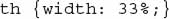
Then, each of the following cells in that column will have the same width (and/or height). An exception to this rule might be when one cell contains an extremely long string of text without spaces, such as “abcdefghijklmnopqrstuvwxyz.” In this case, the browser may have to make that cell larger, as necessary, to accommodate the long string of text.
It isn’t necessary to place
width properties in every cell in a column—only the first one. Also, if you set the width two columns, the third will simply use the remaining available space. In the end, I recommend testing your pages in multiple browsers to verify that the table appears as you intended.
Cell Padding
While table cells don’t have margins (at least not by CSS standards), they do have padding. This means if you want to have some buffer space around the content of your cells (padding), you can add the padding property to your style sheet declaration.
Using the padding property for tables is the same as using it for other HTML elements, as was discussed in previous chapters. So, if you wanted to add 10 pixels of padding around each cell, the style sheet might look like this:
Can you imagine how you might achieve 10 pixels of padding only on the top and bottom edges of each cell? There are a couple of ways to do it, but I like to simply specify the padding in pairs, where the first number lists the top and bottom padding, and the second number lists the left and right padding. Check it out:
Colors
While adding the
background-color property to a table style declaration lets you change the color for the entire table, using this property with the tr, td, or th tag lets you specify the color of a single row or cell:
Coloring rows or columns in a table with different hues can be a great way to make the table more readable, particularly if it’s a long table. Style sheets make it easy to create such patterns through the use of classes. Consider the table shown in Figure 11-4. If you had to add the style declarations to each row in the table, it could become quite cumbersome as the table grew to include more rows. Instead, create the two classes in your internal or external style sheet:
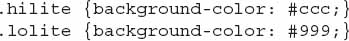
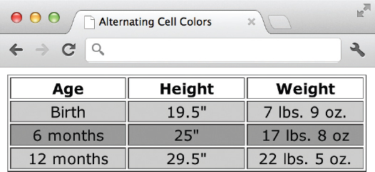
Figure 11-4 Style sheets and classes make it easy to create rows of alternating colors like these.
and then reference each one in alternating rows of your table.
TIP
When naming classes, stick with names that reference the purpose of the class, as opposed to the style of the class. For example, avoid a name like “bluerow” and “orangerow” because these would become confusing if you ended up changing the colors of the rows. Instead, try “hilight” and “lolite” for alternating color rows like these.

NOTE
When you include background colors for both individual cells and the entire table, the background color of the table may also show through in between the cells (in the border). However, this does vary somewhat from browser to browser. My advice to you on this topic is to test your pages in a wide number of settings to make sure you’re happy with how they look under each different browser.
Prohibit Line Breaks
At times, you might have content in a cell that needs to be kept on a single line. In cases like this, you can use the
white-space property with a value of “nowrap” to tell the browser to try and keep all the content in that cell on a single line if possible. (This might not be possible if the browser window is so small that the content cannot be rendered across a single line.) The style sheet might look like the following:
while the only change to the HTML table is the addition of the class reference:
Spanning Columns
So far in this chapter, you have only worked with tables in a grid-like fashion where an equal number of cells is in each row and column. While this is the default, you can add an attribute to an opening
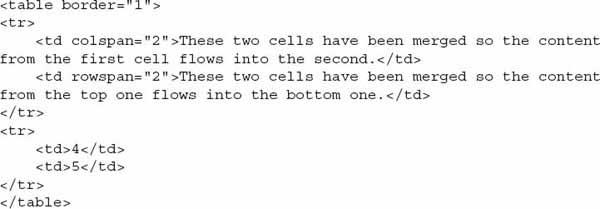
td or th tag to cause it to merge with another cell below it, as shown here: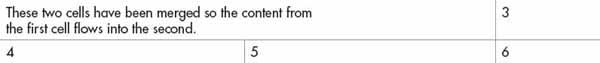
To accomplish this, use the
colspan attribute. By default, each cell is set to span, or to go across, only one column. Using the colspan attribute enables you to change that, so that a cell spans two or more columns. The following HTML shows how you might code the preceding table:
Span Rows
Just as you can merge cells across two or more columns, you can merge cells across two or more rows. The attribute used to do so is
rowspan.If you take the table used in the preceding section and merge the two cells on the right (#3 and #6) into one, the table might look like that shown next.

Here you have two cells in the first row merged, while the third cell from the first row is merged with the third cell from the second row. Here is the HTML used to create this table:
The
rowspan attribute can be used by itself in a td tag to cause a cell to merge with the cell below it, or it can be combined with the colspan attribute to cause a cell to merge with both the cell below it and the one next to it.Although the
colspan and rowspan attributes give web developers a lot of power to build creative table structures, they add a degree of complexity to tables that’s often difficult to grasp. Don’t worry—everyone struggles with these concepts at first. If you have trouble, go back to using your pencil and paper to plan out your table structure before you type a single key.TIP
If you have a picture in your mind of the final output of your table, draw that first. Then, go back and add the table or grid structure around the picture, placing each piece into a cell or a group of cells. This is also one of the places where a visual HTML editor may come in handy because it enables you to see the table while you’re creating it.
Additional Formatting Techniques for Tables
HTML has additional tags geared toward helping web developers build more user-friendly tables. These tags and attributes enable you to group rows and/or columns so that the browser more clearly understands the purposes of each element.
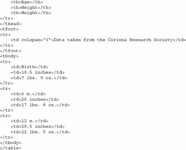
Group Rows
Three tags in particular are used to group rows within tables:
•
thead table header•
tfoot table footer•
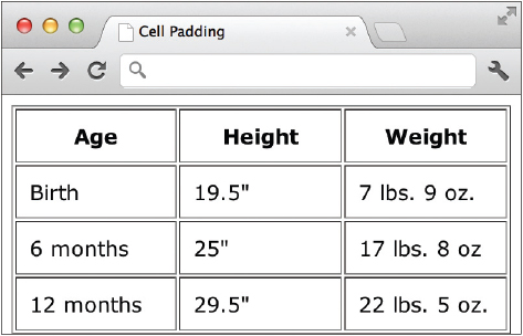
tbody table bodyWhen you use these tags, the browser is able to differentiate between the header and footer information and the main content of the page. The benefit here is that when a user views a page containing a long table, the header information is repeated at the top of each page or screen view of the table, even if the table is printed. This helps users avoid wondering what column three was supposed to hold, when they are looking at page four, and the title of column three was only listed on page one.
While these three tags are never required, when they are used, each must contain at least one table row, as defined by the
tr tag. In addition, if you include a thead and/or a tfoot, you must also include at least one tbody. So, a table layout using these three tags might look like this:
An additional benefit of using these tags is that it helps make styling the table easier. For example, suppose you wanted to format the data rows of your table in one way, the header in a different way, and the footer in yet another fashion. As long as the
thead, tbody, and tfoot tags are in place, you only need to reference those tags in your style sheet to do so. Figure 11-5 shows how the preceding code would be viewed in a browser when the following style sheet is also included:
Figure 11-5 When you use the
thead, tbody, and tfoot tags, styling table rows becomes a snap.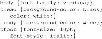
Group Columns
Along the same lines, you can group columns together with the
col and colgroup elements. Browsers that understand these tags can then render the table incrementally, instead of all at once. This causes long tables to load more quickly than they might otherwise. In addition, using colgroups enables you to apply styles and characteristics to entire sections of columns, as opposed to doing so individually.TIP
Simply stated, the
colgroup and col elements are ways to pass information about structure and style on to the browser in the beginning of the table in order to help render it.The opening and closing
colgroup tags enclose one or more columns in the group and can dictate how those columns should be rendered. This means you can use the colgroup tag as a selector in your style sheet to format all the columns in that group the same way. You can also add the span attribute to this tag to tell the browser how many columns should be included in the group.NOTE
If you had both
colgroups and theads, the colgroups would be placed before the theads in your table structure.In this example, the first
colgroup contains five columns, while the second colgroup contains two columns. You can see the colgroup tags are placed at the top of the table, before all the table rows and table cells.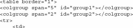
Each
colgroup in this example also has an ID assigned: group1 and group2. If you make formatting specifications in the corresponding ID style declaration, they take effect for all the columns in that group. If you need to alter the width or alignment of specific columns in the group, you then only have to make the change once in the style sheet. The following shows what a style sheet might look like to make all the columns in group1 50 pixels in width, while those in group2 are 25 pixels wide: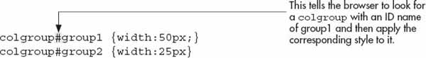
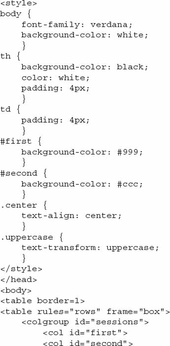
In this next example, there are two groups of columns in a table about adventure trips at a summer camp. In this case, the colgroups aren’t set up to handle width as much as background colors. The first group contains two columns, one for each of the camp sessions available. The second group contains three columns for the information about trips offered during each session. The session columns are styled with different background colors. In addition, two classes are created to handle capitalization and text alignment styling.

The table then continues with the rest of the cell data. You can see how it all turned out visually in the following illustration.

NOTE
As of this writing, the only aspects of
cols or colgroups that can be styled are borders, background, width, and visibility. Unfortunately, this means you can’t use a colgroup to adjust the alignment of all the cells in that column (wouldn’t that be nice!). The only way to do that is to add a class to each cell you want to style, and then use the text-align property with that class in your style sheet.Whether used in the
colgroup or col tag, column width can be specified as demonstrated in Table 11-2.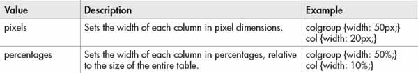
Table 11-2 Setting the Column Width
| Try This 11-2 | Format Cell Content |
Returning to the services page you began in Try This 11-1, let’s format some of the individual cells and add a horizontal rule that spans the entire width of the table. Goals for this project include
• Changing the alignment of content within table cells
• Causing a cell to span across multiple columns
1. Open your text or HTML editor and open the file used in Try This 11-1.
2. Create two column groups—one for the feature column, and one for the product columns.
3. Assign IDs to each column so that you can reference them from your style sheet.
4. Style the first column to have a colored background.
5. Style the second column group to have a different colored background.
6. Style the table header rows to have a very dark background color with white (or very light) text.
7. Add a four-pixel padding to the table cells for a bit of buffer space around the content.
8. Adjust the border to display only the outside box around the table and the horizontal lines between each row (but not the vertical lines between the columns).
9. Save the file.
10. Open your web browser and choose File | Open Page (or Open File or Open, depending on the browser you’re using). Locate the file you just saved. Make sure the file appears as you intended it.
11. If you need to make changes, return to your text editor to do so. After making any changes, save the file and switch back to the browser. Choose Refresh or Reload to preview the changes you just made.
NOTE
Feel free to experiment with other types of formatting as you see fit for your particular table design.
Although somewhat complex in nature, these formatting techniques help you build more creative tables than might otherwise have been possible. In addition, formatting techniques such as adjusting alignment, colors, and sizes are ways to draw attention to cell content. This project gave you practice working with many of these features.
Chapter 11 Self Test
1. What is the difference between the
td and th elements? 2. The
td and th elements are contained within which other table tag (aside from the table tag itself)? 3. How do you force a cell’s contents to display along a single line?
4. What should be the value of the border attribute to turn on a table’s borders?
5. True/False: You cannot use other HTML tags between opening and closing
td tags. 6. Fill in the blank: The ______________ property affects the space around the content of each individual table cell.
7. Fix the following code:

8. What are two types of measurements you can use to identify a table’s width?
9. Add the appropriate code to cause this table to fill the entire browser window, regardless of the user’s screen size.

10. Fill in the blank: You can add the ____________ property to your style sheet to change the background color of the whole table.
11. True/False: To add a caption to a table, you use the
caption attribute in the opening table tag.12. If you include a
thead or a tfoot group in your table, you must also include which other group?13. Which CSS property (and value) is used to align all the text in a cell to the right?
14. True/False: If you had both
colgroups and theads in a single table, the colgroups would be placed before the theads in your table structure...................Content has been hidden....................
You can't read the all page of ebook, please click here login for view all page.