Chapter 8
Working with Images
Key Skills & Concepts
• Become Familiar with Graphics Software
• Recognize Appropriate Web Image File Formats
• Use Images as Elements in the Foreground of a Web Page
• Specify the Height and Width of Images
• Provide Alternative Text and Titles for Images
• Link Images to Other Content on a Web Site
• Add Figure Captions
• Style Foreground Images
• Use Images as Elements in the Background of a Web Page
At its beginning, information pages on the Internet were text only and didn’t contain any images. We’ve come a long way since then, with some web sites now consisting solely of images. While, in most cases, I wouldn’t advocate using only images, I do advocate employing images to spice up your web pages wherever they make sense. The saying “a picture is worth a thousand words” definitely holds true for the Internet.
Locating Web Image Sources
Whenever you create a web site, you will undoubtedly want to include images. It isn’t always necessary to create your own images. In fact, thousands of stock images are available, both online and off. Some require minimal fees, while others are free. Let’s run through a few different types to help you decide what to use.
Use Stock Images
The use of high-quality photography and illustration can often add a sense of professionalism to a business web site, but many businesses don’t have the budget to hire photographers to do private photo shoots for them. If you’re in this predicament, have no fear. Plenty of stock imagery houses offer royalty-free photography and illustrations to be used for almost any purpose, except for resale.
You can purchase entire CDs of images with a particular theme at your local computer or office supply store. These CDs range in cost from $40 to $500, depending on the quality of the work and the type of license you’re given.
You can also search online and purchase the right to use an individual photograph or graphic. The costs vary according to how you plan to use it. For example, if you want to purchase the right to use a photo only on your web site, you can expect to pay a minimal fee as low as a few dollars (especially on sites like istockphoto.com). If, however, you want to use the same image in all your printed publications, as well as in any digital presentations, the fees typically start around $100 and go up from there.
You might also check the software licenses that came with your favorite graphics or presentation program. For instance, registered owners of Microsoft Office have access to Microsoft’s free image gallery at http://office.microsoft.com/clipart.
NOTE
Just because you find an image online doesn’t mean it’s available for you to use! Always check the license—if available—and ask for permission before using personal or business photos that belong to someone else.
When using any stock images, be sure to read the terms of use and license carefully. While you may find free stock images, they are often restricted only to noncommercial use. Here are a few other resources to consider:
Creating Your Own Graphics
If you do not use existing graphics on your pages, you may need to create some of your own or hire a web designer to do so. The best web designers typically have a background in graphic design and know how to make fast-loading, good-looking graphics for the Web. You can locate web designers either by word of mouth or by searching an online directory such as The Firm List: www.firmlist.com.
The next few sections provide an overview of the process of creating and saving web graphics.
Become Familiar with Graphics Software
If you check out the software section (virtually or otherwise) of your favorite computer store, you might be surprised by the sheer volume of graphics-related software available. You can buy clip art and photography, fonts, scanning utilities, animation titles, photo editing programs, desktop publishing applications, drawing tools, and so forth.
NOTE
You’ll hear the term layers used a lot when discussing graphics software. Using layers in a graphics program is similar to making a bed. You place sheets, blankets, and pillows over the mattress, but you can change any of those items freely if you decide you dislike one. The same is true with layers—you can paint on a layer, and then delete it later if you don’t like it. Layers offer much flexibility in graphics programs. However, once you export a file for use in a web page, those layers are merged, or flattened, to save file size and make it easily portable. So if you want to make changes to that file, you’ll need the original—layered—source file.
For the purposes of this chapter, I focus on those software titles that offer you the best tools for creating web graphics. Two main categories of graphics software titles exist: vector and bitmap.
Bitmap applications, also called raster applications, create graphics using tiny dots known as bits. These types of images are more difficult to resize because you must change each individual dot, but they have been around longer and enjoy more support from file formats. GIFs and JPEGs are bitmap images.
Vector applications, also called object-oriented applications, are based on mathematically calculated lines and curves that are easily changed and updated. Images created with vectors tend to be smaller in file size and, for that reason, are increasing in popularity on the Internet.
TIP
Can’t decide which graphics program to purchase? Most options have trial or demo versions available for free. Visit each company’s web site for details.
The programs discussed here are by no means the only products available for creating web graphics. Given the scope of this book, though, I thought it best to limit the discussion to the most popular programs. If none of these tools suits your needs, try searching in Yahoo! (www.yahoo.com) or CNET’s download center (www.downloads.com) for “web graphics,” and perhaps you’ll find one more suitable for your purposes.
Adobe Photoshop and Illustrator
Adobe is the world leader in graphics and imaging software. It offers such renowned titles as Photoshop and Illustrator, which have been used in the printing and design industry for years.
TIP
Adobe’s products are available for Windows and Macintosh systems. For more information, visit www.adobe.com.
Photoshop is a bitmap program, best known for image manipulation, using layers to allow for virtually limitless flexibility in design. In fact, if you’ve recently bought a new scanner or printer, you might have acquired a scaled-back version of Photoshop with it. Illustrator, on the other hand, is a vector tool, more suited for freehand drawing and illustration. However, both products can save and open web file formats.
In many design circles, Adobe’s Photoshop is the product to use. For the typical home user, however, the price for the full version is a bit steep (over $650). If you’re familiar with Adobe’s products and enjoy them, I recommend sticking with Photoshop. Likewise, if you’re interested in creating web graphics as well as editing images for printed publications, Photoshop is your best bet. But if your particular interest is more in the graphical or illustrative realm, I suggest you download a trial of Adobe Illustrator to see if that better serves your needs.
If you don’t fall into either of those categories, you might be interested in Photoshop Elements (the scaled-back, but still fabulous, version), which costs around $100. While this version doesn’t have all the high-powered image editing tools used by the professionals, it’s more than capable of handling the needs of someone just starting, and it even has a few bells and whistles that the full version doesn’t. Photoshop Elements, available for both the Mac and the PC, is a superb gateway graphics program for the typical home user.
TIP
If you are a student or are employed by an academic institution, remember to check into academic pricing for software like this, since Adobe offers significant academic discounts. Also, their subscription options can make software quite affordable. For example, you can use Photoshop for as little as $19.99/month if you pay for a year at a time.
Other Options
While the Adobe tools are by far the most popular web graphics applications, there are several other options available that might be more appropriate for you. Corel fans particularly enjoy Draw and Photo-Paint (www.corel.com), which are Corel’s competitors to Illustrator and Photoshop. Features include animation, direct digital camera support, layers, filters, watermarks, special effects, and advanced text tools, such as text typed along a curve or custom path.
Xara (www.xara.com) is another company that offers a few competing tools for cost-conscious users who are relatively new to web design. Photo & Graphic Designer FX is less than $100, and touts all of the basic features you’ll likely need. But if you’re looking for a few advanced options, like Pantone color libraries or built-in PayPal integration, consider the Designer Pro X version for under $300. (Xara’s software packages are Windows-only.)
Everyone always wants to know if you can get some software for free. Normally, I’d say, “not legally,” but in this case there actually is an option for you: GIMP, which is an acronym for GNU Image Manipulation Program. GIMP is freely distributed from www.gimp.org for the Mac, Windows, and UNIX platforms. Its features include photo retouching, image composition, and image authoring. If you’re just getting started with creating your own web graphics and aren’t interested in spending a lot of money until you know if this is something to which you want to commit, GIMP might be the perfect way to start. And who knows, you may even decide you don’t need anything else.
Recognize Appropriate Web Image File Formats
Now that you have some ideas about software to use, let’s talk about the file formats necessary. If you try to load a TIFF or PICT into your web page, users will see a broken image symbol. This occurs because graphics in web pages must be in a format understood by the web browser. The most popular graphics file formats recognized by web browsers are GIF, JPEG, and PNG.
Terminology
Before you dive into the nuts and bolts about those file types, you need to learn a few terms that relate to web file formats.
Compression Methods
Web graphic file formats take your original image and compress it to make it smaller for web and email delivery. Two types of compression methods are used for web graphics:
• Lossy
• Lossless
Lossy compression requires data to be removed—permanently—from the image to compress the file and make it smaller. Typically, areas with small details are lost as the level of lossy compression is increased. Lossless compression is the opposite of lossy, in that no data is lost when the file is compressed. In these cases, the actual data looks the same whether it’s compressed or uncompressed.
Resolution
You might have considered your monitor’s resolution previously, but in this case I’m referring specifically to file resolution. Whenever you create or edit a file in a graphics editor, you need to specify a file resolution (see Figure 8-1). The standard file resolution for web graphics is 72 pixels per inch (ppi).
Figure 8-1 When working with web graphics, use a file resolution of 72 ppi.
NOTE
Don’t be confused if you see dpi (dots per inch) used interchangeably with ppi. Technically speaking, dpi is more often linked to a printer’s “dots per inch,” while monitors are considered to have “pixels per inch.”
Transparency
When you view an image and are able to see through parts of it, that image is said to have transparency. Some graphics editors show this transparency by displaying a gray and white checkerboard behind the image. Figure 8-2 shows an example of this in Photoshop.
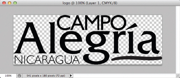
Figure 8-2 When a file with transparency is displayed in a graphics program, you typically see a gray and white checkerboard in the transparent areas of the image.
When a web graphic contains transparency, the page’s background color or background tile shows through in the transparent areas.
File types that support transparency fall into two categories: binary and variable. Binary transparency means any given pixel is either transparent or opaque. Variable transparency, also known as alpha channel, allows pixels to be partially transparent or partially opaque; therefore, it is capable of creating subtle gradations.
Certain file types don’t support transparency. If the image shown in Figure 8-2 were to be saved in a file format not supporting transparency, the areas shown in a checkerboard would be filled in with a solid color.
Animation
Some web file formats support animation as well as still images. These animation files contain two or more individual files called animation frames. The following illustration shows three frames of an animation. Notice that the position of the rattle changes slightly from frame to frame.
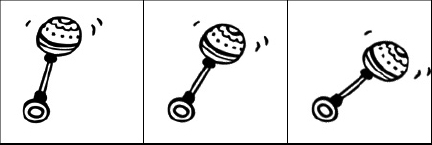
When the file is played back through the browser, viewers watch the various frames of the animation appear, one after the other. The rate at which the frames change can vary between a speedy filmstrip and a slowly blinking button. In the preceding example, the rattle appears to shake.
The most common example of this type of animation—bitmap animation—is GIF animation. More robust animation tools are those that use vectors instead of bitmaps. This means the animation is sent as a series of instructions instead of actual pixel renderings. The result is much more fluid animation that downloads in a fraction of the time a similar bitmap animation would. Flash is the most common type of vector animation. In addition, HTML5 introduces animation right within the page, using the canvas element and JavaScript. I’ll discuss that a bit more in Chapter 14.
GIF
GIF is the acronym for graphic interchange format. Originally designed for online use in the 1980s, GIF uses a compression method that is well suited to certain types of web graphics. This method, called LZW compression, is lossless and doesn’t cause a loss of file data. However, several characteristics of GIFs restrict the type of files capable of being saved as GIFs. Table 8-1 lists these and other characteristics of the GIF file type.
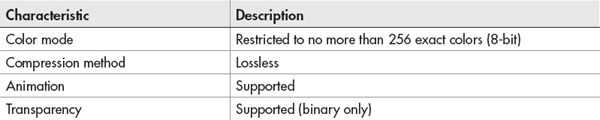
Table 8-1 GIF File Format Characteristics
NOTE
According to its creator, GIF is officially pronounced with a soft g. Because the word is an acronym, though, many people pronounce it with a hard g.
Because of these characteristics, the following types of images lend themselves to being saved as GIFs. Notice all of these are limited in colors.
• Text
• Line drawings
• Cartoons
• Flat-color graphics
Ask the Expert
Q: I noticed photographs aren’t on this list. I’ve seen plenty of photographs used on web pages—can’t they be saved as GIFs?
A: Images with photographic content shouldn’t usually be saved as GIFs, unless they’re part of an animation or require transparency. Other file types are more capable of compressing photographs. In fact, the JPEG file format was created specifically for photographs and shouldn’t be used for other types of images such as flat-color graphics and text.
Save a GIF
When you save a file as a GIF in a graphics program, you have the option of saving your image with or without dithering. GIF color palettes only have a limited number of colors, and the fewer colors present, the smaller the file size. When you want to reduce the number of colors in the palette, the program must know what to do with the areas in your image that contain the colors you’re removing.
TIP
The g in GIF gives you a hint about what types of images are best saved as GIFs: graphics (as opposed to photographs).
If you tell the program to use dithering (you can specify any amount of dithering between 0 and 100 percent), it may use multiple colors in a checkerboard pattern in those areas to give the appearance of the color you removed. If no dithering is used, the removed colors are replaced with another solid color (see Figure 8-3). Dithering can be useful in giving the appearance of gradations or subtle color shifts, but be forewarned—it adds to the file size.

Figure 8-3 In this example, the photograph on the bottom is dithered, while the photograph on the top is not.
TIP
Few images actually need all 256 colors available in a GIF color palette. Try reducing the number of colors all the way down to 8 or 16, and work your way back up as high as you need to go to make the image look acceptable. This assures that you reach the minimum colors more easily than if you try to work from the most colors on down. Remember, the fewer colors in the palette, the smaller the file size.
JPEG
The JPEG file format (pronounced jay-peg) was created by the Joint Photographic Experts Group, who sought to create a format more suitable for compressing photographic imagery. After reading Table 8-2, review Table 8-1 to compare JPEG’s characteristics with those of GIF.
One major difference between GIFs and JPEGs is that JPEGs don’t contain an exact set of colors. When you save a photograph as a JPEG, you might consider all the colors in the file to be recommended, because the lossy compression might require some colors to be altered. In addition, all web JPEG files must be in the RGB (Red, Green, Blue) color mode, as opposed to the print standard—CMYK (Cyan, Magenta, Yellow, Black).

Table 8-2 JPEG File Format Characteristics
Save a JPEG
When you save an image as a JPEG, you choose between several different quality levels. The highest-quality JPEG has the least amount of compression and, therefore, the least amount of data removed. The lowest-quality JPEG has the most amount of data removed and often looks blotchy, blurry, and rough. I usually save JPEG images with a medium quality. The decision is made based on how low in quality you can go without compromising the integrity of the file: The lower the quality level, the lower the file size.
PNG
PNG, which stands for Portable Network Graphics and is pronounced ping, is the newest and most flexible of these three graphics file formats. After looking at the list of characteristics for PNG in Table 8-3, you might think of PNG as being the best of both the GIF and JPEG formats.
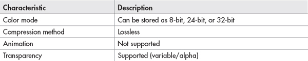
Table 8-3 PNG File Format Characteristics
TIP
The 32-bit color format is similar to 24-bit color because it also has millions of colors. However, 32-bit color also has a masking channel, which can be used for alpha transparency.
An additional benefit of PNG is its gamma correction. The PNG file format has the capability to correct for differences in how computers and monitors interpret color values.
Save a PNG
When saving a file as a PNG, you must first choose how many colors to include in its palette. Saving as PNG-8 uses an exact palette of 256 colors or less. Transparency and dithering are available in the PNG-8 setting. PNG-24 and PNG-32 offer 24-bit (millions) and 32-bit (millions, plus an alpha channel) color modes, respectively.
Choose the Best File Format for the Job
Now that you know a little about the different web graphics file formats, you’re probably wondering how you might select the best format for the job. While I wish I could give you a foolproof method, the answer, ultimately, lies in your own testing.
Luckily, many of the popular graphics programs make this testing easy. For example, Photoshop enables you to compare how a single image might look when saved in any of these file formats.

TIP
If the graphics program you’re using doesn’t allow you to compare and preview file types, save several different versions of the same file and preview each one in a browser. Compare their file size (with regard to download speed) and appearance to determine which file type and settings are the best.
In the preceding example, I used Photoshop’s Save For Web feature to compare three different quality levels for the JPEG file format. The settings and file sizes are printed below each example to help decide which would work the best.
Choosing the best file format is like shopping—you are looking for the file format that looks the best, but costs the least. In this case, the cost comes in download time for web page visitors.
| Try This 8-1 | Save Web Graphics |
Designers often receive images for web pages on disc, via email, or even in printed format. On receipt of these files, you need to put them in a web-ready format by saving them as GIFs, JPEGs, or PNGs.
If you have a graphics program, this project gives you a chance to practice saving different types of images in the appropriate web file format. If you don’t already have a graphics program, you might visit the web sites listed in the beginning of this chapter to download trial copies or demo versions. Goals for this project include the following:
• Saving a photograph in an appropriate web file format
• Saving an illustration in an appropriate web file format
NOTE
You will need a few image files to use for this project. Search your computer’s hard drive and/or Google Images to find a few practice files. At this point, we are less concerned about the actual image content as much as the process by which web graphics are saved.
1. Open your graphics editor and load a logo file, an illustration, or another graphical image (something other than a photograph).
2. Adjust the dpi and pixel dimensions to be more suited toward placement of this image in a web page.
3. Determine which file format is the most appropriate for this image, using any of the following techniques. If necessary, keep track of your progress by entering each file’s setting in the following table. The first two rows give examples of how the table might be used.
• Review the guidelines in this chapter.
• If available, use the program’s preview and compare features.
• Save multiple versions of the file, using different settings in each one, and view them in a web browser.
4. Repeat this process for a photographic image.
5. Open your web browser and choose File | Open Page (or Open File or Open, depending on the browser you’re using). Locate the graphics you just saved. Make sure the image appears as you intended.
6. If you need to make changes, return to your graphics editor to do so. After making any changes, save the file and switch back to the browser. Choose Refresh or Reload to preview the changes you just made.
TIP
Do you see broken image symbols instead of your images? Make sure the filenames end in a three-letter extension (such as .gif or .jpg). If they don’t, go back to your graphics editor and resave or re-export the file as a GIF, JPEG, or PNG. For more tips, see Appendix C.
Creating your own web graphics can be a great way to add your own personal style to your web pages. This project gave you a chance to practice saving files in formats viewable on the Web.
Use Images as Elements in the Foreground of a Web Page
Now that you have a basic understanding of how to save web images, let’s discuss how to insert them into your site. You can easily add images anywhere on your web page by using the
img element, where img is short for image. Add the src attribute (short for source), supply the appropriate value, and you’re off and running.
When you use the
img element, you’re telling the browser to display the image right within the web page. In doing so, remember the following few things:• Your image should be in a web-friendly file format, such as GIF, JPEG, or PNG.
• The value of your
src attribute should include the correct pathname and location of your file. So, if the image you want to use is not located in the same folder as the HTML page you’re working on, you need to tell the browser in which folder that image is located. For example, if you want to include an image located one directory higher than the current directory, you would use src="../photo.jpg", where the ../ tells the browser to go up one directory before looking for the image file. If you want to reference an image from another web site, first you must obtain permission from the image’s owner. Then, you could use src="http://www.websitename.com/images/photo.jpg", where the URL is the full name of the image location on the other site.• In general, each image should serve a unique purpose and add something to your web page. Because visitors have to wait while images download to their computers, it’s wise not to bog down your page with gratuitous graphics that serve little or no purpose.
Specify the Height and Width of Images
After you start adding several images to your web pages, you may notice they sometimes cause the browser to wait a few seconds before displaying the page. Because they don’t know the size of the image, some browsers actually wait until the images are all loaded before displaying the web page.
Therefore, you can help speed the display of your web pages by telling the browser the sizes of your images right within the
img tag. You do so with the height and width attributes.
If you don’t know the size of your image, you can open it in a graphics editor to find out. Or you can use the browser to determine the size of your images.
• In Firefox/Mozilla for the Mac and PC, as well as in Safari for the Mac First, load the image by itself into the browser window (choose File | Open or File | Open Page and locate the image file on your computer). Then, look at the top of the browser window where the title is usually displayed. When you view an image file, these browsers print the width and height of the image (in that order) in the title.
• In Internet Explorer Load the image into the browser window (choose File | Open and locate the image file on your computer, or drag it from the desktop into an open browser window). Then, right-click the image and choose Properties. The size is displayed as dimensions (width × height).
TIP
If a magnifying glass is displayed when you hover over the image in the browser, you are not viewing the full-size image. Click the magnifying glass to enlarge the image to its full size, and then view the dimensions.
You can also use the
height and width attributes to change the size of an image. For example, if you were given an image that was 50 pixels high by 60 pixels wide, you could change that size by specifying a different size in the HTML (such as 50 pixels wide by 50 pixels high). This causes the browser to attempt to redraw the image at the newly specified size. I don’t recommend doing this—and neither does the W3C—because it may not only slow down the display of your pages, it may also cause the image to lose proper proportions. Creating the image at whatever size you need it to be within your page is best.Provide Alternative Text and Titles for Images
Some people visiting your site won’t be able to see the images on your pages. This might be the case for a variety of reasons, but here are a few of the most common ones:
• They have turned images off in their browsers Most browsers have a setting in the preferences that enables you to disable images on pages. By turning off images, visitors are able to view web pages more quickly, and then choose which (if any) images they want to see.
• They are using text-only browsers Although a small minority of people using desktop computers have text-only browsers, some of those with handheld devices do use text-only browsers on a daily basis. These handheld devices might include Internet-ready telephones, pagers, and palm-size computers. In addition, those who are vision-impaired often use text-only browsers with additional pieces of software that read the pages to them. In these cases, your alternate text may be the only way vision-impaired people can understand the purpose of your images.
• The image doesn’t appear Sometimes, even though you coded the page properly, the visitor to your site doesn’t see every single image on the page. This could happen if too much traffic occurs, or when visitors click the Stop button in their browser before the page has fully loaded.
The good news is you can do something to help visitors to your site understand the content of your images, even if they can’t see them. You can use the
alt attribute in the img tag to provide alternative text for an image.
The text value of the
alt attribute displays in the box where the image should be located if the browser cannot find the image or if it isn’t set to display images (see Figure 8-4).
Figure 8-4 This screen shows how Safari displays the alternative text if it cannot find the image. Without that alternative text, viewers wouldn’t have any idea what they were supposed to see.
In addition to the
alt attribute, it’s a good idea to add the title attribute to your img tag. While the alt attribute specifies alternative text for images in case the images don’t load, the title attribute is displayed in a box near your pointer arrow when the arrow is positioned over the image. In addition, the title attribute can be added to images as well as links and other page elements. It serves as a quick tip for users to briefly explain the contents of the page element or, in this case, the image.
TIP
This process of showing informative text when the mouse moves over an image is also called a tool tip in other software programs.
Link Images to Other Content on a Web Site
In the preceding chapter, you learned how to create links to other pieces of information on the Internet. Text phrases were used to mark links and give visitors something to click. You could also use an image to label a link, with or without an additional text marker. Figure 8-5 shows an example of an image used as a link without an additional text label, while Figure 8-6’s linked image does have a text label.

Figure 8-5 Here, an image—in this case, an animated banner ad—is used as a link to another web page.
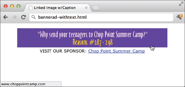
Figure 8-6 As an alternative, a text label has been added in this example to help users understand where the link will take them.
Link the Entire Image
To link an entire image, as in Figures 8-5 and 8-6, you need only to add an
a tag and the href attribute around the image. Both figures show a linked banner ad. The associated code looks like this:
As with any other linked elements in a web page, the visitor’s pointer turns to a hand when she moves her mouse over the linked image (refer to Figures 8-5 and 8-6 for examples).
TIP
When I link an image, I like to add “LINK:” to the beginning of my alternative text. This immediately lets users who can’t see the image know it is also a link.
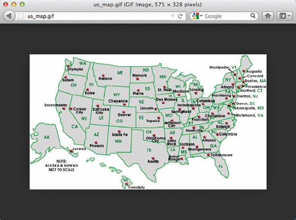
Link Sections of an Image
You can also link sections of an image, creating what are called image maps. When only sections of an image are linked (as opposed to the entire image), the visitor’s pointer only changes to the hand when he moves his mouse over one of the predefined hot spots on the image. Each hot spot within an image map can link to its own web page, if wanted.
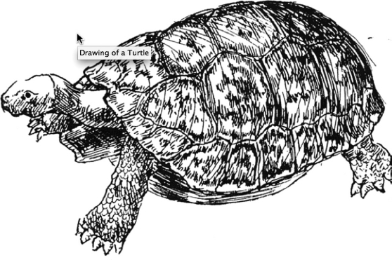
So, looking back at the drawing of a turtle, an image map could be used to link the eyes to one web page and the shell to a different one. Another example of an image map is a picture of the United States, where each state could be designated as a hot spot, with its own link.
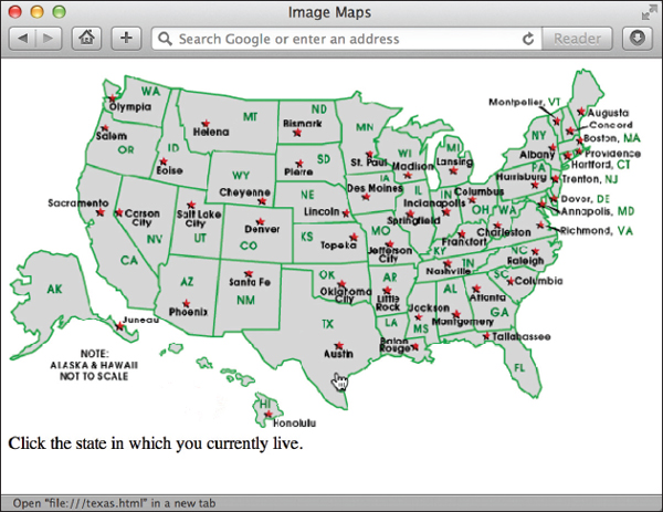
In this example, when you move your mouse over the state of Texas, for example, the pointer changes to a hand telling you Texas is a link. You can see in the status bar at the bottom that the Texas hot spot links to a page called texas.html. If you moved your mouse over another state, such as New Mexico, you would see it’s linked to newmexico.html.
The technical term for the type of image map discussed here is “client-side image map.” Client-side image maps are so called because all the work is done on the client’s (or visitor’s) computer. The “work” I refer to is the computation of where the hot spot is located and to which link it corresponds. All the information about which hot spot is where and what it links to is included within the original HTML file. This makes for easy access by your visitor’s web browser because it doesn’t have to look for the information elsewhere. The following example shows what that code looks like. First, we have to tell the browser this image will be used as an image map. Use the
usemap attribute to do that and tell the browser where to look for the map file:
Then we name the map:
…and define each hot spot:

After defining all the hot spots in the image, don’t forget to close the map tag:
You use the
usemap attribute of the img tag to specify the image as a client-side image map. This attribute works similarly to something you learned in the preceding chapter: links within a page. The reason for this is that the map tag contains a name attribute that enables you to link to it.When you use the
usemap attribute, you reference whatever name you gave to your map in the map tag. So, in the previous example, the image references an image map called “usa” (usemap="#usa"), which is defined further down the page by <map name="usa">.NOTE
Remember, whenever you reference a client-side image map, you need to use the hash mark (#) before the name of the map to tell the browser you’re referencing something contained within a named section of the page.
Let’s look at the code a little more closely.
Here’s your basic
img tag, with the addition of the usemap attribute. The value of the usemap attribute (in this case, usa) should be enclosed in quotes and preceded by a hash mark (#).
The
map element surrounds all the other information defining hot spots in your image. The opening and closing tags are both required. The map element and its enclosed information can actually be located anywhere within your HTML page and needn’t be immediately below the corresponding img tag. The name attribute is used with the map tag to enable you to reference it from anywhere else on the page (or any other page, for that matter).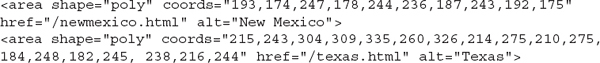
In between the opening and closing map tags are
area tags for each hot spot. The area element has four basic attributes (see Table 8-4).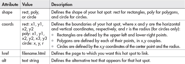
Table 8-4 Attributes for the
area Element
Finally, you end this section by closing the
map tag.Finding Hot-Spot Coordinates
If you need to, you can likely use your favorite graphics program or HTML editor to find the coordinates of your hot spots. Alternatively, there are plenty of online tools that can help you find the hot spots and code the image map for you. Check out www.kolchose.org/simon/ajaximagemapcreator to see one in action.
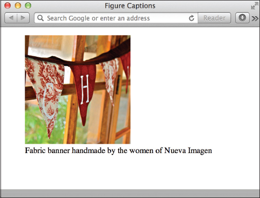
Add Figure Captions
Prior to HTML5, there was no easy way to semantically connect a figure caption to the actual image. Thankfully, we can use the
figure and figcaption elements to do just that. The following code snippet and illustration show the code and resulting browser display for a single photo and caption: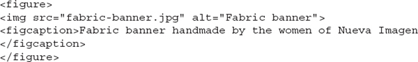
When you use the
figcaption element, it must be placed inside the figure element, and must contain both opening and closing tags. You can then use the figcaption tag as a selector in your style sheet to format the caption to match your site’s look and feel. (We’ll look at an example of this shortly.)NOTE
It’s not necessary, or even recommended, to put all of your images inside
figure elements. Logo and navigational items, for instance, are not part of the actual informational content of a document, and therefore should not be placed inside figure elements.You can also use the
figure and figcaption elements to connect more than just images with their captions. Suppose you created a table of reference information and wanted to place it within a large text block. You could place the table or other diagram within a figure element, and then add a caption to explain the purpose of the figure.Style Foreground Images
While the basic
img element provides an easy way to add images to your web pages, you likely want to do a whole lot more than just plop those images down on the page. Style sheets enable you to customize the borders, align images with text, and a whole lot more.Borders
You might have noticed that many linked images have borders around them. This happens because all linked images automatically have borders, just as all linked text automatically has underlines. The earlier HTML specifications allowed for a
border attribute, which was used to specify the size of an image’s border, as in the following example:
NOTE
Some versions of Internet Explorer turn off borders for images by default. However, because this is not true for all browsers, you should turn it off yourself if you indeed want it to be off.
The value of the
border attribute is expressed in pixels, where the default is 1 for linked images and 0 for nonlinked images. If you wanted to make it thicker, you would use a larger number, such as 4. In this example, the value is 0. This turns the border off completely, making it invisible.NOTE
You could also use the
border attribute to add a border to an image that is not linked by specifying the value as any number greater than 0.With that said, the W3C retired the
border attribute and now prefers that you adjust the display of borders with style sheets, just as you learned in a previous chapter. One reason for this is that style sheets offer significantly more control over your borders. For example, if you have multiple images on your page and wish to turn the borders off for all of them, instead of adding “border=0” to each of the img tags on the page, you can add the following code to the page’s style sheet:
Actually, you could use
border-style: none; instead of border-width: 0; and it would also make the border invisible. Additional style sheet properties related to borders are as follows:• border-width Controls the size of the borders, individually (border-left-width, border-right-width, and so on) or as a whole (border-width). Values can be specified in length units (0 or 1, for example) or keywords (thin, thick, or medium).
• border-color Controls the border’s color by specifying between one and four values. When you specify one value, that color is set for all four border edges. When two values are specified, the top and bottom edges take on the color in the first value and the left and right edges take on the second. When three values are specified, the top is set to the first, the right and left are set to the second, and the bottom is set to the third. When four values are set, the top, right, bottom, and left edges are set, respectively, as in the following example:
img {border-color: #ccc #666 #333 #999;}. To specify a value for only one side, add the side’s name (top, bottom, right, or left) to the property, as in “border-top-color.”• border-radius Allows you to round the corners of the border by specifying between one and four values (just like the border-color property). To round an image’s border, use any pixel dimension greater than zero for the value, such as border-radius: 25px.
• border-style Changes the style of the border. Options include
• none
• dotted
• dashed
• double
• solid
• groove
• ridge
• inset
• outset
As you can see, another powerful aspect of the border properties is that they can be altered either as a whole (so that all four edges look the same) or individually. To alter the characteristics individually, you simply add the side specification (top, bottom, right, or left) to the border property, after
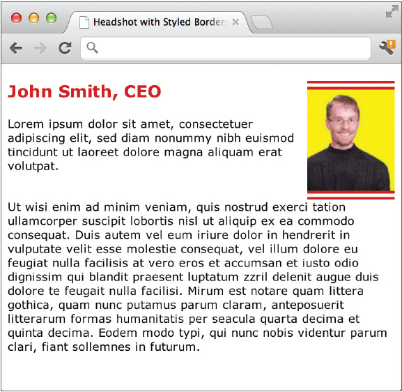
border and before any final characteristic. To give you an idea how this is done, consider the following example and Figure 8-7. Here, I’ve created a class called headshot and then set the border properties in my style sheet.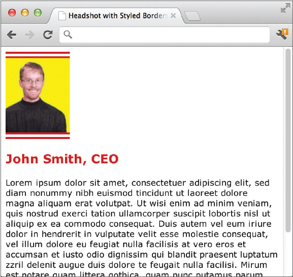
Figure 8-7 The headshot class tells the browser to add double, 10-pixel borders to the top and bottom edges of the photo, but leave the left and right edges blank.
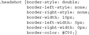
After adding that style declaration to my style sheet, I can add the class reference to my
img tag to complete the task:
TIP
As discussed previously, with style sheets these types of borders can be added not just to images but to any other element on the page! This means you can quickly add border styles to things like table cells or pull-out quotes, or virtually any other piece of content.
Floats
Whenever images appear within a section of text, you may want to alter the alignment so that the image floats within the text flow instead of above or below it. (By default, the text starts wherever the image ends and flows below it, as shown previously in Figure 8-7.)
While the text-align property discussed previously works for basic alignment of text, it does not align images. Chapter 6 introduced the process of more complex alignment and positioning, but sometimes that is not necessary for quick image alignments. So, I want to mention a very quick and easy way to “float” an image on the page—the CSS float property and a value of either left or right.
Floating an Image Within Text
The float property essentially tells the browser to place the floated element nearest whichever browser edge is specified, and then flow the rest of the page’s content around it. To say it another way, content automatically flows along the right side of a left-floated image, and to the left side of a right-floated image. For example, if you had a lengthy paragraph of text and wanted to place an image in the upper-right corner of that paragraph, like this:

you could use the float property on that image, and set the value to right to tell the browser to keep the image on the right side of the text. Possible values for the float property are left, right, or none.
NOTE
When coding floats, your floated content must be placed before any other content to wrap around it.
Clearing Floats
From time to time you’ll encounter an instance in which you actually need to stop or clear a float. One example might involve the same situation I just used—an image floated to the right of a long paragraph of text. Suppose you wanted to break the long paragraph up into two paragraphs, and then you only wanted the first paragraph to wrap around the image. The remaining paragraph would then take up the entire width of the page. To accomplish this, you have to “clear the float” by adding the
clear property to the section in question, such as:
This causes the paragraph to be “pushed down” until it is below the bottom edge of the floated image, like this:
NOTE
Possible values for the clear property are left, right, both, or none.
Floating Groups of Images
Suppose you had a page with lots of images, maybe one with several photos of products for sale. If all of the images were the same size, it would be very easy to use the float property and let the browser automatically place them in lines across the page. The following code shows one way to accomplish this task by placing each of the images (and their accompanying captions) into separate figure elements:

Then you would add the declaration for that element to your style sheet:
The
float: left code tells the browser to put the first image next to the left margin of the page. Then, each subsequent image with the float: left style follows suit and sits in a row next to the first image until it reaches the right edge of the browser. If the browser is open wide enough for all the floated images to fit in a single row, they will do so. If the user has the browser window open only enough for two images to fit in a row, then the remaining images will begin a new row beneath the first row (starting again near the left margin).This is the true meaning of a “liquid layout” in web design, because the page is able to grow or shrink according to the browser window size. Figure 8-8 shows how the images line up next to each other when the browser window is open wide enough.

Figure 8-8 A very simple style sheet declaration allows these three photos to float next to each other on the page.
Padding and Margins
In Chapter 5, we discussed how to use the padding and margin properties to add blank space within and around an element’s borders. Those same properties can also be applied to images to specify the space around an image on one, two, three, or all four sides.
For example, suppose you wanted to add a small block of space on the left side of an image, but you didn’t want to add any space on the right side because that side fits perfectly with another image. If you added the margin-left property to your style sheet or within your
img tag, you could add space only on the left side:
NOTE
The figure element has a default margin of 15 pixels on all four sides, as of this writing, So if you place an image inside figure tags, be sure to set the margin to whatever size you want it to be if you don’t want it to be 15 pixels.
Centering
By this point, there’s probably a big question still remaining about images and alignment … how to center?! While there isn’t a “center” property for images, there is a trick you can use to center an image on the page or within a section. The key lies in changing the way we refer to “centering” an element—in reality, what we’re doing is making its left and right margins exactly equal.
First, we must tell the browser to display the image as a block element. In CSS, block elements will automatically fill the entire available space. So if an image becomes a block element, its margins will grow until they reach the edges of the browser window.
Next, if you tell the browser to make both the left and right margins the same, you will, in effect, center the image. The following is an example of the code you might use to center an image. First, the style sheet:
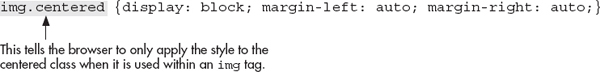
Then, add the name of the class (in this case, it’s “centered”) to the
img tag. No matter how wide (or narrow) the browser window is opened, the image remains centered horizontally.Pulling It All Together
Now that we’ve looked at a few of the most commonly used style properties affecting images, let’s pull it all together by reviewing a more complete style sheet for one of the examples used previously from Figure 8-8.
In this instance, the border-radius property is used to round the corners of the images, while the margin property is added to the figure element to control the amount of space between the floated images. Finally, the figure caption’s text is made smaller and centered below the image. Figure 8-9 shows how the following code translates into a typical browser view.

Figure 8-9 The images in this example are arranged and styled through a few key style sheet declarations.

| Try This 8-2 | Add an Image and Customize Image Characteristics |
Returning to one of the web pages you’ve created, let’s first add an image file, and then vary the characteristics of that image. Goals for this project include
• Specifying the height and width for an image
• Providing alternative text and a title for an image
• Linking an image to another web page
• Turning off the border for a linked image Aligning an image with the text around it
• Adding some buffer space around an image
1. Open your HTML editor and load one of the pages saved from a previous Try This.
2. Add the appropriate code to insert an appropriate image into the file.
3. Add the
height and width attributes to the image code. 4. Add alternative text and a title to the image.
5. Add 10 pixels of buffer space around the image.
6. Link the image to another page and turn off the image’s border.
7. Add another image to the page, making sure to specify the height, width, and alternative text.
8. Align the first image to the right of the text in that section.
9. Align the second image to the left of the text in that section.
10. Save the file.
11. Open your web browser and choose File | Open Page (or Open File or Open, depending on the browser you’re using). Locate the file that you just saved.
12. Verify that all your changes were made as you expected. If you need to make additional changes, return to your text editor to do so. When you finish, save the file and switch back to the browser. Choose Refresh or Reload to preview the changes you just made.
You can customize the look and style of the images displayed in the foreground of your web pages in many ways. This project gives you practice with many image properties, including links, alignment, borders, and alternative text.
Use Images as Elements in the Background of a Web Page
Images have another role in a web page, which is in the background. Just as in a theatrical play, where actors may be moving in the foreground while scenery moves in the background, two levels of design also exist in a web page.
The old HTML specifications enabled you to add a single image to be used as the “scenery” in the background of your web page. This was accomplished using the background attribute of the
body element, as in <body background="picture. jpg">. However, the W3C retired the background attribute in favor of using style sheets to specify backgrounds. The latter is done by adding the background-image property to a style declaration for the body element:
One great advantage of the background property in style sheets is that it can be added to all sorts of page elements, from paragraphs to lists and table cells, using the same format shown for the
body tag:
Several benefits arise from using an image in the background as opposed to the foreground:
• You can achieve a layered look in your designs this way, because an image in the foreground can actually be placed on top of the image in the background.
• Background images begin at the top of the page and run all the way to each of the four sides. By contrast, elements in the foreground are subject to borders on the top and left, similar to those that occur when you print something.
• Adding backgrounds to page elements (like navigation bars or footers) can be a great way to set that content apart from the rest of the page.
When you insert a background image with HTML, you need to remember a few other things:
• All background images tile by default Tiling means background images repeat in the browser window as many times as needed to cover the whole screen.
• You can only include one image in the background So, if you want to use two different patterns in your background, they need to be included in a single image file.
• Text in the foreground must be readable on top of the background If you’re using dark colors in your background, make sure the text on your page is much lighter. Likewise, try to avoid high-contrast backgrounds because they make it extremely difficult to read any text placed on top of them.
• Background images should be small in file size This avoids a long download time. Take advantage of the fact that the browser repeats a background image and cut your image down as much as possible.
To help clarify these points, look at Figure 8-10. If I told you the darker bar on the left, as well as the word “Corinna” and the stars, are all in the background, could you imagine what the background image itself looks like when it isn’t tiled? Figure 8-11 gives the answer.

Figure 8-10 Here, a background image enables me to achieve a layered look because the photo in the foreground lies over the top of the image in the background.

Because the original image was only 1000 pixels wide but only 100 pixels tall, it appears to repeat more vertically than horizontally. Testing your pages on different screen sizes is important to ensure your background images are repeating as you expect.
You can force the background image to remain stationary by adding the
background-attachment property to the page’s style sheet. This property allows the background to stay in place (when set to fixed) or to move when the page is scrolled (when set to scroll). Similarly, you can even tell the browser whether or not to repeat your background image at all using the background-repeat property.
Possible values of the
background-repeat property are• repeat Specifies the file should repeat both horizontally and vertically (which is the default)
• repeat-x Specifies the file should repeat horizontally only
• repeat-y Specifies the file should repeat vertically only
• no-repeat Specifies the file should not repeat
TIP
You can find many images suitable for background tiles in the same clipart catalogs mentioned earlier in the chapter.
| Try This 8-3 | Add a Background Image |
This final project in Chapter 8 gives you a chance to add a background image to your page.
1. Open your HTML editor and load the page saved from Try This 8-2.
2. Add a patterned image into the background of the page. (Refer to the stock image resources listed previously for help locating a background image.)
3. Make any changes necessary to the colors of the text on your page in order to ensure it remains readable against the new background.
4. Save the file.
5. Open your web browser and choose File | Open Page (or Open File or Open, depending on the browser you are using). Locate the file you just saved.
6. Preview the page to check your work. If you need to make changes, return to your text editor to do so. After making any changes, save the file and switch back to the browser. Choose Refresh or Reload to preview the changes you just made.
Adding an image in the background can add depth and appeal to your web pages when used wisely. This activity gives you practice using the
background-image property with the body tag to add a background image.TIP
Having trouble getting your background to display? If so, make sure the image file is located in the same directory as your HTML file. If it isn’t, you need to specify the correct file location in the
background-image property. For more tips, see Appendix C.Extra Credit
Try reformatting the page you just completed using an internal style sheet. Some formatting possibilities might be to
• Specify that the background image should only repeat along the horizontal axis. You could also try repeating it only along the vertical axis.
• Specify that the background image should remain fixed at the top of the page and should not scroll with the page. Alternatively, you could specify that the background image should always be displayed at the top of the screen, even if the user has scrolled.
Chapter 8 Self Test
1. What does the
src attribute do? 2. Why is it important to specify the height and width of images in web pages?
3. Which style sheet properties enable you to add blank space around images?
4. Which attribute must be added to an
img tag to designate the image as a client-side image map? 5. Which two elements are used when defining a client-side image map’s name and hot spots?
6. You are creating the code for a client-side image map, and one of the rectangular hot spots has the following coordinates: 0,0 (upper left); 50,0 (upper right); 50,50 (lower right); and 0,50 (lower left). Which are used in the following
coords attribute?
7. Fill in the blank: The value of the
height and width attributes is measured in ______________. 8. Fix the following code:
9. Add the appropriate style declaration to use wallpaper.gif as a background for the web page code shown next. Note that the graphic is in the same folder as the HTML file.
10. What are the four possible values of the
clear property (used to clear floats)?11. Fill in the blank: The default value of the
border property is ___________ pixels for linked images and _________ pixels for nonlinked images.12. True/False: You can achieve a layered look in your designs when an image in the foreground is placed on top of an image in the background.
13. What value must be used with the display property before you can center an image using the method discussed in this chapter?

14. Which attribute is used to add alternative text to an image?
15. Which statement is not true about background images?
A. All background images tile by default.
B. You can only include one image in the background.
C. Background images are added to web pages with the
background tag.D. Background images begin at the top of the page and run all the way to each of the four sides.
..................Content has been hidden....................
You can't read the all page of ebook, please click here login for view all page.