CHAPTER |
|
1 |
Introduction to Maps and the Google API |
Google is a company that, more than any other, shapes the way we use computers today. No scientific discovery, new technology, or space mission has had as much impact in our daily lives as the Google Search service. Need information on “anything”? Just google it. Another service from Google that has become a household term is Google Maps, a technology that added a spatial dimension to everything. Google Maps is much more than a digital map; third parties are adding all types of information on the map and new creative applications based on Google Maps surface every day.
All events have two basic dimensions: a temporal dimension (when it took place) and a spatial dimension (where it took place). Google Maps is the tool that helps you visualize the spatial dimension of an event. Besides data with an obvious spatial component, such as temperatures and city populations, even simple business data such as sales have a spatial component, as the two basic attributes of an invoice are its date and the customer’s address. Even the simplest hotel booking applications provide a lot of functionality through Google Maps; the IP addresses hitting a specific site can also be easily tied to a location, and the list is endless. And then there are the GIS systems (Geographical Information Systems) that associate data of all types with geographical locations.
Up until now, the spatial dimension has been overlooked because there were no tools to easily explore the world. Not anymore. With Google Maps, you can see the earth at a glance, get an overview of your neighborhood, and view everything on our small planet in place. Everyone has seen photos of the Eiffel Tower in Paris or the Elizabeth Tower in London. But with Google Maps, you can view the monument in place. You can actually see what it looks like from the street level and drive around it.
Google Maps is also changing the way people look at the world. You can personalize the map by identifying the features you’re interested in, explore cities you will never visit, plan your trips before getting there, and document them when you return. It’s an amazing service and it comes for free to all (7 billion) of us. With Google Maps, you can create your own personalized maps of your neighborhood and the places you love to visit. All this is available to you on a variety of devices, including tablets and phones, and soon to your glasses.
In addition to the basic services of Google Maps (and Google Earth, for that matter) available directly from Google, numerous applications make use of this technology to add value to plain maps. Close to one million sites are built on top of Google Maps and these sites attract users with special interests. While most of these sites rely on the built-in functionality of Google Maps, many sites add value to Google Maps by embedding useful data and operations on the map. These sites are applications built on top of Google Maps using the Google Maps API, similar to the applications you will build in the course of this book. If you want to know how other developers exploit Google Maps, visit Google Maps Mania at http://googlemapsmania.blogspot.com. The site reviews third party sites that rely on Google’s mapping technology.
Building Map-Driven Applications
Because readers of this book are more than familiar with Google Maps (every computer user is), this chapter starts with the basic ingredients of a map-driven application: an application that incorporates a Google map and allows users to interact with it in ways that go beyond mere zoom or drag operations. A map-driven application is a web page that contains HTML and some JavaScript code. The HTML content of the page takes care of the appearance of the page and, at the very least, contains a placeholder for the map. The script is responsible for rendering the map in its placeholder and enabling users to interact with the map. The script can be very simple, or very lengthy, depending on the complexity of the interaction model.
To better understand how Google Maps works, you need to understand the architecture of a map-driven web page. To display a map on your page, you set aside a segment of the page where the map will be displayed (or use the entire page for this purpose). You also download a program—let’s call it the application—which is executed at the client. The client is your computer; it’s your browser, to be precise, because the application runs in the context of the browser. The application at the client is responsible for the interaction between the user and the map. Every time the user drags the map, or zooms in and out, the application calculates the coordinates of the part of the world that should appear on the user’s browser, requests it from a server, and renders it on the page. Google Maps is a client server application that uses the client computer to intercept the user’s actions, and the server to retrieve the information required by the client on the fly.
The map is stored on powerful servers located around the world and every time a user requests a new map, an image is transmitted from one of these servers to the client. If you consider the number of people using Google Maps around the world, the size of the world, and the zoom levels, you will soon realize that serving all the users is an extreme challenge. Yet maps are downloaded to clients very quickly. To simplify the process of transmitting the requested maps to its clients, Google uses map tiles. The global map is broken into small squares and the client application requests only the tiles required to generate the map requested by the user. It’s imperative that the servers provide the information needed at the client and no more.
The Map Tiles
Google’s maps are digital and, as such, their content changes depending on the zoom level. As you zoom into the map, more and more information becomes available on the map. At the globe or continent level, you see just countries and then again not all of them. As you zoom in, you start seeing large cities and highways, then smaller cities and local roads, all the way down to your backyard or a Buddha monument somewhere in Asia that you will never see in real life. Google doesn’t maintain a single map with all the details. Instead, it maintains different maps for different zoom levels, and maps at different zoom levels have different content.
To organize all these views, Google breaks up its maps into tiles and each tile is an image of 256 by 256 pixels. The size of the map at the client determines the number of tiles that must be downloaded from the Google servers. Even if the map is displayed in a 256 × 256 pixel section of the page, the user may center it anywhere and, as a result, multiple tiles may have to be transmitted to the client for a map that’s no larger than a tile. At zoom level 1, the entire globe fits into a single tile, and when you view this tile there are no labels on the map—just the continents and the oceans (and the ice of the Arctic and Antarctic circles). This tile fits easily on most monitors and it’s repeated sideways to cover the segment of the page devoted to the map. When you zoom in to level 2, you switch to a different map that displays the continent labels. The entire map is made up of four tiles, each one being an image with 256 × 256 pixels. The map contains twice as much information in either direction, or 2 × 2 tiles. Zoom in again and you’ll see the names of the largest countries. This time the map is made up of 4 × 4 tiles, or sixteen tiles, and this process continues. At zoom level 10, the map is made up of 1024 × 1024 or one mega tiles. At this zoom level, Google keeps as many tiles as there are bytes in a megabyte! And you’re still at level 10. At zoom level 20, there are 2^20 × 2^20 tiles. That is 1,099,511,627,776 tiles—one trillion is a large number of bytes even for a typical server. Here we’re talking about tiles, or 256 × 256 = 65,536 pixels. Multiply this by the number of tiles and try to read out the number. It’s an incredible amount of information, all stored at Google’s servers.
The tiles are generated from raw data and are stored in a format that can be modified. As the raw information changes, the tiles are updated. And then there are satellite and aerial views of large parts of the world, also stored as tiles. It goes without saying that all information is duplicated along numerous servers, which explains why Google Maps is never down and also why Google servers respond so fast.
NOTE It’s no wonder Google is investing into clean energy alternatives because running all these servers with electricity generated from fossil fuels translates into tons of CO2 per hour. There are no figures for Google Maps, but an estimate provided by Google for the energy cost of a single Google search is 0.2 grams of CO2. There’s no direct link between the two services, but the footprint of Google’s services on the environment is not negligible. After all, Google is serving more users than any other company. Currently, Google uses renewable energy sources to power 34 percent of its operations, and this trend will continue.
In addition to storing huge volumes of data for the needs of its mapping operations, Google has to maintain this information. There are many people in many countries that actually maintain the Google Maps. New information is added on a daily basis as features are modified and as new data becomes available. The world is not static: New roads are built every day, new building are erected, and so on. The satellite images do not always correspond to the latest features on the ground. If you place a pool or a guest house in your backyard, it will be a while before you can see it in Google Maps, but eventually you will see it. And we’re not counting the street view images, which include images in the Antarctic Circle.
How Tiles Are Organized
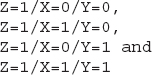
At each zoom level, the entire map is made up of X tiles horizontally and Y tiles vertically. The titles are numbered by the zoom level and their X and Y index. The application running at the client calculates the three indices of the tiles required to display the requested map and retrieves the appropriate tiles from the server. The tile that contains the entire globe has the coordinates 0/0/0: At the first zoom level, there’s only one tile. At the next zoom level, this tile is broken into four tiles, two for the Northern Hemisphere and two for the Southern Hemisphere. The first coordinate is 1 for all four tiles (it’s the zoom level). The second coordinate is 0 for the Eastern Hemisphere and 1 for the Western Hemisphere, and the third coordinate is 0 for the Northern Hemisphere and 1 for the Southern Hemisphere. So the coordinates of all four tiles at zoom level 1 are
This process continues until the maximum zoom level is reached and at each level the number of tiles is doubled in each direction. This isn’t the type of information that will help you design mapping applications, and you will never have to request tiles from within your script. It always feels good, however, to demystify some technology, especially when it’s based on simple principles.
You may use this information if you plan to substitute the background of the map with your own image. You obviously can’t create a better map of the earth, but you can use any other image as the background. The following site demonstrates this technique and it explains how it was done (the site was built with version 2 of the API and hasn’t yet been upgraded to version 3): http://forevermore.net/articles/photo-zoom/.
This site uses the interface of Google Maps to enable users to navigate through an extremely large image with the zoom and drag operations used by Google Maps. The author of the photo-zoom site broke up the image into tiles and serves it as the background of Google Maps.
You can use Google’s documentation at the following URL to research the use of custom images as map backgrounds:
The sample application provided by Google demonstrates how the surface of the moon is displayed in Google Moon. Google Moon is based on the same technology as Google Maps, but it uses different tiles and there’s no roadmap view for the moon (not yet). As you will read in the documentation, the individual tiles are requested with a URL like the following:
where
Z is the zoom level, X the x-coordinate and Y is the y-coordinate of the desired tile. This URL isn’t going to work if you substitute values for the X, Y, and Z parameters. It must be called from within the application. However, it’s possible to create your own background for Google Maps by creating the tiles that make up the entire image at all (or selected) zoom levels and naming them appropriately.By the way, this tile-naming scheme is not unique to Google Maps. All services that provide map backgrounds, including Bing Maps, use the same technique because it’s simple and it works very well.
Cartography 101
Google provides maps by combining the tiles that have been prepared and stored at their servers. But where did the information come from? To make the most of Google Maps, you need to understand how maps are constructed. Even though Google has taken care of this step for you and provides a global map with all the detail you may need, you should be aware of the process of map production, mainly because there are inherent limitations—some very serious limitations, actually.
The science of map making is known as cartography. To some extent, it’s also an art, although the creative part of cartography is in the decline with so much aid from satellites. To appreciate cartography, think of it as the science, or practice, of mapping a round planet onto a flat surface, be it a computer screen or a printed map. People have been fascinated by the vastness of the planet and have tried to document the world since they started traveling. Figure 1-1 shows the map of Ptolemy dating back to the second century. This map depicts the “known world” at the time: the countries around the Mediterranean and the Indian Ocean. Figure 1-2 shows the same area in Google Maps. This part of the world hasn’t changed over the last 2,000 years, but the cartography techniques have surely evolved.
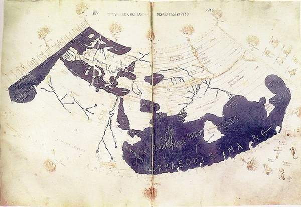
Figure 1-1 The world according to Ptolemy (courtesy of Wikipedia)
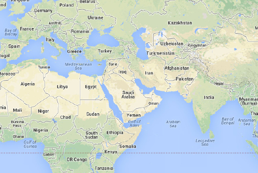
Figure 1-2 The same part of the world according to Google
The goal of cartography is to project the features of a round planet onto a flat surface, which is the map. To put it simply, there’s no way to “unfold” the surface of the earth on a flat surface. It’s like trying to lay the peels of an orange on a flat surface (between two glasses, for example). Parts of it will be squashed together, and parts of it will come apart. Conversely, you can’t wrap a printed page around a sphere; no matter how you go about it, the paper will wrinkle and there will be substantial overlaps. In short, you can’t project a round planet on a flat surface without introducing various types of distortion.
To transfer the features from the surface of a round planet onto a flat map, we perform a projection. Think of the globe as made of a semitransparent material and a source of light in its center. If you place a piece of white paper near this globe, part of the earth’s surface will be mapped on the paper. If you orient the paper correctly, you will end up with a map that is partially correct. Features near the center of the map are depicted more accurately than features away from the center (assuming that the center of the map is the point where the paper is nearest to the globe). This map can be considered accurate for a small area. For other areas you would have to use different maps. Even though you will end up with dozens, or hundreds, of (mostly) accurate maps, you won’t be able to stitch them together to produce a large map.
There are many projection techniques, all based on mathematical models. Google Maps uses the Mercator projection, so this is the only projection we will explore in this book.
The Mercator Projection
Can we project the entire globe on a flat surface? The answer is yes, as long as we accept the fact that no projection is perfect. There are different types of errors introduced by each projection type, and no single projection minimizes all types of errors. Some projections preserve shapes but not sizes; other projections preserve local sizes but not distances or directions. No single projection technique can minimize all types of errors at the same time, and that’s why there’s a separate category of projections, called compromise projections, which attempt to hit a balanced mix of distortions.
The projection used by Google Maps is the Mercator projection. Proposed by the Dutch cartographer Gerardus Mercator in 1569, the Mercator projection has become the standard projection for nautical maps and remains quite popular even today. Over the years, maps based on Mercator’s projection have become very popular. The maps in basic geography books use this projection and the wall maps at school also used the Mercator projection. As a result, we’ve learned to accept gross inaccuracies, such as Greenland appearing as large as Africa while, in reality, Greenland is only a small fraction of Africa. On the positive side, the Mercator projection yields a rectangular map and turns parallels and meridians (the vertical and horizontal circles going around the globe) into straight lines, as shown in Figures 1-6 and 1-7 later in this chapter. This is the very feature that made the Mercator maps so useful to sailors.
Mercator devised this map construction technique to assist sailors. The name of his map was “new and augmented description of Earth corrected for the use of sailors.” It’s clear that Mercator’s map was designed to assist sailing, which was a risky business at the time. Moreover, the word “corrected” indicates that he was aware of the errors introduced by his projection technique.
Performing the Projection
The Mercator projection is a cylindrical projection: It’s produced by wrapping a cylinder around the globe so that it touches the globe at the equator. The features on the globe are projected on the cylinder by lines that start at the center of the globe, pass through the specific feature, and extend to the surface of the cylinder. After projecting all the features on the cylinder, you unfold the cylinder and you have a flat map.
To understand the way Mercator projected the earth on a map and the distortions introduced by this projection, consider the following explanation, which was suggested by Edward Wright in the seventeenth century, almost a century after Mercator proposed his technique. Imagine that the earth is a balloon and the features you’re interested in are drawn on the surface of the balloon. Place this balloon into a hollow cylinder so that the balloon simply touches the inside of the cylinder. The points of the balloon that touch the cylinder form a circle that divides the balloon in two halves. This circle is the equator by convention. Since the balloon is a perfect sphere, any circle that divides it into two hemispheres is an equator and there’s an infinity of equators you can draw on a sphere.
Now imagine that the balloon expands inside the cylinder and the features drawn on the balloon’s surface are imprinted on the inside surface of the cylinder. As the balloon is inflated, more and more of its surface touches the cylinder’s surface. No matter how much the balloon is expanded, however, the two poles will never touch the cylinder. This explains why you’ll never see the two poles on a conventional map. All maps show parts of the polar circles, but never the two poles, because the poles can’t be projected on the cylinder wrapped around the equator. Features near the equator will touch the surface early, before the balloon is substantially inflated, and these are the features that are mapped with very little distortion. Features far from the equator will touch the cylinder’s surface only after the balloon has been inflated substantially.
There are variations to reduce the errors of the Mercator projection. The part of the sphere with the least distortion is the part that touches the cylinder on which the globe is projected. This is the part of the world on and near the equator. As you move from the equator toward either of the poles, the distortion becomes more and more significant. The type of distortion introduced by the Mercator projection changes the size of large shapes. This explains why Greenland appears to be larger than Australia on Google maps, while in reality it’s much smaller.
To minimize the distortion, cartographers can make the cylinder smaller than the equator so that part of the earth lies outside the cylinder. This part is also projected on the equator with the same math, but it’s projected from a different direction. With this projection there are two zones of minimal distortion and they’re above and below the equator, where the cylinder cuts through the surface of the earth. The advantage of this projection, known as secant projection, is that the distortion starts above and below the equator and the usable part of the map extends a bit further to the north and a bit further to the south. If you consider that most of the population lives in a zone to the north of the equator, the most populated part of the world is depicted more accurately.
Why the Mercator Projection
The next question is, of course, why has Google used a practically ancient projection for its maps? Google Maps is a service for viewing small parts of the world, not an accurate depiction of the globe. When you zoom down to your neighborhood, the map should match the satellite view. The Mercator projection doesn’t change small shapes. Even if it does, it does so in a uniform manner, which is quite acceptable. The important point to keep in mind is that Google Maps treats the earth as a perfect sphere and that the global view of the map is not very accurate near the poles. Open Google Maps at zoom level 1 and you will see most of the Arctic and Antarctic circles, but not the poles themselves. The Mercator projection is practically useless at latitudes over 70 degrees in either direction. The most northern tip of Finland is at latitude 71 degrees. In the opposite direction, the most southern tip of Chile is at –55 degrees (or 55 degrees south). The parts of the world that are of interest to most of us are well within the range of the Mercator projection.
Figure 1-3 is borrowed from Chapter 10 and demonstrates the type of distortion introduced by the Mercator projection. All the circles you see in the figure have the same radius, but they’re drawn at different parallels. The sizes of the circles are getting larger the further away from the equator. The pattern shown in the figure is known as Tissot Indicatrix and is discussed in detail in Chapter 10.
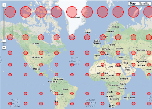
Figure 1-3 This pattern of equal radii circles repeated at constant latitude/longitude values shows how shapes are distorted far from the equator.
Google Earth to the Rescue
Is there an optimal projection technique? As far as Google Maps go, the answer is no, because the projection process will inevitably distort the map. One might claim that the best maps should be shaped like shells: If you could carry with you maps printed on curved surfaces, you’d have a much more accurate view of the world. While carrying such maps is out of the question for most practical purposes, the digital era has made non-flat maps a reality. Welcome to Google Earth. Google Earth displays the earth as-is on the monitor and it doesn’t introduce the usual distortions resulting from the projection process. The monitor is still flat, but what you see in Google Earth is a round planet. When you zoom in deeply enough, the visible area is so small that it’s practically flat. Viewing details on Google Earth is like projecting a small part of the earth on a flat surface without distortion. As you zoom out, you see the earth in its true shape, not a flattened version of it. When more elaborate 3D viewing techniques become widely available, flat maps will become as antiquated as the Ptolemy map, and Google Maps will be a thing of the past.
If you install Google Earth, you will be able to see any part of the world without distortion. If you place yourself right over Greenland and Australia, you will be able to compare their sizes, because you’re seeing them in their true scale, as shown in Figure 1-4. The problem with Google Earth, however, is that you can’t view the entire globe at once. On Google Maps, you can view both islands on the same map, but you can’t compare their sizes.

Figure 1-4 On Google Earth, you can compare the sizes of Australia and Greenland, even though you can’t view both islands at once.
Compare the relative sizes of Greenland and Australia in Google Earth and in Google Maps, shown in Figures 1-4 and 1-5. Google Earth doesn’t introduce any distortion to the shapes in its center, but you can view only a small percentage of the planet at the time.
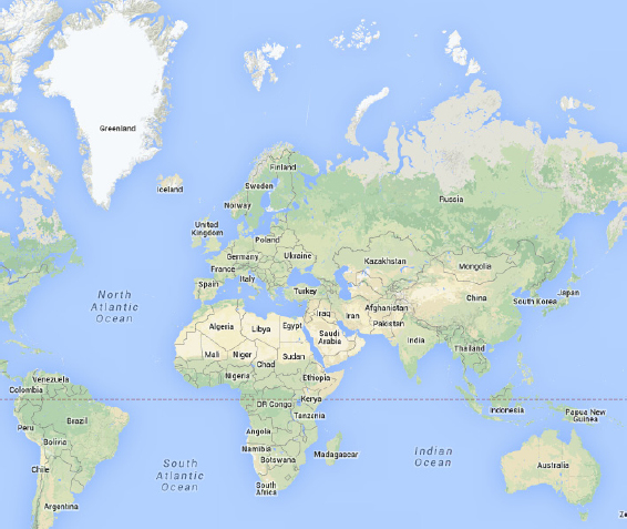
Figure 1-5 Google Maps distorts heavily the shapes far from the equator.
A Global Addressing Scheme: Parallels and Meridians
Another important question that has to be answered before attempting to make a map is how we identify a point on the earth’s surface. On the plane, we always use two axes: the horizontal (or X) axis and the vertical (or Y) axis. Any point on this plane is identified by its horizontal and vertical displacements from the origin. The two displacements are the point’s coordinates, and by convention we list first the horizontal and then the vertical coordinate. The origin is where the two axes meet. The units along the two axes may correspond to actual, meaningful values, but this isn’t necessary. The purpose of coordinates is to uniquely identify each point on the plane. Of course, if the coordinates have meaningful units, they’re much more useful in that they allow us to compare distances. If the plane is a map of a town, or the blueprint of a building, then the units on the two axes are units of length, such as meters or feet.
To identify locations on the surface of the earth, we use two coordinates, which are known as geo-coordinates or geo-spatial coordinates. These coordinates are expressed in degrees because the earth’s equator is a perfect circle (as far as Google Maps is concerned, of course) and, as such, it spans 360 degrees. Any circle on the surface of the earth parallel to the equator also spans 360 degrees, even though it’s smaller than the equator and as you approach the poles these circles are very small. Instead of the two displacements we use on the plane, on the sphere we use two circles to identify the location of a point on the surface of the sphere. One of the circles is parallel to the equator and goes through the point in question, and the other one goes through the two poles and the same point. The two circles are perpendicular to one another. (Two circles are perpendicular to one another when the planes on which they lie are perpendicular to one another.)
Figure 1-6 shows a location on the earth and the two circles that identify this location on the sphere. One of them goes through the specific location and the two poles. All circles that go through the two poles are called meridians. The origin of this circle is the equator and angles to the north are positive angles from 0 to 90 degrees (the North Pole is at 90 degrees), while angles to the south of the equator are negative values from 0 to –90 (the South Pole is at –90 degrees). The second circle is parallel to the equator. All circles parallel to the equator are called parallels. The two angles that identify every point on the surface of the sphere are called latitude and longitude. The point’s longitude is the angle between the prime meridian and the meridian going through the point (λ). The point’s latitude is the angle between the equator and the parallel going through the same point (φ).

Figure 1-6 Identifying a location on the globe with latitude (φ) and longitude (λ) value.
We also need to define a starting point on each circle, from where we’ll measure the angles. The origin for the parallels is the equator: Each parallel is defined by its distance from the equator in degrees. The distance of a parallel from the equator is the angle formed by a radius that extends from the center of the earth to the equator and another radius that extends from the center of the earth to the specific parallel. However, there’s no apparent origin for the meridians, so an origin has been defined arbitrarily. The first meridian, known as the prime meridian, is the meridian that goes through the two poles and through the Royal Observatory in Greenwich near London. If you rotate the prime meridian around its north-south axis, it will cover the entire sphere, and it will yield all other meridians. The equator can’t produce the other parallels by rotation. Figure 1-7 shows the locations of the equator and the prime meridian on the map. In the figure, which was produced by Google Earth, you see two important parallels: They’re the parallels at 23.5 and -23.5 degrees (or 23.5 degrees north and south) and they’re known as the Tropic of Cancer (north) and the Tropic of Capricorn (south), respectively. The zone inside the two tropics is the part of the earth that gets directly under the sun. The position of the earth directly under the sun is the location nearest to the sun and it changes as the earth rotates. No location outside this zone ever gets directly under the sun.

Figure 1-7 The prime meridian, equator, and a few meridians and parallels on the globe
Imagine a plane that slices the earth in two halves along the equator. Move this plane north or south and keep it parallel to the equator’s plane at all times. The intersection of this plane with the globe yields the parallels.
On the Mercator projection, parallels and meridians are converted into straight lines, which is an extremely convenient feature. It was, at least, extremely convenient to sailors for centuries, before the deployment of GPS (Geographical Positioning System) satellites. Figure 1-8 shows some lines of constant latitude and longitude on Google Maps. The distance between meridians is the same at all latitudes and all longitudes. The distance between parallels becomes larger as they approach the poles, even though all parallels are spaced 10 degrees apart. The darker line going through Congo is the equator.
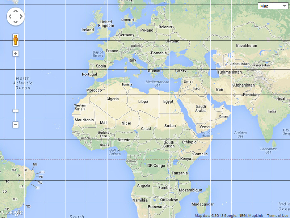
Figure 1-8 Parallels and meridians are mapped into straight lines under the Mercator projection.
Converting Angles to Length Units
Latitude and longitude values suffice to define a point on a sphere, regardless of the size of the sphere; you would use the same values to define a point on a marble ball, or on the sun. The two values represent angles and they’re adequate to identify any point on the sphere. They can also be translated to distances on the surface of the earth. The API treats the earth as a perfect sphere and so a specific angle should present a specific distance on the surface of the earth. On the equator, each degree corresponds to approximately 69 miles and here’s why. The equator is a full circle spanning 360 degrees and its circumference is
2 * π * R where R is the earth’s radius. A good approximation of the earth’s radius is 3,960 miles, or 6,371 kilometers. The circumference of the equator is 24,881 miles and corresponds to a full circle. The distance on the surface of the earth that corresponds to 1 degree is 1/360th of the circumference: 24,881/360, or 69.11 miles.If you perform the same calculations along a meridian, the result will always be the same. If you perform the same calculations on a parallel other than the equator, the result will be smaller because the parallels are not equal. The parallels become smaller as you move away from the equator. One degree of longitude is 69.11 miles on the equator and it shrinks to zero at the poles. At a latitude of 45 degrees, the circumference of the parallel is
2 * π * R * cos(λ) or 19,060 miles (λ being the latitude). If you divide this by 360, the distance on the surface of the earth corresponding to 1 degree of longitude at the specific latitude is 52.95 miles. You realize that the use of units of length to express coordinates on the sphere is out of the question. The angles are the only alternative and work nicely all over the globe. Angles are often used to specify distances because an angle of 1 degree is always the same, regardless of where it’s projected on the earth’s surface.Longitude and latitude angles are expressed as decimal angles. Latitude values are measured from the equator and they go from –90 to 90 with positive angles corresponding to points in the Northern Hemisphere and negative values corresponding to points in the Southern Hemisphere. Longitude values are measured from the prime meridian and they go from 0 to 180 in the Eastern Hemisphere (east of the prime meridian) and from 0 to –180 in the Western Hemisphere (west of the prime meridian). The Latitudes Longitudes application (see Figure 1-9) shows the coordinates of any location on the globe. Just click to place a label with the current location’s coordinates on the map. To delete a label, simply click it. The label also contains the nearest city (if available) and the country you clicked.

Figure 1-9 Use the Latitudes Longitudes web page to experiment with the geo-coordinates of locations around the globe.
A slightly different notation uses positive numbers and a suffix to identify the hemisphere. This notation uses positive values for western longitudes and southern latitudes and the suffix E (for East), W (for West), N (for North), and S (for South). The coordinates of the city Ate in Peru can be written as (–12.039321, –76.816406) or as (12.039321W, 76.816404S). This notation of coordinate specification is called decimal degrees because it uses fractional degrees.
The Degrees-Minutes-Seconds System
Another common method of expressing angles is the degrees, minutes, and seconds notation (DMS units). If you look up the geo-coordinates of LAX, for example, many sites list it as
33°56′33″N 118°24′29″W. The first part of this expression is the latitude and the second part is the longitude, and each coordinate is expressed in degrees, minutes, and seconds. It’s very similar to decimal degrees, only minutes are 1/60 of a degree and seconds are 1/60 of a minute.Let’s demonstrate the process of converting latitude/longitude values into DMS notation with an example. The geo-coordinates of the Eiffel Tower in decimal degrees are (48.8582, 2.2945). The integer part of the angle corresponds to degrees and doesn’t change. The 0.8582 degrees of latitude are 60 * 0.8582, or 51.492 minutes. The integer part of this value is the number of minutes of latitude. The fractional part, 0.492 minutes, corresponds to 60 * 0.492, or 29.52 seconds. So the 48.8582 degrees of latitude correspond to 48 degrees, 51 minutes, and 29.52 seconds. The coordinates in the DMS system are written with the N/S qualifier for the latitude values (depending on whether they lie in the northern or Southern Hemisphere) and the W/E qualifier for the longitude value. The coordinates of the Eiffel Tower in the DMS system are written as
48°51′29.5″N, 2°17′40.2″E.The Google Maps API uses decimal degrees, so if you have the DMS coordinates of a point, here’s how you will calculate the decimal degrees value. This time, let’s use the coordinates of the Statue of Liberty in New York:
40°41′21″N 74°2′40″W. Because the longitude value lies in the Western Hemisphere, it will have a negative sign in the decimal degrees system. The degree values remain as they are. The 41 minutes of latitude are 41/60 or 0.6833 degrees, and the 21 seconds are 21/(60 * 60) or 0.0058 degrees. The latitude value of the monument’s coordinates is 40 degrees and 0.6833 + 0.0058, or 40.6891 degrees. With similar calculations, the longitude value is 74.0444W, or –74.0444. The coordinates of the Statue of Liberty in DMS notation are 40°41′21″N 74°2′40″W and in decimal degrees notation they are (40.6891, –74.0444).The Google Maps API
You know how to identify any point on the surface of the earth and you have a good understanding of the projection process and the distortions it produces. To exploit Google Maps, you must familiarize yourself with a component that Google developed for you, and you can reuse it in your pages to add mapping features to them. The functionality of Google Maps is made available to developers through an Application Programmer’s Interface (API), a specification of how an application exposes its functionality through methods and properties to other applications. The Google Maps API is a set of objects that represent the programmable entities of the map. These objects are the Map object that represents the map itself; the Marker object, which represents the markers you place on the map to identify points of interest; the InfoWindow object, which represents the popup window displayed when users click a marker; and many more. These objects provide their own properties and methods, which allow you to access their functionality from within the code and manipulate the map, and they constitute the Google Maps API: the tools for programming the map.
Using the Google Maps API
Because not all readers are familiar with APIs, let’s look at some very basic examples to understand how an API works and how it exposes the functionality of an application. In a way, an API is the software equivalent of a user interface: Just as users can access the functionality of an interactive application through its user interface, applications can access the functionality of a service such as Google Maps and manipulate it through a set of “commands.” These commands are functions that the external application can call to manipulate Google Maps. To zoom into a Google map, you can click the zoom-in button on the map’s visual interface, To do the same programmatically, you can call the
setZoom() method of the Google Maps API, this time using the application’s programming interface.To use the API, as you will see in the following chapter, you must insert a special JavaScript program in your page. This program is a script and it is available from Google for free; it contains the implementation of the API. The script contains the
google.maps library and all objects for manipulating maps are implemented in this library.To create a new map on the page, you must use the following statement to create a new Map object:
This statement creates a new map on the page. The ellipsis indicates the arguments you pass to the constructor; they’re discussed in detail in the following chapter. They specify where on the page to place the map and the initial properties of the map. To understand the role of the API, just keep in mind that the preceding statement embeds a map on the current page and stores a reference to it in the
myMap variable. To manipulate the map, you manipulate the myMap variable’s properties and call its methods. To change the current zoom level from within your code, for example, you must call the setZoom() method of the myMap variable as follows:Let’s say that you have embedded a map on a web page, and that the map is referenced in your code by the
myMap variable. You can manipulate the map by calling its methods. You can also place items on the map, such as markers. To place a marker on the map, you must create a Marker object and specify the marker’s location and title.To specify a point in Google Maps, you must create a
LatLng object passing its coordinates as arguments:The values in the parentheses are the latitude and longitude values that identify the point on the globe. The variable
RomeLocation represents the location of Rome on the globe. You can use this variable to place a marker to identify Rome on the map, to calculate the distance of Rome from any other location represented by another LatLng object, or to center the map on Rome.To place a marker on Rome, you must create a new
Marker object with a statement like the following: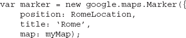
The basic attributes of the
Marker have a name and a value. The attributes are set by name and their values follow the name and a colon. One of the attributes is the position of the marker, which is a LatLng object. The title attribute is the marker’s title, and the map attribute determines the map on which the marker will be placed.The
LatLng object can also be used with the geometry library (also available from Google) to calculate the distance between any two points. First, you create two LatLng objects to represent two locations, as in the following:The
P1 variable corresponds to Dallas and the P2 variable corresponds to Beijing. To find out the distance between them, call the computeDistanceBetween() method, passing the two points as arguments:Don’t try to figure out how to use these examples in your scripts yet; they were included here as an overview of how the API is used to produce useful results. All the objects and methods shown in this section are discussed in detail later in this book.
Embedding a map in your HTML page is almost trivial and so is the placement of markers on the map to identify points of interest. Later in this book, you learn how to place more items on the map, such as lines and shapes. To make a mapping application really unique, however, you must enable users to interact with it in a friendly and productive manner. A good portion of this book is dedicated to this type of interaction, which is based on events. The API allows you to react to various events, such as the click of the mouse, or the dragging of the map itself, and you can design a highly interactive map by programming the map’s events. In Chapter 9, you learn how to let users draw on the map with the mouse by exploiting the click event. Users can draw shapes based on the underlying map’s features, and these shapes can be the outlines of landmarks (lakes, properties, airports, administrative borders, land usage, and so on). In addition to the basic Google Maps API, there are auxiliary APIs that rely on this API. The geometry library, discussed in Chapter 10, allows you to perform basic calculations with the map’s features, and you have already seen an example of the
computeDistanceBetween() method of the geometry library. You can use this library to calculate the length of a route or the area covered by a shape you have drawn on the map. The visualization library, which is discussed in Chapter 18, enables you to create graphs for visualizing large sets of data on the map. The graph you see in Figure 1-10, known as a heatmap, corresponds to the distribution of the airports around the world. There are so many airports that it’s practically impossible to view them as individual markers on the map. The heatmap represents the density of the airports around the globe as a gradient: Areas with many airports correspond to brighter colors in the figure. The black and white version of the printed image doesn’t do justice to the heatmap. You can open the original image, which is included in the chapter’s support material, to see the colors of the gradient. Or you can double-click the file Heatmap.html in the folder with this chapter’s support material, to view the heatmap in full color.
Figure 1-10 Displaying a very large number of items on the globe as a heat map graph
Summary
Google Maps are based on a projection of the globe onto a flat surface. The projection used by Google Maps is the oldest one, the Mercator projection, which was designed more than three centuries ago. The Mercator projection introduces some substantial distortions, especially as you move toward the poles, but it has advantages that outweigh its shortcomings, including the fact that the Mercator projection is a rectangular one and that the meridians are transformed into straight lines.
You’re ready to start exploring the Google Maps API, and in the following chapter, you learn how to embed a map in a web page.
..................Content has been hidden....................
You can't read the all page of ebook, please click here login for view all page.